1 Getting Started: Data Analysis with JMP
,Goals of Data Analysis: Description and Inference
Graph Builder: An Interactive Tool to Explore Data
Exporting JMP Results to a Word-Processor Document
Overview
Statistical analysis and visualization of data have become an important foundation of decision making and critical thinking. Professionals in numerous walks of life—from medicine to government, from science to sports, from commerce to public health—all rely on the analysis of data to inform their work. In this first chapter, we take first steps into the important and rapidly-growing practice of data analysis.
Goals of Data Analysis: Description and Inference
The central goal of this book is to help you build your capacity as a statistical thinker through progressive experience with the techniques and approaches of data analysis, specifically by using the features of JMP. As such, before using JMP, we’ll begin with some remarks about activities that require data analysis.
People gather and analyze data for many different reasons. Engineers test materials or new designs to determine their utility or safety. Coaches and owners of professional sports teams track their players’ performance in different situations to structure rosters and negotiate salary offers. Chemists and medical researchers conduct clinical trials to investigate the safety and efficacy of new treatments. Demographers describe the characteristics of populations and market segments. Investment analysts study recent market data to fine tune investment portfolios. All of the individuals who are engaged in these activities have consequential, pressing needs for information, and they turn to the techniques of statistics to meet those needs.
There are two basic types of statistical analysis: description and inference. We do descriptive analysis in order to summarize or describe an ongoing process or the current state of a population—a group of individuals or items that is of interest to us. Sometimes we can collect data from every individual in a population (every professional athlete in a sport, or every firm in which we currently own stock), but more often we are dealing with a subset of a population—that is to say with a sample from the population. When we study on-going processes, we nearly always deal with samples.
If a company reviews the records of all of its client firms to summarize last month’s sales to all customers, the summary will describe the population of customers. If the same company wants to use that summary information to make a forecast of sales for next month, the company needs to engage in inference. When we use available data to make a conclusion about something we cannot observe, or about something that hasn’t happened yet, we are drawing an inference. As we will come to understand, inferential thinking requires risk-taking. Learning to measure and minimize the risks involved in inference is a large part of the study of statistics.
Types of Data
The practice of statistical analysis requires data—when we “do” analysis, we’re analyzing data. It’s important to understand that analysis is just one phase in a statistical study. Later in this chapter we’ll look at some data collected and reported by the World Population Division of the United Nations. Specifically, we will analyze the estimated life expectancy at birth for nations around the world in 2010. This set of data is a portion of a considerably larger collection spanning many years.
In this particular example we have four variables that are represented as four columns within a data table. A variable is an attribute that we can count, measure, or record. The variables in this example are country, region, year, and life expectancy. Typically, we’ll record or capture multiple observations of each variable—whether we’re taking repeated measurements of (say) stock prices, or recording facts from numerous respondents in a survey or individual countries around the globe. Each observation (often called a case or subject in survey data) occupies a row in a data table. In this example, the observational units are countries.
Whenever we analyze a data set in JMP, we’ll work with a data table. The columns of the table contain different variables, and the rows of the table contain observations of each variable. In your statistics course, you’ll probably use the terms data set, variable, and observation (or case). In JMP, we more commonly speak of data tables, columns, and rows.
One of the organizing principles you’ll notice in this software is the differentiation among data types and modeling types. The columns that you will work with in this book are all either numeric or character data types, much like data in a spreadsheet are numeric or labels.
In your statistics course, you may be learning about the distinctions among different kinds of quantitative and qualitative (or categorical) data. Before we analyze any date, we’ll want to understand clearly whether a column is quantitative or categorical. JMP helps us keep these distinctions straight by using different modeling types, and JMP recognizes three such types:
• Continuous columns are inherently quantitative. That is to say, they are numeric so that you can meaningfully compute sums, averages, and so on. Continuous variables can assume an infinite number of values. Most measurements and financial figures are continuous data. Estimated average life expectancies (in years) are continuous.
• Ordinal columns reflect attributes that are sequential in nature or have some implicit ordering (for example, small, medium, large). In our data table, we have an ordinal variable indicating the year, which in this case is 2010 for all observations. Ordinal columns can be either numeric or character data.
• Nominal columns simply identify individuals or groups within the data. For example, if we are analyzing health data from different countries, we might want to label the nations and/or compare figures by continent. With our U.N. data, both the names of countries and their continental regions are nominal columns. Nominal variables can also be numeric or character data. Names are nominal, as are postal codes or telephone numbers.
As we’ll soon see, understanding the differences among these modeling types is helpful in understanding how JMP treats our data and presents us with choices.
Starting JMP
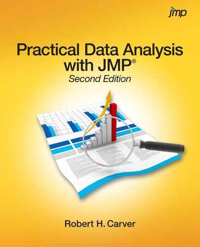
Whether you are using a Windows-based computer or a Macintosh, JMP works in very similar ways. All of the illustrations in this book were generated in a Windows environment. Find JMP1 among your programs and launch it. You’ll see the opening screen shown in Figure 1.1. The software opens a Tip of the Day window each time you start the software (assuming no initial default settings have been changed). These are informative and helpful. You can elect to turn off the automatic messages by clearing the Show tips at startup check box in the lower-left part of the window. You’ll be well advised to click the Enter Beginner’s Tutorial button sooner rather than later to get a helpful introduction to the program (perhaps you should do so now or after reading this chapter). After you’ve read the tip of the day, click Close.
The next window displayed by default is called the JMP Starter window, which is an annotated menu of major functions. It is worth your time to explore the JMP Starter window by navigating through its various choices to get a feel for the wide scope of capabilities that the software offers. As a new user, though, you may find the range of choices to be overwhelming.
In this book, we’ll tend to close the JMP Starter window and use the menu bar at the top of the screen to make selections. Behind the JMP Starter window is the JMP Home Window. The home window is divided into four panes that can help you keep track of recently used files and currently open windows. One can customize this view, but this book shows the standard four-pane layout.
A Simple Data Table
In this book, we’ll most often work with data that has already been entered and stored in a file, much like you would type and store a paper in a word-processing file or data in a spreadsheet file. In Chapter 2, you’ll see how to create a data table on your own.
We’ll start with the U.N. life expectancy data mentioned earlier.
1. Click File ► Open.
2. Navigate your way to the folder of data tables that accompany this book2.
3. Select the file called Life Expectancy 2010 and click Open.
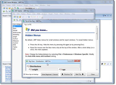
The data table appears in Figure 1.2. Notice that there are four regions in this window including three vertically arranged panels on the left, and the data grid on the right.
The three panels provide metadata (descriptive information about the data in the table) which is created at the time the data table was saved, and can be altered for various reasons. At this early stage, it may be helpful to understand the purpose of each panel.
Beginning at the top left, we find the Table panel, which displays the name of the data table file as well as optional information provided by the creator of the table. You’ll see a small red triangle pointing downward next to the table name.
Red triangles indicate a context-sensitive menu, and they are an important element in JMP. We’ll discuss them more in later chapters, but you should expect to make frequent use of these little red triangles.
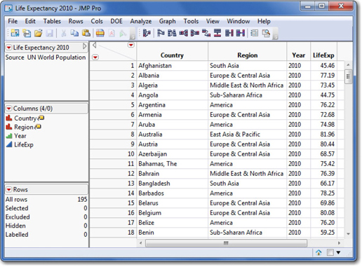
Just below the red triangle, there is a note describing the data and identifying its source. You can open that note (called a Table variable) just by double-clicking on the word “Source.” Figure 1.3 shows what you’ll see when you double-click. A table variable contains metadata about the entire table.
Below the Table panel is the Columns panel, shown in Figure 1.4, which lists the column names, JMP modeling types, and other information about the columns. There are several important things to notice in this panel.
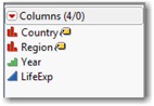
The notation (4/0) in the top box of the panel tells us that there are four columns in this data table, and that none of them are selected at the moment. In a JMP data table, we can select one or more columns or rows for special treatment, such as using the label property in the first two columns so that value labels will display within graphs. There is much more to learn about the idea of selection and column properties, and we’ll return to it later in this chapter.
Next we see the names of the columns. To the left of the names are icons indicating the modeling type. In this example, first two red icons (these look like bar graphs) identify Country and Region as nominal data. The “price tag” icons indicate that these variables can act as labels to specifically identify observations that are displayed in a graph.
The green ascending bar icon next to Year indicates that year is to be analyzed as an ordinal variable. In this data table, all observations are from the same year, 2010, but in the original data set, we have observations at five-year intervals from 1950 through 2010. Hence, this is an ordinal variable.
Finally, the blue triangle next to LifeExp identifies the column as continuous data. Remember, it makes sense to perform calculations with continuous data.
At the bottom left, we find the Rows panel (Figure 1.5), which provides basic information about the number of rows (in this case 195, for 195 countries). Like the other two panels, this one provides quick reference information about the number of rows and their states. We’ll come back to row states in a few pages.
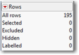
The top entry indicates that there are 195 observations in this data table. The next four entries refer to the four basic row states in a JMP data table. Initially, all rows share the same state, in that none has been selected, excluded, hidden or labeled. Row states enable us to control whether particular observations appear in graphs, are incorporated into calculations, or whether they are highlighted in various ways.
The Data Grid area of the data table is where the data reside. It looks like a familiar spreadsheet format, and it just contains the raw data for any analysis. Generally speaking, each column of a table contains either a raw data value (e.g., a number, date, or text) or the entire column contains a formula or the result of a computation. Unlike a spreadsheet, each cell in a JMP data table column must be consistent in this sense. You will not find some rows of a column representing one type of data and other rows representing a different type.
![]() In the upper-left corner of the data grid, you’ll see the region shown here. There is a triangular disclosure button (pointing to the left side here in Windows; on a Macintosh it is an arrowhead ►). Disclosure buttons allow you to expand or contract the amount of information displayed on the screen. The disclosure button shown here lets you temporarily hide the three panels discussed above.
In the upper-left corner of the data grid, you’ll see the region shown here. There is a triangular disclosure button (pointing to the left side here in Windows; on a Macintosh it is an arrowhead ►). Disclosure buttons allow you to expand or contract the amount of information displayed on the screen. The disclosure button shown here lets you temporarily hide the three panels discussed above.
4. Try it out! Click the disclosure button to hide and then reveal the panels.
The red triangles offer you menu alternatives that won’t mean much at this point, but which we’ll discuss in the next section. The hotspot in the upper-right corner (above the diagonal line) relates to the columns of the grid, and the one in the lower-left corner to the rows. The very top row of the grid contains the column names, and the left-most column contains row numbers. The cells contain the data.
Graph Builder: An Interactive Tool to Explore Data
Our main interest within this data table is the life expectancy values around the world. As you peruse the list of values, you might notice that they vary. Variation is so common as to be unremarkable, but the very fact that they vary is what leads us to analyze them. We can imagine many reasons that life expectancy varies around the world; there are differences in nutrition, wealth, access to healthcare and clean water, education, political stability, and so forth. Are there systematic differences in different parts of the world?
We have a table displaying all 195 values, but it is hard to detect patterns by scanning up and down a long list. As a first step in analysis, we’ll make some simple graph to summarize the table information visually. Software affords us many options to visualize a set of data, and can help us discover errors in the recording of the raw data, locate important patterns of variability, or identify possible connections between and among variables. JMP’s Graph Builder is an intuitive interactive platform for visualization.
1. From the Life Expectancy2010 data table window, click Graph ► Graph Builder.
The graph builder gives us a blank tableau on which we can create a JMP Report representing multiple columns in a single visual display. There are numerous options available, but in this first example, we’ll look at just a few.
In analyzing this set of data, our primary interest lies in the variation of life expectancy. Following one of JMP’s conventions, we’ll think of this column as our Y variable.
2. To display LifeExp on the Y axis, click the LifeExp column in the panel of Variables, and drag it to the vertical Y drop zone in the Graph Builder window. When you do this, your screen should look like Figure 1.6.
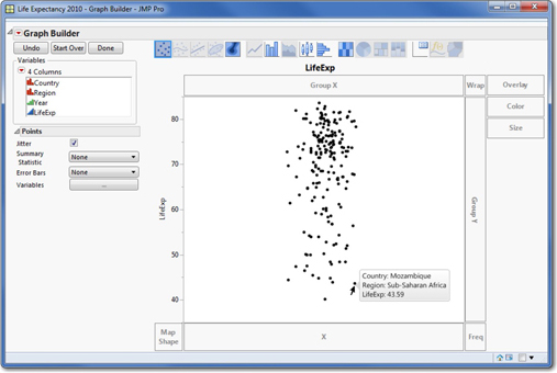
In this graph, each dot represents the value for one country. If you move your cursor to any dot and hover, the name of the country and other data appear. Notice that the reported life expectancies lie between roughly 40 years and 85 years, with a large number of countries enjoying life expectancies above 65 years.
By default, JMP “jitters” the points in this graph (see the checkbox next to Jitter just below the list of variables). This spreads the points apart to the left and right, so that identical or similar values do not overlap in the graph.
Now let’s see how the values compared across different regions in the world.
3. One way to accomplish this is to drag Region to the Color drop zone.
This assigns a color code to each global region so that all of the counties in Europe, for example, are the same color. This immediately reveals that nearly all of the countries with brief life expectancy are in Sub-Saharan Africa. This fact was not at all obvious from the initial data table; that’s what visualization can do for us.
4. Now move the cursor back to the list of columns and once again choose Region, and this time drag it to the Group X drop zone at the top of the tableau.
When you do this, you will now have six adjacent small graphs showing the values from each region. As you examine these graphs, you may notice that the values vary vertically within each region and that the patterns of variation are similar in some regions but dramatically different in others. The study of descriptive statistics largely revolves around common patterns of variation, comparisons of those patterns, and deviations from those patterns. Here again, it is very evident that the nations of Sub-Saharan Africa largely have the shortest life expectancies in the world. What other general patterns emerge?
Because the data are reported geographically, another useful way to examine the patterns is to overlay them on a map. Doing so magnifies a few key points.
5. In the Graph Builder, click the Start Over button in the upper left.
6. Drag the Country column to the lower left of the Graph Builder into the drop zone labeled Map Shape.
7. Now drag LifeExp over the map and release the mouse button. Alternatively you may drag LifeExp into the Color drop zone. Your map should now look like Figure 1.7. At this point, click the Done button.
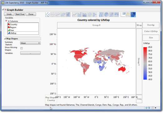
As the legend to the right indicates, the colors shaded dark red enjoy the longest life expectancies and dark blue countries have the shortest life expectancies. This map is an alternative method to see how life expectancy varies around the world.
Please note two limitations of this particular graph. You may have spotted a large white “hole” in the center of Africa. These are countries for which JMP found no data in our data table. Additionally, there is a notation at the bottom of the graph indicating that JMP did not recognize some of the country names, and hence did not display them on the map.
Using an Analysis Platform
Of course data analysis is not limited to graphing and mapping—there are numbers to be crunched, and JMP will do the heavy computational work. We have many pages ahead of us to learn how to request and to interpret many useful computations. With this set of data, we’ll summarize life expectancy in different parts of the world. Don’t worry about the details of these steps. The goal right now is just for you to see a typical JMP platform and its output.
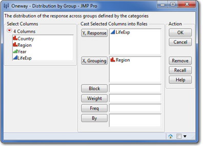
1. Select Analyze ► Fit Y by X. This analysis platform lets us plot one variable (life expectancy) versus another (region).
Why “fit” Y by X? Analysts often speak of fitting an abstract or theoretical model to a set of data. We can think of models as common or standard patterns of variation, and the process of model fitting begins with exploring how a Y column varies across categories or values of an X column.
2. In this dialog box (Figure 1.8), we’ll cast LifeExp as the Y or Response variable3 and Region as the X variable, or Grouping variable. Click OK.
By design, the initial output of a JMP analysis platform includes one or more graphs. In this case, the initial report includes only a graph, as shown in Figure 1.9.
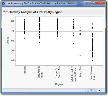
We saw a very similar graph earlier in the Graph Builder; in this graph, the points are not jittered and they are all black. There is one additional feature in this graph: the horizontal line at just below 70 years is the mean (average) of all 195 values.
It is clear that the overall grand mean of all countries does not really describe any of the continental regions. We might want to dig deeper and display the regional averages.
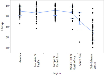
3. Click the red triangular hot spot in the upper left next to Oneway Analysis, and choose Display Options, and check Connect Means.
Look again at the modified graph. The new blue line on your graph represents the mean life expectancy of the countries in each region. As a group, the nations of Europe and Central Asia appear to have the longest life expectancies, whereas countries in South Asia and Sub-Saharan Africa have far shorter life expectancies.
Finally, the graph now shows us the mean values of each group. Suppose we want to know the numerical values of the five averages.
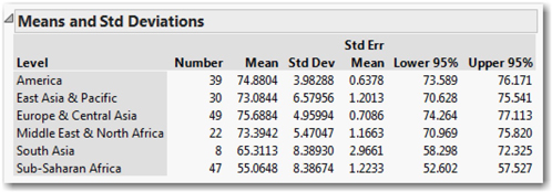
4. Click the hot spot once more, and this time choose Means and Std Dev (standard deviations).
This will generate a table of values beneath the graph, as shown in Figure 1.10. For the current discussion, we’ll focus our attention only on the first three columns. Later in the book, we’ll learn the meaning of the other columns. This table (below) reports the mean for each of the regions, and also reports the number of countries within each region.
Row States
Our data table consists of 780 cells: four variables with 195 observations each, arrayed in four columns and 195 rows. One guiding principle in statistical analysis is that we generally want to make maximum use of our data. We don’t casually discard or omit any portion of the data we’ve collected (often at substantial effort or expense). There are times, however, that we might want to focus attention on a portion of the data table or examine the impact of a small number of extraordinary observations.
By default, when we analyze one or more variables using JMP, every observation is included in the resulting graphs and computations. You can use row states to confine the analysis to particular observations or to highlight certain observations in graphs.
There are four basic row states in JMP. Rows can be one of the following:
• Selected: selected rows appear bolded or otherwise highlighted in a graph.
• Excluded: when you exclude rows, those observations are temporarily omitted from calculated statistics such as the mean. The rows remain in the data table, but as long as they are excluded they play no role in any computations.
• Hidden: when you hide rows, those observations do not appear in graphs, but are included in any calculations such as the mean.
• Labeled: The row numbers4 of any labeled rows display next to data points in some graphs for easily identifying specific points. The user (you) can designate specific columns that contain useful labels.
Let’s see how the row states change the output that we’ve already run by altering the row states of rows 3 and 4.
1. First, arrange the open windows so that you can clearly see both the Fit Y by X report window and the data table and click anywhere in the data table window to make it the active window.
2. Move your cursor into the column of row numbers the data table. Within this column your cursor will become a “fat cross” ![]() . Select rows 3 and 4 by clicking and dragging on the row numbers 3 and 4. You’ll see the two rows highlighted within the data table.
. Select rows 3 and 4 by clicking and dragging on the row numbers 3 and 4. You’ll see the two rows highlighted within the data table.
Look at your graph. You should see nearly all of the points are gray, except for two black dots—one right near the mean value of the Middle East & North Africa and the other well below the average of Sub-Saharan Africa. That’s the effect of selecting these rows. Notice also that the Rows panel in the Life Expectancy data window now shows that two rows have been selected.
3. Click on another row, and then drag your mouse slowly down the column of row numbers. Do you notice the rows highlighted in the table and the corresponding data points “lighting up” in the graph?
4. Press Esc or click in the triangular area above the row numbers in the data table to deselect all rows.
Next we will exclude two observations and show that the calculated statistics change when they are omitted from the computations. To see the effect, we first need to instruct JMP to automatically recalculate statistics when the data table changes.
5. Click the red triangle next to Oneway Analysis in the report window and choose Script ► Automatic Recalc.
6. Now let’s exclude rows 3 and 4 from the calculations. To do this, first select them as you did before.
7. Select Rows ► Exclude/Unexclude (you can also find this option by clicking the red triangle above the row numbers; in Windows, you could also right-click). This will exclude the rows.
Now look at the analysis output. The number of observations in the Middle East drops from 22 to 21 and the mean value for that group has changed very slightly. Likewise, in Sub-Saharan Africa we have 46 rather than 47 observations, and mean life expectancy increased from 55.0648 years to 55.289 years. Toggle between the exclude and unexclude states of these two rows until you understand clearly what happens when you exclude observations.
8. Finally, let’s hide the rows. First, be sure to unexclude rows 3 and 4 so that all 195 points appear in the graph and in the calculations. If you aren’t sure if you have reversed earlier actions, choose Rows ► Clear Row States and then confirm in the Rows panel that the four row state categories show 0 rows.
9. Once again select rows 3 and 4 still selected and choose Rows ► Hide/Unhide. This will hide the rows (check out the very cool dark glasses icon).
Look closely at the graph and at the table of means. It is a subtle change, but the two black dots are gone, leaving only gray points. The numbers in the table of means are unaffected by hiding points. If you toggle the Hide/Unhide state you’ll notice the black points come and go, but the number of observations in each region is stable.
10. Before continuing to the next section, clear all row states again (as in Step 8 above).
Exporting JMP Results to a Word-Processor Document
As a statistics student, you may often want or need to include some of your results within a paper or project that you’re writing for class. As we wrap up this first lesson, here’s a quick way to capture output and transfer it to your paper. To follow along, first open your word processing software, then write a sentence introducing the graph you’ve been working with. Next, return to the JMP oneway analysis report window.
Windows users will notice that there are no menus in the report window. To reveal the menus, hover your cursor in the pale blue bar just above Oneway Analysis of LifeExp by Region.
Our analysis includes a graph and a table. To copy the graph only for your document, do this:
1. Select Tools ► Selection. Your cursor will now become an open cross. You could also click the open (“fat”) cross button from the menu icon bar.
2. Move the open cross to the upper left of the graph and click. This should highlight the entire graph. If it doesn’t, click and drag across the graph until it is entirely selected.
3. Select Edit ► Copy.
4. Now move to your word processor and paste your copied graph.
The graph should look like the one shown above in Figure 1.11. Note that the graph will look slightly different from its appearance within JMP, but this demonstration should illustrate how very easy it is to incorporate JMP results into a document.
Saving Your Work
As you work with any software, you should get in the habit of saving your work as you go. JMP supports several types of files, and enables you to save different portions of a session along the way. You’ve already seen that data tables are files; we’ve modified the Life Expectancy 2010 data table and might want to save it.
Alternatively, you can save the session script, which essentially is a transcript of the session coded in the JMP Scripting Language (JSL) – all of the commands you issued, as well as their results. Later, when you restart JMP, you can open the script file, run it, and your screen will be exactly as you left it.
1. Select File ► Save Session Script. In the dialog box, choose a directory in which to save this JSL file, give the file a name, and click OK.
Leaving JMP
We’ve covered a lot of ground in this first session, and it’s time to quit.
2. Select File ► Exit JMP.
Answer No to the question about saving changes to the data. Then you’ll see this dialog box:
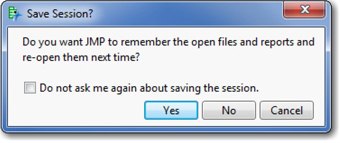
In this case, you can click No. In future work, if you want to take a break and resume later where you left off, you may want to click Yes. The next time you start the program, everything will look as it did when you quit.
Remember to run the Beginner’s Tutorial from the Tip of the Day (or under the Help menu) before moving on to Chapter 2.
1 This book’s illustrations and examples are all based on JMP 11.0. In most instances, we show the default settings that come with JMP when it is newly installed.
2 All of the data tables used in this book are available from http://support.sas.com/publishing/authors/carver.html. If you are enrolled in a college or university course, your instructor may have posted the files in a special directory. Check with your instructor.
3 In Chapter 4, we will study response variables and factors. In this chapter, we are getting a first look at how analysis platforms operate.
4 Columns can contain labels (for example, the name of respondent or country name), which are also displayed when a row is labeled.