
In the first chapter, you got a brief introduction to Flutter, and in the second, you got some good exposure to Dart. Now, it’s time to look at Flutter in a bit more detail.
Given that Flutter is all about the widgets, here we’ll look at many of those widgets. But, in direct contravention to what I just said, Flutter is not, in fact, all about the widgets: there are also APIs, separate from widgets, so we’ll also look at some of the APIs that Flutter has to offer our application code (though the APIs will come in Chapter 4, which is effectively the second half of this chapter).
This chapter (along with the next), like the previous one, does not seek to be a deep dive, nor does it attempt to be reference material. With well over 100 widgets available out of the box, and each with numerous options, methods, and events, a single chapter or two to cover them all in depth would take hundreds of pages and would just replicate the documentation found on the flutter.io web site anyway. No, what I’ll be doing is pulling out the widgets and APIs I believe most developer will use regularly and discussing those in just enough detail to give you an idea what they’re all about. I’ll also describe some that demonstrate some concept that you may need or want to know even if it’s something I think you may not use all that regularly (and this all applies to the APIs as well).
But, to be sure, there is more available than what you’ll find in this chapter and the next, and there’s a good chance there will be more by the time this book hits shelves then there even is when I was writing it (and some may be introduced as we build the three apps to follow too). But, this chapter and the next will provide you an excellent survey of what’s available and prepare you for the application code to come.
A Buffet of Widgets
We’ll begin by looking at the widgets, and as I mentioned earlier, there are well over 100 at the time of this writing. I’ve attempted to organize them into logical groups to give you some context around them.
Note
Where possible, I’ve attempted to match up the Material design version (Android style) of widgets with their (iOS style) version widgets. A few are unique to one platform or another or have no direct match, but most do, so you’ll see that here. I think that approach will help you conceptualize the cross-platform design goals of both platforms well.
Layout
The layout widgets help you organize your user interface and structure your application in various ways. They, in a sense, allow you to build the skeleton of your app.
MaterialApp, Scaffold, Center, Row, Column, Expanded, Align, and Text
As a general statement, layout in Flutter mainly comes down to a grid structure, which means rows and columns. As such, there is a Row widget and a Column widget . Each can have one or more children, and those children will be laid out horizontally (across the screen) in the case of the Row widget and vertically (down the screen) for a Column widget .
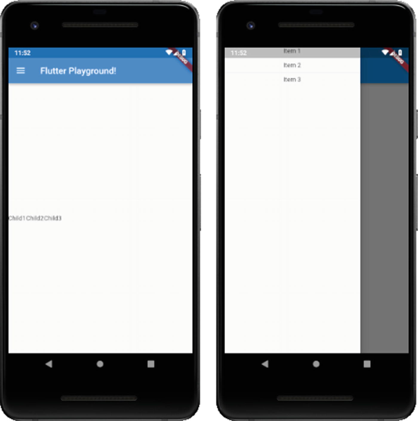
The basics

The basics, in pictures!
A fair bit is going on here beyond the Row and Column widgets though, so let’s break it down.
This is a complete Flutter app, so it begins with the usual import of the material.dart library , which brings in the Material style widgets. Next, we have a main() function that instantiates the MyApp class and passes the instance to the runApp() function that Flutter provides. That gives Flutter the top-level widget it needs to start running the app.
The MyApp class is a StatelessWidget, since for this we do not need any sort of state, and the required build() method produces a single widget of type MaterialApp. This widget implements quite a bit of “plumbing” for us, so it’s always a good idea to start with it. You might choose to use the WidgetsApp widget instead, but that will require you to implement a fair bit more code to define at a minimum the routes (read: screens) of your application, so it’s generally not something you’ll want to do unless you have specific goals that require it. Note that it doesn’t matter if you’re developing for iOS, you can still use the MaterialApp widget as the top-level widget (and in fact, at this time, there is no iOS-specific CupertinoApp widget or something like that, which you might expect to find).
The title you see here is a property of this widget, and this one is a single-line string of text that is used by the device to identify the app to the user), the MaterialApp widget provides quite a few other properties. A few of interest include the color property, which defines the primary color used for the application in the OS’s interface, and theme, which takes as its value a ThemeData widget and which further describes the colors used for the app.
The MaterialApp widget also requires a home property, and the value of it must be a widget, and this is the top of the widget tree for the main screen of your app (or, at least, the screen that the user starts at, main or not). Most commonly, you’ll specify a scaffolding widget for this. There are a couple of scaffolding widgets, but they all serve the same purpose: they implement the basic layout structure of a screen in your app. Like MaterialApp, the basic Scaffold widget takes care of many common app UI elements for you like the top-level navigation bar, drawers (those little elements that slide out from the side of the screen to show options) and bottom sheets (like drawers, but they slide up from the bottom). The other kinds of scaffolding widgets are the CupertinoPageScaffold , which is specific to iOS and which provides basic iOS page layout structure including a top navigation bar and content over a background, and CupertinoTabScaffold, which is like CupertinoPageScaffold except that it includes a tabbed navigation bar at the bottom.
Note
To use the Cupertino widgets, you would need to add an import "package:flutter/cupertino.dart"; to the app. Then, if you wanted, you could change Scaffold to CupertinoPageScaffold, which would then require you to change home to child, since that’s what the CupertinoPageScaffold widget requires. Also note that there is no limitation to using Cupertino widgets on an iOS device, or vice versa. Recall that Flutter renders the UI itself rather than relying on the OS, and that allows you to easily run one type of UI on the “wrong” platform, so to speak, if you wish!
The Scaffold widget provides a number of properties, including floatingActionButton, which allows your app to support a Floating Action Button, or FAB (which is a widget that will be covered later); drawer, which allows your app to have a sliding drawer for hidden functionality; bottomNavigationBar, which allows your app to have a navigation bar at the bottom; and backgroundColor, which enables you to define the background color of the page.
Whichever scaffolding widget you use, it will require a child widget. With the Scaffold widget, you specify that via the body property. Here, I want all my widgets to be vertically centered, so the Center widget is used. This widget will center all its children within itself, but the critical thing is that by default, a Center widget will be as big as possible, meaning it will fill whatever space its parent widget allows. In this case, the parent widget is the Scaffold, which automatically has available the full size of the screen, so essentially the Center widget will fill the entire screen.
The child of the Center is a single Row widget, which means that the Row will be centered within the Center and thus centered on the screen. The Row widget has a property children, which allows us to specify an array of widgets that will be laid out across the Row. Here, three children are defined: three Text widgets. A Text widget displays a string of text in a single style. Some interesting properties that Text supports are overflow, which tells Flutter what to do when the text overflows the bounds of its container (specifying overflow : TextOverflow.ellipsis, for example, causes ... to be appended to the end); textAlign, which lets you determine how text should be aligned horizontally; and textScaleFactor, which tells Flutter the number of font pixels for each logical pixel unit and thereby scale the text.
One thing to notice if you try this sample (you HAVE tried this sample, right?!) is that all the Text widgets are scrunched up on the left. What if we want them horizontally centered? In that case, we need to tell the Row to center them, and to do that, we add mainAxisAlignment : MainAxisAlignment.center to the Row’s constructor call (it’s just another property, just like children is).
The Expanded causes its child to fill all available space. Now, after the first and third Text widgets are rendered (using the space they require, but no more, since we haven’t attempted to specify a width for either), then whatever remains will be filled by that second Text widget.
One other widget to mention here is the Align widget. Like the Center widget , Align is generally used when you have only one child, and it serves a similar purpose to Center but has more flexibility in that it’s not just for centering content. This widget aligns its child within itself and can also optionally size itself based on the child’s size. The key to using it is the alignment property. If you set that to Alignment.center, then congratulations, you’ve just created a Center widget! The value of this property is an Alignment class instance, but Alignment.center is a static instance which has x and y values of 0 and 0. The x and y values are how you specify the alignment, with 0, 0 being the center of the rectangular area that the Align widget takes up. If you have values of −1 and −1, then that represents the top left of the rectangle, and 1, 1 is the bottom right (starting to see how this works?)
Finally, we have the Column widget, and I’ve left it for last because virtually everything discussed for the Row widget also applies to the Column widget. The obvious difference is that its children are laid out going down the screen. Otherwise, you use it the same, and most everything mentioned about Row applies to Column as well, just going in a vertical direction. You can, of course, nest Row widgets within Column widgets, and vice versa, allowing you to create arbitrarily complex grid structures, and really, that’s what a great deal of Flutter UI development boils down to!
Container, Padding, Transform
The Container widget is, along with Row and Column (and ignoring the application and page-level widgets) probably one of the most-used widgets Flutter offers for laying out your UI. It’s a bit of a jack-of-all-trades in that it combines what a number of other widgets provide into one sleek package.
That puts 20 pixels around the Text (above, below, left, and right, which is what EdgeInsets.all(20.0) says). You can use only() instead of all() to specify the left, top, right, and bottom values separately, or you can use symmetric() to specify a vertical and horizontal value that will be applied to the top and bottom and/or left and right equally.
The scale() static method returns a new Transform widget with a scale factor of 2, which means twice as large as normal.
The syntax is a little more complex because now we have to use matrix math to scale the child widget manually, something the Transform widget does for us automatically (a good reason to use it!), and that’s largely true of any of the other widgets that Container subsumes, but you can accomplish the same goals with Container as with those other widgets, that’s the point.
Flutter developers often use Container and little else, and that’s entirely viable. However, I would suggest that if for no other reason than a somewhat cleaner API that you should look to the purpose-built widgets first and use Container only as a fallback or unless you have specific goals it meets best.
ConstrainedBox, FittedBox, RotatedBox, SizedBox
Flutter offers several “box” components that act a lot like Row and Column and Container, but which provide various positioning, sizing, and other manipulations on its single child.
The BoxConstraints class offers some properties for defining a constraint, with minWidth, minHeight, maxWidth, and maxHeight being probably the most commonly used.
This scales the Text widget , but in contrast to the previous scale example, this also repositions the Text, so it remains centered, and it scales it up to be a minimum width of 200 pixels in width, so it scales the height to maintain the aspect ratio automatically. If you try this and compare it to the previous scale example you’ll see, I think, that the scaling here is better and probably more like what you expect.
The quarterTurns property is the number of clockwise quarter turns to rotate the child by. So, if you need quarter turns, this widget is perfect, but if you need arbitrary degrees then you’ll need to deal with Transform.
Here, if you try it, you’ll notice that the result is the Text widget seeming to “float” up and left of its usual position. That’s because the Text itself is sized to 200 pixels by 400 pixels, but that doesn’t imply a scale of any sort. The actual text is by default left aligned and top aligned inside the Text widget, so giving it this size results in this “floating” into the upper-left corner of the Text, which takes up the 200x400 pixels specified. What this widget does to its child will be dependent on what its child does in response to defining its width and height (assuming the child supports those properties at all).
Divider
...and, well, you’ll see nothing! That’s because a Divider can only be horizontal, but when the layout is in a Row, they won’t display. So, just change the Row to a Column, and now you’ll see some beautiful lines between the Text widgets!
Card
The Divider in action

The Card widget
The Card widget doesn’t have a ton of properties, but some of the most interesting include color, which allows you to set the background color of the card; elevation, which will enable you to set the size of the shadow; and shape, which allows you to alter the rounded corners of the Card (to make them more or less rounded).
Drawer
The Drawer widget is most usually given as the value to the drawer property of a Scaffold widget, although it doesn’t have to be. This widget is a Material design panel that slides in horizontally from the left to provide a way for the user to activate app functionality or navigate through the app and which is hidden until called upon. Another widget, AppBar, goes typically along with a Drawer because it automatically provides an appropriate IconButton (a widget that is a button the user can click which shows just an icon on it) to show and hide the Drawer (which can also be done via a swipe in or out from the edge).
The Drawer widget in “action”
The Drawer widget, before and after expansion
And, for the most part, that’s about all there is to the Drawer widget! It’s an essential and common widget, but it’s also effortless to use thanks to Flutter!
Note
The CupertinoNavigationBar widget is the rough equivalent to the AppBar widget, which is customarily used for Material (Android) apps.
Navigation
Navigation widgets allow the user to move through your app in some fashion, or your app to move them between different parts of the app automatically (different screens, for example).
First, let’s talk about the Navigator widget. Since in most cases you’ll start your app with a WidgetsApp or a MaterialApp, you’ll automatically get a Navigator widget (you can also create one explicitly, but that’s less typical). This widget manages a set of child widgets as a stack. In other words, one such child is visible at a time, with the rest “beneath” it. These children are the various screens of your apps, which are called routes in Flutter. The Navigator provides methods such as push() and pop() to add and remove routes.
You’ve seen the use of MaterialApp a couple of times now, and you’ve seen the home property of it used. Well, guess what? The value of that property is the first route in your app! You were using a Navigator without even knowing it!
You always add a MaterialPageRoute widget when calling push(), and this requires the use of a builder function, a pattern you’ll see plenty in Flutter. This is needed because when a route is navigated to, it will be built and re-built many times and that will occur in different contexts depending on when it occurs. Therefore, hardcoding the children would result, potentially, in your code executing in the wrong context. The builder pattern avoids this problem.
You can also nest Navigator widgets. In other words, one route in a Navigator can itself have a Navigator. This allows the user to take “sub-journeys,” so to speak, through your app.
BottomNavigationBar
Sometimes, a Navigator isn’t the best choice for navigating between parts of your app. One significant consideration with it is that there is no user-facing interface to it, it’s entirely programmatic. Fortunately, Flutter offers a few visual navigation widgets too, one of which is the BottomNavigationBar. This widget provides a bar at the bottom of the screen with icons and/or text that the user can click to move between parts of your app.
The BottomNavigationBar

The BottomNavigationBar widget
Here, we start by creating a stateful widget. This is necessary because the top-level widget is built once unless it has state that changes, which is precisely what we need to happen when the user clicks one of the items on the bar. Hence, we have to make this a stateful widget to provide that state. You’ll recall the pattern of needing to create two classes when dealing with state: a class extending from StatefulWidget and one extending from State. Although it may seem weird (it does to me anyway!), the class that actually is your widget is the one extending from State, not the one extending from StatefulWidget. Whether you find this weird or not, the key is to recognize the pattern. For the most part, the StatefulWidget class is basically boilerplate and will usually look about like what you see here, and the State class looks more or less like the StatelessWidget-extending widget classes you’ve seen a bunch of times now.
Getting into the actual State widget class, the state for this widget is the private _currentPage variable. The value of this is fed to the elementAt() method of the private _pages list. This determines what item from the list is the contents inside the Center widget (which could be an entire widget tree rather than a single Text widget). The bottomNavigationBar property of the Scaffold widget takes as its value an instance of BottomNavigationBar, which has an items property. This property is a list of BottomNavigationBarItem widgets. Each of those can have an icon and a title as we seem fit. Flutter comes with a collection of icons thanks to the Icons class, so we don’t even have to go digging around for graphics if we don’t want to! And, when working in Android Studio, you’ll have code completion, so you don’t even have to remember or even look up the icons when you need them! The currentIndex property of the BottomNavigationBar tells us which of the items on the bar is currently selected, and the fixedColor property determines what color to make that selected item.
Now, when the user taps one of the items, by default nothing will happen. To fix that, the onTap property is defined. This is a function that is passed the index of the tapped item. So, now we know what item from _pages we should display, but how does the value of _currentPage get updated? That’s where the call to the setState() method, supplied by virtue of this class extending the State class, comes into play. All we need to do is call this method and do the updates to the _currentPage variable in it. This triggers Flutter to rebuild the widget. Since _currentPage is different now, a different element from _pages will be displayed. The result for the user is that they appear to have navigated to a new page.
TabBar (CupertinoTabBar) and TabBarView (CupertinoTabView)
Another ubiquitous navigation element is the TabBar , and its iOS equivalent CupertinoTabBar. Going along with these is the TabBarView and CupertinoTabView widgets, respectively (note that I’ll be talking about TabBar and TabBarView only from here on out, but it all applies to CupertinoTabBar and CupertinoTabView as well).
A TabBarView is essentially a stack of screens (or views, if you will) where only one is visible at a time, and the user can move between them. The way one becomes visible is by user interaction with a TabBar. They can click the icon for one of the tabs or swipe between them. There is usually some sort of animation between the views, a slide for example.
The TabBar widget

The TabBar widget
However, you do it, you have to tell the TabController how many tabs there are via the length property. After that, you need to describe each tab for the TabController, and that’s done by giving it an array of tabs where each item is a Tab widget. Here, we just specify an icon for each.
Once the tabs themselves are defined, we then must tell the TabController what the content for each tab is, and that’s done by providing a TabBarView widget as the value of the body property. Each element in the children list can be as complex a widget tree as you need. Here, it’s just some Center widgets with Text widgets in them.
With all of that done, the interaction of moving between the views is automatic from our perspective, and the user can navigate between them freely.
Stepper
The last navigation widget I want to discuss is the Stepper widget. This is used to walk the user through a defined sequence of events. Conceptually, think about what happens when you go to buy something on Amazon or another eCommerce retailer. First, you must enter your shipping information, then click a button to continue. Then you enter payment information and then click a button to continue. Finally, maybe you must decide if you need gift wrapping and other services. You click a button one last time, and your order is placed. That’s a sequence of three steps, and a Stepper provides that same functionality in a Flutter app.
Stepping with the Stepper widget
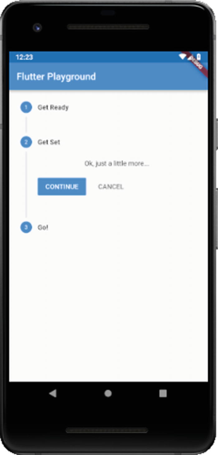
Walking a mile in Stepper’s shoes (okay, that one was a stretch, I admit!)
Most of it should look familiar by now, until we get to the Stepper widget as the body of the Scaffold widget. You first need to tell it whether you want your steps to be displayed vertically or horizontally via the type property. You also need to tell it what step the user is currently on, and that’s done here by virtue of the _currentStep variable. This is a stateful widget since the value of that variable is what determines what step is displayed, which is what state is all about in Flutter.
We also must provide some code to the Stepper for when the user clicks the Continue and Cancel buttons, which will be presented by the Stepper. Here, the value of _currentStep is incremented when Continue is clicked as long as we’re not on the final step, and decremented when Cancel is clicked as long as we’re not on the first step. This allows the user to go backward and forwards through the sequence at will.
Next, we need to define the steps of the sequence; each one is a Step widget. This widget takes some title text to display next to the circle for the step and an isActive property that will grey the step out when set to false (note that it does not do anything but alter the styling of the step’s circle – your code has to do something in order to skip it or whatever is appropriate when inactive). After that, we define the content, which can be as complex of a widget tree as you need.
Each Step can also have a subtitle if you wish, and each has a state property that determines the styling of the component and whether the step is interactive. Again, your code must provide the functionality to back this up though. Note too that the Stepper widget provides an onStepTapped property that is a function you provide that is called when the user taps one of the step circles. Obviously, you’ll generally provide code to jump to the selected step directly.
Input
Input widgets are used to obtain user input in some fashion (he said, obviously!). Flutter comes with a range of such widgets, some perhaps a bit unexpected.
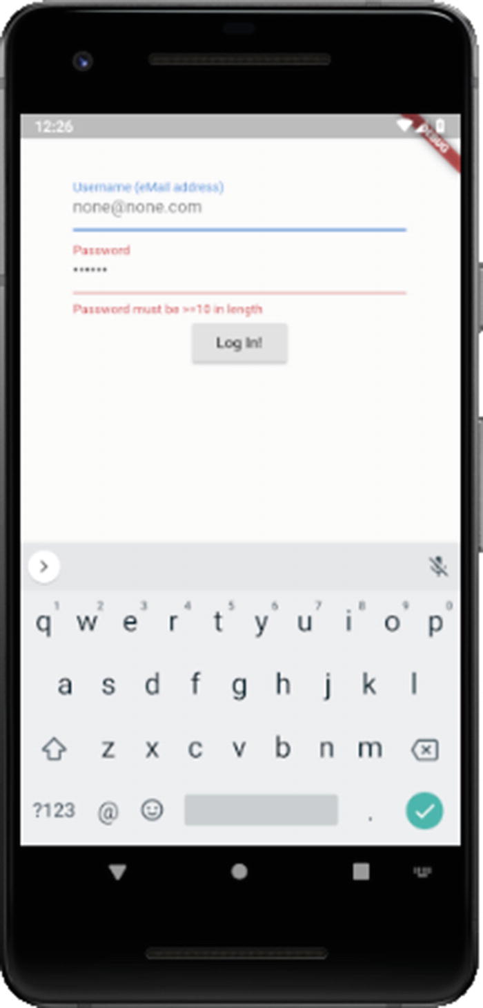
Form
In Flutter, user input begins with a Form widget. Well, actually, that’s not true: the Form widget is actually optional. But, since it does offer some utility and is therefore used frequently around user input, let’s talk about it as if it was required!
Form is a container for form fields, and I mean that literally: there is a FormField widget that wraps all input fields and which are then made children of the Form widget. The reason you might choose to use a Form widget is that it provides you some common functionality including saving the form data, resetting it and validating it. Without Form, you would be left to implement any of that yourself that you need entirely, so why not use the plumbing Form provides?
The Form widget, and its cohorts
The gatekeeper to your app, courtesy of the Form widget (and friends!)
After the usual import and main() function, we’re dealing with a StatefulWidget, so we have the usual class definition for that. But, before we get to the State class that you know goes along with it, we have one small class: LoginData . An instance of this class will wind up storing the username and password entered by the user. This is a typical pattern when dealing with Flutter forms and is nice because it consolidates all the input in one object, making it easier to work with.
After that comes the _MyApp State class . This is like any other State class you’ve seen before, but in this one, we have a few new things. First, we have that instance of LoginData I mentioned. After that is an instance of the GlobalKey class. A GlobalKey is a key that is unique across the entire app. This usually comes into play as the value of the key property of a widget, which determines how a widget replaces another in the widget tree. If the runtimeType and key properties of the two widgets are equal, then the new widget replaces the old widget by updating the underlying element. Otherwise, the old element is removed from the tree, the new widget is inflated into an element, and the new element is inserted into the tree. Using a GlobalKey as the widget's key (as opposed to a LocalKey, which is another type that only ensures uniqueness under a given parent) allows the element to be moved around the widget tree without losing state. When a new widget is found (meaning that its key and runtimeType don’t match a previous widget in the same location in the tree) but there was a widget with that same GlobalKey elsewhere in the tree in the previous frame, then that widget's element is moved to the new location.
The result will be that the label of the text will be written to the console. For that to work, we have to cast _btnKey.currentWidget to RaisedButton using the as keyword since the type of currentWidget is Widget, and the cast the child property of that to Text, and then the data property is the text of the button. In this way, you can access any property of any widget or execute methods directly on a widget, as long as it has a key (whether a GlobalKey or a LocalKey). I said you really shouldn’t ever do this and that’s because it’s in a sense anathema to the reactive nature of Flutter. Instead, it’s usually the case that you’ll use state to drive these sorts of interactions. But, it’s a good trick to have in your back pocket if it ever comes up, and if nothing else, it helps you understand some of the internals of Flutter just a little bit.
After that comes the usual build() method. It starts like any other you’ve seen, but now we have a Form widget in the tree. Usually, a widget that is the only child of another widget does not need an explicit key, which is why up until this point I haven’t shown the key property, but here the key property of the Form widget is a reference to _formKey as discussed earlier.
As you can see, the Form widget has a child property, so if we want to have multiple fields in the form, which we do, then we’ll need some sort of container component, so I went with Column here.
The children of the Column, three of them, are the username entry field, password entry field, and the Log In button. The first two use TextFormField widgets . This is a widget that effectively combines two others: FormField, which you’ll recall I previously said must wrap all fields in a Form, and TextField, which is a widget for getting user text input (there is a corresponding CupertinoTextField as well). The username is a TextFormField; since the username is actually the user’s eMail address (a common but not especially good security practice), we want the keyboard displayed to be more oriented toward entering eMail addresses. The keyboardType property allows us to do this. The TextInputType class has several constants for various keyboard types, emailAddress being the one applicable here.
This widget also has a validator property , which defines a function that will perform validation on the field when the Log In button is clicked. This function can do anything you wish, but in the end, it must either return a string that is an error message to display in red below the field or null if the value is valid.
Note that the data itself in the field is never saved anywhere; it only exists transiently in the Form. That’s not of much use though, so to address that, we need to implement a callback function for the onSaved property. This function will fire when the save() method of the Form is called, which will happen later, as you’ll see (and, it’s not actually a method on the Form itself, but that too you’ll see shortly). The onSaved handler function just stores the inValue passed into the _loginData variable’s username field.
Although optional, the decoration property is an instance of InputDecoration and is commonly used to declare some hintText (shown in the field when nothing has yet been entered) and a label for the field via the labelText property, which gets shown above the field.
The password field is just like the username field except that, being a password, what the user enters shouldn’t be shown on the screen, so the obscureText property is set to true to accomplish that. Otherwise, we have another validator function doing much the same as for password and an onSaved handler again to store the data, plus a decoration instance of InputDecoration once more.
Finally, we come to the Log In button. In it, we do a couple of things. First, the validate() method is called, which we can do through the _formKey variable. This provides us a reference to the widget, and within that widget is the currentState property that contains the values currently entered on the form. That’s the object the validate() method is actually on, and since each field has a validator function attached, validate() knows how to call each of them and either display the error fields or else return true if the form is valid according to the validators on all its fields. In that case, we call save() on the currentState, which results in all the onSaved handlers firing and thus the form data is stored in _loginData. Finally, we print that information to the console to ensure everything worked as expected.
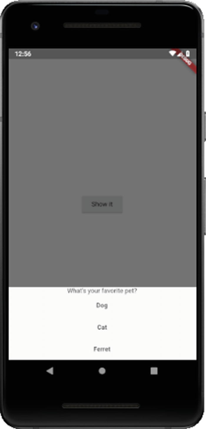
Checkbox
Yeah, you know what a Checkbox is! It’s a little box that you... wait for it... check! Or uncheck... but it’s called a Checkbox, not an UnCheckbox, but I guess that’s a philosophical discussion for another day. Either way, Flutter has them, and they’re a piece of cake to use.
Note
Listing 3-8 demonstrates Checkbox, as well as Switch, Slider and Radio, and Figure 3-8 shows it. Please refer to these in the coming sections.
Checkbox, along with Switch, Slider, and Radio

A gaggle of input widgets (Checkbox, Switch, Slider and Radio)
Yep , that’s it! As long as your StatefulWidget has a checkboxValue variable, then you’re good to go. Alternatively, you can supply an onChanged callback handler function to do something else when the Checkbox is checked or unchecked. Also, Checkbox supports a tristate flag (true or false, false by default) that allows for three values: checked, unchecked, and null. The latter will display as a dash in the Checkbox.
One thing to note is that the Checkbox widget does not intrinsically have a text label, something that is common with such components. To achieve that, you’ll need to build it yourself, usually by placing a Checkbox and a Text widget in a Row container (assuming you want the label next to the Checkbox, otherwise use Column or some other layout structure).
Switch (CupertinoSwitch)
The Switch widget , and its iOS counterpart CupertinoSwitch, is in most regards just like a Checkbox, but with a different visual presentation: they look like little switches you might find on a tech device. In fact, if you go back to the Checkbox snippet and change Checkbox to Switch and do nothing else, you’ll see that it works!
Note that if onChanged is null, then the Switch will be disabled and not respond to user interaction. This is also true of the Checkbox widget.
Slider (CupertinoSlider)
The important properties are min and max, which define the lower and upper limits of the range of values the user can choose from, and value, which is its current value. As a member of a StatefulWidget, the value of this should be a variable in the State object. Finally, onChanged is required to set the value in State when the thumb is moved.
There are also properties like activeColor and inactiveColor for adjusting the color of the portion of the slider track that is active and inactive, respectively. You can also determine the number of divisions within the range (when null, the default, the Slider will automatically produce divisions that are a continuous and discrete set of values within the min to max range). There are also event handler hooks for when the user begins moving the thumb (onChangeStart) and when they lift their thumb (onChangeEnd).
Radio
It’s a little funny to think about, but I’m a bit older than I’d like to admit these days, old enough that I remember those days of car radios that had a row of buttons, one per stored radio station, and when you would press one, the others would pop back out, and the one you pressed would now be the current station. I say it’s funny because I bet a lot of younger people reading this have never seen such a thing, yet here we have a widget, called Radio no less, that implements that metaphor, a metaphor many younger people don’t know!
But I digress, and hey, you kids get off my lawn!
Here, three Radio widgets are present, each with an associated Text to label it. Notice how all of them have the same groupValue property value? That’s by design: by virtue of them all having the same variable reference, they become part of the same group, which conveys to them the mutual exclusivity I mentioned. Each has a discrete value though, so when the first Radio is selected, its value is transferred to _radioValue by virtue of the setState() call in its onChanged handler. The code using these Radio widgets can then examine the value to determine which was selected.
Date and Time Pickers (CupertinoDatePicker, CupertinoTimerPicker)
Picking a date and a time (but not a nose)

Date picker and time picker
As you can see (in the code, as well as in Figure 3-9), they make use of the showDatePicker() and showTimePicker(), respectively. The former requires the build context, the initialDate that’s selected by default, and the firstDate and lastDate that the picker will allow to be chosen, here just specified as years. A DateTime object is returned and is displayed. For showTimePicker(), only the build context and the initialTime are necessary.
There is a CupertinoDatePicker and a CupertinoTimerPicker widgets for the iOS side, and they are implemented as conventional widgets, so no functions to call for them.
Note that there are three other pickers available on Android: DayPicker for picking from the days of a month, MonthPicker for choosing from the months of the year, and YearPicker for selecting from a year of lists.
Dismissible
The Dismissible widget is an element that the user can get rid of by flinging it in a given direction. The widget has a direction property that specifies which direction it can be dragged in. When the user drags it, the child of it slides out of view, and if the optional resizeDirection property isn’t null, the Dismissible animates its height or width, whichever is perpendicular to the dismiss direction, to zero.
If you wish, you can implement a “leave-behind,” which is what happens if the background property is specified. In that case, the widget it describes is stacked behind the Dismissible’s child and is shown when the child is dragged away.
The onDismissed callback function will be called when the size has collapsed to zero when resizeDuration is specified, or immediately after the slide animation if it’s not. A key also must be defined for this to work; in this example, it’s not used though so I just use a GlobalKey instance to fulfill that requirement.
Dialogs, Popups, and Messages
There are ways to interact with the user, to show them something, that is, in a sense “out of band,” meaning content that isn’t directly part of the screen they are currently looking at. Broadly, those are dialogs (typically, where we request some information), popups (usually, where we show some information that needs more immediate attention) and messages (typically, how we show quick, transient pieces of information to the user).
Tooltip
In fact, some widgets have a tooltip property that automatically wraps the widget in a Tooltip, but you can do so manually if not.
Usually, a Tooltip is displayed below the widget it wraps, but you can set its preferBelow property to false to reverse that (and it will automatically do so if there isn’t enough room to display it below). You can also adjust the verticalOffset property to determine the distance between the Tooltip and its target widget.
SimpleDialog (CupertinoDialog)
A SimpleDialog
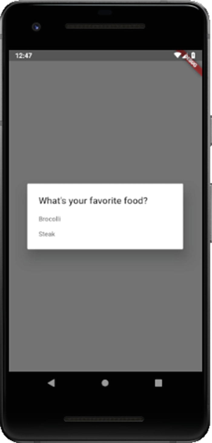
It doesn’t get much simpler than SimpleDialog (it’s in the name after all!)
When the RaisedButton is tapped, it calls the _timeForADialog() function. This function awaits the return value from showDialog() as the value of the switch statement. When the user then clicks one of the options, first the dialog must be hidden, which is what the Navigator.pop() call does. The dialog is on the top of the navigation stack at that point, hence pop()’ing it off hides it. The second argument to pop() is the value to return, which the two case statements then handle to print() the result to the console.
There is a CupertinoDialog widget, and corresponding CupertinoDialogAction widget, for providing the same sort of dialog on iOS, and you would use them the same way.
Note
The structure here is a little different than what you’ve seen before. The reason is that if you try to call showDialog() from the RaisedButton’s onPressed handler directly, which is what you’d likely think to do first, you’ll find that you get an error talking about needing a MaterialLocalization. The problem is that showDialog() must be called in a build context that has a MaterialApp as an ancestor, which by default includes a MaterialLocalization widget , which is involved with localizing apps. The build context inside the RaisedButton’s onPressed handler though has no such ancestor (even if the build() method returned MaterialApp as the top-level widget, that represents a different build context than the build context passed into build() itself). So, the solution is to create a top-level MaterialApp widget and then make the home property point to another widget, a Scaffold in this case, which itself has the Home widget as a child (the Scaffold is optional here, but it’s necessary for some other examples that will build on this in this section). That way, the build context for the top-level widget is the one that applies to the showDialog() call, which does have MaterialApp as an ancestor, and thus the error is avoided. Although I haven’t done it for most code samples, what you see here is a bit more typical structure, but it hasn’t mattered until now, so I chose to keep the code more straightforward to this point (and I’ll continue to do so except where it matters, as it does here).
AlertDialog (CupertinoAlertDialog)
As before, showDialog() is used, but this time the builder() function returns an AlertDialog. The content property is how we tell AlertDialog what to display, and then the actions property allows us to provide an array of elements for the user to click, just one FlatButton in this case. Like with SimpleDialog, we need to pop() the dialog off the navigator stack, and there’s nothing to return this time, so no second argument is needed. The barrierDismissable property set to false ensures that the user must click the FlatButton; the dialog cannot be dismissed by clicking elsewhere on the screen as the SimpleDialog could be. This is appropriate for an informational popup meant to alert the user to something important (Captain Kirk’s hypocrisy may or may not qualify in this instance!)
Note that there is an iOS version of this dialog, aptly named CupertinoAlertDialog, and you use it the same way.
SnackBar
We have to use the Scaffold.of(inContext) call to get a reference to the Scaffold that is the parent to the widget calling this function. That Scaffold has a showSnackBar() method, which is what we call. We can optionally set the backgroundColor as well as the duration, the latter needing an instance of the Duration class (which can accept values in many forms such as hours, minutes, and seconds). The content is the text to show on the SnackBar. The action property is optional but if present shows a clickable bit of text. Usually, you would hide the SnackBar here when tapped, but nothing says you must, as shown. If you don’t, then the SnackBar will automatically disappear after the specified duration (or the default duration if not specified).
BottomSheet (CupertinoActionSheet)
A BottomSheet... not a top or side sheet, but a BottomSheet!
There’s actually two variations of BottomSheet , one shown via a call to showModalBottomSheet() and another shown by calling the showBottomSheet() of the Scaffold that the widget showing the sheet descends from. The difference is that the former prevents the user from interacting with other parts of the app until the sheet is hidden (what is termed being “model”), while the other is called “persistent” because it remains, unless and until dismissed, but doesn’t disallow interactions with other parts of the app. In either case, the BottomSheet is constructed in the same fundamental way. What content you show on it is up to you, as is whether it’s interactive or not. In this example, I’ve got a Text heading with three FlatButton widgets below it. Tapping any of them results in the BottomSheet being hidden via the Navigator.of(inContext).pop() call you’ve seen a few times now.
Summary
Whew, that was a long chapter! I think this is an excellent place to take a little break. In this chapter, you began to see the widgets that Flutter ships with, at a high level, but there’s still plenty more to look at, including more widgets and then some APIs.
So, grab a snack, go for a stretch, maybe a bio break if you need to, and then meet me right back here for Chapter 4!