
In the last chapter, you began your exploration of the widgets Flutter ships with. Now, in this chapter, we’ll play the back nine, to use some golf lingo (I’m not a golfer – I consider golf a nice walk interrupted by a game – but it’s a good phrase none the less) and continue looking at the widgets, followed by a brief dive into some APIs that Flutter provides.
Styling Widgets
Flutter has a rich system for styling widgets in various ways, and being widget-oriented at its core, you do this, largely at least, through widgets that are specifically designed to style other widgets. It’s like widget inception up in here!

Demonstration of the following four sections (trust me, it’s better in color!)
Theme and ThemeData
The Theme widget applies a theme to its child widgets. This includes colors and typographic settings.
When we looked at the MaterialApp widget, you saw that it has a theme property that can be used to declare the theme to apply for the entire application. Where the Theme widget comes into play is typically when you want to override that application-level theme for just some subset of widgets. Alternatively, you could just wrap the entire application’s widget tree in a Theme widget and apply the theme that way, but that’s not usually done in favor of the theme property of MaterialApp.
The Theme.of() method is basically how you say “hey, Flutter, what’s the nearest theme to this widget?” Whatever parent widget has a theme is the theme it will find (and remember: even if you don’t explicitly define a theme anywhere there’s a default theme automatically that will be found). This method returns a ThemeData object, which has a copyWith() method. This method returns a new ThemeData object but with whatever properties you pass to it overriding what was in it before. Here, we’re making the accentColor property of the new ThemeData use Colors.red, overriding whatever it was before. Now, all widgets underneath this Theme widget will have a red accent color regardless of what any other widgets in the app have.
No need to get the parent ThemeData; you just create a new instance and define the properties you want. There are many properties supported by ThemeData, far too many to list here, so you’ll need to refer to the Flutter documentation to see which you want to define.
Remember the key point: since the Container here is wrapped in a Theme, Theme.of(context) will return that theme’s ThemeData; if the Container was not wrapped in a Theme, then the application-level ThemeData for the Theme specified in the theme property of the MaterialApp widget would be used; if no theme was specified on the MaterialApp, then a default Theme and ThemeData would be built under the covers and used by default.
Opacity
When you rerun it, you’ll see that the text is now semi-transparent (or to state it another way: 25% opaque). There’s not much more to it than this!
DecoratedBox
The DecoratedBox widget is exactly what it says: a box, which is decorated! More conceptually, it paints a decoration onto another box-like container widget that is a child of the DecoratedBox. Going along with DecoratedBox, nearly always, is the BoxDecoration widget, which defines the decoration you want.
Here, we wrap a DecoratedBox around a Container that is parent to a Text widget. On its own, the DecoratedBox won’t display anything; that’s where its child comes in. We need to give it a box to decorate, and that’s what the Container is for. The Text inside it is just an added bonus to show that it’s the Container being decorated and not the Text itself.
Now, how it’s being decorated is where the decoration property comes into play, and its value is an instance of BoxDecoration. The BoxDecoration widget provides a way to decorate with colors, or with images (to have a background image applied to the Container behind the Text, for example) or play with the borders (rounded corners, for example) and apply shadows and gradients, the latter of which is shown here. The LinearGradient is one of several gradient classes (in addition to RadialGradient and SweepGradient) that take a position in the box to begin and end the gradient (conveniently specified with the Alignment class constants) and the colors to use and how to repeat the gradient if needed based on the size of the box.
DecoratedBox, combined with BoxDecoration, is a handy and flexible way to add styling to any container element as your needs require.
Transform
That rotates and skews a red box with a yellow background that has some text in it while keeping the bottom left corner of the box pinned to its original location. It may not be an especially useful example, but it begins to hint at the sort of power this widget provides if you are familiar with matrix transformations.
In addition to this constructor , there is also Transform.rotate(), Transform.scale(), and Transform.translate() which each returns a Transform widget specifically configured for the three most common types of transformations, namely, rotations, scaling, and translations. These are considerably easier to use since they don’t require you to know matrix operations (they take a simple subset of arguments that is less math-y, if you will), so if you need one of these common transformation types, I highly recommend using them instead of the Transform() constructor.
Animations and Transitions
Animations in a user interface are big business these days! Users expect their apps to move visually and to do so in a visually appealing way. Flutter provides some animation widgets for just this purpose. Given that by their nature it wouldn’t make much sense to show screenshots of any of this, I haven’t done so. But, I think this would be an excellent opportunity for you to fire up Android Studio, create a basic project, and then work on running this code. You’ll have to do some work to create a basic app, but it should be an excellent exercise to test your understanding to this point as well as showing you what this all does.
AnimatedContainer
For relatively simple animations, the AnimatedContainer widget is perfect. It gradually changes its values over a defined period of time. It does this automatically – you just tell it what the starting values are, then change to the new values and it will animate (or tween) between them as required.
Here, we’ve got an AnimatedContainer with its duration property set to one second so that’s how long the animation will take. We set the initial color, width, and height properties to the values of the variables defined in the State. Then, when the user clicks the RaisedButton, the values of all three variables are changed and setState() is called, which triggers the rebuild, but now Flutter will do so over one second of time, gradually making the AnimatedContainer bigger and gradually changing it to red.
You’ll also find a DecoratedBoxTransition which can be used to animate the various properties of a DecoratedBox, so it’s conceptually pretty similar to AnimatedContainer, but for a specific target widget.
AnimatedCrossFade
First, this is the first time you’ve seen the FlutterLogo widget . As I’m sure you can guess, this is one that displays the Flutter widget with various stylings. You don’t need to add it as a resource or anything like that, it’s just there automatically for you to use.
Now, here, we embed two of them inside an AnimatedCrossFade widget by setting the firstChild and secondChild properties to instances of FlutterLogo. Like AnimatedContainer, this widget has a duration property too, which is set to two seconds here.
The crossFadeState property is what matters most: it tells the widget which of the two widgets to show. When set to the value of CrossFadeState.showFirst, it shows the first. Otherwise, it shows the second when the value is CrossFadeState.showSecond. This is based on the value of the boolean _showFirst variable, which starts out true, so the first image appears but then gets set to false when the RaisedButton is clicked, and voila, we have ourselves a cross-fade!
Note that there is also a FadeTransition that animates the opacity of an element. You could build your own AnimatedCrossFade with two FadeTransition widgets working simultaneously if you wanted (which, while I haven’t checked, I’d be willing to bet is exactly how AnimatedCrossFade is implemented).
AnimatedDefaultTextStyle
Here, the Text that is the child of the AnimatedDefaultTextStyle is enlarged 100% and its color changed over the course of one second. By this point I’m going to assume that not much needs to be explained here given how similar these last three widgets have been.
A Few Others: AnimatedOpacity, AnimatedPositioned, PositionedTransition, SlideTransition, AnimatedSize, ScaleTransition, SizeTransition, and RotationTransition
I’m going to save some space here and just mention without showing examples that in addition to the widgets you’ve seen in this section, there are a few others, as you can see in the heading. These can be used just like the others to animate the opacity of an element, or the position of an element, the size of an element, or the rotation of an element.
Note that the AnimatedOpacity widget should be used sparingly because opacity animation is a relatively expensive operation (this would apply to the AnimatedCrossFade and FadeTransition widgets too).
Also note that the AnimatedPositioned widget only works if the child is an element of a Stack, which is a widget we never discussed explicitly. In brief, it allows you to display several children overlapped over one another (whether they are the same size or not, meaning that if a larger element is beneath a smaller one then the larger element can “peek out” from behind the smaller one on top, at least partially). You’ll definitely be seeing the stack again in later chapters, but understand that it’s not the same as the navigator stack that you saw earlier. They are two separate concepts. The Stack widget is just a container for other elements that can be on top of each other.
An interesting note about the *Transition widgets is that they all support physics, which allows you to have animations that aren’t purely linear. This is true to varying degrees for the Animated* widgets , but the support for it in the *Transition widgets tends to be a bit more robust, which means you can get more exciting animations.
Drag and Drop
First, we have a DragTarget , which of course is where the thing being dragged can be dropped. We need to specify the data type that this target will accept, and in this case, it’s a plain old String. The builder() function returns a Container, but it can return anything we want to make a drop target.
Next, a second Container is added to the Column layout, just to give us a little bit of space between the DragTarget and the Draggable, which is next. The primary things we need to supply here are the data property, which is any arbitrary data you want to provide to the DragTarget, and then the feedback property, which is a widget that the user will physically (err, virtually? Physically-virtually? What’s the right verb?!) drag.
You see, the way it works is that the original widget, which is specified via the child attribute, never moves. Instead, when the user begins to move the child Container, the widget determined by feedback is rendered and begins to be draggable. When it’s dropped onto a DragTarget, the onAccept handler function on the DragTarget fires and receives the data property value of the Draggable.
There are a host of other callbacks that can be triggered in various situations on both widgets, but probably the most useful is the onDragComplete handler , which is a function that fires when the Draggable is dropped on a DragTarget. This is usually the place where you’d hide the original child widget or do whatever else makes sense.
Finally, there is a LongPressDraggable widget that can be used in place of Draggable. The difference is that this one makes the child draggable from a long press instead. It’s a minor interaction difference that merely depends on your use case.
Data Views
It is a typical pattern in any app, mobile or otherwise, to show the user lists of data in some form. Flutter provides a handful of widgets specifically for that purpose (though you can always build your own if you want with various scrolling components, but that will usually not be necessary given the widgets here).
Table
Setting the table with the Table widget

It’s not much to look at, but it’s just a basic Table example after all!
It’s straightforward, right? You can optionally define the border of the Table , but by default, it will have none. Then, you just need to supply some rows via children, which can be any widget or widget tree you like but it must at the top be an instance of TableRow, and the children of each is a cell, or column, in the row. Every row in a Table must have the same number of children. You can manually set the widths of the columns with the columnWidths property, and you can adjust the vertical alignment of content in each cell with the defaultVerticalAlignment property.
DataTable
The DataTable widget

Are you team Star Wars or Star Trek? Oh yeah, and that’s a DataTable!
A DataColumn can supply a tooltip property to show some descriptive text when the column is long-pressed, and a DataCell can include a showEditIcon property that, when true, shows a little pencil icon to indicate the cell can be edited. The actual editing must be supplied by your code, however.
Note that a DataTable is a somewhat expensive widget computationally owing to the layout process it must implement. Therefore, if you have a lot of data to display it is recommended that you use the PaginatedeDataTable widget instead. It works much like DataTable does, but it splits the data into pages that the user can move between. That way, it only has to lay one page at a time, which is less expensive.
GridView
A GridView full of fluttering Flutter logos (okay, they’re not fluttering)

It’s not much to look at, I admit, but it demonstrates GridView well enough
Note that GridView is very much like ListView, which in a sense is a purely linear GridView (we’ll be looking at ListView shortly).
ListView and ListTile
Coding a simple static ListView

The ListView widget, in conjunction with ListTile
The ListView can scroll vertically or horizontally depending on the setting of its scrollDirection property. You can even adjust the way the ListView handles scrolling by adjusting the physics property, which is an instance of ScrollPhysics.
ListView supplies a couple of different constructors, with the default one shown in the example. There is also a ListView.builder() constructor that uses a builder function to render the rows. ListView.separated() is also available, and this will provide you a ListView with items separated by list separators you define. The ListView.custom() constructor allows you more flexibility in setting the child model to make the ListView look and work in pretty much any way you want.
There is also the PageView widget, which is a ListView that supports pagination. This is a good choice if you have many items that you want to ensure are displayed with good performance, but more importantly, that is logical to break into groupings in some way where each grouping becomes a page.
Miscellaneous
Some widgets defy categorization. Well, not for long, because now we have a miscellaneous category just for them!
CircularProgressIndicator (CupertinoActivityIndicator) and LinearProgressIndicator
Yep, in simplest terms, that’s all it takes! Flutter handles everything else for you. Now, there are of course some options that will be of interest to you. First, strokeWidth allows you to determine how thick the circle is. The backgroundColor property lets you set a different color behind the indicator. Finally, valueColor allows you to define the color of the circle itself. Unfortunately, it’s not as simple as setting a color from the Colors class. No, you have to provide an instance of the Animation class or one of its descendants. Almost always, it will be the AlwaysStoppedAnimation class, which has a constructor that accepts a color, so it winds up not being that much more difficult.
For iOS, there is a corresponding CupertinoActivityIndicator which looks and works much the same. To use it, you’ll need to import package:flutter/cupertino.dart, which is true of all the Cupertino widgets. Plus, it doesn’t have quite the same degree of flexibility: it only has a radius property to define how big it is – no color options are present.
Here, value is a number between zero and one that determines how much progress has been made and hence how much of the bar is colored. The backgroundColor is the color of the portion of the bar corresponding to remaining progress while the value of valueColor (which like CircularProgressIndicator takes an instance of an Animation as a value) is the portion that has completed. So, in the example, 75% of the bar would be colored yellow while 25% of it would be colored whatever the default color of the theme is since there is no valueColor specified.
Icon
The Icons class contains a list of Material icons for your use, quite a lot of them in fact. However, you can also add your own. As it happens, these are implemented via fonts, and you can add custom fonts if you want other icons (the popular Font Awesome icon collection, for example).
That specifies that we want version 8.4.0 of the font_awesome_flutter plugin or higher, if a higher version is available (if you aren’t familiar with semantic versioning, then a quick Google search will get you up to speed in no time – it’s pretty simple, so if it’s new to you, don’t worry because it’s easy to pick up but is also beyond the scope of this book). Information on this plugin can be found at https://pub.dartlang.org/packages , and you can find many other useful plugins in this repository, all which get added the same way. This won’t be the last plugin we see used in this book.
You’ll then need to tell Android Studio to get dependencies, which it will automatically show a prompt bar for above the editor when it recognizes that pubspec.yaml has changed. Click Packages Get and the dependencies will be downloaded. This includes the necessary TTF file and some extra code.
It makes it just as easy as using the built-in Material icons, but now you have way more icons to choose from thanks to Font Awesome and this plugin!
We’ll look at pubspec.yaml as necessary as we forge on, but this serves as a good first introduction to it showing you some of the options it provides you and your Flutter projects.
Image
Along the same lines as the Icon widget is the Image widget , which as I’m sure you can guess is used to display an image of some sort. This widget offers several different constructors, each for fetching an image from a different location. I’m only going to talk about two of them though because they are the most common in my experience: Image.asset() to load an image from the app itself and Image.network() to load it from a network location.
Every asset you want to include must be declared in this section. Otherwise, the Flutter SDK won’t know to include it. You could also do - img/ to include everything under the img directory. But, note that only files directly under img/ would be included – anything in subdirectories of img/ would not be (you would have to add an entry for each subdirectory).
Also tangential but worth knowing: When a build is done, the Flutter SDK creates a special archive that goes along with your app called the asset bundle. You can read from this at runtime, as shown by the settings.json example (and, obviously, Image.asset() is doing so under the covers).
Note
There is a fair bit more to asset bundling in Flutter than I’m covering here, things like variant assets, resolution-aware image assets, and the AssetBundle object that provides access to bundled resources (that’s the class that rootBundle is an instance of, and it offers other facilities, as most classes do). However, for our purposes in this book, we won’t need much more than what you see here, so if you think you need those other capabilities, then you’ll have to explore them on flutter.io.
Yep, that’s it! Assuming the device has connectivity, the image will be loaded and displayed just as if it were bundled with the application (albeit perhaps a little slower, given intrinsic network latency).
Chip
A Chip is small visual elements that are typically meant to display attributes of things, or small text, or to represent entities like users or quick actions the user can take.
A simple Chip
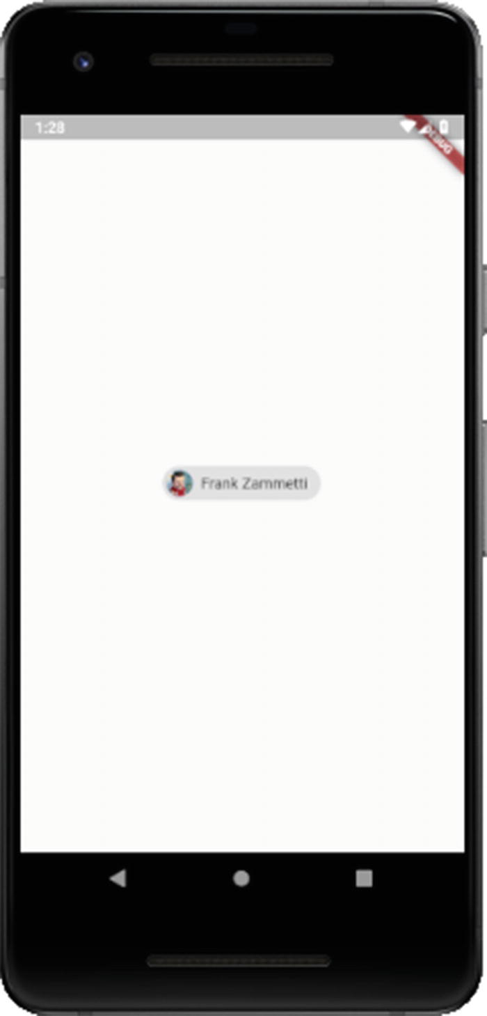
A Chip off the old Flutter block
The avatar property is optional and usually shows either an image or the initials of the user. This property takes a value that is itself a Widget, so in theory, you could put anything you want here. In this case, I’m using a CircleAvatar widget , which is common for this use case. It can show images or text (typically a person’s initials when the Chip represents a person) or can itself contain child widgets. In this case, I’ve used the same image as for the previous Image example to show a little picture of me. The backgroundColor property , of course, is the color of the chip, and the label property is the text to display next to the avatar image (or alone, if no avatar property is specified).
If you add an onDeleted property , then the Chip will include a delete button for deleting the entity it represents. You’ll need to provide a function to implement the delete though as this is purely a visual addition to the Chip.
FloatingActionButton
The FloatingActionButton widget is one that is very common on Android devices, somewhat less so on iOS devices. It’s a round button that floats above the main content and provides the user quick access to some primary function. For example, it might be the button that triggers the appointment add screen in a calendar app.
A basic FloatingActionButton as part of a Scaffold
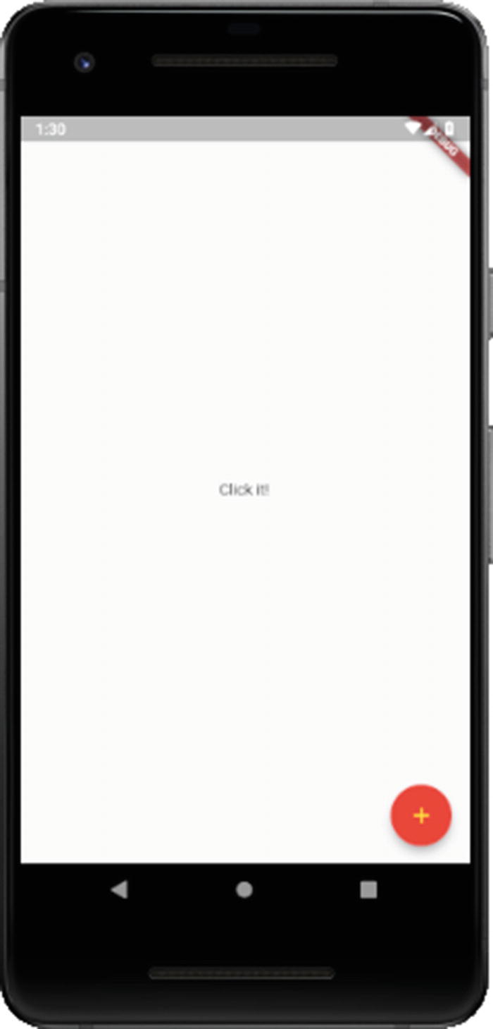
A FloatingActionButton doing its, uh, floating thing
The backgroundColor property makes the button itself whatever color you like, and foregroundColor makes the icon or text on the button the specified color. The onPressed property is optional and if not specified will make the button disabled and unresponsive to touch. That isn’t usually much good though so you’ll need to define a function to implement whatever the functionality for the button should be.
You can also adjust the shadow via the elevation property, and you can even make the button square by setting the shape property to an instance of a RoundedRectangleBorder widget, among other tweaks its properties allow for.
PopupMenuButton
A PopupMenuButton, and its menu
I’m gonna go out on a limb here and say you probably know what this looks like without seeing a screenshot! The PopupMenuButton widget uses the builder pattern previously discussed to construct a list of PopupMenuItem widgets. These widgets can have any child you deem appropriate, but most commonly it’s just a Text widget. You associate a value with each item, and then your onSelected function is passed that value and is responsible for what each does (here it’s just print()’d to the console).
Some of the other properties supported included the ability to pre-select an item with the initialValue property, the ability to react to the user canceling without selecting an item by supplying a function to the onCanceled property, and adjusting the shadow with the elevation property and play with the padding via the padding property.
Wither APIs?
In addition to the wide variety of widgets, Flutter also offers some APIs for your use, packaged into libraries. They fall into three rough categories: core Flutter framework libraries, Dart libraries, and other/support libraries. We’ll look at each group here, although because of what’s covered, the latter two groups will wind up being combined.
Note that, as with the widgets, this is intended as a very brief, high-level look at what’s available. There are more APIs than will be shown here, and for most of these, there won’t be any sample code or in-depth details, just a basic “here’s something that might be of interest to you,” and as before, I’ll try and point out the things that I believe will be of interest to most developers. You definitely should though spend some time on flutter.io to see all that’s available though, and you’ll need to reference that online documentation to get all the details you need to put most of this to proper use, but after this section, you should have at least some idea what’s available and what to look up, and that’s the goal here!
Core Flutter Framework Libraries
The core Flutter framework libraries provide most of the basic functionality of Flutter. Much of this is used internally by the widgets themselves, and so you may find that you don’t have cause to use all that much of this directly. Indeed, some of it you will though of course, so let’s have a look.
Note that you must import these to use them, and the import syntax to use is package:flutter/<library-name>.dart.
animation
Animation – This class contains basic information about an animation, things like whether it’s running and allowing you to hook event listener functions to it.
AnimationController – This class allows you to control an animation, things like starting and stopping, resetting, and repeating an animation.
Curve – This class contains data defining an easing curve, which allows you to have animations that aren’t strictly linear in appearance. There are numerous subclasses of Curve including Cubic, ElasticInOutCurve, Interval, and Sawtooth that define common easings.
Tween – Like Curve, this class contains data defining a particular type of tween operation, and like Curve, it has many subclasses for common tweens such as ColorTween (tween between two colors), TextStyleTween (for animating between two text styles such as going from regular text to bold text), and RectTween (interpolation between two rectangles, perhaps to animate the size of a rectangle).
foundation
Key – You’ve seen this class before in its GlobalKey and LocalKey subclasses.
kReleaseMode – A constant that if true if the application is compiled in release mode.
required – A constant that is used to mark a parameter in a method or function as being required. Yes, you can use this on your own classes!
debugPrintStack – A function that dumps the current stack to the console.
debugWordWrap – A function to wrap a given string to a given length.
TargetPlatform – An enum that provides values corresponding to the various supported platforms (android, fuscia, and iOS at the time of this writing).
gestures
DoubleTapGestureRecognizer – A class that knows how to detect a double-tap
PanGestureRecognizer – A class that recognizes drag movements in both horizontal and vertical directions
ScaleGestureRecognizer – A class to recognize pinch gestures typically used for zooming in and out
painting
Alignment – A class that defines a point inside a rectangle
AssetImage – A class that fetches an image from an AssetBundle and determines the appropriate image based on context
Border – A class defining the border of a box
Gradient – A class for showing a 2D color gradient
TextDecoration – A class used to show a linear decoration (read: a line) above or below some text
debugDisableShadows – A property you can set to true to turn all shadows into solid color blocks for troubleshooting purposes
BorderStyle – An enum with values for defining the style of line to draw as the border of a box (none, solid, or a List of values)
TextAlign – An enum with values for defining how text will horizontally align, whether center, end, justify, left, or start
services
AssetBundle – A class that consists of a collection of resources used by the application (we talked about this briefly before). Things like images and even data files can be asses in an AssetBundle.
ByteData – A class that represents a fixed-length, random-access sequence of bytes that also provides random and unaligned access to the fixed-width integers and floating-point numbers represented by those bytes.
Clipboard – A class that contains utility methods for working with the system clipboard (getData() and setData() methods). This makes use of the ClipboardData class to hold the data being put on or taken from the Clipboard.
HapticFeedback – A class that provides access to the device’s haptic engine. Methods like heavyImpact() to produce a haptic collision response corresponding to a heavy mass and mediumImpact() and lightImpact() for medium and light masses respectively can be found here.
SystemSound – A class that provides a play() method that accepts a SystemSoundType instance to let your app play one of the sounds from the system’s library of short system sounds as specified by the SystemSoundType.
DeviceOrientation – An enum with values such as landscapeLeft and portraitDown that can be used to determine and change device orientation.
widgets
There is also a widgets library, and if you guess that it contains all the Flutter widgets, you would pretty much be right! Given that, there’s not much point going over it here since you have seen most of its contents already and will continue to see its contents thanks to writing Flutter code in later chapters. But, if you ever are wondering where the widgets live, the answer is in this library, and you can naturally get to the documentation of widgets through the documentation for this library (though since there’s separate documentation for widgets explicitly, there’s not much point to going that route – but you can).
Dart Libraries
The Dart libraries are provided by Dart itself. To import these, you use the import form dart:<library-name>.dart.
core
Technically, there is a library called core that contains built-in types, collections, and other basic functionality every Dart program need (or, at least, has access to). As such, and in contrast with all the other Dart libraries, you do not need to import this library explicitly. It’s effectively done automatically for you by virtue of, you know, writing a Dart program! As such, I’m going to skip going over anything here because much of it you’ve either seen already or will see, so no point being redundant I figure.
ui
Although these are Dart libraries, given that Google runs the show with both Flutter and Dart, you will sometimes find some cross-pollinization, so to speak, and this library is one such instance. This library contains built-in types and core primitives for Flutter applications. However, given that what this library contains exposes the lower-level services that Flutter frameworks use to bootstrap applications, things like classes for driving the input, graphics, text, layout, and rendering subsystems of the framework, you are unlikely to use too much here directly in your application code, and in places where you do need to use it, I think it’s better to see it in a specific context. Therefore, I won’t go into details of the contents of this library here.
async
Future – This is a class that represents a computation whose return value might not be available yet. You’ll find that many methods across Flutter and Dart return a Future. The Future has a then() method, which is a function you provide that will execute when the Future finally returns its value. You’ll be seeing plenty of this class in the code to come.
Stream – A class that provides asynchronous access to a stream of data. The Stream class has a listen() method, which is a function you provide that will execute every time more data is available in the Stream.
Seriously, I think it’s fair to say that if you know nothing else about this library, then you will know almost all you’ll ever need, with few exceptions!
collection
DoubleLinkedQueue – A Queue class (which, hey, is another class in this library!) based on a double-linked list implementation.
HashSet – An unordered hash table-based Set implementation class.
SplayTreeMap – A Map class that stores objects that can be ordered relative to each other.
UnmodifiableListView – A class with a name that’s a mouthful but which provides a simple use: it’s a view of another List that can’t be modified.
convert
JsonCodec – A class that encodes and decodes JSON string and objects. The methods json.encode() and json.decode() are your main entry points (note that json is an instance of JsonCodec that is always automatically available to your code if you’ve imported this library).
Utf8Codec – A class which you’ll also find an automatic instance of named uft8. It too has an encode() and decode() method that you can use to convert between Unicode strings and their corresponding byte values.
AsciiCodec – A class which, through its automatic ascii instance, lets you encode strings as ASCII bytes via its encode() method and decode ASCII bytes to strings via decode().
Base64Codec – A class used to encode and decode things in base64, again with an encode() and decode() method and available via the top-level base64 instance (are you starting to see a pattern?!).
Note that in addition to the json and base64 instances, because JSON and base64 encoding/decoding is so common, you’ll also find top-level functions base64Encode(), base64Decode(), jsonEncode() and jsonDecode().
io
File – A class representing a file on the file system. You can copy(), create(), check the length() of, openRead(), openWrite(), and rename() files, among many operations available on it.
Directory – A class representing a directory on the file system. You can create(), list() the subdirectories of, rename(), and delete() directories, among many operations available on it.
HttpClient – A class that can be used to fetch content from a remote server via HTTP. Going along with this is the Cookie class for dealing with HTTP cookies, HttpClientBasicCredentials for supporting BASIC Auth, HttpHeaders for working with HTTP headers, and even HttpServer if you need your app to act as an HTTP server!
Socket – A class for performing low-level communications over a TCP socket.
exit() – A top-level function for exiting the Dart VM process with a given error code. You probably don’t want to do this in a mobile app, but if you’re writing a generic Dart program, then you might want to know about this.
There is definitely more available in this library, a lot of other classes related to HTTP communications specifically to name some, but I suspect this is the stuff you’ll use most.
math
Random – A class for generating random numbers, including cryptographically secure random numbers via its secure() method.
pi – The venerable constant you know and love and, uh, eat a lot of I guess? I do!
cos() – A function for getting the cosine of a value by converting radians to a double first. Most of the other trigonometry functions you know and love (or hate, depending on how your schooling went!) are here too: acos(), asin(), atan(), sin(), and so on.
max() – Returns the larger of two numbers.
min() – Returns the smaller of two numbers.
sqrt() – Returns the square root of a number.
Other (Support) Libraries
Finally, we have just a couple of other/support libraries. There are, of course, more than just two, but they get pretty special-purpose pretty fast, so I think just talking about these few will mostly be sufficient.
crypto
MD5 – A class for generating MD5 hashes. You don’t even have to instantiate one because this library gives you an md5 instance automatically. At this point, you probably shouldn’t be using MD5 except for backward-compatibility though.
Sha1 – Ah, a better class for hashing than MD5, complete with its own sha1 instance.
Sha256 – Oh, but Sha1 not good enough for ya? Okay, fine, you can haz Sha256 instead! And yes, there’s a sha256 instance ready and waiting for ya.
collection
CanonocalizedMap – A map class whose keys are converted to canonical values of a specified type. This can be useful for when you want case-insensitive keys in your map and where null is not allowed.
DelegatingSet – A set class that delegates all operations to a base set. Handy for when you want to hide non-set methods of a Set object.
UnionSet – A set class that provides a view of the union of a set of Set instances (wow, set-Inception right there!).
binarySearch() – A top-level function that finds a value in a List, if any.
compareNatural() – A top-level function to compare two strings according to natural sort ordering.
mergeMaps() – A top-level function that merges two Map instances and returns a new Map.
shuffle() – A top-level function that shuffles a List randomly.
convert
HexCodec – A class for all your byte arrays to and from hexadecimal string conversion needs! This library gives you a hex instance to use right off the bat, and it’s got the typical encode() and decode() methods as you’ve I’m sure come to expect.
PercentCodec – This is a bit of an oddly named class because what it means by “percent” is “URL-encoded.” As with HexCodec, you’ll find a percent instance all set for you.
Summary
In this chapter, along with the previous chapter, we took a plane ride at 30,000 feet and looked at the beautiful Flutter landscape below! In the process, you got a good picture of many of (most, even!) the widgets Flutter ships with. You also looked at some of the APIs Flutter offers out of the box, all of which provide you the foundation you need, along with the previous two chapters, to start building some Flutter apps!
And, in the next chapter, that’s precisely what we’re going to do! The first app to build won’t be anything too technically challenging, but it will serve as an excellent first foray into the world of Flutter coding.
Let’s get to hacking some code, shall we?