7. Sample Visuals: Images & Text

By now we know what makes a slide effective and how to embrace and use ideas such as simplicity, contrast, empty space, and so on. Once you have achieved visual harmony in your slides, you’ll find the design is naturally better and the overall presentation is improved. Your visuals should be engaging and “part of the show,” but they must also be easy to understand—quickly. If you need to explain something complex, don’t present all of the information at once. Instead, animate (or build) the slide so that the different parts of your chart or diagram appear one after the other in logical and clear steps. Simplicity, restraint, and balance are important considerations when designing slides and other multimedia.
In the case of presentation visuals, graphics must be free of errors and they must be accurate. But our visuals—like it or not—also touch our audiences at an emotional level. People make instant judgments about whether something is attractive, trustworthy, professional, too slick, and so on. This is a visceral reaction—and it matters. The primary goal is not simply to make slides look good. The goal is clarity. However, if you design slides while always mindful of the principles of simplicity and restraint—as well as the basic design concepts outlined in Chapter 6—your slides will indeed look attractive and amplify your overall effectiveness.
Fill the Screen: Redux
Fill the screen and create design elements that are easy to see.
The problem with most presentation visuals is not that text in the slide is too big, for example, but that it is way too small. For larger presentations at conferences and in classrooms and lecture halls, why not make the text large enough for instant understanding while offering visual impact? This is not a gimmick. Remember, people are there to listen to you speak—and the visuals can help illustrate and back up your points—but no one is there to read a load of slides or to listen to you read them. Design for the back of the room.

Presentation screens for keynote-style talks at conferences or in large lecture halls have much in common with road signs or billboards. In her book Slide:ology (O’Reilly Media), my friend Nancy Duarte says that good slides are similar to signs along the side of the road in the sense that the audience should be able to get the meaning in a very short amount of time: “Presentations are a ‘glance media’—more closely related to billboards than other media.... Ask yourself whether your message can be processed effectively within three seconds.”
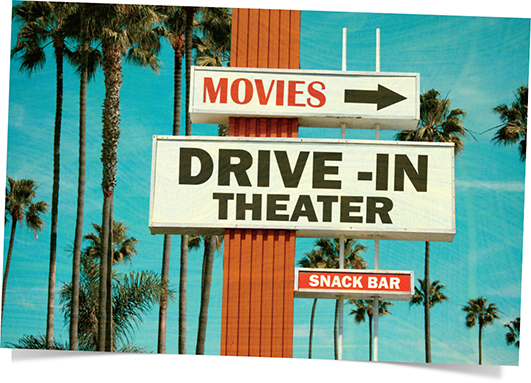
Like a billboard, the elements in a slide, including type, must be large enough to be seen and understood instantly from a distance. There is no excuse for making people squint. Make it big and make it clear.
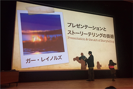
This is the title slide of a 90-minute presentation I did for about 400 participants in a large auditorium in Ikoma City in Nara. This photo was snapped during rehearsal as you can see me playing around on stage with my two children. Note that we were careful to adjust the projection system so that our 16:9 slides filled the entire screen. Too many presentations have less visual impact than they could have because the projector is not adjusted to fill the screen, projecting slides that fill only a part of the screen.
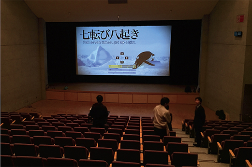
This photo was snapped during the rehearsal of another presentation in a large hall in Japan. When we were setting up, we noticed that the 16:9 slides filled only about half of the screen. We needed to consult with the tech staff who were eventually able to adjust the settings on the projector to fill the screen. The staff said that no one had ever complained before and had just accepted the smaller size in the past. I highly recommend that if you can not control the screen or projector yourself, that you consult with the staff at your venue to ensure that the projected image is as large as possible. The large size makes for greater impact and makes things more enjoyable for the audience.
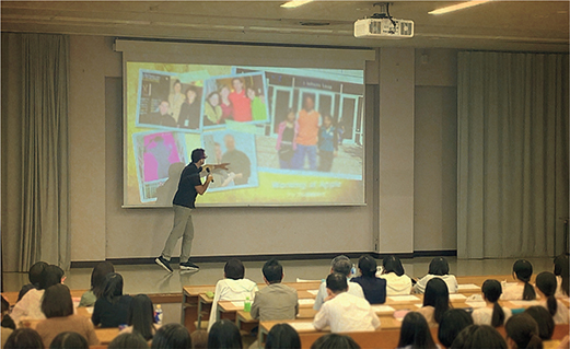
Here I am presenting for a university near Tokyo in a hall with about 300 students and faculty. The projected slides did not fill the screen during the set-up, but with a little help with the projector from the staff, we got the projected image to fill the screen. Here, since I always eschew laser pointers, I am physically pointing to a relevant element on the screen. Ninety-nine percent of the time I am on either side of the screen or out front in the center, but occasionally it’s acceptable to put yourself “inside the slide.”
From Text to Visual: Myriad Possibilities
Your audience is not interested in looking at a screen full of text while listening to a speaker, but how you decide to present your information visually depends on you. There is not one way, there are myriad ways to present your information to complement and amplify your message. For example, imagine you want to make the simple point that people in Japan eat much less rice today than 55 years ago. The easiest thing to do is just type out a few lines of text on the slide, but easy for you does not mean the visuals will be compelling or memorable for the audience. So here I show four different ways you might choose to redesign slides to support this point regarding rice consumption.
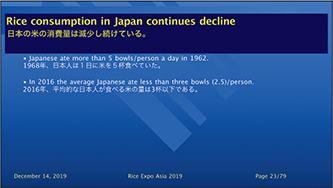
This is the easiest slide to make, but it fails to (1) get the attention or interest of the audience, (2) make things easier to understand (though the point is not complicated in this case), and (3) make the message memorable. For the first redesign, an actual image of the data —5.4 and 2.5 bowls of rice—is displayed. As this is a bilingual slide, it’s important not to display both languages at the same size. The second redesign (below) displays the bowls as well, but this time with images that support visually the speaker’s points regarding the changing diet from the 1960s to present day, a diet that incorporates more bread.
REDESIGN (1)

REDESIGN (2)

REDESIGN (3)

REDESIGN (4)

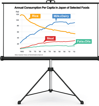
The third version at the top of the page is basically the same as the second, but this time an image snapped in 1962 of a thin Japanese man (my father-in-law) is juxtaposed with the image of a heavier, present-day man. The intent is to illustrate the increase in metabolic syndrome in Japan over the past few decades. In the fourth redesign, images are again used to underscore the presenter’s narrative as she talks about the changing diet and lifestyle in Japan over five decades. The simple chart on the right is yet another way to illustrate some of the points that the presenter wants to make concerning the changing Japanese diet.
Dealing With a Visual Shot in Portrait Mode
At this writing, there are over five billion people with access to a camera in the form of a smartphone or other mobile device. A huge percentage of people who take photos today—which is virtually everyone—have only ever done so with a camera phone. This has lead to a plethora of images and videos shot in portrait mode rather than the wider landscape mode. This is not a problem unless the image or video needs to be shown on a wide screen in a live presentation or displayed on a TV screen. News programs, for example, frequently have to deal with this dilemma, because such programs often show images that were sent in from viewers who shot the video or snapped the photo on their phones.
So, how do you deal with a portrait image in a landscape world? One option is to zoom in and crop the photo to fill the screen. If that’s not possible because important elements would be lost or the quality would suffer, then you may have no choice but to display the photo in portrait mode. However, this will leave space on the sides that can look unprofessional or even be distracting. But the solution is simple. A common technique is to make a copy of the original image and enlarge it so that it completely fills the screen horizontally. Now, move this copy of the original to the back. Then, in your presentation or photo editing software, add a blur to the image. You can adjust the position of the background image or the degree of the blur as desired.
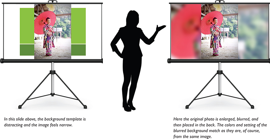

When you have a deck of presentation visuals that fill the screen and then suddenly show a slide with bright chunks of white background, it can be jarring.

Here you can see how much of the blurred version will be cropped off the top and bottom.

In terms of signal-to-noise ratio, the portrait photo in the original slide with the white chunks is perhaps cleaner, but this version achieves a more professional look, and the slide feels larger.

Layers and Transparency Effect
Most presentation applications allow you to edit part or all of your image, including making part of your image transparent so that elements from a different visual in the background can show through. In PowerPoint, choose the Remove Background tool to remove the desired part of an image. In Keynote, the Instant Alpha tool will do the trick. Below, and on the opposite page, are a few examples of how making part of an image transparent can be used to create an interesting effect.

Here is the slide with three different photographs inserted into it. Using the Instant Alpha tool in Keynote (Remove Background in PowerPoint), I removed the background color from the image of the vintage TV. I also removed the solid color of the TV screen.

Here, I placed the background image on the back layer, with the small potato chips image on top of it. Because the TV screen is now transparent, I placed it over the chips layer to make the chips image appear to be broadcast like a commercial. Lastly, I added the text and arrow elements on top.

In this slide, the image behind the TV is not a photo but actual video (from old 8mm film from the 1960s), which really enhances the interest of the slide and takes the viewer back in time.

You can make your own visual themes or templates. In this case, I created a vintage photo album theme for a presentation on a “Changing Japan” which included images and video from long ago. This slide features a background photo and a video. The background is a photo of a page out of one of my mother-in-law’s old photo albums. I kept the photo frame but made the contents of the old photo transparent so that the video shows through.

When the slide first appears, the audience may think that this is a photo of Mt. Fuji and a rice field, but when I click the remote control, the video begins, revealing a speeding Shinkansen (bullet train) passing by as the video, shot with a drone, moves across the field.

I purchased this shot of an album because its solid-white photo frames could be easily made transparent in software. I planned to layer in some presentation-specific content.
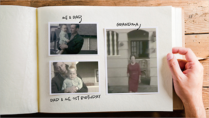
This slide introduces a bit of my childhood. When the slide appears, it seems to show an image of a photo album with three pictures from my past. But behind the transparent frames of the photo album image, I actually placed three video clips (converted from 8mm film). Each of the “photos” becomes a movie clip within its photo frame as I click the remote control device.
Contrast and the Blur Effect
There are times when you want to show a full-screen photo for a period of time before then having the relevant text appear on top. One way to achieve better contrast and make the text easier to read is to blur the background image. To create a nice effect, use two different versions of the image—a clear version and a blurry version with text on top—and then use a smooth dissolve between them.
I used the slides below in a presentation on creativity. Here I was talking about the issue of alone time and spending time in nature, showing an example of one of my favorite places to find solitude.

Sample Slide Decks
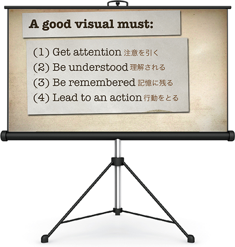
In this section, you can review slides from several different presentations. (Because of limited space, not all the slides are shown from each presentation.) The sample slides are not all necessarily perfect. However, while we can judge a slide in terms of its adherence to basic design principles, it is difficult to judge the effectiveness of its design without seeing how the visuals are used in the live talk. Although the content and circumstances are different in each case, what the slides shown in this section have in common is that they are simple, highly visual, and served (or could serve) a successful supportive role in a live talk. These slides augment the presenter’s narrative and help make things clear. A good rule of thumb when judging your own visuals is to ask ourselves: (1) Does the visual get attention or bring the eye of the viewer in to the screen? (2) Is the visual easy to understand quickly, and does it help the viewer understand your verbal message? (3) Does the visual—including the display of data—help the viewer remember your message? (4) Will the visual help your audience not only to understand and remember your message, but will it even help to change the thinking or behavior of your audience long after your talk is finished. Number (4) may not apply in every case, but numbers (1)–(3) are crucial in almost every situation.
Lessons from the Bamboo
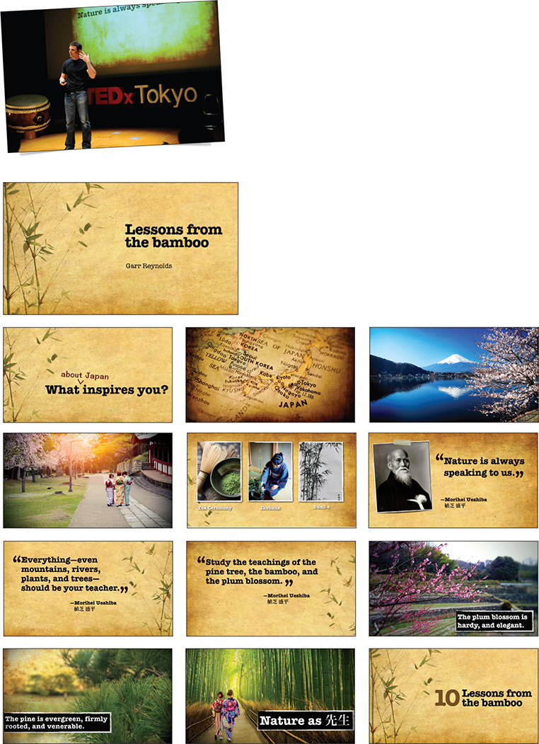
I created the slides shown on the next three pages for my 12-minute presentation at TEDxTokyo. During this fast-paced talk, I shared my thoughts on the lessons we can learn from observing the world around us. Even the humble bamboo, which plays such an integral role in Japanese culture, offers lessons in simplicity, flexibility, and resilience. I made the slide background from composites of simulated washi paper to give the visuals a more earthy, textured look. The aspect ratio of the slides is 16:9 to match the wide screen at the venue in Tokyo. You can find the presentation on YouTube. Search: TEDxTokyo - Garr Reynolds - Lessons from the Bamboo - [English].


Think Like a Designer
I created these 4:3 slides (to match the screen at the venue) quickly and simply with nothing but type and a background. I use these for a 60-minute session introducing basic design concepts to non-designers. Mostly, this session was a back-and-forth discussion with the slides displayed onscreen to simply keep us on track and give structure to the session. I used the whiteboard and handouts to highlight examples for each of the key messages.

Gihan Perera

Author of the best-selling book Webinar Smarts: The Smart Way for Professional Speakers, Trainers, Thought Leaders and Business Professionals to Deliver Engaging and Profitable Webinars.
Webinar expert Gihan Perera offers advice on how to run an effective webinar that engages people.
Webinars have become a mainstream presentation tool, but many presenters—even experienced presenters—deliver them poorly. The biggest difference between a webinar and an in-person presentation (such as a seminar, training course, or boardroom presentation) is the environment. When you’re presenting in person, the environment—such as room layout, lighting, screen, stage, seating, and audience attention—is designed to focus on you and your presentation. In contrast, for somebody attending a webinar, the presentation is just on one small screen in a larger environment full of other distractions.
This means you must work much harder to engage your audience and keep their attention throughout the presentation.
Here are seven techniques for being more effective and engaging in a webinar.
1. Be Relevant.
If your webinar guaranteed to share the winning numbers from next weekend’s lottery, you would have their attention—even with scratchy audio, a slow Internet connection, busy slides, bullet points, clip art, and ugly fonts! So, first, be sure you understand your audience, solve their problems, answer their questions, and add value. Substance trumps style every time. But don’t settle for one or the other—excel at both.
Webinar audiences want information and education. They don’t come to be motivated, inspired, or entertained (That’s a bonus). Rather, they come for solid take-away value they can use to tackle their questions, challenges, problems, and aspirations.
2. Use More Slides.
In an in-person presentation, your slides are a visual aid; in a webinar, they are the visuals. Use more slides than you normally would, so you can keep viewers’ interest and provide visual reinforcement. It’s very tempting for webinar attendees to multitask (by listening to the audio in the background while checking email or doing other work), so keep the visuals changing frequently.
As a rough guide, each slide should match what you’re saying at the time (much more so than in an in-person presentation, where some slides can be just a backdrop). If it takes more than a minute to make a point, use multiple slides for that point.
Invest more time in your slide design. Use diagrams and models rather than bullet lists, icons rather than words, and photographs rather than clip art. Your slides don’t need to be works of art, but they do need to be visually appealing.
3. Build Your Slides.
Build complex slides as you’re talking about them. If you’re showing a graph, start with the axes, then labels, then the bars or lines, then the highlighted points. If you’re showing a model, build it up step by step. It’s easy to do this in PowerPoint using the Animation tool (but don’t use fancy animation; just let each part “appear”), or simply use a series of slides that build up to the final picture.
4. Signpost Your Content.
Insert “signpost” slides into your slide deck to clearly explain the structure and flow of your content. Start with an overview slide, then one slide before each main point, then finish with a summary slide. This helps your audience mentally grasp the webinar progress and flow, which reduces the risk of confusion and distraction.
5. Make Them Active.
Make your webinars active and interactive. Your audience is attending a live event, so involve them in it. Early in your webinar, ask them to do something simple. This makes them take notice, involves them right from the start, and demonstrates that this isn’t just another boring presentation. For example, you could conduct a poll, pose a puzzle, ask them to write something, or ask some people to speak out loud.
6. Shift Energy.
As with any other presentation, design segments that shift energy during the webinar for example:
Conduct online polls.
Ask attendees to write or draw things.
Stop talking for 30 seconds of reflection time.
Show a list and ask them to mentally pick their top three priorities.
Ask for questions.
Hand the presentation over to a guest presenter.
Switch from a slideshow to a Web page or some other software.
You don’t do all these things in your first webinar. Build up to them over time, as you become more familiar with the technology.
7. Start Before You’re Ready.
Webinars can be unsettling and nerve-wracking, even for experienced presenters. The only solution to this is practice. Take the pressure off yourself by starting small. Start with small groups, not large audiences. Offer free webinars before you start charging money. Get somebody else to manage the technology for you. Write a script for what you’re going to say.
But whatever you do: Start!

Keep people engaged with your screen and your narrative by building your visuals. You can do this using animation features in your software or just a sequence of slides as shown here.

Clearly explain your webinar structure by inserting signpost slides to show progress. You can do this with a simple list—but something more visual than a plain bulleted list, as in the first example. If you invest slightly more in design, you can make it more visually appealing, as illustrated below.
The Changing Landscape of Grantmaking
These slides were used by Shena Ashley, Vice President of the Urban Institute’s Center on Nonprofits and Philanthropy, for a keynote address in Washington D.C. The audience included professionals from large nonprofit organizations and philanthropists, according to Urban Institute Data Visualization Specialist Jon Schwabish who helped design the slides. “What I like about this deck (aside from the good visuals) is the clean, simple design, and simple dataviz,” Schwabish said.
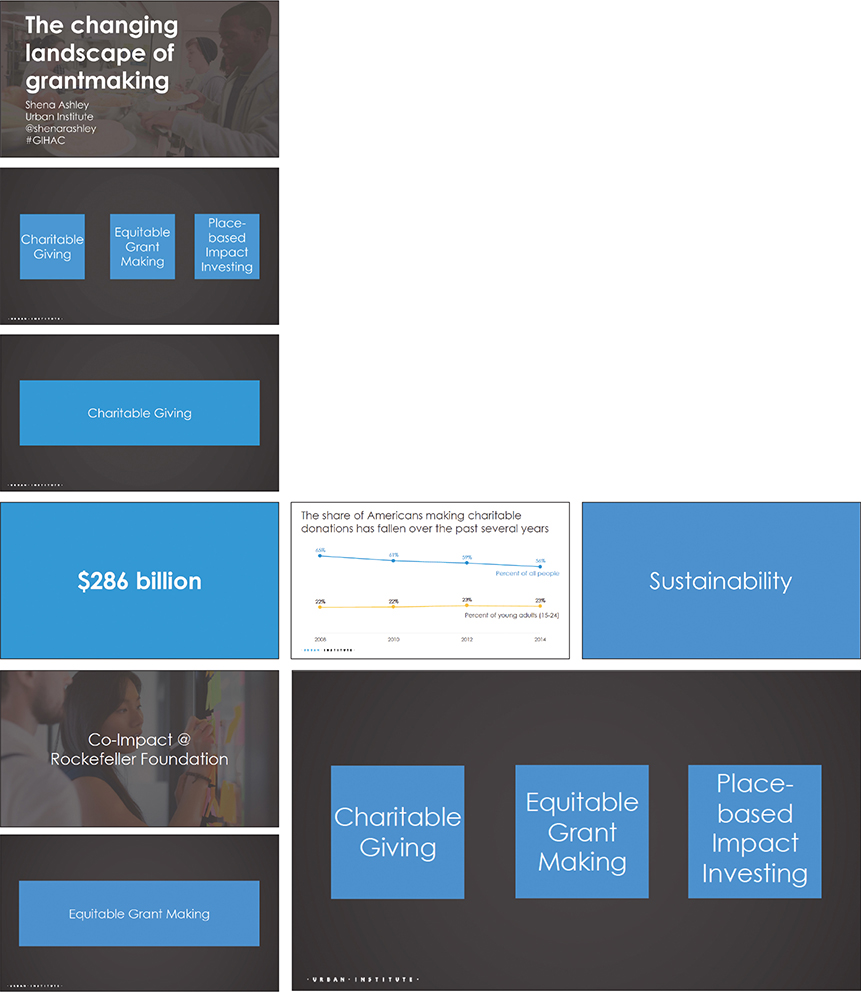

The slide above appeared on screen during the 30-minute Q&A period. Following the discussions, the speaker ended with a call to action in the form of questions she wanted the participants to consider after the talk. The questions appeared on screen one at a time. It’s good form to follow a Q&A period with a short summary or a clear call for action before thanking the audience.
Factfulness
Available for free at www.gapminder.org, this slide deck is a good example of keeping design simple and gives an overview of Hans Rosling’s book Factfulness: Ten Reasons We’re Wrong About the World—and Why Things Are Better Than You Think. Each title slide represents one of the ten key points and builds in three steps, shown below as three slides. Gapminder is a website I just love. Besides this deck, Gapminder makes freely available over a dozen presentation slide decks on its website, which is an invaluable resource. These slides have been shown in public presentations and TED talks over the years, and you can find it at: www.gapminder.org/factfulness.


Japanese Hot Springs Etiquette
I used these slides for an orientation presentation for visiting college students in Japan. These slides were meant to complement my short talk, but because of the simple nature of the topic—and the choice of displaying one key point per slide—they could be understood if they were printed out (though important details would be missing). I used vector art graphics, because they can be resized easily without reducing the quality. I chose the background and text colors to match the colors in the original art work. Simple elements and colors are repeated throughout the entire deck for a unified, simple, and light feel.

Takahashi Method
Masayoshi Takahashi
Web Application Developer, Tokyo, Japan
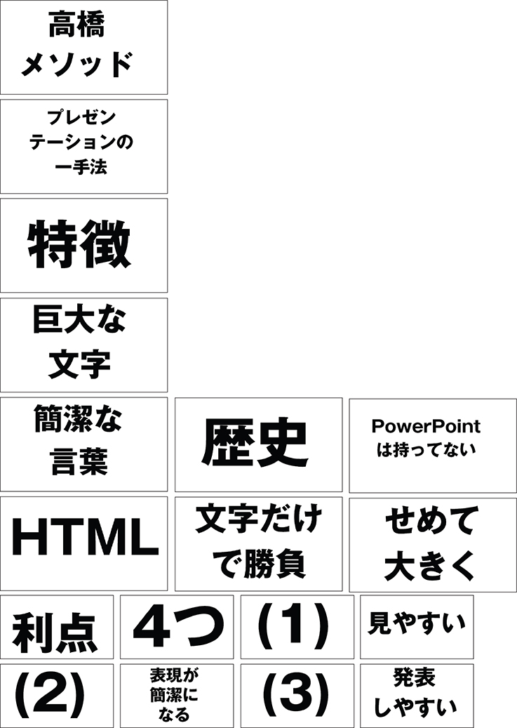
Masayoshi Takahashi is a programmer who created a new approach to presenting at tech conferences in Japan around the time the first edition of this book was published. Takahashi uses only text in his slides. But not just any text—really big text. Huge text. Characters of impressive proportion that rarely number more than a few per slide. The words or phrases resemble Japanese newspaper headlines rather than sentences that must be read, Takahashi says. His slides, though they are all text, are visual in the sense that (if you read Japanese) they are instantly understood and support his talk. As he says, if you have bullets or sentences, the audience will read those and may miss what you are saying.
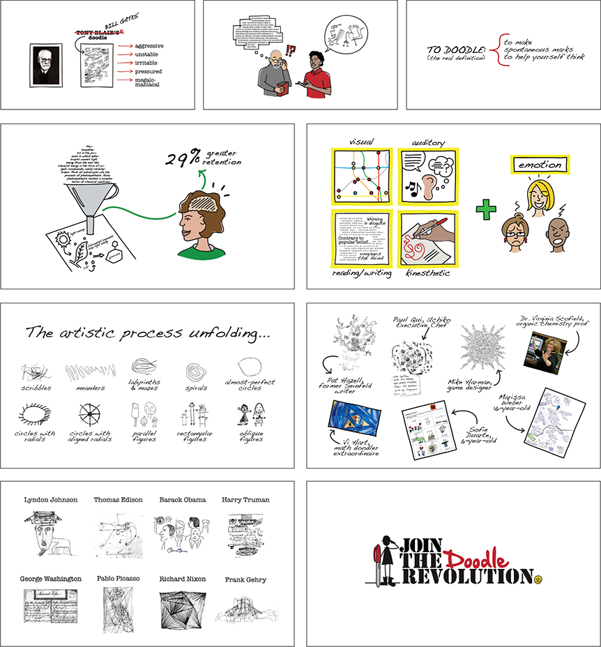
Doodlers, Unite!
Sunni Brown
Sunni Brown is a bestselling author, visual thinking specialist, and leader of the Doodle Revolution. In 2011, the producers at TED decided to make room for six-minute presentations. Sunni was one of the first speakers to give a six-minute TED talk. It can be difficult to prepare such a short talk. “It took me four months of almost daily crafting to arrive at my final, six-minute destination,” she says. “In the process of designing the shortest talk I had ever given, I had dozens of openings, dozens of closings, and dozens of mediating pathways to try and make the two ends meet. I had mountains of research to condense.” Sunni crafted a simple story to illustrate her message. Given the nature of her topic, it made sense that Sunni’s slides were created by sketching on a digital graphics drawing tablet.

Doctor Impresses Crowd at Medical Symposium
Andreas Eenfeldt is a young, 6' 8" medical doctor from Sweden who is very interested in presenting differently. I first met Andreas at one of my Presentation Zen seminars in Paris. He is a good example of someone doing important work and making an impact, using his knowledge and experience to challenge conventional wisdom and create a dramatic change. “It’s time for a health revolution,” he says. To create this revolution, he realized early on that engaging presentation skills were necessary to spread the word.

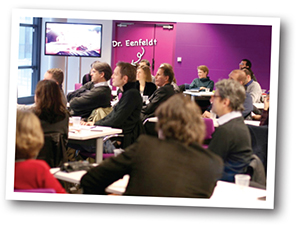
In 2011, Andreas gave an impressive presentation at the Ancestral Health Symposium 2011 that caught my eye. The presentation had a good flow and structure that provided enough evidence to support his statements. He provided personal stories of his friends balanced with data and quotations from credible people in the field that supported his idea. He also told personal stories. Andreas was not always such an engaging presenter, so I asked him about his transformation:
“Fall-asleep-boring presentations are no exceptions in the medical field—they are the norm. This is good news, of course, because even small improvements are all that’s needed for presentations to stand out today. Back in 2008, I had started to do more and more presentations on low-carb nutrition. It was then pointed out to me that just reading to the audience from my slides was not optimal. My presentation skills back then (just three years ago) were as bad or worse than your average MD’s. I started Googling and watching some YouTube videos on the subject. Pretty soon I ended up on the Presentation Zen website and have probably read every post on the site and read all of the Presentation Zen books and Nancy Duarte’s books and most of the books recommended on presentationzen.com. I have also lectured about 150 times in Swedish since then, and four times in English. So, in just three years my presentation skills improved from awful to pretty decent (even in my second language). Makes me wonder what my talks are going to be like 10 years from now.”
For preparation, Andreas says he brainstormed using sticky notes on his whiteboard, and then filtered out the most important points, arranging them into groups, creating messages, and organizing them in the best order. The opposite page shows a few of his more than 100 slides used in the 45-minute presentation.
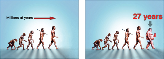
These two visuals are from early in his presentation—the exposition stage—where he introduces the problem. That is, that the obesity epidemic is a recent phenomenon.

The doctor then used statistical evidence from the CDC over 14 slides (four of which are shown here) featuring a map of the United States that changes to reflect in a clear and visceral way the dramatic increase in obesity over a 27-year period.

A useful presentation technique is to use quotes from credible sources to support your assertions. Andreas displayed quotes a few times in this talk—in large type with key phrases highlighted, producing a very simple and clear design that was easily seen from the back of the hall.

The doctor shares a personal example, shown here. After a home-cooked LCHF (low-carbohydrate, high-fat) meal in Sweden, he tested his blood glucose, which remained rather stable as shown clearly in the simple chart.

Then, Andreas went on to compare his LCHF meal to a high-carb lunch with loads of sugars that he was served—ironically enough—at an obesity conference in Stockholm. Although this example is just his personal experience, it very much resonated with the audience: a very simple, clear, and visual explanation.
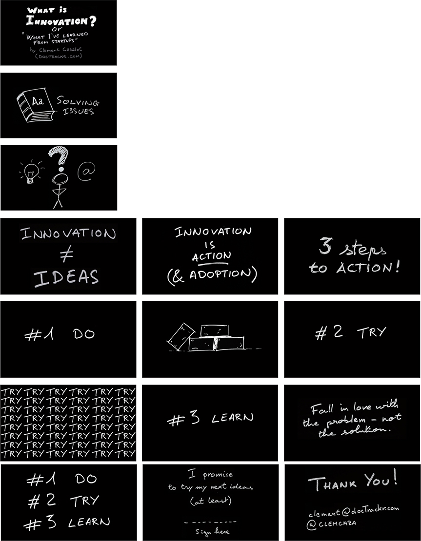
What is Innovation
Clement Cazalot
I met Clement Cazalot at a conference in Paris, France a few years ago. I was impressed with his presentation in general and his visuals in particular. Although only a few slides are shown here, all of his slides, as you can see, were sketched by hand. This set his presentation apart from others visually. It was an uncommon technique then, and it still is now. You could use a graphic tablet to hand draw slides, but Clement used an actual notebook, just black ink on white paper. Then he reversed the colors in a photo editing app, and voilà! The images changed to white sketches on a black background.
The Role of Student Presentations in 21st Century Learning
I was invited to give a presentation in English (though interpretation was provided) to a few hundred teachers in Japan recently on the topic of student presentations. The screen at the auditorium was very large with a 16:9 aspect ratio, lending itself to cinematic visuals with large text. These are just the first 25 slides out of about 100.


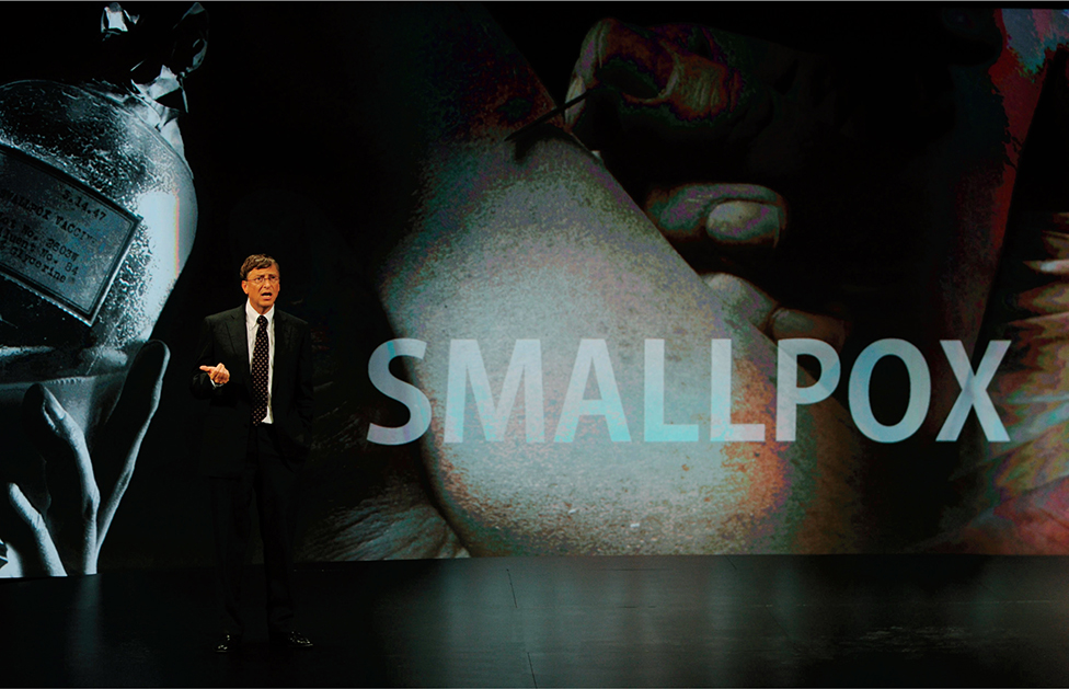
Bill Gates presenting on stage with the aid of large, evocative visuals.
In Sum
A good visual enhances the speaker’s message. From a technical point of view, none of the slides in this chapter was too difficult to produce. All the designer needed was a presentation application along with image editing software. What you design your slides or other visuals to look like depends completely on your unique situation, content, and audience, but keep the following in mind:
Create visuals that are simple and feature clear design priorities and elements that guide the viewer’s eye.
Design for the back of the room. Make it easy for everyone to see all elements on your visual no matter where they may be sitting in the room.
Use a visual theme, but avoid tired, overused software templates.
Use images and text in interesting ways, but always remember to balance your elements.
Limit bullet points or avoid them completely.
Use high-quality graphics.
Build (animate) complex graphics to support your narrative.
Think “maximum effect with minimum means.”
Learn to see empty space, and learn to use it in a way that brings greater clarity to visuals.

