In this chapter, I describe the Angular animation system, which uses data bindings to animate HTML elements to reflect changes in the state of the application. In broad terms, animations have two roles in an Angular application: to emphasize changes in content and to smooth them out.
Emphasizing changes is important when the content changes in a way that may not be obvious to the user. In the example application, using the Previous and Next buttons when editing a product changes the data fields but doesn’t create any other visual change, which results in a transition that the user may not notice. Animations can be used to draw the eye to this kind of change, helping the user notice the results of an action.
Smoothing out changes can make an application more pleasant to use. When the user clicks the Edit button to start editing a product, the content displayed by the example application switches in a way that can be jarring. Using animations to slow down the transition can help provide a sense of context for the content change and make it less abrupt. In this chapter, I explain how the animation system works and how it can be used to draw the user’s eye or take the edge off of sudden transitions. Table 28-1 puts Angular animations in context.
Table 28-1.
Putting Angular Animations in Context
Question
Answer
What are they?
The animation system can change the appearance of HTML elements to reflect changes in the application state.
Why are they useful?
Used judiciously, animations can make applications more pleasant to use.
How are they used?
Animations are defined using functions defined in a platform-specific module, registered using the animations property in the @Component decorator and applied using a data binding.
Are there any pitfalls or limitations?
The main limitation is that Angular animations are fully supported by few browsers and, as a consequence, cannot be relied on to work properly on all the browsers that Angular supports for its other features.
Are there any alternatives?
The only alternative is not to animate the application.
Drawing the user’s attention to a transition in the state of an element
Apply an animation
1–9
Animating the change from one element state to another
Use an element transition
9–14
Performing animations in parallel
Use animation groups
15
Using the same styles in multiple animations
Use common styles
16
Animating the position or size of elements
Use element transformations
17
Using animations to apply CSS framework styles
Use the DOM and CSS APIs
18, 19
Preparing the Example Project
In this chapter, I continue using the exampleApp project that was first created in Chapter 22 and has been the focus of every chapter since. The changes in the following sections prepare the example application for the features described in this chapter.
Tip
You can download the example project for this chapter—and for all the other chapters in this book—from https://github.com/Apress/pro-angular-9. See Chapter 1 for how to get help if you have problems running the examples.
Disabling the HTTP Delay
The first preparatory step for this chapter is to disable the delay added to asynchronous HTTP requests, as shown in Listing 28-1.
import { Injectable, Inject, InjectionToken } from "@angular/core";
import { HttpClient, HttpHeaders } from "@angular/common/http";
import { Observable, throwError } from "rxjs";
import { Product } from "./product.model";
import { catchError, delay } from "rxjs/operators";
export const REST_URL = new InjectionToken("rest_url");
Disabling the Delay in the rest.datasource.ts File in the src/app/model Folder
Simplifying the Table Template and Routing Configuration
Many of the examples in this chapter are applied to the elements in the table of products. The final preparation for this chapter is to simplify the template for the table component so that I can focus on a smaller amount of content in the listings.
Listing 28-2 shows the simplified template, which removes the buttons that generated HTTP and routing errors and the button and outlet element that counted the categories or products. The listing also removes the buttons that allow the table to be filtered by category.
Simplifying the Template in the table.component.html File in the src/app/core Folder
Listing 28-3 updates the URL routing configuration for the application so that the routes don’t target the outlet element that has been removed from the table component’s template.
import { Routes, RouterModule } from "@angular/router";
import { TableComponent } from "./core/table.component";
import { FormComponent } from "./core/form.component";
import { NotFoundComponent } from "./core/notFound.component";
import { ProductCountComponent } from "./core/productCount.component";
import { CategoryCountComponent } from "./core/categoryCount.component";
import { ModelResolver } from "./model/model.resolver";
import { TermsGuard } from "./terms.guard";
import { UnsavedGuard } from "./core/unsaved.guard";
Updating the Routing Configuration in the app.routing.ts File in the src/app Folder
Open a new command prompt, navigate to the exampleApp folder, and run the following command to start the server that provides the RESTful web server:
npm run json
Open a separate command prompt, navigate to the exampleApp folder, and run the following command to start the Angular development tools:
ng serve
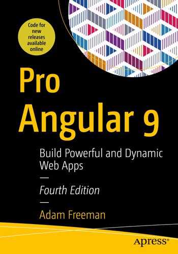
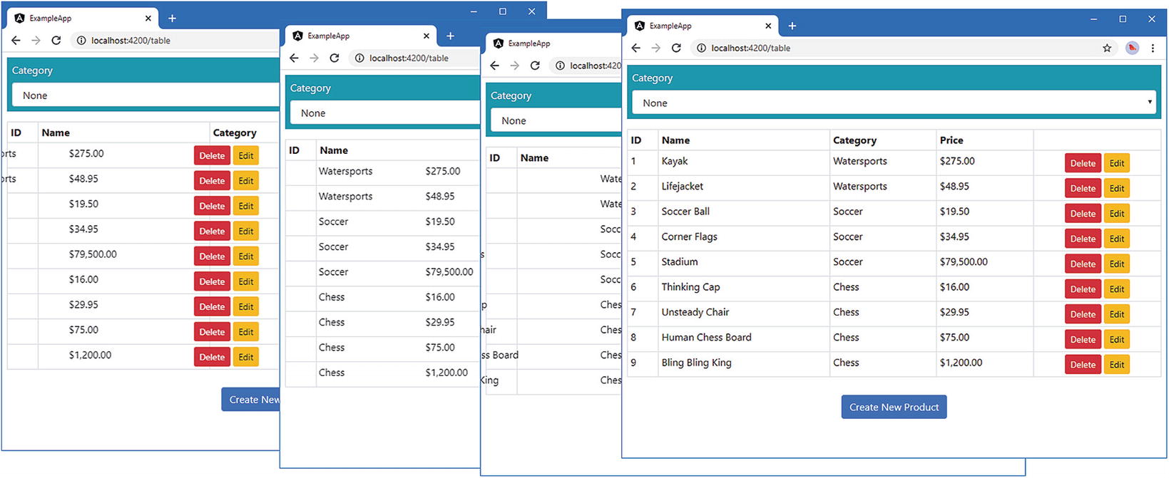
Open a new browser window and navigate to http://localhost:4200 to see the content shown in Figure 28-1.
Figure 28-1.
Running the example application
Getting Started with Angular Animation
As with most Angular features, the best place to start is with an example, which will let me introduce how animation works and how it fits into the rest of the Angular functionality. In the sections that follow, I create a basic animation that will affect the rows in the table of products. Once you have seen how the basic features work, I will dive into the details of each of the different configuration options and explain how they work in depth.
But to get started, I am going to add a select element to the application that allows the user to select a category. When a category is selected, the table rows for products in that category will be shown in one of two styles, as described in Table 28-3.
Table 28-3.
The Styles for the Animation Example
Description
Styles
The product is in the selected category.
The table row will have a green background and larger text.
The product is not in the selected category.
The table row will have a red background and smaller text.
Enabling the Animation Module
The animation features are contained in their own module that must be imported in the application’s root module, as shown in Listing 28-4.
import { NgModule } from "@angular/core";
import { BrowserModule } from "@angular/platform-browser";
import { ModelModule } from "./model/model.module";
import { CoreModule } from "./core/core.module";
import { TableComponent } from "./core/table.component";
import { FormComponent } from "./core/form.component";
import { MessageModule } from "./messages/message.module";
import { MessageComponent } from "./messages/message.component";
import { routing } from "./app.routing";
import { AppComponent } from "./app.component";
import { TermsGuard } from "./terms.guard"
import { LoadGuard } from "./load.guard";
import { BrowserAnimationsModule } from "@angular/platform-browser/animations";
The Contents of the table.animations.ts File in the src/app/core Folder
The syntax used to define animations can be dense and relies on a set of functions defined in the @angular/animations module. In the following sections, I start at the top and work my way down through the details to explain each of the animation building blocks used in the listing.
Tip
Don’t worry if all the building blocks described in the following sections don’t make immediate sense. This is an area of functionality that starts to make more sense only when you see how all the parts fit together.
Defining Style Groups
The heart of the animation system is the style group, which is a set of CSS style properties and values that will be applied to an HTML element. Style groups are defined using the style function, which accepts a JavaScript object literal that provides a map between property names and values, like this:
...
style({
backgroundColor: "lightgreen",
fontSize: "20px"
})
...
This style group tells Angular to set the background color to lightgreen and to set the font size to 20 pixels.
CSS Property Name Conventions
There are two ways to specify CSS properties when using the style function. You can use the JavaScript property naming convention, such that the property to set the background color of an element is specified as backgroundColor (all one word, no hyphens, and subsequent words capitalized). This is the convention I used in Listing 28-5:
...
style({
backgroundColor: "lightgreen",
fontSize: "20px"
})),
...
Alternatively, you can use the CSS convention, where the same property is expressed as background-color (all lowercase with hyphens between words). If you use the CSS format, then you must enclose the property names in quotes to stop JavaScript from trying to interpret the hyphens as arithmetic operators, like this:
...
state("green", style({
"background-color": "lightgreen",
"font-size": "20px"
})),
...
It doesn’t matter which name convention you use, just as long as you are consistent. At the time of writing, Angular does not correctly apply styles if you mix and match property name conventions. To get consistent results, pick a naming convention and use it for all the style properties you set throughout your application.
Defining Element States
Angular needs to know when it needs to apply a set of styles to an element. This is done by defining an element state, which provides a name by which the set of styles can be referred. Element states are created using the state function, which accepts the name and the style set that should be associated with it. This is one of the two element states that are defined in Listing 28-5:
...
state("selected", style({
backgroundColor: "lightgreen",
fontSize: "20px"
})),
...
There are two states in the listing, called selected and notselected, which will correspond to whether the product described by a table row is in the category selected by the user.
Defining State Transitions
When an HTML element is in one of the states created using the state function, Angular will apply the CSS properties in the state’s style group. The transition function is used to tell Angular how the new CSS properties should be applied. There are two transitions in Listing 28-5.
The first argument passed to the transition function tells Angular which states this instruction applies to. The argument is a string that specifies two states and an arrow that expresses the relationship between them. Two kinds of arrow are available, as described in Table 28-4.
Table 28-4.
The Animation Transition Arrow Types
Arrow
Example
Description
=>
selected => notselected
This arrow specifies a one-way transition between two states, such as when the element moves from the selected state to the notselected state.
<=>
selected <=> notselected
This array specifies a two-way transition between two states, such as when the element moves from the selected state to the notselected state and from the notselected state to the selected state.
The transitions defined in Listing 28-5 use one-way arrows to tell Angular how it should respond when an element moves from the selected state to the notselected state and from the notselected state to the selected state.
The second argument to the transition function tells Angular what action it should take when the state change occurs. The animate function tells Angular to gradually transition between the properties defined in the CSS style set defined by two element states. The arguments passed to the animate function in Listing 28-5 specify the period of time that this gradual transition should take, either 200 milliseconds or 400 milliseconds.
Guidance for Applying Animations
Developers often get carried away when applying animations, resulting in applications that users find frustrating. Animations should be applied sparingly, they should be simple, and they should be quick. Use animations to help the user make sense of your application and not as a vehicle to demonstrate your artistic skills. Users, especially for corporate line-of-business applications, have to perform the same task repeatedly, and excessive and long animations just get in the way.
I suffer from this tendency, and, unchecked, my applications behave like Las Vegas slot machines. I have two rules that I follow to keep the problem under control. The first is that I perform the major tasks or workflows in the application 20 times in a row. In the case of the example application, that might mean creating 20 products and then editing 20 products. I remove or shorten any animation that I find myself having to wait to complete before I can move on to the next step in the process.
The second rule is that I don’t disable animations during development. It can be tempting to comment out an animation when I am working on a feature because I will be performing a series of quick tests as I write the code. But any animation that gets in my way will also get in the user’s way, so I leave the animations in place and adjust them—generally reducing their duration—until they become less obtrusive and annoying.
You don’t have to follow my rules, of course, but it is important to make sure that the animations are helpful to the user and not a barrier to working quickly or a distracting annoyance.
Defining the Trigger
The final piece of plumbing is the animation trigger, which packages up the element states and transitions and assigns a name that can be used to apply the animation in a component. Triggers are created using the trigger function, like this:
The first argument is the name by which the trigger will be known, which is rowHighlight in this example, and the second argument is the array of states and transitions that will be available when the trigger is applied.
Applying the Animation
Once you have defined an animation, you can apply it to one or more components by using the animations property of the @Component decorator. Listing 28-6 applies the animation defined in Listing 28-5 to the table component and adds some additional features that are needed to support the animation.
import { Component, Inject } from "@angular/core";
import { Product } from "../model/product.model";
import { Model } from "../model/repository.model";
import { ActivatedRoute } from "@angular/router";
import { HighlightTrigger } from "./table.animations";
Applying an Animation in the table.component.ts File in the src/app/core Folder
The animations property is set to an array of triggers. You can define animations inline, but they can quickly become complex and make the entire component hard to read, which is why I used a separate file and exported a constant value from it, which I then assign to the animations property.
The other changes are to provide a mapping between the category selected by the user and the animation state that will be assigned to elements. The value of the highlightCategory property will be set using a select element and is used in the getRowState method to tell Angular which of the animation states defined in Listing 28-7 should be assigned based on a product category. If a product is in the selected category, then the method returns selected; otherwise, it returns notselected. If the user has not selected a category, then the empty string is returned.
The final step is to apply the animation to the component’s template, telling Angular which elements are going to be animated, as shown in Listing 28-7. This listing also adds a select element that sets the value of the component’s highlightCategory property using the ngModel binding.
Applying an Animation in the table.component.html File in the src/app/core Folder
Animations are applied to templates using special data bindings, which associate an animation trigger with an HTML element. The binding’s target tells Angular which animation trigger to apply, and the binding’s expression tells Angular how to work out which state an element should be assigned to, like this:
...
<tr *ngFor="let item of getProducts()" [@rowHighlight]="getRowState(item.category)">
...
The target of the binding is the name of the animation trigger, prefixed with the @ character, which denotes an animation binding. This binding tells Angular that it should apply the rowHighlight trigger to the tr element. The expression tells Angular that it should invoke the component’s getRowState method to work out which state the element should be assigned to, using the item.category value as an argument. Figure 28-2 illustrates the anatomy of an animation data binding for quick reference.
Figure 28-2.
The anatomy of an animation data binding
Testing the Animation Effect
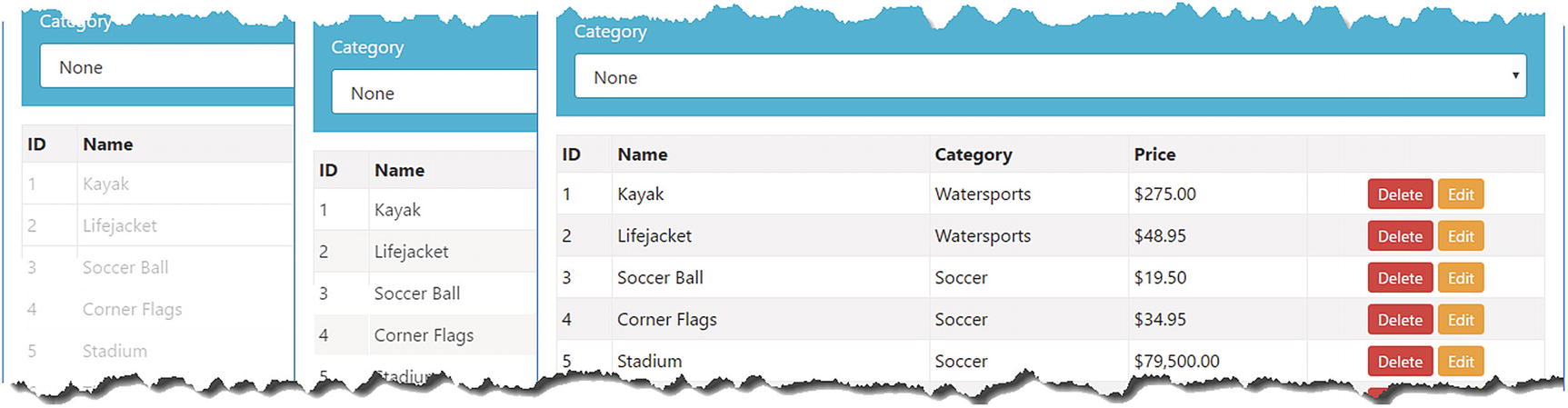
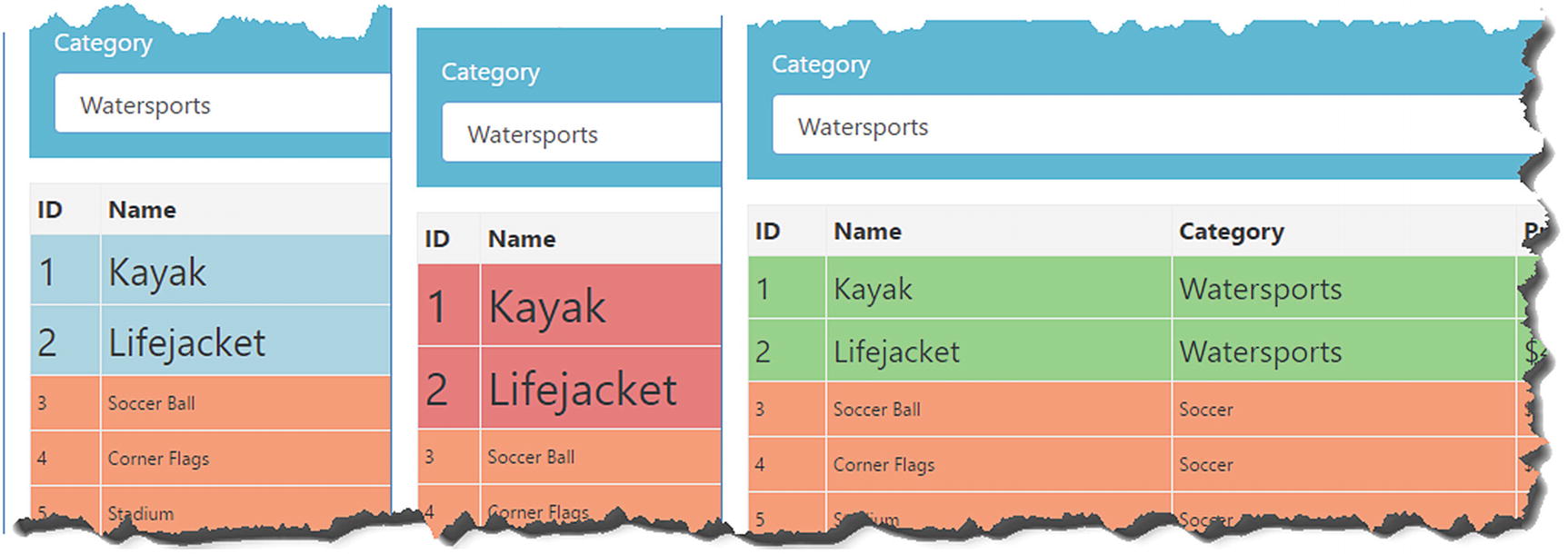
The changes in the previous section add a select element above the product table. To see the effect of the animation, restart the Angular development tools, request http://localhost:4200, and then select Soccer from the list at the top of the window. Angular will use the trigger to figure out which of the animation states each element should be applied to. Table rows for products in the Soccer category will be assigned to the selected state, while the other rows will be assigned to the notselected state, creating the effect shown in Figure 28-3.
Figure 28-3.
Selecting a product category
The new styles are applied suddenly. To see a smoother transition, select the Chess category from the list, and you will see a gradual animation as the Chess rows are assigned to the selected state and the other rows are assigned to the notselected state. This happens because the animation trigger contains transitions between these states that tell Angular to animate the change in CSS styles, as illustrated in Figure 28-4. There is no transition for the earlier change, so Angular defaults to applying the new styles immediately.
Figure 28-4.
A gradual transition between animation states
Tip
It is impossible to capture the effect of animations in a series of screenshots, and the best I can do is present some of the intermediate states. This is a feature that requires firsthand experimentation to understand. I encourage you to download the project for this chapter from GitHub and create your own animations.
To understand the Angular animation system, you need to understand the relationship between the different building blocks used to define and apply an animation, which can be described like this:
1.
Evaluating the data binding expression tells Angular which animation state the host element is assigned to.
2.
The data binding target tells Angular which animation target defines CSS styles for the element’s state.
3.
The state tells Angular which CSS styles should be applied to the element.
4.
The transition tells Angular how it should apply CSS styles when evaluating the data binding expression results in a change to the element’s state.
Keep these four points in mind as you read through the rest of the chapter, and you will find the animation system easier to understand.
Understanding the Built-in Animation States
Animation states are used to define the end result of an animation, grouping together the styles that should be applied to an element with a name that can be selected by an animation trigger. There are two built-in states that Angular provides that make it easier to manage the appearance of elements, as described in Table 28-5.
Table 28-5.
The Built-in Animation States
State
Description
*
This is a fallback state that will be applied if the element isn’t in any of the other states defined by the animation trigger.
void
Elements are in the void state when they are not part of the template. When the expression for an ngIf directive evaluates as false, for example, the host element is in the void state. This state is used to animate the addition and removal of elements, as described in the next section.
An asterisk (the * character) is used to denote a special state that Angular should apply to elements that are not in any of the other states defined by an animation trigger. Listing 28-8 adds the fallback state to the animations in the example application.
import { trigger, style, state, transition, animate } from "@angular/animations";
Using the Fallback State in the table.animations.ts File in the src/app/core Folder
In the example application, elements are assigned only to the selected or notselected state once the user has picked a value with the select element. The fallback state defines a style group that will be applied to elements until they are entered into one of the other states, as shown in Figure 28-5.
Figure 28-5.
Using the fallback state
Understanding Element Transitions
The transitions are the real power of the animation system; they tell Angular how it should manage the change from one state to another. In the sections that follow, I describe different ways in which transitions can be created and used.
Creating Transitions for the Built-in States
The built-in states described in Table 28-5 can be used in transitions. The fallback state can be used to simplify the animation configuration by representing any state, as shown in Listing 28-9.
import { trigger, style, state, transition, animate } from "@angular/animations";
Using the Void State in the table.animations.ts File in the src/app/core Folder
This listing includes a definition for the void state that sets the opacity property to zero, which makes the element transparent and, as a consequence, invisible. There is also a transition that tells Angular to animate the change from the void state to any other state. The effect is that the rows in the table fade into view as the browser gradually increases the opacity value until the fill opacity is reached, as shown in Figure 28-6.
Figure 28-6.
Animating element addition
Controlling Transition Animations
All the examples so far in this chapter have used the animate function in its simplest form, which is to specify how long a transition between two states should take, like this:
...
transition("void => *", animate("500ms"))
...
The string argument passed to the animate method can be used to exercise finer-grained control over the way that transitions are animated by providing an initial delay and specifying how intermediate values for the style properties are calculated.
EXPRESSING ANIMATION DURATIONS
Durations for animations are expressed using CSS time values, which are string values containing one or more numbers followed by either s for seconds or ms for milliseconds. This value, for example, specifies a duration of 500 milliseconds:
...
transition("void => *", animate("500ms"))
...
Durations are expressed flexibly, and the same value could be expressed as a fraction of a second, like this:
...
transition("void => *", animate("0.5s"))
...
My advice is to stick to one set of units throughout a project to avoid confusion, although it doesn’t matter which one you use.
Specifying a Timing Function
The timing function is responsible for calculating the intermediate values for CSS properties during the transition. The timing functions, which are defined as part of the Web Animations specification, are described in Table 28-6.
Table 28-6.
The Animation Timing Functions
Name
Description
linear
This function changes the value in equal amounts. This is the default.
ease-in
This function starts with small changes that increase over time, resulting in an animation that starts slowly and speeds up.
ease-out
This function starts with large changes that decrease over time, resulting in an animation that starts quickly and then slows down.
ease-in-out
This function starts with large changes that become smaller until the midway point, after which they become larger again. The result is an animation that starts quickly, slows down in the middle, and then speeds up again at the end.
Listing 28-11 applies a timing function to one of the transitions in the example application. The timing function is specified after the duration in the argument to the animate function.
import { trigger, style, state, transition, animate } from "@angular/animations";
Applying a Timing Function in the table.animations.ts File in the src/app/core Folder
Specifying an Initial Delay
An initial delay can be provided to the animate method, which can be used to stagger animations when there are multiple transitions being performed simultaneously. The delay is specified as the second value in the argument passed to the animate function, as shown in Listing 28-12.
import { trigger, style, state, transition, animate } from "@angular/animations";
Adding an Initial Delay in the table.animations.ts File in the src/app/core Folder
The 200-millisecond delay in this example corresponds to the duration of the animation used when an element transitions to the notselected state. The effect is that changing the selected category will show elements returning to the notselected state before the selected elements are changed.
Using Additional Styles During Transition
The animate function can accept a style group as its second argument, as shown in Listing 28-13. These styles are applied to the host element gradually, over the duration of the animation.
import { trigger, style, state, transition, animate } from "@angular/animations";
Defining Transition Styles in the table.animations.ts File in the src/app/core Folder
The effect of this change is that when an element is transitioning into the selected state, its appearance will be animated so that the background color will be lightblue and its font size will be 25 pixels. At the end of the animation, the styles defined by the selected state will be applied all at once, creating a snap effect.
The sudden change in appearance at the end of the animation can be jarring. An alternative approach is to change the second argument of the transition function to an array of animations. This defines multiple animations that will be applied to the element in sequence, and as long as it doesn’t define a style group, the final animation will be used to transition to the styles defined by the state. Listing 28-14 uses this feature to add two animations to the transition, the last of which will apply the styles defined by the selected state.
import { trigger, style, state, transition, animate } from "@angular/animations";
Using Multiple Animations in the table.animations.ts File in the src/app/core Folder
There are three animations in this transition, and the last one will apply the styles defined by the selected state. Table 28-7 describes the sequence of animations.
Table 28-7.
The Sequence of Animations in the Transition to the selected State
Duration
Style Properties and Values
400 milliseconds
backgroundColor: lightblue; fontSize: 25px
250 milliseconds
backgroundColor: lightcoral; fontSize: 30px
200 milliseconds
backgroundColor: lightgreen; fontSize: 20px
Pick a category using the select element to see the sequence of animations. Figure 28-7 shows one frame from each animation.
Figure 28-7.
Using multiple animations in a transition
Performing Parallel Animations
Angular is able to perform animations at the same time, which means you can have different CSS properties change over different time periods. Parallel animations are passed to the group function, as shown in Listing 28-15.
import { trigger, style, state, transition, animate, group }
Performing Parallel Animations in the table.animations.ts File in the src/app/core Folder
The listing replaces one of the animations in sequence with a pair of parallel animations. The animations for the backgroundColor and fontSize properties will be started at the same time but last for differing durations. When both of the animations in the group have completed, Angular will move on to the final animation, which will target the styles defined in the state.
Understanding Animation Style Groups
The outcome of an Angular animation is that an element is put into a new state and styled using the properties and values in the associated style group. In this section, I explain some different ways in which style groups can be used.
Tip
Not all CSS properties can be animated, and of those that can be animated, some are handled better by the browser than others. As a rule of thumb, the best results are achieved with properties whose values can be easily interpolated, which allows the browser to provide a smooth transition between element states. This means you will usually get good results using properties whose values are colors or numerical values, such as background, text and font colors, opacity, element sizes, and borders. See https://www.w3.org/TR/css3-transitions/#animatable-properties for a complete list of properties that can be used with the animation system.
Defining Common Styles in Reusable Groups
As you create more complex animations and apply them throughout your application, you will inevitably find that you need to apply some common CSS property values in multiple places. The style function can accept an array of objects, all of which are combined to create the overall set of styles in the group. This means you can reduce duplication by defining objects that contain common styles and use them in multiple style groups, as shown in Listing 28-16. (To keep the example simple, I have also removed the sequence of styles defined in the previous section.)
import { trigger, style, state, transition, animate, group } from "@angular/animations";
Defining Common Styles in the table.animations.ts File in the src/app/core Folder
The commonStyles object defines values for the border and color properties and is passed to the style function in an array along with the regular style objects. Angular processes the style objects in order, which means you can override a style value by redefining it in a later object. As an example, the second style object for the notselected state overrides the common value for the color property with a custom value. The result is that the styles for both animation states incorporate the common value for the border property, and the styles for the selected state also use the common value for the color property, as shown in Figure 28-8.
Figure 28-8.
Defining common properties
Using Element Transformations
All the examples so far in this chapter have animated properties that have affected an aspect of an element’s appearance, such as background color, font size, or opacity. Animations can also be used to apply CSS element transformation effects, which are used to move, resize, rotate, or skew an element. These effects are applied by defining a transform property in a style group, as shown in Listing 28-17.
import { trigger, style, state, transition, animate, group }
Using an Element Transformation in the table.animations.ts File in the src/app/core Folder
The value of the transform property is translateX(50%), which tells Angular to move the element 50 percent of its length along the x-axis. The transform property has been applied to the void state, which means that it will be used on elements as they are being added to the template. The animation contains a transition from the void state to any other state and tells Angular to animate the changes over 500 milliseconds. The result is that new elements will be shifted to the left initially and then slid back into their default position over a period of half a second, as illustrated in Figure 28-9.
Figure 28-9.
Transforming an element
Table 28-8 describes the set of transformations that can be applied to elements.
Table 28-8.
The CSS Transformation Functions
Function
Description
translateX(offset)
This function moves the element along the x-axis. The amount of movement can be specified as a percentage or as a length (expressed in pixels or one of the other CSS length units). Positive values translate the element to the right, negative values to the left.
translateY(offset)
This function moves the element along the y-axis.
translate(xOffset, yOffset)
This function moves the element along both axes.
scaleX(amount)
This function scales the element along the x-axis. The scaling size is expressed as a fraction of the element’s regular size, such that 0.5 reduces the element to 50 percent of the original width and 2.0 will double the width.
scaleY(amount)
This function scales the element along the y-axis.
scale(xAmount, yAmount)
This function scales the element along both axes.
rotate(angle)
This function rotates the element clockwise. The amount of rotation is expressed as an angle, such as 90deg or 3.14rad.
skewX(angle)
This function skews the element along the x-axis by a specified angle, expressed in the same way as for the rotate function.
skewY(angle)
This function skews the element along the y-axis by a specified angle, expressed in the same way as for the rotate function.
skew(xAngle, yAngle)
This function skews the element along both axes.
Tip
Multiple transformations can be applied in a single transform property by separating them with spaces, like this: transform: "scale(1.1, 1.1) rotate(10deg)".
Applying CSS Framework Styles
If you are using a CSS framework like Bootstrap, you may want to apply classes to elements, rather than having to define groups of properties. There is no built-in support for working directly with CSS classes, but the Document Object Model (DOM) and the CSS Object Model (CSSOM) provide API access to inspect the CSS stylesheets that have been loaded and to see whether they apply to an HTML element. To get the set of styles defined by classes, I created a file called animationUtils.ts to the src/app/core folder and added the code shown in Listing 28-18.
Caution
This technique can require substantial processing in an application that uses a lot of complex stylesheets, and you may need to adjust the code to work with different browsers and different CSS frameworks.
export function getStylesFromClasses(names: string | string[],
for (let i = 0; i < document.styleSheets.length; i++) {
let sheet = document.styleSheets[i] as CSSStyleSheet;
let rules = sheet.rules || sheet.cssRules;
for (let j = 0; j < rules.length; j++) {
if (rules[j].type == CSSRule.STYLE_RULE) {
let styleRule = rules[j] as CSSStyleRule;
if (elem.matches(styleRule.selectorText)) {
for (let k = 0; k < styleRule.style.length; k++) {
result[styleRule.style[k]] =
styleRule.style[styleRule.style[k]];
}
}
}
}
}
return result;
}
Listing 28-18.
The Contents of the animationUtils.ts File in the src/app/core Folder
The getStylesFromClass method accepts a single class name or an array of class names and the element type to which they should be applied, which defaults to a div element. An element is created and assigned to the classes and then inspected to see which of the CSS rules defined in the CSS stylesheets apply to it. The style properties for each matching style are added to an object that can be used to create Angular animation style groups, as shown in Listing 28-19.
import { trigger, style, state, transition, animate, group }
from "@angular/animations";
import { getStylesFromClasses } from "./animationUtils";
Using Bootstrap Classes in the table.animations.ts File in the src/app/core Folder
The selected state uses the styles defined in the Bootstrap bg-success and h2 classes, and the notselected state uses the styles defined by the Bootstrap bg-info class, producing the results shown in Figure 28-10.
Figure 28-10.
Using CSS framework styles in Angular animations
Summary
I described the Angular animation system in this chapter and explained how it uses data bindings to animate changes in the application’s state. In the next chapter, I describe the features that Angular provides to support unit testing.