
C H A P T E R 7
Creating Charts in JavaFX
Any sufficiently advanced technology is indistinguishable from magic.
—Arthur C. Clarke
Reporting is an important aspect in many business applications. The JavaFX Platform contains an API for creating charts. Because a chart is basically a node, integrating charts with other parts of a JavaFX application is straightforward. As a consequence, reporting is an integral part of the typical JavaFX Business Application.
Designing an API is often a compromise between a number of requirements. Two of the most common requirements are “make it easy” and “make it easy to extend.” The JavaFX Chart API fulfills both of these. The Chart API contains a number of methods that allow developers to change the look and feel as well as the data of the chart, making it a flexible API that can be easily extended. The default values for the settings are very reasonable though, and make it easy to integrate a chart with a custom application, with only a few lines of code.
The JavaFX Chart API in JavaFX 2.0 has six concrete implementations that are ready to be used by developers, and this number is expected to grow in subsequent releases. Also, developers can add their own implementations by extending one of the abstract classes.
Structure of the JavaFX Chart API
Different types of charts exist, and there are a number of ways to categorize them. The JavaFX Chart API distinguishes between two-axis charts and charts without an axis. The JavaFX 2.0 release contains one implementation of a no-axis chart, which is the PieChart. There are a number of two-axis charts, which all extend the abstract class XYChart, as shown in Figure 7-1.

Figure 7-1. Overview of the charts in the JavaFX Chart API
The abstract Chart class defines the setup for all charts. Basically, a chart consists of three parts: the title, legend, and content. The content is specific for each implementation of the chart, but the legend and the title concepts are similar across the implementations. Therefore, the Chart class has a number of properties with corresponding getter and setter methods that allow the manipulation of those concepts. The javadoc of the Chart class mentions the following properties.
BooleanProperty animated

ObjectProperty<Node> legend

BooleanProperty legendVisible

StringProperty title

ObjectProperty<Side> titleSide
We use some of these properties in the upcoming examples, but we also show that even without setting values for these properties, the Chart API allows you to create nice charts.
Inasmuch as Chart extends Region, Parent, and Node, all of the properties and methods available on these classes can be used on a Chart as well. One of the benefits is that the same CSS styling techniques that are used to add style information to JavaFX Nodes also apply to JavaFX Charts.
The JavaFX CSS Reference Guide, available at http://docs.oracle.com/javafx/2.0/api/javafx/scene/doc-files/cssref.html, contains an overview of CSS properties that can be altered by designers and developers. By default, the caspian stylesheet that comes with the JavaFX 2.0 Runtime is used to skin JavaFX Charts. For more information on using CSS styles in JavaFX Chart, we refer to the Oracle Chart tutorial at http://docs.oracle.com/javafx/2.0/charts/css-styles.htm.
Using the JavaFX PieChart
A PieChart renders information in a typical pie structure, where the sizes of the slices are proportional to the values of the data. Before diving into the details, we show a small application that renders a PieChart.
The Simple Example
Our example shows the “market share” of a number of programming languages, based on the TIOBE index in December 2011. The TIOBE Programming Community Index is available at www.tiobe.com/index.php/content/paperinfo/tpci/index.html, and it provides an indication of the popularity of programming languages, based on search engine traffic. A screenshot of the ranking in December 2011 is shown in Figure 7-2.
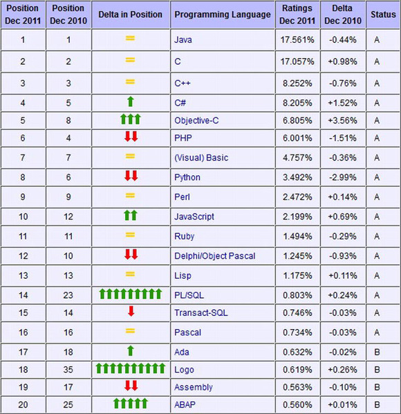
Figure 7-2. Screenshot of the TIOBE index in December 2011, taken from www.tiobe.com/index.php/content/paperinfo/tpci/index.html
![]() Note The algorithm used by TIOBE is described at
Note The algorithm used by TIOBE is described at www.tiobe.com/index.php/content/paperinfo/tpci/tpci_definition.htm. The scientific value of the numbers is out of scope for our examples.
Listing 7-1 contains the code for the example.
Listing 7-1. Rendering the TIOBE Index in a PieChart
import javafx.application.Application;

import javafx.collections.FXCollections;

import javafx.collections.ObservableList;

import javafx.scene.Scene;

import javafx.scene.chart.PieChart;

import javafx.scene.chart.PieChart.Data;

import javafx.scene.layout.StackPane;

import javafx.stage.Stage;


public class ChartApp1 extends Application {


    public static void main(String[] args) {

        launch(args);

    }


    @Override

    public void start(Stage primaryStage) {

        PieChart pieChart = new PieChart();

        pieChart.setData(getChartData());


        primaryStage.setTitle("PieChart");

        StackPane root = new StackPane();

        root.getChildren().add(pieChart);

        primaryStage.setScene(new Scene(root, 400, 250));

        primaryStage.show();

    }


    private ObservableList<PieChart.Data> getChartData() {

        ObservableList<PieChart.Data> answer = FXCollections.observableArrayList();

        answer.addAll(new PieChart.Data("java", 17.56),

                new PieChart.Data("C", 17.06),

                new PieChart.Data("C++", 8.25),

                new PieChart.Data("C#", 8.20),

                new PieChart.Data("ObjectiveC", 6.8),

                new PieChart.Data("PHP", 6.0),

                new PieChart.Data("(Visual)Basic", 4.76),

                new PieChart.Data("Other", 31.37));

        return answer;

    }

}
The result of running this example is shown in Figure 7-3.
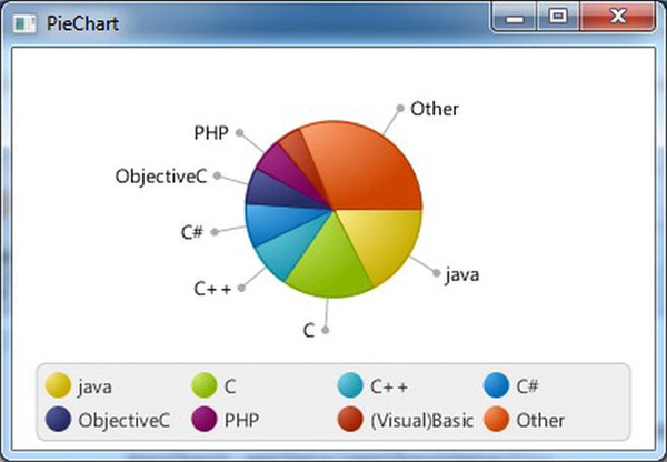
Figure 7-3. Rendering the TIOBE index in a PieChart
With only a limited amount of code, we can render data in a PieChart. Before we make modifications to this example, we explain the different parts.
The code required for setting up the Application, the Stage, and the Scene is covered in Chapter 1. A PieChart extends a Node, so we can easily add it to the scene graph. The first two lines of code in the start method create the PieChart, and add the required data to it:
        PieChart pieChart = new PieChart();

        pieChart.setData(getChartData());
The data, which are of type ObservableList<PieChart.Data> are obtained from the getChartData() method and for our example, it contains static data. As the return type of the getChartData() method specifies, the returned data are an ObservableList of PieChart.Data.
An instance of PieChart.Data, which is a nested class of PieChart, contains the information required to draw one slice of the pie. PieChart.Data has a constructor that takes the name of the slice and its value:
PieChat.Data(String name, double value)
We use this constructor to create data elements containing the name of a programming language and its score in the TIOBE index.
new PieChart.Data("java", 17.56)
And we add those elements to the ObservableList<PieChart.Data> we need to return.
Some Modifications
Although the result of the simple example already looks good, we can tweak both the code and the rendering. First of all, the example uses two lines of code for creating the PieChart and populating it with data:
        PieChart pieChart = new PieChart();

        pieChart.setData(getChartData());
Because PieChart has a single argument constructor as well, the preceding code snippets can be replaced as follows.
PieChart pieChart = new PieChart(getChartData());
We can also use the builder pattern, using the PieChartBuilder class:
PieChart pieChart = PieChartBuilder.create().data(getChartData()).build();
These modifications do not alter the output, and it is up to the developer to choose whether to use the builder pattern or to manipulate the properties using the JavaBeans pattern.
Apart from the properties defined on the abstract Chart class, a PieChart has the following properties.
- BooleanProperty clockwise
- ObjectProperty<ObservableList<PieChart.Data>> data
- DoubleProperty labelLineLength
- BooleanProperty labelsVisible
- DoubleProperty startAngle
We covered the data property in the previous section. Some of the other properties are demonstrated in the next code snippet. Listing 7-2 contains a modified version of the start() method.
Listing 7-2. Modified Version of the PieChart Example
  public void start(Stage primaryStage) {

    PieChart pieChart = new PieChart();

    pieChart.setData(getChartData());

    pieChart.setTitle("Tiobe index");

    pieChart.setLegendSide(Side.LEFT);

    pieChart.setClockwise(false);

    pieChart.setLabelsVisible(false);


    primaryStage.setTitle("Chart App 2");


    StackPane root = new StackPane();

    root.getChildren().add(pieChart);

    primaryStage.setScene(new Scene(root, 300, 250));

    primaryStage.show();

  }
Running this modified version results in the modified output in Figure 7-4.
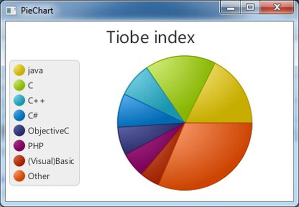
Figure 7-4. The output of the modified PieChart example
By changing a few lines of code, the output looks very different. We go over the changes we made in a bit more detail. First, we added a title to the chart. That was done using the call
pieChart.setTitle("Tiobe index");
We could also have used the builder pattern:
PieChartBuilder.create().title("Tiobe index")
Or we could have used the titleProperty:
pieChart.titleProperty().set("Tiobe index");
The three approaches result in the same output.
![]() Note The upcoming modifications could also be done using the same patterns. We only document the approach with setter methods, but it is easy to replace this with the builder pattern or with a property-based approach.
Note The upcoming modifications could also be done using the same patterns. We only document the approach with setter methods, but it is easy to replace this with the builder pattern or with a property-based approach.
The next line of code in our modified example changing the location of the legend:
pieChart.setLegendSide(Side.LEFT);
When the legendSide is not specified, the legend is shown at the default location, which is below the chart. The title and the legendSide are both properties that belong to the abstract Chart class. As a consequence, they can be set on any chart. The next line in our modified example modifies a property that is specific to a PieChart:
pieChart.setClockwise(false);
By default, the slices in a PieChart are rendered clockwise. By setting this property to false, the slices are rendered counterclockwise. We also disabled showing the labels in the PieChart. The labels are still shown in the legend, but they do not point to the individual slices anymore. This is achieved by the following line of code:
pieChart.setLabelsVisible(false);
All layout changes so far are done programmatically. It is also possible to style applications in general and charts in particular using a CSS stylesheet.
We remove the layout changes from the Java code, and add a stylesheet containing some layout instructions. Listing 7-3 shows the modified code of the start() method and Listing 7-4 contains the stylesheet we added.
Listing 7-3. Remove Programmatic Layout Instructions
    public void start(Stage primaryStage) {

        PieChart pieChart = new PieChart();

        pieChart.setData(getChartData());

        pieChart.titleProperty().set("Tiobe index");

        pieChart.setLegendSide(Side.LEFT);


        primaryStage.setTitle("PieChart");

        StackPane root = new StackPane();

        root.getChildren().add(pieChart);

        Scene scene = new Scene (root, 400, 250);


scene.getStylesheets().add(ChartApp2css.class.getResource("chartapp2.css").toExternalForm());


        primaryStage.setScene(scene);

        primaryStage.show();

    }
Listing 7-4. Stylesheet for PieChart Example
.chart {

    -fx-clockwise: false;

    -fx-pie-label-visible: true;

    -fx-label-line-length: 5;

    -fx-start-angle: 90;

}


.default-color0.chart-pie {

    -fx-pie-color: blue;

}
.default-color1.chart-pie {

    -fx-pie-color: yellow;

}


.chart-legend {

   -fx-background-color: #f0e68c;

   -fx-stroke: #696969;

}
Running this code results in the output shown in Figure 7-5.
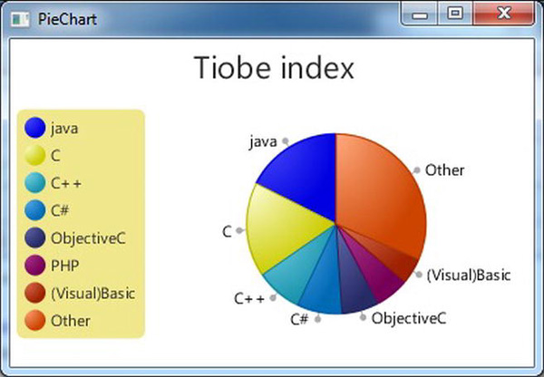
Figure 7-5. Using CSS to style the PieChart
We now go over the changes we made. Before we go over the individual changes in detail, we show how we include the CSS with our application. This is achieved by adding the stylesheet to the scene, which is done as follows.
scene.getStylesheets().add(ChartApp2css.class.getResource("chartapp2.css").toExternalForm());
In Listing 7-2, we set the clockwise configuration using
pieChart.setClockwise(false)
We removed that line from the code in Listing 7-3, and instead defined the -fx-clockwise-property on the chart class in the stylesheet:
.chart {

    -fx-clockwise: false;

    -fx-pie-label-visible: true;

    -fx-label-line-length: 5;

    -fx-start-angle: 90;

}
In that same .chart class definition, we make the labels on the pie visible by setting -fx-pie-label-visible property to true, and we specify the length of the lines for each label to be 5.
Also, we rotate the whole pie by 90 degrees, which is achieved by defining the -fx-start-angle property. The labels are now defined in the stylesheet, and we remove the corresponding definition from the code by omitting the following line.
pieChart.setLabelsVisible(false)
By default, a PieChart uses the default colors defined in the caspian stylesheet. The first slice is filled with default-color0, the second slice with default-color1, and so on. The easiest way to change the color of the different slices is by overriding the definitions of the default color. In our stylesheet, this is done by
.default-color0.chart-pie {

    -fx-pie-color: blue;

}
The same can be done for the other slices.
Finally, we changed the background and the stroke of the legend. This is achieved by overriding the chart-legend class as follows.
.chart-legend {

   -fx-background-color: #f0e68c;

   -fx-stroke: #696969;

}
Again, we refer the reader to http://docs.oracle.com/javafx/2.0/charts/css-styles.htm for more information about using CSS with JavaFX charts.
Using the XYChart
The XYChart class is an abstract class with five direct known subclasses. The difference between these classes and the PieChart class is that an XYChart has two axes and an optional alternativeColumn or alternativeRow. This translates to the following list of additional properties on an XYChart.
- BooleanProperty alternativeColumnFillVisible
- BooleanProperty alternativeRowFillVisible
- ObjectProperty<ObservableList<XYChart.Series<X,Y>>> data
- BooleanProperty horizontalGridLinesVisible
- BooleanProperty horizontalZeroLineVisible
- BooleanProperty verticalGridLinesVisible
- BooleanProperty verticalZeroLineVisible
Data in an XYChart are ordered in series. How these series are rendered is specific to the implementation of the subclass of XYChart. In general, a single element in a series contains a number of pairs. The following examples use a hypothetical projection of market share of three programming languages in the future. We start with the TIOBE index for Java, C, and C++ in 2011, and add random values (between –2 and +2) to them for each year until 2020. The resulting (year, number) pairs for Java constitute the Java Series, and the same holds for C and C++. As a result, we have three series, each containing 10 pairs.
A major difference between a PieChart and an XYChart is the presence of an x axis and a y axis in the XYChart. These axes are required when creating an XYChart, as can be observed from the following constructor.
XYChart (Axis<X> xAxis, Axis<Y> yAxis)
The Axis class is an abstract class extending Region (hence also extending Parent and Node) with two subclasses: CategoryAxis and ValueAxis. The CategoryAxis is used to render labels that are in the String format, as can be observed from the class definition:
public class CategoryAxis extends Axis<java.lang.String>
The ValueAxis is used to render data entries that represent a Number. It is an abstract class itself, defined as follows.
public abstract class ValueAxis <T extends java.lang.Number> extends Axis<T>
The ValueAxis class has one concrete subclass, which is the NumberAxis:
public final class NumberAxis extends ValueAxis<java.lang.Number>
The differences between those Axis classes become clear throughout the examples.
We now show some examples of the different XYChart implementations, starting with the ScatterChart. Some features common to all XYCharts are also explained in the section on ScatterChart.
Using the ScatterChart
An instance of the ScatterChart class is used to render data where each data item is represented as a symbol in a two-dimensional area. As mentioned in the previous section, we will render a chart containing 3 series of data, representing the hypothetical evolution of the TIOBE index for, respectively, Java, C, and C++. We first show the code of a naive implementation, and refine that to something more useful.
A Simple Implementation
A first implementation of our application using a ScatterChart is shown in Listing 7-5.
Listing 7-5. First Implementation of Rendering Data in a ScatterChart
import javafx.application.Application;

import javafx.collections.FXCollections;

import javafx.collections.ObservableList;

import javafx.scene.Scene;

import javafx.scene.chart.NumberAxis;

import javafx.scene.chart.ScatterChart;
import javafx.scene.chart.XYChart;

import javafx.scene.chart.XYChart.Series;

import javafx.scene.layout.StackPane;

import javafx.stage.Stage;


public class ChartApp3 extends Application {


    public static void main(String[] args) {

        launch(args);

    }


    @Override

    public void start(Stage primaryStage) {

        NumberAxis xAxis = new NumberAxis();

        NumberAxis yAxis = new NumberAxis();

        ScatterChart scatterChart = new ScatterChart(xAxis, yAxis);

        scatterChart.setData(getChartData());

        primaryStage.setTitle("Chart App 3");


        StackPane root = new StackPane();

        root.getChildren().add(scatterChart);

        primaryStage.setScene(new Scene(root, 400, 250));

        primaryStage.show();

    }


    private ObservableList<XYChart.Series<Integer, Double>> getChartData() {

        double javaValue = 17.56;

        double cValue = 17.06;

        double cppValue = 8.25;

        ObservableList<XYChart.Series<Integer, Double>> answer = FXCollections.observableArrayList();

        Series<Integer, Double> java = new Series<Integer, Double>();

        Series<Integer, Double> c = new Series<Integer, Double>();

        Series<Integer, Double> cpp = new Series<Integer, Double>();

        for (int i = 2011; i < 2021; i++) {

            java.getData().add(new XYChart.Data(i, javaValue));

            javaValue = javaValue + 4 * Math.random() - 2;

            c.getData().add(new XYChart.Data(i, cValue));

            cValue = cValue + Math.random() - .5;

            cpp.getData().add(new XYChart.Data(i, cppValue));

            cppValue = cppValue + 4 * Math.random() - 2;

        }

        answer.addAll(java, c, cpp);

        return answer;

    }

}
Executing this application results in the image shown in Figure 7-6.
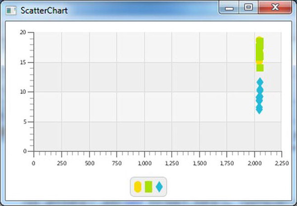
Figure 7-6. The result of the naive implementation of the ScatterChart
Although the chart shows the required information, it is not very readable. We add a number of enhancements, but we first have a deeper look at the different parts of the code.
Similar to the PieChart example, we created a separate method for obtaining the data. One of the reasons for this is that in real-world applications, it is unlikely to have static data. By isolating the data retrieval in a separate method, it becomes easier to change the way data are obtained.
A single data point is defined by an instance of XYChart.Data<Integer, Double>, created with the constructor XYChart.Data(Integer i, Double d) where the parameters have the following definitions.
i: Integer, representing a specific year (between 2011 and 2020)

d: Double, representing the hypothetical TIOBE index for the particular series in the year specified by I
The local variables javaValue, cValue, and cppValue are used for keeping track of the scores for the different programming languages. They are initialized with the real values from 2011. Each year, an individual score is incremented or decremented by a random value between –2 and +2. Data points are stacked into a series. In our examples, we have three series each containing 10 instances of XYChart.Data<Integer, Double>. Those series are of type XYChart.Series<Integer, Double>.
The data entries are added to the respective series by calling
java.getData().add (...)

c.getData().add(...)
and
cpp.getData().add(...)
Finally, all series are added to the ObservableList<XYChart.Series<Integer, Double>> and returned.
The start() method of the application contains the functionality required for creating and rendering the ScatterChart, and for populating it with the data obtained from the getChartData method.
![]() Note As discussed earlier in the PieChart section, we can use different patterns here. We used the JavaBeans pattern in the examples, but we could also use properties or the Builder pattern.
Note As discussed earlier in the PieChart section, we can use different patterns here. We used the JavaBeans pattern in the examples, but we could also use properties or the Builder pattern.
In order to create a ScatterChart, we need to create an xAxis and a yAxis. In our first, simple, implementation, we use two instances of NumberAxis for this:
        NumberAxis xAxis = new NumberAxis();

        NumberAxis yAxis = new NumberAxis();
Apart from calling the following ScatterChart constructor, there is nothing different in this method than in the case of the PieChart.
ScatterChart scatterChart = new ScatterChart(xAxis, yAxis);Improving the Simple Implementation
One of the first observations when looking at Figure 7-5 is that all data plots in a series are almost rendered on top of each other. The reason for this is clear: the x-Axis starts at 0 and ends at 2250. By default, the NumberAxis determines its range automatically. We can overrule this behavior by setting the autoRanging property to false, and by providing values for the lowerBound and the upperBound. If we replace the constructor for the xAxis in the original example by the following code snippet,
        NumberAxis xAxis = new NumberAxis();

        xAxis.setAutoRanging(false);

        xAxis.setLowerBound(2011);

        xAxis.setUpperBound(2021);
the resulting output will look as shown in Figure 7-7.
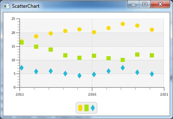
Figure 7-7. Defining the behavior of the xAxis
Next, we want to add a title to the chart, and we want to have names near the symbols in the legend node. Adding a title to the chart is no different from adding a title to the PieChart and is achieved by the code:
scatterChart.setTitle("Speculations");
By adding a name to the three instances of XYChart.Series, we add labels to the symbols in the legend node. The relevant part of the getChartData method becomes
        Series<Integer, Double> java = new Series<Integer, Double>();

        Series<Integer, Double> c = new Series<Integer, Double>();

        Series<Integer, Double> cpp = new Series<Integer, Double>();

        java.setName("java");

        c.setName("C");

        cpp.setName("C++");
Running the application again after applying both changes results in the output shown in Figure 7-8.
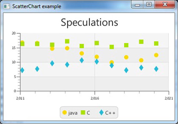
Figure 7-8. ScatterChart with a title and named symbols
Until now, we used a NumberAxis for the xAxis. Inasmuch as years can be represented as Number instances, that works. However, because we don't do any numerical operation on the years, and because the distance between consecutive data entries is always one year, we can as well use a String value to represent this information.
We now modify the code in order to work with a CategoryAxis for the xAxis. Changing the xAxis from a NumberAxis to a CategoryAxis also implies that the getChartData() method should return an instance of ObservableList<XYChart.Series<String, Double>> and that implies that the different elements in a single Series should have the type XYChart.Data<String, Double>.
In Listing 7-6, the original code has been modified to use the CategoryAxis.
Listing 7-6. Using CategoryAxis Instead of NumberAxis for the xAxis
import javafx.application.Application;

import javafx.collections.FXCollections;

import javafx.collections.ObservableList;

import javafx.scene.Scene;

import javafx.scene.chart.CategoryAxis;

import javafx.scene.chart.NumberAxis;

import javafx.scene.chart.ScatterChart;

import javafx.scene.chart.XYChart;

import javafx.scene.chart.XYChart.Series;

import javafx.scene.layout.StackPane;

import javafx.stage.Stage;
public class ChartApp6 extends Application {


    public static void main(String[] args) {

        launch(args);

    }


    @Override

    public void start(Stage primaryStage) {

        CategoryAxis xAxis = new CategoryAxis();

        NumberAxis yAxis = new NumberAxis();

        ScatterChart scatterChart = new ScatterChart(xAxis, yAxis);

        scatterChart.setData(getChartData());

        scatterChart.setTitle("speculations");

        primaryStage.setTitle("ScatterChart example");


        StackPane root = new StackPane();

        root.getChildren().add(scatterChart);

        primaryStage.setScene(new Scene(root, 400, 250));

        primaryStage.show();

    }


    private ObservableList<XYChart.Series<String, Double>> getChartData() {

        double javaValue = 17.56;

        double cValue = 17.06;

        double cppValue = 8.25;

        ObservableList<XYChart.Series<String, Double>> answer = FXCollections.observableArrayList();

        Series<String, Double> java = new Series<String, Double>();

        Series<String, Double> c = new Series<String, Double>();

        Series<String, Double> cpp = new Series<String, Double>();

        java.setName("java");

        c.setName("C");

        cpp.setName("C++");


        for (int i = 2011; i < 2021; i++) {

            java.getData().add(new XYChart.Data(Integer.toString(i), javaValue));

            javaValue = javaValue + 4 * Math.random() - .2;

            c.getData().add(new XYChart.Data(Integer.toString(i), cValue));

            cValue = cValue + 4 * Math.random() - 2;

            cpp.getData().add(new XYChart.Data(Integer.toString(i), cppValue));

            cppValue = cppValue + 4 * Math.random() - 2;

        }

        answer.addAll(java, c, cpp);

        return answer;

    }

}
Running the modified application results in the output shown in Figure 7-9.
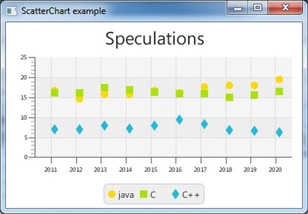
Figure 7-9. Using a ScatterChart with a CategoryAxis on the xAxis
Before we move on to the LineChart, we show how to use the alternativeRowFillVisible and alternativeColumnVisible properties. As you can observe from Figure 7-9, two consecutive horizontal rows (between the major tickmarks on the axis) have slightly different colors. No such difference is observed in the columns, though. By adding the following lines of code to Listing 7-6, that behavior will be reversed.
        scatterChart.setAlternativeRowFillVisible(false);

        scatterChart.setAlternativeColumnFillVisible(true);
These two statements define that there should not be a difference between consecutive rows, but there should be a difference in the background color of consecutive columns. Running the example again after adding those two lines of code gives the output shown in Figure 7-10.
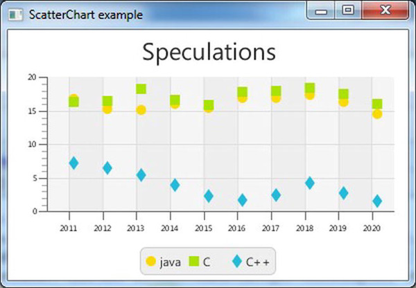
Figure 7-10. Using similar fill values for rows and different fill values for columns
![]() Note The appearance of the alternative rows can be defined by overriding the chart-alternative-row-fill class in a CSS stylesheet.
Note The appearance of the alternative rows can be defined by overriding the chart-alternative-row-fill class in a CSS stylesheet.
Using the LineChart
The example in the previous section resulted in data entries being represented by single dots or symbols. Often, it is desirable to have the dots connected by a line because this helps in seeing trends. The JavaFX LineChart is well suited for this.
The API for the LineChart has many methods in common with the API for the ScatterChart. In fact, we can reuse most of the code in Listing 7-6, and just replace the ScatterChart occurrences with LineChart. The data stay exactly the same, so we only show the new start() method in Listing 7-7.
Listing 7-7. Using a LineChart Instead of a ScatterChart
    public void start(Stage primaryStage) {

        CategoryAxis xAxis = new CategoryAxis();

        NumberAxis yAxis = new NumberAxis();

        LineChart lineChart = new LineChart(xAxis, yAxis);

        lineChart.setData(getChartData());

        lineChart.setTitle("speculations");

        primaryStage.setTitle("LineChart example");
        StackPane root = new StackPane();

        root.getChildren().add(lineChart);

        primaryStage.setScene(new Scene(root, 400, 250));

        primaryStage.show();

    }
Running this application gives the output shown in Figure 7-11.
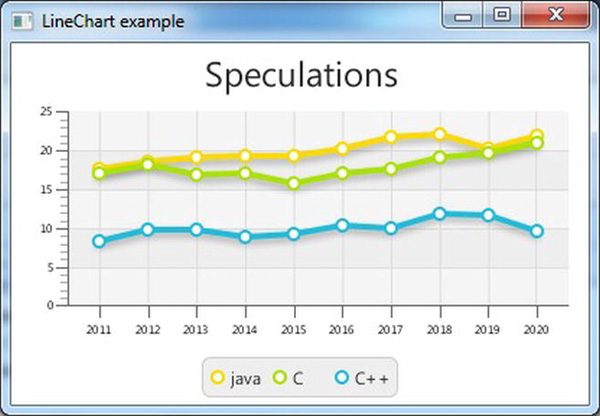
Figure 7-11. Using a LineChart for displaying trends
Most of the functionality available for the ScatterChart is also available for the LineChart. Changing the location of the legend, adding or removing a title, and using a NumberAxis instead of a CategoryAxis are very well possible using the LineChart.
Using the BarChart
A BarChart is capable of rendering the same data as a ScatterChart and a LineChart, but it looks different. In a BarChart, the focus is often more on showing the relative differences between the different series for a given category. In our case, that means that we focus on the differences between the values for Java, C, and C++.
Again, we do not need to modify the method that returns our data. Indeed, a BarChart requires a CategoryAxis for its xAxis, and we already modified the getChartData() method to return an ObservableList containing XYChart.Series<String, double>. Starting from Listing 7-6, we change only the occurrences of ScatterChart with BarChart and we obtain Listing 7-8.
Listing 7-8. Using a BarChart Instead of a ScatterChart
    public void start(Stage primaryStage) {

        CategoryAxis xAxis = new CategoryAxis();

        NumberAxis yAxis = new NumberAxis();

        BarChart barChart = new BarChart(xAxis, yAxis);

        barChart.setData(getChartData());

        barChart.setTitle("speculations");

        primaryStage.setTitle("BarChart example");


        StackPane root = new StackPane();

        root.getChildren().add(barChart);

        primaryStage.setScene(new Scene(root, 400, 250));

        primaryStage.show();

    }
The result of this application is shown in Figure 7-12.

Figure 7-12. Using BarChart for highlighting differences between the values
Although the result indeed shows the differences between the values for each year, it is not very clear because the bars are rather small. With a total scene width at 400 pixels, there is not much space to render large bars. However, the BarChart API contains methods to define the inner gap between bars, and the gap between categories. In our case, we want a smaller gap between the bars, for example, one pixel. This is done by calling
barChart.setBarGap(1);
Adding this single line of code to the start method and rerunning the application results in the output shown in Figure 7-13.
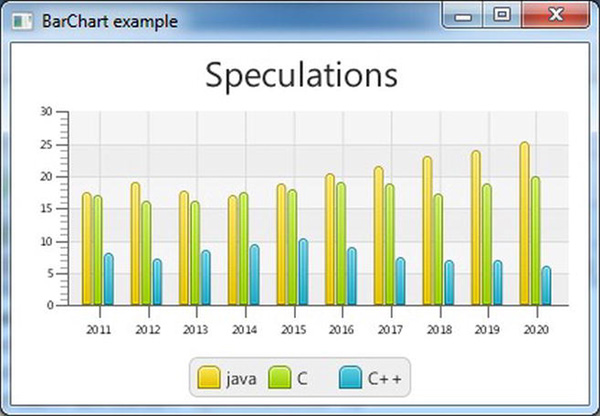
Figure 7-13. Setting the gap between bars to one pixel
Clearly, this one line of code leads to a huge difference in readability.
Using the AreaChart
In some cases, it makes sense to fill the area under the line connecting the dots. Although the same data are rendered as in the case of a LineChart, the result looks different. Listing 7-9 contains the modified start() method that uses an AreaChart instead of the original ScatterChart. As in the previous modifications, we didn't change the getChartData() method.
Listing 7-9. Using an AreaChart Instead of a ScatterChart
  @Override

    public void start(Stage primaryStage) {

        CategoryAxis xAxis = new CategoryAxis();

        NumberAxis yAxis = new NumberAxis();

        AreaChart areaChart = new AreaChart(xAxis, yAxis);

        areaChart.setData(getChartData());

        areaChart.setTitle("speculations");

        primaryStage.setTitle("AreaChart example");
        StackPane root = new StackPane();

        root.getChildren().add(areaChart);

        primaryStage.setScene(new Scene(root, 400, 250));

        primaryStage.show();

    }
Running this application results in the output shown in Figure 7-14.
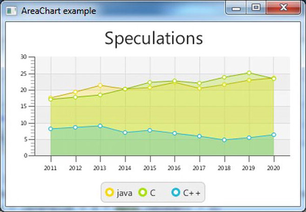
Figure 7-14. Rendering area plots using AreaChart
Using the BubbleChart
The last implementation of the XYChart is a special one. The BubbleChart does not contain properties that are not already on the XYChart class, but it is the only direct implementation in the current JavaFX Chart API that uses the additional parameter on the XYChart.Data class.
We first modify the code in Listing 7-6 to use the BubbleChart instead of the ScatterChart. Because by default, bubbles are stretched when the span on the xAxis is much different from the span on the yAxis, we do not use years, but a tenth of a year as the value on the xAxis. Doing so, we have a span of 100 units on the xAxis (10 years) compared with a span of about 30 units on the yAxis. This is also more or less the ratio between the width and the height of our chart. As a consequence, the bubbles are relatively circular.
Listing 7-10 contains the code for rendering a BubbleChart.
Listing 7-10. Using the BubbleChart
import javafx.application.Application;

import javafx.collections.FXCollections;

import javafx.collections.ObservableList;

import javafx.scene.Scene;

import javafx.scene.chart.*;

import javafx.scene.chart.XYChart.Series;

import javafx.scene.layout.StackPane;

import javafx.stage.Stage;

import javafx.util.StringConverter;


public class ChartApp10 extends Application {


    public static void main(String[] args) {

        launch(args);

    }


    @Override

    public void start(Stage primaryStage) {

        NumberAxis xAxis = new NumberAxis();

        NumberAxis yAxis = new NumberAxis();

        yAxis.setAutoRanging(false);

        yAxis.setLowerBound(0);

        yAxis.setUpperBound(30);

        xAxis.setAutoRanging(false);

        xAxis.setAutoRanging(false);

        xAxis.setLowerBound(20110);

        xAxis.setUpperBound(20201);

        xAxis.setTickUnit(10);

        xAxis.setTickLabelFormatter(new StringConverter<Number>() {


            @Override

            public String toString(Number n) {

                return String.valueOf(n.intValue() / 10);

            }


            @Override

            public Number fromString(String s) {

                return Integer.valueOf(s) * 10;

            }

        });

        BubbleChart bubbleChart = new BubbleChart(xAxis, yAxis);

        bubbleChart.setData(getChartData());

        bubbleChart.setTitle("Speculations");

        primaryStage.setTitle("BubbleChart example");
        StackPane root = new StackPane();

        root.getChildren().add(bubbleChart);

        primaryStage.setScene(new Scene(root, 400, 250));

        primaryStage.show();

    }


    private ObservableList<XYChart.Series<Integer, Double>> getChartData() {

        double javaValue = 17.56;

        double cValue = 17.06;

        double cppValue = 8.25;

        ObservableList<XYChart.Series<Integer, Double>> answer = FXCollections.observableArrayList();

        Series<Integer, Double> java = new Series<Integer, Double>();

        Series<Integer, Double> c = new Series<Integer, Double>();

        Series<Integer, Double> cpp = new Series<Integer, Double>();

        java.setName("java");

        c.setName("C");

        cpp.setName("C++");

        for (int i = 20110; i < 20210; i = i + 10) {

            double diff = Math.random();

            java.getData().add(new XYChart.Data(i, javaValue));

            javaValue = Math.max(javaValue + 4 * diff - 2, 0);

            diff = Math.random();

            c.getData().add(new XYChart.Data(i, cValue));

            cValue = Math.max(cValue + 4 * diff - 2, 0);

            diff = Math.random();

            cpp.getData().add(new XYChart.Data(i, cppValue));

            cppValue = Math.max(cppValue + 4 * diff - 2, 0);

        }

        answer.addAll(java, c, cpp);

        return answer;

    }


}
The xAxis ranges from 20110 till 20210, but of course we want to show the years at the axis. This can be achieved by calling
xAxis.setTickLabelFormatter(new StringConverter<Number>() {

 …

}
where the StringConverter we supply converts the numbers we use (e.g., 20150) to Strings (e.g., 2015) and vice versa. Doing so, we are able to use whatever quantity we want for calculating the bubbles and still have a nice way of formatting the labels. Running this example results in the code shown in Figure 7-15.

Figure 7-15. Using a BubbleChart with fixed radius
Until now, we didn't leverage the three-argument constructor of XYChart.Data. Apart from the two-argument constructor that we are already familiar with,
XYChart.Data (X xValue, Y yValue)
XYChart.Data also has a three-argument constructor:
XYChart.Data (X xValue, Y yValue, Object extraValue)
The extraValue argument can be of any type. This allows for developers to implement their own subclasses of XYChart that take advantage of additional information that can be enclosed inside a single data element. The BubbleChart implementation uses this extraValue for deciding how large the bubbles should be rendered.
We now modify the getChartData() method to use the three-argument constructor. The xValue and yValue parameters are still the same as in the previous listing, but we now add a third parameter that indicates an upcoming trend. The larger this parameter is, the bigger the rise in the next year. The smaller the parameter is, the bigger the drop in the next year. The modified getChartData() method is shown in Listing 7-11.
Listing 7-11. Using a Three-Argument Constructor for XYChart.Data Instances
    private ObservableList<XYChart.Series<Integer, Double>> getChartData() {

        double javaValue = 17.56;

        double cValue = 17.06;

        double cppValue = 8.25;

        ObservableList<XYChart.Series<Integer, Double>> answer = FXCollections.observableArrayList();

        Series<Integer, Double> java = new Series<Integer, Double>();
        Series<Integer, Double> c = new Series<Integer, Double>();

        Series<Integer, Double> cpp = new Series<Integer, Double>();

        java.setName("java");

        c.setName("C");

        cpp.setName("C++");

        for (int i = 20110; i < 20210; i =  i+10) {

            double diff = Math.random();

            java.getData().add(new XYChart.Data(i, javaValue, 2*diff));

            javaValue = Math.max(javaValue + 4*diff - 2,0);

            diff = Math.random();

            c.getData().add(new XYChart.Data(i, cValue,2* diff));

            cValue = Math.max(cValue + 4*diff - 2,0);

            diff = Math.random();

            cpp.getData().add(new XYChart.Data(i, cppValue, 2*diff));

            cppValue = Math.max(cppValue + 4*diff - 2,0);

        }

        answer.addAll(java, c, cpp);

        return answer;

    }
Integrating this method with the start() method in Listing 7-10 results in the output shown in Figure 7-16.

Figure 7-16. Adding variations in the size of the Bubbles
Summary
The JavaFX Chart API provides a number of ready-to-use implementations for different chart types. Each of these implementations serves a different purpose, and it is up to the developer to choose the most appropriate Chart.
Modifying a Chart and tuning it for a specific application can be done by applying CSS rules or by using Chart-specific methods or properties. If you prefer to use the Builder pattern, you can use this as well because a corresponding Builder class exists for all existing concrete subclasses of Chart.
In case you need a more customized Chart, you can extend the abstract Chart class and take advantage of the existing properties on that class, or you can extend the abstract XYChart class in case your chart requires two axes.
Resources
For more information on the JavaFX Chart API, consult the following resources.