
Mobile JavaScript Development
Of all the technological advances in recent years, few have had the reach and effect that the mobile smartphone and tablet revolution has had. Industry trends indicate that desktop computer sales are on the decline, while mobile device adoption is growing at breakneck speed. For many, the web is accessed more frequently on small screen devices than on desktop machines. We need to ensure that we keep up with this change, adapting our websites and applications to the needs of our users, many of whom will soon be familiar with a World Wide Web that they access through their fingers.
In this chapter, we will learn the constraints of web development for mobile devices and how to overcome these, how to access data from the sensors on board these devices through JavaScript, how to deal with network problems and poor connections, and, finally, how to adapt our JavaScript to suit websites adopting the principle and techniques of Responsive Design.
The Constraints of Mobile Web Development
With a device so much smaller than a desktop computer, it’s not hard to believe that some compromises are made in the design and construction of a mobile device. Some of these compromises are related to the technology within the device itself, and some are a knock-on effect of the networks used to transfer data between the device and its nearest cell tower or WiFi network. Understanding these constraints allows us to adapt our website and application development to minimize their effect and produce the best experience for our end users.
At the time of writing, most smartphone batteries give their owners a day or two of battery life under normal conditions. Performance-intensive apps and websites can drain battery levels over and above the standard power draw of running the device idle.
We need to construct the code in our websites and applications to have the least impact on battery life possible. This involves updating the display area of the page as infrequently as possible, and executing the least amount of JavaScript possible to deliver the desired user experience. Avoid using JavaScript to perform animations and transitions on the page; where these are essential, use CSS3 transitions (http://bit.ly/css_trans) and animations (http://bit.ly/css_anims) instead, which are far more CPU-efficient, sparing battery usage. If you intend to access data from the mobile device’s sensors, such as geolocation or orientation, only access these values sporadically and only for the duration you actually need to, disconnecting any event listeners in your code at the point in which you no longer need access to the data. Use the principle of event framing discussed in Chapter 4 to execute less code when sensor data changes frequently.
Network Bandwidth Speeds And Latency
You might not be surprised to learn that the speeds advertised by mobile network providers don’t always match up with reality. The truth is that connection speeds on mobile devices can become constrained by a number of factors including the distance to the cell tower mast you are connected to, the number of other people connected to that same mast, and environmental factors such as weather and the density of surrounding buildings. With modern 4G/LTE mobile networks, the problem of speed is becoming less acute because the potential data transfer rates are that much higher; however, another factor affecting the perceived network speed of the device is that of latency, the time it takes for a HTTP data packet to get from the device to the server and back again. Latency is low on WiFi and wired networks, meaning client-server communication is snappy and feels very responsive; however, on mobile networks latency is a bigger issue, largely because the distances between the device and the cell tower masts are that much greater.
Poor latency will affect each and every HTTP request made by your website or application. The more requests you have, therefore, the slower it will feel your application is responding, as it will take longer for the full page to render completely. With this in mind, minify and concatenate JavaScript files together wherever possible for page load, and offload nonessential scripts to load on demand at the point they’re needed, using the techniques covered in Chapters 4 and 9. Minify and concatenate CSS files in the same way (try the CSS Minifier at http://bit.ly/css_min), and combine image files into sprites (the technique is explained in detail at http://bit.ly/css_sprite), where possible, or use base64 encoding to reference smaller icon-size image files as data URIs directly from within your CSS file (read more on base64 encoding and data URIs at http://bit.ly/data_uris). Browsers have limits as to number of files they are configured to download per domain name simultaneously, so by splitting assets across multiple domains, it’s possible to download more files simultaneously—a process known as parallelization. However, this is a technique to be used with a lot of care, as each DNS lookup takes time and adds to the total latency of your page loading. By attempting to download a large number of files at the same time, the risk grows that none of the files will complete their download in a reasonable time since the network bandwidth available is spread across them all. Use this technique of parallelization wisely, if at all, because it is too easy to have the opposite effect of that intended. Ensure that your web server supports caching and gzipping of JavaScript and CSS files, as these will help reduce the amount of data loaded from the server each time. Later in this chapter we will look at using the HTML5 Application Cache as a means to store files to reduce the number of HTTP requests our page makes each time.
Web developers have not had to concern themselves with the amount of memory available on a device until the recent wave of smartphone adoption; desktop devices have housed reasonable amounts of memory for some time, plenty enough for rendering web pages with. Most entry-level desktop computers now come with 2GB of on-board memory at the time of writing, whereas the very top-end mobile devices come with only around 512MB. Not all the available memory is readily accessible to a web page either, as it must be shared between the operating system and other background applications and processes. Realistically, a 512MB device probably has less than half of that available to the actual foreground running application.
Consider images; once an image has downloaded from the server it is represented in the device’s memory as pixel data in an uncompressed form. A web page with a large number of images will consume more of the device’s available memory, and the larger the images, the more memory used. Be wary, therefore, of transmitting large images over the network to mobile devices and then resizing them smaller on the page as they consume the same amount of memory as a much larger image. The same applies to JavaScript, which may be compressed for more efficient data transmission, but once it arrives on the device, is uncompressed and stored in memory. Ensure that you do not transmit more, or larger, files than you need to in order to display your page, as each consumes memory. When the memory is filled, the operating system will attempt to free up memory by closing unused background tasks and applications, affecting the responsiveness and convenience of the user’s mobile experience.
Many mobile devices sport graphical processors (GPUs) in addition to their standard processors, each having their own assigned memory. It is possible to offload images to the graphics memory, from where they are hardware accelerated, by applying the CSS transform shown in Listing 10-1 to the element containing the image.
Listing 10-1. CSS rules to offload visual page elements to graphics memory
.element {
    /* enforces hardware acceleration on the GPU */
    -webkit-transform: translateZ(0); /* Vendor-specific prefix for Safari 3.1+ / Chrome */
    -moz-transform: translateZ(0); /* Vendor-specific prefix for Firefox 3.5 - 15 */
    -ms-transform: translateZ(0); /* Vendor-specific prefix for Internet Explorer 9 */
    -o-transform: translateZ(0); /* Vendor-specific prefix for Opera 10.50—12.00 */
    transform: translateZ(0);  /* Standard rule (Firefox 16+, IE 10+, Opera 12.10+) */
}
Use this technique with caution and in limited amounts, however, as hardware composited images take up four times as much video memory as identical images would in standard memory, corresponding to the red, blue, green, and alpha channels within the image represented separately on the GPU.
Operating System Responsiveness
The users of our websites and applications expect a certain degree of responsiveness from their applications. Anecdotal evidence suggests that if the user does not receive feedback from an action within 300 milliseconds, they feel a distinct lag and form a negative impression of the application. For this reason, it is essential that any interaction they make with the page be shown to produce some visible reaction within this timeframe. If they click a button that triggers an Ajax call and, due to latency or connection speed, that call does not produce a response within 300ms, you should display an indicator on the page to show that an action is taking place in the background. This could take the form of a spinning wheel indicator, though many developers and designers are choosing to use a new generation of indicators such as those collected and curated by Tim Holman online at http://bit.ly/loaders_and_spinners.
Compounding this issue is the fact that the standard click event handler on most mobile devices is not triggered until 300ms after the user lifts their finger after a tap on the screen. This delay is intentional as the device needs to wait to see if the user intended to double-tap on the screen triggering a different action, such as page zoom; without the delay, every action would be interpreted as a single tap. To trigger an action at the very instant the user lifts their finger after a screen tap, connect your code up to the touchend event rather than the click event, although bear in mind the implication this will have for users who intend to double-tap on that element on the screen.
Accessing Mobile Device Sensors with JavaScript
Just as we humans call on our senses to provide us with data about our environment, so smartphones and tablet devices use their own digital senses—touchscreen, geolocation, orientation, direction and motion—to provide interaction and to tailor applications and games to the user and their real-world surroundings. Adding external accessories can give a mobile device even more senses—these include: add-ons for health, such as measuring blood sugar levels (http://bit.ly/bg_module) or tracking blood pressure (http://bit.ly/blood_pressure); add-ons for fitness, such as heart rate monitors (http://bit.ly/hr_monitor) and in-shoe sensors (http://bit.ly/nike_ipod); and add-ons for small businesses, such as credit card readers (http://bit.ly/cc_readers) for accepting payments.
There are three main ways that web developers can access the data reported by the in-built device sensors:
- Using native operating system application programming interfaces (APIs) for each platform (e.g. Google Android, Apple iOS, Microsoft Windows Phone) they wish to support.
- Using a framework such as PhoneGap (http://phonegap.com), which enables developers to write their code once in HTML5 and recompile it into native apps for each operating system and device, interacting using native APIs.
- Sensor data can be accessed using standardized web standard APIs (details of the API via http://bit.ly/1aIQV0x) that work with different devices using JavaScript within mobile browsers such as Mobile Safari for iOS, Chrome for Android, IE for Windows Phone, Opera Mobile, and Firefox, among others.
The advantage of the third, web standard-based, approach is that it sidesteps the requirement to go through app-store approval processes each time the app is updated, or a bug fix is released. Nor do users have to manually update their apps (it can be done automatically), and it still allows functional and beautiful apps to be built. This is the approach that appeals to me most, and that I will cover in detail in this section.
I will discuss each sensor in turn and describe how to access its data through JavaScript, giving examples of real-world usage and offer some of my personal experience for getting the best results. Refer to the Mobile HTML5 Compatibility Tables (http://mobilehtml5.org) for full details on which browsers and devices currently support accessing sensor data.
Accessing The Geolocation Sensor
The geolocation sensor is the power behind mobile mapping applications, locating the user’s position on Earth to help them plot routes to different destinations. The sensor uses a combination of approaches, which may include WiFi positioning (read more via http://bit.ly/wifi_positioning), GSM cell tower triangulation (read more via http://bit.ly/mobile_tracking), and GPS satellite positioning (read more via http://bit.ly/gps_triangulate) to retrieve latitude and longitude coordinates representing the user’s location. To protect the user’s privacy, the website or application must request permission (as specified the W3C guidelines via http://bit.ly/geo_api) before accessing data from the geolocation sensor. The user is presented with a dialog asking them to permit access to their location, as shown in Figure 10-1 which shows that presented to users of Apple iOS 7.

Figure 10-1. Operating system dialog asking the user to permit access to their location from a website
Using this geolocation data allows developers to improve user experience of their website or application by, for example, automatically pre-filling city and country fields in web forms, or by looking up what films are playing, at what time, at cinemas in the user’s vicinity. Using this data in conjunction with the Google Maps API (usage instructions via http://bit.ly/maps_api) means we can build dedicated mapping and routing apps with maps that dynamically update the user interface as the user changes location. Knowing the location also enables a web app to show photos taken in the user’s immediate area using the Panoramio API (usage instructions via http://bit.ly/panoramio_api) or a training assistant (follow the tutorial via http://bit.ly/exercise_app) to calculate how long it takes a runner to cover a certain distance, with the ability to compare performance with past and future runs.
The W3C Geolocation API (http://bit.ly/w3c_geo_api) allows us to access the user’s location coordinates through JavaScript, providing a one-off position lock, or the ability to continuously track the user as they move. The browser’s navigation.geolocation.getCurrentPosition() method executes a callback function passed to it one time only, which receives the user’s location coordinates, whereas the navigation.geolocation.watchPosition() method executes a passed callback function every time the user’s location changes allowing for geolocation monitoring. The API also allows us to establish the accuracy of the returned coordinates and specify whether we want the location to be returned normally or with high precision.
 Note Precision location will both take a little longer to pinpoint the user and potentially consume more device battery power in the process.
The example in Listing 10-2 shows how this API could be used to update a map on screen dynamically based on the user’s location, using Google’s Static Maps API (usage instructions via http://bit.ly/static_maps) for simplicity. It assumes it is running within the context of a HTML page that it will place the map tile image within.
Listing 10-2. Accessing the Geolocation sensor and displaying location on a map
// Create a <img> element on the page to display the map tile in
var mapElem = document.createElement("img");

// Define a function to execute once the user's location has been established,
// plotting their latitude and longitude as a map tile image
function successCallback(position) {
    var lat = position.coords.latitude,
        long = position.coords.longitude;

    mapElem.setAttribute("src", "http://maps.googleapis.com/maps/api/staticmap?markers=" + lat + "," + long + "&zoom=15&size=300x300&sensor=false");
}

// Define a function to execute if the user's location couldn't be established
function errorCallback() {
    alert("Sorry - couldn't get your location.");
}

// Detect the Geolocation API before using it—'feature detection'—exposed in the
// navigator.geolocation object in the browser
if (navigator.geolocation) {

    // Start watching the user's location, updating once per second (1s = 1000ms)
    // and execute the appropriate callback function based on whether the user
    // was successfully located or not
    navigator.geolocation.watchPosition(successCallback, errorCallback, {
        maximumAge: 1000
    });

    // Size the map tile image element and add it to the current page
    mapElem.setAttribute("width", 300);
    mapElem.setAttribute("height", 300);
    document.body.appendChild(mapElem);
}
To prevent JavaScript errors, we use feature detection to ensure that access to the geolocation sensor is available before coding against its API, using a simple if statement around the code that may or may not be supported by the browser. It’s possible to request access to the user’s location on page load, but this is best avoided, as this forces them to choose to share their location before they know how it will be used, raising suspicion. Providing a button for the user to press to give permission to access their location gives them a greater sense of control over the site or application, which makes them much more likely to grant permission.
If the user denies access to their location, you may be able to locate their general position to city or country level using an IP-based fallback (such as FreeGeoIP at http://freegeoip.net). If this is not suitable, explain politely to the user that you are unable to provide them with some specific functionality until they grant you permission, thus letting them feel as if they’re in control of their data and how it is used.
Further Reading On Geolocation
If you would like to read more on the W3C Geolocation API, the following links will help you dig deeper into this fascinating sensor.
- “Using Geolocation” on Mozilla Developer Network (via http://bit.ly/using_geo)
- “Exception Handling with the Geolocation API” by Jef Claes (via http://bit.ly/geo_exception)
- “A Simple Trip Meter Using the Geolocation API” by Michael Mahemoff on HTML5 Rocks (via http://bit.ly/trip_meter)
Touchscreens allow users control of the interface of their mobile devices in a simple and natural manner. The touch sensors underneath the screen can detect contact by one or more fingers and track their movement across the screen. In JavaScript, this movement causes a touchevent, which you can read more about on the W3C website via http://bit.ly/w3c_touch_event.
The data from the touch sensor is accessed in JavaScript using the W3C Touch Events API (http://bit.ly/w3c_touchevents). This enables the enhancement of websites and apps with image carousels and slideshows, for example, which react to finger swipes. It also allows the development of advanced web apps that allow people to draw pictures using their fingers, such as one demonstrated by Artistic Abode via http://bit.ly/abode_touch, as shown in Figure 10-2, or to test their memory by flipping over cards with a finger to find the pairs, as in MemoryVitamins, found online at http://bit.ly/mem_vitamins.

Figure 10-2. A picture being drawn using a finger on a touchscreen with Artistic Abode’s web app
Whenever the user touches, moves, or removes a finger from the screen, a touch event fires in the browser, first when a finger is placed onto the screen, the touchstart event, when that finger is moved, the touchmove event, and finally when that finger is removed from the screen, the touchend event. Event handler functions can be assigned to each of these events to create the desired behavior for our web applications. As well as giving us the location of the current touch point, the sensor can also tell us through our event handler which page element was touched and provide a list of all other finger touches currently on screen, those within a specific element, and those which have changed since the last touch event fired.
Certain touch actions trigger behavior within the operating system of the mobile device itself: holding down a finger over an image, for example, might trigger a context menu to appear or two fingers moving apart over a page might trigger a page zoom. If you are coding for the touch sensor, you can override this default OS behavior within your event-handler function using the preventDefault() method of the event object passed to the event handler when a touch event fires.
Listing 10-3 shows how the touchscreen API can be used to display the current number of touches on the screen at any one time, updating whenever a finger, or fingers, are added or removed from the screen. It assumes running in the context of an HTML page, to which it adds a <p> element for displaying the number of screen touches in.
Listing 10-3. Accessing data from the touch sensors
// Create a <p> element on the page to output the total number of current touches
// on the screen to
var touchCountElem = document.createElement("p");

// Define an event handler to execute when a touch event occurs on the screen
function handleTouchEvent(event) {

    // Get the list of all touches currently on the screen
    var allTouches = event.touches,
        allTouchesLength = allTouches.length;

    // Prevent the default browser action from occurring
    // when the user touches and holds their finger on the screen
    if (event.type === "touchstart") {
        event.preventDefault();
    }

    // Write the number of current touches onto the page
    touchCountElem.innerHTML = "There are currently " + allTouchesLength + " touches on the screen.";
}

// Add the output <p> element to the current page
document.body.appendChild(touchCountElem);

// Assign the event handler to execute when a finger touches (touchstart) or is removed
// from (touchend) the screen
window.addEventListener("touchstart", handleTouchEvent, false);
window.addEventListener("touchend", handleTouchEvent, false);
Apple iOS devices support a more advanced set of JavaScript events relating to gestures. These events fire when the user pinches or rotates two or more fingers on the screen and reports back how far the figures moved. These are device-specific, however, so if you wish to replicate these events on different devices, you might find the JavaScript library Hammer.js (http://bit.ly/hammer_js) useful, which enables you to utilize touch gestures easily across multiple devices within your websites and applications.
Further Reading on Touch Sensors
You might find the following links handy if you wish to read more about the W3C touch events API:
- Developing for Multi-Touch Web Browsers by Boris Smus on HTML5 Rocks (http://bit.ly/multitouch_dev)
- Touch Events on the Mozilla Developer Network (http://bit.ly/touchevents)
- Handling Gesture Events on Apple Safari Web content guide (http://bit.ly/handling_events)
Accessing The Orientation and Direction Sensors
The orientation sensor establishes which way up the device is being held; it can also detect how the device is being positioned about three different rotational axes, as shown in Figure 10-3, assuming the device has an internal gyroscope. Some devices, such as Apple’s iPhone and iPad, also include a magnetometer, which helps to establish the precise direction the device is pointing in. The rotation around the x-, y-, and z-axes may respectively be referred to as roll pitch, and yaw, or expressed in degrees of beta, gamma, and alpha rotation.
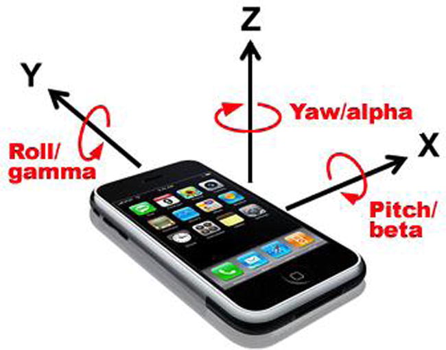
Figure 10-3. Rotation around the x, y, z axes of a mobile device. Source: http://hillcrestlabs.com
By knowing the mobile device’s orientation, we can adjust features of our sites to suit, such as repositioning a navigation menu above or beside the main content area, as appropriate. The W3C Screen Orientation API (http://bit.ly/screen_orientation) in JavaScript informs us of the device’s current orientation, whether portrait or landscape, as well as whether it is being held upside down or not. It fires an orientationchange event that we can hook code into, to execute at the very moment the device is reorientated. The example in Listing 10-4 shows how to use the Screen Orientation API to add a CSS class to your page’s <body> tag to indicate whether the device is in portrait or landscape orientation and to allow appropriate styling changes to be made through that.
Listing 10-4. Changing a class name on a HTML page based on the orientation of the mobile device
// Define an event handler function to execute when the device orientation changes between
// portrait and landscape
function onOrientationChange() {

    // The device is in portrait orientation if the device is held at 0 or 180 degrees, and in
    // landscape orientation if the device is held at 90 or -90 degrees
    var isPortrait = window.orientation % 180 === 0;

    // Add a class to the <body> tag of the page according to the orientation of the device
    document.body.className += isPortrait ? " portrait" : " landscape";
}

// Execute the event handler function when the browser tells us the device has
// changed orientation
window.addEventListener("orientationchange", onOrientationChange, false);

// Execute the same function on page load to set the initial <body> class
onOrientationChange();
If you only wish to change visible page styles when the device is reorientated, consider using CSS Media Queries (http://bit.ly/css_mq) to achieve this rather than JavaScript, as this will provide the correct separation of concerns (http://bit.ly/concerns_web).
Access to a built-in gyroscope allows us to create mobile versions of games such as Jenga (http://bit.ly/jenga_game) or Marble Madness (http://bit.ly/marble_madness) to test the user’s steadiness and nerves. When rotating a mobile device containing a gyroscope, the browser fires a reorientation event according to the W3C DeviceOrientation API (http://bit.ly/orientation_event). Data supplied with this event represents the amount the device rotated around its three axes, measured in degrees. Feeding this motion data back to our JavaScript code allows us to update the display according to our program logic. The code in Listing 10-5 shows how to use the built-in gyroscope with the DeviceOrientation API to rotate an image on a page in 3D according to the precise orientation of the device. It adds an <img> tag to the current HTML page to display the image in. The resulting pseudo-3D effect can be seen in Figure 10-4.
Listing 10-5. Rotating an image in pseudo-3D according to the precise orientation of the mobile device
// Create a <img> element on the page and point to an image of your choosing
var imageElem = document.createElement("img");
imageElem.setAttribute("src", "Listing10-5.jpg");

// Create an event handler function for processing the device orientation event
function handleOrientationEvent(event) {

    // Get the orientation of the device in 3 axes, known as alpha, beta, and gamma, and
    // represented in degrees from the initial orientation of the device on load
    var alpha = event.alpha,
        beta = event.beta,
        gamma = event.gamma;

    // Rotate the <img> element in 3 axes according to the device's orientation using CSS
    imageElem.style.webkitTransform = "rotateZ(" + alpha + "deg) rotateX(" + beta + "deg) rotateY(" + gamma + "deg)";
}

// Add the <img> element to the page
document.body.appendChild(imageElem);

// Listen for changes to the device orientation using the gyroscope and fire the event
// handler accordingly
window.addEventListener("deviceorientation", handleOrientationEvent, false);

Figure 10-4. Running Listing 10-5, creating a pseudo-3D effect on an image using device sensors
We could combine data from a magnetometer with a CSS rotation transform to construct a virtual compass or to align an on-screen map to the direction in which the user is facing. An experimental Webkit-specific property is available in Apple’s Mobile Safari browser, returning the current compass heading in degrees from due north whenever the device is moved, allowing us to update the display accordingly. There is no standardized API for accessing the magnetometer at present, although this is envisioned as an extension to the DeviceOrientation API already mentioned.
The code in Listing 10-6 shows how to rotate an <img> tag on a HTML page representing a compass (with due north represented by the image pointing directly upward on the page) according to the current heading to which the device is pointing.
Listing 10-6. Rotating an image according to the compass heading of the mobile device
// Create a <img> element on the page and point to an image of a compass
var imageElem = document.createElement("img");
imageElem.setAttribute("src", "Listing10-6.jpg");

// Create a function to execute when the compass heading of the device changes
function handleCompassEvent(event) {

    // Get the current compass heading of the iPhone or iPad, in degrees from due north
    var compassHeading = event.webkitCompassHeading;

    // Rotate an image according to the compass heading value. The arrow pointing to due north
    // in the image will continue to point north as the device moves
    imageElem.style.webkitTransform = "rotate(" + (-compassHeading) + "deg)";
}

// Add the <img> element to the page
document.body.appendChild(imageElem);

// Observe the orientation of the device and call the event handler when it changes
window.addEventListener("deviceorientation", handleCompassEvent, false);
Further Reading On Orientation And Direction Sensors
To discover more about coding for the orientation and direction sensors, check out “Detecting Device Orientation” on the Mozilla Developer Network website via http://bit.ly/detect_orientation.
A mobile device’s motion sensor tells us how fast the device is being moved by the user in any of its three linear axes, x (side-to-side), y (forward/back), z (up/down) and, for those devices with a gyroscope built in, the speed at which it moves around its three rotational axes, x (degrees of beta rotation, or roll), y (gamma, or pitch), and z (alpha, or yaw).
The motion sensor is used in flip-to-silence apps, such as Flip4Silence (available for Android via Google Play via http://bit.ly/flip4silence) and games such as Sega’s Super Monkey Ball 2 (available for Apple iOS on the App Store via http://bit.ly/smball2). The motion sensor opens up all sorts of possibilities from enabling users to reset a form or undo an action with a shake of their device to advanced web apps, such as the virtual seismograph found online via http://bit.ly/is_quake.
The W3C DeviceMotionEvent API (http://bit.ly/device_motion) dictates that the mobile device fires a JavaScript event whenever a it is moved or rotated, this passes on sensor data giving device acceleration (in meters per second squared—m/s^2) and rotation speed (in degrees per second—deg/s). Acceleration data is given in two forms: one taking into account the effect of gravity and one ignoring it. In the latter case, the device will report a downward acceleration of 9.81 meters per second squared even while sitting perfectly still. The code in Listing 10-7 shows how to report the current acceleration of the device to the user using the DeviceMotionEvent API. It assumes to be running within the context of a HTML page, and adds two <p> tags to display the values returned by the motion sensor, without the effects of gravity, and with it, respectively.
Listing 10-7. Accessing the motion sensor to display the device’s maximum acceleration in any direction
// Create <p> elements for displaying current device acceleration values in
var accElem = document.createElement("p"),
    accGravityElem = document.createElement("p");

// Define an event handler function for processing the device's acceleration values
function handleDeviceMotionEvent(event) {

    // Get the current acceleration values in 3 axes and find the greatest of these
    var acc = event.acceleration,
        maxAcc = Math.max(acc.x, acc.y, acc.z),

        // Get the acceleration values including gravity and find the greatest of these
        accGravity = event.accelerationIncludingGravity,
        maxAccGravity = Math.max(accGravity.x, accGravity.y, accGravity.z);

    // Output to the user the greatest current acceleration value in any axis, as well as the
    // greatest value in any axis including the effect of gravity
    accElem.innerHTML = "Current acceleration: " + maxAcc + "m/s^2";
    accGravityElem.innerHTML = "Including gravity: " + maxAccGravity + "m/s^2";
}

// Add the <p> elements to the page
document.body.appendChild(accElem);
document.body.appendChild(accGravityElem);

// Assign the event handler function to execute when the device is moving
window.addEventListener("devicemotion", handleDeviceMotionEvent, false);
Further Reading On The Motion Sensor
To discover more about accessing the motion sensor on mobile devices, take a look at the following material online.
- “Device Motion Event Class Reference” at Apple Safari Developer Library (http://bit.ly/devicemotion)
- “Orientation and Motion Data Explained” at Mozilla Developer Network (http://bit.ly/orientaton_motion)
At the time of writing, neither camera nor microphone sensors are accessible through JavaScript within a mobile browser. If we were able to access these sensors, we could, for example, potentially capture an image of the user’s face to assign to an online account or allowed the user to record audio notes for themselves.
Disagreements between different browser vendors are in part to blame for the lack of a standardized API for access to this data. The recent W3C Media Capture and Streams API (http://bit.ly/media_capture) is gaining traction, however, and in time should enable developers to capture a still image or video stream from the camera or an audio stream from the microphone (with the user’s permission) for use within our JavaScript code. At present, this API is only available in Google’s Chrome browser and Mozilla’s Firefox browser on the desktop, but support looks to be added soon. See the latest browser support for this feature by visiting http://bit.ly/caniuse_stream in your browser.
In Chapter 4, I described the process of event framing for handling events that trigger very frequently, to improve performance by reducing the amount of code executed each time such an event fired. This technique should be used in earnest when it comes to mobile devices, which aren’t capable of processing JavaScript as quickly as desktop browsers can. Without framing, event handler functions will consume additional extra memory on the device and cause the website or application to feel unresponsive. Listing 10-8 shows how we might adjust the code from Listing 10-5 apply the technique of event framing to the DeviceOrientation API.
Listing 10-8. Rotating an image according to the precise orientation of the mobile device using event framing
// Create variables to store the data returned by the device orientation event
var alpha = 0,
    beta = 0,
    gamma = 0,
    imageElem = document.createElement("img");

imageElem.setAttribute("src", "Listing10-5.jpg");

// Update the event handler to do nothing more than store the values from the event
function handleOrientationEvent(event) {
    alpha = event.alpha;
    beta = event.beta;
    gamma = event.gamma;
}

// Add a new function to perform just the image rotation using the stored variables
function rotateImage() {
    imageElem.style.webkitTransform = "rotateZ(" + alpha + "deg) rotateX(" + beta + "deg) rotateY(" + gamma + "deg)";
}

document.body.appendChild(imageElem);

// Connect the event to the handler function as normal
window.addEventListener("deviceorientation", handleOrientationEvent, false);

// Execute the new image rotation function once every 500 milliseconds, instead of every time
// the event fires, effectively improving application performance
window.setInterval(rotateImage, 500);
Taking Sensor Data Further
The possibilities and opportunities for enhancing sites and creating web apps based on sensor data using JavaScript are huge. I have considered a few examples here—and with a little creativity, I’m sure you can come up with many more. Try combining data from different sensors (such as geolocation and direction or motion and orientation) to help you build enhanced sites and web apps that respond to the user and their environment in new and exciting ways. Experiment and have fun with it!
Network Connection Failures And Offline States
A well-known problem of browsing the web on mobile devices is the issue of drops in network connection, particularly if the user is in motion, for example onboard a train or in the back of a car. When following a link to open a new page, it is clear to the user that the network has dropped as they will see a familiar screen for those on mobile devices. Figure 10-5 shows how such a screen looks on Apple iOS 7.

Figure 10-5. Network drops on mobile devices cause inconvenient experiences for those browsing the web
If we’re building a web application driven by JavaScript, in which hard page transitions are removed in favor of a single-page experience, the user won’t be presented with a such a screen if the network connection drops, and it’s therefore up to us as developers to handle this in our applications ourselves, to indicate to the user that the network connection has dropped on screen, for example, or to store HTTP calls in a buffer until such time as the network connection returns.
Detecting Online and Offline States
The code in Listing 10-9 shows how to detect, at any point in your JavaScript code’s execution, if the network connection has dropped, using the browser’s navigator.onLine property.
Listing 10-9. Detecting a drop in network connection at a specific point during JavaScript code execution
var isOnline = navigator.onLine;

if (isOnline) {
    // Run code dependent on network access, for example, execute an Ajax call to the server
} else {
    alert("The network has gone offline. Please try again later.");
}
The code in Listing 10-9 is useful for wrapping around any network connection code, such as an Ajax call using XmlHttpRequest, or creating a <script>, <img>, or <link> DOM element dynamically which refers to an external file resource. You may wish, however, to present the user with an indication on screen if the network is connected or not. Rather than poll the value of navigator.onLine continuously, we can take advantage of two JavaScript events that fire when the network drops and when it is restored, named offline and online, respectively. You can then hook code to execute onto these events to update the page when the network state changes, as shown in Listing 10-10.
Listing 10-10. Detecting a change in network connection at any point in a JavaScript application
// Define a function to execute when the network drops
function goneOffline() {
    alert("No network connection");
}

// Define a function to execute when the network connection returns
function backOnline() {
    alert("The network connection has been restored");
}

// Connect these functions up to the relevant JavaScript events that fire when the
// network goes offline and back online, respectively
window.addEventListener("offline", goneOffline, false);
window.addEventListener("online", backOnline, false);
Listing 10-11 demonstrates how we can combine both forms of network connection drop detection together into a code routine that stores Ajax calls when the network is offline and immediately enacts them when the network connection is restored.
Listing 10-11. Stacking Ajax calls when the network goes down, and releasing when it returns
// Define a variable to store our stack of Ajax calls in if they can't be made immediately
// because of a dropped network connection
var stack = [];

// Define the function that makes Ajax calls
function ajax(url, callback) {

    // The XMLHttpRequest class enables Ajax requests to be made in the browser
    var xhr = new XMLHttpRequest(),
        LOADED_STATE = 4,
        OK_STATUS = 200;

    // If the browser has gone offline, add the function arguments (the url and callback) to the
    // stack for sending later
    if (!navigator.onLine) {
        stack.push(arguments);
    } else {

        // If the browser is online, make the Ajaz call
        xhr.onreadystatechange = function() {

            // A readyState of 4 indicates that the server response is complete
            if (xhr.readyState !== LOADED_STATE) {
                return;
            }

            // Execute the callback function if the server responded with a HTTP 200
            // status message ("OK")
            if (xhr.status === OK_STATUS) {
                callback(xhr.responseText);
            }
        };

        // Trigger the Ajax HTTP GET operation
        xhr.open("GET", url);
        xhr.send();
    }
}

// Define a function that loops through the stack of unsent Ajax calls, sending each in turn
function clearStack() {

    // Loop through the items in the stack until the stack length is 0 (a falsy value)
    while (stack.length) {

        // Make the Ajax call, using the data from the stack. The shift() method pulls the first
        // item off the array and returns it, altering the original array
        ajax.apply(ajax, stack.shift());
    }
}

// Ensure the clearStack function executes as soon as the network connection is restored

window.addEventListener("online", clearStack, false);
You would then make Ajax calls in your code using the ajax() method, as shown here. The code in Listing 10-11 will then handle whether to make the network call immediately or wait until the network connection returns.
ajax("/my-service-url", function(data) {
    alert("Received the following data: " + JSON.stringify(data));
});
You could adapt this example further to allow your website or application to deal with occasional network drops without affecting the user’s experience at any point in their interaction with your code.
Persisting Data With The Web Storage API
When your web application goes offline, we saw in Listing 10-11 how to stack up the calls that would have been so that they can continue once the network connection returns. The user, however, isn’t aware in this case that this is going on, that the calls they made to, for example, save personal data, didn’t go through to the server and are only being stored in memory. If they chose to close the tab down in their browser, these memory contents are wiped, meaning those calls will never be made to the server. We need a way to persist this stack in memory, even if the browser gets closed down, so that when the user returns to the application in future, the calls can then be made from the stack, provided the network is connected.
Persistent variable storage used to be handled through the creation of cookies, small files that get dropped on the user’s machine and get sent with each HTTP request to the server. This is inefficient—a large cookie file that gets sent with every request could result in a much less performant application. Today, we have access to the HTML5 Web Storage API (http://bit.ly/webstorage_api) and specifically the window.sessionStorage and window.localStorage objects defined within that specification. The former, sessionStorage, allows data to be stored only for the duration of the user’s browser session. Typically, once they close down the browser any stored values are deleted. The localStorage object, on the other hand, allows data to persist across sessions until deleted by the user or your application. There are three methods available on the object to get, set, and remove items by name from the local storage memory block: getItem, setItem, and removeItem, respectively. Listing 10-12 shows how to use these methods to persist variable data in memory, even after the browser is closed down.
Listing 10-12. Using the Web Storage API to persist data values after the browser is closed down
// Check to see if we have stored a value for the "favoriteBrowser" key before
var favoriteBrowser = window.localStorage.getItem("favoriteBrowser");

// If not, prompt the user to tell us their favorite web browser
if (!favoriteBrowser || favoriteBrowser === "") {
    favoriteBrowser = prompt("Which is your favorite web browser?", "Google Chrome");

    // Store their favorite browser in localStorage for next time they visit
    window.localStorage.setItem("favoriteBrowser", favoriteBrowser);
}

// Show the user that we know what their favorite browser is, even if they told us some time ago
alert("Your favorite browser is " + favoriteBrowser);

// Ask if the user would like us to remove their favorite browser value from persistent storage
if (confirm("Would you like us to forget your favorite browser?")) {

    // Remove the value from localStorage
    window.localStorage.removeItem("favoriteBrowser");
}
The getItem, setItem and removeItem methods can be replaced in favor of a simplified, more familiar syntax, treating the localStorage object as a standard object in JavaScript, creating, accessing, and deleting properties from that object to persist their data, as shown in Listing 10-13 which performs the exact same function as Listing 10-12. Note also how the localStorage object can be accessed directly without needing to go through the window object to get a reference to it.
Listing 10-13. An alternative method for accessing the Web Storage API
// Data within localStorage can be accessed as if they were properties on a standard object
var favoriteBrowser = localStorage["favoriteBrowser"];

if (!favoriteBrowser || favoriteBrowser === "") {
    localStorage["favoriteBrowser"] = prompt("Which is your favorite web browser?", "Google Chrome");
}

alert("Your favorite browser is " + favoriteBrowser);

if (confirm("Would you like us to forget your favorite browser?")) {

    // The delete keyword allows the removal of a property from localStorage
    delete localStorage["favoriteBrowser"];
}
We can apply the Web Storage API to the code we wrote in Listing 10-11 to stack Ajax calls when the network is disconnected, persisting that stack if the user closes the browser down, and making those calls when the user reopens the browser and the network connection is restored, as shown in Listing 10-14.
Listing 10-14. Stacking Ajax calls when the network drops, and persisting them after the browser is closed down
localStorage["stack"] = localStorage["stack"] || [];

function ajax(url, callback) {
    var xhr = new XMLHttpRequest(),
        LOADED_STATE = 4,
        OK_STATUS = 200;

    if (!navigator.onLine) {

        // Data in localStorage is stored as strings, so to store complex data structures such
        // as arrays or objects, we need to convert those into a JSON-formatted string first
        localStorage["stack"].push(JSON.stringify(arguments));
    } else {
        xhr.onreadystatechange = function() {
            if (xhr.readyState !== LOADED_STATE) {
                return;
            }

            if (xhr.status === OK_STATUS) {
                callback(xhr.responseText);
            }
        };

        xhr.open("GET", url);
        xhr.send();
    }
}

function clearStack() {
    if (navigator.onLine) {
        while (localStorage["stack"].length) {

            // After reading the JSON-formatted string data out of localStorage, it needs to be
            // converted back into a complex data form for use with the ajax() function
            ajax.apply(ajax, JSON.parse(localStorage["stack"].shift()));
        }
    }
}

// Check on page load if there are any previously stacked Ajax calls that could now be sent
window.addEventListener("load", clearStack, false);
window.addEventListener("online", clearStack, false);
Before you go ahead and start adding megabytes worth of data locally using this API, it’s worth considering the limitations enforced by the browser on the amount of data that can be stored this way. Each domain name gets to store a maximum of 5MB of data locally. Although this is a setting that can be changed in many browsers, this is the default amount and there is no way to change that via JavaScript. If you attempt to write more than 5MB of data using localStorage, JavaScript will throw an error and will not allow you to save your extra data until you delete previously stored data. If you wish to clear the entire contents stored locally in this way, you can call the localStorage.clear() method, which will free up all the space available to your application, restoring you to the 5MB default data storage amount.
For a thorough look into the Web Storage API, have a read of “The DOM Storage Guide” on Mozilla’s Developer Network online via http://bit.ly/dom_storage.
The final technology we have at our disposal for handling the offline state is the HTML5 Application Cache. Using a specially formatted file, known as a cache manifest, you are able to list specific files in your application to download and store in a cache on the local device, allowing those files to be loaded from there instead of directly from the network each time. This means that once you’ve visited a website or application once, you should be able to access that same site again even if your network connection is offline. This is not only beneficial to those on mobile devices or with poor network connections, the benefits can be experienced on desktop devices too, meaning sites, once cached in this way, will load virtually instantaneously.
The cache manifest file is a simple text file which convention dictates should have an .appcache file extension, although really this is not essential or part of any specification. More important, the cache manifest file must be served with a MIME type of text/cache-manifest, which for most web servers will mean a specific rule will need to be added to the server configuration for that specific file extension.
A manifest file must be referenced from your HTML file by referencing it using the manifest attribute on the <html> tag:
<html manifest="manifest.appcache">
The manifest file itself looks like a standard text file, the first line of which must read CACHE MANIFEST in order to be properly identified. In its simplest use, there should then follow a list of files, one per line, which will then be cached for future requests of the same page. If any file listed in the manifest file does not exist, or returns a HTTP error status (for example, 404, or 500) when requested, the whole manifest file will be considered invalid and no files will be cached using this mechanism. The next time the page is loaded, the browser treats the manifest file as if it has never seen it before, attempting to download all referenced assets again.
If the browser detects that the manifest file has been updated since files were last cached, it will go back to the web server to download any of the referenced files that have changed—it sends an If-Modified-Since HTTP header for each file request when it does this, meaning that only files that have been updated since the last round of caching are actually replaced in the cache. A good tip is to include a commented line, indicated by a hash (#) character at the start of the line, in the manifest file, which references a version number for the file, and/or an optional date of the change. When you update the referenced files, update the version number in the file so that the browser detects the change and begins to check for updated files. Without a change in the manifest file, the browser will continue to serve the cached version of the files until such time as the user deletes the cache manually. When requesting a page that has been cached in this way in the past, the browser will first load the cached version of the page before downloading the updated files in the background. Only when the page is next refreshed will the updated assets load. This is in contrast to how many expect the browser behavior to be, expecting the page to redownload and render the whole page based on the new assets immediately if a change in the manifest file is detected.
Listing 10-15 shows a simple cache manifest file, listing file assets that should be loaded and cached for the next time the page is loaded, whether that is online or offline. Note that you do not need to list the HTML page referencing the manifest file itself, as this will be cached by default.
Listing 10-15. A simple cache manifest file
CACHE MANIFEST
# Version 1.0.1 - 2013-01-02
/library/styles/main.css
/library/scripts/lib/jquery.min.js
/library/scripts/main.js
/images/background.jpg
/images/logo.png
A cache manifest file may contain three optional sections, each denoted by the headings: CACHE:, NETWORK:, and FALLBACK:. The CACHE: section is the same as if there were no sections listed, that is to say that it contains the files listed that should be stored in the offline cache.
The NETWORK: section lists URLs that require the user to be online to access them, for example form action URLs, web services, and other network-essential files. Any resource listed in this section will be accessed directly via the network, bypassing the cache altogether. This section requires only partial URLs, so if a set of web services are exposed via the same foundation URL, for example, https://api.twitter.com/1.1/, then this is all that need be listed. Wildcard values are permitted by using the asterisk (*) character.
The FALLBACK: section lists locally cached files to be used in place of network-essential URLs when the network is offline. It consists of a file name, URL or pattern, followed by the local cached file to be used in place if the network connection is down. In its simplest incarnation, with a static HTML site, you could use a wildcard to reference all .html files and have them fallback to a single offline HTML file, explaining to the user that the site is currently offline on that single page, for a more pleasing user experience. In more advanced cases, you can provide fallbacks to any server-side script, image, stylesheet, JavaScript file, or more, to provide a good experience for your users when the network drops.
Listing 10-16 shows a more advanced cache manifest file using the optional CACHE:, NETWORK:, and FALLBACK: sections.
Listing 10-16. A cache manifest file containing three sections
CACHE MANIFEST
# Version 1.0.1 - 2013-10-02

CACHE:
/library/styles/main.css
/library/scripts/lib/jquery.min.js
/library/scripts/main.js
/images/background.jpg
/images/logo.png

# Always go straight to the network for API calls from a base /api/ URL
NETWORK:
/api/

# Replace a 'network online' image with a 'network offline' image when the network is down
FALLBACK:
/images/network-status-online.png /images/network-status-offline.png
If you would like to read more about the HTML5 Application Cache, visit the “Using The Application Cache” article on Mozilla’s Developer Network site (http://bit.ly/app_cache).
JavaScript For Responsive Design
Responsive Web Design is an emerging technique of designing and constructing websites and apps by allowing the interface to adapt to the characteristics of the device it is being viewed upon. Devices with a small screen, such as a smartphone, will display an appropriately sized and scaled user interface, as will those users on larger devices. CSS3 Media Queries allow the application of different style rules to page elements based on the current characteristics of the device.
In many cases, a visual change to a website using this technique might warrant a change in the behavior of the interface. A navigation menu that might be fully displayed on a larger device, might be hidden offscreen on a smaller device, with a toggle button used to trigger the display of the menu; the toggle button’s behavior would only apply to the small-screen view.
Different JavaScript code can be executed based on which CSS3 Media Query rule is currently active by using the window.matchMedia() method of the browser, passing the Media Query or partial query to be compared with the current display. This returns a MediaQueryList object containing a matches property, which will be set to true if the Media Query it represents is active at that time.
If the applied Media Query changes, you will need to recheck the state of the matches properties of each of your MediaQueryList objects. Fortunately, in the vast majority of cases, this should be a simple case of hooking into the browser window’s resize event, as shown in Listing 10-17.
Listing 10-17. Executing specific JavaScript based on CSS3 Media Queries
// Create MediaQueryList objects for different CSS3 Media Query rules
var landscapeMQL = window.matchMedia("(orientation: landscape)"),
    smallScreenMQL = window.matchMedia("(max-width: 480px)");

function checkMediaQueries() {

    // Execute specific code if the browser is now in landscape orientation
    if (landscapeMQL.matches) {
        alert("The browser is now in landscape orientation");
    }

    // Execute specific code if the browser window is 480px or narrower in width
    if (smallScreenMQL.matches) {
        alert("Your browser window is 480px or narrower in width");
    }
}

// Execute the function on page load and when the screen is resized or its orientation changes
window.addEventListener("load", checkMediaQueries, false);
window.addEventListener("resize", checkMediaQueries, false);
Read more about the matchMedia method on Mozilla’s Developer Network via http://bit.ly/matchmedia.
Summary
In this chapter, we’ve considered the web, and specifically JavaScript, as it applies to a user browsing on a mobile, smartphone, or tablet device. We’ve seen the restrictions we need to consider in terms of memory, bandwidth, latency, and speed, and how best to work around these. We’ve looked at how to access data directly from the sensors onboard such devices, allowing our applications to react to location, motion, direction, and more. We’ve also looked at what happens when the network connection drops and how to provide a smooth user experience despite this, dealing with network operations as soon as the network is restored. Finally, we’ve learned how to execute specific JavaScript based on CSS3 Media Queries applied in the browser on responsive websites.
Mobile-focused development is a growing area, and with the release of new devices and operating system updates each year, we have access to more and more features of the device directly through JavaScript using open, standard W3C APIs. Ensure you keep abreast of the latest developments on a regular basis so as not to be left behind in this fast-moving world of technological progress.
In the next chapter, we will look at how to use the HTML5 Canvas drawing API to build online games for desktop and mobile, without relying on any third-party plugins, such as Adobe Flash.