
Chapter 5
Developing a Service-Oriented Enterprise RIA
Chapters 3 and 4 of this book mainly focused on explaining the need for enterprises to embrace the Enterprise 2.0 concept and enable development and deployment of service-oriented RIAs. Chapter 3 defined the Enterprise 2.0–ready technology platform and explained how Silverlight fits in this category. In Chapter 4, you learned about the SOA concept and the seven key principles of SOA for developing service-oriented RIAs and deploying them as SaaS. I also explained different features and capabilities of Silverlight such as WCF/Web Services, LINQ, and feed integration to implement SOA-based RIAs by developing a sample Silverlight application.
This chapter will transform the My Album RIA developed in Chapter 2 into the Enterprise Training Portal RIA utilizing Silverlight and its service-oriented features and capabilities.
During the development of the My Album RIA, I covered various aspects of the Silverlight's basic technology features and capabilities using Microsoft development tools such as the following:
Integration of Silverlight with the Visual Studio IDE and development environment
Seamless integration with Microsoft Expression Blend for rich user interface definition and event integration
Use of WPF and XAML for the user interface definition
Managed code-behind integration to develop an interactive application
Rich .NET class library integration
Animation capabilities
Rich media integration
Use of Expression Encoder
Figure 5-1 shows the My Album RIA.
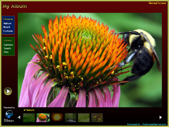
Figure 5.1 The My Album RIA developed in Chapter 2 using Silverlight
Defining the Enterprise Training Portal RIA Project
The Enterprise Training Portal RIA extends the My Album RIA concept, enabling the enterprise to provide different types of interactive training through an enterprise portal to internal and external audiences. The training subjects and material are very dynamic in nature. The enterprise portal must be flexible and should provide dynamic features such as support for multiple languages with rich presentation capabilities to display media, content, and RSS (Really Simple Syndication) feed integration with proper categorization, just as a traditional desktop application would have. Figure 5-2 shows the Enterprise Training Portal RIA compared to the My Album RIA.
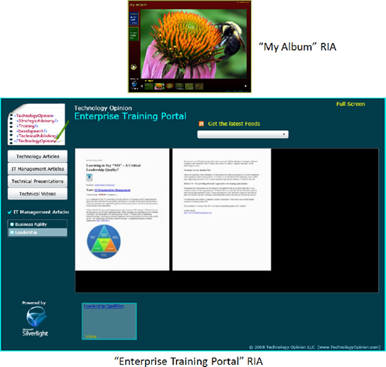
Figure 5.2 The Enterprise Training Portal RIA
We will be building the Enterprise Training Portal RIA for an enterprise named Technology Opinion. Now let's define the Enterprise Training Portal RIA project scope.
The Enterprise Training Portal RIA will provide interactive training to internal and external users using an online central server or a distributed offline portal. The scope of the training (subject, category, who should get what) and content (media, documents, feeds) of the training is dynamic, supporting different cultures, languages, and user preferences. The RIA should feature subscription and nonsubscription–based training portal views.
The Enterprise Training Portal RIA has the following features:
Generic and subscription–based portal
User preference–based views
Support for internal (organization employees) and external users
Support of central online portal or distributed offline portal
Simplified and interactive user interface
Support for dynamic media files, image files, documents, and RSS integration
Training content preview functionality using thumbnails
Play and stop capabilities for video files
Zoom-in functionality for the image files
Easy navigation
RSS feed viewer
Support for multiple languages
Full-screen view option
Easy to customize
Design and Development Considerations
When developing the application, we need to bear the following in mind:
Support for an agile project life cycle
Prioritizing requirements and defining development iteration phases
Service–oriented, externalized, and pluggable architecture
Development of reusable services and components/custom controls
RSS 2 reader
Lightweight application
Easy to deploy, support, and maintain
Support for globalization and localization features
High–performing application
The application will support the following types of media:
Documents: Any document type (referenced as a link and can be opened in a native formatin a separate new window)
Picture file types: JPG, PNG, BMP, GIF (other file types should be supported but not tested), with minimum 800×600 resolution for better–quality pictures
Video file types: WMV (Compressed Broadband Version)
RSS feed: RSS 2 feed
Technology Platform Used to Develop the Enterprise Training Portal RIA
The application will be based on the following platforms:
Microsoft Silverlight 2
Microsoft .NET Framework 3.5 SP1
WPF and XAML
LINQ
WCF/Web Services
XML/SQL Server
RSS 2 feed
C# for the managed code development
Development Tools Used to Develop the Enterprise Training Portal RIA
We'll use the following tools to develop the application:
Microsoft Visual Studio 2008 SP1
Microsoft Silverlight Tools for Visual Studio 2008 SP1
Microsoft Expression Blend 2 SP1
Microsoft Expression Encoder 2 SP1
Microsoft Deep Zoom Composer
Designing the Enterprise Training Portal
Along with following enterprise best practices for application architecture and design, a fluent user interface design to provide high application usability is a key design consideration for RIAs. As discussed earlier in this book, the architecture and design teams should define a system and application architecture that is aligned with the enterprise's strategic vision and technology and product roadmaps. However, the implementation of a designed solution may follow a phased approach to provide priority-based features in the Agile SDLC.
In this chapter, the following prioritized application features will be implemented as part of the first phase. The designed application architecture will allow the developed portal to support additional features in future phases.
Application Features to Be Implemented in This Chapter
We will implement the following application features in this chapter:
Generic portal
Support for internal (organization employees) and external users
Support of central online portal or distributed offline portal
Simplified and interactive user interface
Two-level categorized content files
Support for dynamic media files, image files, documents, and RSS integration
Training content preview functionality using thumbnails
Play and stop capabilities for video files
Zoom-in functionality for the image files
Easy navigation
RSS feed viewer
Full-screen view option
Easy to customize
Figure 5-3 defines the application architecture of the Enterprise Training Portal RIA.

Figure 5.3 Application architecture of the Enterprise Training Portal RIA
During the first phase of the development (covered in this chapter), the main focus is to define an interactive, rich, service-oriented presentation layer supporting dynamic content presentation of different file types (media, images, and RSS feeds). The data access layer is platform agnostic, pluggable, and based on external configuration, so the RIA can connect to different types of data platforms such as SQL Server, RSS feeds, and XML files. At present, the business service layer is very lightweight, and we'll develop services only for data access from the various data platforms.
We'll use the .NET WebClient class to read the XML files (RSS feeds and custom XML files) and a custom WCF Service and LINQ to read from SQL Server. The logic related to each custom controlis handled through the code-behind .NET managed assembly of the custom control. The business service layer can be extended in the future to provide additional enhanced functionality for the Enterprise Training Portal.
The presentation layer of the Enterprise Training Portal is driven by the Silverlight XAML-based custom controls. The definition of the presentation layer is modular and externalized by using the Silverlight Class Library project template to define different reusable custom controls.
Overall the user interface framework of the Enterprise Training Portal is very similar to the MyAlbum RIA. Figure 5-4 defines the Enterprise Training Portal RIA user interface framework layout and its specifications.
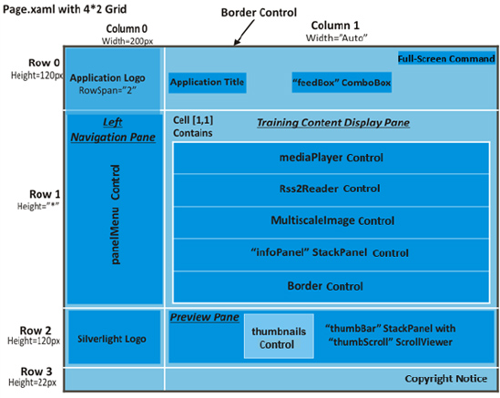
Figure 5.4 The Enterprise Training Portal RIA UI framework layout design and specifications
User Interface Navigation Patterns
Consistent to the My Album RIA, the following are the key navigation patterns of the Enterprise Training Portal RIA:
The center stage theme displays the selected content (media, RSS feed, image) in the main
StackPanelcontrol as a container.The left navigation pane dynamically drives the user to navigate through the available categorized content to receive the appropriate training. We will use the static multilevel hierarchy navigation pattern (two-level) to display different categories of training content.
We will follow the linear animated slide transition navigation pattern to preview collections of training content based on the selection of the category using the
StackPanelcontrol as a container.The RIA window layout will be configured as a liquid layout to enable us to resize the application when the user resizes the browser window to match the browser window size.
User Interface Layout Definition
We will expand the grid from 2×2 to 4×2 (compared to the My Album RIA) to accommodate different parts of the RIA, which will ease the work of designing, placing, and maintaining controls.
We will set Row 1's height to * and Column 1's width to Auto to cover a portion of the window. This allows the content container to keep the width to the size of the content and the application to resize according to the browser window's size, maintaining the original aspect ratio of the different parts of the application.
The Row 0/Column 0 cell contains the enterprise logo with the height and width configured to 120 px and 200 px. The logo image will have
RowSpanset to 2.The Row 0/Column 1 cell contains the enterprise name and the RIA name with a drop-down box containing the available RSS feeds to select and view. It also contains the Full Screen/Normal Screen command, enabling users to toggle the content control to full-screen mode or normal screen mode. The cell is configured with height and width set to 120 px and Auto.
The Row 1/Column 0 cell contains the main navigation pane. It will build the dynamic subject categories of the available training, and upon selection of a particular category, available subjects will be displayed. The cell is configured with the height and width set to * and 200 px.
The Row 1/Column 1 cell contains the main container to display the selected content (media, image, or RSS feed). Based on the selection from the preview pane, the training will be loaded utilizing the proper custom control (
mediaPlayerfor media,Rss2Readerfor the RSS feed, andMultiscaleImagefor image display). The cell is configured with the height and width set to * and Auto.The Row 2/Column 0 cell contains the official Silverlight logo. The cell is configured with the height and width set to 120 px and 200 px.
The Row 2/Column 1 cell contains the preview pane displaying thumbnails of available training programs of the selected subject. You can view the content within the content container upon selection. With Next and Previous functionality, the selected subject thumbnail will be animated and highlighted, and the rest will be dimmed slightly. The preview pane would also allow users to link to the original source from where the training content is made available. The cell is configured with the height and width set to 120 px and Auto.
We will not have anything in the Row 3/Column 0 cell. The cell is configured with the height and width set to 22 px and 200 px.
The Row 3/Column 1 cell contains the copyright notice of the enterprise. The cell is configured with the height and width set to 22 px and Auto.
Reusable Key User Interface Components
Based on the application features I've defined and the preceding user interface framework discussion, it is clear that we will need the following key user interface components:
The left navigation pane is a driver of the training portal. It builds the vertical tab-based training menu. As shown in Chapter 4, a dynamic left navigation pane will be created at runtime based on external definitions of the available training categories and subjects.
The preview pane dynamically presents available training as thumbnails based on the selected training category and training subject using the left navigation pane. The preview pane allows a user to get a quick overview of available training and select content to display in the display area of the portal.
The enterprise training portal supports media (video files), image files, and RSS feed types of content to display. The training content display pane, which is at the center of the screen, hosts the selected training content. We will need custom controls that can host the required types of content. The
MultiscaleImagecontrol will show the selected images with the Deep Zoom functionality. ThemediaPlayercustom control enables users to play video files with the default video player. TheRss2Readercustom control will display all RSS feed–related items.
All of the preceding functionality is very common, and usually an enterprise will need these types of functionality repeatedly in more than one application. We can use Silverlight Class Library project templates to build these custom controls individually as user interface components that canbe reused across different RIAs.
Figure 5-5 shows the high-level XAML control class diagram of the Enterprise Training Portal. The class diagram demonstrates the use of different Silverlight controls to develop the previously mentioned reusable custom controls.
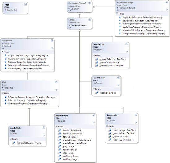
Figure 5.5 Silverlight XAML control class diagram for the Enterprise Training Portal RIA
Business Service Layer and Data Access Layer
The loosely coupled business service layer of the Enterprise Training Portal is very lightweight and mainly focused on data management. It supports integration with multiple data platforms, as we discussed previously. The data access layer provides data platform–agnostic services to retrieve the requested information from the business service layer.
The custom control class library project contains the code-behind .NET assembly that performs presentation layer–specific functionality (e.g., for the mediaPlayer custom control, the code-behind assembly will perform all media-related functionalities—play, pause, stop, resume, control volume, etc.).
The reusable class library project tpDataLayer is a data access component .NET assembly that is a bridge between the presentation layer and the data services and platform. This component is mainly responsible for retrieving the following information at runtime from different types of configuration files and data sources. It then provides this information to the presentation layer and related components.
Read the
tpConfig.xmlconfiguration file to get the data source configuration and data service definition andtpFeeds.xmlto get the subscribed RSS feed information.Get the left navigation pane menu definition from the
tpContents.xmltraining content file or from the SQL Server databasetrainingPortalDB_Data.mdffile to build the left navigation pane dynamically.Get the preview pane definition of the selected training category and subject from the
tpContents.xmltraining content file or from the SQL Server databasetrainingPortalDB_Data.mdffile to build the preview pane dynamically upon selection of the training category and specific subject.Get the training content (HTML, image, or video) from the
tpContents.xmltraining contentfile or from the SQL Server databasetrainingPortalDB_Data.mdffile based on the selection of the training program from the preview pane.
As discussed earlier, the Enterprise Training Portal supports data integration with SQL Server and different types of XML files—configuration files, content files, and RSS feeds. We will build two loosely coupled data services. The first will use the .NET Framework WebClient class to read XML files, and the second will be a custom WCF service that uses LINQ to perform read operations from the SQL server.
Configuration files are key components for implementing externalized and pluggable solutions. The portal uses three key configuration files:
tpConfig.xmltpFeeds.xmlClientaccesspolicy.xml
As part of the walkthrough in Chapter 2, we hard-coded/embedded the following items and made them part of the application deployment package:
Image and video file categories were named Pictures and Videos, respectively. If we want to update (add, modify, or delete) these predefined categories, we need to change the code and recompile and redeploy the project.
The image and video files were embedded within the project at compile time. This does not allow us to change existing content or add new content types and content without recompiling.
To decouple training content from the Enterprise Training Portal RIA, we will integrate data source definitions, training content types, and training content files dynamically at runtime by externalizing their definition using the tpConfig.xml configuration XML file. This file mainly provides the data source definition (SQL Server and XML) and what type of data source to be used (SQL Server or XML) for the training portal. It also provides the WCF-based service URL to retrieve the content from SQL Server (or any other types of database, if used). This will allow the enterprise to incorporate future content updates without recompiling or redeploying the Enterprise Training Portal RIA.
Note For the central deployment of the application, every resource in the tpConfig.xml configuration file must be provided with an absolute URL, not a relative URL. See the note at the end of the "Centralized Deployment of the Enterprise Training Portal RIA" section of this chapter for more details.
We will use the .NET Framework WebClient class to retrieve the tpConfig.xml XML file and store the retrieved information using the custom appConfig data class.
Since the training content database does not store original training content, only training content–related metadata—training category, training track, and individual training profile with the link to the original training file available for display—it is a best practice to keep all training-related taxonomy information in a single data source (in our example, either SQL Server database or XML file).
For this chapter, all the actual training materials are stored on a file system as files or as RSS feeds, rather than storing them in a database.
tpConfig.xml is an application-level configuration file. During deployment, it must reside alongside the TrainingPortal XAP package within the same folder.
The following is a snapshot of the tpConfig.xml file, where the database is stored locally on the machine and the WCF service is also locally hosted. tpContents.xml is stored on the technologyopinion.com server.
<?xml version="1.0" encoding="utf-8" ?>

<TrainingPortal Datasource="XML">

   <Datasource>

     <SQL>

          <connectionString>

                     "Data Source=VISTA64DTSQLEXPRESS;

                         AttachDbFilename=|DataDirectory|	rainingPortalDB_Data.mdf;

                       Initial Catalog=trainingPortalDB;Integrated Security=True"

          </connectionString>

          <Url/>

     </SQL>

     <XML>

          <connectionString/>

          <Url>http://technologyopinion.com/Documents/tp/tpContents.xml</Url>

     </XML>

   </Datasource>

   <webservice>

      <getContents>

           <serviceEndpoint>

                     http://localhost:63167/getContents.svc

           </serviceEndpoint>

      </getContents>

   </webservice>

</TrainingPortal>
The Datasource attribute of the <TrainingPortal> root node defines what type of data sourceis being used to provide the available training profile information. In our example, it is XML, which is the same as the data source node name defined under the <Datasource> node. It means that the tpDatalayer data access component will read the <XML> node and read the XML file (in this case tpContents.xml) to build the left navigation pane and the preview pane. If the Datasource attribute is set to SQL, tpDatalayer will connect to the SQL Server database to populate the navigation and preview panes.
Note This version of the Enterprise Training Portal supports only two types of database—SQL Server and XML files. However, it can be enhanced very easily by just adding a database type–specific node under the <Datasource> element to support other database types.
The Enterprise Training Portal also displays predefined RSS feeds. The portal can display any RSS feeds published by either the enterprise itself or third parties. The tpFeeds.xml configuration XML file provides the set of feeds available to display on the portal. Each feed configuration contains two nodes—the value of the <Title> node will be displayed in the Portal menu, and the <Url> node points to the URL where the RSS feed is published.
Like tpConfig.xml,tpFeeds.xml is also an application-level configuration file. During deployment, it must reside alongside the TrainingPortal XAP package within the same folder.
The following is a snapshot of the tpFeeds.xml file:
<?xml version="1.0" encoding="utf-8" ?>

<TrainingPortal>

<feed>

    <Title>TechnologyOpnion New</Title>

    <Url>http://technologyopinion.com/Documents/technologyopinionRSS</Url>

</feed>

</TrainingPortal>
Note The application can access the cross-domain-published RSS feed only if the proper Clientaccesspolicy.xml or Crossdomain.xml policy file is published, allowing cross-domain access.
To demonstrate a complex scenario, we can deploy the tpContents.xml file and/or the WCF service on a different domain from that of the Enterprise Training Portal. In this case, to access the content XML file and service successfully, you need to deploy either a Crossdomain.xml or a Clientaccesspolicy.xml file.
We will use the Clientaccesspolicy.xml file to allow access from the Enterprise Training Portal.
The training portal mainly presents media-centric training. The training material consists of a collection of media files (audio and visual) and images. To provide proper categorization of the training material, each training item contains a set of predefined metadata (providing a training profile) and physical training files. The Enterprise Training Portal will support the published training content in the same domain and cross-domain (with properly defined security policies).
The enterprise can use any type of document/content management system (e.g., Microsoft Office SharePoint Server) to store the training media files. We can use an XML file or a relational database (e.g., SQL Server) to maintain the available training profiles (with reference to the published training media files) that we will use to feed the presentation layer. Upon selection of the specific training item from the preview pane, the portal will access the physical media file based on the training profile reference and will display the training content in the training content display pane.
In this chapter, I will demonstrate the use of SQL Server and XML file to maintain the training profiles.
Figure 5-6. shows a simple relational schema diagram of the trainingPortalDB_Data.mdf database.
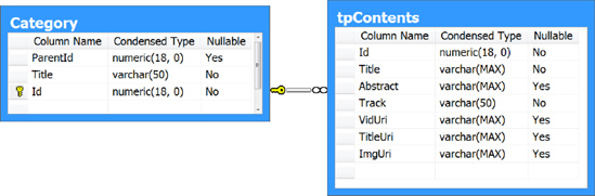
Figure 5.6 Database schema of the trainingPortalDB_Data.mdf database containing Enterprise Training Portal training profiles
The database contains only two tables—Category and tbContents. The Category table contains all the training categories representing the complete training taxonomy. The left navigation pane is built dynamically at runtime based on the Category table.
In this chapter, we will populate only one level of category. The developed Panelmenu custom control component supports only one level of category. However, the Category table definition supports n-levels in the training category taxonomy. The combination of the ParentId and Id fields can build n-levels of category taxonomy. The first level of the category will have ParentID with a NULL value.
The tpContents table defines the different tracks (with the Track field) available in each training category. The tracks will be displayed in the left navigation pane upon selection of a particular category. Each track contains one or more training items. The preview pane will display the available training items of the selected track based on the Title field. The type of training and definition of the training file location for each training item is decided based on the populated VidUri (for video files) or ImageUri (for image files). The TitleUri field provides a link to the original source of the training material. The Abstract field contains a short description of the training.
Note The current database schema (tpContents table) and Enterprise Training Portal only support image and video file types. You can have additional types of training materials (e.g., PowerPoint presentations, Word documents, XPS documents, and PDF documents). It would be very easy to enhance the database to support additional types of training materials. However, currently Silverlight does not support hosting different types of documents (PowerPoint, PDF, etc.). The alternative is to show the abstract as HTML or as an image file in the training content display pane and provide a link to the original document to open in a native format in a new window. The approach is shown in the Technology Articles and IT Management Articles categories in our example.
The alternative approach is to use an XML file (in our example it is tpContents.xml) defining training profiles to build the left navigation and preview panes. The structure of the tpContents.xml file is very much aligned with the trainingPortalDB_Data.mdf database.
The following is a snapshot of the tpContents.xml file containing example information:
<?xml version="1.0" encoding="utf-8" ?>

<TrainingPortal>

   <Category Title="Technology Articles" Id="1">

      <Training>

         <Title>Manage Metadata with Document Information Panels</Title>

         <Abstract>This article demonstrates how to enable.... </Abstract>

         <Track>Microsoft Office 2007</Track>

         <ImgUri></ImgUri>

         <TitleUri>

                 http://msdn2.microsoft.com/en-us/magazine/cc500578.aspx

         </TitleUri>

         <VidUri></VidUri>

      </Training>

      <Training>

          <Title>

                 Publish a Self-Signed InfoPath Form Template to Local Computer

          </Title>

         <Abstract>To attach an InfoPath form template ...</Abstract>

         <Track>Microsoft Office 2007</Track>

        <ImgUri>

                http://technologyopinion.com/Documents/tp/content/

                  PublishInfoPathTemplateToLocalComputer/dzc_output.xml

     </ImgUri>

      <TitleUri>http://technologyopinion.com/word2007.aspx#pubinfopath</TitleUri>

      <VidUri></VidUri>

    </Training>

   </Category>

   <Category Title="IT Management Articles" Id="2">....</Category>

</TrainingPortal>
Note In this example, the <ImgUri> node is populated with a reference to an XML file rather than any image file (e.g., http://technologyopinion.com/Documents/tp/content/sayNo/dzc_output.xml). This XML file represents the outcome of the image collection using the Deep Zoom composer to enable the Deep Zoom functionality.
RSS is a widely used open standard format to feed updated information to end users without their having to actually visit sites. As organizations become virtual and transform their paper-based processes to electronic/digitized processes, they will start utilizing RSS-like open standards in their knowledge management systems and services, enabling effective interorganization information exchange.
The Enterprise Training Portal can display RSS 2 feeds in the training content display pane. The RSS 2 feed drop-down of the portal is populated based on the tpFeeds.xml definition. Upon selection of a particular RSS feed, the related feed items will be displayed within the portal.
There is no particular training portal RIA–specific database schema required to display the RSS feeds.
Understanding Silverlight Custom Controls
Silverlight has extensive support for SOA capabilities when defining the presentation layer of an RIA. It provides a reusable custom control library that supports the following SOA features
Modular design of rich user interfaces and related business logic supporting reusability of custom controls across applications
Separated user interface definition and business logic
Style-based control template definition to enable an application-specific look and feel without having an impact on the business logic of the custom control
Before we dive into the development of the Enterprise Training Portal, I think it is fairly important for you to understand Silverlight custom control capabilities and how to develop them, since we are using this feature to define the modular, reusable, and customizable presentation layer of the RIA.
Key Components of Custom Controls
Silverlight custom controls contain a clear separation between the user interface definition and business logic (see Figure 5-7) compared to other reusable GUI custom controls (e.g., Windows Forms or ASP.NET, where there is no clear separation between the visuals and logic). This feature enables the development team to customize an application-specific look and feel without having an impact on the business logic of the custom control.
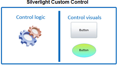
Figure 5.7 Microsoft Silverlight custom controls contain a clear separation between visuals and business logic.
Silverlight custom controls are derived from the Control class. To define how custom controls look, we use the Style and ControlTemplates classes. Microsoft recommends utilizing the Parts and States model with the Visual State Manager (VSM) to define customization scope and behavior of visual of custom controls.
Following is a quick overview on three key components of Silverlight custom controls—the Style class, the ControlTemplates class, and the Parts and States model.
One of the ways to apply a consistent look and feel across an application is to define the style of the application controls. The Style class is a part of the .NET Framework class library for Silverlight and is a collection of one or more Setter objects. Each Setter object has Property and Value attributes. Property defines the name of the property of the element to which the style is applicable, and Value is the value that is applied to the defined property.
Figure 5-8 demonstrates how to define a style for the Button element and how you can apply it to one or more instances of the Button element. x:key and TargetType are key attributes for defining the style of a control, whereas Style is a key attribute for applying the predefined style to a control.
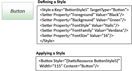
Figure 5.8 Demonstrating how to define and apply style to the Button control
We can define the Style in App.xaml in the <Application.Resources> section to make it visible at the application level. In the custom control, we can define a Style in the <UserControl.Resources> section of the XAML file where we want to place that particular styled control.
The definition and use of Style-based controls across an enterprise-level application is the best way to apply and maintain enterprise-level presentation (user interface) standards.
The main constraint of the Style class is that you cannot customize the appearance of the styled control (e.g., changing the shape of the button from rectangle to circle); you cannot do it using only a styled control. To achieve the visual customization of controls, Silverlight provides the ControlTemplate class.
A ControlTemplate defines the visual structure and behavior of the control. Thus, with the use of the ControlTemplate, you can have different shapes of the Button control without having an impact on its functionality. In our example, you can change the appearance of buttons in your application from rectangle to oval, but the behavior of the button is not changed (e.g., there is no impact on the MouseEnter and Click events). For the same control/functionality, you can have more than one ControlTemplate defining different visual structures.
Figure 5-9 demonstrates how to define the ControlTemplate for the Button control to change its regular shape to oval, and how you can apply it to one or more instances of the Button element. x:key and TargetType are key attributes for defining a template of a control, whereas Template is a key attribute for applying a predefined template to a control.
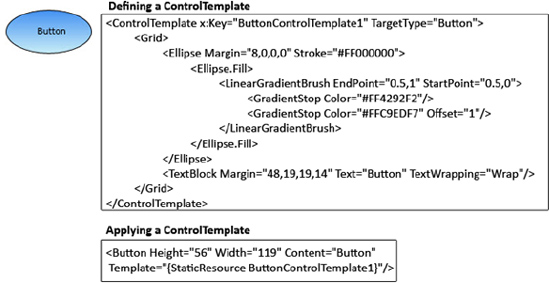
Figure 5.9 Demonstrating how to define ControlTemplate to change the Button control's shape to Oval and apply the template to the Button control
The definition of a ControlTemplate library for a set of controls across enterprise-level applications is the best way to apply and maintain enterprise-level presentation standards.
As you saw, the ControlTemplate class defines the custom visual structure of the control. Now I'll explain how you can manage a control's behavior with different types of look and feel for different states and while the control is transitioning from one state to another (e.g., MouseEnter to Click).You can achieve this functionality very easily with the help of the Parts and States model and the VSM of Expression Blend.
The main objective of the Parts and States model is to define the control structure and behavior of the control by defining the control contract (associated with the VSM) and separating the control visual appearance and the control logic. Microsoft recommends utilizing the Parts and States model to define and maintain control structure and state management. The Parts and States model and VSM are tightly integrated with Expression Blend for easy definition and development.
There are three main components of the Parts and States model—parts, states, and transitions.
Many Silverlight controls (though not all controls, such as the CheckBox and Button controls) consist of distinct visual components (e.g., the Slider control) where each component can be named in the ControlTemplate. Each distinct component is called a part. The behavior and structure of these parts can be controlled by the control logic.
As shown in Figure 5-10, the Slider control consists of four distinct parts—DownRepeatButton, UpRepeatButton, Thumb, and Track. Each part is accessible and can be controlled through the control logic.
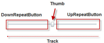
Figure 5.10 The Slider control has four distinct parts.
All Silverlight controls have distinct states. A particular control's specific state defines its visual appearance. As shown in Figure 5-11, the CheckBox has a check mark when in the checked state and is embossed with a gradient fill when in the MouseEnter state.

Figure 5.11 Different states of the CheckBox control
Each state group represents a collection of mutually exclusive states. Silverlight controls can contain more than one state group. State groups are orthogonal, which means that it is possible for a Silverlight control to have more than one state at a time as long as each of those states is in a different state group.
As shown in Figure 5-12, the CheckBox control has two state groups—CommonStates and CheckStates. At any one time, the CheckBox control can be in two different states (e.g., MouseEnter and Checked states), one from each state group.
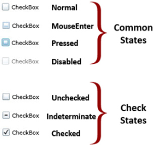
Figure 5.12 Two different state groups of the CheckBox control
Transitions represent the way a control looks visually as it transitions from one state to another. For example, when the CheckBox control goes from the MouseEnter state to the Pressed state, the background changes from light blue to dark blue (see Figure 5-13).
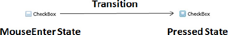
Figure 5.13 State transition of the CheckBox control
Note Get more information on the Parts and States model and Visual State Manager by visiting the Scorbs site—Karen Corby's blog— at http://scorbs.com/2008/06/11/parts-states-model-with-visualstatemanager-part-1-of.
The Silverlight 2 VSM follows the Parts and States model and features visual states and state transitions within the control templates. Within ControlTemplate, the VisualStateManager class manages states and the logic for transitioning between states defining the control's behavior. The attached property VisualStateManager. VisualStateGroups contains a collection of VisualStateGroup objects. Each VisualStateGroup object contains a collection of mutually exclusive VisualState objects and VisualTransition objects.
As mentioned, Expression Blend makes it very easy to manage control states and to define control state transitions (by defining the duration of a transition to animate). At runtime, Silverlight will dynamically run the appropriate animation storyboards to move the control from one state to another. The key advantage of integration with Expression Blend is that there is no need to write code and create animation storyboards manually.
So that you understand the VSM, try this Button control example. Add a Button control to the Blend design surface. Right-click the Button control and choose the options Edit Control Parts (Template) and Create Empty. You will then be prompted for the name of the Style resource you want to create. Now you will notice that a new States window at the top-left side in the Blend IDE is displayed, as shown in Figure 5-14.
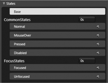
Figure 5.14 States management window in Microsoft Expression Blend
As you click any of the states except Base, automatic recording of the design surface starts, and it records all the steps performed and creates animation for the selected state. You can also define the transition value (of the TimeSpan type) to transit from one state to another. The following is an example XAML snapshot:
<Setter Property="Template">

        <Setter.Value>

            <ControlTemplate TargetType="Button">

                <Grid>

                    <vsm:VisualStateManager.VisualStateGroups>

                        <vsm:VisualStateGroup x:Name="CommonStates">

                    <vsm:VisualStateGroup.Transitions>

                        <vsm:VisualTransition To="MouseOver"

                                 GeneratedDuration="0:0:0.6"/>

                    </vsm:VisualStateGroup.Transitions>

                            <vsm:VisualState x:Name="Normal"/>

                            <vsm:VisualState x:Name="MouseOver">

                                <Storyboard>

                                    <! –Some animation-->

                                </Storyboard>

                            </vsm:VisualState>

                            <vsm:VisualState x:Name="Pressed">

                                <Storyboard>

                                    <! –Some animation-->

                                </Storyboard>

                                ......

                             <vsm:VisualStateGroup x:Name="FocusStates">

                             <vsm:VisualState x:Name="Focused">

                                <Storyboard>

                                     <! –Some animation-->

                                 </Storyboard>

                                 ......

                              </vsm:VisualStateGroup>

                       </vsm:VisualStateManager.VisualStateGroups>

     ......

</Setter>
Note Get more information on the Visual State Manager by visiting the Scorbs site—Karen Corby's blog—at http://scorbs.com/2008/06/11/parts-states-model-with-visualstatemanager-part-1-of/.
Developing a Sample Custom Control
Developing a custom control is a six-step process:
1. Create a Silverlight class library project in Visual Studio 2008 SP1 and name it SampleCustomControl.
2. Define generic.xaml under the themes folder. The generic.xaml file defines the default visual appearance of the custom control. This file also contains keyed resources under the <ResourceDictionary> element that we will manipulate in SampleCustomControl.cs. We can also define custom states for the custom control in this file.
a. Right-click the SampleCustomControl project and choose Add  New Folder to create a new folder with the name
 themes.
b. Right-click the newly created themes folder and choose Add New Item. Select the TextFile file type and name it generic.xaml.
c. As shown in Figure 5-15, change the Build Action property to Resource to add generic.xaml as a resource file. Also clear the Custom Tool property value.
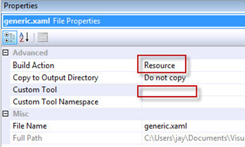
Figure 5.15 Changing the generic.xaml file to a resource file
d. Add a <ResourceDictionary> element to the generic.xaml file to place all the resources as shown in the following. The ResourceDictionary provides a dictionary that contains key resources that we will manipulate in SampleCustomControl.cs and also in the ControlTemplate defined in the generic.xaml file.
<ResourceDictionary

        xmlns="http://schemas.microsoft.com/winfx/2006/xaml/presentation"

        xmlns:x="http://schemas.microsoft.com/winfx/2006/xaml">

</ResourceDictionary>
3. Add the default Style for the control under the ResourceDictionary section. Start by including the XML namespace of the assembly, and then add the default Style for the control as shown in the following code snippet:
<ResourceDictionary

       xmlns="http://schemas.microsoft.com/winfx/2006/xaml/presentation"

       xmlns:x="http://schemas.microsoft.com/winfx/2006/xaml"

       xmlns:local="clr-namespace:CustomControl;assembly=SampleCustomControl">

         <!-- Default style for CustomControl -->

         <Style TargetType="local: SampleCustomControl ">

             <Setter Property="Template">

                 <Setter.Value>

                     <ControlTemplate TargetType="local: SampleCustomControl ">

                          <!--Control template for CustomControl -->

                     </ControlTemplate>

                 </Setter.Value>

             </Setter>

         </Style>

</ResourceDictionary>
4. Define the custom control class. Rename the default added class Class1.cs to SampleCustomControl.cs. The custom control class derives from the base Control class. The custom control class contains the metadata that allows it to conform to the Parts and States model enabling integration with VSM and control logic such as properties, dependency properties, event handlers, and methods.
The TemplatePart represents a contract as an attribute that is applied to the class definition to identify the types of the named parts that are used in control template and to place them under the VSM domain (this is an optional step).
You can add the TextBlock control as an attribute to the SampleCustomControl custom control.
You can add the following code snippet within the namespace section or under the class definition:
[TemplatePart(Name = panelMenu.CurrentSelection, Type = typeof(TextBlock))]
We also need to create a constructor for this class and set the Control.DefaultStyleKey property. The DefaultStyleKey references the default style for the control. To work correctly as part of theme style lookup, this value is expected to be the Type of the control being styled (in our case, SampleCustomControl).
The following is the code snippet of the SampleCustomControl class:
//Default Included Namespaces

using System;

using System.Net;

using System.Windows;

using System.Windows.Controls;

using System.Windows.Documents;

using System.Windows.Ink;

using System.Windows.Input;

using System.Windows.Media;

using System.Windows.Media.Animation;

using System.Windows.Shapes;


namespace CustomControl

{


    [TemplatePart(Name = panelMenu.CurrentSelection, Type = typeof(TextBlock))]

    public class SampleCustomControl: Control

    {

        public SampleCustomControl()

        {

            this.DefaultStyleKey=typeof(CustomControl);

            this.Loaded+=new RoutedEventHandler(SampleCustomControl_Loaded);

            OnApplyTemplate();

            ....

        }

    }

}
5. Define the template handlers. You need to define the Override OnApplyTemplate method and GetTemplateChildren method as the main template handlers:
public override void OnApplyTemplate()

{

       base.OnApplyTemplate();

       GetTemplateChildren();

             ....

}
The GetTemplateChildren method is used to retrieve the named element in the instantiated control template visual tree:
private void GetTemplateChildren()

{

...

}
6. The final step is to define the required custom properties and dependency properties (private and public fields) and methods and event handlers of the custom control.
Figure 5-16 shows the overall generic structured template of a typical Silverlight custom control. We will follow the same structure for developing our required custom controls.
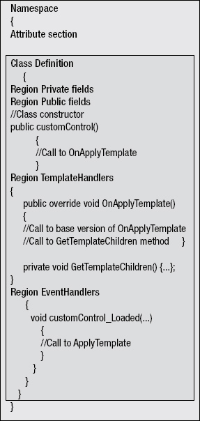
Figure 5.16 Generic structured template for a typical Silverlight custom control
Note Get more information on how to develop custom controls by reading "Digging into Custom Controls," http://silverlight.net/blogs/jesseliberty/archive/2008/09/12/digging-into-custom-controls.aspx. The "Additional References" section at the end of this chapter also lists a couple articles on this topic.
There are two ways you can make a custom control visible to Silverlight projects as a reference. Here we will use the panelMenu.dll custom control (which we will develop for the left navigation pane later in the chapter) as an example.
Manually Adding the Control As a Reference
You can add the panelMenu.dll file to the Silverlight application project as a reference using Add Reference option; select it from the context menu that appears when you right-click the project. This will open the dialog box shown in Figure 5-17.
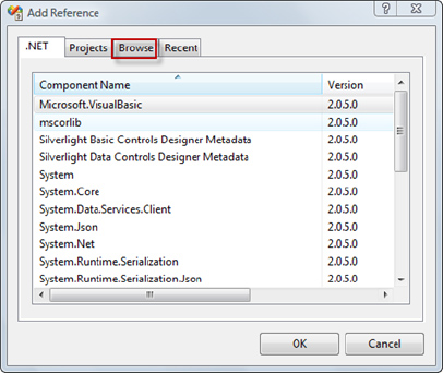
Figure 5.17 Adding a Silverlight custom control as a reference to the Silverlight Application project
Click the Browse tab to browse to the location of the file panelMenu.dll. Select the file and click OK. The References section in the project will expand, showing the newly added assembly reference.
Now you can use this control in an XAML file or a code-behind file the same way you use other Silverlight controls.
To add your custom control in XAML, you need to add the XML namespace in the UserControl section that will contain the CLR namespace of the control (in this case, TechnologyOpinion) and the assembly name (in this case, panelMenu) as shown in the following code:
xmlns:myControl="clr-namespace:TechnologyOpinion;assembly=panelMenu"
Note In the case of a Silverlight class library project, you need to add the custom control namespace in the generic.xaml file under the ResourceDictionary section.
Now you are all set to use the referenced custom control in XAML by using <xmlns>:<assemblyname> as shown here:
<myControl:panelMenu ...>
Note that as you start typing this line, the Visual Studio IntelliSense feature will help the same way it helps with other Silverlight controls.
Using the Control in the Code-Behind
To use the control in the code-behind, add the generic namespace (TechnologyOpinion in this example) as shown here:
using TechnologyOpinion;
Note In the case of a Silverlight class library project, you need to add the namespace in the custom control class definition.
Adding a Custom Control in the Visual Studio Toolbox
You can also add Silverlight custom controls to the Visual Studio Toolbox tab pane. Until you remove this item, it will be part of the Visual Studio toolbox for every Silverlight project you create. Follow these steps to do so.
As shown in Figure 5-18, right-click the Visual Studio Toolbox tab to which you would like to add the custom control. In this case, right-click the Custom tab and select the Choose Items option. Now in the opened Choose Toolbox Items dialog box, click the Silverlight Components tab and browse to the panelMenu.dll file. Upon adding the custom control, it will be displayed on the list with the selected check box. Click OK to finish the process. You should see the panelMenu custom control available in the Custom tab.
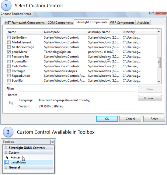
Figure 5.18 Adding the custom control to the Visual Studio Toolbox
Now you can just drag and drop this panelMenu item into the XAML view of the page when you want to add this control to your Silverlight application project.
Developing the Enterprise Training Portal
Now that the design of the Enterprise Training Portal has been established, it's time to start developing this application.
Project Structure of the Enterprise Training Portal
The Enterprise Training Portal RIA consists of the project structure shown in Figure 5-19.
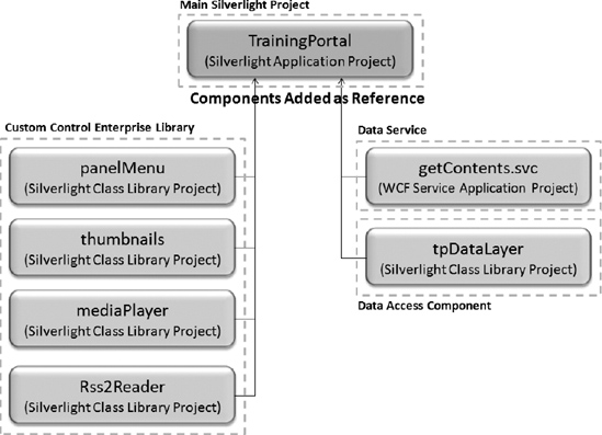
Figure 5.19 Enterprise Training Portal project structure
We will create these projects in the following order:
1. Data service project: The WCF Service application project provides a getContents WCF serviceto integrate the application with the SQL Server database.
2. Data access component project: A Silverlight class library project is needed to create a core and reusable data access layer component, tpDataLayer. This project does not contain any user control.
3. Custom control enterprise library: Four Silverlight class library projects—panelMenu, thumbnails, mediaPlayer, and Rss2Reader—will be used to create a custom control enterprise library. These projects can be added as a reference to any Silverlight projects.
4. Main training portal project: The TrainingPortal is the main Silverlight application projectfor building the Enterprise Training Portal. This project will reference the previously mentioned components to build a complete service-oriented Enterprise Training Portal.
To simplify the development process, we will create one temporary Silverlight application project solution, PortalComponentsLibrary, and add these four projects one by one.
Developing the Data Access WCF Service: getContents
First we need to create a WCF-based data access service to integrate the Enterprise Training Portalwith the SQL Server database so it can retrieve the available training information. We'll use the metadata with LINQ to SQL classes bridging between the Web Service class and SQL Server.
Add a new project to the solution by selecting WCF in the Visual Studio project template section, choosing WCF Service Application for the project type, and naming it getContents. The project will contain the default files Service1.svc and iservice.cs, which you need to delete.
Now right-click the project in Solution Explorer, select Add/New Item to add a WCF service, and name it getContents. This will create three new files—getContents.svc, a service file; associated code-behind file getContents.svc.cs; and a service interface file, IgetContents.cs.
Delete all the lines of the dummy DoWork method from IgetContent.cs and getContent.svc.cs.Later, we will implement the service interface and custom methods to query the SQL Server database and parse it using LINQ.
Figure 5-20 shows the class diagram of the getContents WCF service.
Figure 5.20 getContents WCF service class diagram
Before you create LINQ to SQL classes, make sure you have created the TrainingPortalDB_Data.mdf file following the schema shown earlier in Figure 5-6.
1. Right-click the server project, add the LINQ to SQL Classes template as shown in Figure 5-21, name the class SQLDB.dbml, and click the Add button.
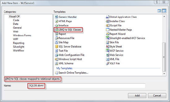
Figure 5.21 Adding SQLDB.dbml LINQ to SQL classes mapped to relational objects
2. When the Object Relational Designer window opens, open the Server Explorer and navigate to the TrainingPortalDB database.
3. Expand to reveal the tables and drag both the Category and tpContents tables onto the SQLDB.dbml designer workspace as shown in Figure 5-22.
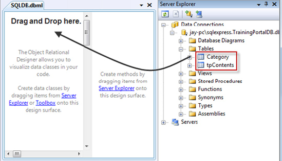
Figure 5.22 Creating data classes
4. The generated LINQ class corresponding to both the tables is not Serializable by default.We need to change it to Serializable to integrate with the WCF service. Click the design surface to bring up the properties of the entire class and change the Serialization Mode setting from None to Unidirectional, as shown in Figure 5-23.
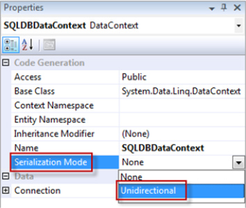
Figure 5.23 Making the data class Serializable
Defining the Service Interface: IgetContent.cs
Now we are all set to define the contract for the service and write the LINQ query.
Open IgetContent.cs and insert the following line of code to define the IgetContent service contract:
[ServiceContract]

public interface IgetContent

{

   [OperationContract]

   menuBinding[] menuClient(string connectionString);

   [OperationContract]

   appContents[] contentClient

      (string selectedItem, string selectedMenuId, string connectionString);

}
As shown in this code snippet, the menuClient method will query the SQL Server database to get the data to generate the left navigation pane. It has a return type of menuBinding, which we will define in the DataContract of this interface. The contentClient method will query the database to get the content of the selected menu item (which is actually the Track field value). It has a return type of appContents, which we also define in the DataContract section.
Next, we define the menuBinding and appContents data contract classes:
[DataContract]

public class menuBinding

{

    [DataMember]

    public int Id;

    [DataMember]

    public string Title;

    [DataMember]

    public List<string> Items;

}
[DataContract]

public class appContents

{

    [DataMember]

    public string Title;

    [DataMember]

    public string Abstract;

    [DataMember]

    public string ImageUri;

    [DataMember]

    public string VidUri;

    [DataMember]

    public string TitleUri;

}
Defining the Service Class: getContent.svc.cs
Now we jump to the code-behind getContent.svc.cs and declare two class-level variables as shownin the following code snippet:
private appContents[] content;

private SQLDBDataContext db;
Note that in this code, we declare an instance of the SQLDBDataContext (a LINQ to SQL class) touse with the LINQ query.
public menuBinding[] menuClient(string connectionString)

{

     db = new SQLDBDataContext(connectionString);


     menuBinding[] menuData =

         (from cat in db.Categories

          select new menuBinding()

          {

              Id = (int)cat.Id,

              Title = (string)cat.Title,

              Items = (from row in db.tpContents

                       where row.Id == cat.Id

                       select (string)row.Track).Distinct().ToList()

          }).ToArray();


     return menuData;

}
As shown in the preceding code snippet, the method signature has a return type of menuBindingand accepts connectionString as a String type parameter. We pass this connectionString to the SQLDBDataContext constructor so it can point to the location that we supplied in tpConfig.xml underthe Datasource node for the SQL Server database. This way we override the local connection stringcreated earlier (when we dragged and dropped the SQL database table from the local SQL Server) tothe connection string specified in tpConfig.xml.
public appContents[]

  contentClient(string selectedItem, string selectedMenuId,string

  connectionString)

{


    db = new SQLDBDataContext(connectionString);
   var rowData =

         (from cat in db.Categories

         where cat.Id == int.Parse(selectedMenuId)

         select new

         {

             trainings = (from training in db.tpContents

                         where training.Track == selectedItem

                         select new appContents()

                         {

                             Title = training.Title,

                             Abstract = training.Abstract,

                             TitleUri = training.TitleUri,

                             ImageUri = training.ImgUri,

                             VidUri = training.VidUri,

                         })

         });

    foreach (var item in rowData)

    {

         content = item.trainings.ToArray<appContents>();

    }


    return content;

}
Note that the foreach loop converts the System.Linq.IQueryable<AnonymousType#1> to getContents.appContents[] so it is compatible with the return type of the method.
Now getContents is ready to be deployed and consumed by the TrainingPortal application's business layer, tpDataLayer, which we define in the next section.
Deploying the getContents WCF Service
To publish the getContents WCF service, right-click the project from Solution Explorer and select the Publish option. You will get the Publish Web window as shown in Figure 5-24.
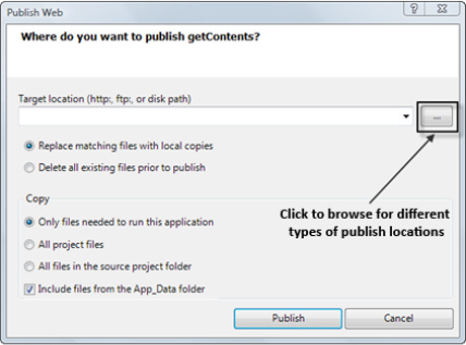
Figure 5.24 Publishing the getContents WCF service
There are four types of publish locations: file system, local IIS, FTP site, and remote site. Based on your criteria, you can choose the option that best suits you. For example, you can choose the Local IIS option to deploy to your local IIS for testing purposes to take full advantage of IIS features, such as process recycling, idle shutdown, process health monitoring, and message-based activation during development time.
Note As mentioned, this service will be used only if we use the SQL Server database. We are going to develop and explore the WCF service for demonstration purposes only. For this chapter, to simplify the overall deployment process, we are going to use XML as the content database file with our TrainingPortal project. As a result, we do not need to deploy and access this service during this chapter.
Since we are not going to utilize the deployed WCF, we are not going to get into the details of publishing WCF services here. A number of sources and books covering this topic are available for your reference. To deploy on the IIS server, you can visit these links from the Microsoft MSDN site: http://msdn.microsoft.com/en-us/library/ms733766.aspx and http://msdn.microsoft.com/en-us/library/aa751792.aspx.
Developing the Core Data Access Component: tpDataLayer Class Library
Add a new project to the solution by creating a new Silverlight class library project named tpDataLayer to develop a centralized core data access component. Rename Class1.cs to tpDataLayer.cs.
In addition to the default namespaces, add the following namespaces:
//Added

using System.Collections.Generic;

using System.Xml.Linq;

using System.Linq;

using System.Threading;

using System.ServiceModel;

using System.ServiceModel.Channels;
Adding a WCF Service reference
Next, add the getContent WCF service reference created in the previous step. Right-click the projectin Solution Explorer and choose Add Service Reference. This will bring up the Add Service Reference dialog box (see Figure 5-25).
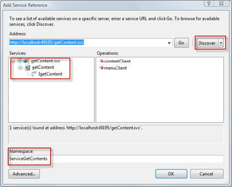
Figure 5.25 Adding the getContent WCF service as a reference
Add the getContent WCF service URL, and click the Discover button. Set the namespace as ServiceGetContent, and click the OK button. The ServiceReferences.ClientConfig file is created in the project, and it contains information regarding the service endpoint and binding as shown in thefollowing code snippet:
<configuration>

      <system.serviceModel>

            <bindings>

                 <basicHttpBinding>

                        <binding name="BasicHttpBinding_IgetContent"

                                  maxBufferSize="2147483647"

                                  maxReceivedMessageSize="2147483647">

                              <security mode="None" />

                        </binding>

                 </basicHttpBinding>

            </bindings>

            <client>

                  <endpoint

                       address="http://localhost:49195/getContent.svc"

                       binding="basicHttpBinding"

                       bindingConfiguration="BasicHttpBinding_IgetContent"

                       contract="ServiceGetContent.IgetContent"

                       name="BasicHttpBinding_IgetContent" />

           </client>

      </system.serviceModel>

</configuration>
Note The service endpoint address is referring to the locally hosted WCF service in the development environment on port 49195, which can be different for different machines. In practice, you will be publishing the WCF service to the production server.
To return a collection of type List, we need to change the Collection type of the service. For this, expand the Service References section in the tpDataLayer project, right-click the ServiceGetContents reference, and choose Configure service reference. In the opened dialog box, change the Collection type to System.Collection.Generic.List from System.Collections.ObjectModel.ObservableCollection as shown in Figure 5-26.
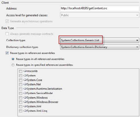
Figure 5.26 Changing the Collection type of the data service to support the List collection type
Note The ServiceReferences.ClientConfig file must be present in the XAP package upon deployment. As it is generated in tpDataLayer, it will not be automatically added to the XAP package. To utilize the service, you need to add the ServiceReferences.ClientConfig file to the TrainingPortal Silverlight application project manually.
TechnologyOpinion Default Namespace
We will use TechnologyOpinion as the namespace of all training portal–related Silverlight projects. Add TechnologyOpinion as the namespace, as shown in the following code:
namespace TechnologyOpinion

{

     public class tpDataLayer

     {.....}

}
Figure 5-27 shows the class diagram of the tpDataLayer component.
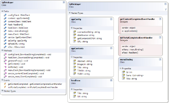
Figure 5.27 Class diagram of the tpDataLayer data access component
To support different data operations for the portal, we will define the following four data classes under the data classes region:
The
appConfigclassThe
menuBindingclassThe
appContentsclassThe
feedItemclass
The appConfig class will be used by the TrainingPortal project to store different Enterprise Training Portal application configuration values retrieved from the tpConfig.xml file. These are the automatic properties dataSource, connectionString, URL, and getContentsWCFUrl.
public class appConfig

{

     public string dataSource { get; set; }

     public string connectionString { get; set; }

     public string URL { get; set; }

     public string getContentsWCFUrl { get; set; }

}
The menuBinding class is used by the panelMenu custom control for storing different training categories and tracking information retrieved from the application data source. The retrieved information will be used to build the left navigation pane.
public class menuBinding

{

     public int Id { get; set; }

     public string Title { get; set; }

     public List<string> Items { get; set; }

}
The appContents class is used by the thumbnails custom control to store available training items retrieved from the application data source, which will be displayed in the preview pane.
public class appContents


{

    public string Title { get; set; }

    public string Abstract { get; set; }

    public string TitleUri { get; set; }

    public string ImageUri { get; set; }

    public string VidUri { get; set; }

}
The feedItem class is used by the Rss2Reader custom control to store available subscribed RSS URLs to display the selected RSS feed within the portal.
public class feedItem

{

       public string Title { get; set; }

       public string Url { get; set; }

}
Under the private fields region, define the following required private fields:
//Private fields

private XDocument xDoc = new XDocument();

private appContents[] content;

private menuBinding[] menu;

private feedItem[] feed;

private string tpFeedURL;

//Webclient object for various HTTP Request

private WebClient menuClient = new WebClient();

private WebClient contentClient = new WebClient();

private WebClient configClient = new WebClient();

private WebClient feedClient = new WebClient();

private appConfig tpConfig = new appConfig();

//Proxy client for "getContents" WCF service

private ServiceGetContent.IgetContentClient service;
The defined variables are mainly related to retrieving the XML file using the WebClient object. To integrate with the WCF service, we also need to define the proxy client for the getContents WCFservice.
Defining the initportal Method
The public initPortal method is used by the TrainingPortal project to initialize the Enterprise Training Portal and retrieve the key application configuration information such as data source, data service, and subscribed RSS feeds. With the use of the WebClient object, we will retrieve the XML configuration file asynchronously (using the HTTP protocol). So we need to create a custom event handler that will be raised when the asynchronous data retrieval operation is completed.
To achieve this, first create a delegate, initPortalCompletedEventHandler, under the public fields region.
public delegate void

     initPortalCompletedEventHandler(object sender, menuBinding[] eMenu,

     feedItem[] eFeed);
Note that here we supply our custom data types menuBinding and feedItem as parameters along with first parameter, sender, of type Object, which provides a reference to the object that raised theevent to the calling environment.
Next, create one event handler of type initPortalCompletedEventHandler:
public event initPortalCompletedEventHandler initPortalCompleted;
Now we create the initPortal method. This method has two parameters of type string that hold the URL to both configuration files.
public void initPortal(string tpConfigURL,string tpFeedsURL)

{

     //Getting tpConfig.xml configuration file using WebClient

     configClient.DownloadStringCompleted += new

           DownloadStringCompletedEventHandler

               (configClient_DownloadStringCompleted);

     configClient.DownloadStringAsync

           (new Uri(tpConfigURL, UriKind.RelativeOrAbsolute));


   //Getting tpFeeds.xml configuration file using WebClient

   feedClient.DownloadStringCompleted += new

          DownloadStringCompletedEventHandler

              (feedClient_DownloadStringCompleted);

   //Store local parameter to global variable

   tpFeedURL = tpFeedsURL;

}
In this method, we defined an event handler for the DownloadStringCompleted event of the configClient WebClient. This event is raised each time an asynchronous operation todownload a resource as a string is completed. These operations are started by calling one of the DownloadStringAsync methods. Next, we make an asynchronous call to download the tpConfig.xml file. Similarly, we define an event handler for the DownloadStringCompleted event of the feedClient WebClient. We will raise the DownloadStringAsync event of feedClient later.
Let's implement the methods to extract the XML information.
configClient_DownloadStringCompleted Method
Once the tpConfig.xml file is retrieved in this method, we will create a simple LINQ query to parse the received XML and store the result in the tpConfig variable of the appConfig class.
void configClient_DownloadStringCompleted

     (object sender, DownloadStringCompletedEventArgs e)

{

   XDocument xDocConfig = XDocument.Parse(e.Result);

   //Define Query
   var Config =

         (from g in xDocConfig.Descendants("TrainingPortal")

             select new appConfig()

            {

              dataSource = g.Attribute("Datasource").Value,

              connectionString =g.Element("Datasource").Element

                   (g.Attribute("Datasource").Value).Element

                     ("connectionString").Value,

                 URL = g.Element("Datasource").Element

                   (g.Attribute("Datasource").Value).Element("URL").Value,

                 getContentsWCFUrl = g.Element("webservice").Element

                   ("getContents").Element("serviceEndpoint").Value,

             });


   //Store configuration

   foreach (var item in Config)

   {

      tpConfig.dataSource = item.dataSource;

      tpConfig.connectionString = item.connectionString;

      tpConfig.URL = item.URL;

      tpConfig.getContentsWCFUrl = item.getContentsWCFUrl;

   }

   xDocConfig = null;


   //Based on DataSource configuration, get the contents to build menu of the

   //training portal from XML or SQL Server

   switch (tpConfig.dataSource)

   {

      case "XML":

         //Read tpContents.xml to build the left navigation pane

         menuClient.DownloadStringCompleted += new

             DownloadStringCompletedEventHandler

             (menuClient_DownloadStringCompleted);

         menuClient.DownloadStringAsync

             (new Uri(tpConfig.URL, UriKind.RelativeOrAbsolute));

         break;


      case "SQL":

         //Call to generateProxy

        generateProxy();

        //Call to Web Service to build the left navigation pane

        service.menuClientAsync(tpConfig.connectionString);

        service.menuClientCompleted += new EventHandler

           <TechnologyOpinion.ServiceGetContent.menuClientCompletedEventArgs>

            (service_menuClientCompleted);

        break;

   }

 }
First we define the LINQ code to retrieve the data source and data service–related fields from the tpConfig.xml file.
In the case of the XML data source, we made an asynchronous call to get the XML file (tpContents.xml in this example) based on the retrieved tpConfig.URL field to build the left navigation pane. We also need to define the DownloadStringCompleted event handler to process the retrieved XML file.
In the case of the SQL type data source, we call the generateProxy method to initialize the proxy of the getContents WCF data service based on the retrieved tpConfig.getContentsWCFUrl field, and then call the service to build the left navigation pane. After an asynchronous call to the menuClient method of the data service, we set the menuClientCompleted event handler to process the retrievedXML file.
The generateProxy method initializes the proxy of the getContents WCF data service. This method will be called only if the data source type is SQL. The method updates the endpoint of the service to point to the new endpoint based on the retrieved tpConfig.getContentsWCFUrl field from the tpConfig.xml client file.
//This method creates the getContents service proxy

private void generateProxy()

{

     //Silverlight 2 supports only basic HTTP binding

     BasicHttpBinding serviceBinding = new BasicHttpBinding();

     //Endpoint address for service

     EndpointAddress serviceURI=new

             EndpointAddress(tpConfig.getContentsWCFUrl);

     //Creates service proxy based on endpoint from tpConfig.xml

     service = new TechnologyOpinion.

             ServiceGetContent.IgetContentClient(serviceBinding,serviceURI);

}
menuClient_DownloadStringCompleted Method
The menuClient_DownloadStringCompleted method, which is called only if the data source type is XML, parses the retrieved training content from the training content XML file to get the Id, Title, and Items fields using LINQ. These retrieved fields will be used by the panelMenu.addMenuItem method as a parameter to build the left navigation pane. At the end of the method, we make an asynchronous call to retrieve the tpFeeds.xml file to populate the RSS feeds drop-down control.
void menuClient_DownloadStringCompleted

    (object sender, DownloadStringCompletedEventArgs e)

{

        xDoc = XDocument.Parse(e.Result.ToString());

        //Parsing xml

        menu =

       (from cat in xDoc.Root.Elements("Category")

       select new menuBinding()

          {

           Id = (int)cat.Attribute("Id"),

           Title = (string)cat.Attribute("Title"),

           Items = (from row in cat.Elements("Training")

           select (string)row.Element("Track")).Distinct().ToList()

           }).ToArray();

       //Get RSS feed URLs

       feedClient.DownloadStringAsync

           (new Uri(tpFeedURL,UriKind.RelativeOrAbsolute));

}
service_menuClientCompleted Method
The service_menuClientCompleted method, which is called only if the data source type is SQL, gets the Id, Title, and Items fields from each retrieved record. These retrieved fields will be used by the panelMenu.addMenuItem method as a parameter to build the left navigation pane. At the end of the method, we make an asynchronous call to retrieve the tpFeeds.xml file to populate the RSS feeds drop-down control.
void service_menuClientCompleted

  (object sender, TechnologyOpinion.ServiceGetContent.

    menuClientCompletedEventArgs e)

{

      menu = new menuBinding[e.Result.Count+1];

      foreach (var item in e.Result)

      {


          menu[item.Id] = new menuBinding();

          menu[item.Id].Id = item.Id;

          menu[item.Id].Title = item.Title;

          menu[item.Id].Items = item.Items;

      }

      //Get RSS feed URLs

      feedClient.DownloadStringAsync

          (new Uri(tpFeedURL, UriKind.RelativeOrAbsolute));

}
feedClient_DownloadStringCompleted Method
The feedClient_DownloadStringCompleted method parses the retrieved tpFeeds.xml file using LINQ and stores the feeds in an array of type feedItem.
void feedClient_DownloadStringCompleted

   object sender, DownloadStringCompletedEventArgs e)

{

   XDocument xDocFeed = XDocument.Parse(e.Result.ToString());

   feed = (from cat in xDocFeed.Root.Elements("feed")

        select new tpDataLayer.feedItem()

        {

        Title = cat.Element("Title").Value,

        Url = cat.Element("Url").Value,

        }).ToArray();

    xDocFeed = null;


 initPortalCompleted(this, menu, feed);

}
Since we have the left navigation menu and RSS feed items defined, we need to raise the initPortalCompleted event. The calling environment must have some kind of implementation of the initPortalCompleted event handler. We will implement that when we wire up all the custom controls along with the WCF service in the Page.xaml.cs file of the main TrainingPortal project.
Defining the getContent Method
The public getContent method is called by the itemClicked event of the tpMenu panelMenu control. The retrieved content is used for thumbnail generation.
The approach of the getContent method is very similar to the initPortal method. As we did for the initPortal method, we need to create a getContentCompletedEventHandler delegate and an event handler of type getContentCompletedEventHandler under the public fields region.
public delegate void

     getContentCompletedEventHandler(object sender, appContents[] e);

public event getContentCompletedEventHandler getContentCompleted;
As shown in the following code snippet of the getContent method, based on the retrieved data source (tpConfig.dataSource) type, XML or SQL, you will use LINQ or call the WCF data service, respectively, to get the training content.
public void getContent(string selectedItem, string selectedMenuId)

{

      switch (tpConfig.dataSource)

      {

           case "XML":

                //Parse the in- memory copy of tpContents.xml i.e. xDoc

                var rowData =

                   (from cat in xDoc.Root.Elements("Category")

                    where cat.Attribute("Id").Value ==

                         selectedMenuId.ToString()

                    select new

                    {

                       trainings = (from training in cat.Elements("Training")

                          where training.Element("Track").Value == selectedItem

                          select new appContents()

                          {

                             Title = training.Element("Title").Value,

                             Abstract = training.Element("Abstract").Value,

                             TitleUri = training.Element("TitleUri").Value,

                             ImageUri = training.Element("ImgUri").Value,

                             VidUri = training.Element("VidUri").Value,

                          })

                    });


          foreach (var item in rowData)

           {

              content = item.trainings.ToArray<appContents>();

           }

           getContentCompleted(this, content);

           break;


           case "SQL":

                //Call to generateProxy

                generateProxy();

                //Call to Web Service

                service.contentClientAsync(selectedItem,

                      selectedMenuId,tpConfig.connectionString);

                service.contentClientCompleted += new

                   EventHandler<TechnologyOpinion.ServiceGetContent.

                   contentClientCompletedEventArgs>

                   (service_contentClientCompleted);

                break;

      }

}
Note that in the case of the XML data source type, the foreach loop converts System.Linq.IQueryable<AnonymousType#1> to getContents.appContents[]. After completion of the foreach loop, we raise the getContentCompleted event. The calling environment must implement the getContentCompleted event handler. We will implement this when we wire up all the custom controls in the Page.xaml.cs class of the main TrainingPortal project.
In the case of a SQL data source, we make an asynchronous call to the contentClient method of the getContents Web Service and define the service_contentClientCompleted event handler.
service_contentClientCompleted Method
This method is called only if the data source type is SQL. The service_contentClientCompleted method gets the Title, Abstract, TitleUri, ImageUri, and VidUri fields from each retrieved record. These retrieved fields are placed in the content array of type appContents.
Finally, we raise the getContentCompleted event. The calling environment must have some kind of implementation of the getContentCompleted event handler.
void service_contentClientCompleted(object sender,

     TechnologyOpinion.ServiceGetContent.contentClientCompletedEventArgs e)

{

     content = new appContents[e.Result.Count];

     int countTo = e.Result.Count;

     int incr = 0;

     foreach (var item in e.Result)

     {

          content[incr] = new appContents();

          content[incr].Title = item.Title;

          content[incr].Abstract = item.Abstract;

          content[incr].TitleUri = item.TitleUri;

          content[incr].ImageUri = item.ImageUri;

          content[incr].VidUri = item.VidUri;

          incr++;

     }


     getContentCompleted(this, content);

}
Deploying the tpDataLayer Class Library Component
You are all set to deploy the tpDataLayer class library. Now the data access class library component—tpDataLayer—is ready as a class library to deploy and can be referenced by the project's custom controls to perform training portal schema–specific data operations.
Note The data access layer component is flexible enough and can be enhanced easily for additional data platforms (you need to recompile the project though). To keep the example simple, we kept the design of the data access layer as a single noncomplex component. However, based on enterprise needs, you can design the data access layer to be more abstracted and loosely coupled, where just changing XML and deploying the new data platform agent can enable an additional data platform.
Developing Custom Controls Enterprise Library
Custom controls will allow the Enterprise Training Portal to be modular, pluggable, and customizable. We need to develop four Silverlight class library projects—panelMenu, thumbnails, mediaPlayer, and Rss2Reader—as custom controls to build the interactive presentation layer of the training portal.
Figure 5-28 shows a complete high-level class diagram of the Enterprise Training Portal RIA.
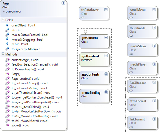
Figure 5.28 High-level class diagram of the Enterprise Training Portal RIA
Left Navigation Pane: panelMenu Custom Control
Add a new project to the solution by creating a new panelMenu Silverlight class library project todevelop the left navigation pane UI component of the portal. It will build the left navigation pane dynamically from the data source defined in the tpConfig.xml file. As described in the design section, in this case it will read either the tpContents.xml file or the trainingPortalDB_Data.mdf SQLServer database file to get the navigation definition.
Next, we are going to follow all the steps outlined in the "Understanding Silverlight Custom Controls" section.
Building the generic.xaml File
Add a file named generic.xaml under the Theme folder and follow all the steps described in the section "Understanding Silverlight Custom Controls" to add ControlTemplate with the TargetType set to local:panelMenu.
Figure 5-29 presents the user interface layout design of the left navigation pane.
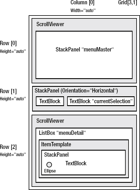
Figure 5.29 User interface layout design of the left navigation pane
Take the following steps to build the left navigation pane as shown in Figure 5-29:
1. We will use a Grid control as the main layout control. Under the ControlTemplate section, add a Grid control with no background and having three autoresizable rows.
2. In the first row of the Grid control, place the ScrollViewer control, and under that add a StackPanel layout control with the name menuMaster. The StackPanel control will hold dynamically created instances of the Button control based on the number of Category records (for database) and nodes (for XML) available in the training content database or XML file, respectively, at runtime. For this chapter, there will be four Button control instances for the four categories: Technology Articles, IT Management Articles, Technical Presentations, and Technical Videos. The Button control instances will be placed vertically, so set the StackPanel control Orientation property value to Vertical.
3. In the second row of the Grid control, place the StackPanel layout control, and inside that put two TextBlock controls. To display the title of the currently selected category with the check mark prefix, for the first TextBlock control set the Text property to a and FontFamily property to Webdings with FontSize set to 20. Name the second TextBlock control currentSelection, with the FontSize set to 13 to display the currently selected category at runtime.
4. In the third row, place the ScrollViewer control and under that a ListBox control with the name menuDetail. This ListBox control will display distinct tracks of the selected category with a bullet point as a prefix. To place a bullet point as a prefix, we will use ListBox.ItemTemplate and place a StackPanel layout control with Orientation set to Horizontal. Under the StackPanel control, we will place a 10×10 Ellipse control with the Fill property set to White and Stroke property set to Cyan to create a bullet point. Next place a TextBlock control to display tracks.
5. For both ScrollViewer controls, hide the border by setting BorderThickness to 0. To display an automatic vertical scrollbar when required, set the VerticalScrollBarVisibility value to Auto.
The following is the resultant XAML code for the generic.xaml file:
<ResourceDictionary

     xmlns="http://schemas.microsoft.com/winfx/2006/xaml/presentation"

     xmlns:x="http://schemas.microsoft.com/winfx/2006/xaml"

     xmlns:vsm="clr-namespace:System.Windows;assembly=System.Windows"

     xmlns:local="clr-namespace:TechnologyOpinion;assembly=panelMenu">

     <Style TargetType="local:panelMenu">

         <Setter Property="Template">

             <Setter.Value>

                 <ControlTemplate TargetType="local:panelMenu">

                     <Grid Background="{x:Null}" Width="Auto" Height="Auto" >

                         <Grid.RowDefinitions >

                             <RowDefinition Height="auto" ></RowDefinition>

                             <RowDefinition Height="auto"></RowDefinition>

                             <RowDefinition Height="auto"></RowDefinition>

                         </Grid.RowDefinitions>

                         <!-- First Row -- >

                         <ScrollViewer VerticalScrollBarVisibility="Auto"

                                   MaxHeight="250" BorderThickness="0" >

                              <StackPanel x:Name="menuMaster"

                                    ScrollViewer.VerticalScrollBarVisibility="Auto"

                                    Orientation="Vertical" >

                             </StackPanel>

                         </ScrollViewer>

                         <!-- Second Row -- >

                          <StackPanel Height="Auto" Margin="0,20,0,10"

                                      VerticalAlignment="Bottom" Grid.Row="1"

                                      Orientation="Horizontal">

                                 <TextBlock Height="Auto" Width="Auto"

                                         Text="a" TextWrapping="Wrap" Foreground="Cyan"

                                         FontFamily="Webdings" FontSize="20"/>

                                 <TextBlock Height="Auto" x:Name="currentSelection"

                                         Width="Auto" Text="" Foreground="White"

                                         TextWrapping="Wrap" FontSize="13"/>

                          </StackPanel>

                           <!-- Third Row -- >

                           <ScrollViewer VerticalScrollBarVisibility="Auto"

                                    MaxHeight="200" BorderThickness="0"

                                    Margin="0,-4,0,-8" Grid.Row="2">

                               <ListBox x:Name="menuDetail" Height="auto"

                                         Width="auto" Background="{x:Null}"

                                         Foreground="White">

                                    <ListBox.ItemTemplate>

                                         <DataTemplate>

                                               <StackPanel Orientation="Horizontal" >
                                                <Ellipse x:Name="bullet"

                                                      HorizontalAlignment="Left"

                                                      Margin="2,2,4,2"

                                                      Width="10" Fill="White"

                                                      Height="10"

                                                      Stroke="Cyan" />

                                              <TextBlock Text="{Binding}"/>

                                       </StackPanel>

                                  </DataTemplate>

                            </ListBox.ItemTemplate>

                         </ListBox>

                     </ScrollViewer>


        </Grid>

      </ControlTemplate>

    </Setter.Value>

 </Setter>

</Style>

</ResourceDictionary>
Building the panelMenu.cs Class File
Rename Class1.cs to panelMenu.cs. Figure 5-30 shows the class diagram of the panelMenu class.
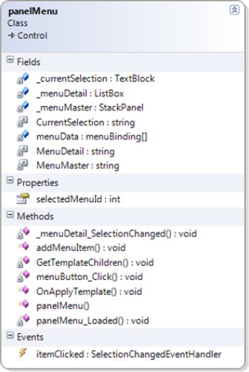
Figure 5.30 Class diagram of the panelMenu class
Follow these steps to build the panelMenu class:
1. To access the tpDataLayer project menuBinding class to get the details on the categories and tracks, add a reference to the tpDataLayer project and add the TechnologyOpinion namespace. Also add the System.Collections.Generic namespace, since later we are going to use the List<> data type. The following code snippet defines the overall panelMenu.cs class structure:
using System;

using System.Net;

using System.Windows;

using System.Windows.Controls;

using System.Windows.Documents;

using System.Windows.Ink;

using System.Windows.Input;

using System.Windows.Media;

using System.Windows.Media.Animation;

using System.Windows.Shapes;

//Additional references

using TechnologyOpinion;

using System.Collections.Generic;


namespace TechnologyOpinion

{


     //Define custom control contracts


     public class panelMenu:Control

     {

       //Define private fields

       //Define public fields

       Public panelMenu

       {

          ....

       }

       //Define public methods

       //Define TemplateHandlers

       //Define private methods

       //Define TemplateHandlers

       //Add event handlers

     }

}
2. Add custom control contracts. The TemplatePart represents a contract as an attribute that is applied to the class definition to identify the types of the named parts that are used in the control template and to place them under the VSM domain. Add the following three attributes to the panelMenu custom control:
[TemplatePart(Name = panelMenu.MenuDetail, Type = typeof(ListBox))]

[TemplatePart(Name = panelMenu.MenuMaster, Type = typeof(StackPanel))]

[TemplatePart(Name = panelMenu.CurrentSelection, Type = typeof(TextBlock))]
3. Add the following private class members and string constants aligned with the contract definition:
#region Private Fields


    private const string MenuMaster = "menuMaster";

    private const string MenuDetail = "menuDetail";
    private const string CurrentSelection= "currentSelection";


    private tpDataLayer.menuBinding[] menuData = new

        tpDataLayer.menuBinding[50] ;


    private StackPanel _menuMaster;

    private ListBox _menuDetail;

    private TextBlock _currentSelection;


#endregion
Note We are going to follow a standard naming convention pattern across the project. String constants used for adding attributes to the custom control as well as for passing as parameters to the GetTemplateChild method will be in Pascal case. Actual elements will be defined in camel case with the prefix _.
4. Add the selectedMenuId as an int property within the public fields region:
#region Public Fields


    public int selectedMenuId { get; set; }


#endregion
5. Create the class constructor and set the FrameworkElement.DefaultStyleKey property to the type of the panelMenu control. Then call the OnApplyTemplate method to load the relevant control template, allowing its parts to be referenced within the class, as in the following code snippet:
public panelMenu()

{

     this.DefaultStyleKey = typeof(panelMenu);

     this.Loaded+=new RoutedEventHandler(panelMenu_Loaded);

     OnApplyTemplate();

}
6. Add the following two methods under the TemplateHandlers region:
#region TemplateHandlers


    //Add OnApplyTemplate and GetTemplateChildren methods


#endregion
7. First the OnApplyTemplate method. As shown in the following code snippet, we call the base version of the OnApplyTemplate method and then call the GetTemplateChildren method to retrieve the named element of the control template. Next, we wire an event handler for the SelectionChanged event of the _menuDetail list box control:
public override void OnApplyTemplate()

{

 base.OnApplyTemplate();

 GetTemplateChildren();

 //Assign event handler only if not Null

 if (_menuDetail != null)

   {
   _menuDetail.SelectionChanged += new

      SelectionChangedEventHandler

        (_menuDetail_SelectionChanged);

   }

}
8. Next the GetTemplateChildren method. As shown in the following code snippet, we need to retrieve three named elements from the control template—the ListBox control named menuDetail, the StackPanel control named menuMaster, and the TextBlock control named currentSelection.
private void GetTemplateChildren()

{

  _menuMaster= base.GetTemplateChild(MenuMaster) as StackPanel;

  _menuDetail = base.GetTemplateChild(MenuDetail) as ListBox;

  _currentSelection = base.GetTemplateChild(CurrentSelection) as TextBlock;

}
9. Add a region called Public Methods to define required public methods. First we need to define an event handler, itemClicked, of the same type as the _menuDetail_SelectionChanged event so that the control that is hosting this custom control can subscribe to this event, as in the following code snippet. This will allow the host to access the selected information when this event is raised.
public event SelectionChangedEventHandler itemClicked;
10. Next add the main method—addMenuItem—of this custom control. The main objective of this method is to store the retrieved information, add a category-related button dynamically, and assign a Click event to it. The following code snippet presents the addMenuItem method:
public void addMenuItem(int Id, string Title, List<string> Items)

{

    menuData[Id] = new tpDataLayer.menuBinding();

    menuData[Id].Title = Title;

    menuData[Id].Items = Items;

    Button menuButton = new Button();

    menuButton.FontSize = 13;

    menuButton.Content = Title;

    menuButton.Name = Id.ToString();

    menuButton.Click+=new RoutedEventHandler(menuButton_Click);

   _menuMaster.Children.Add(menuButton);

}
As you can see, the method required three parameters, Id, Title, and Items (which contains a collection of distinct tracks related to the category), aligned with the content database or content XML file definition.
The menuButton Button control Content property is set to the Title of the category. Each menuButton will dynamically assign a Click event handler as well. And finally, the Name property of the menuButton will be set to the Id of that category to identify which instance of menuButton raised the associated menuButton_Click event. We are also storing parameters to the menuData array using Id as the index for the array. With the use of the same Id, we can access information associated with the selected menuButton when it gets clicked. To build the left navigation pane, we add the dynamically created menuButton Button control as a child in the _menuMaster StackPanel control.
11. Define the event handler. As mentioned previously, we have three events that we need to define. Add them under the event handler region.
void panelMenu_Loaded(object sender, RoutedEventArgs e)

{

    this.ApplyTemplate();

}
When the panelMenu control is loaded, we call the ApplyTemplate method to load the relevant control template so that its parts can be referenced within the class.
void menuButton_Click(object sender, RoutedEventArgs e)

{

    Button btnRef = (Button)sender;

    selectedMenuId = int.Parse(btnRef.Name);

    _menuDetail.ItemsSource = menuData[selectedMenuId].Items;

}
Here we've used the same technique of casting the sender object to a Button control as we did with TextBlock control (representing the category name) for the My Album RIA in Chapter 2. We set the selectedMenuId property to the Name property of the selected Button control, which is actually a unique Id of the related category. At the end, we set the ItemSource property of the _menuDetail ListBox control to the Items field of menuData with the same selectedMenuId as an index of the array for the selected Button control.
void _menuDetail_SelectionChanged

    (object sender, SelectionChangedEventArgs e)

{

   itemClicked(this, e);

}
Earlier we defined the itemClicked event handler of the same type as the _menuDetail_SelectionChanged event. During the event implementation, we call itemClicked to display the available training programs in the preview pane of the selected track item.
Deploying the panelMenu Custom Control
Now you are all set to deploy the panelMenu custom control. Follow the instructions provided in the "Adding a Custom Control in the Visual Studio Toolbox" section of the chapter to register the component in Visual Studio, or you can add it later as a reference when we develop the main training portal Silverlight project.
Note Due to a shortage of space, from this point onward in this chapter I am not going to mention redundant information or steps that are required to develop all projects. For this, you can refer either to the downloadable source code for the book or the earlier sections of this chapter.
Preview Pane: thumbnails Custom Control
Add a new project to the solution by creating a new thumbnails Silverlight class library project, which will be used to develop the preview pane user interface component of the portal. It will build the preview pane thumbnails dynamically based on the training track selection in the left navigation pane. The thumbnails get populated from the training content data file based on the data source defined in the tpConfig.xml file. In our case, it will read either the tpContents.xml file or the trainingPortalDB_Data.mdf SQL Server database file to get the navigation definition.
Building the generic.xaml File
Add a file named generic.xaml under the Theme folder and follow all the steps described earlier to add ControlTemplate with the TargetType set to local:thumbnails.
Figure 5-31 presents the user interface layout design of the left navigation pane.

Figure 5.31 User interface layout design of the thumbnails to develop the preview pane
Please follow these steps to build the preview pane as shown in Figure 5-31:
1. We will use the Grid control as the main layout control. Under the ControlTemplate section, add a Grid control with Opacity set to 0.6 to make thumbnails slightly fade out when they are loaded. To have thumbnails match the Enterprise Training Portal color scheme, set BackGround to #99BDF4FF (which is a light cyan color).
2. Add the Grid.Resources section to include two styles. One is named thumbTitleStyle for the HyperLinkButton control, and the second is linkStyle for the TextBlock control.
3. Add a Border control to surround the Grid control with boundaries. Set the BorderBrush property to Cyan and BorderThickness to 2, and add an appropriate Margin.
4. Place a StackPanel control inside a 1×1 Grid control with Width="150" and Height="100" px.
5. In the StackPanel, place one HyperLinkButton control named Title to hold the title of the training item. Since the HyperLinkButton control does not have the TextWrapping property, we will use the TextBlock control in the HyperLinkButton.Content template. This allows us to span training titles over multiple lines. We use the HyperLinkButton control and its Title.NavigateUri property set to the Title field to display the training title with the link pointing to the original source of the training.
6. In the same StackPanel, place another StackPanel control with the Orientation property set to Horizontal. Inside this StackPanel, place two TextBlock controls named launchVid and launchImage, respectively. As their names suggest, these controls enable users to launch the appropriate video or image (which is a Deep Zoom image collection) related to that training subject in the training content display pane.
Here is the finished generic.xaml file:
<ResourceDictionary

     xmlns="http://schemas.microsoft.com/winfx/2006/xaml/presentation"

     xmlns:x="http://schemas.microsoft.com/winfx/2006/xaml"

     xmlns:vsm="clr- namespace:System.Windows;assembly=System.Windows"

     xmlns:local="clr- namespace:TechnologyOpinion;assembly=thumbnails"

     >

     <Style TargetType="local:thumbnails">

         <Setter Property="Template">

             <Setter.Value>

                 <ControlTemplate TargetType="local:thumbnails" >

                     <Grid x:Name="LayoutRoot" Width="150" Height="100"

                           Background="#99BDF4FF" Opacity="0.6">

                        <Grid.Resources>

                            <Style x:Key="thumbTitleStyle"

                                   TargetType="HyperlinkButton">

                                <Setter Property="FontSize" Value="12"/>

                                <Setter Property="FontFamily" Value="Trebuchet MS"/>

                                <Setter Property="FontStyle" Value="Normal"/>

                                <Setter Property="Foreground" Value="Blue"/>

                                <Setter Property="Margin" Value="3,0,0,0"/>

                            </Style>

                            <Style x:Key="linkStyle" TargetType="TextBlock">

                                <Setter Property="Cursor" Value="Hand"/>

                                <Setter Property="HorizontalAlignment"

                                         Value="Center"/>

                                <Setter Property="VerticalAlignment"

                                         Value="Center"/>

                                <Setter Property="FontSize" Value="13"/>

                                 <Setter Property="Foreground" Value="Yellow"/>

                                 <Setter Property="TextWrapping" Value="Wrap"/>

                                 <Setter Property="Margin" Value="10,0,0,0"/>

                             </Style>

                         </Grid.Resources>

                        <StackPanel Width="150" Height="100">

                            <HyperlinkButton Height="80" Width="145" x:Name="Title"

                                 TargetName="_blank"

                                 Style="{StaticResource thumbTitleStyle}" >

                             <HyperlinkButton.Content>

                                 <Canvas>

                                    <TextBlock Width="145" Height="80"

                                        TextWrapping="Wrap" Text="{Binding}"

                                             TextDecorations="Underline" />

                                  </Canvas>
                                           </HyperlinkButton.Content>

                            </HyperlinkButton >

                            <StackPanel Height="20" Width="150"

                                   Orientation="Horizontal">

                                <TextBlock Height="Auto" Width="Auto"

                                        Text="Play Video" Style="{StaticResource

                                         linkStyle}"

                                        x:Name="launchVid"/>

                                <TextBlock Height="Auto" Width="Auto" Text="View"

                                        Style="{StaticResource linkStyle}"

                                        x:Name="launchImage"/>

                            </StackPanel>
                        </StackPanel>

                        <Border BorderBrush="Cyan" BorderThickness="2"

                                  Margin="0,-1,0,1"/>

                 </Grid>

               </ControlTemplate>

           </Setter.Value>

       </Setter>

    </Style>

</ResourceDictionary>
Building the thumbnails.cs Class File
Rename Class1.cs to thumbnails.cs. Figure 5-32 shows the class diagram of the thumbnails class.
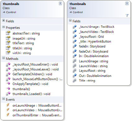
Figure 5.32 Class diagram of the thumbnails class
Follow these steps to build the thumbnails.cs class:
1. In addition to the default namespaces, you need to add the following namespaces:
//Additional namespaces

using System.Windows.Media.Imaging;
2. Add the following attributes to the thumbnails custom control:
[TemplatePart(Name = thumbnails.Title, Type = typeof(HyperlinkButton))]

[TemplatePart(Name = thumbnails.LaunchVideo, Type = typeof(TextBlock))]

[TemplatePart(Name = thumbnails.LaunchImage, Type = typeof(TextBlock))]
3. Add the following private class members and string constants aligned with the contract definition under the private fields region:
private const string Title = "Title";

private const string LaunchVideo = "launchVid";

private const string LaunchImage = "launchImage";

private const string LayoutRoot = "LayoutRoot";
private HyperlinkButton _title;

private TextBlock _launchVideo;

private TextBlock _launchImage;

private Grid _layoutRoot;

private Storyboard fadeIn=new Storyboard();

private Storyboard fadeOut = new Storyboard();

private DoubleAnimation In=new DoubleAnimation();

private DoubleAnimation Out = new DoubleAnimation();
4. Create five public properties that can be set for the thumbnails custom control. The titleUri property will contain a link to the original source of the training. The vidUri will have a link to the media file. We also create two public events of type MouseButtonEventHandler named onLaunchImage and onLaunchVideo, and one event of type MouseEventHandler named onThumbnailEnter.
public event MouseButtonEventHandler onLaunchImage;

public event MouseButtonEventHandler onLaunchVideo;

public event MouseEventHandler onThumbnailEnter;


public string titleUri { get; set; }

public string vidUri { get; set; }

public string imageUri { get; set; }

public string titleText { get; set; }

public string abstractText { get; set; }
5. The following is a code snippet of the self-explanatory class constructor:
public thumbnails()

{

   this.DefaultStyleKey=typeof(thumbnails);

   this.Loaded += thumbnails_Loaded;

   OnApplyTemplate();

}
6. Add the following two methods under the TemplateHandlers region:
public override void OnApplyTemplate()

{

     base.OnApplyTemplate();

     GetTemplateChildren();

     //Assign

     if (_launchVideo != null)

     {

         if (vidUri == null || vidUri=="")

             _launchVideo.Visibility = Visibility.Collapsed;

         else

             _launchVideo.MouseLeftButtonDown +=

                 launch_MouseLeftButtonDown;

     }

     if (_launchImage != null)

     {

         if (imageUri == null || imageUri=="")

             _launchImage.Visibility = Visibility.Collapsed;

         else

             _launchImage.MouseLeftButtonDown +=

                  launch_MouseLeftButtonDown;

     }

     if (_title != null)
     {

        _title.DataContext = titleText;


        if (titleUri != null)

             _title.NavigateUri = new

                 Uri(titleUri,UriKind.RelativeOrAbsolute);

    }

 if (_layoutRoot != null)

 {

    _layoutRoot.MouseEnter += new

         MouseEventHandler(_layoutRoot_MouseEnter);

    _layoutRoot.MouseLeave += new

         MouseEventHandler(_layoutRoot_MouseLeave);

    ToolTipService.SetToolTip(_layoutRoot, "Click to visit...");

 }

}
After calling the GetTemplateChildren method in this method, we need to wire up some events to the retrieved elements. For both TextBlock controls _launchVideo and _launchImage, assign the MouseLeftButtonDown event. For the _layoutRoot Grid control, assign the MouseEnter and MouseLeave event. We will call the animation storyboards fadeIn and fadeOut from these events of the _layoutRoot Grid control. Here we also set the NavigateUri property of the _title HyperlinkButton control to TitleUri.
The following is a code snippet for the GetTemplateChildren method:
private void GetTemplateChildren()

{

   _title = base.GetTemplateChild(Title) as HyperlinkButton;

   _launchVideo = base.GetTemplateChild(LaunchVideo) as TextBlock;

   _launchImage = base.GetTemplateChild(LaunchImage) as TextBlock;

   _layoutRoot = base.GetTemplateChild(LayoutRoot) as Grid;

}
7. Now define the event handlers:
void thumbnails_Loaded(object sender, RoutedEventArgs e)

{

    this.ApplyTemplate();

    //Setting storyboard and animation

    //fadeIn

    In.From = 0.6;

    In.To = 1;

    In.SpeedRatio = 2;

    Storyboard.SetTarget(In, _layoutRoot);

    Storyboard.SetTargetProperty

         (In, new PropertyPath("(Grid.Opacity)"));

    fadeIn.Children.Add(In);

    //fadeOut

    Out.From = 1;

    Out.To =0.6;

    In.SpeedRatio = 3;

    Storyboard.SetTarget(Out, _layoutRoot);

    Storyboard.SetTargetProperty

          (Out, new PropertyPath("(Grid.Opacity)"));

    fadeOut.Children.Add(Out);

}
This event will provide the fadeIn and fadeOut animations by creating a Storyboard and DoubleAnimation type animation.
The _layoutRoot_MouseEnter and _layoutRoot_MouseLeave event handlers for _layoutRoot will start the animation storyboards as shown here:
void _layoutRoot_MouseLeave(object sender, MouseEventArgs e)

{

    fadeOut.Stop();

    fadeOut.Begin();

}


void _layoutRoot_MouseEnter(object sender, MouseEventArgs e)

{

    fadeIn.Stop();

    fadeIn.Begin();

    onThumbnailEnter(this, e);

}
The launch_MouseLeftButtonDown event handler contains a switch case on txtRef.Name. Based on the Name property of the TextBlock that has raised the event, it will perform the appropriate action to launch the training video or display the image with Deep Zoom capabilities.
void launch_MouseLeftButtonDown(object sender, MouseButtonEventArgs e)

{

    TextBlock txtRef = new TextBlock();

    txtRef = (TextBlock)sender;

    switch (txtRef.Name)

    {

       case LaunchVideo:

           onLaunchVideo(this,e);

           break;

       case LaunchImage:

           onLaunchImage(this,e);

           break;

    }

}
Deploying the thumbnails Custom Control
Now you are all set to deploy the thumbnails custom control. Follow the instructions provided in the earlier part of the chapter to register the component with Visual Studio, or you can add it later as a reference when we develop the main training portal Silverlight project.
Media Player: mediaPlayer Custom Control
Add a new project to the solution by creating a new mediaPlayer Silverlight class library project to develop the video media player control to play training video files within the training content display pane. We will implement basic media player functionality like play, pause, rewind, and forward functions as well as volume control functionality.
Building the generic.xaml File
Add a file named generic.xaml under the Theme folder and follow all the steps described earlier to add a ControlTemplate with the TargetType set to local:mediaPlayer.
Figure 5-33 presents the user interface layout design of the media player custom control.
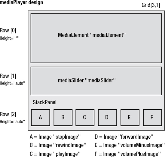
Figure 5.33 User interface layout design of the media player
Follow these steps to build the media player as shown in Figure 5-33:
1. We will use the Grid control as the main layout control. Under the ControlTemplate section, add a Grid control with no background and three rows. The Grid.Resources section contains two storyboard animations named fadeIn and fadeOut. We call these animations from mediaPlayer.cs on the MouseEnter event of each of the navigation Image controls (e.g., stopImage, playImage, etc.). Note that both storyboards have no TargetName property defined. We will set up this property at runtime when we call the storyboards.
2. The first row of the Grid control will contain the MediaElement control.
3. The second row contains a mediaSlider custom control. This control is actually derived from the Slider control (see Figure 5-4 earlier in the chapter). Here we just need to add drag functionality to the Slider control in such a way so it can skip forward or backward in the currently playing media. For that we just need to code the OnDragCompleted event of the HorizontalThumb Thumb control in the default control template of the Slider control. We can create this default control template with help of Expression Blend.
Open Expression Blend, and create a new Silverlight application project. On the Page.xaml file, drag the Slider control from the toolbox. Right-click the control and choose Edit Control Parts (Template) Edit a Copy as shown in Figure 5-34.
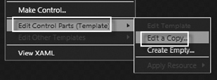
Figure 5.34 Editing the control template using Expression Blend
This will bring up a dialog box asking for the name (key) of the style. Name it mediaSliderStyle and click OK, as shown in Figure 5-35.
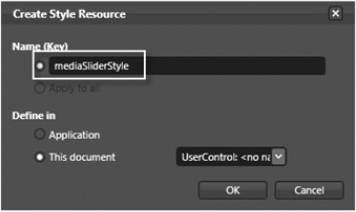
Figure 5.35 Defining the style resource for the control template
This will create a default control template for the Slider control. You can view it by switching to XAML view in Expression Blend. You will see a huge amount of XAML with a control template for every part of the Slider control including VSM. But in our case, we just need the HorizontalTemplate of the default Slider control template without VSM, as we are not changing or adding any new states to the mediaSlider control derived from the Slider control. So we will copy the XAML code for HorizontalTemplate only and will paste it into generic.xaml in the ResourceDictionary section.
4. Add the mediaSlider control to the second row of the Grid control. Note that here we apply mediaSliderStyle to the mediaSlider control that we just created using Expression Blend.
5. In the third row, the StackPanel control will contain six Image controls that together will act as a navigation pane. Note that in the following code snippet, we set the ToolTip property of each Image control to display populated property values upon the MouseEnter state. We also want to change the Cursor to Hand for all six Image controls. So we will apply the custom mediaButtonStyle Style. Here we will set the Opacity property to 0.5 to slightly fade out the images and set the Margin property to 5 between each image. Add this custom style into generic.xaml in the ResourceDictionary section.
The following is the complete XAML code of the mediaPlayer custom control:
<ResourceDictionary

    xmlns="http://schemas.microsoft.com/winfx/2006/xaml/presentation"

    xmlns:x="http://schemas.microsoft.com/winfx/2006/xaml"

    xmlns:vsm="clr- namespace:System.Windows;assembly=System.Windows"

    xmlns:local="clr- namespace:TechnologyOpinion;assembly=mediaPlayer">
<Style x:Key="mediaButtonStyle" TargetType="Image">

    <Setter Property="Margin" Value="5,0,0,0"/>

    <Setter Property="Cursor" Value="Hand"/>

    <Setter Property="Opacity" Value="0.5"/>

</Style>


<Style x:Key="mediaSliderStyle" TargetType="Slider">

    <Setter Property="Template">

        <Setter.Value>

            <ControlTemplate TargetType="Slider">

                <Grid x:Name="Root">

                    <Grid.Resources>

                        <ControlTemplate x:Key="RepeatButtonTemplate">

                        <Grid x:Name="Root" Opacity="0"

                                 Background="Transparent"/>

                        </ControlTemplate>

                    </Grid.Resources>

                    <Grid x:Name="HorizontalTemplate"

                                 Background="{TemplateBinding Background}">

                        <Grid.ColumnDefinitions>

                             <ColumnDefinition Width="Auto"/>

                             <ColumnDefinition Width="Auto"/>

                             <ColumnDefinition Width="Auto"/>

                         </Grid.ColumnDefinitions>

                         <Rectangle Height="3" Margin="5,0,5,0" Grid.Column="0"

                                  Grid.ColumnSpan="3" Fill="#FFE6EFF7"

                                  Stroke="#FFA3AEB9"

                                  StrokeThickness="{TemplateBinding

                                  BorderThickness}"

                                 RadiusX="1" RadiusY="1"/>

                         <RepeatButton x:Name=

                                  "HorizontalTrackLargeChangeDecreaseRepeatButton"

                                  IsTabStop="False" Grid.Column="0"

                                  Template="{StaticResource RepeatButtonTemplate}"/>

                         <Rectangle x:Name="LeftTrack" Grid.Column="0"

                                  Fill="#00FFFFFF" />

                         <Thumb x:Name="HorizontalThumb" Height="18" Width="11"

                                  IsTabStop="True" Cursor="Hand" Grid.Column="1"/>

                         <RepeatButton x:Name=

                                 "HorizontalTrackLargeChangeIncreaseRepeatButton"

                                 IsTabStop="False" Grid.Column="2"

                                 Template="{StaticResource RepeatButtonTemplate}"/>

                         <Rectangle x:Name="RightTrack" Grid.Column="2"

                                 Fill="#00FFFFFF" />

                     </Grid>

                 </Grid>

             </ControlTemplate>

         </Setter.Value>

      </Setter>

   </Style>


<Style TargetType="local:mediaPlayer">

    <Setter Property="Template">

        <Setter.Value>

            <ControlTemplate TargetType="local:mediaPlayer">

                <Grid>

                    <Grid.Resources>
                         <Storyboard x:Name="fadeIn">

                             <DoubleAnimation

                                     Storyboard.TargetProperty ="Opacity"

                                     From="0.5" To="1"SpeedRatio="2"/>

                         </Storyboard>

                         <Storyboard x:Name="fadeOut">

                             <DoubleAnimation

                                     Storyboard.TargetProperty ="Opacity"

                                     From="1" To="0.5" SpeedRatio="4"/>

                        </Storyboard>

                    </Grid.Resources>

                    <Grid.RowDefinitions>

                        <RowDefinition Height="*"/>

                        <RowDefinition Height="auto"/>

                        <RowDefinition Height="auto"/>

                    </Grid.RowDefinitions>

                    <StackPanel HorizontalAlignment="Center" Grid.Row="2"

                           Orientation="Horizontal">

                        <Image x:Name="stopImage" ToolTipService.ToolTip="Stop"

                               Style="{StaticResource mediaButtonStyle}"/>

                        <Image x:Name="rewindImage"

                            ToolTipService.ToolTip="Rewind"

                            Style="{StaticResource mediaButtonStyle}"/>

                        <Image x:Name="playImage"  ToolTipService.ToolTip="Play"

                               Style="{StaticResource mediaButtonStyle}" />

                        <Image x:Name="forwardImage"

                               ToolTipService.ToolTip="Forward"

                               Style="{StaticResource mediaButtonStyle}" />

                        <Image x:Name="volumeMinusImage"

                               ToolTipService.ToolTip="Decrease Volume"

                               Style="{StaticResource mediaButtonStyle}" />

                        <Image x:Name="volumePlusImage"

                            ToolTipService.ToolTip="Increase Volume"

                            Style="{StaticResource mediaButtonStyle}"/>

                    </StackPanel>

                    <local:mediaSlider x:Name="mediaSlider" Grid.Row="1"

                             MaxWidth="500" Style="{StaticResource

                             mediaSliderStyle}"

                             Margin="0,5,0,5" >

                    </local:mediaSlider>

                    <MediaElement x:Name="mediaElement"

                             Grid.Row="0" AutoPlay="True" />

                  </Grid>

              </ControlTemplate>

           </Setter.Value>

       </Setter>

   </Style>

</ResourceDictionary>
Building the mediaSlider.cs File
Rename Class1.cs to mediaSlider.cs. Figure 5-36 shows the class diagram of the mediaSlider class.
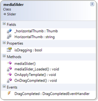
Figure 5.36 Class diagram of the mediaSlider class
Follow these steps to build the mediaSlider.cs class:
1. In addition to the default namespaces, you need to add the following namespace:
using System.Windows.Controls.Primitives;
2. Add the following attribute to the mediaSlider custom control:
[TemplatePart(Name = mediaSlider.HorizontalThumb,

         Type = typeof(Thumb))]
3. Add the following private class member and string constant aligned with the contract definition:
private const string HorizontalThumb = "HorizontalThumb";

private Thumb _horizontalThumb;
4. Add isDragging as a Boolean property within the public fields region and an event handler for the DragCompleted event:
public bool isDragging

{

    get { return _horizontalThumb.IsDragging; }

}

public event DragCompletedEventHandler DragCompleted;
5. The following is a code snippet of the class constructor:
public mediaSlider()

{

    this.DefaultStyleKey = typeof(mediaSlider);

    this.Loaded += new RoutedEventHandler(mediaSlider_Loaded);

    OnApplyTemplate();

}
6. Add the following two methods under the TemplateHandlers region:
public override void OnApplyTemplate()

{

    base.OnApplyTemplate();


    getTemplateChildren();

    if (_horizontalThumb != null)

    {

       _horizontalThumb.DragCompleted += new

             DragCompletedEventHandler(OnDragCompleted);

    }

}
We need to retrieve only one named element from our control template: Thumb HorizontalThumb in the getTemplateChildren method.
private void getTemplateChildren()

{

   _horizontalThumb = GetTemplateChild(HorizontalThumb) as Thumb;

}
7. Finally, define the following two event handlers:
void mediaSlider_Loaded(object sender, RoutedEventArgs e)

{

    this.ApplyTemplate();

}


private void OnDragCompleted(object sender, DragCompletedEventArgs e)

{

    DragCompleted(this, e);

}
Building the mediaPlayer.cs File
Right-click the project in Solution Explorer, choose Add Class, and name it mediaPlayer.cs. Figure 5-37 shows the class diagram of the mediaPlayer class.
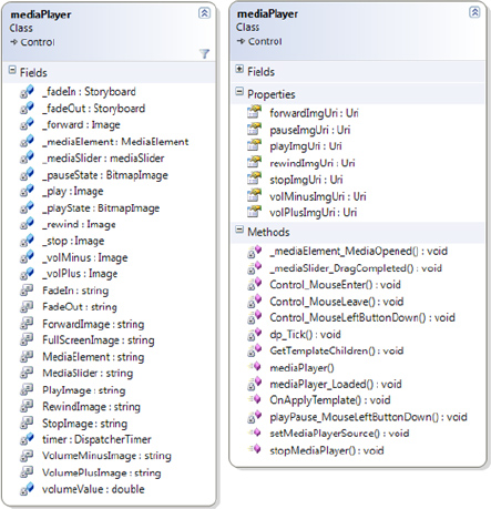
Figure 5.37 Class diagram of the mediaPlayer class
Follow these steps to build the mediaPlayer.cs class:
1. In addition to the default namespaces, you need to add the following namespace, as we make use of DispatcherTimer:
using System.Windows.Threading;
2. Add the following attribute to the mediaPlayer custom control:
[TemplatePart(Name = mediaPlayer.FadeIn, Type = typeof(Storyboard))]

[TemplatePart(Name = mediaPlayer.FadeOut, Type = typeof(Storyboard))]

[TemplatePart(Name = mediaPlayer.ForwardImage, Type = typeof(Image))]

[TemplatePart(Name = mediaPlayer.FullScreenImage, Type = typeof(Image))]

[TemplatePart(Name = mediaPlayer.MediaElement,

     Type = typeof(MediaElement))]

[TemplatePart(Name = mediaPlayer.MediaSlider,Type = typeof(Slider))]

[TemplatePart(Name = mediaPlayer.PlayImage, Type = typeof(Image))]

[TemplatePart(Name = mediaPlayer.RewindImage, Type = typeof(Image))]

[TemplatePart(Name = mediaPlayer.StopImage,Type = typeof(Image))]

[TemplatePart(Name = mediaPlayer.VolumeMinusImage, Type = typeof(Image))]

[TemplatePart(Name = mediaPlayer.VolumePlusImage, Type = typeof(Image))]
3. Add the following private class members and string constants aligned with the contract definition:
//String for the media element template item.

private const string MediaElement = "mediaElement";

//String for the media slider template item.

private const string MediaSlider = "mediaSlider";

//String for the media player navigation control template item.

private const string PlayImage = "playImage";
private const string StopImage = "stopImage";

private const string ForwardImage = "forwardImage";

private const string RewindImage = "rewindImage";

private const string VolumePlusImage = "volumePlusImage";

private const string VolumeMinusImage = "volumeMinusImage";

private const string FullScreenImage = "fullScreenImage";

private const string FadeIn = "fadeIn";

private const string FadeOut = "fadeOut";

private double volumeValue = 0.1;

//Animations

private Storyboard _fadeIn;

private Storyboard _fadeOut;

//The main media element for playing audio and video.

private MediaElement _mediaElement;

//The slider for showing video progress and drag feature.

private mediaSlider _mediaSlider;

//Images for media player navigation

private Image _play;

private Image _stop;

private Image _forward;

private Image _rewind;

private Image _volPlus;

private Image _volMinus;

private BitmapImage _pauseState;

private BitmapImage _playState;

//DispatcherTimer object to update slider as video progresses

private DispatcherTimer timer = new DispatcherTimer();
In this code snippet, we create a BitmapImage object for _pauseState and _playState rather than Image, as we need to toggle the image displayed in the _play Image control based on the current state of the _mediaElement control.
4. Add seven public properties and two public methods:
public Uri playImgUri

{

  set

    {_playState = new BitmapImage(value);

     _play.SetValue(Image.SourceProperty, _playState);

    }

}


public Uri pauseImgUri

{

  set

    {_pauseState = new BitmapImage(value);}

}


public Uri stopImgUri

{

  set

    {

     BitmapImage source = new BitmapImage(value);

     _stop.SetValue(Image.SourceProperty, source);

    }

}


public Uri forwardImgUri
{

  set

    {

     BitmapImage source = new BitmapImage(value);

     _forward.SetValue(Image.SourceProperty, source);

    }

}


public Uri rewindImgUri

{

  set

    {

     BitmapImage source = new BitmapImage(value);

    _rewind.SetValue(Image.SourceProperty, source);

    }

}


public Uri volPlusImgUri

{

  set

    {

     BitmapImage source = new BitmapImage(value);

     _volPlus.SetValue(Image.SourceProperty, source);

    }

}


public Uri volMinusImgUri

{

  set

    {

     BitmapImage source = new BitmapImage(value);

     _volMinus.SetValue(Image.SourceProperty, source);

    }

}


public void stopMediaPlayer()

{

 _mediaElement.Stop();

}


public void setMediaPlayerSource(Uri mediaFile)

{

 _mediaElement.Source = mediaFile;

}
In this code snippet, the method setMediaPlayerSource is the main method to set the Source property of the _mediaElement control. It requires a Uri object containing the URL to the media file.
5. The following is the code snippet of the class constructor:
public mediaPlayer()

{

    this.DefaultStyleKey = typeof(mediaPlayer);

    this.Loaded += new RoutedEventHandler(mediaPlayer_Loaded);

    OnApplyTemplate();

    timer.Interval = new TimeSpan(0, 0, 1);

}
The timer.Interval is set to 1 second by using the TimeSpan object. So every second, the event handler assigned for timer.Tick will be called. We will create an event handler for timer.Tick later in this section.
6. Next, we will add two methods under the TemplateHandlers region.
After calling the GetTemplateChildren method in the OnApplyTemplate method, we need to wire up some events to the retrieved elements. For the navigation elements (six Image controls), we assign three event handlers: MouseLeftButtonDown as Control_MouseLeftButtonDown, MouseEnter as Control_MouseEnter, and MouseLeave as Control_MouseLeave. For the Image _play control, we need to assign the MouseLeftButtonDown event handler as playPause_MouseLeftButtonDown. For the _mediaElement control, we assign the event MediaOpened. For the _mediaSlider control, we assign the event DragCompleted. We also need to assign the event timer_Tick to the DispatcherTimer timer control.
public override void OnApplyTemplate()

 {

     base.OnApplyTemplate();


     GetTemplateChildren();


     //Assign event handlers

     timer.Tick += new EventHandler(timer_Tick);


     if (_mediaElement != null)

         _mediaElement.MediaOpened += new

             RoutedEventHandler(_mediaElement_MediaOpened);


     if (_mediaSlider != null)

         _mediaSlider.DragCompleted += new

             System.Windows.Controls.Primitives.

             DragCompletedEventHandler(_mediaSlider_DragCompleted);


     if (_play != null)

     {

         _play.MouseLeftButtonDown += playPause_MouseLeftButtonDown;

         _play.MouseEnter += Control_MouseEnter;

         _play.MouseLeave += Control_MouseLeave;

     }

     if (_stop != null)

     {

         _stop.MouseLeftButtonDown += Control_MouseLeftButtonDown;

         _stop.MouseEnter += Control_MouseEnter;

         _stop.MouseLeave += Control_MouseLeave;

     }

     if (_forward != null)

     {

         _forward.MouseLeftButtonDown += Control_MouseLeftButtonDown;

         _forward.MouseEnter += Control_MouseEnter;

         _forward.MouseLeave += Control_MouseLeave;

     }

     if (_rewind != null)

     {

         _rewind.MouseLeftButtonDown += Control_MouseLeftButtonDown;

         _rewind.MouseEnter += Control_MouseEnter;

         _rewind.MouseLeave += Control_MouseLeave;

     }
     if (_volMinus != null)

     {

         _volMinus.MouseLeftButtonDown += Control_MouseLeftButtonDown;

         _volMinus.MouseEnter += Control_MouseEnter;

         _volMinus.MouseLeave += Control_MouseLeave;

     }

     if (_volPlus != null)

     {

         _volPlus.MouseLeftButtonDown += Control_MouseLeftButtonDown;

         _volPlus.MouseEnter += Control_MouseEnter;

         _volPlus.MouseLeave += Control_MouseLeave;

     }


}


private void GetTemplateChildren()

{

    _mediaElement = base.GetTemplateChild(MediaElement)

         as MediaElement;

    _mediaSlider = base.GetTemplateChild(MediaSlider) as mediaSlider;

    _play = base.GetTemplateChild(PlayImage) as Image;

    _stop = base.GetTemplateChild(StopImage) as Image;

    _forward = base.GetTemplateChild(ForwardImage) as Image;

    _rewind = base.GetTemplateChild(RewindImage) as Image;

    _volPlus = base.GetTemplateChild(VolumePlusImage) as Image;

    _volMinus = base.GetTemplateChild(VolumeMinusImage) as Image;

    _fadeIn = base.GetTemplateChild(FadeIn) as Storyboard;

    _fadeOut = base.GetTemplateChild(FadeOut) as Storyboard;

}
In this code snippet, the last two lines retrieve the fadeIn and fadeOut storyboards that we defined in our control template of mediaPlayer under the Grid.Resources section.
7. Finally, we define the event handlers:
void mediaPlayer_Loaded(object sender, RoutedEventArgs e)

{

   this.ApplyTemplate();

}


void timer_Tick(object sender, EventArgs e)

{

    if (_mediaSlider.isDragging == false)

        _mediaSlider.Value = _mediaElement.Position.TotalSeconds;

}
This event changes the value property of _mediaSlider so that as the media in _mediaElement progresses, the thumb in the mediaSlider control will update its position. Here we are preventing _mediaSlider.Value from changing to stop HorizontalThumb in _mediaSlider moving when the user drags the thumb. We determine this feature by validating the isDragging property of the _mediaSlider control.
void _mediaElement_MediaOpened(object sender, RoutedEventArgs e)

{

    _mediaSlider.Maximum = _mediaElement.NaturalDuration.

         TimeSpan.TotalSeconds;

    timer.Start();

}
Here we set the _mediaSlider control's Maximum property to the length in seconds of the media file, which is currently playing in _mediaElement by using the _mediaElement. NaturalDuration property. We also start the timer object to begin moving the thumb in the _mediaSlider control.
void _mediaSlider_DragCompleted(object sender,

    System.Windows.Controls.Primitives.DragCompletedEventArgs e)

{

    _mediaElement.Position = TimeSpan.FromSeconds(_mediaSlider.Value);

}
Here we set _mediaElement.Position to _mediaSlider.Value.
Add code for the event handler playPause_MouseLeftButtonDown as follows. Note that we also change the tooltip for the control as we change the source of the image.
void playPause_MouseLeftButtonDown

    (object sender, MouseButtonEventArgs e)

{

    if (_mediaElement.CurrentState == MediaElementState.Playing)

    {

       _mediaElement.Pause();

       _play.SetValue(Image.SourceProperty, _playState);

       ToolTipService.SetToolTip(_play, "Play");

    }

    else

    {

      _mediaElement.Play();

      _play.SetValue(Image.SourceProperty, _pauseState);

      ToolTipService.SetToolTip(_play, "Pause");

    }

}
In the event handlers Control_MouseEnter and Control_MouseLeave, we call the _fadeIn and _fadeOut animations so that when the user mouses over any navigation control, they fade in and when the mouse leaves that control, they fade out to their original Opacity.
void Control_MouseEnter(object sender, MouseEventArgs e)

{

   Image imgRef = new Image();

   imgRef = (Image)sender;

   _fadeIn.Stop();

   _fadeIn.SetValue(Storyboard.TargetNameProperty, imgRef.Name);

   _fadeIn.Begin();

}


void Control_MouseLeave(object sender, MouseEventArgs e)

{

    Image imgRef = new Image();

    imgRef = (Image)sender;

    _fadeOut.Stop();

    _fadeOut.SetValue(Storyboard.TargetNameProperty, imgRef.Name);

    _fadeOut.Begin();

}
In the Control_MouseLeftButtonDown event, we will place a switch case on imgRef.Name. Based on the Name property of the control that has raised the event, we select the appropriate actions to perform. This way we avoid defining an individual event handler for each of the six navigation Image controls.
void Control_MouseLeftButtonDown

    (object sender, MouseButtonEventArgs e)

{

    Image imgRef = new Image();

    imgRef = (Image)sender;


    switch (imgRef.Name)

    {

        case StopImage :

        _mediaElement.Stop();

        _play.SetValue(Image.SourceProperty, _playState);

        break;


        case ForwardImage:

        _mediaElement.Position =

             _mediaElement.Position.Add(new TimeSpan(0, 0, 5));

        break;


        case RewindImage:

        _mediaElement.Position =

             _mediaElement.Position.Subtract(new TimeSpan(0, 0, 5));

        break;


        case VolumePlusImage:

        _mediaElement.Volume = _mediaElement.Volume + volumeValue;

        break;


        case VolumeMinusImage:

        _mediaElement.Volume = _mediaElement.Volume - volumeValue;

       break;

     }

}
Deploying the mediaPlayer Custom Control
Now you are all set to deploy the mediaPlayer custom control. Follow the instructions provided in the section "Understanding Silverlight Custom Controls" to register the component with Visual Studio, or you can add it later as a reference when we develop the main training portal Silverlight project.
RSS 2 Feed Viewer: Rss2Reader Custom Control
Add a new project to the solution by creating a new Rss2Reader Silverlight class library project to develop the RSS feed viewer UI component of the portal. This control will be populated with the data that we parse using LINQ and the SyndicationFeed class. The URL for the feed will be accessed from tpFeeds.xml.
We are going to follow all the steps outlined previously in the "Understanding Silverlight Custom Controls" section.
Building the generic.xaml File
Add a file named generic.xaml under the Theme folder and follow all the steps described earlier to add a ControlTemplate with the TargetType set to local:Rss2Reader.
Figure 5-38 presents the user interface layout design of the left navigation pane.
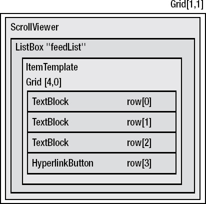
Figure 5.38 User interface layout design of the RSS feed viewer
Follow these steps to build the RSS feed viewer as shown in Figure 5-38:
1. We will use the Grid control as the main layout control. Under the ControlTemplate section, add a Grid control with no background and only one row, and add the Grid.Resources section to include the htmlFormat and linkFormat helper classes under the local namespace. We will develop these helper classes when we develop the Rss2Reader class.
2. Add a ScrollViewer control inside the Grid control. Add the ListBox control within the ScrollViewer control and name it feedList. Set the Background property of the ListBox control to {x:Null} and the BorderThickness property to 0.
3. In the ItemTemplate of the feedList ListBox control, add another Grid control with four rows. Set the Height property to Auto and MaxWidth property to 800. In the first three rows, place TextBlock controls, and in the last row place the HyperlinkButton control.
4. The Rss2Reader control will display only the Title, PublishDate, and Summary properties of the SyndicationFeed class and bind them with the Text property of three TextBlock controls. Bind the Links property of the SyndicationFeed class to the NavigateUri property of the HyperlinkButton.
5. Set the Converter to htmlFormatter when you bind the Summary in the third TextBlock control to remove all HTML tags, newline characters, and spaces. Set the Converter to linkFormatter when you bind the HyperlinkButton to display only the first link that will point to the post.
6. Set other properties of these four controls as shown in the following code snippet for the generic.xaml file:
<ResourceDictionary

       xmlns="http://schemas.microsoft.com/winfx/2006/xaml/presentation"

       xmlns:x="http://schemas.microsoft.com/winfx/2006/xaml"

       xmlns:local="clr-namespace:TechnologyOpinion;assembly=Rss2Reader"

       xmlns:vsm="clr-namespace:System.Windows;assembly=System.Windows">

       <Style TargetType="local:Rss2Reader">

           <Setter Property="Template">

               <Setter.Value>

                   <ControlTemplate TargetType="local:Rss2Reader">

                       <Grid>

                              <Grid.Resources>

                                 <local:htmlFormat x:Key="htmlFormatter"/>

                                 <local:linkFormat x:Key="linkFormatter"/>

                              </Grid.Resources>

                              <ScrollViewer VerticalScrollBarVisibility="Auto"

                                     HorizontalScrollBarVisibility="Auto"

                                     BorderThickness="0"

                                     Style="{StaticResource ScrollViewerStyle1}">

                              <ListBox x:Name="feedList" Background="{x:Null}"

                                     BorderThickness="0" >

                                  <ListBox.ItemTemplate>

                                     <DataTemplate>

                                        <Grid MaxWidth="800"

                                               ScrollViewer.HorizontalScrollBarVisibility

                                               ="Auto" >

                                            <Grid.RowDefinitions>

                                                <RowDefinition Height="Auto"/>

                                                <RowDefinition Height="Auto"/>

                                                <RowDefinition Height="Auto"/>

                                                <RowDefinition Height="Auto"/>

                                            </Grid.RowDefinitions>

                                            <TextBlock Foreground="Cyan" Grid.Row="0"

                                                    FontWeight="Bold" Text ="{Binding

                                                    Path=Title.Text}"

                                                    TextWrapping="Wrap" FontSize="12" />

                                            <TextBlock Foreground="SkyBlue"

                                                    Grid.Row="1"

                                                    Text="{Binding Path=PublishDate}"

                                                    TextWrapping="Wrap" FontSize="10" />

                                            <TextBlock Foreground="White" Grid.Row="2"

                                                    Text="{Binding Converter=

                                                      {StaticResource htmlFormatter},

                                                    Path=Summary.Text}"TextWrapping="Wrap"

                                                    FontSize="11"/>

                                            <HyperlinkButton Foreground="Yellow"

                                                    Grid.Row="3"

                                                    VerticalAlignment="Top"

                                                    HorizontalAlignment="Left"

                                                    Content="Read more..."

                                                    NavigateUri="{Binding Converter={

                                                       StaticResource linkFormatter},

                                                       Path=Links}"

                                                    FontSize="12" TargetName="_blank"/>

                                        </Grid>

                                     </DataTemplate>

                                  </ListBox.ItemTemplate>
                              </ListBox>

                              </ScrollViewer>

                       </Grid>

                   </ControlTemplate>

               </Setter.Value>

           </Setter>

       </Style>

   </ResourceDictionary>
Note Here we have not used Expression Blend. To make the control more rich looking and integrate with VSM to make it more interactive, you can use Expression Blend and VSM as described earlier.
Building the Rss2Reader.cs Class File
Rename Class1.cs to Rss2Reader.cs. Figure 5-39 shows the class diagram of the Rss2Reader class library project.
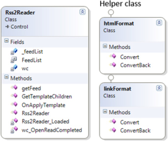
Figure 5.39 Class diagram of the Rss2Reader class library project
Follow these steps to build the Rss2Reader.cs class:
1. In addition to the default namespaces, you need to add the following namespaces:
//Additional namespaces

using System.Text.RegularExpressions;

using System.Windows.Browser;

using System.ServiceModel.Syndication;

using System.Windows.Data;

using System.Collections.ObjectModel;

using System.Linq;

using System.Xml;

using System.Windows.Controls.Primitives;
2. Add the following attribute to the Rss2Reader custom control:
[TemplatePart(Name = Rss2Reader.FeedList, Type = typeof(ListBox))]
3. Add the following private class members and string constant aligned with the contract definition:
private const string FeedList = "feedList";

private ListBox _feedList;

private WebClient wc = new WebClient();
4. The following is the code snippet of the class constructor:
public Rss2Reader()

 {

     this.DefaultStyleKey = typeof(Rss2Reader);

     OnApplyTemplate();

     this.Loaded += new RoutedEventHandler(Rss2Reader_Loaded);

     wc.OpenReadCompleted += new

         OpenReadCompletedEventHandler(wc_OpenReadCompleted);

 }
We will use the WebClient class and make asynchronous calls to access the RSS feed XML file using HTTP. To download feeds, we need to make an HTTP request. To support this functionality, within the class constructor we create the event handler that will notify when the asynchronous call is completed.
5. Add the following two methods under the TemplateHandlers region:
public override void OnApplyTemplate()

{

    base.OnApplyTemplate();

    GetTemplateChildren();

}

private void GetTemplateChildren()

{

    _feedList = base.GetTemplateChild(FeedList) as ListBox;

}
Here we need to retrieve only the ListBox control named feedList.
6. The public getFeed method will have one parameter of type Uri pointing to the RSS feed that we want to download and display. So we make an asynchronous call to the wc WebClient in this method.
public void getFeed(Uri feedAddress)

{

    wc.OpenReadAsync(feedAddress);

}
7. Now we define the event handlers:
void Rss2Reader_Loaded(object sender, RoutedEventArgs e)

{

   this.ApplyTemplate();

}


void wc_OpenReadCompleted(object sender, OpenReadCompletedEventArgs e)

{

      if (e.Error == null)

      {

          //Load feed into SyndicationFeed

          XmlReader reader = XmlReader.Create(e.Result);
          SyndicationFeed feed = SyndicationFeed.Load(reader);


          //Set up databinding

          _feedList.ItemsSource = (feed as SyndicationFeed).Items;

      }

}
When the RSS feed read operation is completed, the wc_OpenReadCompleted event handler will parse the result using XmlReader and then set the _feedList ListBox control's ItemSource property.
8. We need to define two additional helper classes to format the data based on the portal requirement. Place them in the helper classes region.
Both of these classes inherit from the IvalueConverter interface. It exposes methods that allow us to modify the data as it passes through the binding engine. In other words it allows us to convert the format of our data between the source and the target.
The htmlFormat class removes all the HTML tags, newline characters, and spaces:
public class htmlFormat : IValueConverter

{

   public object Convert(object value, Type targetType, object parameter,

     System.Globalization.CultureInfo culture)

   {

     //Remove all HTML tags, newline characters, and spaces

     string returnValue = Regex.Replace(value as string, "<.*?>", "");

     returnValue = Regex.Replace(returnValue, @"
+s+", "

");


     //Decode HTML entities

     returnValue = HttpUtility.HtmlDecode(returnValue);

     return returnValue;

   }

   //We need to implement IValueConverter interface member ConvertBack

   public object ConvertBack(object value, Type targetType,

     object parameter, System.Globalization.CultureInfo culture)

   {

     throw new NotImplementedException();

   }

}
The linkFormat class gets the first link (this link will point to the post) from the SyndicationLink collection.
public class linkFormat : IValueConverter

{

  public object Convert(object value, Type targetType, object parameter,

     System.Globalization.CultureInfo culture)

  {

      //Get the first link that will point to the post

      return ((Collection<SyndicationLink>)value).FirstOrDefault().Uri;

  }

  //We need to implement IValueConverter interface member ConvertBack

  public object ConvertBack(object value, Type targetType, object parameter,

     System.Globalization.CultureInfo culture)

  {

      throw new NotImplementedException();

  }

}
Deploying the Rss2Reader Custom Control
Now you are all set to deploy the Rss2Reader custom control. Follow the instructions provided in the earlier part of the chapter to register the component with Visual Studio, or you can add it later as a reference when we develop the main TrainingPortal Silverlight project.
Image Viewer: MultiScaleImage Control
The image viewer includes the Silverlight Deep Zoom functionality. You need to use the MultiScaleImage control (available as part of the default Silverlight control) to enable the Deep Zoom functionality. We will add this control as part of the main Silverlight TrainingPortal application project within the main user control of the Page.xaml file.
In this section, you will see how to prepare images for Deep Zoom using the freely available Deep Zoom Composer. You can download the Deep Zoom Composer by visiting http://silverlight.net/GetStarted/ and clicking the Install Deep Zoom Composer link.
Understanding the Deep Zoom Composer
After successful installation of the Deep Zoom composer, the following steps will allow you to prepare images for the Deep Zoom functionality using the MultiScaleImage Silverlight control:
1. Open Deep Zoom Composer, create a new project, and name it whatever you want.
2. This will open the IDE of the tool where you will have three options for the workspace: Import, Compose, and Export. The Import workspace allows you to import and manage images in the project. The Compose workspace allows you to position and arrange your images. The Export workspace allows you to export your final composition to a Deep Zoom image or collection. Choose the Import option for the workspace.
3. Add images that you want to prepare for Deep Zoom by clicking the Import tab.
4. After completion of the import process, click Compose to switch to the Compose workspace. At the right side, you can see images that you added in the previous step. You need to drag them to the center of the workspace to compose them for Deep Zoom. Drag as many images as you want and arrange them. There are various tools available at the bottom of this workspace that will help in composing your images.
5. You can also alter the square, as shown in Figure 5-40, to adjust the default view of Deep Zoom images when they are loaded.
Figure 5.40 Adjusting the default view of Deep Zoom images
6. When you are finished with the composition, click the Export tab. Here you will see a preview of the composition that you finished in the previous step. You will be presented with two options to export. The first is PhotoZoom Export, which requires you to sign in with your Windows Live ID if you already have a PhotoZoom account. PhotoZoom is the free service that provides hosting of Deep Zoom albums. The second option is the Silverlight Export. In this tab, you need to name the composition. Then if you want, click Browse to set the export location. We are going to use the second option for our application.
7. The next section is Image Type, where you need to select between Export as Composition and Export as Collection. For our needs, you can select any one. Choose Image Format as JPEG from the drop-down box, as it will have a smaller size than the default format PNG.
8. In the last section, Output Type, we have two options. The first option is Export Images, which exports only images that can be used with the MultiScaleImage control. The second option is Export Images and Silverlight Project, which also generates a sample Deep Zoom project displaying your images as Deep Zoom images. For our needs, we will select the first option.
9. After successful export, you will get a dialog box providing information about the image folder where Deep Zoom images are saved. Click that folder to open the export location.
10. The export folder contains two folders and three XML files. We need all these items when we add or upload Deep Zoom images to use with our application. The XML file dzc_output.xml is the main file, and we will supply the URL of it when setting the MultiScaleImage control's Source property. Repeat the preceding steps to prepare your images for Deep Zoom.
Now we are all set for Deep Zoom. We will integrate this feature in the next section.
Developing the Main Silverlight Application Project: TrainingPortal
Create a TrainingPortal Silverlight application project by selecting the Silverlight Application project template with a web solution to host the Silverlight control for the testing.
Adding Exiting Custom Controls and the Data Access Component
Since we are going to use the tpContents.xml file as a training database, except for the getContents WCF data service, we need to add all the developed components (four custom controls and one data access component) to this newly created project.
To make your efforts organized and simple, create a Bin folder under the training portal solution folder TrainingPortal. Place all deployed custom control DLLs and the data class library DLL in this folder.
Now right-click the project, choose Add reference, and browse to the Bin folder that you just created. Select all the DLLs and click OK. The References section of the project will contain all four custom controls and the data access component. Figure 5-41 shows the added components under the References section.
To contain the resources that we use in the TrainingPortal project, we will create a res folder in the project and put each resource we create in this folder. Here I have placed six PNG images for the vidStage mediaPlayer control, one PNG image for the training portal icon, and a PNG image RSS feed icon as shown in Figure 5-41.
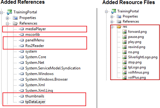
Figure 5.41 Additional references and resource files for the TrainingPortal project
The Page.xaml XAML markup file represents the main user interface of the Enterprise Training Portal RIA and is derived from the UserControl.
1. In the XAML code view of Page.xaml, within the UserControl we need to add four XML namespaces for our custom controls as shown here:
    <UserControl x:Class="TrainingPortal.Page"

       xmlns="http://schemas.microsoft.com/winfx/2006/xaml/presentation"

       xmlns:x="http://schemas.microsoft.com/winfx/2006/xaml"

       xmlns:TO1="clr- namespace:TechnologyOpinion;assembly=mediaPlayer"

       xmlns:TO2="clr- namespace:TechnologyOpinion;assembly=Rss2Reader"

       xmlns:TO3="clr- namespace:TechnologyOpinion;assembly=thumbnails"

       xmlns:TO4="clr- namespace:TechnologyOpinion;assembly=panelMenu" >
2. Now change the Background property of the LayoutRoot Grid control to #FF023B4A. Under the Grid.Resources section, add a simple storyboard fadeIn that you will call while loading thumbnails into the ThumbBar StackPanel control.
    <Grid.Resources>

       <Storyboard x:Name="fadeIn">

       <DoubleAnimation

                Storyboard.TargetProperty ="Opacity"

                From="0.6"

                 To="1"

                 SpeedRatio="2"/>

       </Storyboard>

</Grid.Resources>
3. As defined in Figure 5-4, the Grid control has the following code for row and column definitions:
<Grid.RowDefinitions>

       <RowDefinition Height="120"/>

       <RowDefinition Height="*"/>

       <RowDefinition Height="120"/>

       <RowDefinition Height="22"/>

</Grid.RowDefinitions>


<Grid.ColumnDefinitions>

       <ColumnDefinition Width="200"/>

       <ColumnDefinition Width="*"/>

</Grid.ColumnDefinitions>
4. Add a Border control surrounding the Grid control:
<!--Border surrounding Grid "LayoutRoot"-->

<Border Grid.ColumnSpan="2" Grid.RowSpan="4" BorderThickness="3,3,3,3"

         BorderBrush="Cyan" Padding="0,0,0,0" Margin="0,0,0,0"/>
5. Add the TechnologyOpinion enterprise logo using the Image control:
<Image x:Name="logo" Margin="10,15,0,0" Height="118" Source="res/tpLogo.jpg"

        Stretch="Fill" HorizontalAlignment="Center" VerticalAlignment="Top"

        Width="172" Grid.RowSpan="2"/>
6. Add the enterprise name, Technology Opinion, using the TextBlock control:
<!--Application company name -->

<TextBlock x:Name="companyName" Text="Technology Opinion" Margin="3,18,0,0"

        FontSize="16" Foreground="White" TextWrapping="Wrap" Width="181"

        Grid.Column="1" HorizontalAlignment="Left" VerticalAlignment="Top"/>
7. Add the application title, Enterprise Training Portal, using the TextBlock control:
<!--Application title -->

<TextBlock x:Name="portalTitle" HorizontalAlignment="Left" Margin="3,34,0,51"

         Width="Auto" FontSize="24" Text="Enterprise Training Portal"

         TextWrapping="Wrap" Foreground="Cyan" Grid.Column="1" />
8. Add the Silverlight logo using the Image control:
<!-- Powered by Microsoft Silverlight Logo -->

<Image x:Name="silverlightLogo" Source="res/SilverlightLogo.jpg" Stretch="None"

         Grid.Row="2" Margin="0,0,0,0" Height="84" Width="76"

         VerticalAlignment="Center"

         HorizontalAlignment="Center" RenderTransformOrigin="0.487,0.25"/>
9. Add the text "Powered by" above the Silverlight logo using the TextBlock control:
<!— Add "Powered by" text above Microsoft Silverlight Logo -- >

<TextBlock Height="24" Margin="61.34,0.503,43.66,95.497"

        VerticalAlignment="Stretch" Grid.Row="2" Text="Powered by"

        TextWrapping="Wrap" Foreground="#FFFFFFFF" HorizontalAlignment="Stretch"/>
10. Add the enterprise copyright notice with a link to the enterprise web site using the HyperlinkButton control:
<!-- Copyright notice -->

<HyperlinkButton x:Name="copyrightNote" Margin="0,2,0,2" Grid.Column="1"

        Grid.Row="3" Content ="© 2009 Technology Opinion LLC

        (www.TechnologyOpinion.com) " NavigateUri=http://www.technologyopinion.com

        TargetName="_blank" Foreground="SkyBlue" HorizontalAlignment="Right"

        VerticalAlignment="Top"/>
11. Add a full screen/normal screen TextBlock control with the default Full Screen value as its Text property:
<!-- Fullscreen command -->

<TextBlock x:Name="goFullscreen" Height="20" HorizontalAlignment="Right"

        Margin="0,8,0,0" VerticalAlignment="Top" Width="135" Grid.Column="1"

        Text="Full Screen" TextWrapping="Wrap" Foreground="#FFFFFD11"

        FontSize="14" MouseLeftButtonDown="fullScreenToggle" Cursor="Hand"/>
12. Add code for the feedBox ComboBox control along with the Image and Title that get displayed above it to select the RSS feed:
<!-- "feedBox" ComboBox -->

<ComboBox x:Name="feedBox" SelectionChanged="feedBox_SelectionChanged"

       Margin="98.5,0,24.5,8" Grid.Column="1" VerticalAlignment="Bottom" Height="22"

       Width="250" HorizontalAlignment="Center">

  <ComboBox.ItemTemplate>

    <DataTemplate >

      <StackPanel Orientation="Horizontal">

         <Image Source="res/rss.jpg" Margin="0,0,5,0" />

         <TextBlock Text="{Binding Path=Title}" FontSize="13" Foreground="Black" />

      </StackPanel>

    </DataTemplate>

  </ComboBox.ItemTemplate>

</ComboBox>


<!-- "feedBox" ComboBox Title -->

<TextBlock Margin="130,0,104,38" Grid.Column="1" Text="Get the latest Feeds"

       TextWrapping="Wrap" Foreground="#FFF6FF1C" FontSize="14"

       VerticalAlignment="Bottom" HorizontalAlignment="Center"/>


<!-- "feedBox" ComboBox Image-->

<Image Margin="102,27,257,41" Source="res/rss.jpg" Stretch="Fill"

       Grid.Column="1" RenderTransformOrigin="-0.321,0.071" Width="14"

       HorizontalAlignment="Center" Height="14" VerticalAlignment="Bottom"/>
13. And finally add code for Cell[1,1], which contains all the custom control instances along with the MultiScaleImage tpMsi control, enabling the Deep Zoom functionality:
<!--Following 6 items are in Cell[1,1]-->

<!--Border surrounding cell[1,1] -->

<Border Grid.Row="1" Grid.Column="1" BorderThickness="1" BorderBrush="Gray"

       Margin="5,19,19,19" Background="Black"/>

<!-- panelMenu "tpMenu"-->

<TO4:panelMenu x:Name="tpMenu" itemClicked="tpMenu_itemClicked" Width="172"

       Grid.Row="1" Margin="5,20,0,0" HorizontalAlignment="Center"/>
<!-- mediaPlayer "tpVidStage"-->

<TO1:mediaPlayer x:Name="tpVidStage" Visibility="Collapsed" Grid.Row="1"

       Grid.Column="1" Margin="6,20,20,20" />

<!-- Rss2Reader "tpFeed"-->

<TO2:Rss2Reader x:Name="tpFeed" Visibility="Collapsed" Grid.Row="1"

       Grid.Column="1" Margin="6,20,20,20" />

<!-- StackPanel "tpInfoPanel" -->

<StackPanel x:Name="tpInfoPanel" MaxWidth="800" Grid.Row="1" Grid.Column="1"

       Margin="6,20,20,20" HorizontalAlignment="Center" VerticalAlignment="Center" >

   <TextBlock x:Name="Title" FontSize="18" Foreground="Yellow" TextWrapping="Wrap"

    />

   <TextBlock x:Name="Abstract" FontSize="16" Foreground="White"

        TextWrapping="Wrap"/>

</StackPanel>

<!-- MultiScalImage "tpMsi" for DeepZoom -->

<MultiScaleImage x:Name="tpMsi" MouseLeftButtonDown="tpMsi_MouseLeftButtonDown"

       MouseLeftButtonUp="tpMsi_MouseLeftButtonUp" MouseMove="tpMsi_MouseMove"

       Visibility="Collapsed" Grid.Row="1" Grid.Column="1" Margin="6,20,20,20"/>
In this code snippet, as you type code for MultiScaleImage tpMsi events, IntelliSense will prompt you to create event handlers in the code-behind (Page.xaml.cs). Please do so.
Now if you look at the design view of the Page.xaml file, the training portal screen will look asshown in Figure 5-42.
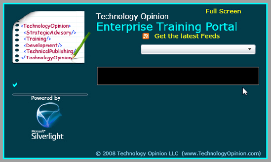
Figure 5.42 Enterprise Training Portal RIA in design view mode of the Page.xaml file
Building the Page.xaml.cs File
The Page.xaml.cs class is a code-behind of Page.xaml and will have methods and event handlers defined for custom controls.
Figure 5-43 shows the Page.xaml.cs class diagram of the TrainingPortal main Silverlight application project.
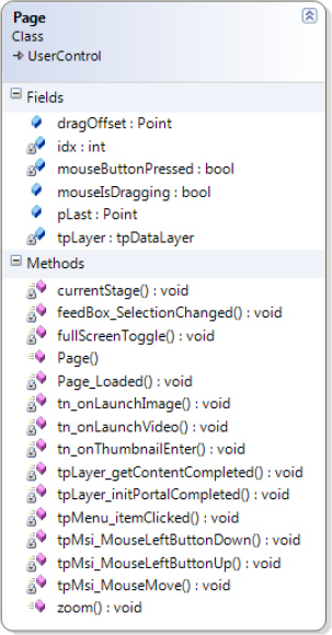
Figure 5.43 Class diagram of the Page.xaml.cs class of the main TrainingPortal Silverlight application project
Follow these steps to build the Page.xaml.cs class:
1. In addition to the default namespaces, you need to add the TechnologyOpinion namespace to access the tpDataLayer component:
using System;

using System.Collections.Generic;

using System.Linq;

using System.Net;

using System.Windows;

using System.Windows.Controls;

using System.Windows.Documents;

using System.Windows.Input;

using System.Windows.Media;

using System.Windows.Media.Animation;

using System.Windows.Shapes;

//Added

using TechnologyOpinion;
2. Create a global variable of type tpDataLayer named tpLayer. We also create one integer type idx that we will use when we generate thumbnails and name them:
TechnologyOpinion.tpDataLayer tpLayer = new

    TechnologyOpinion.tpDataLayer();

 //Index for unique naming of thumbnails

 int idx = 0;
3. In the Page constructor, we define the Loaded event and mouse wheel support for zoom inand out (Deep Zoom):
public Page()

{

    InitializeComponent();

    this.Loaded += new RoutedEventHandler(Page_Loaded);

    new MouseWheelHelper(this).Moved += delegate(object sender,

        MouseWheelEventArgs e)

    {

        double zoomFactor = 1.55;

        if (e.Delta < 0)

          zoomFactor = 1 / 1.55;

        zoom(zoomFactor, pLast);

    };

}
4. The Page_Loaded event initializes the portal by calling the initPortal method of tpLayer. We also define two required events, initPortalCompleted and getContentCompleted, here, as well as set seven required properties for the tpVidStage mediaPlayer control.
//Here we initialize our custom controls

void Page_Loaded(object sender, RoutedEventArgs e)

{

    //Initializing portal

    tpLayer.initPortal("tpConfig.xml","tpFeeds.xml");

    tpLayer.initPortalCompleted += new tpDataLayer.

      initPortalCompletedEventHandler(tpLayer_initPortalCompleted);

    tpLayer.getContentCompleted += new TechnologyOpinion.

      tpDataLayer.getContentCompletedEventHandler

       (tpLayer_getContentCompleted);


    //Setting tpVidStage mediaPlayer buttons

    tpVidStage.playImgUri = new

      Uri("res/play.jpg", UriKind.RelativeOrAbsolute);

    tpVidStage.pauseImgUri = new

      Uri("res/pause.jpg", UriKind.RelativeOrAbsolute);

    tpVidStage.rewindImgUri = new

      Uri("res/rewind.jpg", UriKind.RelativeOrAbsolute);

    tpVidStage.forwardImgUri = new

      Uri("res/forward.jpg", UriKind.RelativeOrAbsolute);

    tpVidStage.stopImgUri = new

      Uri("res/stop.jpg", UriKind.RelativeOrAbsolute);

    tpVidStage.volMinusImgUri = new

      Uri("res/volMinus.jpg", UriKind.RelativeOrAbsolute);

    tpVidStage.volPlusImgUri = new

      Uri("res/volPlus.jpg", UriKind.RelativeOrAbsolute);

}
5. In the initPortalCompleted event, we set the ItemSource property of the feedBox ComboBox control and populate the tpMenu panelMenu control by calling the addMenuItem method:
void tpLayer_initPortalCompleted(object sender,

  tpDataLayer.menuBinding[] eMenu,

 tpDataLayer.feedItem[] eFeed)

{

    //Generate menu

    foreach (var item in eMenu)

    {

        if (item != null)

        {

            tpMenu.addMenuItem

             (item.Id, item.Title, item.Items.ToList());

        }

    }


    //Fill the "feedBox" ComboBox by setting ItemSource

    feedBox.ItemsSource = eFeed;

}
6. The code for the goFullscreen TextBlock is the same as the Chapter 2 version of the full-screen command, as shown in the following snippet:
//Fullscreen toggle command

private void fullScreenToggle(object sender, MouseButtonEventArgs e)

{

    if (goFullscreen.Text == "Full Screen")

        goFullscreen.Text = "Normal Screen";

    else

        goFullscreen.Text = "Full Screen";


    Application.Current.Host.Content.IsFullScreen =

        !Application.Current.Host.Content.IsFullScreen;

}
7. As Cell[1,1] of the Grid LayoutRoot control contains many controls, we need to set Visibility to Visible for controls whenever a resource of its type needs to be displayed. For this we will create a simple method, currentStage, that will require one argument, controlToShow, of type FrameworkElement. This method will set Visibility to Visible for the control that we pass as a parameter. The remaining controls of Cell[1,1] will have Visibility set to Collapsed.
void currentStage(FrameworkElement controlToShow)

{

    //Hide all

    tpInfoPanel.Visibility = Visibility.Collapsed;

    tpFeed.Visibility = Visibility.Collapsed;

    tpMsi.Visibility = Visibility.Collapsed;

    tpVidStage.Visibility = Visibility.Collapsed;

    tpVidStage.stopMediaPlayer();

    //Currently visible

    controlToShow.Visibility = Visibility.Visible;

}
8. While we code the SelectionChanged event in Page.xaml for feedBox, VS automatically generates the corresponding code-behind in Page.xaml.cs. In this event, we will call the getFeed method of the tpFeed Rss2Reader control by supplying selectedFeed.Uri as a parameter.
//Feed ComboBox

private void feedBox_SelectionChanged(object sender,

   SelectionChangedEventArgs e)

{

    currentStage(tpFeed);

    tpDataLayer.feedItem selectedFeed =

      (tpDataLayer.feedItem)e.AddedItems[0];

    tpFeed.getFeed(new Uri(selectedFeed.Url, UriKind.RelativeOrAbsolute));

}
9. To add support for zoom in or out using the mouse wheel, we need to use the MouseWheel-Helper helper class from the Deep Zoom project that is automatically generated by the Deep Zoom Composer.
Note Remember, when we prepared images for Deep Zoom, in the last Export tab under the Output Type section, you saw the option Export Images and Silverlight Project. This generates a sample Deep Zoom project for displaying images as Deep Zoom images. We reuse the helper class MouseWheelHelper from that project and add it to the tpDataLayer class library project.
10. We need to define the following four variables to enable the Deep Zoom functionality:
#region DeepZoom variables

   public bool mouseIsDragging = false;

   public Point dragOffset;

   public Point pLast;

   bool mouseButtonPressed = false;

#endregion
The bool mouseIsDragging variable will help to determine whether the user is dragging the mouse over the tpMsi MultiScaleImage control or not. The Point dragOffset will capture the offset from where the drag is started. The Point pLast will store the last location of the tpMsi MultiScaleImage control after the drag is completed. The bool mouseButtonPressed variable will help to determine whether the mouse button is pressed over the tpMsi MultiScaleImage control or not.
11. For the zoom in and out feature of the tpMsi MultiScaleImage control, create the method zoom:
public void zoom(double zoom, Point pointToZoom)

{

    if (tpMsi.Visibility == Visibility.Visible)

    {

        Point pz = tpMsi.ElementToLogicalPoint(pointToZoom);

        tpMsi.ZoomAboutLogicalPoint(zoom, pz.X, pz.Y);

    }

}
12. In the tpMsi_MouseLeftButtonDown event handler, we will set pLast to tpMsi.ViewportOrigin. The ViewPortOrigin property of the MultiScaleImage control gets or sets the top-left corner of the area of the image to be displayed. We will also capture the drag offset in dragOffset here as shown in the following code snippet:
private void tpMsi_MouseLeftButtonDown

   (object sender, MouseButtonEventArgs e)

 {

    mouseIsDragging = false;

    mouseButtonPressed = true;

    pLast = tpMsi.ViewportOrigin;

    dragOffset = e.GetPosition(this);

 }
13. In the tpMsi_MouseMove event handler, we change ViewportOrigin to the new point where the user is dragging the image:
private void tpMsi_MouseMove(object sender, MouseEventArgs e)

{

   if (mouseButtonPressed)

       mouseIsDragging = true;


   if (mouseIsDragging)

   {

       Point newOrigin = new Point();

       newOrigin.X = pLast.X - (((e.GetPosition(tpMsi).X - dragOffset.X) /

         tpMsi.ActualWidth) * tpMsi.ViewportWidth);

       newOrigin.Y = pLast.Y - (((e.GetPosition(tpMsi).Y - dragOffset.Y) /

         tpMsi.ActualHeight) * tpMsi.ViewportWidth);

       tpMsi.ViewportOrigin = newOrigin;

   }

}
14. For when the user releases the image in the tpMsi control, we code the tpMsi_MouseLeftButtonUp as follows:
private void tpMsi_MouseLeftButtonUp

   (object sender, MouseButtonEventArgs e)

{

   mouseButtonPressed = false;

   pLast = e.GetPosition(this.tpMsi);

   double zoomFactor = 1.55;

   if (mouseIsDragging == false)

   {

      zoom(zoomFactor, pLast);

   }

  mouseIsDragging = false;

}
15. Create the tpMenu_ItemClicked event handler. We call the tpLayer.getContent method to get thecontent of the selected category and generate thumbnails in the tpLayer.getContentCompleted event handler.
private void tpMenu_itemClicked

  (object sender, SelectionChangedEventArgs e)

{

    //If condition to prevent itemClicked Event

      //raised on menu button click

    if (e.AddedItems.Count != 0)

    {

        fadeIn.Stop();

        fadeIn.SetValue(Storyboard.TargetNameProperty, "thumbBar");

        fadeIn.Begin();

        //Clear previous thumbnails

        thumbBar.Children.Clear();

        tpLayer.getContent(e.AddedItems[0].ToString(),

          tpMenu.selectedMenuId.ToString());

    }

}
16. The code for tpLayer_getContentCompleted is as follows. Here, we will dynamically define three event handlers to generate thumbnails instances.
void tpLayer_getContentCompleted(object sender,

  TechnologyOpinion.tpDataLayer.appContents[] e)

{

    //Now create thumbnails

    foreach (var item in e)

    {

            thumbnails tn = new thumbnails();

            tn.Name = "Thumb" + idx.ToString();

            tn.titleText = item.Title;

            tn.abstractText = item.Abstract;

            tn.imageUri = item.ImageUri;

            tn.vidUri = item.VidUri;

            tn.titleUri = item.TitleUri;

            //Right margin for spacing between thumbnails

            tn.Margin = new Thickness(0, 0, 8, 0);

            //Assign three event handlers

            tn.onLaunchImage += new

              MouseButtonEventHandler(tn_onLaunchImage);

            tn.onLaunchVideo += new

              MouseButtonEventHandler(tn_onLaunchVideo);

            tn.onThumbnailEnter += new

              MouseEventHandler(tn_onThumbnailEnter);

            //Add to thumbBar stackpanel

            thumbBar.Children.Add(tn);

            //Increment for unique naming

            idx++;

    }

}
17. These event handlers will load the appropriate resource in the appropriate container: the tn_onThumbnailEnter event handler will set the Title and Abstract text of the tpInfoPanel control, the tn_onLaunchVideo event handler will load video into the tpVidStage control, and the tn_onLaunchImage event handler will load the Deep Zoom image package into the tpMsi control.
void tn_onThumbnailEnter(object sender, MouseEventArgs e)

{

    currentStage(tpInfoPanel);

    thumbnails tnRef = (thumbnails)sender;

    Title.Text = tnRef.titleText;

    Abstract.Text = tnRef.abstractText;

}


void tn_onLaunchVideo(object sender, MouseButtonEventArgs e)

{

    currentStage(tpVidStage);

    thumbnails tnRef = (thumbnails)sender;

    this.tpVidStage.setMediaPlayerSource(new

      Uri(tnRef.vidUri, UriKind.RelativeOrAbsolute));

}


void tn_onLaunchImage(object sender, MouseButtonEventArgs e)

{

    currentStage(tpMsi);

    thumbnails tnRef = (thumbnails)sender;

    this.pLast = new Point(0, 0);

    this.tpMsi.ViewportOrigin = new Point(0, 0);

    this.tpMsi.ViewportWidth = 1.0;

    this.tpMsi.Source = new DeepZoomImageTileSource

      (new Uri(tnRef.imageUri, UriKind.RelativeOrAbsolute));

}
Centralized Deployment of the Enterprise Training Portal RIA
Now we are all set to deploy the Enterprise Training Portal centrally. We will follow the same steps that we performed while deploying the My Album RIA (in Chapter 2) on the Microsoft Silverlight Streaming Server. First, we'll create the deployment XAP package.
Figure 5-44 shows the overall deployment process. It includes the following steps:
1. Zip the XAP package, TrainingPortal.xap, and the two application configuration files, tpConfig.xml and tpFeeds.xml. Name the ZIP package TrainingPortal.zip and upload it to the Microsoft Silverlight Streaming Server. Refer to Chapter 2 for the required steps to deploy Silverlight RIAs on this server.
Note The service-oriented Enterprise Training Portal XAP package is very lightweight (about 300K) compared to the My Album RIA package (about 1.8MB). Along with being flexible, the Enterprise Training Portal RIA becomes a high-performing application at startup time.
2. Along with Clientaccesspolicy.xml, upload the content files to the TechnologyOpinion.com site (or the site from which you plan to deploy the content files) following the folder structure shown in Figure 5-44. The Clientaccesspolicy.xml file must be placed at the root level.
3. Update the TrainingPortal.aspx page to plug in the deployed training portal using the iframe element, as shown in Figure 5-44.
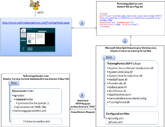
Figure 5.44 Deployment process for deploying the Enterprise Training Portal RIA
Use the following link to access the developed Microsoft Silverlight–based Enterprise Training Portal RIA shown in Figure 5-45: http://technologyopinion.com/TrainingPortal.aspx.
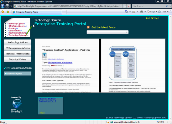
Figure 5.45 Deployed Enterprise Training Portal RIA on TechnologyOpinion.com
Note Silverlight RIAs can be deployed centrally and in a distributed mode. You can deploy the same Enterprise Training Portal RIA in distributed mode, enabling distribution of the RIA on CD or DVD or installation on individual machines. There are only two things to remember for our application:
You must use the local data storage (in this case, XML files) to support operations in disconnected/offline mode.
You must change every resource in the
tpConfig.xmlfile to use a relative URL instead of the absolute URL.
The distributed RIA does not need to connect to the central server to function. This approach will help enterprises to enable remote users to access RIAs installed in their machine or available on various media.
This long chapter provided hands-on guidelines to transform the My Album RIA developed in Chapter 2 to an enterprise-level Enterprise Training Portal. You learned how to apply enterprise-level features and capabilities to develop enterprise RIAs using Silverlight. Key features and capabilities covered in this chapter are as follows:
Service-oriented architecture
Modular and decoupled design
Data platform–agnostic application design
Reusable custom controls for the presentation and business service layers
Use of LINQ and WCF services
Use of Deep Zoom and VSM Silverlight features
Cross-domain deployment
Flexible deployment strategies: central and distributed deployment
In the next chapter, you will learn best practices for planning and preparing enterprises to deploy Silverlight-based RIAs. It also provides technical details on the key factors for the strategiesto deploy Silverlight-based RIAs in the same domain and cross-domain by supporting globalization and localization.
Links from the Microsoft Web Site
Style Class, http://msdn.microsoft.com/en-us/library/system.windows.style(VS.95).aspx
ControlTemplate Class, http://msdn.microsoft.com/en-us/library/system.windows.controls.controltemplate(VS.95).aspx
Customizing the Appearance of an Existing Control by Creating a ControlTemplate, http://msdn.microsoft.com/en-us/library/cc189093(VS.95).aspx
Styling and Skinning Your Objects, http://silverlight.net/learn/tutorials/StylesTemplatesVSM.aspx
VisualStateManager Class, http://msdn.microsoft.com/en-us/library/system.windows.visualstatemanager(VS.95).aspx
Emil Stoychev, "Creating a Silverlight Custom Control—The Basics," http://www.silverlightshow.net/items/Creating-a-Silverlight-Custom-Control-The-Basics.aspx
Carol Snyder, "Different Kinds of Controls You Can Make in Silverlight," http://blogs.msdn.com/silverlight_sdk/archive/2008/10/31/different-kinds-of-controls-you-can-make-insilverlight.aspx
Expression Blend and Design team blog, "Deep Zoom Composer User Guide," http://blogs.msdn.com/expression/archive/2008/03/05/deep-zoom-composer-user-guide.aspx