Chapter 1
Why Design?
When people attempt to take up Microsoft Office SharePoint 2007 (MOSS 2007) as a profession, or even as a hobby, they immediately begin by trying to understand how to make the portal work. This is probably an obvious path; to make SharePoint work, you have to, well, make it work. Beginners toil with custom lists, site administration, and out-of-the-box Web parts. They may start getting into security and document libraries and slightly more advanced topics. Some more advanced (or brave) users may even get into custom development and modification in SharePoint and its integration with other technologies.
But when is it time to learn about design and branding when it comes to the SharePoint portals these people are designing? Should they learn it in the beginning? Or perhaps wait until they have a solid understanding of all other principles related to MOSS 2007? And, once they learn good design concepts, when is it time to worry about the site's look and feel? Is there a good time? If so, should it come at the beginning of the planning process? At the end?
Unfortunately, too often MOSS 2007 developers put little to no emphasis on the actual look and feel of the sites they are designing. There could be any number of reasons that this happens. Maybe it's because, from a business sense, it's hard to quantify good design. Sure, any analyst can show that with the addition of this new feature of the Web site subscription revenue went up by x number of dollars. It's harder to evaluate, though, if a site becomes more or less popular because of the way it looks and feels. This is especially true for a completely new site because there are no historical numbers to use to determine how much difference the site's aesthetics make. Conversely, if a site has been online for three years and one day a total redesign is introduced and within three months sales double, it might be easier to give the credit to the design (although it might be just as easy not to). And what of the sites that generate no real revenue? Perhaps new and/or repeat visits would be able to quantify good design, but even this would be hard to measure. So maybe this is part of the reason.
Or maybe the problem is with the mindset of the developers making the MOSS 2007 sites. Maybe they don't have the training and exposure to make the sites visually impressive. Or maybe there is general apathy about design. Perhaps they just care a lot more about functionality than design. After all, most clients sign off on projects based on what they do, not how they look. Or maybe it's just that these developers don't feel they have the time to make the design look distinct, and besides, there are plenty of out-of-the-box solutions that would work just fine. Slap on the client's logo and be done with design.
This book will attempt to put new emphasis on design. Specifically, this chapter will try to point out the “why” of good design. Why does it matter? Why should developers care? Why should managers care? And why should clients care? The rest of the book will be more aimed at the “how” of good design: How to create a new design. How to create master pages and CSS files to support your new design. How to incorporate themes. How to make more accessible designs. How to make MOSS 2007 work for the design you create.
With that, it's time to get started.
The Million-Dollar Question: What Makes Good Design?
This is a tough question to field. If you ask 100 different Web designers today what is critical for good design, you will not see the same answers brought up by all of them. There will be a lot of recurring themes, but varying weight or importance will be given to each one (if mentioned at all).
However, even with that being true, there are definitely some things that any designer should give thought to when coming up with a design:
- Usability This should probably be at the top of every designer's list. If the site is amazing looking and could have easily come right out of a top New York designer's art portfolio, that is cool. But if a user has no idea they have to press the broken toothpick depicted in the bottom corner of the collage to get to the Contact Us area of the Web site, designers have missed the point. More important, if that site is commercial, the owners may miss a sale (or a lot of sales). Usability has to be taken into consideration when planning the design of a site. This will include navigation, spatial layout, information provided, and general user experience (for example, if the user is presented with a shocking strobe-light effect when they visit the site, they may never come back). A Web site is built for its user base and failing to cater to the people that use the site can have tragic consequences for the longevity of the site.
- Aesthetics Thought should be given to the colors that will be used, how they play into the general scheme of the site and its principles, and how they will shape the experience of the user. This is different from usability in that usability means that the site visitor can use the site effectively, whereas aesthetics is a question of how much the user enjoys the feeling of the site. To extend the preceding example, if the users are easily able to find the “Contact Us” button because it is logically placed and easily identified, they might just use it to tell you that they hate your site if the colors, images, and font choices are giving them headaches. (Of course, more likely you will simply lose them as future visitors and never have a clue how much your organization is suffering from these aesthetic choices.) While not as important as usability, aesthetics should never be undervalued.
- Accessibility This is one of those terms that people have trouble defining. Some people might refer to it as 508 design (after Section 508 of the Disabilities Act). Some might associate it with text readers and other tools to assist the visually impaired. But that isn't really what accessibility means (although this is certainly part of it). Accessibility means, in its simplest form, making sites that everyone gets equal value from. This takes a lot of different forms. Take, for example, a site that broadcasts its daily specials using Flash software. A text reader will read the rendered code of a Web site to the user accessing the site. When it gets to the site's daily advertised specials in Flash, the reader will likely announce something like “embedded object found” and then move on (if they acknowledge it at all). So these patrons will have no idea that ear muffs are buy-one-get-one-free today and may decide to brave the frozen tundra without them. And you just lost a sale. In a similar situation, imagine an e-training site that offers online training on various business topics. But what if those classes were all done in streaming media where some narrator or even instructor is recorded going over subjects like sexual harassment or civil rights issues. How effective would that be to a person who cannot hear? If there is no consideration for such people (and there are plenty of them), the site will suffer for it. These ideas should be fundamental to any designer in today's Internet.
Before you dismiss vision- and hearing-based accessibility issues, consider this: According to the U.S. Bureau of the Census statistics for 1999, there are more than 1.5 million visually impaired computer users. Also, according to a 2005 report by Ross E. Mitchell in the Journal of Deaf Studies and Deaf Education from Oxford University, nearly 10 million people in the U.S. are hard of hearing and nearly 1 million are functionally deaf. And those numbers only reflect potential U.S. visitors to your site; they don't account for all of the other visitors from Canada, Britain, Germany, and the rest of the world.
- Branding This can mean different things to different people, especially on the Web. Many corporations today have specific branding requirements. This often means that Web media can only use a designated logo at specific dimensions and must be separated from all other elements by a specific number of pixels. It could mean that the entire color scheme is mandated by the branding requirements of the company or public entity. It could even mean font sizes and colors. When getting into site design, it is imperative that designers understand the branding requirements of the people paying you to make the design and then adhere to them.
With MOSS 2007 (and portals in general), there is at least one other consideration: Don't look like every other instance of this portal. If visitors come to your site and think, “I've seen this look somewhere before—make that lots of places before,” that is not a good thing. Unfortunately, many user groups fall into this exact trap. If you go to one user group site, it will often look like every other user group site, with the exception of the content, colors, and logo. They all take the same portal and just choose one of the out-of-the-box templates and slap their logo at the top and call it a day.
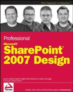
Here is an interesting case study: Look at Figures 1-1 and 1-2.
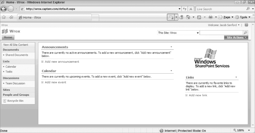
If this book were in color, you might more easily distinguish the two screenshots from each other. However, in the grayscale world of the printed manuscript, this will be much harder to see. It's almost as if one design is simply the other one with a filter on top of it that affects the hue of colors. If you are curious, Figure 1-1 is “Default Theme” and Figure 1-2 is “Granite.”
But this is the point: Do you want people to look at your site and see the business as bland, predictable, and unimaginative, or do you want them to see the business as interesting, dynamic, and unique?
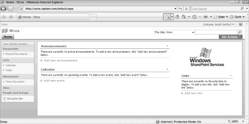
Now, to contrast against these designs, consider Figure 1-3, which is the Web site for The Kroger Company (www.kroger.com).
Does that look like a SharePoint site? Even in grayscale, would you think that this site is one designed in MOSS 2007? Well, it is.
And take a look at Figure 1-4, the Web site for Migros (www.migros.ch).
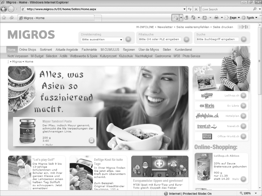
Again, even in the context of black and white images in the print of this book, this site looks distinctly different from anything out of the box with SharePoint.
Finally, take a look at Figure 1-5, the Web site for SendTec. (www.sendtec.com).
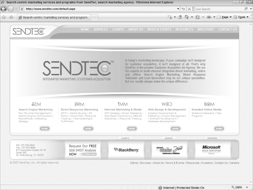
This example may be the most unlike any SharePoint design you have seen. But it was, in fact, designed in SharePoint. If you don't believe it, view the source of the rendered page and you will see the following:
<meta name=“GENERATOR” content=“Microsoft SharePoint” />
As with many things, it may be hard to define what good design is, even though you probably know it when you see it. And these examples show what good design can look like. In addition, the examples establish that designers are not and, more important, should not be confined to the templates that come with a standard MOSS 2007 installation.
Note, however, that these examples are provided to contrast the look and feel of the default templates available in MOSS 2007. Do they necessarily satisfy things such as usability and accessibility? Maybe or maybe not, but that is not the point. The point is that with some thought and planning, and maybe access to the right tools (and the right book), you can take the ordinary and make it extraordinary.
The reasons that MOSS 2007 developers make the effort to put design at the forefront of their projects probably vary from developer to developer. But one universal truth is pride. Pride in the final product and how good it looks. Pride in the fact that something they created is so well received. Pride that they did a good job. But is pride enough? Fortunately, there are other real rewards to doing good design.
Maybe the biggest reason is that it often makes financial sense to do good design work. After all, when you are a consultant, you often get leads and maybe even sales based largely on your portfolio. If a potential client is looking through the sites you have developed and can see nothing inspiring or, even worse, different from the other 20 sites you have already shown them, they will not be knocking down the door to try to hire you. You may still get the sale, but the first impression may not be what you are hoping for. After all, if businesses are scouring the Web to find consultants and looking at their online portfolios, are they really going to know that for client ABC you created innovative event handlers to customize workflow procedures on the document library? That won't come through in a screenshot or even in a visit to the finished site. They would have to decide that they are still interested and then come talk to you to learn about the cool technology you were capable of using. But if you lose them in the first 10 seconds of looking through your portfolio, you won't get that chance.
Beyond that, though, what about referrals? Many deals today are made based on referrals or recommendations from clients. So what happens when you turn in this powerful site but the design looks like you didn't even try to deviate from the out-of-the-box templates? Would the client recommend you? Perhaps. But would you rather they say, “Well, these guys were pretty good. They did everything we asked them to do and were great people to work with?” Wouldn't it be better if they started off by saying, “You have to get these guys. They blew us away. Sure, they did everything we required from a business-requirements perspective. But have you seen our site? These guys are great?” Both scenarios might get you the call, but one would get you a much better starting point with these potential clients.
And, to look at the other side of the coin, there are potentially going to be more and more consequences to bad design. Sure, there are costs of users not buying what you are selling; that is the obvious consequence if your site is horrible and ineffective. What designers might not think of, though, is that there are other real costs. In February 2006, Target Corporation was probably shocked to find out that they were being sued because their Web site was not accessible. In an effort to dismiss the charges, they claimed that they met the requirements of law by making their brick-and-mortar retail stores accessible to all. However, in October 2007, the Federal court thought differently. The U.S. District Court for the Northern District of California certified the case as class action on behalf of blind Internet users throughout the country and determined that Target.com violated not only the Americans with Disabilities Act but also two California civil rights statutes. This resulted in a lot of time and money being spent by the company to deal with both the legal ramifications and customer satisfaction concerns. This is a headache that anyone doing business on the Web just doesn't need.
You can read the National Federation of the Blind's press release on the decision here: http://www.nfb.org/nfb/NewsBot.asp?MODE=VIEW&ID=221.
It should be noted, too, that this is just one of the most recent legal battles forged publicly about Web sites and accessibility. Similar suits have come up in Europe. This is a global issue that needs to be acknowledged and addressed by designers. As the world continues to change, designers need to keep abreast of the serious design considerations that change with it.
Perhaps intuitively, managers should care about good design for the same reasons that developers should. After all, it is important to them as well that they have strong portfolios, extremely satisfied customers, and no negative legal consequences to the products they deliver. They are in the same boat as their developers in this regard. In fact, it could be argued that these reasons are even more important to the manager than to the developer; if any of these things bring about negative consequences to the ongoing concerns of the business, the manager would be much closer to the shouting line than the developer (for better or worse).
But more important than these reasons is the consideration of the impact on the organization's employees and their professional growth and happiness. Plenty of developers have no interest in design and see it at best as a necessary evil. However, a growing number of developers really want to create good design. While it is important to focus on deliverables, it is also important for managers to understand how good design reaches clients and to make sure that developers have the resources they need to make the site look good, function ethically, and provide value. While it is true that some, or maybe even many, developers don't want to get involved in design work, it is equally true that many do. By pursuing the discipline of design, they will become better employees who add tremendous value to the overall business.
It is a safe bet to assume that clients have a primary reason to care about the design of their sites: the user experience. For many sites, this translates into actual dollars. For others, it might mean that they are getting their message out to the largest audience possible. However they quantify it, they should, and almost always do, care about the design of their sites. Sure, they care about the nuts and bolts that run the sites. But you can rest assured that they care about the way they look too.
And clients are getting better at quantifying this experience. Web metrics are becoming increasingly popular. People can fairly easily tell how many unique visitors access their sites. They can tell if they only go to the main page and then leave (indicating a bad experience) or if they stay for a while and surf the content available. If an analysis of the log files for the site shows that 90 percent of visitors access the main page for an average of only 2.3 seconds and then leave, something in the design is just not right. Whether that means that the content is such that nobody knows what the site is for or that the navigation is so confusing and poorly planned that nobody even knows how to get to another page is not as clear. What is clear, though, is that people found their sites and found them useless. Then they left.
In this example, the site is not performing whatever function it is supposed to (unless it is supposed to run people off, in which case it is working perfectly). If the client is selling something, potential buyers likely aren't even seeing what is available for sale, much less buying anything. And if the site is a public-information Web site preaching the gospel of good Web site design, it means nobody is listening to the message. This can be frustrating and can affect revenues severely (even public-awareness sites often sell advertisement space, which is affected by no-stays).
Increasingly more important will be the desire to stay out of court. For example, say the class-action plaintiffs in an accessibility lawsuit get awarded $10,000,000 (or more). Who has to pay that? The designer who designed the site? The manager who oversaw the designer's work? Probably not. After all, any independent consultant (or firm) will require the client to sign off before completing the project. So if the client used an outside firm to design their site, they likely signed off on its final design before releasing it to the world. And, if the client didn't even put in any business requirements to handle accessibility (or if their requirements were vague), they can't even say that they asked for accessible design but rather that the designers failed. And if the client used in-house resources to design the site, there really is not any gray area about who is responsible for the $10,000,000 penalty.
This example might be hypothetical, but it does reflect some of the very real concerns developing in the business world. Either sites will get better about accommodating all users or lawsuits will become more frequent. And going to court, win or lose, is not cheap. Even if you win the case, you are out the legal costs. It's better to worry about paying an extra $5,000 in the design budget than to worry about dealing with an exponentially more expensive lawsuit down the road.
Plus, clients care about their image. They want their sites to look better than the competition. They want to send links to their friends and colleagues and say, “Look at our new site!” Clients, maybe more than any other group, care about design. And, if for no other reason, so should you.
So Why Use SharePoint for Design?
A fair question to ask, especially after reading this chapter, is, “Why should I design with SharePoint?” This is a remarkably simple question with a less-than-simple answer.
First, SharePoint is designed to provide every functionality a portal may need out of the box: wikis, blogs, message boards, document libraries, version control, security, announcements, integration with Active Directory, and a laundry list of other features. This all comes with the initial installation and is fairly easily set up and controlled by administrators. This is a huge selling point.
Add to that the flexibility and ease of customizing the default installation, and you have a much more compelling reason to consider SharePoint as your portal platform. You can integrate custom .NET code into your applications (in code blocks or in code-behind files). You can import data connections through the Business Data Catalog (BDC) that allow your SharePoint lists and controls to integrate with outside data sources. You also can completely overhaul the way the site looks and feels using familiar .NET 2.0 controls (for instance, master pages). Add to this that you can create custom Web parts to do pretty much anything else you need to do. So, while the default installation is remarkable on its own, the power of what you can do with it when you want to step outside of the boundaries of the default can be awe-inspiring.
And don't forget the level of user interaction and control of the site once it is running. Users with no Web programming experience can, with a little training and guidance, create grids that report data from the system, generate and modify custom lists, and even control who has access to what on the site. Developers no longer need to do a lot of the day-to-day maintenance of the site. The users and site administrators can do the majority of it on their own, even if they have no idea what a code block in C# looks like and have no interest in finding out.
One thing that might give developers pause, though, especially in light of some of the examples in earlier sections of this chapter, is accessibility concerns. It is worth noting that, out of the box, SharePoint has some accessibility problems. This is a known issue. However, Microsoft and the community of developers are working together to try to solve this. One example is the efforts made by the development community to integrate the CSS Friendly Control Adapters into SharePoint sites to make many of the controls, such as the menu/navigation system, more accessible. (You can read more about these adapters in Chapter 13.) Maybe even more impressive is the October 2007 release of the Accessibility Kit for Microsoft Office SharePoint Server 2007 by HiSoftware (http://aks.hisoftware.com). (This, too, will be covered in greater depth in Chapter 13.) This kit was commissioned by Microsoft in an effort to better meet the accessibility needs of the Internet community regarding MOSS 2007. This is a huge step forward in the mindset of major software developers and is worth noting when getting into accessibility issues, especially when considering using MOSS 2007 as your platform.
Is MOSS 2007 the perfect platform for portal development on the Web? No, not really. There are a few limitations, such as the accessibility problem that, if not handled, will be an issue with out-of-the-box installations. And this is no small matter. However, there is a concerted effort to remedy this major limitation, and as the community of developers grows, more and more solutions will present themselves. The developers already out there in the field working in MOSS 2007 are probably some of the more passionate you will run into in the Web application development arena, and most of them are happy to share their experience and suggestions. So, whatever limitations there might be could probably just as easily be called “opportunities” or “challenges.” With the power under the hood of SharePoint, figuring out how to get around these challenges is not only achievable; you might just have fun doing it (and you might even make a few friends along the way).
At this point, you have gained an appreciation of some of the reasons why good design should be a serious part of the planning of any Web project (SharePoint or otherwise). Maybe you have been exposed to some things you haven't considered before. Or maybe you have just received confirmation on some of the things you already believe. Either way, you should have a new (or renewed) appreciation of the reason to follow good design principles.
Now that the why is out of the way, the rest of this book will focus more on the how. You will get a better understanding of what good Web design means, how to use tools such as Photoshop and SharePoint Designer for your design needs, and how to use all of the out-of-the-box functionality of SharePoint to make it look anything but.
With that, it's time to begin. Good luck and good coding.