Chapter 2
Web Design 101
Any chapter titled “Web Design 101” is bound to be passed over for more exciting topics. A broad introduction to Web site design isn't nearly as interesting as customizing a search results page or creating publishing sites, is it? Bear with me, though. SharePoint has its own rules, tools, and pitfalls that can make design easy or maddening.
Much of this chapter should be common sense. The key ideas covered here are pretty straightforward: Set limits, involve your users, make things easy to find, and make pages that give users what they need in as attractive a manner as possible. The problem is that common sense often gets plowed under in the name of speed and efficiency, or it gets lost in feature creep. And if you've ever had a Web browser open for more than 5 minutes, you can probably attest to the fact that common sense is not all that common.
Development and design techniques have changed considerably from the early days of the Web. In the murky backwaters of the Internet, site design required arcane knowledge. In-depth understanding of technologies like HTML, CSS, and JavaScript were needed just to make pages function, let alone look professional. This meant that the majority of sites were created by people with a bent for the technical rather than an eye for design.
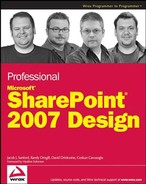
Times have changed. Moreover, the technology that drives Web sites has changed. The next time you crack open the Internet Information Services console (see Figure 2-1), take a look at the files that make up your SharePoint site. The folder that would normally house all of the files that constitute your site is surprisingly sparse. There's no “there” there. SharePoint sites are not hand-built .NET applications, ASP sites, or a from-scratch set of HTML pages. Everything a user sees on your SharePoint site is created “on the fly,” rendered in real time by the SharePoint engine from a small handful of ASPX files, XML files, configuration settings, and rows from a database.
This is a source of frustration to many developers. Since this is very likely the first time you have encountered anything like this, many of the tools and techniques that you've honed over the years doing traditional Web page development no longer apply. In far too many cases, you'll be limited to SharePoint Designer or a text editor to implement a new design.
The payoff for these limitations is pretty significant; SharePoint provides a framework that contains most of the tools needed for the heavy lifting on a Web site: display, workflow, security, content management, and data management. These functions are already baked in. It makes it easy to rapidly develop sites with robust functionality through a simple Web interface. You don't have to concern yourself with building document storage, complex content management tools, or implementing a page-by-page security scheme. But, that also means relearning new technologies to do things that most coders already know how to do.
The idea of a table or a chair is pretty easy to define, and as such is fairly easy to design. If you ask someone to jot down a plan to build those things, you have a pretty good idea what you're going to get. A portal, on the other hand, is another matter entirely.
Microsoft and others have done an excellent job marketing portals to corporate America, but there is a great debate as to how to define what “portal” means. The market-speak for portals sounds great. After all, who doesn't want to connect people, processes, and information using next-generation tools while empowering users by harnessing business intelligence? The problem often lies in making this concept into any sort of reality. Is your intranet already a portal? Is it a portal in the same way Yahoo! is a portal, or is it more like a document management system that can act as a portal? Do you have an external facing Web site that clients use as a portal? Is your Internet site part of an overall portal system? There are a lot of grey areas.
Before you can begin with page layouts or decide which Web Parts to use, take a step back. The goal of a portal is to help make things more organized, to make the lives of users simpler and more efficient. Many companies make the mistake of installing SharePoint and allowing it to grow rampantly, without a plan. In the end, this can make things far more complicated than they were to begin with.
Let's simplify things then. For the sake of argument, let's make up a working definition: A portal is a Web-based application that provides users with access to the stuff they need.
So, the real question is this: What is your company going to do with a portal? What stuff do they need? Is it merely a replacement for a few mapped network drives, or is it going to be used as a product development lifecycle tracking system? Is it part of a document management system, or are you just trying to give your office a way to find key performance indicators from other business systems? The most important step in any design process is to define the goals that your portal will attempt to achieve. Get your goals firmly in place and carve them in stone. This defines the scope of your project. Once you have the finish line clearly defined, they you can fill in the details.
Wait. Driving adoption? Isn't that what you do after you've got a portal for users to adopt? That's what usually happens, and by then, it's too late.
In a previous life, I did a systems upgrade project for a client, installing Windows XP on all desktop computers and upgrading existing Office applications. The job was fairly easy and straightforward. The other techs and I made things faster, better, and prettier.
This is the best part of the IT world. Once in a great while, IT people are regarded as conquering heroes by nearly everyone. However (and there's always a however), everyone warned me about Marge, one of the heads of the accounting department. She had been in charge of expenses longer than anyone had been with the company. She probably came with the building. She is the most frustrating part of the IT world.
Marge had no love or patience for computers or anyone in IT. She had been involved in the company's migration from card readers to tape drives, from letters to faxes to email. I was there to change everything again, for which I was evil incarnate. She thought my job was to screw up her life.
She complained about the new OS, she complained about the icons. She gave me the evil eye when I set up Outlook, and she told me that she didn't trust email. As I put shortcuts on her desktop, she told me that the database applications used the wrong calculations. She complained that no one ever asked her before changing everything. This went on for over an hour.
Every company has a “Marge in Accounting.” Unfortunately, your job is to make her happy (or, at the least, less unhappy). And trust me, if you can get your Marge to adopt the changes that you're about to throw at her, the rest of the job is a walk in the park. Marge is a worst-case scenario. I can't really blame her for being mad at the all new stuff that was thrown at her. She was just trying to do her job, and IT was methodically making things more complicated without asking if it would actually help her. And she had no say in any of the decisions that directly affected her job.
You're about to be the IT person in that scenario and you're going to have to get Marge and the rest of your organization to adopt your new portal. What can you do to improve this process? Simple: Ask them to help.
The key to driving user adoption is to get users involved in the design process from the very beginning. There are no better experts at your company that the people who actually do the work. Once you have a set of goals for your portal, the next step should be to involve these users.
This process can be challenging. As with Marge, modern users are often jaded by the constant changes in IT. You're just another snake oil salesman that promises to make the “Bad Stuff” go away with your really great “New Stuff.” At this point in the process, your job is less about interfacing with a Web site and more about fostering relationships with people. There's a natural progression to these relationships that can benefit you and the people who'll use your SharePoint sites. This process can be a lot like dating. In fact, the sequence of emotions is very similar:
| Note | New SharePoint User | New Boy/Girlfriend |
| Uncertain | Hey, this seems shiny and new, but it's probably another junk piece of software that someone in IT is trying to force on me. | Hey, this person seems nice and attractive, but they're probably just another whackjob like the last three people I dated. |
| Excited | HOLY COW! Did you see that? I can move stuff around on my Web page! This is the greatest thing ever! | HOLY COW! This is the person of my dreams! Perfect in every possible way! |
| Inspired | Wouldn't it be great if I could get this key performance indicator to automatically tie in with these three other business systems? | Wouldn't it great if we, you know, moved in together? |
| Disappointed | What do you mean I can't have a list view that automatically reads people's minds? I NEED THAT. | What do mean you want to get rid of my collection of bobble head dolls? I NEED THAT. |
| Acceptance | Well, maybe it can't read minds, but I suppose that this is still leaps and bounds better than the old way we did things. | Well, they may have their flaws, but I suppose that this is still leaps and bounds better than those last three whackjobs I dated. |
Painful as it can be, involving users early in the design process accomplishes two of the most difficult tasks in design:
1. It gives the people who know the business a chance to share their knowledge. A well- designed, well-thought-out solution will be adopted with less resistance than one that ignores what every other user knows. It is better to get this information now than after you're done.
2. It is a chance to internally market the portal. When the day comes to roll out your great new portal, the users who helped will be more likely to support adoption of a new way of doing business.
Okay. You've gotten the best and brightest of your company to sit down with you. You've plied them with coffee and baked goods. What's the next step? Drawing pictures, of course.
A picture, as it is said, is worth a thousand words. That goes double with SharePoint design. Odds are, the people you're mining for information have never seen SharePoint before. Storyboarding is a process where you create a representation of what users are going to see. By working with users to create interfaces, you get more bang for your buck: Users can give immediate feedback on what they like and what they don't like. Time spent at a whiteboard is cheap compared to time spent creating anything on a screen.
But a quick word of warning: SharePoint is not all things to all people, and this may be a cause of contention. As someone who designs portals for a living, I constantly bump my head into the limitations of the SharePoint architecture. It is extremely malleable. It can be extended, stretched, and tweaked. But it is not and will not be all things to all people.
The line is often the difference between design and development. SharePoint often gives the illusion that everything should be easy, that a few clicks on a Web page will accomplish something that ends up taking weeks of staring at Visual Studio to accomplish. One of the most difficult things about SharePoint design is realizing when that line is crossed.
For example, assume for a moment that you need to allow users to publish documents from a team site to a document repository. Spending time with the team in question will help you design a document library that meets their needs. They want custom columns for “Client Name” and “Purchase Date”? No problem. They want to be able to use a drop-down menu that allows their users to send the document to a central document repository? Piece of cake. They want a custom graphic that appears next to each document to tell them the approval status of a published document? Hold it right there. Yes, it's possible to develop just such a display using custom coding tools such as list event handlers, but realizing that this is a non-trivial task will help keep your project on schedule.
The more users, designers, and management learn to use and embrace SharePoint's innate tools and functionality, the easier it's going to be to build your site. And unfortunately, the further you stray from SharePoint's standard functionality, the more work it's going to mean for you. In terms of storyboard creation, your job is to keep user's requests in the realm of the real.
One of the great strengths of SharePoint is that it's very easy for users to create sites and customize the look and feel of content. One of the great dangers of SharePoint is that it's very easy for users to create sites and customize the look and feel of content.
SharePoint's biggest challenge is often controlling growth. With all that “enabling” and “empowering” you'll be doing, it's often difficult to maintain a firm grasp on where your portal is going. An uncontrolled portal will quickly descend into a chaotic mess where no one can find anything. A well designed portal structure, on the other hand, will make your job easier. Security is easier to control. Search is easier to define. Growth is easier to manage. Users can access information easily. It's like an IT version of nirvana.
The goal of portal design is simple: Give your users a structure where they can quickly and efficiently find and use the information that they need. But what is the best way to create a framework for information and still allow for growth?
Take a step back a moment and return to some of the fundamental reasons you're implementing a portal. Most companies use SharePoint for:
- Giving users a framework to share and use information
- Making it easier to find that information
- Controlling access to critical information
To achieve these goals and to maintain some sort of order, a SharePoint portal should have a pre-defined growth plan. This plan should define its topology, its “shape.” Several basic topologies are commonly used, but it's up to you to decide which is best for your company.
If you're reading this book, you probably already have a portal in place. Things like design and branding often come in last as companies learn to embrace SharePoint. But again, bear with me. If you already have a portal, understanding portal topologies can help you plan for future growth, and perhaps allow you to reorganize your site collection so that users can get the information that they need faster and more efficiently.
Things to Consider
Before you get into any examples, look at some of the things that you should consider when deciding how you will construct your portal.
Ease of Use
This is, by far, the most important consideration when deciding site layout. One of the best ways to help users access the knowledge your portal contains is to organize it in a pattern that they already know. The portal should be a paradigm for how people think about information in your company.
Your already have this in one form or another. It could be a set of departments or a business process. It could be the words that people in your company use to describe your business. More than likely, it will be a combination of one or more of these.
Security
SharePoint allows for very complex security scenarios. Rights can be granted on a global level, a site level, a list level, or an item level. Recognize that the more granular the level of security, the more administrative overhead you or your portal management team will incur. In general, it's best to group information with similar security rights. For instance, if your company intends to store sensitive materials such as patent information, it would be far easier to place all the lists, document libraries, and calendars surrounding patents together on a single site.
External access to information can also drive topology decisions. If you plan to grant access to external users such as vendors or clients, you need to decide how they can access the information that they need without interrupting business processes or violating your company's security policies.
Search
Yet another reason people implement SharePoint is for its powerful search capabilities. There is a common misconception that search can make up for poor portal design. After all, who cares if the HR site is in a logical place for certain documents when I can just pull up a vacation request form using search results? The problem with this scenario is that search ignores the context of the information. Most data is not isolated. A document like a vacation request form may have metadata that is not returned with search results or may only be useful if I have access to the company's vacation calendar. Giving information a clear place to reside makes it easier to find and allows users to leverage it more effectively. Information wants a good home.
Another consideration with search is the proper implementation of search scopes. A scope allows users to search a specific subset of the data in your portal. This subset can be defined in two ways:
1. Defining one or more sites that compose a “branch” of a portal's hierarchy.
2. Defining a specific kind of data—a content type or property.
The goal of setting up search scopes is to segment your portal's information into chunks for easier access. A proper portal design should allow for that by segregating data into logical chunks so that each scope can be easily defined. Have a lot of product literature? Keep it in the same section of your portal, set up a scope, and users can find the right document without muddling through all the documents from HR and Accounting.
Content type and property search scopes are meant to be topology-independent. However, search results are dependent on the security of where the information lives, so a properly planned portal design can benefit these types of search scopes as well. For more on search scopes, see Chapter 12.
Growth
One of the worst mistakes you can make when defining a portal topology is ignoring growth. The minute you decide that 10 sites is all your company needs, you'll need 11. The key with planned growth is to have room to grow built in at each level of the hierarchy.
Portal Topologies
Now that you've explored a few of the areas that will influence the shape of your portal, it's time to consider topology. Note that in the topological descriptions shown below, several types of sites are not shown. Search Centers and Document Repositories, for instance, are meant to aggregate data from other parts of the portal, and therefore live “outside” of the primary portal topology.
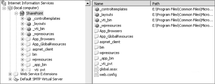
Business-Based Model
This is probably the most commonly used topology. Creating a portal to match your business's departmental structure is a no-brainer. In Figure 2-2, you can see a top-level home site that allows access to a set of departmental sites, each of which allows access to sub-departments and committees.
This plan allows for an easy implementation of security. If your company uses Active Directory, you probably already have these groups defined. Departmental separations also often mimic the security needs of a business. For instance, HR users may have privileges to view payroll information, while IT and Marketing people do not.
The downside of this topology is that it often ignores how your company does business. In a business-based topology, departments are completely segregated. The only place that companies like these exist is in business school text books. Accomplishing real work takes people from every area of your company working together. For instance, putting a new product on a shelf often involves a mish-mash of personnel from various departments: people from Research & Development, new hardware from IT, a new marketing campaign, and so on. Setting up a portal using business-based topology can involve additional administrative overhead, and information on a single project can end up scattered over the portal.
Here are the pros and cons of using the business-based topology:
Pros
- Users are already aware of the structure.
- Security and Search are easy to implement.
Cons
- It may not reflect the way your company actually does business.
Process-Based Model
A business-based model makes sense in several places: org charts, Active Directory, and in the heads of a corporate board. Instead of a business-based topology, you may need a topology that reflects the way your company does business.
Let's take another look at the example given in the previous section. The information that a company accrues is all about a business process—taking a product from conception to a shelf. Rather than setting up the elaborate custom code and processes needed to move a mass of documents data from a product development branch of a portal to a marketing branch each time a product is ready to be advertised, it makes much more sense to keep the data in one place—perhaps a site that can be used to house everything there is to know about that product. Each site can, in turn, have its own document libraries, workflow, and security based on the needs of the business process.
In most cases, companies don't make a single product, but a host of items across several product lines. This is not a problem for SharePoint—just add sites as needed.
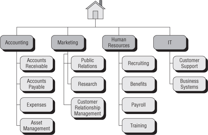
In the example shown in Figure 2-3, the portal topology is defined by a collection of business processes. It's a simplified portal for a company that develops hair care products. In this case, the primary goal of the portal is not to house a disparate collection of company-wide data but to drive a business process. Each site can house the information that is needed on a specific product, including design specifications, marketing materials, sales forecasts, you name it. Every bit of information that you'd need to know on any product has a special place to call home.
The information makes more sense for a process-driven business culture. One of the shortcomings of previous versions of SharePoint was that it was difficult to share information between sites. MOSS and WSS 3.0, however, make data aggregation easier with new technologies such as the Content Query Web Part and the Data View Web Part, both of which allow data to be aggregated for display in a single location. In the example shown, these tools would allow for users to view information across a product line without the need to manually dig though various sites.
This topology can also simplify administration. Security can be implemented by creating teams of users from across various departments. Search can benefit as well, as information is segregated into the same logical “chunks” that users are already used to. Need to set up a scope that identifies a specific product line? Not a problem.
As you can see, this changes what the concept of a portal can be. With the addition of some simple workflow, the portal can go from a centralized repository of departmental information to a full-blown tracking application. Of course, this methodology could be used for nearly any business process, from product management to case management to streamlining a sales pipeline.
Here are the pros and cons of using the process-based topology:
Pros
- Can closely match the ways your company manages processes.
- Gives each process a place to call home—a centralized resource location for all information pertaining to a single item.
- Has excellent ability for growth. When another business process starts, just add a site at the appropriate place in your site collection. Users will already know where to look for it.
Cons
- Security and Search can be more complicated to administer. For instance, in the example given above, consider the headaches that could occur if users could only be granted permission to access a site on an item-by-item basis, and that some companies produce thousands of items.
Taxonomy-Based Model
On its surface, this can look similar to a business-based topology. After all, businesses classify departments by what they do. But look a little deeper, and taxonomy-based topology starts to reveal itself.
Taxonomy, by its definition, is all about classification. This can be a little abstract, but you will probably find that you use this technique to store information already. For instance, my desk has several piles of paper, each with its own classification. Receipts are in one pile, mail is in another, and notes are in yet another. It's not practical for me to separate these items by who is going to use them (a business-based topology) or what I'm going to do with them (a process-based topology). But I can find what I need because I understand the classification of the item I'm looking for.
Your business already has its own taxonomy, whether you realize it or not. Taxonomy is about the way people describe what they do. You'll probably find that your company has its own language, a way of describing what it does. In the example shown below (Figure 2-4), the portal in question groups business processes and departmental needs together, because that is how the users think and talk about their business. Rather than discussing inventory, vendor supply chains, and factories as completely separate entities, the entire lot is placed together to address the manufacturing needs of the company as a whole.
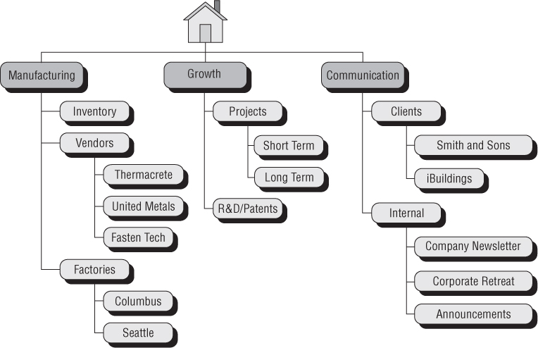
By properly defining how your data should be defined, you can give users an extremely intuitive way to find data.
Here are the pros and cons of using the taxonomy-based topology:
Pros
- It can be used to enforce a classification of information. This can have distinct benefits. For instance, users can be certain that if a document is in a site called “Approved Vendor Contracts,” it is indeed an approved vendor contract.
- Users can intuitively find information.
- This topology is very easy to extend. Because the shape of the portal is based on abstract ideas, there's no limit to how or where the portal can grow.
Cons
- It can be difficult to get everyone to agree on taxonomic terms. For instance, users could have widely divergent ideas of where a document should reside, leading to information on similar topics being scattered about the portal.
- It can be difficult to implement search and security. Though it may be possible to group restricted items together, this may not always be practical. For instance, suppose that your company classifies a certain set of documents as “contracts.” If your business rules for contracts dictate that some contracts should only be viewed by management, while others are available to the general populace, you'll have to implement item-level procedures to ensure that only the right people have access to each document. Yes, this can be done, but no, it's not very efficient (or fun).
- To maintain the proper classification, a small number of users must be in charge of the classification procedure.
Publishing Portal
This may not exactly be a topology per se, but it does deserve some attention here. More companies are embracing SharePoint as an intranet solution. It's becoming obvious that all the tools that make SharePoint valuable internally can also be leveraged to make sure that information flows from the experts—your users—to the outside world of people who visit your Internet site.
The goal of your portal may not be to function as an intranet or extranet site, but as your company's primary presence on the Internet. Microsoft Office SharePoint Server 2007's new publishing features make this an ideal tool to facilitate the creation, approval, and publication of outward facing information.
Here are the pros and cons of using the publishing portal-based “topology”:
Pros
- Allows users to publish and approve information on an external facing site.
Cons
- Because the site is open to the public, security and access need to be considered very carefully.
- Microsoft Office SharePoint Server 2007 for Internet open licensing can be costly.
Hybrid Portals
It's unlikely that any particular topology will work best for your company. More often than not, a hybrid of one or more of these ideas will be developed.
By combining strategies from multiple topologies, you can take the best from each. A business based topology can easily contain a group of sites that support a business process. For instance, a research and development site can lead to a group of sites for new product development.
There are downsides to this approach. If the goal of a portal's topology is to give users a well-defined paradigm that they intuitively understand, deviating from that plan could cause confusion. Be prepared to provide additional training to support this. If users in Accounting are expected to leave their accounting site to provide forecasting information in another branch of the portal, they'll need to know how and where this data should live.
To that end, security can be a little more complicated to configure. Again, if the security of a portal is based on the fact that users have access to a business process or a departmental site, deviating from that plan requires additional administrative overhead. In most cases, you'll have to implement active directory or SharePoint security groups on a site-by-site basis and continue to maintain these for the life of the portal.
There are real benefits to this plan, however, especially when your portal's needs are more complex. Many companies are extending their portals to reach outside their intranets. In the past, when a user wanted to publish an article or release information to an outside client via the Web, they'd deliver the document or other information to the Web master so that the Internet site could be updated. SharePoint can streamline that process while ensuring that information is provided in a secure manner.
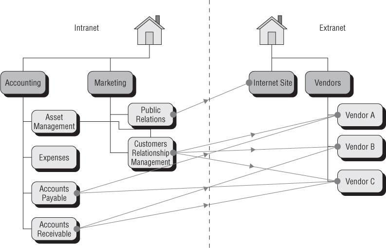
In Figure 2-5, you can see that the company that uses this installation of SharePoint has divided their portal into two separate sections—an inward-facing intranet based on a business model and an outward facing extranet portal that is used as a corporate presence site and a portal for vendors to access key information. Information can flow between the two sections through manual or automated processes, eliminating the need for a Web master as a middleman. This can also ensure that external users are kept up-to-date with the latest information.
Here are the pros and cons of using a hybrid topology:
Pros
- Can take advantage of the best of each topology.
Cons
- Because the rules that define where information lives can differ from site to site, this plan may make information more difficult to find.
- Security can be more difficult to configure and maintain.
- Search can be difficult to set up, as information can reside in more than one site collection.
Mini Portals
More and more companies are starting out with small implementations of SharePoint. There are numerous reasons for this. In some cases, companies are implementing dashboard sites that leverage SharePoint's technologies to aggregate important data quickly, without a lot of development time. For instance, a portal may display data from an SQL-based inventory management system using a Business Data Connector or give users real time updates using key performance indicator Web Parts. This also allows site administrators to quickly update the display of this data using a Web-based interface rather than having to crack open Visual Studio or another development tool.
The initial cost for a SharePoint license may seem steep for such things, but is still probably less than hiring a developer to create custom interfaces.
Another case for mini portals is that they allow for the rapid development of Web sites for key business processes. SharePoint lists are great for quickly implementing data storage and some light reporting. Calendars and announcement lists are a great way to give visibility to key projects.
Here are the pros and cons of using the mini portal-based topology:
Pros
- Allows for the fast delivery of key information.
- Is easy to maintain.
- Is a great way to introduce your company to SharePoint without involving the entire organization.
Cons
- Can be difficult to build on if the company decides to expand the portal's functionality.
Now that you have a plan for where information will live, the next step should be to get your plan off your white board and onto a Web site.
If you search for “Web design” on the Internet, page design is what people are talking about. There are thousands of Web sites that detail good design practices for general use sites, and it is certainly worth your time to peruse as many as you can. Most of the information you'll find refers to general-use Internet pages and the complexities of code that are required to create them.
SharePoint sites, on the other hand, have a preset collection of building blocks that can be used to craft professional looking sites more quickly and efficiently. There is no need to build that style sheet from scratch or hand code navigation pieces. Out of the box, SharePoint's got you covered.
Some people might look on this as limiting, but I see it as liberating. SharePoint allows for rapid application development, letting you skip the dirty parts of page crafting and begin putting together sites immediately. More in-depth changes can take more time but still far less time than a from-scratch solution takes.
That being said, there are still some basic rules to help your users get the most out of each page on your portal. The suggestions in the following sections should get you started in created a more useable, more attractive portal.
A Grain of Salt
Sure, you can spend thousands on licensing and design work to create a static site that will stay exactly the way you build it, but that's probably not why you're using SharePoint. When you have a moment, check out the language on Microsoft's SharePoint site (http://www.microsoft.com/sharepoint/default.mspx). It's all about “empowering knowledge workers” and “enabling communities.” What exactly does this mean? It means that users can control content on the Web sites: lists, documents, calendars, press releases, you name it.
This can be frustrating for some designers used to maintaining tight control over the sites they've created. Since the early days of Web design, developers and designers have owned the look and feel of a site. For more than a decade, these people were often given the hokey title of “Web master” as they alone controlled what went where and why.
One of SharePoint's great strengths is its capacity for user driven design. Site owners can move items around to best meet their needs. They can add and remove lists, calendars, and other content when they feel their site needs to grow. Although MOSS and WSS allow for a fairly granular control over the rights each site user and administrator are granted, there needs to be a balance. Each right you grant to a user is one that you, as a designer, are giving away. The goal of SharePoint is to put control into the hands of the people who have end-of-line business knowledge. Moreover, they will be able to do this without bothering you to update content or make simple changes.
So, what follows are a few fundamental rules for page layout. Realize that in some cases, the best you can do is to give users a solid framework and hope for the best.
Creating a Site Template
Before you start slapping together your Web pages, they'll need someplace to live. SharePoint has the ability to make exact copies of a site through the use of site templates. This is an excellent means to get the design exactly right once and then propagate the site to flesh out your portal topology. Creating a site template gives you a few other benefits as well:
- Site templates allow for a standardized site design. As mentioned before, keeping a uniform interface throughout your portal makes it easier for users to quickly adapt to a new SharePoint environment. Creating sites from a base template ensures that your future sites will look, feel, and act the same.
- They allow for fast implementation of complex items. Keep in mind that document libraries and lists maintain any customizations you make. This means that things like custom workflows or template documents are carried to the new site without any additional effort. If necessary, you can even retain fully populated lists and document libraries as part of the template, but keep in mind that there is a 10 megabyte limit on the size of a site template.
Identifying a Target Resolution
Designing a Web page is much the same as painting a picture: You have to know your canvas. In Web design, this means determining an optimum resolution at which your pages will be displayed. Luckily, as screen size and video technology have progressed throughout the last few years, average screen resolution has increased greatly.
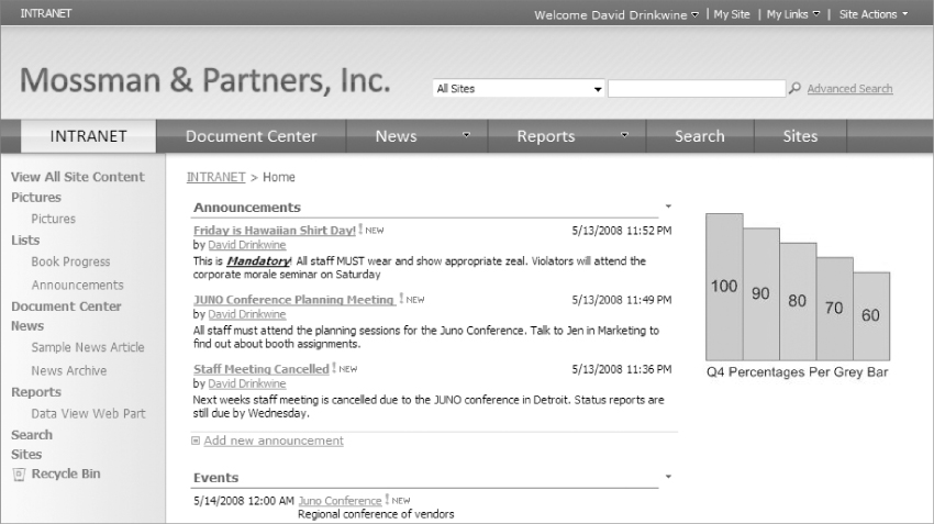
For a moment, let's assume that you've selected a target resolution of 1024 × 768 pixels, which is a fairly common resolution these days. With luck, your page will look something like Figure 2-6.
More screen real estate makes things considerably easier for Web page designers. Unfortunately, you have less space to place information than you think.
First, forget about making users scroll sideways to access key information. Most scroll mice and touch pads only allow for up and down tracking. Anything past the right side of the screen is unlikely to be seen by the majority of users.
The goal of a Web page is to display unique page content. As beautiful as your navigation and title bars appear on the page, they won't keep users coming back to your site. So, for the moment, let's think about content.
That still leaves you with 1024 pixels to play with, right? Wrong—take away 10 pixels for the browser's scroll bar and another 10 pixels on each side of the screen for margins. Take away another 165 for the SharePoint Quick Links menu down the left side of your page, and you're down to 829 pixels. Take away another 80–100 pixels for padding between Web Parts and any additional content, and you're down to around 740 pixels. You've lost over a quarter of your horizontal canvas to SharePoint, and you don't even have any content on your page.
Vertical resolution leaves you with even less space. Over 140 pixels are non-negotiable, given up to the browser controls—the address bar and button bars. This number goes up if users have additional toolbars such as Google or Yahoo search bars. Then lose 25 pixels for a global links bar (users have to have access to their My Site and My Links, right?), another 35–50 for your company's logo, and another 20 for SharePoint's tab navigation feature. Add 20 for margins and another 20 for a breadcrumb Web Part. Tack on another 80 for padding, and you've lost almost half of your 768 pixels of vertical space.
| Web Page Elements | Horizontal | Vertical |
| Starting Screen Resolution | 1024 | 768 |
| Web Browser | − 10 | − 140 |
| Margins | − 20 | − 20 |
| Quick Links Navigation | − 165 | |
| Site Navigation (global links and tab controls) | − 0 | − 45 |
| Breadcrumbs | − 0 | − 20 |
| Internal Page Padding | − 80 | − 80 |
| Corporate Logo | − 0 | − 50 |
| Remaining Space | 759 | 413 |
So, all told, your 1024 × 768 resolution yields 759 × 413 pixels. That means that more than 60 percent of a user's screen is gone before you even start putting content on a page, and that's the best-case scenario.
Yes, you can remove some of these items, but that will also remove the functionality that the items provide to users, which is functionality that you will probably have to provide in some other way.
Now that it's been established that you have a postage-stamp-sized plot in which you can grow your intranet, the goal will be to make the most out of what you have. The following sections will explain how.
Keeping It Clean and Simple
SharePoint makes it easy to put things on a page, regardless of whether it is the new task list, the key performance indicators, or the handy list of contacts. One of the greatest temptations that designers face is to show everything to their users at once. Needless to say, this can overwhelm even the most data-hungry user. (See Figure 2-7).
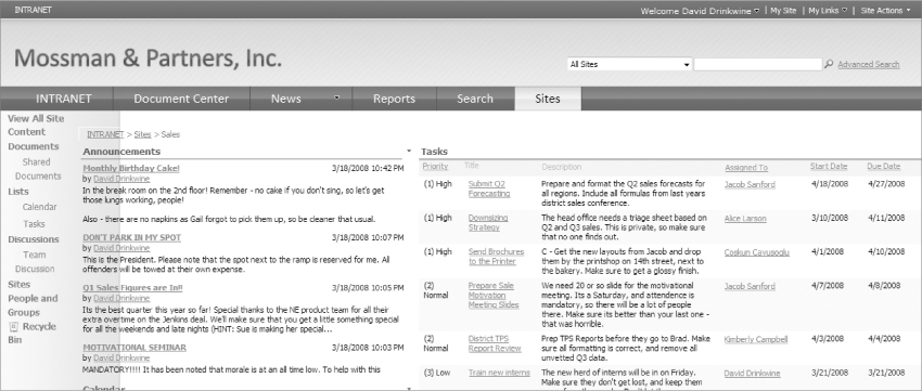
As you can see in Figure 2-7, too much information is not only unattractive but difficult to use. The page uses the same navigation and layout as Figure 2-6, but the amount of data that's packed on the page doesn't help users be more efficient; it just makes them more confused.
Try to limit the information that you place on the page. A few tips include:
- It's been established that there's not much free space on a page, but blank space is okay. Really it is. Some designers seem to have an itch to fill every square inch of a user's screen with data. Isn't that what portals are for? Easy access to everything? Well, yes, but not all at once. A good rule of thumb is that every idea that you're trying to get across deserves its own page. SharePoint makes it easy to add pages, format data, and extend navigation. Take advantage of these tools.
- Allow users to drill down into list items rather than displaying each item's full text. Announcement lists are excellent candidates for this. Users often enter lengthy descriptions, but a headline will suffice to lead people to click through to a full listing.
- Limit list displays to key columns. List views are your friends, but don't abuse that friendship. Avoid the temptation to cram as much data into one place as possible.
Keeping Important Information above the Fold
A user's attention is a finite resource. You have to catch his or her attention with every page click. The opposite also hold true: If you don't make it easy for users to spot what they're looking for, it's likely to be missed.
If you are old enough to have ever seen a newspaper, you'll notice that all the eye-catching information is on the top half of the page. Of course, that's what people see first. The same can be said for Web pages. If you want users to see something, place it at the top of your content area.
Give Yourself an ‘F’
The human brain is very, very good at absorbing information quickly. Recent studies (Nielsen, 2006) have shown that most users develop a visual shorthand for quickly ascertaining whether the information that they're looking for is on the Web page they're viewing. These studies show that most users develop a pattern for reading pages that is consistent and (if you play your cards right) exploitable.
Per the study (Neilson, Jacob “F-Shaped Pattern for Reading Web Content” Useit.com: April 17, 2006—see http://www.useit.com/alertbox/reading_pattern.html): When a user arrives at a page, there's usually a fairly large amount of data to absorb. Most users read the headline first the horizontal bar across the top of the page. They then start further down the page and begin another horizontal scan, looking for additional content. Finally, users tend to scroll downward along the left side of the page, picking up the start of any data that runs the length of the page.
This standard page scanning pattern (Figure 2-8) can help you position key information in a place that is most likely to be seen.
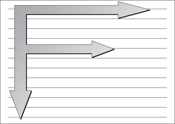
Also note that there are large tracts of the page that are not scanned by most users. Remember the 50 or so percent of the page that you have where you can actually display data? Cut that in half if you actually want that information to be seen.
Keep that in mind when designing SharePoint page layouts. A typical layout looks like Figure 2-9.
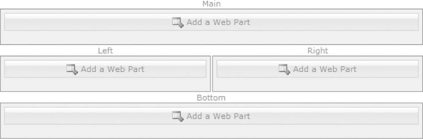
When information gets added to this page, what will users see? Based on the rules shown above, the Main and Left Web Part zones get all the attention, followed by the Bottom (that is, if the bottom makes it above the fold). The Right zone will get the least attention of all.
Keeping It Consistent
It's difficult to compare a SharePoint site to a traditional Web site. SharePoint is more interactive, more like a desktop application. Now imagine starting an application like Microsoft Word and finding that the interface changes intermittently depending on what you're doing. The File menu changes from horizontal to vertical if you're looking at a page with a picture on it. The Help button requires users to play hide and seek. Spell checking is enabled on some paragraphs but not others.
For better or worse, SharePoint's modular design makes it easy to create applications just like that. The last thing you want is to have users lost in your application. Try to be as consistent as possible when creating page layouts.
Navigation is an excellent example. Certain screen real estate will always be allocated to getting around. There will be tab navigation, there will be Quick Link list access, and there will be links to My Site or My Links. If you want people to actually visit these pages, make sure all navigation tools are in the same place on every single Web page.
There's also something to be said for using the standard SharePoint page layout formats. They may be boring, but they're very consistent. A few things that out-of-the-box SharePoint pages (and most modern Web pages) have in common include the following:
- A logo is located in the upper left-hand corner, linked to the home page.
- Search is available in the upper right-hand corner of the page.
- Navigation is available below the logo.
- Additional navigation features run down the right or left side of the page.
- Content is centrally located on the page.
Do these things sound obvious? They should. Microsoft has spent enormous amounts of time and money to train your users to navigate just such a standardized interface.
Yes, you could get creative and wild with navigation and page layout. You could design a Flash or JavaScript based interface that dynamically uses the letters in your company's logo to spell out the navigational options on your site. You can make your pages as creative and off the wall as you want. You can also pay to retrain your users on how to use the fancy new interface. In a corporate intranet, this will mean a lot of resentful users. On the commercial face of a site, it might mean a lot of frustrated users going to your competitor. Your call.
Making It Fast
People hate waiting. Don't make users wait, or they'll hate your application. To avoid this, keep a few simple rules in mind:
- Keep it simple See above. Clean, tidy pages load faster.
- Put limits on list views List views are SharePoint's bread and butter. They do all the ugly little things that I, as an old-school database application developer, got bored to tears by. Adding a column to a Web-based database application would often be a tedious process. Adding a column to a SharePoint list? Easy as pie. Maybe a little too easy. Power SharePoint users are often more than happy to pile data into lists—both more columns and more rows.
Whenever a user opens a page with a List View Web Part, SharePoint has to retrieve and format list information for display. The more data that's displayed, the longer it will take. So when possible, try to keep List View Web Parts small and manageable. There is rarely a need to display every single column in a list, nor is it always necessary to display every single item that the list contains. Luckily, List View Web Parts allow you to pick and choose columns and place limits on the number of list items displayed with each page load. Add a bit of creative grouping and sorting, and your List View Web Part will give your users the data they need without making them wait.
- Watch your image sizes This should be a no-brainer, but it often causes otherwise speedy page loads to be sluggish. Modern digital cameras allow for multi-megabyte files. Please remember the following:
- Resize images before they are uploaded to your SharePoint site, or your users will download that multi-megabyte file every time they visit your page.
- Resizing the display size of an image in SharePoint Designer does not change the image file size, but only the amount of space that the image takes up on the user's screen. Browsers also do a notoriously bad job of trying to cram pixels together to fix hard-coded image sizes, making your photographic masterpiece look blocky and blurry.
- It's common for both designers and users to reference pictures in a SharePoint Picture Library for image display. This is a great tool to empower users to display images on your portal, but once again, be aware of image sizes. Displaying a 5 megabyte image from a Picture Library is no faster than displaying an image that you placed on a page using SharePoint Designer.
- Watch out for Web Parts that you don't control MOSS has several great new Web Parts that allow for the display of information from all over the Web. RSS Viewer Web Parts, for example, can display content from feeds anywhere on the Web. Realize that if the RSS feed you added is slow to respond, your Web page will be slow as well. So, though it may be great to show a weather feed on your site's home page, users may bear the brunt of slow page loads as a result.
Other Web Parts, such as Key Performance Indicators and Data View Web Parts, can suffer from the same problems. Each of these Web Parts can directly access lines of business data. With luck, you'll have more control over the gathering of internal data. If it takes more than a few seconds to access that data through a Web service or a stored procedure, it's going to take SharePoint the same amount of time when it pulls the data for your Web Part, plus additional time to process and format it.
- Keep big items out of traffic Sometimes, loading extremely large amounts of data is unavoidable. Try as you might, you or one of your users will be asked to show a list view that returns a horrific number of rows and columns. Or it will be absolutely essential to display key business data that takes 20 seconds to retrieve. The goal in these cases should be to limit the impact on your users.
Users will wait 20 seconds once for a page to load. They'll get frustrated if they have to wait for the 20-second page load fifty times a day. So keep Web Parts, images and data-displays that are data intensive off of your home page or other commonly accessed pages.
- Cache when possible Think about it—most of the files that SharePoint uses to display each page are identical. Your company logo, for instance, is often stored in an image library. When each page is loaded, the SharePoint page rendering engine makes a call to the database. In many cases, this can mean retrieving information from another server.
Caching can be enabled in a few different ways. One of the easiest to implement is a minor change to the web.config file for your SharePoint application. To enable this feature, follow these steps:
1. Find and open the web.config file using notepad or another text editor.
2. Then, find the line that starts with: <BlobCache …
3. Next, you'll want to set the “enabled” parameter in this line to “true.”
4. Then, locate the parameter called “path.” It will look something like: path = “.(png|js)$
5. By adding additional file extensions, you can tell SharePoint to cache files with the included extension. Excellent candidates for this would be images (.jpg, .gif, etc.) and style sheets (.css), as they will be loaded on each page. Microsoft has an excellent tutorial that describes this process further at http://office.microsoft.com/en-us/sharepointserver/HA101762841033.aspx.
Beware of Ad Fatigue
Odds are that your users spend a large amount of time on the Web. Someone somewhere is always trying to get them to buy something. Users are constantly inundated with advertising. Common practices include blinking, animation, repetitive text, repetitive text, bizarre color schemes, scrolling or moving banners, or anything in ALL CAPITAL LETTERS. At one time, these techniques would capture the eyes of users and draw attention to whatever it was that was that they were trying to shill.
Fortunately, most modern Web users have become jaded to these techniques and have learned to ignore them. This means that they'll also ignore the very thing you're trying to drawn attention to. In the end, the best way to draw attention to content is to make the content worth looking at, but that's a topic for another book.
And please don't click on those ads. It only encourages them.
Making It Appealing
There are a few keys to making an appealing design, each of which could take up its own book. These keys fall into the realm of art rather than science. I'll cover them lightly, as there is already a wealth of information on each, and this book emphasizes how to improve the look and feel of SharePoint design rather than an understanding of color temperature or a description of how users will feel when they see a specific font.
Color is largely a matter of taste. There are, however, a few good rules of thumb.
- First, black text on a white background may be boring, but it's the easiest to see. Avoid complex background images, as text will get lost.
- Avoid colors that scream at you. The goal is to draw attention to your content, not the background.
- Avoid using too many colors. Three or four will suffice. Again, this keeps the user's eye focused on the content, not trying to make sense of the color range.
- Some people have a natural eye for color. For everyone else, there are a multitude of color- scheme generation tools that can help in the selection of complementary colors. (One of my favorites is this one: http://websitetips.com/colortools/sitepro/.)
- Always show hyperlinks in a consistent separate color, and change that color for clicked links.
Fonts should complement the overall look and feel of the site without overwhelming the user's eye.
- Fonts are like stewed prunes: One is good for you. Two can work. More than that and you're asking for trouble. Users' eyes have to adapt to a new set of characters each time you change, and that stands in the way of usability.
- If possible, avoid using graphics for text. Since text inside an image can't be read by SharePoint or most accessibility enhancing software, it won't be available within search or to visually impaired users. It also makes updating the text far more complicated.
- Avoid fonts that draw attention away from the content. For example, a simple sans serif font like Arial is easier to read than a font with ornate scrollwork or other extravagances like Viner Hand ITC. Some fonts might seem to tie in nicely with the overall corporate look and feel, but they can also force users to have to decipher the font everywhere they see it, which is always unpleasant.
Note that constantly changing the color of text will have a similar effect.
White space is tricky, because there are no definite rules. In most cases, the more blank space you can get away with, the better. Blank space on a page draws your attention to what really matters—your content.
A good example of this can be seen in the current state of the search business. Yahoo! has attempted to provide users with an abundance of information, making their site a destination for users who are not on the Web just for search. Google, on the other hand, has kept the same sparse layout for years. It provides the bare minimum that users will need to accomplish their goal. And as of this writing, Google had 62 percent of the search market to Yahoo!'s 17 percent.
Inevitably, your company will want to update the look and feel of your portal. Maybe your company's name changes or a new logo is adopted. Maybe it's just time for a new overall feel for your company's image. This can be an insanely complicated process, or it can be as easy as making changes to a few files.
My grandmother was all about common sense. She had a saying: “If you don't have the time to do it right the first time, when are you going to have time to fix it?” This goes double when updating SharePoint pages.
SharePoint uses cascading style sheets and themes to control how each page looks and feels. Fortunately or unfortunately, there is no way to force users to always use these styles. Any manual changes to a page will retain their formatting even after you update the style sheet. This means that every time you use SharePoint Designer to change the style, font, or size of text on a screen, you've made more work for yourself when it comes time to change the portal.
Another thing to consider is the location of the images that your pages will use. If you place inline images in SharePoint pages using SharePoint Designer, you'll have to update each image manually if they change. Placing company images in a central location, say an Image Library, makes it easy to make global changes instantly.
My grandmother was one smart cookie, and if it wasn't for the fact that she never wanted to operate anything more complicated than her 1972 Oldsmobile Cutlass, she would have made a pretty good Web designer.
At the beginning of this chapter, I mentioned that most of basic Web design is common sense. Actually, it's even more simple than that. Good Web design is based on making things easier—easier for your users, easier for the site administrators, easier for you.
Making a successful portal is pretty straightforward:
1. Find out what your portal is supposed to do.
2. Get input from the people who will use it.
3. Try to lay out the portal in a way that matches how your company does business.
4. Make it as appealing as you can.
5. Plan for growth.
That's it. Everything else is detail.