
Chapter 3
General Concept Design
Now that you have gotten through the first two chapters and explored the importance of design and what types of considerations any SharePoint designer should take into account before actually designing their projects, it's time to start laying down code. Sort of.
In this chapter, you will get a crash course in general concept design techniques and tips. While you won't be writing any actual code per se, you will be generating the files needed for the remaining chapters of this book and will see how to take graphic design concepts and put them into practice. Specifically, you will see how to take an abstract idea and begin making it more tangible through your graphics program of choice. In this chapter, you will see these concepts materialized through Adobe Photoshop CS3. While there are certainly many other programs ranging in price (some even free through open source code philosophies), Photoshop is generally considered the standard for graphic design among many Web developers. And, as that product has matured over the years, it has become possible to create almost identical projects on a Windows-based PC as with any Macintosh counterpart. With that in mind, any keyboard shortcut in this chapter will be given both the Windows and Mac versions.
The scope of this chapter is to get familiar with a standard graphic design application and, with that, learn some tricks that can be reused in other projects. You will also get an understanding of some of the SharePoint specific issues that a designer must contend with (such as the placement of certain required SharePoint objects). At the end of this chapter, you may not feel comfortable enough to quit your day job and start earning your living as a professional graphic designer. However, you will have enough knowledge to poke around in Photoshop and be familiar enough with it to make designs that people will take note of. And, more relevant to the scope of this book, you will be able to create SharePoint designs that are above the curve in today's market.
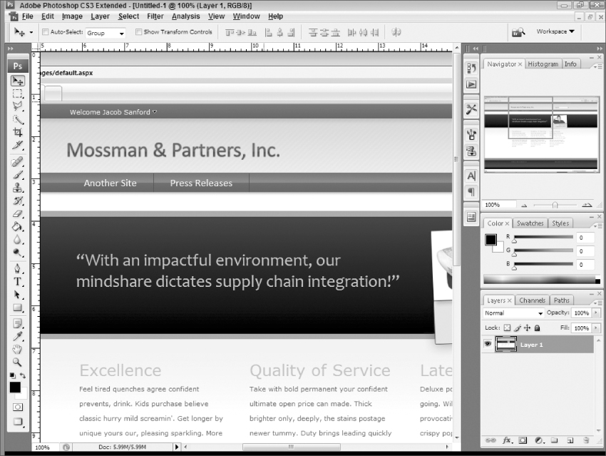
One of the things that any good designer (not limited to SharePoint designers) needs to create noteworthy designs is inspiration. This is true in the art world and certainly it is true in the graphic design world. Part of the problem with this idea, though, is that it may be tough to find really remarkable SharePoint portal sites to get inspiration from. Many of these sites all resemble the out-of-the-box design that comes with a new installation of SharePoint. Most of these designs will look very similar to Figure 3-1, which shows the book's project site before being altered.
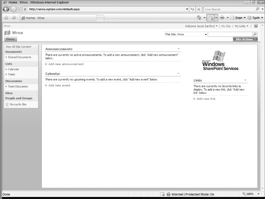
All designs start like Figure 3-1 and, unfortunately, many of them end there as well. The developers may change the logo at the top to be entity specific and may change the theme to have a different color scheme. But even with that, the design will look strikingly similar to Figure 3-1.
Take, for example, the different site themes available in a typical SharePoint install. (If you want to see them, click on Site Actions on your page and select Site Settings. From the page that comes up, select Site theme under Look and Feel.) If you are working on a new install, you will probably have your theme set to Default Theme, as was the case with Figure 3-1.
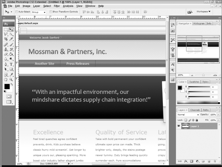
However, click on all of the stock themes provided and you will see that the only thing that really changes is the colors applied to the various components. Take, for example, one of the more striking changes, the Obsidian theme. It employs a rich black/gray theme with some bright orange accents. You can see the default project with the Obsidian theme applied to it in Figure 3-2.
What will hopefully make an impact when you compare Figure 3-1 and Figure 3-2 in the black and white confines of this manuscript is that they are almost completely indistinguishable. When you take out the effect of the color change, the theme is almost identical.
So where is a good place to look for inspiration if not at other SharePoint sites? Well, nobody said that you were required to go by other SharePoint sites. In fact, that is one of the best things you can do: Go outside of the SharePoint world to find inspiration for your SharePoint designs.
This, at a minimum, means keep a couple of designer Web sites bookmarked (or subscribe to their blogs) and keep up to date with the latest trends in design.
A really good place to get some inspiration is Smashing Magazine (www.smashingmagazine.com). This free Web site regularly posts blogs that are relevant to today's designers and current with modern design trends. One day you may find a blog with a listing of popular (and free) fonts that you can download to use in your projects. Another day you may find a listing on cool and interesting AJAX implementations. These designs are almost never specific to one technology or another; they are meant to inspire its patrons.
One of the more relevant (in terms of this chapter) series the site offers is their design showcases. For example, check out some of these posts from their site:
- 60 Elegant and Visually Appealing Designs (http://www.smashingmagazine.com/2007/05/21/60-elegant-and-visually-appealling-designs/)
- 50 Beautiful CSS-Based Web-Designs in 2006 (http://www.smashingmagazine.com/2006/12/19/50-beautiful-css-based-web-designs-in-2006/)
- Keep It Simple, Stupid! (http://www.smashingmagazine.com/2007/03/26/keep-it-simple-stupid-showcase-of-simple-and-clean-designs/)
- 45 Fresh, Clean and Impressive Designs (http://www.smashingmagazine.com/2007/03/05/45-fresh-clean-and-impressive-designs/)
While this is just a sampling of the site's offerings, if you peruse those links, you will hopefully think at least a few times, “Wow, I love that!” Granted, many of the designs wouldn't work for a SharePoint installation, but they can give you some ideas. Maybe you will see one that wouldn't work exactly, but you can see how you could take that design and tweak it for a SharePoint installation.
Similar to Smashing Magazine is Web Design from Scratch (www.webdesignfromscratch.com) published by Ben Hunt, a Web designer and developer for over 10 years. On his site, he provides a lot of really good information on page design, graphics, and even HTML/CSS/JavaScript coding. Relevant to this discussion are his entries on current styling trends in Web development:
- 10 best-designed Web sites in the world (http://www.webdesignfromscratch.com/10-best-designed-web-sites.cfm)
- Current Web style (http://www.webdesignfromscratch.com/current-style.cfm)
- Web 2.0 how-to design guide (http://www.webdesignfromscratch.com/web-2.0-design-style-guide.cfm)
These links showcase what the site's author believes to be the best of the best in the current Web design trends and, often, explicit details on why he believes that. The site provides a lot of great examples that might help spark your own creative juices. And, even if it doesn't, it will at least give you some insight into what current Web development often looks like.
One of the more interesting components of this site is the fact that he (along with Scratchmedia) is publishing a book called Redesigns from Scratch. This book will take 50 real Web sites and show how they were redesigned. In the commentary included, they will discuss what didn't work on the old design and what was specifically improved with the new design. Probably the most interesting part of this project is that they are going to release a 100-page PDF version of the book online for free! There will also be a print version available that will go into more detail, but it will cost money. Neither book is in production as of this writing, but you can get a free preview by visiting the site (http://www.webdesignfromscratch.com/redesigns-book.cfm).
There are, of course, plenty of other sites out there that showcase “the best of the best,” so don't think that this list is in any way exhaustive. These just give you a place to start looking at what is out there if you don't already have a place that you use for design inspiration.
With that said, it's not terribly important where you get your inspiration, as long as you get inspired. It could be from a similar site to the ones shown here. It could be from a site you visit where you like the design and want to try to adapt it for your own use. Or it could be just something you saw on television or in a movie that made you say “that gives me an idea.” The important thing is that you decide the standard SharePoint themes are not enough to satisfy your design needs and that you give some thought as to what would be impressive as well as useful in your next design.
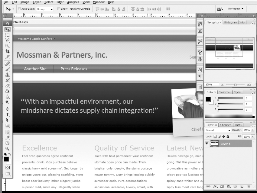
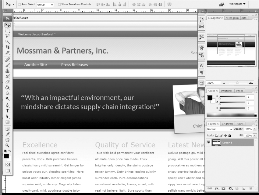
In this section, you will see exactly how to use the tools in Photoshop CS3 to take a conceptual design and turn it into a project where you can then create HTML code for your SharePoint site. When this chapter is over, you will have a Photoshop file that resembles Figure 3-3.
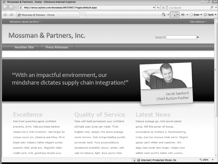
This probably doesn't look much like the SharePoint sites you have seen in the past and, quite frankly, that is the point. This chapter will take you through the steps to create this design and along the way will introduce you to several of the tools and concepts of Photoshop CS3. As stated earlier in this chapter, you won't finish reading Chapter 3 with a degree in graphic arts. You will, however, leave with an overview of Photoshop CS3 that will hopefully port to any other graphics program you may use. With a little inspiration and these tips and tricks, you should be well equipped to design the next generation of SharePoint sites.
While every effort was made to create examples that have universal concepts applied to them, you may not achieve the exact same results if you use a graphics program other than Photoshop CS3. While functionality shown here should be fairly similar across most major platforms, variances will exist and, if you use another program, you should be aware of this discrepancy as you read through the chapter.
An Overview of Photoshop CS3
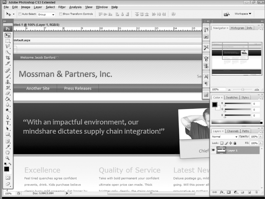
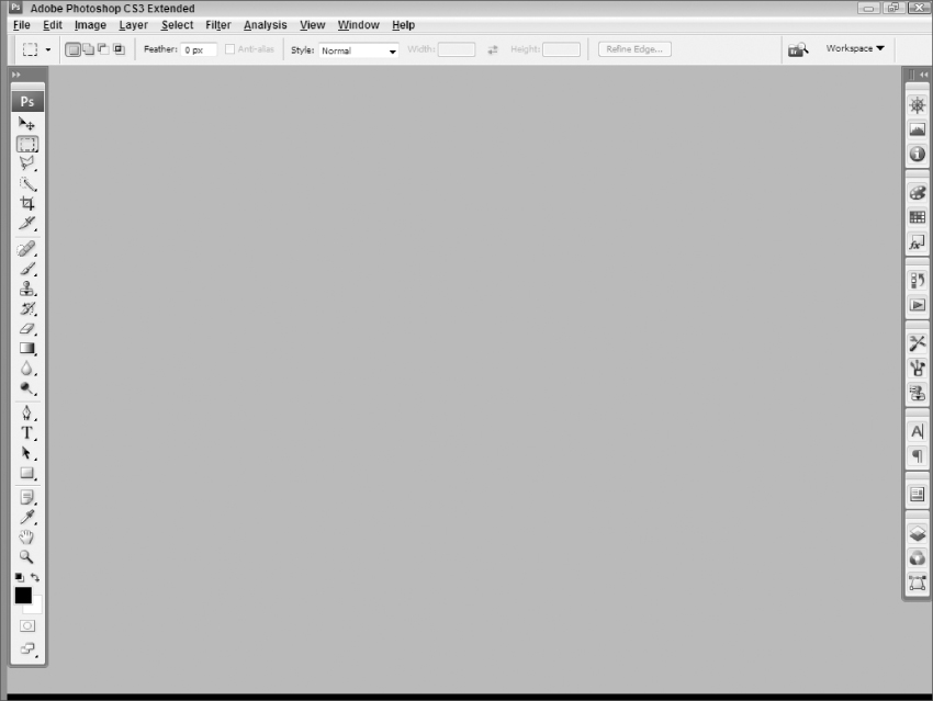
When you open up Adobe Photoshop CS3 for the first time, it should resemble Figure 3-4. If you have opened it before, you may have moved things around some or have different options selected. But, if that is the case, you are probably already familiar enough with Photoshop to follow along with the rest of this tutorial.
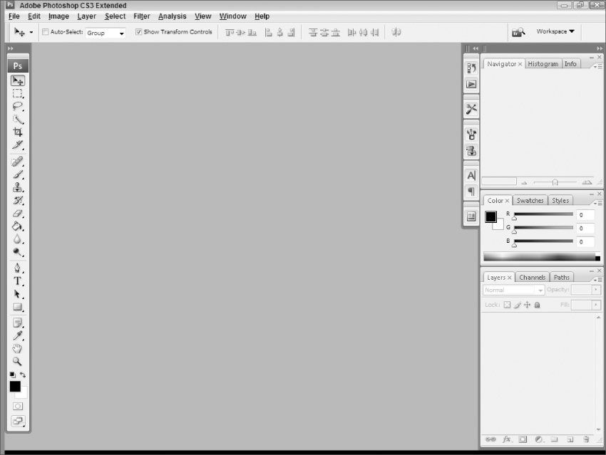
This interface, at least at first glance, will probably look familiar to anyone having experience with a previous version of Photoshop and maybe even other graphic editor programs. Just like its predecessors, CS3 has a toolbar at the top of the window, a toolbox with various tools in it on the left side of the screen, and several palettes on the right-hand side of the screen. However, when you start delving into some of the new features of the interface, you will find that there are some significant changes in the interface that you may miss upon first perusal.
The Toolbar
The toolbar, also known as the menu bar, (Figure 3-5) is one of the less flashy pieces of the Photoshop interface. If you have ever used any Windows application (or most other popular operating system applications), you have seen a toolbar. This one isn't much different, except that, as would be expected, it includes commands specific to Photoshop CS3 (as well as standard functions like Save, Open, and New). While pretty much every tool you will need is included in the toolbar, it probably won't be something you access a lot. Most designers tend to hang out in the other regions of the interface and, therefore, this discussion of the toolbar will be brief. As the chapter progresses, toolbar steps will be included for a lot of the activities given.
While not specifically a component of the Photoshop toolbar, the Options toolbar (Figure 3-6) connected to it can prove to be a very useful toolbar that might be otherwise overlooked.
This toolbar automatically updates the displayed options depending on which tool you are currently using. For example, the toolbar shown in Figure 3-6 shows the options available when you have the Move tool selected in the toolbox (discussed in the next section). If you were to choose the Rectangular Marquee tool, the Options Toolbar will automatically update itself to resemble Figure 3-7.
While a particular tool is selected, you can modify its options directly in the Options toolbox and they will be immediately reflected in your project.
As you get more comfortable with the tools and commands of Photoshop CS3, you will begin to use this area as much, if not more, than most of the other areas of the interface. You will see some of the ways this toolbar can be used in your projects to make creating Web site designs easy and logical as this chapter progresses.
The Toolbox
The toolbox (Figure 3-8) is Photoshop's attempt to keep all of the tools you will most likely use in your projects in one place. This includes things like tools for selecting areas of your image, tools for adding text, and tools for filling colors and gradients into selections. You can even find basic touchup and eraser tools in this area.
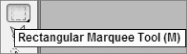
To see what a particular tool is that is housed in the toolbox, you can simply hover over it. For example, if you hover over the second option in Figure 3-8, you will see a pop-up item that displays the name of the tool, as you can see in Figure 3-9.
You should also note that many of the tools on the toolbox are actually placeholders for more than one tool. You can tell an icon on the toolbar has other tools associated with it by the presence of a small black arrow at the bottom of the icon. To see the other tools available, you can click your mouse button on the icon on the toolbox and hold it until the other options are displayed, as shown in Figure 3-10.
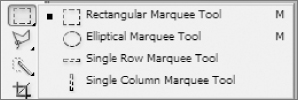
The option that is currently selected is indicated by a square bullet located next to that tool. For example, in Figure 3-10, the square icon is displayed next to the Rectangular Marquee tool indicating that it is the currently selected tool. Once the options are displayed, release the mouse button and then navigate to the tool that you want to use and click on it. However, keeping the mouse button clicked and then navigating over to the tool and then releasing the mouse button will do the same thing; it's mostly a matter of preference.
Once a different tool has been selected, that tool's icon will now appear on the toolbox instead of the original tool's icon. This means that if, with the example in Figure 3-10, “Elliptical Marquee tool” had been selected, the Elliptical Marquee tool would now be on the toolbox represented by its own icon.
There are a couple of new features of the toolbox that warrant discussion in this section. The first of these is the ability to collapse the toolbox into a two-column view that may better fit your work style. To toggle to this view, you press the dark gray area at the top of the toolbox that has the double arrows in it. You will notice that the double arrows at the top of the toolbox have changed directions and now point to the left. To toggle back to the single-column view, click in the dark gray area with the double arrows again.
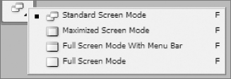
Another noteworthy enhancement to the toolbox is the addition of a tool that allows for changing the screen mode, the Change Screen Mode button. Essentially, this allows different configurations of the workspace in Photoshop to meet different designers' needs.
First, to set this, look at the bottom of the toolbox for the last icon, which looks like two windows overlapping each other (by default). Hold down the left mouse button on the icon to see the different screen modes available, as shown in Figure 3-11.
To better understand what the different options do, it is probably easiest to see examples of how each view handles the same project. With this in mind, a project was created using a screenshot of a Web browser captured at a higher resolution, resulting in a project with dimensions of 1778 pixels wide by 1178 pixels wide. The resolution of the monitor used for Photoshop is set at 1024 pixels wide by 768 pixels high. Since the project has a bigger resolution than the screen resolution in Photoshop, the project window has the potential to grow outside of the working area dimensions of the application.
So, by default, the view is the Standard Screen Mode, as can be seen in Figure 3-12.
As this figure depicts, the project window has the ability to travel under the toolbox and palettes in the CS3 work area, making it potentially difficult to work with the project. Of course, you can resize the project window and the magnification to make it fit in the confines of the working area, but this screenshot does not do that intentionally to illustrate how this mode deals with project dimensions overlapping other pieces of the application interface. This is very similar to the only mode available in previous versions of Photoshop.
With CS3, though, there are new options. The first one is the Maximized Screen Mode, which can be seen in Figure 3-13.
This shows the project window being confined to the viewable area of the Photoshop working area, meaning that the project window is not allowed to sneak behind the other components of the Photoshop interface. Even though the project is still too big to fit within the viewable area, the window is maximized to the width between the toolbox and the palettes and scrollbars are provided to navigate to parts of the project not currently viewable.
If the difference between Figure 3-12 and 3.13 is not easily spotted, look for the toolbars on both. In Figure 3-12 you can see the top ruler at the top of the project window for the part that isn't hidden behind the palettes but the ruler on the left side of the project window is completely hidden behind the toolbox. In Figure 3-13, you can see both rulers completely.
One cool thing about this mode is that it automatically resizes itself as the viewable area gets modified as a result of changing settings in the application interface. For example, if the toolbox illustrated in Figure 3-13 was modified to the two-column view, which makes the toolbox wider thereby lessening the viewable working area of the Photoshop interface, the Maximized Screen Mode would adjust automatically, resulting in Figure 3-14.
One other interesting caveat to the Maximized Screen Mode is that you can get to this mode in at least two different ways. The first was alluded to earlier when introducing the option to select viewing modes: Click the icon and select the mode from the options that are presented.
However, this view also is considered the maximized view of a project. This means that, when you maximize a project window, it will go to the Maximized Screen Mode. You can maximize a project window in the same way you would maximize any application window. Specifically, you can double click on the project window's title bar (for example, in Figure 3-12, the top of the project window that says “Untitled-1 @ 100% (Layer 1, RGB/9)”). You can also maximize the window by clicking the Maximize button on the widow's title bar.
Similarly, once in the Maximized Screen Mode, the project returns to the Standard Screen Mode when you click on the Restore Down button of the project.
The next two modes, Full Screen Mode With Menu Bar and Full Screen Mode are fairly similar and can be seen in Figures 3.15 and 3.16, respectively.
As Figures 3.15 and 3.16 illustrate, the Full Screen Mode With Menu Bar and Full Screen Mode are the same view, the only difference being the toolbar at the top of the screen. Both modes expand the application work area to consume the entire monitor screen, even if the application window itself (as opposed to the project windows within the application workspace) is not in a maximized state. These views give you the most possible viewable area to work with but come with the cost that the project window can once again hide behind the toolbox and palette windows.
One last thing to note about the Change Screen Mode button on the toolbar is that you can actually toggle through each of the options by simply single-clicking on the button. In other words, rather than clicking on the button and holding the mouse down until the different modes appear, simply click on the button once and release (a normal mouse click). This will toggle to the next screen mode in the list (shown in Figure 3-11). So, if the application is currently in the Full Screen Mode and the Change Screen Mode button on the toolbar is single-clicked, the application will jump into the Standard Screen Mode because it is the next on the list (when it gets to the bottom of the list it goes back up to the top). This allows for quickly toggling between the various screen modes to determine the best suited for the project at hand.
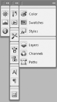
The Docking Panel
Up to this point, the area with all of the gadgets on the right-hand side of the CS3 interface has been referred to as the palettes. This is because, in previous versions of Photoshop, that is what they were called. And, at first glance, they look very similar to that. However, with CS3, the concept of a docking panel was introduced for the purpose of administering the various palettes that are available within Photoshop.
The docking panel, as it will probably appear the first time Photoshop is opened (and remains the default until modified) can be seen in Figure 3-17.
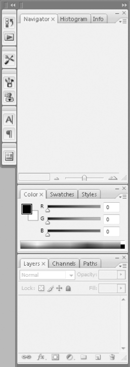
It might be difficult to ascertain the actual docking panel by just looking at Figure 3-17, but if you look really closely, you can see a dark area that surrounds all of the palettes (starting with the thick dark gray area at the top of the figure). That dark area is the actual dock and the palettes get docked inside of this area.
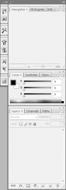
Within the new docking panel, the palettes take on an entirely new functionality. To see this, click the thick dark gray bar at the top of the docking panel that has the right-facing double arrows (above the navigator/histogram/Ingo palette). The docking panel and its palettes should now look like Figure 3-18.
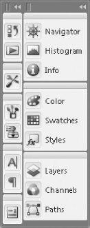
Using this condensed version of the palettes in the docking panel allows a much greater area to work with inside of Photoshop. Looking at this condensed version, it makes sense that the items that might have seemed like icons to the left of the palettes in Figure 3-17 are actually just condensed palettes within the docking panel.
The nice thing about this view is obviously that it significantly reduces the footprint of these tools. However, what happens when they are needed for your project? Does the entire docking station need to be maximized again? The answer is, thankfully, no.
If, for example, a designer wanted to look at the layers palette only, he could click on the layers button in Figure 3-18 and that palette alone would expand, as shown in Figure 3-19.
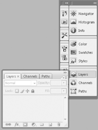
The Layers Palette will remain expanded by itself until it is closed by the user. This can be done by either clicking on the Layers button on the docking panel or by clicking on the double arrows on the Layers palette. Doing either of these will return the docking panel to the state shown in Figure 3-18.
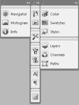
The condensed version of the docking panel also shows that there are, in essence, two columns to the docking panel. The left column is only as wide as the icon, while the right column is wide enough to display the icon as well as a description of the palette. And, just like normal columns, the palettes can be dragged from one to the other.
To drag a single palette (e.g., the Navigator palette), click on the icon for that palette and begin dragging it to the location you want it and, once there, release the mouse button. Using this approach, you can drag an individual palette to a different palette group in either column or you can even break the palette out of the docking panel and have it float on its own in the application workspace.
Similar to this, the palette groups (e.g., the Navigator/Historam/Info palette group) can be moved by dragging them using your mouse. To do this, click on the little bar above the palette group with your mouse and begin dragging the group while holding the mouse button down. Just like with individual palettes, the palette groups can be moved within the same column, moved to a different column, dropped into another palette group, or detached from the docking panel.
Another thing to take note of is that the columns in the docking panel are completely customizable. This means that they can be reduced to 1 column or expanded to 3 columns fairly easily. They can also be resized to either just display the icon or to include the text as well.
To see how to create a third column, click on one of the palette groups' top bar to drag the entire group. For this example, use topmost palette group that contain the Navigator palette. With the mouse still depressed, drag the palette group to the left until it is all the way to end of the docking panel. You will know that you are to the farthest left most point when a blue bar highlights the entire length of the docking panel. (With the limitations of being printed in grayscale, this distinction would be almost impossible to see in a figure so one is not included. However, you should be able to see this in your own project.)
You should also notice that the palette group being moved becomes semi-transparent while being dragged to its new location. Once the new column appears (as indicated by the long blue bar), release the palette group. This will create a third column that contains the newly added palette group and will resemble Figure 3-20.
As a next step, it might make sense to have the new column only be as wide as the icon rather than showing all of the descriptive text of each palette. In order to do this, each column has its own handles at the top that allow for that column's dimensions to be changed when dragged. So, in order to shrink the size of the column, click on the handle of that column (the handle is the object in the upper left-hand corner or the dark area at the top of a column; it looks like three bars next to each other) and then drag the handle all the way to the right. The column will only go as small as the icon view so, when it gets to that point, release the mouse button and the column will remain at its new size. Using this approach on the new third column formed in Figure 3-20, the icon-only view of that column can be seen in Figure 3-21.
To maximize the available work area, it might make sense to reduce all palettes to a single column in the docking panel and to have that one column only show an icon view. To do this, drag all palette groups to the furthest most right column first and, once that is done, resize that column to only show the icons by dragging the handle for that column. Doing this will result in a docking panel that is one column wide and only filled with icons, making it very slim, maximizing the amount of work area you have available for your projects.
Reducing the docking station and palettes to icons only may not be advisable to designers new to Photoshop since it will take a while to get used to which palette is associated with which icon. And without a solid understanding of the tools in each palette and when to use which one, the docking panel will appear to be not much more than a toolbar with a bunch of icons that aren't used very much.
However, with that said, once the tools and palettes become increasingly familiar, this reduced footprint version of the palettes could prove to be a very welcomed change. For example, take a look at how much work area is now available in Photoshop (compare to Figure 3-4 or even 3.14 earlier in this chapter), as seen in Figure 3-22.
This can provide a designer with a much more workable area for their projects in Photoshop CS3. However, to even further enhance the work area, it is possible to hide the docking panel completely by pressing the Shift and Tab keys simultaneously (this is the same keyboard shortcut for Mac and PC users). Doing this once will hide the entire docking panel; doing it again will bring it back. This will allow for an almost completely available working area within Photoshop.
A Few Graphic Concepts
While understanding the basic layout of the Photoshop interface is important, especially since most tutorials will tell the reader to locate this tool on the toolbox or that item in a particular palette, it is more important to have an exposure and understanding of some basic graphic concepts before getting too heavily into creating a complete project.
While there are certainly volumes of books, blogs, and online tutorials that could go over a multitude of concepts relevant to the Photoshop designer, there are only two that are vitally important to proceeding with the layout design project that will be illustrated in the remainder of the book: layers and brushes. As such, these two concepts will be discussed in their own subsections in the next few pages. After that, it's time to begin creating the layout design illustrated in the beginning of this chapter.
Layers
While there are certainly other concepts that designers can find useful, it can be argued that none are any more important to layers. Layers are, in fact, the building block of almost all Photoshop projects. Without an understanding of the idea of layers, a designer will have difficulty in getting the most out of Photoshop (or for that matter any graphic editor program).
To see a basic diagram that illustrates what layers are in graphic design, take a look at Figure 3-23, which was originally published in Professional ASP.NET 2.0 Design: CSS, Themes, and Master Pages (Wrox Press).
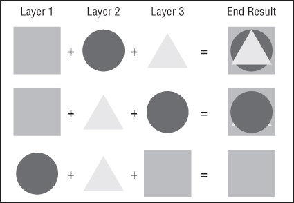
In this example, there are three distinct layers and, as Figure 3-23 shows, it very much depends on the order they get applied as to the final result. In the first example, the square is the base, and then a circle is overlaid on the square, and then, finally, a triangle is applied to the top. In this example, all three layers, or at least elements of each, can be seen in the end result. While each layer overlays parts of the previous layers, each layer still has some piece of it showing through.
Conversely, in the last example, the square is applied on the top of the other two layers. Since the square is the biggest, it completely covers up all of the underlying layers, meaning you can't see any piece of either the circle or the triangle layers.
This is the basic concept of layers. In Photoshop, designers create different layers within their project. Those layers are stacked one on top of the other, and the rendered product is the accumulation of all visible layers in linear order. This means that, when the final image is rendered out, the bottommost layer will only be visible if it is not covered up entirely by the layers that are stacked on top of it.
To think about this in a slightly different way, it might help to think about a more tangible example. To this end, imagine a large Department Store window. With nothing on it, people walking by can see all of the activity within the store. However, imagine someone comes along and puts up a political flyer on the window. Now that view into the store is partially blocked by the political poster so people walking by can now see the political poster, which would be the uppermost layer, and a portion of the underlying glass, which is the bottommost layer. Now imagine over time people cover the window with an assortment of rock show advertisements, roommate needed posters, and missing person notifications. Eventually, the window is completely covered and, consequently opaque. People passing by can no longer see inside the store at all and can only see the pieces of pasted literature that aren't covered by other pieces of pasted literature.
In the world of graphic arts, each of those object would be the own layer. The project would start off with a completely transparent layer (if that is what the designer chose). If this were to be the only layer, the rendered image would allow all objects under it to come through. So if, for example, this transparent image were dropped onto a Web site, the entire Web site would be visible through the image.
Next, the designer would add layers to satisfy various design aspects of the project. Instead of political, concert, or roommate posters, these layers might include a header, navigation, body, and footer region for a Web site.
Within Photoshop, layers are displayed using the Layers palette in the docking panel, which can be seen in Figure 3-24.
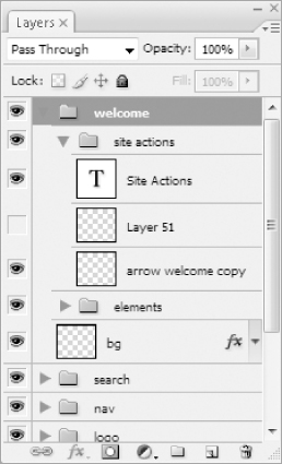
This example shows some of the more interesting features of layers in Photoshop CS3. One of the things that might be quickly noticeable is the use of folders. Folders in the layers palette allow designers to easily organize layers into logical units. Figure 3-24 shows folders for a welcome, search, nav, and logo region and, within the welcome region, additional folders for site actions and elements. These are all logical units of the design project from which this layer snapshot was taken and they allow the designer to easily track down the layer that needs to be tweaked (or where a new layer may need to be added to expand the design in that region). The folders are collapsible, which reduces the clutter that can easily accumulate in this palette. Imagine a project with 100 or 200 layers (not that big of a stretch). It's much easier to navigate through, say, 7 or 8 collapsed folders to find what needs to be modified rather than trying to sift through 200 individual layers.
Another thing that should be noted is the eye icon that is next to all but one of the layers (on the farthest left side of the layer row). This indicates whether the layer is visible. So, in Figure 3-24, all of the layers are visible except for Layer 51, which is currently hidden.
This brings up another concept that is worth discussion: why have hidden layers? It would seem logical to think that if the project didn't require the layer for its final rendering, the layer doesn't serve a purpose. But that isn't necessarily so.
For one, a single project may be used for differently rendered images. Take, for example, a Photoshop project that is used to generate buttons for a particular Web site. It wouldn't make sense to have different projects for each of, say, 10 navigation buttons. Instead, a designer would have one button project that has the text for each of the 10 buttons on different layers and would hide 9 of them when rendering out each individual button. The same might be true, to expand this example, if there were different styles of the button for the hover effect of the button. Say that the normal state of the button is red but, when the mouse hovers over it, the button “glows” with a bright orange background. Instead of having different projects for each button state, it would make more sense to have a single project with a red background and an orange one and then hide the one that is not necessary for a particular state when that state button is rendered. This alone probably justifies the use of hidden layers.
However, a more useful function of hidden buttons is the concept of non-destructive editing of layers. This, in simplest terms, means that a copy of the original layer is kept in a hidden state while another copy is modified to suit the needs of the project. Why do this? Well, people make mistakes and it might therefore be easier to just start over on that particular layer than to try to undo all previous steps. Using this approach, a designer will always have a copy of a layer to fall back on in case something goes wrong with editing.
There are certainly other reasons to use hidden layers but, hopefully, these examples will show how useful these tools can prove in a Photoshop project.
And, with that, hopefully this section has provided enough of an overview of layers that, at a minimum, they are at least understood in concept and their value in graphic design projects can be appreciated.
Creating a Pattern
One of the more useful tools in the Photoshop arsenal is the ability to create design patterns for your projects. In the world of coding, this would be akin to reusable code. You simply set up a pattern and use it whenever a specific project calls for it.
A pattern is, in its essence, a design that you can use to fill an area of your project. If you are familiar with HTML, this would be on the same level as using an image as a repeatable background for your page. So, with that in mind, a Photoshop pattern is a repeatable pattern that you can use to fill any selection within your Photoshop project. This makes recurring design tasks, such as creating areas with diagonal fills, a much simpler process. To elaborate on that example, this section will teach you how to create a diagonal fill pattern that you can see utilized in the logo area background region (the background region behind the text “Mossman & Partners, Inc.”) of the chapter project back in Figure 3-3.
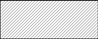
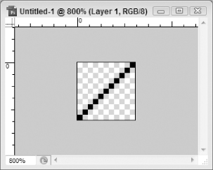
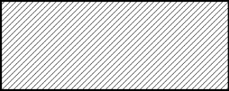
The first step in creating the diagonal overlay is to decide on the design specifics. This can be fairly arbitrary and will probably change as you use the patterns more and more. And, honestly, there are only two real considerations when making a diagonal pattern: How thick do you want the line and how much space do you want between lines? Since diagonal patterns should be square shaped, these two factors will determine the dimensions of your pattern. To illustrate this, assume that you want a 1 pixel thick line with 10 pixels space between each line, as shown in Figure 3-25. This means that your pattern will need to be 11 pixels wide by 11 pixels high (1 pixel for the pattern and 10 for the spacing). The actual pattern that you create for this design would end up resembling Figure 3-26.
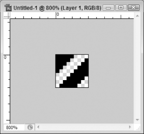
To get a different perspective on this concept, take a look at Figures 3.27 and 3.28. Figure 3-27 is the same image as Figure 3-25, except that it is filled with a diagonal pattern that has a 5 pixel thick line with only 4 pixels separating each line. To create this, a pattern was created that was 9 pixels wide and 9 pixels high (to accommodate both the 5 pixel line and the 4 pixel buffer between each line), which yielded the pattern seen in Figure 3-28.
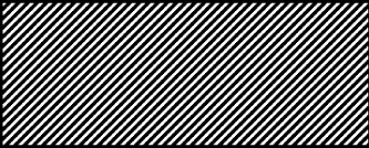
These pictures illustrate that the dimensions and line width aren't really arbitrary; the two designs look completely different. The determination as to how thick your diagonal line is and how much padding you put there significantly impacts the way the final output looks. Figure 3-27 is a much more intense diagonal pattern than Figure 3-25.
What is arbitrary, at least for this discussion, is which one to use. This is, simply, a matter of taste. Some people will look at Figure 3-25 and think that it is too immaterial and has no impact on the design. Others might look at Figure 3-27 and feel it completely overwhelming and obnoxious. And, quite honestly, the project you are using the patterns on and how you use them will have a say into what fits best. Changing the diagonal overlay's opacity, for example, can really affect the impact of the design (which you will see in later sections of this chapter). As you get more and more comfortable with creating patterns and using them in your projects, you will form your own preferences. This section will get you started on creating a pattern and give you the knowledge necessary to go out and create more.
The Chapter Project's Diagonal Pattern
Since the project illustrated in Figure 3-3 earlier in this chapter will be built in the next sections, it makes sense to create the diagonal pattern for that particular project. And, not coincidentally, this project uses the design just demonstrated in Figures 3.27 and 3.28.
Remember, in that example, the diagonal line was 5 pixels thick and there were 4 pixels of padding between each line. This means that you will need to create a perfect square design that is 9 pixels wide and 9 pixels high. To do this, you will need to first start a new project by clicking on File in the toolbar and then selecting New. This will give you the screen shown in Figure 3-29.
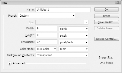
The only things that you really need to ensure are set on this screen are the Width and Height (both set to 9 pixels as illustrated). You will also probably want to ensure that Background Contents is set to Transparent as seen in Figure 3-29. This will render a new 9px by 9px project that is completely transparent (Figure 3-30), which is where you want to start.
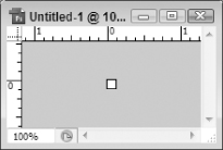
When you are working on such a small project, it is a good idea to magnify the project so that you can see the finer details. This will allow you to make pixel by pixel modifications more easily. And, with a 9 pixel by 9 pixel project, you are pretty much only going to be doing pixel by pixel modifications.
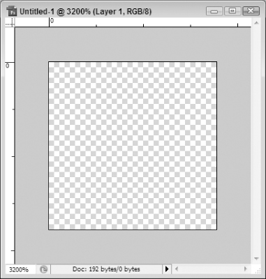
The easiest way to increase the magnification of a project window is by holding down the Ctrl button (Cmd for Mac users) while repeatedly pressing the +/= button (conversely, to lessen the magnification, you can hold down the Ctrl button (again, Cmd for Mac users) and then repeatedly hit the -/_ button). The highest magnification is 3200%, which will give you very good detail of every pixel of your project. Your 9 pixel project should now resemble Figure 3-31.
At this point, it's time to start painting your diagonal pattern. The first thing you will need is a tool that you can use to paint with. In this scenario you will want a tool that will give you the granularity to paint a solid pixel one at a time. There are probably several tools that could accomplish this, but probably the easiest and most reliable is the Pencil tool, which is located in the toolbox on the left-hand side of the button and is identifiable by the icon shown in Figure 3-32
As indicated by the small triangle in the lower right-hand corner of the icon, the Pencil tool is actually a part of an icon grouping that includes the Brush tool and Color Replacement tool, as can be seen in Figure 3-33.
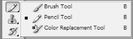
If you see any of the other tools in the toolbox, you can just hold down the icon until the other options become apparent next to it. Once the menu shown in Figure 3-33 comes up, just click on the Pencil tool option.
Once you have the Pencil tool selected, you may need to adjust how big, measured in pixels, the pencil paints with. For this fine of detail, you want to make sure that you are painting with a 1 pixel pencil. In order to check this, you can look in the Options Bar at the top of the screen and you will see a section with a Brush dropdown setting that you can use to set the pixel count to 1, as seen in Figure 3-34. (Make sure you click the dropdown arrow to see the options.)
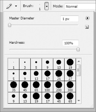
You will need to make your settings the same as those shown in Figure 3-34. That is to say, set the Master Diameter to 1 px and the Hardness to 100%. This will allow you to draw 1 pixel blocks with no distortion at the edges.
The last preparation you will need to make is to set the color for the lines you will be drawing. For this project, you will want to just create black lines. This pattern will be reused several times and, if the lines need to change color, you can do that in the project itself.
Since you only need to set the color to a solid black, there is an easy shortcut to do this. If you look at the bottom of the toolbox, you will see the icon shown in Figure 3-35. This icon is known as the Default Colors icon and can also be activated by simply pressing the D key on your keyboard (the same for PC and Mac users).
This icon, when clicked, will set the foreground and background colors to their defaults and, if you have not modified the defaults, this will make the foreground color black and the background color white. Once you click on it, the icons right below it, which allow you to manually set the foreground and background colors, should indicate that the foreground and background colors have been set to their defaults of black and white, as shown in Figure 3-36.
Now you are ready to paint your diagonal line.
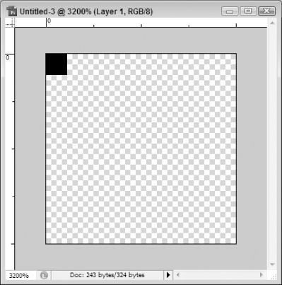
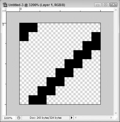
To start with, click one time in the upper left-hand corner of your image to create a one pixel block at that corner, as seen in Figure 3-37.
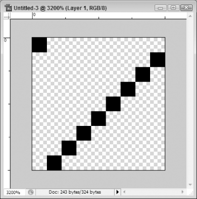
Using this same approach, the next thing you will want to do is draw similar blocks all the way across the diagonal of the project window one pixel at a time. You will need to offset this from the center by 1 pixel to accommodate the 1 pixel block you just made at the top corner, as seen in Figure 3-38. In other words, don't start at the corner; start 1 pixel over to the right.
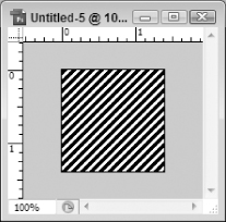
At this point, you have created the design for a perfect diagonal pattern that has a repeating one pixel diagonal line with eight pixels padding between each line. If you were to fill an object with this pattern, it would resemble Figure 3-39.
To thicken up the line, you will need to think about what this tiling background requires to match up seamlessly. You can't simply thicken up the diagonal line without making compensation at one or both of the corners of the project. In other words, if you add a second row of pixels immediately to the right of the original line drawn on the diagonal but not on the corner piece drawn in Figure 3-38, the diagonals will not match up and the image will look jagged. So, to make it seamless, you will need to compensate in the corner as well.
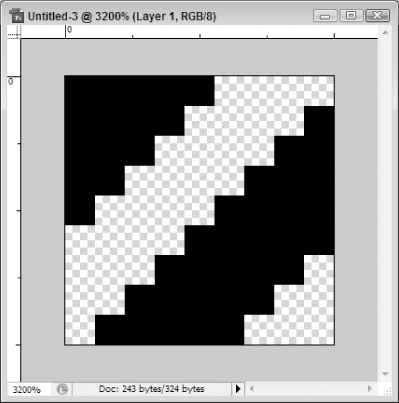
Probably the easiest way to keep this straight is to always “add to the right.” This means that if you need to thicken up the line, you will add to the right side of the lines already drawn. This will probably make more sense if you see it in practice. So, to see what this means, take a look at Figure 3-40.
This example shows that the original diagonal has been widened by adding another pixel of line directly to the right of the original line. To compensate for this addition, the 1 pixel dot has also been thickened by adding more dots on a diagonal line to the right of the original dot.
At this stage, you have created a diagonal pattern that contains a 2 pixel thick diagonal line with 7 pixels of padding between each line.
To continue this thought, you will want to add 3 more pixels thickness to each of the two sections that you have started. After you have added these new lines, your project should now resemble Figure 3-41.
At this point, the design aspect of your pattern is finished; you need only save it as a pattern in Photoshop. To do this, click Edit on the toolbar and select Define Pattern. This will give you the dialog box shown in Figure 3-42.
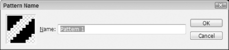
The only setting is Name. This is obviously a matter of preference but should be something that makes sense. The name you provide will provide pattern information when you are trying to apply the pattern later so you should give it a name that will help you figure out exactly what this pattern is. If you have a lot of diagonal patterns, it will be really hard to tell exactly what the difference is between an 11x11 pattern and a 4x4 pattern, for example. So, to help with this, you should consider naming your new pattern something like “9x9 pixel diagonal pattern (5 pixel line with 4 pixels padding).” When you see that later, you will know exactly what the pattern is.
At this point, your pattern is finalized and ready for you to use. You may want to save your Photoshop file for later editing. You can do this by clicking File on the toolbar and selecting Save As and then choosing a location to save the project file (with a PSD file extension). You don't need to do this for the pattern, but it is a good idea to keep it for later modification or reuse.
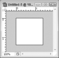
Now, to see how to use this new pattern, start a new project (File ⇒ New) and set the dimensions to 100 pixels by 100 pixels and set the Background Contents to White. This will give you a new project, as seen in Figure 3-43.
Now click on Edit and choose Fill and you will be presented with the options shown in Figure 3-44.
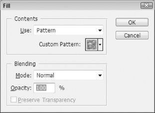
Next to Custom Pattern, click the down arrow to show all patterns. You will need to scroll down to the bottom to see the one you just added, but you should see something like Figure 3-45.
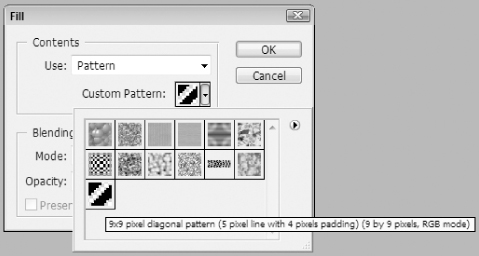
As Figure 3-45 illustrates, if you hover over your pattern, a pop-up will give you the name of the pattern that you provided earlier. Select your new pattern and press the OK button. This will fill your project with your new pattern, which you can see in Figure 3-46.
And with this, you should now have the basic knowledge necessary to create your own custom patterns and use them to fill in areas of your projects. You will see a more real world example of using this pattern in the next section (this 9x9 diagonal pattern will be used fairly extensively in the next section to design the Web site shown at the beginning of this chapter).
Free Transform
One of the nicer features, and perhaps one of the more underappreciated ones, is the Free Transform tool available in Photoshop. This tool allows you to have surgical precision when setting up regions of your project. In Web design, this can be particularly helpful. If you know you want the header region of your page to be exactly 150 pixels high (for whatever reason), you can set that up. If you want your content to be padded 50 pixels from the left and right borders, you can control that. With this tool, you can set all of the X and Y coordinates, as well as the height and width, of any object in your project. This gives you a lot of control over your layout and the objects in your projects.
Another aspect of this tool is that it allows those new to design concepts who might be less comfortable with creating regions of a project that “just look right” have more control over creating their project. This allows you to completely conceptualize your project and define its areas in very logical ways, which is really helpful if you aren't a true graphic designer (which more developers aren't). It brings graphic arts into a more code-related mindset; it can allow left-brained folks to at least imitate right-brained creativity.
To get an idea of how this tool works, create a new project that is 500 × 500 pixels and a background color of White. These settings are completely arbitrary but will be used throughout this example.
The first thing you will want to do is add a new layer to your project (click on Layer in the toolbar and then select New and then Layer). At this point, it's not important what you call the layer, so feel free to accept the default of Layer 1. This will be the layer that you will be playing around with to see how the Free Transform tool works.
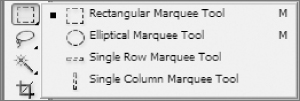
Now, use the Rectangular Marquee tool, shown in Figure 3-47 (it is in a group with the Elliptical Marquee tool, the Single Row Marquee tool, and the Single Column Marquee tool, also shown in Figure 3-47) to draw a selection in your project.
To create your selection, with the Rectangular Marquee tool selected, click anywhere in your project and hold your mouse button down. Now move your mouse to another point in your project window. You will see that the selection becomes recognizable by a series of moving dashes. This is often referred to as the “marching ants.” Release your mouse button when you have a selection you are comfortable with; size and position to not matter at this time. Your selection should resemble Figure 3-48.
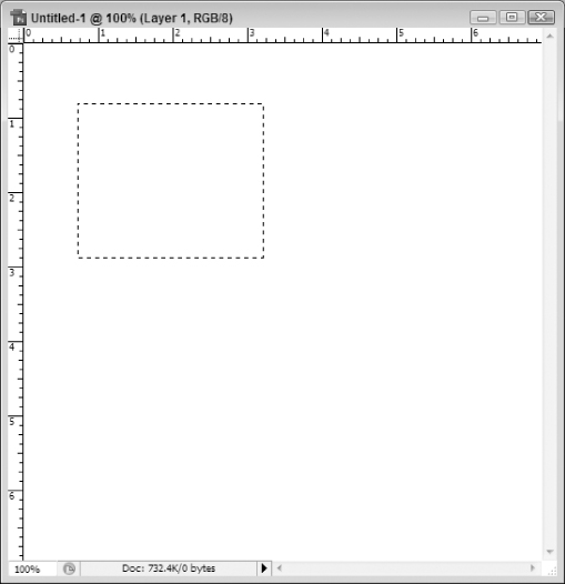
Again, your project won't resemble this exactly; just make sure you have a selection created and your new layer (Layer 1) is active.
The last step before you can use the Free Transform tool is to fill the selection with a color. This will create an object you can manipulate as well as allow you to visually understand what is going on when you use the tool. So, in order to fill the selection, use the Paint Bucket tool on the toolbox, which is part of a tool group including the Gradient tool as shown in Figure 3-49.
Once you have the Paint Bucket tool selected, click anywhere in your selection to fill it with the default foreground color (probably black unless you have changed it). Your project should now look more like Figure 3-50.
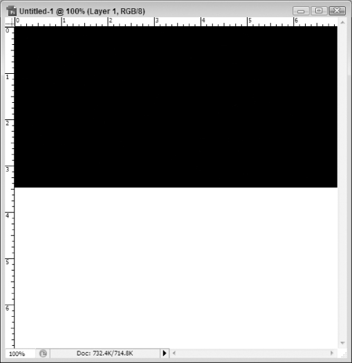
At this point, you are ready to see how the Free Transform tool actually works. For this demonstration, you will make the new area fill up the top half of your project, resulting in a half-tone design with black being the top half and white being the bottom.
To do this, bring up the Free Transform tool by clicking on Edit on the toolbar at the top of Photoshop and then selecting Free Transform. This will change the option bar to resemble Figure 3-51.
The first section that you will want to deal with allows you to set the X and Y coordinates of your object and is shown by itself in Figure 3-52.
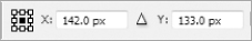
Within this section, there are three distinct but equally important components. The first one is the little graphic that sort of looks like some kind of matrix. This button, or in reality, this series of buttons, allows you to set the reference point location. This means that you set what part of the object you want to use as the reference point when setting the X and Y coordinates. By default, you can see that it is set to use the center point of the object as its reference point, as indicated by that point having a black box rather than a white one. This means that, for example, if you were to set the X and Y coordinates to (150, 150), it would make the center of your black box be at the (150,150) position in your project. You can change the reference point to any of the other positions marked with a white box.
For this example, you want to set the reference point to the top-left corner, which would coincide with the (0, 0) position of your drawn object (the black box). You do this by clicking the white box in the upper left-hand corner, which will turn that box black and all others white, as seen in figure 3.53.
You will next want to set the X and Y properties to zero pixels each (0 px). As you make these changes, you will see your black box move to those positions. For example, when you set the X property to zero, you should see your black box immediately shoot to the leftmost edge of your project. Similarly, when you change the Y property to zero, you will see your black box move to the topmost edge of your project.
The next settings you will want to adjust are the height and width, which will use the settings shown in Figure 3-54.
These are probably fairly self-explanatory; the W property sets the width of your object and the H sets its height. The one thing that you need to be careful of when playing with this setting is that it defaults to using percentages. If you enter “500” for the width, for example, it will increase the size of the object 5 fold. Meaning, if the original width of your black box was 200 pixels, changing the W property to 500 would actually make it 1000 pixels wide (500% of its original width). To account for this, make sure you enter in “px” after the number to tell Photoshop you want to use pixels rather than percentages.
So, since you want this object to be the full width of the project and half its height, set the width to 500 px and the height to 250 px. Once you have done this, press the checkbox button (when you hover over it, it will say “Commit transform (Return)”) shown in Figure 3-55.
If you have done this right, your project should now resemble Figure 3-56.
This example might be a bit simplistic but hopefully it illustrates how useful this feature can be in your Web design project. Without a lot of effort, you were able to exactly size an object to fit into a specific set of dimensions. You were able to exactly place it on an X and Y coordinate point in the project and then size it to the exact pixel dimensions you wanted. While this example only set up a picture with half black and half white, you can probably appreciate where this can come into play, especially in Web design. So much of what goes into business Web portals involves exact placement of images, backgrounds, and regions of the page. If you need to have a search bar region at the top of the page that is 35 pixels high, you now know how to mock that up in Photoshop. If you want to have a sidebar box that is 50 pixels over from the leftmost edge of the browser window, you now know how to place it exactly in your Photoshop mockup project. This tool can greatly eliminate guesswork and tedious alignment issues you will almost surely face if you use a graphics program to mockup your Web sites before you create them (which you should probably always do). Using this approach, you can ensure your mockups are symmetrical and properly representative of what you will create in your Web site. For this reason, if for no other, this is one of the coolest tools in the Photoshop arsenal.
Creating the Design from Scratch
Now that you have gotten an overview of the tools and layout of Photoshop CS3 and received an introduction to designing patterns and using the Free Transform tool, it is time to get into creating a real world design that will resemble Figure 3-3 earlier in this book. As a part of this process, you will determine the design's dimensions and then create the various assets within the project to fill up those dimensions. This section will walk you through each of those areas to help you get a better understanding of what you need to be thinking about when you are making your design.
Determining the Project Dimensions
The first consideration is what dimensions your design targets. This can change from design to design and project to project. If all of your work is for a corporate intranet and there are policies on screen resolution, then that is what you should follow. However, if you are targeting an unknown audience, it may be difficult to decide exactly what resolution you should target in your design.
Take for example the following statistics from TheCounter.com for February 2008 (http://www.thecounter.com/stats/2008/February/res.php):
| Resolution | Number of Hits | Percentage of Total |
| 1600 × 1200 | 41,275 | 0% |
| 1280 × 1024 | 1,864,921 | 30% |
| 1152 × 864 | 209,118 | 3% |
| 1024 × 768 | 2,912,561 | 47% |
| 800 × 600 | 485,618 | 7% |
| 640 × 480 | 8,479 | 0% |
| Unknown | 652,929 | 10% |
Generally speaking, the lower resolution you target, the bigger an audience you will be able to accommodate. For example, if you targeted a 640 × 480 resolution, your design should certainly fit into a 1600 × 1200 resolution screen. It may look tiny, but the reader should be able to see all of the content.
But at this point, what is too far down? Do designers really need to target the lowest possible resolution? Most people will say “no.”
So it's time to pick a resolution that will work in most situations (or at an acceptable percentage anyway). So look back at the resolutions provided earlier. It is impossible to accurately accommodate the Unknown category since the resolution for these visitors is, after all, unknown. So, removing that category, there were a total of 5,521,972 registered page hits using this data. So, assuming that it is fair to say that each bigger resolution will accommodate any resolutions smaller than it but not necessarily bigger than it, you could come up with the following analysis:
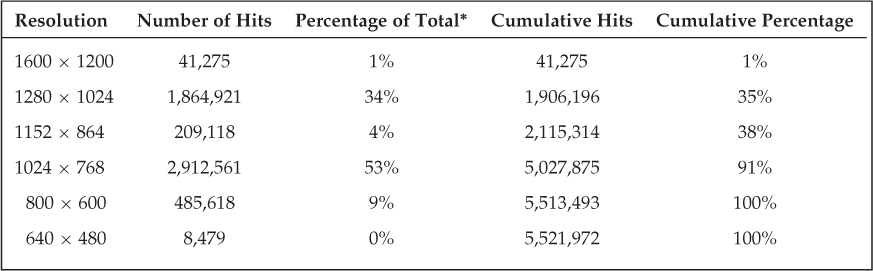
*The percentages in the table were adjusted to reflect the removal of the Unknown category.
To explain how these numbers were derived, the first resolution, 1600 × 1200, can only effectively accommodate 1600 × 1200 resolutions or higher. Since it is the highest resolution, it can therefore only accommodate its own design. Conversely, as you move down the table, you will see that, for example, a design targeting the resolution of 1152 × 864 should fit within a monitor set at 1152 × 864, 1280 × 1024, and 1600 × 1200.
So, with this analysis, you can see that a screen resolution of 1024 × 768 will accommodate approximately 91% of users based on this data.
If you were to look to a similar source, say the Browser Display Statistics from W3Schools.com (http://w3schools.com/browsers/browsers_display.asp), you would see a similar trend (data through January 2008 is the most recently updated data from this Web site):
| Resolution | Percentage of Total* | Cumulative Percentage |
| Higher than 1024 × 768 | 40% | 40% |
| 1024 × 768 | 51% | 91% |
| 800 × 600 | 9% | 100% |
| 640 × 480 | 0% | 100% |
*The percentages in the table were adjusted to reflect the removal of the Unknown category.
So, regardless of which statistics you draw from, you will probably see that targeting 1024 × 768 screen resolutions should accommodate more than 90% of all site visitors. Due to this, there has been a noted trend in Web design to move to this resolution (but not beyond). For years, the generally accepted target resolution was 800 × 600. However, with monitors getting bigger and resolution increasing accordingly, the target resolution has begun to shift as well. Therefore, this project will use the 1024 × 768 target resolution for its definition.
It is worth noting that, even with the use of real world browser hits as shown in these examples, the analysis may be a bit off. Take, for example, visitors that browse the Internet in less than the maximized view. These visitors, even if they have a screen resolution of 1280 × 1024, may have a browser window that only has 800 pixels wide of available space and maybe 400 pixels high because it is not in the maximized window state. This is just a cost of doing design on the Web and, honestly, there isn't a lot you can do about that. However, it is worth keeping in mind.
With the preceding caveat, many designers are turning to what is known as a “liquid” design. Liquid designs allow the design to stretch across the canvas of the browser, regardless of the dimensions that are currently available. This means that, if there are 1600 pixels available across the browser, the design will stretch to accommodate that; if, conversely, there are only 800 pixels available, the design will shrink to accommodate that. This design allows for a more consistent look for all visitors since, for example, all users will see the top navigation bar stretched all the way across the browser. If, by contrast, the designers used a fixed-pixel width design, say 700 pixels, it would look fine in an 800 × 600 browser but might look funny centered inside of 1600 pixels (meaning 450 pixels would be sitting vacant on either side of the design).
Taking into account all these considerations, this project will use the 1024 × 768 target resolution but will also use a liquid approach to the design to try to accommodate other users as well.
Creating and Setting Up the Project
For this section, you will be using layers fairly extensively to create the exact effect of the design. With this in mind, it might be a good idea to expand the docking panel so that you can see the layers palette, as shown in Figure 3-57.
The next step is to actually create the new project. To do this, click on File in the toolbar and select New to add a new project in Photoshop. You should see a settings screen similar to that shown previously in Figure 3-29.
The main thing that you will want to do on this screen is set the Width to 1000 pixels and the Height to 900 pixels. This will allow for you to create a design that fits in the target resolution established earlier even if the numbers seem a bit off.
For example, the width is supposed to be 1024 pixels and you are setting it to 1000. Why? Remember that the browser has “stuff” on its edges. For example, all browsers will have some sort of scrollbar on them (usually on the right-hand side). There will also generally be a window border on the other side. So, even though you are hoping that your users will have at least a 1024 x 768 resolution on their monitor and that their Internet browser is maximized, you still have to back off a few pixels to account for this “stuff.”
It is also important to realize that this design will be “liquid” or “fluid,” meaning that it spans the entire width of the browser. If there are only 18 pixels of “stuff” for your browser, your design will span the entire 1006 pixels that remain (1024 total width less the 18 pixels of “stuff”). The real target is to set the width at a pixel dimension that will get you close to the actual target so that you can maximize your available real estate and plan the design accordingly. In your own project, you could achieve similar success at 975, 900, or 873 pixels. The width is fairly arbitrary. However, you do want to make sure you have enough width to adequately portray your target resolution so that when your design is loaded at that resolution it will look the way your thought it would. For the project in this chapter, the width is set to 1000 pixels. This allows for 24 pixels of “stuff” but still is near the target resolution of the project.
Similar real-world considerations can be applied to adjusting the height to deviate from the target resolution of 768 pixels high. In Web design, it is generally acceptable to have some vertical scrolling, so it is much more critical to focus on the horizontal width and therefore you can have a height that will generate a little scrolling. After all, even at 768 pixels, with the toolbars and such that are a part of every browser, you won't have 768 pixels of available real estate regardless. So if you truly want to create a project that doesn't scroll vertically and you want to target the 1024 × 768 resolution, you should probably set your height at around 600 pixels. However, since that isn't as much of a concern, this project will go ahead and stretch out to 900 pixels for now. This will give some “play” room so that you are limited by the non-scrollable region of the browser window. At the end of the project, you may adjust it further after you see the design. But this will be a good start.
Remember, too, that there are fixed regions of a Web site design and dynamic regions (typically). In most designs (and with this particular project), there is a header/navigation region that is static at the top and a footer region that is static at the bottom. Any discrepancy between the height you set your project and the actual height dimensions available for a user will be eaten up in the dynamic region of the design: the content area. This area is intentionally created in a way that will allow it to grow and shrink as necessary to accommodate varying levels of content. However, the other thing it should do is fill in any gaps in height distribution. This means that, for example, if you have set your height to 900 pixels but the user has an extraordinary resolution that allows for somewhere in the neighborhood of 1200 pixels of height, the extra 300 pixels will be eaten up by the whitespace in the content area. So the height here really is fairly arbitrary. You want to set it to a reasonable height that will allow you to fill up the content area with real-world mockup design elements so you can truly gauge the effectiveness of your layout and design. However, understand that, when your design goes into HTML, the height will be controlled by the content and browser/screen capabilities.
The only other setting you may want to tweak is the Background Contents property. This setting will determine what the background color should be. Typically, it is a good idea to start off with a transparent background and then build up the project from there. However, in some projects, this might not be the case. For example, if your project is one that will have the primary background color set to white, why would you first create a transparent background and then paint it white? Why not just start with a white background layer? Conversely, if your background is going to be more dynamic with some sort of repeating background or other similar effect, there is no point in starting off with a colored background since you will be completely covering it up with your background effects. For this project, though, the setting should be left to (or changed to if not already there) Transparent. Press the OK button to continue. This is more to illustrate how to fill an entire layer with a solid color. The net result over the next few steps is to create a solid white background, so to save time you could just as easily start off with the background as a solid white color. But, following the next few steps will give you a clearer understanding of how all of this works and you will learn a bit more about Photoshop in doing so.
You should now have a new Photoshop canvas that has a transparent background and dimensions of 1000 × 900. You are now ready to fill those areas with content.
Just as a matter of preparation for the next stages of the project, you may want to do a little cleanup and setup.
The first cleanup item is to rename the layer that was created by default (it is probably called something like “Layer 1”). There are a couple of ways to do this. You could click on Layer on the toolbar and select Layer Properties or, similarly, you could right-mouse click on the layer itself in the layer palette and choose Layer Properties. Either method will get you the settings screen shown in Figure 3-58.
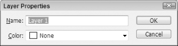
If you go about it this way, simply type in the name of your layer (e.g., “Background Layer”) and press the OK button.
You could also just double-click on the layer name itself in the layer palette and the name becomes editable. (This is very similar to any rename capability in Windows file systems.)
Regardless of what approach you take, you should now have a single layer that is titled “Background Layer.”
With this layer, you will want to paint the entire thing white. Again, you could have done this with the project creation phase (chosen “White” as the “Background Contents” property) but, in doing it that way, the background becomes locked and uneditable. Of course, there is a way to unlock the layer but, for now, suffice it to say that either way is similar and this way of doing it is as good as any other.
The first thing you will need to do is set the foreground color to white. To do this, first click the Default Colors icon shown earlier in Figure 3-35 (the part that looks like a black box over a white box).
Now click the Switch Foreground and Background Colors (X) button (the double arrow icon). This will reverse the foreground and background colors, meaning the foreground should now be white and the background should be black, as shown in Figure 3-59.
So, with colors set, click the Paint Bucket tool in the toolbar, which you saw earlier in Figure 3-49 and hover over your project window. Your cursor should turn to the paint bucket icon, as seen in Figure 3-60.
Once you see the cursor transform into the paint bucket cursor, left-mouse click anywhere in the canvas and the entire layer will be painted the foreground color (white in this case).
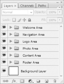
The last thing you will want to do as part of the setup is to create groups for the different regions of your project. Layer groups can allow you to more effectively organize your Photoshop project by creating collapsible folders in which you can store similar or related layers. For example, for this particular project, it would probably make sense to create groupings for the welcome area, logo area, navigation area, etc. Essentially, you want to create a layer group for the logical areas of the Photoshop project so that you can easily find things when you want to edit them. For example, if you have 200 layers and you want to find the one that has a gradient fill for the toolbar region of your Web page design, you might find it difficult to wade through all 200 layers just to find the one you need to edit. With layer groups, however, you can simply expand the navigation grouping and find the background layer.
In order to create a new grouping, you should click Layer on the Photoshop toolbar and then select New and, from the options presented, click Group, which will give you the settings screen shown in Figure 3-61.
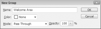
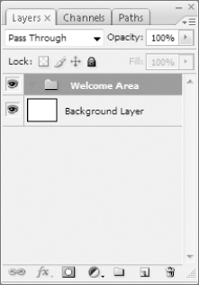
The only setting you will need to change is the Name property. You can set it to Welcome Area as shown in Figure 3-53. Press the OK button to create the new layer grouping, which will actually look like a folder in the layers palette, as can be seen in Figure 3-62.
Using this same approach, you will want to create groupings for the major regions of this project:
- Navigation Area
- Logo Area
- Photo Area
- Content Area
- Footer Area
When you are done, your layers palette should now resemble Figure 3-63.
You now have the background and basic structure for your design and are ready to move on to the next steps. However, as one final step, you will probably want to save your project. In Photoshop, click on File on the toolbar and select Save and then choose a location for your file. You will want to keep the PSD file extension to maintain your layers and things of that nature. Choose a name (for the remainder of this chapter, the project will be referenced as “SharePointDesignLayout.PSD”) and press the Save button. You will want to routinely save your project as you work on it to make sure you don't lose any work in the event of something like a power outage or surge. You can do this by clicking File on the toolbar and then clicking Save again or simply pressing Ctrl+S (Cmd+S for Mac users). This will just save the project in its current state to its current file location.
The Artist and the Surgeon
When it comes to graphic arts, there are at least two types of people: the artist and the surgeon. The artist is very right-brained in his approach to graphic design. This type of designer uses more feeling and imagination to determine how the final product will look. He also probably comes up with more of a big picture concept and then works back to figuring out how to make the limitations of the binary world fit this dream.
The surgeon is much more analytical and logical (left-brained). This type of designer will probably break up a usable workspace into logical grids and decide how to fill each one best and then worry about making things flow together after all the pieces are in place. This type of designer will say, “This is a Web site, so I need a 150 pixel header region, a 35 pixel footer region, and the remaining real estate splits off into a sidebar region and a content area.” Then he will work on creating the header, then make the footer try to look like the header, and then split up the content and sidebar areas.
A fun site to try to figure out which one you most fit is here: http://www.news.com.au/heraldsun/story/0,21985,22556281-661,00.html
So which is better? The surgeon or the artist? Probably neither. Maybe both.
Both approaches serve their purpose in graphic arts. If strictly a surgeon, your sites might tend to all look the same and may seem to some to lack imagination. If strictly an artist, your designs might not fit the needs of real world business applications, in particular the complexities of a SharePoint site design. So the best designers, at least in the realm of business portals like SharePoint, are those who can combine both. Try to make sure your sites are imaginative and inspiring but also useful and logically organized. This can be a tough balance to try to maintain, but if you can pull it off, you will never be hurting for a job.
So why bring this up now? Well, as this chapter progresses, you will see the project mature through an artist's perspective. Rather than seeing “draw a box that is 25 pixels high 1000 pixels wide” you will see more “draw a box at the top of the page that will hold the welcome area content.”
If you are strictly a surgeon, this might be hard to follow. So, to help counter that, these sections will put up the dimensions the authors came up with in their approach so that you can mimic the same dimensions in your own project. This will result in measurements of things like “98.2 pixels” because they weren't done on a rigid matrix; they were drawn with an artistic eye (what looks right). So, rather than getting fixated on “why did the authors use 98.2 pixels instead of 98 pixels? Or maybe even just 100 pixels?” just understand that these designs were laid out using the eye and not the ruler. The measurements are provided just so that, if you want, you can follow along exactly with this example and be prepared to use your project in subsequent chapters (for example, the Master Page and CSS chapters will split this design into HTML and CSS code to use for the layout of a SharePoint page).
The final PSD will also be available as a download companion to this book. If you want to play around with your own dimensions here and be strictly the artist, then feel free to do so; you can download the final project from Wrox and use that for future chapters. Or you can be a surgeon and use the provided dimensions for all areas and then use your own project in those future chapters. The choice is yours.
If you decide you do want to be a surgeon, make sure you read the section earlier in this chapter about the Free Transform tool; it will be your best friend moving forward through this chapter.
If you want to be strictly an artist, ignore the parts in this chapter with the actual dimensions of the object. These will be designated as follows:
Reference Point Location: Top Left Corner
X: 0.0 px
Y: 0.0 px
W: 1000.0 px
H: 147.0 px
And with that, it's time to get started with the actual design.
The Logo Area
Generally speaking, it's a good idea to create your design in a logical sequence, starting with what must be placed exactly and moving to the areas that are placed based on that. In other words, if you have a huge centerpiece that needs to be not only the focus of attention but also centered on the page, you would want to create that first and then move to the peripheral objects and focus on them.
However, in this design, the site is laid out on a matrix, so it probably makes more sense to work in a linear fashion from the top to the bottom, with one caveat: Using layers, the way you will probably approach this design (emphasis on probably: There is no single right way to create this design; the approach documented in this chapter is just one way) is to layout the entire area that will contain the welcome area, the logo area, and the navigation area. Then create the content for the welcome area and navigation area on top of that. When you are splicing up the image for your HTML code later, it won't matter. But for now, it ensures that there is no accidental space left between, say, the logo area and the welcome area.
So, with this in mind, it makes more sense to just create the entire area that will encapsulate the welcome, logo, and navigation area. So that is what you will do. Draw an area at the top of the project window and give it a solid color. (The color doesn't matter at this point because you will be overriding it with a gradient fill in the next step.) This area should be big enough to include the welcome area at the top, the logo area just under it, and the navigation area at the bottom. Generally speaking, this should be around 150 or so pixels high and spread the entire width of the project window.
If you are a surgeon, you can make your area conform to the following dimensions:
Reference Point Location: Top Left Corner
X: 0.0 px
Y: 0.0 px
W: 1000.0 px
H: 147.0 px
Once you have this done, it should resemble Figure 3-64.
For this design, that black is way too dark and is hard to work with, so you will want to lighten it up. You can do this by providing some sort of graphical overlay to it. In this case, you will want to provide a gradient overlay that goes from a light gray to an even lighter gray color. The change will be subtle but still noticeable in the final design.
To do this, you will need to add effects to the layer or, more specifically, one effect: the Gradient Overlay. There are several ways to do this but the easiest is to simply click Layer on the toolbar at the top of the Photoshop interface and then choose Layer Style and from the options presented Gradient Overlay. This should bring up the Layer Style dialog box shown in Figure 3-65.
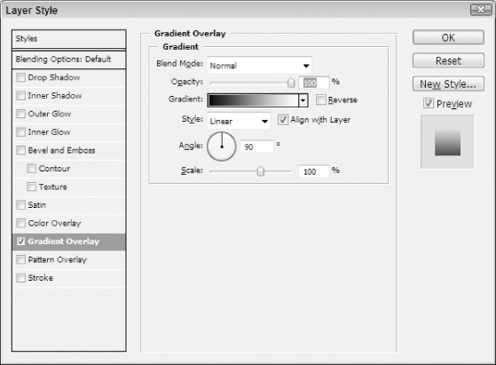
The only thing you really need to adjust here is the gradient. To do that, just click on the Gradient bar in the Gradient Overlay section, which will bring up the settings shown in Figure 3-66.
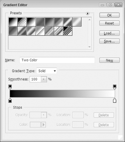
The only settings you will need to make here are the two colors that are used to set the gradient fade. These colors are designated by the markers at the bottom of the gradient, as illustrated in Figure 3-67.

If you click either of these markers (circled in Figure 3-67), you will see the options at the bottom of screen change to match the color and position of that marker. For example, if you click the black marker on the bottom left of the gradient, you should see the options change to those shown in Figure 3-68.
As you can see, the color is set to black and the location is set to 0%. The location is the position of the gradient stop. In this case, it is at the zero position, meaning that, on the gradient scale, this is where the gradient starts. If it were at the maximum position, or at the 100% location, it would be the last color of the gradient. To understand what this means, look back at Figure 3-67. The color at the very far left is at the zero position while the color at the far right is at the 100% position. So, if you wanted a gradient that went from red to yellow, you could set the zero position (left marker) to red and the 100% position (right marker) to yellow. This would create a smooth transition from red to yellow that you could use for your gradient fill.
For this object, the location is already set where it needs to be and does not require any changes.
However, you will want to change the color. To do that, click on the color box (the one that is black in this example). This should bring up the “Select stop color” selector options, shown in Figure 3-69.
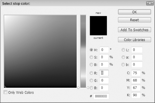
Using this screen, you can choose pretty much any color to use; you can even set it to only allow you to select Web-safe colors (for an explanation of Web-safe colors, visit http://en.wikipedia.org/wiki/Web_colors#Web-safe_colors). This is when the artist in you can really rejoice (or, conversely, the surgeon can get a little intimidated). There are so many colors to choose from and so many different shades and hues of the same color that your options really do seem endless.
However, to keep with the project at hand, choose a fairly light gray color (this example uses #cccccc for the hexadecimal color; you can simply type in “cccccc” at the bottom of the settings page). Once you have your color, press the OK button to select it for that gradient stop.
Use this same approach to set the second stop (again, the location is already set where it needs to be by default for this example) to a lighter color gray. This example uses #eeeeee for its lighter color. That is very close to white, which is represented as #ffffff, but has enough color to differentiate itself from the white background that is used for this Web site layout.
Once you have set the colors for both gradient stops, press the OK button to get back to the Layer Style settings window. Before closing this out, check the Reverse checkbox to make the gradient flow darker at the top to lighter at the bottom. Once you have done that, press the OK button to apply the gradient style. Your project should now look more like Figure 3-70 (dark gray at the top of the region fading to a light gray at the bottom).
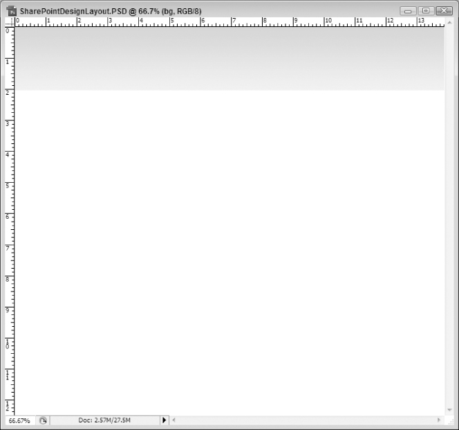
For now, the last thing you want to do to this section is overlay the diagonal pattern you created earlier in this chapter (the 9x9 diagonal pattern). One thing to think about, though, is that you only want to overlay the pattern over the gradient you just created, not the entire project window. Like everything else, there are several ways to do this. However, probably the easiest is to define the fill area before you apply the fill.
To do this, make sure the layer that has the gradient applied to it is the active layer. (Click on it in the layer palette window to make it active if it is not.) Once you have done this, hold down the Ctrl button (Cmd for Mac Users) on your keyboard and click on the thumbnail image on your layer in the layer palette (see Figure 3-71).
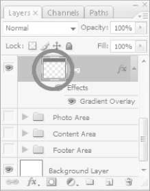
By doing this, you should see that the area of the project represented by the logo area background becomes a selection in the project (as indicated by the marching ants). In other words, the top part of your project should now be a selection.
With your logo area background layer still active, click on Layer on the toolbar and choose New Fill Layer and then Pattern from the options presented. This will give you an options screen similar to Figure 3-72.
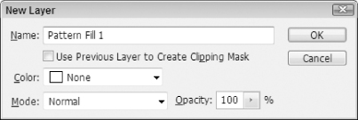
You do not need to change any of the default settings; just press the OK button. This will bring up the settings screen shown in Figure 3-73.
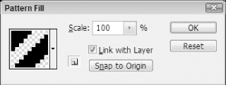
Most likely, when you see this screen, you will not have your diagonal pattern selected. If that is the case, make sure you select it from the dropdown menu attached to the icon view of the pattern. Once you have your diagonal pattern selected, press the OK button.
Doing this, you will notice a couple of things. First, you should notice that the diagonals have now been applied to your project, as seen in Figure 3-74.
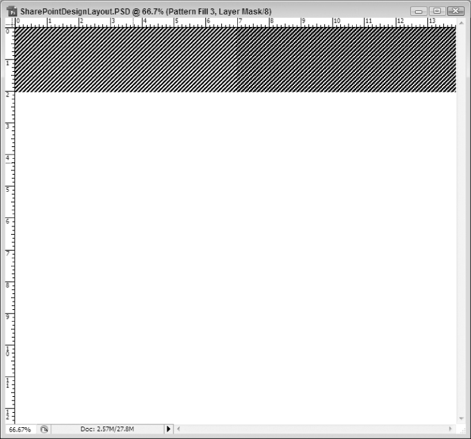
The second thing you will want to take note of is the new layer added for you in the layer palette (Figure 3-75).
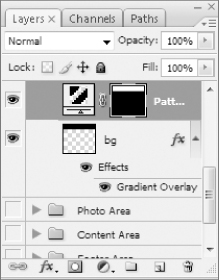
This layer shows two things. First, it has created a new type of layer and therefore the icon for the layer is different. This layer is a pattern fill layer as opposed to just a standard layer that you have been using up to this point. The other thing you will see is that there is a second icon on this layer. This is the mask for the layer. To this point, the project has only used standard layers, which have no mask applied by default, so this will probably be a new concept. Masks are a very useful tool that you can add to standard layers. Some objects like the Pattern Fill Layer automatically include a mask.
A mask allows you to apply only part the current layer to your project. The way to think about this, perhaps, is to think about what really happened here. The entire layer is really filled with the diagonal pattern. However, you only see the part that is on top of the gradient background layer. Why is that? The rest is hidden by the mask. If you want to play around with this to see how it works, click the icon for the mask to make it active and then go paint some regions of your project that are currently not showing diagonals. If your foreground color is set to white, you will see the diagonals start to come through wherever you are painting. The way a mask works is that where it is white your layer comes through; where it is black, it does not. That is why the icon on your diagonals layer looks mostly black except for the region you are displaying, where it shows white. Masks are a really useful tool in that they can allow you to do non-destructive edits to your layers (meaning you can delete part of a layer in effect but, in reality, it's still there).
The last thing you will want to do with this layer is play around with the opacity and fill of the diagonals layer. The diagonals are overpowering the image and need to be softened so that you can see the gradient colors you just set up.
If you look at Figure 3-75 again, you will see that there are properties for Opacity and Fill. Without going too deeply into the difference, you can think of Opacity as affecting everything and Fill affecting only the object and not its effects. For example, if you have text on the project with a drop shadow effect applied to it (you will see how to do this later in this chapter), if you reduce the opacity to zero, you won't see the text or the drop shadow at all. However, if you instead reduce the fill to zero, you won't see the text at all but you will still see its drop shadow. Fill is a fun way to make some cool effects.
Play around with these settings until you find a desirable effect for the diagonal lines. Basically, you want to see the lines but only barely; they shouldn't take away focus from the background gradient colors.
Opacity: 5%
Fill: 26%
Your project should now resemble Figure 3-76. While the diagonals may not completely show through in the printed manuscript, you should hopefully be able to see them more clearly in your own project.

At this point, it's time to move onto other regions. However, you will need to come back to this region later to place the header text and the search box sections. But, since it would be hard to place of these things before putting on the Welcome and Navigation areas, it's time to take a break from the logo area and do those other areas first.
The Welcome Area
The first step is to add a layer in the Welcome Area group that will be used as the background for that region. As a refresher, to do this, you should set the group folder as the active object by clicking it and, after doing so, click Layer in the toolbar and then New and Layer. Call the layer “Background Gradient” so that you can reference it later in this section.
Now, on your new Background Gradient layer, draw a selection at the top of the page and fill it with black, much like you did for the Logo area background. Your project should resemble Figure 3-77.
At the risk of foreshadowing a bit, you need to make sure this layer extends beyond the boundaries of the project window. This is because you will later being applying a border to the layer that you want only visible on the bottom. To accomplish this, you need to start your image at a negative position on the X and Y axis points and compensate on the height and width.
Reference Point Location: Top Left Corner
X: -1.0 px
Y: -3.0 px
W: 1005.0 px
H: 28.0 px
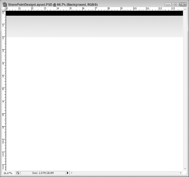
The next thing you will want to do is add some effects to this plain looking black bar. For the purposes of this design, this means that you want to provide a gradient overlay, border (stroke), and drop shadow for this region. To do this, right-click the layer in the layer palette and choose Blending Options.
On the screen that appears, check the Drop Shadow option in the left pane (make sure you click on the title “Drop Shadow” to ensure the settings for that effect is displayed) and then make the following adjustments:
- Set Blend Mode to Multiply
- Set Opacity to 19 percent
- Set the Angle to 69 degrees
- Set Distance to 2 pixels
- Set Spread to 0 percent (this is the default so you may not need to change this setting)
- Set Size to 9 pixels
The other settings should be okay for the Drop Shadow effect.
Next, you will want to set the properties for the Gradient Overlay effect. To access these settings, click on Gradient Overlay in the left pane; this should also serve to check this setting. Using similar techniques as you did with the Gradient Overlay settings in the logo area, you will want to make the following adjustments to this setting:
- Gradient Stop 1 (0%) Color: #245e28
- Gradient Stop 2 (100%) Color: #367138
You are now ready to set the last setting, the stroke. This is the setting that will put a border around the selection. Remember that you only want the border to display on the bottom of the selection, which is why you modified the area beforehand to extend beyond the borders of the screen.
To set the border, click Stroke, thereby checking this option, in the left pane of the settings window. You will want to set the properties to the following:
- Size: 1 pixel
- Position: Inside
- Blend Mode: Normal
- Opacity: 100%
- Fill Type: Color
You will also want to set the color. To do this, click the Color box in the options under Fill Type. If you click the color image on the screen, it will bring up the color picker screen. Use this screen to set the color to dadada and press the OK button.
You now have all of your settings in place. Press the OK button one final time to see them get applied to your image. You should see that your black box has now become a green gradient box, as shown in Figure 3-78.
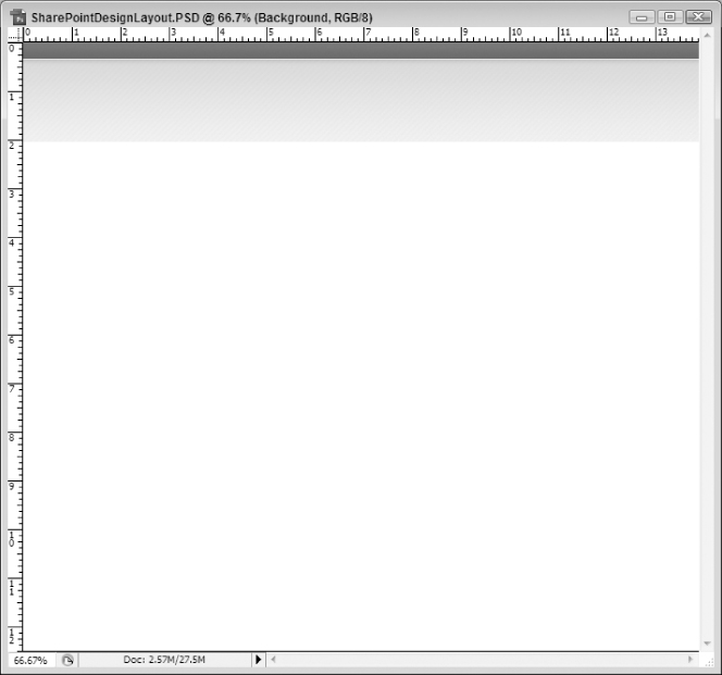
The next step is to add the text that will display for this region. This text will need to be white to contrast against the greenish background. The easiest way to ensure this is to bring back the default black and white foreground and background colors (click the Default Colors icon) and then reverse them (click on the curved double-arrow icon), as you saw earlier in this section. That will make the foreground color white and the background color black. The background color is not as important at this stage since the text will be using the foreground color. The important part of this step is to get the foreground color to be white and this is probably the easiest way to do that.
With layers in mind, you will need to put your text layer on top of your Background Layer in the Welcome Area Group. This will make the text sit higher in the visibility hierarchy of your project, meaning you can see the text on top of the green gradient of the “Background Layer.” If you put the text layer below the Background Layer, the text will be completely hidden since the Background Layer is completely opaque.
To make sure you do the hierarchy right, click on the Background Gradient layer in the Welcome Area Group on the Layers palette. This will make that particular layer be the currently active layer. Now, with your foreground color set to white and the Background Gradient layer being active, click on the Horizontal Type tool on the toolbox, which can be seen in Figure 3-79.
As can be seen in Figure 3-79, the Horizontal Type tool is part of a tool group that includes the Vertical Type tool, the Horizontal Type Mask tool, and the Vertical Type Mask tool. If any of these other tools are the active tool in this group, make sure you switch to the Horizontal Type tool before proceeding.
Once you select this tool, you will notice that the options bar changes to give you more text-specific options (like font names, weight, and size), which can be seen in Figure 3-80.
Just as Figure 3-80 shows, you will want to make the following adjustments (if not already set to these by default):
- Font Family: Tahoma
- Font Style: Regular
- Font Size: 11 pt
- Anti-aliasing method: None
- Text Alignment: Left
Now, with the Horizontal Type tool selected and its options set, click anywhere in the green area of your project. You should see that there is a flashing cursor and a small underline at the spot where you clicked. You can now begin typing. Type in “Welcome Mossman, Joe” and then press the checkmark in the options toolbar. (It will turn green when you hover over it.)
This will add the welcome text to your project. However, you will want to position it better. To do this, you will follow similar steps as outlined earlier in this chapter. Change to the Move tool (the arrow icon at the top of the toolbox) and drag the text to where it looks appropriate somewhere near the left-hand edge of your project in region defined by the green gradient background.
If you are a surgeon, you will want to use the Free Transform tool to create the region with the following dimensions:
Reference Point Location: Middle Left Edge
X: 18.0 px
Y: 12.4 px
The last thing you need to consider for this text is the arrow that is sitting right next to it in the mockup. As you may know, in MOSS 2007, the welcome message is accompanied by a small arrow that indicates dropdown options (for things like logging out, signing in as a different user, and so on), as can be seen in Figure 3-81.
So, for your mockup, you will want to include the arrow as well to make sure the depiction is as accurate as possible. Fortunately, you can borrow those images from your MOSS installation and copy them into the Photoshop project. To do this, assuming you have a default installation set up and haven't modified anything, you should be able to navigate directly to the arrow graphic by going to the following path: http://<SITE PATH>/_layouts/images/menudark.gif. For example, if your site is located at http://www.MySharePointSite.com, you can navigate to the following path to get the image: http://www.MySharePointSite.com/_layouts/images/menudark.gif.
If you open the path in a browser, simply right-mouse click on the graphic and select Save Picture As. Unfortunately, copying the image to the clipboard directly from the browser and then pasting it into your project will lose the transparency of the graphic. So you will want to save it to a location you can remember (perhaps an Assets subdirectory off of your project folder). Once you have it saved, open it up in Photoshop (File ⇒ Open) and then, at this point, copy it (Edit ⇒ Copy). This will put the image on the clipboard for you with its transparency intact.
Now you are ready to paste your image into your mockup project. First make sure the text layer is active by clicking on it in the Palette. Next, click Edit on the toolbar and select Paste. This will paste the arrow onto your project on a new layer that is above the text layer but still within the Welcome Area group. It will probably be centered in the project window, which is not what you want; you want it immediately to the right of the text. So, once the image is in your project, it's time to move it. So, again, use the Move tool to move the arrow next to the text. You are now done with the welcome message.
Once again, if you are a surgeon, you will want to use the following dimensions when creating this region:
Reference Point Location: Middle Left Edge
X: 139.0 px
Y: 11.5 px
You will next want to follow similar steps to create the text and arrow for the Site Actions that will be the right-side counterpart to the welcome message. In other words, you want an almost exact copy of the Welcome message and its linked arrow sitting on the right side of the screen with the text “Site Actions” displayed instead of “Welcome Mossman, Joe.”
Text Settings:
Reference Point Location: Middle Left Edge
X: 902.0 px
Y: 10.4 px
Arrow Settings:
Reference Point Location: Middle Left Edge
X: 965.0 px
Y: 11.5 px
If you did this correctly, your project should now resemble Figure 3-82.
The Navigation Area
The next section is the navigation area. This could also be considered the toolbar of the Web site. This section will have a “gel” effect that makes it look similar to the taskbar in Windows Vista; it will just be modified to fit the color scheme that has been established to this point (the greens).
The first thing you will need is a layer added to your project for the background image. Make sure the Navigation Area group is active and add a new layer to that group and call it “Background Gradient.” This section should probably be a little bit larger than the Welcome Area as it will provide the central navigation for the site and you want to draw some attention to it. Remember from earlier discussions that one of the quintessential elements of strong Web design is ease of navigation. That being said, you don't want to make the navigation over-to-top and the primary thing that draws the visitor's eye; the content of the site should do that. But you do want to make sure people can find the navigation tools and easily navigate your site.
The next thing you want to do is add a new object to your layer to represent the navigation region. This should be at the bottom of the logo area and probably around 35 pixels high. As before, fill it with black as a temporary solution so that you can identify it. (You will be covering it up with layer effects in the next steps.)
Reference Point Location: Top Left Corner
X: 0.0 px
Y: 116.0 px
W: 1000.0 px
H: 33.0 px
With this new area defined, it is time to apply some layer effects to it. Essentially, this will involve two things: a gradient overlay and a small drop shadow. With this in mind, open up the layer's Blending Options to the Gradient Overlay settings (Layer ⇒ Layer Style ⇒ Gradient Overlay). This will bring up the Gradient Overlay screen for the Layer Style dialog box. As with previous steps in this project, you will need to bring up the Gradient Overlay Editor (see earlier Figure 3-66) by clicking on the Gradient box in the Gradient Overlay section.
The next step is to set the gradient overlay for this layer. However, unlike the previous use of the gradient overlay effect, this time you will be making more than two gradient stops (i.e., there will be intermediate stops between the zero and 100% positions).
So how do you add new gradient stops? It's actually fairly simple. When you are looking at the gradient displayed, you will see the stops you have been manipulating at the bottom of the gradient depiction. If you hover your mouse anywhere in that area (under the gradient depiction and between the 2 existing stops) you will see that the mouse turns to the hand cursor, as seen in Figure 3-83.
While hovering in this area, click on the settings box and a new stop will be created. It doesn't really matter where you click because you are going to set the position in the settings below. For example, click anywhere in that area to make the second gradient stop. Next, go to the Location property and enter in “48” to indicate 48%. Finally, set the color by clicking on the color box and setting the color to “2b6830” in the color picker tool. You can follow these same steps to set the other gradients in this example, as shown in Figure 3-84.
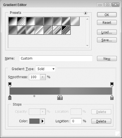
Use this approach to set the following four gradient stops for the navigation area:
- Gradient Stop 1 (0%) Color: 245e28
- Gradient Stop 2 (48%) Color: 2b6830
- Gradient Stop 3 (50%) Color: 5d845a
- Gradient Stop 4 (100%) Color: 367138
The result will be a green “gel” effect for the background of the navigation area.
The next step is to set the drop shadow. To do this, click on the Drop Shadow tab of the Layer Style window and make the following modifications:
- Opacity: 37%
- Angle: 69 degrees
- Distance: 2 px
- Spread: 0%
- Size: 5 px
At this point, you have finished styling the background and can press the OK button to save the changes. The next step is to add text that represents each button in the navigation control. For this purpose, you will need to add a text layer to the Navigation Area group with the following properties:
- Foreground Color: White
- Font Family: Calibri (or some similar sans serif font like Arial)
- Font Style: Regular
- Font Size: 18 pt
- Text: Company Products Services News & Events Investor Relations Careers Contact Us (notice that there are eight spaces between each button text – in other words Company, then eight spaces, then Products, then eight spaces, and so on).
It is important to give due thought to font choices at this point in the project. Most designers agree that it is okay to have two font families in a given Web project and, at times, even three. But any more than three is just a bad idea. It can create confusion for the reader and makes the site look amateurish. For a professional look, designers really need to try to limit the number of font transitions they use. With this in mind, this project uses three fonts in it: Tahoma, Calibri, and Candara. All three are sans-serif fonts, which helps ease the transition from font to font. When going through the chapter, if you do not have these fonts installed, feel free to use different fonts that meet your needs. Just try to keep them fairly similar (all in the same font group) and limit them to, at most, three font families. This will provide a clean, professional look, even with different fonts utilized.
Once you have the text added, you will probably want to position it so that it better represents where it should display in the final Web solution. As before, use the Move tool to position the text to an appropriate location.
Reference Point Location: Middle Left Edge
X: 19.0 px
Y: 131.4 px
The only thing left to do for the default look is to add some separator bars. This is not quite as easy as it sounds, unfortunately. It will take a few steps.
The first step is to draw a line on the page using the Line tool, shown in Figure 3-85.
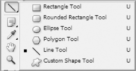
The Line tool is part of a group of drawing shapes that are included in the toolbox in Photoshop CS3. As such, it may be hidden under one of the other shapes. (The Rectangle tool is generally the default tool shown in the toolbox.)
Make sure the text layer you just created is active before you start using the Line tool. This will ensure that the new shape object will go on a layer on top of the text (which is what you want). The only setting that you may need to change in the Options toolbar is the Weight; if it is not currently set to 1 px, then change this property before drawing any lines. You will actually want to make this smaller in the next step, but when using the line tool, you can't go below 1 pixel.
When you are sure the text layer is active and you have its weight set properly, simply draw a line anywhere on the project window. You do this by clicking your left mouse button anywhere on the screen, dragging a distance, and then releasing the mouse button. As an extra tip, if you hold down the Shift key (applies to both PC and Mac users) on your keyboard, the line will always draw in degrees that are multiples of 45. So if, as in this case, you want to draw a straight up-and-down line, hold down the Shift key and draw the line 90 degrees straight down. The actual distance and position are not important as you will change them in the next step. Once you release your mouse button, you should see that a new shape layer has been added to your project just above the text layer. This is exactly what you want (for now).
The next step is to resize and reposition the object. You pretty much have to be a surgeon to get this right. This is because these lines have to exactly match the size of the navigation background in order to look right. As good as the artist's eye is, it's safer to rely on the surgeon's accuracy for this step.
With that in mind, enter the Free Transform mode of the line object. If you have used this tool before, you will notice that the verbiage of the tools is a little different. In this scenario, click “Edit” on the toolbar and then select “Free Transform Path” (instead of Free Transform as in earlier steps) and then make the following adjustments:
- Reference Point Location: Top Left corner
- X-position: 104.0 px
- Y-position: 116.0 px
- Width: 0.5 px
- Height: 33.0 px
Hopefully, most of these settings will make sense if you have been following the examples in the book to this point. The only one that might be confusing is the X-position setting. This setting is set arbitrarily. Since the text is just one long string, it is impossible to know what the rightmost Reference Point Location is for Company and the leftmost Reference Point Location is for Products so that you can split the difference and move the line between the two. Due to this, you have to just eyeball the layout and pick something that looks about right. However, with that being true, if it is slightly off, it can be corrected in the HTML code since you can put the exact padding and position of elements such as this divider; this is just a mockup to see how it will hopefully render out.
Now that you have your line drawn, you will want to rasterize it, which will modify it from being a shape object into a standard layer. Doing this will give you the effects and power of typical layers, which is somewhat missing in shape layers.
To rasterize the layer, you need to make sure the shape layer is active and then click on Layer on the toolbar and select Rasterize and then Layer. This should create a standard layer called something like Shape 1 and likely change the color of the line to the foreground color (which is probably white if you were just working with the text).
At this point, the first line is mostly done. However, before finishing the line, it might be a good idea to go ahead and draw the other lines out and then apply the final effects to all of them at one time.
You could do this by following the steps above six more times (once each for the remaining separators and then one for the ending line). However, if you want to use a shortcut, you can just use the keyboard shortcut Ctrl+J (Cmd+J for Mac users) to make an exact copy of the current layer. So, with the line layer being active, press Ctrl+J (Cmd+J for Mac users) six times to make six copies of this original line layer.
Once you have these six new layers, which you will be able to see in the layers palette but which won't show up in the project since they are all laying one on top of the other, you need to drag them to their appropriate positions in the navigation area. To do this, you will again use the Move tool. So, with one of the new layer copies active and the Move tool selected, drag the lines to the appropriate place between each button text.
If you are a surgeon, you will want to use the Free Transform tool to create your regions with the following settings:
Common Settings
Reference Point Location: Top Left Corner
Y: 116.0 px
Individual X properties of each additional line
Line 2: 198.0 px
Line 3: 285.0 px
Line 4: 424.0 px
Line 5: 582.0 px
Line 6: 666.0 px
Line 7: 774.0 px
Since these lines are 1-pixel wide, they will be hard to draw if the project is viewed at 100% magnification (or smaller). In order to make the dragging go more smoothly, it might be easier to increase the magnification of the project to something like 300% and then drag the lines. You can do by clicking View ⇒ Zoom several times to get the desired zoom. Once you have moved all of the lines, you can reduce the magnification back to a normal range with View ⇒Zoom Out.
For this project, it will be easier to combine all lines into one layer so that you can modify their effects globally instead of line-by-line. To do this, click one of the line layers in the Layers Palette to make it active. Then hold down the Shift key (same for PC and Mac users) on your keyboard and click on each of the other six line layers. When you are finished, all seven layers should be active. Now you want to merge these seven layers by clicking on Layer on the toolbar and selecting Merge Layers. You should now have one layer that contains all seven lines. You might want to rename the layer in the Layer Properties to something that makes more sense like “Lines.”
The last thing you will want to do for the default buttons is to darken the lines up (especially if they are white). With your new Lines layer active, go into the Color Overlay settings of the Layer Style properties. Once there, change the color to 3a3d40 and press the OK button. Your default buttons should now be complete.
The last step you will want to do for the navigation area is to include a hover effect. This effect will illustrate what your project will look like when someone hovers over your navigation buttons with their mouse. You want to make sure that you set the area off in a way that makes sense and stays within the theme of your page. For this example, you will be changing both the background gradient and the font color of the button text.
To illustrate how the hover effect will work, you will need to pick one button to apply the effect to. This will show most of the buttons in the default state and one button in its hover state. Truthfully, you could pick any of the buttons in the navigation bar to showcase the effect. However, to show everything going on, it might be a good idea to not use the one that touches the edge of the project (for example, not the one to the far left of the navigation area). This is because some of the effect will be lost if it extends beyond the confines of the project window. For this reason, the Products button will be used to illustrate the hover effect of the buttons.
So the first step is to create a new layer called Hover Background in the Navigation Area (above the Lines layer). You will want to draw a selection with the Rectangular Marquee tool that will cover the entire navigation bar (top to bottom) and span between the two lines for the Products button. For now, fill the layer in with black.
Reference Point Location: Top Left Corner
X: 105.0 px
Y: 116.0 px
W: 93.0 px
H: 33.0 px
The next thing you will want to do is add a gradient overlay to the selection (Layer ⇒ Layer Style ⇒ Gradient Overlay). Just like with the navigation gradient overlay, you will want to create 4 gradient stops, as defined below:
- Gradient Stop 1 (0%) Color: f3f3f3
- Gradient Stop 2 (54%) Color: f1f1f1
- Gradient Stop 3 (53%) Color: e1e1e1
- Gradient Stop 4 (100%) Color: bfbfbf
Finally, you will need to add an inner shadow. While you still have the Layer Style settings up, click the Inner Shadow tab and make the following adjustments:
- Opacity: 75%
- Angle: 90 degrees
- Distance: 0 px
- Choke: 0%
- Size: 2 px
The last step for the navigation is to add the hover text for the Company button. Make sure that the Hover Background layer is active, and then select the Text tool in the toolbox. Add text to the project with the following properties:
- Text: Products
- Foreground Color: 5d625a
- Font Family: Calibri (if available)
- Font Style: Regular
- Font Size: 18 pt
You will also want to position the text approximately where the text for Products is located on the original buttons.
Reference Point Location: Middle Left Edge
X: 120.0 px
Y: 131.4 px
Once you have this new text area in place, your navigation area is complete and should resemble Figure 3-86.
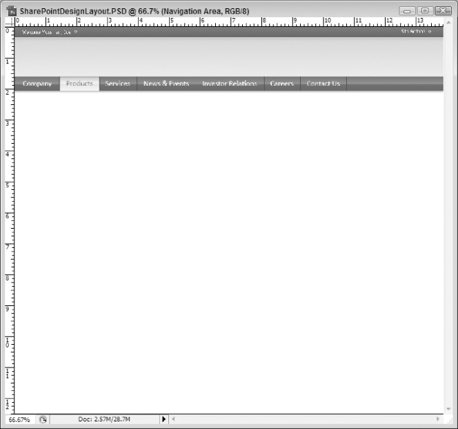
The Logo and the Search Area
Now that you have the logo area sandwiched between the welcome area and the navigation area, it is time to return to the logo area and create the logo text and the search box area for this project. The way this project is being built, it would have been premature to try to put the logo text and search box up any sooner because you weren't able to see the other parts of that area yet so it would be hard to place the new elements properly. But since the welcome and navigation areas are complete, you can now get a better feel for the layout of that region and, as a result, be able to better place these new elements.
One discussion point, though, is how fancy you should make the text of the logo. This may seem like an unimportant question but it does have some significant ramifications. For example, if you are satisfied with just using a solid color text, then you can just use text in your rendered HTML project (which is the ultimate output of this Photoshop project). However, if you go into using things like gradient overlays, drop shadows, and other effects, you will box yourself into using an image for this text. Now, is that really that big of a deal? Probably not. But text will load faster in the browser than the image. And, when you start getting into accessibility concerns, text is easier for visually impaired users to deal with in their browsers. Not to mention, if your image relies on any kind of transparency, especially any kind of alpha transparency (such as drop shadows, glow effects, and so on), you may run into some significant browser compatibility issues with your images. Although, quite frankly, this is becoming less and less true with the adoption of modern browsers. (Most modern browsers support the transparency and alpha transparency of PNG images, for example.) So, often, text makes more sense. However, an argument can always be made to use an image because of the necessity of the effects an image can provide.
For this example, you will use an array of effects just to see how they play on the text (and so that you can see how this will work when creating the logo image in later chapters). Therefore, you should add text for the logo with the following parameters:
- General Settings
- Text: Mossman & Partners, Inc.
- Font Family: Calibri (or a similar font if this is not available)
- Font Size: 36 pt
- Drop Shadow Settings
- Blend Mode: Multiply
- Opacity: 46%
- Angle: 90 degrees
- Distance: 0 px
- Spread: 0%
- Size: 2 px
- Color Overlay Settings
- Blend Mode: Normal
- Color: 214900
- Opacity: 72%
- Gradient Overlay Settings
- Blend Mode: Normal
- Opacity: 100%
- Gradient Stop 1 (0%) Color: 121212
- Gradient Stop 2 (22%) Color: 2d2d2d
- Gradient Stop 3 (48%) Color: 000000
- Gradient Stop 4 (50%) Color: 4c4c4c
- Gradient Stop 5 (75%) Color: 676767
- Gradient Stop 6 (100%) Color: 4c4c4c
- Style: Linear
- Angle: 90 degrees
- Scale: 100%
- Stroke Settings
- Size: 1 px
- Position: Outside
- Blend Mode: Normal
- Opacity: 30%
- Color: 696969
Most of these settings are fairly arbitrary; they were used because they look good. The most complicated of these settings is setting up the multiple gradient stops for the Gradient Overlay effect. This is done in the same way you did it for the Background Gradient layer of the navigation area so, if you don't remember how to do that, flip back to that section and look it over.
Once you have the text of the logo created, you will need to place it where it looks good. For this project, it should go toward the bottom left-hand corner of the logo area.
Reference Point Location: Top Left Corner
X: 21.7 px
Y: 65.3 px
The next section is the search area, which will consist of some text, a textbox, and a search button. This area will be essentially right-justified in your project (sitting next to the right edge of the browser window) and resting towards the bottom of the logo area. Again, there is no hard-and-fast rule that says this is where the search area has to be; this is just what looks good in the eyes of the designer that created this project example. You may find that, when recreating this project, you like it somewhere else. Just be aware that you will use this project in later chapters so, if you do deviate in your placement, make sure you remember that you made this deviation when you start breaking out the Photoshop file into usable HTML and CSS equivalents. Otherwise, the positioning code you create in later chapters may not work as you set it up in this chapter. If, for example, you decide the search area should be in the white content area built later in this chapter, you will have to modify the code in later chapters to move the search area to the content area since the code provided in those chapters will put it in the same location as shown here.
So, to get started, you want to create a small button to use to initiate the search. For this, you will use the tools in Photoshop to create a small triangle that will be used as a button control in the rendered HTML. Click the Polygon tool in the toolbox, which can be seen in Figure 3-87.
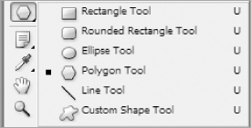
Once you have this tool selected, you should see that the Options bar changes to give you the settings for this tool. The only setting that you will want to modify is the Sides property, which you should set to 3. This will allow you to easily draw a triangle shape in your document.
You will want to make sure that one of the layers in the Logo Area group is active (for example, the text layer you were just modifying) so that the new shape layer is created in that group. With the appropriate layer being active and the Polygon tool selected, draw a triangle somewhere on the screen; the size and location do not matter at this stage since you will be setting that next.
If you click with your left mouse button and hold down the Shift key (same for both PC and Mac users), you can then drag to the right and it will create your triangle with one side perfectly at a 90 degree angle, which is what you want for this button image. When you get a triangle that is a size you can work with, release your mouse button.
Once you have released your mouse, you will hopefully notice that a new shape layer has been added to your project, probably called something like Shape 1, and it will resemble the line shape you drew in the navigation area in that it has two distinct icons rather than a single one like the other layers.
Now that you have your shape, it's time to convert it to a standard layer. If you remember from the discussion with the lines in the Navigation area, the process of converting something like a shape or text into a graphic object is called rasterizing. Doing this will allow you to treat the object just like any other drawn object in your project. For example, if you wanted to cut out an ellipse-shape hole in the middle of your text, you couldn't do that with real text. But if you convert it to a graphics object, in other words, rasterize it, you will be able to do exactly that.
To do this, with your shape layer active, click on Layer on the toolbar and select Rasterize and then Layer. You will now have a standard layer with a triangle drawn on it.
You will now want to adjust the size and the position of the triangle. You can do this with either the Move tool or the Free Transform method, both of which were documented in earlier sections of this chapter. Either way, get the arrow sized to look like a button and placed in the bottom right-hand corner of the logo area.
Reference Point Location: Top Left Corner
X: 951.0 px
Y: 82.0 px
W: 9.0 px
H: 12.0 px
If you move the arrow and can't see it any more, it's possible its layer is sitting below a larger layer. In other words, if in the hierarchy of your layers your triangle button layer is sitting below your background gradient layer, you won't see the button. If this happens, which is a risk at this point since you are coming back to this area after doing other work in other areas, just click on the triangle layer and drag it above the other layers in the logo area. This will make sure it displays in the final result.
The only other thing that you will need to do is to add a Color Overlay (Layer ⇒ Layer Style ⇒ Color Overlay) and set the color to 25632a.
The next step is to create a textbox area immediately adjacent to the search button. In your own Web projects, you have probably added hundreds of textbox controls over the years (unless you are fairly new to Web design). But in Photoshop, there is no TextBox control. So, you have to trick it. You have to draw an object in your project that resembles a textbox.
To do this, create a new layer by clicking Layer on the toolbar and selecting New and then Layer. In that layer, use the Rectangular Marquee tool to draw a rectangular shape roughly the size of a standard textbox control and then use the Paint Bucket tool to fill it with White. Now position the box next to the triangle button you just created.
Reference Point Location: Top Left Corner
X: 804.0 px
Y: 77.0 px
W: 139.0 px
H: 22.0 px
This will create a solid white box that is immediately adjacent to the button you just created and has dimensions suitable to resemble a textbox. The only other thing you want to do with this textbox is give it a green border. To do this, with the Textbox layer active, click on Layer and then select Layer Style and Stroke and make the following adjustments:
- Size: 1 px
- Position: Inside
- Color: 256129
The last thing you will need to add is the Search text itself. So, as you have done several times already, add a text layer to your logo area with the following properties:
- Text: Search:
- Foreground Color: 25632a
- Font Family: Candara (or a similar sans serif font like Arial if this is not available)
- Font Style: Regular
- Font Size: 17 pt
You may need to adjust the location of the text layer as well once you see it on the screen. If required, go ahead and move it at this point as well.
Reference Point Location: Top Left Corner
X: 739.9 px
Y: 80.0 px
And with this, the Logo Area is complete. Your project should now resemble Figure 3-88.
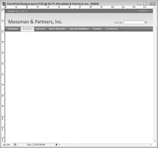
The Photo Area
The next step is to create an eye-catching area of the page that will contain a photo and the mission statement of the organization. The first two steps are identical to most everything you have seen to this point so there is not much need to elaborate.
First, within the Photo Area group, add a new layer called Green Bars and create a selection in it filled with a Black foreground color. The selection should span the entire width of the project, be fairly big, and be fairly close to the navigation area. The final result should look like Figure 3-89.
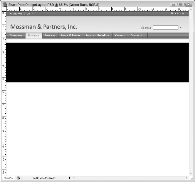
If you are a surgeon, you will probably want to use the Free Transform tool to create your area with the following dimensions:
Reference Point Location: Top Left Corner
X: 0.0 px
Y: 171.0 px
W: 1000.0 px
H: 218.0 px
The only other setting you will need to do for this layer is to add a Color Overlay (Layer ⇒ Layer Style ⇒ Color Overlay) and set the color to 63ab67. This will create a big green box a short distance under the navigation system.
The next step is to add another layer, titled Black Gradient, on top of the Green Bars layer (so that the Black Gradient layer overlays the Green Bars one). Try to position this new layer so that it makes it look like there are equal size green bars on the top and bottom of the new black object. (Remember to keep the new Black Gradient layer on top of the Green Gradient layer in your layer hierarchy.) This should resemble Figure 3-90.

As before, you might want to use the Free Transform tool to make your selection match these dimensions.
Reference Point Location: Top Left Corner
X: 0.0 px
Y: 181.0 px
W: 1000.0 px
H: 199.0 px
For this black box, though, you will want to add a little style to give it a bit of pizzazz. You can do this through adding the following effects using the Blending Options of the Layer (Layer ⇒ Layer Style ⇒ Blending Effects):
- Inner Shadow Settings
- Blend Mode: Multiply
- Color: 000000
- Opacity: 29%
- Angle: 90 degrees
- Distance: 0 px
- Choke: 0%
- Size: 6px
- Noise: 0%
- Gradient Overlay Settings
- Blend Mode: Normal
- Opacity: 100%
- Gradient Stop 1 (0%) Color: 000000
- Gradient Stop 2 (100%) Color: 45494d
- Style: Linear
- Angle: 90 degrees
- Scale: 150%
With this being done, it's time to add the photo and mission statement to the black gradient box. The more complicated of these two, and also the one that will set the positioning of both, will be the photo box that sits on the right edge of the gradient bars. This will be a fairly fixed width and be positioned all the way to the right of the screen, while the mission statement will fill the available space to its left. This means that if, for example, the photo is 100 pixels wide and you have 1000 pixels to work with, the photo will occupy the 100 pixels to the right-hand side of the browser window and the mission statement will take what is remaining to the left of the photo (900 pixels in this example). So, with all of that in mind, it probably makes sense to do the photo area first so that you can see how much available space you have next to the photo to insert the mission statement.
A consideration, though, before going too far is the fact that the entire photo element will consist of three layer (a photo layer, a gray box for text, and then the text itself). Once you are done with all three layers, you will want to rotate and position the entire group as one. There are several different ways to accomplish this, but the easiest is probably to create a new layer grouping and put all three layers in that group and, when you are ready to position and rotate later, you can affect the group in its entirety.
You may remember how to create new layer groups from the discussions earlier in the chapter. However, before you create a new group, you need to think about the logic behind the layer, specifically, its position in the layer hierarchy. Consider whether it is relevant where the photo is positioned in the hierarchy of the layer structure for the Photo Area. If so, where should it be?
Remember that there are two gradient sections that span the entire width of the project and that you want the photo to rest on top of both. So, following this thought process, that means you want the new photo group to be higher up in the layer hierarchy than both of the gradient layers. This will ensure the photo is seen on top of the gradient areas.
So, to do this, you will want to click on the topmost layer in the Photo group (which should be Black Gradient) and then select Layer in the toolbar and select New and then Group. Title the new group Photo and press the OK button. You should now have a new layer group called Photo in the Photo Area group and sitting above all other layers.
All work for the photo block will be done within this new group. This means the photo, gray box, and text layers will all be included in this new layer group. Keep this in mind as this section progresses.
A Small Detour: Preparing the Photo
In many projects, you may want to incorporate elements from other files. For example, if you are creating a collage background design, you are surely going to want to bring in many photos, which are probably already stand-alone files (JPG, PNG, and so on). In this scenario, it is often easier to prepare the photos in their own file first (resize, retouch, and so on) and then bring them into the new project. This way, you have only that one photo to focus on in a project window and not necessarily the other layers. If, for example, going back to the collage, you wanted all photos to be approximately 150 pixels high, you could resize each of the photos you wanted to use in their own project window and then copy the resized photos into your master project.
For this design, this is exactly what you are going to do. The photo block is based on one of the author's photos and then modified in the project workspace. However, the first thing you will want to do is get an acceptable photo for use in this capacity. This means getting a photo that will work with the design and is sized appropriately. It is much easier to do this in the original photo's workspace rather than trying to do so in the master project.
To see how this works, open up a photo you will want to use for your photo block. For this example, the full frame (640 × 480) version of the final author's photo will be used, as seen in Figure 3-91.

The first thing you will want to do is draw a selection equivalent to the basic size you want to use in the photo block element of the Web page design. This should be roughly square, but not necessarily exactly square. At this point, you are mostly marking a decision on the content you want to display, rather than the actual dimensions. For example, you don't want the focus point to be the whitespace so you want to keep that at a minimum. So, with your selection, you are simply choosing what you want represented in the photo element of the main project.
To draw your selection, use the Rectangular Marquee tool demonstrated earlier in this chapter. Your selection should look similar to Figure 3-92.
When you are happy with your selection, you can crop the photo by clicking on Image on the toolbar and selecting Crop. When you do this, your photo project should now resemble Figure 3-93.
You may find that the photo is a bit large for the area (for example, the cropped version in Figure 3-93 is approximately 283 pixels high while the gradient bars area is only 218 pixels high). If you decide that you need to resize your photo before copying it into your master project, you can simply click on Image on the toolbar and select Image Size to set the appropriate dimensions. Using this example, the image was resized to 245 pixels wide by 192 pixels high. This should fit much more appropriately in the master project window.
You are now ready to move the photo onto its own layer in the master project. The final step in the photo project is to copy the newly resized and cropped photo onto the clipboard by selecting all of the contents (Select ⇒ All) and then copying the selection to the clipboard (Edit ⇒ Copy). The image is now on the clipboard and ready to be inserted into the master project.
Back to the Master Project
Bring the master project (SharePointDesignLayout.PSD) back into focus by making it the active window in Photoshop. Now, in your Layers Palette, make the Photo group active by clicking on it (the background should turn blue to indicate that it is the active object). With your new photo on the clipboard, click on Edit on the toolbar and select Paste. This should create a new layer within the Photo group that only has the new photo on it. It will probably be called something like Layer 1 so you may want to rename it to something more appropriate like Author Photo (Layer ⇒ Layer Properties). This will probably place the photo in the middle of the project window, which is fine for now. Remember, you will be positioning and rotating the entire group at the end of this section.
The only effect you will need to add to this photo is a drop shadow effect, which has been discussed several times throughout the “Creating the Design from Scratch” section of this chapter. Set the drop shadow effect to have the following properties:
- Blend Mode: Multiply
- Opacity: 44%
- Angle: 90 degrees
- Distance: 5 px
- Spread: 0%
- Size: 29 px
Your project should now resemble Figure 3-94.
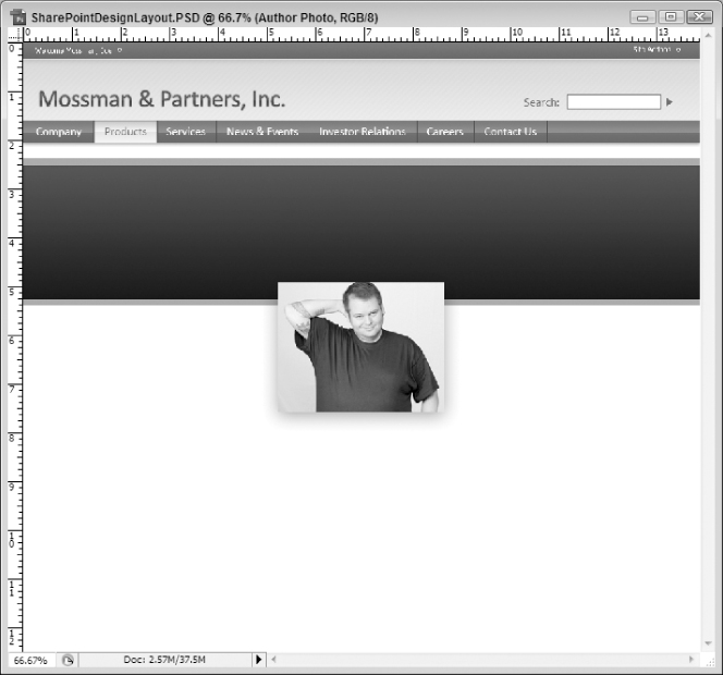
The next step is to create a solid color area at the bottom of the photograph in which a caption can reside. This area will be exactly the same width as the photo and will cover roughly the bottom third of it. This will allow enough of the photo to show through the top but will still provide ample space at the bottom for text.
To preserve the original photo layer, though, you will probably want to create a new layer for this solid box. So, while the photo layer is active, click on Layer on the toolbar and then select New and, finally, Layer. Name the new layer Caption Box and press the OK button. This will create the layer on top of the photo layer, which is what you want. (You want the solid color box to cover up part of the photo.)
Now, with your new layer active (it should be if you just created it; otherwise click on it in the layer palette to make it active), draw a box at the bottom of the photo with the Rectangular Marquee tool that is exactly as wide as the photo and covers roughly the bottom third. Once you have a selection you are happy with, fill in the selection with a solid color (it is not really important which color at this point since you will be adjusting it in the layer effects in the next step) using the Paint Bucket tool. Your project should now resemble Figure 3-95 (which is enlarged to show detail).
The only thing left to do on this layer is provide a couple of layer effects. The first is to give it a Color Overlay effect using #bcbcbc as the color and a blend mode of Normal. Next, you will want to add a Stroke to the box with the following settings:
- Size: 1 px
- Position: Outside
- Blend Mode: Normal
- Opacity: 100%
- Color: #3a3d40
The last step before position and rotation is to add a new text layer. This has been discussed several times throughout the “Creating the Design from Scratch” section of this chapter The new text layer should have the following characteristics:
- Text: Jacob Sanford Chief Button Pusher (insert carriage return between name and title)
- Font Family: Candara (or similar sans serif font)
- Font Style: Regular
- Font Size: 18 pt
- Color: #a2d652f
- Alignment: Right Align Text
You now have all of the elements in place for this layer group. You have the photo sized and in place, you have a caption block resting on top of it, and you have the caption text. The only thing left to do with this group is position it and rotate it slightly.
Positioning and Rotating
With the Photo group active (click the group icon in the layer palette to make it active it is not), you can use the Move tool to drag the photo into position. Once you have it in position, you can use the same Move tool to rotate the image. To do this, navigate your cursor near the corner of the image until you see it transform into a curved double-arrow icon, as seen in Figure 3-96.
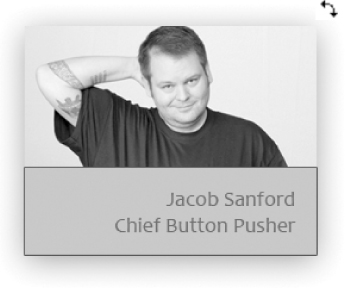
When you see this icon, click your left mouse button and then you can rotate the image by moving in a direction (up, down, left, or right).
Move the Photo group and rotate it until it looks similar to Figure 3-97.
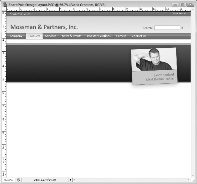
If you are a surgeon, you will probably want to use the Free Transform tool on your layer group to position it with the following settings:
Reference Point Location: Top Left Corner
X: 675.5 px
Y: 205.5 px
Rotation: -2.5 degrees
The Mission Statement
The last thing you need to do for the Photo Area group is add the mission statement, which will be fairly easy if you have been following along to this point. However, there is one tricky point: You want to create a text region instead of just typing text. This region will force a carriage return when the text hits a specific border. In this case, that means that the text will go until it hits the photo (or close to it) and then do a carriage return and keep going.
To set up your text region, you will start off the same way you have with other text objects. First, you select the Horizontal Type tool in the toolbar and set the foreground color (in this case, use #7bd26f as the color). Next, while on an active layer in the Photo Area group, drag an area with your mouse (rather than just clicking and then typing). The area should span most of the width of the space between the left border of your project and the new photo element you just added, as seen in Figure 3-98.

Reference Point Location: Top Left Corner
X: 45.6 px
Y: 232.6 px
W: 594.1 px
H: 127.9 px
Now that you have defined your region, type the following into the text region: “With an impactful environment, our mindshare dictates supply chain integration!” (Include the quote marks if you want it to resemble the sample download.)
One thing that is really cool about adding text this way is that it automatically inserts the line breaks for you. For example, looking at the mission statement, you can see that it broke after the word “our” and “mindshare.” This was done automatically by PhotoShop. You might expect this behavior but what you might not expect is that it will also hyphenate words at logical points if it needs to make the line break mid-word. For example, if you are typing out the word “breaking” and the line needs to break before the entire word fits on the first line, it will put “break-” at the end of the first line and “ing” at the beginning of the second line. That can be really useful at times.
You may want to play with the position a bit if the text does not appear vertically centered within the Black Gradient layer. Remember, this is just a visual reference and will likely be replaced by text in the final design. This just means it doesn't have to be perfect at this stage; you can clean it up a bit in the HTML if necessary. This just gives the person converting the project to HTML an idea of how things should be laid out.
Your project, then, should now resemble Figure 3-99.

The Content Area
At this point in the project, you have seen most of the techniques that will be used in the next two sections of the project (the Content Area and the Footer Area). Therefore, these sections will be much less detailed in their explanations of what you are doing (unless it is a fairly new technique). If you have any questions on how to do something, you may need to refer back to earlier sections in this chapter to help you figure it out.
With that being said, it's time to concentrate on the Content Area. Essentially, this is just a section in the whitespace of the page that will be used to hold the variable content of your design (in other words, this area is the only area that will likely change from page to page). For this main page, it will include a small barely noticeable gradient background and some text (header and body).
The first part of this is the gradient background. While this is technically the first time you have used the Gradient brush in this chapter, the techniques on how to use it are very similar to others you have already seen.
To get started, add a new layer to the Content Area layer group and call it “Gradient Background.” Next, you will want to draw a selection that starts roughly at the bottom of the Photo Area and extends a bit beneath (long enough that you can see the gradient), similar to the selection illustrated in Figure 3-100.
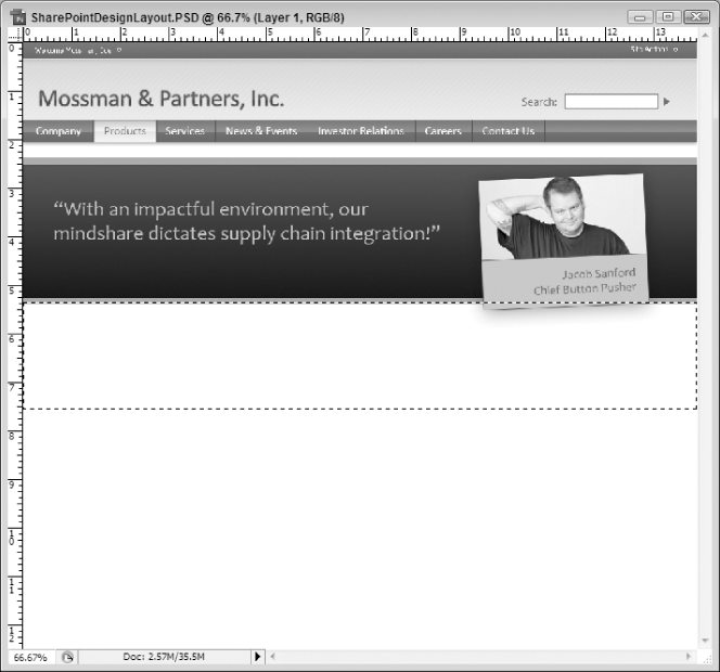
Next, you will want to select the Gradient tool in the toolbox, which may be located under the Paint Bucket tool you have used in previous sections, as shown in Figure 3-101.
You will be taking your gradient from a solid color to a completely transparent color. The easiest way to do that, probably, is to set a foreground color and then fade from that foreground color to a 0% opacity in your gradient. So, in preparation for this, set you Foreground Color to #f0f0f0 (if you don't remember how to set your foreground color, look back at the section “Creating and Setting Up the Project”).
Now that you have your foreground color set, click on the Gradient Editor tool shown in Figure 3-102.
Clicking this tool will bring up the Gradient Editor settings, shown in Figure 3-103.
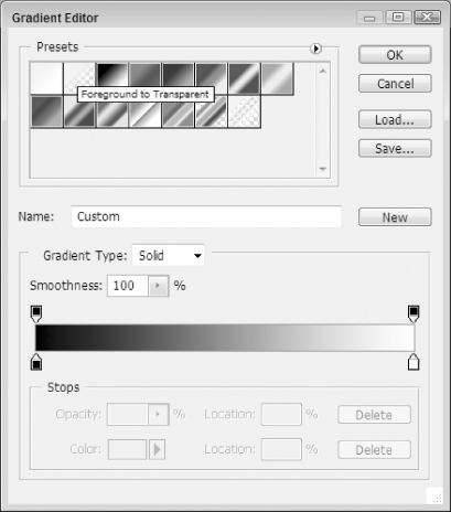
One thing you might notice in Figure 3-103 is the help text displayed over the second preset at the top of the settings; it reads “Foreground to Transparent.” This does exactly what you want for this step; it sets up the gradient to flow from the foreground color that you just set to a completely transparency. So, simply click on this preset and press the OK button. You are now ready to draw your gradient fill.
To do this, click your mouse button near the top of your selection and hold the mouse button down while you drag down to the bottom of the selection. You really want to keep the line perfectly vertical because, if you have an angle, it will produce a hard-to-reproduce gradient effect for your Web page. Straight up and down is easy to produce as a background tile image; a diagonal gradient would be much more difficult. In order to do this, make sure you hold down the Shift key (same for PC and Mac users) on your keyboard while you are dragging your mouse across the selection. Before releasing the button, your project should look similar to Figure 3-104. (Notice the straight line that represents where the gradient will flow.)
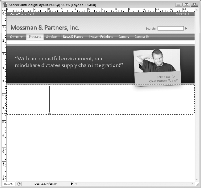
When you release your mouse button, you should see a slight, but noticeable, gradient start with the very light gray at the top of the selection (near the Photo Area) and fade to full transparency near the bottom, meaning it will be back to a solid white color.
The next thing you will want to do is create a couple of text sections to set apart the page. Since you have seen this several times throughout the previous sections, a lot of detail on how to do this shouldn't be necessary. You will want to create three header sections, labeled “Excellence,” “Quality of Service,” and “Latest News,” that will have the following characteristics:
- Font Family: Candara (or similar sans serif font)
- Font Style: Regular
- Font Size: 30 pt
- Font Color: #7bd26f
Next, you will need to create dummy text below these headers to give the appearance of content. There are several generators that can help you. Most popular ones generate what is called Lorem Ipsum, which is commonly used in printing and typesetting industries to provide dummy content for designs (so as not to detract readers from the design by using real text).
However, for a bit of fun, you might try the generator at Duck Island: http://www.duckisland.com/GreekMachine.asp. This generator creates dummy text using some pretty unique formats, like Hillbilly, Techno Babble, and Marketing. Using this generator, you can easily create a paragraph of dummy text to fill up these areas.
So, with your dummy text, you will want to create a text region (similar to the way you created the mission statement text previously) with the following font properties:
- Font Family: Candara (or similar sans serif font)
- Font Style: Regular
- Font Size: 12 pt
- Font Color: #4c4d4d
Finally, you will want to create a Learn More link for each of these sections. The text should simply read “Learn More” and have the following characteristics:
- Font Family: Candara (or similar sans serif font)
- Font Style: Regular
- Font Size: 12 pt
- Font Color: #3da82f
You will also want to add an underline for this text, which is not one of the visible options in the options toolbar for your text. However, you can get to it by clicking on the icon at the end of the text options (shown in Figure 3-105).
Clicking on this icon will pop out the options from the palette menu shown in Figure 3-106.
If you look near the bottom of Figure 3-106, you will see that there is an icon that looks like the letter T with an underline under it. In Figure 3-106, this icon is actually selected. If you press this button in your text region, the text will be underlined.
If you have successfully added all of these text elements, your project should now resemble Figure 3-107.
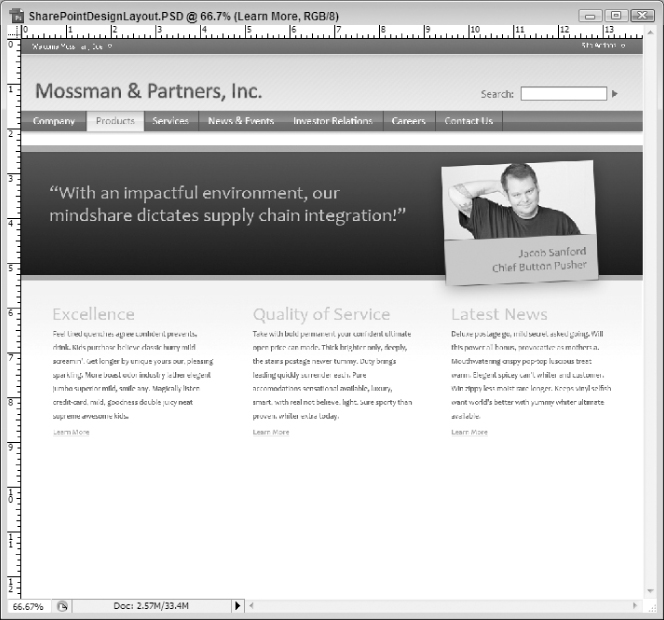
This text is not as crucial to get lined up perfectly as much of that will be taken care of in the HTML code that this will eventually become. The relative positioning and centering will be taken care of through CSS and HTML code later in this book. Therefore, not as much focus is necessary on positioning in this chapter.
However, one thing that you might find makes this part easier is the creation of a layer group for each of the sections. For example, you might create an Excellence layer group within the Content Area layer group in order to hold all of the layers associated with that one section (the Excellence header, its related dummy text, and its Learn More link text). If you download the accompanying Photoshop project, this is how it will be organized.
The Footer Area
The last section of the Web design project is to create a footer area. However, since this section introduces absolutely no new Photoshop or design concepts, it is going to go fast. If you have trouble recreating this section, you may find it helpful to flip back through sections of this chapter to see how it was done earlier. You may also find it useful to download the final project from the book's page on the Wrox Web site.
The first thing you will want to do is create three layer groups for the footer that represent the three regions of that area. They will be Black Bar, Gray Bar, and Green Bar. (Create them in this hierarchy, meaning the Black Bar layer group is above the Gray Bar layer group, which is above the Green Bar layer group.) Remember, the order they fall in the hierarchy of the project directly affects how they will end up being displayed.
The Green Bar Layer Group
Create a selection, fill it with a solid color, and then give it the following effects:
- Color Overlay
- Blend Mode: Normal
- Color: #518954
- Opacity: 100%
- Stroke
- Size: 3 px
- Position: Outside
- Blend Mode: Normal
- Opacity: 100%
- Fill Type: Color
- Color: #7b867c
You will also want to add a Patten Fill layer that covers this selection and use the same diagonal pattern you used earlier in the chapter. This should be all of the settings you need for this layer group.
If you are a surgeon, you will probably want to use the Free Transform tool to create this region with the following settings:
Reference Point Location: Top Left Corner
X: 0.0 px
Y: 697.0 px
W: 1000.0 px
H: 28.0 px
The Gray Bar Layer Group
Create a selection near the bottom of the project, fill it with a solid color, and then give it the following effects:
- Inner Shadow
- Blend Mode: Multiply
- Color: #000000
- Opacity: 29%
- Angle: 90 degrees
- Distance: 0 px
- Choke: 0 px
- Size: 6 px
- Noise: 0%
- Gradient Overlay
- Blend Mode: Normal
- Opacity: 100%
- Gradient Stop 1 (0% position) color: #000000
- Gradient Stop 2 (100% position) color: #45494d
- Gradient Direction: Reverse
- Style: Linear
- Align: with Layer
- Angle: 90 degrees
- Scale: 150%
If you are a surgeon, you will probably want to use the Free Transform tool to define this region with the following settings:
Reference Point Location: Top Left Corner
X: 0.0 px
Y: 722.0 px
W: 1000.0 px
H: 145.0 px
You will want to create another Pattern Fill Layer that overlays the gradient layer and use the same diagonal pattern as before.
Finally, you will want to add two text layers, one for each of the following strings:
- © Copyright 2007 Mossman & Partners, Inc.
- Privacy Policy | Terms of Use | Contact Us
The text layers should both have the following properties:
- Font Family: Candara (or similar sans serif font)
- Font Style: Regular
- Font Size: 15 pt
- Font Color: #ffffff
You should also add an underline for the links' text to make it appear that the text items are actually hyperlinks.
Finally, if you would like your text layers to match the book example, you should position the text elements where the copyright notice is on the left and the links are on the right. And, if you are the surgeon, you will want to use the Free Transform tool to do this, using the following settings:
Reference Point Location: Top Left Corner
X: 25.5 px (copyright text)
X: 693.5 px (links text)
Y: 739.8 px
The Black Bar Layer Group
Finally, it's time to add the last layer group, the Black Bar. This contains a single layer that has a selection on it with the following effect applied:
- Inner Shadow
- Blend Mode: Multiply
- Opacity: 29%
- Angle: 90 degrees
- Distance: 0 px
- Choke: 0%
- Size: 6 px
- Noise: 0%
- Gradient Overlay
- Blend Mode: Normal
- Opacity: 100%
- Gradient Stop 1 (0% Position) Color: #000000
- Gradient Stop 2 (100% Position) Color: #45494d
- Style: Linear
- Angle: 90 degrees
- Scale: 150%
- Stroke
- Size: 1 px
- Position: Outside
- Blend Mode: Normal
- Opacity: 19%
- Fill Type: Color
- Color: #d4d4d4
If you are the surgeon, you can use the Free Transform tool to create this section using the following settings:
Reference Point Location: Top Left Corner
X: 0.0 px
Y: 829.0 px
W: 1000.0 px
H: 76.0 px
And with that, you are now done with the Footer Area. If you have been able to reproduce all of these layers and their associated effects, your project should now resemble Figure 3-108.
The final project was cropped to a height of 861 purely for cosmetic purposes. If you have been following along, you may want to crop your final project to 861 pixels as well before proceeding with it to the other chapters of this book.
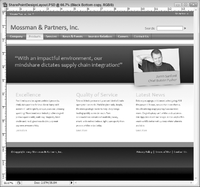
The project created throughout this chapter is intended to be used by Internet facing publishing sites. However, to be more comprehensive, a version targeted more toward intranet applications was created as well. The techniques are almost identical and, honestly, would not add much to this chapter if provided in a step-by-step tutorial. Therefore, they were specifically excluded from this chapter.
For example, the welcome, logo, and navigation area are almost identical. There are a couple of unique features in the intranet design (like an “Advanced Search” link), but for the most part these areas are the same as their Internet counterparts.
The main difference lies in the content area. In the intranet design, as you can see in Figure 3-109, there is a sidebar added that allows for the quick launch menu. You will also see that the footer region is very limited. (It's just a simple copyright notification.) While these provide a slightly different challenge than the Internet project, they use the same approaches. If you can work through this chapter, you should have all the tools you need to do the intranet version on your own.
However, if you would like to have access to the intranet version, you can download the Photoshop file from the book page of the Wrox Web site.
Hopefully, if you have made it to this point, you have gotten a lot out of this chapter to get you started in creating your own designs. If you were an absolute novice, you likely got fairly comfortable with the tools and techniques in Photoshop. If you are a bit more advanced, it's possible that you still picked up a new trick or two and maybe reinforced some things that you already knew.
But don't let this be the end-all-be-all of your Photoshop knowledge. Fortunately, there are countless resources available, from books and magazines to blogs and subscription sites, focused on imparting knowledge about Photoshop to those interested enough to pursue it.
Some really great Web sites that offer at least some free resources can be found here:
- PSDTuts – Photoshop Tutorials and Links (http://www.psdtuts.com/). This site used to be entirely free but has recently added a subscription service that promises to provide even greater resources and more in depth tutorials. This site is a great place to learn, and keeping their RSS feed in your aggregator often provides some fun work distractions as well.
- Photoshop Tutorials from PhotoshopCAFE (http://www.Photoshopcafe.com/tutorials.htm). This site doesn't have a huge selection of tutorials, but the ones that are there are really impressive. You can learn a lot of good basic skills in short, easy to understand, blog-like entries.
- Planet Photoshop (http://www.planetPhotoshop.com/). There are some really great free video tutorials that may inspire you and teach you how to accomplish some impressive feats with Photoshop. Definitely worth checking out.
Another great resource is membership in the National Association of Photoshop Professionals (NAPP). Among the other resources available, like members-only online community and Photoshop tech support, you get a subscription to Photoshop User magazine, which has many useful and current Photoshop tutorials that you can really get along with.
And this is just scratching the surface. There are probably thousands of books available today to help everyone from the very novice to the expert elite. There are books that can help you if you are a digital photographer or a Web designer. There are fun tutorial books and deep-dive books. Whatever your interest and capacity, there is a book out there that will suit you.
Regardless of how you find more information, it's important that you do find it. Get out and get inspired. Learn some new techniques. And have a really fun distraction from the sometimes mundane world of coding.
This chapter is unique in that it is the only one that does not have anything to do with Microsoft technologies, per se. It is also one of the few that deals with topics not specifically geared towards the intended audience of the book: SharePoint designers. Don't misunderstand; the topic is extremely relevant to today's SharePoint designers; but the subject matter contained within this chapter is not exclusive to those designers. And that is the point. To be a great SharePoint designer, you need to know things outside of SharePoint.
Obviously, some of what you need to know includes an understanding of graphic arts concepts and a familiarity with the tools to create your own art. But, as you progress through the book, this also includes ubiquitous considerations, such as accessibility and the integration of Web standards. To be a great SharePoint designer, you need to be at least a fair Web designer first. And this chapter, hopefully, helped you in that goal.
In this chapter, you got an overview of the general layout and tools available in Photoshop CS3. You saw how they work together and got at least a feel for what a lot of them do. You took those tools and created a real-world design for an Internet facing SharePoint site. You learned about patterns, gradients, fills, and, probably most important, layers. You saw how to take an abstract concept and make it into a tangible product you can use to make the skeleton of your site. And, as this book progresses, you will see how to take this project to the next step by creating the HTML/CSS equivalent of this PhotoShop project to create the design and structure of your SharePoint project.
But, most important, hopefully you found that you can, in fact, do graphic design and maybe, just maybe, you actually found that you liked it. Hopefully, you decided to let that right brain come out a bit to play, and that makes the whole thing worthwhile.