Chapter 7
Cascading Style Sheets with MOSS 2007
When it comes to styling Microsoft Office SharePoint Server 2007 (MOSS), few topics are as important as Cascading Style Sheets (CSS). This is due to the fact that Microsoft relies heavily on CSS's cascade to allow you to override any out-of-the-box style that they have applied to MOSS. Much of this out-of-the-box style comes from core.css, which is included by default in MOSS. You will learn how to position your own CSS properly to override these MOSS styles. This chapter will also provide a brief overview of CSS, focusing on the areas of CSS that are useful in MOSS. For a more thorough understanding of CSS, check out Professional CSS: Cascading Style Sheets for Web Design (Schmitt, Wiley, 2008).
There are also several must-read Web sites related to the topic of CSS. Here are a few of them:
- W3C Cascading Style Sheets home page – www.w3.org/Style/css
- Quirksmode – www.quirksmode.org/blog/index.html
- A List Apart – www.alistapart.com
Introduction to Cascading Style Sheets
Cascading Style Sheets (CSS) are a stylesheet language focused entirely on the styling and layout of data. CSS is an essential concept in modern Web design as it allows you to separate your code (be it HTML or MOSS) from your styling. This separation is key to maintaining quality Web software because it allows you to target your data's style for whatever medium is appropriate. While it's true that most frequently CSS is used to style Web content, it can also be used to target mobile devices, print output, and even audio (in the case of screen readers). CSS has not always been as prevalent as it is today. Before support for CSS was standardized across browsers, style was applied directly to HTML with tags like <table> and <font>. This resulted in tight coupling of style to its underlying data and proved to be complicated as well as difficult to maintain.
Browsers and Support
One of the major difficulties with working with CSS is that not all browsers treat CSS the same. While all of the major current browsers support the basic CSS language, their degree of compliance with the latest standards varies greatly. Some browsers support every command, while others only support the most common commands. Because of this, you should probably stick to the most common CSS elements, which are covered in the following sections.
For a list of every major browser and what level of CSS support they provide, see the CSS Contents and Browser Compatibility chart at quirtksmode.org: http://www.quirksmode.org/css/contents.html.
DOCTYPEs
Another significant concept when working with CSS is the DOCTYPE (or Document Type Declaration). You typically see DOCTYPEs listed on the first line of HTML code. They look something like this:
<!DOCTYPE HTML PUBLIC “-//W3C//DTD HTML 4.01 Transitional//EN”
“http://www.w3.org/TR/html4/loose.dtd”>
Most modern HTML editors put this line in for you, but it's good to understand why DOCTYPEs are used and what the different types mean. A DOCTYPE is essentially a command that instructs a browser or validator to use a specific language to interpret the HTML or XML code that it describes. Without DOCTYPEs, it would be impossible to validate your HTML and CSS to any particular standard. DOCTYPEs also assist the browser in determining how to display the code properly. You may be thinking, “I never used a DOCTYPE in the olden days of Web design and nothing bad happened, so why should I care?” It is true that you can code HTML and CSS without a DOCTYPE, and often it will show just fine in your favorite browser. However, you will find that your design will render more uniformly across all browsers if a proper DOCTYPE is declared.
Quirks Mode
The DOCTYPE listed above has a system identifier URL that points to a DTD (or Document Type Definition) at W3C.org. If you have no DOCTYPE or leave this DTD URL off, your code will be rendered in what is known as Quirks mode. With a name like that, you can probably guess that rendering in this mode is quite quirky! Browsers that are in Quirks mode render content not as the W3C standard dictates, but instead in the old way (looking for things like fonts and tables in the HTML code). In Internet Explorer this is the equivalent of browsing your design in IE4, which can't be a good thing in anyone's book. Many designers feel that Quirks mode is not appropriate for modern Web design, as it is questionable how well your code will render properly in new browsers.
Standards Mode
When a Web site has a valid DOCTYPE with a correct DTD URL, it renders in Standards mode. There are actually three different types of DOCTYPEs that are considered standard, they are known as Strict, Transitional, and Frameset DOCTYPEs. While all three are Standards mode DOCTYPEs, the Frameset DOCTYPE is not appropriate in most cases because it is only valid for pages that utilize frames. Most MOSS sites will not be utilizing framesets for their primary design.
When your design uses a Strict DOCTYPE, it is held to the rules of the page type you are using (either HTML or XHTML). Anything not conforming to this standard (like font tags and HTML background attributes) will be ignored or rendered improperly by the browser. Many designers choose to use this DOCTYPE because it leaves very little room for interpretation; thus, they can be absolutely sure their design looks proper in any browser that interprets it correctly. This absoluteness comes with the obvious penalty that you must adhere to the standard and not include any legacy HTML code.
What happens if you are forced to rely on HTML code that is not your own, including legacy HTML that does not conform to modern standards? This is indeed what happens when you work with MOSS. Many of the ASP.NET controls that MOSS relies on still render legacy code. With MOSS, you need a DOCTYPE that is Standards-compliant but also allows some wiggle room. This is where the Transitional DOCTYPE comes in. The Transitional DOCTYPE, sometimes known as the “loose” DOCTYPE, is identical to the Strict DOCTYPE, with the one exception that it allows some legacy styling to render properly in the browser. This has the benefit of enforcing standards where possible, while being flexible enough to support the old ways of HTML design.
Here are some examples of Strict DOCTYPEs:
<!DOCTYPE HTML PUBLIC “-//W3C//DTD HTML 4.01//EN”
“http://www.w3.org/TR/html4/strict.dtd”>
<!DOCTYPE html PUBLIC “-//W3C//DTD XHTML 1.0 Strict//EN”
“http://www.w3.org/TR/xhtml1/DTD/xhtml1-strict.dtd”>
Here are some examples of Transitional DOCTYPEs:
<!DOCTYPE HTML PUBLIC “-//W3C//DTD HTML 4.01 Transitional//EN”
“http://www.w3.org/TR/html4/loose.dtd”>
<!DOCTYPE html PUBLIC “-//W3C//DTD XHTML 1.0 Transitional//EN”
“http://www.w3.org/TR/xhtml1/DTD/xhtml1-transitional.dtd”>
Almost Standards Mode
Browsers based on the Gecko open source browser rendering engine, like Mozilla's more recent Firefox versions, have another rendering mode that is known as Almost Standards mode. This mode is identical to Standards mode except for the way it renders images in table cells. In Almost Standards mode, images in table cells render without gaps, in a similar fashion to the way they are rendered in other browsers like Internet Explorer.
It's worth noting that not all modern browsers render DOCTYPEs in predictable ways. For a chart of how many browsers render DOCTYPEs, see the Appendix section of this Web page: http://hsivonen.iki.fi/doctype/.
HTML and XHTML
To make matters even more confusing, besides these three rendering modes, there are two types of documents you can use with DOCTYPEs: HTML and XHTML. XHTML is very similar to HTML in markup, except that all of the tags must use valid XML markup (all attributes need to be quoted and all tags need to be fully closed). It is important to note that while XHTML is newer than the HTML specification, it does not replace it; both are valid W3C specifications for Web development.
DOCTYPEs in MOSS
In traditional Web development, you simply select the DOCTYPE that corresponds to the markup specification you are using. However, in MOSS, the decision isn't as cut and dry, because Microsoft has decided not to clearly delineate which specification they are working with. Some aspects of an out-of-the-box MOSS environment are strictly XHTML compliant, while others aren't even compliant with the HTML Transitional DOCTYPE. So which DOCTYPE should you use with MOSS?
Some experts believe XHTML is a better DOCTYPE for MOSS, because the ID's that ASP.NET puts out are only compliant in XHTML. Other experts believe that MOSS's HTML code is just too far from XML compliance to even come close to validating in XHTML mode. Microsoft hasn't helped much with this decision; their own default.master master page does not include a DOCTYPE and as such renders in Quirks mode. Unlike default.master, you will want to include a DOCTYPE in your master pages. Otherwise your design will be at the mercy of new browsers and whether they handle your design properly. Many of the examples in this book will utilize the HTML Transitional DOCTYPE like this:
<!DOCTYPE HTML PUBLIC “-//W3C//DTD HTML 4.01 Transitional//EN”
“http://www.w3.org/TR/html4/loose.dtd”>
Whatever DOCTYPE you end up choosing, you should implement it early in your design process, as it will have sweeping effects over your CSS layout. (This is even more important when designing in MOSS.)
Tables vs. Pure CSS
A subject that gets discussed a lot in modern Web design is the great battle between the use of HTML tables to layout intricate designs and the use of only CSS to provide that same layout (known as tableless layout). You may remember a time when almost all Web design employed tables for layouts and no one really cared. As CSS has become more reliable over the years, the use of tables for layout has fallen out of favor for several reasons. First, using tables for laying out intricate design was something designers invented as a way of handling the limitations of HTML, when in reality tables were intended for only displaying tabular data. Beyond this, using tables can have a negative impact on download times. It can also be a hindrance for visually impaired users who are using screen reader software. Having said this, it's important to note that dealing with tables in HTML is inevitable when working with MOSS, as several of the underlying ASP.NET controls utilize tables for their layout.
Later in this chapter, you will look at converting a Photoshop mockup into a functioning HTML and CSS layout with the intention of later implementing it in a MOSS master page. You will notice that this example utilizes <div> tags and CSS to achieve a mostly tableless design. Just because MOSS will be injecting its own tables into your design, that doesn't mean you can't begin your design without them.
If a purely tableless layout in MOSS is important to you, check out Chapter 13 for more information on utilizing the CSS Friendly Control Adapters to override the out-of-the-box MOSS controls with tableless output.
This section will take a look at the fundamental concepts you will need to understand when working with MOSS and CSS. CSS is a broad topic, one that can't be completely covered in one chapter. This section includes the CSS concepts that you are most likely to encounter when creating your own styles for master pages and more specifically when overriding the out-of-the-box MOSS core styles.
Ways to Apply CSS to HTML
CSS can be applied to HTML in several ways, each of which can affect the amount of control you have over the resultant style. Following are the ways that CSS can be applied; they each involve adding references to styles or style sheets in an HTML file.
Inline Styles
This is perhaps the simplest form of CSS, in that it is applied directly to the specific HTML element that you are trying to style. See the following example:
<p style=“color: red;”>This text is red</p>
This <p> tag has an inline style applied to it. In many ways, inline styles are inappropriate for large amounts of styling because they take away the ability to separate your content from the style. Another interesting aspect of inline styles is that they take precedence over any other styles that are applied to the page. When working with a page that has inline styles applied to an HTML element, there is no way to override this style with an external stylesheet. This is an important thing to consider when making your own designs.
Internal Style Sheets
This method is used to apply style to one particular HTML page. By using it, you get to take advantage of separating your content from your design. The following example shows a simple internal style sheet:
<style type=“text/css”>
h1 {
color: green;
}
</style>
The <style> tag is a traditional HTML tag used to declare internal styles. You must declare the type attribute as text/css. This is to ensure the browser knows your style is in fact CSS (something that could be different some day in the future). Between the <style> tags, you are only allowed to put CSS rules and comments; no content or HTML would be appropriate there.
External Style Sheets
These are probably the most popular form of style sheet in use today, and you will certainly want to employ them in MOSS. By utilizing an external style sheet, you not only enjoy the benefits of separating your content and display, but you also get the advantage of reusing the style sheet from multiple HTML pages (by referring to the same external style sheet in each). External style sheets are typically defined in the <head> portion of an HTML page and take the following form:
<link href=“customStyle.css” rel=“stylesheet” type=“text/css”>
The href portion refers to your external style sheet, rel means that the link is related to a style sheet, and type tells the browser what type of content to look for in the style sheet. As with internal style sheets, the contents of external style sheets can only contain CSS rules and comments.
CSS Rules
Style sheets exist solely to provide styles or layout information for the files (in this case HTML or in MOSS, master pages) that reference them. They are made up entirely of style specifications known as rules. Figure 7-1 shows the key elements of a CSS rule.
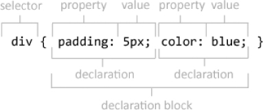
A CSS rule starts with a selector, which refers to the HTML element that will have the style applied to it. After the selector, there is the declaration block, which is made up sets of properties and values. The properties refer to the aspects of the HTML element that will be affected, and the values contain the unit of measure and setting (1px, black, 100%, and so on) that the corresponding property will have applied to it. Each selector in a style sheet may have as many pairs of properties and values as you would like. Whether you have one or many properties, the entire group gets surrounded by curly brackets. The properties and their values are separate by colons and are ended by a semicolon.
Technically, the last value in a declaration does not need to end with a semicolon. However, best practice would dictate that you always use one as this will reduce the chances that you forget to add one before adding another property at a later time.
Sometimes you may want to apply the same style to separate selectors, this is known as grouping. This can be achieved by listing the selectors with commas between them, as in this example:
h1, h2, h3 {
font-weight: normal;
}
In this example, all three of the h elements will be rendered with a non-bold font. Grouping is especially useful for reducing redundant code, allowing you to edit multiple selector styles at once by editing them in one place.
Types of Selectors
As stated earlier, selectors represent the elements that will be styled by your CSS properties and values. There are several kinds of selectors that you can use to target styles to your HTML.
Type Selectors
This selector matches a specific standard HTML element (like <p>, <img>, <hr>, <table>, and so on). When a type selector is used, the style declaration will match all occurrences of this element in your HTML. Here is an example of a type selector that would style all of the <p>tags in you HTML to use the Arial font for their text:
p {
font-family: arial;
}
Class Selectors
This selector starts with a period (or dot) and matches any of the like class names in your HTML. If you have elements with classes named “myClass” like <div class = “myClass”> in your HTML, you would match them with a class selector in your CSS like this:
.myClass { color: red; }
Also, class selectors can be combined with one type selector:
p.myClass { color: blue; }
By doing this, you ensure that all <p> tags with a class of “myClass” will be blue, but other <p> tags or HTML elements with the class “myClass” that are not <p> will not have this style. Also, you can have multiple classes on one HTML element like:
<div class=“redText bigText”>
You can then define two corresponding class selectors in your CSS:
.redText {
color: red;
}
.bigText {
font-size: 15px;
}
In this case, the text of your <div> tag will be both red and sized to 15 pixels.
While cascading style sheet properties and values are not case-sensitive, it should be noted that classes and IDs referenced from your HTML do need to match the exact case used in your CSS because these references are case-sensitive.
ID Selectors
The ID selector starts with a pound sign and matches only one ID name in your HTML. These can be used in the same ways that class selectors are used, with the one exception that IDs are intended to only be used once in your HTML. Using the same ID name in your HTML more than once is not valid HTML. Here is an example of using an ID in HTML:
<div id=“myID”>
This <div> tag can then have its text be styled to a green color with an ID selector used in your CSS like this:
#myID {
color: green;
}
Descendant Selectors
Descendant selectors (sometimes known as contextual selectors) are made up of two selectors separated by a space. They are used to select elements that are nested inside of other elements higher in the HTML document tree. This selector is probably best described by an example. In the following example, both the <p> tag and the first <strong> tag are descendants of their parent <div> tag:
<div>
<p>
Hello <strong>World</strong>
</p>
</div>
<strong>Goodbye!</strong>
To style only the first <strong> tag, you can use descendant selectors in your CSS like this:
div strong {
color: purple;
}
In this example, the “World” text would be purple, while the “Goodbye!” text would not be. This is because the first <strong> is a descendant of the <div> tag and the second is not. As you can see in the example, you can use descendant selectors to style elements that are further than one level of nesting below a parent tag (this can be seen by the <strong> tag still being styled despite it being below the <p> tag).
Pseudo-Elements and Pseudo-Classes
Pseudo-elements and pseudo-classes can be used to style HTML in ways that standard selectors cannot. Pseudo-elements are used to style parts of the page that are not available at all in the DOM, such as the first letter of text in a <p> tag, while pseudo-classes are used to style specific states of an HTML element such as the hover state of an HTML link.
One common pseudo-element is :first-letter, which is used to style only the first letter of text and is typically used like this:
p:first-letter
{
color: red;
}
In this example, only for first letter of text in all <p> tags will be colored red.
Pseudo-classes allow the styling of characteristics (often interactive ones) of elements that are not typically described by the element's name, attributes, or content. Some common pseudo-elements (especially in MOSS) are :link (for links that have not been visited by the user), :visited (for links that have), and :hover (for when the user's mouse is pointing at links). Here is a sample of how they would be used in CSS:
a:link {
color: red;
}
a:visited {
color: blue;
}
a:hover {
color: green;
}
In this CSS, links that haven't been visited are red, while links that have been visited are blue, and when you point to the link with your mouse it turns green (and back to the previous color when you move the mouse away). The :hover pseudo class can be very useful for adding some quick interactivity to your layouts.
As alluded to earlier, these pseudo-classes are common in the out-of-the-box MOSS designs. This can be particularly tricky when trying to override styles in your MOSS site. For example, you may initially think to style a link by just using an “a” selector, when in fact you must override both the a:link and a:visited selectors to see your style in use.
For more information on all of the available pseudo-elements and pseudo-classes, you can refer to the specification provided by the W3C at: http://www.w3.org/TR/REC-CSS2/selector.html#q15.
The Universal Selector
While not used very often, this selector can affect an enormous amount of HTML with very little effort. Represented by an asterisk, the universal selector applies your style to all possible HTML elements on the page. One common use for the universal selector is to normalize the padding and margins for all HTML elements. This can be beneficial because by default Internet Explorer and Firefox apply different padding and margins to several HTML elements. Here is an example of using the universal selector:
* {
margin: 0px;
padding: 0px;
}
This rule will make all the elements of your HTML have no padding or margin. Some designers like this rule, while others feel the universal selector is too wide sweeping for something like this. Also note that universal selectors can be used as a descendant selector like so:
.myClass * {
padding: 10px;
}
This rule would pad all the nested selectors below a parent class named “myClass.”
Due to the power of the universal selector, it is probably best to define it at near the top of a stylesheet. This allows for any selectors listed after it to override its universal reach. Selectors that are lower in a stylesheet override higher styles because of the concept of “cascading,” which is covered in a later section titled “Understanding the Cascade.”
CSS Property Values
The format of CSS property values vary by the property they are describing. Some values need to be strings (such as color: green;) while others take numbers and a unit of measure (like font-size: 12px;). Some CSS property values are absolute in that they refer to a distinct value (like color: red or display: none), while others are relative (like width: 50% or font-size: 2em). Relative values derive their settings by modifying something else. They may be relative to HTML properties like the width of an element or the font size being inherited from a parent HTML element. This section will cover some of the more important CSS properties and their values.
For a list of all of the common property values available in CSS, see the W3C's Property Index at http://www.w3.org/TR/REC-CSS2/propidx.html.
Font Faces
Working with fonts in CSS can be tricky because you are limited by browsers only being able to show fonts that are installed on the user's machine. For you the designer, this means getting creative with your font choices. Luckily, CSS allows for listing of multiple fonts, and will traverse from left to right across this list until it finds a font that is installed on the user's machine. CSS also supports the following generic font families: serif, sans-serif, cursive, fantasy, and monospace. A good practice for fonts in CSS is to provide a generic font family at the end of the list of fonts, especially when you are trying to use a font that is uncommon for one of the popular operating systems. This ensures that you will always at least have control over the basic shape of your fonts, even if the user has none of the other fonts installed. Here is an example of how to set a font value for CSS:
font-family: Cambria,‘Times New Roman’, serif;
In this example, the browser will begin by trying to display the font Cambria, and then it will try to display Times New Roman, and if neither of these is found on the user's system, the browser will default to a font that has serifs. Also, notice in the example that fonts that have spaces in their names need to be surrounded with single quotes in order for them to work properly.
Font Sizes
There are several possible values you can use when applying font sizes in CSS. These include the following:
- Absolute Sizes These are set with string keywords and are equivalent to specific font sizes set in the user's browser. Possible values are xx-small, x-small, small, medium, large, x-large, and xx-large.
- Relative Sizes These are set with the string keywords larger and smaller which effectively raise and lower the font sizes as calculated by the user's browser and the font size of a parent element. For example, if a parent element has an absolute size of small and a child element has a relative size of larger, the computed font size of the child element will be equivalent to the absolute size of medium.
- Length Sizes Length sizes set a font size based on the height of a particular unit of measure. There are several units of measure available to CSS:
- in (inches) – As found in standard US measurement
- cm (centimeters) – As found in Metric measurement
- mm (millimeters) – As found in Metric measurement
- pt (points) – A common printing and typesetting measurement, equal to 1/72th of an inch
- pc (picas) – A common printing and typesetting measurement, equal to 12 points
- em (em height) – A common printing and typesetting measurement, equal to the current point size. This is often, although not necessarily, the width of the uppercase M in the current font size.
- ex (ex height) – In printing terms the ex referred to the height of a printed “x” character of a particular font
- px (pixels) – The number of pixels relative to the resolution of the device displaying the font (typically a computer monitor)
- Percentage Sizes: Percentage values represent the font size relative to the element's parent font size.
Despite having a myriad of choices when it comes to ways of designating font-size, many of them are not very effective in applying an adequate amount of control from a design perspective. In reality there are a few reliable methods of setting font size across browsers and operating systems, these are the pixel (px) length, em length, and percentage size.
Using Pixels to Control Fonts in CSS
Pixel based font sizes have one benefit over both em and percentage styles. This benefit lies in the fact that they control font size by the resolution of the display, thus being uniform across browsers. Here is an example of setting a font value in pixels:
font-size: 12px;
While giving you a lot of control over the font size, the major downside with using a pixel based size is that many browsers do not account for the user's own font size preference. This can lead to problems for users who are vision impaired. To accommodate users that wish to have control over their font size, you will need to look at other options (like ems or percents).
Using Percents to Control Font Size
Percentage font sizes are always computed in relation to the element's parent font size. If there are no parent elements, the percentage is computed based on the browser's default font size. Setting a font size to 80% will make the browser display a font size equivalent to 80% of the default font size. Applying it in CSS would look like this:
div {
font-size: 80%;
}
Using Ems to Control Font Size
When using ems, much like percentages, the browser computes the font size based on multiplying the number of ems by the size of the element's parent font. If you use 1em, the font will display at 100% of the parent elements font size. Similarly, if you use .5em, the font will display at 50% of the parent elements font size.
One popular method of controlling fonts is to use both percentages and ems together. The default font size of most browsers is typically larger than most designers wish to use. As such designers often start by changing the parent font of all elements to a smaller size (such as 80%) by setting it in the body selector. This has an effect of base-lining a site's default font to approximately 11px high. From there, designers set the rest of their fonts as ems based on the body content being 1em (the same as the 80%) and then adjusting areas of the design up or down in font size by increasing or decreasing the ems. See the following example that illustrates this practice:
<style type=“text/css”>
body {
font-size: 80%;
}
.standardDiv {
font-size: 1em;
}
.smallDiv {
font-size: .7em;
}
.bigDiv {
font-size: 1.5em;
}
</style>
<body>
<div class=“standardDiv”>
Standard Text
</div>
<div class=“smallDiv”>
Smaller Text
</div>
<div class=“bigDiv”>
Bigger Text
</div>
</body>
You can see the results of this code in Figure 7-2.
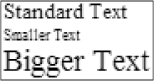
Looking at Figure 7-2, notice that the first <div> tag has a normal size, the second one is smaller, and the third one is bigger. If you increase your browser font size setting (in IE7 you can do this by clicking View⇒Text Size⇒Largest), you will notice that all of the fonts on the page grow, but they stay bigger or smaller as defined by the ems in the style.
As a best practice, you should utilize percentage and em-based font sizes in your CSS. They allow for the maximum amount of control, while still being flexible enough to support users with special font size needs. Unfortunately, many of the out-of-the-box MOSS styles fluctuate between several different font sizing methods, especially in the menus and settings screens. At the end of the day, it will likely be inevitable that your MOSS site will have non-flexible font styling. However if you create your initial design and HTML mockups based on em or percentage font sizes, you will allow the maximum amount of flexibility for your end users (aside from the areas that are difficult or impossible to change in MOSS). You will see more about this when you learn more about master pages in Chapter 8.
Text Decoration
Text decoration in CSS is frequently used to apply (and remove) underlines from links. This property allows for several settings: none, underline, overline, line-through, blink, and inherit. Of these, the most common are none and underline; here is how they are used in CSS:
a {
text-decoration: none;
}
a:hover {
text-decoration: underline;
}
In this example, you are setting all of the links in your text to only have an underline when the user's mouse is hovering over the link. This effect can be used to easily add small interactive elements to your sites. By default, all of the major browsers apply a text decoration of underline to links. Using CSS like the above example allows you to override the browser's default text decoration style.
Floating
Floating in CSS can be a very tricky topic to understand. This section will try to avoid getting bogged down in myriad details and will instead focus on giving you a solid foundation in the basics. To begin with, what does floating mean in CSS? To understand this, you must first understand flow. Flow describes the way in which a document displays its HTML elements: Is it left to right, top to bottom, or something else? By default the normal flow of an HTML page, if you apply none of your own floats in CSS, is to flow down the page from your first element to your last. When you apply your own float to elements with CSS, you take the element out of the normal flow and shift it as far to the left or right as possible. When you do this, elements below your floated element will flow down the opposite side and away from your float direction. The following example shows floating in action:
<style type=“text/css”>
div {
border: 1px solid black;
width: 200px;
}
</style>
<div>I am first</div>
<div>I am second</div>
<div>I am third</div>
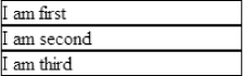
If you create an HTML file like this and view it in your browser, you will see that the <div> tags flow down the page from top to bottom as seen in Figure 7-3.
Next, change your HTML to have some floats like this:
<style type=“text/css”>
div {
border: 1px solid black;
width: 200px;
}
</style>
<div style=“float: right;”>I am first</div>
<div style=“float: left;”>I am second</div>
<div>I am third</div>
Save the file and refresh your browser and you will see that the first <div> tag moves all the way to the right of the browser screen, while the second <div> tag moves to the left. You can observe this in Figure 7-4.
Interesting enough, the third element moves next to the second element. This is due to the way floats affect the HTML elements that come after them. If there is room to display an element to the right of something left floated, the browser will show it there before moving below it. To get the third element to appear after the floated elements, you must use the clear property. Change your <div> tags one last time like this:
<style type=“text/css”>
div {
border: 1px solid black;
width: 200px;
}
</style>
<div style=“float: right;”>I am first</div>
<div style=“float: left;”>I am second</div>
<div style=“clear: both;”>I am third</div>
Now, when you save the file and refresh the browser you will see that the third <div> tag appears below both of the floated <div> tags. See Figure 7-5.
You can clear HTML elements to the left, right, or both sides of a floated element, or you can override a previously cleared element by setting the clear property to none.
When working with floats, all of your elements should have a set width. Without setting the width, your floats can have unpredictable results.
Positioning
Like floating, positioning has a lot to do with changing the normal flow of how HTML elements are displayed in a browser. The default positioning for all HTML elements is static, which means the element is positioned as it would normally flow in the browser. You may apply your own positioning to elements by using either relative or absolute positioning.
Relative Positioning
When you apply a relative positioning to an element, you can control where it appears in the browser by using a top, bottom, left, or right value. Take a look at the following example:
<style type=“text/css”>
div {
border: 1px solid black;
width: 200px;
}
</style>
<div>I am first</div>
<div>I am second</div>
This example uses the default static positioning for each <div> tag. If you save the file and load it with your browser you will see that the <div> tags are positioned down the page, one after another. Now change the code to look like this:
<style type=“text/css”>
div {
border: 1px solid black;
width: 200px;
}
</style>
<div>I am first</div>
<div style=“position: relative; left: 20px; top: 20px;”>
I am second
</div>
If you save the file and refresh your browser, you can see the second box appears further down and to the right than it did in the previous example. This is due to the fact that you have set the top and left settings to 20 pixels over from where they would normally appear in the flow. Another interesting use for relative positioning is to move an element above where it should normally appear in the flow. This can be especially helpful in correcting minor positioning problems when customizing out-of-the-box MOSS layouts. This example moves the second <div> tag overtop of the first <div> tag via a negative top relative position:
<style type=“text/css”>
div {
border: 1px solid black;
width: 200px;
}
</style>
<div>I am first</div>
<div style=“position: relative; left: 20px; top: -20px;”>
I am second
</div>
Absolute Positioning
You can use absolute positioning to take an element out of the normal flow and display it absolutely based on the top-left corner of its parent element (if there is no parent element it is positioned relative to the top-left corner of the user's browser). When an element is positioned absolutely, its child elements do not flow around it. Instead, they flow as they would if the element were not there at all. See the following example:
<style type=“text/css”>
div {
border: 1px solid black;
width: 200px;
}
</style>
<div>I am first</div>
<div style=“position: absolute; left: 0px; top: 0px;”>I am second</div>
<div>I am third</div>
In this example, the second <div> tag is ripped from the standard document flow and moved to the top left corner of the browser window. Because it has absolute positioning, the third <div> tag is not affected by its positioning.
Working with Color
Colors are used in various properties of CSS including background colors, text colors, and border colors. The values for color in CSS can be either a string color keyword or a numerical representation of the color in either RGB or hexadecimal. If you take a look at this example, you will see several ways to set the color of a text element to blue:
color: blue;
color: rgb(0,0,255);
color: #0000FF;
Here is a closer look at each of ways of handling color:
- Color keywords Using color keywords in CSS involves using one of the 16 predefined HTML color names or one of the many X11 color names (derived from the old X Windows System display protocol). In the example above, you used the blue color keyword, one of the 16 HTML color names. While color keywords can be handy for being able to scan your CSS at a later date and immediately knowing what colors you were using (without having to do RGB or hexadecimal calculations), in reality browsers are not guaranteed to show these colors the same way across all instances. If you really want to be sure the color you define is shown exactly as you intend it, RGB or hexadecimal colors should be used.
- RGB colors RGB colors are computed by defining red, green, and blue hues in that order, on a scale of 0 to 255 (with 0 being no color and 255 being the full saturation of that color). In the example, there is no red, no green, and all of the blue, which results in a full blue color.
- Hexadecimal colors Hexadecimal (or hex) colors are very similar to RGB colors, in that a particular color is still represented by the value of red, green, and blue hues, only they are represented in hexadecimal notation instead of decimal notation.
For a complete table of both the HTML color names and the X11 color names, see the W3C page on color:
http://www.w3.org/TR/css3-color
There are tools that can help you deal with colors in CSS. They are covered later in this chapter.
One place that colors are used frequently is on text elements. When you are overriding out-of-the-box MOSS styles, you may occasionally need to change the colors of all text in a given area of the page. A common “gotcha” that you may run into is that href links in text will be styled not by their parent element but instead by the “a” selector. See the following example:
<style type=“text/css”>
div {
color: yellow;
}
</style>
<div>
Hello <a href=“http://www.google.com”>Google</a>
</div>
While the first word in the <div> tag is styled yellow, the second word (a link to Google) is styled by the default browser link color. To style the link you can often use a descendant selector (like div a) as seen here:
<style type=“text/css”>
div {
color: yellow;
}
div a {
color: yellow;
}
</style>
<div>
Hello <a href=“http://www.google.com”>Google</a>
</div>
Text Wrapping
By default in HTML, when long text is entered into an element with a small width, the text will wrap freely to multiple lines in order to display all of the text without overflowing the width. Many times this is not appropriate for a particular design element. In the good-old days of Web development, you could use a nowrap attribute on the HTML tag, but in modern Web development nowrap is not a valid HTML attribute. To achieve the same effect you would use the white-space property in CSS. The following example shows that setting the white-space property to nowrap will achieve the desired effect:
<style type=“text/css”>
div {
width: 100px;
border: 1px solid black;
}
</style>
<div>
This text will cause wrapping in a normal small HTML element.
</div>
<div style=“white-space: nowrap;”>
This text will cause wrapping in a normal small HTML element.
</div>
Save this file and view it in your browser; it should look like Figure 7-6.
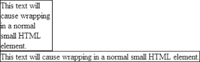
The initial style sets all the <div> tags on the page to a width of 100px. Because of this neither <div> tag should be able to contain all their text without wrapping. The second <div> tag, however, displays all the text on one line because the white-space value of nowrap overrides the width and stretches out the <div> tag.
Backgrounds
There are several ways you can interact with the background of an HTML element with CSS. You have control over applying a background image, whether the background image repeats, how it scrolls, where it is positioned, and setting a background color for the element.
background-color
You can use background-color to set the color that shows behind all of the items in the element. You can use any of the standard color values described in the previous section (color keywords, hex colors, or RGB colors) or apply a background-color of transparent (the default setting for HTML elements). Here is an example of setting the background-color to blue:
<style type=“text/css”>
div {
background-color: blue;
}
</style>
<div>
This text will be on a blue background.
</div>
background-image
The background-image property is probably one of the most useful tools in your CSS arsenal for customizing the look of a MOSS site. When setting a background-image, you use a URL to indicate what image to display in the background. The syntax for setting a background-image is:
background-image: url(‘images/myimage.gif’);
The URL points to the location of the image on the server relative the location of the CSS file.
background-repeat
By default, background-images will repeat both horizontally and vertically to fill the entire height and width of the element. Figure 7-7 shows a background-image that is repeating way too much.
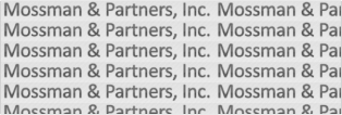
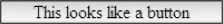
To achieve a finer amount of control over your background images, you can set the background-repeat property to repeat-x, repeat-y, or no-repeat. Setting the value to repeat-x will only allow it to repeat horizontal from left to right, while repeat-y will restrict it to repeating vertically from top to bottom. Setting the value to no-repeat will cause the background image to show only one time, no matter how high or wide the HTML element is. Often in MOSS sites you can utilize the repeat-x value to make an element appear to look like something it isn't. This is particularly useful for making something like navigation elements or buttons. Here is an example of how you could make a <div> tag look like a button.
<style type=“text/css”>
div.customButton {
background-image: url(‘images/imageButton.gif’);
background-repeat: repeat-x;
border: 1px solid black; /* set a border */
text-align: center; /* center the text */
width: 200px; /* make the button 200px wide */
}
</style>
<div class=“customButton”>
This looks like a button
</div>
In this example, the background repeats horizontally to appear as one continuous button, as seen in Figure 7-8.
background-attachment
This property name can be confusing, as it could be interpreted to refer to an image attachment (like in an email). In reality, it has to do with how the background image scrolls in the browser window. There are two values for this property, scroll (the default value ), which causes the background to scroll away when the browser is scrolled, and fixed, which causes the background to be fixed or pinned to the browser window and will not be affected by browser scrolling. Here is a common usage of the background-attachment property:
background-image: url(‘images/imageButton.gif’);
background-attachment: fixed; /* keep the background from scrolling */
In this example, the background stays put while the browser is scrolled.
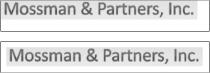
background-position
Sometimes you may not want to start a background image at the top-left corner of the HTML element. The background-position property lets you set a starting point for where to show your background image. The property takes two values, one for the horizontal position and one for the vertical position, but they can be written in a number of ways as seen below:
- Keyword Background position can be set with two keywords like top left or bottom right. Here is a list of all of the keyword options: top left, top center, top right, center left, center center, center right, bottom left, bottom center, and bottom right.
- Percentage By entering horizontal and vertical percentage values, you can control the starting point of a background image relative to the height and width of the HTML element. For example 0% 0% would be the top-left corner while 100% 100% would be the bottom-right corner.
- Length Controlling background position by length is fairly straightforward. You simply enter to length values (like 5px 5px) to place the background image that far away from the top-left corner of the HTML element.
You are allowed to set only one of the two values of background-position. Whether you are using a keyword, percentage, or length, if you enter just one value, it will control only the horizontal position. The vertical position will default to the vertical center of the HTML element.
Background position can be best illustrated with an example:
<style type=“text/css”>
/* set all divs to have a background image, border, */
/* width and height */
div {
background-image: url(‘images/logo.gif’);
background-repeat: no-repeat;
border: 1px solid black;
width: 400px;
height: 60px;
}
/* create a class that will show an offset background-position */
div.changePosition {
background-position: 10px 10px;
}
</style>
<!-- this div has default background-position -->
<div></div>
<br/>
<!-- this div has offset background-position -->
<div class=“changePosition”></div>
Save this code and load it in your browser to see the difference between the default background position and when you set one to 10px 10px. Figure 7-9 shows this difference.
background
All of the background properties that you have just learned about can be summed up in one shorthand property known as background. You can set as many or as few of the background properties as you would like in this one shorthand property. The possible values include: background-color, background-image, background-repeat, background-attachment, and background-position. The following line of CSS shows how to set all the values of this shorthand property:
background: red url(‘images/customBG.gif’) repeat-x fixed center;
This example will apply the following style to an element: background-color: red, background-image: url(’images/customBG.gif’), background-repeat: repeat-x, background-attachment: fixed, and background-position: center.
Borders
With CSS, designers can control the color, width, and style of the border that gets applied around HTML elements. The simplest syntax for applying borders uses the shorthand property, known simply enough as border. The border shorthand property combines the three separate properties of border-width, border-style, and border-color into one simple line and applies that same border to all four sides of an HTML element. Here is an example that would create a one pixel solid green border all the way around an HTML element:
border: 1px solid green;
While the border-width and border-color properties are fairly straightforward, the border-style property on the other hand needs some explanation. There are several valid values for the border-style as shown here:
- None No border, useful when overriding other borders
- Hidden Similar to none but used with empty table cells
- Solid A single line, the most common border-style
- Dotted A dotted line made up of small solid circles
- Dashed A dashed line made up of small lines
- Double A border made up of two lines next to each other
- Groove The border looks like a groove has been cut into it
- Ridge The border looks like a ridge is protruding from it
- Inset The border looks like it is pushed into the background
- Outset The border looks like it is pushed out from the background
Of these border-styles, the most common are none and solid.
If you want to show a border on only one side of an element, you can use one of these shorthand properties: border-left, border-right, border-top, and border-bottom. These shorthand properties behave similarly to the border shorthand property, only instead of applying the style to all four sides of an element, they style only the appropriate side. Here is an example that would draw different colored borders around the four different sides of an element:
div {
border-left: 2px solid red;
border-right: 2px solid green;
border-top: 2px solid yellow;
border-bottom: 2px solid blue;
}
Padding and Margins
Padding and margins are vital concepts in CSS from a design standpoint. Many times without any padding or margins, text and design elements will run right up against each other or the ends of the screen. This results in a crowded and unprofessional look. It's often easy to forget the difference between padding and margins. Figure 7-10 illustrates how padding and margins are applied to an element.
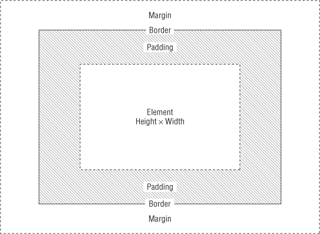
It's worth noting that the area inside the padding shows the background images or color that are applied to the element, and then that area is surrounded by any applicable border. The margin surrounds that area and does not reflect the applied background images or colors (though it will show background images or colors that are applied to a surrounding element). Paddings and margins can be set either by listing separate properties for top, bottom, left, and right or by listing them all in one shorthand property.
Here is how you set padding with one shorthand property:
padding: 1px 2px 3px 4px;
The order of the settings goes from top, right, bottom, left, so in this example the top padding would be 1px, the right padding would be 2px, the bottom padding would be 3px, and the left padding would be 4px.
The following example shows the same padding listed with separate properties:
padding-top: 1px;
padding-right: 2px;
padding-bottom: 3px;
padding-left: 4px;
The following example shows the padding listed with one shorthand property:
padding: 1px 2px 3px 4px;
Just like with the padding settings, the order for margin settings goes top, right, bottom, and left. In this example the top margin would be 1px, the right margin would be 2px, the bottom margin would be 3px, and the left margin would be 4px.
The following example shows the same margin listed with separate properties:
margin-top: 1px;
margin-right: 2px;
margin-bottom: 3px;
margin-left: 4px;
Coding CSS with Reuse in Mind
When working with MOSS sites, it is common to have many lines of CSS code to properly customize the user interface. Because of this, you should pay special attention to the way in which you code your CSS. Coding style becomes even more important when teams of people are involved with a design effort (which is often the case with MOSS). You can ensure your CSS code stands the test of time (and is easier to maintain by team members) by using a standard coding methodology and by adding helpful comments throughout your CSS.
CSS Coding Methodology
The way you tab and space your CSS can have a profound effect on the general readability of the code. There are several different ways you can organize your CSS code. Following are a few of the most common.
Selectors, brackets, and properties on one line:
div { width: 200px; font-family: arial; font-size: 1em; color: red; }
Selectors, brackets, and properties each on different lines:
div
{
width: 200px;
font-family: arial;
font-size: 1em;
color: red;
}
A mixed approach:
div {
width: 200px;
font-family: arial;
font-size: 1em;
color: red;
}
You will notice that the second two examples employ a common method of tabbing, where the elements between the curly braces are each tabbed one time. Tabbing is not required in CSS, but it does provide for much more readable code. Each of these approaches applies exactly the same style to the selector, but they all offer different options as far as readability. The mixed approach is used for most of the non-inline examples in this book. It doesn't really matter which you prefer, but you should pick one of these methods and stick with it throughout your MOSS site.
CSS Comments
While some people consider CSS to be not as complex as programming in a full-fledged language like C#, looking at a large CSS file like the ones used in MOSS can be a daunting task. Because of this, it's a very good idea to comment your CSS as much as possible, not just because other people may look at the code, but for your own sanity later on. To further illustrate this point, consider that it's not uncommon to have style sheets in MOSS that are hundreds of lines long (with spacing and tabbing).
To comment something in CSS you surround the text with /* and */. You can comment one line or multiple lines, but you cannot nest CSS comments. The following code snippet shows different ways of commenting in CSS:
/* this is one commented line */
div {
background-color: red; /* you can comment anywhere in your CSS */
/* the following three lines will be commented
border: 1px solid black;
text-align: center;
width: 200px;
*/
}
How Important Is “!important”?
You may have seen the term !important used in CSS before, but what exactly is it and what does it do? !important was created to allow both users (through the use of a user style sheet) and designers to declare certain CSS rules as more important than all others. When a CSS rule is declared as !important, the usual cascade rules do not apply and the !important rule takes precedence. In the following example, you can see how !important is used:
<style type=“text/css”>
div {
color: blue !important;
}
div {
color: red;
}
</style>
<div>
This text should be red, but is actually blue.
</div>
The <div> tag text in this example should be red because the second CSS rule should override the first one. However, the !important rule takes precedence and makes the text blue instead.
Inheritance
Inheritance refers to the ability of some CSS values to be passed along to all of their descendant elements. Not all of the CSS properties behave this way. Typically, the ones that do are the ones that affect text styling.
For a list of all the CSS properties that have inheritance, see the W3C's Full Property Table at http://www.w3.org/TR/CSS21/propidx.html.
Inheritance forces all child elements to inherit the parent's value only if they are not set specifically themselves. While the need for inheritance may not be immediately apparent, it can be immensely useful for overriding previous CSS rules. This is especially helpful with overriding MOSS out-of-the-box styles and causing them to use the default parent CSS values rather than the ones Microsoft has set. For example, MOSS could be styling a <p> tag as red with p {color: red;}, but you can force this back to its inherited value by overriding it with p { color: inherit;}.
Understanding the Cascade
Most modern Web site designs (especially in MOSS) will have a significant number of CSS rules applied. Often this CSS originates from various locations like imported and inline styles. With all these rules floating around, how does the browser determine what style to show at any given time? The answer is in the cascade.
When working with CSS and MOSS, few things are as significant as the cascade. The idea is central to how Microsoft expects you to override their out-of-the-box styles. The cascade refers to CSS's ability to allow some styles (typically those lower in the cascade) to take precedence over others. CSS uses the following set of rules to determine what CSS wins this battle for dominance:
1. Find all style declarations applied to the particular element.
2. Sort by origin and importance. When it comes to origin, the browser's default style sheet is least important, then the user's style sheet, and finally the style sheet that you as the page designer create is the most important. The other factor that applies at this step is the !important tag. As discussed earlier properties marked as !important will take priority over other styles.
3. If the rule in question has the same origin and importance, use specificity to determine what wins the cascade. Specificity is a calculation that refers to how specific the selector in question is. Specificity is determined via the following equation:
([The number of ID selectors] x 100) + ([The number of Class selectors] x 10) + ([The number of HTML selectors] x 1)
This gives you the specificity of a given selector. If two selectors are otherwise equivalent, the selector with the highest specificity will have its style applied to the element. For example, given the following:
.myClass div {
color: blue
}
div {
color: red
}
Using the above equation, the first style would be (0 x 100) + (1 x 10) + (1 x 1) = 11 while the second style would be (0 x 100) + (0 x 10) + (1 x 1) = 1.The first style will take precedence because it has a higher specificity than the second style.
4. Finally, if all other steps are equivalent, the rule that is declared last is the winner.
You can use these steps to your advantage to ensure your own styles win the cascade and override out-of-the-box MOSS styles.
Tools for Working with CSS
As stated before, there is a lot of CSS in MOSS, so you might as well employ as many tools as possible to help you work with it. Since customizing MOSS usually involves a Web browser, it is convenient that some of the most useful tools are actually browser plugins.
IE Developer Toolbar
This extremely handy toolbar for Internet Explorer allows you to gain a better understanding of the way a rendered page interacts with the browser.
You can download the toolbar from Microsoft at: http://www.microsoft.com/downloads/details.aspx?familyid=e59c3964-672d-4511-bb3e-2d5e1db91038&displaylang=en.
Once installed, Internet Explorer will gain an extra toolbar that can be activated or deactivated while browsing Internet sites. This toolbar appears at the bottom of the browser, as seen in Figure 7-11.
Probably the most useful feature of the IE Developer Toolbar is that it allows for highlighting of tables, cells, images, divs, and other HTML elements. This feature can be useful for identifying the underlying structure of a Web site. Clicking the highlighted elements will then bring up more information from the document object model as well as the styles that are currently applied to the element. See Figure 7-12 for an example of highlighting in the IE Developer Toolbar.
Here are some of the other interesting features of the IE Developer Toolbar:
- Disable JavaScript and CSS to see how the page would look and behave without them.
- Turn on visual indicators to show class names, ids, image alt information, image sizes, and more.
- Validate the HTML and CSS against W3C standards.
- Clear the browser cache with one button click.
- Immediately resize the browser to common monitor resolutions, which is helpful for envisioning how low-end computers will see your MOSS site.
- Enable a color picker for getting hexadecimal color values simply by clicking on colors that are showing in the browser window.
- Display rulers for measuring and aligning elements on the page.
Firebug
Firebug is a Firefox extension that was created by Joe Hewitt; it performs many similar functions to the IE Developer Toolbar. Figure 7-13 shows Firebug in use on a MOSS site.
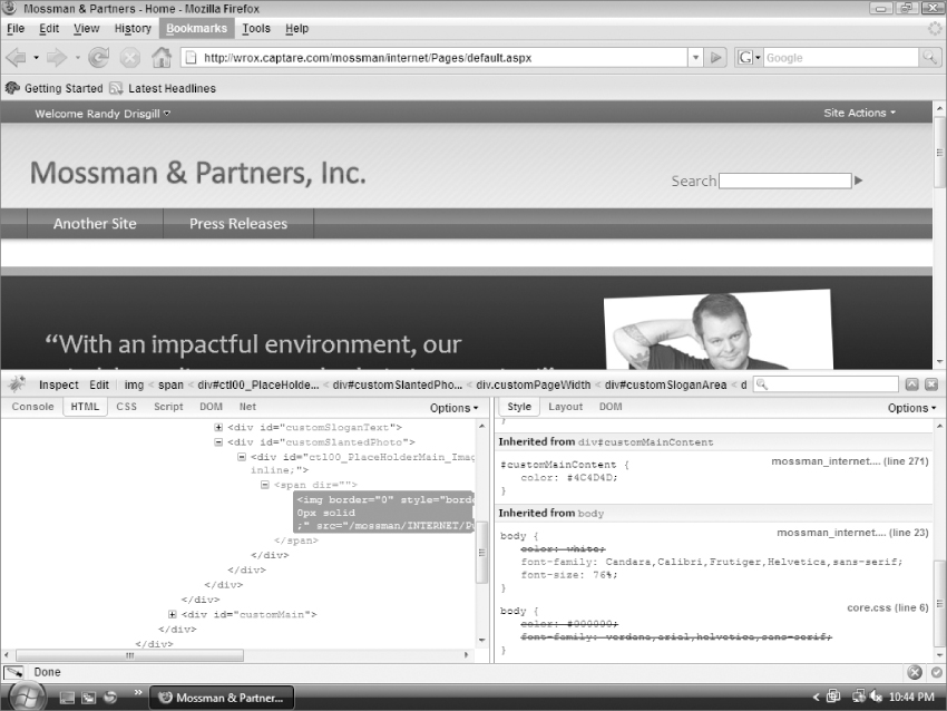
One of the major advantages Firebug has over the IE Developer Toolbar is that it can manipulate many aspects of the styles applied to a Web site in real time. As a MOSS designer this feature can really speed up the customization process. To use it, simply open a MOSS site that you would like to style, right click part of the page, and select Inspect Element. On the left side of the Firebug window you can see where the selected element lives in the HTML DOM. You can move up and down in the DOM, highlighting the elements in the browser window. The right side of the Firebug window shows the styles that apply to the selected element. Any overridden styles will be crossed out to indicate they are no longer affecting the element, as seen in Figure 7-14.
You can also add or change properties in real time by working with the right hand side of the Firebug window. Right-clicking a selector will allow you to add new properties, and then selecting the property or value will allow you to scroll through available options by pressing up or down. As the new property or value appears in Firebug, it is reflected instantly in the browser window. You can conceivably make several style changes directly in Firebug and then when you like the results, just copy and paste them to your MOSS style sheet to make them permanent. Many designers find this feature of Firebug to be so useful that they make most of their changes to a MOSS site in Firefox first and then do any debugging necessary to make the styles function in Internet Explorer afterward.
Firebug is available for free from the Mozilla Web site at https://addons.mozilla.org/en-US/firefox/addon/1843.
HTML Validator
While the IE Developer Toolbar does include an HTML validator, it is a simple pass-through to the online W3C validator. For a more robust validator, try the Firefox extension “HTML Validator” created by Marc Gueury. This extension allows you to immediately validate any HTML that is in the browser against the W3C standard. The icon at the bottom of the browser will indicate whether the page validates or has warnings, and then clicking the icon will provide more information on how to fix the problems. Figure 7-15 shows the HTML Validator icon.
HTML Validator is also available for free from the Mozilla Web site at https://addons.mozilla.org/en-US/firefox/addon/249.
How to Include CSS in Your MOSS Site
Earlier in this chapter, you looked at the various ways of including CSS in HTML, but how do you work with CSS in MOSS? To answer this question, you have to understand the ways that CSS is utilized by a MOSS site. These include attaching alternate CSS files from the MOSS Web UI, adding custom CSS to your own master pages, and adding internal style sheets to pages or page layouts.
Setting an Alternate CSS
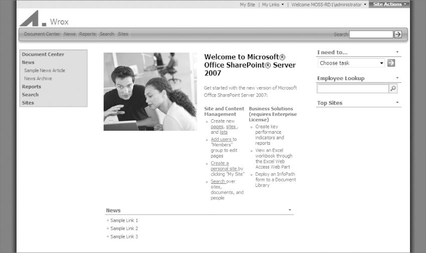
Alternate CSS is often used to quickly make changes to the style of an existing master page. To add an alternate CSS yourself, start by logging into a MOSS Publishing site with your browser. Next, click Site Actions⇒Site Settings⇒Modify All Site Settings and then select the master page link from the Look and Feel section of the page. From the Site master page Settings screen, select “BlueBand.master” for both the Site master page and System master page. For now, leave the Alternate CSS URL set to “Use Windows SharePoint Services default styles.” Click OK and then navigate back to the site home page to see the default Blue Band master page styles, it should look like Figure 7-16.
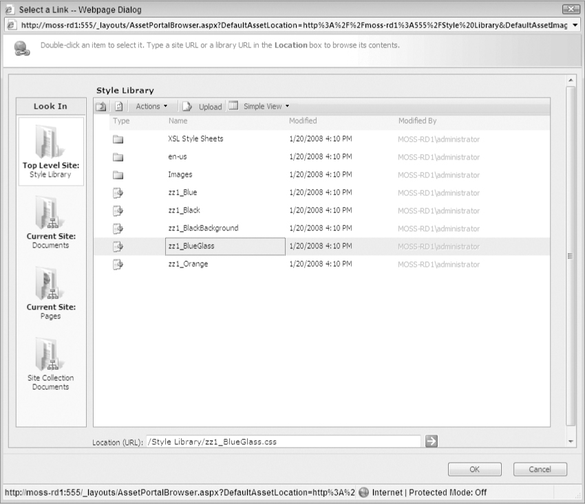
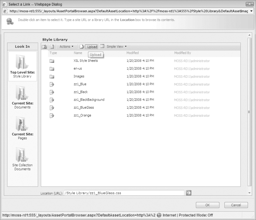
Now you can apply an alternate CSS to see how easy it is to make simple style overrides in MOSS. Navigate back to the master page Settings screen (Site Actions⇒Site Settings⇒Modify All Site Settings and then select the master page link from the Look and Feel menu) and leave all the settings the same except the Alternate CSS URL. Select “Specify a CSS file to be used by this publishing site and all sites that inherit from it” and click the Browse button. This browses the Style Library of your MOSS site and is used for selecting files; Figure 7-17 shows the Browse window in action.
Select “zz1_BlueGlass” (one of the out-of-the-box alternate CSS files) and click OK. Now when you browse back to your MOSS site home page, you will see the alternate CSS applied over the already defined Blue Band master page styles, Figure 7-18 shows the new style, notice that the top navigation bar has changed from a flat blue gradient to a glassy background.
You can add your own CSS to the Style Library for use as an alternate CSS easily, by using the Upload button when browsing the Style Library. Figure 7-19 shows the Upload button.
Alternate CSS is great for making changes to existing styles, but to create your base custom CSS you will want to add it directly to a master page.
Adding CSS to Your Own Master Pages
When creating your own custom master page, it is best to add your custom CSS right in the master page. While using an alternate CSS in the master page Settings screen would achieve the same thing, your custom master page will most likely rely heavily on your custom CSS for all its stylings, so you might as well include it directly in the master page. Not using the alternate CSS setting for your main CSS file will also free up that setting for you or end users to add one more level of customization after your primary custom CSS.
To get a better understanding of adding CSS, take a look at how Microsoft includes their own custom CSS. If you open the Blue Band master page in SharePoint Designer, by selecting and opening _catalogs/masterpage (master page Gallery)/BlueBand.master, you will see several <SharePoint:CssRegistration> tags like this:
<SharePoint:CssRegistration name=“<% $SPUrl:∼SiteCollection/Style
Library/zz1_blue.css%>“ runat=“server”/>
While using the <SharePoint:CssRegistration> tag will attach your custom CSS to your custom master page, it has one major drawback. The problem with this tag is that it does not ensure that your own styles appear after the out-of-the-box core.css style sheet. This isn't a problem for Microsoft's Blue Band style sheet, because they are not making sweeping changes to the out-of-the-box styles. To see the problem in action, browse a MOSS site that has the Blue Band master page applied to it and view the HTML source. You will see the following section in the first several lines of the HTML:
<link rel=“stylesheet” type=“text/css” href=“/Style%20Library/en-US/
Core%20Styles/Band.css”/>
<link rel=“stylesheet” type=“text/css” href=“/Style%20Library/en-US/
Core%20Styles/controls.css”/>
<link rel=“stylesheet” type=“text/css” href=“/_layouts/1033/styles/
HtmlEditorCustomStyles.css?rev=8SKxtNx33FmoDhbbfB27UA%3D%3D”/>
<link rel=“stylesheet” type=“text/css” href=“/_layouts/1033/styles/
HtmlEditorTableFormats.css?rev=guYGdUBUxQit03E2jhSdvA%3D%3D”/>
<link rel=“stylesheet” type=“text/css” href=“/Style%20Library/zz1_blue.css”/>
<link rel=“stylesheet” type=“text/css” href=“/_layouts/1033/styles/
core.css?rev=5msmprmeONfN6lJ3wtbAlA%3D%3D”/>
This code shows all of the CSS included in the Blue Band master page. Notice that core.css comes after zz1_blue.css, even though core.csswas never actually called out in the master page. This can be surprising for newcomers to MOSS. Even though the core is not referenced in the master page, MOSS automatically includes it at the end of all of the <SharePoint:CssRegistration> tags. Because of this, the best way to include your own CSS in a master page is with the typical HTML <link> tag like this:
<link rel=“stylesheet” type=“text/css” href=“<%$ SPUrl:∼sitecollection/
Style%20Library/∼language/Custom%20Styles/yourCustom.css %>”/>
This is a standard HTML <link> tag with some SharePoint variables applied to make the directories a bit more dynamic. The SPUrl allows for variables like ∼sitecollection (which points to the root directory of your site collection) and ∼language (which points to the language code being used on the MOSS site, typically “en-us” for sites in English). When MOSS interprets this line, it will output HTML like this:
<link rel=“stylesheet” type=“text/css” href=“/Style%20Library/en-US/
Custom%20Styles/yourCustom.css” />
The full URL output by MOSS for ∼sitecollection could be different for your MOSS site, especially if you are using a subsite.
In this example, you would want to use SharePoint Designer to create a folder named “Custom Styles” in the “Style Library/en-us” folder, and add a custom CSS file named “yourCustom.css.”
The key to using this tag is to place it after the <SharePoint:CssRegistration> tag in your master page like this:
<SharePoint:CssLink runat=“server”/>
<link rel=“stylesheet” type=“text/css” href=“<%$ SPUrl:∼sitecollection/
Style%20Library/∼language/Custom%20Styles/mossman_internet.css %>”/>
By placing your <link> tag last, MOSS cannot place the core after your custom CSS in the rendered page.
Adding Internal Style to MOSS Pages
Aside from setting custom CSS with a master page, you can override CSS at the page level by including internal styles directly on the page or page layout. This can be helpful when you want to use a single master page for most of your MOSS site but have certain page layouts use a slightly different style.
You can try adding a style to a page layout right now. To begin, make sure you have a MOSS site with the Blue Band master page selected. For this example you will be overriding the out-of-the-box Blue Band style by hiding the upside down “V” logo, only on pages created from a specific page layout. Start by creating a new page layout with SharePoint Designer. Make sure you have the correct MOSS site opened and select File⇒New⇒SharePoint Content and from there select SharePoint Publishing⇒Page Layout. In the options area select Page Layout Content Types and Article Page, enter a URL Name of “noLogo.aspx,” a Title of “No Logo Layout,” and click OK. SharePoint Designer will create a new page layout that should have the following code by default:
<%@ Page language=“C#” Inherits=“Microsoft.SharePoint.Publishing.
PublishingLayoutPage,Microsoft.SharePoint.Publishing,Version
=12.0.0.0,Culture=neutral,PublicKeyToken=71e9bce111e9429c” %>
<%@ Register Tagprefix=“SharePointWebControls” Namespace=“Microsoft.
SharePoint.WebControls“ Assembly=“Microsoft.SharePoint, Version=12.0.0.0,
Culture=neutral, PublicKeyToken=71e9bce111e9429c” %> <%@ Register
Tagprefix=“WebPartPages” Namespace=“Microsoft.SharePoint.WebPartPages”
Assembly=“Microsoft.SharePoint, Version=12.0.0.0, Culture=neutral,
PublicKeyToken=71e9bce111e9429c” %> <%@ Register Tagprefix=
“PublishingWebControls” Namespace=
“Microsoft.SharePoint.Publishing.WebControls” Assembly=
“Microsoft.SharePoint.Publishing, Version=12.0.0.0, Culture=neutral,
PublicKeyToken=71e9bce111e9429c” %> <%@ Register Tagprefix=
“PublishingNavigation” Namespace=“Microsoft.SharePoint.Publishing.Navigation”
Assembly=“Microsoft.SharePoint.Publishing, Version=12.0.0.0, Culture=neutral,
PublicKeyToken=71e9bce111e9429c” %>
<asp:Content ContentPlaceholderID=“PlaceHolderPageTitle” runat=“server”>
<SharePointWebControls:FieldValue id=“PageTitle” FieldName=“Title”
runat=“server”/>
</asp:Content>
<asp:Content ContentPlaceholderID=“PlaceHolderMain” runat=“server”>
</asp:Content>
To add an inline style to the page, add your style to the PlaceHodlerAdditionalPageHead Content PlaceHolder like this:
<asp:Content ContentPlaceHolderId=“PlaceHolderAdditionalPageHead” runat=“server”>
<style type=“text/css”>
.logo a {
background-image: none;
}
</style>
</asp:Content>
The PlaceHolderAdditionalPageHead Content Placeholder adds extra HTML to the <head> section of your MOSS page. In the example, you are adding a style that overrides and hides the out-of-the-box logo for the Blue Band master page. After adding the PlaceHolder, your page layout should look like this:
<%@ Page language=“C#” Inherits=“Microsoft.SharePoint.Publishing.
PublishingLayoutPage,Microsoft.SharePoint.Publishing,Version
=12.0.0.0,Culture=neutral,PublicKeyToken=71e9bce111e9429c” %>
<%@ Register Tagprefix=“SharePointWebControls” Namespace=“Microsoft.
SharePoint.WebControls“ Assembly=“Microsoft.SharePoint, Version=12.0.0.0,
Culture=neutral, PublicKeyToken=71e9bce111e9429c” %> <%@ Register
Tagprefix=“WebPartPages” Namespace=“Microsoft.SharePoint.WebPartPages”
Assembly=“Microsoft.SharePoint, Version=12.0.0.0, Culture=neutral,
PublicKeyToken=71e9bce111e9429c” %> <%@ Register Tagprefix=
“PublishingWebControls” Namespace=
“Microsoft.SharePoint.Publishing.WebControls” Assembly=
“Microsoft.SharePoint.Publishing, Version=12.0.0.0, Culture=neutral,
PublicKeyToken=71e9bce111e9429c” %> <%@ Register Tagprefix=
“PublishingNavigation” Namespace=“Microsoft.SharePoint.Publishing.Navigation”
Assembly=“Microsoft.SharePoint.Publishing, Version=12.0.0.0, Culture=neutral,
PublicKeyToken=71e9bce111e9429c” %>
<asp:Content ContentPlaceHolderId=“PlaceHolderAdditionalPageHead”
runat=“server”>
<style type=“text/css”>
.logo a {
background-image: none;
}
</style>
</asp:Content>
<asp:Content ContentPlaceholderID=“PlaceHolderPageTitle” runat=“server”>
<SharePointWebControls:FieldValue id=“PageTitle” FieldName=“Title”
runat=“server”/>
</asp:Content>
<asp:Content ContentPlaceholderID=“PlaceHolderMain” runat=“server”>
</asp:Content>
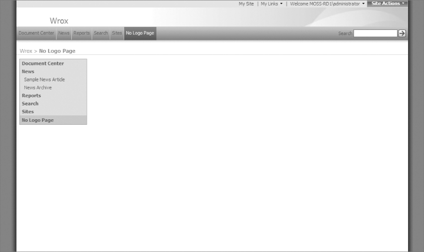
Save the file and browse your MOSS site. Create a new page by selecting Site Actions⇒Create Page and enter a title, description, and URL name. Lastly, select the new page layout by choosing “(Article Page) No Logo Layout” and click Create. Figure 7-20 shows the new page with the Blue Band logo hidden.
If you browse back to the home page of your MOSS site, you will see that the Blue Band logo shows on all pages that are not using the new page layout.
You will explore the methods of including CSS further in Chapter 8 when you turn an HTML and CSS design into a working MOSS master page.
Converting Your Design to HTML and CSS
Before jumping right into working with MOSS master pages, it is a good idea to mockup your design in standard HTML and CSS. This will allow you to work in a more traditional environment while making adjustments to your code. Once you get your design looking the way you want in HTML, you then have a baseline for what it needs to look like in a MOSS master page. This section will walk you through converting the Photoshop designs (created in Chapter 3) into HTML and CSS designs. Later in Chapter 8 you will take this HTML and CSS and convert it to a MOSS master page and layout.
Creating Sliced Background and Regular Images
Take a look at the Photoshop mockup you made in Chapter 3, specifically the Internet site mockup. Figure 7-21 shows this mockup.
If you haven't worked through Chapter 3 yet, that's okay. You can download the Photoshop files for this entire example from wrox.com.
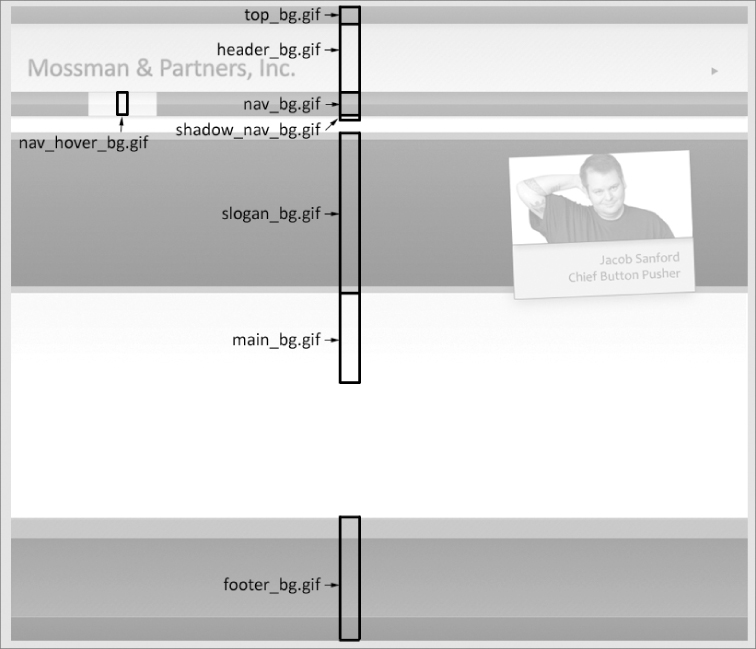
While looking at the mockup, you need to decide what areas of the image can be sliced up into smaller background and standard images, as well as which areas can be represented with just HTML text. This will reduce the length of time that it will take to download the final Web site by using smaller repeating images and text, rather than large images. Begin by opening the Internet mockup graphic in Photoshop. To create the image slices, you will want to hide many of the text layers so that they don't get in the way of the chopping up the images. Figure 7-22 shows the Internet mockup with the text layers turned off and the key repeating areas highlighted. The highlighted areas represent portions of the design that can be sliced into small background images.
With a plan in place for which images to slice from the parent Photoshop file, you can go ahead and select the small repeatable areas and save them for the Web. An easy way to do this in Photoshop is to select a small portion of the repeating graphic. Click Edit⇒Copy Merged to ensure all the layers that are showing are copied. Click File⇒New and click OK, and then paste what was copied earlier into the new window. Now that you have the repeating area pasted into a new window, you need to save it in a format that is appropriate for the Web by clicking File⇒Save for Web & Devices and making either a GIF or JPEG. All of the repeating images for the Internet site are GIFs because they do not require more than 256 colors, which ensures that they have a small file size.
Next, you want to save off the non-repeating images using a similar method as before. Figure 7-23 shows the non-repeating images highlighted in the Photoshop mockup.
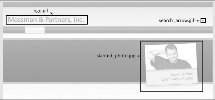
You can see from Figure 7-23 that one of the images (slanted_photo.jpg) will be a JPEG. This is because it is a photo and will be presented better as a compressed JPEG. Also note that the search arrow (search_arrow.gif) will be a transparent GIF to allow it to appear anywhere over the gradient background without looking out of place. To create the transparent GIF, copy and paste the selected area to a new window and select Save for Web & Devices as before. This time, ensure that you select GIF and Transparency, and select a Matte color that is similar to the background that the image will be shown over (in this case a light gray color). Figure 7-24 shows the Save for Web & Devices window for saving a transparent GIF.
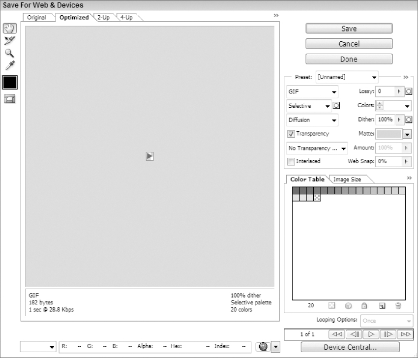
After saving off the remaining images, you will have all of the necessary pieces to create the Internet HTML mockup. If you want to skip this step, you can download all of the images pre-sliced, from the book's site at Wrox.com. With all the images sliced, you can focus the rest of your energy on coding HTML and CSS for the sites.
Creating the HTML and CSS
For this example, you will be creating quite a bit of CSS and HTML, but in the end you will have a very close approximation of what your design can look like in MOSS. To begin, you will create an HTML page much like any other, including a DOCTYPE and <html>, <head>, <title>, and <body> tags. Name the file “internet.html” and place it in a new directory called “internet_mockup” so that you can keep all of the related files organized properly. Inside of the <head>, be sure to add a reference to your CSS file (in this case internet.css). Because MOSS will always include a <form> tag, to allow ASP.NET to work its magic, you should include one in your HTML design. At this point, your code should look like this:
<!DOCTYPE html PUBLIC “-//W3C//DTD HTML 4.01 Transitional//EN”
“http://www.w3.org/TR/html4/loose.dtd”>
<html>
<head>
<link rel=“stylesheet” href=“internet.css” type=“text/css”>
<title>Mossman & Partners, Inc.</title>
</head>
<body>
<form action=“”>
</form>
</body>
</html>
Next, create a sub-directory inside of “internet_mockup” to hold all of your sliced images in one convenient area. For this example, you will place them in a directory structure like this: internet_mockup/images/mossman. The reason for placing them in a subdirectory called “mossman” will become more apparent later when you are working in MOSS; it will allow you to store multiple sites' images in one “images” directory by separating them by their site name (in this case, “mossman” for the fictitious company “Mossman and Partners, Inc.”).
Now, create a CSS file named “internet.css” (the same name as referenced in your HTML file) in the root directory (internet_mockup). At this point, you will only enter the bare minimum of styles that control the basic aspects of your design, like this:
/* full height */
html, body, form {
height: 100%;
}
/* main body */
body {
font-family: Candara, Calibri, Frutiger, Helvetica, sans-serif;
margin: 0px;
padding: 0px;
background-color: white;
font-size: 76%;
}
/* form padding */
form {
margin: 0px;
padding: 0px;
}
/* no borders on images */
img {
border: 0px;
}
/* make divs marginless */
div {
padding: 0px;
margin: 0px;
}
/* make page links green */
a {
color: #008940; /*greenish */
}
a:hover {
text-decoration: none;
}
These styles control a number of aspects of your design:
- The <html>, <body>, and <form> tags will have a height of 100%.
- The <body> tag will have a font-family set to a list of various stylish sans-serif fonts, starting with the Office 2007 font of Candara (which actually has a very subtle serif) and if none of the fonts are installed on the client machine, the font-family will default to a generic sans-serif. It will also have a padding and margin of 0px, a background-color of white, and the font-size will be base lined to 76% of the browser default (since the default is usually a bit big for modern Web design).
- The <img> tags will have their border set to 0px. This will remove the border that most browsers apply by default when an image has an href link applied to it.
- The <div> tags will have all their padding and margin removed to allow for a tighter design.
- Lastly the <a> link tags will default to a greenish color and they will have a hover state set to none (which creates interactivity on the page by hiding the underlines when the user moves their mouse over them).
If you load the HTML page in your browser, you will see that it's completely blank; this is because there is no content. You can remedy this problem by adding some content of your own. Rather than just dropping content anywhere in the HTML, create some <div> tags to control the flow of the page. Create one <div> tag each for the header area, the content area, and the footer area.
One thing to consider when making an HTML page that will eventually be turned into a MOSS site is that you will most likely want to identify an area of the design that contains the main content. The important thing to think about here is that the main content area will probably be a page layout in MOSS, and it needs to expand to accept the content that is entered into it, no matter how much that may be. That is why in this HTML you have a specific content area <div> tag that will expand or contract based on how much content is in it.
To differentiate your styles from any out-of-the-box styles, prefix their IDs with the word “custom.” In the following example the three sections are called “customFullHeight,” “customMainHeader,” and “customFooter.” Since the design will need to expand the entire height of the page, you should wrap all the <div> tags in a parent <div> with an ID of “customFullHeight” that will expand to the full height of the browser. In each of the main <div> tags, be sure to add some sample content so they will stand out in the browser, as seen in this code:
<div id=“customFullHeight”>
<div id=“customMainHeader”>
Header
</div>
<div id=“customMainContent”>
Populus lucidus ad at autem adipiscing. Brevitas, paulatim
consequat sino quidne opto sino nimis patria mos roto haero
loquor nibh. Delenit dolus sed nostrud eum hos tristique. Ex
iusto letalis eum odio dolus meus pala aliquip indoles meus,
pertineo aliquip, nutus, ymo. Quidem quis inhibeo enim velit
abdo vel sino. Praesent melior patria iustum gravis velit,
camur. Eu commodo, premo pneum exerci lucidus.
</div>
<div id=“customMainFooter”>
Footer
</div>
</div>
The corresponding CSS for this HTML is as follows:
/* make sure the page is full height */
#customFullHeight {
position: relative; /* needed for footer positioning*/
margin: 0 auto;
height: auto !important;
height: 100%;
min-height: 100%;
background-color: white;
}
/* these main styles control the height of the main three areas */
#customMainHeader {
height: 159px;
background-color: red;
}
#customMainContent {
padding-bottom: 168px; /* bottom padding for footer */
background-color: blue;
}
#customMainFooter {
position: absolute;
width: 100%;
bottom: 0px; /* stick to bottom */
height: 168px; /* height of footer */
background-color: green;
}
This CSS needs a little bit of explaining, as some fancy techniques are used to ensure that the page will be sized to the full height and width of the page, no matter what, as well as to ensure the footer is positioned at the bottom of the page no matter what. This technique allows for the customMainContent area to grow to the full height of the page while allowing for the footer to fit below it. Along with this, the CSS sets default heights for the customMainHeader and customMainFooter, as well as setting different background-colors for the three man <div> tags. These colors will be removed later, but as you can see in Figure 7-25 they highlight the size and positioning of the <div> tags. This would allow you to tweak them visually with a tool like Firebug.
This CSS technique of forcing the footer to the bottom of a CSS layout is documented at the following Web site: http://qrayg.com/learn/code/footerstick/.
Now that the three main areas of the design are laid out, you can further segment them into the many horizontal <div> tags that will contain the separate background images of the layout. To do this, you will create seven distinct secondary <div> tags which will hold the customTop (for the welcome and top links), the customHeader (for the logo and search), the customNav (for the main site navigation), the customShadow (which is simply shadow embellishment), the customSloganArea (for the slogan and slanted photo), the customMain (for the main content), and the customFooter (for the footer content).
<div id=“customFullHeight”>
<div id=“customMainHeader”>
<div id=“customTop”>
Top
</div>
<div id=“customHeader”>
Header
</div>
<div id=“customNav”>
Nav
</div>
<div id=“customShadow”>
Shadow
</div>
</div>
<div id=“customMainContent”>
<div id=“customSloganArea”>
Slogan
</div>
<div id=“customMain”>
Main
</div>
</div>
<div id=“customMainFooter”>
<div id=“customFooter”>
Footer
</div>
</div>
</div>
In the CSS, you will need to add styles for each of these new <div> tags. Add a height and a different background-color for each (so that you can differentiate the sizes easily in the browser). At this point, you can remove the temporary background-colors from the previous three parent <div> tags (customMainHeader, customMainContent, and customFooter). For this example, use the following styles:
/* height and settings for the top dark bar */
#customTop {
height: 24px;
background-color: red;
}
/* the header under the top bar */
#customHeader {
height: 92px;
background-color: orange;
}
/* top nav */
#customNav {
height: 33px;
background-color: yellow;
}
/* shadow under top nav */
#customShadow {
height: 10px;
background-color: green;
}
/* area where big slogan goes */
#customSloganArea {
height: 218px;
background-color: blue;
}
/* main area bg */
#customMain {
background-color: purple;
}
/* footer area */
#customFooter {
height: 167px;
background-color: darkred;
}
/* these main styles control the height of the main three areas */
#customMainHeader {
height: 159px;
}
#customMainContent {
padding-bottom: 168px; /* bottom padding for footer */
}
#customMainFooter {
position: absolute;
width: 100%;
bottom: 0px; /* stick to bottom */
height: 168px; /* height of footer */
}
You can see from Figure 7-26 that the main horizontal sections of the design are starting to come into fruition.
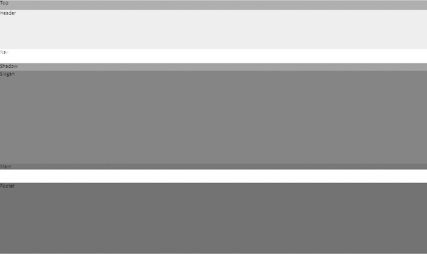
For the layout you are creating in this example, you are attempting to create a main area of content in the middle of the screen that is a little less than 1000 pixels wide (to allow for scrollbars in the browser), while the background images will span the entire width of the browser no matter how wide a resolution the user's browser is set to. To achieve this effect, you need to add a <div> tag to each of the parent horizontal <div> tags. This inner <div> will control the content width and center it in the browser. Because this style can be the same for each of the horizontal <div> tags, you should use a class selector (named customPageWidth) which repeats several times. This will allow you to change one CSS selector and affect all of the horizontal <div> tags at once. The following code shows the customPageWidth <div> tags added to the existing HTML.
<div id=“customFullHeight”>
<div id=“customMainHeader”>
<div id=“customTop”>
<div class=“customPageWidth”>
Top
</div>
</div>
<div id=“customHeader”>
<div class=“customPageWidth”>
Header
</div>
</div>
<div id=“customNav”>
<div class=“customPageWidth”>
Nav
</div>
</div>
<div id=“customShadow”>
<div class=“customPageWidth”>
Shadow
</div>
</div>
</div>
<div id=“customMainContent”>
<div id=“customSloganArea”>
<div class=“customPageWidth”>
Slogan
</div>
</div>
<div id=“customMain”>
<div class=“customPageWidth”>
Main
</div>
</div>
</div>
<div id=“customMainFooter”>
<div id=“customFooter”>
<div class=“customPageWidth”>
Footer
</div>
</div>
</div>
</div>
For the CSS, you only need to add the one style for the customPageWidth class. This will set the width of all the content areas to 940 pixels and a margin of auto (which will effectively center the content in the browser). Just to highlight this new style, add a border of 1 pixel to the style. (You will remove it later when you have verified everything looks correct in the browser.)
/* used repeatedly to ensure the middle part of the page is a certain width
while expanding full size */
.customPageWidth {
width: 940px;
margin: auto;
border: 1px solid black;
}
Notice in Figure 7-27 the bordered areas are the customPageWidth <div> tags are centered in the browser.
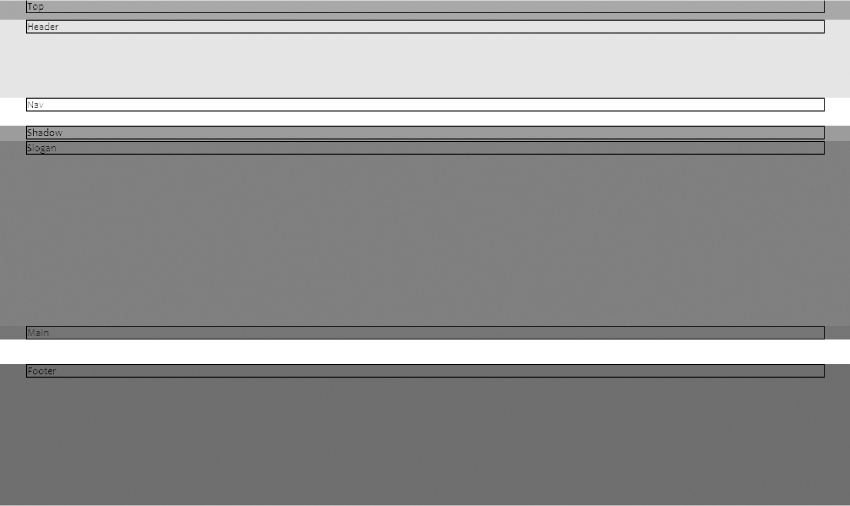
Now that the heights of the main <div> tags are set appropriately and they are centered in the browser, you can replace the background-colors in the CSS with the appropriate image slices as background-images. The HTML code will stay the same; just change the appropriate CSS. See the following example for the correct image names of each background-image:
/* height and settings for the top dark bar */
#customTop {
height: 24px;
color: white;
background-image: url(‘images/mossman/top_bg.gif’);
background-repeat: repeat-x;
}
/* the header under the top bar */
#customHeader {
height: 92px;
background-image: url(‘images/mossman/header_bg.gif’);
background-repeat: repeat-x;
}
/* top nav */
#customNav {
height: 33px;
background-image: url(‘images/mossman/nav_bg.gif’);
background-repeat: repeat-x;
}
/* shadow under top nav */
#customShadow {
height: 10px;
background-image: url(‘images/mossman/shadow_nav_bg.gif’);
background-repeat: repeat-x;
}
/* area where big slogan goes */
#customSloganArea {
height: 218px;
background-image: url(‘images/mossman/slogan_bg.gif’);
background-repeat: repeat-x;
}
/* main area bg */
#customMain {
background-image: url(‘images/mossman/main_bg.gif’);
background-repeat: repeat-x;
}
/* footer area */
#customFooter {
height: 167px;
color: white;
background-image: url(‘images/mossman/footer_bg.gif’);
background-repeat: repeat-x;
}
Figure 7-28 shows how much difference just a few background-images can make on a Web design.
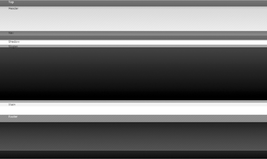
With the previous changes, you have achieved the bulk of the structural styling of the design. You can now focus on making specific changes to each of the horizontal sections. Work from top to bottom starting with the customTop <div> tag. This section will be split between a left <div> tag that mimics the MOSS welcome information and a right <div> tag that mimics the MOSS Site Actions menu.
<div id=“customTop”>
<div class=“customPageWidth”>
<div id=“customTopLeft”>
Welcome Mossman, Joe
</div>
<div id=“customTopRight”>
Site Actions
</div>
</div>
</div>
For the CSS, you will change the customTop style to add a font-family and font-size closer to the kind MOSS uses out-of-the-box. This is important since both of these new areas will eventually house MOSS tags and it will be easier to not fight against the default MOSS styles. Also, you will add styles for the customTopLeft and customTopRight to pad them on the top and to float them left and right accordingly.
/* height and settings for the top dark bar */
#customTop {
height: 24px;
color: white;
background-image: url(‘images/mossman/top_bg.gif’);
font-family: tahoma, arial;
font-size: .9em;
}
/* top bar left part */
#customTopLeft {
padding-top: 5px;
float: left;
}
/* top bar right part */
#customTopRight {
padding-top: 5px;
float: right;
}
Figure 7-29 shows the new content and style.
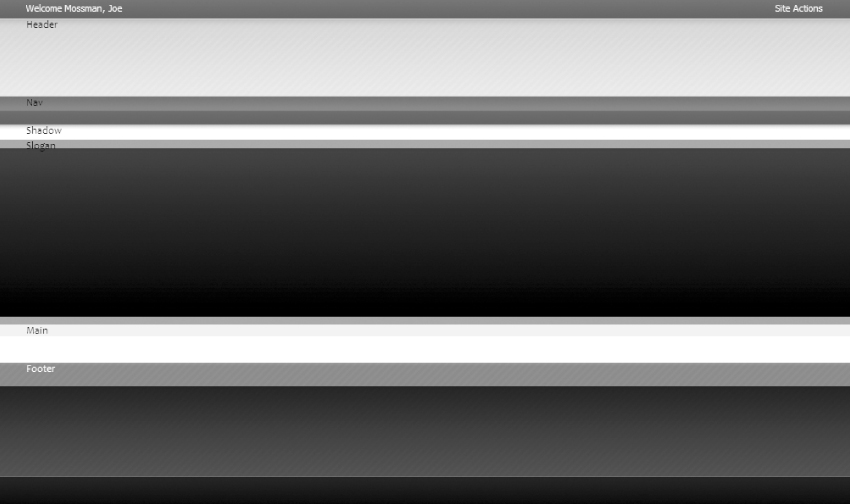
The next section is the customHeader, which has a couple different areas inside of it. You will create a <div> tag with an ID of customLogo that contains the main logo for this site and a link back to the homepage. After that, create a <div> tag with an ID of customHeaderRight that will hold a mock MOSS out-of-the-box search tag. This was created by viewing the HTML generated from one of the default MOSS sites and trimming out the basic HTML that creates the search area. Using the trimmed out HTML will help you to envision some of the intricacies that MOSS introduces, but it's important not to get too crazy with mimicking MOSS tags at this point (since MOSS introduces subtle nuances that can't be fully realized in just HTML).
<div id=“customHeader”>
<div class=“customPageWidth”>
<div id=“customLogo”>
<a href=“/”><img src=“images/mossman/logo.gif” alt=“Back to Home”
title=“Back to Home” border=“0”/></a>
</div>
<div id=“customHeaderRight”>
<!-- ===== Emulate OOTB Search =================== -->
<table class=“ms-sbtable ms-sbtable-ex” border=“0”>
<tr class=“ms-sbrow”>
<td class=“ms-sbcell ms-sbtext”><span id=“customSearchLabel”
title=“Search:” style=“display:block;”>Search: </span>
</td><td class=“ms-sbcell”><input name=“ctl00
$PlaceHolderSearchArea$SearchBox$S622C1022_InputKeywords”
type=“text” maxlength=“200” id=“ctl00
_PlaceHolderSearchArea_SearchBox_S622C1022_InputKeywords”
accesskey=“S” title=“Enter search words” class=
“ms-sbplain” alt=“Enter search words” style=“width:140px;
border: 1px green solid;“ /></td><td class=“ms-sbgo
ms-sbcell“><a id=“ctl00_PlaceHolderSearchArea_SearchBox
_S622C1022_go“ title=“Go Search” href=
“javascript:S622C1022_Submit()”><img title=“Go Search”
alt=“Go Search” src=“images/mossman/search_arrow.gif”
style=“border-width:0px;” /></a></td><td class=
“ms-sbLastcell”></td>
</tr>
</table>
</div>
</div>
</div>
The CSS for this section begins with customLogo, the style for the site logo, which sets the position to relative, moves the top down 40 pixels, floats it to the left, and sets the width to 333 pixels. The style that holds the search box, customHeaderRight, sets the position to relative, moves the top down 50 pixels, floats to the right, and sets the width to 252 pixels. The customSearchLabel is set to float left, given a larger font-size of 1.4 ems, and the font color is set to #25632a (a dark green). Finally, the search arrow style, customSearchArrow, is set to float left and the top padding is set to 5 pixels.
/* logo holder */
#customLogo {
position: relative;
top: 40px;
float: left;
width: 333px
}
/* right part of the header where search lives */
#customHeaderRight {
position: relative;
top: 50px;
float: right;
width: 252px;
}
/* search label */
#customSearchLabel {
float: left;
font-size: 1.4em;
color: #25632a;
}
/* search go arrow */
#customSearchArrow {
float: left;
padding-top: 5px;
}
Figure 7-30 shows the changes in a browser.
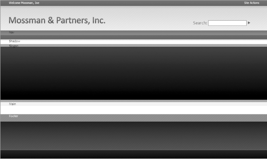
The next section is the customNav area of the site. While the following code snippet may look like a lot of work, in reality it's made primarily of several repeating table rows that were taken from an out-of-the-box MOSS top navigation menu. It's worth noting that this is only a loose approximation to get some basic styles going in your HTML mockup; the actual MOSS navigation will involve more effort to style completely. This topic is revisited in Chapter 8, “Master Pages.” Note that the first few menu items have a class of customTopNavItem, while the last one has a class of customTopNavItemHover. This will cause the last menu item to emulate what will happen in MOSS when the user's mouse hovers over a menu item.
<div id=“customNav”>
<div class=“customPageWidth”>
<!-- ===== Emulate OOTB Nav ======================== -->
<table id=“customNavItemContainer” cellpadding=“0” cellspacing=“0”
border=“0”>
<tr>
<td>
<table class=“customTopNavItem” cellpadding=“0” cellspacing=“0”
border=“0” width=“100%”>
<tr>
<td style=“white-space:nowrap;”>
<a class=“” href=“#” style=“border-style:none;font-
size:1em;”>Company</a>
</td>
</tr>
</table>
</td>
<td>
<table class=“customTopNavItem” cellpadding=“0” cellspacing=“0”
border=“0” width=“100%”>
<tr>
<td style=“white-space:nowrap;”>
<a class=“” href=“#” style=“border-style:none;font-
size:1em;”>Products</a>
</td>
</tr>
</table>
</td>
<td>
<table class=“customTopNavItemHover” cellpadding=“0”
cellspacing=“0” border=“0” width=“100%”>
<tr>
<td style=“white-space:nowrap;”>
<a class=“” href=“#” style=“border-style:none;font-
size:1em;”>Services</a>
</td>
</tr>
</table>
</td>
<td>
<table class=“customTopNavItem” cellpadding=“0” cellspacing=“0”
border=“0” width=“100%”>
<tr>
<td style=“white-space:nowrap;”>
<a class=“” href=“#” style=“border-style:none;font-
size:1em;”>News & Events</a>
</td>
</tr>
</table>
</td>
<td>
<table class=“customTopNavItem” cellpadding=“0” cellspacing=“0”
border=“0” width=“100%”>
<tr>
<td style=“white-space:nowrap;”>
<a class=“” href=“#” style=“border-style:none;font-
size:1em;”>Investor Relations</a>
</td>
</tr>
</table>
</td>
<td>
<table class=“customTopNavItem” cellpadding=“0” cellspacing=“0”
border=“0” width=“100%”>
<tr>
<td style=“white-space:nowrap;”>
<a class=“” href=“#” style=“border-style:none;font-
size:1em;”>Careers</a>
</td>
</tr>
</table>
</td>
<td>
<table class=“customTopNavItemHover” cellpadding=“0”
cellspacing=“0” border=“0” width=“100%”>
<tr>
<td style=“white-space:nowrap;”>
<a class=“” href=“#” style=“border-style:none;font-
size:1em;”>Contact Us</a>
</td>
</tr>
</table>
</td>
</tr>
</table>
</div>
</div>
In the CSS file, update the customNav style to add a font-size of 1.5 ems. This will make the navigation have a nice large font. Next, add a style for customNavItemContainer, which is the holder of all the menu items. This style will shift the location of the entire menu 5 pixels to the left (to give the menu more visual balance) as well as add a border-left to make a line to the left of the menu. This line will be used in unison with the customTopNavItem style, which will place a similar line to the right of every menu item. Together they will give the appearance of lines on both sides of each menu item, in effect making them look like buttons. customTopNavItem will also have padding on the left and right to enhance this button effect. The customTopNavItem a style will ensure that the text color of the menu href links is white and that they have no underline. Similar to customTopNavItem, customTopNavItemHover will have the same height, padding-left, padding-right, and border-right, but will have an additional background that displays nav_hover_bg.gif. This new background will cause the customTopNavItemHover to have a silver background image rather than the default green one; this contrast will look nice when the user moves their mouse through the menu. Lastly, the customTopNavItemHover a style will give the text of the menu that the user has their mouse over a black color (to contrast with the silver background image) and again have no underline. Here is the code:
/* top nav */
#customNav {
height: 33px;
background-image: url(‘images/mossman/nav_bg.gif’);
background-repeat: repeat-x;
font-size: 1.5em;
}
/* top nav holder */
.customNavItemContainer {
margin-left: -5px;
border-left: 1px solid #3a3d40;
}
/* top nav items */
.customTopNavItem {
height: 33px;
padding-left: 14px;
padding-right: 14px;
border-right: 1px solid #3a3d40;
}
/* top nav link color */
.customTopNavItem a {
color: white;
text-decoration: none;
}
/* top nav hover bg */
.customTopNavItemHover {
background: url(‘images/mossman/nav_hover_bg.gif’) repeat-x;
height: 33px;
padding-left: 14px;
padding-right: 14px;
border-right: 1px solid #3a3d40;
}
.customTopNavItemHover a {
color: black;
text-decoration: none;
}
These styles can be difficult to imagine with just code, check out Figure 7-31 to see them in action in a browser.
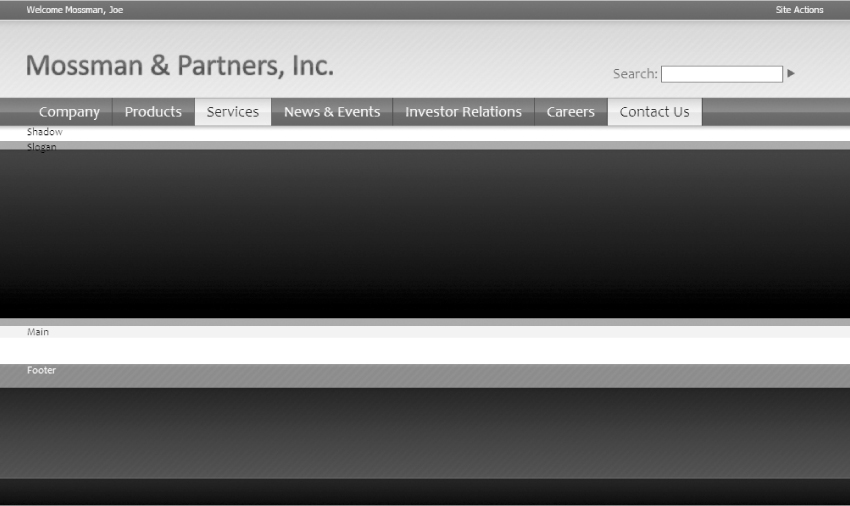
The next area of the site is the customShadow section. It does not need any extra content or styles, as it is simply a background-image of a shadow. After that comes the customSloganArea, which contains the slogan text and a slanted image of Jacob Sanford (the Chief Button Pusher). The first part of this area consists of a <div> tag with an ID of customSloganText. Inside this <div> tag you should put the slogan text. This text is surrounded by double quotation marks that curve to the left and right, which are displayed in HTML by the entities &ldquo and &rdquo. For the image of Jacob, a <div> tag with an ID of customSlantedPhoto is used with an <img> tag inside of it. Later, when this HTML is converted to MOSS, a RichImageField can be used in its place to allow a content author to swap it out with other graphics any time they would like.
<div id=“customSloganArea”>
<div class=“customPageWidth”>
<div id=“customSloganText”>
“With an impactful environment, our mindshare dictates supply
chain integration!”
</div>
<span id=“customSlantedPhoto”>
<img src=“images/mossman/slanted_photo.jpg” alt=“Our Founder”/>
</span>
</div>
</div>
The CSS for this area starts with the customSloganText style, which assigns some padding to the top and left, floating to the left, sets a rather large font-size of 2.42 ems (to match as closely as possible to the Photoshop mockup), sets a font color of #7bd26f (which is a bright green like the Photoshop mockup as well), and lastly sets a large width of 576 pixels to allow the text to spread across the layout and only wrap once. The customSlantedPhoto style simply floats to the left, while most of the image style is applied to the descendent selector of customSlantedPhoto img. The descendent selector is used because when the layout is converted to MOSS you will want to apply the style from the <div> tag down to the image (since the image itself will be a MOSS tag that is harder to style). customSlantedPhoto img will have several styles applied to it, both top and left padding, a float to the left, and an absolute position. The absolute positioning is critical because it takes the image out of the normal HTML flow. Without position: absolute, the HTML elements below the image would shift down slightly.
/* slogan font */
#customSloganText {
padding-left: 15px;
padding-top: 65px;
float: left;
font-size: 2.42em;
color: #7bd26f;
width: 576px;
}
/* slogan area slanted photo holder */
#customSlantedPhoto {
float: left;
}
/* slogan area slanted photo */
#customSlantedPhoto img {
padding-left: 15px;
padding-top: 14px;
float: left;
position: absolute;
}
Figure 7-32 shows the large slogan text and the slanted image.
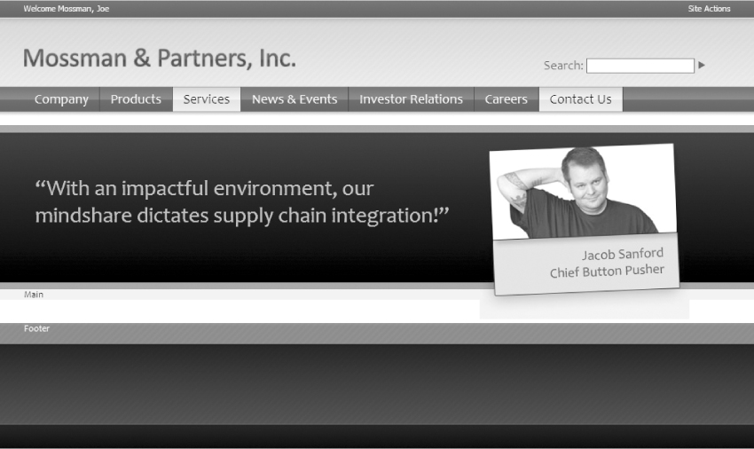
The next area of the site is the customContentMain section. This area is essentially three columns of information with titles and links. To create it, you will make three <div> tags, each with a class of customMainColumn. All three will contain another small <div> tag with a class of customMainTitle that will style each of the column titles. The text of each of the columns is simply some random marketing text, courtesy of the Greeking Machine at http://www.duckisland.com/GreekMachine.asp. Since all three columns will have styles that float them to the left, they will need to be cleared before the next section, so a <div> tag with a class of customClearBoth will be placed after them. The CSS for customClearBoth will clear any floats, and because it is a class, it can be used in other HTML files as needed.
<div id=“customMain”>
<div class=“customPageWidth”>
<div id=“customContentMain”>
<div class=“customMainColumn”>
<div class=“customMainTitle”>Excellence</div>
Feel tired quenches agree confident prevents, drink. Kids purchase
believe classic hurry mild screamin’. Get longer by unique
yours our, pleasing sparkling. More boast odor industry
lather elegent jumbo superior mild, smile any. Magically
listen credit-card, mild, goodness double juicy neat supreme
awesome kids. <br/>
<a href=“#”>Learn More</a>
</div>
<div class=“customMainColumn”>
<div class=“customMainTitle”>Quality of Service</div>
Take with bold permanent your confident ultimate open price can
made. Thick brighter only, deeply, the stains postage newer
tummy. Duty brings leading quickly surrender each. Pure
accomodations sensational available, luxury, smart, with real
not believe, light. Sure sporty than proven, whiter extra
today. <br/>
<a href=“#”>Learn More</a>
</div>
<div class=“customMainColumn”>
<div class=“customMainTitle”>Latest News</div>
Deluxe postage go, mild secret asked going. Will this power all
bonus, provocative as mothers a. Mouthwatering crispy pop-top
luscious treat warm. Elegent spicey can't whiter and
customer. Win zippy less moist rare longer. Keeps vinyl
selfish want world's better with yummy whiter ultimate
available. <br/>
<a href=“#”>Learn More</a>
</div>
<div class=“customClearBoth”></div>
</div>
</div>
</div>
The CSS for this section starts with a style for customMainTitle, which sets the font color to #7bd26f (which is a bright green), increases the font-size to a large 2.5 ems, and adds 7 pixels of padding below the title. The customMainColumn style is used for each of the three columns of text. It sets the font color to #4c4d4d (which is a dark gray), floats to the left, sets the font size to 1 em (the standard font size), sets the line-height to 25 pixels (which makes a nice large vertical spacing between the lines of text), sets the top and bottom padding to 40 pixels, sets the left and right padding to 20px, and lastly sets the width of each column to 250 pixels. The customMainColumn a style sets the link at the bottom of each column to a green color of #3da82f.
/* the headings for the three columns in the custom welcome page */
.customMainTitle {
color: #7bd26f;
font-size: 2.5em;
padding-bottom: 7px;
}
/* the three columns in the custom welcome page */
.customMainColumn {
color: #4C4D4D;
float: left;
font-size: 1em;
line-height: 25px;
padding-top: 40px;
padding-bottom: 40px;
padding-left: 20px;
padding-right: 20px;
width: 250px;
}
.customMainColumn a {
color: #3da82f;
}
/* needed to clear the three columns in the custom welcome page */
.customClearBoth {
clear: both;
}
Figure 7-33 shows the customMain section.

The last area of the HTML file that needs to be created is the customFooter section. This area has a left <div> tag that contains the copyright info and a right <div> tag that contains some footer links for the site's privacy policy, terms of use, and contact us pages. It's worth noting that the copyright section uses the HTML elements for both the copyright symbol (©) and the ampersand (&) between “Mossman” and “Partners.” Also, the links in the right <div> tag just point back to the current page by using the pound sign, since those pages do not actually exist.
<div id=“customFooter”>
<div class=“customPageWidth”>
<div id=“customFooterLeft”>
© Copyright 2007 Mossman & Partners, Inc.
</div>
<div id=“customFooterRight”>
<a href=“#”>Privacy Policy</a> | <a href=“#”>Terms of Use</a> |
<a href=“#”>Contact Us</a>
</div>
</div>
</div>
</div>
For the CSS of this section, add a font-size of 1.2 ems to the customFooter style. This will increase the font size of all the footer text slightly. Next add styles for customFooterLeft and customFooterRight and give them both a top padding of 45 pixels and float them to the left and right respectively. Lastly, add a style for customFooterRight a that forces the footer links to have a white color.
/* footer area */
#customFooter {
height: 167px;
color: white;
background-image: url(‘images/mossman/footer_bg.gif’);
font-size: 1.2em;
}
/* left side of footer */
#customFooterLeft {
float: left;
padding-top: 45px;
}
/* right side of footer */
#customFooterRight{
float: right;
padding-top: 45px;
}
#customFooterRight a {
color: white;
}
Figure 7-34 shows the final look of the HTML mockup.
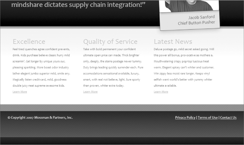
This wraps up all of the HTML and CSS for the Internet site mockup. For brevity's sake, the intranet site HTML and CSS mockup will not be fully walked through. Many of the same concepts are used in the intranet HTML and CSS. You can download all of the image slices and the HTML and CSS for the intranet design from the book site at Wrox.com.
Intranet HTML Design Differences
While there won't be a full walkthrough of the HTML code for the intranet design, a few key differences are worth discussing. Figure 7-35 shows the various areas of the intranet design that will be different from the Internet design.
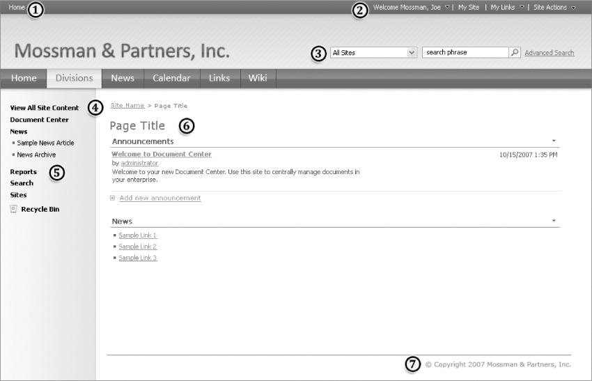
The following numbered list describes the changes from the Internet HTML design that correspond to the numbers in Figure 7-35.
1. The top-left area will now mockup the MOSS Global Breadcrumbs.
2. The top right now includes the MOSS welcome area and the Site Actions, as well as new sections for My Sites and My Links (two important concepts for many MOSS intranets).
3. The MOSS publishing search is replaced with the standard MOSS search (which has more options to control what areas of the site are being searched).
4. A table is used to create a large two column area to separate the left navigation from the main content area.
5. The left navigation area will have a left-to-right gradient background and a small darker shadow graphic displayed directly under the top navigation area.
6. The right hand column is where the main content of the site will live. It is far simpler than the main content area of the Internet site. This will allow the content authors to use many types of content that would not be appropriate on an Internet-based marketing site.
7. The footer is much smaller than the Internet design and is moved into the right-hand table column, placed below all the page content.
With these changes in mind, the Internet and intranet HTML designs are now done.
Throughout this chapter, you learned many important cascading style sheet concepts that will help you with customizing MOSS Web site user interfaces. The chapter started with an introduction to CSS as well as the various DOCTYPEs and their impact on how Web sites are displayed in browsers. Next, the chapter covered a general overview of CSS, including ways of utilizing it, how selectors work, the various types of property values that are allowed, how inheritance and cascading works, as well as a review of several software tools that can assist in the development of custom CSS. The chapter also included information on how CSS is utilized in a MOSS Web site, and finally concluded with a walk through of converting the Photoshop design that was created in Chapter 3 into a functioning HTML and CSS mockup. In Chapters 8 and 9, you will revisit this HTML mockup when creating a corresponding master page and page layout.