Chapter 6
Themes
SharePoint themes are a great way to brand a site as they help you instantly change the look and feel based on your corporate identity requirements. Themes are a key tool in the customization of SharePoint sites. This is particularly true for Windows SharePoint Services V3 (WSS) sites, which, unlike Microsoft Office SharePoint Server 2007 (MOSS) sites, are not as easily customized via master pages. Despite their usefulness, themes can be challenging to work with in a consistent manner across SharePoint sites.
This chapter will explain what themes are and how they help you “skin” SharePoint sites. Then it will cover why themes should be used over other approaches. After discussing the “what” and the “why,” this chapter will discuss how to create a theme using the design that was created in previous chapters. It will walk through the steps in how designers can create themes for their organizations with Photoshop CS3 and SharePoint Designer.
If you are familiar with ASP.NET 2.0, you have probably come across the concept of themes. Themes, to put it simply, allow designers to set up “skins” for the sites they develop. This means that there is a defined set of colors and attributes to the site that you pass on to all of the pages that make up the site. This collection of colors, styles, and design rules is called a “theme.”
SharePoint themes are used for “skinning” SharePoint sites. These themes incorporate skin files that dictate the look and feel of graphical user interfaces and are applied to Web applications to suit the different stylistic needs of different groups of users. When a skin is applied to the Web application, the Web application functions the same but looks different. This is the concept of themes.
Web applications that are capable of having a skin applied are referred to as being skinnable, and the process of creating and applying the skin is known as skinning. These terms are fairly universal and are not unique to SharePoint. However, it is important that you understand these terms as you proceed through this chapter (and as you begin your own themes).
Essentially, the color scheme, fonts, and look and feel of SharePoint sites are all maintained through SharePoint themes, and they can be easily changed by applying a different theme to a SharePoint site.
SharePoint themes also allow organizations to keep the consistent look and feel across all sites in their SharePoint portal by applying the corporate theme to them. The SharePoint framework makes themes a powerful branding tool as themes can be easily applied to sites without affecting their availability.
The following themes are available in out-of-the-box SharePoint installations.
| Theme Name | Description |
| Beltown | Belltown has a light teal motif. |
| Breeze | Breeze has a gray frame with teal control areas and orange highlights. |
| Cardinal | Cardinal has a gray background with red control areas. |
| Citrus | Citrus has a green background with yellow control areas and orange highlights. |
| Classic | Classic has a white background with blue control areas and orange highlights. This is the same color scheme that the default SharePoint 2003 sites have. |
| Default Theme | The default theme has a white background with blue control areas and orange highlights. |
| Granite | Granite has a slight brown frame with tan control areas and blue highlights. |
| Jet | Jet has a gray frame with blue control areas and yellow highlights. |
| Lacquer | Lacquer has a gray background with gray control areas and orange highlights. |
| Lichen | Lichen has a khaki frame with olive control areas and orange highlights. |
| Obsidian | Obsidian has a dark gray frame with light gray control areas and orange highlights. |
| Petal | Petal has a light gray frame with pink control areas and highlights. |
| Plastic | Plastic has an orange background with blue control areas. |
| Reflector | Reflector has a black background with purple control areas and brown highlights. |
| Simple | Simple has a white background with minimal blue highlights. |
| Verdant | Verdant has a complete green motif. |
| Vintage | Vintage has a worn tan motif. |
| Wheat | Wheat has a golden background with brown control areas. |
Applying a Theme to a SharePoint Site
Applying a theme to a SharePoint site is fairly easy; with a few clicks, users can apply a theme to a site instantly without affecting the site's availability. The following steps will detail how to apply an out-of-the-box theme to a SharePoint site.
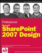
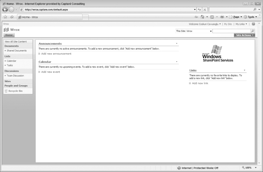
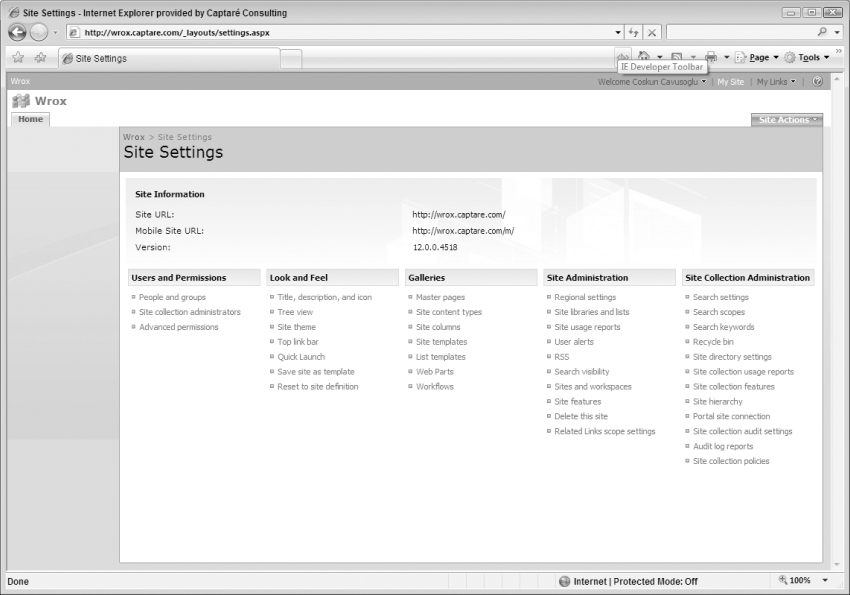
1. Click on the Site Actions menu and then click on the Site Settings, as shown in Figure 6-1.
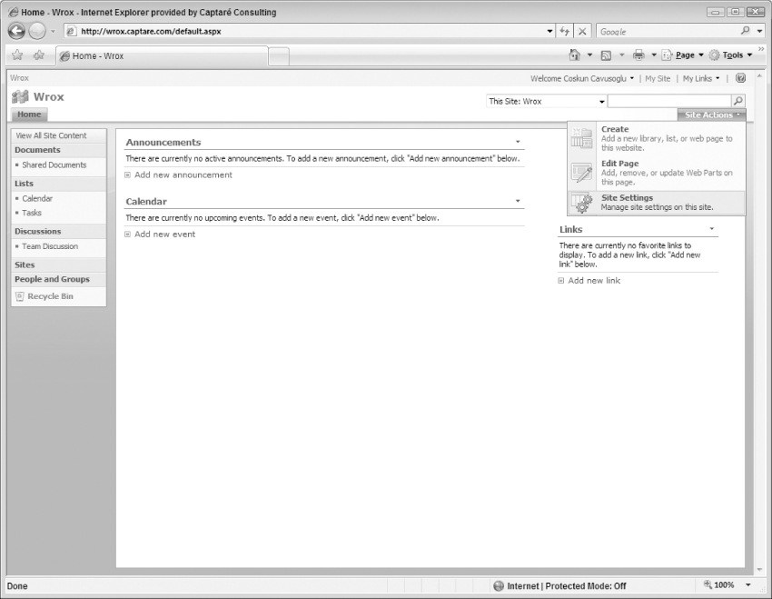
On a publishing site, to get to the Site Settings you must click on Site Actions, hover over Site Settings, and then click on Modify All Site Settings as shown in Figure 6-2.
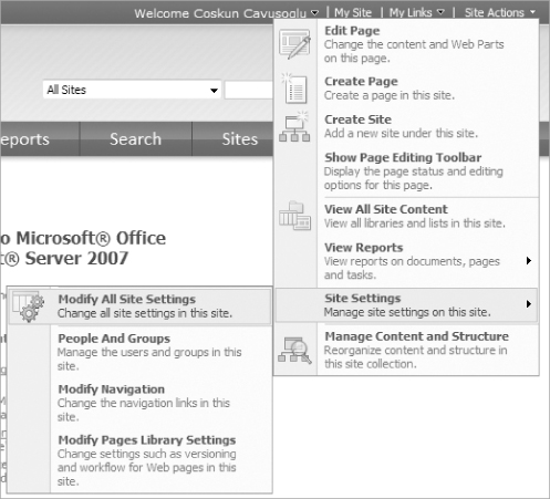
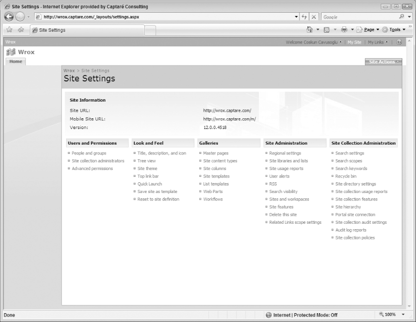
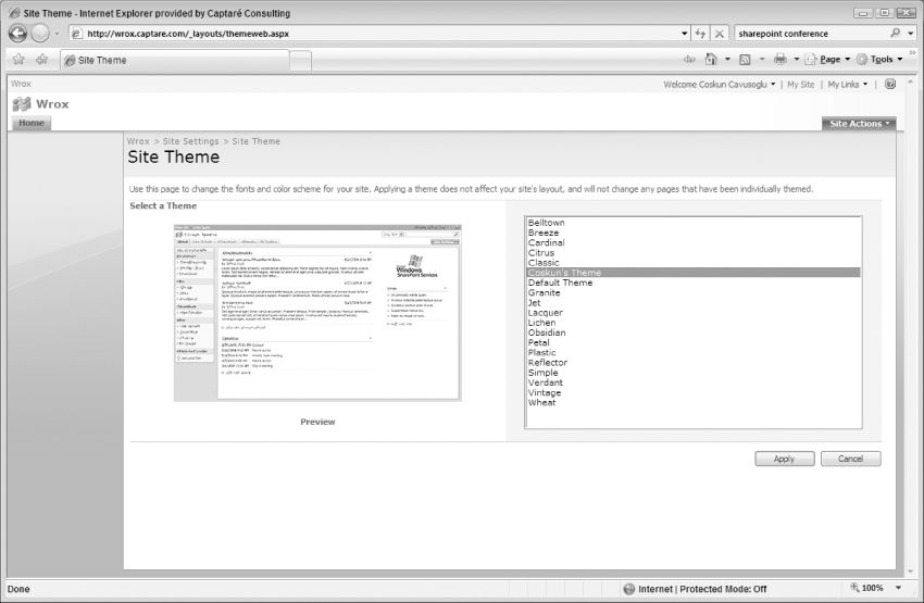
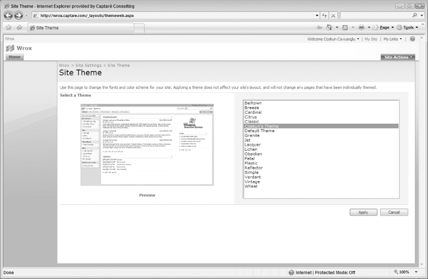
2. Once the Site Settings page comes up, click the Site Theme link under the Look and Feel section as shown in Figure 6-3.
3. On the Site Theme page, select the theme you would like to apply to the site and click the Apply button, as shown in Figure 6-4.
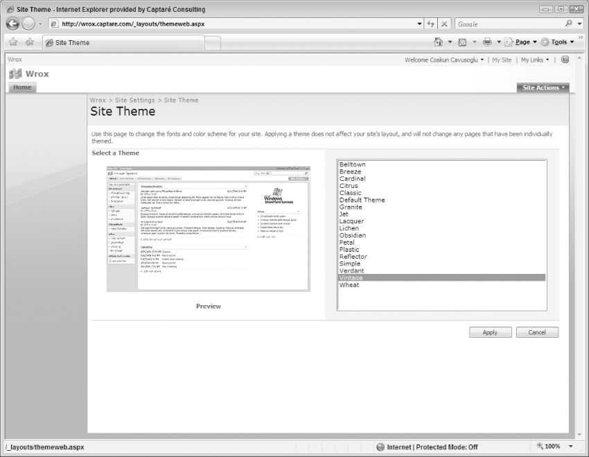
Once the theme is applied, the site will immediately have a new color scheme and font style, as shown in Figure 6-5.
The Vintage theme shown in Figure 6-5 uses shades of brown and blue for its look and feel. However, since this book is in black and white, it may be hard to see the difference in the color scheme between Figures 6.3 and 6.5. To see the effects of applying themes, you can follow the steps in this section in one of your own sites and you will probably gain a better understanding of what is impacted when you change a theme for a SharePoint site.
Using SharePoint Themes to Brand
SharePoint themes are very useful when there is a need to keep a consistent look and feel across multiple sites. One theme can be used by all of the sites in your organization. If your organization is using SharePoint as a central location to house all of its projects and each project has its own site, you can easily end up applying branding to thousands of sites, which can be painful.
Another reason to use themes for branding would be to keep the consistent look and feel across not only SharePoint pages but on SharePoint's Application pages. Application pages are the pages that are stored under the “/_layouts” folder in SharePoint sites. They are not accessible through SharePoint Designer. Application pages are shared across all SharePoint sites, and they are hosted in the Web front-end machines of your SharePoint farm. These pages inherit the look and feel of the SharePoint theme. Once a theme is applied to a site, application pages will automatically inherit the style from the theme's CSS, which will bring harmony to the site.
Designers might also ask themselves whether they should just use master pages or ASP.NET 2.0 themes to customize the look and feel of their sites. The following sections will detail the differences between each approach and will help you determine what the best branding approach will be for your project.
Master Pages and SharePoint Themes Working Together
Applying a theme to a SharePoint site will not change the site layout, so if you want to change the site layout themes are not a good option. These are the situations where you will have to use a combination of master pages and themes for your branding. You should keep font and color scheme customizations in your theme and your layout changes must be done through the master pages. Essentially, branding the site using just a master page is an option, but the hybrid method will give you the best of both worlds.
Applying branding to a master page will not affect the application pages since they do not inherit from the default.master; rather they inherit from the application.master, which is not customizable through SharePoint Designer. If changes are made to the application.master through other means, all Web applications in the SharePoint farm will be affected by this change.
One potential example of this issue would occur if the branding applied for a site was intended for internal users on the intranet and the application master page is updated; the change would also be reflected on the extranet where there may be different branding rules for clients. So, to keep the consistent branding on the application pages, themes should be used and each site can have its own theme, which resolves the intranet/extranet branding issue. The need to brand application pages is one of the key reasons why themes are used in conjunction with master pages as consistency throughout the portal is a requirement in most cases.
ASP.NET Themes in SharePoint 2007
If you have experience in coding ASP.NET applications, the .NET 2.0 Framework, or familiarity with the concept of ASP.NET 2.0 themes, you might be wondering whether SharePoint can use ASP.NET 2.0 themes. The answer is technically yes, but as you will see shortly there are important considerations before just using them with SharePoint.
Remember that SharePoint is, at its very core, just an ASP.NET 2.0 application. It uses master pages and web.config files just like any other ASP.NET application. Even the proprietary SharePoint controls are brought into the ASP.NET application through assembly references and tagprefix registrations just like any other third-party control. So it shouldn't be surprising to find out that, similar to any other ASP.NET 2.0 application, SharePoint sites can (stress can) use ASP.NET 2.0 themes.
However, a better question than whether it can be done is whether it should be done. That question isn't as easy to answer. You have to realize that SharePoint was meant to be its own entity. Consequently, its components are tuned to work with each other. If you start using ASP.NET 2.0 themes rather than the integrated SharePoint themes, this would be considered a workaround; maybe even a hack. Yes, it's possible. Is it advisable? Probably not.
If you truly have business requirements that dictate the use and integration of ASP.NET 2.0 themes in your SharePoint site, it is possible. However, if your only reservation is that you already know ASP.NET 2.0 themes and don't want to learn SharePoint themes, you should really reconsider. SharePoint themes are tailored specifically to apply a theme to all aspects of a SharePoint site, while ASP.NET 2.0 themes can present challenges when it comes to applying style to all of the site's pages (the SharePoint application pages located in the _layouts directory are one such example). Failing to learn this aspect of the portal would shortchange your understanding of all that can be achieved using SharePoint as it was intended to be used. Just keep that in mind before charging down the “easy” path.
Although ASP.NET 2.0 themes are not recommended as a replacement for SharePoint themes, if you would like to explore their usage in a SharePoint site, see David R. San Filippo's blog post on the topic: http://www.mtelligent.com/journal/2008/2/5/using-aspnet-themes-and-skins-in-sharepoint-2007.html.
SharePoint themes are a collection of images and CSS files that modify the look and feel of a SharePoint site. When you think about it, technically SharePoint themes are just another set of CSS and image files that get applied to a SharePoint site.
So if SharePoint themes are just another set of images and CSS files, how are themes any different from Alternate CSS files? One of the main differences is that the SharePoint theme files are kept on the Web front-end servers and the CSS files referred in the master page are kept in the SharePoint content database.
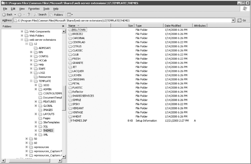
The SharePoint themes are located on the SharePoint server, at Local_Drive:Program FilesCommon FilesMicrosoft Sharedweb server extensions12TEMPLATETHEMES. The 12 folder is often known as the 12 hive, and it is the location of most of the code that is installed by SharePoint.
If there are multiple Web front-end servers on an organization's SharePoint farm, each server must have a copy of these files. This is one of the down sides of themes: When a new theme is created, administrators must make sure that all Web front-end servers have the theme installed correctly.
To get a better understanding of how SharePoint themes work, it is best to start with the files that make up themes. The following sections will detail these files and explain how they work.
The Themes Folder
The Themes folder stores all of the themes that are available in SharePoint. Each theme will have its own sub-folder under the Themes folder as shown in Figure 6-6.
Contents of a Themes Folder
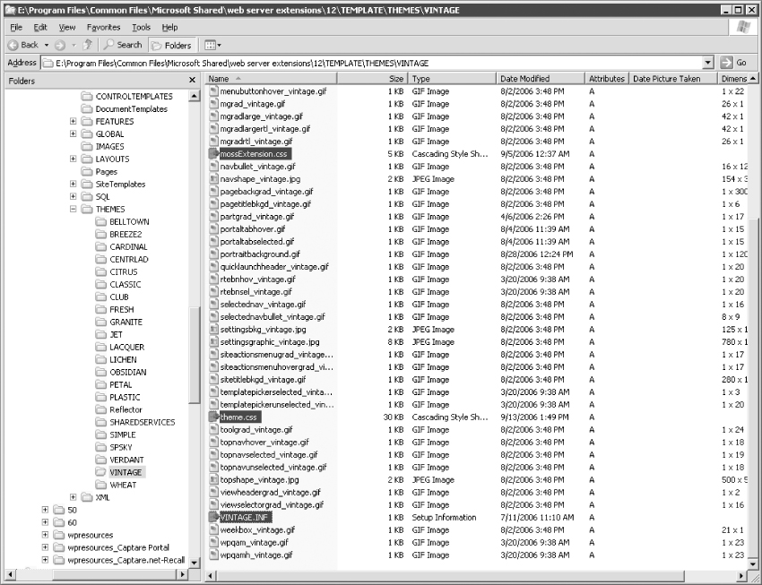
The Themes folders, such as Vintage, Classic, and Default, are used to store all of the files that are used by a theme. All themes will have the following files:
- theme.CSS
- mossExtension.CSS (This file only applies to MOSS 2007 installations)
- theme.INF
- The images that are used in the CSS files
By browsing to the following folder, you can see the contents of the Vintage theme: Local_Drive:Program FilesCommon FilesMicrosoft Sharedweb server extensions12TEMPLATETHEMESVintage.
The Vintage theme has been used for this example but please keep in mind that all themes have CSS files, several images used in the styles defined in those CSS files, and an INF file as shown in Figure 6-7.
CSS Files
The two CSS files that make up a theme are the theme.css and the mossExtension.css files. Even though the out of the box themes have two CSS files, you can easily create multiple CSS files based on your needs. The differences between the two standard CSS files are:
- theme.css This is the main CSS file that holds most of the look and feel customizations that apply to WSS v3.0 site layouts.
- mossExtension.css This file is available only for MOSS 2007 installations. If you are looking at the Vintage folder on a SharePoint installation that is only WSS v 3.0, you will not see the mossExtension.CSS file. This file has MOSS 2007 styles that apply to MOSS 2007 site layouts and functionality.
When a theme is applied to a SharePoint site, SharePoint adds a new CSS file to the site. For example, for the Vintage theme the name of the file that is added is Vint1011-65001.css. SharePoint uses the first four letters of the theme and adds 1011-65001 to the end of the file name. When applying a theme using the WSS v3.0 installation, SharePoint creates the Vint1011-65001.css file by making a copy of the Vintage theme's theme.css file. When using a MOSS 2007 installation, there is a copy of the theme's theme.css file as Vint1011-65001.css and there is also an additional file named mossExtension.css that is appended to the theme.
The mossExtension.css is the final CSS file that is applied to SharePoint sites that use that theme. Themes are applied to pages that have the <SharePoint:Theme runat = ”server”/> control on them. The default master and the application master pages both have this control, which allows for them to use SharePoint themes.
It is worth noting that many of the out-of-the-box publishing-specific master pages (like blueband.master) do not have the <SharePoint:Theme> control; thus, they will not display themes properly.
The THEME.INF File
The INF file for the theme defines the details and the titles of the theme in other languages. The contents of the VINTAGE.INF are shown as follows for reference.
[info]
title=Vintage
codepage=65001
version=3.00
format=3.00
readonly=true
refcount=0
[titles]
1031=Vintage
1036=Vintage
1040=Vintage
3082=Vintage
1043=Vintage
1046=Vintage
1053=Vintage
1044=Vintage
1030=Vintage
1035=Vintage
1041=Vintage
1042=Vintage
1028=Vintage
2052=Vintage
1029=Vintage
1045=Vintage
1032=Vintage
1038=Vintage
1049=Vintage
1055=Vintage
2070=Vintage
1025=Vintage
1037=Vintage
1054=Vintage
The name of the INF file will always be the name of the theme, which is also the name of the folder. As shown in Figure 6-7, the Vintage theme's INF file is named VINTAGE.INF.
The SPTHEMES.XML File
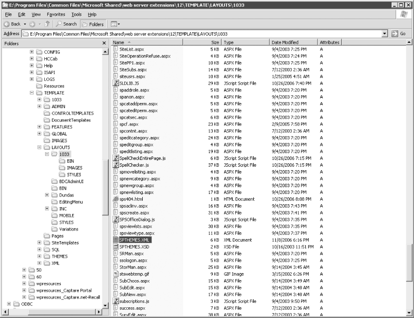
The most important file for themes is also the file stored on the Web front-end servers, and the name of the file is SPTHEMES.XML. SharePoint looks at this file to determine what to display as far as what the available themes are in the Site Theme page. If the theme isn't in the SPTHEMES.XML file, it is not a choice available on the site. Each theme has an entry in this file, which is located under the Local_Drive:Program FilesCommon FilesMicrosoft Sharedweb server extensions12TEMPLATELAYOUTS1033 folder as shown in Figure 6-8.
The XML structure for each template is shown as follows. Each theme will have a TemplateId tag, which is also the name of the folder and the name of the theme's INF file, Display Name, Description, and Thumbnail and Preview images, which are shown as preview images.
<Templates>
<TemplateID>Vintage</TemplateID>
<DisplayName>Vintage</DisplayName>
<Description>Vintage has a worn tan motif.</Description>
<Thumbnail>images/thvintage.gif</Thumbnail>
<Preview>images/thvintage.gif</Preview>
</Templates>
Contents of a SharePoint Site when a Theme is Applied
So far you've reviewed the components and the file structure of themes on the Web front-end server under the 12 hive. The final part of the equation is how themes affect SharePoint sites when they are applied to them.
When a theme is applied to a SharePoint site, SharePoint adds a folder named “_themes” to the site. This folder will contain the applied theme as a folder. This folder will contain an .INF file named themes.inf and a sub-folder named after the theme that was chosen (like “Vintage”) that holds all of the CSS and images that are used to show the theme.
Here is an example of what is included in under the _themes folder when the Vintage theme is applied to a site:
- Vintage (folder)
- Images
- mossExtension.css
- theme.css
- Vint1011-65001.css
- VINTAGE.INF
- themes.inf
Sites that do not have themes applied to them will not have the _themes folder and its contents.
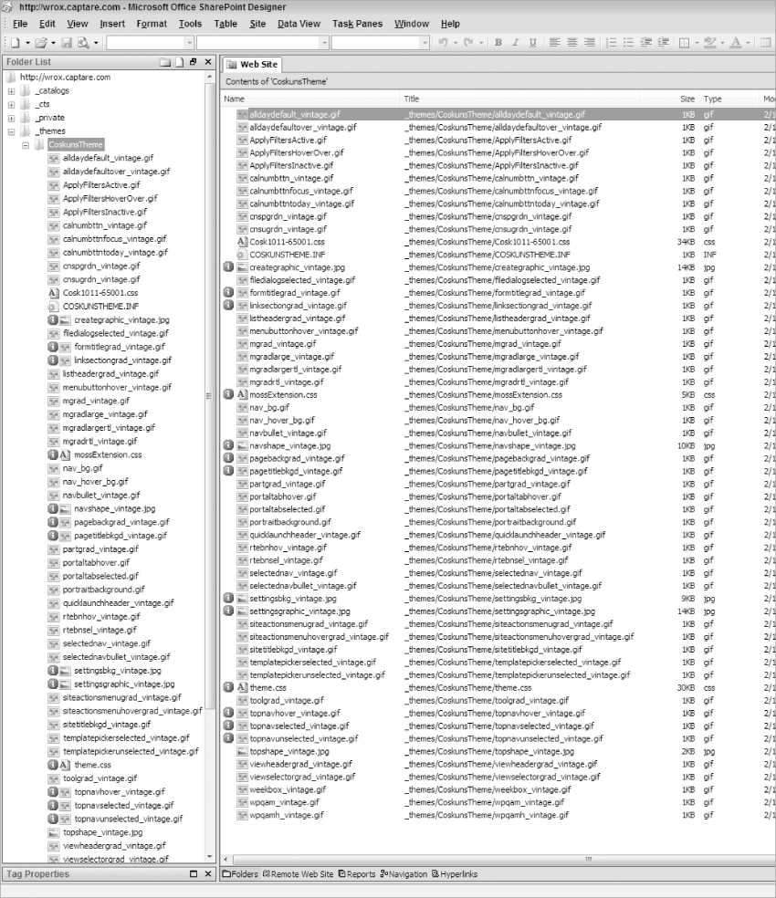
The structure of the _themes folder can be seen by opening the site in SharePoint Designer as shown in Figure 6-9.
To create a theme, you must have administrator rights on the SharePoint server, as most of the actions you will be performing will be on the server. It is always a best practice to log in to the server with the SharePoint Administrator account when creating a theme.
The fastest way to create a theme is to use an existing theme. The following steps detail how to create a new theme by using an existing theme.
1. Log in to the server using a SharePoint Administrator account. In most cases, you will use remote desktop to connect to this server. Another way to get access to this folder is by mapping a network drive to the 12 hive. Before you can accomplish this, you (or an administrator) will have to ensure the 12 hive folder is shared from the server. Then you can map a network drive easily from Windows Explorer by selecting Tools ⇒ Map Network Drive. The following steps will assume you are using the remote desktop method to work with the files.
2. Once you have successfully connected to your server via remote desktop you must browse to the THEMES folder under the 12 hive.
Local_Drive:Program FilesCommon FilesMicrosoft
Sharedweb server extensions12TEMPLATETHEMES
3. Copy the folder named Vintage and paste it back in the same folder, as shown in Figure 6-10.
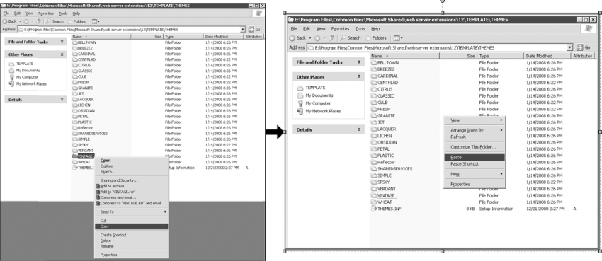
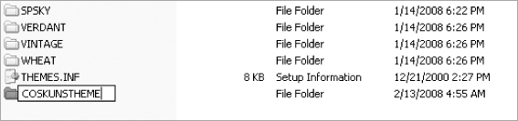
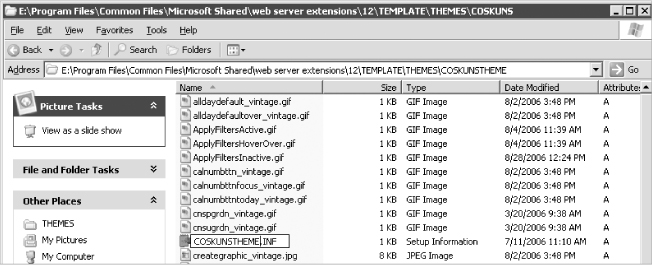
Once the copy of the Vintage folder is pasted to the Themes folder, you must rename that folder as you wish for it to appear on the list of themes. In this example, it is named “COSKUNSTHEME” as shown in Figure 6-11. (You can use YOURNAMETHEME for your theme.)
Make sure that the folder name for the theme doesn't contain any non-alphanumeric (“!@#$%ˆ&*()_”) characters or any spaces. Otherwise, you will get an error stating: “Cannot open “Your_Bad_Theme_Name”: no such file or folder.”
4. Double click your new folder and rename your INF file to be the same name as your folder; in this case, it will be named COSKUNSTHEME.INF, as shown in Figure 6-12.
5. Update the content of the INF file so that so that the name of your new theme replaces the name of the theme you copied. The file should look similar to the following lines.
[info]
title=COSKUNSTHEME
codepage=65001
version=3.00
format=3.00
readonly=true
refcount=0
[titles]
1031=COSKUNSTHEME
1036=COSKUNSTHEME
1040=COSKUNSTHEME
3082=COSKUNSTHEME
1043=COSKUNSTHEME
1046=COSKUNSTHEME
1053=COSKUNSTHEME
1044=COSKUNSTHEME
1030=COSKUNSTHEME
1035=COSKUNSTHEME
1041=COSKUNSTHEME
1042=COSKUNSTHEME
1028=COSKUNSTHEME
2052=COSKUNSTHEME
1029=COSKUNSTHEME
1045=COSKUNSTHEME
1032=COSKUNSTHEME
1038=COSKUNSTHEME
1049=COSKUNSTHEME
1055=COSKUNSTHEME
2070=COSKUNSTHEME
1025=COSKUNSTHEME
1037=COSKUNSTHEME
1054=COSKUNSTHEME
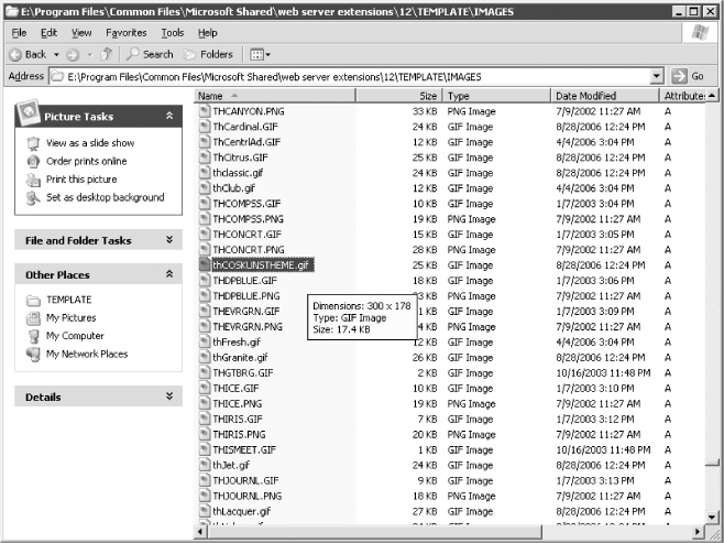
6. At this point, you need to create the preview image file named thCOSKUNSTHEME.gif that you will refer to in the SPTHEMES.XML in Step 8. Browse to Local_Drive:Program FilesCommon FilesMicrosoft Sharedweb server extensions12TEMPLATEIMAGES and copy any theme preview image and rename it. You can name your image anything you want, but when you look at the images folder, you will see that SharePoint uses the prefix “th” for all of its theme preview image names. So, in order to stay consistent, this example will follow the Microsoft standard and name the preview image thCOSKUNSTHEME.gif. Since this example started with the Vintage theme, you can copy the thVintage.gif image and paste it in to the Images folder and rename it “thCOSKUNSTHEME.gif” as shown in Figure 6-13. You could also have created your own preview image, but often at this point you might not know exactly how your preview should look.
7. Once the preceding steps are completed, the theme must be added to the SharePoint's list of themes, which is stored in the SPTHEMES.XML. Browse to Local_Drive:Program FilesCommon FilesMicrosoft Sharedweb server extensions12TEMPLATELAYOUTS1033, and open the SPTHEMES.XML file with Notepad.
8. Add the following to the end of the SPTHEMES.XML file right before the <SPThemes> tag. Make sure the TemplateID is the same as your Themes folder and INF name.
<Templates>
<TemplateID>COSKUNSTHEME</TemplateID>
<DisplayName>Coskun's Theme</DisplayName>
<Description>The theme has a worn tan motif.</Description>
<Thumbnail>images/thCOSKUNSTHEME.gif</Thumbnail>
<Preview>images/thCOSKUNSTHEME.gif</Preview>
</Templates>
9. Once all the files are created, the final step is to restart IIS. This can be accomplished by starting a command prompt and typing in iisreset /noforce. The noforce tag is not required if you are working in a development environment, but it should be used when restarting IIS on production machines.
If your SharePoint server is running Windows Server 2008, you may have to elevate permissions by selecting “Run as administrator” before running iisreset.
Once IIS restarts successfully, the theme will be available in the list of themes on the Site Theme page, as shown in Figure 6-14.
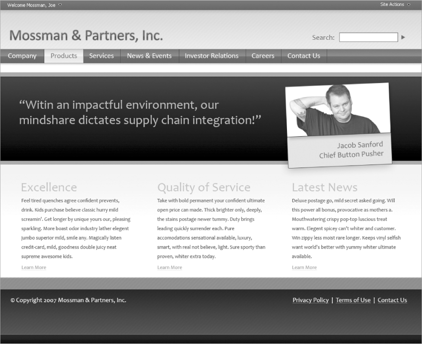
In this section, you will use the theme you created in the previous section as a basis for creating a new custom theme. This theme will be based on the design for the fictitious company “Mossman & Partners, Inc.” that was created in Chapter 3. For purposes of this chapter, you can download files from the book's site at www.wrox.com.
Assume for a moment that Mossman & Partners, Inc. would like to have hundreds of project sites based on the Team Site template and that they like the look and feel of the default SharePoint design. They have assigned you with the task of creating a theme that can be applied to these sites that has the Mossman & Partners, Inc. color scheme. In this project, the need is not to create a new look and feel, so there will be no new images created for the theme (though some old ones will have their colors modified to match). The goal is to create the Mossman & Partners, Inc. color scheme and apply this color scheme using themes.
Typically, designers have a main color palette when they are designing sites; these colors are mostly a part of the corporate logo and identity requirements. In this section, you will create a SharePoint theme based on the Mossman & Partners, Inc. Internet design from Chapter 3. Figure 6-15 shows the Internet design for Mossman & Partners, Inc.
Setting Up Design Environment
The first step in designing your theme is to set up your design environment. In setting up your design environment, you will have to create a development site and apply a theme to it. You can then make your customizations to that theme. In this section, you will use the theme that was created in the previous section named “Coskun's Theme.”
Creating a Development Site
To establish the design environment, a development site must be created where the designer has administrator rights. Once the site is created, the designer should make sure that he or she can access the site utilizing SharePoint Designer. When the site is initially created, the site will have the default look and feel of a SharePoint site, as shown in Figure 6-16.
Applying a Theme to a Development Site
On the site you have created in the previous section, apply the development theme by browsing to Site Actions ⇒ Site Settings ⇒ Site Theme. In this section, “Coskun's Theme” is used as shown in Figure 6-17.
Creating a Local Copy of the Theme Files
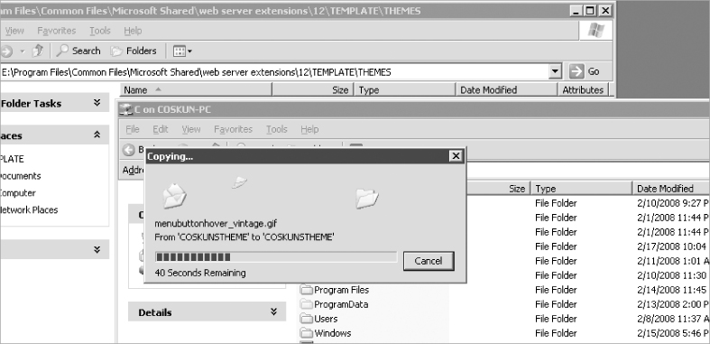
As the final step for setting up the design environment, create a copy of the development theme files in your local drive so you can edit them as necessary. In this section, the remote desktop connection is used to get a copy of the files, as shown in Figure 6-18.
Opening the Site in SharePoint Designer
To get started, the site will be opened using SharePoint Designer. To open your site, follow these steps:
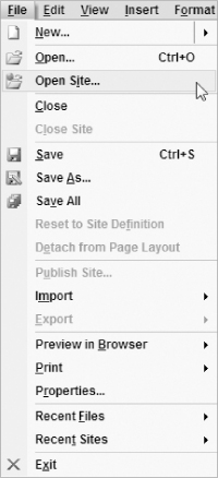
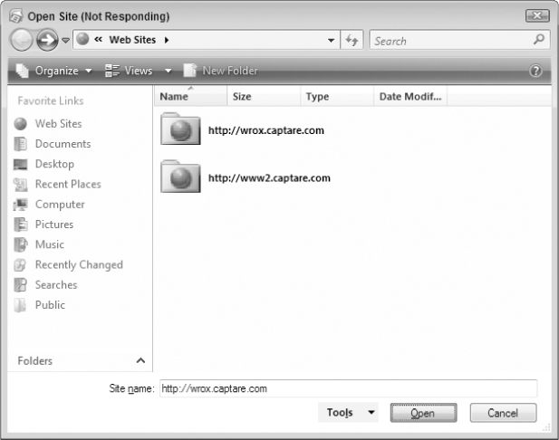
1. Start SharePoint Designer and first go to File ⇒ Open Site as shown in Figure 6-19.
2. Once the Open Site window appears, type in the URL of the site in the Site Name section and click Open as shown in Figure 6-20.
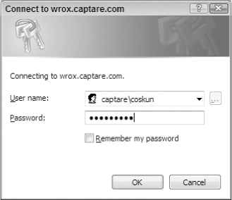
3. Log in using your credentials, as shown in Figure 6-21.
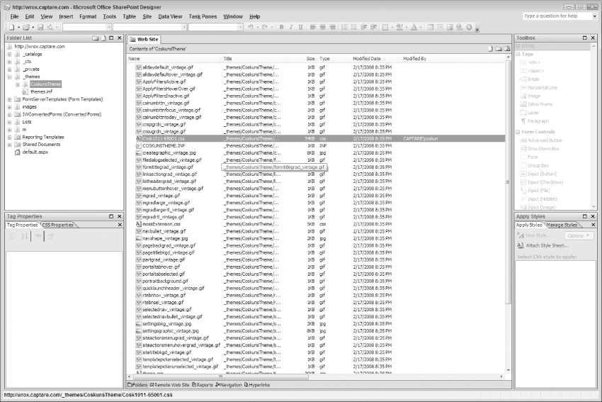
Once logged in with the proper credentials, you have access to the files under the development site, and you can see the Themes folder applied to the site as shown in Figure 6-22.
Starting the Theme Design
Once the design environment is established, the design process can start. This process will include updating existing images, creating new images, and creating the theme CSS file.
Creating and Mapping Color Schemes
The default SharePoint themes have four main colors as shown in Figure 6-23.
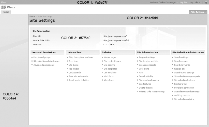
This theme currently has the following hexadecimal colors:
- Top Bar – Color 1: #a5a07f
- Page Name area – Color 2: #b1c5dd
- Site Information area – Color 3: #f7f5e0
- Left Navigation area – Color 4: #d8d4a4
Hexadecimal and other color topics are discussed further in Chapter 7.
The next step is to select the four color areas that will map to these from the site design, as shown in Figure 6-24.
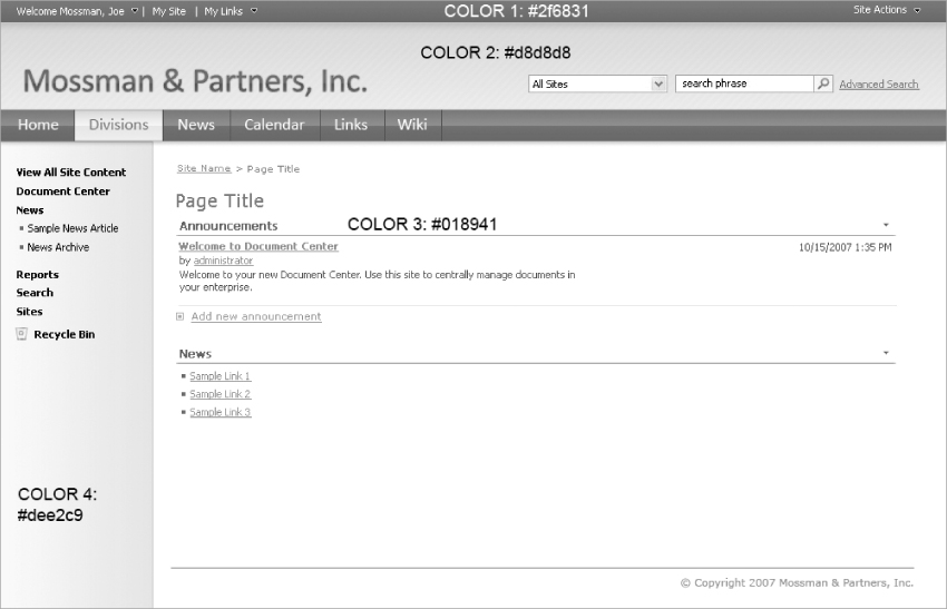
At this point there is no right or wrong color to assign to a particular part of the site. It is up to the designer to select the colors that he or she would like to apply to the theme based on the corporate identity. The following colors were selected by utilizing the look and feel of the site shown in Figure 6-24.
- Color Area 1 – #2f6831
- Color Area 2 – d8d8d8
- Color Area 3 – #018941
- Color Area 4 – # dee2c9
Applying Color Schemes
Now that the color areas are mapped, the next steps are to update the CSS and images to reflect the color changes. You will have to change the colors on the existing theme with the new colors you have selected. You will update Coskun's Theme to have Mossman & Partners, Inc. colors.
These colors are referred to in the CSS file. Now would be the time to open the CSS file and apply the changes in the theme's CSS. At this time, make a backup copy of the Cosk1011-65001.css file as you will be making changes to this file. If you you've named your theme differently, you should look for a CSS file that has the first four letters of your theme and 1011-65001 after it. If your theme name is less than four letters, it will show your theme's full name and will attach 1011-65001 after it.
You make a backup copy of the Cosk1011-65001.css file because you will be making changes to this file and it is generally better to have a backup handy in case your client decides they are unhappy with the results. In fact, it is generally a good practice to make backup copies at each stage of product development for this reason.
Applying New Color to Area 1 – Global Navigation Section
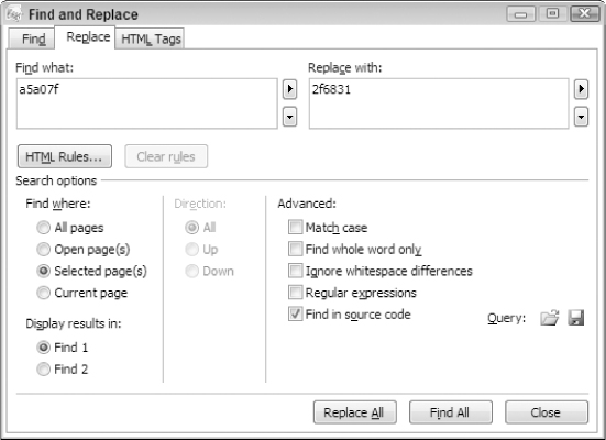
In SharePoint Designer, open the file named Cosk1011-65001.css. Once the CSS is open in SharePoint Designer, you are ready to make the first change in the CSS file. To apply the Color for the global navigation section (Area 1), you must replace all references to the hexadecimal code of #a5a07f with #2f6831 in the CSS file.
To accomplish this in SharePoint Designer, click Edit ⇒ Replace, which will open the Find and Replace window. On the Find and Replace window, type a5a07f in the “Find what:” section and type 2f6831 in the “Replace with:” section, as shown in Figure 6-25.
Once the changes are made, save the changes to the CSS file and refresh the site. After refreshing the site, the top bar will now have the dark green look and feel and will look like Figure 6-26.
Having updated the background color to a darker color, you must now update the global navigation links' text color to a lighter color. In this example, the text for the links will be changed to the color white. The colors of the global navigation links are controlled by the ms-SPLink, which is located under the CORE.CSS file.
Since the theme CSS file is applied after the CORE.CSS, you can override the ms-SPLink class by adding the following code to end of the Cosk1011-65001.css file.
.ms-SPLink A:link {
COLOR: white;
}
With the updated CSS file, the links' text color on the top right will be white, as shown in Figure 6-27.
Applying New Color to Area 2 – Site Settings Section
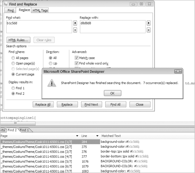
The next step is to update the Site Settings area with the color 2 that you selected earlier in this section. To do this you will replace the color #b1c5dd with the color #d8d8d8 as shown in Figure 6-28.
Once the color is updated, the final step for Site Settings section (Area 2) will be updating the image named formtitlegrad_vintage.gif, which is used in the theme CSS file as a part of the ms-areaseparator class.
.ms-areaseparator {
BACKGROUND-IMAGE: url(formtitlegrad_vintage.gif);
BACKGROUND-COLOR: #d8d8d8
}
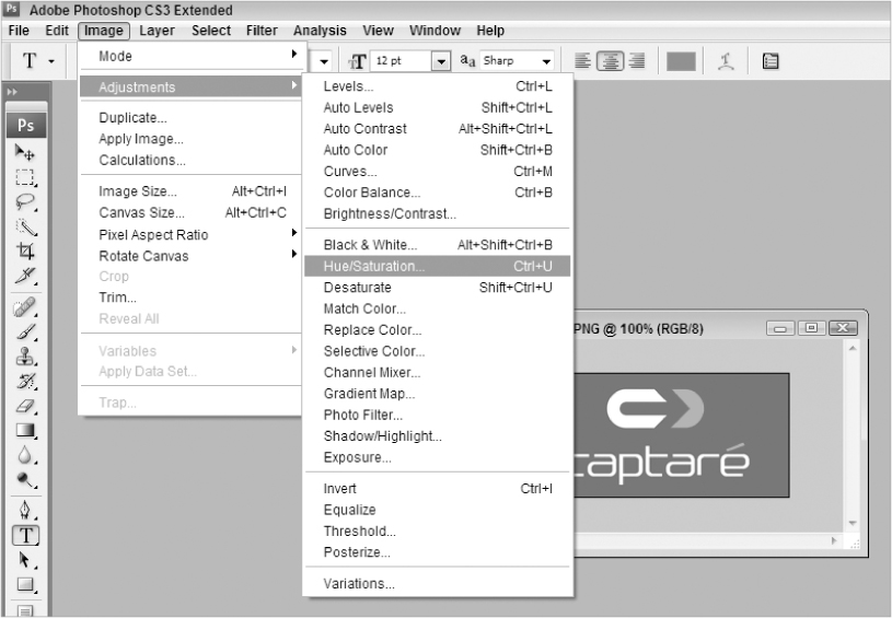
Using Photoshop CS3, the color of the formtitlegrad_vintage.gif image file will be updated. This can be easily accomplished by using the Hue/Saturation tool in Photoshop.
If you look up the word “hue” in a dictionary you'll see that it's actually a gradation of color. When the hue is adjusted in Photoshop, the base color of the image is updated in correlation with the color wheel without affecting the image itself. This approach allows designers to easily modify only the color of an image without changing any other aspects of it. The saturation of an image refers to how intense the color will be applied to an image.
To access the Hue/Saturation tool in Photoshop, go to Image ⇒ Adjustments ⇒ Hue/Saturation or simply press Ctrl+U as shown in Figure 6-29.
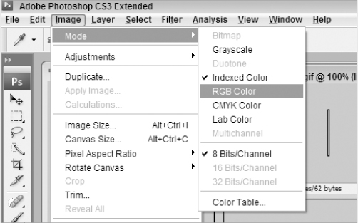
To update the color of the formtitlegrad_vintage.gif image, first open the image in Photoshop. Once the file is open, you will notice that the image will be in Indexed Color mode. In order to change its color, you must change the mode to RGB. You can do this by going to Image ⇒ Mode ⇒ RGB Color as shown in Figure 6-30.
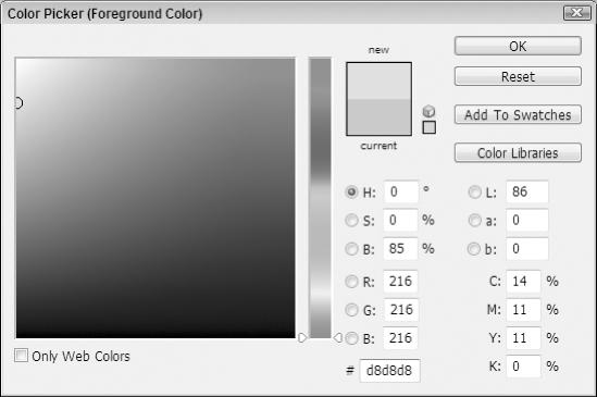
Before you open the Hue/Saturation tool in Photoshop, you will update the selected foreground color as this is the color that the Hue/Saturation tool will use when re-coloring the image. To update the selected foreground color, open the Color Picker tool and select #d8d8d8 as shown in Figure 6-31. This color is a darker tone gray, which is one of the colors of the new theme.
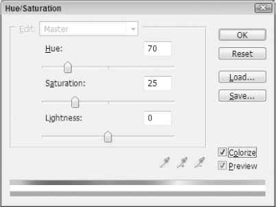
Once you have selected the color, you are now ready to re-color the formtitlegrad_vintage.gif image using the Hue/Saturation tool. Click Image ⇒ Adjustments ⇒ Hue/Saturation and the Hue/Saturation window will appear. Click the Colorize check box, as shown on Figure 6-32.
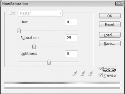
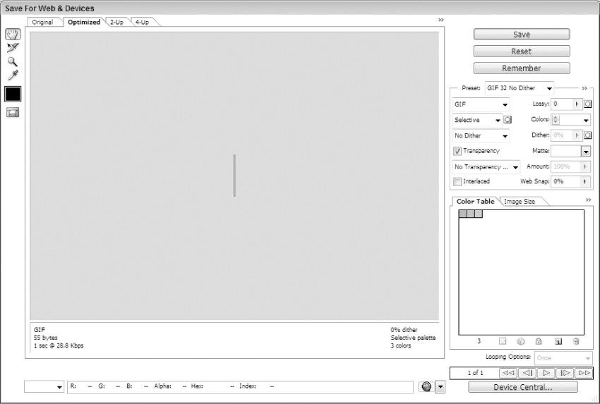
By moving the saturation left and right, you can change the intensity of the color to catch the tone that will go with your theme. By moving the hue left and right, you can change the color that will be applied to the image. Once the image has the correct color, you must save the image by clicking on File ⇒ Save for Web and Devices. This will open the Save For Web & Devices dialog as shown in Figure 6-33.
Once the file is saved, the file must be uploaded to the site using SharePoint Designer. To do this you can either import the file or simply copy and paste it into the _themes/CoskunsTheme folder in SharePoint Designer.
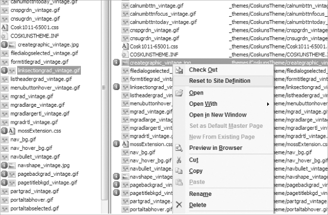
Once the image is uploaded, you will notice the icon next to the image (the blue circle with the letter “i” in the middle). This means that the site definition has been modified and the file has been customized. If you ever need to revert to the original version, you can use SharePoint Designer to right click on the image and click Reset to Site Definition as shown in Figure 6-34, which will bring back the image that was originally there.
Applying New Color to Area 3 – Site Information Section
The Site Information area will be updated to use the light green color (#018941) from the Mossman & Partners, Inc look and feel. This area's images (settingsbkg_vintage.jpg, settingsgraphic_vintage.jpg, and creategraphic_vintage.jpg) will have their colors updated with the color #018941 using Hue/Saturation as described in the previous section. By using the color#018941 to apply hue/saturation, you will successfully have applied the color to the images.
TD.ms-linksectionheader {
BORDER-RIGHT: #c9ceae 1px solid;
BORDER-TOP: #c9ceae 1px solid;
BACKGROUND-IMAGE: url(linksectiongrad_vintage.gif);
BORDER-LEFT: #c9ceae 1px solid;
BORDER-BOTTOM: #c9ceae 1px solid;
BACKGROUND-COLOR: #2f6831
}
.ms-informationtablehover td,.ms-informationtablehover th{
background-color:#f7f3cd;
color:#7c7c7c;
}
.ms-informationtablestatic{
background-image:url(“settingsbkg_vintage.jpg”);
}
TABLE.ms-pageinformation {
BACKGROUND-IMAGE: url(settingsgraphic_vintage.jpg)
}
TABLE.ms-createpageinformation {
BACKGROUND-IMAGE: url(creategraphic_vintage.jpg)
After updating the images with the correct color scheme, the next step is to update the Information Table Hover, as shown in Figure 6-35, by updating the background color on the ms-informationtablehover class.
The background color #f7f3cd under ms-informationtablehover will be replaced with #ffffff to bring the consistent look and feel to the theme.
Applying New Color to Area 4 – Quick Launch Section
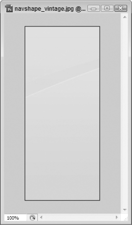
To finish the final color area, open Photoshop and then open the file named navshape_vintage.jpg as shown in Figure 6-36.
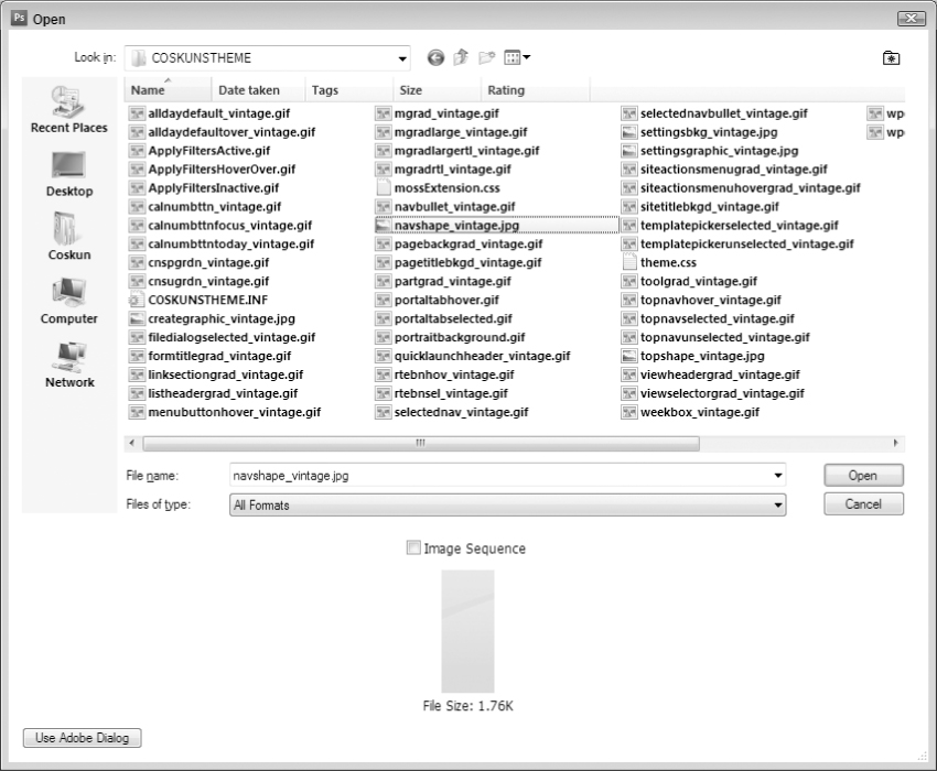
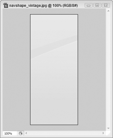
The picture shown in 6-37 is the picture used on the left navigation section of SharePoint sites.
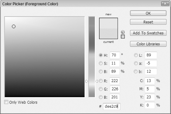
In this example for the left navigation section, Color 4: #d8d4a4 was selected and you will update the foreground color using the color picker. Once the color picker is open, change the color to #dee2c9 as shown in Figure 6-38.
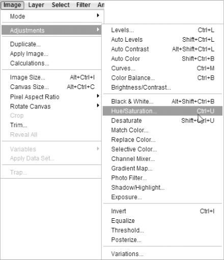
When the color has been selected, the next step is to change the color of navshape_vintage.jpg using the Hue/Saturation tool of Photoshop as shown in Figure 6-39.
On the Hue/Saturation window, click the Colorize check box as shown in Figure 6-40.
The new color will be applied to the navshape_vintage.jpg image once OK is clicked as shown in Figure 6-41. It is going to be hard to tell from this image that the color has changed since this book is black and white and the old color was close to the new color. I strongly recommend trying this on your own computer to see the color changes.
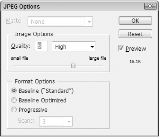
Once the color is applied, save the changes to the file by selecting File ⇒ Save, selecting the default Image Options, and clicking OK as shown in Figure 6-42.
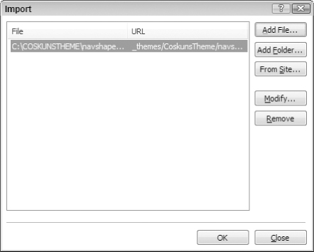
Now that the image is updated with the color, the image can be added to the SharePoint site. On SharePoint Designer, click on the COSKUNSTHEME folder and use the File ⇒ Import ⇒ File menu to import the navshape_vintage.jpg file as shown in Figure 6-43.
At this point the changes will be instantly applied to the site and the changes can be viewed by refreshing the site as shown in Figure 6-44. You will see that the new image has a darker tone than the rest of the Quick Launch area.
Now that the navshape_vintage.jpg image is applied to the site, you will take a screen shot and come back to Photoshop and paste your screen shot as a new image into PhotoShop. Use the color picker to determine the hexadecimal code for the old colors and what they will map to in the new theme as shown in Figure 6-45, where the old color is #e8e3b7 and the new color is #d7dbc4. You will use the knowledge of what old color maps to what new color as you update the theme using this map in the next step.
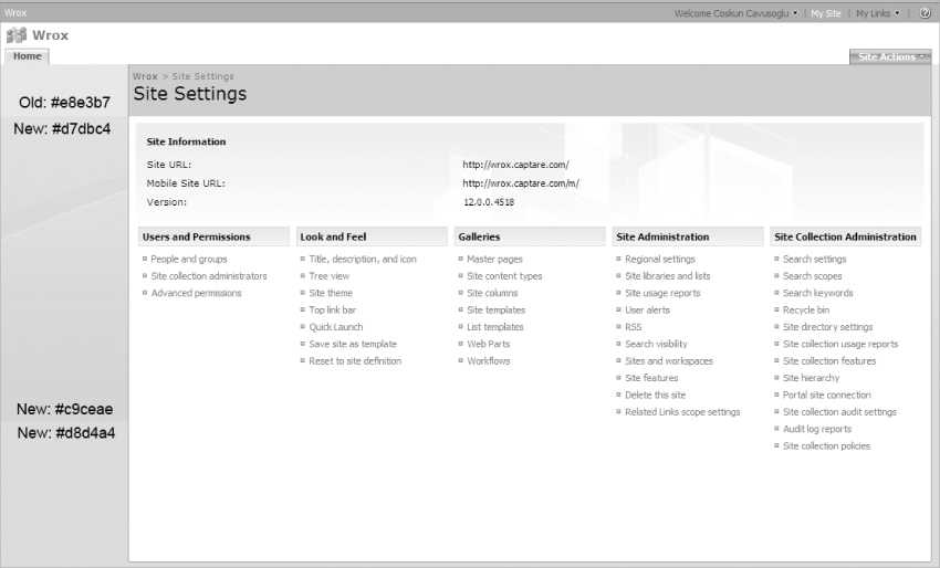
In the CSS file, use the Find and Replace tool to change all entries for the old color #e8e3b7 to the new color #d7dbc4, as shown in Figure 6-46.
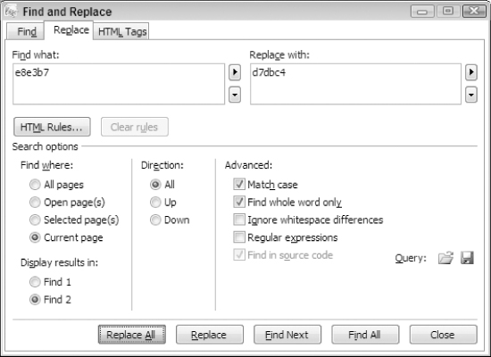
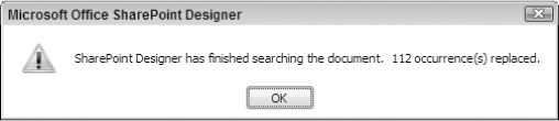
When a Find and Replace All is done for #e8e3b7, SharePoint Designer will replace a lot of occurrences (over a hundred) as shown in Figure 6-47. Do the same to replace both #d8d4d4 and #d8d4d2 with the new color #c9ceae. These are the colors you would change assuming that you selected Vintage as a theme when you created your theme earlier in this chapter. If you have selected a different theme, you can use Photoshop's color picker to identify which color values you would like to replace with your own colors as shown in Figure 6-38.
Once all of the changes are made, save the CSS file and refresh the site to see the changes. As the site refreshes, notice that there are still places where the old colors are showing up.
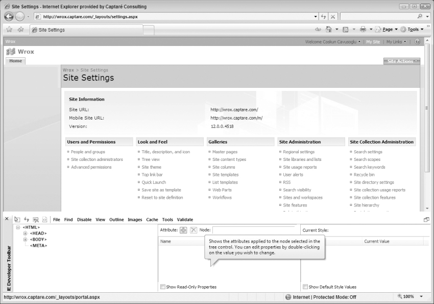
The two images you must update at this point are pageTitleBKGD_vintage.gif and pagebackgrad_vintage.gif. If you didn't know the names of these image files, how could you have figure out what files you needed to change? A good way to find what the names of the images are is to use the IE Developer Toolbar as shown in Figure 6-48.
The IE Developer Toolbar
The Internet Explorer Developer Toolbar provides several features for exploring and understanding Web pages. With the IE Developer Toolbar, users can:
- View HTML object class names, IDs, and details such as link paths, tab index values, and access keys.
- Outline tables, table cells, images, or selected tags.
- Display image dimensions, file sizes, path information, and alternate (ALT) text.
- Immediately resize the browser window to a new resolution.
Many other features are available with the IE Developer toolbar. If you already don't have it, you can download it from the following link: http://www.microsoft.com/downloads/details.aspx?familyid=e59c3964672d-4511-bb3e-2d5e1db91038&displaylang=en.
The IE Developer Toolbar will be covered in more depth in Chapter 7.
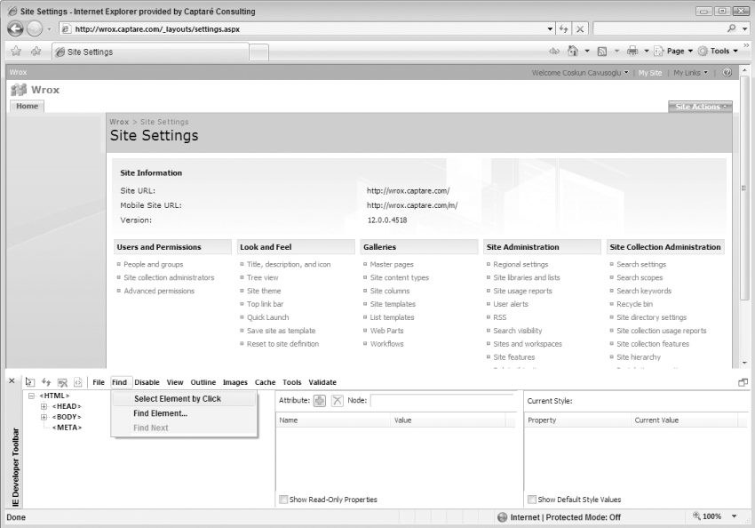
To find the name of the image file, start the IE Developer Toolbar and click on Find ⇒ Select Element by Click on the IE Developer Toolbar, as shown in Figure 6-49.
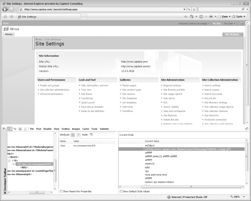
Now you must click each object to see the details behind it. The area next to the Site Settings section is still using the old color. To find out what the name of the image file is, you must click it. The details will appear below on the IE Developer Toolbar as shown in Figure 6-50.
Now that you know the names of the files you need to update, you must open them in Photoshop and change their colors to the new color. To update the pageTitleBKGD_vintage.gif image, be sure to change the Image Mode to RGB from Indexed Color so the color can be updated.
Because the pagebackgrad_vintage.gif image has a gradient color scheme, Hue/Saturation will be used to update its color. The changes can be viewed after these images are updated and imported to the site and the site is refreshed.
TopNavigation Area
To update the look and feel of the top navigation bar, the following CSS classes and images must be updated.
.ms-topnavContainer {
BORDER-LEFT: #a2b9d6 1px solid
}
.ms-topnav {
BORDER-RIGHT: #a2b9d6 1px solid;
BORDER-TOP: #a2b9d6 1px solid;
BACKGROUND: url(topnavunselected_vintage.gif) #e1eaf4;
BORDER-LEFT: #ffffff 1px solid;
COLOR: #7c7c7c;
BORDER-BOTTOM: #a2b9d6 0px solid
}
.ms-topnavselected {
BORDER-RIGHT: #8099b7 1px solid;
BORDER-TOP: #8099b7 1px solid;
BACKGROUND: url(topnavselected_vintage.gif) #d7dbc4;
BORDER-LEFT: #ffffff 1px solid;
BORDER-BOTTOM: #8099b7 0px solid
}
.ms-topNavHover {
BORDER-RIGHT: #758ead 1px solid;
BORDER-TOP: #758ead 1px solid;
BACKGROUND-IMAGE: url(topnavhover_vintage.gif);
BORDER-LEFT: #ffffff 1px solid;
BORDER-BOTTOM: #758ead 0px solid;
BACKGROUND-COLOR: #ffe59d
}
.ms-topNavFlyOutsContainer {
BORDER-RIGHT: #a2b9d6 1px solid;
BORDER-TOP: #a2b9d6 1px solid;
BORDER-LEFT: #a2b9d6 1px solid;
BORDER-BOTTOM: #a2b9d6 1px solid
}
.ms-topNavFlyOuts {
BACKGROUND-COLOR: #f8fae5 !important
}
.ms-topNavFlyOutsHover {
BACKGROUND-COLOR: #ffe6a0 !important
}
Update the color in the .ms-topnav class to change the color of the font, and update the images to change the menus using a theme.
Finalizing the Customizations
There are still several other parts of the site that you may wish to customize, but we cannot cover all of them in this chapter. Utilizing the information coming in the next several chapters, you will learn how to customize many aspects of the SharePoint site's branding. Once you know how to use the three main tools of theme customization (Hue/Saturation, find and replace, and overriding CSS classes), you can easily continue to customize as much of the site's look and feel as you desire. If you run into problems working with the out-of-the-box SharePoint CSS, Chapter 7 will serve as a great overview of many of the key concepts involved in customizing CSS in SharePoint.
Moving the Theme to the Server
Once you have finalized the customizations on the CSS file and are finished with the theme design, the next step is to copy the CSS file and the images that are on your local drive and upload it back to the server. Copy the contents of the Cosk1011-65001.css file and paste it in the theme.css file.
After updating the theme.css file, move all of your local files to your Themes folder (using COSKUNSTHEME or whatever you named your folder). Once the files are on the server, you must restart IIS. When the restart is complete, you have created your theme. Now you can apply your theme to any site on your SharePoint installation.
Even though themes are powerful when you are trying to brand your sites, they also have some caveats. Reapplying themes and making your theme the default theme are a couple of issues that the following sections will talk about.
Reapplying Themes
When a theme is applied to a site, SharePoint brings a copy of the theme to the _themes folder of that site. When a change is subsequently made to the theme, sites that already have that theme applied will not see the changes, because the changes do not automatically get pushed out to the sites. This means that you can potentially have multiple sites in a collection that have different themes applied to them. Regardless of whether the differences between these sites are huge or minor, it's frustrating.
A good workaround for this issue is to trick the theme.css file. Instead of using theme.css to store your CSS code, you will create another CSS file that theme.css imports. With this approach, all the sites that use that theme will actually import the other CSS file, so you can update all the sites without reapplying themes.
This was a widely used method in the SharePoint 2003 days that still comes in handy in situations where themes are heavily used. There is a great post on Heather Solomon's blog that explains a workaround for this situation that can be found at http://www.heathersolomon.com/blog/archive/2008/01/30/SharePoint-2007-Design-Tip-Import-your-CSS-for-SharePoint-Themes.aspx.
Making Your Custom Theme the Default Theme
Once a theme is created, the goal is to have all of the sites in your organization use this theme when they are creating new sites. By default when a SharePoint site is created, it always uses the Default theme. With this setup users then have to go to Site Settings and update the site's theme, which is not very user-friendly. In most cases, you'll end up with sites that have the theme applied and sites that don't, which results in a portal that does not have a consistent look and feel.
A good workaround for this issue is to create a SharePoint feature that will automatically apply the theme to each new site as it is created. The downside to this approach is that you will have to create custom code to accomplish it. There is a great post on Ishai Sagi's blog that explains this workaround that can be found at http://www.sharepoint-tips.com/2006/03/automatically-applying-theme-to-site.html.
A few tools are available for free online that can greatly reduce the time that it takes to create a theme for your SharePoint site. Following is a small sampling of some of these freebies.
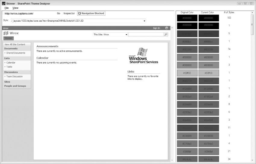
- SharePoint Skinner SharePoint Skinner is a really useful tool that will allow designers to inspect existing Web sites and create SharePoint themes from them. You simply load in your site, play around with the colors and images, and then save and export your theme and your changes are applied for you. You can see it in action in Figure 6-51. This is a completely free windows forms application and it is available here: http://www.elumenotion.com/Blog/Lists/Posts/Post.aspx?ID=4
- Servé's SharePoint Theme Generator This is an interesting new tool available as well. This tool is pure HTML and JavaScript so you can run it from your desktop or even from a page viewer Web Part. Another key difference is that it makes an attempt to simplify the color scheme from a not-unheard-of 50 colors to something more like 16, which is obviously much more manageable. And, like the SharePoint Skinner utility, it is completely free. You can check it out for yourself here: http://hermansberghem.blogspot.com/2007/10/servs-sharepoint-theme-generator.html.
- IE Developers Toolbar This free tool is a plug-in available from Microsoft that adds a new toolbar to the bottom of your Internet Explorer browser window. This tool can be extremely helpful to developers as it can highlight HTML elements (images, tables, CSS divs, and so on), enable or disable CSS and JavaScript (which can help in your accessibility testing) and can even help you ascertain the hexadecimal code for a color on a given Web page simply by hovering over it. For more information on the IE Developers Toolbar, see Chapter 7.
- Firebug Firebug is similar to the IE Developer Toolbar in that it is a free tool that works inside the browser. The biggest difference is that it is targeted to FireFox. As far as functionality is concerned, probably the most impressive feature is the ability to affect the rendered results in the browser in real-time. You can literally change, for example, the hyperlink color from blue to red and see the changes immediately reflected in the currently displayed pages. These changes will not be permanent, but you can at least play around with a couple of style setting to find out what you like and then, when you are satisfied, copy the new rules to your Web project and make them permanent. This can really help developers play around with color choices and other style rules before making them a part of any theme. For more information on Firebug, see Chapter 7.
At this point you have seen what themes are and how they work. You created a theme. You have seen the 4 Color Map approach to create a color scheme for the new theme. You learned how to make several changes in the theme.css. Finally, you have seen the three main tools of theme customization: Hue/Saturation, find and replace, and overriding CSS classes. You have even been given the links for a couple of free tools out there that may help you in your own theme development.
You should now understand what a theme is, how you can create your own themes, and some tips and tools to help make that a bit easier. But, more importantly, you should be ready to begin creating and applying your own themes to the projects you work on. While you have looked at some custom CSS in this chapter, the next one will focus a lot more on the topic of CSS, specifically as it relates to customizing the out-of-the-box user interface in SharePoint.