
TELLING YOUR STORY WITH VISUALS
The whole point of creating web video is to use the power of images to educate, entertain, or motivate your audience. Without compelling visuals, you have just a bunch of talking heads.
Depending on your approach, you may need photos, videos, slides, screen captures, or motion graphics. In this chapter we'll explore the many options for footage that you can use to tell a story. A professional podcast or web video needs the “whole package” to complete the viewing experience.
Web videos take more than just camera footage. The use graphics can quickly provide important information to the viewer.
We recognize that web videos often face a constrained budget. Learning how to make a lot from a little is a key skill for successful publishers. In this chapter we'll explore several options for improving the quality of your web video with effective visuals. We encourage you to implement as many of these ideas as your budget and narrative approach will support.
Working with B-roll
The term B-roll has held many meanings through the history of film and video. It originated in the days where two prints of a film would literally be spliced together to tell a story. During the days of linear video editing, it came to mean the footage playing in a second deck (or B) that was edited into the primary sources or interviews coming from the primary (or A) deck.
The term has been further modified and has come to be regarded as a broad category of footage that is used for a successful edit. As you remove unwanted parts of a performance or interview, you'll need to cover the edits (otherwise it is a jarring edit, called a jump cut). The technique of using a cutaway is a great way to hide unwanted camera movement as well. You can also use it to hide unwanted coughs, ums, and uhs by your subject.
Besides technical necessity, B-roll can significantly add to an audience's understanding and enjoyment. The visuals can help enhance or tell the story besides the on-camera interviews. By showing what is being discussed, your web video moves from being talk radio with visible heads toward the approach of television and film. There are several sources for B-roll, but you need to start thinking about it early on with your productions.
B-roll Acquisition During Production
Be sure to plan ahead. You'll likely have many great things that happen during your shoot. One approach is to capture visuals while you are shooting the principal coverage. This is usually accomplished by using a second camera that focuses on additional footage. For the example of a cooking show, this camera would generally stay close on the hands of the chef as they prepared food; it might also provide close-up details of the prepared food.
Other programs take a parallel approach to capture events that happen related to the video's subject. For example, you might be profiling a topic like car restoration. Although the interview with the subject matter expert can be compelling, adding visuals of the topics being discussed can really improve comprehension and viewer enjoyment.
In both cases, be sure you leave time in the schedule to go and acquire footage. We often bring an extra camera on location so the producer can step away and capture some more footage. This all ties back to the advice of having a multitalented crew. You'll often be able to cut a person free from your set to gather visuals. What's important is that you generate a shot list before the shoot day. List your anticipated needs, and then quickly move to capture the material.
Stock Sources
There will be times when you won't have the time to shoot B-roll. Or maybe it's raining. Perhaps the event being discussed is historical, or on the other side of the world? The bottom line is that you'll often need to get creative in where you find your visuals.
Archive Materials
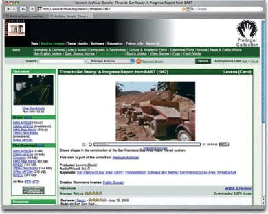
Several high-resolution clips from the Prelinger collection are available at www.archives.org.
There are several sources of publicly available footage that can be freely used in video projects. This material generally comes from government-funded archives (such as the United States National Archives). There may be small fees involved to get copies of footage, but the material can be often used with few or no restrictions. A great place to start your search is www.archives.gov/research/formats/film-sound-video.html. Another place you can browse is www.archive.org, where you'll find several different collections (just be sure to read the usage rights for the footage you want to use).
Trade and Business Groups
You can find professional groups on almost any topic or industry. These groups often have footage or photos that they will share (don't just take it from their website; contact their communications or media relations departments). Additionally, groups such as chambers of commerce and tourism boards often have great footage that they can make available to you. If you're tackling topics like health or education, there are numerous nonprofit groups that can offer you free footage to use (just contact their marketing or public relations departments).
Old Productions
If we are producing web video for a client, we'll often ask for copies of previous videos they've made. This can be a great source for video materials. Your own archive is also a great place to start if you have rights to the images. Be sure to follow the rabbit hole down; you may need to trace a project back to the original vendor to get the highest quality source materials.
Stock Footage
If you can't procure, acquire, or locate footage, you can often buy it. Stock footage costs can vary greatly; the two biggest factors in cost are uniqueness of footage and exclusivity of use. There are several vendors for stock footage. Here are a few that we turn to do the following:
- Artbeats (www.artbeats.com)
- CNN ImageSource (www.imagesource.cnn.com)
- Digital Juice—Video Traxx HD (www.digitaljuice.com)
- iStockPhoto (www.istockphoto.com/video.php)
- Revostock (www.revostock.com)
- Shutterstock Footage (www.footage.shutterstock.com)
Working with Photos
Many web video producers overlook the power of still photography. In our experience, photos are a fantastic alternative to video. Photos are generally easier to find or acquire, and thus less expensive and more plentiful. We're big fans of taking our own pictures whenever possible. Cameras are a great way to bring on shoots, as many are capable of shooting both stills and video (thus a potential solution for the B-roll problem too).
By using stock photos and free government resources, a more visually compelling story can be told.
The amount of royalty-free stock photography sites has boomed, with many offering affordable images or subscription plans. The Internet is filled with thousands of sources for stock photos; a simple web search will inundate you with hits.
Google Image Search Is Not a Candy Store

Just because an image is free to view on the Internet does not mean it can be used freely. We know many producers who turn to web search tools like Google Image Search to find photos for their videos. This is generally illegal and can get you into a lot of trouble. There are many affordable stock photo websites as well as photo communities where images are freely shared. Don't be lazy; it might get you sued.
There are also free sources for images, but you'll often need to do some research. Rather than sending you on a hunt- and-peck mission, let us offer three great resources:
- Richard Harrington Blog. Rich Harrington keeps a list of government websites with images available for free use. You can find the directory at www.richardharringtonblog.com/resources/free.
- Creative Commons. If you are looking for generous folks willing to share their photos, then check out Creative Commons (www.creativecommons.org). Just be sure to check the requirements for an image's use.
- Wikimedia Commons. The folks behind Wikipedia maintain a large catalog of supporting images (and footage). You'll often find the images in articles (be sure to look for the Wikimedia Commons logo and terms of use). You can also access the library directly by visiting commons.wikimedia.org.
Avoid JPEGs at All Costs

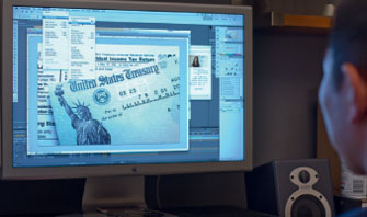
Although not exactly malevolent, JPEGs should at least be considered evil. After all, the file type loses additional quality with each File >Save. The compression scheme used in JPEG files is also problematic when mixed with many common video formats. This can lead to jittery images and flashes. Remember that JPEGs are a web distribution format; the only reason some digital cameras use JPEGs is that they are targeting consumers or trying to reduce the cost of storage media. You should either shoot your images as Camera Raw files or batch convert your JPEG files to an uncompressed format like TIFF or PSD. Trust us when we say avoid JPEGs.
Enhancing Images
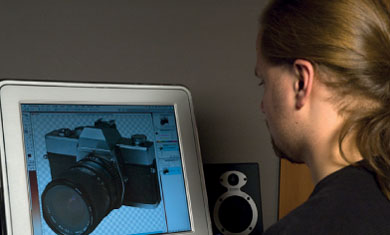
We've never come across a direct-from-camera photo that couldn't be improved. Some of the most common adjustments to photos intended for podcast screens are boosting the saturation and adjusting the gamma or levels for the image. The number one software application for these tasks is Adobe Photoshop. If you need to prep images for use in video, be sure to check out the podcast and the book called Photoshop for Video. There's lots more information on preparing still images for use with digital video.
Resolution Requirements
For maximum image clarity, it's a good idea to properly size your images to match your editing screen size. Otherwise your editing software will have to scale the images. This leads to an increase in render times and a major drop in image sharpness. Although there are several ways of doing this, one of the easiest is to use Adobe Photoshop. A fast way to do this is using the Image Processor Script (File > Scripts > Image Processor). With it, you can target a folder of images and set a target output size.
Creating Moving Footage
One additional technique when working with stills is employing motion control to animate your photos. Some users call this the Ken Burns effect. By animating a photo, you can create zooms and pans to help guide the viewer's eyes through a photo. This technique has been popularized by many documentary filmmakers and is quite effective.
In our opinion, the best way to do this technique is with Adobe After Effects. It offers precise controls and advanced options to make simulated camera moves appear more natural. These techniques can be accomplished in most editing tools, however, through the use of keyframes or specialized plug-ins.
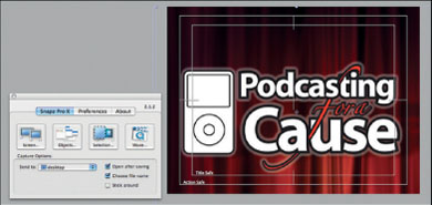
Want to Move Pictures?
![]()
For a free web tutorial on Motion Control techniques with After Effects, visit Creative Cow's website at library.creativecow.net/articles/harrington_richard/doc_style.php.
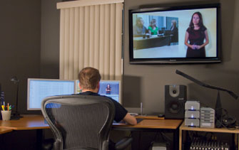
Working with Screen Captures
If you are producing technical training video or need to show something like a website or a video game, then you'll need to use a screen capture tool. There are software programs that allow you to record what is happening on your computer's screen. The software can create a video file and store it on a hard drive so you can edit it with your nonlinear editing software. Let's start by looking at some of the popular tools.
Screen capture software is needed if you want to record a computer screen for creating how-to tutorials or demonstrations.
Software Choices
Although there are several choices out in the market, a few really stand out. The Macintosh platform has several more options than the PC world (go figure). Here are a few proven ones that do a great job:
- iShowU (www.shinywhitebox.com). This tool creates remarkable computer screens for Mac users. It is reasonably priced and does a great job of writing files to disk as it captures (which makes them ready to use in moments).
- Snapz Pro (www.AmbrosiaSW.com). This is another Mac-only tool for capturing both static and motion screens. This tool is very established, with many users. We prefer it for capturing stills, but find that it waits until you stop capturing to write to disk. This can hog RAM and can be quite slow.
- Screenflow (www.telestream.net). This tool is really an all-inone suite. Although it captures the computer screen, it can also record a video camera and even build basic graphics for keyboard shortcuts. The tool is Mac-only, but it is a popular solution for screencasters.
- Camtasia Studio (www.techsmith.com). This is a cross-platform solution that writes very small files. It can then write out to virtually any video format.
- Screenr.com (www.screenr.com). This web-based application is a free option for recording the screen. Although you are limited to five minutes, you can post directly from the site to YouTube or Twitter. You can also save the file to your computer for additional editing. We find this cross-platform application works best with the Firefox web browser.
Capture Strategies
We have found that getting high-quality screenshots can be tricky. Fortunately, we've had lots of practice in working with these tools. There are several factors that contribute to success. Here's some hard-earned advice we've found over the past five years.
To use screen capture tools, you'll need a pretty powerful computer. Be sure to boost your system's RAM; screen capture software needs plenty of it. You'll also want at least a 128 MB graphics card. A dedicated-capture hard drive (preferably a high-speed RAID) connected via FireWire or SATA is also needed.
If you'd like to get the best results, capture at the size you need. For example, use the square pixel equivalent of 640 × 480 if you are editing a 4:3 podcast. It's important to note that you may need to use a higher resolution monitor setting, such as 800 × 600 or 1024 × 768. If this is the case, you can compress the files after capture and resize to a nonsquare pixel size like 720 × 480. If working in HD, then be sure to use a 16:9 aspect ration (such as 1280 × 720 or 1920 × 1090).
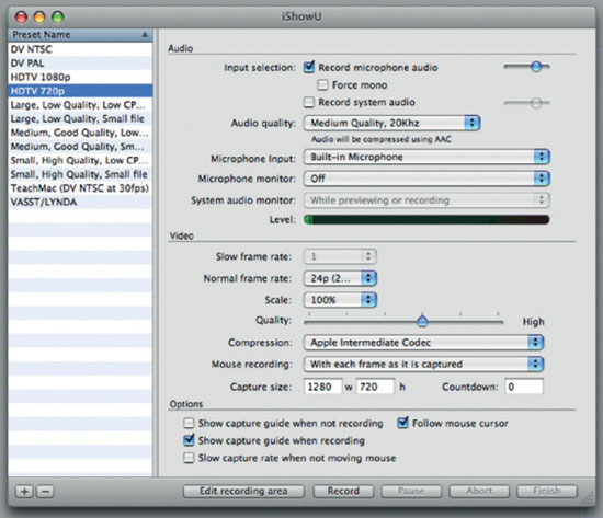
iShowU can capture full-screen video at standard frame rates including 24p.
If you'd like to have more flexibility during the edit, you can instead capture the video larger than you need. Then simply bring the video into a resolution-independent nonlinear editor (such as Premiere Pro or Final Cut Pro). These types of nonlinear editing packages allow you to load images that are bigger than standard video sizes. Once you've edited the screen capture in your timeline, you can apply scale and position values to adjust what the viewer sees.
One area that can be problematic with screen capture is frame rate. Some software tools support capturing at video native frame rates. However, you really need a powerful computer to perform these styles of capture. If you can't get a consistent frame rate, we recommend running your captured files through a compression tool and converting to a consistent frame rate. Ideally your file will end up at 29.97 or 25 frames per second (fps) to match NTSC and PAL, respectively, or the newer 23.98 fps, which is used by most 24p cameras.
If you need to capture a computer screen, you'll need to avoid the DV or HDV codec. A codec is a video format's compressor/decompressor. For best results, you'll want to minimize the compression applied to the screen capture. Be sure to check which “uncompressed” formats your nonlinear edit system supports.
Final Cut Pro Quality Control
Be sure to open your sequence settings in Final Cut Pro (Sequence > Settings). If you're using screen-captured files, click the Video Processing tab and change the Motion Filtering Quality pop-up to Best.
Analog Screen Captures
Sometimes, capturing a computer screen using a software tool will be impossible. For example, you may need to record the screens of multiple presenters at a conference or you may have to capture a video source directly from a projector. Don't worry; this too is possible if you use an analog video capture device. The biggest drawback is that the files will likely be larger and a little less clear than the software capture tools.
To successfully capture a computer screen's analog signal, you'll need the following:
- A computer that is capable of mirroring its video output so you can see what you are doing on the computer's monitor and still drive an image on a plugged-in device such as a projector or a second monitor.
- A scan converter that lets you feed in the computer's image via a VGA or DVI connection and then converts the signal into analog video. These devices are readily available if you are looking for an S-video connection type. For maximum image quality, however, you should look for a scan converter that offers a component connection such as those from Comprehensive/Kramer.
- A video capture device that accepts analog inputs. Ideally this device will allow resolutions above DV compression. You may already have a device like a capture card or breakout box that allows you to capture directly into your computer. Slightly less desirable, you could record to a high-quality tape format and then capture.
- High-speed hard drives that can work with the uncompressed video. It's important to note that the files can be quite large and demanding if you are used to a DV or HDV workflow.
- Editing software that supports an uncompressed workflow. You will want to have very high quality sequence settings so the screens are as easy to see as possible.
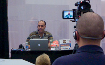
Working with Speaker Support/Slides
Many presenters use slides to reinforce key points as they talk. Common software tools include Microsoft PowerPoint and Apple Keynote. These tools can be used to create text and informational graphics that can be quite effective. When used correctly, you can create informational graphics that match the quality of broadcast news. Although these programs can create effective visuals, you'll need to process the images a bit to make them ready for web video.
Be sure to leave a slight pad around the border for all slides. These edges make it easier to read on a smaller screen by allowing a margin.
Design Slides Properly
By default, most slides are not optimized for video. Text can be hard to read, or even get cut off. Don't worry. It's a pretty easy fix; just follow these guidelines:
- Don't go too close to the outermost edge. Leave at least a 10% margin around the outside edge of the screen.
- Simplify your message. Try reducing the length of your bullet points and spreading your slides’ content across multiple slides.
- Increase the size of your type. The web video is often played back on a small screen; use a larger and thicker font.
- Increase contrast of the text to the background. For best results, try using light text over a dark background.
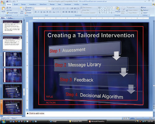
Export Still Graphics
To use slides in a video-editing tool, you'll need to convert them to a standard graphic file format. It's important to note that you won't be able to edit the content of these exports. Be sure to proofread your slides before export and to keep a copy of the original around in case changes become necessary.
Microsoft PowerPoint
Microsoft PowerPoint makes it easy to save your slides as graphic files. PowerPoint supports seven different graphic formats, including the versatile TIFF and PNG formats.
1. To save your slideshow as a series of still graphics, open your presentation in Microsoft PowerPoint.
2. Click the Office button and choose Save As Other Formats. Near the bottom of the Save dialog box is a Save as type: drop-down menu. Pick the file format you need (such as TIFF).
3. Specify a location for the files on your hard drive and click Save.
4. PowerPoint then gives you three options: export Every Slide, Current Slide Only, or Cancel.
Apple Keynote
If you are using a Mac, you should strongly consider using Apple's Keynote application, which is part of iWork. This program is similar to PowerPoint (and can even open PowerPoint files). To export slides, simply choose File > Export. There are two key differences that make Keynote desirable for preparing slides for a podcast.
- Keynote anti-aliases the text on the slide. This process helps reduce flickering text and makes it look better on a video screen.
- Keynote can export slide animations (such as charts) in a QuickTime format. This adds a lot of life to your podcast.
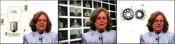
Motion Graphics
Getting your web video graphics to look their best and work effectively often comes down to how they are designed. It is important that your graphics are easy to use and modify, as well as look great on their intended playback devices.
The advice we offer here is specific to web video graphics. However, if you are inexperienced with broadcast graphics, we strongly recommend additional reading and practice. See the advice in this chapter as being the essential information. Here are the key points we've learned when designing graphics for web video and podcasting.
Screen Size
Web video graphics often play back at a small size (such as a width only 320 pixels). Even though many web videos are produced and delivered in HD, the maximum screen resolution that most watch is only 640 pixels wide.
What quickly becomes apparent is that you should build your graphics to match your editing (and not delivery) standard. This means use the presets that match your shooting format. All motion and standard graphics applications offer templates or preset settings to simplify this process.
We recommend building your podcast graphics at standard video size, then edit with your video. You can always resize the entire episode after editing with compression software.
As such we usually build the graphics to match the acquisition format (such as 720 × 480 with nonsquare pixels for NTSC and 720 × 576 in nonsquare pixels for PAL). We assume that the show is probably going to get reformatted and could end up on a DVD or even be broadcast. Working at the size at which the video was acquired speeds up editing and rendering times.
Codec Issues
The video camera you use will often highly compress the footage as it shoots. For example, if you are shooting video using mini-DV, DV Cam, or DVCPRO 25 formats, you are likely using the DV codec in your sequence. This codec is essentially throwing away three-fourths of your graphics information, “smooshing” your graphics to heck. It would be the equivalent of shooting a beautiful photo with your digital camera and then only being able to deliver it at a JPEG set to low quality.
The graphic on the left is an uncompressed original. The one on the right has standard DV compression applied. The differences are subtle, but they are most evident in the small text details and glowing areas.
There are two ways to work around these limitations:
- Mixed formats. Some nonlinear editing systems allow you to mix resolutions in the timeline. In this case, your footage can be heavily compressed, whereas graphics use a lower-compression format.
- Switch settings. If your sequence doesn't support real-time performance with mixed formats, then you should edit your video in the correct native editing (matching sequence settings to the primary camera acquisition format). Once your content is locked down, you can add your graphics. At the end of the production, switch your sequence settings to an uncompressed codec for finalizing. This way when you export your self-contained QuickTime movies to compress them for web delivery, they come out very clean.
Remember that the goal with video compression is simple: start high, and finish low. The better quality image you feed into the podcast compression software, the cleaner and smaller file you'll get out. The original file doesn't need to play back smoothly; it only needs maximum image quality.
The codecs used for web delivery are primarily designed for video sources (and not graphics). As such, there are a few things to consider when building motion graphics. If your compression software encounters really flat areas of color, it will often try to oversimplify the material and overcompress it. Many graphics will look terrible because they've been overly compressed. We get around this by putting a little texture or gradient into the graphics. Another way to improve quality is to use motion blur. Modern video codecs can support relatively fast motion.
Kiss of Death
The digital video codec instantly throws away three-fourths of the work you've done and makes it look terrible. Be careful if you're working with DV footage; do not finish your sequences using the DV codec.
Motion Blur Can Be Good
Most motion graphic applications support the use of motion blur. This rendering option adds a gentle, directional blur to fast-moving objects. If you don't use motion blur, your graphics may actually compress poorly for the web because video codecs are designed to work with video most often. In the real world if you're shooting with a video camera, if something's moving fast, it has motion blur.
Font Selection
Fonts are critical to a successful design. Be sure to invest in a font for your web video that is unique (and that didn't come preinstalled with Microsoft Office). You need to find a visual identity for your podcast, and good use of type is an easy way to do it. Yes, you're going to have your favorites—your classics—but you need to find a font that gets used for show titles that complements the logos, the set, and the colors in your graphics.
Take a look out there; there's a typeface that has your video's personality. Something that is unique and helps convey the character of your show. Here are a few of our favorite type foundries:
- Chank (www.Chank.com)
- Dinctype (www.girlswhowearglasses.com)
- Blue Vinyl (www.bvfonts.com)
- Acid Fonts (www.acidfonts.com)
- Fontalicious (www.fontalicious.com)
Find a Video's Personality
When we start a new video project, we try to get the client or those involved to describe the video with adjectives. We call it the adjective game. We ask for 10 to 20 words to describe how the video should feel. These words can be used to help you select your font choice (as well as everything else after that). The font choice is one of the biggest things that impacts overall style and truly sets the tone for your graphic identity.
Text Placement
Remember that web videos are often viewed at a small size. Be sure to set your display window to a lower magnification to simulate viewing the video on a smaller screen. Be sure to make the text larger and easier to read.
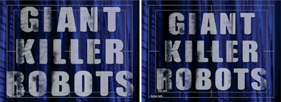
The graphic on the left keeps all text within the action Safe zone used by broadcasters (the innermost 90%). in traditional video, text and logo elements are kept within the title-safe area (the innermost 80%), as shown by the graphic on the right.
In broadcast graphics, designers usually use a safe title grid that identifies two zones: title safe, which is the innermost 80% of the graphic and where all text should fall, and action safe, which is the innermost 90% and where all essential design elements should fall. In broadcast, if these are ignored, text can become difficult (or even impossible) to read on a television.
Mixing Cases
We often recommend a mixed approach when choosing font case. If you have larger enough letters, you can use a mixture of upper and lowercase letters (which will be easier to read). This gives you better variation between individual letter shapes so the human eye can more quickly read it and cognitively process the information. If you have a very small space, then you might switch to a small caps style. This will switch all of the characters to uppercase but will leave the capital letters larger. This takes up less space, but you need to leave the graphic up longer because it takes more time to be read.
For podcasting, you can treat the action-safe guides that most graphics programs offer as your title-safe zone. Go all the way out and just leave a 10% margin around the outside edge of the podcasting graphic so the text doesn't get hard to read by being too close to the edge of the computer screen or the edge of the portable media player. By keeping all text within these guides, you ensure that it is easy to read on the portable screen or computer. However, if your show is going to be used in both traditional and podcasting situations, you may need to create two master sequences for the different graphic standards.
Contrast
How does the graphic hold up when you remove color and just look at contrast? The middle of this animation looks a little low contrast, but where it really matters for the end sponsor logo, contrast is proper.
With web video graphics, contrast is key. Does the graphic still work when you remove color? If it does, this means that you have proper contrast and you are ensuring that your audience has an easier time comprehending the information.
You'll want to check your graphics in grayscale mode. If they're still easy to read, then they're easy to read. One way to do this is to add an adjustment layer in your graphics application with a hue/saturation effect. By pulling down the saturation, you can strip out the color.
Another way to accomplish this is to print them out in gray-scale mode to a printer. These are both simple, but good tests. If the graphics hold up, then you've got a good balance of contrast and luminance. Proper contrast is essential, as it affects how easily the viewer can comprehend the information.
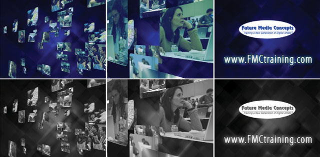
Busyness of Background to Foreground
For this video, it was important to find the right balance for the background images. The client wanted to create an active virtual world, but also communicate several ideas.
In recent years, the evolution of the stock animation market has led to a terrible problem. In the quest to stand out from their competition, several manufacturers of stock animation have made their backgrounds more and more elaborate. As such, we've gotten to the point where backgrounds are too busy and compete for attention with foreground elements such as text. A background is just that, a background. We find an easy solution is to blur and darken our backgrounds.
Power Windows
We often use a power window (or a vignette) around the edge of the screen. This can be an effective way to draw a viewer's eye to the center of the screen. We do that because people watching videos on mobile devices often have lots of things around to distract them. The more you draw their eyes to the middle of the screen, the more they're watching your content.
Type on Pattern
Related to both the contrast and busyness of the image is the type-on-pattern issue. What often happens in video is that text is placed over a busy or moving background. As such, white text can intersect with a bright area in the background and become difficult to read. This problem is easy to address.
First make sure that your font choice is relatively thick. A heavier font will hold up better on the video screen. Then add a contrasting edge such as a stroke or drop shadow. Light text should get a dark edge, whereas dark text should get a light edge. Take advantage of contrasting edges to make the text easier to read.
The use of a solid bar helps the text stand out to the podcast viewer (even when viewed at a small size). The use of uppercase letters was a stylistic choice, but it also helped readability and kept the text blocks more compact. Finally, a drop shadow was added to some elements (such as the logo) to address the moving background.
Additionally, try to keep lines of text shorter. This is because of how web videos are viewed. For example, on the small screen of an iPod, larger text in smaller blocks is easier to read. A viewer watching on a laptop may blow the video up to full screen. In this case, it's going to get pixilated. If the font is thicker and has contrast, it won't fall apart as badly. Fortunately, these guidelines work well for both viewing scenarios. In a confluence of circumstances, thicker, larger text generally holds up better through compression and at scaled playback sizes.
Testing Graphics
If you want to see how your graphics are going to look on the web, then you need to test them. We subscribe to the belief of pushing graphics to the point that they break, then backing off a “few feet” and you're good.
Most people subscribe to an overly conservative view of the web, which is, “Oh, we want to serve the least common denominator.” They're concerned that a person standing on top of the Colorado Rockies with an Edge cell phone connection can view a high-definition video and have a pleasant experience.
Screw that. This is not your target audience or whom you're trying to please.
If your primary audience is people in office buildings, go to a couple of office buildings and look at the video. If you want to see what it looks like online, drop it to your private YouTube channel at low quality and take a look at it. Put it on a portable player and look at it.
We test our graphics throughout. As we are starting to build things we do test compressions along the way. Closely examine the effects of compression, then make decisions.
With animated sequences, the “read-aloud” rule still applies. Be sure your audience understands each element by giving it enough time to be easily read twice, out loud.
Read Times
Many motion graphic designers and editors seem to forget that graphics are actually meant to be read by an audience. The idea with read times is that you want to be able to read the graphic out loud, preferably twice before removing the graphic. This is an old broadcast standard for a good reason.
Unfortunately, most motion graphic designers are watching their motion graphics play back at less than real-time speed. Instead, they choose an arbitrary number like three seconds. Remember, you are adding graphics to enhance the viewer's understanding. Allowing the graphic to be read aloud twice ensures that the viewer has enough time to read the graphic while still absorbing the other information being presented simultaneously by the host or B-roll.
Creating a Graphic Identity
If you want your web video to stand out from the clutter, motion graphics are the way to succeed. By giving your show a polished graphical identity, you make it easier for your audience to connect with your program. Even more important, because video-sharing site viewers will typically outnumber viewer's on your website, a graphics package helps establish the author and sponsoring organizations.
Who Are You?: Production Company Credit
We are big proponents of following broadcast standards. At the end of nearly all network programming is the production company logo. We always try to place our logo at the end of programs we work on (at bare minimum, our company's name in the show credits). We make the argument that it's just like a broadcast TV show, where you see the production company logo at the end. In our minds, this adds a professional feeling to the entire package, and it is certainly a benefit to the production company.
A well-designed graphics package can help establish the topic of your show as well as reinforce its personality and style. The show's graphics essentially create its brand. This is essential to both attracting and maintaining your audience.
Flexibility
It is essential that your graphics be easy to modify. You'll often need to make tweaks to your content to freshen it for changes in current events. You may also find that a popular video may need follow-up content or updates based on viewer feedback.

Two very different shows, same principle in ease of production. By keeping show titles easy to modify, you will save significant time in producing custom graphics.
We employ two primary techniques to ensure flexibility:
Prerender. The first method involves prerendering elements and adding them to a template sequence. Essentially everything except the text or media placeholder (for a headshot or video) is rendered in advance. For example, in our weekly shows we only need to add the title and the host's name. This makes changes simple and results in a short render time (often done by the video editor). With easy-to-modify graphics, it is not a challenge when it comes time to pump out 40 graphics for a series.
Start at the Beginning
If you're working on a project that is sponsored by a client or is tied to a bigger program, be sure you respect the existing identity. Ask to see any existing graphic materials (even if they are print or web based). This is often an easy way to find the right fonts as well as the color palette.
Use edit points. The other technique involves creating edit points right within your graphics. In almost all of our podcast graphics, we find a way to creatively dip to black or dip to a color. This makes it easy to edit the show title or attach it to the body sequence. This has several ramifications, including ease of use and rebranding.
On several shows, we have had to go back to our library of previously edited shows and simply copy and paste the new graphics onto the front. These quick updates let us keep old shows looking fresh. We know that we will change the look of graphics packages from time to time in order to refresh our content. We don't want to have old graphics in our episodes because it sends an inconsistent message. The lesson learned is that you want to make it easy for graphics to be stitched on. Make sure your graphics are easy to take on and off of your show. Another lesson learned the hard way: save graphics-free masters of your podcasts so you can easily add new graphics.
Start Simple
When building a graphics package, we usually tackle the background and the lower third first because those are some of the easiest graphics to put together. They'll also serve as the cornerstone for a lot of your other graphics by providing the fonts, color, and texture. We'd rather hash out internal and client design arguments over the graphics that don't take a long time to make and then move on to the more complex graphics. It's called winning an easy battle before you take on a big war. Don't start with the hardest part of the project first, start with one of the easiest parts and work out your battles over design.
Clean Appearance
Although clean is a subjective judgment, it is still essential. By clean, we mean crisp, easy-to-read, and easy-to-understand designs. You want clarity with your podcast graphics; if things feel too busy, they probably are too busy. If you think your design is a little hard to read, your audience will think it's very hard to read.
We are not advocating for vanilla design; just remember that podcasting is a low-resolution medium that is also heavily compressed. You have less latitude than you do with print (and even video), so it is essential you design with the medium in mind.
This show's graphics were created on a tight budget and little time. Simplicity was the goal all around, and it resulted in a clean and popular appearance. This show was time limited, but it spiked as high as number two in the Technology category on iTunes.
There Should Be Bugs in Your Video
If you watch broadcast or cable television, you'll see that they frequently place a logo in the corner of video to establish network identity. For a web video we recommend that you insert one into your show every 90 seconds or so.
Logo bugs don't need to be giant or obnoxious (subtle is fine). We often create them at partial transparency to let the video show through. Graphics should go in either the lower-left or lower-right corner.
Match Style of Video
We see many videos that have a patchwork-quilt appearance. This is because many producers rely on stock graphics and then pick and choose from several different volumes or collections. Think of your video as being a unique individual; you want it to stand out from the crowd, but not because it is wearing two different colored socks, a fur hat, a leather cowboy jacket, and a Scottish kilt. Make sure your elements match or complement each other so the show remains consistent in its style.
The goal is simple: You want the personality of your graphics package to match the style of your show and its host. Make sure that you're figuring out a way to make your show different than the rest. Analyze your perceived competition and develop graphics with a unique appearance that matches your show.
We often see graphics that are “hot and sizzling” and the talent is barely a “warm fish.” There is nothing wrong with having low-key or subdued talent, just make sure the graphics match the show's personality. If your show is warm and nurturing, then look to networks like the Oxygen or Food Network for graphic ideas and not MTV2.
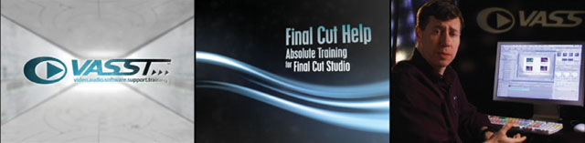
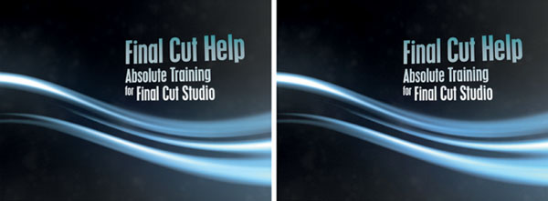
For the Final Cut Help podcast series, the graphic identity was carried through the show's open and sequence graphics onto the set. in fact, the branding and design carried through to the commercial DVDs that are sold by the show's sponsor VASST.
Integrating into Set Design
You should also have a color palette that carries through from graphics to the set. You can take the key colors of your graphics package and repeat them on the video shoot. This looks good and adds a level of professionalism to the show's appearance. By tying the look of the visuals together, you can create a cohesive visual experience for the audience. Here are a few practical tips:
- Background colors. We often use various colored backdrops in our productions. Affordable backdrops made from muslin or other materials can be bought from photography and video vendors. If using a practical set, try to place props with the show's colors in the background.
- Project logos and artwork. We'll often use show logos or design elements and project them on the walls of our set. If you're on a budget, you can use a simple slide or transparency projector. You can also create a custom gobo, which is a cutout of the logo. These can be made of steel for monochromatic options or glass for full-color choices. A gobo will typically cost you between $150 and $500 depending on complexity and number of colors. You'll also need a light to hold the gobo; a standard Fresnel light can work or you can purchase special fixtures for around $200.
- Prop pieces. If you'd like to integrate your show logo, you can order small quantities of printed items. For example, you could use coffee mugs with a custom logo for a talk show or a custom printed mouse pad for a technical program.
- Microphone flags. A common branding in traditional broadcasting is the microphone flag. You can order preprinted flags or use a blank one that you adhere your logo to. Two sources for mic flags that we've used are www.mikeflags.com and www.markertek.com.
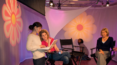
The daisy shape from the MommyCast logo is projected onto a curtain. Other colors from the show's palette make up the rest of the set.
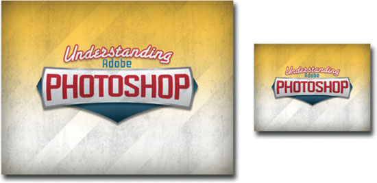
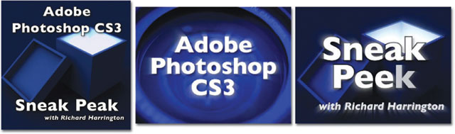
Style in Action
At RHED Pixel, we've produced two regular shows on Adobe Photoshop. The first show, Understanding Adobe Photoshop, targets a mass appeal audience that is less experienced with the software. The second, Photoshop for Video, looks at the software for experienced video professionals and motion graphic artists. Same subject, same host—different audiences, different graphics.
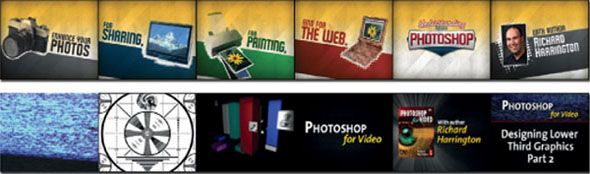
As such, we rebranded our shows to make them feel different. The Understanding Adobe Photoshop show is packaged to feel consumer friendly. Because we were attracting a more basic audience, we wanted the opening to feel more like a McDonald's commercial.
For the other show, Photoshop for Video, we used a much more aggressive and gritty approach. There are several elements that are very technical, including old registration patterns and testing bars. The graphics would be fairly meaningless except to those in the know. This podcast goes after a niche audience, and the graphics reflect that.
Creating Show Graphics
Several tools for creating graphics are available. Which tools you use will be a matter of availability and skill level. When it comes to motion graphics, you should see the software as being part of a bigger toolkit. As such, it is common to use several tools on a project. The three most common graphic tools are these:
- Adobe Photoshop. The one graphics tool that is almost universal is Adobe Photoshop. If you understand Photoshop, most other graphics tools will make sense. Photoshop integrates well with nearly every motion graphics and video-editing tool on the market. Before you invest time learning another tool, start with Photoshop. It's important to focus on graphics that look good when they're not moving; then these can be animated. You will learn to use technology for compositing and design. Plus, compared to other graphics software, Photoshop is easier to learn. This is due in large part to the vast number of books, websites, and even podcasts about the program. If Photoshop is outside of your reach, then pick up the very capable Photoshop Elements, which offers a pared-down feature set that is still quite capable.
- Adobe After Effects. After Effects is often called “Photoshop with a timeline.” It has close integration with Photoshop, in that it can easily import layered Photoshop files, which can be animated. Adobe After Effects is a wonderful yet complex tool that will take an investment of time to learn. However, the investment pays off in that After Effects knowledge is a very marketable skill.
- Apple Motion. If your workflow is primarily Apple based, then you should strongly consider integrating Apple Motion into your toolset. Although Motion can work with keyframes much like After Effects does, it has additional, unique features like behavior-based animation and the ability to turn a project into a template, which is accessible through Final Cut Pro. If you already have Adobe-created artwork, it is easy to import. With Motion, you can bring in elements that you've created in Photoshop and After Effects as well as use Motion's toolset. The graphics can then be easily accessed in the Viewer window as a template project. This is particularly useful if your video editor needs to update graphics but lacks extensive graphics capabilities.
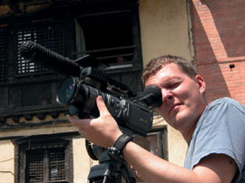
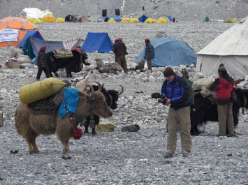
Profile: The Rest of Everest |
The Rest of Everest is a web video series conceived and created by documentary filmmaker Jon Miller of TreeLine Productions (www.treelineproductions.com). It is “the rest” of the footage from the groundbreaking expedition documentary “Everest: The Other Side” which engrossed thousands of viewers when it premiered on Dish Network Pay-Per-View in May of 2005.

The film documents the 2003 expedition to the Northeast Ridge route in Tibet, and coincides with the 50th-anniversary climbing season. The story revolves around 23-year old climber Ben Clark and the fulfillment of his dream to become one of the youngest climbers to ever summit Everest. Although the film has been very well received, there was just so much of the story left to be told.
“I had recently finished the edit on my own film about climbing Everest and thought it was such a shame that I had all of this material on tape that would never see the light of day,” said Miller. “Surely there was a group of people who were interested in seeing hours and hours of Everest that no one ever shows?”

Miller returned from Everest with over 80 hours of tape from the 60-day expedition. The final cut of the film totaled just 84 minutes. That meant that only one minute of every hour filmed made it into the finished version. Miller was looking for a way to get his footage out there.
“In Fall of 2005 I watched my first video podcast, Four Eyed Monster. It was a show about the trials and tribulations about promoting an independently produced film,” sad Miller. “The podcast really flipped a switch in my head. I thought the podcast was as engrossing as the film it was based on could ever be. I realized that podcasting was an entire ecosystem. A podcast could exist on its own for its own sake.”
The show features nearly all of the footage from the trip. Additionally, the climber, Ben, and others offer audio commentary to the footage. This lets the viewer get all of the stories right from the people who experienced it first-hand. This new approach really connected with the audience.
“Podcasting has doubled my workload…and in a mostly unpaid way. But I love it and wouldn't change a thing,” said Miller. “The show had introduced me to so many amazing people who simply found the show in iTunes or through Google. Every morning I get up and check my email first thing to see who has written me while I was asleep. Podcasting is international in nature too; I regularly get emails from Australia and Japan, Europe, and all over the USA. I make it a point to write back to every single person.”
Miller's passion for his show and its audience has been a key to its success. Besides staying in the top-rated list for his podcast, he's received several honors for his show. The Rest of Everest was a finalist for the Best Video Podcast at the 2007 People's Choice Podcast Awards. The show was also designated by the iTunes directory as one of their exclusive “Best of 2006” podcasts.
“I was absolutely stats-obsessed when I began the show. I stayed that way for most of the first year. At some point that all changed and I began to slow down on my obsessive-compulsive behavior. I knew I was producing a quality show and people, viewers, had noticed it as well,” said Miller. “I began to build relationships with several of the bigger fans. People started emailing me to say how the show had inspired them to travel or to climb the mountain outside of their town.”
“It was these emails and friendships that I developed that made me realize that I was going to produce the show even if my viewership dropped down to just these people. It was for them. After I made that perspective change, the show has been a much more enjoyable endeavor. I still check stats, but I'm surprised to find that it can be up to a month between log-ins.”
Miller encouraged other media professionals to give podcasting a try. He emphasized how enjoyable the entire process is.
“I've been a professional content producer for over 10 years now and I can say that podcasting is the most gratifying endeavor I've ever undertaken,” said Miller. “There's just something magical about being able to shoot, edit, and publish all by yourself and in such an immediate, international way. It's changed my life for the better. I'm happy to be a part of the podcasting community.”
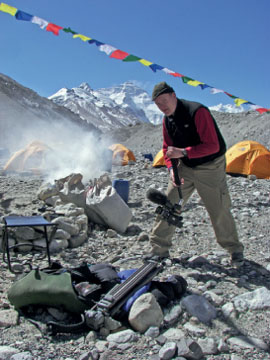
Gear List
- Sony HVR-A1U & HVR-V1U cameras (“I'm a real fan of tape since my productions take me to remote areas.”)
- Libec TH-M20
- AKG C414 microphone
- Mackie 1402-VLZ PRO mixer
- Ultrasone 550 headphones