
Chapter 6. Dashboarding with Grafana
When you get an alert or want to check on the current performance of your systems, dashboards will be your first port of call. The expression browser that you have seen up to now is fine for ad hoc graphing and when you need to debug your PromQL, but it’s not designed to be used as a dashboard.
What do I mean by dashboard? A set of graphs, tables, and other visualisations of your systems. You might have a dashboard for global traffic, which services are getting how much traffic and with what latency. For each of those services you would likely have a dashboard of its latency, errors, request rate, instance count, CPU usage, memory usage, and service-specific metrics. Drilling down, you could have a dashboard for particular subsystems or each service, or a garbage collection dashboard that can be used with any Java application.
Grafana is a popular tool with which you can build such dashboards for many different monitoring and nonmonitoring systems, including Graphite, InfluxDB, Elasticsearch, and PostgreSQL. It is the recommended tool for you to create dashboards when using Prometheus, and is continuously improving its Prometheus support.
In this chapter I introduce using Grafana with Prometheus, extending the Prometheus and Node exporter you set up in Chapter 2.
Installation
You can download Grafana from https://grafana.com/grafana/download. The site includes installation instructions, but if you’re using Docker, for example, you would use:
docker run -d --name=grafana --net=host grafana/grafana:5.0.0
Note that this doesn’t use a volume mount,3 so it will store all state inside the container.
I use Grafana 5.0.0 here. You can use a newer version but be aware that what you see will likely differ slightly.
Once Grafana is running you should be able to access it in your browser at http://localhost:3000/, and you will see a login screen like the one in Figure 6-1.
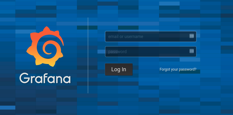
Figure 6-1. Grafana login screen
Log in with the default username of admin and the default password, which is also admin.
You should see the Home Dashboard as shown in Figure 6-2. I have switched to
the Light theme in the Org Settings in order to make things easier to see in my screenshots.
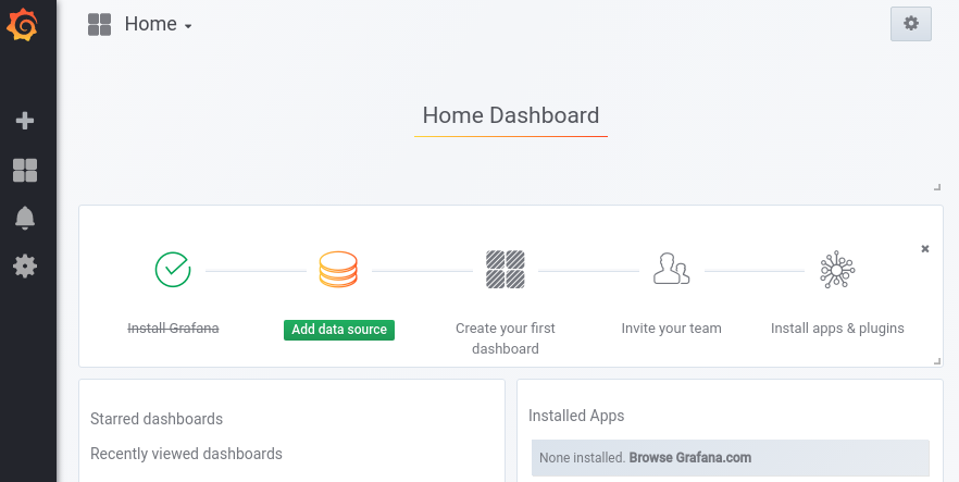
Figure 6-2. Grafana Home Dashboard on a fresh install
Data Source
Grafana uses data sources to fetch information used for graphs. There are a variety of types of data sources supported out of the box, including OpenTSDB, PostgreSQL, and of course, Prometheus. You can have many data sources of the same type, and usually you would have one per Prometheus running. A Grafana dashboard can have graphs from variety of sources, and you can even mix sources in a graph panel.
More recent versions of Grafana make it easy to add your first data source. Click on Add data source and add a data source with a Name of
Prometheus, a Type of Prometheus, and a URL of http://localhost:9090
(or whatever other URL your Prometheus from Chapter 2 is
listening on). The form should look like Figure 6-3. Leave
all other settings at their defaults, and finally click Save&Test. If it
works you will get a message that the data source is working. If you don’t,
check that the Prometheus is indeed running and that it is accessible from
Grafana.4

Figure 6-3. Adding a Prometheus data source to Grafana
Dashboards and Panels
Go again to http://localhost:3000/ in your browser, and this time click New dashboard, which will bring you to a page that looks like Figure 6-4.
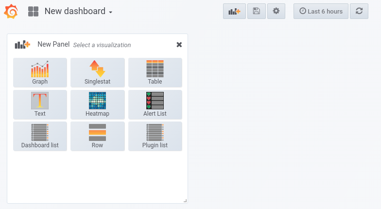
Figure 6-4. A new Grafana dashboard
From here you can select the first panel you’d like to add. Panels are rectangular areas containing a graph, table, or other visual information. You can add new panels beyond the first with the Add panel button, which is the button on the top row with the orange plus sign. As of Grafana 5.0.0, panels are organised within a grid system,5 and can be rearranged using drag and drop.
Note
After making any changes to a dashboard or panels, if you want them to be remembered you must explicitly save them. You can do this with the save button at the top of the page or using the Ctrl-S keyboard shortcut.
You can access the dashboard settings, such as its name, using the gear icon up top. From the settings menu you can also duplicate dashboards using Save As, which is handy when you want to experiment with a dashboard.
Avoiding the Wall of Graphs
It is not unusual to end up with multiple dashboards per service you run. It is easy for dashboards to gradually get bloated with too many graphs, making it challenging for you to interpret what is actually going on. To mitigate this you should try to avoid dashboards that serve more than one team or purpose, and instead give them a dashboard each.
The more high-level a dashboard is, the fewer rows and panels it should have. A global overview should fit on one screen and be understandable at a distance. Dashboards commonly used for oncall might have a row or two more than that, whereas a dashboard for in-depth performance tuning by experts might run to several screens.
Why do I recommend that you limit the amount of graphs on each of your dashboards? The answer is that every graph, line, and number on a dashboard makes it harder to understand. This is particularly relevant when you are oncall and handling alerts. When you are stressed, need to act quickly, and are possibly only half-awake, having to remember the subtler points of what each graphs on your dashboard mean is not going to aid you in terms of either response time or taking an appropriate action.
To give an extreme example, one service I worked on had a dashboard (singular) with over 600 graphs.6 This was hailed as superb monitoring, due to the vast wealth of data on display. The sheer volume of data meant I was never able to get my head around that dashboard, plus it took rather a long time to load. I like to call this style of dashboarding the Wall of Graphs antipattern.
You should not confuse having lots of graphs with having good monitoring. Monitoring is ultimately about outcomes, such as faster incident resolution and better engineering decisions, not pretty graphs.
Graph Panel
The Graph panel is the main panel you will be using. As the name indicates, it displays a graph. As seen in Figure 6-4, click the Graph button to add a graph panel. You now have a blank graph. To configure it, click Panel Title and then Edit as shown in Figure 6-5.7
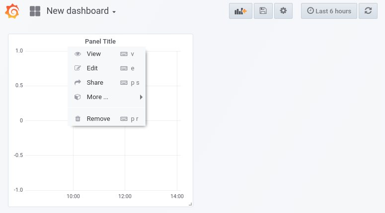
Figure 6-5. Opening the editor for a graph panel
The graph editor will open on the Metrics tab. Enter
process_resident_memory_bytes for the query expression, in the text box
beside A,8 as shown in
Figure 6-6, and then click outside of the text box. You will see a
graph of memory usage similar to what Figure 2-7 showed when the same
expression was used in the expression browser.
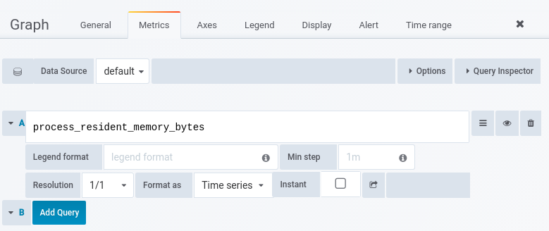
Figure 6-6. The expression process_resident_memory_bytes in the graph editor
Grafana offers more than the expression browser. You can configure the
legend to display something other than the full-time series name. Put
{{job}} in the Legend Format text box. On the Axes tab, change the Left Y
Unit to data/bytes. On the General tab, change the Title to Memory Usage.
The graph will now look something like Figure 6-7, with a more
useful legend, appropriate units on the axis, and a title.
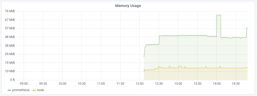
Figure 6-7. Memory Usage graph with custom legend, title, and axis units configured
These are the settings you will want to configure on virtually all of your graphs, but this is only a small taste of what you can do with graphs in Grafana. You can configure colours, draw style, tool tips, stacking, filling, and even include metrics from multiple data sources.
Don’t forget to save the dashboard before continuing! New dashboard is a
special dashboard name for Grafana, so you should choose something more
memorable.
Time Controls
You may have noticed Grafana’s time controls on the top right of the page. By default, it should say “Last 6 hours.” Clicking on the time controls will show Figure 6-8 from where you can choose a time range and how often to refresh. The time controls apply to an entire dashboard at once, though you can also configure some overrides on a per-panel basis.
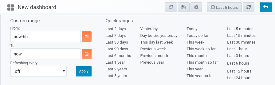
Figure 6-8. Grafana’s time control menu
Singlestat Panel
The Singlestat panel displays the value of a single time series. More recent versions of Grafana can also show a Prometheus label value.
I will start this example by adding a time series value. Click on Back to dashboard (the
back arrow in the top right) to return from the graph panel to the dashboard
view. Click on the Add panel button and add a Singlestat panel. As you did for
the previous panel, click on Panel Title and then Edit. For the query expression
on the Metrics tab, use prometheus_tsdb_head_series, which is (roughly
speaking) the number of different time series Prometheus is ingesting. By
default the Singlestat panel will calculate the average of the time series over
the dashboard’s time range. This is often not what you want, so on the Options
tab, change the Stat to Current. The default text can be a bit small, so change
the Font Size to 200%. On the General tab, change the Title to
Prometheus Time Series. Finally, click Back to dashboard and you should see
something like Figure 6-9.
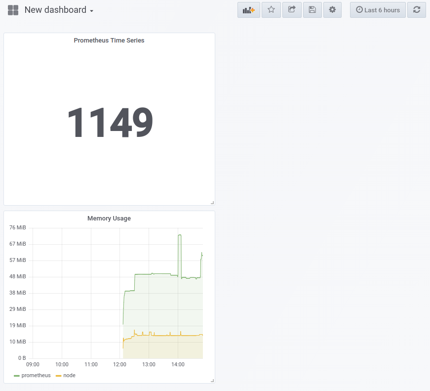
Figure 6-9. Dashboard with a graph and Singlestat panel
Displaying label values is handy for software versions on your graphs.
Add another Singlestat panel; this time you will use the query expression
node_uname_info, which contains the same information as the uname -a
command. Set the Format as to Table, and on the Options tab set the Column to
release. Leave the Font size as-is, as kernel versions can be relatively long.
Under the General tab, the Title should be Kernel version. After clicking Back to dashboard
and rearranging the panels using drag and drop, you should see something like
Figure 6-10.
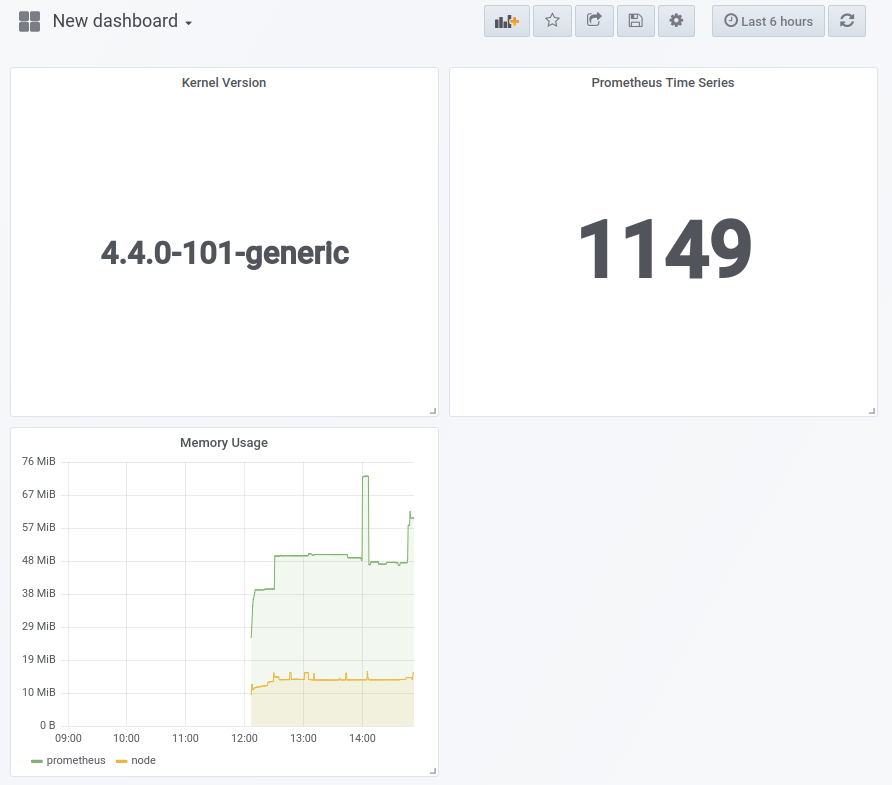
Figure 6-10. Dashboard with a graph and two Singlestat panels, one numeric and one text
The Singlestat panel has further features including different colours depending on the time series value, and displaying sparklines behind the value.
Table Panel
While the Singlestat panel can only display one time series at a time, the Table panel allows you to display multiple time series. Table panels tend to require more configuration than other panels, and all the text can look cluttered on your dashboards.
Add a new panel, this time a Table panel. As before, Click Panel Title and then
Edit. Use the query expression rate(node_network_receive_bytes_total[1m]) on the
Metrics tab, and tick the Instant checkbox. There are more columns that you
need here. On the Column styles tab, change the existing Time rule to have a
Type of Hidden. Click +Add to add a new rule with Apply to columns named
job with Type of Hidden, and then add another rule hiding the instance.
To set the unit, +Add a rule for the Value column and set its Unit to
bytes/sec under data rate. Finally, on the General tab, set the title to
Network Traffic Received. After all that, if you go Back to dashboard and
rearrange the panels, you should see a dashboard like the one in Figure 6-11.

Figure 6-11. Dashboard with several panels, including a table for per-device network traffic
Template Variables
All the dashboard examples I have shown you so far have applied to a single Prometheus and a single Node exporter. This is fine for demonstration of the basics, but not great when you have hundreds or even tens of machines to monitor. The good news is that you don’t have to create a dashboard for every individual machine. You can use Grafana’s templating feature.
You only have monitoring for one machine set up, so for this example I will template based on network devices, as you should have at least two of those.9
To start with, create a new dashboard by clicking on the dashboard name and then +New dashboard at the bottom of the screen, as you can see in Figure 6-12.

Figure 6-12. Dashboard list, including a button to create new dashboards
Click on the gear icon up top and then Variables.10 Click +Add variable to add a
template variable. The Name should be Device, and the Data source is
Prometheus with a Refresh of On Time Range Change. The Query you will use is
node_network_receive_bytes_total with a Regex of
.*device="(.*?)".*, which will extract out
the value of the device labels. The page should look like
Figure 6-13. You can finally click Add to add the variable.

Figure 6-13. Adding a Device template variable to a Grafana dashboard
When you click Back to dashboard, a dropdown for the variable will now be available on the dashboard as seen in Figure 6-14.

Figure 6-14. The dropdown for the Device template variable is visible
You now need to use the variable. Click the X to close the Templating section,
then click the three dots, and add a new Graph panel. As before, click on
Panel Title and then Edit. Configure the query expression to be
rate(node_network_receive_bytes_total{device="$Device"}[1m]), and $Device will be substituted
with the value of the template variable.11 Set the Legend Format to {{device}}, the Title to
Bytes Received, and the Unit to bytes/sec under data rate.
Go Back to the dashboard and click on the panel title, and this time click More and
then Duplicate. This will create a copy of the existing panel. Alter the
settings on this new panel to use the expression
rate(node_network_transmit_bytes_total{device=~"$Device"})[1m] and the Title
Bytes Transmitted. The dashboard will now have panels for bytes sent in
both directions as shown in Figure 6-15, and you can look at each
network device by selecting it in the dropdown.

Figure 6-15. A basic network traffic dashboard using a template variable
In the real world you would probably template based on the instance label
and display all the network related metrics for one machine at once. You might
even have multiple variables for one dashboard. This is how a generic dashboard
for Java garbage collection might work: one variable for the job, one
for the instance, and one to select which Prometheus data source to use.
You may have noticed that as you change the value of the variable, the URL parameters change, and similarly if you use the time controls. This allows you to share dashboard links, or have your alerts link to a dashboard with just the right variable values as shown in “Notification templates”. There is a Share dashboard icon at the top of the page you can use to create the URLs and take snapshots of the data in the dashboard. Snapshots are perfect for postmortems and outage reports, where you want to preserve how the dashboard looked.
In the next chapter I will go into more detail on the Node exporter and some of the metrics it offers.
1 Grafana by default reports anonymous usage statistics. This can be disabled with the reporting_enabled setting in its configuration file.
2 This is the same templating language that is used for alert templating, with some minor differences in available functionality.
3 A way to have filesystems shared across containers over time, as by default a Docker container’s storage is specific to that container. Volume mounts can be specified with the -v flag to docker run.
4 The Access proxy setting has Grafana make the requests to your Prometheus. By contrast, the direct setting has your browser make the request.
5 Previously, Grafana panels were contained within rows.
6 The worst case of this I have heard of weighed in at over 1,000 graphs.
7 You can use the e keyboard shortcut to open the editor while hovering over the panel. You can press ? to view a full list of keyboard shortcuts.
8 The A indicates that it is the first query.
9 Loopback and your wired and/or WiFi device.
10 This was called templating in previous Grafana versions.
11 If using the Multi-value option, you would use device=~"$Device" as the variable would be a regular expression in that case.