
Hyperlink locators used to jump to different sections or pages of a web application were discussed in the previous chapter. The same web locators are used to trace user interface elements like buttons. There are various buttons in a web application, which are described in this chapter.
Buttons are part of the user interface in any web application that interacts with a user/client. These interactions are associated with certain actions, such as moving to the next page and submitting forms. They include default buttons, form/submit button, radio buttons, checkboxes, and select lists. The differences among them depend on the usage, which is explained next.
The types of HTML buttons are located using Python on Selenium because web elements like these buttons have specific functionalities related to them. Let’s start by learning about a default button on a web page.
Default Button
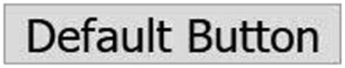
Default button
Select (locate elements and click)
Assert (check for the button and whether enabled/disabled)
Select
Selecting and clicking a button is a way to locate the button element on a web page. A button is activated when clicked, and then it performs the assigned task to it.
The button is always selected by using the click( ) method after locating it on the web page.
There is another method to click a button, which is discussed later in this chapter. A default button can be selected in any of the following ways.
Select by ID
The HTML code for the default button in Figure 6-1 is a source to locate the button element. There are two methods for it. In the first method, two functions are used, one for identifying the default button by using an ID, which is then selected by using the click() function (for more information, see Chapter 3).
In the second method, the same functions from the first method are combined in a single line of code. It is utilized in the rest of this chapter. The first method is more readable, whereas the second method is short. It is up to the tester to decide which one to use.
These two methods have the same functionality and purpose.
The ID is stated when the developer is writing the code, which makes it simpler for the tester to use in testing cases.
By Text
This is the most basic selection mechanism for buttons. In this selection type, the default button is selected by using the text written to it, which is seen in the browser.
By Name
When there are multiple buttons with same name, the first button bearing the name is selected.
Next, let’s look at another type of button.
Submit/Form Button
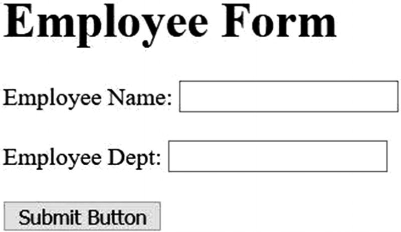
Submit button
The submit button does not work until all fields are filled, which makes it different from the default button.
The click( ) function for a form button is successful only when all the form elements are filled.
Select by Visible Text
XPath is used to locate the submit button by its text, which is case sensitive.
Image as a Button
A button can be created using an image. The image offers a customized look and feel to the user.

Image as a button
Images can act as both submit or default types.
Assert for Button
The two main assert approaches for buttons are to verify the presence of a button element on a web page and to check if the element is disabled or not.
The assertion method determines whether the button is present on the given web page. A button can be present on a web page but also be disabled, which makes the button unable to be clicked. The click() function cannot operate on disabled buttons.
Check the Presence of a Button
Check If the Button Is Enabled or Not
Checking its presence and whether a button is enabled or disabled is done using the if-else condition in Python on Selenium. These validations are the same for all button types.
Next, let’s discussed the radio button, which is one of the most used buttons on a web page that offers choices.
Radio Buttons
Radio buttons are used when multiple choices are available. Each radio button has the same name attribute. When a radio button is selected from a collection, the others are automatically deselected. There is no limit on the number of radio buttons in a group or the number of groups that use radio buttons.
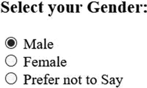
Radio buttons checked and unchecked
Figure 6-4 shows that when a radio button is selected, a black dot appears in it. There is no dot in the unselected radio buttons. This helps you identify if the radio button was selected/checked or not. Male is checked by default as seen in the HTML source code. Selection is not mandatory in radio buttons.
Selection and checked are referred interchangeably.
The attribute value presents the radio button’s unique value, which is only showcased in the HTML code. The user cannot see it in a browser. The value is transmitted to the server.
Radio buttons have two main operations: to select and to deselect the selected. These two operations are demonstrated next.
Select Radio Buttons
There are various ways to select radio buttons that need to be tested among a group, which are explained as follows.
Simple Select
The ID attribute selected is female, which is associated with the radio button provided in the HTML source. When clicked, a black dot appears in the selected radio button. A dot can be customized into various shapes and colors. The primary motive is to see that the radio button was selected.
Select Using Label
The label tag is selected by using XPath and the value of the attribute related to it. The click function is used after locating the radio element.
A black dot in a radio button shows that the button has been selected.
Unselect/Clear Selection
The radio button has two operations associated with it: one is to select, and the other is to deselect. A black dot is available only when a radio button is selected. To clear the selected radio button, you need to select another button because multiple selections are not allowed in the same collection of radio buttons.
The selection of another radio button from the group is made the same way as previous selection types. To avoid the unnecessary selection of radio buttons, a default selection is introduced in some cases.
The only way to deselect an already selected radio button is to select another radio button from the group/collection.
Assert for Radio Button
If there is a group of radio buttons on a web page, to identify if one is checked or to make sure the specified radio element is available on the web page, assertions are used. Assertions play an important role in testing radio buttons and the actions corresponding to them.
Assert If a Radio Button
In this example, the web element with female as the ID is checked for its input type using the if statement from the get_attribute( ) function.
Assert If Checked
The assertion method checks if the radio button is selected or not. But locating of buttons does not get affected by the type of button to be located using web locators.
Next, let’s examine checkboxes.
Checkbox
Checkboxes have a square box associated with them. They are commonly used when multiple selections are required from the user. There are no restrictions on selecting checkboxes. You could select all the checkboxes in the same group/collection. The selection can also be restricted when necessary, however.
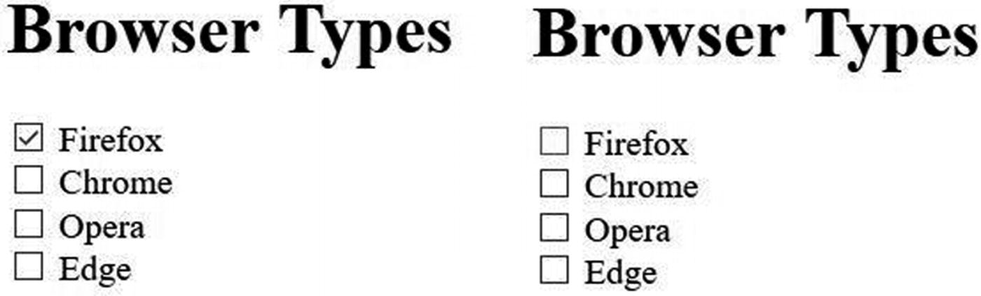
Checkbox checked and unchecked
Select/Check
Selecting a checkbox is like selecting a radio button. The difference is that multiple selections are allowed with checkboxes, but radio button selection is limited to one. A checkbox has various attributes associated with it. It is selected by clicking it.
Checkboxes can have multiple selections related to the same group.
Check Using Name
Check Using ID
A tick mark appears when a checkbox has been selected.
Assert If Checkbox
The get attribute function is used in if statement to check for the presence of a checkbox element.
Assert Checkbox If Checked or Not
Clear/Unselect/Deselect Checkbox
To remove the tick from a selected checkbox is to deselect, unselect, or clear it. These three terms are used interchangeably. Clearing the textbox is allowed in Python on Selenium, and it is used to test that the checkbox is working correctly. In some cases, the checkbox is disabled or is set to default, which does not allow you to clear it.
In this code, the checkbox is recognized if it has already been selected using the if condition statement; if selected, then it is cleared or unselected.
Clearing the checkbox can be done only when it is selected.
All the methods used in checkboxes are the same ones available for radio buttons, apart from the clearing method. A radio button automatically clears after selecting another option. This is not the case with a checkbox; hence, clear/deselect is done by performing the same action used to select.
Next, let’s discuss the select list.
Select List
Select lists are commonly used inside a form tag but can be used independently. The number of options that can be selected from the lists can be controlled. When only one option can be selected from a list, it behaves as a radio button. When multiple options can be selected from a list, it acts as a checkbox.

Single select list
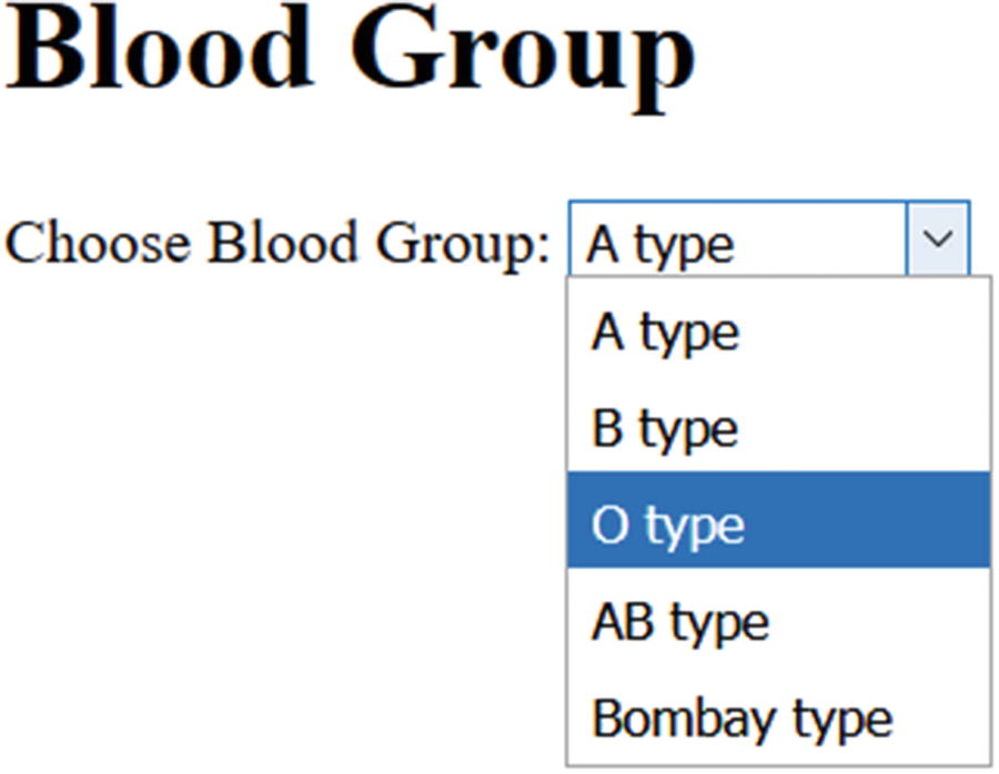
Open select list
Getting All the Options
As stated in the code, the for loop returns all the options in the blood group select list.
Select
Python in Selenium provides many ways to select from the available options. Before selecting the select list from the web page/app, you need to import the select library from selenium.webdriver.support.select in Python. The selection methods are discussed next.
Select Using Visible Text
In the selection process of a drop-down/select list, the drop-down menu is located first. Then, an instance is created to select an option from the list. The drop-down can be located using several attributes, such as ID and name.
Select by Value
The value attributes are case sensitive and allow alphanumeric characters.
The O blood type needs to be selected. This is done by first selecting the drop-down in which the option is located, and then the instance is created to select the specified option.
Select Using Index
An index value of 4 selects the last option in the drop-down list. To select options using an index value, you need to know the number of available options in the drop-down.
The select method in Python on Selenium cannot be used if the list was not built using the select tag.
Unselect/Clear/Deselect
The options selected from a list can revert by clearing it. Unselecting/deselecting/clearing (the terms are synonymous) an option in a select list can be done the same way the selection was made. The list may allow single or multiple selections.
Deselect/Clear One Selected
Deselection can be made to single or multiple options in the list. The following discusses deselecting/clearing a single option.
Deselect by Visible Text
The last option, Bombay, is deselected using a visible text function.
Deselect by Value
There are two possible exceptions may be raised in this case, one when there is no match for the defined value. The second exception is raised after the value is matched but the list element is not selected as deselect works only if list is selected.
Deselect by Index
The last element in the list is cleared if selected; otherwise, an exception is raised.
Multiple Select List
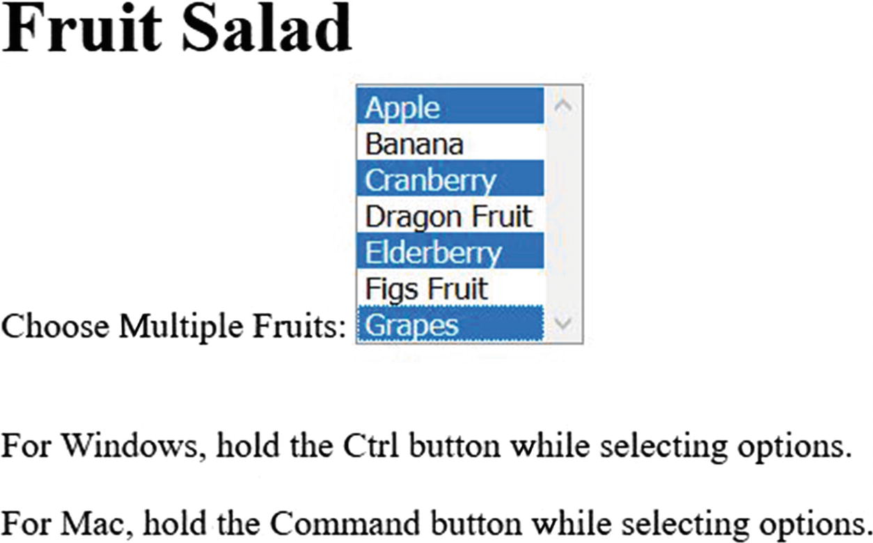
Multiple select list
Verify
Assertion functions are used to avoid exceptions that arise in an element not found, or when the element needs to be deselected when not selected and vice versa. These kinds of exceptions can be avoided using option functions that let you know the type of list and whether it is selected or not.
Get the First Option Selected
The print statement prints the first selected option from the list and returns an error if no option is selected.
Get All Options Selected
It is mainly used in a multiple select list that returns all selected options.
Deselect/Clear All Selected
To clear all the selected options in a list, Selenium provides the deselect_all() function .
The select method in Python on Selenium cannot be used if the list is not built using the select tag.
Summary
This chapter explains the mouse/keyboard actions and web locators discussed in Chapters 3 and 4 that are most often used on a user interface (i.e., the buttons in a web application). The web locators find all types of buttons available, and corresponding actions are performed on them.
The default button, when located, is only allowed to perform click action. The Submit button is used for forms. The radio button provides multiple choices but allows only one selection among them. Checkboxes allow multiple choices and selections. A select list is a button further classified into two types based on the single or multiple selections in it. Each button was illustrated with an example.
Locating UI web elements like frames and textboxes are discussed in the next chapter.