QUARKXPRESS IS RENOWNED FOR ITS TYPOGRAPHIC FEATURES—in fact, the ability to produce high-end, professional typography is one of the main reasons to use it over a word processor or lower-end page layout program. Talented graphic designers work with typeface, column width, hyphenation and justification, and leading (space between lines) to create a look that complements the subject matter and overall layout. Typographic features include everything from applying a font to inserting special characters to controlling the precise amount of space between individual characters. Special effects include the ability to wrap text around graphics and convert text to boxes that can contain pictures or more text.
In this chapter you’ll learn how to format paragraphs and characters, set tabs, and automate that formatting with style sheets; fine-tune spacing by specifying hyphenation and justification, kerning and tracking text, entering special spaces, and hanging punctuation outside margins; work with special characters such as fractions; create drop caps; and combine text and graphics with techniques such as text wraps and anchored items.
Formats for text come in two flavors—character attributes and paragraph attributes. Character attributes are formats such as font and type size that apply to selected characters within a paragraph. Paragraph attributes are formats such as alignment and indents that apply to the entire paragraph containing the text insertion bar or a range of selected paragraphs. To select text for formatting, use the Text Content tool ![]() . For information about selecting text, see Chapter 4.
. For information about selecting text, see Chapter 4.
Character attributes and paragraph attributes generally work together to create an overall look for type. The combination of font, size, leading, and alignment set the tone for publications—because you’ll want a different look for a news story or annual report than for an invitation, a brochure, or an academic piece. Look at a newspaper, for example, and you’re likely to see a sans serif font and fairly small justified type. Compare that to a wedding invitation, which may feature centered type in a script font. Another factor that sets the tone of a piece is the type “color.” This is not literally the color of the characters, but the overall appearance of the type when you glance at a document or even look at it upside down. Dense blocks of text usually indicate more serious content while light and airy blocks suggest fun. Again, the combination of character and paragraph attributes you choose all contribute to the color.
The most common character and paragraph attributes are available on the right side of the Measurements palette’s Classic tab (Figure 5.1). If you don’t find what you’re looking for there, you can use the Character Attributes or Paragraph Attributes tab of the Measurements palette. In addition, the Character Attributes (Style > Character) and Paragraph Attributes (Style > Formats) dialog boxes consolidate nearly all the text formatting options available in QuarkXPress.
Figure 5.1: On the right side of the Classic tab of the Measurements palette, you’ll find the most common character and paragraph attributes.
Tip: International Typesetting Features
You will find many unfamiliar features in the Style menu, Character Attributes dialog box, and Paragraph Attributes dialog box—such as Rubi and Mojigumi Set. These features are for typesetting text in other languages.
Character attributes apply to selected text or to the text insertion point (so you can start typing text with the specified attributes). You’ll find most of the character attributes you need in the Classic tab (Figure 5.2) or the Character Attributes tab of the Measurements palette. If you’re not sure what a control does, point at it to display its tool tip. Commands in the top portion of the Style menu and in the Character Attributes dialog box (Style > Character) round out all the character attributes available in QuarkXPress (Figure 5.3).
Figure 5.2: Here, the selected text is in a different font and color than the rest of the line as shown in the Classic tab of the Measurements palette.

Figure 5.3: The Character Attributes dialog box consolidates nearly all the character attributes in QuarkXPress—some of which are specific to typesetting in other languages.

Tip: Special Effects for Type
In addition to familiar controls such as font, size, color, and type style, QuarkXPress offers character attributes such as opacity and scaling. Other special effects for text are box based, such as the ability to skew or flip all the text in a box, as discussed in Chapter 4.
Understanding Fonts
The important thing to understand about fonts is that they are not part of QuarkXPress. They are individual files that are activated (turned on) through your system or through a font manager such as Suitcase Fusion. Once activated, they show up in QuarkXPress menus.
If a font is missing, you either need to activate it or purchase and install it. You can buy fonts from vendors such as Linotype and Bitstream—and you should buy them as they are licensed pieces of software (rather than, say, “borrowing” them from friends and coworkers). Companies may have site licenses or enforce work rules that ensure legal font usage.
When you buy fonts, keep in mind that they come in a variety of formats: PostScript, OpenType, TrueType, and so on. PostScript Type 1 fonts ruled high-end publishing for a long time, but OpenType fonts are rapidly becoming the standard as the same files can be used on both Mac and Windows. Fonts also come from different vendors such as International Typeface Corporation and Adobe. Generally, fonts include multiple “faces” such as bold, italic, and condensed versions. If multiple faces of a font are active, the QuarkXPress Font menus display a submenu for selecting just the right font face (Figure 5.4). Note that for proper output, you must apply the bold or italic face of a font rather than the QuarkXPress Bold or Italic type style.
Figure 5.4: When multiple faces of a font are active, the font menus display a submenu that lets you select the right face.

When it comes to fonts, the name is not a unique identifier. Fonts in different formats, from different vendors—and even in different versions from the same vendor—are not interchangeable. Small variations in fonts can and will cause text to reflow, possibly ruining a layout. As a result, it’s important that a workgroup use precisely the same fonts and that fonts are provided with QuarkXPress layouts as necessary for output. You can package fonts with a layout through File > Collect for Output.
Paragraph attributes apply to selected paragraphs or to the paragraph containing the text insertion point. A few paragraph attributes are available in the Classic tab of the Measurements palette, but you’ll find more complete controls in the Paragraph Attributes tab (Figure 5.5). Use tool tips to help identify the palette icons. The Paragraph Attributes dialog box (Style > Formats) consolidates all the paragraph attributes available in QuarkXPress (Figure 5.6).
Figure 5.5: The Paragraph Attributes tab of the Measurements palette lets you change the indents, space before and after, leading, alignment, and drop caps for paragraphs.

Figure 5.6: To quickly set many paragraph attributes, use the Paragraph Attributes dialog box (Style > Formats). The Formats tab provides additional controls, such as Keep with Next ¶, and uses clear labels so you don’t have to decipher icons.

Tip: Hanging Indents for Bulleted and Numbered Lists
To create bulleted lists and numbered lists in QuarkXPress, you need to create a hanging indent through tabs and paragraph attributes. Set a tab stop and left indent for the paragraph at the same location, then set a negative first line indent. For example, if you set a tab stop at .25″ and a left indent of .25″, the first line indent should be –.25″. Place the bullet or numeral—formatted with a character style sheet—before the tab stop.
QuarkXPress provides left-aligned tab stops at every half-inch by default. You might use tabs to space text across a line or to align columns of information that are not in a table. Since tabs are paragraph attributes, when working with tabs it’s helpful to choose View > Invisibles to actually see the tab characters ![]() and paragraph returns ¶. You can override the default tab stops, customize how the text aligns with each tab stop, and add leader characters.
and paragraph returns ¶. You can override the default tab stops, customize how the text aligns with each tab stop, and add leader characters.
To set tabs for selected paragraphs, you can use the Tabs tab of the Paragraph Attributes dialog box (Style > Tabs) shown in Figure 5.7. A more interactive method of working with tabs, however, is to use the Tabs tab of the Measurements palette (Figure 5.8). Either way, the controls are basically the same. To set tabs for selected paragraphs:
Figure 5.7: If the tiny icons in the Measurements palette aren’t for you, set tabs with the Tabs tab of the Paragraph Attributes dialog box.


1. Display the Tabs tab of the Paragraph Attributes dialog box (Style > Tabs) or the Measurements palette ![]() .
.
2. First click one of the alignment buttons to specify how text aligns with the tab stop: Left, Center, Right, Decimal, Comma, or Align On. If you click Align On, you can enter an alignment character in the Align On field.
3. Enter a value in the Position field or click on the tab ruler above the text box.
4. Click Set to create the tab stop. When you set a tab stop, the default tab stops to the left of it are removed.
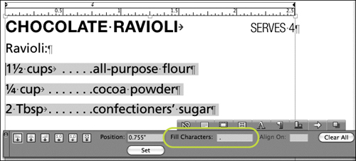
You can specify one character to repeat or two characters to alternate to fill the white space created by a tab. Fill characters help draw the eye across a line—for example, the dotted line in a table of contents helps readers find the page number. (The dotted line, referred to as a dot leader, is actually a fill character of periods.) Enter one or two characters in the Fill Characters field as you create a tab or for a tab stop selected on the tab ruler (Figure 5.9).
To change the position or any other attribute of a tab, click the tab stop icon on the tab ruler. Change any of the values in the Tabs tab of the Paragraph Attributes dialog box (Style > Tabs) or the Measurements palette. You can also drag the tab stop on the ruler to view a vertical guide that helps with placement (Figure 5.10). To delete a tab stop, drag its icon off the ruler. To delete all tab stops, click Clear All.
Figure 5.10: When you drag a tab stop icon on the tab ruler, a vertical guide displays to help with placement.

Tip: Copying Tabs to Selected Paragraphs
Often, you’ll set tabs perfectly for one paragraph, then realize you need the same tab settings in another paragraph. To quickly copy paragraph attributes, select all the paragraphs that need the new tab settings. Then, Option+Shift+click (Mac) or Alt+Shift+click (Windows) the paragraph with the right settings.
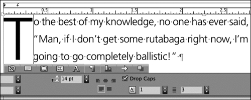
A common trick for drawing the eye into a story is to create a drop cap for the first paragraph. A drop cap is generally the first letter of a paragraph that is enlarged and dropped down two or three lines into a paragraph—but you are not limited to one letter or even capital letters. You can drop up to 127 characters into a maximum of 16 lines. While a drop cap appears to affect characters, it is actually a paragraph attribute that can be applied quickly through a paragraph style sheet. As a paragraph style, the drop cap formatting is not dependent on specific text—you can change the text at the beginning of a paragraph and the drop cap remains.
To create a drop cap for a selected paragraph, use the Formats tab of the Paragraph Attributes dialog box (Style > Formats) or the Paragraph Attributes tab of the Measurements palette (Figure 5.11). Check Drop Caps and enter a value in the Character Count and Line Count fields. Once a drop cap is applied, you can select the characters and apply a character style sheet to change the color or font. In addition, sometimes you may need to adjust the drop cap based on the context—for example, if the paragraph starts with a quotation mark, you may want to adjust the character count from one character to two.
Figure 5.11: The Paragraph Attributes tab of the Measurements palette lets you create drop caps. Here, one character drops three lines as shown in the Character Count field (left) and the Line Count field (right).
Tip: Creating Initial Caps
Drop caps are not the only way to draw the eye into a story. Often, the first character or characters of a paragraph are embellished in some other way—popped up above the paragraph, enlarged significantly and placed outside the margin, copied and screened behind the story, or even replaced with a graphic.
To quickly and consistently format text, you can save multiple attributes as paragraph style sheets and character style sheets. In general, paragraph style sheets set the general text formats while character style sheets are reserved for exceptions within the paragraph. For example, if you bold words within a paragraph, you might use a character style sheet. When you use style sheets, you can easily make global changes across a project by revising style sheets rather than manually reformatting text. You can apply style sheets quickly by clicking the Style Sheets palette or pressing keyboard shortcuts (Figure 5.12).
Figure 5.12: A foolproof template includes style sheets for every possible variation of formatting. The style sheets list for a magazine shown here includes “Headline,” “Byline,” “Body Text,” “Body Text No Indent,” and “Photo Caption” paragraph style sheets along with a Book/Bold character style sheet. The numbers in front of each style sheet name not only create a hierarchy (1 for heads, 2 for bylines, 3 for body text), but the numbers are synchronized to the style sheets with Command+1 for “1 Headline,” Command+Option+1 for “1.1 Department Tag Line,” and so on.

The easiest way to create a new style sheet is to first format text, then create a new paragraph or character style sheet based on its attributes. To do this, click in formatted text and choose New Paragraph Style or New Character Style from the Style Sheets palette menu. (To create a character style sheet, select text or be sure to click within text that has the appropriate formatting.) Use the Edit Paragraph Style Sheet and Edit Character Style Sheet dialog boxes to name the style sheet, specify keyboard shortcuts, and confirm the formatting (Figures 5.13-5.14).
Figure 5.13-5.14: The Edit Paragraph Style Sheet dialog box, at left, and the Edit Character Style Sheet dialog box, at right, let you name style sheets, specify keyboard shortcuts, and base style sheets on existing style sheets.

The Edit Style Sheet dialog boxes work as follows:
![]() Name field: Enter a name that indicates the style sheet’s use (such as Headline, Body Text, or Sidebar Text) rather than its attributes (such as Garamond or Blue). That way, you will always remember where to apply the style sheet—and you won’t have to change the style sheet name if the attributes change.
Name field: Enter a name that indicates the style sheet’s use (such as Headline, Body Text, or Sidebar Text) rather than its attributes (such as Garamond or Blue). That way, you will always remember where to apply the style sheet—and you won’t have to change the style sheet name if the attributes change.
![]() Keyboard Equivalent field: To specify a keyboard shortcut for a style sheet, click in the field to highlight it, then press the key combination. You can use any combination of Command, Option, Control, and Shift (Mac) or Control, Alt, and Shift (Windows) with your keyboard’s function keys or keypad keys.
Keyboard Equivalent field: To specify a keyboard shortcut for a style sheet, click in the field to highlight it, then press the key combination. You can use any combination of Command, Option, Control, and Shift (Mac) or Control, Alt, and Shift (Windows) with your keyboard’s function keys or keypad keys.
![]() Based On menu: You can base a style sheet on another style sheet. Then, changes made to the “based on” style sheet affect both style sheets. For example, you might start with one “Body Text” style sheet and base related style sheets such as “Bulleted List” and “Body Text No Indent” on it. Then, if you decide to change the font or leading, you can change it in “Body Text” and the changes affect all three style sheets.
Based On menu: You can base a style sheet on another style sheet. Then, changes made to the “based on” style sheet affect both style sheets. For example, you might start with one “Body Text” style sheet and base related style sheets such as “Bulleted List” and “Body Text No Indent” on it. Then, if you decide to change the font or leading, you can change it in “Body Text” and the changes affect all three style sheets.
![]() Character Style controls: In the Edit Paragraph Style Sheet dialog box, you can specify character attributes by embedding a character style sheet in the paragraph style sheet. If you embed the same character style sheet in all related paragraph style sheets, you can make changes to character attributes such as font or color across all paragraph style sheets by editing the character style sheet. To embed a character style sheet, choose an existing one from the Character Style menu or click New. To confirm or set character attributes without embedding a character style sheet, click Edit next to the Character Style menu.
Character Style controls: In the Edit Paragraph Style Sheet dialog box, you can specify character attributes by embedding a character style sheet in the paragraph style sheet. If you embed the same character style sheet in all related paragraph style sheets, you can make changes to character attributes such as font or color across all paragraph style sheets by editing the character style sheet. To embed a character style sheet, choose an existing one from the Character Style menu or click New. To confirm or set character attributes without embedding a character style sheet, click Edit next to the Character Style menu.
In addition to creating style sheets from the Style Sheets palette, you can choose Edit > Style Sheets. Click New and choose Paragraph or Character from the New button’s menu. If a project is open and text is selected, you can create style sheets from formatted text. If no text is selected, you can specify attributes manually. If no projects are open, you can modify the default list of style sheets included in all new projects. In fact, you may want to change the default font included in the Normal paragraph and character style sheets since Normal is applied to new text boxes by default.
The Style Sheets palette lets you quickly apply paragraph and character style sheets (Figure 5.15).
Figure 5.15: In this example, the “3 Body Text No Indent” paragraph style sheet is applied to the paragraph while the “4 Runin Subhead” character style sheet is applied to the selected text, which serves as a subhead.

![]() Paragraph style sheet: Click in a paragraph or select several paragraphs, then click a style sheet name or press its keyboard shortcut.
Paragraph style sheet: Click in a paragraph or select several paragraphs, then click a style sheet name or press its keyboard shortcut.
![]() Character style sheet: Select text and click the style name or press its keyboard shortcut.
Character style sheet: Select text and click the style name or press its keyboard shortcut.
Tip: Clearing Local Attributes
When you make changes to text that is already formatted with a style sheet, the additional formatting is referred to as “local formatting.” (QuarkXPress also considers a character style sheet applied to text within a paragraph to be local formatting.) When local formatting is applied to selected text, a plus sign displays next to the style sheet name in the Style Sheets palette. To clear local overrides so text reverts to the style sheet definition, Option+click (Mac) or Alt+click (Windows) the style sheet name.
The beauty of formatting text with style sheets is that you can make a quick change in a style sheet to make global changes throughout a document. For example, if you decide to change the font used for headlines in a newsletter, you only need to change the font in your headline paragraph style sheet. You can also delete a style sheet and globally replace it with another.
To edit all the style sheets in a project, use the Style Sheets dialog box (Edit menu). You can also use options in the Style Sheets palette menu to edit the selected style sheet. If you want to update a style sheet to match selected text, choose Update from the Style Sheets palette menu (Figure 5.16). This technique is helpful for experimenting with different looks then making global changes.

A distinguishing factor of good typography is expert spacing, with no gaps in justified text, a smooth edge on left-aligned paragraphs, no awkward hyphens or line breaks, no large gaps between letters, and more. With attention to detail and a few QuarkXPress features—including hyphenation, justification, kerning, tracking, special spaces, and hanging characters—you can achieve this expert spacing. As with other typography features, select characters and paragraphs for spacing adjustments with the Text Content tool ![]() .
.
The spacing within a paragraph is largely controlled by hyphenation and justification settings—even for text that is not justified. In QuarkXPress, hyphenation and justification settings are saved as styles called H&Js that can be specified in paragraph style sheets and shared among projects through File > Append. Prior to version 7 of QuarkXPress, it was important to create your own H&Js and experiment with all the settings. Recent versions of QuarkXPress, including version 8, include a variety of expert H&Js that may suit all your needs.
To create H&Js, choose Edit > H&Js. The H&Js dialog box lists all the H&Js for use in the project (Figure 5.17). Click New or Edit to display the Edit Hyphenation & Justification dialog box and adjust the H&J (Figure 5.18).
Figure 5.17-5.18: At left, the H&Js dialog box lists two custom H&Js at the top (CE and deck) along with the QuarkXPress defaults (Narrow Measure, No Hyphenation, Standard, Titles, Very Narrow Measure, and Wide Measure). At right, the Edit Hyphenation & Justification dialog box provides controls such as Auto Hyphenation and Single Word Justify.

![]() Auto Hyphenation controls: If you check Auto Hyphenation, consult editors on hyphenation settings: While hyphenation affects how text looks, it also affects how it reads. Consult an editor on topics such as whether to hyphenate capitalized words, how many words in a row to hyphenate, and how many characters should remain before or after a hyphen. The final H&J may be a compromise that produces clean spacing and legible text.
Auto Hyphenation controls: If you check Auto Hyphenation, consult editors on hyphenation settings: While hyphenation affects how text looks, it also affects how it reads. Consult an editor on topics such as whether to hyphenate capitalized words, how many words in a row to hyphenate, and how many characters should remain before or after a hyphen. The final H&J may be a compromise that produces clean spacing and legible text.
![]() Justification Method controls: The controls in the Justification Method area control the amount of space added and removed between characters and words, particularly in justified text. Due to the esoteric nature of these controls, you may be better off starting with one of the default H&Js included with QuarkXPress and adjusting it. The H&J names indicate usage: No Hyphenation is appropriate for body text that is not hyphenated; Titles is used for headings that are not hyphenated; and Narrow Measure, Very Narrow Measure, and Wide Measure are fine-tuned for different column widths.
Justification Method controls: The controls in the Justification Method area control the amount of space added and removed between characters and words, particularly in justified text. Due to the esoteric nature of these controls, you may be better off starting with one of the default H&Js included with QuarkXPress and adjusting it. The H&J names indicate usage: No Hyphenation is appropriate for body text that is not hyphenated; Titles is used for headings that are not hyphenated; and Narrow Measure, Very Narrow Measure, and Wide Measure are fine-tuned for different column widths.
Tip: Append New H&Js
During the development of QuarkXPress 7, Quark product managers consulted with expert type setters—including Brad Walrod, renowned for typesetting the Harry Potter books—to adjust the default Standard H&J and create several new H&Js, including Narrow Measure, No Hyphenation, Titles, Very Narrow Measure, and Wide Measure. The adjustments to Standard and new H&Js will not be included in projects created prior to version 7. If that is the case, you can append the new H&Js from a project created in QuarkXPress 7 or later (File > Append).
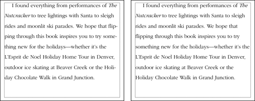
To apply an H&J to selected paragraphs, choose an option from the H&J menu in the Formats tab of the Paragraph Attributes dialog box or the Edit Paragraph Style Sheet dialog box. The default H&J is Standard, which hyphenates text and provides expert spacing within standard column widths. Experiment with the different default H&Js and your own to get the best look for the font size, alignment, leading, column width, and content in use (Figure 5.19).
Figure 5.19: At left, the Standard H&J applied to left-aligned text. At right, No Hyphenation applied to the same text. Changing the H&J can significantly affect the color of blocks of text and the overall tone of a document.
Tip: Adjusting Line Breaks
Settings in the H&J applied to a paragraph and the hyphenation exceptions specified for the project largely control the spacing and line endings in a paragraph. You can further perfect line endings by manually breaking lines with the New Line character (Shift+Return). Since manual line breaks remain if text reflows, it’s a good idea to do this after the formatting and text are final.
Tip: Preventing Widows
To prevent one line of a paragraph from ending up alone at the top or bottom of a column, use the Keep Lines Together controls in the Formats tab of the Paragraph Attributes dialog box. To keep subheads with accompanying text or keep the bulleted paragraphs in a list together, use the Keep With Next ¶ control.
If you have specific words that you never want to hyphenate, or you want them to hyphenate in certain ways, you can save hyphenation exceptions with a project. If you specify hyphenation exceptions when no projects are open, they apply to all new projects. To specify hyphenation exceptions:
1. Choose Utilities > Hyphenation Exceptions.
2. Enter each word with hyphens where you prefer the word to hyphenate. To prevent words from hyphenating, include no hyphens (Figure 5.20).
3. Click Add. You need to add all variations of the word, such as plurals, with hyphens separately.

Tip: Entering Discretionary Hyphens
To control the hyphenation of an individual word, you can enter a “discretionary hyphen” at the preferred hyphenation spot. To do this, type Command+hyphen (Mac) or Control+hyphen (Windows) within the word. A discretionary hyphen in front of the word (with no other discretionary hyphens in the word) prevents the word from hyphenating. You can also enter discretionary hyphens from the Utilities > Insert Character > Special.
QuarkXPress lets you adjust the amount of space between two characters with kerning and between a range of selected characters with tracking. Kerning is often used to remove space between particular character pairs, particularly in larger font sizes. Tracking is often used to spread out text for special effects or to decrease space for copyfitting. For example, you might track a paragraph a minimal amount to pull up an orphan (a single, lonely word in the last line of a paragraph).
The Classic tab and Character Attributes tab of the Measurements palette provide a Kern Amount field when the text insertion bar is between characters (Figure 5.21). When text is highlighted, the field changes to Track Amount (Figure 5.22).
Figure 5.21-5.22: At left, the text between the “I” and the apostrophe is kerned −3. At right, the entire word, “UDI’S” is tracked −10.

To adjust kerning and tracking, enter a value in the field (1 equals 1/200th of an em space). You can also click the arrows next to the field to adjust the kerning or tracking by 1/20th of an em space. Option+click (Mac) or Alt+click (Windows) the arrows to adjust kerning or tracking by 1/200th of an em space. Using keyboard shortcuts, however, is probably the most common way to apply kerning and tracking because you can see the results immediately.
![]() Increase (Mac): Press Command+Shift+] to increase kerning or tracking by 1/20th of an em space; press Command+Option+Shift+] to adjust by 1/200th em.
Increase (Mac): Press Command+Shift+] to increase kerning or tracking by 1/20th of an em space; press Command+Option+Shift+] to adjust by 1/200th em.
![]() Decrease (Mac): Press Command+Shift+[ to decrease kerning or tracking by 1/20th of an em space; press Command+Option+Shift+[ to adjust by 1/200th em.
Decrease (Mac): Press Command+Shift+[ to decrease kerning or tracking by 1/20th of an em space; press Command+Option+Shift+[ to adjust by 1/200th em.
![]() Increase (Windows): Press Control+Shift+] to increase kerning or tracking by 1/20th of an em space; press Control+Alt+Shift+] to adjust by 1/200th em.
Increase (Windows): Press Control+Shift+] to increase kerning or tracking by 1/20th of an em space; press Control+Alt+Shift+] to adjust by 1/200th em.
![]() Decrease (Windows): Press Control+Shift+[ to decrease kerning or tracking by 1/20th of an em space; press Control+Alt+Shift+[ to adjust by 1/200th em.
Decrease (Windows): Press Control+Shift+[ to decrease kerning or tracking by 1/20th of an em space; press Control+Alt+Shift+[ to adjust by 1/200th em.
Tip: The Kern-Track Editor Xtension
Some fonts seem to cause spacing problems or constantly require tracking just to look normal. For example, when using GillSans Light, it often appears that spaces are missing after a period. Or, some condensed versions of fonts often look too tight for comfortable reading. You can specify kern values for character pairs in specific fonts and you can adjust tracking tables in fonts using the Kern-Track Editor XTension provided with QuarkXPress. To experiment with these controls, choose Utilities > Tracking Edit or Utilities > Kerning Table Edit. In general, these controls are best left to experienced typographers.
In high-end typography, punctuation often hangs outside the margins of the text, particularly in display type. When punctuation hangs outside the margin, the text actually looks more aligned than when it is really aligned (Figure 5.23). Hanging punctuation is a paragraph attribute you can choose from the Hanging Character Set menu in the Formats tab of the Paragraph Attributes dialog box (Style > Formats). Choose Hanging Punctuation or Punctuation Margin Alignment. You can also create your own sets of characters to hang outside margins (Edit > Hanging Characters).

QuarkXPress provides a variety of special space characters for carefully positioning and aligning text (Figure 5.24). For example, in this book, an en space is used after the word “Tip” (in the Tip headings) and a nonbreaking standard space is used before the arrow (>) character that indicates menu paths (for example, File > Open). To insert special spaces, choose Utilities > Insert Character > Special or Utilities > Insert Character > Special (nonbreaking). If you use one of these spaces often, memorize the keyboard shortcut shown in the submenu. For information about when to use these spaces, consult a typography book such as The Complete Manual of Typography, by Jim Felici (Adobe Press).
Figure 5.24: In this example, an en space is used after the bullet for a consistent amount of space that is slightly wider than a standard space.
Tip: Inserting Hyphens, En Dashes, And Em Dashes
The Insert Character submenu of the Utilities menu also lets you insert hyphens, en dashes, and em dashes in both standard and nonbreaking varieties. You might use a nonbreaking hyphen to prevent a phone number from breaking at the end of a line. An en dash (–), which is usually half the width of a capital “N” in the active font, should be used as a minus sign and in number ranges. An em dash (—), the width of a capital “M,” is often used for dramatic effect within a sentence or used in pairs, like commas, to set off a clause. A sure sign of amateur typography is the use of hyphens rather than en dashes or em dashes.
Plenty of little touches make the difference between professional typography and the text in an e-mail message. Taking the time to use special characters such as bullets and real cent symbols, creating fractions, taking advantage of styles built into OpenType fonts, and applying ligatures (which combine certain character combinations) are just some of the refinements possible.
Many fonts contain far more characters than you can see on the keyboard, including bullets, accented characters, the euro symbol, and much more. In fact, many characters come in more than one shape, such as multiple variations on the ampersand symbol. So while you may have thought a character was the smallest unit of a font, the smallest unit is in fact called a “glyph.” You can access all the glyphs in a font with the Glyphs palette (Window menu).
Choose a font from the menu at the top of the palette, then scroll to locate the character you need. If the glyphs are too small for easy identification, click the zoom buttons at the right. When you locate the glyph you want, double-click to insert it at the text insertion point. A small triangle in the corner of a glyph’s box indicates alternate glyphs (Figure 5.25). If you use certain glyphs often, open the Favorite Glyphs area at the bottom of the palette and drag glyphs into the open boxes.

Combining full-size numbers with a slash, as in 1/2, yields some very ugly fractions. For a professionally typeset document, you need to use actual fractions such as ½, ¼ and ¾. To automatically format selected text as a fraction, choose Style > Type Style > Make Fraction. You can also insert common fractions from the Glyphs palette or create fractions from any numerals using a fraction font.
OpenType fonts may include special styles such as fractions (½) and ordinals (1st), both of which are included in the font used in this book, Proxima Nova. The styles available in OpenType fonts vary significantly from font to font. (You can identify OpenType fonts in the QuarkXPress menu by the “O” in front of the font name.)
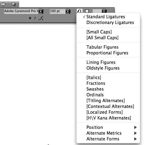
To see which styles are available for the active font, click the OpenType menu on the Classic tab or the Character Attributes tab of the Measurements palette (Figure 5.26). Options in brackets are not available in that font. You can also see available OpenType options in the OpenType area of the Character Attributes dialog box (Style > Character). Note that OpenType styles work best when applied to the appropriate text only—for example, only apply Tabular Figures to numerals not to all the text in a paragraph.
A ligature is a glyph that represents a character pair; common ligatures include “fi” and “fl” (Figure 5.27). For PostScript fonts, QuarkXPress can substitute “fi” and “fl” ligatures automatically when Enable Ligatures is checked in the Character tab of the Measurements palette. For OpenType fonts, you can apply the Standard Ligatures and the Discretionary Ligatures styles (if available for the font). The Glyphs palette (Window menu) displays all the ligatures available in a font.

Interesting layouts usually feature a combination of type and graphics, including text wraps, anchored items that flow with text, rules (lines) above and below paragraphs, and text converted to boxes.
In QuarkXPress, text can wrap around items and pictures placed in front of text. First, ensure that the item is placed in front of the text (Item > Bring to Front). Then, use the Runaround tab of the Modify dialog box (Item menu) or the Measurements palette to specify the type of runaround and how much space to leave between the item or picture and the text (Figure 5.28). Experiment with the various runaround options and outset values until the text wraps the way you want.

Anchored items flow with text just like other characters. To anchor an item, select it with the Item tool and choose Edit > Cut. Then, click the Text Content tool in text and choose Edit > Paste. When an anchored item is selected with the Item tool, the Align With Text Ascent and Align With Text Baseline buttons on the Classic tab of the Measurements palette let you position it. You can select anchored items with the Text Content tool ![]() just like other characters.
just like other characters.
Although you can anchor lines in text, it’s easier to place rules above or below paragraphs with the Rules tab of the Paragraph Attributes dialog box (Style > Rules). You can specify the length, width, placement, style, and color of rules for selected paragraphs and through a paragraph style sheet.
To convert text to a box—which can then contain text or a picture—select text and choose Item > Convert Text To Boxes > Unanchored or Anchored (Figure 5.29).