The QuarkXPress 8 default workspace is designed to put all the tools and controls you need right at your fingertips. With easy access to design options, you can let your creativity flow as you compose layouts, fine-tune text, and manipulate images onscreen. QuarkXPress tools make it easy to create and modify items, the palettes provide a convenient path to formatting controls, and layout aids such as rulers and guides help with placement.
You can customize the workspace by displaying the palettes and layout aids you need, saving palette sets, resizing and splitting project windows, and more. As you work in QuarkXPress, you’ll need to navigate through layouts and pages, change the view scale, and experiment with items on the paste-board surrounding layout pages. Since nothing can stymie your creative inspiration more than having to hunt through the program interface for a command you need, familiarize yourself with the QuarkXPress workspace in these pages.
In this chapter you’ll learn about the QuarkXPress interface, including the main project window, the primary palettes, navigation and viewing options, and other interface-related features.
The main project window displays all the palettes you have open, the layouts within the project, and the pages of the selected layout (Figure 2.1).

QuarkXPress lets you split the project window to see different views of projects within the layout. For example, while you’re working, you might want to see how adjusting the runaround on a picture affects all the text in a box, or you might need to see if adding text in one location causes reflow across a layout (Figure 2.2).
Figure 2.2 Splitting the project window allows you to display different views of the same layout or display a different layout.
To split the project window horizontally or vertically, click the split-screen icons on the lower-left corner of the project window
 or choose Window > Split Window > Horizontal (or Vertical). You can also drag the small, light blue split bar
 in the lower-right corner of the project window for a vertical split or the upper-right corner for a horizontal split. The size of the original window determines how many times it can be split. Drag the split bar between windows to adjust the window sizes.
To remove a split, click a window’s close box or drag the split bar to any side of the project window. You can also choose Window > Split Window > Remove All.
To open a new window for the active project, choose Window > New Window. You can drag the new window to another monitor, view different layouts in that window, and more. This is particularly helpful if you are updating shared content among layouts. To close a separate window, click its close box.
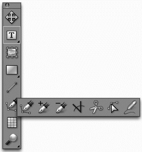
The Tools palette provides all the tools you need for creating, selecting, and modifying QuarkXPress items and their contents. You will generally keep the Tools palette open at all times, but you can open and close it quickly by pressing F8 or choosing Window > Tools. Select tools with the mouse or with keyboard shortcuts.
A small triangle in the lower-right corner of a tool’s box indicates a pop-out menu of additional tools. The default Tools palette provides the tools shown in Figure 2.3; the tools in the pop-outs are shown in Figures 2.4–2.7.


Figure 2.5 The box creation tools and the Composition Zones tool (far right).

Figure 2.6 The tools for manipulating Bézier points, the Scissors tool, and the Freehand Drawing tool.

To select a tool in a pop-out menu, click the main tool, then drag to the right. The tool replaces the initial tool. Press Control as you select a tool to add it to the Tools palette. To move the tool back to its pop-out menu, Control+click it.
Single-letter keyboard shortcuts let you quickly change tools. (If you’re using the Text Content tool, press Escape first.) When different tools have the same shortcut, press the shortcut key repeatedly until the tool you want is selected.
You can also gain “temporary access” to some tools by pressing a keyboard shortcut. For example, while editing text with the Text Content tool, you can press Command (Mac) Control (Windows) for the Item tool and move the box. When you release the key, the previous tool is still selected.
 Item tool: V or Command (Mac) or Control (Windows) for temporary access.
Text Content tool, Text Linking tool, Text Unlinking tool: T or double-click a box with the Item tool for the Text Content tool.
Picture Content tool: R or double-click a picture with the Item tool.
Rectangle Box tool, Oval Box tool, Star Box tool, Composition Zones tool: B.
Line tool: L.
Bézier Pen tool, Add Point tool, Remove Point tool, Convert Point tool, Scissors tool, Select Point tool, Freehand Drawing tool: P.
Table tool: G.
Zoom tool: Z or Control+Shift (Mac)/Control+spacebar (Windows) for temporary access.
Pan tool: X or Option (Mac)/Alt (Windows) for temporary access.
Even QuarkXPress beginners will have no trouble using the QuarkXPress menus. You may wish to click each menu to see how commands are grouped. Just don’t get bewildered by the sheer length and complexity of the commands—many of the menu commands are special-purpose options that you’ll never touch.
A few notes about the QuarkXPress menus:
Preferences dialog box: The Mac version provides a QuarkXPress menu, where you will find the Preferences command. (On Windows, you’ll find Preferences under the Edit menu.)
Context-sensitive menus: The options in the Style menu (Figure 2.8) change entirely depending on whether text, a picture, or a line is selected in the layout. In other menus, commands are grayed out if they are not relevant to the layout type (print, Web, or interactive) or the selected item.

Context menus: You can make quick changes to everything from the rulers to the project window to the selected item with context menus (Figure 2.9). Control+click/right+click anywhere on the window or page to see the options.

The Measurements palette puts scores of formatting controls for text, pictures, and items front and center. The palette is divided into tabs of related controls along with a Classic tab that consolidates the most frequently used options for formatting both items and contents (Figure 2.10). As with the Tools palette, you will generally keep the Measurements palette open at all times. You can open and close it quickly by pressing F9 or choosing Window > Measurements.
Figure 2.10 The Classic tab of the Measurements palette combines the most-often used formatting controls, with item formatting options on the left and content formatting options on the right. When text is selected, as shown above, the left side lets you change the placement, size, and color of the box itself. The right side provides formatting options such as alignment and font.
The availability of the tabs in the Measurements palette depends on what is selected in the layout—text, a picture, an item, a group, a table, and so on—and what type of layout you’re working on. Tabs include Classic, Text, Paragraph, Character, Tabs, Frame, Runaround, Clipping, Text Path, Space/Align, Export, Grids, and Drop Shadow. Figures 2.11–2.13 show a variety of basic Measurement palette tabs.
Figure 2.11 When a picture is selected, the Classic tab of the Measurements palette provides box controls (such as size) at left and picture controls (such as scale) at right.
Figure 2.12 When a text box is selected, the Text tab of the Measurements palette lets you control the placement of text within the box, including the number of columns and text inset.
By default, the Classic tab of the Measurements palette displays tabs for the current selection. To select another tab, hover the mouse above the Measurements palette to display the tab bar and select a button. Since you will use the various tabs of the Measurements palette often, you can set the tab bar to always display. To do this, Control+click/right-click the Measurements palette title bar (on the far left side) and choose Always Show Tab Bar (Figure 2.14).

When you enter values in fields in the Measurements palette—or fields in any dialog box—you can enter math operators so QuarkXPress can calculate values for you. For example, to cut the width of a 3.12″ box in half, you can enter /2 next to the value in the Width field. To double the width of the box, you can enter *2. The math operators are: + (plus), − (minus), * (multiply), / (divide).
The palettes in QuarkXPress are both a blessing and a curse. They make frequently used controls readily available while cluttering your screen and obscuring your layouts. Having a second monitor for storing palettes is handy, but it does put them a little out of reach. To get control of palettes and keep them close by, you can open, close, and resize them; group them; and save palette configurations as sets to show and hide together.
Palettes are small floating windows that condense a lot of related features into a little space. All the QuarkXPress palettes are listed in the Window menu. In general, you will have at least the Tools palette and the Measurements palette open, along with possibly the Page Layout, Colors, and Style Sheets palettes. Palettes work as follows:
Open: Choose a palette name from the Window menu to open it.
Close: Click the close button in the upper-left corner or choose a palette name from the Window menu to close it.
Resize: Drag the lower-left corner of the palette to resize it. (Some palettes are a fixed size.) Click the arrow next to the palette’s name to shrink the palette to just its title bar.
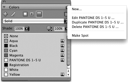
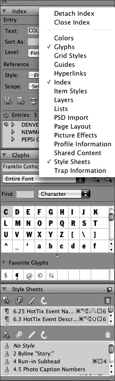
Palette menus: Click the menu icon in the upper-right corner of a palette’s title bar to display a menu of options specific to the palette (Figure 2.15).
QuarkXPress lets you group palettes vertically so they travel together. To group palettes, Control+click (Mac) or right+click (Windows) the title bar of any palette (Figure 2.16). From the context menu, choose a palette to add it to the current palette or group. You can also detach palettes from a group and close palettes from this context menu.
Once you create a palette configuration that you like—including which palettes are open, how they are grouped, and where they are—you can save the configuration as a palette set. You can create multiple palette sets for different purposes, such as editing text or working with color and pictures. To create a palette set, first set up your palettes the way you want them. Then, choose Window > Palette Sets > Save Palette Set As. Give the palette set a descriptive name and specify a keyboard shortcut for it if you want (Figure 2.17). To display a palette set, choose it from the Window > Palette Sets submenu or press its keyboard shortcut.

When you’re designing and revising a layout, it can seem like you’re spending half your time just locating the right spot to work on. QuarkXPress provides many ways to navigate through layouts, including “turning” pages and entering page numbers as well as more visual methods such as clicking page icons. Most users find a navigation method they like best and stick with it.
Scroll bars: Using the scroll bars is probably the slowest and least accurate way to navigate in QuarkXPress. Nonetheless, as in all programs, you can scroll within pages and from page to page.
Pan tool: The Pan tool
 lets you “push” pages around until you get to just the right spot. Similar to scrolling, panning can be somewhat slow, but it’s very visual and can give you a good overview of a layout. The Pan tool is in a popout menu of the Zoom tool at the bottom of the Tools palette. You can select it from the pop-out or press X. (You may need to press X twice as X is also assigned to the Zoom tool; X will not select the Pan tool when the Text Content tool is selected.) A better way to access the Pan tool is by holding down Option (Mac) or Alt (Windows). Rather than selecting the Pan tool, this just gives you temporary access to it so you can move around the layout, then go back to what you were doing with the previously selected tool.
Turn pages: To flip from page to page, you can use the arrows in the lower-left corner of the project window
 , the Page Up and Page Down keys on your keyboard, or the options in the Page menu: Previous, Next, First, and Last. Pressing Page Up and Page Down on the keyboard moves up or down an entire spread. Add the Shift key to move up or down one page; add the Option (Mac) or Alt (Windows) key to view the same area of the previous or next page.
Select page icons: You can double-click a page icon in the Page Layout palette (Window menu) to jump to that page. In addition, if you click the up arrow
 next to the Page Number field in the lower-left corner of the project window, you can choose from a menu of page icons.
Enter page numbers: If you know what page you want to display, you can enter its number in the Page Number field in the lower-left corner of the project window
 . The quickest way to jump to a page—without taking your hands off the keyboard—is to use the keyboard shortcut for the Page > Go To menu command. Press Command+J (Mac) or Control+J (Windows), enter a number, and press Return/Enter.
Tip: Entering Page Numbers
When you enter page numbers, you need to include any section numbering. So if the page number shows 1.2, you need to enter 1.2. If you don’t know the section number, you can enter an “absolute” page number according to the page’s position in the layout. To enter an absolute page number, precede it with a plus sign—so +1 is the first page in the layout, +2 is the second, and so on. You can also quickly jump to the last page of a layout by entering the word “end.” This information applies to page numbers you enter in any fields—for navigation, printing, moving pages, and the like.
QuarkXPress provides a variety of visual aids that help with sizing and positioning items on pages. You can customize many of these aids in preferences and control which ones are showing. You might show all the layout aids while constructing a layout, then hide them all for fine-tuning.
Tip: Memorize Keyboard Shortcuts for Favorites
Memorize the keyboard shortcuts for showing and hiding the rulers—Command+R (Mac) or Control+R (Windows)—as you may show and hide them often. If you tend to use grids, notice the keyboard shortcuts listed in the menu and memorize the ones you use.
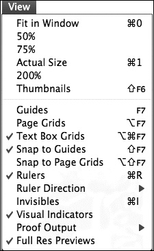
Choose options from the View menu (Figure 2.18) to control which layout aids display, including:
Guides: Choose View > Guides to display margin guides, ruler guides, and any guides you created through the Guides palette (Window menu).
Page grids: Choose View > Page Grids to display each page’s grid.
Text box grids: Choose View > Text Box Grids to display any grids applied to text boxes in the layout.
Rulers and ruler direction: Choose View > Rulers to display a horizontal ruler across the top of the project window along with a vertical ruler down the left side. By default, the ruler measures pages from left to right. The View > Ruler Direction submenu lets you choose Left-to-Right or Right-to-Left.
Invisibles: Choose View > Invisibles to display nonprinting characters in text such as spaces (dots), tabs (arrows), and paragraph returns (¶). Invisibles are particularly helpful when creating tabs and applying style sheets.
You can also activate the Snap to Guides and Snap to Page Grids commands in the View menu. When checked, these options create a sort of “magnetic field” around guides so that items automatically align with them. The size of the magnetic field, called the Snap Distance, is specified in the Guides & Grids pane of the Preferences dialog box.
You can customize most of the layout aids in QuarkXPress—for example, you can change the default color of guides if they are the same color as a layout’s background. Or, you can work in picas or centimeters instead of inches. To customize the layout aids:
Guides: Specify the color of margin guides and ruler guides in the Grids & Guides pane of the Preferences dialog box. The Guides palette (Window menu) lets you specify the color of individual guides as well.
Page Grids: Specify the color of gridlines in the Master Guides & Grids dialog box when a master page is displayed.
Text Box Grids: Specify the color of gridlines through the Grid Settings dialog box (context menu > Grid Settings) or a grid style (Window > Grid Styles).
Rulers: The Measurements pane of the Preferences dialog box lets you choose from Inches, Inches Decimal, Picas, Points, Millimeters, Centimeters, Ciceros, and Agates for the horizontal and vertical rulers. You can also Control+click (Mac) or right+click (Windows) the rulers and choose an option from the Measure submenu of the context menu.
Tip: Changing the Measurement System
The measurement system selected for the rulers affects all the measurement fields in the software (Origin Across, Origin Down, Width, Height, and so on). If you want to enter a value in a different measurement system—for example, if you want to enter a value in inches while the measurement system is set to picas—enter the measurement system’s standard abbreviation (such as ″ or cm) with the value. QuarkXPress will convert the values for you. Note that font size, line width, and frame width are always specified in points, regardless of the selected measurement system.
QuarkXPress lets you view layouts at anywhere from 10% to 800% of their actual size—so you can, for example, zoom out to get a quick overview of an entire publication or zoom in to carefully position a single letter or box. Since you change the view scale often as you work, QuarkXPress provides a variety of convenient methods for changing the view. In addition, you can view imported pictures at their full resolution to see all the details.
You can change the view scale by using the Zoom tool, choosing commands in the View menu, and entering a value in the View Percent field on the project window. If you have a split window, you can view the same layout at different view percentages, allowing you to see the effect of detailed changes on an entire layout.
Zoom tool: Use the Zoom tool
 at the bottom of the Tools palette to increase the layout view scale; press Option (Mac) or Alt (Windows) to decrease the view scale. You can click the Zoom tool to change the view in standard increments or you can click and drag to view a specific area of a layout. Press V (when you’re not using the Text Content tool) to select the Zoom tool. You can also press Control+Shift (Mac) or Control+spacebar (Windows) for temporary access to the Zoom tool.
Keyboard commands: Press Command (Mac) or Control (Windows) along with the plus (+) or minus (-) sign on the keyboard to change the view in standard increments. When using the Text Content tool, press Escape first.
View menu: Choose an option from the View menu to change the view scale: Fit in Window, 50%, 75%, Actual Size, 200%, and Thumbnails. You are likely to use Fit in Window and Actual Size (100%) often enough that you should remember those shortcuts: Command+zero (Mac) or Control+zero (Windows) for Fit in Window; change the zero to 1 for 100%. Thumbnails view (around 10%) lets you move pages within a layout and drag pages among projects.
Enter a percent value. Enter a specific value in the View Percent field in the lower-left corner of the project window
. You can quickly jump to this field by pressing Control+V (Mac) or Control+Alt+V (Windows), entering a value, and pressing Return/Enter. Enter “t” for Thumbnails view.
If the files for imported pictures are available on your computer, you can enable full-resolution previews for individual pictures. Full-resolution picture previews are smooth (not pixelated) and give you a better idea of how the final output will look. To enable a full-resolution preview, select the picture and choose Item > Preview Resolution > Full Resolution. To enable and disable the display of full-resolution previews for those pictures, choose View > Full Res Previews.
Every page or spread of a QuarkXPress layout is surrounded by a work area called the pasteboard (Figure 2.19). You can use the pasteboard for temporary item storage and to work on items without distractions. For example, if you’re drawing a new logo with the Bézier Pen tool, you might want to work on the pasteboard so you can really focus on the drawing. You can then drag the finished item to a layout page. To see the pasteboard, reduce the view scale or scroll.
Figure 2.19 QuarkXPress provides a wide pasteboard to the left and right of each page or spread. Use the pasteboard for item storage, work space, and bleed items as you work. You can specify that the pasteboard for the active spread display in a different color as shown here.

You can customize the width and color of the pasteboard, and you can specify a different color for the pasteboard of the active spread. The default pasteboard width is 100%, meaning that the pasteboard is the same width as the layout pages. You can make the pasteboard narrower but not wider. The Display pane of the Preferences dialog box (Figure 2.20) lets you customize the pasteboard. Display preferences are not project- or layout-specific; they apply to your copy of QuarkXPress.

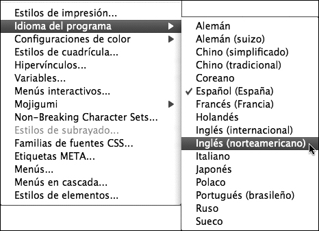
You can display the QuarkXPress 8 interface—including menu commands and palette controls—in many different languages. To do this, choose an option from the Edit > Program Language submenu (Figure 2.21). If you need to reset the language to U.S. English (or your preferred language) and cannot read the commands, click the Edit menu. (The Edit menu will be the second or third menu from the left, depending on your operating system.) Notice the gray dividing lines in the menu; display the second submenu under the fourth line. If you can’t figure out which command is U.S. English (for example, if you don’t recognize the word “Inglés”), experiment with the different options.