Chapter 10. Reports and Graphs
Quicken comes with dozens of built-in reports and graphs that show what’s up (or down) with your personal finances. The only challenging aspect is figuring out which report tells you what you need to know and where you can find it. This chapter demystifies reports and the many ways of generating them.
If you’re new to Quicken or financial lingo in general, EasyAnswer reports were made for you, as explained in the box on Section 10.1. These reports tell you what they do in plain English—as in, “Did I meet my budget?” If none of the EasyAnswer reports meets your needs, the Reports & Graphs Center lists all of Quicken’s reports. This chapter describes some of the more popular built-in reports, what they’re good for, and where you can find them.
If you’re a Quicken veteran (or trying to become one), you can take those built-in reports and customize them to your needs: tweak a date range, remove unneeded columns, or add subtotals in different places. You can then launch that report straight from the Reports menu or the Reports & Graphs window. In this chapter, you’ll learn how to customize reports to get what you want and then save those reports for future use.
Tip
If none of Quicken’s customization tools does what you want, see Appendix B to learn how to export a Quicken report to another program for fancy formatting and other fine-tuning.
Running Reports
Quicken’s report categories are broad but distinct, so finding the right report can be as easy as scrolling through the Reports menu to a likely category, and then, on the category submenu, clicking the name of the report you want. But if you’d rather see all built-in and customized reports in one window, the Reports & Graph Center is a better option.
Finding and Customizing Reports
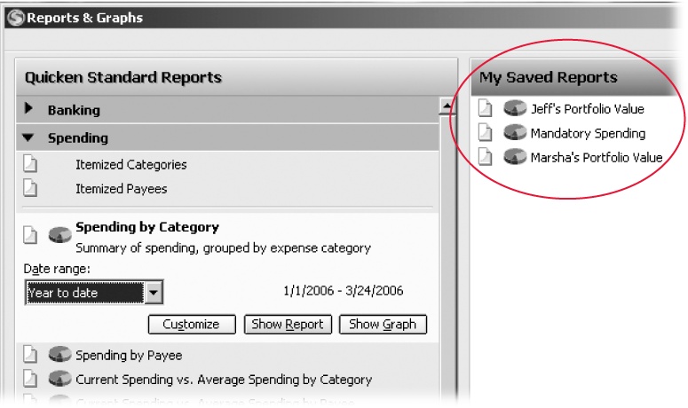
When you choose Reports → Reports & Graphs Center, the Reports & Graphs window opens showing you two clickable lists of reports: Quicken Standard Reports and My Saved Reports. One significant advantage of the Reports & Graphs window is that you can tweak a report before you run it. For instance, you can change the date range or specify which categories to include. Click a report name, and the Reports & Graphs window expands the report to include the key settings you can change, as shown in Figure 10-1. Click Show Report to see the results. Once a report is visible, you can edit the transactions it contains, as discussed in the box on Section 10.1.3.
To run a report without any changes, click the report icon (which looks like a piece of paper). If a pie chart icon appears to the left of the report name, you can create the report as a graph. Click the pie chart icon or, if you clicked the report name to expand it, click Show Graph.
That’s all there is to generating a report. In the report window, you can then save the report, print it, or click Customize to modify it (see Section 10.5).
Generating a Report or Graph
In Quicken, almost every report is also available as a graph, and you can transform every graph into a tabular report. In the Reports & Graphs window, click either the report or graph icon to display that format. In a report window, you can click Show Graph or Hide Report to view either or both formats.
Note
Transactions for hidden accounts don’t appear in reports automatically. If you want to generate a report including transactions for a hidden account, first “unhide” the account by turning off the Hide In Quicken checkbox. (Press Ctrl+A to open the Account List window and then click the Manage Accounts tab.) Then hide it again after you produce the report.
You can take your pick of how you generate a report or graph. Here are your choices and why you might prefer each:
Reports menu. When you know exactly which report you want and don’t want to make any changes to it, the fastest method is to choose Reports, scroll to the report category, and, on the submenu that appears, click the report name.
The Reports menu includes several report categories, which display submenus of built-in reports. When you choose Reports → My Saved Reports & Graphs, the reports that you’ve customized and saved appear on a submenu.
Reports & Graphs window. As you can see in Figure 10-1, you can run a report or graph in two ways in this window. Click the report or graph icon to run the report as is, or click the report name to first change settings before generating it.
Quicken icon bar. You can add the customized reports that you run more frequently than you brush your teeth to the Quicken icon bar for one-click access, as described in Managing Reports on Section 10.1.3.
Managing Reports
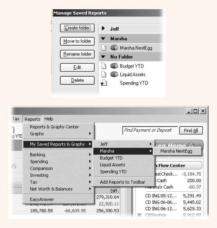
At the bottom of the My Saved Reports pane are two additional features for working with your customized reports. In Quicken 2006, you can add reports to the program’s icon bar for ready access. In addition to editing and deleting your customized reports, this version of the program lets you categorize your customized reports.
Manage Toolbar Reports. If you want to add one of your customized reports to the Quicken icon bar, click Manage Toolbar Reports. In the Manage Toolbar Reports dialog box, turn on the checkboxes for every report you want to launch from the Quicken icon bar, as demonstrated in Figure 10-2.
Manage Saved Reports. To edit, delete, or organize your reports and report folders, click Manage Saved Reports. You can create folders to categorize your customized reports, move reports to different folders, or edit or delete your reports. For example, a Marsha folder could hold reports for her stellar portfolio results. A separate folder for Jeff could show reports for his retirement nest egg. Reports that apply to the entire household can be in a household folder or no folder at all. Figure 10-3 shows the Manage Saved Reports dialog box and the results of putting it to use.
A Quick Guide to Quicken Reports
Most entries on the Reports menu are categories of reports. When you position the mouse pointer over a category, a submenu with report names appears. Read the following sections to learn what each Quicken report category represents—a big help in finding the reports you want—and which reports are most likely to help. If you still don’t find the report that you want, you can explore all of the reports in the Reports & Graphs window—or head to Section 10.5 to bone up on customizing reports.
Banking
The Banking report category provides reports that summarize banking activity— deposits, payments, and transfers—in several ways. Here are some helpful reports in this category:
The Reconciliation report (see Chapter 7) shows transactions based on whether they’ve reconciled or haven’t yet cleared.
The Banking Summary report shows your income, expenses, and transfers between accounts, grouped by category. This is the report to use if you want to see whether your income in a period is enough to cover your expenses, and to see transfers to savings and other accounts.
The Cash Flow report is like the Banking Summary report without the transfers between accounts. It tells you whether your income is enough to cover your spending.
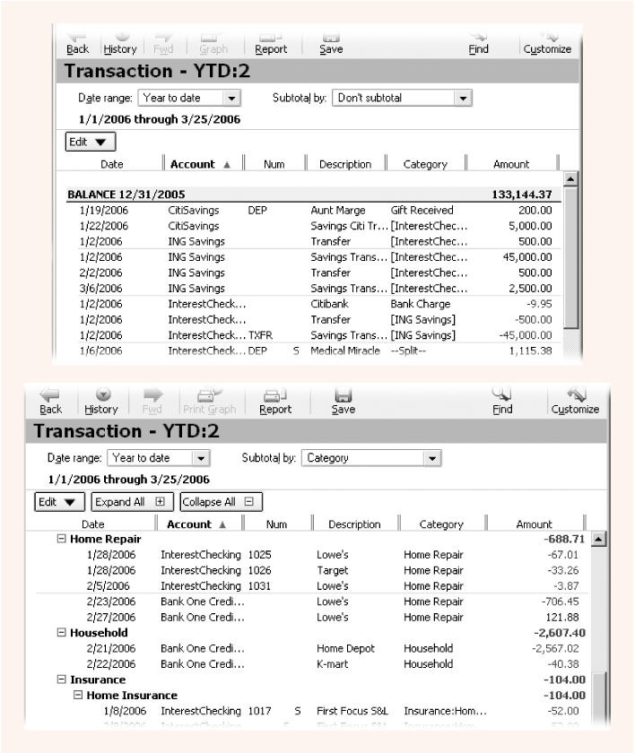
The Transaction report doesn’t set up much formatting, but it includes all transactions in all accounts for the date range you choose. If you want to customize a report to your liking, this report is a good place to start.
Spending
If you’re perpetually short on cash or trying to squeeze more savings into your budget, knowing how you spend money is a great place to start. Quicken 2006 has added several new reports to help people discover how they spend money, which is a real plus now that the national savings rate is at an all-time low.
Here are some of the spending reports:
Itemized Categories is a lot like the Banking Summary report except that it shows transactions for each category (income, expense, and transfers) for all of your accounts, not just for checking, savings, credit card, and cash.
Spending by Category shows only transactions for expense categories. If you can’t do anything about how much money you make, use this report to focus on finding out where you can cut costs.
Current Spending vs. Average Spending by Category compares how much you spent during one period (like the current month) to your average spending for another period. This report doesn’t tell you how you’re doing compared to your budget; it only shows whether you’re spending more or less during the period than you usually do.
Income and Expense by Category is like the Itemized Categories report without the transfers.
Monthly Budget compares your income, expenses, and transfers to what you planned in your budget. This report is a better gauge of whether you’re going to make ends meet than the “Current Spending vs. Average Spending by Category” report.
When you customize a budget report, the Display tab in the Customize Budget dialog box includes a drop-down menu to select the budget you want to report on.
Comparison
Some of the reports in the Comparison category are repeats from other categories, like the “Current Spending vs. Average Spending by Category” report. And others take reports from other categories and add a comparison to another time period. For example, if you want to plan a future budget, the “Income and Expense Comparison by Category” report in this section shows your income and expenses for one period (such as the last 12 months) compared to your income and expenses for the previous year.
Investing
The Investing category has reports for all sorts of tasks—from tax reporting to planning to gloating over your success. If you have any investments, you’re bound to use almost every one of these reports at one time or another.
Capital Gains. This report tells you the capital gains you realized on securities you sold and is one thing your accountant asks for at tax time.
Investing Activity. This report summarizes the activity in your investment accounts, including deposits and withdrawals you made; interest, dividends, and gains you received; and the change in market value for the securities you still own. For an overview of what contributed to the change in your portfolio value, this report is it.
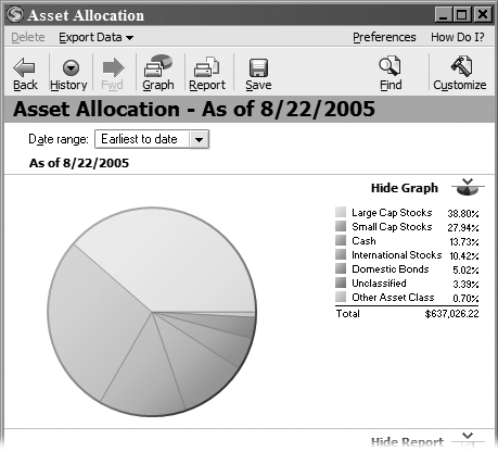
Investment Asset Allocation. How you allocate your investments to different asset classes is one way to measure the risk in your portfolio. For example, a portfolio dedicated to small-cap stocks is roller-coaster material, while a portfolio mainly but not entirely in bonds and CDs is steadier (but risk is due to inflation and interest rate changes). The best way to see if your portfolio is diversified is to generate this report as a graph, as shown in Figure 10-4.
Tip
If you double-click one of the slices in the Asset Allocation pie chart, Quicken creates a second graph that shows the allocation of securities within that asset class. If you double-click a slice in this second graph, the program produces a report showing the performance of that security over time.
Investment Income. Whether you need to know how much income you earned from investments for your tax return or you want to see whether your portfolio produces enough income for you to retire, this report shows how much you receive in dividends, interest, and capital gains.
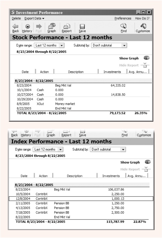
Investment Performance. This report calculates the average annual return your portfolio earned during a period. It uses the balance on the starting date, the present value of the portfolio, and the amount of time you’re measuring to calculate this time-based return. For example, as shown in Figure 10-5, running this report for the individual stocks you pick and then running the report again for your index mutual funds can tell you whether you’re as good a stock picker as you think you are.
Investment Transactions. This report shows all of your investment transactions from dividends to gains to transfers into your investment accounts.
Portfolio Value and Cost Basis. If you want to know how much your portfolio is worth compared to how much you contributed, this report’s for you. By letting you compare your portfolio’s current value to cost basis (Section 9.11.2.1), this report tells you how much your investments have earned. (A report that shows only portfolio value can be misleading, particularly if you’re socking away oodles of money into an investment account but the return is mediocre.)
Tax
Even if you work with an accountant, the Tax report category is a lifesaver when you want to collect the information that your accountant requests. You can generate reports specific to one tax form or dump all your tax transactions out in one fell swoop, as long as your Quicken categories are linked to tax line items (see the box on Section 10.2.6).
Tax reports
Although it’s the last report in the category, the Tax Summary report is the be-all and end-all of tax reports—it shows all of your tax-related transactions subtotaled by category. If you know how your Quicken categories correspond to lines on tax forms and you’ve diligently entered all of your tax-related transactions, you can produce this one report and start working on your return.
Tip
To check that you’ve recorded all monthly and quarterly tax-related transactions, run an itemized category report and make sure you see 12 transactions for monthly payments and four transactions for quarterly payments.
Other reports help you figure out where your tax-related data belongs. Schedule A-Itemized Deductions, Schedule B-Interest and Dividends, and Schedule D-Capital Gains and Losses show only the transactions that apply to that specific tax form. Moreover, the transactions are all neatly subtotaled by the Quicken categories that correspond to the tax lines on those forms.
Exporting tax data to Turbo Tax
If you go it alone preparing your tax returns, chances are you use Turbo Tax, Intuit’s program for preparing tax returns. Because one of the big benefits of Turbo Tax is reusing data you’ve captured in Quicken, you’ll be happy to see the “Tax Schedule (for export to Turbo Tax)” report in the Tax category. This report groups and subtotals all of your tax-related transactions by tax form.
Clearly, printing this report to paper isn’t going to help Turbo Tax. To create an electronic file to import into the current year’s version of Turbo Tax, in the report window menu bar, choose Export Data → “Report to tax export file.”
Net Worth & Balances
If you want to see whether you’ve mortgaged yourself to the hilt or enjoy seeing numbers that indicate your obscene wealth, the reports in this category tell you that in two different ways.
Account Balances. This report shows the balance in each account you have in Quicken. At the bottom of the report, the program subtracts liabilities from your assets to calculate the Overall Total. This result is also called your net worth (the net of what you own minus how much you’ve borrowed to own it).
Net Worth. The Net Worth report lists all of your asset accounts first and totals them to show Total Assets (what you own). It then lists your liability accounts and totals the money you owe. But at the very bottom, the Overall Total is the same number you see at the bottom of the Account Balances report.
A Review of Report Preferences
Although Chapter 1 tells all you need to know about Quicken’s preferences (Section 1.5), a chapter devoted to reports wouldn’t be complete without a brief review of report preferences. Setting the preferences in this section lets you choose how you want all of your reports to behave. Choose Edit → Preferences → Quicken Program to open the Quicken Preferences dialog box.
Reports and Graphs Preferences
Here are the preferences you can set for reports and graphs and what you can do with them:
Default date range. By setting this preference, you tell Quicken the date range you want to use for any report that isn’t already customized to a specific date range. For example, if you tend to generate reports to review your performance so far this year, choose “Year to date.”
Default comparison date range. This preference sets the date range that the program uses automatically when you generate a report that compares two date ranges.
Customizing reports and graphs options. You have two choices for what Quicken does when you customize a report. If you want to keep original reports as they are, regardless of the changes you make in a report, select the “Customizing creates new report or graph” option. If you would rather have Quicken change a report to match your tailoring, choose the “Customizing modifies current report or graph” option.
Note
If you modify one of Quicken’s built-in reports and save it, the program doesn’t overwrite the built-in report. It saves your customized report to “My Saved Reports and Graphs” (see Section 10.6).
Customize report/graph before creating. If you can’t help making small changes to every report you generate, turn on this checkbox. When you choose a report from the Reports menu, Quicken automatically opens the Customize dialog box.
Reports Only
Tabular reports have a few preferences that determine what you see in the columns and how you interact with the results. Here are the preferences that apply only to tabular reports:
Account display. Quicken automatically selects the Name option to show account names. But if you use abbreviated names and want to see details, choose Description. Or go whole hog and choose Both to display the account name and its description.
Category display. The Name option, which the program chooses automatically, is fine most of the time. The only time you might choose Both is if you want to produce a report of all of your categories along with their descriptions, so you can plan updates to the Category List while lounging in the sun.
Use color in report. Quicken turns on this checkbox automatically, which shows negative numbers vividly in red. You might decide to turn this checkbox off if you have a color printer and don’t want to remember to turn off color printing.
QuickZoom to investment forms. This checkbox is turned on initially, and there’s no reason to turn it off. With this preference turned on, you can double-click report items to open the appropriate dialog box for editing that transaction.
Remind me to save reports. This checkbox is also turned on initially. If you regularly customize reports to save for future use, this preference helps you remember to save those changes. However, if you’ve saved a host of reports and rarely need a new one, turn this checkbox off to prevent the interruption.
Decimal places for prices and shares. Out of the box, Quicken sets this preference to 3. If any of your brokerage accounts provide prices and shares to more decimal places, change this setting so you can keep your records synchronized with your financial institution.
Printing Reports and Graphs
In Quicken, you can turn any report or graph you create into either a hard copy or a file. If you save a report as a file, you can use that file to feed other programs for more formatting or calculations.
Printing a Report
Telling Quicken to print a report is easy. In a window containing a report or graph, in the icon bar, click Print Report. In the Print dialog box that opens, Quicken offers printing options that you’re probably familiar with from other programs, as shown in Figure 10-6.
Once you’ve selected the settings you want, click Preview to see if the report is correct before committing it to paper, or click OK to print the report.
Most of the options for printing a report are easy to figure out. The dialog box even includes icons for portrait and landscape orientation, in case you forget which prints “the long way.” Here are the options that aren’t immediately obvious:
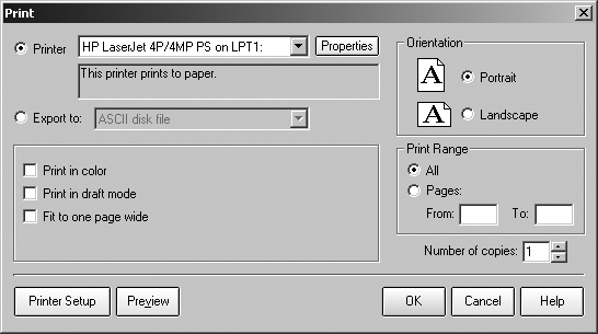
Print in draft mode. If you’re sprinting to the wire to deliver tax information to your accountant, you can turn on this checkbox to print your report using a printer font for faster printing.
Fit to one page wide. If a report oozes past the width of a page like your Aunt Hilda on a picnic bench, turn on the “Fit to one page wide” checkbox to girdle the report back to one page width.
If you click Print Graph, the Print dialog box appears, but with more limited options. You can still choose the Printer or “Export to” options, a page orientation, the number of copies, and whether to print in color. If you have a color printer, be sure to turn on the “Print in color” checkbox to make the printed chart easier to read.
Saving a Report as a PDF File
New in Quicken 2006 is the ability to save reports and graphs as PDF files. Although you probably send tab-delimited or text-file reports to your accountant, PDF files are perfect if you want a snapshot of your finances that no one can edit. For example, if you generate reports for loan applications, a PDF file ensures that a bank employee doesn’t change a value inadvertently.
In a report window menu bar, choose Export Data → “Report to PDF format.” The Print dialog opens, but this time with the Printer text box filled in with Quicken PDF Printer. When you click OK, the “Save to PDF File” dialog box opens. Choose a folder and a filename and then click Save.
Saving a Report to a File
For some reason, Intuit provided two places to transform reports into files. The Print dialog box contains an option to create ASCII text files, tab-delimited files, and comma-delimited files. But you can also create tab-delimited files by choosing Export Data → “Export to Excel compatible format” (see Appendix B). The tab-delimited files that you create in both dialog boxes are identical, so you can generate them with whichever method you prefer.
The easiest way to generate tab-delimited files, which separate each piece of information with a tab character, is from a report window menu bar. You may think that the “Export to Excel compatible format” command applies only to Excel, but many programs can read tab-delimited files. In the “Create Excel compatible file” dialog box, click a folder and a filename, click Open, and your tab-delimited file is ready to import into another program.
The Print dialog box takes a few more clicks, but that’s the price you pay for getting to choose any of the three file formats that Quicken handles. In a report window icon bar, click Print Report to open the Print dialog box. Just below the Printer option are the “Export to” option and a drop-down menu of file formats. Here are the choices and when you might want to use them:
ASCII disk file. This format produces a text file that looks like the report, but uses space characters to position values in columns and uses different fonts. You can use this format to store an electronic version of your report, but it won’t import properly into a spreadsheet or other program.
Tab-delimited (Excel compatible) disk file. Choosing this format produces a file with tab characters separating each value. Although the choice says “Excel compatible,” many programs can read files in this format.
.PRN (123-compatible) disk file. Despite this format’s convoluted name, it produces a plain old comma-delimited file, which works with 123, Excel, and most other programs. Use this option if you want to import a report to a program that doesn’t handle the tab-delimited format that the “Export to Excel compatible format” command produces.
After you choose the type of file and click OK, Quicken opens the Create Disk File dialog box, in which you can specify the filename and where you want to save the file.
Customizing Reports
As you can see in Figure 10-7, the report window provides several ways to customize reports, depending on whether you’re looking to nudge a column over, tweak the date range, or perform a major overhaul.
Tip
If you’re editing your report to make it fit better on the printed page, consult the box on Section 10.5, too.
You can’t edit the way report contents appear right in the report window like, say, a spreadsheet or text document. Instead, you tweak the report’s settings in a dialog box, and let Quicken make the changes to the report. Here are your options:
Reports & Graphs window. If you choose Reports → Reports & Graphs Center, you can customize reports before you generate them. In the Reports & Graphs window, click the name of a report and then change the settings that appear. Click Show Report to generate the customized report.
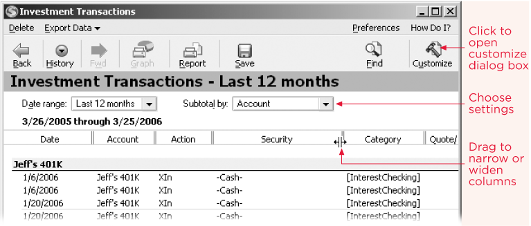
Figure 10-7. In the report window, you can choose date ranges or columns to tweak the report and drag heading separators to resize columns. Click Customize to open a dialog box with even more options (Section 10.5).Customize icon. At the top of the report window, the icon bar includes the Customize icon, which opens the most powerful of Quicken’s customization tools—the Customize dialog box.
Report window drop-down lists. Below the icon bar, you’ll see drop-down menus for changing settings, such as the date range or which column to use for subtotaling the report contents.
Report headings. You can drag the double vertical lines between column headings to the left or right to make a column narrower or wider, respectively.
Note
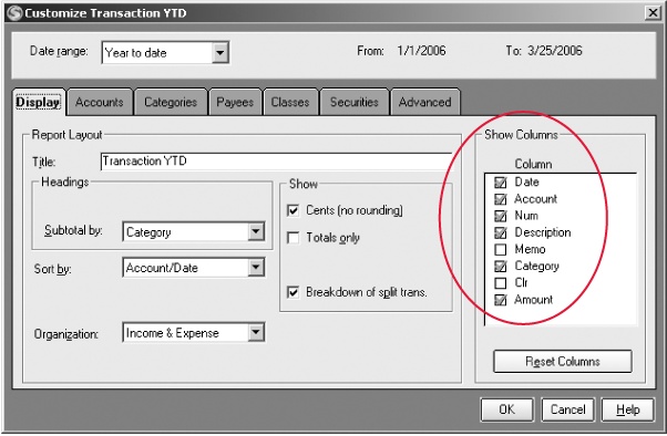
One thing you have almost no control over is the headers and footers of reports. In fact, the only thing you can change here is the title of a report. In the Customize dialog box, click the Display tab and, in the Title text box, type the title you want to use. Quicken automatically adds the date range for the report and pages numbers to the report header.
Date Ranges
Different reports call for different date ranges. For example, tax reports often apply to the previous year, whereas a spending report might be for the present year to date. Quicken contains over a dozen preset date ranges that work based on today’s date. For example, if it’s March 12, 2006, “Year to date” represents January 1 through March 12, 2006, but Last Month covers February 1 through February 28, 2006. And, if none of these date ranges do what you want, “Custom dates” opens a Custom Date dialog box with From and To text boxes for choosing or typing in specific dates.
Tip
Try to avoid saving reports using Custom dates. These dates won’t change with the passage of time—and eventually you won’t care how much you spent on tie-dye T-shirts in 1968.
The pre-set date ranges are numerous, because they mix and match several types of date ranges.
Include all dates. If you’re trying to find a payee by searching through old credit card charges, choose “Include all dates.” This time period encompasses the first date in your Quicken data file up to and including today.
Durations. Quicken includes three repeating time periods: Monthly, Quarterly, and Yearly. If you choose one of these, the program sets the report to that duration, but also includes an additional drop-down menu to specify which month, quarter, or year you want to see.
To Date durations. You can choose from “Month to date,” “Quarterly to date,” and “Year to date,” which are particularly useful for budget-versus-actual reports. “Earliest to date” does the same thing as “Include all dates.” “Custom to date” lets you pick the starting date and the report covers that date to today.
Last periods. Although you can choose periods that range from “Last month” to the Last 12 months, at tax time, “Last year” is a very handy time period to pick. With this date range, you can report on the previous year’s data at any time during the present year.
Because date ranges are the most widely revised settings, Quicken gives you several places to set them:
In the Reports & Graphs window, click a report name to display a date range drop-down menu.
In a report window, below the report title, you’ll see a “Date range” drop-down menu.
In the Customize dialog box, the “Date range” drop-down menu is in a section of its own at the very top of the dialog box.
Subtotals
In a report window, you can group and subtotal results in several ways, depending on the report. For example, the built-in Investment Performance report comes without any subtotaling; the transactions appear in chronological order. So you may want to add subtotals by account to see the performance return for your accounts separate from your husband’s. Or, you can subtotal by security type, investing goal, or asset class to see which kinds of investments are living up to your expectations.
You can change the fields used to subtotal your report in two places:
Figure 10-8 shows an example of how subtotaling can convey the information you need.
Adding and Removing Columns in Reports
Each built-in report comes with a set of columns, all of which are initially displayed. In some reports, you can’t change the columns at all, but in others, you can choose which of the columns to hide or show.
As you can see in Figure 10-9, checkmarks show the columns that are visible. Clicking a turned-on checkbox turns off a column. Clicking an empty box turns the column on. To return the report to the columns that Quicken displayed originally, click Reset Columns.
Customizing Other Report Content
As you can see in Figure 10-10, the Customize dialog box includes several tabs, which change depending on the type of report you’re working on. Each tab contains all sorts of tailoring tools, many of which can remain as they are through years of successful Quicken use.
Here are some of the tabs that appear and some of the changes you can make on each:
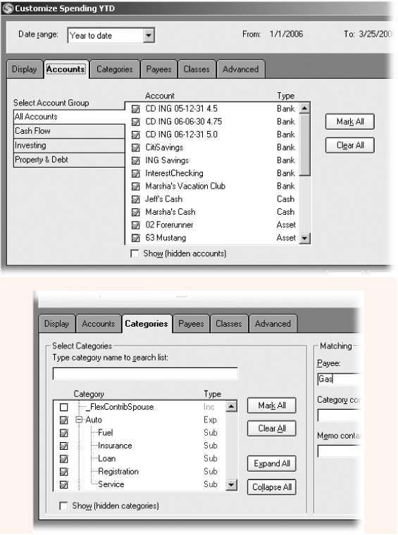
Accounts. You can choose the accounts to include in a report to produce more surgical reports; for example, to examine your retirement accounts separate from your spouse’s. You can turn accounts on and off by clicking them one at a time or by clicking Mark All or Clear All. Quicken initially hides accounts that you marked as Hidden in the Account List (see Section 2.5). If you want information from bank accounts you’ve closed (and subsequently hidden in Quicken), turn on the “Show (hidden accounts)” checkbox.
Categories. You can choose individual categories, turn all categories on or off, or search for a specific category. You can also add additional criteria to look for transactions assigned to a specific payee, or that have categories and memos that contain the text that you specify.
Advanced. The Advanced tab is, well, advanced, but some of the settings can come in handy more than you’d expect. For example, if you want to look for transactions that have obstinately remained uncleared, you can turn off the “Newly cleared” and Reconciled checkboxes and keep the “Not cleared” checkbox turned on. To change any report to a tax-related report, turn on the “Tax-related transactions only” checkbox.
Tip
The “Include unrealized gains” checkbox is good for what-if games. Suppose you want to see how your taxes would be affected if you sold different stocks in your taxable investment account. Turning on this checkbox would show the capital gains you’d have if you sold stocks at their current prices.
Sorting Reports
Some Quicken reports come sorted, but the sort order isn’t immediately obvious. If a report is sortable, in the report window menu bar, you’ll see the Sort command. Click Sort and a menu of sort options appears with a checkmark to the left of the current sort order. Choose the sort order you want, and Quicken applies it to the report immediately. (You can also click Customize. The “Sort by” drop-down menu is on the Display tab in the Customize dialog box.)
Sort orders for reports are similar to the sort orders you can apply to an account register. For example, the “Sort by” drop-down menu includes Account/Date, Date/Account, Account/Check#, Amount, Payee, and Category.
Saving a Report
Once you’ve customized a report, there’s no sense in repeating the same steps every time you need to run the same report. That’d be silly. By saving your customized reports, you can run them again and again by choosing Reports → My Saved Reports & Graphs, and then choosing the report name.
A saved report memorizes all your settings—things like date range, accounts, categories, sort order, and so on—but not the data itself. For example, if you save a report whose date range is set to Monthly, the report initially shows the results for June when you run the report in June, but shows results for December when you run the report in December.
Saving a report is so easy, there’s no reason ever again to recreate a customized report.
Review the report to make sure that it contains the information and formatting you want. Then, in the report window icon bar, click Save.
Quicken opens the Save Report dialog box.
In the Report name box, type a name that indicates what the report does, like Marsha’s Portfolio Performance .
If you intend to add the saved report to the Quicken icon bar (see Section 10.1.2), make the report name brief but as meaningful as possible.
If you want to save the report to a certain folder, in the “Save in” drop-down menu, choose the folder you want.
If you don’t save the report to a folder, the report appears below the folders on the My Saved Reports & Graphs submenu. (Saving customized reports and graphs to folders is new in Quicken 2006.)
Click OK.
Quicken saves the report.