Chapter 20. Project: Implementing autocomplete with Jest, Express, and MongoDB
This chapter covers
- Project structure and Webpack configuration
- Implementing the web server
- Adding the browser script
- Creating the server template
- Implementing the autocomplete component
The goal of this project is first of all to combine many of the techniques you’ve learned throughout this book, such as component composition, states, form elements, and testing, as well as how to fetch data from an API server and store and how to implement a simple Express server and Universal React rendering. You’ve already done most of these things in the book, but repetition is the mother of learning—especially intermittent repetition!
In this chapter, you’ll build a well-rounded component and supply it with a back end. This little project is close to the sort of real-life projects you’ll most likely perform on the job.
In a nutshell, this project will guide you through building an autocomplete component that’s visually and functionally similar to the one in Slack (a popular messaging app) and Google (a popular search engine), as shown in figure 20.1. For simplicity’s sake, the widget will work with the names of rooms in a chat application.
Figure 20.1. In Slack, when you start typing, the widget offers matches.

The autocomplete widget, shown in figure 20.2, has the following:
- Input field—Always appears but is empty initially
- List of options, filtered according to the entered characters—Appears when there’s at least one match
- Add button—Appears when there are no matches
Figure 20.2. Autocomplete form with an empty field

Room names are filtered using the entered characters as the first characters of each option. A simple comparison autocompletes the name of a room (see figure 20.3). For example, if you have rooms named angular, angular2, and react, and you type angu, then only angular and angular2 will be shown as a match, not the react option.
Figure 20.3. Typing angu filters the matches and shows only angular and angular2.

What if there are no matches? There’s a way to add a new option using the Add button. For convenience, the Add button is shown only when there are no matches (see figure 20.4). This button lets you persist (save permanently in the database) the new input.
Figure 20.4. The Add button is shown only when there are no matches.

The new option is saved to the database via an XHR call to the REST API. You can use this new room name in future matches (see figure 20.5), just like the initial list of room names.
Figure 20.5. The room name has been saved and now appears in the list.

To implement this autocomplete widget, you need to do the following:
- Install dependencies.
- Set up the build process with Webpack.
- Write tests using Jest.
- Implement an Express REST API server that connects to Mongo-DB and also acts as a static server for the widget example.
- Implement an Autocomplete React component.
- Implement the example using Autocomplete and Handlebars.
You’ll render the React components on the server, test them with Jest, and make AJAX/XHR requests with axios.
Note
The source code for the examples in this chapter is at www.manning.com/books/react-quickly and https://github.com/azat-co/react-quickly/tree/master/ch20. You can also find some demos at http://reactquickly.co/demos.
Let’s start by setting up the project.
20.1. Project structure and Webpack configuration
To give you an overview of the tech stack, in this project you’ll use the following technologies and libraries:
- Node.js and npm for compiling JSX and downloading dependencies such as React
- Webpack as a build tool
- Jest as the test engine
- Express to act as a web server, and MongoDB accessed using the native MongoDB Node.js driver to hold the autocomplete options
- Handlebars for the layout
I prefer to use Handlebars for the layout for several reasons. First, React makes it painstakingly difficult to output unescaped HTML; it uses a weird syntax that involves the word dangerously. But this is what you need to do for Universal React and server-side rendering. Yes, the unescaped HTML can expose an app to cross-site scripting attacks,[1] but you’re rendering on the server, so you control the HTML string.
A cross-site scripting (XSS) attack is characterized by attackers injecting malicious code into legitimate websites that users trust but that contain XSS vulnerabilities. For example, an attacker can post a message with some bad code that includes <script> elements on a vulnerable forum that isn’t sanitizing and/or escaping the post text. All visitors to the forum will end up executing the malicious code. For more on XSS, see Jakob Kallin and Irene Lobo Valbuena, “Excess XSS: A Comprehensive Tutorial on Cross-Site Scripting,” https://excess-xss.com.
The second reason is that Handlebars more naturally renders things like <!DOCTYPE html>. React can’t do it as naturally because React is meant more for individual elements than entire pages.
Third, React is for managing state and automatically maintaining the view in accordance with the state. If all you’re doing is rendering a static HTML string from a React component, why bother with React? It’s overkill. Handlebars is similar to HTML, so it’s easy to copy and paste existing HTML code without having to think twice about JSX and React gotchas that may bite you in the tail when you’re converting HTML to React.
Finally, my personal experience explaining code functionality to other developers and to students in my courses and workshops has shown that some people have a harder time understanding the structure when React components are used for layout on the server and other React components are used for views on both the client and server.
Appendix A covers the installation of these tools, so I won’t bore you by duplicating that information. Go ahead and create a new project folder named autocomplete. This is what the folder structure will look like:

The __tests__ folder is for Jest tests. As should now be familiar to you, the node_modules folder is for Node.js dependencies (from npm’s package.json). The public, public/css, and public/js folders contain the static files for the application.
Naming is paramount to good software engineering because a good name provides a crucial piece of information. It can tell you a lot about the script, file, module, or component without you having to read the source code, tests, or documentation (which may not exist!).
Just as you’ve gotten familiar with putting JSX files into the jsx folder and using build as a destination folder for compiled files, I’ve started to use other names. That’s because you’ll encounter many different conventions. Each project will probably have a different structure; the structure may vary a lot or a little. As a developer, it’s your job to be comfortable with configuring tools such as Webpack and libraries such as Express to work with any names. For that reason, and to add variety, in this chapter I use public instead of build (plus public is a convention for static files served by Express), src instead of jsx (you may have other source files, not just JSX, right?), and so on.
The public/js/app.js file will be bundled by Webpack from the dependencies and the JSX source code src/app.jsx. The source code for the Autocomplete component is in the src/autocomplete.jsx file.
The views folder is for Handlebars templates. If you feel confident about your React skills, you don’t have to use a template engine; you can use React as the Node.js template engine!
In the root of the project, you’ll find these files:
- webpack.config.js—Enables build tasks
- package.json—Contains project metadata
- rooms.json—Contains MongoDB seed data
- index.js—With the Express.js server and its routes for the API server (GET and POST /rooms)
Don’t forget that to avoid installing each dependency with the exact version manually, you can copy the package.json file from the following listing (ch20/autocomplete/package.json) to the root folder, and run npm install.
Listing 20.1. Dependencies and setup for the project


Of course, using the same versions as in this book is important if you want to have a working app in the end. Also, don’t forget to install the dependencies from package .json using npm i.
The scripts section is interesting:
"scripts": {
    "test": "jest",
    "start": "./node_modules/.bin/node-dev index.js",
    "build": "./node_modules/.bin/webpack",
    "seed": "mongoimport rooms.json --jsonArray --collection=rooms
     --db=autocomplete"
  },
--db=autocomplete"
},
test is for running Jest tests, and start is for building and launching your server. You also add seed data for the room names, which you can run with $ npm run seed. The database name is autocomplete, and the collection name is rooms. This is the content of the rooms.json file:
[ {"name": "react"},
  {"name": "node"},
  {"name": "angular"},
  {"name": "backbone"}]
When you run the seed command, it prints something like this (MongoDB must be running as a separate process):
> [email protected] seed /Users/azat/Documents/Code/
You’ve defined the project dependencies, and now you need to set up your Web-pack build process so you can use ES6 and transform JSX. To do this, create the webpack.config.js file in the root directory with the following code (ch20/autocomplete/webpack.config.js).
Listing 20.2. Webpack configuration
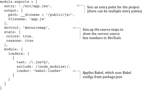
There’s no difference between this Webpack config file and those in the other projects you’ve built so far. It sets up Babel for transpiling JSX files and identifying where the bundled JavaScript will be saved.
20.2. Implementing the web server
In this project, rather than a host HTML file, you need to write a simple web server to receive requests based on what the reader has typed so far and respond with a list of suggestions. It will also render the control on the server side and send the respective HTML to the client. As noted earlier, the example uses Express as the web server. The index.js file defines the web server and has three sections:
- Importing libraries and components
- Defining the REST API for receiving requests
- Rendering the control on the server side
We’ll look at each section in turn. First is the most straightforward bit: the imports. The following listing shows the components and libraries the server needs (ch20/autocomplete/index.js).
Listing 20.3. Components and libraries for the web server

The next section continues with index.js and discusses connecting to the database and middleware.
20.2.1. Defining the RESTful APIs
The index.js file has GET and POST routes for /rooms. They provide RESTful API endpoints for your front-end app to supply the data. The data in turn will come from a MongoDB database, which you can see with an npm script (npm run seed), assuming that you have it in package.json and that you have the rooms.json file. But before fetching data from the database, you need to connect to it and define the Express routes (ch20/autocomplete/index.js).
Listing 20.4. RESTful API routes


If you need to brush up on the Express.js API, there’s a convenient cheatsheet in appendix c.
20.2.2. Rendering React on the server
Finally, index.js contains the / route, where you render React on the server by hydrating components with the room objects (ch20/autocomplete/index.js).
Listing 20.5. Server-side React

There are two properties for the Autocomplete component: options and url. options contains the names of the chat rooms, and url is the URL of the API server (http://localhost:3000/rooms in this case). The Autocomplete component will be rendered on the browser as well.
20.3. Adding the browser script
The browser script is an example of how someone might use the autocomplete widget; it will be run only on the browser. The file is very short. You just create an element with options and url properties (ch20/autocomplete/src/app.jsx).
Listing 20.6. Main client-side script

The global __autocomplete_data is provided via the data local (local is the term for template data in Express lingo) using the <script> tag in the / route.
Listing 20.7. Express app rendering data for browser React

The <script> HTML tag is injected into the index.hbs template (the .hbs file extension is assumed by Express, so it’s optional). Next, you’ll implement this template.
20.4. Creating the server template
In the index.handlebars file, you can see the props and autocomplete locals being output.
Listing 20.8. Host markup page


The work for running the autocomplete example is done. Obviously, it will be powered by the Autocomplete component. Next, you’ll finally start implementing it.
20.5. Implementing the Autocomplete component
The Autocomplete component is self-sufficient, meaning it isn’t just a view component but can also fetch from and save to the REST API. It has two properties: options and url. In accordance with TDD, let’s start coding the Autocomplete component with tests.
20.5.1. The tests for Autocomplete
According to the principles of TDD/BDD, you should begin with tests. The __tests__/autocomplete.test.js file lists room names and then renders the component into autocomplete:

You get the input field, which has an option-name class. These room options will match the input-field value.
Now you can write the actual tests. You can get all the option-name elements from the widget and compare them against the number 4, which is the number of rooms in the rooms array:
describe('Autocomplete', () => {
  it('have four initial options', () => {
    var options = TestUtils.scryRenderedDOMComponentsWithClass(
      autocomplete,
      'option-list-item'
    )
    expect(options.length).toBe(4)
  })
The next test changes the input-field value and then checks for that value and the number of the offered autocomplete option. There should be only one match, which is react:
it('change options based on the input', () => {
    expect(fD(optionName).value).toBe('')
    fD(optionName).value = 'r'
    TestUtils.Simulate.change(fD(optionName))
    expect(fD(optionName).value).toBe('r')
    options = TestUtils.scryRenderedDOMComponentsWithClass(autocomplete,
      'option-list-item')
    expect(options.length).toBe(1)
    expect(fD(options[0]).textContent).toBe('#react')
  })
The last test changes the room name field to ember. There should be no matches, only the Add button:
it('offer to save option when there are no matches', () => {
    fD(optionName).value = 'ember'
    TestUtils.Simulate.change(fD(optionName))
    options = TestUtils.scryRenderedDOMComponentsWithClass(
      autocomplete,
      'option-list-item'
    )
    expect(options.length).toBe(0)
    var optionAdd = TestUtils.findRenderedDOMComponentWithClass(
      autocomplete,
      'option-add'
    )
    expect(fD(optionAdd).textContent).toBe('Add #ember')
  })
})
20.5.2. The code for the Autocomplete component
Finally, it’s time to write the Autocomplete component (ch20/autocomplete/src/autocomplete.jsx). It includes the input field, the list of matching options, and the Add button to add a new option when there are no matches. The component performs two AJAX/XHR calls: to retrieve a list of options and to create a new option. There are two methods:
- filter()—Happens on every new input in the <input> field. Takes the current input and the list of options, and sets the state to a new list that contains only options that match the current input.
- addOption()—Happens on a button click or Enter press for the Add button. Takes the value, and sends it to the server.
This is how the Autocomplete component looks at a high level:

Now let’s start from the beginning of the file. Begin by importing the libraries in the CommonJS/Node.js style; thanks to Webpack, this is bundled for the browser’s consumption. The fD alias is for convenience:
const React = require('react'),
  ReactDOM = require('react-dom'),
  request = require('axios')
const fD = ReactDOM.findDOMNode
constructor sets the state and bindings. You set options from properties. filteredOptions will initially be the same as all the options, and the current option (input-field value) is empty. As the user types characters, filteredOptions will become narrower and narrower, to match the entered letters.
In componentDidMount(), you perform the GET request using the axios (request variable) library. It’s similar to jQuery’s $.get(), but with promises:

The filter() method is called on every change of the <input> field. The goal is to leave only the options that match user input:

The addOption() method handles the addition of a new option, in the event that there are no matches, by invoking the store’s action:

Finally, the render() method has a controlled component, <input>, with an onChange event listener, this.filter:
  ...
  render() {
    return (
      <div className="form-group">
        <input type="text"
          onKeyUp={(event) => (event.keyCode==13) ? this.addOption() : ''}
          className="form-control option-name"
          onChange={this.filter}
          value={this.currentOption}
          placeholder="React.js">
        </input>
onKeyUp can be written as a method, not necessarily as an anonymous inline function, right in {}.
The list of filtered options is powered by the filteredOptions state, which is updated in the filter() method. You iterate over it and print _id as keys and links with option.name:
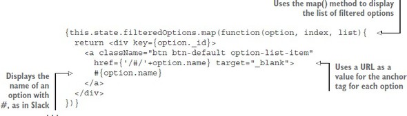
The last element is the Add button, which is shown only when there’s no filtered-Options (no matches):

You’re using CommonJS syntax, so you can declare the Autocomplete component and export it like this:
module.exports = Autocomplete
You’re finished. Good job, mate!
20.6. Putting it all together
If you’ve followed along through the steps, you should be able to install the dependencies with this command (if you haven’t done so already):
$ npm install
Then, launch the app as follows (you must have started MongoDB first with $ mongod):
$ npm start
The tests will pass after you run this command:
$ npm test
There’s also npm run build, without the watch (you’ll need to rerun it on changes). npm start runs npm run build for you.
Optionally, you can seed the database with $ npm run seed. Doing so populates MongoDB with names from ch20/autocomplete/rooms.json:
[ {"name": "react"},
  {"name": "node"},
  {"name": "angular"},
  {"name": "backbone"}]
That’s all for the Autocomplete component. Now, run the project by building it with npm run build and navigating to http://localhost:3000, assuming you have MongoDB running in a separate terminal. Although 127.0.0.1 is an alias, you must use the same domain localhost as the browser location to avoid CORS/Access-Control-Allow-Origin issues, because JavaScript will call the localhost server.
You should see the component with names (if you seeded the database) on the page. When you type characters in the input field, the selection will be filtered according to matches in the input. When there are no matches, click the Add button to add the room to the database; it will immediately appear in the list.
If you ever need to manipulate the data in MongoDB directly, the mongo shell (a.k.a. REPL) is available via the mongo command in the terminal. It automatically connects to the locally running instance on port 27017 (you must have one running; to do so, use mongod). Once in the mongo shell, you can perform all kinds of operations like creating a new document, querying a collection, dropping a database, and so on. The advantage is that you can use the mongo shell anywhere, even on a remote server without a GUI.
But there’s a lot of typing involved when working with the mongo shell, and typing is slow and error-prone. Therefore, I built a better tool called MongoUI (https://github.com/azat-co/mongoui), which you can use to query, edit, add documents, remove documents, and do other things in a browser by clicking with your trackpad instead of typing copious amounts of JSON (MongoDB is JavaScript and JSON-based).
MongoUI allows you to work with MongoDB via a user-friendly web interface. This figure shows the names of the rooms in my rooms collection in the autocomplete data-base.

The MongoDB web interface
Install MongoUI with npm i -g mongoui, launch it with mongoui, and then open in the browser at http://localhost:3001. Oh, and MongoUI is built with React, Express, and Webpack. Enjoy!
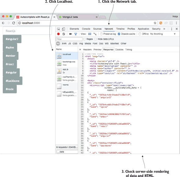
The end result of this autocomplete example is shown in figure 20.6. You can open the Network tab and click Localhost to make sure the server-side rendering is working (that is, that the data and HTML for names are there).
Figure 20.6. Inspect the localhost response by clicking Network (1) and Localhost (2) to ensure that server-side rendering (3) is working properly.
If for some reason your project isn’t working, there may be a new version or a typo in your code. Refer to the working code at www.manning.com/books/react-quickly or https://github.com/azat-co/react-quickly/tree/master/ch20.
20.7. Homework
For bonus points, do the following:
- Add a test for a Remove button, which is as an X icon next to each option name.
- Add the Remove button as an X icon next to each option name. Implement an AJAX/XHR call, and add a REST endpoint to handle deletion.
- Enhance the matching algorithm so that it will find matches in the middle of names. For example, typing ac should show react and backbone, because both of them contain the letters ac.
- Add a Redux store.
- Implement GraphQL instead of a REST API back end.
Submit your code in a new folder under ch20 as a pull request to this book’s GitHub repository: https://github.com/azat-co/react-quickly.
20.8. Summary
- Curly braces output unescaped HTML in Handlebars, whereas in React you need to use __html to dangerously set inner HTML.
- findRenderedDOMComponentWithClass() tries to find a single component by its CSS class name, and scryRenderedDOMComponentsWithClass() finds multiple components by their CSS class name (see chapter 16).
- babel-register lets you import and use JSX files: require('babel-register') ({presets:[ 'react' ]}).
- MongoUI is an open source, web-based interface built on React for developing and administering MongoDB databases. You can install it with npm i -g mongoui and run it with mongoui.