Chapter 7: Advanced Features
Create a Shared-Variable Graph with a Dynamic Title
Create the Shared-Variable Graph
Add Cells and Plots to the Graph
Assign a Different Variable to the Graph
Add a Dynamic Title and Save the Graph
Generate the Graph Using the SGDESIGN Procedure
Add an Axis Table to the Graph
Customize the Appearance of Grouped Data
Change the Bar Fill and Outline Color Group Attributes
About the Advanced Features
This chapter discusses some advanced features of the SAS ODS Graphics Designer (the designer).
First, you learn how to use the designer tools that facilitate reusing your graphs. Some graphs consist of multiple plots that are driven by a few (one or two) variables. Such graphs are easier to define and modify using shared variables.
Second, you customize a graph by specifying which tick marks are displayed.
Finally, you learn how to customize the appearance of graphs that include a group variable.
Overview of Graph Reuse
Suppose you want to create the following graph, which is similar to the example that you created in Chapter 3:
Figure 7.1 Three-Cell Distribution Graph to be Reused

The key feature to note about this graph is that it consists of multiple plots, all of which are based on only one variable MPG (City). You want to reuse this graph with different data. For example, maybe you want to show the distribution of engine size rather than city gas mileage. Or, perhaps you want to show the distribution of data other than the Cars data. To make these changes, you would normally have to re-assign data for each cell in the graph. You would also need to change the graph’s title.
The designer’s shared-variable feature provides an easier way to build and reuse graphs. You first define one or more shared variables, and then associate the shared variables with the data roles in your plots. You build the graph by using the defined shared variables. Changing the data assignment in a graph is simply a matter of changing the data assigned to the shared variables. You make this change once, and the change is applied to all the plots in the graph.
Here are some additional features of shared variables:
● Shared variables can be used in single-cell graphs and in multi-cell graphs, including classification panels.
● Shared variables are most effective for creating graphs that have many plots and that use few (one or two) variables. The graph shown in Figure 7.1 is a good example because it has several plots, but uses just one variable.
● You can run shared-variable graphs in batch mode by using the SGDESIGN procedure. You can specify different variables in the same data set or in a different data set by using the DYNAMIC option.
● You can use the DYNAMIC option to generate a dynamic title that changes to match the data that is used to generate the graph.
Note: Dynamic usage is relevant only if you use the SGDESIGN procedure to generate the graph. Shared variables, on the other hand, are useful for graphs created by the designer and for graphs that are generated by the SGDESIGN procedure.
Create a Shared-Variable Graph with a Dynamic Title
In this example, you create a graph that has three cells with different types of plots, all of which use the same variable. For this example, the right amount of explanation required to create the graph and gain a basic understanding of the process is provided. For more details, see the SAS ODS Graphics Designer: User’s Guide.
Create the Shared-Variable Graph
When creating the shared-variable graph, the first step is to assign the data to one or more shared variables.
1. Select File ► New ► Blank Shared Variable Graph. The Assign Data dialog box appears with the Shared Variables tab selected. The other tabs are displayed but are not available.
By default, the dialog box contains one shared variable named V1. You can define more as needed.
2. In the Assign Data dialog box, complete these steps:
a. For Library, select SASHELP.
b. For Data Set, select CARS.
3. Assign a data variable to the shared variable named V1:
a. For Variable, select MPG_CITY.
b. For Type, select Numeric.
Although you can keep the default type Any, it is good practice to specify a variable type. Some plots, such as histograms, require that the variable be a particular type.
Once you specify a variable type, Variable contains only the variables of that type.

To add another shared variable, you would click the Add a Variable icon ![]() , and then specify the variable and type. Shared variables are identified as V1, V2, and so on. This example uses only one shared variable.
, and then specify the variable and type. Shared variables are identified as V1, V2, and so on. This example uses only one shared variable.
4. Click OK.
A graph window is displayed in the work area. This window is blank except for the prompt (drop a plot here).
Figure 7.2 Initial Graph Window

Add Cells and Plots to the Graph
You are now ready to add plots.
1. In the Elements pane, click Histogram, and drag and drop the icon onto the graph window.
![]()
The Assign Data dialog box for the histogram is displayed. Library and Data Set are unavailable because they have already been set for the graph.
2. In the Assign Data dialog box, complete these steps:
a. For Analysis, select V1 (MPG_CITY).
b. Click OK.

The histogram is added to your graph.
3. In the Elements pane, click Normal, and drag and drop the icon onto the graph window.

The Assign Data dialog box is displayed.
4. For Analysis, select V1 (MPG_CITY). Click OK.
Your graph looks like the following:

5. Right-click anywhere in the cell, and select Add a Row. The graph area is split into two rows. Each row contains one cell.
6. In the Elements pane, click Fringe, and drag and drop the icon onto the bottom cell of the graph.

The Assign Data dialog box is displayed.
7. For X, select V1 (MPG_CITY). Click OK.
The fringe plot is added to the bottom cell of your graph.
8. Right-click in either cell, and select Add a Row. A third row is created below the existing two rows.
9. In the Elements pane, click Box(H), and drag and drop the icon onto the bottom cell of the graph.

The Assign Data dialog box for the horizontal box plot is displayed.
10. For Analysis, select V1 (MPG_CITY). Click OK.
The horizontal box plot is added to the bottom cell of your graph.

11. Right-click on one of the X axes, and select Common Column Axis.
A common column axis is created for all the cells in the column (three cells, in this case) and is displayed at the bottom. The axis range for the common column axis is the union of the ranges for each cell in the column. All plots in each cell in the column are now correctly scaled to this new common column axis.
The graph is the same as the one shown in Figure 7.1, except that this graph has no title yet.
Assign a Different Variable to the Graph
You have created a very common and useful graph to visualize the distribution of gas mileage for vehicles. The graph has multiple plots, all of which use the same analysis variable. This type of graph can be used to visualize the distribution of any analysis variable, such as horsepower in the same data set. Or, you could use it to visualize cholesterol or systolic blood pressure in the Sashelp.Heart data set.
Once you have created a shared-variable graph, you can easily reuse it to visualize the distribution of other analysis variables by setting the shared variable to a different data variable in the same data set or in a different data set. You make this change in the Assign Data dialog box for any of the plots in the graph. The change is propagated to all plots in the graph.
In this example, you want to show the distribution for engine size, so you assign the ENGINESIZE variable to the V1 shared variable. The new variable must be the same type (numeric, in this case) as the original variable.
1. Right-click inside the plot area of a cell in the graph, and select Assign Data. The Assign Data dialog box is displayed.
2. Click the Shared Variables tab.
3. For the V1 shared variable, select ENGINESIZE.
The variables available depend on the variable type. For example, if the type is Numeric, then only numeric variables are listed. For a type of Any, all variables are listed.
You cannot change the data type for any variable that is currently used by any plot in the graph. In this case, Type is unavailable.
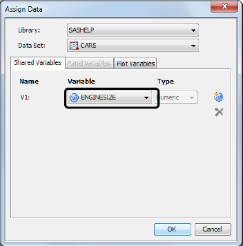
4. Click OK.
Tip: You can change the library or data set if you want to use different data. Then, you would specify a variable from the new data set.
All the plots are updated to show the new variable.
Figure 7.3 Graph with Engine Size Variable

Add a Dynamic Title and Save the Graph
When you create a graph in the designer, you can add a title to reflect the content of the graph. In this example, if the analysis variable is ENGINESIZE, you might add a title to say “Distribution of Engine Size.”
A nice feature of the designer is that you can define and save a graph as a SAS ODS Graphics (SGD) file. Then, you can use the SGDESIGN procedure to run the graph in the SAS windowing environment with a different data set or variable, such as the SYSTOLIC variable in the Sashelp.Heart data set. Although you can easily change the analysis variable to SYSTOLIC, what can you do about the title that still says “Distribution of Engine Size”?
You can use the following special construct in the title string:
dyn(DNAME)
DNAME is a name that you want to associate with the text that is generated. The name cannot contain any special character other than an underscore (_). In addition, DNAME must start with an alphabetic character.
It is easy to add dynamic content to a title:
1. Select Insert ► Title, or click the Title ![]() toolbar button. A new title text box is added at the top of the graph. The text is selected.
toolbar button. A new title text box is added at the top of the graph. The text is selected.
![]()
2. In the title text box, enter Distribution of dyn(SVExample).
3. Save the graph so that you can reference it in the SGDESIGN procedure. Complete these steps:
a. Select File ► Save As.
b. Select a location or keep the default location.
c. For File name, enter a descriptive name, such as svExample.
d. For Files of type, select SGD Files (*.sgd). (This should be selected by default.)
e. Click Save.
The graph is updated with the new title.
Figure 7.4 Graph with Dynamic Content in the Title

Tip: Dynamic content can be added to footnotes, text entries, cell headers, and axis labels. For more information, see the SAS ODS Graphics Designer: User’s Guide.
Generate the Graph Using the SGDESIGN Procedure
This step includes three runs of the SGDESIGN procedure to produce three graphs with different data.
Set the ODS Destination
In SAS, run the following code to specify the ODS LISTING destination. This output matches the designer’s default output. You can close the HTML destination because it is not needed.
ods listing;
ods html close;
Generate a Graph That Shows the Data Currently Defined in the SGD File
By default, the SGDESIGN procedure uses the data that is currently defined in the SGD file. The graph that you saved in the previous step uses the Sashelp.Cars data set and the ENGINESIZE shared variable. You need to specify only the path to the SGD file and the dynamic content for the graph title.
In SAS, run this code to generate the default output:
proc sgdesign sgd="path-and-filename"; /* ❶ */
dynamic SVExample="Engine Size"; /* ❷ */
run;
❶ Replace path-and-filename with the path to the graph. For example, the path might be C:SGDFilessvExample.sgd.
❷ The DYNAMIC statement specifies the value for the dynamic text used in the graph title. The value is a character string and must be enclosed in quotation marks. The text that you provide replaces the dyn(SVExample) expression in the title.
Here is your new output:
Figure 7.5 Default Data and Dynamically Generated Title Text

Note: When the length of the resolved title differs from that of the placeholder dyn(DNAME) title, you might see wraparounds or other minor text-placement differences.
Generate a Graph That Shows City Gas Mileage
If you want to show city mileage rather than engine size, you can specify the MPG_CITY shared variable in the SGDESIGN procedure. MPG_CITY can replace ENGINESIZE because both are the same type of variable (numeric).
In SAS, run this code to generate the output:
proc sgdesign sgd="path-and-filename";
dynamic V1="MPG_CITY" SVExample="City Mileage"; /* ❶ */
run;
❶ The DYNAMIC statement specifies the value for both of the following:
- the shared variable V1. MPG_CITY is a column name and must be enclosed in quotation marks.
- the dynamic text used in the graph title.
Here is your output:
Figure 7.6 City Gas Mileage and Dynamically Generated Title Text

Generate a Graph That Uses Different Data
Let’s show cholesterol distribution using the Sashelp.Heart data set. You must specify the library, data set, and dynamic variables. For the shared variable, CHOLESTEROL can replace ENGINESIZE because both are the same type of variable (numeric).
In SAS, run this code to generate the output:
proc sgdesign sgd="path-and-filename"
data=sashelp.heart; /* ❶ */
dynamic V1="cholesterol" SVExample="Cholesterol"; /* ❷ */
run;
❶ The DATA= option specifies the library and data set.
❷ The DYNAMIC statement specifies the value for both of the following:
- the shared variable V1.
- the dynamic text used in the graph title.
Here is your output:
Figure 7.7 Heart Data and Dynamically Generated Title Text

Reset the ODS Destination
Run this code to close the ODS LISTING destination and re-open the HTML destination:
ods listing close;
ods html;
Summary
This example showed how you can easily reuse graphs with different data using shared variables. In addition, you used the SGDESIGN procedure to produce several graphs with different data and different titles.
Customize the Axes
Axes have many properties that you can set. For example, you can adjust the range, specify which tick marks are displayed, set offsets, show grid lines, and change axis labels.
About This Example
This example shows you how to remove tick values from the axis. You add color bands and grid lines, and create an axis table.
Figure 7.8 Graph for This Example

Create the Graph
1. In the SAS session, run the code from “Code for the Axis Customization Example in Chapter 7” in the appendix.
2. Select File ► New ► Blank Graph, or click the New Blank Graph ![]() toolbar button. A graph window is displayed in the work area. This window is blank except for the prompt (drop a plot here).
toolbar button. A graph window is displayed in the work area. This window is blank except for the prompt (drop a plot here).
3. In the Elements pane, click Box(H), and drag and drop the icon onto the graph window.

4. In the Assign Data dialog box, complete these steps:
a. For Library, select WORK.
b. For Data Set, select CARS.
c. For Analysis, select MPG_CITY.
d. For Category, select TYPE.

e. Click OK.
The designer creates the following graph in the work area:
Figure 7.9 Initial Graph for this Example
Customize the Axis Properties
In this example, you want to see only non-hybrid vehicles. Therefore, remove the Hybrid category from the axis. And, show color bands and grid lines.
1. Right-click the Y axis, and select Axis Properties. The Cell Properties dialog box is displayed with the Axes tab selected.
The Y axis should be selected for Axis. If it is not, select it.
2. Select Discrete Color Bands.

3. Select the Range tab.
The contents of the Range tab vary by the type of axis. For a discrete axis like the one in this example, you can use a tick values list to customize the range. Linear, date, and logarithmic axes provide different features for customizing the range.
4. On the Range tab, complete these steps:
a. Select the Tick Values List check box. The tick values list becomes available for editing.
The list contains three columns. For each tick value listed in column 1, you can change the value that is displayed in column 2. You can clear the check box in column 3 to hide the tick value.

b. In the Hybrid row, clear the Visible check box.
5. Select the General tab.
6. For Axis, select X.
7. Select the Grid check box. This option creates grid lines for the X axis values.

8. Click OK.
The graph is updated to reflect your changes.
Figure 7.10 Changes to the Axes

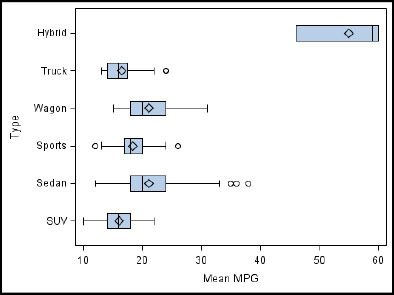
Add an Axis Table to the Graph
Let’s add a Y axis table on the right side of the graph that shows the mean mileage. With the color bands, this makes it easier to align the numbers with the rows in the graph.
1. In the Elements pane, click AxisTable, and drag and drop the icon onto the graph window.

The Assign Data dialog box is displayed. Library and Data Set are unavailable because the axis table must use the same data as the existing plot.
2. In the Assign Data dialog box, complete these steps:
a. For Y, select TYPE. This value identifies the locations along the Y axis for the axis table. It aligns the axis table with the boxes.
b. For Value, select MPG_CITY. This value determines which values are displayed in the axis table.
c. For Position, select Right. This value positions the table along the right Y axis.

d. Click OK. The axis table is added to the graph.

Next, move the axis table label so that it appears above the axis table.
3. Right-click the axis table, and select Plot Properties. The Cell Properties dialog box is displayed with the Plots tab selected.
4. In the Cell Properties dialog box, complete these steps:
a. For Plot, select axistable if it is not already selected.
b. Click the Label tab.
c. For Position, select Max. This moves the axis table’s labels to the maximum end of the axis.
d. Click OK.
The graph is updated to reflect your changes, as shown in Figure 7.8 and repeated here:

Customize the Appearance of Grouped Data
In previous examples, you customized the colors used in your plots. This section deals with grouped data and explains how to customize the appearance of graphs that include a group variable.
About This Example
When you apply a group variable to your graph, by default, the designer rotates through the attributes (such as colors, marker symbols, and line patterns) for the presentation of each unique group value. The attributes are derived from the GraphData1–GraphData12 style elements for the style that is in effect.
You can specify the attributes that are rotated for these group values. You can change the number of attributes that are rotated. In this example, you do both.
This example creates a bar chart that shows cholesterol levels for groups of patients based on weight status. You change the colors of the bar fill and outline. You might want to customize these colors to match your organization’s brand.
Figure 7.11 Graph for This Example

Create the Graph
In this step, create a grouped bar chart.
1. Select File ► New ► Blank Graph, or click the New Blank Graph ![]() toolbar button. A graph window is displayed in the work area. This window is blank except for the prompt (drop a plot here).
toolbar button. A graph window is displayed in the work area. This window is blank except for the prompt (drop a plot here).
2. In the Elements pane, click Bar, and drag and drop the icon onto the graph window.
![]()
3. In the Assign Data dialog box, complete these steps:
a. For Library, select SASHELP.
b. For Data Set, select HEART.
c. For Category, select WEIGHT_STATUS.
d. For Response, select CHOLESTEROL.
e. For Group, select WEIGHT_STATUS.

f. Click OK.
The designer creates the following graph in the work area:
Figure 7.12 Initial Grouped Bar Chart

Change the Bar Fill and Outline Color Group Attributes
The designer provides an editable list of attributes for each graphics element, such as bar fill and outline color.
First, reduce the number of color attributes that are rotated for your group values. Then, change the colors that are rotated. These steps are performed for both bar fill and outline colors so that they match each other.
1. Right-click on the graph, and select Graph Properties. The Graph Properties dialog box is displayed.
2. Click the Group Attributes tab.
3. For Type, make sure that Color is selected. This selection affects the bar fill colors.
4. To reduce the number of colors, complete these steps:
a. Click From Style. A list of colors for the current style is displayed. Notice that the first three colors in the list are the colors used in your bar chart.

For this example, retain only three colors.
b. Starting with the fourth color, select the check box next to each color. You might need to scroll down to select these colors.
c. Click the Delete ![]() button. All of the selected colors are deleted from the list.
button. All of the selected colors are deleted from the list.
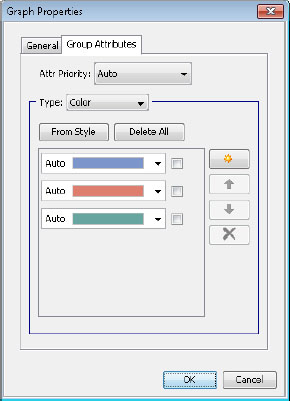
5. To change the colors, complete these steps:
a. To change the first color in the list, select a gold color from the color list box.

b. To change the second color in the list, select a light green color from the color list box.

c. To change the third color in the list, select a dark green color from the color list box.

6. To change the colors for the outline so that they match the bar fill, complete these steps:
a. For Type, select Contrast Color.
b. To reduce the number of colors, repeat step 4.
c. To change the colors, repeat step 5.
7. Click OK.
The graph is updated to reflect your changes, as shown in Figure 7.11 and repeated here:

The designer cycles the colors in the order in which they are specified in the attribute list, which now includes only three colors. In the future, if more categories are added to the data for weight status, the list cycles through the three colors, and then repeats for the new categories.
Where to Go from Here
This book covered the main features of the designer. There are a number of features that were not covered, such as:
● How to use the Style Editor to create your own custom styles
● How to set preferences
● How to manage graphs in the Graph Gallery
● How to create scatter plot matrices
For complete information about the designer, see the SAS ODS Graphics Designer: User’s Guide.