So far, we have been querying data inside our SQL Server Big Data Cluster using external tables and T-SQL code. We do, however, have another method available to query data that is stored inside the HDFS filesystem of your Big Data Cluster. As you have read in Chapter 2, Big Data Clusters also have Spark included in the architecture, meaning we can leverage the power of Spark to query data stored inside our Big Data Cluster.
Spark is a very powerful option of analyzing and querying the data inside your Big Data Cluster, mostly because Spark is built as a distributed and parallel framework, meaning it is very fast at processing very large datasets making it far more efficient when you want to process large datasets than SQL Server. Spark also allows a large flexibility in terms of programming languages that it supports, the most prominent ones being Scala and PySpark (though Spark also supports R and Java).
The PySpark and Scala syntax are both very similar in the majority of commands we are using in the examples. There are some subtle nuances though.
The example code of Listings 6-1 and 6-2 shows how to read a CSV file into a data frame in both PySpark and Scala (don’t worry we will get into more detail on data frames soon).
# Import the airports.csv file from HDFS (PySpark)
val df_airports = spark.read.format("csv").option("header", "true").option("inferSchema", "true").load("/Flight_Delays/airports.csv")
Listing 6-2
Import CSV from HDFS using Scala
As you can see, the code of the example looks very similar for PySpark and Scala, but there are some small differences. For instance, the character used for comments, in PySpark a comment is marked with a # sign, while in Scala we use //. Another difference is in the quotes. While we can use both a single quote and a double quote in the PySpark code, Scala is pickier accepting only double quotes. Also, where we don’t need to specifically define a variable in PySpark (which is called a value in Scala), we do need to explicitly specify this when using Scala.
While this book is focused on Big Data Clusters, we believe an introduction to writing PySpark will be very useful when working with SQL Server Big Data Clusters since it allows you different method to work with the data inside your Big Data Cluster besides SQL.
Loading Data and Creating a Spark Notebook
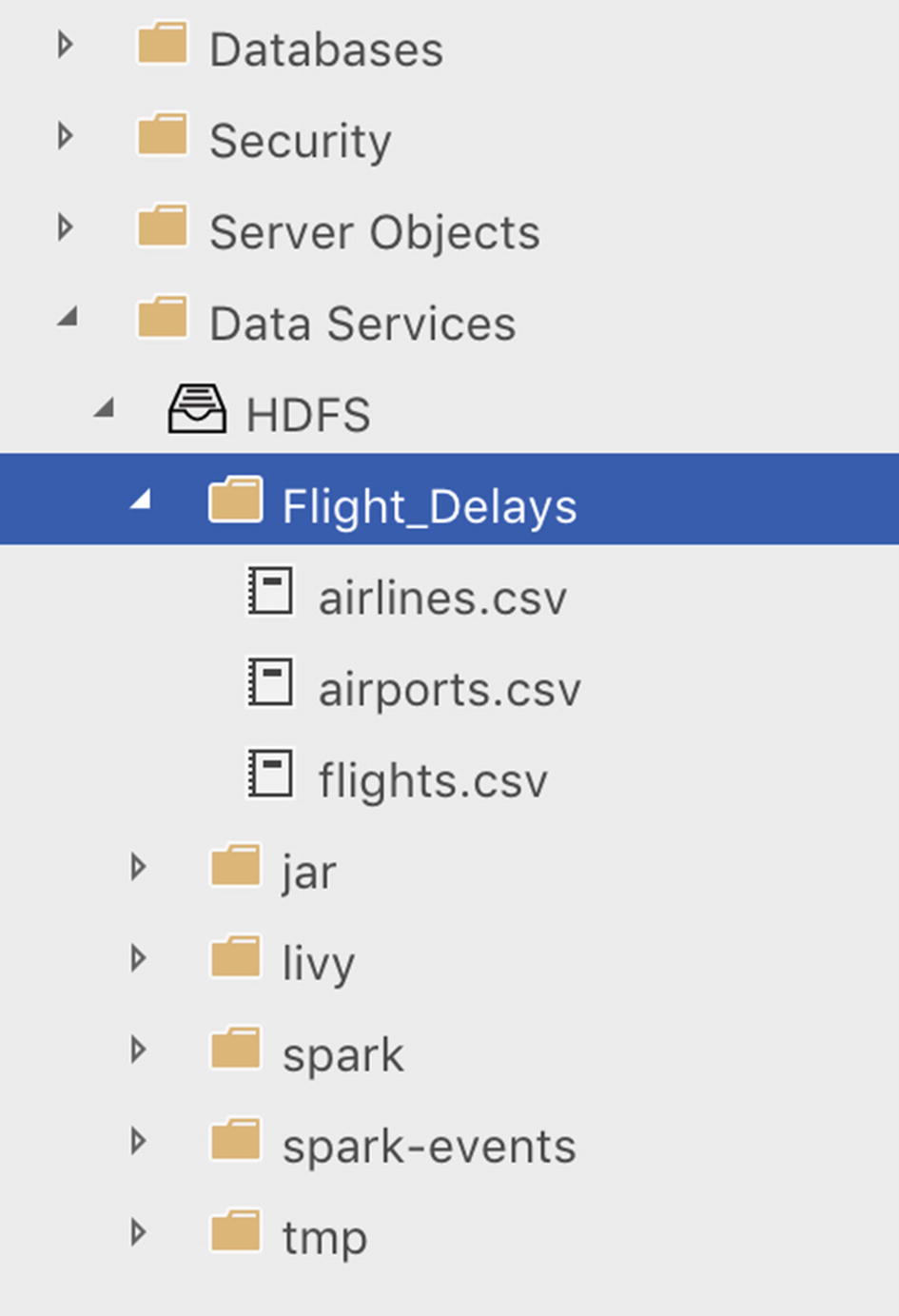
If you followed the steps in the “Getting Some Sample Files into the Installation” section of Chapter 4, you should have already imported the “2015 Flight Delays and Cancellations” dataset from Kaggle to the HDFS filesystem of your Big Data Cluster. If you haven’t done so already, and want to follow along with the examples in this section, we recommend following the steps outlined in the “Getting Some Sample Files into the Installation” section before continuing. If you imported the dataset correctly, you should be able to see the “Flight_Delays” folder and the three CSV files inside the HDFS filesystem through Azure Data Studio as shown in Figure 6-1.
Figure 6-1
Flight delay files in HDFS store
With our sample dataset available on HDFS, let’s start with exploring the data a bit.
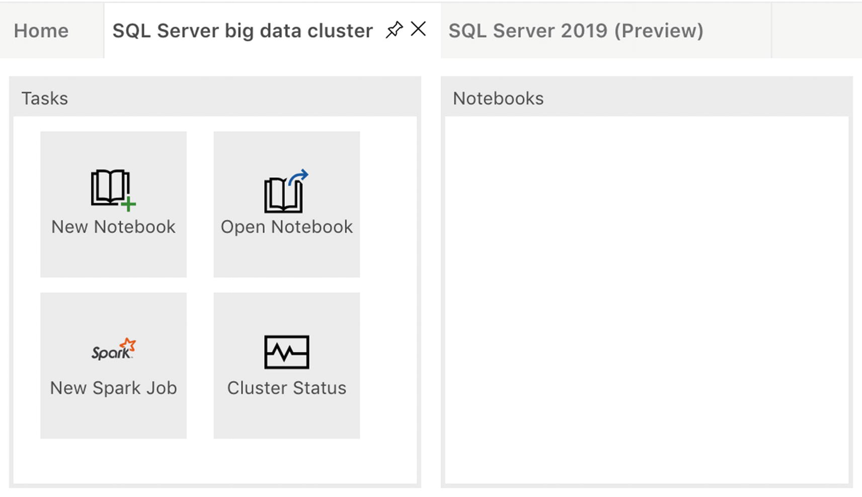
The first thing we need to do is to create a new notebook through the “New Notebook” option inside the Tasks window of our SQL Big Data Cluster tab (Figure 6-2).
Figure 6-2
Tasks in Azure Data Studio
After creating a new notebook, we can select what language we want to use by selecting it through the “Kernel” drop-down box at the top of the notebook as shown in Figure 6-3.
Figure 6-3
Kernel selection in ADS notebook
During the remainder of this chapter, we will be using PySpark as the language of all the examples. If you want to follow along with the examples in this chapter, we recommend selecting the “PySpark” language.
With our notebook created and our language configured, let’s look at our flight delay sample data!
Working with Spark Data Frames
Now that we have access to our data, and we have a notebook, what we want to do is load our CSV data inside a data frame. Think of a data frame as a table-like structure that is created inside Spark. Conceptually speaking, a data frame is equal to a table inside SQL Server, but unlike a table that is generally stored on a single computer, a data frame consists of data distributed across (potentially) all the nodes inside your Spark cluster.
The code to load the data inside the “airports.csv” file into a Spark data frame can be seen in Listing 6-3. You can copy the code inside a cell of the notebook. All of the example code shown inside this chapter is best used as a separate cell inside a notebook. The full example notebook that contains all the code is available at this book’s GitHub page.
# Import the airports.csv file from HDFS (PySpark)
If everything worked, you should end up with a Spark data frame that contains the data from the airports.csv file.
As you can see from the example code, we provided a number of options to the spark.read.format command. The most important one is the type of file we are reading; in our case this is a CSV file. The other options we provide tell Spark how to handle the CSV file. By setting the option header='true', we specify that the CSV file has a header row which contains the column names. The option inferSchema='true' helps us with automatically detecting what datatypes we are dealing with in each column. If we do not specify this option, or set it to false instead, all the columns will be set to a string datatype instead of the datatype we would expect our data to be (e.g., an integer datatype for numerical data). If you do not use the inferSchema='true' option, or inferSchema configures the wrong datatypes, you have to define the schema before importing the CSV file and supply it as an option to the spark.read.format command as shown in the example code of Listing 6-4.
# Manually set the schema and supply it to the spark.read function
# We need to import the pyspark.sql.types library
from pyspark.sql.types import *
df_schema = StructType([
StructField("IATA_CODE", StringType(), True),
StructField("AIRPORT", StringType(), True),
StructField("CITY", StringType(), True),
StructField("STATE", StringType(), True),
StructField("COUNTRY", StringType(), True),
StructField("LATITUDE", DoubleType(), True),
StructField("LONGITUDE", DoubleType(), True)
])
# With the schema declared, we can supply it to the spark.read function
If this was your first notebook command against the Spark cluster, you will get some information back regarding the creation of a Spark session as you can see in Figure 6-4.
Figure 6-4
Output of spark.read.format
A Spark session represents your entry point to interact with the Spark functions. In the past, we would have to define a Spark context to connect to the Spark cluster, and depending on what functionality we needed, we would have to create a separate context for that specific functionality (like Spark SQL, or streaming functionalities). Starting from Spark 2.0, Spark sessions became available as entry point, and it, by default, includes all kinds of different functions that we had to create a separate context for in the past, making it easier to work with them. When we run the first command inside a notebook against the Spark cluster, a Spark session needs to be created so we are able to send commands to the cluster. Running subsequent commands will make use of the initially created Spark session.
Now that we have our CSV data inside a data frame we can run all kind of commands to retrieve information about our data frame. For instance, the example of Listing 6-5 returns the number of rows that are inside the data frame.
# Display the amount of rows inside the df_airports data frame
df_airports.count()
Listing 6-5
Retrieve row count of the data frame
The result should be 322 rows as shown in Figure 6-5 which returns the number of rows.
Figure 6-5
Output of row count
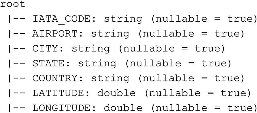
Another very useful command is to return the schema of the data frame. This shows us which columns make up the data frame and their datatypes. The code of Listing 6-6 gets the schema of the df_airports data frame and returns it as output (Figure 6-6).
# Display the schema of the df_flights data frame (PySpark)
df_airports.printSchema()
Listing 6-6
Retrieve the schema of the data frame
Figure 6-6
Schema output of the df_airports data frame
Now that we know the schema of the data frame, let’s return some data from it. One easy way to do that is to use the head() function. This function will return the top n rows from the data frame. In the following example, we will return the first row of the data frame. The output of the command is shown below the example (Listing 6-7 is followed by Figure 6-7).
# Let's return the first row
df_airports.head(1)
Listing 6-7
Retrieve first row of data frame
Figure 6-7
First row of the df_airports data frame
As you can see in Figure 6-7, the results aren’t by default returned in a table-like structure. This is because head() only returns the output as a string-like structure.
To return a table structure when getting data from a dataset, you can use the show() function as shown in the following example. Show() accepts an integer as a parameter to indicate how many rows should be returned. In the example (Listing 6-8), we supplied a value of 10, indicating we want the top ten rows returned by the function (Figure 6-8).
# Select top ten rows, return as a table structure
df_airports.show(10)
Listing 6-8
Retrieve first row of data frame as a table structure
Figure 6-8
Show the top ten rows of the df_airports data frame
Next to returning the entire data frame, we can, just like in SQL, select a subset of the data based on the columns we are interested in. The following example (Listing 6-9) only returns the top ten rows of the AIRPORT and CITY columns of the df_airports data frame (Figure 6-9).
# We can also select specific columns from the data frame
df_airports.select('AIRPORT','CITY').show(10)
Listing 6-9
Select specific columns of the first ten rows of the data frame
Figure 6-9
Top ten rows for the AIRPORT and CITY column of the df_airports data frame
Just like in SQL, we also have the ability to sort the data based on one or multiple columns. In the following example (Listing 6-10), we are retrieving the top ten rows of the df_airports data frame order first by STATE descending, then by CITY descending (Figure 6-10).
Retrieve the first ten rows of the data frame using sorting
Figure 6-10
df_airports data frame sorted on STATE and CITY columns
So far when getting data from the data frame, we have been selecting the top n rows but we can also filter the data frame on a specific column value. To do this, we can add the filter function and supply a predicate. The following example (Listing 6-11) filters the data frame and only returns information about airports located in the city Jackson (Figure 6-11).
Besides filtering on a single value, we can also supply a list of values we want to filter on, much in the same way as you would use the IN clause in SQL. The code shown in Listing 6-12 results in Figure 6-12.
# Besides filtering on a single value, we can also use IN to supply multiple filter items
# We need to import the col function from pyspark.sql.functions
In the example in Figure 6–12, we declared a list of values we want to filter on and used the isin function to supply the list to the where function.
Besides the == operator to indicate values should be equal, there are multiple operators available when filtering data frames which you are probably already familiar with, the most frequently used are shown in Table 6-1.
Table 6-1
Compare operators in PySpark
==
Equal to
Unequal to
<
Less than
<=
Less than or equal
>
Greater than
>=
Greater than or equal
We have been focusing on getting data out of the data frame so far. However, there might also be situations where you want to remove a row from the data frame, or perhaps, update a specific value. Generally speaking, updating values inside Spark data frames is not as straightforward as, for instance, writing an UPDATE statement in SQL, which updates the value in the actual table. In most situations, updating rows inside data frames revolves around creating a sort of mapping data frame and joining your original data frame to the mapping data frame and storing that as a new data frame. This way your final data frame contains the updates.
Simply speaking, you perform a selection on the data you want to update (as shown in Figure 6-13) and return the updated value for the row you want to update and save that to a new data frame as shown in the example code of Listing 6-13.
# Update a row
# We need to import the col and when function from pyspark.sql.functions
from pyspark.sql.functions import col, when
# Select the entire data frame but set the CITY value to "Cody" instead of "Jackson" where the IATA_CODE = "COD"
# Store the results in the new df_airports_updated data frame
If we are interested in removing rows the same reasoning applies, we do not physically delete rows from the data frame; instead, we perform a selection that does not include the rows we want removed and store that as a separate data frame (Figure 6-14 shows the result of using Listing 6-14).
# Remove a row
# Select the entire data frame except where the IATA_CODE = "COD"
# Store the results in the new df_airports_removed data frame
The concept of no deleting or updating the physical data itself but rather working through selections to perform update or delete operations (and then store them in new data frames) is very important when working with data frames inside Spark and has everything to do with the fact that a data frame is only a logical representation of the data stored inside your Spark cluster. A data frame behaves more like a view to the data stored in one or multiple files inside your Spark cluster. While we can filter and modify the way the view returns the data, we cannot modify the data through the view itself.
One final example we want to show before we continue with a number of more advanced data frame processing examples is grouping data. Grouping data based on columns in a data frame is very useful when you want to perform aggregations or calculations based on the data inside the data frame column. For instance, in the following example code (Listing 6-15), we perform a count of how many airports a distinct city has in the df_airports data frame (Figure 6-15).
# Count the number of airports of each city and sort on the count descending
In this example, we used the sort function instead of the orderBy we used earlier in this section to sort the results. Both functions are essentially identical (orderBy is actually an alias for sort) and there is no difference in terms of functionality between both functions.
More Advanced Data Frame Handling
So far, we’ve looked at – relatively – simple operations we can perform on data frames like selecting specific rows, grouping data, and ordering data frames.
However, there are far more things we can do in Spark when it comes to data frames, for instance, joining multiple data frames together into a new data frame. In this section, we are going to focus on doing some more advanced data frame wrangling.
To start off, so far, we have been working with a single dataset which we imported into a data frame that contains information of the various airports in America. In many situations you do not have a single dataset that contains everything you need, meaning you will end up with multiple data frames. Using PySpark we can join these data frames together on a key the data frames share and build a new, joined, data frame.
Before we can get started on joining data frames together, we will need to import the other sample datasets from the 2015 Flight Delays and Cancellations examples we are working with. If you are following along with the examples in this chapter, you should already have a data frame called df_airports that contains the data of the airports.csv file. If you haven’t, you can run the following code (Listing 6-16) to import the data from the file into a data frame.
Import airlines.csv and flights.csv into data frames
After executing Listing 6-17, we should have three separate data frames available to us in the PySpark notebook: df_airports, df_airlines, and df_flights.
To join two data frames, we have to supply the key on which we are joining the two data frames on. If this key is identical on both data frames, we do not have to explicitly set the mapping in the join (and we only need to supply the column name as a parameter). However, we believe it is always good practice to describe the join mapping to make the code easier to understand. Also, in the sample dataset we are using, the data frame columns have different column names on which we need to join requiring an explicit join mapping.
The code example of Listing 6-18 will join the df_flights and df_airlines data frames together using an inner join and output a new data frame called df_flightinfo. We return the schema of the newly created data frame to see how the two data frames are joined together (Figure 6-16).
from pyspark.sql.functions import *
# Let's join the df_airlines and df_flights data frames using an inner join on the airline code
Join two data frames and retrieve the schema of the result
Figure 6-16
Schema of the df_flightinfo data frame which is a join between df_flights and df_airlines
As you can see in Figure 6-16, the two columns (IATA_CODE and AIRLINE) that make up the df_airlines data frame are added to the right side of the new df_flightinfo data frame. Because we already have the IATA_CODE in the df_flights data frame, we end up having duplicate columns in the new data frame (to make matters more interesting: in this sample dataset the df_flights data frame uses the column “AIRLINE” to denote the IATA code on which we join the df_airlines data frame. The df_airlines data frame also has the AIRLINE column but it shows the full airline name. Essentially this means both AIRLINE columns in the df_flightinfo data frame contain different data).
We can easily drop the duplicate column when joining both data frames by specifying it in the join command (Listing 6-19 and Figure 6-17).
from pyspark.sql.functions import *
# We will join both data frames again but this time drop the AIRLINE column of the df_flights data frame
df_flightinfo schema without the duplicate AIRLINE column
As you can see from the schema shown in Figure 6-17, we now end up with only one AIRLINE column which contains the data we are after (the full airline name).
With the duplicate column removed, let’s select some information from the new df_flightinfo data frame. For this example, let’s say we are interested in seeing the scheduled and actual elapsed travel times for each flight together with the airline that performed the flight. We can simply select the columns we are interested in just as we did a number of times already in this chapter. This time using the code shown in Listing 6-20 results in the table shown in Figure 6-18.
# Select a number of columns from the joined data frame
Select a number of columns from the joined data frame
Figure 6-18
Scheduled and elapsed flight time for each flight number
Now let’s say we are analyzing this data since we are interested in the differences between the scheduled time for a flight and the actual time the flight took. While we can manually look at each of the rows in the data frame to figure out what the difference between both of the time columns is, it is far easier to let Spark perform this calculation for you. For this scenario, we are using the following code (Listing 6-21) to create a new data frame that selects a subset of the columns of the original df_flightinfo data frame and does a simple calculation between the SCHEDULE_TIME and the ELAPSED_TIME columns (Figure 6-19).
# Create a new df_flightinfo_times data frame from df_flightinfo
# with a new column that does a calculation between the scheduled and elapsed time
df_flightinfo_times data frames that show travel time information
As we can see from Figure 6-19, the majority of the flights in our selection of ten rows actually spend less travel time than scheduled.
While seeing this information on an individual flight is very useful, it would also be very interesting to see how all the flights in our sample performed. To get an idea on things like the average, maximum (Listing 6-22 resulting in Figure 6-20), or minimum (Listing 6-23 resulting in Figure 6-21) of time difference (Listing 6-24 resulting in Figure 6-22) between the scheduled and elapsed flight time, we can call a number of functions in PySpark.
While it is undoubtedly helpful to know the separate commands to retrieve a number of summary statistics for a dataset, Spark also has a separate function (Listing 6-25) that can directly do that for you and combine the multiple results into a single output (Figure 6-23).
# We can generate summary statistics for a specific column using a single command
Generate summary statistics from a specific column
Figure 6-23
Summary statistics for the Time_diff column of the df_flightinfo_times data frame
As we can see from the preceding summary statistics (Figure 6–23), on average the flights were performed almost 5 minutes faster than originally scheduled. We can also see there are some outliers in the data; the fastest flight arrived 201 minutes earlier than scheduled, while one of the flights took 330 minutes longer to perform than scheduled.
Perhaps we can gain some more understanding of the delays by looking at the data of flights that had a delay of more than 180 minutes. The code of Listing 6-26 selects the top 20 of those rows and sorts them based on the delay descending, meaning the flights that were delayed the most are at the top of the results (Figure 6-24).
# Select all flights that had more than 60 minutes delay
What we can see in these results is that the airline “American Airlines” has ran into quite some flight delays based on this dataset. But are they also the airline with the most delay on average? One way to figure that out is to calculate the average time difference for each airline and return them. We can do this by grouping the data based on the airline and calculate the average delay across all flights for each distinct airline. The code example of Listing 6-27 does just that, using the groupby function together with an aggregate option (written as agg) to supply to method on which the data needs to be grouped and on which column (Figure 6-25).
# Group the Time_diff data for each airline and return the average
# difference between the scheduled and the elapsed time of a flight
Average difference between scheduled and elapsed time for each airline total over all flights
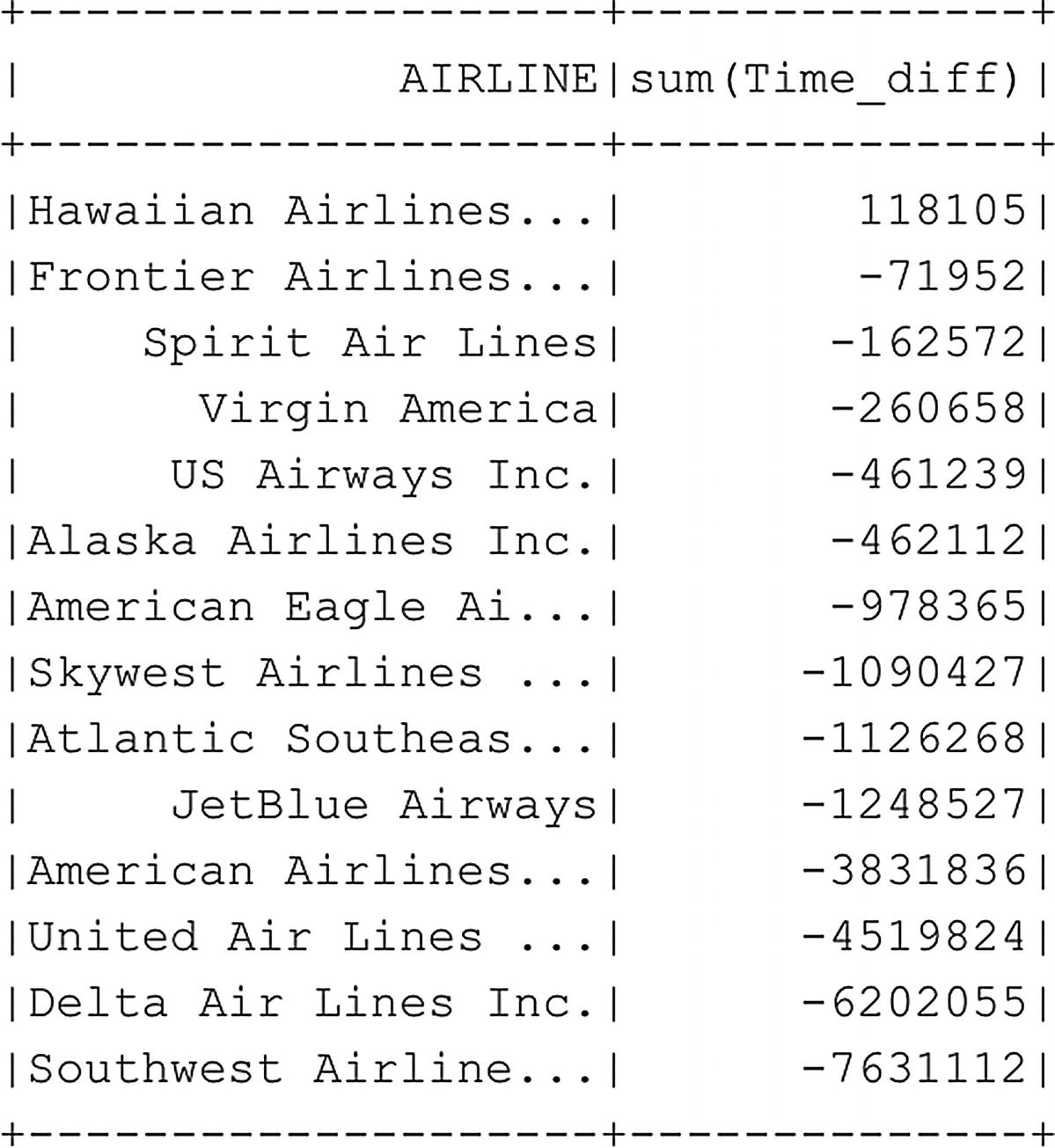
The groupby function is very useful when you want to calculate values across the entire data frame and group them on a specific function. Besides the mean option we supplied using the agg parameter, we can also use other calculation methods like sum to calculate the totals for each grouped column, or count to count the amount of occurrences for each column value (Figure 6-26).
Figure 6-26
Total difference between scheduled and elapsed time for each airline calculated over all flights
Another thing worth pointing out is how we passed the column that is returned by the groupby function to the sort function. Whenever a calculated column is added to the data frame, it also becomes available for selecting and sorting, and you can pass the column name into those functions.
If we continue with our flight delay investigation, we can see from the grouped average and total results that American Airlines isn’t performing as badly in the delay department as we first expected. As a matter of fact, on average, their flights arrive 5 minutes earlier than planned!
We are going to return to this dataset in Chapter 7, explore it further, and even make some predictions on flight delays.
Working with SQL Queries on Spark Data Frames
So far in this chapter, we have used functions related to data frame handling to perform actions like selecting a specific column, sorting, and grouping data. Another option we have to work with the data inside data frame is by accessing it through SQL queries directly in Spark. For those who are familiar with writing SQL code, this method might prove far easier to use than learning all the new functions (and many more we haven’t touched) earlier.
Before we can write SQL queries against a data frame, we have to register it as a table structure which we can do through the code in Listing 6-28.
# Register the df_flightinfo data frame as a (temporary) table so we can run SQL queries against it
Now that we have registered our data frame as a (temporary) table, we can run SQL queries against it using the sqlContext command (Listing 6-29) which calls the Spark SQL module which is included in the Spark engine (Figure 6-27).
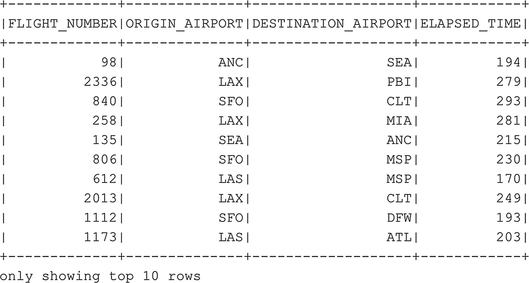
# Select the top ten rows from the FlightInfoTable for a selection of columns
sqlContext.sql("SELECT FLIGHT_NUMBER, ORIGIN_AIRPORT, DESTINATION_AIRPORT, ELAPSED_TIME FROM FlightInfoTable").show(10)
Listing 6-29
Select first ten rows of a table using SQL
Figure 6-27
Top ten rows of the FlightInfoTable queried using Spark SQL
As you can see in the preceding example, we executed a simple SELECT SQL query in which we supplied a number of columns we want to return. The Spark SQL modules process the SQL query and execute it against the table structure we created earlier. Just like the example we’ve shown before, we still need to supply the .show() function to return the results in a table-like structure.
Practically everything you can do using SQL code can be applied in Spark as well. For instance, the last example (Listing 6-30) in the previous section showed how to group data and calculate an average. We can do identical processing using a SQL query as shown in the example in Figure 6-28.
# Group the flight distance for each airline and return the average flight distance for each flight
sqlContext.sql("SELECT AIRLINE, AVG(DISTANCE) FROM FlightInfoTable GROUP BY AIRLINE ORDER BY 'avg(Distance)' DESC").show()
Listing 6-30
Aggregate a column grouped by another column with SQL
Figure 6-28
Average flight distance grouped for each airline
Reading Data from the SQL Server Master Instance
A huge advantage of SQL Server Big Data Clusters is that we have access to data stored in SQL Server instances and HDFS. So far, we have mostly worked with datasets that are stored on the HDFS filesystem, accessing them directly through Spark or creating external tables using PolyBase inside SQL Server. However, we can also access data stored inside a SQL Server database inside the Big Data Cluster directly from Spark. This can be very useful in situations where you have a part of the data stored in SQL Server and the rest on HDFS and you want to bring both together. Or perhaps you want to use the distributed processing capabilities of Spark to work with your SQL table data from a performance perspective.
Getting data stored inside the SQL Server Master Instance of your Big Data Cluster is relatively straightforward since we can connect using the SQL Server JDBC driver that is natively supported in Spark. We can use the master-0.master-svc server name to indicate we want to connect to the SQL Server Master Instance (Listing 6-31).
# Connect to the SQL Server master instance inside the Big Data Cluster
.option("password", "[your SA password]"). ").load()
Listing 6-31
Execute SQL Query against Master Instance
The preceding code sets up a connection to our SQL Server Master Instance and connects to the AdventureWorks2014 database we created there earlier in this book. Using the “dbtable” option, we can directly map a SQL table to the data frame we are going to create using the preceding code.
After executing the code, we have a copy of the SQL table data stored inside a data frame inside our Spark cluster and we can access it like we’ve shown earlier (Listing 6-31 leads to Figure 6-30).
To only retrieve the first ten rows, run Listing 6-32. This will result in Figure 6-29.
df_sqldb_sales.show(10)
Listing 6-32
Retrieve first ten rows
Figure 6-29
Data frame created from a table inside the SQL Server Master Instance
Something that is interesting to point out for this process is the fact that Spark automatically sets the datatypes for each column to the same type as it is configured inside the SQL Server database (with some exceptions in datatype naming, datetime in SQL is timestamp in Spark, and datatypes that are not directly supported in Spark, like uniqueidentifier) which you can see in the schema of the data frame shown in Figure 6-30.
Figure 6-30
Data frame schema of our imported data frame from the SQL Server Master Instance
Next to creating a data frame from a SQL table, we can also supply a query to select only the columns we are after, or perhaps perform some other SQL functions like grouping the data. The example in Listing 6-33 shows how we can load a data frame using a SQL query (Figure 6-31).
# While we can map a table to a data frame, we can also execute a SQL query
.option("query", "SELECT SalesOrderID, OrderQty, UnitPrice, UnitPriceDiscount FROM Sales.SalesOrderDetail")
.option("user", "sa")
.option("password", "[your SA password]").load()
df_sqldb_query.printSchema()
Listing 6-33
Use SQL Query instead of mapping a table for a data frame
Figure 6-31
Schema of the df_sqldb_query data frame
Plotting Graphs
So far, we have mostly dealt with results that are returned in a text like format whenever we execute a piece of code inside our PySpark notebook. However, when performing tasks like data exploration, it is often far more useful to look at the data in a more graphical manner. For instance, plotting histograms of your data frame can provide a wealth of information regarding the distribution of your data, while a scatter plot can help you visually understand how different columns can correlate with each other.
Thankfully, we can easily install and manage packages through Azure Data Studio that can help us plot graphs of the data that is stored inside our Spark cluster and display those graphs inside notebooks. That’s not to say that plotting graphs of data that is stored inside data frames is easy. As a matter of fact, there are a number of things we need to consider before we can start plotting our data.
The first, and most important one, is that a data frame is a logical representation of our data. The actual, physical data itself is distributed across the worker nodes that make up our Spark cluster. This means that if we want to plot data through a data frame, things get complex very fast since we need to combine the data from the various nodes into a single dataset on which we can create our graph. Not only would this lead to very bad performance since we are basically removing the distributed nature of our data, but it can also potentially lead to errors since we would need to fit all of our data inside the memory of a single node. While these issues might not occur on small datasets, the larger your dataset gets, the faster you will run into these issues.
To work around these problems, we usually resort to different methods of analyzing the data. For instance, instead of analyzing the entire dataset, we can draw a sample from the dataset, which is a representation of the dataset as a whole, and plot our graphs on this smaller sample dataset. Another method can be to filter out only the data that you need, and perhaps do some calculations on it in advance, and save that as a separate, smaller, dataset before plotting it.
Whichever method you choose to create a smaller dataset for graphical exploration, one thing we will be required to do is to bring the dataset to our main Spark master node on which we submit our code. The Spark master node needs to be able to load the dataset in memory, meaning that the master node needs enough physical memory to load the dataset and not run out-of-memory and crash. One way we can do this is by converting our Spark data frame to a Pandas data frame. Pandas, which is an abbreviation for “panel data,” is a term that is used in the world of statistics to describe multidimensional datasets. Pandas is a Python library written for data analysis and manipulation, and if you have ever done anything with data inside Python, you are bound to have worked with it. Pandas also brings in some plotting capabilities by using the matplotlib library. While Pandas is, by default, included inside the libraries of Big Data Clusters, matplotlib isn’t. The installation of the matplotlib package is however very straightforward and easy to achieve by using the “Manage Packages” option inside a notebook that is connected to your Big Data Cluster (Figure 6-32).
Figure 6-32
Manage Packages option inside the notebook header
After clicking the Manage Packages button, we can see what packages are already installed and are presented an option to install additional packages through the “Add new” tab (Figure 6-33).
Figure 6-33
Manage Packages
In this case we are going to install the matplotlib packages so we can work through the examples further on in this chapter. In Figure 6-34 I searched for the matplotlib package inside the Add new packages tab and selected the latest stable build of matplotlib currently available.
Figure 6-34
Matplotlib package installation
After selecting the package and the correct version, you can click the “Install” button to perform the installation of the package unto your Big Data Cluster. The installation process is visible through the “TASKS” console at the bottom area of Azure Data Studio as shown in Figure 6-35.
Figure 6-35
Matplotlib installation task
After installing the matplotlib library, we are ready to create some graphs of our data frames!
The first thing we need to do when we want to plot data from a data frame is to convert the data frame to a Pandas data frame. This removes the distributed nature of the Spark data frame and creates a data frame in-memory of the Spark master node. Instead of converting an existing data frame, I used a different method to get data inside our Pandas data frame. To create some more interesting graphs, I read data from a CSV file that is available on a GitHub repository and load that into the Pandas data frame. The dataset itself contains a wide variety of characteristics of cars, including the price, and is frequently used as a machine learning dataset to predict the price of a car based on characteristics like weight, horsepower, brand, and so on.
Another thing that I would like to point out is the first line of the example code shown in Listing 6-34. The %matplotlib inline command needs to be the first command inside a notebook cell if you want to return graphs. This command is a so-called “magic” command that influences the behavior of the matplotlib library to return the graphs. If we do not include this command, the Pandas library will return errors when asked to plot a graph and we would not see the image itself.
%matplotlib inline
import pandas as pd
# Create a local Pandas data frame from a csv through a URL
After running the preceding code, we can start to create graphs using the pd_data frame as a source.
The code of Listing 6-35 will create a histogram of the horsepower column inside our Pandas data frame (Figure 6-36) using the hist() function of Pandas. Histograms are incredibly useful for seeing how your data is distributed. Data distribution is very important when doing any form of data exploration since you can see, for instance, outliers in your data that influence your mean value.
%matplotlib inline
# We can create a histogram, for instance, for the horsepower column
pd_data_frame.hist("horsepower")
Listing 6-35
Create a histogram for a single column
Figure 6-36
Histogram of the horsepower column of the pd_data frame Pandas data frame
Next to histograms we can basically create any graph type we are interested in. Pandas supports many different graph types and also many options to customize how your graphs look like. A good reference for what you can do can be found on the Pandas documentation page at https://pandas.pydata.org/pandas-docs/stable/user_guide/visualization.html.
To give you another example of the syntax, the code of Listing 6-36 creates a boxplot of the price column inside our Pandas data frame (Figure 6-37).
%matplotlib inline
# Also other graphs like boxplots are supported
# In this case we create a boxplot for the "price" column
pd_data_frame.price.plot.box()
Listing 6-36
Generate a boxplot based on a single column
Figure 6-37
Boxplot of the price column inside the pd_data frame
Just like histograms, boxplots graphically tell us information about how our data is distributed. Boxplots, or box-and-whisker plots as they are also called, show us a bit more detail regarding the distribution of the data compared to a histogram. The “box” of the boxplot is called the interquartile range (IQR) and contains the middle 50% of our data. In our case we can see that the middle 50% of our price data is somewhere between 7,500 and 17,500. The line, or whisker, beneath the IQR shows the bottom 25% of our data and the whisker above the IQR the top 25%. The circles above the top whisker show the outliers of our dataset, in the case of this example dataset, to indicate cars that are priced higher than 1.5 ∗ IQR. Outliers have a potentially huge impact on the average price and are worth investigating to make sure they are not errors. Finally, the green bar inside the IQR indicates the mean, or average, price for the price column.
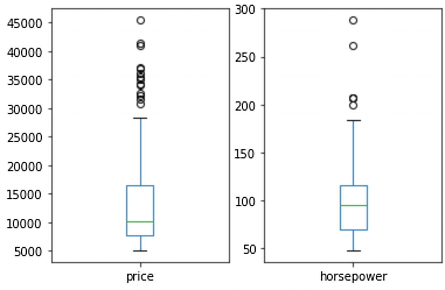
Boxplots are frequently used to compare the data distribution of multiple datasets against each other. Something we can also do inside our PySpark notebook by setting the subplot() function of the matplotlib library. The parameters we set for subplot() dictate the location, expressed in rows and columns, the plot following the subplot() function should be displayed in. In the example in Listing 6-37, the boxplot for the price column is shown in location 1,2,1 which means 1 row, 2 columns, first column. The plot for the horsepower is shown in location 1 row, 2 columns, second column effectively plotting both boxplots next to each other (Figure 6-38).
%matplotlib inline
# Boxplots are frequently used to compare the distribution of datasets
# We can plot multiple boxplots together and return them as one image using the following code
import matplotlib.pyplot as plt
plt.subplot(1, 2, 1)
pd_data frame.price.plot.box()
plt.subplot(1, 2, 2)
pd_data frame.horsepower.plot.box()
plt.show()
Listing 6-37
Generate multiple boxplots to compare two values
Figure 6-38
Two different boxplots plotted next to each other
We won’t go into further detail about boxplots since they are outside the scope of this book, but if you are interested in learning more about them, there are plenty of resources available online about how to interpret them.
One final example we would like to show displays how powerful the graphical capabilities of Pandas is. Using the code of Listing 6-38, we will create a so-called scatter matrix (Figure 6-39). A scatter matrix consists of many different graphs all combined into a single, large, graph. The scatter matrix returns a scatter plot for each interaction between the columns we provide and a histogram if the interaction is on an identical column.
%matplotlib inline
import matplotlib.pyplot as plt
from pandas.plotting import scatter_matrix
# Only select a number of numerical columns from our data frame
Scatter matrix plot on various columns inside the pd_data frame
A scatter matrix plot is incredibly useful when you want to detect correlations between the various columns inside your dataset. Each of the scatter plots draws a dot for each value on the x axis (for instance, length) and the y axis (for instance, price). If these dots tend to group together, making up a darker dot in the case of the plot above, the data inside the columns could potentially be correlated to each other, meaning that if one has a higher or lower value, the other generally moves in the same direction. A more practical example of this is the plot between price (bottom left of the preceding graph) and curb weight (fourth from the right in the preceding graph). As the price, displayed on the y axis, goes up, the curb weight of the car also tends to increase. This is very useful information to know, especially if we were interested in predicting the price of a car based on the column values that hold the characteristics of the car. If a car has a high curb weight, chances are the price will be high as well.
Data Frame Execution
In this chapter I have mentioned a number of times that a data frame is just a logical representation of the data you imported to the data frame. Underneath the hood of the data frame, the actual, physical data is stored on the Spark nodes of your Big Data Clusters. Because the data frame is a logical representation, processing the data inside a data frame, or modifying the data frame itself, happens differently than you might expect.
Spark uses a method called “lazy evaluation” before processing any commands. What lazy evaluation basically means in terms of Spark processing is that Spark will delay just about every operation that occurs on a data frame until an action is triggered. These operations, called transformations, are actions like joining data frames. Every transformation we perform on a Spark data frame gets added to an execution plan, but not executed directly. An execution plan will only be executed whenever an action is performed against the data frame. Actions include operations like count() or top().
Simply speaking, all the transformations we do on a data frame, like joining, sorting, and so on, are being added to a list of transformations in the shape of an execution plan. Whenever we perform an action like a count() on the data frame, the execution plan will be processed and the resulting count() result will be displayed.
From a performance perspective, the lazy evaluation model Spark uses is very effective on big datasets. By grouping transformations together, less passes over the data are required to perform the requested operations. Also, grouping the transformations together creates room for optimization. If Spark knows all operations it needs to perform on the data, it can decide on the optimal method to perform the actions required for the end result, perhaps some operations can be avoided or others can be combined together.
From inside our PySpark notebook, we can very easily see the execution plan by using the explain() command. In the example in Listing 6-39, we are going to import flight and airport information into two separate data frames and look at the execution plan of one of the two data frames (Figure 6-40).
# Import the flights and airlines data again if you haven't already
# Just like SQL Server, Spark uses execution plans which you can see through .explain()
df_flights.explain()
Listing 6-39
Explain the execution plan of a single table data frame
Figure 6-40
Execution plan of a newly imported data frame
As you can see in Figure 6-40, there is only a single operation so far, a FileScan, which is responsible for reading the CSV contents into the df_flights data frame. As a matter of fact, the data is not already loaded into the data frame when we execute the command, but it will be the first step in the execution plan whenever we perform an action to trigger the actual load of the data.
To show changes occurring to the execution plan, we are going to join both the data frames we created earlier together (Listing 6-40) and look at the plan (Figure 6-41).
# Let's join both data frames again and see what happens to the plan
Explain the execution plan of a multitable data frame
Figure 6-41
Execution plan of a data frame join
From the execution plan, we can see two FileScan operations that will read the contents of both source CSV files into their data frames. Then we can see that Spark decided on performing a hash join on both data frames on the key columns we supplied in the preceding code.
Again, the actions we performed against the data frame have not been actually executed. We can trigger this by performing an action like a simple count() (Listing 6-41).
# Even though we joined the data frames and see that reflected in the
# execution plan, the plan hasn't been executed yet
# Execution plans only get executed when performing actions like count() or top()
df_flightinfo.count()
Listing 6-41
Perform an action to execute the execution plan
The execution plan will still be attached to the data frame, and any subsequent transformations we perform will be added to it. Whenever we perform an action at a later point in time, the execution plan will be executed with all the transformations that are part of it.
Data Frame Caching
One method to optimize the performance of working with data frames is to cache them. By caching a data frame, we place it inside the memory of the Spark worker nodes and thus avoid the cost of reading the data from disk whenever we perform an action against a data frame. When you need to cache, a data frame is depended on a large number of factors, but generally speaking whenever you perform multiple actions against a data frame in a single script, it is often a good idea to cache the data frame to speed up performance of subsequent actions.
We can retrieve information about whether or not (Figure 6-42) our data frame is cached by calling the storageLevel function as shown in the example in Listing 6-42.
df_flightinfo.storageLevel
Listing 6-42
Retrieve the data frame’s storage level
Figure 6-42
Caching information of the df_flightinfo data frame
The function returns a number of Boolean values on the level of caching that is active for this data frame: Disk, Memory, OffHeap, and Deserialized. By default, whenever we cache a data frame, it will be cached to both Disk and Memory.
As you can see in Figure 6-43, the df_flightinfo data frame is not cached at this point. We can change that by calling the cache() function as shown in the code in Listing 6-43.
# To cache our data frame, we just have to use the .cache() function
# The default cache level is Disk and Memory
df_flightinfo.cache()
df_flightinfo.storageLevel
Listing 6-43
Enable caching on a data frame
Figure 6-43
Caching information of the df_flightinfo data frame
If we look at the results of the storageLevel function, shown in Figure 6-43, we can see the data frame is now cached.
Even though the storageLevel function returns that the data frame is cached, it actually isn’t yet. We still need to perform an action before the actual data that makes up the data frame is retrieved and can be cached. One example of an action is a count(), which is shown in the code of Listing 6-44.
# Even though we get info back that the data frame is cached, we have to
# perform an action before it actually is cached
df_flightinfo.count()
Listing 6-44
Initialize cache by performing a count on the data frame
Besides the storageLevel() command which returns limited information about the caching of a data frame, we can expose far more detail through the Yarn portal.
To get to the Yarn portal, you can use the web link to the “Spark Diagnostics and Monitoring Dashboard” which is shown in the SQL Server Big Data Cluster tab whenever you connect, or manage, a Big Data Cluster through Azure Data Studio (Figure 6-44).
Figure 6-44
Service Endpoints in Azure Data Studio
After logging into the Yarn web portal, we are shown an overview of all applications as shown in Figure 6-45.
Figure 6-45
Yarn web portal
Consider an application inside Spark as a unit of computation. An application can, for instance, be an interactive session with Spark through a notebook or a Spark job. Everything that we have been doing throughout this chapter inside our PySpark notebook has been processed in Spark as one or multiple applications.
As a matter of fact, the first command we execute against our Spark cluster returns information about our Spark application as you can see in Figure 6-46.
Figure 6-46
Spark application information
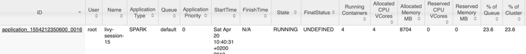
For us the most important bit of information we are after is the “YARN Application ID.” This ID should be present on the Yarn All Applications page, and if you are still connected to Spark through this Application ID, it should be marked as “RUNNING” like our session displayed in Figure 6-47.
Figure 6-47
Spark application overview from the Yarn web portal
The information about data frame caching we are looking for is stored inside the application logging. We can access more details about the application by clicking the link inside the ID page. This brings us to a more detailed view for this specific application as shown in Figure 6-48.
Figure 6-48
Application detail view inside the Yarn web portal
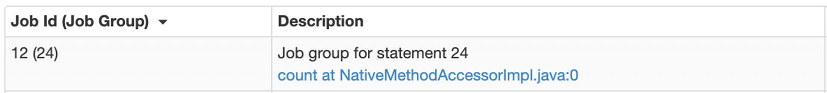
To see the information we’re after, we have to click the “ApplicationMaster” link at the “Tracking URL:” option. This opens up a web page with Spark Jobs that were, or are being, processed by this specific application. If you consider an application as your connection to the Spark cluster, a job is a command you send through your application to perform work like counting the number of rows inside a data frame. Figure 6-49 shows an overview of our Spark Jobs inside the application we are currently connected to through our PySpark notebook.
Figure 6-49
Spark job overview
You can open the details of a job by clicking the link inside the “Description” column and access a wealth of information about the job processing including how the job was processed by each worker node and the Spark equivalent of the graphical execution plan for the job called the DAG (directed acyclic graph) of which an example is included in Figure 6-50.
Figure 6-50
DAG of a count() function across a data frame
To view information about data frame caching, we do not have to open the job details (though we can if we want to see storage processing for only a specific job); instead we can look at the general storage overview by clicking the “Storage” menu item at the top bar of the web page.
On this page we can see all the data frames that are currently using storage, either physical on disk, or in-memory. Figure 6-51 shows the web page on our environment after executing the cache() and count() commands we performed at the beginning of this section.
Figure 6-51
Storage usage of data frames
What we can see from Figure 6-51 is that our data frame is completely stored in-memory, using 345.6 MB of memory spread across five partitions. We can even see on which Spark nodes the data is cached and partitioned to by clicking the link beneath the “RDD Name” column. In our case, we get back the information shown in Figure 6-52.
Figure 6-52
Storage usage of our data frame across Spark nodes
We can see our data frame is actually cached across three Spark worker nodes, each of which cached a different amount of data. We can also see how our data frame is partitioned and how those partitions are distributed across the worker nodes. Partitioning is something that Spark handles automatically and it is essential for the distributed processing of the platform.
Data Frame Partitioning
Like we mentioned at the end of the previous section, Spark handles the partitioning of your data frame automatically. As soon as we create a data frame, it automatically gets partitioned and those partitions are distributed across the worker nodes.
We can see in how many partitions a data frame is partitioned through the function shown in Listing 6-45.
# Spark cuts our data into partitions
# We can see the number of partitions for a data frame by using the following command
df_flightinfo.rdd.getNumPartitions()
Listing 6-45
Retrieve the number of partitions of a data frame
In our case, the df_flightinfo data frame we’ve been using throughout this chapter has been partitioned into five partitions – something we also noticed in the previous section where we looked at how the data is distributed across the Spark nodes that make up our cluster through the Yarn web portal.
If we want to, we can also set the amount of partitions ourselves (Listing 6-46). One simple way to do this is by supplying the number of partitions you want to the repartition() function.
# If we want to, we can repartition the data frame to more or less partitions
df_flightinfo = df_flightinfo.repartition(1)
Listing 6-46
Repartition a data frame
In the example code of Listing 6-46, we would repartition the df_flightinfo data frame to a single partition. Generally speaking, this isn’t the best idea, since only having a single partition would mean that all the processing of the data frame would end up on one single worker node. Ideally you want to partition your data frame in as equally sized partitions as possible. Whenever an action is performed against the data frame, it can get split up into equally large operations, having maximum computing efficiency.
To make sure your data frame is as efficiently partitioned as possible, it is in many cases not very efficient in just supplying the number of partitions you are interested in. In most cases you would like to partition your data on a specific key/value, making sure all rows inside your data frame that have the same key/value are partitioned together. Spark also allows partitioning on a specific column as we show in the example code of Listing 6-47.
In this specific example, we are partitioning the df_flights_partitioned data frame on the AIRLINE column. Even though there are only 14 distinct airlines inside our data frame, we still end up with 200 partitions if we look at the partition count of the newly created data frame. That is because, by default, Spark uses a minimum partition count of 200 whenever we partition on a column. For our example, this would mean that 14 of the 200 partitions actually contain data, while the rest is empty.
Let’s take a look at how the data is being partitioned and processed. Before we can do that, however, we need to perform an action against the data frame so that it actually gets partitioned (Listing 6-48).
# Let's run a count so we can get some partition information back through the web portal
df_flights_partitioned.count()
Listing 6-48
Retrieved count from partitioned data frame
After running this command, we are going to return to the Yarn web portal which we visited in the previous section when we looked at data frame caching. If you do not have it opened, you need to navigate to the Yarn web portal and open the currently running application and finally clicking the ApplicationMaster URL to view the jobs inside your application as shown in Figure 6-53.
Figure 6-53
Spark jobs inside our active application
We are going to focus at the topmost job (Figure 6-54) of the list shown in Figure 6-53. This is the count we performed after manually partitioning our data frame on the AIRLINE column which you can also see in the name of the operation that was performed.
Figure 6-54
Spark job for our count() operation
By clicking the link in the Description, we are brought to a page that shows more information about that specific job which is shown in Figure 6-55.
Figure 6-55
Spark Job details
What is very interesting to see is that the jobs themselves are also divided into substeps called “Stages.” Each stage inside a job performs a specific function. To show how our partitioning was handled, the most interesting stage is the middle one on which we zoom in in Figure 6-56.
Figure 6-56
Stage inside a Spark job
In this stage, the actual count was performed across all the partitions of the data frame; remember, there were 200 partitions that were created when we created our partition key on the AIRLINE column. In the “Tasks: Succeeded/Total” column, you see that number being returned.
If we go down even deeper in the details of this stage, by clicking the link inside the Description column, we receive another page that shows us exactly how the data was processed for this specific stage. While this page provides a wealth of information, including an event timeline, another DAG visualization, and summary metrics for all the 200 steps (which are again called tasks on this level), I mostly want to focus on the table at the bottom of the page that returns processing information about the 200 tasks beneath this stage.
If we sort the table on the column “Shuffle Read / Records” in a descending manner, we can exactly see how many records were read from each partition for that task and from which host they were read as shown in Figure 6-57, which shows the first couple of tasks that processed rows of the total of 14 tasks that actually handled rows (the other 186 partitions are empty; thus no rows are processed from them).
Figure 6-57
Tasks that occurred beneath our count step, sorted on Shuffle Read Size / Records
From the results in Figure 6-57, we can immediately also see a drawback of setting our partitioning on a column value. The biggest partition contains far more rows (1,261,855) than the smallest one (61,903), meaning most of the actions we perform will occur on the Spark worker that contains our largest partition. Ideally, you want to make your partitions as even as possible and distributed in such a way that work is spread evenly across your Spark worker nodes.
Summary
In this chapter, we took a detailed look at working with data inside the Spark architecture that is available in SQL Server Big Data Clusters.
Besides exploring the programming language PySpark to work with data frames inside Spark, we also looked at more advanced methods like plotting data. Finally, we looked a bit underneath the hood of Spark data frame processing by looking at execution plans, caching, and partitioning while introducing the Yarn web portal which provides a wealth of information about how Spark processes our data frames.
With all that data now on hand within our Big Data Cluster, let’s move on to Chapter 7 to take a look at machine learning in the Big Data Cluster environment!