
In the early days of Web sites, Web developers were content with having a Web page with columns of text for their hyperlinks. Web pages were boring and drab, but they served their purpose. As the Internet became more popular, Web sites became more interactive and dynamic. Instead of plain text and graphics, it is much more common now to see dynamic, graphically oriented Web pages with content that changes in real time as you interact with the page.
A Web developer can use many techniques to create a Web page in which certain areas of the page change as the user interacts with the page. Many Web developers use <div> tags to implement this kind of functionality because by using the style attribute of the <div> tag, you can easily control the <div> tag’s position, size, and many other attributes.
Expression Web 2 uses absolutely positioned <div> tags to implement layers so you have fine control over their location on the page. When an item on a Web page is absolutely positioned, the tag used to render that item contains attributes that specify exactly where that item is to appear on the Web page. The position is specified using three attributes:
left—. The distance between the left side of the Web page and the left side of the item.top—. The distance between the top of the Web page and the top of the item.z-index—. The position of the item in relation to other absolutely positioned items if you were to stack the items one on top of the other. A higher z-index indicates that an item is higher in the stack.
The z-index is what defines a <div> tag as an actual layer. Because the z-index allows you to stack <div> tags in layers on a page, absolutely positioned <div> tags are known as layers.
Caution
If you change the properties of a layer and turn off absolute positioning for the layer, or if you edit a page in Code View and remove the style attribute, the <div> is no longer considered a layer and Expression Web 2 will no longer provide you with the tools to edit it as a layer.
You encounter layers almost every time you go to a Web site. For example, when you see a menu system that pops up a submenu for items you point to, chances are that functionality is implemented with layers. Expression Web 2 uses the Layers task pane to provide an intuitive interface with which to add and configure layers on your Web page. Even with layers, you will not be required to manipulate code directly.
Note
Layers can be used for much more than just menu systems. You can use layers to control any element on your page, including graphics, blocks of text, and even other layers.
Over the course of this chapter, you will create a Web page with a dynamic menu system and other dynamic content using layers, behaviors, and Interactive Buttons. Better yet, you will create it all without looking at a single line of code!
Note
If you’d prefer to use a completed copy of the Web page described in this chapter, see the file layers.htm in the ExamplesCh25Files folder on the CD-ROM that accompanies this book for the completed example.
→ | For more information on using behaviors in Expression Web 2, see Chapter 23, “Using Behaviors,” p. 395. |
→ | For more information on using Interactive Buttons, see Chapter 22, “Using Interactive Buttons,” p. 383. |
Layers are inserted and formatted using the Layers task pane. There are other ways to insert a layer, but the Layers task pane is the most efficient because it is also used to format and arrange layers. If the Layers task pane is not visible, simply select Task Panes, Layers to display the Layers task pane, as seen in Figure 25.1. From the Layers task pane, you can click the Insert Layer button or the Draw Layer button to insert a new layer into the page.

Tip
By default, the Layers tab will appear inside the same task pane as the Apply Styles, Manage Styles, and Behavior task panes.
In addition to the Insert Layer and Draw Layer buttons, the Layers task pane consists of three columns. The leftmost column, the Layer Visibility column, allows you to control whether a particular layer is visible and to see at a glance which layers are visible and which ones are not. The second column, the Layer Z-Index column, provides a quick reference to the z-index of each layer. The rightmost column, the Layer ID column, displays the ID for each layer.
Tip
Choose the ID for each layer carefully and try to choose an ID that describes the layer’s purpose. You will use the ID of the layer to refer to the layer in behavior-related dialogs and if you are writing client-side code. By naming your layers with descriptive names such as mainContent and navButtons, you will be less likely to confuse them later.
Let’s begin creating the Web page you’ll use throughout this chapter to learn about layers in Expression Web 2:
Create a new blank page.
If the Layers task pane is not visible, select Task Pane, Layers to display it.
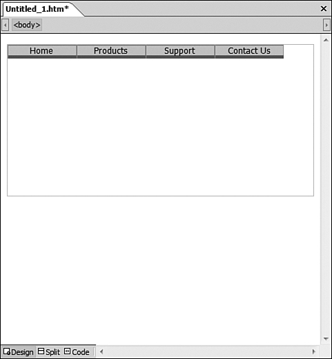
Click the Draw Layer button and draw a layer the same width as your page and half the height of your page by clicking in the upper-left corner of the page and dragging the mouse to draw the layer.
Click inside the layer to place the insertion point in it.
Select Insert, Interactive Button to insert an Interactive Button.
Choose the Border Bottom 1 button.
Enter
Homefor the text of the button and click OK.Continue this process by repeating steps 6 and 7 to create buttons for
Products,Support, andContact Us. Your page should look like Figure 25.2 when you are finished.Double-click the layer to display the Layers task pane if it’s not already displayed.
Right-click layer1 and select Modify ID to rename the layer.
Change the layer name to
mainMenu.Right-click on the mainMenu layer and select Modify Z-Index.
Change the z-index for the mainMenu layer to
3.
The layer you have just inserted needs to be resized so it is the same size as the four Interactive Buttons inside it. Change the width and height of the layer to match the width and height of the Interactive Buttons. To do that, follow these steps:
Move the mouse over the border of the layer until the mouse pointer changes to a four-way arrow.
Click on the border to activate the sizing handles. The sizing handles appear as small white circles at each corner and in the middle of each side of the layer.
Move the mouse pointer over a sizing handle until the mouse pointer changes to a two-way arrow.
Click and hold the left mouse button while you drag the sizing handle to change the width or height of the layer.
Resize the mainMenu layer until it matches the width and height of the Interactive Buttons you added previously. You should now have a new layer containing four Interactive Buttons, as shown in Figure 25.3. The buttons represent the top-level menu. You will next create submenus that will display when a user hovers over the Products or Support menu buttons.

Next, you need to create a layer to hold each submenu. You will then control the visibility of the layer based on the position of the mouse. To do that, you’ll use the Behaviors and Layers task panes.
One of the great things about layers is that because they are absolutely positioned, you can design them anywhere on the page and then simply drag and drop them where you want them to appear when your page is complete. In the case of your menu, you will be creating three separate layers. As you’ll soon see, being able to design these layers and then place them in their final positions makes the development of menus very simple.
The mainMenu layer is the parent layer for all the other layers in the menu system. By making the mainMenu layer the parent, all the layers that make up your menu will be attached to the mainMenu layer. If you move the mainMenu layer, it will move the entire menu system and keep all your layers in place.
You now need to create the first child layer for the mainMenu layer. To do that, follow these steps:
Select Task Pane, Layers to display the Layers task pane if it’s not already visible.
Select the mainMenu layer so the new layer will be inserted as a child layer.
Because the new layer is inserted directly on top of the existing layer, select the layer and drag it below the mainMenu layer, as shown in Figure 25.4.
Insert an Interactive Button into the layer by selecting Insert, Interactive Button.
Choose the Border Left 1 button.
Enter
Softwarefor the text of the button and click OK.Press Shift+Enter to insert a line break.
Insert another Border Left 1 Interactive Button immediately below the first button.
Enter
Hardwarefor the text of the button and click OK.

The mainMenu layer now has a child layer called layer1, and that layer contains two Interactive Buttons. Resize the layer so that its height and width match the height and width of the Interactive Buttons.
You should now rename the layer and give it a more descriptive ID. Right-click the layer1 layer in the Layers task pane and select Modify ID. Type ProdSubmenu for the layer ID. Your page should now resemble the page in Figure 25.5. Note that the ProdSubmenu layer appears slightly indented below the mainMenu layer in the Layers task pane, and there is a minus sign next to the mainMenu layer. This indicates that the ProdSubmenu layer is a child layer.
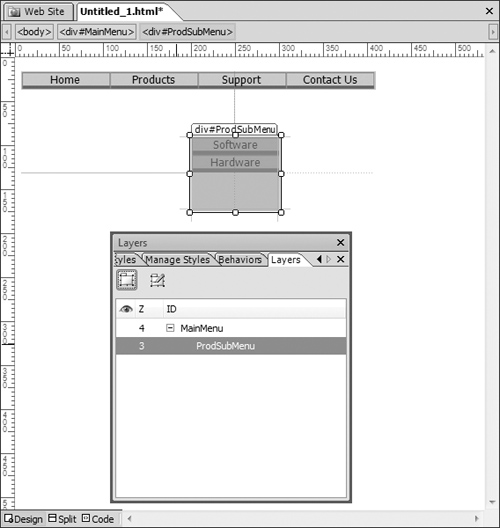
The layer is still not in its final position. When you’ve finished this page, the ProdSubmenu layer will appear just below the Products menu button. It’s easiest to design your layers first and then move them into their correct positions later. Because the ProdSubmenu layer is a child layer to the mainMenu layer, it will always move with the mainMenu layer. Therefore, when you place it in its final position, you’ll never have to worry about it losing its position relative to the mainMenu layer.
Note
When you insert a child layer, Expression Web 2 simply inserts the <div> tag for the layer nested within the parent <div> tag.
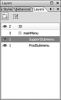
The final pop-up menu you need to create is the Support menu. Copy the ProdSubmenu layer and paste it as a new layer. Rename the new layer SupportSubmenu. This layer also needs to be a child of the mainMenu layer. To make it a child layer, click the SupportSubmenu layer in the Layers task pane and drag and drop it on top of the mainMenu layer in the Layers task pane. The layer is now a child layer at the same level as the ProdSubmenu layer.
Now, change the Interactive Buttons in the new SupportSubmenu layer. Double-click the first button and change its text to FAQ. Double-click the second button and change its text to Ask Us. You now have all the layers complete for your interactive menu and your page should look like Figure 25.6.

As mentioned previously, none of the layers on your page are in their final positions. However, because layers are often stacked on top of each other, they are difficult to edit when they are placed in their final positions prior to finishing their content. That’s why you added all the items to your layers while they were all separated. Now it’s time to move the layers into their final positions.
The dynamic menu you are building will display a submenu of products when you hover over the Products button and a submenu of support options when you hover over the Support button. You’ll want to position the ProdSubmenu layer so it appears underneath the Products button and slightly overlaps the bottom of the button. You will also want to position the SupportSubmenu layer so it appears underneath the Support button.
Drag the ProdSubmenu layer so it appears underneath the Products button and the SupportSubmenu layer so it appears underneath the Support button, as shown in Figure 25.7. Make sure the ProdSubmenu and SupportSubmenu layers do not overlap. After you have positioned the ProdSubmenu and SupportSubmenu layers, select the mainMenu layer and drag it to the position where you want your menu to appear on the page. Notice that as you drag the mainMenu layer, the positions of the ProdSubmenu and SupportSubmenu layers do not change in their relation to the mainMenu layer. That’s the benefit of making those layers children of the mainMenu layer.

Now you’re ready to add interactivity to your menu. When the page first loads, the only layer that you want to be visible is the mainMenu layer. When a user hovers over the Products button, the ProdSubmenu layer should display. When a user hovers over the Support button, the SupportSubmenu layer should appear.
In addition to configuring these layers to appear at the correct time, you also need to configure when each layer should disappear. You wouldn’t want your menus to appear and stay visible forever. When a user moves the mouse out of a menu, you want the menu to disappear.
The perfect way to implement this interactivity is to use behaviors. By using the Change Property and Change Property Restore behaviors, you can easily configure your layers to appear and disappear when you need them to.
→ | For more information on using behaviors, see Chapter 23, “Using Behaviors,” p. 395. |
When your page loads, the only layer you want the user to see is the mainMenu layer. All the other layers should be invisible. The Layers task pane provides an easy method of controlling the visibility of layers using the Layer Visibility column.
The Layer Visibility column is empty by default, but by clicking next to a specific layer, an eyeball icon will appear, as shown in Figure 25.8. The open eye icon means that the layer is visible. There are three visibility states for each layer in the Layers task pane:
Default—. Indicated by the absence of an eye icon.
Visible—. Indicated by an open eye icon.
Invisible—. Indicated by a closed eye icon.
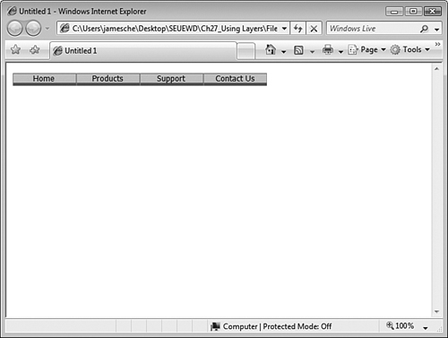
Click the eye icon on the ProdSubmenu layer so it appears closed. The Products submenu will now appear hidden when the page is first browsed. Click the Layer Visibility column next to the SupportSubmenu layer twice so it is invisible as well. Now save your page and browse it. You will see that the only layer visible is the mainMenu layer, as seen in Figure 25.9.
Now you need to add some interactivity. Remember that the ProdSubmenu layer needs to be made visible when a user hovers over the Products button. To add that interactivity, use the Change Property behavior to change the Visibility property for the ProdSubmenu layer.
→ | For more information on the Change Property behavior, see “Expression Web 2 Behaviors,” p. 398. |
Select Task Panes, Behaviors to display the Behaviors task pane if it’s not already visible. To add interactivity for the Products submenu, follow these steps:
Select the Products button.
In the Behaviors task pane, click the Insert button.
Select Change Property from the Behaviors menu.
Select the Select Element radio button.
Select div from the Element Type drop-down.
Select ProdSubmenu from the Element ID drop-down.
Click the Visibility button.
Select the Visible radio button and click OK.
Make sure the Restore on Mouseout Event check box is unchecked.
Click OK to add the behavior.
Locate the behavior in the Behaviors task pane and change the Events from
onclicktoonmouseover. The behavior will change position in the Behaviors task pane when the event is changed.
Now if you browse the page, the ProdSubmenu layer appears when you hover over the Products menu. However, there is a problem. The Products submenu will never disappear unless you reload the page. You want the Products submenu to disappear when the user moves the mouse off the menu.
Note

If the submenu does not appear when you hover over the Products button, see “Behaviors Don’t Work” in the “Troubleshooting” section of this chapter.
Switch to the Layers task pane and select the ProdSubmenu layer to make it visible so you can apply behaviors to it. Without deselecting the ProdSubmenu layer, switch to the Behaviors task pane. To configure the ProdSubmenu layer so it disappears at the correct time, follow these steps:
Select Insert, Change Property to display the Change Property dialog.
Leave the Current Element option selected.
Click the Visibility button and select the Hidden option.
Click OK.
Make sure the Restore on Mouseout Event box is unchecked.
Click OK.
In the Behaviors task pane, change the Events column from
onclicktoonmouseout.
Now the Products button is configured to show the submenu when you hover over it, and the ProductSubmenu layer is configured to hide itself when you move the mouse outside the menu.
Save and test your page to see how it’s working so far. Hover over the Products button and you should see the ProductSubmenu layer appear. Move the mouse over the ProductSubmenu layer and you should notice a problem. When you hover over the buttons on the ProductSubmenu layer, the entire menu disappears! This is obviously not what you want to happen. To correct this, you need to add a behavior to each button on the ProductSubmenu layer.
Switch back to Expression Web 2, activate the Layers task pane, and click the closed eye for the ProdSubmenu layer to make it visible again. Switch to the Behaviors task pane and configure the behaviors for each button as follows:
Select the Software Interactive Button.
In the Behaviors task pane, select Insert, Change Property.
Select the Select Element option.
Select div from the Element Type drop-down.
Select ProdSubmenu from the Element ID drop-down.
Click the Visibility button.
Select the Visible option and click OK.
Make sure the Restore on Mouseout Event check box is unchecked.
Click OK.
Change the
onclickevent toonmouseover.
Perform the same steps for the Hardware Interactive Button. After configuring the Hardware button, switch to the Layers task pane and make the ProdSubmenu layer invisible again. Then, save and preview your page in the browser. Hover over the Products button to display the Products submenu, then hover over the Software and Hardware buttons. Move the mouse below the Products submenu to ensure that the menu disappears as expected.
One problem still remains. If you hover over the Products button and then move the mouse off the Products button to any other button or off the menu itself without hovering over the submenu, the ProdSubmenu layer remains visible. You actually want the ProdSubmenu layer to disappear when a user hovers over one of the other mainMenu layer buttons or when the user moves the mouse off the menu altogether. To correct that, follow these steps:
Switch back to Expression Web 2.
Select the Home button.
Switch to the Behaviors task pane.
Select Insert, Change Property.
Select div from the Element Type drop-down.
Select ProdSubmenu from the Element ID drop-down.
Click the Visibility button.
Select the Hidden option and click OK.
Make sure the Restore on Mouseout Event check box is unchecked.
Click OK.
Change the
onclickevent toonmouseover.
Make the same behavior configuration change for the Support button. After you’ve done that, create a new behavior for the mainMenu layer to hide the ProdSubmenu layer as follows:
Select the mainMenu layer.
From the Behaviors task pane, select Insert, Change Property.
Select the Select Element option.
Select div from the Element Type drop-down.
Select ProdSubMenu from the Element ID drop-down.
Click the Visibility button.
Select the Hidden option and click OK.
Make sure the Restore on Mouseout Event check box is unchecked.
Click OK.
Change the event from
onclicktoonmouseout.
Save your page and browse it to preview the menu. The Products submenu should now work perfectly—it should display and hide itself in response to the correct events.
The next step is to configure the Support submenu. The steps are the same as those you completed for the Products submenu:
Make the SupportSubmenu layer visible.
Create a behavior for the Support button to display the SupportSubmenu layer in the
onmouseoverevent.Create a behavior for the FAQ and Ask Us buttons to display the SupportSubmenu layer in the
onmouseoverevent.Create a behavior for the SupportSubmenu layer that hides the SupportSubmenu layer in the
onmouseoutevent.Create a behavior for the Products and Contact Us buttons that hides the SupportSubmenu layer in the
onmouseoverevent.Create a behavior for the mainMenu layer that hides the SupportSubmenu layer in the
onmouseoutevent.Hide the SupportSubmenu layer.
Save the page again and preview it. Your dynamic menu should be fully functional at this point.
I configured the behaviors for my menu but they don’t do anything.
When you insert a behavior, the event defaults to onclick. If you are expecting the behavior to work when you hover the mouse on a page element, but you forgot to change the onclick event to onmouseover, the behavior will not work.
Make sure you always change the event if necessary.
As mentioned in this chapter, the z-order of a layer affects whether a layer appears on top of other layers. However, as in many other areas of Web design, z-order doesn’t always work the way you may expect.
To fully understand how z-order works in Internet Explorer, you must first understand that there are two types of elements that can be placed on a Web page: windowed elements and windowless elements. Each of these element types uses an entirely separate z-order hierarchy. Additionally, windowed elements will always appear on top of windowless elements. That means a windowless element with a z-order value of 4 will appear on top of a windowless element with a z-order value of 3, but all windowed elements will appear on top of both windowless elements regardless of z-order.
Why is this important? It’s important because some common elements such as drop-down boxes are windowed elements. Therefore, if you have a drop-down box on your Web page and you are expecting a layer that displays part of a menu system to appear on top of the drop-down, you’ll be out of luck. The drop-down will always appear on top of the menu layer.
To work around this behavior, make sure any windowed elements do not appear close enough to windowless elements so that they overlap. If you absolutely must place two in close proximity, you can create a behavior that hides the windowed element when the windowless element appears.