
Chapter 17. GDI+
A picture is worth a thousand words—or several thousand lines of source code, if you’re generating a bitmap image of it. Writing code to manipulate images of varying color depths, or to trace out multi-layer vector art, can be a nightmare of geometric contortions and linear algebra. It makes one yearn for those days of pre-screen computers. The first programming class I took used a DECWriter, a printer-based terminal that had no screen, and included the graphics capabilities of a jellyfish. It was perfect for me. I couldn’t draw a straight line anyway, and I didn’t need some fancy schmancy “video display terminal” reminding me of it.
The graphics included in early display systems weren’t much better. “Dumb terminals,” like the popular VT100, included some simple character graphics that displayed basic lines and blocks. Each graphic part was exactly one character in size, and any images you sought to display had to fit in a clunky 80 by 24 grid.
Fortunately for art aficionados everywhere, computers have come a long way in the graphics department. GDI+ includes complex drawing features that would make a DECWriter cry. Built upon the older Windows’ Graphics Device Interface (GDI) technology, GDI+ includes commands for drawing lines, text, and images in the Picasso-enhanced world of 2D graphics.
Overview of GDI+
Before .NET, Windows programmers depended on the GDI system to draw pretty much anything on the screen, even if they didn’t know that GDI existed. In addition to bitmap images, all controls, labels, window borders, and icons appeared on the screen thanks to GDI. It was a giant step forward from character graphics. GDI presented a basic set of drawing features from which you could potentially output any type of complex image. But it wasn’t easy. The graphic primitives were—well—primitive, and you had to build up complex systems from the parts. Most programmers weren’t into making things beautiful, so they tried to avoid the complexities of GDI. But sometimes you had to draw a line or a circle, and there was no way around it.
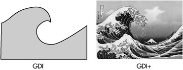
GDI+, new with .NET, builds on GDI, providing the basic primitives of GDI, but also supplying some more complex groupings of graphic features into easy-to-use functions. The simplicity has brought about a Renaissance of programmer-initiated graphic work. Take a look at Figure 17-1, which shows an image drawn using the older GDI, and that same image generated with just a few quick commands in GDI+.
Figure 17-1. The marvel that is GDI+
The GDI+ system makes its home in the System.Drawing namespace, and includes multitudes of classes that represent the drawing objects, surfaces, and embellishment features that enable display graphics. But it’s not just about display. GDI+ generalizes bitmap and vector drawing on all available output surfaces: bitmaps or line drawings on the screen (including form and control surfaces), report output on a printer, graffiti on the back wall of your local supermarket, image content destined for a JPEG file—they are all the same to GDI+. All destinations use the same drawing methods and objects, making it easier for you to generalize your drawing code.
GDI+’s features include surfaces, drawing inks, drawing elements, and transformations.
- GDI+ generalizes drawing surfaces through the System.Drawing.Graphics class. This object represents a drawing canvas, with attributes for color depth and size (width and height). The canvas may link to a region of the workstation screen, an internal holding area for final output to the printer, or a general graphics canvas for manipulating content in-memory before outputting it to a display or a file. Another type of surface, the path (System.Drawing.Drawing2D.GraphicsPath), is like a macro recorder for vector (line) graphics. Drawing done within a path can be “replayed” back on a standard drawing surface, or used to supply boundaries for other drawing commands.
- Colors and inks appear in the form of colors (opaque or semi-transparent color values), brushes (bitmap-based pseudo-pens used for fills and tiling), and pens (colored line-drawing objects with a specific thickness).
- Drawing elements include rectangles, ellipses, lines, and other standard or custom-edge shapes. They also include fonts, both bitmapped and outline-based versions.
- Transformations let you resize, rotate, and skew drawings as you generate them. When a transformation is applied to a surface, you can draw objects as if there were no transformation applied, and the changes will happen in real time.
The Windows Forms controls that you use in desktop applications generally take care of their own display features. However, some controls let you take over some or all of the drawing responsibilities. For instance, the ListBox control displays simple single-color text for each list item. However, you can override the drawing of each list item, providing your own custom content, which may include multi-color text or graphics. This ability to supply some of the drawing code to a control is known as owner draw, and it works through the same generalized Graphics object used for other drawing. We’ll include some owner draw code in the Library Project.
In the interest of full disclosure, you should know that this chapter will cover probably only one percent of the available GDI+ features, if even that. GDI+ is complex and vast, and you could spend three years delving into every little feature, just in time for the next major release of GDI+ (it will be called Windows Presentation Foundation and was formerly known as Avalon). I’ll give you a brief overview of the system so you get a feel for some of the basics. If you need to manipulate images and text beyond what is listed here (and you probably will), try the MSDN documentation or another resource dedicated to deciphering GDI+.
Selecting a Canvas
Most drawing in .NET occurs in the context of a Graphics object. (For those familiar with pre-.NET development in Windows, this is similar to a device context.) Graphics objects provide a canvas on which you draw lines, shapes, bitmap images, and pre-recorded drawing macros. Graphics objects do not contain the graphics surface itself; they are simply generic conduits to the actual canvas. There is always some surface behind the Graphics object, whether it is a portion of the screen, a Bitmap object, or the simulated surface of a printed page. Any drawing that is done to the Graphics object immediately impacts the underlying surface.
The Graphics object includes dozens of methods that let you draw shapes and images on the graphics surface, and perform other magical 2-D activities. We’ll cover many of them in this chapter.
Obtaining and Creating Graphics Objects
Getting a Graphics object for an on-screen form or control is as easy as calling the form or control’s CreateGraphics method.
Some events, most notably the Paint event for forms and controls, provide access to a Graphics object through the event arguments.
You can also create a Graphics object that is unrelated to any existing display area by associating it to a bitmap.
Dim workBitmap As New Bitmap(50, 50)
Dim workGraphics = Graphics.FromImage(workBitmap)
Remember, all changes made to the workGraphics instance will impact the workBitmap image.
Disposing of Graphics Objects Properly
When you are finished with a Graphics object that you create, you must dispose of it by calling its Dispose method. (This rule is true for many different GDI+ objects.) Don’t keep it around for a rainy day because it won’t be valid later. You must, must, must dispose of it when you are finished with it. If you don’t, it could result in image corruption, memory usage issues, or worse yet, international armed conflict. So, please dispose of all Graphics objects properly.
workGraphics.Dispose()
If you create a Graphics object within an event, you really need to dispose of it before exiting that event handler. There is no guarantee that the Graphics object will still be valid in a later event. Besides, it’s easy to re-create another Graphics object at any time.
If you use a Graphics object that is passed to you from another part of the program (like that e.Graphics reference in the preceding Paint event handler), you should not dispose of it. Each creator is responsible for disposing of its own objects.
Choosing Pens and Brushes
A lot of graphics work involves drawing primitives: using lines, ellipses, rectangles, and other regular and irregular shapes to build up a final display. As in real life, you draw these primitives using a Pen object. For those primitives that result in a fillable or semi-fillable shape, a Brush object specifies the color or pattern to use in that filled area. GDI+ includes many predefined pens and brushes, or you can create your own.
Pens
Pens are line-drawing tools used with the drawing commands of a Graphics object. A basic pen has a solid color and a thickness.
' ----- A red pen five units wide.
Dim redPen As New Pen(Color.Red, 5)
As with Graphics objects, any Pen you create using the New keyword must be disposed of properly when you are finished with it.
redPen.Dispose()
There are several predefined pens made available through the System.Drawing.Pens class, all named by their color, as in Pens.Red. If you use one of these pens, you don’t have to dispose of it.
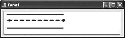
You can create a lot of interesting pens that vary by line style, end decoration, and color variations. The following code generates the image displayed in Figure 17-2.
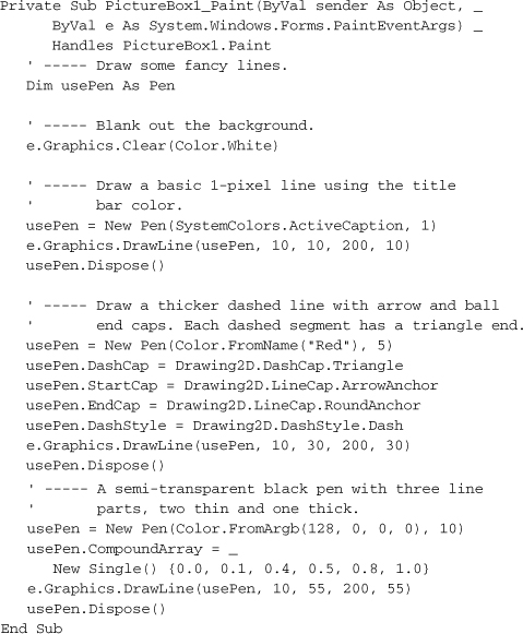
Figure 17-2. Yes sir, yes sir, three lines full
The code shows that there are a few different ways to specify a color, either by its predefined name (Color.White and SystemColors.ActiveCaption), a string name (using Color.FromName), or its Alpha-Red-Green-Blue value (Color.FromArgb). That last version lets you supply distinct values for the “alpha blend” (which sets the transparency level, from 0 for fully transparent, to 255 for fully opaque), red, green, and blue components of the full color.
Most of the pen-specific properties I demonstrated here are somewhat self-explanatory. As with most of GDI+, the mind-numbing amount of available features makes it impossible to completely document in a small chapter, let alone provide a good night’s sleep for authors designing such chapters. I will simply refer you to the online documentation for the Pen class to get all of the luscious details.
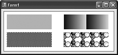
Brushes
Brushes are used for filling in spaces between drawn lines, even if you make those lines fully invisible. GDI+ includes a variety of brush types, including solid brushes (your basic single-color brush), hatch brushes (pattern brushes that are pleasant but general), texture brushes (where a custom bitmap is used for the brush), and gradient brushes (which slowly fade from one color to another across the brush). The System.Drawing.Brushes class includes some predefined solid brushes based on color name. As with pens, you must dispose of brushes that you create, but not the solid system-defined brushes.
The following block of code draws some simple rectangles with a variety of brush styles. The results appear in Figure 17-3.
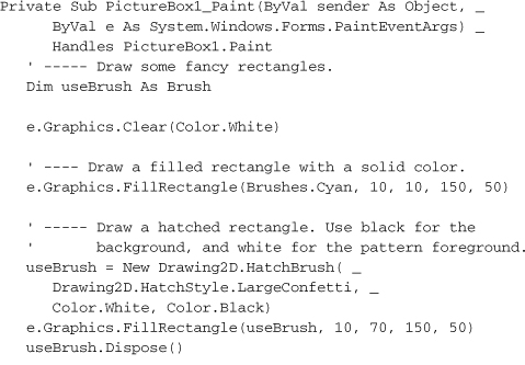
Figure 17-3. Kind of square if you ask me
Flowing Text from the Font
Circles and squares are okay, but they don’t always communicate much, unless you are Joan Miró. Most of us depend on text to say what we mean. Fortunately, GDI+ has features galore that place text on your graphics surface.
Before graphical user interfaces were all the rage, text wasn’t really an issue; you either used the characters built into the system, or nothing. On the screen, each letter of the alphabet was designed into the hardware of the computer or monitor, and any particular character could only appear within each square of the predefined 80×24 grid. Printers were a little better, becaue you could backspace and retype over previously typed positions to generate either bold or underscore text. Still, you were generally limited to one font, or just a small handful of basic fonts embedded in the printer’s memory.
Such limitations are a thing of the past. All text in Microsoft Windows appears courtesy of fonts, descriptions of character shapes that can be resized or stretched or emphasized to meet any text need. And because the user can add fonts to the system at any time, and from any third-party source, the variety of these fonts is amazing. But you already know all this. Let’s get on to the code.
To gain access to a font for use in your graphics, create an instance of the System.Drawing.Font class, passing it at least the font name and point size, and an optional style reference.
Dim basicFont As New Font("Arial", 14, FontStyle.Italic)
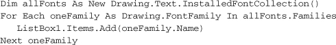
Naturally, the list of available fonts varies by system; if you’re going to go beyond the basic preinstalled fonts supplied with Windows, you should confirm that a named font is really available, and have a fallback option if it is not. You can get a list of all fonts by asking GDI+ nicely. All fonts appear in “families,” where each named family may have bold, italic, and other variations installed as separate font files. The following code block adds a list of all installed font families to a ListBox control.
If the font you need isn’t available and you aren’t sure what to use, let GDI+ choose for you. It includes a few generic fonts for emergency use.
Getting back to using fonts in actual drawing: The Graphics object includes a DrawString method that blasts out some text to the canvas.
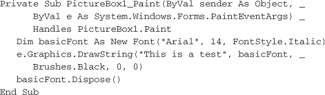
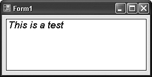
Figure 17-4 shows the output for this code block. In most of the sample code in this chapter, I’ll be outputting content to a PictureBox control named PictureBox1 that I’ve placed on the form of a new Windows Forms application. I’ve also set that control’s BorderStyle property to FixedSingle, and its BackColor property to white, so that I can visualize the edges of the canvas. Drawing occurs in the Paint event handler, which gets called whenever the picture box needs to be refreshed, as when another window obscures it and then goes away. In the remaining code examples, I won’t be including the “Sub PictureBox1_Paint” method definition, just the code that goes inside of it.
Figure 17-4. This is a test for sure
Of course, you can mix and match fonts on a single output canvas. This code includes text using Arial 14 and Arial 18.
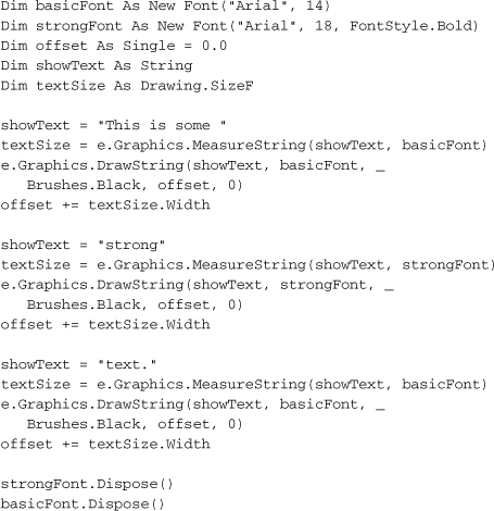
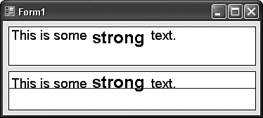
The output of this code appears in the top box of Figure 17-5, and it’s okay. But I want the bottom edges of the main body parts of each text block—that is, the baselines of each block—to line up properly, as shown in the lower box of Figure 17-5.
Figure 17-5. The good and the bad; both ugly
Doing all of the fancy font-lining-up stuff is kind of a pain in the neck. You have to do all sorts of measuring based on the original font design as extrapolated onto the pixel-based screen device. Then you connect the knee bone to the thigh bone, and so on. Here’s the code I used to generate the second lined-up image.
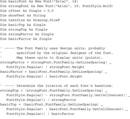
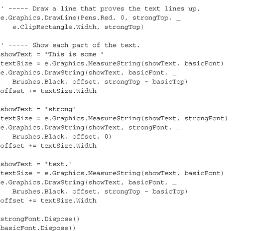
There’s a lot more calculating going on in that code. And I didn’t even try to tackle things like kerning, ligatures, or anything else having to do with typography. Anyway, if you need to perform complex font manipulation, GDI+ does expose all of the details so that you can do it properly. If you just want to output line after line of text using the same font, call the font’s GetHeight method for each line displayed.
verticalOffset += useFont.GetHeight(e.Graphics)
Enough of that complex stuff. There are easy and cool things to do with text, too. Did you notice that text output uses brushes and not pens? This means that you can draw text using any brush you can create. This block of code uses the Library Project’s “LookupItem” bitmap brush to display some bitmap-based text.
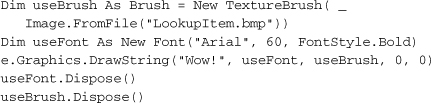
The output appears in Figure 17-6.
Figure 17-6. The merger of text and graphics
Imagining Images
Probably more than anything else, the Internet has fueled the average computer user’s need for visual stimuli. Web sites are awash with GIF, JPG, TIFF, and a variety of other image formats. Even if you deal with non-web applications, it’s likely that you, as a programmer, will come into more frequent contact with graphic images. Fortunately, GDI+ includes features that let you manage and manipulate these images with ease.
The “BMP” file format is the native bitmap format included in Microsoft Windows, but it’s not all that common in the web world. But none of that matters to GDI+. It can load and manage files using the following graphics formats.
- Windows “BMP” bitmap files of any color depth and size.
- CompuServe Graphics Interchange Format (GIF) files, commonly used for non-photo images on the Internet.
- Joint Photographic Experts Group (JPEG) files, commonly used for photos and other images on the Internet. JPEG files are compressed internally to reduce file size, but with the possible loss of image quality.
- Exchangeable Image File (EXIF) files, a variation of JPEG that stores professional photographs.
- Portable Network Graphics (PNG) files, which are similar to GIF files, but with some enhanced features.
- Tag Image File Format (TIFF) files, which are kind of a combination of all other file formats. Some government organizations store scanned images using TIFF.
- Metafiles, which store vector line art instead of bitmap images.
- Icon (ICO) files, used for standard Microsoft Windows icons. You can load them as bitmaps, but there is also a distinct Icon class that lets you treat them in more icon-like ways.
There are three primary classes used for images: Image (an abstract base class for the other two classes), Bitmap, and Metafile. I’ll discuss the Metafile class a little later.
Bitmaps represent an image as drawn on a grid of bits. When a bit in the grid is on, that grid cell is visible or filled. When the bit is off, the grid cell is invisible or empty. Figure 17-7 shows a simple image using such a bitmap grid.
Figure 17-7. An 8×8 monochrome bitmap containing great art
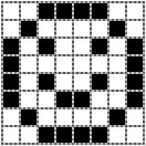
Because a bit can support only two states, “1-bit bitmap files” are monochrome, displaying images using only black and white. To include more colors, bitmaps add additional “planes.” The planes are stacked on each other, so that a cell in one plane matches up with that same position cell in all other planes. A set of eight planes results in an “8-bit bitmap image,” and supports 256 colors per cell (because 2planes = 28 = 256). Some images include as many as 32 or even 64 bits (planes), although some of these bits may be reserved for “alpha blending,” which makes perceived transparency possible.
Unless you are a hardcore graphics junkie, manipulating all of those bits is a chore. Fortunately, you don’t have to worry about it, because it’s all done for you by the Bitmap class. You just need to worry about loading and saving bitmaps (using simple Bitmap methods, of course), using a bitmap as a brush or drawing object (as we did in some sample code in this chapter already), or writing on the bitmap surface itself by attaching a Graphics object to it.
If you have a bitmap in a file, you can load it via the Bitmap class constructor.
Dim niceImage As New Bitmap("LookupItem.bmp")
To save a bitmap object to a file, use its Save method.
niceImage.Save("LookupItem.jpg")
Another constructor lets you create new bitmaps in a variety of formats.
To draw a bitmap on a graphics surface, use the Graphics object’s DrawImage method.
e.Graphics.DrawImage(niceImage, leftOffset, topOffset)
That statement draws the image to the graphics surface as is, but that’s kind of boring. You can stretch and crop the image as you draw it, or even generate a thumbnail. I’ll try all these methods using the image from the Library Project’s “splash” welcome form (SplashImage.jpg).
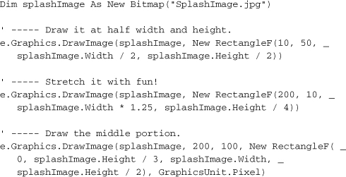
Figure 17-8 shows the output for the previous block of code. But that’s not all the drawing you can do. The DrawImage method includes 30 overloads. That would keep me busy for 37 minutes at least!
Figure 17-8. Three views of a reader: a masterpiece by the author
Exposing Your True Artist
Okay, we’ve covered most of the basic GDI+ features used to draw images. It’s all now just a matter of issuing the drawing commands for shapes, images, and text on a graphics surface. Most of the time, you’ll stick with the methods included on the Graphics object, all 12 bazillion of them. Perhaps I over-counted, but there are quite a few. Here’s just a sampling.
- Clear method. Clear the background with a specific color.
- CopyFromScreen method. If the “Prnt Scrn” button on your keyboard falls off, this is the method for you.
- DrawArc method. Draw a portion of an arc along the edge of an ellipse. Zero degrees starts at three o’clock. Positive arc sweep values move in a clockwise direction; use negative sweep values to move counterclockwise.
- DrawBezier and DrawBeziers methods. Draw one Bezier spline, or a continuing curve made up of multiple connected splines.
- DrawCurve, DrawClosedCurve, and FillClosedCurve methods. Draw “cardinal” curves, with an optional brush fill.
- DrawEllipse and FillEllipse methods. Draw an ellipse or a circle (which is a variation of an ellipse).
- DrawIcon, DrawIconUnstretched, DrawImage, DrawImageUnscaled, and DrawImageUnscaledAndClipped methods. Different ways of drawing images and icons.
- DrawLine and DrawLines methods. Draw one or more lines with lots of options for making the lines snazzy.
- DrawPath and FillPath methods. I’ll discuss “graphic paths” a little later.
- DrawPie and FillPie methods. Draw a pie-slice border along the edge of an ellipse.
- DrawPolygon and FillPolygon methods. Draw a regular or irregular geometric shape based on a set of points.
- DrawRectangle, DrawRectangles, FillRectangle, and FillRectangles methods. Draw squares and rectangles.
- DrawString method. We used this before to output text to the canvas.
- FillRegion method. I’ll discuss regions later in the chapter.
Here’s some sample drawing code.
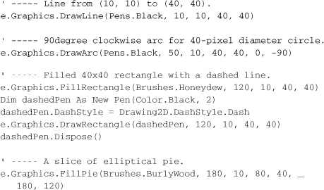
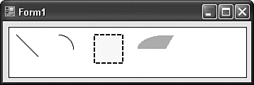
And so on. You get the idea. Figure 17-9 shows the output for this code.
Figure 17-9. Some simple drawings
Paths: Drawings on Macro-Vision
The GraphicsPath class lets you collect several of the more primitive drawing objects (like lines and arcs, and even rectangles) into a single grouped unit. This full path can then be replayed onto a graphics surface such as a macro.
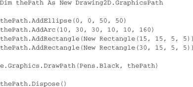
This code block draws a smiley face on the canvas (see Figure 17-10).
Figure 17-10. Drawing with a GraphicsPath object
That’s cute. Fortunately, there are other uses for graphics paths, some of which I’ll discuss in the following section.
Keeping It Regional
Usually, when you draw images, you have the entire visible canvas to work with. (You can draw images and shapes off the edge of the canvas if you want, but if a tree draws an image in the forest and no one is there to admire it, does it appear?) But there are times when you may want only a portion of what you draw to appear. Windows uses this method itself to save time. When you obscure a window with another one, and then expose the hidden window, the application has to redraw everything that appeared on the form or window. But if only a portion of that background window was hidden and then made visible again, why should the program go through the trouble of drawing everything again? It really only has to redraw the part that was hidden, the part that was in the hidden region.
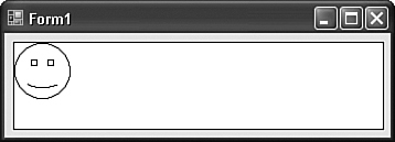
A region specifies an area to be drawn on a surface. And regions aren’t limited to boring rectangular shapes. You can design a region based on simple shapes, or you can combine existing regions into more complex regions. For instance, if you have two rectangular regions, you can overlap them and request a new combined region that contains (1) all of the original two regions; (2) the original regions but without the overlapped parts; or (3) just the overlapped parts. Figure 17-11 shows these combinations.
Figure 17-11. Different combinations of regions
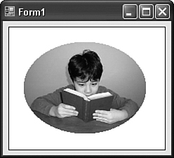
During drawing operations, regions are sometimes referred to as “clipping regions” because any content drawn outside of the region is clipped off and thrown away. The following code draws an image, but masks out an ellipse in the middle by using (ta-da!) a graphics path to establish a custom clipping region.
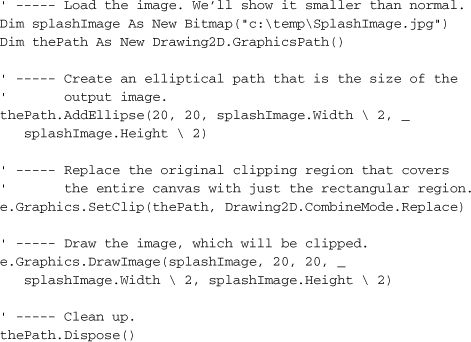
The output for this code appears in Figure 17-12.
Figure 17-12. Ready to hang in your portrait gallery
Regions are also useful for “hit testing.” If you draw a non-rectangular image on a form, and you want to know when the user clicks on the image, but not on any pixel just off of the image, you can use a region that is the exact shape of the image to test for mouse clicks.
Twisting and Turning with Transformations
Normally, anything you draw on the graphics canvas is laid down directly on the bitmap surface. It’s like a giant grid, and your drawing commands are basically dropping colored inks directly into each grid cell. The Graphics object also gives you the ability to pass your drawing commands through a geometric transformation before their output goes to the canvas surface. For instance, a rotation transformation would rotate your lines, shapes, and text by the amount you specify (in degrees), and then apply the result to the surface. Figure 17-13 displays the results of the following code, which applies two translations: (1) moving the (0, 0) origin right by 100 pixels, and down by 75 pixels; and (2) adding a clockwise rotation of 270 degrees.
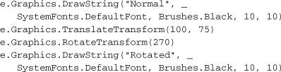
Figure 17-13. Normal and rotated text
Transformations are cumulative; if you apply multiple transformations to the canvas, any drawing commands will pass through all of the transformations before arriving at the canvas. The order in which transformations occur is important. If the code we just ran had reversed the TranslateTransform and RotateTransform statements, the rotation would have altered the x-y coordinates for the entire canvas world. The subsequent translation of (100, 75) would have moved up the origin 100 pixels, and then to the right 75 pixels.
The Graphics class includes these methods that let you apply transformations to the “world view” of the canvas during drawing.
- RotateTransform. Rotates the world view in clockwise degrees, from 0 to 359. The rotation can be positive or negative.
- ScaleTransform. Sets a scaling factor for all drawing. Basically, this increases or decreases the size of the canvas grid when drawing. Changing the scale impacts the width of pens. If you scale the world by a factor of two, not only do distances appear to be twice as far apart, but all pens draw twice as thick as when unscaled.
- TranslateTransform. Repositions the origin based on an x and y offset.
- MultiplyTransform. A sort of master transformation method that lets you apply transforms through a Matrix object. It has more options than just the standard transforms included in the Graphics object. For instance, you can apply a shearing transformation that skews all output in a rectangle-to-parallelogram type of change.
- ResetTransform. Removes all applied transformations from a canvas.
- Save. Saves the current state of the transformed (or untransformed) graphics surface to an object for later restoration. This allows you to apply some transformations, save them, apply some more, and then restore the saved set, wiping out any transformations applied since that set was saved.
- Restore. Restores a saved set of transformations.
Enhancing Controls Through Owner Draw
There are a lot more drawing features included in .NET, but what we’ve seen here should be enough to whet your appetite. You can do a lot of fancy drawing with GDI+, but let’s face it: You and I are programmers, not artists. If we were artists, we’d be raking in six figures using a floor mop to draw traditional abstract cubist Italian landscapes with Bauhausian accents.
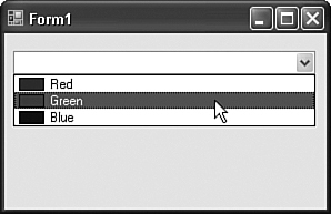
Fortunately, there are practical semi-artistic things you can do with GDI+. One important drawing feature is owner draw, a sharing of drawing responsibilities between a control and you, the programmer. (You are the “owner.”) The ComboBox control supports owner drawing of the individual items in the drop-down portion of the list. Let’s create a ComboBox control that displays color names, including a small sample of the color to the left of the name. Create a new Windows Forms application, and add a ComboBox control named ComboBox1 to Form1. Make these changes to ComboBox1.
- Change its DropDownStyle property to DropDownList.
- Change its DrawMode property to OwnerDrawFixed.
- Alter its Items property, adding multiple color names as distinct text lines in the String Collection Editor window. I added Red, Green, and Blue.
Now, add the following code to the source code area of Form1’s class.
Run the code and play with the combo box, as shown in Figure 17-14.
Figure 17-14. Our custom color combo box
Enhancing Classes with Attributes
Class-modifying attributes are something we discussed way back in Chapter 1, “Introducing .NET,” and they have nothing to do with GDI+. I just wanted to refresh your memory, because they will be used in this chapter’s project code.
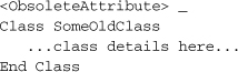
Class- or member-modifying attributes appear just before the definition of the class or member, and within angle brackets. This code attaches the ObsoleteAttribute attribute to the SomeOldClass class.
(You can leave the “Attribute” part of an attribute’s name off if the first part of the name doesn’t conflict with any Visual Basic keyword.) Attributes appear as metadata in the final compiled assembly, and they are used by classes and applications that, by design, extract meaning from specific attributes. In this chapter’s code, we’ll make use of the PropertyGrid control, the control that implements the Properties panel within the Visual Studio development environment, and is often used to modify Form and Control properties. This control is available for your use in your own applications. To use it, assign a class instance to the control’s SelectedObject property. Then, magically, all of the object’s properties appear in the controls list of properties.
Nice as this is, it’s not always desirable. Your object may have properties that should not be displayed. The PropertyGrid control is designed to be generic; it doesn’t know about your object’s needs, so it doesn’t know which properties to exclude. That is, it doesn’t know until you tell it through attributes. By adding specific attributes to your class’s properties, you tell the PropertyGrid control how to treat members of your object. For instance, the BrowsableAttribute attribute tells the PropertyGrid to include (True) or exclude (False) the property.
<Browsable(False)> _
Public Property SecretProperty() As String...
I’ll supply additional details about this when we use the PropertyGrid control later in this chapter.
Summary
While many parts of GDI+ are pretty much wrappers around the old GDI system, it still manages to provide power and simplicity that goes way beyond the original implementation. In business development, you won’t always have a need to use the more interesting aspects of the System.Drawing namespace. But when you do, you’ll encounter a simple and coherent system for displaying images, text, and custom vector elements on the screen or other output medium.
Project
The Library Project has used features of GDI+ since the moment the first form appeared in the newly created project, but it all came for free through code included in the Framework. Now it’s time for you, the programmer, to add your own GDI+ contribution to the application. In this chapter’s project code, we’ll use GDI+ to enhance the normal display of a control through owner draw features. Plus, we’ll finally begin to implement some of the barcode features I tempted you with in earlier chapters.
Project Access
Load the “Chapter 17 (Before) Code” project, either through the New Project templates, or by accessing the project directly from the installation directory. To see the code in its final form, load “Chapter 17 (After) Code” instead.
Install the Barcode Font
If you haven’t yet obtained a barcode font, now is the time to do it. The features included in this chapter’s project code will require you to use such a font. The publisher web site for this book (listed in Appendix A, “Installing the Software”) includes suggested resources for obtaining a font at little or no cost for your personal use. You may also purchase a professional barcode font. Make sure the font you obtain is a TrueType font.
Using Owner Draw
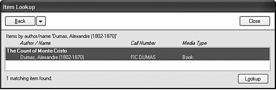
In the previous chapter, we added the ItemLookup.vb form with its multiple views of library items. One of those views included the MatchingItems control, a multi-column list box displaying “Author/Name,” “Call Number,” and “Media Type” columns. Although we stored the column-specific data within each item already, we didn’t actually display the individual columns to the user.
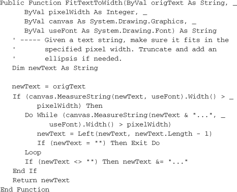
The thing about multi-column lists and other limited-space text displays is that some of the text is bound to overrun its “official” area if you let it. For instance, the text in one list column may overlap into another column of text. In such cases, it has become the tradition to chop off the extended content, and replace it with an ellipsis (” . . . ”). So we’ll need a routine that will determine if a string is too long for its display area, and perform the chopping and ellipsizing as needed. Add the FitTextToWidth method to the General.vb file’s module code.
Insert Snippet
Insert Chapter 17, Snippet Item 1.
The ItemLookup.vb form has a web-browser-like Back button with a drop-down list of recent entries. The items added to this list may include long book titles and author names. Let’s use the new FitTextToWidth method to limit the size of text items in this list. Open the source code for the ItemLookup form and locate the RefreshBackButtons method. About halfway through this routine is this line of code:
whichMenu.Text = scanHistory.HistoryDisplay
Replace this line with the following lines instead.
Insert Snippet
Insert Chapter 17, Snippet Item 2.
whichMenu.Text = FitTextToWidth(scanHistory.HistoryDisplay, _
Me.Width 2, useCanvas, whichMenu.Font)
That will limit any menu item text to half the width of the form, which seems reasonable to me. That useCanvas variable is new, so add a declaration for it at the top of the RefreshBackButtons method.
Insert Snippet
Insert Chapter 17, Snippet Item 3.
Dim useCanvas As Drawing.Graphics = Me.CreateGraphics()
Also, we need to properly dispose of that created graphics canvas at the very end of the method.
Insert Snippet
Insert Chapter 17, Snippet Item 4.
useCanvas.Dispose()
Now let’s tackle owner draw list items. ListBox controls allow you to use your own custom drawing code for each visible item in the list. You have two options when you are managing the item drawing by yourself: You can keep every item a consistent height, or you can make each list item a different height based on the content for that item. In the MatchingItems list box, we’ll use the same height for every list item.
To enable owner draw mode, open the ItemLookup form design editor, select the MatchingItems list box on the form or through the Properties panel, and change its DrawMode property to OwnerDrawFixed.
Each matching list item will include two rows of data: (1) the title of the matching item, in bold; and (2) the three columns of author, call number, and media type data. Add the following code to the form’s Load event handler that determines the entire height of each list item, and the position of the second line within each item.
Insert Snippet
Insert Chapter 17, Snippet Item 5.
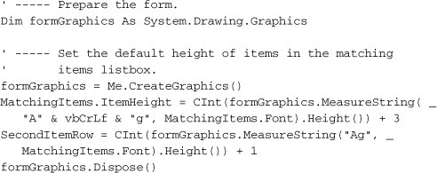
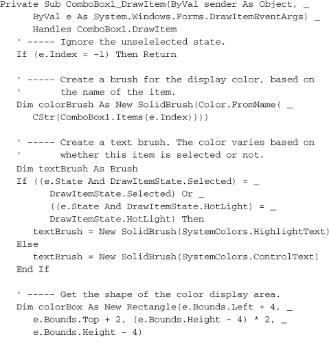
I used the text “Ag” to make sure that the height included all of the font’s ascenders and descenders (the parts that stick up and stick down from most letters). I think the calculation would include those values even if I used “mm” for the string, but better safe than sorry, I always say. Setting the MatchingItems.ItemHeight property here indicates the size of all items in the list. If we had decided to use variable-height items instead of fixed-height items, we would have handled the control’s MeasureItem event. With fixed items, we can ignore that event, and move on to the event that does the actual drawing: DrawItem.
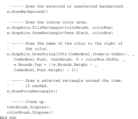
Here is what the code is going to do for each list item: (1) create the necessary brushes and font objects we will use in drawing; (2) draw the text strings on the list item canvas; and (3) clean up. Becasue list items can also be selected or unselected, we’ll call some framework-supplied methods to draw the proper background and foreground elements that indicate item selections.
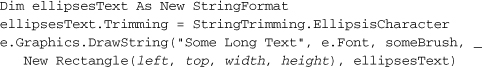
When we draw the multiple columns of text, it’s possible that one column of text will be too long, and intrude into the next column area. This was why we wrote the FitTextToWidth function earlier. But it turns out that GDI+ already includes a feature that adds ellipses to text at just the right place when it doesn’t fit. It’s found in a class called StringFormat, in its Trimming property. Setting this property to EllipsisCharacter and using it when drawing the string will trim the string when appropriate. When we draw the string on the canvas, we will provide a rectangle that tells the string what its limits are. Here is the basic code used to draw one column of truncated text.
The code we’ll use to draw each list item in the MatchingItems list will use code just like this. Let’s add that code now to the MatchingItems.DrawItem event handler.
Insert Snippet
Insert Chapter 17, Snippet Item 6.
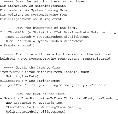
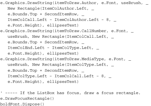
See, it’s amazingly easy to draw anything you want in a list box item. In this code, the actual output to the canvas via GDI+ amounted to just the four DrawString statements. Although this library database doesn’t support it, we could have included an image of each item in the database, and displayed it in this list box, just to the left of the title. Also, the calls to e.DrawBackground and e.DrawFocusRectangle let the control deal with properly highlighting the right item (although I did have to choose the proper text brush). Figure 17-15 shows the results of our hard labor.
Figure 17-15. A sample book with two lines and three columns
Barcode Design
The Library Project includes generic support for barcode labels. I visited a few libraries in my area and compared the barcodes added to both their library items (like books) and their patron ID cards. What I found is that the variety was too great to shoehorn into a single predefined solution. Therefore, the Library application allows an administrator or librarian to design sheets of barcode labels to meet their specific needs. (There are businesses that sell preprinted barcode labels and cards to libraries that don’t want to print their own. The application also supports this method, because barcode generation and barcode assignment to items are two distinct steps.)
To support generic barcode design, we will add a set of design classes and two forms to the application.
- BarcodeItemClass.vb. This class file contains six distinct classes, one of which is a base class for the other five derived classes. The derived classes design the static text elements, barcode images, barcode numbers, lines, and rectangles that the user will add to the surface of a single barcode label.
- BarcodePage.vb. An editor form derived from BaseCodeForm, the same base form used for the various code editors in the application. This form specifies the arrangement of labels sheets. Users will probably purchase label sheets from their local office supply store. By entering the number of label rows and columns, the size of each label, and any spacing between and around each label, the user can design on pretty much any regular sheet of labels.
- BarcodeLabel.vb. Another editor based on BaseCodeForm. This form lets the user design a single barcode label by adding text, barcodes, lines, and rectangles to a preview area.
In a future chapter, we’ll add label printing, where labels and pages are joined together in one glorious print job.
Because these three files together include around 2,000 lines of source code, I will show you only key sections of each one. I’ve already added all three files to your project code, so let’s start with BarcodeItemClass.vb. It defines each type of display item that the user will add to a label template in the BarcodeLabel.vb form. Here’s the code for the abstract base class, BarcodeItemGeneric.
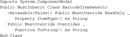
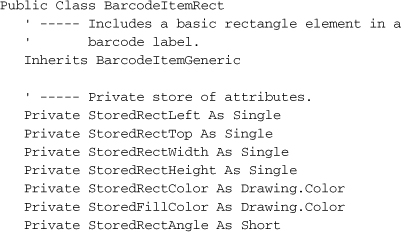
Not much going on here. The class defines two required members: a read-only String property named ItemType, and a requirement that derived classes provide their own implementation for ToString. The other five derived classes in this file enhance the base class to support the distinct types of display elements included on a barcode label. Let’s look briefly at one of the classes, BarcodeItemRect. It allows an optionally filled rectangle to appear on a barcode label, and includes private members that track the details of the rectangle.
The rest of the class includes properties that provide the public interface to these private members. Here’s the code for the public FillColor property.
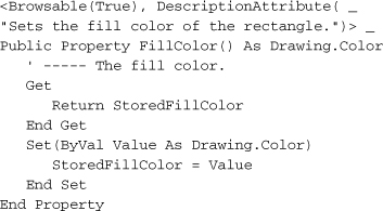
Like most of the other properties, it just sets and retrieves the related private value. Its declaration includes two attributes that will be read by the PropertyGrid control later on. The Browsable property says, “Yes, include this property in the grid,” while DescriptionAttribute sets the text that appears in the bottom help area of the PropertyGrid control.
When you’ve used the Property panel to edit your forms, you’ve been able to set colors for a color property using a special color selection tool built into the property. Just having a property defined using System.Drawing.Color is enough to enable this same functionality for your own class. How does it work? Just as the FillColor property has attributes recognized by the PropertyGrid control, the System.Drawing.Color class also has such properties, one of which defines a custom property editor class for colors. Its implementation is beyond the scope of this book, but it’s cool anyway. If you’re interested in doing this for your own classes, you can read an article I wrote about property grid editors a few years ago.1
Before we get to the editor forms, I need to let you know about four supporting functions I already added to the General.vb module file.
- BuildFontStyle function. Font styles (like bold and italic) are set in Font objects using members of the System.Drawing.FontStyle enumeration. But when storing font information in the database, I chose to store these style settings using letters (like “B” for bold). This function converts the letters back to a FontStyle value.
- ConvertPageUnits function. The label editors let you position items in a few different measurement systems, including inches or centimeters. This function converts measurements between the different systems.
- DBFontStyle function. This is the opposite of the BuildFontStyle function, preparing a FontStyle value for insertion into a database record.
- GetBarcodeFont function. Returns the name of the barcode font, if configured.
The BarcodePage form lets the user define a full sheet of labels—not the labels themselves, but the positions of multiple labels on the same printed page. Figure 17-16 shows the fields on the form with some sample data.
Figure 17-16. The BarcodePage form
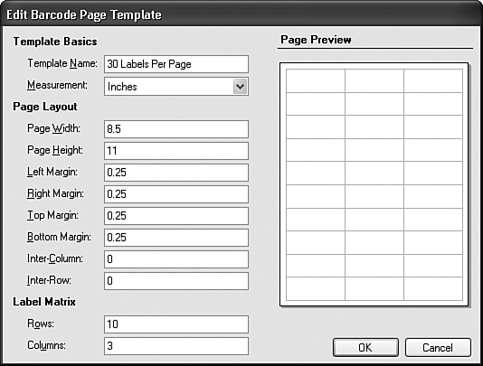
Collectively, the fields on the form describe the size of the page and the size of each label that appears on the page. As the user enters in the values, the Page Preview area instantly refreshes with a preview of what the page will look like.
As a code editor derived from BaseCodeForm, you’re already familiar with some of the logic in the form; it manages the data found in a single record from the BarcodeSheet table. What’s different is the GDI+ code found in the PreviewArea.Paint event handler. Its first main block of code tries to determine how you scale down an 8.5×11 piece of paper to make it appear in a small rectangle that is only 216×272 pixels in size. It’s a lot of gory calculations that, when complete, determine the big-to-small-paper ratio, and lead to the drawing of the on-screen piece of paper with a border and a drop shadow.

Then, before drawing the preview outlines of each rectangular label, it repositions the grid origin to the upper-left corner of the on-screen piece of paper, and transforms the world scale based on the ratio of a real-world piece of paper and the on-screen image of it.
e.Graphics.TranslateTransform(pageLeft, pageTop)
e.Graphics.ScaleTransform(useRatio, useRatio)
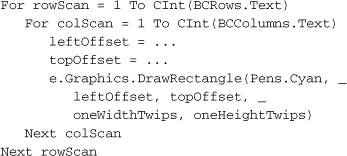
There are a few more calculations for the size of each label, followed by a double loop (for both rows and columns of labels) that does the actual printing of the label boundaries (detail calculations omitted for brevity).
The BarcodeLabel form is clearly the more interesting and complex of the two barcode editing forms. While the BarcodePage form defines an entire sheet of labels with nothing inside of each label, BarcodeLabel defines what goes inside of each of those labels. Figure 17-17 shows this form with a sample label.
Figure 17-17. The BarcodeLabel form
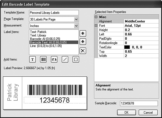
The BarcodeLabel form does derive from BaseCodeForm, so much of its code deals with the loading and saving of records from the BarcodeLabel and BarcodeLabelItem database tables. Each barcode label is tied to a specific barcode page template (which we just defined through the BarcodePage form), and stores its primary record in the BarcodeLabel table. This table defines the basics of the label, such as its name and measurement system. The text and shape items placed on that label are stored as records in the related BarcodeLabelItem table.
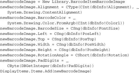
The PrepareFormFields routine loads existing label records from the database, creating instances of classes from the new BarcodeItemClass.vb file, and adds them to the DisplayItems ListBox control. Here’s the section of code that loads in a “barcode image” (the actual displayed barcode) from an entry in the BarcodeLabelItems table.
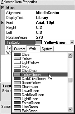
The user can add new shapes, text elements, and barcodes to the label by clicking on one of the five “Add Items” buttons that appear just below the DisplayItems control. Each button adds a default record to the label, which can then be modified by the user. As each label element is selected from the DisplayItems, its properties appear in the ItemProperties control, an instance of a PropertyGrid control. Modification of a label element is a matter of changing its properties. Figure 17-18 shows a color property being changed.
Figure 17-18. Modifying a label element property
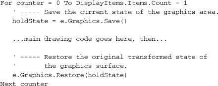
As with the BarcodePage form, the real fun in the BarcodeLabel form comes through the Paint event of the label preview control, PreviewArea. This 300+ line routine starts out drawing the blank surface of the label with a drop shadow. Then it processes each element in the DisplayItems list, one by one, transforming and drawing each element as its properties indicate. As it passes through the element list, the code applies transforms to the drawing area as needed. To keep things tidy for each element, the state of the surface is saved before changes are made, and restored once changes are complete.
Each element type’s code performs the various size, position, and rotation transformations needed to properly display the element. Let’s take a closer look at the code that displays static text elements (code that is also called to display barcode text). After scaling down the world view to the label surface preview area, any user-requested rotation is performed about the upper-left corner of the rectangle that holds the printed text.
e.Graphics.TranslateTransform(X1, Y1)
e.Graphics.RotateTransform(textAngle)
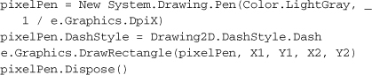
Next, a gray dashed line is drawn around the text object to show its selected state.
After setting some flags to properly align the text vertically and horizontally within its bounding box, the standard DrawString method thrusts the text onto the display.
We will somewhat duplicate the label drawing code included in the BarcodeLabel class when we print actual labels in a later chapter.
The only thing left to do is to link up these editors to the main form. Because I’ve had so much fun with these forms, I’ll let you play for a while in the code. Open the code for MainForm, locate the event handler for the AdminLinkBarcodeLabel.LinkClicked event, and add the following code.
Insert Snippet
Insert Chapter 17, Snippet Item 7.
Do the same for the AdminLinkBarcodePage.LinkClicked event handler. Its code is almost identical except for the class instance passed to ListEditRecords.
Insert Snippet
Insert Chapter 17, Snippet Item 8.
Fun with Graphics
GDI+ isn’t all about serious drawing stuff; you can also have some fun. Let’s make a change to the AboutProgram.vb form so that it fades out when the user clicks its Close button. This involves altering the form’s Opacity property to slowly increase the transparency of the form. From our code’s point of view, there is no GDI+ involved. But it’s still involved through the hidden code that responds to the Opacity property.
Open the source code for the AboutProgram.vb file, and add the following code to the end of the AboutProgram.Load event handler.
Insert Snippet
Insert Chapter 17, Snippet Item 9.
' ----- Prepare the form for later fade-out.
Me.Opacity = 0.99
Although this statement isn’t really necessary, I found that the form tended to blink a little on some systems when the opacity went from 100% (1.0) to anything else (99%, or 0.99, in this case). This blink was less noticeable when I made the transition during the load process.
In the event handler for the ActClose.Click event, include this code.
Insert Snippet
Insert Chapter 17, Snippet Item 10.
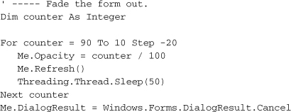
This code slowly fades out the form over the course of 250 milliseconds, in five distinct steps. So that the form doesn’t close abruptly before the cool fade-out, open the form designer, select the ActClose button, and change its DialogResult property to None.
Another thing we never did was to set the primary icon for the application. Although this isn’t strictly GDI+, it does involve graphic display, which impacts the user’s perception of the program’s quality. I’ve included an icon named Book.ico in the project’s file set. Open the project properties, select the Application tab, and use the Icon field to browse for the Book.ico file.
While testing out the icon, I noticed that the splash window appeared (with the default Visual Studio icon) in the Windows task bar. In fact, each opened form appeared in the task bar, right alongside the main form’s entry. This is non-standard, and it’s all due to the ShowInTaskbar property setting included in each form. I’ve taken the liberty of going through all the forms (except for MainForm) and setting this property to False. Most of the forms were already set properly, so I altered the dozen or so that were set improperly.
The Library application is really starting to bulk up with features. In fact, by the next chapter, we will have added more than 95 percent of its total code. I can see the excitement on your face. Go ahead, turn the page, and add to your coding enjoyment.