5
Single Samples
Suppose we have a single sample. The questions we might want to answer are these:
- what is the mean value?
- is the mean value significantly different from current expectation or theory?
- what is the level of uncertainty associated with our estimate of the mean value?
In order to be reasonably confident that our inferences are correct, we need to establish some facts about the distribution of the data:
- are the values normally distributed or not?
- are there outliers in the data?
- if data were collected over a period of time, is there evidence for serial correlation?
Non-normality, outliers and serial correlation can all invalidate inferences made by standard parametric such as like Student's t test. It is much better in cases with non-normality and/or outliers to use a non-parametric technique such as Wilcoxon's signed-rank test. If there is serial correlation in the data, then you need to use time series analysis or mixed effects models.
Data Summary in the One-Sample Case
To see what is involved, read the data called y from the file called example.csv:
data <- read.csv("c:\temp\example.csv")attach(data)names(data)
[1] "y"
Summarizing the data could not be simpler. We use the built-in function called summary like this:
summary(y)
Min. 1st Qu. Median Mean 3rd Qu. Max.1.904 2.241 2.414 2.419 2.568 2.984
This gives us six pieces of information about the vector called y. The smallest value is 1.904 (labelled Min. for minimum) and the largest value is 2.984 (labelled Max. for maximum). There are two measures of central tendency: the median is 2.414 and the arithmetic mean in 2.419. What you may be unfamiliar with are the figures labelled ‘1st Qu.’ and ‘3rd Qu.’ The ‘Qu.’ is an abbreviation of quartile, which means one quarter of the data. The first quartile is the value of the data below which lie the smallest 25% of the data. The median is the second quartile by definition (half the data are smaller than the median). The third quartile is the value of the data above which lie the largest 25% of the data (it is sometimes called the 75th percentile, because 75% of the values of y are smaller than this value). The graphical equivalent of this summary table is known as a box-and-whisker plot:
boxplot(y)
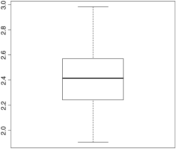
There is a lot of information here. The bold horizontal bar in the middle of the box shows the median value of y. The top of the box shows the 75th percentile, and the bottom of the box shows the 25th percentile. The box as a whole shows where the middle 50% of the data lie (this is called the ‘interquartile range’; we can see that this is between about 2.25 and 2.55). If the boxes above and below the median are different sizes, then this is indicative of skew in the data. The whiskers show the maximum and minimum values of y (later on we shall see what happens when the data contain ‘outliers’).
Another sort of plot that we might want to use for a single sample is the histogram:
hist(y)
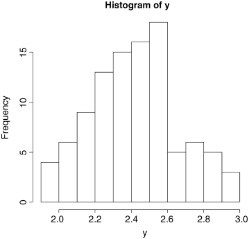
Histograms are fundamentally different from the graphs that we have encountered so far, because in all cases to date the response variable has been on the y axis (the ordinate). With a histogram, the response variable is on the x axis (the abscissa). The ordinate of a histogram shows the frequency with which different values of the response were observed. We can see that rather few values of y were less that 2.0 or greater than 2.8. The most frequently observed values of y were between 2.4 and 2.6. Histograms are related to probability density functions. We shall come across several very important statistical distributions in various parts of the book; we have met the normal and Student's t distributions already, and later we shall meet the Poisson, binomial and negative binomial distributions. What they all have in common is that y is on the abscissa and the ordinate shows the probability density associated with each value of y. You need to be careful not to fall into the trap of confusing graphs and probability distributions (see p. 1).
Our histogram (above) is clearly not symmetrical about its mode (2.5 to 2.6). There are six bars below the mode but only four above the mode. Data like this are said to be ‘skew to the left’ because the longer tail is on the left of the distribution.
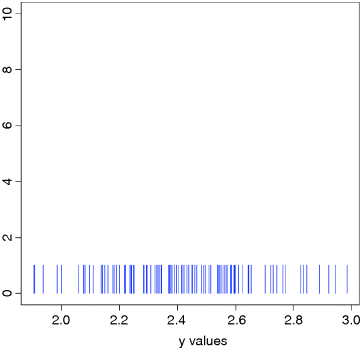
Simple as they seem at first sight, there are actually lots of issues about histograms. Perhaps the most important issue is where exactly to draw the lines between the bars (the ‘bin widths’ in the jargon). For whole-number (integer) data this is often an easy decision (we could draw a bar of the histogram for each of the integer values of y). But for continuous (real number) data like we have here, that approach is a non-starter. How many different values of y do we have in our vector of 100 numbers? The appropriate function to answer questions like this is table: we do not want to see all the values of y, we just want to know how many different values of y there are. That is to say, we want to know the length of the table of different y values:
length(table(y))
[1] 100
This shows us that there are no repeats of any of the y values, and a histogram of unique values would be completely uninformative (a plot like this is called a ‘rug plot’, and has short vertical bars placed at each value of y).
plot(range(y),c(0,10),type="n",xlab="y values",ylab="")for (i in 1:100) lines(c(y[i],y[i]),c(0,1),col="blue")
Let us look more closely to see what R has chosen on our behalf in designing the histogram. The x axis is labelled every 0.2 units, in each of which there are two bars. So the chosen bin width is 0.1. R uses simple rules to select what it thinks will make a ‘pretty’ histogram. It wants to have a reasonable number of bars (too few bars looks dumpy, while too many makes the shape too rough); there are 11 bars in this case. The next criterion is to have ‘sensible’ widths for the bins. It makes more sense, for instance to have the bins exactly 0.1 units wide (as here) than to use one tenth of the range of y values, or one eleventh of the range (note the use of the diff and range functions) which are close to 0.1 but not equal to 0.1:
(max(y)-min(y))/10
[1] 0.1080075
diff(range(y))/11
[1] 0.09818864
So a width of 0.1 is a ‘pretty’ compromise. As we shall see later, you can specify the width of the bins if you do not like the choice that R has made for you, or if you want to draw two histograms that are exactly comparable.
The really important thing to understand is how R decides where to put values that fall exactly on one of the edges of a bin. It could decide to put them in the lower bin (the one to the left) or the higher bin (to the right) or it could toss a coin (heads in the left hand bin, tails in the right). This is hard to understand at first. Suppose that a is the value of the lower break and b is the value of the higher break for a given bar of the histogram. The convention about what to do is indicated by the use of round brackets and square brackets: (a,b] or [a,b). The number next to the square bracket is included in the bar, while the number next to the round bracket is excluded from this bar. The first convention (a,b] is the default in R, and means include the right-hand endpoint b, but not the left-hand one a in this bar (in the function definition, this is written as right = TRUE). In our histogram (above) the modal bin is between 2.5 and 2.6. This would be written as (2.5,2.6] and it means that a value of exactly 2.60 would be included in this bin, but a value of exactly 2.50 would not (it would be included in the bin to the left). You will meet this convention again later, when we learn about the cut function for converting a continuous variable into a categorical variable (p. 276).
The main problem with histograms is the arbitrariness about where the breaks are put and how wide the bins are defined to be. For instance, distributions that look bimodal with narrow bins can look unimodal with wider bins. The moral about histograms is ‘take care; all may not be as it seems’.
The Normal Distribution
This famous distribution has a central place is statistical analysis. If you take repeated samples from a population and calculate their averages, then these averages will be normally distributed. This is called the central limit theorem. Let us demonstrate it for ourselves.
You may be familiar with the ancient game of ‘craps’. It involves the use of two 6-sided dice. In its simplest form the two dice are thrown and the two scores added together. The lowest score you can get is 1 + 1 = 2 and the highest is 6 + 6 = 12. There is only one way of getting each of these scores so they both have the same low probability (1/6 × 1/6 = 1/36). You can score 3 by throwing 1 and 2 or 2 and 1 (so the probability of getting 3 is 2 × 1/36 = 1/18; the same as scoring 11 by getting 5 and 6 or 6 and 5). The most likely score is 7 because there are so many ways of getting this: 1 and 6, 2 and 5, 3 and 4, 4 and 3, 5 and 2 or 6 and 1). Let us simulate 10 000 plays of the game and produce a histogram of the results. The possible scores are the 11 numbers from 2 to 12:
score <- 2:12
The number of ways of getting each score are:
ways <- c(1,2,3,4,5,6,5,4,3,2,1)
We can use the rep function to produce a vector of all the 36 possible outcomes:
game <- rep(score,ways)game
[1] 2 3 3 4 4 4 5 5 5 5 6 6 6 6 6 7 7 7 7 7 7[22] 8 8 8 8 8 9 9 9 9 10 10 10 11 11 12
Now we draw a single random sample from this vector to represent the outcome of one throw (this game produced a score of 5):
sample(game,1)
[1] 5
and we record this score in a vector called outcome. The game is repeated 10 000 times:
outcome <- numeric(10000)for (i in 1:10000) outcome[i] <- sample(game,1)
This is what the distribution of outcomes looks like:
hist(outcome,breaks=(1.5:12.5))
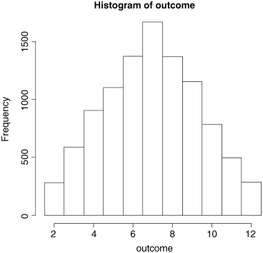
Note the trick of specifying the breakpoints to be offset by 0.5 in order to get the correct labels in the centre of the relevant bars.
The distribution is very well behaved, but it is clearly triangular, not bell-shaped like the normal. What if we work out the mean score over, say, three games? Presumably, the mean score is still going to be 7 (as above) but what will the distribution of mean scores look like? We shall try it and see:
mean.score <- numeric(10000)for (i in 1:10000) mean.score[i] <- mean(sample(game,3))hist(mean.score,breaks=(1.5:12.5))
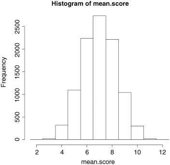
That was a demonstration of the central limit theorem in action. The triangular distribution of scores has become a normal distribution of mean scores, even though we were averaging across only three games. To demonstrate the goodness of fit to the normal distribution, we can overlay the histogram with a smooth probability density function generated from a normal distribution (dnorm) with the same mean and standard deviation of our actual sample of games:
mean(mean.score)
[1] 6.9821
sd(mean.score)
[1] 1.366118
To accommodate the top of the smooth density function, we need to make the y axis a little longer: ylim=c(0,3000). To generate a smooth curve, we need a series of values for the x axis ranging between 2 and 12 (as a rule of thumb, you need 100 or so values to make a smooth-looking curve in R):
xv <- seq(2,12,0.1)
Now calculate the height of the curve. The standard normal has an integral of 1.0 but our histogram has an integral of 10 000 so we calculate the height of the curve like this
yv <- 10000*dnorm(xv,mean(mean.score),sd(mean.score))
We shall make a few minor embellishments by removing the heading from the plot (main=""), colouring the bars in yellow (col="yellow"):
hist(mean.score,breaks=(1.5:12.5),ylim=c(0,3000),col="yellow", main="")
and overlaying the normal probability density in red:
lines(xv,yv,col="red")
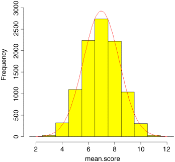
As you can see, the fit to the normal distribution is excellent, even though we were averaging across just three throws of the dice. The central limit theorem really works. Almost any distribution, even a ‘badly behaved’ one like the negative binomial (p. 251), will produce a normal distribution of sample means taken from it.
The great thing about the normal distribution is that we know so much about its shape. Obviously, all values must lie between minus infinity and plus infinity, so the area under the whole curve is 1.0. The distribution is symmetrical, so half of our samples will fall below the mean, and half will be above it (i.e. the area beneath the curve to the left of the mean is 0.5). The important thing is that we can predict the distribution of samples in various parts of the curve. For example, c.16% of samples will be more than 1 standard deviation above the mean, and c.2.5% of samples will be more than 2 standard deviations below the mean. But how do I know this?
There is an infinity of different possible normal distributions: the mean can be anything at all, and so can the standard deviation. For convenience, it is useful to have a standard normal distribution, whose properties we can tabulate. But what would be a sensible choice for the mean of such a standard normal distribution? 12.7? Obviously not. 1? Not bad, but the distribution is symmetrical, so it would be good to have the left and right halves with similar scales (not 1 to 4 on the right, but −2 to 1 on the left). The only really sensible choice is to have the mean equal to 0. What about the standard deviation? Should that be 0 as well? Hardly, since that would be a distribution with no spread at all. Not very useful. It could be any positive number, but in practice the most sensible choice is 1. So there you have it. The standard normal distribution is one specific case of the normal with mean = 0 and standard deviation = 1. So how does this help?
It helps a lot, because now we can work out the area below the curve up to any number of standard deviations (these are the values on the x axis):
standard.deviations <- seq(-3,3,0.01)pd <- dnorm(standard.deviations)plot(standard.deviations,pd,type="l",col="blue")
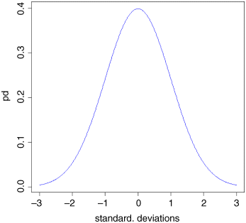
You can see that almost all values fall within 3 standard deviations of the mean, one way or the other. It is easy to find the area beneath the curve for any value on the x axis (i.e. for any specified value of the standard deviation). Let us start with standard deviation = −2. What is the area beneath the curve to the left of −2? It is obviously a small number, but the curvature makes it hard to estimate the area accurately from the plot. R provides the answer with a function called pnorm (‘probability for a normal distribution’; strictly ‘cumulative probability’, as we shall see). Because we are dealing with a standard normal (mean = 0, sd = 1) we need only specify the value of the normal deviate, which is −2 in our case:
pnorm(-2)
[1] 0.02275013
This tells us that just a bit less than 2.5% of values will be lower than −2. What about 1 standard deviation below the mean?
pnorm(-1)
[1] 0.1586553
In this case, about 16% of random samples will be smaller than 1 standard deviation below the mean. What about big values of the normal deviate? The density function shows a maximum of +3. What is the probability of getting a sample from a normal distribution that is more than 3 standard deviations above the mean? The only point to note here is that pnorm gives the probability of getting a value less than the value specified (not more, as we want here). The trick is simply to subtract the value given by pnorm from 1 to get the answer we want:
1-pnorm(3)
[1] 0.001349898
This tells us that a value as large as 3 or more is very unlikely indeed: less than 0.2%, in fact.
Probably the most frequent use of the standard normal distribution is in working out the values of the normal deviate that can be expected by chance alone. This, if you like, is the opposite kind of problem to the ones we have just been dealing with. There, we provided a value of the normal deviate (such as −1, or −2 or +3) and asked what probability was associated with such a value. Now, we want to provide a probability and find out what value of the normal deviate is associated with that probability. Let us take an important example. Suppose we want to know the upper and lower values of the normal deviate between which 95% of samples are expected to lie. This means that 5% of samples will lie outside this range, and because the normal is a symmetrical distribution, this means that 2.5% of values will be expected to be smaller than the lower bound (i.e. lie to the left of the lower bound) and 2.5% of values will be expected to be greater than the upper bound (i.e. lie to the right of the upper bound). The function we need is called qnorm (‘quantiles of the normal distribution’) and it is used by specifying our two probabilities 0.025 and 0.975 in a vector like this c(0.025,0.975):
qnorm(c(0.025,0.975))
[1] -1.959964 1.959964
These are two very important numbers in statistics. They tell us that with a normal distribution, 95% of randomly selected values will fall between −1.96 and +1.96 standard deviations of the mean. Let us shade in these areas under the normal probability density function to see what is involved:
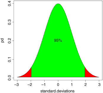
In the green area between the two vertical lines, we can expect 95% of all random samples to fall; we expect 2.5% of samples to be more than 1.96 standard deviations below the mean (the left-hand red area), and we expect 2.5% of samples to be greater than 1.96 standard deviations above the mean (the right-hand red area). If we discover that this is not the case, then our sample is not normally distributed. It might, for instance, follow a Student's t distribution (see p. 82).
To sum up: if we want to provide values of the normal deviate and work out probabilities, we use pnorm; if we want to provide probabilities and work out values of the normal deviate, we use qnorm. You should try and remember this important distinction.
Calculations Using z of the Normal Distribution
Suppose we have measured the heights of 100 people. The mean height was 170 cm and the standard deviation was 8 cm. The normal distribution looks like this:
ht <- seq(150,190,0.01)plot(ht,dnorm(ht,170,8),type="l",col="brown",ylab="Probability density",xlab="Height")
(the top left-hand panel in the plots below). We can ask three sorts of questions about data like these. What is the probability that a randomly selected individual will be:
- shorter than a particular height?
- taller than a particular height?
- between one specified height and another?
The area under the whole curve is exactly 1; everybody has a height between minus infinity and plus infinity. True, but not particularly helpful. Suppose we want to know the probability that one of our people, selected at random from the group, will be less than 160 cm tall. We need to convert this height into a value of z; that is to say, we need to convert 160 cm into a number of standard deviations from the mean. What do we know about the standard normal distribution? It has a mean of 0 and a standard deviation of 1. So we can convert any value y, from a distribution with mean ![]() and standard deviation
and standard deviation ![]() to a standard normal very simply by calculating:
to a standard normal very simply by calculating:
So we convert 160 cm into a number of standard deviations. It is less than the mean height (170 cm) so its value will be negative:
Now we need to find the probability of a value of the standard normal taking a value of −1.25 or smaller. This is the area under the left-hand tail of the distribution. The function we need for this is pnorm: we provide it with a value of z (or, more generally, with a quantile) and it provides us with the probability we want:
pnorm(-1.25)
[1] 0.1056498
So the answer to our first question is just over 10% (the orange shaded area, below).
The second question is: What is the probability of selecting one of our people and finding that they are taller than 185 cm? The first two parts of the exercise are exactly the same as before. First we convert our value of 185 cm into a number of standard deviations:
Then we ask what probability is associated with this, using pnorm:
pnorm(1.875)
[1] 0.9696036
But this is the answer to a different question. This is the probability that someone will be less than 185 cm tall (that is what the function pnorm has been written to provide). All we need to do is to work out the complement of this:
1 - pnorm(1.875)
[1] 0.03039636
So the answer to the second question is about 3% (the blue shaded area, below).
Finally, we might want to know the probability of selecting a person between 165 cm and 180 cm. We have a bit more work to do here, because we need to calculate two z values:
The important point to grasp is this: we want the probability of selecting a person between these two z values, so we subtract the smaller probability from the larger probability. It might help to sketch the normal curve and shade in the area you are interested in:
pnorm(1.25) - pnorm(-0.625)
[1] 0.6283647
Thus we have a 63% chance of selecting a medium-sized person (taller than 165 cm and shorter than 180 cm) from this sample with a mean height of 170 cm and a standard deviation of 8 cm (the green shaded area, below).
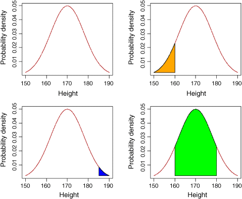
The function called polygon is used for colouring in different shaped areas under the curve: to see how it is used, type ?polygon
par(mfrow=c(2,2))
ht <- seq(150,190,0.01)pd <- dnorm(ht,170,8)
plot(ht,dnorm(ht,170,8),type="l",col="brown",ylab="Probability density",xlab="Height")
plot(ht,dnorm(ht,170,8),type="l",col="brown",ylab="Probability density",xlab="Height")yv <- pd[ht<=160]
xv <- ht[ht<=160]xv <- c(xv,160,150)yv <- c(yv,yv[1],yv[1])polygon(xv,yv,col="orange")
plot(ht,dnorm(ht,170,8),type="l",col="brown",ylab="Probability density",xlab="Height")xv <- ht[ht>=185]yv <- pd[ht>=185]xv <- c(xv,190,185)yv <- c(yv,yv[501],yv[501])polygon(xv,yv,col="blue")
plot(ht,dnorm(ht,170,8),type="l",col="brown",ylab="Probability density",xlab="Height")xv <- ht[ht>=160 & ht <= 180]yv <- pd[ht>=160 & ht <= 180]xv <- c(xv,180,160)yv <- c(yv,pd[1],pd[1])polygon(xv,yv,col="green")
Plots for Testing Normality of Single Samples
The simplest test of normality (and in many ways the best) is the ‘quantile–quantile plot’; it plots the ranked samples from our distribution against a similar number of ranked quantiles taken from a normal distribution. If the sample is normally distributed then the line will be straight. Departures from normality show up as various sorts of non-linearity (e.g. S-shapes or banana shapes). The functions you need are qqnorm and qqline (quantile–quantile plot against a normal distribution):
data <- read.csv("c:\temp\skewdata.csv")attach(data)qqnorm(values)qqline(values,lty=2)
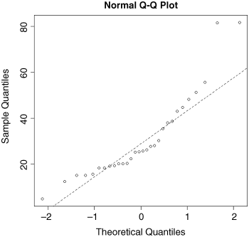
This shows a marked S-shape, indicative of non-normality (as we already know, our distribution is non-normal because it is skew to the left; see p. 68).
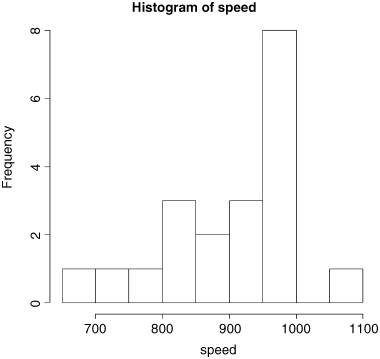
We can investigate the issues involved with Michelson's (1880) famous data on estimating the speed of light. The actual speed is 299 000 km s−1 plus the values in our dataframe called light:
light <- read.csv("c:\temp\light.csv")attach(light)names(light)
[1] "speed"
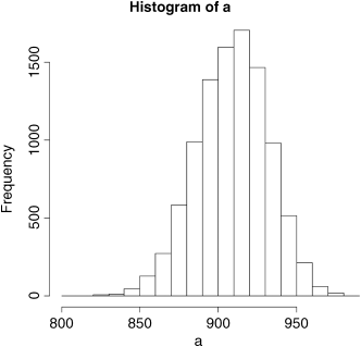
hist(speed)
We get a summary of the non-parametric descriptors of the sample like this:
summary(speed)
Min. 1st Qu. Median Mean 3rd Qu. Max.650 850 940 909 980 1070
From this, you see at once that the median (940) is substantially bigger than the mean (909), as a consequence of the strong negative skew in the data seen in the histogram. The interquartile range, the difference between the first and third quartiles, is 980 − 850 = 130. This is useful in the detection of outliers: a good rule of thumb is this
an outlier is a value more than 1.5 times the interquartile range above the third quartile, or below the first quartile.
(130 × 1.5 = 195). In this case, therefore, outliers would be measurements of speed that were less than 850 − 195 = 655 or greater than 980 + 195 = 1175. You will see that there are no large outliers in this data set, but one or more small outliers (the minimum is 650).
Inference in the One-Sample Case
We want to test the hypothesis that Michelson's estimate of the speed of light is significantly different from the value of 299 990 thought to prevail at the time. The data have all had 299 000 subtracted from them, so the test value is 990. Because of the non-normality, the use of Student's t test in this case is ill advised. The correct test is Wilcoxon's signed-rank test:
wilcox.test(speed,mu=990)
Wilcoxon signed rank test with continuity correction
data: speed
V = 22.5, p-value = 0.00213
alternative hypothesis: true location is not equal to 990
Warning message:In wilcox.test.default(speed, mu = 990) :cannot compute exact p-value with ties
We reject the null hypothesis and accept the alternative hypothesis because p = 0.00213 (i.e. much less than 0.05). The speed of light is significantly less than 990.
Bootstrap in Hypothesis Testing with Single Samples
We shall meet parametric methods for hypothesis testing later. Here we use bootstrapping to illustrate another non-parametric method of hypothesis testing. Our sample mean value of y is 909. The question we have been asked to address is this: ‘How likely is it that the population mean that we are trying to estimate with our random sample of 100 values is as big as 990?’
We take 10 000 random samples with replacement using n = 100 from the 100 values of light and calculate 10 000 values of the mean. Then we ask: what is the probability of obtaining a mean as large as 990 by inspecting the right-hand tail of the cumulative probability distribution of our 10 000 bootstrapped mean values? This is not as hard as it sounds:
a <- numeric(10000)for(i in 1:10000) a[i] <- mean(sample(speed,replace=T))hist(a)
The test value of 990 is off the scale to the right. A mean of 990 is clearly most unlikely, given the data:
max(a)
[1] 983
In our 10 000 samples of the data, we never obtained a mean value greater than 983, so the probability that the mean is 990 is clearly p < 0.0001.
Student's t Distribution
Student's t distribution is used instead of the normal distribution when sample sizes are small (n < 30). Recall that the 95% intervals of the standard normal were −1.96 to +1.96 standard deviations. Student's t distribution produces bigger intervals than this. The smaller the sample, the bigger the interval. Let us see this in action. The equivalents of pnorm and qnorm are pt and qt. We are going to plot a graph to show how the upper interval (equivalent to the normal's 1.96) varies with sample size in a t distribution. This is a deviate, so the appropriate function is qt. We need to supply it with the probability (in this case p = 0.975) and the degrees of freedom (we shall vary this from 1 to 30 to produce the graph)
plot(c(0,30),c(0,10),type="n",xlab="Degrees of freedom",ylab="Students t value")lines(1:30,qt(0.975,df=1:30),col="red")abline(h=1.96,lty=2,col="green")
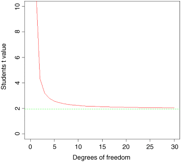
The importance of using Student's t rather than the normal is relatively slight until the degrees of freedom fall below about 10 (above which the critical value is roughly 2), and then it increases dramatically below about 5 degrees of freedom. For samples with more than 30 degrees of freedom, Student's t produces an asymptotic value of 1.96, just like the normal (this is the horizontal green dotted line). The graph demonstrates that Student's t = 2 is a reasonable rule of thumb; memorizing this will save you lots of time in looking up critical values in later life.
So what does the t distribution look like, compared to a normal? Let us redraw the standard normal in black:
xvs <- seq(-4,4,0.01)plot(xvs,dnorm(xvs),type="l",ylab="Probability density",xlab="Deviates")
Now we can overlay Student's t with d.f. = 5 as a red line to see the difference:
lines(xvs,dt(xvs,df=5),col="red")
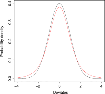
The difference between the normal (black line) and Student's t distributions (red line) is that the t distribution has ‘fatter tails’. This means that extreme values are more likely with a t distribution than with a normal, and the confidence intervals are correspondingly broader. So instead of a 95% interval of ±1.96 with a normal distribution we should have a 95% interval of ±2.57 for a Student's t distribution with just 5 degrees of freedom:
qt(0.975,5)
[1] 2.570582
Higher-Order Moments of a Distribution
So far, and without saying so explicitly, we have encountered the first two moments of a sample distribution. The quantity ![]() was used in the context of defining the arithmetic mean of a single sample: this is the first moment,
was used in the context of defining the arithmetic mean of a single sample: this is the first moment, ![]() . The quantity
. The quantity ![]() , the sum of squares, was used in calculating sample variance, and this is the second moment of the distribution,
, the sum of squares, was used in calculating sample variance, and this is the second moment of the distribution, ![]() . Higher-order moments involve powers of the difference greater than 2, such as
. Higher-order moments involve powers of the difference greater than 2, such as ![]() and
and ![]() .
.
Skew
Skew (or skewness) is the dimensionless version of the third moment about the mean
which is rendered dimensionless by dividing by the cube of the standard deviation of y (because this is also measured in units of y3):
The skew is then given by
It measures the extent to which a distribution has long, drawn-out tails on one side or the other. A normal distribution is symmetrical and has skew = 0. Negative values of ![]() mean skew to the left (negative skew) and positive values mean skew to the right. To test whether a particular value of skew is significantly different from 0 (and hence the distribution from which it was calculated is significantly non-normal) we divide the estimate of skew by its approximate standard error:
mean skew to the left (negative skew) and positive values mean skew to the right. To test whether a particular value of skew is significantly different from 0 (and hence the distribution from which it was calculated is significantly non-normal) we divide the estimate of skew by its approximate standard error:
It is straightforward to write an R function to calculate the degree of skew for any vector of numbers, x, like this:
skew <- function(x){m3 <- sum((x-mean(x))^3)/length(x)s3 <- sqrt(var(x))^3m3/s3 }
Note the use of the length(x) function to work out the sample size, n, whatever the size of the vector x. The last expression inside a function is not assigned to a variable name, and is returned as the value of skew(x) when this is executed from the command line.
We use the data from the file called skewdata.txt that we read on p. 79. To illustrate the skew, we plot a histogram of values, taking the opportunity to introduce two useful options: main="" to suppress the production of a title and col="green" to fill in the histogram bars in a chosen colour:
hist(values,main="",col="green")
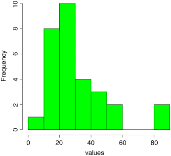
The data appear to be positively skew (i.e. to have a longer tail on the right than on the left). We use the new function skew to quantify the degree of skewness:
skew(values)
[1] 1.318905
Now we need to know whether a skew of 1.319 is significantly different from zero. We do a t test, dividing the observed value of skew by its standard error ![]() :
:
skew(values)/sqrt(6/length(values))
[1] 2.949161
Finally, we ask: what is the probability of getting a t value of 2.949 by chance alone, given that we have 28 degrees of freedom, when the skew value really is zero?
1 - pt(2.949,28)
[1] 0.003185136
We conclude that these data show significant non-normality (p < 0.0032). Note that we have n − 2 = 28 degrees of freedom, because in order to calculate skew we needed to know the values of two parameters that were estimated from the data: the mean and the variance.
The next step might be to look for a transformation that normalizes the data by reducing the skewness. One way of drawing in the larger values is to take square roots, so let us try this to begin with:
skew(sqrt(values))/sqrt(6/length(values))
[1] 1.474851
This is not significantly skew. Alternatively, we might take the logs of the values:
skew(log(values))/sqrt(6/length(values))
[1] -0.6600605
This is now slightly skew to the left (negative skew), but the value of Student's t is smaller than with a square-root transformation, so we might prefer a log transformation in this case.
Kurtosis
This is a measure of non-normality that has to do with the peakyness, or flat-toppedness, of a distribution. The normal distribution is bell-shaped, whereas a kurtotic distribution is other than bell-shaped. In particular, a more flat-topped distribution is said to be platykurtic, and a more pointy distribution is said to be leptokurtic. Kurtosis is the dimensionless version of the fourth moment about the mean
which is rendered dimensionless by dividing by the square of the variance of y (because this is also measured in units of y4):
Kurtosis is then given by
The minus 3 is included because a normal distribution has m4/s4 = 3. This formulation therefore has the desirable property of giving zero kurtosis for a normal distribution, while a flat-topped (platykurtic) distribution has a negative value of kurtosis, and a pointy (leptokurtic) distribution has a positive value of kurtosis. The approximate standard error of kurtosis is
An R function to calculate kurtosis might look like this:
kurtosis <- function(x) {m4 <- sum((x-mean(x))^4)/length(x)s4 <- var(x)^2m4/s4 - 3 }
For our present data, we find that kurtosis is not significantly different from normal:
kurtosis(values)
[1] 1.297751
kurtosis(values)/sqrt(24/length(values))
[1] 1.450930
because the t value (1.45) is substantially less than the rule of thumb (2.0).
Reference
- Michelson, A.A. (1880) Experimental determination of the velocity of light made at the U.S. Naval Academy, Annapolis. Astronomical Papers, 1, 109–145.
Further Reading
- Field, A., Miles, J. and Field, Z. (2012) Discovering Statistics Using R, Sage, London.
- Williams, D. (2001) Weighing the Odds. A Course in Probability and Statistics, Cambridge University Press, Cambridge.