2
Dataframes
Learning how to handle your data, how to enter it into the computer, and how to read the data into R are amongst the most important topics you will need to master. R handles data in objects known as dataframes. A dataframe is an object with rows and columns (a bit like a two-dimensional matrix). The rows contain different observations from your study, or measurements from your experiment. The columns contain the values of different variables. The values in the body of the dataframe can be numbers (as they would be in as matrix), but they could also be text (e.g. the names of factor levels for categorical variables, like ‘male’ or ‘female’ in a variable called ‘gender’), they could be calendar dates (like 23/5/04), or they could be logical variables (like ‘TRUE’ or ‘FALSE’). Here is a spreadsheet in the form of a dataframe with seven variables, the leftmost of which comprises the row names, and other variables are numeric (Area, Slope, Soil pH and Worm density), categorical (Field Name and Vegetation) or logical (Damp is either true = T or false = F).
| Field Name | Area | Slope | Vegetation | Soil pH | Damp | Worm density |
| Nash's Field | 3.6 | 11 | Grassland | 4.1 | F | 4 |
| Silwood Bottom | 5.1 | 2 | Arable | 5.2 | F | 7 |
| Nursery Field | 2.8 | 3 | Grassland | 4.3 | F | 2 |
| Rush Meadow | 2.4 | 5 | Meadow | 4.9 | T | 5 |
| Gunness' Thicket | 3.8 | 0 | Scrub | 4.2 | F | 6 |
| Oak Mead | 3.1 | 2 | Grassland | 3.9 | F | 2 |
| Church Field | 3.5 | 3 | Grassland | 4.2 | F | 3 |
| Ashurst | 2.1 | 0 | Arable | 4.8 | F | 4 |
| The Orchard | 1.9 | 0 | Orchard | 5.7 | F | 9 |
| Rookery Slope | 1.5 | 4 | Grassland | 5 | T | 7 |
| Garden Wood | 2.9 | 10 | Scrub | 5.2 | F | 8 |
| North Gravel | 3.3 | 1 | Grassland | 4.1 | F | 1 |
| South Gravel | 3.7 | 2 | Grassland | 4 | F | 2 |
| Observatory Ridge | 1.8 | 6 | Grassland | 3.8 | F | 0 |
| Pond Field | 4.1 | 0 | Meadow | 5 | T | 6 |
| Water Meadow | 3.9 | 0 | Meadow | 4.9 | T | 8 |
| Cheapside | 2.2 | 8 | Scrub | 4.7 | T | 4 |
| Pound Hill | 4.4 | 2 | Arable | 4.5 | F | 5 |
| Gravel Pit | 2.9 | 1 | Grassland | 3.5 | F | 1 |
| Farm Wood | 0.8 | 10 | Scrub | 5.1 | T | 3 |
Perhaps the most important thing about analysing your own data properly is getting your dataframe absolutely right. The expectation is that you will have used a spreadsheet like Excel to enter and edit the data, and that you will have used plots to check for errors. The thing that takes some practice is learning exactly how to put your numbers into the spreadsheet. There are countless ways of doing it wrong, but only one way of doing it right. And this way is not the way that most people find intuitively to be the most obvious.
The key thing is this: all the values of the same variable must go in the same column. It does not sound like much, but this is what people tend to get wrong. If you had an experiment with three treatments (control, pre-heated and pre-chilled), and four measurements per treatment, it might seem like a good idea to create the spreadsheet like this:
| Control | Preheated | Prechilled |
| 6.1 | 6.3 | 7.1 |
| 5.9 | 6.2 | 8.2 |
| 5.8 | 5.8 | 7.3 |
| 5.4 | 6.3 | 6.9 |
But this is not a dataframe, because values of the response variable appear in three different columns, rather than all in the same column. The correct way to enter these data is to have two columns: one for the response variable and one for the levels of the experimental factor (control, pre-heated and pre-chilled). Here are the same data, entered correctly as a dataframe:
| Response | Treatment |
| 6.1 | control |
| 5.9 | control |
| 5.8 | control |
| 5.4 | control |
| 6.3 | preheated |
| 6.2 | preheated |
| 5.8 | preheated |
| 6.3 | preheated |
| 7.1 | prechilled |
| 8.2 | prechilled |
| 7.3 | prechilled |
| 6.9 | prechilled |
A good way to practice this layout is to use the Excel function called PivotTable (found under the Insert tab on the main menu bar) on your own data: it requires your spreadsheet to be in the form of a dataframe, with each of the explanatory variables in its own column.
Once you have made your dataframe in Excel and corrected all the inevitable data entry and spelling errors, then you need to save the dataframe in a file format that can be read by R. Much the simplest way is to save all your dataframes from Excel as comma-delimited files: File/Save As/ . . . then from the ‘Save as type’ options choose ‘CSV (Comma delimited)’. There is no need to add a suffix, because Excel will automatically add ‘.csv’ to your file name. This file can then be read into R directly as a dataframe, using the read.csv function.
Think of a name for the dataframe (say, ‘worms’ in this case). Now use the gets arrow <− which is a composite symbol made up of the two characters < (less than) and − (minus) like this
worms <- read.csv("c:\temp\worms.csv")To see which variables are included in this dataframe, we use the names function:
names(worms)[1]"Field.Name""Area""Slope""Vegetation"[5]"Soil.pH""Damp""Worm.density"
In order that we can refer to the variable names directly (without prefixing them by the dataframe name) we attach the dataframe:
attach(worms)To see the contents of the dataframe, just type its name:
wormsField.NameAreaSlopeVegetationSoil.pHDampWorm.density1 Nashs.Field 3.6 11 Grassland 4.1 FALSE 42 Silwood.Bottom 5.12 Arable 5.2 FALSE 73 Nursery.Field 2.83 Grassland 4.3 FALSE 24 Rush.Meadow 2.45 Meadow 4.9 TRUE 55 Gunness.Thicket 3.80 Scrub 4.2 FALSE 66 Oak.Mead 3.12 Grassland 3.9 FALSE 27 Church.Field 3.53 Grassland 4.2 FALSE 38 Ashurst 2.10 Arable 4.8 FALSE 49 The.Orchard 1.90 Orchard 5.7 FALSE 910 Rookery.Slope 1.54 Grassland 5.0 TRUE 711 Garden.Wood 2.910 Scrub 5.2 FALSE 812 North.Gravel 3.31 Grassland 4.1 FALSE 113 South.Gravel 3.72 Grassland 4.0 FALSE 214 Observatory.Ridge 1.86 Grassland 3.8 FALSE 015 Pond.Field 4.10 Meadow 5.0 TRUE 616 Water.Meadow 3.90 Meadow 4.9 TRUE 817 Cheapside 2.28 Scrub 4.7 TRUE 418 Pound.Hill 4.42 Arable 4.5 FALSE 519 Gravel.Pit 2.91 Grassland 3.5 FALSE 120 Farm.Wood 0.8 10 Scrub 5.1 TRUE 3
The variable names appear in row number 1. Notice that R has expanded our abbreviated T and F into TRUE and FALSE.
Selecting Parts of a Dataframe: Subscripts
We often want to extract part of a dataframe. This is a very general procedure in R, accomplished using what are called subscripts. You can think of subscripts as addresses within a vector, a matrix or a dataframe. Subscripts in R appear within square brackets, thus y[7] is the 7th element of the vector called y and z[2,6] is the 2nd row of the 6th column of a two-dimensional matrix called z. This is in contrast to arguments to functions in R, which appear in round brackets (4,7).
We might want to select all the rows of a dataframe for certain specified columns. Or we might want to select all the columns for certain specified rows of the dataframe. The convention in R is that when we do not specify any subscript, then all the rows, or all the columns is assumed. This syntax is difficult to understand on first acquaintance, but [, ‘blank then comma’ means ‘all the rows’ and ,] ‘comma then blank’ means all the columns. For instance, to select the first column of the dataframe, use subscript [,1]. To select groups of columns we provide several column numbers. Thus, to select all the rows of the first three columns of worms, we write:
worms[,1:3]Field.Name Area Slope1 Nashs.Field 3.6 112 Silwood.Bottom 5.1 23 Nursery.Field 2.8 34 Rush.Meadow 2.4 55 Gunness.Thicket 3.8 06 Oak.Mead 3.1 27 Church.Field 3.5 38 Ashurst 2.1 09 The.Orchard 1.9 010 Rookery.Slope 1.5 411 Garden.Wood 2.9 1012 North.Gravel 3.3 113 South.Gravel 3.7 214 Observatory.Ridge 1.8 615 Pond.Field 4.1 016 Water.Meadow 3.9 017 Cheapside 2.2 818 Pound.Hill 4.4 219 Gravel.Pit 2.9 120 Farm.Wood 0.8 10
To select just the middle 11 rows for all the columns of the dataframe, use subscript [5:15,] like this:
worms[5:15,]Field.Name Area Slope Vegetation Soil.pH Damp Worm.density5 Gunness.Thicket 3.8 0 Scrub 4.2 FALSE 66 Oak.Mead 3.1 2 Grassland 3.9 FALSE 27 Church.Field 3.5 3 Grassland 4.2 FALSE 38 Ashurst 2.1 0 Arable 4.8 FALSE 49 The.Orchard 1.9 0 Orchard 5.7 FALSE 910 Rookery.Slope 1.5 4 Grassland 5.0 TRUE 711 Garden.Wood 2.9 10 Scrub 5.2 FALSE 812 North.Gravel 3.3 1 Grassland 4.1 FALSE 113 South.Gravel 3.7 2 Grassland 4.0 FALSE 214 Observatory.Ridge 1.8 6 Grassland 3.8 FALSE 015 Pond.Field 4.1 0 Meadow 5.0 TRUE 6
It is often useful to select certain rows, based on logical tests on the values of one or more variables. Here is the code to select only those rows which have Area > 3 and Slope < 3 using ‘comma then blank’ to specify all the columns like this:
worms[Area>3 & Slope <3,]Field.Name Area Slope Vegetation Soil.pH Damp Worm.density2 Silwood.Bottom 5.12 Arable 5.2 FALSE 75 Gunness.Thicket 3.80 Scrub 4.2 FALSE 66 Oak.Mead 3.12 Grassland 3.9 FALSE 212 North.Gravel 3.31 Grassland 4.1 FALSE 113 South.Gravel 3.72 Grassland 4.0 FALSE 215 Pond.Field 4.10 Meadow 5.0 TRUE 616 Water.Meadow 3.90 Meadow 4.9 TRUE 818 Pound.Hill 4.42 Arable 4.5 FALSE 5
Sorting
You can sort the rows or the columns of the dataframe in any way you choose, but typically you will want to see all of the columns and to sort on the basis of the values in one or more of the columns. By default, things in R are sorted into ascending order (i.e. into alphabetical order for character data, and increasing numeric order for numbers). The simplest way to sort is to use the name of the variable. Suppose we want the whole dataframe sorted by Area:
worms[order(Area),]
Field.Name Area Slope Vegetation Soil.pH Damp Worm.density20 Farm.Wood 0.8 10 Scrub 5.1 TRUE 310 Rookery.Slope 1.5 4 Grassland 5.0 TRUE 714 Observatory.Ridge 1.8 6 Grassland 3.8 FALSE 09 The.Orchard 1.9 0 Orchard 5.7 FALSE 98 Ashurst 2.1 0 Arable 4.8 FALSE 417 Cheapside 2.2 8 Scrub 4.7 TRUE 44 Rush.Meadow 2.4 5 Meadow 4.9 TRUE 53 Nursery.Field 2.8 3 Grassland 4.3 FALSE 211 Garden.Wood 2.9 10 Scrub 5.2 FALSE 819 Gravel.Pit 2.9 1 Grassland 3.5 FALSE 16 Oak.Mead 3.1 2 Grassland 3.9 FALSE 212 North.Gravel 3.3 1 Grassland 4.1 FALSE 17 Church.Field 3.5 3 Grassland 4.2 FALSE 31 Nashs.Field 3.6 11 Grassland 4.1 FALSE 413 South.Gravel 3.7 2 Grassland 4.0 FALSE 25 Gunness.Thicket 3.8 0 Scrub 4.2 FALSE 616 Water.Meadow 3.9 0 Meadow 4.9 TRUE 815 Pond.Field 4.1 0 Meadow 5.0 TRUE 618 Pound.Hill 4.4 2 Arable 4.5 FALSE 52 Silwood.Bottom 5.1 2 Arable 5.2 FALSE 7
The key point to note is that order(Area) comes before the comma, and there is a blank after the comma (which means that we want all of the columns). The original row numbers appear on the left of the sorted dataframe.
Now suppose we just want the columns containing numeric information to appear in the output; these are column numbers 2, 3, 5 and 7:
worms[order(Area),c(2,3,5,7)]
Area Slope Soil.pH Worm.density20 0.8 10 5.1 310 1.5 4 5.0 714 1.8 6 3.8 09 1.9 0 5.7 98 2.1 0 4.8 417 2.2 8 4.7 44 2.4 5 4.9 53 2.8 3 4.3 211 2.9 10 5.2 819 2.9 1 3.5 16 3.1 2 3.9 212 3.3 1 4.1 17 3.5 3 4.2 31 3.6 11 4.1 413 3.7 2 4.0 25 3.8 0 4.2 616 3.9 0 4.9 815 4.1 0 5.0 618 4.4 2 4.5 52 5.1 2 5.2 7
To sort things into descending order we employ the reverse function rev like this:
worms[rev(order(worms[,5])),c(5,7)]Soil.pH Worm.density9 5.7 911 5.2 82 5.2 720 5.1 315 5.0 610 5.0 716 4.9 84 4.9 58 4.8 417 4.7 418 4.5 53 4.3 27 4.2 35 4.2 612 4.1 11 4.1 413 4.0 26 3.9 214 3.8 019 3.5 1
which sorts into descending order by Soil pH, with only Soil pH and Worm density as output (because of the c(5,7)). This makes the point that you can specify the sorting variable either by name (as we did with Area above) or by column number (as we did with Soil.pH here by specifying column number 5).
Summarizing the Content of Dataframes
The object called worms now has all the attributes of a dataframe. For example, you can summarize it, using summary:
summary(worms)Field.Name Area Slope VegetationAshurst : 1 Min. :0.800 Min. : 0.00 Arable :3Cheapside : 1 1st Qu. :2.175 1st Qu. : 0.75 Grassland :9Church.Field : 1 Median :3.000 Median : 2.00 Meadow :3Farm.Wood : 1 Mean :2.990 Mean : 3.50 Orchard :1Garden.Wood : 1 3rd Qu. :3.725 3rd Qu. : 5.25 Scrub :4Gravel.Pit : 1 Max. :5.100 Max. :11.00(Other) :14Soil.pH Damp Worm.densityMin. :3.500 Mode :logical Min. :0.001st Qu. :4.100 FALSE :14 1st Qu. :2.00Median :4.600 TRUE :6 Median :4.00Mean :4.555 NA's :0 Mean :4.353rd Qu. :5.000 3rd Qu. :6.25Max. :5.700 Max. :9.00
Values of continuous variables are summarized under six headings: one parametric (the arithmetic mean) and five non-parametric (maximum, minimum, median, 25th percentile or first quartile, and 75th percentile or third quartile). Levels of categorical variables are counted.
Summarizing by Explanatory Variables
The function you need to master for summarizing quantitative information in dataframes is called aggregate. You will often want to know the average values of continuous variables within the dataframe summarized by factor levels from one or more of the categorical variables. For instance, we may want to know the mean number of worms under different plant communities. For a single response variable like Worm.density, you can use tapply and with like this:
with(worms,tapply(Worm.density,Vegetation,mean))
Arable Grassland Meadow Orchard Scrub5.33 2.44 6.33 9.00 5.25
In the early stages of analysis, however, we often want to see the mean values of all the continuous variables summarized at the same time, and this is where aggregate comes into its own. We need to do a little bit of work in advance, by noting down the column numbers that contain the variables for which it would be useful and sensible to calculate the mean values (i.e. the columns containing real numbers). These are Area and Slope in columns 2 and 3 respectively, Soil.pH in column 5 and Worm.density in column 7. To get their mean values classified by plant communities we need only type:
aggregate(worms[,c(2,3,5,7)],list(Vegetation),mean)
Group.1 Area Slope Soil.pH Worm.density1 Arable 3.87 1.33 4.83 5.332 Grassland 2.91 3.67 4.10 2.443 Meadow 3.47 1.67 4.93 6.334 Orchard 1.90 0.00 5.70 9.005 Scrub 2.42 7.00 4.80 5.25
which causes all of the mean values to be printed. Do you know why there is a comma after the left hand square bracket on worms? Note that the column containing the levels of Vegetation is headed Group.1. This is the default used by aggregate. Within the column, the levels of Vegetation appear in alphabetical order. To get the column headed by ‘Community’ instead of Group.1 we annotate the list like this:
aggregate(worms[,c(2,3,5,7)],list(Community=Vegetation),mean)Community Area Slope Soil.pH Worm.density1 Arable 3.87 1.33 4.83 5.332 Grassland 2.91 3.67 4.10 2.443 Meadow 3.47 1.67 4.93 6.334 Orchard 1.90 0.00 5.70 9.005 Scrub 2.42 7.00 4.80 5.25
You can do multiple classifications using two or more categorical explanatory variables: here is a summary that asks for the mean values separately for each level of soil moisture within each vegetation type
aggregate(worms[,c(2,3,5,7)],list(Moisture=Damp,Community=Vegetation),mean)
Moisture Community Area Slope Soil.pH Worm.density1 FALSE Arable 3.87 1.33 4.83 5.332 FALSE Grassland 3.09 3.62 3.99 1.883 TRUE Grassland 1.50 4.00 5.00 7.004 TRUE Meadow 3.47 1.67 4.93 6.335 FALSE Orchard 1.90 0.00 5.70 9.006 FALSE Scrub 3.35 5.00 4.70 7.007 TRUE Scrub 1.50 9.00 4.90 3.50
You will notice that aggregate produces only those rows for which there is output (there are no dry meadows, and no wet arable or wet orchards, for instance). This is in contrast to tapply, which produces NA for missing combinations:
with(worms,tapply(Slope,list(Damp,Vegetation),mean))
Arable Grassland Meadow Orchard ScrubFALSE 1.33 3.62 NA 0 5TRUE NA 4.00 1.67 NA 9
You choose between aggregate and tapply on the basis of which of them serves your needs best in a particular case, bearing in mind that tapply can summarize only one variable at a time.
The answer to the quiz (above) is that the comma after the square bracket means ‘select all of the rows in the dataframe’. If we wanted only some of the rows, then we would need to specify which rows, just like we specified which columns we wanted using c(2,3,5,7).
First Things First: Get to Know Your Data
Once the data are in the computer, the temptation is to rush straight into statistical analysis. This is exactly the wrong thing to do. You need to get to know your data first. This is particularly important early on in a project, because there is a very high chance that the data contain mistakes. Obviously, these need to be put right before anything sensible can be done.
Just as important, if you do not know what your data look like, then you will not know what model to select to fit to the data (e.g. a straight line or a curved line), or whether the assumptions of your intended model are met by the data (e.g. constancy of variance and normality of errors).
The recommended procedure is this. First, just plot the response variable on its own. This is called an index plot. It will show if there are any glaring errors in the data and whether there are trends or cycles in the values of the response as they appear in the dataframe.
data <- read.csv("c:\temp\das.csv")attach(data)head(data)
y1 2.5145422 2.5596683 2.4600614 2.7027205 2.5719976 2.412833
Data inspection could not be simpler. Just plot the values of y using plot(y). This produces a scatterplot with the values of y appearing from left to right in the order in which they appear in the dataframe:
plot(y)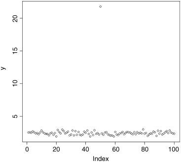
One data point sticks out like a sore thumb. We need to go back to the lab notebook and check what has happened. It is useful to know what line of the dataframe contains the unusually large value of y. This is easy to work out using the which function. Inspection of the plot shows that our questionable data point is the only one larger than 10, so we can use the which function like this:
which(y > 10)[1] 50
so the outlying data point is on line 50 of the spreadsheet. Now we need to go back to the lab book and try to work out what happened. What is the exact value of the outlier? We use subscripts [square brackets] for this. We want the 50th value of y:
y[50][1] 21.79386
The lab book shows that the value should be 2.179386. What has happened is that a typing error has put the decimal point in the wrong place. Clearly we should change the entry in the spreadsheet and start again. Now when we use plot to check the data, it looks like this
plot(y)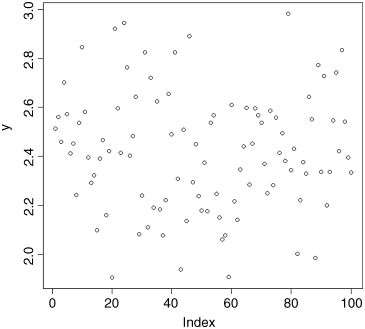
There is no reason to suspect any of the data points. The data are not trended with the order of entry, and the degree of scatter looks to be consistent from left to right. That is good news.
It is important to appreciate that outliers are not necessarily mistakes. Most outliers will be genuine values of the response. The key point about outliers is that you need to be aware of their existence (the plots will show this) and to understand how influential the outliers are in determining effect sizes and standard errors in your chosen model. This crucial point is discussed on p. 135. Now do the same thing for each of the continuous explanatory variables in turn.
To check for mistakes in the factor levels of categorical explanatory variables, you use the table function. This shows how many times each factor level appears in a particular column of the data frame. Mistakes will be highlighted because there will be more factor levels than there should be. Here is a variable called treatment from an experiment on fertilizer application and plant growth. There are four levels of the factor: control, nitrogen, phosphorus and both N and P. This is how we check the data:
yields <- read.csv("c:\temp\fertyield.csv")attach(yields)head(yields)
treatment yield1 control 0.82741562 control 3.61262753 control 2.61925814 control 1.74121905 control 0.65905896 control 0.4891107
As you can see, the variable called treatment is a factor with text (‘control’ on these six lines) entries to describe which of the four treatments was applied to obtain the yield in column 2. This is how we check the factor levels:
table(treatment)
variableboth N and P control nitogen nitrogen phosphorus10 10 1 9 10
There are five factor levels printed rather than the four we expected, so it is clear that something is wrong. What has happened is that one of the nitrogen values has been misspelled as nitogen with the result that there are only 9 nitrogen values (not the 10 we expect) and an extra column in the table with one entry for the spelling mistake. The next step is to find out which row the mistake occurs in, then armed with this information, go back to the original spreadsheet and correct the error. This is easy using the which function. Note the use of ‘double equals’ to check for equality):
which(treatment == "nitogen")[1] 11
The mistake is in line number 11. We need to correct that line in the spreadsheet. Make the change then start again, by reading the new corrected dataframe into R. Check all of your variables, continuous and categorical, one at a time and correct all of the mistakes you find. Now it is time to look at relationships between variables.
detach(yields)Relationships
The place to start is with pairwise relationships. When both variables are continuous, the appropriate graph is a scatterplot:
data <- read.csv("c:\temp\scatter.csv")attach(data)head(data)
x y1 0.000000 0.000002 5.112000 61.040003 1.320000 11.111304 35.240000 140.650005 1.632931 26.152186 2.297635 10.00100
The response variable is y and the explanatory variable is x, so we write plot(x,y) or plot(y~x) to see the relationship (the two forms of plot produce the same graph; the choice of which to use is entirely up to you). We introduce two new features to customize the plot: changing the plotting symbol (pch stands for ‘plotting character’) from the default open circles we have been using so far to coloured discs with a black edge (pch = 21) and select a bright colour for the fill of the disc (the ‘background’ as it is called in R, using bg="red"):
plot(x,y,pch=21,bg="red")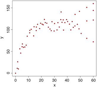
This plot immediately alerts us to two important issues: (1) the relationship between the response and the explanatory variable is curved, not a straight line; and (2) the degree of scatter of the response variable increases from left to right (this is what non-constant variance (heteroscedasticity) looks like). These two features of the data are not mistakes, but they are very important elements in model selection (despite the positive correlation between x and y, we would not do a linear regression on these data, for instance).
When the explanatory variable is categorical the plot function produces a box-and-whisker plot. This is very useful for error-checking, as the following example illustrates:
data <- read.csv("c:\temp\weather.data.csv")attach(data)head(data)
upper lower rain month yr1 10.8 6.5 12.2 1 19872 10.5 4.5 1.3 1 19873 7.5 -1.0 0.1 1 1987
4 6.5 -3.3 1.1 1 19875 10.0 5.0 3.5 1 19876 8.0 3.0 0.1 1 1987
There are three potential continuous response variables in this dataframe (daily maximum temperature ‘upper’ in degrees Celsius, daily minimum temperature ‘lower’ in degrees Celsius, and daily total precipitation ‘rain’ in millimetres) and two quantitative variables that we might choose to define as categorical (month and year). Here, we carry out an initial inspection of the maximum temperature data. Note that when the plot function is invoked with a categorical explanatory variable – factor(month) in this case – then R produces a box-and-whisker plot rather than a scatterplot (see p. 67 for details).
plot(factor(month),upper)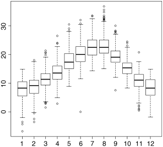
The box-and- whisker plot shows the very clear seasonal pattern of median temperature, peaking in July and August and reaching a minimum in January. The details of what the boxes and whiskers mean are explained on p. 161. For our present purposes we concentrate on error-checking.
The plot shows a freezing day (0 maximum) in June (month = 6), which is unheard of at this location. It turns out that the thermometer broke on this day and was replaced by a new one. The missing value for the day of the breakdown was foolishly entered as a zero (it should have been NA). Again, we go back to the spreadsheet and replace the erroneous 0 by the correct NA (this stands for not available; notice that NA is not enclosed in quotation marks).
Looking for Interactions between Continuous Variables
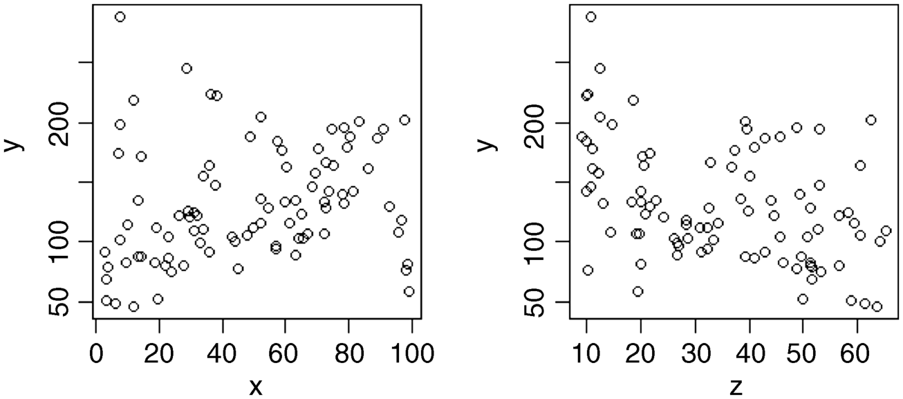
Once the obvious errors have been corrected, the next questions concern model choice. For instance, does the response to one variable depend upon the level of another variable? (in the jargon, this is known as a statistical interaction). With continuous explanatory variables, we can look for interaction effects using conditioning plots (typically known as coplots). With categorical explanatory variables, we can look for interaction effects using barplots. Here we have one response variable (y) and two continuous explanatory variables (x and z):
data <- read.csv("c:\temp\coplot.csv")attach(data)head(data)
x y z1 95.73429 107.8087 14.3244082 36.20660 223.9257 10.1905773 28.71378 245.2523 12.5668154 78.36956 132.7344 13.0843845 38.37717 222.2966 9.9600336 57.18078 184.8372 10.035677
Two scatterplots side by side look better if we change the shape of the plotting window from the default square (7 × 7 inches) to a rectangle (7 × 4 inches) like this:
windows(7,4)then alter the graphics parameter to specify two sets of axis on the same row (see p. 134 for details):
par(mfrow=c(1,2))There is no clear relationship between the response and either of the two continuous explanatory variables when they are fitted on their own:
plot(x,y)plot(z,y)
To look for interactions between continuous explanatory variables (like x and z in this example) we employ a superb graphical function called coplot. The function plots y against x conditional on the value of z. The function is very simple to use. The symbol that might be new to you is the vertical bar | which is read as ‘given’. The syntax says ‘plot y against x given the value of z’ and is written as plot(y~x|z). The default is to split the data into six graphs (but you can change this if you want to). The sixth of the data with the lowest values of z appear in the bottom left-hand panel as a plot of y against x. To improve the appearance of the plot we can use solid black plotting symbols (pch =16) and fit a trend line through the scatterplot in red (this is called a non-parametric smoother, and is invoked by the function panel.smooth). First we return to the default window shape (7 × 7 inches):
windows(7,7)then we draw the conditioning plot:
coplot(y~x|z,pch=16,panel=panel.smooth)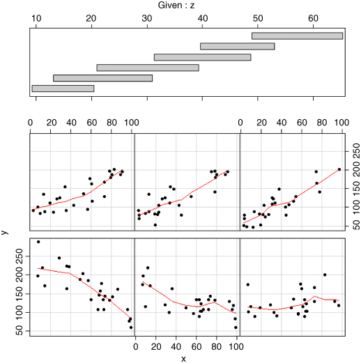
This shows a really clear relationship between the response variable and x, but the form of the relationship depends on the value of z (the second of our continuous explanatory variables). For low values of z (in the bottom left-hand panel) the relationship between y and x is strongly negative. For high values of z (top right) the relationship is strongly positive. As z increases (from bottom left to bottom right, then from top left to top right), the slope of the relationship between y and x increases rather smoothly from large negative values to zero then to increasingly positive values. Only coplot can show this kind of interaction so simply and clearly.
The top part of the figure can be confusing for beginners. The shaded horizontal bars are called shingles (after the American word for roof tiles) and they show the range of values of the variable (z in this example) used to produce each of the six panel plots. The bottom (left-hand) shingle shows that the bottom left-hand panel (with the strong negative relationship between y and x) was based on data selected to have z values between 10 and 20 (look at the scale on the top axis beneath ‘Given: z’). The next panel used data with z values between 13 and 30, the next between 20 and 40, and so on. The shingles overlap because that is the default setting (see ?coplot for details of overlap = 0.5): for a non-edge plot, half of the data points are shared with the panel to its left, and half are shared with the panel on its right. You can specify non-overlapping panels if that is what you want (overlap = 0).
Graphics to Help with Multiple Regression
The problems become most acute when we have many continuous explanatory variables and the data come from observational studies where we have no control over replication or randomization. In data sets like this, the explanatory variables are often correlated with each other (most simple models assume that the explanatory variables are independent – orthogonal in the jargon). We discuss these issues in detail in Chapter 10, but at this stage we simply observe that there are no easy cures for this. Two very useful tools for preliminary investigation of multiple regression data are tree models and generalized additive models, as illustrated on p. 197.
Interactions Involving Categorical Variables
The following data are from a factorial experiment involving nitrogen and phosphorus fertilizers applied separately and in combination:
data <- read.csv("c:\temp\np.csv")attach(data)head(data)
yield nitrogen phosphorus1 0.8274156 no no2 3.6126275 no no3 2.6192581 no no4 1.7412190 no no5 0.6590589 no no6 0.4891107 no no
There is one continuous response variable (yield) and two categorical explanatory variables (nitrogen and phosphorus) each with two levels (yes and no, meaning the fertilizer was or was not applied to the plot in question). First we look at the effects of the two nutrients separately:
windows(7,4)par(mfrow=c(1,2))plot(nitrogen,yield,main="N")plot(phosphorus,yield,main="P")
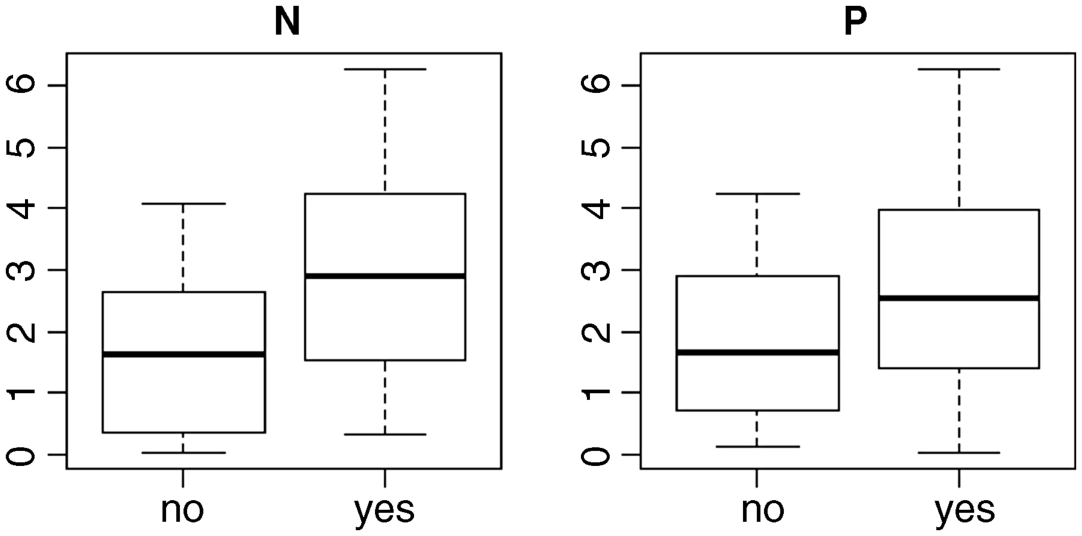
These plots show what are called the ‘main effects’ of nitrogen and phosphorus: it looks as if nitrogen increases yield slightly more than does phosphorus. The median for plus nitrogen (‘yes’ in the left-hand plot) is above the top of the box for no nitrogen, whereas the median for plus phosphorus is below the top of the box for no phosphorus (right-hand plot). What these main effects fail to show us is whether the response to phosphorus depends on the level of nitrogen. What we need is an interaction plot showing effect sizes for four levels of response: neither nutrient, just nitrogen, just phosphorus, or both N and P. We use the function tapply to do this:
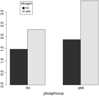
tapply(yield,list(nitrogen,phosphorus),mean)
no yesno 1.47384 1.875928yes 2.28999 3.480184
The rows refer to nitrogen and the columns to phosphorus. With no P (left column), the effect size for N is 2.290/1.474 = 1.55, but with P the effect size of N is 3.480/1.876 = 1.86. The effect size for nitrogen depends on the level of phosphorus (55% increase in yield without P, but 86% increase with P). That is an example of a statistical interaction: the response to one factor depends upon the level of another factor.
We need a way of showing interactions graphically. There are many way of doing this, but perhaps the most visually effective is to use the barplot function. We can use the output from tapply directly for this, but it is a good idea to add a legend to show the nitrogen treatments associated using two colours of shading:
barplot(tapply(yield,list(nitrogen,phosphorus),mean),beside=TRUE,xlab="phosphorus")
The locator function allows you to put the legend in a place where it does not interfere with any of the bars. Put the cursor where you want the top left corner of the legend box to appear, then left click:
legend(locator(1),legend=c("no","yes"),title="nitrogen",fill=c("black","lightgrey"))
For your final presentation, you would want to add error bars to the plot, but we shall deal with this later, once we have discussed how to measure the unreliability of effects (see p. 162).
It is essential to spend time on understanding the patterns in your data before you embark on the statistics. These preliminary plots are not optional extras. They are absolutely vital for deciding what kind of statistical modelling will be appropriate, and what kinds of assumptions about the data (linearity of response, constancy of variance, normality of errors) are likely to be justified. As you will see, we return to check the assumptions again, once the statistical modelling has been carried out (see p. 134).
That concludes the initial data inspection. Now we can begin to think about statistical analysis of the data. We shall concentrate on measuring effect sizes and their unreliabilities (the modern approach) and pay relatively little attention to hypothesis testing (the old-fashioned approach).
Further Reading
- Chambers, J.M. and Hastie, T.J. (1992) Statistical Models in S, Wadsworth & Brooks/Cole, Pacific Grove, CA.
- Crawley, M.J. (2013) The R Book, 2nd edn, John Wiley & Sons, Chichester.