6
Two Samples
There is absolutely no point in carrying out an analysis that is more complicated than it needs to be. Occam's razor applies to the choice of statistical model just as strongly as to anything else: simplest is best. The so-called classical tests deal with some of the most frequently-used kinds of analysis, and they are the models of choice for:
- comparing two variances (Fisher's F test, var.test)
- comparing two sample means with normal errors (Student's t test, t.test)
- comparing two means with non-normal errors (Wilcoxon's test, wilcox.test)
- comparing two proportions (the binomial test, prop.test)
- correlating two variables (Pearson's or Spearman's rank correlation, cor.test)
- testing for independence in contingency tables using chi-squared (chisq.test)
- testing small samples for correlation with Fisher's exact test (fisher.test)
Comparing Two Variances
Before we can carry out a test to compare two sample means, we need to test whether the sample variances are significantly different (see p. 55). The test could not be simpler. It is called Fisher's F test after the famous statistician and geneticist R. A. Fisher, who worked at Rothamsted in south-east England. To compare two variances, all you do is divide the larger variance by the smaller variance.
Obviously, if the variances are the same, the ratio will be 1. In order to be significantly different, the ratio will need to be significantly bigger than 1 (because the larger variance goes on top, in the numerator). How will we know a significant value of the variance ratio from a non-significant one? The answer, as always, is to look up the critical value of the variance ratio. In this case, we want critical values of Fisher's F. The R function for this is qf which stands for ‘quantiles of the F distribution’. For our example of ozone levels in market gardens (see Chapter 4) there were 10 replicates in each garden, so there were 10 − 1 = 9 degrees of freedom for each garden. In comparing two gardens, therefore, we have 9 d.f. in the numerator and 9 d.f. in the denominator. Although F tests in analysis of variance are typically one-tailed (the treatment variance is expected to be larger than the error variance if the means are significantly different; see p. 153), in this case, we had no expectation as to which garden was likely to have the higher variance, so we carry out a two-tailed test (![]() ). Suppose we work at the traditional
). Suppose we work at the traditional ![]() , then we find the critical value of F like this:
, then we find the critical value of F like this:
qf(0.975,9,9)
4.025994
This means that a calculated variance ratio will need to be greater than or equal to 4.026 in order for us to conclude that the two variances are significantly different at ![]() . To see the test in action, we can compare the variances in ozone concentration for market gardens B and C.
. To see the test in action, we can compare the variances in ozone concentration for market gardens B and C.
f.test.data <- read.csv("c:\temp\f.test.data.csv")attach(f.test.data)names(f.test.data)
[1] "gardenB" "gardenC"
First, we compute the two variances:
var(gardenB)
[1] 1.333333
var(gardenC)
[1] 14.22222
The larger variance is clearly in garden C, so we compute the F ratio like this:
F.ratio <- var(gardenC)/var(gardenB)F.ratio
[1] 10.66667
The test statistic shows us that the variance in garden C is more than 10 times as big as the variance in garden B. The critical value of F for this test (with 9 d.f. in both the numerator and the denominator) is 4.026 (see qf, above), so we conclude: since the test statistic is larger than the critical value, we reject the null hypothesis.
The null hypothesis was that the two variances were not significantly different, so we accept the alternative hypothesis that the two variances are significantly different. In fact, it is better practice to present the p value associated with the calculated F ratio rather than just to reject the null hypothesis. To do this we use pf rather than qf. We double the resulting probability to allow for the two-tailed nature of the test:
2*(1 - pf(F.ratio,9,9))
[1] 0.001624199
so the probability of obtaining an F ratio as large as this or larger, if the variances were the same (as assumed by the null hypothesis), is less than 0.002. It is important to note that the p value is not the probability that the null hypothesis is true (this is a common mistake amongst beginners). The null hypothesis is assumed to be true in carrying out the test. Keep rereading this paragraph until you are sure that you understand this distinction between what p values are and what they are not.
Because the variances are significantly different, it would be wrong to compare the two sample means using Student's t test. In this case the reason is very obvious; the means are exactly the same (5.0 pphm) but the two gardens are clearly different in their daily levels of ozone pollution (see p. 55).
There is a built-in function called var.test for speeding up the procedure. All we provide are the names of the two variables containing the raw data whose variances are to be compared (we do not need to work out the variances first):
var.test(gardenB,gardenC)
F test to compare two variances
data: gardenB and gardenCF = 0.0938, num df = 9, denom df = 9, p-value = 0.001624alternative hypothesis: true ratio of variances is not equal to 195 percent confidence interval:0.02328617 0.37743695sample estimates:ratio of variances0.09375
Note that the variance ratio, F, is given as roughly 1/10 rather than roughly 10 because var.test put the variable name that came first in the alphabet (gardenB) on top (i.e. in the numerator) instead of the bigger of the two variances. But the p value of 0.0016 is exactly the same, and we reject the null hypothesis. These two variances are highly significantly different.
detach(f.test.data)
Comparing Two Means
Given what we know about the variation from replicate to replicate within each sample (the within-sample variance), how likely is it that our two sample means were drawn from populations with the same average? If this is highly likely, then we shall say that our two sample means are not significantly different. If it is rather unlikely, then we shall say that our sample means are significantly different. As with all of the classical tests, we do this by calculating a test statistic and then asking the question: how likely are we to obtain a test statistic this big (or bigger) if the null hypothesis is true? We judge the probability by comparing the test statistic with a critical value. The critical value is calculated on the assumption that the null hypothesis is true. It is a useful feature of R that it has built-in statistical tables for all of the important probability distributions, so that if we provide R with the relevant degrees of freedom, it can tell us the critical value for any particular case.
There are two simple tests for comparing two sample means:
- Student's t test when the samples are independent, the variances constant, and the errors are normally distributed
- Wilcoxon rank-sum test when the samples are independent but the errors are not normally distributed (e.g. they are ranks or scores or some sort)
What to do when these assumptions are violated (e.g. when the variances are different) is discussed later on.
Student's t Test
Student was the pseudonym of W.S. Gosset who published his influential paper in Biometrika in 1908. He was prevented from publishing under his own name by dint of the archaic employment laws in place at the time, which allowed his employer, the Guinness Brewing Company, to prevent him publishing independent work. Student's t distribution, later perfected by R. A. Fisher, revolutionised the study of small-sample statistics where inferences need to be made on the basis of the sample variance s2 with the population variance ![]() unknown (indeed, usually unknowable).
unknown (indeed, usually unknowable).
The test statistic is the number of standard errors by which the two sample means are separated:
We already know the standard error of the mean (see p. 60) but we have not yet met the standard error of the difference between two means. For two independent (i.e. non-correlated) variables, the variance of a difference is the sum of the separate variances (see Box 6.1).
This important result allows us to write down the formula for the standard error of the difference between two sample means:
At this stage we have everything we need to carry out Student's t test. Our null hypothesis is that the two sample means are the same, and we shall accept this unless the value of Student's t is sufficiently large that it is unlikely that such a difference arose by chance alone. We shall estimate this probability by comparing our test statistic with the critical value from Student's t distribution with the appropriate number of degrees of freedom.
For our ozone example, each sample has 9 degrees of freedom, so we have 18 d.f. in total. Another way of thinking of this is to reason that the complete sample size as 20, and we have estimated two parameters from the data, ![]() and
and ![]() , so we have 20 − 2 = 18 d.f. We typically use 5% as the chance of rejecting the null hypothesis when it is true (this is the Type I error rate). Because we did not know in advance which of the two gardens was going to have the higher mean ozone concentration (and we usually do not), this is a two-tailed test, so the critical value of Student's t is:
, so we have 20 − 2 = 18 d.f. We typically use 5% as the chance of rejecting the null hypothesis when it is true (this is the Type I error rate). Because we did not know in advance which of the two gardens was going to have the higher mean ozone concentration (and we usually do not), this is a two-tailed test, so the critical value of Student's t is:
qt(0.975,18)
[1] 2.100922
This means that our test statistic needs to be bigger than 2.1 in order to reject the null hypothesis, and hence to conclude that the two means are significantly different at ![]() . The data frame is attached like this:
. The data frame is attached like this:
t.test.data <- read.csv("c:\temp\t.test.data.csv")attach(t.test.data)names(t.test.data)
[1] "gardenA" "gardenB"
A useful graphical test for two samples employs the ‘notches’ option of boxplot:
ozone <- c(gardenA,gardenB)label <- factor(c(rep("A",10),rep("B",10)))boxplot(ozone~label,notch=T,xlab="Garden",ylab="Ozone pphm",col="lightblue")
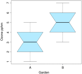
Because the notches of two plots do not overlap, we conclude that the medians are significantly different at the 5% level. Note that the variability is similar in both gardens (both in terms of the range – the length of the whiskers – and the interquartile range – the size of the boxes).
To carry out a t test long-hand, we begin by calculating the variances of the two samples, s2A and s2B:
s2A <- var(gardenA)s2B <- var(gardenB)
We need to check that the two variances are not significantly different:
s2A/s2B
[1] 1
They are identical, which is excellent. Constancy of variance is the most important assumption of the t test. In general, the value of the test statistic for Student's t is the difference divided by the standard error of the difference.
In our case, the numerator is the difference between the two means (3 − 5 = −2), and the denominator is the square root of the sum of the variances (1.333333) divided by their sample sizes (10):
(mean(gardenA)-mean(gardenB))/sqrt(s2A/10+s2B/10)
Note that in calculating the standard errors we divide by the sample size (10) not the degrees of freedom (9); degrees of freedom were used in calculating the variances (see p. 53).
This gives the value of Student's t as
[1] -3.872983
With t tests you can ignore the minus sign; it is only the absolute value of the difference between the two sample means that concerns us. So the calculated value of the test statistic is 3.87 and the critical value is 2.10 (qt(0.975,18), above). Since the test statistic is larger than the critical value, we reject the null hypothesis.
Notice that the wording of that previous sentence is exactly the same as it was for the F test (above). Indeed, the wording is always the same for all kinds of tests, and you should try to memorize it. The abbreviated form is easier to remember: larger reject, smaller accept. The null hypothesis was that the two means are not significantly different, so we reject this and accept the alternative hypothesis that the two means are significantly different. Again, rather than merely rejecting the null hypothesis, it is better to state the probability that a test statistic as extreme as this (or more extreme) would be observed if the null hypothesis was true (i.e. the mean values were not significantly different). For this we use pt rather than qt, and 2 × pt because we are doing a two-tailed test:
2*pt(-3.872983,18)
[1] 0.001114540
so p < 0.0015. You will not be surprised to learn that there is a built-in function to do all the work for us. It is called, helpfully, t.test and is used simply by providing the names of the two vectors containing the samples on which the test is to be carried out (gardenA and gardenB in our case).
t.test(gardenA,gardenB)
There is rather a lot of output. You often find this: the simpler the statistical test, the more voluminous the output.
Welch Two Sample t-test
data: gardenA and gardenB
t = -3.873, df = 18, p-value = 0.001115alternative hypothesis: true difference in means is not equal to 095 percent confidence interval:-3.0849115 -0.9150885sample estimates:mean of x mean of y3 5
The result is exactly the same as we obtained long-hand. The value of t is −3.873 and since the sign is irrelevant in a t test we reject the null hypothesis because the test statistic is larger than the critical value of 2.1. The mean ozone concentration is significantly higher in garden B than in garden A. The output also gives a p value and a confidence interval. Note that, because the means are significantly different, the confidence interval on the difference does not include zero (in fact, it goes from −3.085 up to −0.915). You might present the result like this:
Ozone concentration was significantly higher in garden B (mean = 5.0 pphm) than in garden A (mean = 3.0 pphm; t = 3.873, p = 0.0011 (two-tailed), d.f. = 18).
which gives the reader all of the information they need to come to a conclusion about the size of the effect and the unreliability of the estimate of the size of the effect.
Wilcoxon Rank-Sum Test
This is a non-parametric alternative to Student's t test, which we could use if the errors were non-normal. The Wilcoxon rank-sum test statistic, W, is calculated as follows. Both samples are put into a single array with their sample names clearly attached (A and B in this case, as explained below). Then the aggregate list is sorted, taking care to keep the sample labels with their respective values. A rank is then assigned to each value, with ties getting the appropriate average rank (two-way ties get (rank i + (rank i + 1))/2, three-way ties get (rank i + (rank i + 1) + (rank i + 3))/3, and so on). Finally, the ranks are added up for each of the two samples, and significance is assessed on size of the smaller sum of ranks.
First we make a combined vector of the samples:
ozone <- c(gardenA,gardenB)ozone
[1] 3 4 4 3 2 3 1 3 5 2 5 5 6 7 4 4 3 5 6 5
Then we make a list of the sample names, A and B:
label <- c(rep("A",10),rep("B",10))label
[1] "A" "A" "A" "A" "A" "A" "A" "A" "A" "A" "B" "B" "B" "B" "B" "B" "B" "B" "B" "B"
Now we use the built-in function rank to get a vector containing the ranks, smallest to largest, within the combined vector:
combined.ranks <- rank(ozone)combined.ranks
[1] 6.0 10.5 10.5 6.0 2.5 6.0 1.0 6.0 15.0 2.5 15.0 15.0 18.5 20.0 10.5[16] 10.5 6.0 15.0 18.5 15.0
Notice that the ties have been dealt with by averaging the appropriate ranks. Now all we need to do is calculate the sum of the ranks for each garden. We use tapply with sum as the required operation:
tapply(combined.ranks,label,sum)
A B66 144
Finally, we compare the smaller of the two values (66) with values in tables of Wilcoxon rank sums (e.g. Snedecor and Cochran, 1980, p. 555), and reject the null hypothesis if our value of 66 is smaller than the value in tables. For samples of size 10 and 10 like ours, the 5% value in tables is 78. Our value is smaller than this, so we reject the null hypothesis. The two sample means are significantly different (in agreement with our earlier t test on the same data).
We can carry out the whole procedure automatically, and avoid the need to use tables of critical values of Wilcoxon rank sums, by using the built-in function wilcox.test:
wilcox.test(gardenA,gardenB)
This produces the following output:
Wilcoxon rank sum test with continuity correction
data: gardenA and gardenBW = 11, p-value = 0.002988alternative hypothesis: true location shift is not equal to 0
Warning message:In wilcox.test.default(gardenA, gardenB) :cannot compute exact p-value with ties
The function uses a normal approximation algorithm to work out a z value, and from this a p value to assess the hypothesis that the two means are the same. This p value of 0.002988 is much less than 0.05, so we reject the null hypothesis, and conclude that the mean ozone concentrations in gardens A and B are significantly different. The warning message at the end draws attention to the fact that there are ties in the data (repeats of the same ozone measurement), and this means that the p value cannot be calculated exactly (this is seldom a real worry).
It is interesting to compare the p values of the t test and the Wilcoxon test with the same data: p = 0.001115 and 0.002988, respectively. The non-parametric test is much more appropriate than the t-test when the errors are not normal, and the non-parametric test is about 95% as powerful with normal errors, and can be more powerful than the t test if the distribution is strongly skewed by the presence of outliers. Typically, as here, the t test will give the lower p value, so the Wilcoxon test is said to be conservative: if a difference is significant under a Wilcoxon test it would be even more significant under a t test.
Tests on Paired Samples
Sometimes, two-sample data come from paired observations. In this case, we might expect a correlation between the two measurements, either because they were made on the same individual, or because they were taken from the same location. You might recall that earlier (Box 6.1) we found that the variance of a difference was the average of
which is the variance of sample A, plus the variance of sample B, minus 2 times the covariance of A and B. When the covariance of A and B is positive, this is a great help because it reduces the variance of the difference, which makes it easier to detect significant differences between the means. Pairing is not always effective, because the correlation between yA and yB may be weak.
The following data are a composite biodiversity score based on a kick sample of aquatic invertebrates from 16 rivers:
streams <- read.csv("c:\temp\streams.csv")attach(streams)names(streams)
[1] "down" "up"
The elements are paired because the two samples were taken on the same river, one upstream and one downstream from the same sewage outfall. If we ignore the fact that the samples are paired, it appears that the sewage outfall has no impact on biodiversity score (p = 0.6856):
t.test(down,up)
Welch Two Sample t-test
data: down and upt = -0.4088, df = 29.755, p-value = 0.6856alternative hypothesis: true difference in means is not equal to 095 percent confidence interval:-5.248256 3.498256sample estimates:mean of x mean of y12.500 13.375
However, if we allow that the samples are paired (simply by specifying the option paired=T), the picture is completely different:
t.test(down,up,paired=T)
Paired t-test
data: down and upt = -3.0502, df = 15, p-value = 0.0081alternative hypothesis: true difference in means is not equal to 095 percent confidence interval:-1.4864388 -0.2635612sample estimates:mean of the differences-0.875
Now the difference between the means is highly significant (p = 0.0081). The moral is clear. If you can do a paired t test, then you should always do the paired test. It can never do any harm, and sometimes (as here) it can do a huge amount of good. In general, if you have information on blocking or spatial correlation (in this case, the fact that the two samples came from the same river), then you should always use it in the analysis.
Here is the same paired test carried out as a one-sample t-test on the differences between the pairs:
d <- up-downt.test(d)
One Sample t-test
data: dt = 3.0502, df = 15, p-value = 0.0081alternative hypothesis: true mean is not equal to 095 percent confidence interval:0.2635612 1.4864388sample estimates:mean of x0.875
As you see, the result is identical to the two-sample t test with paired=T (p = 0.0081).
The upstream values of the biodiversity score were greater by 0.875 on average, and this difference is highly significant. Working with the differences has halved the number of degrees of freedom (from 30 to 15), but it has more than compensated for this by reducing the error variance, because there is such a strong positive correlation between yA and yB. The moral is simple: blocking always helps. The individual rivers are the blocks in this case.
The Binomial Test
This is one of the simplest of all statistical tests. Suppose that you cannot measure a difference, but you can see it (e.g. in judging a diving contest). For example, nine springboard divers were scored as better or worse, having trained under a new regime and under the conventional regime (the regimes were allocated in a randomized sequence to each athlete: new then conventional, or conventional then new). Divers were judged twice: one diver was worse on the new regime, and eight were better. What is the evidence that the new regime produces significantly better scores in competition? The answer comes from a two-tailed binomial test. How likely is a response of 1/9 (or 8/9 or more extreme than this, i.e. 0/9 or 9/9) if the populations are actually the same (i.e. there was no difference between the two training regimes)? We use binom.test for this, specifying the number of ‘failures’ (1) and the total sample size (9):
binom.test(1,9)
This produces the output:
Exact binomial test
data: 1 and 9number of successes = 1, number of trials = 9, p-value = 0.03906alternative hypothesis: true probability of success is not equal to 0.595 percent confidence interval:0.002809137 0.482496515sample estimates:probability of success0.1111111
From this we would conclude that the new training regime is significantly better than the traditional method, because p < 0.05. The p value of 0.03906 is the exact probability of obtaining the observed result (1 of 9) or a more extreme result (0 of 9) if the two training regimes were the same (so the probability of any one of the judging outcomes was 0.5). If the two regimes had identical effects on the judges, then a score of either ‘better’ or ‘worse’ has a probability of 0.5. So eight successes has a probability of 0.58 = 0.0039 and one failure has a probability of 0.5. The whole outcome has a probability of
Note, however, that there are 9 ways of getting this result, so the probability of 1 out of 9 is
This is not the answer we want, because there is a more extreme case when all 9 of the judges thought that the new regime produced improved scores. There is only one way of obtaining this outcome (9 successes and no failures) so it has a probability of 0.59 = 0.001953125. This means that the probability the observed result or a more extreme outcome is
Even this is not the answer we want, because the whole process might have worked in the opposite direction (the new regime might have produced worse scores (8 and 1 or 9 and 0) so what we need is a two-tailed test). The result we want is obtained simply by doubling the last result:
which is the figure produced by the built in function binom.test (above)
Binomial Tests to Compare Two Proportions
Suppose that in your institution only four females were promoted, compared with 196 men. Is this an example of blatant sexism, as it might appear at first glance? Before we can judge, of course, we need to know the number of male and female candidates. It turns out that 196 men were promoted out of 3270 candidates, compared with 4 promotions out of only 40 candidates for the women. Now, if anything, it looks like the females did better than males in the promotion round (10% success for women versus 6% success for men).
The question then arises as to whether the apparent positive discrimination in favour of women is statistically significant, or whether this sort of difference could arise through chance alone. This is easy in R using the built-in binomial proportions test prop.test in which we specify two vectors, the first containing the number of successes for females and males c(4,196) and second containing the total number of female and male candidates c(40,3270):
prop.test(c(4,196),c(40,3270))
2-sample test for equality of proportions with continuity correction
data: c(4, 196) out of c(40, 3270)X-squared = 0.5229, df = 1, p-value = 0.4696alternative hypothesis: two.sided95 percent confidence interval:-0.06591631 0.14603864sample estimates:prop 1 prop 20.10000000 0.05993884
Warning message:In prop.test(c(4, 196), c(40, 3270)) :Chi-squared approximation may be incorrect
There is no evidence in favour of positive discrimination (p = 0.4696). A result like this will occur more than 45% of the time by chance alone. Just think what would have happened if one of the successful female candidates had not applied. Then the same promotion system would have produced a female success rate of 3/39 instead of 4/40 (7.7% instead of 10%).
The moral is very important: in small samples, small changes have big effects.
Chi-Squared Contingency Tables
A great deal of statistical information comes in the form of counts (whole numbers or integers); the number of animals that died, the number of branches on a tree, the number of days of frost, the number of companies that failed, the number of patients that died. With count data, the number 0 is often the value of a response variable (consider, for example, what a 0 would mean in the context of the examples just listed).
The dictionary definition of contingency is ‘a thing dependent on an uncertain event’ (Oxford English Dictionary). In statistics, however, the contingencies are all the events that could possibly happen. A contingency table shows the counts of how many times each of the contingencies actually happened in a particular sample. Consider the following example that has to do with the relationship between hair colour and eye colour in white people. For simplicity, we just chose two contingencies for hair colour: ‘fair’ and ‘dark’. Likewise we just chose two contingencies for eye colour: ‘blue’ and ‘brown’. Each of these two categorical variables, eye colour and hair colour, has two levels (‘blue’ and ‘brown’ and ‘fair’ and ‘dark’, respectively). Between them, they define four possible outcomes (the contingencies): fair hair and blue eyes, fair hair and brown eyes, dark hair and blue eyes, and dark hair and brown eyes. We take a sample of people and count how many of them fall into each of these four categories. Then we fill in the 2 × 2 contingency table like this:
| Blue eyes | Brown eyes | |
| Fair hair | 38 | 11 |
| Dark hair | 14 | 51 |
These are our observed frequencies (or counts). The next step is very important. In order to make any progress in the analysis of these data we need a model which predicts the expected frequencies. What would be a sensible model in a case like this? There are all sorts of complicated models that you might select, but the simplest model (Occam's razor, or the principle of parsimony) is that hair colour and eye colour are independent. We may not believe that this is actually true, but the hypothesis has the great virtue of being falsifiable. It is also a very sensible model to choose because it makes it easy to predict the expected frequencies based on the assumption that the model is true. We need to do some simple probability work. What is the probability of getting a random individual from this sample whose hair was fair? A total of 49 people (38 + 11) had fair hair out of a total sample of 114 people. So the probability of fair hair is 49/114 and the probability of dark hair is 65/114. Notice that because we have only two levels of hair colour, these two probabilities add up to 1 ((49 + 65)/114). What about eye colour? What is the probability of selecting someone at random from this sample with blue eyes? A total of 52 people had blue eyes (38 + 14) out of the sample of 114, so the probability of blue eyes is 52/114 and the probability of brown eyes is 62/114. As before, these sum to 1 ((52 + 62)/114). It helps to append the subtotals to the margins of the contingency table like this:
| Blue eyes | Brown eyes | Row totals | |
| Fair hair | 38 | 11 | 49 |
| Dark hair | 14 | 51 | 65 |
| Column totals | 52 | 62 | 114 |
Now comes the important bit. We want to know the expected frequency of people with fair hair and blue eyes, to compare with our observed frequency of 38. Our model says that the two are independent. This is essential information, because it allows us to calculate the expected probability of fair hair and blue eyes. If, and only if, the two traits are independent, then the probability of having fair hair and blue eyes is the product of the two probabilities. So, following our earlier calculations, the probability of fair hair and blue eyes is 49/114 × 52/114. We can do exactly equivalent things for the other three cells of the contingency table:
| Blue eyes | Brown eyes | Row totals | |
| Fair hair | 49 | ||
| Dark hair | 65 | ||
| Column totals | 52 | 62 | 114 |
Now we need to know how to calculate the expected frequency. It could not be simpler. It is just the probability multiplied by the total sample (n = 114). So the expected frequency of blue eyes and fair hair is ![]() which is much less than our observed frequency of 38. It is beginning to look as if our hypothesis of independence of hair and eye colour is false.
which is much less than our observed frequency of 38. It is beginning to look as if our hypothesis of independence of hair and eye colour is false.
You might have noticed something useful in the last calculation: two of the sample sizes cancel out. Therefore, the expected frequency in each cell is just the row total (R) times the column total (C) divided by the grand total (G):
We can now work out the four expected frequencies.
| Blue eyes | Brown eyes | Row totals | |
| Fair hair | 22.35 | 26.65 | 49 |
| Dark hair | 29.65 | 35.35 | 65 |
| Column totals | 52 | 62 | 114 |
Notice that the row and column totals (the so-called ‘marginal totals’) are retained under the model. It is clear that the observed frequencies and the expected frequencies are different. But in sampling, everything always varies, so this is no surprise. The important question is whether the expected frequencies are significantly different from the observed frequencies.
We assess the significance of the differences between using a chi-squared test. We calculate a test statistic ![]() (Pearson's chi-squared) as follows:
(Pearson's chi-squared) as follows:
where O is the observed frequency and E is the expected frequency. Capital Greek sigma ![]() just means ‘add up all the values of’. It makes the calculations easier if we write the observed and expected frequencies in parallel columns, so that we can work out the corrected squared differences more easily.
just means ‘add up all the values of’. It makes the calculations easier if we write the observed and expected frequencies in parallel columns, so that we can work out the corrected squared differences more easily.
| O | E | (O − E)2 | ||
| Fair hair and blue eyes | 38 | 22.35 | 244.92 | 10.96 |
| Fair hair and brown eyes | 11 | 26.65 | 244.92 | 9.19 |
| Dark hair and blue eyes | 14 | 29.65 | 244.92 | 8.26 |
| Dark hair and brown eyes | 51 | 35.35 | 244.92 | 6.93 |
All we need to do now is to add up the four components of chi-squared to get the test statistic ![]() . The question now arises: is this a big value of chi-squared or not? This is important, because if it is a bigger value of chi-squared than we would expect by chance, then we should reject the null hypothesis. If, on the other hand, it is within the range of values that we would expect by chance alone, then we should accept the null hypothesis.
. The question now arises: is this a big value of chi-squared or not? This is important, because if it is a bigger value of chi-squared than we would expect by chance, then we should reject the null hypothesis. If, on the other hand, it is within the range of values that we would expect by chance alone, then we should accept the null hypothesis.
We always proceed in the same way at this stage. We have a calculated value of the test statistic: ![]() . We compare this value of the test statistic with the relevant critical value. To work out the critical value of chi-squared we need two things:
. We compare this value of the test statistic with the relevant critical value. To work out the critical value of chi-squared we need two things:
- the number of degrees of freedom
- the degree of certainty with which to work
In general, a contingency table has a number of rows (r) and a number of columns (c), and the degrees of freedom is given by
So we have (2 − 1) × (2 − 1) = 1 degree of freedom for a 2 × 2 contingency table. You can see why there is only one degree of freedom by working through our example. Take the ‘fair hair and brown eyes’ box (the top right in the table) and ask how many values this could possibly take. The first thing to note is that the count could not be more than 49, otherwise the row total would be wrong. But in principle, the number in this box is free to be any value between 0 and 49. We have one degree of freedom for this box. But when we have fixed this box to be 11, you will see that we have no freedom at all for any of the other three boxes.
| Blue eyes | Brown eyes | Row totals | |
| Fair hair | 11 | 49 | |
| Dark hair | 65 | ||
| Column totals | 52 | 62 | 114 |
The top left box has to be 49 − 11 = 38 because the row total is fixed at 49. Once the top left box is defined as 38 then the bottom left box has to be 52 − 38 = 14 because the column total is fixed (the total number of people with blue eyes was 52). This means that the bottom right box has to be 65 − 14 = 51. Thus, because the marginal totals are constrained, a 2 × 2 contingency table has just 1 degree of freedom.
The next thing we need to do is say how certain we want to be about the falseness of the null hypothesis. The more certain we want to be, the larger the value of chi-squared we would need to reject the null hypothesis. It is conventional to work at the 95% level. That is our certainty level, so our uncertainty level is 100 − 95 = 5%. Expressed as a fraction, this is called alpha (![]() ). Technically, alpha is the probability of rejecting the null hypothesis when it is true. This is called a Type I error. A Type II error is accepting the null hypothesis when it is false (see p. 4).
). Technically, alpha is the probability of rejecting the null hypothesis when it is true. This is called a Type I error. A Type II error is accepting the null hypothesis when it is false (see p. 4).
Critical values in R are obtained by use of quantiles (q) of the appropriate statistical distribution. For the chi-squared distribution, this function is called qchisq. The function has two arguments: the certainty level (1 − α = 0.95), and the degrees of freedom (d.f. = 1):
qchisq(0.95,1)
[1] 3.841459
The critical value of chi-squared is 3.841.The logic goes like this: since the calculated value of the test statistic is greater than the critical value, we reject the null hypothesis. You should memorize this sentence: put the emphasis on ‘greater’ and ‘reject’.
What have we learned so far? We have rejected the null hypothesis that eye colour and hair colour are independent. But that is not the end of the story, because we have not established the way in which they are related (e.g. is the correlation between them positive or negative?). To do this we need to look carefully at the data, and compare the observed and expected frequencies. If fair hair and blue eyes were positively correlated, would the observed frequency of getting this combination be greater or less than the expected frequency? A moment's thought should convince you that the observed frequency will be greater than the expected frequency when the traits are positively correlated (and less when they are negatively correlated). In our case we expected only 22.35 but we observed 38 people (nearly twice as many) to have both fair hair and blue eyes. So it is clear that fair hair and blue eyes are positively associated.
In R the procedure is very straightforward. We start by defining the counts as a 2 × 2 matrix like this:
count <- matrix(c(38,14,11,51),nrow=2)count
[,1] [,2][1,] 38 11[2,] 14 51
Notice that you enter the data column-wise (not row-wise) into the matrix. Then the test uses the chisq.test function, with the matrix of counts as its only argument:
chisq.test(count)
Pearson's Chi-squared test with Yates' continuity correction
data: countX-squared = 33.112, df = 1, p-value = 8.7e-09
The calculated value of chi-squared is slightly different from ours, because Yates's correction has been applied as the default (see ?chisq.test). If you switch the correction off (correct=F), you get the exact value we calculated by hand:
chisq.test(count,correct=F)
Pearson's Chi-squared test
data: countX-squared = 35.3338, df = 1, p-value = 2.778e-09
It makes no difference at all to the interpretation: there is a highly significant positive association between fair hair and blue eyes for this group of people.
Fisher's Exact Test
This test is used for the analysis of contingency tables based on small samples in which one or more of the expected frequencies are less than 5. The individual counts are a, b, c and d like this:
| 2 × 2 table | Column 1 | Column 2 | Row totals |
| Row 1 | a | b | a + b |
| Row 2 | c | d | c + d |
| Column totals | a + c | b + d | n |
The probability of any one particular outcome is given by
where n is the grand total, and ! means ‘factorial’ (the product of all the numbers from n down to 1; 0! is defined as being 1).
Our data concern the distribution of 8 ants nests over 10 trees of each of two species (A and B). There are two categorical explanatory variables (ants and trees), and four contingencies, ants (present or absent) and trees (A or B). The response variable is the vector of four counts c(6,4,2,8).
| Tree A | Tree B | Row totals | |
| With ants | 6 | 2 | 8 |
| Without ants | 4 | 8 | 12 |
| Column totals | 10 | 10 | 20 |
Now we can calculate the probability for this particular outcome:
factorial(8)*factorial(12)*factorial(10)*factorial(10)/(factorial(6)*factorial(2)*factorial(4)*factorial(8)*factorial(20))
[1] 0.07501786
But this is only part of the story. We need to compute the probability of outcomes that are more extreme than this. There are two of them. Suppose only one ant colony was found on tree B. Then the table values would be 7, 1, 3, 9 but the row and column totals would be exactly the same (the marginal totals are constrained). The numerator always stays the same, so this case has probability
factorial(8)*factorial(12)*factorial(10)*factorial(10)/(factorial(7)*factorial(3)*factorial(1)*factorial(9)*factorial(20))
[1] 0.009526078
There is an even more extreme case if no ant colonies at all were found on tree B. Now the table elements become 8, 0, 2, 10 with probability
factorial(8)*factorial(12)*factorial(10)*factorial(10)/(factorial(8)*factorial(2)*factorial(0)*factorial(10)*factorial(20))
[1] 0.0003572279
We need to add these three probabilities together:
0.07501786 + 0.009526078 + 0.000352279
[1] 0.08489622
But there was no a priori reason for expecting the result to be in this direction. It might have been tree A that had relatively few ant colonies. We need to allow for extreme counts in the opposite direction by doubling this probability (all Fisher's exact tests are two-tailed):
2*(0.07501786+0.009526078+0.000352279)
[1] 0.1697924
This shows that there is no strong evidence of a correlation between tree and ant colonies. The observed pattern, or a more extreme one, could have arisen by chance alone with probability p = 0.17.
There is a built in function called fisher.test, which saves us all this tedious computation. It takes as its argument a 2 × 2 matrix containing the counts of the four contingencies. We make the matrix like this (compare with the alternative method of making a matrix, above):
x <- as.matrix(c(6,4,2,8))dim(x) <- c(2,2)x
[,1] [,2][1,] 6 2[2,] 4 8
Then we run the test like this:
fisher.test(x)
Fisher's Exact Test for Count Data
data: xp-value = 0.1698alternative hypothesis: true odds ratio is not equal to 195 percent confidence interval:0.6026805 79.8309210sample estimates:odds ratio5.430473
The fisher.test can be used with matrices much bigger than 2 × 2. Alternatively, the function may be provided with two vectors containing factor levels, instead of a matrix of counts, as here; this saves you the trouble of counting up how many combinations of each factor level there are:
table <- read.csv("c:\temp\fisher.csv")attach(table)head(table)
tree nests1 A ants2 B ants3 A none4 A ants5 B none6 A none
The function is invoked by providing the two vector names as arguments:
fisher.test(tree,nests)
Correlation and Covariance
With two continuous variables, x and y, the question naturally arises as to whether their values are correlated with each other (remembering, of course, that correlation does not imply causation). Correlation is defined in terms of the variance of x, the variance of y, and the covariance of x and y (the way the two vary together; the way they co-vary) on the assumption that both variables are normally distributed. We have symbols already for the two variances, ![]() and
and ![]() . We denote the covariance of x and y by cov(x, y), after which the correlation coefficient r is defined as
. We denote the covariance of x and y by cov(x, y), after which the correlation coefficient r is defined as

We know how to calculate variances (p. 53), so it remains only to work out the value of the covariance of x and y. Covariance is defined as the expectation of the vector product x × y, which sounds difficult, but is not (Box 6.2). The covariance of x and y is the expectation of the product minus the product of the two expectations.
Let us work through a numerical example:
data <- read.csv("c:\temp\twosample.csv")attach(data)plot(x,y,pch=21,col="blue",bg="orange")
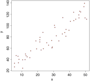
First we need the variance of x and the variance of y:
var(x)
[1] 199.9837
var(y)
[1] 977.0153
The covariance of x and y, cov(x,y), is given by the var function when we supply it with two vectors like this:
var(x,y)
[1] 414.9603
Thus, the correlation coefficient should be ![]() :
:
var(x,y)/sqrt(var(x)*var(y))
[1] 0.9387684
Let us see if this checks out:
cor(x,y)
[1] 0.9387684
Great relief! So now you know the definition of the correlation coefficient: it is the covariance divided by the geometric mean of the two variances.
Correlation and the Variance of Differences between Variables
Samples often exhibit positive correlations that result from the pairing, as in the upstream and downstream invertebrate biodiversity data that we investigated earlier (p. 97). There is an important general question about the effect of correlation on the variance of differences between variables. In the extreme, when two variables are so perfectly correlated that they are identical, the difference between one variable and the other is zero. So it is clear that the variance of a difference will decline as the strength of positive correlation increases.
These data show the depth of the water table (m below the surface) in winter and summer at nine locations:
paired <- read.csv("c:\temp\water.table.csv ")attach(paired)names(paired)
[1] "Location" "Summer" "Winter"
We begin by asking whether there is a correlation between summer and winter water table depths across locations:
cor(Summer, Winter)
[1] 0.8820102
There is a strong positive correlation. Not surprisingly, places where the water table is high in summer tend to have a high water table in winter as well. If you want to determine the significance of a correlation (i.e. the p value associated with the calculated value of r) then use cor.test rather than cor. This test has non-parametric options for Kendall's tau or Spearman's rank depending on the method you specify (method="k" or method="s"), but the default method is Pearson's product-moment correlation (method="p"):
cor.test(Summer, Winter)
Pearson's product-moment correlation
data: Summer and Wintert = 4.9521, df = 7, p-value = 0.001652alternative hypothesis: true correlation is not equal to 095 percent confidence interval:0.5259984 0.9750087sample estimates:cor0.8820102
The correlation is highly significant (p = 0.00165). Now, let us investigate the relationship between the correlation coefficient and the three variances: the summer variance, the winter variance, and the variance of the differences (summer–winter):
varS <- var(Summer)varW <- var(Winter)varD <- var(Summer-Winter)
The correlation coefficient ![]() is related to these three variances by:
is related to these three variances by:
So, using the values we have just calculated, we get a correlation coefficient of
(varS+varW-varD)/(2*sqrt(varS)*sqrt(varW))
[1] 0.8820102
which checks out. We can also see whether the variance of the difference is equal to the sum of the component variances (as we saw for independent variables on p. 97):
varD
[1] 0.01015
varS + varW
[1] 0.07821389
No, it is not. They would be equal only if the two samples were independent. In fact, we know that the two variables are positively correlated, so the variance of the difference should be less than the sum of the variances by an amount equal to ![]() :
:
varS + varW - 2 * 0.8820102 * sqrt(varS) * sqrt(varW)
[1] 0.01015
That's more like it.
Scale-Dependent Correlations
Another major difficulty with correlations is that scatterplots can give a highly misleading impression of what is going on. The moral of this exercise is very important: things are not always as they seem. The following data show the number of species of mammals in forests of differing productivity:
data <- read.csv("c:\temp\productivity.csv")attach(data)names(data)
[1] "productivity" "mammals" "region"
plot(productivity,mammals,pch=16,col="blue")
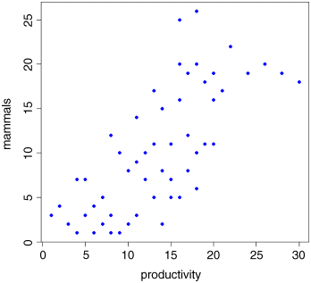
There is a very clear positive correlation: increasing productivity is associated with increasing species richness. The correlation is highly significant:
cor.test(productivity,mammals,method="spearman")
Spearman's rank correlation rho
data: productivity and mammalsS = 6515.754, p-value = 5.775e-11alternative hypothesis: true rho is not equal to 0sample estimates:rho0.7516389
Warning message:In cor.test.default(productivity, mammals, method = "spearman") :Cannot compute exact p-value with ties
But what if we look at the relationship for each region separately, using a different colour for each region?
plot(productivity,mammals,pch=16,col=as.numeric(region))
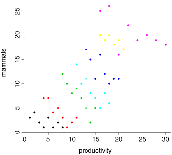
The pattern is obvious. In every single case, increasing productivity is associated with reduced mammal species richness within each region. The lesson is clear: you need to be extremely careful when looking at correlations across different scales. Things that are positively correlated over short time scales may turn out to be negatively correlated in the long term. Things that appear to be positively correlated at large spatial scales may turn out (as in this example) to be negatively correlated at small scales.
Reference
- Snedecor, G.W. and Cochran, W.G. (1980) Statistical Methods, Iowa State University Press, Ames.
Further Reading
- Dalgaard, P. (2002) Introductory Statistics with R, Springer-Verlag, New York.