CHAPTER 10
The Yield Curve
You get recessions, you have stock market declines. If you don't understand that's going to happen, then you're not ready, you won't do well in the markets.
—Peter Lynch
The fixed income market has been on fire for a number of years. I leave it open for interpretation if you as an investor view that as a positive or a negative. In truth, it would depend on the time frame. It is easy to single out a particular year or set of years in which the market has rallied. On the other hand, there are multiple snapshots in time when, if you had entered into a long position and not held the position to maturity, the trade would have been a losing endeavor. Realizing that there is daily, monthly, and even yearly volatility, take a step back and look at the big picture over a longer time frame. The Treasury market specifically has shown a great run over the past few decades.
There's no denying that the Treasury sector is the recipient of the flight-to-quality trade, regardless of the driving force. Over the years, there has been chatter about other government debt markets potentially taking the safe haven role, replacing the U.S. Treasury market. To date, and looking into the foreseeable future, this doesn't seem to be in the cards. It can't go without notice that over time there are moves higher and lower in price reacting to the current headlines, which at that point in time, are the be-all and end-all. However the market is sliced and diced, over the long term, we have seen a strong bull market since the early 1980s. In late September 1981, the 10-year Treasury was yielding approximately 15.84 percent. From there, it was all downhill, finishing—or possibly, just pausing—at 1.87 percent on December 30, 2011. Figure 10.1 shows the massive rally witnessed over the decades; only time will tell if the run is over or not.

FIGURE 10.1 10-year Quarterly yields
Source: Bloomberg data.
With such a strong move pushing yields to these historic low levels, it is inevitable that there will be a reversal of fortune. Eventually, the tides will turn. Interest rates represented by the Treasury sector will move higher, pushing prices lower. It is not a question of if it is going to happen, but when it will happen. There were multiple factors that drove prices up and pushed yields to these absolute levels. Whether fundamentals are depressing interest rates or they are artificially held low by central bank activity, in the end, it really doesn't matter. The plain fact is that the move occurred. What does it mean, and how does it affect the Treasury yield curve?
As with any market or sector, there are unique characteristics that impact fixed income portfolios. Most of these characteristics are distinctive and may have little direct bearing on other fixed income asset classes. The unique characteristics are not represented by just one type of strategy or security type. They are also not driven by the style of the manager or the strategy he or she implements—passive or active, long or short, the impact from the yield curve is very similar. What differs is how it impacts the strategy. First let's take a look at three risks that are inherent to almost all bond portfolios and their relationship to the yield curve.
- Interest rate risk
- Default risk
- Reinvestment risk
These risks are found in almost every type of fixed income portfolio. The same risks are found within a Treasury-only or government portfolio, though in a slightly different order.
- Interest rate risk
- Reinvestment risk
- Default risk
Why a different order? Default risk should be minimal unless you have a bleak outlook on the state of the U.S. government. Don't laugh—or maybe we should pause and take a moment to laugh. The unthinkable act of a U.S. government default carriess a low probability, but it has recently started to increase. History has shown multiple occurrences when the U.S. government has in one fashion or another defaulted or come very close. The most recent event took place back in August 2011, when there was a showdown around raising the debt ceiling. This created the fear that a default or missed coupon payment, ultimately leading to a downgrade of the United States' coveted triple-A rating by a top rating agency.
Before we move on, let's define these three risks.
- Interest rate risk—How the portfolio is affected by the movement of interest rates.
- Reinvestment risk—The risk that a bond with a specific coupon is able to be reinvested at a similar rate to that at which it was purchased within the current interest rate environment. There is greater risk of not capturing, or finding it hard to replicate, similar bond characteristics when interest rates are falling or rallying. This is due to the inverse relationship between prices and yields.
- Default risk—The most straight forward of the three. It is the risk that your coupon payments or principal will not be repaid to you on the expected dates or at maturity.
Let's start with the good news—and there is always a way to put a positive spin on the situation. The good news is that as an investor, you have the ability to mitigate these risks. One way to attempt this is to understand how the yield curve affects your portfolio and what its movements or shape are telling you.
The yield curve is a snapshot in time of specific bond yields shown spanning across different maturities. Different investors may define the yield curve differently as they refer to various segments or points represented by a set of bond maturities. For example, a money market yield curve is represented by securities from overnight to those with a final maturity of 13 months. This curve has its own metrics and nuances, which are fundamentally and technically different. It exists unilaterally, or in combination with agency discount notes, U.S. T-bills, commercial paper, or even lending metrics such as LIBOR. When a yield curve is discussed, investors are usually referring to the Treasury curve. The yield curve terminology is not analogous to just the Treasury sector. When trading corporate securities, the credit curve is utilized. Credit spreads, which make up the curve or spread curve, are the difference between the yield of a corporate security and the Treasury yield. This spread is plotted in a similar manner, painting a story for investors about the credit market. The terminology of the two is slightly different. but the information gleaned is similar, and a is necessity when it comes to investing. When you hear or read about the credit curve, this is what is being discussed.
Source: Bloomberg data.
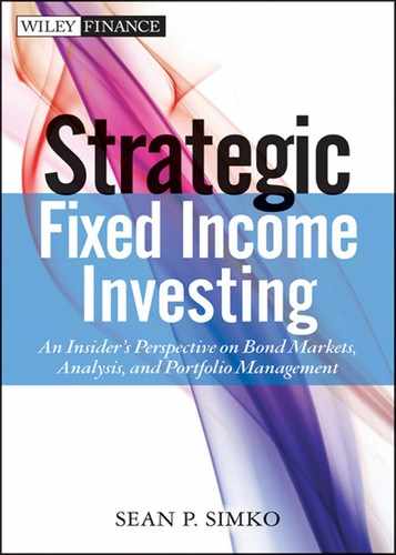
The most talked-about curve is the U.S. Treasury curve, which usually refers to the three-month bill through the 30-year bond, with varying points in between. Figure 10.2 represents the most widely looked-at points along the curve when assessing the broad interest rates market.
It is common to find bonds with longer maturities having a higher yield, unless there is some type of optionality structured into the bond. Optionality is usually not infused into the Treasury market. One caveat on the horizon: the U.S. government is discussing the possibility of issuing a floating rate note Treasury security. Details are not finalized about this security, but if issuance of a floating rate note Treasury becomes reality, it will be a unique offering within the sector. Optionality is found more frequently within the government agency sector through the issuance of callable securities, mortgages, and securities where there are floating rate coupons.
The larger coupon for longer-dated maturities is straightforward. Ask yourself the question, don't I deserve to earn more interest when I lend my money to the issuer—the government, for instance—for a longer time? Hopefully, your answer is also yes. I would expect to receive a higher return if I lend the government money for 30 years versus for two years. Due to those common sense parameters, longer-dated bonds should always have a greater yield than those with shorter maturities. That doesn't mean they always do.
THE SPREAD
A common way to analyze the yield curve is to calculate the spread. The spread is quoted by taking the difference, or spread, between two points. This calculation can be made at any segment of the curve. The most common example that is quoted is the relationship between the 2-year yield and the 10-year yield. Although the spread between the 2-year yield and 10-year yield is the most commonly quoted, the spread or relationship between two securities can be studied on any securities. This analysis helps uncover the dislocations that in the end present opportunities.
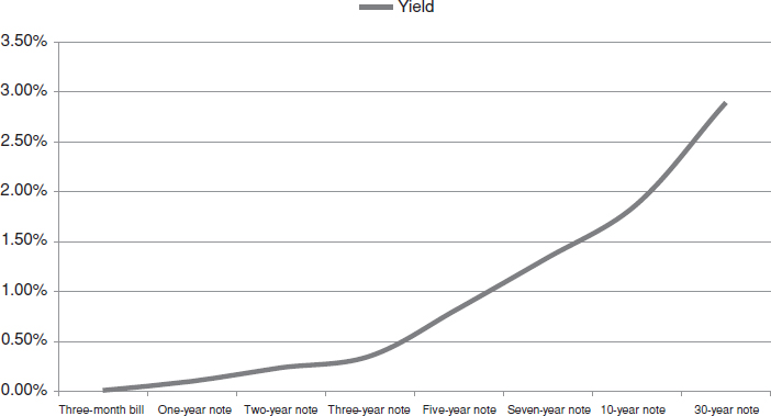
Figure 10.3 reflects the movement of the 2-year, 10-year spread over 2011. Over the course of the year, the spread steadily declined, moving lower—narrowing—by 106 basis points (bps) from the end of 2010 to the end of 2011. On December 31, 2010, the spread held at 269 bps. Remember, this is the difference in yield between the 2-year and 10-year Treasury notes. This spread is what investors required at the time to add duration and invest further out the yield curve. One year later, on December 30, 2011, investors demanded less yield pickup to extend eight years out the curve. At this point, the spread was reduced to 163 bps. The change in heart was driven by multiple factors. The uncertainties within the global economy and European default concerns were unending. In addition, the Federal Open Market Committee (FOMC) was in the midst of rebalancing its current balance sheet holdings and laying the groundwork for interest rates to remain low for an extended period of time. If we break down the spread a little further for the year, it is clearly visible in Figure 10.4 that the 10-year yield fell further and at a more rapid pace than the 2-year note. This flattening bias was expected, taking shape in a bull flattener fashion; that is, the longer maturity outperforms the shorter maturity. The aforementioned events and the low yields artificially created by the Fed pushed investors out the yield curve, amplifying this move.

FIGURE 10.3 Two-year, 10-year spread
Source: Bloomberg data.
THE MONEY MARKET ARENA
Let's revisit the money market sector. Money market portfolio managers investing in the money market arena are not too concerned with the 2-year, 10-year spread, because it does not directly impact or drive their investing decisions. Successful investing within the money market sector is driven by daily decisions made about where to place money along the money market curve. A standard representation of the money market curve is those securities with maturities between overnight and 13 months. The pickup in yield is usually much smaller across the curve within the world of money market investing. There are anomalies similar to other sectors. Unfortunately, the anomalies that create dislocations within the front end are usually not found very attractive to the front-end investor. Increased yield is usually a trade-off for increased risk. A money market fund or strategy designed with the preservation of capital in mind isn't comfortable with taking on additional risk.
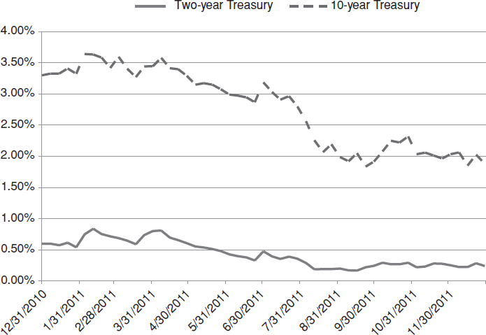
FIGURE 10.4 Two- year and 10-year
Source: Bloomberg data.
Short-term investors are able to benefit by investing out the curve. Picking and choosing your spots will help drive performance. Excluding security selection, the yield curve is a primary driver for returns. Every day, a similar food fight takes place in the search for an extra basis point. The statement “the early bird catches the worm” truly comes into play. Individuals who arrive first in the office have the greatest selection and investing options. This is one reason why money market managers are usually fixated on the computer screens at their desk no later than 7:00 A.M., ready to start trading for the day. Adding to the pressure is the low interest rate environment and the ongoing theme of at times, unlimited risk. This is why every basis point counts. The difference between an overnight security yielding 10 bps and 12 bps doesn't seem like a huge deal, but the 2 bps may help set you apart. On the other hand, when they do the math, the outright yield level can be disheartening to an outside observer, and the additional pickup is negligible. For instance, if you are investing $50 million overnight at 10 bps, you would earn roughly $139. The additional pickup of two bps adds $27 to the overnight return. Not too exciting, but still $27 more than you had the prior day. Unfortunately, that is the environment the front-end investor must navigate, day in and day out.
THE DIRECTION OF RATES
A normal yield curve is represented by longer-dated bonds carrying a higher yield. Although classified as normal, this relationship is not always present. There are different times and environments when the yield on the long bond—that is, a bond with 30 years before it matures—has a similar or lower yield than that of a two-year. As discussed earlier, the shape of the yield curve will help you dictate the direction not only of interest rates, but the economy too. How can this be? Why are interest rates so important? What is the first question you ask your mortgage broker when you are looking to buy a house or your sales agent when looking to finance a car? “What is the interest rate?” That is pretty straightforward. With high probability, the lower the rate is, the more likely it is that you move forward with the purchase. When in discussions with their mortgage brokers and close to locking in your mortgage rate, most individuals will try to asses the economy or at least themselves whether they think rates will move higher or lower from here. How do you know with certainty that you are at the bottom of an interest rate or economic cycle? You don't. It is important to try to assess the situation. Similar activity should take place in your fixed income portfolio. The question is, where do you start in this assessment? One option you have is to start with the yield curve. The yield curve is utilized by economists and asset managers every day to assess the direction of the economy. The shape of the curve helps predict future economic activity. In order to assess the economy from the shape of the yield curve, we need to take a look at the different shapes and what they mean.
There are four common shapes the yield curve could form. They are
- Normal
- Steep
- Flat
- Inverted
The normal yield curve is an upward sloping curve, as was discussed previously. As you work your way out the curve, longer-dated bonds carry a reasonably higher yield than the previous point on the curve. Figure 10.5 shows the Treasury yield curve on December 30, 2011. You can see that the shape of the curve is gradually moving higher. The 2-year, 10-year spread is 164 bps.

FIGURE 10.5 Positive yield curve
Source: Bloomberg data.
A STEEP YIELD CURVE
A steep yield curve is represented when the difference or spread between two points on the curve is abnormally wide. For example, as shown in Figure 10.6, the 2 -year, 10-year spread at the end of 2011 was 164 bps. Rewind to the end of 2009 and the two-year, 10-year spread was 270 bps. Obviously, the 270 basis points is a greater number, therefore a steeper curve. You can see this in Figure 10.6, which overlays the 2-year, 10-year spread on December 31, 2009, and the yield curve in 2011. You can see that the top line is increasing at a steeper angle between the 2- and 10-year points than the dashed line.
One way the yield curve steepens is by the 10-year selling off at a faster pace than the 2-year. This action will create a wider spread or gap between the two points on the curve.
The spread that used to be 270 bps in 2009 finished 2011 at 164 bps. In this example, the 2-year, 10-year curve was steeper by 106 bps in 2009. Usually, a steeper yield curve is tied to an economy with a loose or easy monetary policy. Throughout 2009, the economy was on shaky ground and the Federal Reserve was pumping cash into the system in efforts to generate economic growth. Remember back to the section that addressed the FOMC. A loose monetary policy is initiated in an attempt to spur growth within the economy. The typical bond market reaction would be for the longer end of the yield curve—represented by the 10- through 30-year—to underperform the rest of the yield curve. This underperformance may be attributable to the threat of future inflationary pressures. Another way to phrase this is that the yield of the 10-year note will rise faster than the rest of the curve. Remember, when yields rise, prices fall. If the yield is rising at a faster pace than the other points on the curve, prices are falling at a more rapid pace.
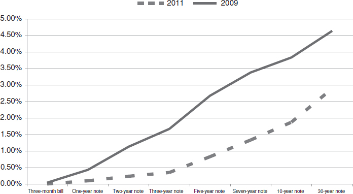
FIGURE 10.6 Steep yield curves
Source: Bloomberg data.
A FLAT YIELD CURVE
As we just covered, a steep yield curve is represented when the spread between two points on the curve is wide and likely to widen further. When discussing the yield curve with a flatter bias or shape, similarities with a steep curve are present. The main difference, which you can glean from the name, is the actual shape that the yields represent when plotted. Figure 10.7 shows that the line representing the curve is becoming more flat or a straight line when plotted.
The curve receives its shape—and its name—from the yields from either the long end or the front end converging on each other. The flattening shape could start with the long end rallying more than the front end of the curve, which is known as a bull flattener. A bear flattener is when the front end of the curve starts selling off quicker than the long end. The front end may sell off as investors start pricing in upcoming Fed activity. For example, one scenario when the curve could take this shape is when the economy is overheating and the Federal Reserve is trying to put the brakes on growth. When the long end rallies, the view might be that inflation is expected to recede, or at the very least, hold constant, and the market will price this in pushing the long end lower. The most common and notable impetus for the curve to flatten is the flight-to-quality bid. When there is uncertainty in the markets or world economy, investors flock to the Treasury market, pushing prices higher. This move could be witnessed in parallel fashion—that is, the entire curve receives the bid, and therefore, the entire line shifts lower—but that would not represent a flattening yield curve. Real money buyers, hedge funds, corporate pensions, and insurance companies flock to the 10-year point on the curve as a normal trade that occurs in a flight-to-quality move.

Source: Bloomberg data.
AN INVERTED YIELD CURVE
Last in the lineup of yield curve shapes is the sometimes-feared inverted yield curve. An inverted curve is when the long end of the yield curve carries a yield that is lower than the two-year or front end of the curve. The long end is usually represented by the 10-year or 30-year points on the curve. Figure 10.8 clearly shows the negative spread between the front end of the yield curve and the longer end. The spread at the turn of the year between the 3-month Treasury bill and the 10-year Treasury note is negative 35 bps. That is the difference between the 10-year that was yielding 4.68 percent, and 5.036 percent on the three-month Treasury bill.
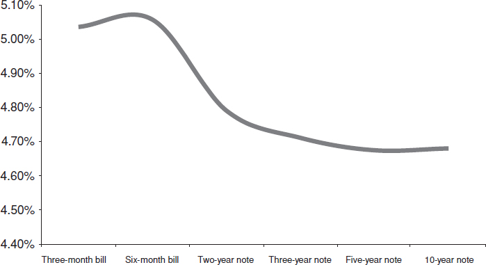
FIGURE 10.8 Inverted yield curve
Source: Bloomberg data.
So what does this really mean? This shape of the curve is heavily debated. The question that frequently arises, particularly in a shift of the curve, is whether an inverted yield curve signals troubled times ahead for the economy. Some investors would answer without hesitating with a definitive yes. Others might not, citing different factors that may influence the market, creating the inversion. Of course, these differences in opinion are what make a market. If history holds any merit and weight, the answer is yes. Although not always, an inverted yield curve typically precedes an environment of slowing economic growth.
Figure 10.8 is telegraphing the economic environment back at the start of 2007. Think back to the mid- to late 2006 time frame, and how the economic environment was on the cusp of transforming, shifting gears. The FOMC completed its current tightening campaign, pausing and holding the fed funds rate at 5.25 percent after the June 29 meeting. This pause occurred approximately three months after Ben Bernanke took the position of chairman. The current policy concern was the risk of inflation. The housing market was starting to show signs of slowing after a historic run. This housing slowdown will ultimately reduce the amount of borrowing and cash that is in circulation. It is common for a slowdown in housing to weigh heavily on economic growth. The Fed was pausing from removing accommodation, which this time, coincided as a signal of slowing growth. The word “recession” did not yet formally make its way into the daily vocabulary, though. It did, however, from time to time arise when discussions were had about the yield curve and future action from the Fed, investors, and the economy. Many investors and economists who challenged or were against the talk of recession signaled that rates were low and the curve inverted for various reasons. One reason was the increased demand. Where does the type of demand come from to artificially lower the long end of the yield curve enough to invert the curve? At the time, China was a strong buyer of U.S. debt. Adding fuel to the fire was the elevated price in oil. Profits generated from oil-producing countries had to be placed somewhere; why not the U.S. Treasury market? In 2011 and 2012, large buyers of Treasury securities are the central banks from around the world. The FOMC specifically influenced the buying patterns.
You can see how there were outside influences—such as central bank activity—that inevitably and realistically can drive yields lower. The Fed was on the sidelines and holding firm with its current policy. As we turned the corner into the new year, the economic landscape was solid, excluding the housing market. Looking back, it was obviously a large exclusion, and if it had been handled properly, a significant amount of pain would have been avoided. The long end of the yield curve was influenced by heavy buying. If only investors had subscribed to—and maybe you did—and followed along with the notion that an inverted yield curve signals a future slowdown, they would have had the right trade in play. The activity from the FOMC signaled to the market that inflation was not, or should not, be a terrible concern. As time rolled on, events such as the housing bubble popping played out. Ultimately, this played a role in the collapse of the financial system and confirmed the view that inflation was not likely to come into play.
LISTEN TO THE CURVE
In the end, you need to respect the yield curve. At times, it may be difficult to peel back the onion or block out all—or at least some—of the outside occurrences and see the light. When you are able to achieve this, you will see that the yield curve is a tool that will provide insight to help gauge economic growth and the future direction of interest rates. There are so many different pieces or silos of information that can, and will, influence the shape of the yield curve. It is understandable that it can be daunting. All of the aforementioned categories and examples paint a picture of four different and unique scenarios that impact and influence investment strategy and economic conditions. These are clear examples of how interest rates and the economy are very much linked to one another.