
Chapter 6. Layouts
We’ve used layouts throughout the course of this book. Now that you have a firm grasp of widgets and controls, we’ll delve into the complexities of how to use layouts to arrange widgets into a pleasant interface.
Layouts are associated with a composite and help organize the controls within it. One way to think about the process is to imagine each widget as a book and the layout as shelving. You can stack books up on the shelf or lay them side by side in a horizontal row. Layouts can consist of partitions to separate the books or new layers to hold them more efficiently. Unlike real-world shelving, SWT layouts are dynamic: the container and its contents can be resized, reflowed, and laid out according to rules you specify. These rules are known as constraints in SWT.
Building a wooden bookshelf can be a lot of work, taking days or weeks. Although creating a UI can also be time consuming, the many options available in SWT’s layouts can make the job much easier. You may not ever make a nice oak bookshelf, but this chapter will show you how to exercise your imagination in creating virtual cabinets.
Note
Before we get into the details, it’s worth taking a moment to compare SWT’s approach with Swing’s design. Swing also has layouts, such as the ubiquitous BorderLayout. Unfortunately, SWT’s layouts typically differ from the Swing layouts, and knowledge of Swing doesn’t ease the learning curve much. The layout algorithms have a tangibly different feel. SWT’s approach minimizes layouts, using attributes and modifiers on widgets to control their position. By contrast, Swing uses a recursive approach that nests layouts. The drawback is that the nesting can quickly become deep, leading to inefficiency and high resource costs. Compared to Swing, SWT layouts require you to do more advance planning and map where the Controls will go, often breaking out paper and pencil to sketch your ideas in advance. With Swing, it’s possible to use a divide-and-conquer approach, laying out small sections at a time and then nesting them to form the overall GUI. Ultimately, the two toolkits chose to emphasis different strengths: design-time simplicity versus runtime simplicity. Neither holds a marked advantage, but this difference shapes our approach as GUI designers.
6.1. The fill layout
Our desks are often littered with books stacked in gigantic piles; this system is simple, easy, and useful in many cases. The fill layout is the layout equivalent of a stack of books. It’s a simple layout that takes the child controls and lays them out at equal intervals to fill the space in a composite. By default, the controls are stacked side by side, from left to right. Each control is given the space it needs, and any leftover space in the composite is divided among the child controls.
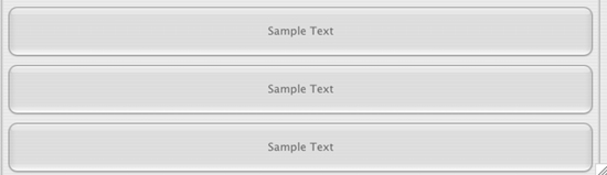
Figure 6.1 shows buttons in a FillLayout; the code in listing 6.1 demonstrates how to create this layout. You add a series of buttons to a composite, and the layout resizes them to take up all the available space.
Figure 6.1. Buttons in a FillLayout, before resizing
Listing 6.1. Ch6FillLayoutComposite.java
package com.swtjface.Ch6;

import org.eclipse.swt.*;
import org.eclipse.swt.widgets.*;
import org.eclipse.swt.layout.*;

public class Ch6FillLayoutComposite extends Composite {

    public Ch6FillLayoutComposite(Composite parent) {
        super(parent, SWT.NONE);

        FillLayout layout = new FillLayout( SWT.VERTICAL);
        setLayout(layout);
        for (int i = 0; i < 8; ++i) {
            Button button = new Button(this, SWT.NONE);
            button.setText("Sample Text");
        }
    }
}
Notice the setLayout() method call. This method in Composite is used to associate a layout with the composite that will be used to arrange all the child controls. Without this call, SWT won’t know how to size or position any of the child controls, so nothing will be displayed. (If you’re having trouble getting your widgets to appear, forgetting to set a layout is a common cause.)
Resizing the window changes the buttons to look like figure 6.2. There is little visible difference between the two images, because the FillLayout always expands the buttons to fill all available space.
Figure 6.2. The same buttons, after resizing

You can call the FillLayout constructor with no parameters or with a single style parameter. The default constructor uses the SWT.HORIZONTAL style, in which case the layout arranges child controls from left to right. Using SWT.VERTICAL causes the controls to be arranged from top to bottom.
Add the following code to WidgetWindow to see how the FillLayout works:
TabItem fillLayoutItem = new TabItem(tf, SWT.NONE);
fillLayoutItem.setText("Chapter 6 FillLayout");
fillLayoutItem.setControl(new Ch6FillLayoutComposite(tf));
Like a stack of books, the fill layout is good only for simple situations. As you gather more books—or controls, in the case of JFace/SWT—the stack becomes unmanageable. Books get lost in the clutter, and your eyes become distracted. To organize more effectively, you need the GUI equivalent of a bookcase.
6.2. The row layout
If the fill layout is like a stack of books, then the row layout is a basic bookcase. Instead of being limited to one pile, you can organize controls into a number of rows, much like shelves. Since the row layout arranges child controls into single row by default, you need to pass in SWT.WRAP to get the functionality of additional rows. The row layout provides additional customization options by giving you access to margin and spacing options. (Note that the name row layout is a bit of a misnomer, because you can choose to use either a horizontal row or a vertical row. The vertical row layout is therefore really a column layout.)
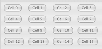
Let’s see how having multiple rows can facilitate user interfaces that have a large number of controls. The code for the WidgetWindow pane in figure 6.3 is almost the same as for the fill layout, but the child controls are laid out differently. The code to produce this layout appears in listing 6.2.
Figure 6.3. Buttons positioned by a RowLayout, before resizing

Listing 6.2. Ch6RowLayoutComposite.java
package com.swtjface.Ch6;

import org.eclipse.swt.*;
import org.eclipse.swt.widgets.*;
import org.eclipse.swt.layout.*;

public class Ch6RowLayoutComposite extends Composite {

    public Ch6RowLayoutComposite(Composite parent) {
        super(parent, SWT.NONE);

        RowLayout layout = new RowLayout(SWT.HORIZONTAL);
        setLayout(layout);
        for (int i = 0; i < 16; ++i) {
            Button button = new Button(this, SWT.NONE);
            button.setText("Sample Text");
        }
    }
}
Add the next three lines to WidgetWindow, and resize the window showing the buttons:
TabItem rowLayoutItem = new TabItem(tf, SWT.NONE);
rowLayoutItem.setText("Chapter 6 RowLayout");
rowLayoutItem.setControl(new Ch6RowLayoutComposite(tf));
As you can see, instead of using all available space for each child, the row layout combines multiple buttons into each row. The layout does so dynamically, so when you reduce the width of the window, the buttons shift downward, as figure 6.4 shows.
Figure 6.4. After resizing, the RowLayout rearranges the buttons into two columns.

Much of the other behavior in a RowLayout is specified through property values. We’re mainly concerned with the following properties:
- wrap— A boolean value that defaults to true. You’ll probably want to keep the default. Switching it off will result in all the controls staying on a single row, with the controls cut off at the end of the visible edge of the parent composite.
- pack— A boolean value that defaults to true. This property keeps child controls the same size, which typically is desirable in the context of a row layout. You get even rows of controls by setting pack; on the other hand, keeping pack off lets controls retain their natural sizing.
- justify— A boolean value that defaults to false. This property distributes controls evenly across the expanse of the parent composite. If justify is on and the parent is resized, then all the child controls pick up the slack and redistribute themselves evenly across the empty space.
6.2.1. Customizing individual layout cells
You’ve seen how to control the overall behavior of the layout. However, it’s also possible to tinker with each individual child control’s sizing in the layout by using the RowData class. Many layouts use the layout data mechanism. The idea is that you can help guide the parent layout by associating hints with each control using the setLayout() method, which takes an instance of LayoutData. An examination of the class hierarchy reveals that RowData is derived from LayoutData and therefore all the layouts have the potential to understand the associated layout data. In practice, though, you need to use the exact layout data class that each layout expects in order to get tangible results. Layouts will ignore hints from layout data they don’t recognize. By convention, for each layout class that supports data for individual children, there is a data class whose name matches: FooLayout has a data class called FooData, and so on.
Creating row data hints for the row layout is simple. All the information is passed in through the row data’s constructor. Let’s expand our WidgetWindow example to give more room for the first couple controls. Add the line in bold in listing 6.3 to the existing code.
Listing 6.3. Ch6RowLayoutComposite.java
package com.swtjface.Ch6;

import org.eclipse.swt.*;
import org.eclipse.swt.widgets.*;
import org.eclipse.swt.layout.*;

public class Ch6RowLayoutComposite extends Composite {

    public Ch6RowLayoutComposite(Composite parent) {
        super(parent, SWT.NONE);

        RowLayout layout = new RowLayout(SWT.HORIZONTAL);
        setLayout(layout);
        for (int i = 0; i < 16; ++i) {
            Button button = new Button(this, SWT.NONE);
            button.setText("Sample Text");
            button.setLayoutData(new RowData(200 + 5 * i, 20 + i));
        }
    }
}
The figures have illustrated the effects of having row data set. Remember, the best way to learn what these options do and how they interact is to tinker with the code. Often, to get the result you want, you’ll need a combination of style hints, properties, and layout data.
6.3. The grid layout
The grid layout builds on the row layout model by allowing you to explicitly create multiple rows and columns. In effect, the grid layout offers a nicely partitioned bookcase with multiple shelves and clean divisions on each shelf to further organize your controls. Factor in a flexible grid data object, and the end result is that the grid layout is the most useful and widely used layout. Figure 6.5 shows a series of buttons, this time controlled by a GridLayout.
Figure 6.5. Buttons controlled by a GridLayout
Listing 6.4 demonstrates a simple grid layout example in the WidgetWindow framework. We create a GridLayout with four columns and allow the layout to create as many rows as necessary.
Listing 6.4. Ch6GridLayoutComposite.java

Note that the constructor takes two parameters: the number of columns and a boolean to indicate whether the columns should take up an even amount of space. By passing false, you tell the layout to only use the minimum amount of space needed for each column.
You can run the composite by adding the following lines to WidgetWindow:
TabItem gridLayoutItem = new TabItem(tf, SWT.NONE);
gridLayoutItem.setText("Chapter 6 GridLayout");
gridLayoutItem.setControl(new Ch6GridLayoutComposite(tf));
6.3.1. GridData
At first, the notion of having a grid may seem contrary to a flexible layout. The key to using the grid layout is understanding that a single child control can span more than one grid cell at a time. You do this through layout data. In this case, let’s turn to the GridData object, which provides additional hints for the GridLayout on how to lay out a Control.
Using GridData styles
GridData is in many ways similar to the RowData object that we examined in the previous section. The constructor takes a series of style constants, which when combined determine how the layout will position an individual widget. These styles fall into three categories: FILL, HORIZONTAL_ALIGN, and VERTICAL_ALIGN.
The various FILL styles determine whether the cell should be expanded to fill available space. Valid values include FILL_HORIZONTAL, which indicates that the cell should be expanded horizontally; FILL_VERTICAL, to expand the cell vertically; and FILL_BOTH, which effectively causes the cell to fill all the space available.
The ALIGN styles, on the other hand, determine where the control should be positioned in the cell. Values include BEGINNING, END, CENTER, and FILL. BEGINNING positions the control at the left or topmost edge of the cell, whereas END puts the control at the right or bottommost edge. CENTER centers the control, and FILL causes the control to expand to fill all available space.
Table 6.1 summarizes the available style combinations for a GridData object.
Table 6.1. Style combinations for GridData
|
Style Constant |
Description |
|---|---|
| FILL_HORIZONTAL | Expand the cell to fill any empty space horizontally. Implies HORIZONTAL_ALIGN_FILL. |
| FILL_VERTICAL | Expand the cell to fill any empty space vertically. Implies VERTICAL_ALIGN_FILL. |
| FILL_BOTH | Expand the cell both vertically and horizontally. Equivalent to FILL_HORIZONTAL | FILL_VERTICAL. |
| HORIZONTAL_ALIGN_BEGINNING | Align the cell’s contents at the leftmost edge of the cell. |
| HORIZONTAL_ALIGN_END | Align the cell’s contents at the rightmost edge of the cell. |
| HORIZONTAL_ALIGN_CENTER | Center the cell’s contents horizontally. |
| HORIZONTAL_ALIGN_FILL | Expand the cell’s contents to fill all empty horizontal space in the cell. |
| VERTICAL_ALIGN_BEGINNING | Align the cell’s contents at the top of the cell. |
| VERTICAL_ALIGN_END | Align the cell’s contents at the bottom of the cell. |
| VERTICAL_ALIGN_CENTER | Center the cell’s contents vertically. |
| VERTICAL_ALIGN_FILL | Expand the cell’s contents to fill all empty vertical space in the cell. |
Using GridData size attributes
Unlike RowData, GridData also has a number of public attributes that can be set to control its behavior. Several of these are boolean values that are automatically managed when the different styles are set, so it isn’t typically necessary to manipulate them directly. Some, however, are integer values used to precisely control the size of individual cells. These attributes are summarized in table 6.2.
Table 6.2. GridData size attributes
|
Attribute |
Description |
Default Value |
|---|---|---|
| widthHint | Minimum width for the column. SWT.DEFAULT designates that there is no minimum width. | SWT.DEFAULT |
| heightHint | Minimum height for the row. SWT.DEFAULT designates that there is no minimum height. | SWT.DEFAULT |
| horizontalIndent | Number of pixels to be placed between the control and the left edge of the cell. | 0 |
| horizontalSpan | Number of columns in the grid that this cell should cover. | 1 |
| verticalSpan | Number of rows in the grid that this cell should cover. | 1 |
Of particular importance are the horizontalSpan and verticalSpan attributes. As we mentioned earlier, by setting a certain control to cover more than one cell, you can make your UI look less like a spreadsheet so it’s more visually appealing. Figure 6.6 demonstrates this concept. We’ve created a grid layout with three columns and three rows. The text area in the lower-left corner has been configured to cover two columns and two rows, allowing it to expand to cover much more area than the buttons. Note that button 2 along the top and buttons 4 and 5 on the right have been set to FILL_HORIZONTAL and FILL_VERTICAL, respectively.
Figure 6.6. A more advanced GridLayout. The text area covers two columns and two rows. All the other controls are contained in one cell each.

For reference, the snippet of code that configures the text area is shown here:
    Text t = new Text(this, SWT.MULTI);
    GridData data = new GridData(GridData.FILL_BOTH);
    data.horizontalSpan = 2;
    data.verticalSpan = 2;
    t.setLayoutData(data);
We set both span attributes to 2 and tell the GridData that we wish to expand as much as possible in both directions.
6.4. The form layout
You’ve seen a steady progression in capability as we’ve discussed the fill layout, the row layout, and finally the grid layout. Those layouts share the same underlying layout algorithm—laying out controls in rows and columns—albeit in varying degrees of complexity. The form layout is a departure from that path. Instead of partitioning sections, the form layout lets you create a UI based on gluing together controls relative to each other or the parent composite.
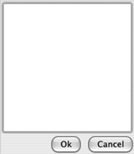
This makes it much easier to create resizable forms with controls of differing sizes. A typical dialog box, for example, has a large central text area and two buttons located just below and to the right. In this case, the most natural way to think of how the controls should be positioned is by envisioning them relative to each other. It’s easier to say “the buttons should be below the text area, and the Cancel button should be to the right of the Ok button” and let SWT worry about the details than to try to calculate how many rows and columns each control should span. Figure 6.7 shows an example of this setup; in the following sections, we’ll discuss the elements necessary to create it.
Figure 6.7. A FormLayout has been used to position the two buttons relative to the text area.
The FormLayout class is fairly simple. The only configuration options come from attributes that control the height and width of the margins around the edge of the layout, and the spacing attribute, which lets you specify the amount of space (in pixels) to be placed between all controls. Similar to the layouts we examined previously, you configure individual controls using instances of FormData.
6.4.1. Using FormData
A FormData instance is typically associated with each child control in a composite. Even more so than with other layouts, it’s important to provide configuration data for each child, because the whole idea of a form layout is to specify positions of child controls relative to each other. If a given control doesn’t have a FormData instance describing it, it will default to being placed in the upper-right corner of the composite, which is rarely what you want.
The width and height attributes specify the dimensions of a control in pixels. More important are the top, bottom, right, and left attributes, each of which holds an instance of FormAttachment. These attachments describe the control’s relations to other controls in the composite.
6.4.2. Specifying relations using FormAttachment
Understanding the FormAttachment class is the most important part of using a form layout. As mentioned earlier, each instance of FormAttachment describes the positioning of one side of a control. You can use FormAttachment two different ways.
First, you can specify a FormAttachment using a percentage of the parent composite. For example, if the left side of a FormData is set to a FormAttachment with 50%, then the left edge of the control will be placed at the horizontal middle of the parent. Likewise, setting the top edge to 75% positions the control three quarters of the way down the composite. Table 6.3 summarizes the FormAttachment constructors that can be used to specify percentages.
Table 6.3. Percentage-based FormAttachment constructors
|
Constructor signature |
Description |
|---|---|
| FormAttachment(int numerator) | Assumes a denominator of 100, meaning that the argument will be treated as a percentage. Only available in SWT 3.0. |
| FormAttachment(int numerator, int offset) | Assumes a denominator of 100, meaning that the argument will be treated as a percentage. The offset is the number of pixels that the control should be offset from the percentage position. |
| FormAttachment(int numerator, int denominator, int offset) | The numerator divided by the denominator gives the percentage used to position the control. The offset is the number of pixels that the control should be offset from the percentage position. |
Specifying FormAttachments in terms of percentages can be useful, but you shouldn’t use this approach often. Specifying all your controls using percentages isn’t much different from assigning them absolute pixel positions: It quickly becomes difficult to visualize the positions of each element; and when the composite is resized, it’s unlikely that the controls will still be in the positions you desire. The point of using a FormLayout is to position controls relative to each other, which the second form of FormAttachment allows.
The second series of FormAttachment constructors are based on passing in other controls. They’re used to position the edge of one control next to another. By setting the right attribute of the FormData for button1 to a FormAttachment constructed with button2, you’re saying that button1 should always be positioned such that button2 is immediately to its right. Laying out most or all of your controls in this fashion has several benefits. The intent of your layout code becomes easier to understand: Instead of your having to guess which controls are meant to be next to each other based on percentages or pixels, it becomes obvious that, for example, control foo should always be below bar. Second, the form layout is also aware of your intent. However the composite may be resized, it will always be able to maintain the correct relative positions.
Again, there are several different forms of the FormAttachment constructor for specifying relative positions; they’re summarized in table 6.4.
Table 6.4. FormAttachment constructors that accept relative positions
|
Description |
|
|---|---|
| FormAttachment(Control control) | Attach the current widget to the adjacent side of the control parameter. |
| FormAttachment(Control control, int offset) | Attach the current widget to the adjacent side of the control parameter, offset by the number of pixels in the offset parameter. |
| FormAttachment(Control control, int offset, int alignment) | alignment must be one of SWT.TOP, SWT.BOTTOM, SWT.LEFT, SWT.RIGHT, or SWT.CENTER. Attach the current widget to the side of the control parameter specified by alignment, offset by the number of pixels in the offset parameter. |
6.4.3. Laying out controls using a form layout
Now that we’ve discussed the classes that work together to drive a form layout, we’ll look at the code we used to produce the screenshot in figure 6.7. Listing 6.5 creates a text area and two buttons. The text control is anchored to the top and left edges of the composite. Both buttons are placed below the text control, and the Ok button is placed to the left of the Cancel button.
Listing 6.5. Ch6FormLayoutComposite.java
package com.swtjface.Ch6;

import org.eclipse.swt.*;
import org.eclipse.swt.widgets.*;
import org.eclipse.swt.layout.*;

public class Ch6FormLayoutComposite extends Composite {

    public Ch6FormLayoutComposite(Composite parent) {
    super(parent, SWT.NONE);

    FormLayout layout = new FormLayout();
    setLayout(layout);

    Text t = new Text(this, SWT.MULTI);
    FormData data = new FormData();
    data.top = new FormAttachment(0, 0);   1 Text goes at upper left
    data.left = new FormAttachment(0, 0);
    data.right = new FormAttachment(100);
    data.bottom = new FormAttachment(75);
    t.setLayoutData(data);

    Button ok = new Button(this, SWT.NONE);
    ok.setText("Ok");
    Button cancel = new Button(this, SWT.NONE);
    cancel.setText("Cancel");

    data = new FormData();                 Ok button positioned
    data.top = new FormAttachment(t);     2 relative to other widgets
    data.right = new FormAttachment(cancel);
    ok.setLayoutData(data);

    data = new FormData();
    data.top = new FormAttachment(t);
    data.right = new FormAttachment(100);  3 Cancel button on right side
    cancel.setLayoutData(data);
    }
}
-
 Here we position the text widget, which is the main control that everything else will be positioned relative to. By setting
both the top and left fields to FormAttachments with a percentage of 0, we anchor the text widget to the upper-left corner. The right field is 100, so the text widget expands horizontally to fill the available area; and the bottom field’s value of 75 causes it to take up the top three quarters of the available area.
Here we position the text widget, which is the main control that everything else will be positioned relative to. By setting
both the top and left fields to FormAttachments with a percentage of 0, we anchor the text widget to the upper-left corner. The right field is 100, so the text widget expands horizontally to fill the available area; and the bottom field’s value of 75 causes it to take up the top three quarters of the available area.
-
 The Ok button must follow two rules: It should always be immediately below the text area and immediately to the left of the
Cancel button. We specify this using the top and right fields of the FormData, giving each a FormAttachment instance with a reference to the appropriate control.
The Ok button must follow two rules: It should always be immediately below the text area and immediately to the left of the
Cancel button. We specify this using the top and right fields of the FormData, giving each a FormAttachment instance with a reference to the appropriate control.
-
 After positioning the Cancel button below the text area, we force it to the right side of the composite by using a FormAttachment with a percentage of 100.
However you resize the window, the buttons and the text area always maintain their correct positions.
You may have noticed that although we use the line
data.right = new FormAttachment(cancel);
when we set up the data for the Ok button, there is no corresponding
data.left = new FormAttachment(ok);
statement for the Cancel button. The second line is implied by the first, but SWT forbids you from creating such circular attachments. Whenever you have a control foo that refers to control bar, bar must not refer back to foo. According to the SWT documentation, if you create such an attachment, the result of the layout algorithm will be undefined, although it’s guaranteed to terminate and not leave your program stuck in an infinite loop.
Add the following lines to WidgetWindow to see for yourself how FormLayout works:
TabItem formLayoutItem = new TabItem(tf, SWT.NONE);
formLayoutItem.setText("Chapter 6 FormLayout");
formLayoutItem.setControl(new Ch6FormLayoutComposite(tf));
6.5. Custom layouts
The standard layouts serve a variety of roles and are suitable for most situations. Sometimes, though, you need to build a custom layout to deal with the exceptions to the rule. Like a finely crafted piece of custom cabinetry, a custom layout can make everything it contains look better.
It’s relatively rare that you’ll need to create a custom layout implementation—the existing layouts can handle most situations, especially when they’re used with a ResizeListener to tweak the positions of widgets after the window has been resized. It’s only appropriate to create a new layout class if the same layout logic will be reused in several places in your application, or if manually adjusting positions after resize events proves to be more awkward than laying them out precisely in the first place.
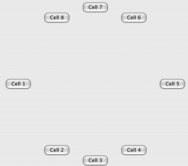
To demonstrate the process of creating a custom layout manager, we’ll create a RadialLayout class that positions its widgets in a circle. You wouldn’t often use this layout in an application, but the fairly straightforward algorithm lends itself to being used as an example. When we’re done, the final result will look like figure 6.8.
Figure 6.8. Buttons laid out using RadialLayout
Custom layouts are derived from the abstract Layout class. You need to write only two methods: computeSize() and layout(). (These are the only methods that Layout defines; it’s more of an interface than a true abstract class.) The computeSize() method is called when the parent composite is instantiated to calculate how much space the layout requires. This is followed by a call to layout() to position all the controls.
6.5.1. Calculating the layout’s size
The first method we’ll examine is computeSize(). The relevant bits of this method are as follows:
  protected Point computeSize(Composite composite,
                              int wHint, int hHint,
                              boolean flushCache)
  {
    Point maxDimensions =
            calculateMaxDimensions(composite.getChildren());
    int stepsPerHemisphere =
            stepsPerHemisphere(composite.getChildren().length);

    int maxWidth = maxDimensions.x;
    int maxHeight = maxDimensions.y;

    int dimensionMultiplier = (stepsPerHemisphere + 1);
    int controlWidth = maxWidth * dimensionMultiplier;
    int controlHeight = maxHeight * dimensionMultiplier;
    int diameter = Math.max(controlWidth, controlHeight);
    Point preferredSize = new Point(diameter,
                                    diameter);
    ... // code to handle case when our calculations
        // are too large
    return preferredSize;
  }
The parameters to this method are straightforward:
- composite— The object we’re going to populate. At the time this method is called, it has children, but neither the composite nor the children have been sized or positioned on the screen.
- wHint and hHint— Suggestions for the width and height, respectively. These values represent the largest size the layout should request. They may also have the special value SWT.DEFAULT, which signifies that the layout is free to use whatever sizes it decides it needs.
- flushCache— A simple flag to tell the layout whether it’s safe to use any cached values that it may be maintaining. In our example, we don’t cache anything, so it’s safe to ignore this flag.
The purpose of computeSize() is to calculate how large the composite we’re laying out should be. In particular, this method shouldn’t modify the sizes of any components—the system will set the parent composite’s size when it’s ready and call layout() when it’s time to position the children. Because our example lays out the controls in a circle, we need to figure out an appropriate radius to fit all the controls without having them overlap and then return a size for the composite that will accommodate a circle of that size.
The calculations are simple. We first find the largest child by calling calculateMaxDimensions(), which asks each child for its preferred size and returns the largest. In order to keep the code simple, we assume that each child is as large as the largest one. (This approach works fine when you’re laying out objects that are all approximately the same size, but it would cause trouble in a real system if some widgets were significantly larger than the others.) Once we have a size for our child objects, we multiply that size by half the number of children. Because one hemisphere of the circle will contain half the child objects, this gives us the diameter of the circle. We create a Point object representing a square of this size (plus some padding) and return it as the preferred size of our composite.
6.5.2. Laying out the widgets
Once we’ve recommended a size for our composite, the layout() method is called. This is our cue to position each of the children in the parent composite.
The parameters are even simpler this time. We’re given the composite that’s being populated and the same flushCache flag as before. The logic, however, is a bit more complex, because we have to calculate the exact position of each child object. To do so, we use an equation you may remember from geometry:
| X2 + Y2 = R2 |
We can easily calculate R (the radius), so for any X coordinate we might choose, Y can be calculated as:
Starting at the leftmost point of the circle, the layout method traverses the list of children, regularly spacing each along the X axis and using this X coordinate to calculate the appropriate Y coordinate. The work is done in the calculateControl-Positions() method, which is called by layout(). Here’s a summary of the code:
  private Point[] calculateControlPositions(Composite composite)
  {
    ... // set up control counts, max width, etc.
    Rectangle clientArea = composite.getClientArea();

    int radius = (smallestDimension / 2) - maxControlWidth;
    Point center = new Point(clientArea.width / 2,
                              clientArea.height / 2);
    long radiusSquared = radius * radius;

    int stepXDistance = ...

    int signMultiplier = 1;
    int x = -radius;
    int y;
    Control[] controls = composite.getChildren();
    for(int i = 0; i < controlCount; i++)
    {
      Point currSize = controls[i].getSize();
      long xSquared = x * x;

      int sqrRoot = (int)Math.sqrt(radiusSquared - xSquared);
      y = signMultiplier * sqrRoot;

      ... // translate coordinates to be relative to
          // actual center, instead of the origin

      positions[i] = new Point(translatedX - (currSize.x / 2),
                               translatedY - (currSize.y / 2) );

      x = x + (signMultiplier * stepXDistance);
      //we've finished the upper hemisphere, now do the lower
      if(x >= radius)
      {
        x = radius - (x - radius);
        signMultiplier = -1;
      }
    }

    return positions;
  }
This method is mostly a straightforward implementation of the algorithm mentioned earlier. The only tricky part is that we lay out one hemisphere at a time. Once the X value has reached the rightmost point of the circle, we switch the X coordinates to decrease back along the same path and reverse the sign on the Y coordinates (which accounts for the +/- part of our equation earlier). The sign-Multiplier variable takes care of this for us. It has the value of either 1 or −1, and it controls both whether the X value is increasing or decreasing and whether the Y values are positive or negative.
The other “gotcha” in this code is remembering that the equation we’re using assumes that the center of the circle is at the origin. It’s therefore necessary to translate each point to be relative to the actual center of the circle instead.
Once we have calculateControlPositions() working, writing layout() is easy. We take the list of positions that we’ve calculated and apply them to the children of the parent composite:
  protected void layout(Composite composite, boolean flushCache)
  {
    Point[] positions = calculateControlPositions(composite);
    Control[] controls = composite.getChildren();
    for(int i = 0; i < controls.length; i++)
    {
      Point preferredSize = controls[i].computeSize(SWT.DEFAULT,
                                                   SWT.DEFAULT);
      controls[i].setBounds(positions[i].x, positions[i].y,
                            preferredSize.x, preferredSize.y);
    }
  }
Because the complete class has already grown rather large, we ask each control to calculate its preferred size and use that value, plus the positions calculated earlier, to place each control in the composite. Giving each control a size is critical: If you don’t set the size, the control will default to having a width and height of 0, meaning that it will be invisible.
6.5.3. Updating WidgetWindow
The complete code for RadialLayout is shown in listing 6.6. The listing is long, but we’ve already examined the complicated parts in detail, so it should be easy to follow.
Listing 6.6. RadialLayout.java
package com.swtjface.Ch6;

import org.eclipse.swt.SWT;
import org.eclipse.swt.graphics.Point;
import org.eclipse.swt.graphics.Rectangle;
import org.eclipse.swt.widgets.*;

public class RadialLayout extends Layout
{
  public RadialLayout()
  {
    super();
  }

  protected Point computeSize(Composite composite,
                            int wHint, int hHint,
                            boolean flushCache)
{
  Point maxDimensions =
          calculateMaxDimensions(composite.getChildren());
  int stepsPerHemisphere =
          stepsPerHemisphere(composite.getChildren().length);

  int maxWidth = maxDimensions.x;
  int maxHeight = maxDimensions.y;

  int dimensionMultiplier = (stepsPerHemisphere + 1);
  int controlWidth = maxWidth * dimensionMultiplier;
  int controlHeight = maxHeight * dimensionMultiplier;
  int diameter = Math.max(controlWidth, controlHeight);
  Point preferredSize = new Point(diameter,
                                  diameter);

  if(wHint != SWT.DEFAULT)
  {
    if(preferredSize.x > wHint)
    {
      preferredSize.x = wHint;
    }
  }

  if(hHint != SWT.DEFAULT)
  {
    if(preferredSize.y > hHint)
    {
      preferredSize.y = hHint;
    }
  }

  return preferredSize;
}

protected void layout(Composite composite, boolean flushCache)
{
  Point[] positions = calculateControlPositions(composite);
  Control[] controls = composite.getChildren();
  for(int i = 0; i < controls.length; i++)
  {
    Point preferredSize = controls[i].computeSize(SWT.DEFAULT,
                                                 SWT.DEFAULT);
    controls[i].setBounds(positions[i].x, positions[i].y,
                          preferredSize.x, preferredSize.y);
  }
}

private Point[] calculateControlPositions(Composite composite)
{
  int controlCount = composite.getChildren().length;
  int stepsPerHemisphere = stepsPerHemisphere(controlCount);
  Point[] positions = new Point[controlCount];

  Point maxControlDimensions =
          calculateMaxDimensions(composite.getChildren());
  int maxControlWidth = maxControlDimensions.x;

  Rectangle clientArea = composite.getClientArea();
  int smallestDimension =
          Math.min(clientArea.width, clientArea.height);
  int radius = (smallestDimension / 2) - maxControlWidth;
  Point center = new Point(clientArea.width / 2,
                            clientArea.height / 2);
  long radiusSquared = radius * radius;

  int stepXDistance =
        calculateStepDistance(radius * 2, stepsPerHemisphere);

  int signMultiplier = 1;
  int x = -radius;
  int y;
  Control[] controls = composite.getChildren();
  for(int i = 0; i < controlCount; i++)
  {
    Point currSize = controls[i].getSize();
    long xSquared = x * x;

    int sqrRoot = (int)Math.sqrt(radiusSquared - xSquared);
    y = signMultiplier * sqrRoot;
    int translatedX = x + center.x;
    int translatedY = y + center.y;
    positions[i] = new Point(translatedX - (currSize.x / 2),
                             translatedY - (currSize.y / 2) );

    x = x + (signMultiplier * stepXDistance);
    //we've finished the upper hemisphere, now do the lower
    if(x >= radius)
    {
      x = radius - (x - radius);
      signMultiplier = -1;
    }
  }

  return positions;
}

 private Point calculateMaxDimensions(Control[] controls)
{
  Point maxes = new Point(0, 0);

   for(int i = 0; i < controls.length; i++)
  {
    Point controlSize =
            controls[i].computeSize(SWT.DEFAULT, SWT.DEFAULT);
      maxes.x = Math.max(maxes.x, controlSize.x);
      maxes.y = Math.max(maxes.y, controlSize.y);
    }
     return maxes;
  }

  private int stepsPerHemisphere(int totalObjects)
  {
    return (totalObjects / 2) - 1;
  }
  private int calculateStepDistance(int clientAreaDimensionSize,
                                    int stepCount)
  {
    return clientAreaDimensionSize / (stepCount + 1);
  }
}
Now that we have our custom layout, using it is easy, as shown by the class in listing 6.7.
Listing 6.7. Ch6RadialLayoutComposite.java
package com.swtjface.Ch6;

import org.eclipse.swt.SWT;
import org.eclipse.swt.widgets.Button;
import org.eclipse.swt.widgets.Composite;

public class Ch6RadialLayoutComposite extends Composite
{
  public Ch6RadialLayoutComposite(Composite parent)
  {
    super(parent, SWT.NONE);
    setLayout(new RadialLayout());

    for(int i = 0; i < 8; i++)
    {
      Button b = new Button(this, SWT.NONE);
      b.setText("Cell " + (i + 1));
    }
  }
}
When you add this class to the WidgetWindow with the following code, it creates a series of buttons laid out in a circle, as you saw earlier:
TabItem radialLayoutItem = new TabItem(tf, SWT.NONE);
radialLayoutItem.setText("Chapter 6 RadialLayout");
radialLayoutItem.setControl(new Ch6RadialLayoutComposite(tf));
6.6. Summary
When you’re using SWT, choosing a layout is often an exercise of weighing flexibility versus complexity. The available options range from the simple FillLayout, which makes all your controls as large as can be such that they all fit; to RowLayout, which lets you position controls in rows or columns; to the more complicated GridLayout and FormLayout, which allow more advanced positioning but require more planning and more code to use. No single layout is the correct choice for all situations, but by knowing the options that are available, you can make appropriate trade-offs for your application. You can use simple layouts to get quick results when the UI isn’t complicated, and advanced layouts can create a good-looking interface when required.
In addition to the layouts, you’ll be using a variety of data classes. Each data class is associated with a specific layout that knows how to use it. Instances of these data classes are attached to individual controls to fine-tune the way they’re laid out by the algorithms embedded in the layout classes.