
Chapter 5. More widgets
Now that you know how to tie together widgets with events and listeners, we’ll continue our tour of JFace/SWT widgets. The controls we discuss in this chapter will round out your toolbox of widgets and give you an understanding of the majority of controls you’ll be using in a GUI application.
We’ll explore two (mostly) separate approaches to text editing in this chapter. First we’ll discuss in some detail the text widgets built into SWT. We’ll follow this discussion with an overview of the enhanced text support available in JFace. Although the JFace text packages offer more advanced options, they’re also much more complicated to use.
Once we’ve covered the details of text editing, we’ll move on to a demonstration of several commonly used widgets. We’ll cover combo boxes, toolbars, sliders, and progress indicators, as well as discussing the coolbar, which allows you to group several toolbars and let users rearrange them in whatever configuration they find most convenient.
In a break from the way we’ve been doing things, we won’t build a single example for the WidgetWindow application. Instead, due to the wide variety of widgets we cover, we’ll create several smaller examples that demonstrate a single widget or concept at a time. These examples will each be structured the same as the Composites you’ve seen before, and they can be plugged in to the WidgetWindow like any of our other examples.
5.1. Editing text with SWT
SWT provides two controls for your text-editing needs: Text allows text to be entered with no style or formatting; StyledText, on the other hand, lets you change the color and style of both the entered text and the control itself. Although StyledText is very similar to Text, with the addition of methods to control styles, the classes are unrelated other than the fact that both extend Composite (as most widgets do).
The editing facilities provided by these classes are rudimentary. They provide convenience methods to copy text to or from the clipboard, but you’ll need to write code to call these methods at the appropriate times.
5.1.1. The basic Text widget
The Text control allows the user to enter unformatted text. Text can be instantiated and used in its basic form; however, a few more interesting capabilities are available. Text exposes several events, and by listening to them, you can affect the widget’s behavior. A brief example will demonstrate: Ch5Capitalizer, presented in listing 5.1, capitalizes text as the user enters it.
Listing 5.1. Ch5Capitalizer.java
package com.swtjface.Ch5;

import org.eclipse.swt.SWT;
import org.eclipse.swt.events.VerifyEvent;
import org.eclipse.swt.events.VerifyListener;
import org.eclipse.swt.layout.FillLayout;
import org.eclipse.swt.widgets.Composite;
import org.eclipse.swt.widgets.Text;

public class Ch5Capitalizer extends Composite
{
  public Ch5Capitalizer(Composite parent)
  {
    super(parent, SWT.NONE);
    buildControls();
  }

  private void buildControls()
  {
    this.setLayout(new FillLayout());
    Text text = new Text(this, SWT.MULTI | SWT.V_SCROLL);

    text.addVerifyListener(new VerifyListener() {
      public void verifyText(VerifyEvent e) {
        if( e.text.startsWith("1") )
        {
          e.doit = false;   1 Validate
        }
        else
        {
          e.text = e.text.toUpperCase();  2 Modify text
        }
    } } );
  }
}
For the sake of this example, assume that in addition to capitalizing all text, we also need to reject anything that starts with a number one (1). This example accomplishes both tasks by using the VerifyListener interface. Any registered VerifyListeners are called whenever the text is modified and given the chance to react to the new text being inserted.
-
 First the VerifyListener checks to make sure the new text doesn’t start with 1. If it does, the doit field of the event is set to false, causing the edit to be rejected by the Text control. For the user typing at his keyboard, this method will be called once for each keypress, effectively preventing any
1s from being entered but allowing any other character through. However, if more than one character is inserted at a time,
programmatically or through pasting text, the listener is called only once for the entire block of text that’s inserted. Therefore,
it will be rejected only if the first character is a 1—any others will make it through.
First the VerifyListener checks to make sure the new text doesn’t start with 1. If it does, the doit field of the event is set to false, causing the edit to be rejected by the Text control. For the user typing at his keyboard, this method will be called once for each keypress, effectively preventing any
1s from being entered but allowing any other character through. However, if more than one character is inserted at a time,
programmatically or through pasting text, the listener is called only once for the entire block of text that’s inserted. Therefore,
it will be rejected only if the first character is a 1—any others will make it through.
-
 After validating that the text should be allowed, we capitalize it by assigning the new text to insert to the text field of
the event. Initially this field holds the String being inserted, but as shown here, we can modify that string to be whatever we want.
After validating that the text should be allowed, we capitalize it by assigning the new text to insert to the text field of
the event. Initially this field holds the String being inserted, but as shown here, we can modify that string to be whatever we want.
To run this example, add it to the WidgetWindow by adding the following lines to the createContents() method:
TabItem chap5Capitalizer = new TabItem(tf, SWT.NONE);
chap5Capitalizer.setText("Chapter 5 Capitalizer");
chap5Capitalizer.setControl(new Ch5Capitalizer(tf));
Table 5.1 summarizes the important methods controlling an instance of Text. These methods allow you to modify the text, control its appearance, and attach listeners to be notified of events you’re interested in.
Table 5.1. Important Text methods
|
Method |
Description |
|---|---|
| addModifyListener() | Adds a listener to be notified when the text is modified |
| addSelectionListener() | Adds a listener to be notified when this control is selected |
| addVerifyListener() | Adds a listener to validate any changes to the text |
| append() | Appends the given String to the current text |
| insert() | Replaces the current contents with the given String |
| copy(), cut(), paste() | Moves the current selection to the clipboard, or replaces the current selection with whatever currently is in the clipboard |
| setSelection(), selectAll() | Programmatically modifies the current selection |
| setEchoCharacter() | Displays the character passed to this method instead of the text typed by the user (useful for hiding passwords, for example) |
| setEditable() | Turns editing on or off |
| setFont() | Sets the font used to display text, or uses the default if passed null (the font can only be set for the widget as a whole, not for individual sections) |
For the most part, these methods are straightforward. The only thing you need to pay attention to is that insert() replaces the entire contents of the widget—it doesn’t allow you to insert text into the existing content.
Now that we’ve covered simple text entry, we’ll move on to more visually interesting options using the StyledText widget.
5.1.2. The StyledText widget
Although the Text control can be useful for text entry, often you’ll want more control over the presentation of text. Toward that end, SWT provides the Styled-Text widget.
StyledText provides all the methods present on Text and adds capabilities to modify the displayed font, text color, font style, and more. Additionally, Styled-Text provides support for basic operations expected of an edit control, such as cutting and pasting.
StyledText includes a large set of predefined actions that can be applied to the widget; these are common things such as cut, paste, move to the next word, and move to the end of the text. Constants representing each of these actions are defined in the ST class in the org.eclipse.swt.custom package. The constants are useful in two cases: First, you can use them to programmatically invoke any of these actions by using the invokeAction() method; second, you can bind these actions to keystrokes by using the setKeyBinding() method. setKeyBinding() takes a key (which can be optionally modified by one of the SWT constants for modifier keys such as Shift or Ctrl) and binds it to the action specified. The following example binds the key combination Ctrl-Q to the paste action. Note that this doesn’t clear the default key binding; either one will now work.
StyledText.setKeyBinding( 'Q' | SWT.CONTROL, ST.PASTE );
StyledText also broadcasts many events that you can listen for. In addition to the same ones defined by Text, StyledText adds events for drawing line backgrounds and line styles. You can use them to modify the style or background color of an entire line as it’s drawn by setting the attributes on the event to match the way you wish the line to be displayed. However, be aware that if you use a LineStyleListener, it’s no longer valid to call the get/setStyleRange() methods (discussed in the next section) on the StyledText instance. Likewise, using a LineBackground-Listener means that you can’t call getLineBackground() or setLineBackground().
You modify the styles displayed by a StyledText through the use of StyleRanges.
Updating text styles with StyleRange
StyledText uses the class StyleRange to manage the different styles it’s currently displaying. A StyleRange holds information about the styled attributes of a range of text. All fields of a StyleRange are public and may be modified freely, but the modified style won’t be applied until setStyleRange() is called on the Styled-Text instance.
StyleRanges specify a region of text by using a start offset and length. Each StyleRange tracks both background and foreground colors (or null, to use the default) and a font style, which may be either SWT.NORMAL or SWT.BOLD.
StyleRange also has a similarTo() method, which you can use to check whether two StyleRanges are similar to each other. Two StyleRanges are defined as being similar if they both contain the same foreground, background, and font style attributes. This can be useful when you’re trying to combine adjacent StyleRanges into a single instance.
To demonstrate the use of StyleRange, we’ll present snippets from a simple text editor that is capable of persisting both the text and style information to a file. Due to space constraints, we won’t show the complete code listing here, but it’s included in the code you can download from this book’s website.
We’ll first consider how to persist the style information. After we’ve saved the text, we can obtain the style information by calling styledText.getStyleRanges(), which gives an array of StyleRange representing every style currently in the document. Because this is a simple example, we assume that the only possible style is bold text; we loop through the array and save the start offset and length of each StyleRange to our file. This example could easily be expanded to query each StyleRange and persist additional information such as the background and foreground colors. The following snippet demonstrates:
StyledText styledText = ...
StyleRange[] styles = styledText.getStyleRanges();
for(int i = 0; i < styles.length; i++)
{
  printWriter.println(styles[i].start + " " + styles[i].length);
}
Once the styles have been saved, they need to be loaded when the file is reopened. We read the styles one line at a time and parse each line to retrieve the style information:
StyledText styledText = ...
String styleText = ... //read line from the file
StringTokenizer tokenizer = new StringTokenizer(styleText);
int startPos = Integer.parseInt(tokenizer.nextToken());
int length = Integer.parseInt(tokenizer.nextToken());

StyleRange style = new StyleRange(startPos, length, null, null, SWT.BOLD);
styledText.setStyleRange(style);
Again, in this example the only possible style is bold text, so we can assume that each style line represents a length of text that should be made bold starting at the given offset. We instantiate a new StyleRange using the offset and length values read from the file, mark it as bold, and add it to our StyledText control. Alternatively, we could have built an array of all the StyleRanges to be used and used setStyleRanges() to apply them all at once.
The following method, toggleBold(), switches between entering text in bold and normal font. It’s called from a KeyListener that listens when the F1 key is pressed:
private void toggleBold()
{
    doBold = !doBold;
    styledText = ...
    if(styledText.getSelectionCount() > 0)
    {
      Point selectionRange = styledText.getSelectionRange();
      StyleRange style = new StyleRange(selectionRange.x,
                                        selectionRange.y,
                                        null, null,
                                        doBold ? SWT.BOLD
                                               : SWT.NORMAL);
      styledText.setStyleRange(style);
    }
}
After toggleBold() switches the current text mode, it checks whether there is currently selected text. If so, it ensures that the selected text matches the new mode. getSelectionRange() returns a Point object whose x field represents the offset of the start of the current selection; the y field holds the length of the selection. We use these values to create a StyleRange, and we apply it to the currently selected text.
Finally, there remains the question of how the text is made bold in the first place. We once again use an ExtendedModifyListener:
public void modifyText(ExtendedModifyEvent event)
{
  if(doBold)
  {
    StyleRange style = new StyleRange(event.start,
                                      event.length,
                                       null, null,
                                       SWT.BOLD);
    styledText.setStyleRange(style);
  }
}
modifyText() is called after text has been newly inserted. If bold mode is currently on (toggled by pressing F1), we use the information about the recent modification included in the event to create a new StyleRange with bold text attributes and apply it to the document. Calling setStyleRange() applies our new style to the document. StyledText tracks the styles of adjacent text and, where possible, combines multiple smaller ranges into a single larger range.
A StyledText example
Our detailed StyledText example (listing 5.2) demonstrates how you can use the events published by StyledText to implement undo/redo functionality. The example presents a text area with scrollbars, where the user may type. Pressing F1 undoes the last edit, and pressing F2 redoes the last undone edit. Notice that cut, copy, and paste functionality is provided automatically with no explicit code required on our part; it’s tied to the standard keyboard shortcuts for our platform.
ExtendedModifyListener differs from ModifyListener, which is also present on StyledText, in the amount of information that is sent as part of the event. Whereas ExtendedModifyListener is provided with details about exactly what was done, ModifyListener is given notification that an edit occurred without details of the exact modification.
In the interest of keeping the code shorter, this example makes the assumption that all edits occur at the end of the buffer. Inserting text anywhere else in the buffer will therefore cause undo/redo to behave strangely. Tracking actual edit locations, as well as style information, is left as an exercise for the reader.
Listing 5.2. Ch5Undoable.java
package com.swtjface.Ch5;

import java.util.LinkedList;
import java.util.List;

import org.eclipse.swt.SWT;
import org.eclipse.swt.custom.*;
import org.eclipse.swt.events.KeyAdapter;
import org.eclipse.swt.events.KeyEvent;
import org.eclipse.swt.layout.FillLayout;
import org.eclipse.swt.widgets.Composite;

public class Ch5Undoable extends Composite
{
  private static final int MAX_STACK_SIZE = 25;
  private List undoStack;
  private List redoStack;

  private StyledText styledText;

  public Ch5Undoable(Composite parent)
  {
    super(parent, SWT.NONE);
    undoStack = new LinkedList();
    redoStack = new LinkedList();
    buildControls();
  }

  private void buildControls()
  {
    this.setLayout(new FillLayout());
    styledText = new StyledText(this, SWT.MULTI | SWT.V_SCROLL);

    styledText.addExtendedModifyListener(    1 ExtendedModifyListener
      new ExtendedModifyListener() {
        public void modifyText(ExtendedModifyEvent event)
        {
          String currText = styledText.getText();
          String newText = currText.substring(event.start,
                                      event.start + event.length);
          if( newText != null && newText.length() > 0 )
          {
            if( undoStack.size() == MAX_STACK_SIZE )
            {
              undoStack.remove( undoStack.size() - 1 );
            }
            undoStack.add(0, newText);
          }
    } } );

    styledText.addKeyListener(new KeyAdapter() {
      public void keyPressed(KeyEvent e)   2 KeyListener
      {
        switch(e.keyCode)
        {
          case SWT.F1:
            undo(); break;
          case SWT.F2:
            redo(); break;
          default:
            //ignore everything else
        }
    } } );
  }

  private void undo()
  {
    if( undoStack.size() > 0 )
    {
      String lastEdit = (String)undoStack.remove(0);
      int editLength = lastEdit.length();
      String currText = styledText.getText();
      int startReplaceIndex = currText.length() - editLength;
      styledText.replaceTextRange(startReplaceIndex,   3 Undo
                                  editLength, "");
      redoStack.add(0, lastEdit);
    }
  }
  private void redo()
  {
    if( redoStack.size() > 0 )
    {
      String text = (String)redoStack.remove(0);
      moveCursorToEnd();
      styledText.append(text);   4 Redo
      moveCursorToEnd();
    }
  }
  private void moveCursorToEnd()
  {
    styledText.setCaretOffset(styledText.getText().length());
  }
}
-
This is the key section of this example: An ExtendedModifyListener is added to the StyledText object so that we can track edit events. The ExtendedModifyListener is called each time the text is edited. The event that’s passed contains information about the newly inserted text. In the
example, we use the start offset and length to retrieve the new text from the StyledText and save it in case the user wants to undo her edit later. The event also provides information about the text that was replaced,
if any, in the replacedText field. A more robust implementation could save this text along with the new edit and reinsert it if the edit was undone.
-
A KeyListener listens for keypresses, which are reported using a KeyEvent. We check the keyCode field to see if it matches one of the keys we’re interested in. Constants for the keys are defined in the SWT class. Additionally, we can query the state of modifier keys such as Ctrl or Alt by masking the stateMask field of the event against the appropriate constants defined in the SWT class.
-
 Undo pops the top entry of the undo stack, which holds a record of all edits that have been made. We then use replaceTextRange() to replace the last n characters in the buffer with the empty string, where n is the length of the edit we retrieved from the stack.
-
 To redo an edit, we pop the top entry off the redo stack. It’s then inserted at the end of the document using append().
The following lines added to WidgetWindow will let you test the undoable editor:
TabItem chap5Undo = new TabItem(tf, SWT.NONE);
chap5Undo.setText("Chapter 5 Undoable");
chap5Undo.setControl(new Ch5Undoable(tf));
There are some complexities to editing text in SWT, but once you understand the events that are broadcast by the widget, it isn’t difficult to add basic types of validation or control logic to your application. Certain features, however, are difficult to implement with the facilities provided by SWT. JFace text editing, although more complex, is also more powerful; it offers a host of new options that we’ll discuss in the next section.
5.2. JFace text support
As an alternative to using the StyledText control provided by SWT, JFace offers an extensive framework for text editing. More than 300 classes and interfaces are spread between 7 jface.text packages and subpackages. Rather than try to cover them all in the limited space we have available, we’ll provide an overview of the key classes in org.eclipse.jface.text and develop a small example showing some of the advanced capabilities available.
5.2.1. Obtaining the JFace text packages
Before you can use the JFace text packages, you need to extract a couple of jar files from your Eclipse installation: text.jar, located in $ECLIPSE_HOME/plugins/org.eclipse.text_x.y.z; and jfacetext.jar, in $ECLIPSE_HOME/plugins/org.eclipse.jface.text_x.y.z. Make sure both of them are in your classpath before you try any of the examples in this section.
5.2.2. TextViewer and Document
JFace text support is implemented by a core set of classes and augmented by a variety of extensions that add specific advanced features. We’ll discuss the core first and then provide an overview of the available extensions.
Two interfaces form the core of JFace’s text support: IDocument and IText-Viewer. Each has a default implementation provided by JFace.
An instance of IDocument holds the actual text that’s being edited. The primary implementation of IDocument is the class Document, although AbstractDocument provides a partial implementation that you can extend if you decide to write your own. In addition to standard methods to set or retrieve text, IDocument also allows for listeners to receive notification of content edits through the IDocumentListener interface.
IDocument also supports several more advanced features:
- Positions— You can assign a “sticky” marker known as a Position to a region of text. A Position object is given an offset and a length of text when it’s assigned to the document. As the document’s text is updated, the Position is kept in sync with the text changes so that it always points to the same section of text, no matter how it moves in the document. You can use this to implement features such as bookmarks, which allow the user to jump to a marked location in the document. The base Position class offers little beyond basic tracking of an offset and length; you’ll usually need to subclass it in order to build useful behavior for your application.
- Partition content types— Conceptually, a document is composed of one or more partitions represented by the ITypedRegion interface. Each partition can have a different content type, such as plain text, rich text, or HTML. To use this feature, you need to create an IDocumentPartitioner and assign it to your document. The document partitioner is then responsible for responding to queries about the content type of specific locations in the document, and it must implement computePartitioning() to return an array of all the ITypedRegions present in the document. It isn’t necessary to implement your own document partitioner; if you don’t assign one, the entire document will be treated as a single region with type IDocument.DEFAULT_CONTENT_TYPE.
- Searching— IDocument provides search facilities to clients through the search() method. Although it doesn’t support regular expressions or other patterns in the search, it does give you control over the search start location, direction, and case sensitivity and whether to match whole words only.
ITextViewer is intended to turn a standard text widget into a document-based text widget. The default implementation is TextViewer, which uses a StyledText under the hood to display data. ITextViewer supports listeners for both text modifications and visual events, such as changes in the currently visible region of text (known as the viewport). Although the default implementation of ITextViewer, TextViewer, allows direct access to the StyledText if you wish to modify the display, it’s intended that you use TextPresentation instead; it collects the various StyleRanges present in the document.
ITextViewer also supports a number of different types of plug-ins that can be used to modify the behavior of the widget. The functionality that can be customized includes undo support, through IUndoManager; how to react to double clicks, through ITextDoubleClickStrategy; automatic indentation of text, supplied by IAutoIndentStrategy; and text to display when the mouse is left on a section of the document, through ITextHover. You use each of these plug-ins by assigning an appropriate instance of the interface to the text viewer and then calling activatePlugins().
Finally, a variety of subpackages of org.eclipse.jface.text provide useful extensions; they’re summarized in table 5.2.
Table 5.2. The subpackages of org.eclipse.jface.text provide a variety of advanced functionality.
|
Package |
Description |
|---|---|
| org.eclipse.jface.text.contentassist | Provides a framework for automatic completion of text as it’s being typed, such as is found in many Java IDEs. IContentAssistant and IContentAssistantProcessor work together to provide ICompletionProposals at appropriate times. |
| org.eclipse.jface.text.formatter | Provides utilities to format text. IContentFormatter registers instances of IFormattingStrategy with different content types. When text needs formatting, the appropriate formatting strategy is given a String representing the text to be modified. |
| org.eclipse.jface.text.presentation | Used to update the visual appearance of the document in response to changes. After a change, an IPresentationDamager is used to calculate the region of the document that needs to be redrawn, and that information is given to an IPresentationRepairer along with a TextPresentation to reset the styles on the damaged region. |
| org.eclipse.jface.text.reconciler | Used to synchronize a document with an external store of its text. The default Reconciler runs periodically in the background, delegating to instances of IReconcilingStrategy as it finds dirty regions that need to be kept in sync. |
| org.eclipse.jface.text.rules | Defines classes to scan and match text based on configurable IRules. This framework is used to implement the presentation package and document partitioner and includes built in rules to match common occurrences such as words, numbers, whitespace, or ends of lines. |
| org.eclipse.jface.text.source | Used to attach visual markers to text, such as the red Xs used in Eclipse to denote compilation errors. To employ these features, you must use ISource-Viewer instead of ITextViewer, which it extends. You’ll then need to subclass Annotation to draw appropriate images. |
5.2.3. A JFace example
We’ll now build a simple text editor that uses some of TextViewer’s features. Inspired by a feature in OpenOffice and other word processors, this editor tracks individual words as the user types. At any time, the user can press F1 to obtain a list of suggested completions for the word he’s currently typing, drawn from the list of all words he has typed so far that start with the text currently under the cursor.
To implement this functionality, we’ll use the classes in org.eclipse.jface.text.contentassist. We’ve created a utility class called WordTracker, which is responsible for tracking the user’s most recently typed words and is capable of suggesting completions for a string. An instance of IContentAssistProcessor, RecentWordContentAssistProcessor, presents the possible completions to the framework. Finally, CompletionTextEditor is our main class: It configures the TextViewer and attaches the appropriate listeners. We’ll discuss each of these classes in detail, followed by the complete source code.
A ContentAssistant is responsible for suggesting possible completions to the user. Each ContentAssistant has one or more instances of IContentAssistProcessor registered; each processor is associated with a different content type. When the TextViewer requests suggestions, the ContentAssistant delegates to the assist processor that is appropriate for the content type of the current region of the document.
You can often use ContentAssistant as is. However, we need to define an IContentAssistProcessor. The processor’s main responsibility is to provide an array of possible completions when computeCompletionProposals() is called. Our implementation is straightforward: Given the current offset of the cursor into the document, it looks for the first occurrence of whitespace to determine the current word fragment, if any, by moving backward through the document one character at a time:
while( currOffset > 0
  && !Character.isWhitespace(
    currChar = document.getChar(currOffset)) )
{
  currWord = currChar + currWord;
  currOffset--;
  }
Once it has the current word, it requests completions from the WordTracker and uses those completions to instantiate an array of ICompletionProposal in the buildProposals() method:
  int index = 0;
  for(Iterator i = suggestions.iterator(); i.hasNext();)
  {
    String currSuggestion = (String)i.next();
    proposals[index] = new CompletionProposal(
                                      currSuggestion,
                                      offset,
                                      replacedWord.length(),
                                      currSuggestion.length());
    index++;
  }
Each proposal consists of the proposed text, the offset at which to insert the text, the number of characters to replace, and the position where the cursor should be afterward. The ContentAssistant will use this array to display choices to the user and insert the proper text once she chooses one.
In this example, we always activate the ContentAssistant programmatically by listening for a keypress. However, IContentAssistProcessor also contains methods that allow you to specify a set of characters that will serve as automatic triggers for suggestions to be displayed. You implement the getCompletionProposalAutoActivationCharacters() method to return the characters that you wish to serve as triggers. Listing 5.3 shows the complete implementation of the IContentAssistProcessor.
Listing 5.3. RecentWordContentAssistProcessor
package com.swtjface.Ch5;

import java.util.Iterator;
import java.util.List;

import org.eclipse.jface.text.*;
import org.eclipse.jface.text.contentassist.*;

public class RecentWordContentAssistProcessor
  implements IContentAssistProcessor
{
  private String lastError = null;
  private IContextInformationValidator contextInfoValidator;
  private WordTracker wordTracker;

  public RecentWordContentAssistProcessor(WordTracker tracker)
  {
    super();
    contextInfoValidator = new ContextInformationValidator(this);
    wordTracker = tracker;
  }

  public ICompletionProposal[] computeCompletionProposals(
    ITextViewer textViewer,
    int documentOffset)
  {
    IDocument document = textViewer.getDocument();
    int currOffset = documentOffset - 1;

    try
    {
      String currWord = "";
      char currChar;
      while( currOffset > 0    1 Find current word
              && !Character.isWhitespace(
                    currChar = document.getChar(currOffset)) )
      {
        currWord = currChar + currWord;
        currOffset--;
      }

      List suggestions = wordTracker.suggest(currWord);
      ICompletionProposal[] proposals = null;
      if(suggestions.size() > 0)
      {
        proposals = buildProposals(suggestions, currWord,
                            documentOffset - currWord.length());
        lastError = null;
      }
      return proposals;
    }
    catch (BadLocationException e)
    {
      e.printStackTrace();
      lastError = e.getMessage();
      return null;
    }
  }
  private ICompletionProposal[] buildProposals(List suggestions,
                                               String replacedWord,
                                               int offset)
  {
    ICompletionProposal[] proposals =
                  new ICompletionProposal[suggestions.size()];
    int index = 0;
    for(Iterator i = suggestions.iterator(); i.hasNext();)
    {
      String currSuggestion = (String)i.next();
      proposals[index] = new CompletionProposal(   2 Build proposals
                                        currSuggestion,
                                        offset,
                                        replacedWord.length(),
                                        currSuggestion.length());
      index++;
    }
    return proposals;
  }

  public IContextInformation[] computeContextInformation(
    ITextViewer textViewer,
    int documentOffset)
  {
    lastError = "No Context Information available";
    return null;
  }

  public char[] getCompletionProposalAutoActivationCharacters()
  {
    //we always wait for the user to explicitly trigger completion
    return null;
  }

  public char[] getContextInformationAutoActivationCharacters()
  {
    //we have no context information
    return null;
  }

  public String getErrorMessage()
  {
    return lastError;
  }

  public IContextInformationValidator getContextInformationValidator()
  {
    return contextInfoValidator;
  }
}
-
We move backward through the document a character at a time until we hit whitespace or the beginning of the document.
-
Each proposal contains the text to propose, as well as information about where to insert the text into the document. Theoretically,
you could insert the proposed text wherever you wish, although doing so could be confusing for the user if the text isn’t
inserted at the cursor’s current position.
WordTracker is a utility class used to maintain and search a list of words (see listing 5.4). Our implementation isn’t particularly efficient, but it’s simple and fast enough for our purposes. Each word is added to a List, and when suggestions are needed, the List is traversed looking for any item that starts with the given String. WordTracker doesn’t contain any SWT or JFace code, so we won’t examine it in detail.
Listing 5.4. WordTracker.java
package com.swtjface.Ch5;

import java.util.*;

public class WordTracker
{
  private int maxQueueSize;
  private List wordBuffer;
  private Map knownWords = new HashMap();

  public WordTracker(int queueSize)
  {
    maxQueueSize = queueSize;
    wordBuffer = new LinkedList();
  }

  public int getWordCount()
  {
    return wordBuffer.size();
  }

  public void add(String word)
  {
    if( wordIsNotKnown(word) )
    {
      flushOldestWord();
      insertNewWord(word);
    }
  }

  private void insertNewWord(String word)
  {
    wordBuffer.add(0, word);
    knownWords.put(word, word);
  }

  private void flushOldestWord()
  {
    if( wordBuffer.size() == maxQueueSize )
    {
      String removedWord =
              (String)wordBuffer.remove(maxQueueSize - 1);
      knownWords.remove(removedWord);
    }
  }

  private boolean wordIsNotKnown(String word)
  {
    return knownWords.get(word) == null;
  }

  public List suggest(String word)
  {
    List suggestions = new LinkedList();
    for( Iterator i = wordBuffer.iterator(); i.hasNext(); )
    {
      String currWord = (String)i.next();
      if( currWord.startsWith(word) )
      {
        suggestions.add(currWord);
      }
    }
    return suggestions;
  }
}
Ch5CompletionEditor brings together the components we’ve discussed. In buildControls(), we instantiate and configure a TextViewer. The ContentAssistant is created, and our custom processor is assigned to the default content type:
final ContentAssistant assistant = new ContentAssistant();
assistant.setContentAssistProcessor(
              new RecentWordContentAssistProcessor(wordTracker),
              IDocument.DEFAULT_CONTENT_TYPE);
assistant.install(textViewer);
Once the assistant has been configured, it’s installed on the viewer. Note that the assistant is given the viewer to install itself to, instead of the viewer receiving a ContentAssistant as you might expect.
To be notified about edits, we use an ITextListener, which is similar to the ExtendedModifyListener used by StyledText:
  textViewer.addTextListener(new ITextListener() {
    public void textChanged(TextEvent e)
    {
      if(isWhitespaceString(e.getText()))
      {
        wordTracker.add(findMostRecentWord(e.getOffset() - 1));
      }
    }
  });
Listening for keystrokes here uses the same listener classes that StyledText did. When we find the completion trigger key, we programmatically invoke the content assistant:
  case SWT.F1:
    assistant.showPossibleCompletions();
ContentAssistant does all the work from this point on, displaying the possible completions and inserting the selected one into the document; see listing 5.5.
Listing 5.5. Ch5CompletionEditor
package com.swtjface.Ch5;

import java.util.StringTokenizer;

import org.eclipse.jface.text.*;
import org.eclipse.jface.text.contentassist.ContentAssistant;
import org.eclipse.swt.SWT;
import org.eclipse.swt.events.KeyAdapter;
import org.eclipse.swt.events.KeyEvent;
import org.eclipse.swt.layout.FillLayout;
import org.eclipse.swt.widgets.Composite;

public class Ch5CompletionEditor extends Composite
{
  private TextViewer textViewer;
  private WordTracker wordTracker;
  private static final int MAX_QUEUE_SIZE = 200;

  public Ch5CompletionEditor(Composite parent)
  {
    super(parent, SWT.NULL);
    wordTracker = new WordTracker(MAX_QUEUE_SIZE);
    buildControls();
  }

  private void buildControls()
  {
    setLayout(new FillLayout());
    textViewer = new TextViewer(this, SWT.MULTI | SWT.V_SCROLL);

    textViewer.setDocument(new Document());   1 Assign an IDocument instance

    final ContentAssistant assistant = new ContentAssistant();
    assistant.setContentAssistProcessor(
                new RecentWordContentAssistProcessor(wordTracker),
                IDocument.DEFAULT_CONTENT_TYPE);   2 Assign content
                                                     assist processor
    assistant.install(textViewer);

    textViewer.getControl().addKeyListener(new KeyAdapter() {
      public void keyPressed(KeyEvent e)
      {
        switch(e.keyCode)
        {
          case SWT.F1:
            assistant.showPossibleCompletions();   3 Display completions
            break;
          default:
            //ignore everything else
        }
      }
    });

    textViewer.addTextListener(new ITextListener() {
      public void textChanged(TextEvent e)
      {
        if(isWhitespaceString(e.getText()))   4 Capture new words
        {
          wordTracker.add(findMostRecentWord(e.getOffset() - 1));
        }
      }
    });
  }

  protected String findMostRecentWord(int startSearchOffset)
  {
    int currOffset = startSearchOffset;
    char currChar;
    String word = "";
    try
    {
      while(currOffset > 0
            && !Character.isWhitespace(    5 Find last word
                  currChar = textViewer.getDocument()
                                        .getChar(currOffset)
            ))
      {
        word = currChar + word;
        currOffset--;
      }
      return word;
    }
    catch (BadLocationException e)
    {
      e.printStackTrace();
      return null;
    }
  }

  protected boolean isWhitespaceString(String string)
  {
    StringTokenizer tokenizer = new StringTokenizer(string);
    //if there is at least 1 token, this string is not whitespace
    return !tokenizer.hasMoreTokens();
  }
}
-
Each TextViewer needs an IDocument to store its text. Here we use the default Document class, which is sufficient for most needs. You must set the document on a TextViewer before it’s used, or NullPointerExceptions will be generated.
-
Each ContentAssistant can have a variety of IContentAssistProcessors assigned; the appropriate one will be selected based on the content type of the document. Here we assign our processor to
the default content type, which is defined in the IDocument interface.
-
When we detect that the proper key has been pressed, we programmatically invoke the ContentAssistant.
-
We examine each edit as it’s made. When we find an edit that consists only of whitespace, we assume that a new word has been
added, retrieve it from the Document, and store it in our WordTracker.
-
 Here we cycle backward through the document one character at a time, starting from the current editing position. When we find
whitespace, we grab the word for the WordTracker.
Here we cycle backward through the document one character at a time, starting from the current editing position. When we find
whitespace, we grab the word for the WordTracker.
To see this in action, add the following to WidgetWindow:
TabItem chap5Completion = new TabItem(tf, SWT.NONE);
chap5Completion.setText("Chapter 5 Completion Editor");
chap5Completion.setControl(new Ch5CompletionEditor(tf));
As you can see, SWT and JFace provide a wide variety of text-editing options. Although we’ve only touched on the possibilities offered by JFace, by understanding the overall design you should be able to use the extensions without much trouble. Now we’ll move on to several less complicated widgets, starting with combo boxes.
5.3. The Combo widget
The Combo control is used to create a combo box. Typically, the Combo control lets the user select an option from a list of choices. There are three styles of Combo controls:
- Simple— Contains an editable text field at the top and a list box with the choices on the bottom. This is the default combo style.
- Drop-down— An editable text field with an arrow at the right side. Clicking the arrow reveals a list of choices and allows the user to select one.
- Read-only— A drop-down combo whose text field can’t be edited. This style is used when you want to limit the choices the user can input. The read-only combo defaults to an empty selection, so most of the time you’ll call select( 0 ) to default the combo to the first choice available.
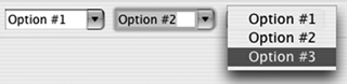
These styles are set via the usual STYLE.* attributes in the constructor and, slightly unexpectedly, are mutually exclusive. Figure 5.1 shows the available styles of combos; you can use the code in listing 5.6 to generate these results.
Figure 5.1. Combo styles, from left to right: simple, drop-down, and read-only
Listing 5.6. Ch5ComboComposite.java
package com.swtjface.Ch5;

import org.eclipse.swt.SWT;
import org.eclipse.swt.layout.RowLayout;
import org.eclipse.swt.widgets.Combo;
import org.eclipse.swt.widgets.Composite;

public class Ch5ComboComposite extends Composite {

    public Ch5ComboComposite(Composite parent) {
        super(parent, SWT.NONE);
        buildControls();
    }

    protected void buildControls() {
        setLayout(new RowLayout());

        int[] comboStyles = { SWT.SIMPLE,
                              SWT.DROP_DOWN,
                              SWT.READ_ONLY };
        for (int idxComboStyle = 0;
            idxComboStyle < comboStyles.length;
            ++idxComboStyle) {
            Combo combo = new Combo(this,
                                    comboStyles[idxComboStyle]);
            combo.add("Option #1");
            combo.add("Option #2");
            combo.add("Option #3");
        }
    }
}
Run this example by adding the following code to WidgetWindow:
TabItem chap5Combos = new TabItem(tf, SWT.NONE);
chap5Combos.setText("Chapter 5 Combos");
chap5Combos.setControl(new Ch5ComboComposite(tf));
5.4. ToolBarManager
The ToolBarManager is a JFace class that simplifies the construction of toolbars by making use of the action framework we discussed in chapter 4. It’s the toolbar equivalent of the MenuManager, and the interfaces are similar. This class is also derived from the ContributionManager class. As such, objects implementing either the IAction or IContribution interface can be added to the ToolBarManager. The ToolBarManager will generate the appropriate SWT Controls when required, so you don’t have to get involved with the gritty details. Most of the time you’ll be adding Action objects to the ToolBarManager, which will then automatically generate instances of the Toolbar and ToolItem classes that we discuss later.
You can easily add a toolbar to your application by calling the ApplicationWindow’s createToolBarManager() method. Unlike its MenuManager counterpart, createToolBarManager() requires a style parameter. This style parameter determines the style of buttons to be used by the ToolBar: either flat or normal pushbuttons. As we mentioned earlier, it’s handy to use the same Actions to generate items on both the menu and the toolbar—for example, actions such as OpenFile are normally found on both. By reusing Actions, you simplify the code and ensure that menu and toolbar are always in sync.
5.4.1. ControlContribution
In addition to the ContributionItems that MenuManager works with, there is a new ContributionItem that can only be used with a ToolBarManager: the ControlContribution. This is a cool class that wraps any Control and allows it to be used on a ToolBar. You can even wrap a Composite and throw it onto the toolbar.
To use the ControlContribution class, you must derive your own class and implement the abstract createControl() method. The following code snippet demonstrates a simple implementation of such a class. We create a custom ControlContribution class that can be used by the JFace ToolBarManager:
toolBarManager.add(new ControlContribution("Custom") {
    protected Control createControl(Composite parent) {
        SashForm sf = new SashForm(parent, SWT.NONE);
        Button b1 = new Button(sf, SWT.PUSH);
        b1.setText("Hello");
        Button b2 = new Button(sf, SWT.PUSH);
        b2.setText("World");
        b2.addSelectionListener(new SelectionAdapter() {
            public void widgetSelected(SelectionEvent e) {
                System.out.println("Selected:" + e);
            }
        });
        return sf;
    }
});
Note that you must implement the SelectionListeners on your controls if you want anything to happen. For all intents and purposes, the ControlContribution class lets you place anything you want on the ToolBar.
5.4.2. Creating toolbars by hand
Although it’s often easiest to create a toolbar by using a ToolBarManager, you may occasionally wish to create one manually, if it’s simple or if you aren’t using JFace. In this case, you’ll need to use two classes: ToolBar and ToolItem.
ToolBar
The Toolbar is a composite control that holds a number of ToolItems. The ToolBar is rendered as a strip of small iconic buttons, typically 16-by-16 bitmap graphics. Each of these buttons corresponds to a ToolItem, which we’ll discuss in the next section. By clicking the button, the user triggers an action represented by the ToolItem.
A ToolBar may be oriented either horizontally or vertically, although it’s horizontal by default. In addition, it’s possible for ToolItems to wrap around and form additional rows.
Typically, ToolBars are used to organize and present sets of related actions. For example, there might a ToolBar representing all text operations with buttons for paragraph alignment, typeface, font size, and so on.
ToolItem
The ToolItem represents a single item in a ToolBar. Its role with respect to the ToolBar is similar to that of the MenuItem to a Menu. Unlike MenuItems, ToolItems aren’t text but iconic in nature. As such, an image should always be assigned to a ToolItem. A ToolItem on a ToolBar ignores the text label and displays only a small red square if no image is assigned. When the user selects a ToolItem from the menu, it broadcasts the event to any registered SelectionListeners. Your application should register a listener with each ToolItem and use that listener to perform whatever logic corresponds to the menu item.
5.5. CoolBar
The CoolBar control is like the ToolBar control with upgraded functionality. The primary distinction between the two is that the items on a CoolBar can be repositioned and resized at runtime. Each of these items is represented by a CoolItem control, which can contain any sort of control. The most common uses of a CoolBar are to hold toolbars or buttons.
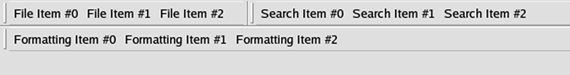
The next snippet shows the creation of a CoolBar that holds multiple toolbars. Each child ToolBar contains items that are grouped together by function. In this case, we have one ToolBar with file functions, another with formatting functions, and a third with search functions, each of which is wrapped in a CoolItem control and contained in a single parent CoolBar. This example is representative of a typical CoolBar; there are many ways to layer and organize controls to create striking user interfaces. Figure 5.2 shows what the toolbars look like before moving them around; notice that initially, the file and search items are next to each other.
Figure 5.2. The initial toolbars, controlled by a CoolBar. Notice that the File and Search items are adjacent.
The code to create the CoolBar looks like this:
String[] coolItemTypes = {"File", "Formatting", "Search"};
CoolBar coolBar = new CoolBar(parent, SWT.NONE);
for(int i = 0; i < coolItemTypes.length; i++)
{
  CoolItem item = new CoolItem(coolBar, SWT.NONE);
  ToolBar tb = new ToolBar(coolBar, SWT.FLAT);
  for(int j = 0; j < 3; j++)
  {
    ToolItem ti = new ToolItem(tb, SWT.NONE);
    ti.setText(coolItemTypes[i] + " Item #" + j);
  }
}
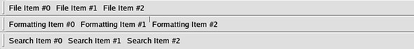
Notice that each CoolItem has a handle on the left side: Double-clicking the handle expands the CoolItem to the full width of the CoolBar, minimizing the other CoolItems if necessary. By clicking the handle and dragging it, the user can move a CoolItem to different parts of the CoolBar. To create additional rows, drag a CoolItem below the current CoolBar. To reorder a CoolItem, drag it to the new position—other CoolItems will be bumped out of the way to accommodate it. Figure 5.3 shows our example after we’ve repositioned the CoolItems.
Figure 5.3. The same toolbars have been repositioned by the user.
5.6. Slider
The Slider control is similar to the scrollbars you see on a window. Although it seems logical to assume that scrollbars are implemented with Slider controls, they’re different. Scrollbars are associated with the item they’re scrolling and aren’t available for use outside of that context. This is where the Slider comes in.
You can use the Slider as a control to select any value along an integral range. This range is set via the setMinimum() and setMaximum() methods.
The rectangular slider you can click and drag is officially referred to as the thumb. You set the size of the thumb via setThumb(); it should be an integral number. Visually, the size of the thumb is depicted realistically as a percentage of the entire range. Thus, if the range is from 0 to 100 and the size of the thumb is 10, then the thumb will take up 10% of the Slider control.
Note
Some operating systems have native scrollbars that feature a constantsized thumb. On these platforms, the size of the thumb is ignored for visual purposes but used in other calculations.
Arrows at each end move the thumb by a set amount referred to as the increment. You specify this increment via the setIncrement() method. Clicking the area between the thumb and an endpoint arrow causes the thumb to jump by a larger set amount. This amount is referred to as the page increment and is set via the set-PageIncrement() method. Figure 5.4 shows a typical slider; notice that it appears similar to a vertical scrollbar.
Figure 5.4. A typical Slider control
There is also a convenience method called setValues() that takes in all these values at once. The method signature is as follows:
void setValues( int selection, int minimum, int maximum, int thumb,
                int increment, int pageIncrement)
The selection is the starting point for the thumb. This is again represented by an integral number that specifies a value along the range of the Slider. The example in listing 5.7 demonstrates a Slider control with a range of 400 to 1600, as might be needed to represent a standardized test score.
Listing 5.7. Ch5Slider.java
package com.swtjface.Ch5;

import org.eclipse.swt.SWT;
import org.eclipse.swt.layout.FillLayout;
import org.eclipse.swt.widgets.Composite;
import org.eclipse.swt.widgets.Slider;

public class Ch5Slider extends Composite {
    public Ch5Slider(Composite parent) {
      super(parent, SWT.NONE);
      setLayout(new FillLayout());
      Slider slider = new Slider(this, SWT.HORIZONTAL);
      slider.setValues(1000, 400, 1600, 200, 10, 100);  1 Create Slider
    }
}
-
The code sets the selection to 1000, the minimum to 400, the maximum to 1600, the thumb size to 200, the increment value to
10, and the page increment to 100.
The Slider also takes a style attribute that lets you specify whether it should be vertical or horizontal. By default, a horizontal Slider is constructed.
The following code adds the slider example to WidgetWindow:
    TabItem chap5Slider = new TabItem(tf, SWT.NONE);
    chap5Slider.setText("Chapter 5 Slider");
    chap5Slider.setControl(new Ch5Slider(tf));
5.7. ProgressBar
The ProgressBar control lets you convey the progress of a lengthy operation. Its simplified counterpart, the ProgressIndicator, is recommended in most cases. Occasionally, you may need more control than a ProgressIndicator allows; if you decide that you need to use a ProgressBar directly, you’re taking responsibility for changing the display of the bar yourself. The following code snippet shows an example:
  //Style can be SMOOTH, HORIZONTAL, or VERTICAL
  ProgressBar bar = new ProgressBar(parent, SWT.SMOOTH);
  bar.setBounds(10, 10, 200, 32);
  bar.setMaximum(100);
  ...
  for(int i = 0; i < 10; i++) {
     //Take care to only update the display from its
    //own thread
    Display.getCurrent().asyncExec(new Runnable() {
      public void run() {
        //Update how much of the bar should be filled in
        bar.setSelection((int)(bar.getMaximum() * (i+1) / 10));
      }
  });
}
As you examine this code, note that in addition to needing to calculate the amount to update the bar, the call to setSelection() causes the widget to be updated every time. This behavior is unlike that of ProgressIndicator or ProgressMonitorDialog, which will update the display only if it has changed by an amount that will be visible to the end user.
As you can see, more work is involved with using ProgressBars than the other widgets we’ve discussed, and in general we recommend avoiding them unless you have no choice. However, a ProgressBar may occasionally be necessary—for example, if you need to unfill the bar, there is no way to do it with the higher-level controls.
5.8. ProgressIndicator
The ProgressIndicator widget allows you to display a progress bar without worrying much about how to fill it. Like the ProgressMonitorDialog, it supports abstract units of work—you need only initialize the ProgressIndicator with the total amount of work you expect to do and notify it as work is completed:
ProgressIndicator indicator = new ProgressIndicator(parent);
...
indicator.beginTask(10);
...
Display.getCurrent()display.asyncExec(new Runnable() {
  public void run() {
    //Inform the indicator that some amount of work has been done
    indicator.worked(1);
  }
});
As this example shows, there are two steps to using a ProgressIndicator. First you let the indicator know how much total work you intend to do by calling begin Task(). The control won’t be displayed on the screen until this method is called. Then you call worked() each time some work has been completed. As we discussed in chapter 4, there are several threading issues to pay attention to here. Doing the actual work in the UI thread will cause the display to lock up and defeats the purpose of using a ProgressIndicator in the first place. However, you aren’t allowed to update widgets from a non-UI thread. The solution is to use asyncExec() to schedule the code that updates the widget to be run from the UI thread.
The ProgressIndicator also provides an animated mode, where the total amount of work isn’t known. In this mode, the bar continually fills and empties until done() is called. To use animated mode, call beginAnimatedTask() instead of beginTask(); there is no need to call the worked() method. Assuming your work is being correctly done in a non-UI thread, this implies that you don’t have to worry about the asyncExec() call, either.
5.9. Summary
SWT and JFace provide many options for editing text. The SWT controls are fairly easy to use, but implementing anything beyond simple text editing using them can quickly become painful. The JFace controls, on the other hand, offer enough power to create sophisticated text editors, such as the one in Eclipse. However, they’re much more complicated to understand and use.
We’ve now covered many useful widgets. We’ve discussed creating combo boxes and toolbars, combining controls with coolbars, adding sliders to a control, and several ways of displaying the progress of a task to the user. As you may have noticed, the code examples have also become more complex and closer to how real-world usage may look. The points we’ve discussed in relation to threading issues are important to keep in mind always, not just when you’re using progress bars or indicators.
In the next chapter, we’ll cover layouts and explain how you can control the overall presentation of controls in a GUI application.