Chapter 8
Bringing It All Together with Dashboards
Storytelling is the creative demonstration of truth. A story is the living proof of an idea, the conversion of idea to action.
Robert McKee1
An essential element of Tableau’s value is delivered through dashboards. Allowing the audience to interact with a dashboard and change the details being displayed provides a means to shift context—leading to new and potentially important discoveries. Assembling dashboards in Tableau is fun for the designer, and good dashboard design can delight information consumers.
How Dashboards Facilitate Analysis and Understanding
When reviewing reports or creating new analytical reviews of data, you are looking for a story—something of value that you can share with others to enable change for the better. Dashboards fortify this storytelling by providing complementary views of the data and turning the data into actionable information that is supported by facts.
Well-designed dashboards are also visually interesting and draw the user in to play with the information, providing details on-demand that enable the information consumer to understand what, who, when, where, how, and perhaps even why something has changed.
How Tableau Improves the Dashboard-Building Process
Only three things really matter when it comes to business information—speed, accuracy, and the ability to make a new inquiry. Tableau delivers on all three. Tableau’s capability to directly connect to a variety of data sources and render the data using the appropriate visualizations provides three distinct advantages over traditional data analysis tools:
- Reduced dashboard development time
- Reduced technical resource involvement
- Better visual analytics
Tableau reduces the need for technical staff in the dashboard development process by providing a user-friendly environment that doesn’t require knowledge of database schema, SQL scripting, or programming. Creating dashboards with Tableau is primarily a drag-and-drop operation. When individual chart panes are placed into the dashboard workspace, filtering and highlighting between panes are also accomplished with point-and-click efficiency.
Publishing your dashboard for consumption on personal computers, tablets, or the Internet requires no technical programming skills either. After learning a few basic principles, you will be creating compelling visual analytics in dashboards more quickly than was ever possible with older tools. Something magical happens the first time people use Tableau and gain a new insight. They begin to understand the potential unlocked when the tool disappears and the information becomes the center of attention.
In this chapter, you learn field-tested techniques that will help you to build dashboards that effectively communicate to your audience. The chapter covers the following:
- Recommended best practices for building dashboards with Tableau
- The mechanics of the dashboard shelves and design objects
- Using actions to filter, highlight, and embed web pages
- Publishing dashboards to Tableau Server or Tableau Online
- Performance tuning dashboards for fast load and query times
You will learn these techniques by building a dashboard that adheres to best practices using sample data included with your Tableau Desktop software. Before building this example, let’s discuss the wrong and right ways to build a dashboard using Tableau.
The Wrong Way to Build a Dashboard
Traditional providers of reporting tools have been companies that have a core competency in data collection and storage. These entities attract people who are very knowledgeable in the technical aspects of database building, data quality, and data storage, but not data presentation.
Traditional buyers of business information systems tend to be people from finance and accounting. The information technology staff are normally involved in the procurement process because the IT staff possess the technical knowledge of database design, data collection, and data governance. Plus, IT is usually responsible for installing and maintaining the system.
Neither group possesses knowledge of the best practices related to data visualization. The IT group’s knowledge of charting typically comes from the commonly available spreadsheet programs, which often provide a lot of unnecessary and inappropriate chart styles. Historically, older business information (BI) tools that information technology staffs are familiar with for report building have been more adept at data creation and storage—not information visualization.
Good report builders from both of these groups develop time-saving techniques that work well for creating dashboards in old-style tools. Unfortunately, those techniques are more concerned with the technical challenges of building the report, not the aesthetic qualities of the user experience.
Why would an experienced designer use overly complex graphics? One possible reason is that dashboards created with legacy tools are more difficult to build—requiring more time and effort to produce. Often, with legacy tools it makes sense to place as much information as possible into a single view to save time. This practice can lead to visualizations that are complex and difficult for end users to understand. Also, internal customers ask for what is familiar (grids of numbers), so that is what they receive. Unfortunately, these techniques are exactly the wrong way to build dashboards in Tableau.
Relying on grids or overly complex individual charts generally accomplishes two undesirable outcomes in Tableau. First, the dashboard doesn’t communicate effectively. Second, it doesn’t load as quickly as it should.
For example, a sales report displaying 12 months of history for 20 products (12 × 20 = 240 data points) does not help the information consumer see the trends and outliers as easily as a time-series chart of the same information. Also, the quality of the data won’t matter if your dashboard takes five minutes to load. Dashboard viewing is an activity that resembles browsing a website. Web browsing isn’t very useful if you have a slow connection. Viewing a dashboard isn’t either if it takes a long time to load or if the interactivity is slow. The dashboard shown in Figure 8-1 displays some common pitfalls—overly dense and complicated charts and inappropriate chart types. Note the pie chart for comparing sales by product subcategory. The stacked bar chart uses a different (conflicting) color legend to display sales by region. The pie chart has too many slices, and performing precise comparisons of each product subcategory is difficult. The crosstab at the bottom requires that the user scroll to see all the data.

Figure 8-1: A poorly designed dashboard
The dashboard fails to convey important information quickly. Presenting the data this way can also lead to performance problems if there are a large number of rows being displayed in the product crosstab.
Fixing these problems is typically not difficult. Tableau is designed to supply the appropriate graphics by default. Understanding why a dashboard loads slowly and how to ensure good speed requires only a basic understanding of how Tableau renders the information. We will dive into those details at the end of this chapter.
The Right Way to Build a Dashboard
How can you improve the previous dashboard and ensure that it loads quickly? Can the crosstab be eliminated in order to reveal what is important in this data? A more effective dashboard conveys the information with less noise and provides details on demand.
The dashboard shown in Figure 8-2 uses a bar chart to provide a more precise comparison of sales by product subcategory (color-encoded bars). The time-series combination line and bar chart at the bottom provides sales by month (the vertical bars are color-encoded gray and black for a 5 percent profit threshold) and year-to-date sales by product category (color-encoded lines matching the bar colors in the bar chart above). The small crosstab in the upper-right corner of the dashboard provides summary information by region. The use of grayscale to depict a profit ratio threshold in the time-series combination line and bar chart provides additional insight into overall profitability. Darker gray is used to highlight product categories and months in which profit ratio is under 5 percent.
The headings contain dynamic elements denoting the regions, product categories, and subcategories that have been selected using filter actions embedded in the bar chart and region text table. The dashboard has been filtered for the central and south regions as well at the technology and office supply product categories. These selections are highlighted in the bar chart and region crosstab.
This dashboard communicates more effectively by removing clutter and unnecessary details. The audience for this dashboard might include senior managers and regional sales staff. This design would serve both groups.

Figure 8-2: A dashboard using simpler views
Best Practices for Dashboard Building
After you have analyzed some data and determined what information you need to share, adhering to these principles will help you create better dashboard designs:
- Size the dashboard to fit in the worst-case available space.
- Employ four-pane dashboard designs.
- Use Actions to filter instead of Quick Filters.
- Build cascading dashboard designs to improve load speed.
- Limit the use of color to one primary color scheme.
- Use small instructions near the work to make navigation obvious.
- Filter information presented in text tables to provide relevant details on-demand.
- Remove all non-data ink.
- Avoid one-size-fits-all dashboards.
Work to achieve initial dashboard load times of less than 10 seconds. These principles come from personal lessons learned building dashboards in a wide variety of use cases. They work well for 90 percent of the use cases across industry, government, and education.
You may find specific use cases for which violating one or more of these best practices performs well and communicates the information effectively. By all means then, do what works best for your specific case.
Size the Dashboard to Fit the Worst-Case Available Space
Dashboard building would be easy if everyone had the best computer with high-resolution graphics. Unfortunately, this normally isn’t the case, so you must design your dashboard to fit comfortably in the available space by determining the pixel height and width of the worst-case dashboard consumption environment. Tableau provides defaults for the typical sizes you will need or allows you to define a custom size. Doing a lot of design work without knowing the consumption environment is a recipe that results in unhappy information consumers and extra work for the designer.
Will the dashboard be consumed on laptops via Tableau Reader? If so, do you know the range of screen resolutions that are being used? Are tablet computers used? Is the dashboard going to be consumed via Tableau server, or will you have to embed the dashboard in a website? You need to understand the specific height and width of your dashboard space. For laptop consumption, this can be as little as 800 × 600 pixels. For desktop computers or better resolution laptop monitors, 1000 × 800 pixels normally works well. Web-embedded dashboards can be smaller but a typical worst-case minimum size might be as little as 420 × 420 pixels. Tableau has predefined sizes to help you lay out the dimensions of your dashboard. Tableau also makes it easy to define custom size ranges if the default values don’t meet your needs.
Employ Four-Pane Dashboard Designs
Four individual visualizations will fit well on most laptop and desktop computer screens, as shown in Figure 8-3. This style of presentation naturally highlights the upper-left pane because people in western societies have been taught to read from the upper left to the lower right of a page. Figure 8-3 shows a four-pane design intended for laptop or desktop consumption.

Figure 8-3: A four-pane design
A four visualizations design style will generally be read from the upper left to the lower right in a Z pattern unless you do something to grab attention elsewhere. Note that this design actually includes five panes—but the fifth pane, (the small Select Year crosstab) acts as a filter for the rest of the dashboard. Ordinarily, a quick filter would be used to permit the audience to select the year in view. Instead, the example in Figure 8-3 uses a small text table to trigger a filter action. The advantage of using a text table instead of a quick filter is that additional information is provided (total sales for each year) in the same amount of space that a multi-select quick filter would have required. The design employs a fifth data pane (an apparent contradiction to the best practice) but in a way that is consistent with the recommendation. Another reason to use a text table for this purpose leads to the next best practice recommendation for using filter actions in place of quick filters.
Different rules apply when designing dashboards for tablet computers. Designing for tablet computers will be covered in detail at the end of this chapter.
Use Actions to Filter Instead of Quick Filters
Using actions in place of quick filters provides a number of benefits. First, the dashboard will load more quickly. In order to visualize quick filters, Tableau must scan the source table from your database. If the table you are scanning is large, it can take some time for Tableau to render the filter. Tableau has improved quick filter load performance over the last several releases, but you may opt to use filter actions for another reason—aesthetics. In the same space that is required to display a multi-select filter, you can provide a small visualization with a filter action that enables filtering, but in a way that also enhances content included in the dashboard.
Employing multiple quick filters in a dashboard is also potentially confusing to the audience. My personal worst-case scenario involved a client dashboard with two data panes and thirteen quick filters. The source database was very large (billions of records). It required 6 minutes and 30 seconds to load—all but 8 seconds of that time was required to visualize the quick filters. Not only was it difficult to find the right filters, it was slow loading. By altering the design to a series of four-pane dashboards and replacing the quick filters with filter actions, load time for each dashboard was reduced to less than 8 seconds. This leads to the next best practice recommendation.
Build Cascading Dashboard Designs to Improve Load Speeds
Achieving fast load times can be challenging if the source data is very large. In the case mentioned in the preceding section, the load speed of the dashboard was terrible because many of the 13 quick filters used in the original design were scanning massive tables. The executive who requested the dashboard needed to see the data summarized globally first, but also wanted to be able to drill into much more detailed subsets of the data. Unfortunately, the initial design was slow-loading and didn’t provide much insight.
Replacing the use of quick filters in the original dashboard with a design that employed a series of four-pane dashboards that used filter actions in place of the quick filters dramatically-improved the dashboard’s load speed and made the information presented is much easier to understand.
The redesigned primary dashboard provided a good overview of operations by showing a bar chart (comparing different products), a map (to show data geographically), a scatter plot (to provide outlier analysis), and a small text table with very high-level metrics. Filter actions were added to these visualizations, which allowed the executive to see more detailed information in other dashboards that were pre-filtered by the selections made on the main dashboard. This cascading dashboard style provided all the information requested, but in a way that improved load speed and understandability.
The final design replaced the original dashboard (that had 13 quick filters) with four cascading, four-panel dashboards (filtering being provided through filter actions within the dashboard panes). The top-level dashboard provided a summary view, but included filter actions in each of the visualizations that allowed the executive to see data for different regions, products, and sales teams. None of the new dashboards required more than 8 seconds to load.
If you employ this recommendation and you are experiencing slow performance, Tableau’s Performance Recorder provides visibility of the technical details you will need to troubleshoot the issues that may be degrading performance. You’ll learn more about the Performance Recorder at the end of this chapter.
Limit the Use of Color to One Primary Color Scheme
Too much color on a dashboard is confusing. Try to limit the use of color to expressing one dimension or one measure. You can effectively add a secondary use of color in the same dashboard if that secondary use of color employs a more muted color scheme. The dashboard in Figure 8-2 used two colors more effectively than the dashboard in Figure 8-1 because the secondary use of color expressed a limited set of values (true/false) and the color was expressed using a muted shade of gray. According to data visualization expert and author Stephen Few, up to 10 percent of males and 1 percent of females have some form of color blindness.2 The most prevalent form of color blindness limits the ability to distinguish red and green. Take this into consideration if your dashboard will be utilized by a large population. To avoid potential problems, apply grayscale or blue-orange color palettes. These are visible to most color-blind people. Tableau also provides a color-blind palette with ten colors. You may also consider building color-blind–specific dashboards if you have a very large population of information consumers.
Use Small Instructions Near the Work to Make Navigation Obvious
Quick filters are obvious. Actions are not. Because actions are triggered by selecting elements of your visualizations, they will not be obvious to your audience unless you provide instructions within the dashboard. Placing instructions in the title bar of the worksheet that triggers the action is a good way to remind people of the availability of the action.
Use a consistent font style and color for these instructions in your dashboards so that your audience learns that style denotes an instruction. The instructions used in the Figure 8-2 dashboard are highlighted through the use of a brown italic font.
Another alternative is to place the instructions in tooltips that appear when the user hovers over marks, as shown in Figure 8-4. This method offers the advantage of having the instructions appear in more complete text without crowding the dashboard space.

Figure 8-4: Instruction in a tooltip
Note that the format of the instruction matches the color, font, and style of the instructions in the headers of the dashboard.
Give your audience even more explanatory information by adding a separate Read Me dashboard that includes additional details regarding the data sources used, formulas used, and navigation tips. You can even include links to websites that provide even more information, as shown in Figure 8-5.

Figure 8-5: A Read Me dashboard
The time required to add this information to your dashboard will more than pay for itself in reduced phone calls and confusion for the people who are using your dashboard. Finally, provide your contact information so that people can easily ask any other questions that may not be anticipated in your design.
Filter Information Presented in Crosstabs to Provide Relevant Details-on-Demand
Crosstabs are useful visualizations for looking up specific values when you know exactly what you’re looking for. Crosstabs are not the best visual style for quickly discovering trends and outliers. Figure 8-6 shows the poor use of a text table view. Even though the text table in view has been filtered for a specific dimension, vertical scrolling is still necessary in order to see all of the state values.
There is also a lot of white space generated by the column headers for Market and State in Figure 8-6. This dashboard could be improved by creating a filter action from the bar chart that could restrict the market displayed in the bar chart to a single market, but even with a filter action for market, the text table would still require scrolling to see all the values.
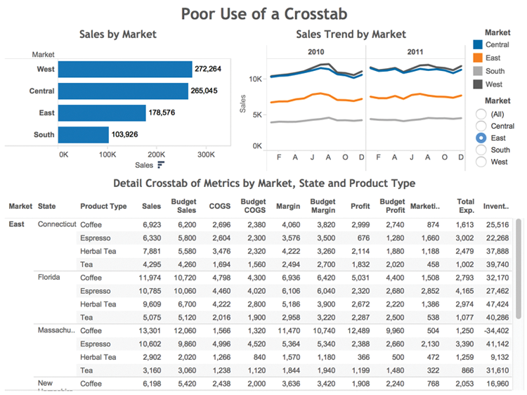
Figure 8-6: A poor use of a text table
In Figure 8-7, the text table is much more compact. The Market and State dimensions are being displayed in the title dynamically, and the orientation of the text table has been changed to place the measures (11 fields) in rows and the Product Type (4 fields) in columns. This reduces white space and eliminates the need for scrolling.
The unfiltered version of the dashboard on the left of Figure 8-7 clearly shows all the information without any scrolling. The filtered version on the right of Figure 8-7 shows more granular data in both the time series and the text table. This is accomplished using filter actions triggered from the bar chart and map—providing details on-demand for the markets and states of interest. The use of dynamic titles in the time series and text table visualization (highlighted in Figure 8-7) communicates the information more effectively in less space.

Figure 8-7: A better use of a text table
Remove All Non-Data-Ink
This best practice rule is inspired by Edward Tufte, author of The Visual Display of Quantitative Information.3 Remove any text, lines, or shading that doesn’t provide actionable information. Remove redundant facts. If a company logo isn’t required for promotion purposes, remove it. Ruthlessly eliminate anything that doesn’t help your audience understand the story contained in the data.
Avoid One-Size-Fits-All Dashboards
Trying to save time by making one dashboard serve many purposes will not result in the best performing dashboard or save design time. It is so easy to build dashboards and apply data restrictions within data extracts that I recommend making your dashboards fit the particular purpose of each audience. Generally, executives need to see high-level data across multiple geographies, product lines, and markets. Regional staff need more granular data but for restricted geographies, products, and customers.
While it is possible to make one dashboard that works for both groups, it normally doesn’t produce the best possible format or the best-performing dashboard for either. Strive to provide the best possible experience for each audience even if that requires a little extra effort.
Work to Achieve Dashboard Load Times of Less Than Ten Seconds
Fast load times are dependent on the size and complexity of your data as well as the type of data source you are using. Slow-loading dashboards can also be caused by poor dashboard design. There are several ways that the dashboard design itself can contribute to slow load speeds. Including high granular visualizations (that plot a large number of marks) can consume resources and slow load times. Using too many quick filters or trying to filter a very large dimension set can slow the load time because Tableau must scan the data to build the filters.
Tableau includes built-in tools for both Tableau Desktop and Tableau Server that help you identify performance issues. At the end of this chapter, you’ll learn about the desktop version of Tableau’s Performance Recorder. The server version is covered in Chapter 11.
Building Your First Advanced Dashboard
Creating dashboards with Tableau is an iterative process. There isn’t a single best method. Starting with a basic concept, discoveries made along the way lead to design refinements. Feedback from your target audience provides the foundation for additional enhancements. With traditional BI tools, this is a time-consuming process. Tableau’s drop-and-drag ease of use facilitates rapid evolution of designs and encourages discovery.
Introducing the Dashboard Worksheet
After creating multiple, complementary worksheets, you can combine them into an integrated view of the data using the dashboard worksheet. Figure 8-8 shows an empty dashboard workspace.
The top-left half of the dashboard shelf displays all of the worksheets contained in the workbook. The bottom half of the same space provides access to other object controls for adding text, images, blank space, or live web pages into the dashboard workspace. The worksheets and other design objects are placed into the dashboard by dragging the selected object into the “Drop sheets here” area. The bottom-left dashboard area contains controls for specifying the size of the dashboard and a checkbox for adding a dashboard title.
In this chapter you will step through the creation of a dashboard using a data source that ships with Tableau called Coffee Chain. You will create the dashboard by employing the best practices recommended earlier in the chapter.

Figure 8-8: Tableau’s dashboard worksheet
The example dashboard is suitable for a weekly or monthly recurring report. The specifications have been defined and are demanding. The example utilizes a variety of visualizations, dashboard objects, and actions. It will include a main dashboard and a secondary dashboard that will be linked together via filter actions.
Read through the rest of the chapter first to get an overview of the process. Then step through each section and build the dashboard yourself. When completed, your dashboard should look like Figure 8-9.
The dashboard follows the four-pane layout recommended earlier in the chapter, in the section “Best Practices for Dashboard Building,” but is actually a five-pane design with the small Select Year crosstab acting as a filter via a filter action. The dashboard example also includes a second dashboard that you see in Figure 8-10.

Figure 8-9: Completed dashboard example

Figure 8-10: Dashboard 2 example
The dashboard in Figure 8-10 is accessed through a filter action from the Main Dashboard shown in Figure 8-9. This cascading style is another best practice that really helps to speed up load times when your data source contains very large datasets.
The Main Dashboard and Dashboard 2 contain many different views and objects. Figures 8-11 and 8-12 show exploded views of both dashboards.

Figure 8-11: Main Dashboard contents
The Main Dashboard includes 17 different objects:
- Items 1–6: Worksheet panes (views)
- Item 7: Dashboard title (with descriptive text added)
- Items 8–11: Color and shape legends
- Item 12: Blank object (used for spacing)
- Items 13–16: Text objects (to annotate content and provide a weblink)
- Item 17: Vertical layout container (to control alignment of objects)

Figure 8-12: Dashboard 2 contents
Dashboard 2 contains five different objects:
- Items 1–2: Worksheet panes (views)
- Item 3: Dashboard title (with descriptive text added)
- Item 4: A Text object (to provide instructions)
- Item 5: A URL object (containing a live website)
This example is designed to use many of Tableau’s advanced dashboard features included in Tableau Desktop Version 9.2. The major steps required to complete this example are as follows:
- Download the Chapter 8, “Dashboard Exercise,” workbook from the book’s companion website. Refer to Appendix F for additional details.
- Define the dashboard size and position the dashboard objects in the dashboard workspace.
- Enhance title elements, improve axis headers, and place image and text objects into the primary dashboard.
- Create a secondary dashboard with a detailed text table, web page object, and navigation pane.
- Add filter, highlight, and URL actions to the dashboards.
- Finish the dashboard by enhancing the tooltips and testing all filtering and navigation. Add a Read Me dashboard to explain how the dashboard is intended to be used, data sources, and any calculations created that may not be obvious to the audience.
The exercise follows the best practice recommendations made at the beginning of this chapter in the context of using as many different advanced dashboard techniques as the sample data supports. You can build very functional dashboards without using many of these methods. The goal is to provide methods and alternative approaches that are not taught in the Tableau Public training courses.
When assembling worksheets in a dashboard, you should consider the available space that your audience has to view the dashboard. Will it be viewed on an old overhead projector with limited resolution and brightness? Is the dashboard going to be embedded in a company reporting website? Or will the audience consume the dashboard on a personal computer or a tablet computer? For this exercise, assume that the majority of people will be viewing the dashboard on laptop computers. A small number of people will view it on desktop computers. The easiest way to start a dashboard is to click the new dashboard tab. Figure 8-8, shown earlier in the chapter, highlights the new dashboard icon at the bottom of the workspace.
Position the Worksheet Objects in the Dashboard Workspace
Placing worksheets into the dashboard workspace can be done by double-clicking the worksheet objects at the top of the dashboard shelf. Tableau will automatically place them into the view. Alternatively, drag the worksheet object into the view and place it in the exact position you desire. Tableau provides a light gray shading as you drag objects into the workspace, indicating the space that it will occupy when you release your mouse button.
Unless custom titles were added in the worksheets, the titles that are displayed in the dashboard for each worksheet reflect the worksheet tab names. A variety of dashboard objects can be accessed and placed into the dashboard workspace using the dashboard and layout objects displayed in Figure 8-13.
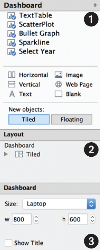
Figure 8-13: Dashboard design shelves
Dashboard area 1 includes worksheet views that are available in the workbook; objects for controlling the orientation of groups of objects, Horizontal and Vertical; and objects for adding text, images, live web pages, or blank space. By default, Tableau uses the New objects option Tiled to place objects in their own panes. Selecting the Floating option makes objects float over other objects already in the workspace. As you add worksheet objects to the dashboard, a small blue circle with a checkmark will appear on its icon. Refer to Figure 8-9 to see how the shelves appear in the finished dashboard.
Layout area 2 includes objects that have been added to the dashboard as well as layout options. Dashboard area 3 at the bottom allows you to define the sizing of the entire dashboard and for the individual objects included in the workspace. Before any worksheets are added into the workspace, define the dashboard size to accommodate the worst-case scenario that the dashboard will be viewed—(800 × 600) pixels. The Laptop option in the menu provides this exact size.
To view more options, click the size shelf, as shown in Figure 8-14, to see additional ways that size can be controlled.
- Automatic: Expands the dashboard to fill the available screen space
- Exactly: Allows you to lock the dashboard width and height
- Range: Enables the designer to define minimum and maximum limits

Figure 8-14: Dashboard layout size definition
Exactly mode allows you to set the worst-case parameters for space. After completing your design, you may want to change the size mode to Range and define specific limits that the dashboard can expand to fill.
Automatic mode expands or contracts the dashboard to fill the available screen resolution of each computer viewing the dashboard. If any of your audience has a high-resolution graphics card, the dashboard might look out of place. The Range option allows you to define specific maximum limits so that dashboards designed for compact spaces don’t look too sparse on large monitors. If someone is using a very low-resolution monitor to view the dashboard, minimum limits can be set for the dashboard pixel height and width. Once the dashboard size has been defined, you are now ready to add individual worksheet objects to the dashboard. Figure 8-13, displayed earlier, shows five different worksheet views that are available to add to the dashboard. There are two ways to add objects into the dashboard. Double-clicking a worksheet object causes Tableau to place that object into the workspace automatically. To control the placement of an individual object more precisely, drag the object into the view. As long as your left mouse button is depressed, Tableau will preview the area that the object will occupy by shading it in gray.
Double-clicking each worksheet object in the order that it appears in the dashboard shelf will result in the worksheet views being displayed in the dashboard, as you see in Figure 8-15.

Figure 8-15: Initial layout of the coffee chain dashboard
Each worksheet has been added into the dashboard, but the placement of the individual views can be improved. Reposition the Select Year Text Table pane by clicking inside the Text Table pane to activate it. Then, using the handle at the top and center of the object, drag it into the upper-right area of the workspace above the sales size legend. Figure 8-16 shows the Select Year pane being activated and the cursor as it appears when you have located it over the handle for the pane.
Next, delete the Sales size legend. When these steps are completed, the dashboard pane should look like Figure 8-17.

Figure 8-16: Repositioning a sheet pane
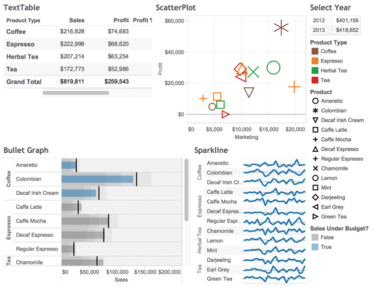
Figure 8-17: Repositioned dashboard objects
Add a title to your dashboard by selecting the Show Title option in the bottom left of your dashboard shelves. The default title will be the name of the dashboard worksheet that was created by Tableau. Edit the title text by double-clicking the default name, and type in Main Dashboard. Edit the title font to Trebuchet MS, 16-point, and select a light gray color. Make sure that the title is left-justified. After adding the title, it should appear as you see in Figure 8-18.

Figure 8-18: Dashboard with title object added
Using Layout Containers to Position Objects
Layout containers allow you to group objects horizontally or vertically within the dashboard workspace.
Use a Horizontal Layout Container for the Dashboard Title
In Figure 8-19, the InterWorksLogo file is aligned horizontally to the right of the dashboard title. You can download this logo from the companion website or use your own logo.
The title and logo alignment in Figure 8-19 was achieved using the following steps:
- Drag a horizontal layout container to the top of the dashboard.
- Drag the title object into the horizontal container.
- Place the logo image file into the right side of the layout container.
- Adjust the height of the layout container.
- Position the title and image within the layout container.
- Associate a URL with the logo.
Figure 8-19: Title and logo aligned
Add the horizontal layout container to the dashboard by dragging the Horizontal object from the dashboard shelf to the area above the title bar, as you see in Figure 8-20.

Figure 8-20: Adding a horizontal layout container
Before you let go of the object, be sure that the gray area highlights the full width of the dashboard at the top. This will ensure that the title object occupies the entire width at the top of the dashboard. After releasing the mouse button, don’t worry if the vertical space occupied by the layout container is very large—you can reposition it by dragging up from the bottom edge of the layout container. Then drag the title object into the horizontal layout container.
Now that the title is placed inside the horizontal layout container, you can drag an Image object into the layout container in the dashboard, as you see in Figure 8-21.

Figure 8-21: Place an image object in the layout container
After dropping the image object into the horizontal layout container, select an image file to add into the space. Use any image file you prefer for the logo. The example uses the InterWorksLogo file provided on the companion website.
Reposition the title and image objects within the layout container by clicking in the title object space. Then, point the mouse at the right edge of the title object until your pointer changes to a horizontal pointer. Drag the edge to the right to align the logo with the left edge of the vertical space occupied by the Year Filter crosstab object. Your logo should now be positioned directly over the vertical space on the right over the legends.
Make the title bar narrower by pointing at its bottom edge and dragging up. The logo probably isn’t centered within the image object. You will notice that the logo image does not fit into the space well. To fit and center the logo in the Image object, click in the object to access the drop-down arrow and expose the object’s menu, as you see in Figure 8-22.
Select Fit Image and Center Image. Your logo should now be resized to fit in the space.

Figure 8-22: Fit and center the logo
To complete the title area, add the URL associated with the logo to the image pane. Set the website address by clicking the image pane to activate the menu; pick the Set URL option and type in the website address. Now, when the logo is clicked and web access is available, a browser session will open and the website will be displayed. Figure 8-23 shows the settings used to create the link for the InterWorks logo.
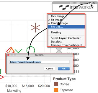
Figure 8-23: Setting the logo image URL
Now that the dashboard title is complete, turn your attention to the area on the right side of the dashboard containing the Select Year Filter text table along with the color, shape, and size legends.
Positioning the Select Year Text Table and Legends
Look at the completed dashboard again in Figure 8-9 and notice that the color legend for Sales Under Budget? has been repositioned below the bullet graph, the Sales size legend is gone, and a text box containing a website link has been added to the bottom. At this point, your legend area should look similar to Figure 8-24.

Figure 8-24: Right vertical layout container
Figure 8-24 shows the Vertical Layout Container and the menu you use to expose it. To highlight the layout container, press the down arrow and then the Select Layout Container menu option. This will cause Tableau to highlight the layout container. Tableau places a vertical layout container on the right side of dashboards that have legends or quick filters. Notice that all of the elements on the right side of the dashboard are in that space except the image pane containing the logo that was added to the horizontal layout container next to the title.
Inserting and Moving Text Objects
Insert a text object below the Select Year text table and type in Color/Shape Legends. Format the text as Arial 9 point bold and center it. After completing that, you should have a text object inserted between the Select Year pane and the Product Type color legend, as you see in Figure 8-25.

Figure 8-25: New Text object
Next, reposition the Sales Under Budget? legend by placing it below the Bullet Graph in the lower-left area of the workspace. From the legend drop-down menu, select Arrange Items > Single Row option. Don’t worry about the title; it will be fixed in the next section. Figure 8-26 shows the relocated color legend for the bullet graph.

Figure 8-26: Relocated color legend
This color legend comes from a Boolean calculation placed on the Color Marks card in the Bullet Graph view that compares actual and budgeted sales. The bars in the bullet graph that are colored blue are below the Budget Sales field included in the data.
Use the additional space in the bottom right of the dashboard to drag another text object below the Product shape legend. Text objects can hold live web addresses if you include a valid web prefix. I used a web service to shorten the address of my personal website http://bit.ly/1ilFrLR. Adding a web address with the “http” or “https” prefix in a Text object is another way active website links can be placed into a dashboard. Precede the website address with Info:, use an 8-point font, and center the text. The new text object should look like Figure 8-27.

Figure 8-27: Text object with live weblink
Open the layout container by clicking the Select Year area; then click the menu drop-down arrow to pick the Select Layout Container menu option. Go to the bottom of the container and drag the text object to the bottom of the layout container, as you see in Figure 8-27. Complete the layout container edits by making these changes:
- Edit the font of Select Year to 12-point, bold, italics.
- Center the Select Year title.
- Edit the Select Year data pane to fit the entire view.
- Center the remaining headings in the layout container.
- Reduce the horizontal space taken by the layout container.
When you complete these steps, your dashboard should look like Figure 8-28.
To edit the Select Year title font, double-click the title to expose the Edit Title dialog box, as you see in Figure 8-29, and make the defined changes.

Figure 8-28: Dashboard editing progress

Figure 8-29: Editing the Select Year title font
Resize the fit of the Select Year text table in the upper right of the dashboard so that it fills the entire view. Access the Fit menu you see in Figure 8-30 to perform the editing.
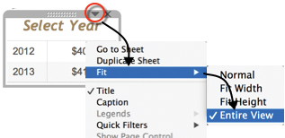
Figure 8-30: Fitting the Select Year pane
Finally, reduce the amount of horizontal space used by the legend area by dragging the left edge of the vertical layout container to the right. Be careful not to obscure any of the legend text. You are done with the layout container styling for now. If necessary, you can come back and make additional refinements later. Your dashboard should now look like Figure 8-31.
The dashboard is starting to take shape, but the data panes don’t utilize the available space well. The title text used in the color legend below the Bullet Graph is partially obscured. In addition, the Bullet Graph and Sparkline objects are displaying identical row headers—creating redundant data ink that can be removed if you ensure that the rows are sorted the same way. In the next section, you’ll learn how to deal with these issues so that the dashboard utilizes the available space more effectively.

Figure 8-31: Dashboard with improved legends
Positioning and Fitting the Dashboard Objects
The general layout of this dashboard is good. The upper-left quadrant contains a text table overview of performance. The table isn’t fitting into the space, so that needs to be addressed. The ScatterPlot shows how promotional spending relates to profits and sales (although it isn’t clear that the size of the marks in the scatter plot provide relative sales amounts). The Bullet Graph and Sparkline provide complementary views of actual sales performance. Color is used in different ways. Editing the use of color in the Sparkline and the Text Table could provide additional insight and understanding. In the ScatterPlot, color is used to distinguish Product Type. In the Bullet Graph, color indicates if a Product is below budgeted sales. To make this dashboard communicate the information more effectively, follow these steps:
- Ensure that each worksheet pane fits its entire view.
- Create more descriptive titles for each pane.
- Make the Product Shape Legend, Bullet Graph, and Sparkline sort in the same order.
- Hide the redundant row headers in the Sparkline chart.
- Reposition the worksheet objects to better utilize space.
Ensure That Each Worksheet Object Fits Its Entire View
Start by changing the fit within the Bullet Graph pane. The most straight-forward method to access the fit menu is the one you used to fit the Select Year pane—clicking the title block of the pane and exposing the pane’s menu. Alternatively, you can expose the same controls from the layout area by selecting the Bullet Graph and right-clicking. Figure 8-32 shows that you can access the same menu using either method.

Figure 8-32: Fitting the Bullet Graph
Change the Bullet Graph fit from Normal to Entire View. You should see the graph fill the pane completely.
Notice when you click the Bullet Graph pane in the layout area, the context of the Position and Size changes to display the values for the Bullet Graph pane. You now see the pixel positions and size of that particular pane. Note that the Show Title option is selected and the Floating option is not. If the Floating pane option were selected, this pane could be placed on top of other panes in the dashboard—floating over the area. This choice wouldn’t be appropriate for the bullet graph. Later in the exercise, you’ll utilize a floating pane. Repeat the same process for all of the data objects so that all of them fill the available space.
Create More Descriptive Titles for Each Data Pane
Adding more descriptive data object titles will make it easier for the audience to interpret the dashboard. Edit the titles by double-clicking each view’s title and replacing the <sheetname> text with the following title text:
- Bullet Graph: Sales versus Budget by Product
- Sparkline: Sales Trend
- Crosstab: Summary by Product Type
- ScatterPlot: Sales versus Marketing Expense
Figure 8-33 shows the dashboard after completing the title editing.

Figure 8-33: Improved dashboard titles
The size, color, and style of the title font used for the Select Year text table in the upper right serves a particular purpose. The brown color and italic font is used to indicate an instruction. Later in the chapter, you will add filter and highlight actions. The Select Year pane will be used to filter the rest of the dashboard using a Filter Action. Next, you’ll learn about creative ways to use sorting, text objects, and mark labels to improve the legibility of the dashboard.
Improving the Bullet Graph and Sparkline Charts
In Figure 8-32, you can see the Bullet Graph and Sparkline have the same row headings. The duplicate headers are an inefficient use of space. The charts are meant to be used together to see performance versus budget and trends over time, but they are not perfectly aligned. The title of the color legend below the Bullet Graph is partially obscured and needs to be edited so that it is legible. Apply these improvements with the following steps:
- Make the row sort order in both charts and the Product legend identical.
- Hide the row labels in the Sparkline.
- Turn on mark labels and hide the header in the Bullet Graph.
- Improve the color legend below the Bullet Graph.
- Precisely align the Sparkline and Bullet Graph rows.
Make the Row Sort Order in Both Charts Identical
Hover your mouse over the bullet graph title. This will expose the Go to Sheet navigation control. Click on the small box with the arrow (see Figure 8-34) to jump to the Bullet Graph worksheet.
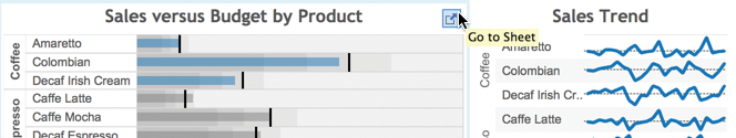
Figure 8-34: Jump to the bullet graph worksheet.
Edit the sort order of the Product Type and Product field pills on the Rows shelf so that the rows in both charts sort identically. Access the sort menu for each field by right-clicking the field pill on the Rows shelf, and then select the Sort menu/Manual sort option, as displayed in Figure 8-35.

Figure 8-35: Editing row sorting
Repeat the same steps in the Sparkline worksheet. When this step is completed, Tableau provides a visual cue in the Product Type and Product field pills confirming that a sort has been applied to each field in both worksheets. The cue is a small bar chart that appears in the right side of each field pill. Now that the Bullet Graph and Sparkline are sorted the same way, you can hide the product type and product row labels in the Sparkline worksheet—saving space and eliminating redundant data ink. Right-clicking the Product Type and Product pills on the row shelf exposes the menu you see in Figure 8-36.

Figure 8-36: Hiding the Sparkline row headings
Hide the Sparkline row headings by selecting any row header, right-clicking, and clearing the Show Header option. Do this for both Product type and Product.
Although the Shape legend doesn’t belong to the Sparkline, it might be useful later if the order of the products displayed in the shape legend matched the order of the Bullet Graph and Sparkline. Edit the sort order of the Product legend by clicking the legend, selecting Sort on the dashboard view menu (down pointing arrow), and doing a Manual sort as you did for sorting fields in the Bullet Graph and Sparkline. This change has already been added to the sample workbook. If you are building the example yourself, you will need to edit the shape legend to match the order of the graphs.
Turn on Mark Labels and Hide the Axis Header in the Bullet Graph
The Bullet Graph can be edited to provide more vertical space by hiding the axis header at the bottom of the chart. These axis labels provide valuable context. If the dashboard were going to be printed and consumed on paper, it would not be a good idea to remove the axis header.
When dashboards are consumed interactively on a computer, mark labels can be used to replace axis headers by presenting important details on demand—when a mark or heading is selected. Mark labels can always be displayed, but in this case space would be better utilized if the labels displayed only when the user wants to see them. To make the mark labels appear on demand, go to the bullet graph worksheet and click the Label button on the Marks card to expose the menu shown in Figure 8-37.

Figure 8-37: Show mark labels
The axis header at the bottom of the Bullet Graph can be hidden by pointing at the axis header area, right-clicking, and unchecking the Show Header option. The view on the left side of Figure 8-38 shows the menu selection, and the resulting appearance of the Bullet Graph is shown on the right.

Figure 8-38: Hiding the Bullet Graph heading
Removing the axis heading in the Bullet Graph is a compromise that the mark labels enable by providing sales details via point-and-click selection of the mark or row header. Given the limited space requirements for this dashboard, this is an acceptable compromise.
Improve the Color Legend Below the Bullet Graph
One more item near the Bullet Graph needs to be addressed. In the view on the right side of Figure 8-33, you can see that the color legend title is partially obscured. This can be addressed by erasing the legend title and then adding a text object to the left of the legend. This technique allows for more precision in the alignment and positioning of the text to describe the legend colors. It also provides a means for centering the legend below the Bullet Graph.
Erase the legend title by accessing the legend menu via the drop-down arrow that appears when the legend is clicked; then clear the Show Title option. Follow these three steps to finish formatting the Bullet Graph:
- Drag a Text object to the left of the color legend.
- Enter Sales Under Budget? and apply the font and color you see in Figure 8-39.
- Reposition the color legend by dragging the True color closer to the False color.
The height of the legend area may make posting the Text object difficult. To make it easier to place the text object in that space, click on the Bullet Graph pane and drag the edge of the pane up to provide more space. After placing the Text Object to the left of the color legend, you can drag the bottom edge of the Bullet Graph down to minimize the vertical height of the legend. Figure 8-39 shows the steps.

Figure 8-39: Replace the legend title with a text object.
These changes have reduced the amount of space required for the Bullet Graph.
Now turn your attention to the Sparkline. Because the row headings were hidden in the Sparkline, it’s important that the Bullet Graph and Sparkline be sorted in the same way. While you did that sort earlier in the chapter, it would be good to provide additional visual cues regarding the Product Type represented by each mark in the Sparkline. You can use color to denote the Product field in the Sparkline just like it was used in the scatter plot displayed in the upper right of the dashboard. It would also look better if the size of the line marks were reduced in the Sparkline. Figure 8-40 shows the Product Type field being added to Color in the Marks card.

Figure 8-40: Editing the Sparkline appearance
Both of the edits are reflected in Figure 8-40. Placing the Product Type field on the Color button in the Marks card changes the line colors. Selecting the Size button and then dragging the slider to the left allows you to reduce the thickness of the lines.
Precisely Align the Scatterplot and Bullet Graph Rows
The Sales Trend Sparkline is not actually plotting the monthly sales value. It is showing the percent change versus the prior month to accentuate the pattern of monthly changes. Refer to Chapter 7 for a full explanation of the reasons why presenting the data in this way may be helpful. This information should be communicated to the audience.
As you can see in Figure 8-41, the color legend below the Bullet Graph is also causing a misalignment of the charts.

Figure 8-41: Misaligned charts
Formatting in this part of the dashboard can be improved in the following ways:
- Center the Sales Under Budget? Color legend under the Bullet Graph.
- Add a Text object under the Sales Trend Sparkline to align the rows with the Bullet Graph and provide additional information about what is being plotted in the graph.
- Align the Product Shape Legend with the Sparkline and Bullet Graph.
Center the color legend under the Bullet Graph by placing a Blank object to the left of the Sales Under Budget Text object. If you run into any trouble getting the Text object in that space, temporarily reposition the Bullet Graph to allow more space to place the object, and then drag the bottom edge of the Bullet Graph back down to minimize the vertical space taken by the legend, as you did once before.
Now add the Text object to the bottom of the Sparkline, type % Change vs. Prior Month, and center the text. Drag the bottom edge of the Sparkline down to align the last row in the Sparkline with the last row in the Bullet Graph.
Finally, position the Product Shape legend with the top and the bottom of the Bullet Graph and Sparkline rows. You will probably have to use a combination of dragging in the Vertical layout container on the right side of the dashboard and repositioning the main dashboard data panes.
Figure 8-42 shows what your dashboard should look like after you have completed these steps.

Figure 8-42: The updated dashboard
The bottom half of the dashboard looks very good now. The color legend title is centered, and the legend title is clear and legible. The rows in the Bullet Graph, Sparkline, and Product shape legend are aligned so users can see product Actual Sales compared to the Budget Sales and the related sales trend.
Although this wasn’t discussed in this chapter, the color applied in the Bullet Graph to indicate sales that are above and below Budget Sales is achieved by creating a new field using a calculation. The field Sales Under Budget? is part of an example created in Chapter 7. To see the calculation, go to the Bullet Graph worksheet. Figure 8-43 shows the calculation.
In the next section, you will focus on the top half of the dashboard. This Boolean calculation will be utilized there as well.

Figure 8-43: Boolean calculation
Improving the Text Tables and Scatter Plot
The dashboard is beginning to look finished, but there is some refinement that can be done to improve the two text tables and the scatter plot. Adding the Boolean calculation applied to the Bullet Graph (refer to Figure 8-43) is a good way to highlight sales performance problems in the Summary by Product Type and Select Year tables. Add the Sales Under Budget? calculated value to the Color button on the Marks card in each of the worksheets. After you do that, you should see the Coffee row in the Summary by Product Type turn blue.
Because the size legend for the Sales vs. Marketing Expense scatter plot was removed earlier to conserve space, it would be useful to find a way to let information consumers know that the size of the marks in the scatter plot denotes the relative sales value of each mark. These issues will be addressed with following steps:
- Adjust the horizontal space used by the row headings in the crosstab chart and reposition the horizontal space allocated to each chart.
- Change the format of the values displayed on the vertical axis of the scatter plot to thousands.
- Edit the scatter plot’s horizontal axis label to provide information related to the size legend that was removed earlier.
The two circles marked 1 in Figure 8-44 show you where to point your mouse in order to reposition the header in the Summary by Product Type to reduce the vertical space required for the headings and for moving the right edge of the Summary by Product Type chart to the right to provide more horizontal room for the Grand Total row label in the chart.
To reposition the title space and the size of the pane, point at the area, depress the left mouse button, and drag the edge to the desired position.

Figure 8-44: Editing the top half of the dashboard
Changing the format of the axis labels marked area 2 in Figure 8-44 is done by pointing at one of the axis labels and right-clicking to expose the formatting menu. Figure 8-45 shows that menu. It’s important to select the SUM(Profit) measure when you apply the formatting, as you see in Figure 8-45.

Figure 8-45: Formatting the axis labels
The axis title at the bottom of the scatter plot can be edited by pointing at the axis title, right-clicking, and then selecting the Edit Axis menu option. This will expose the menu you see in Figure 8-46.

Figure 8-46: Editing the scatter plot axis title
Add the text Mark Size = Sales $ to the Title dialog box in the Edit Axis menu, as you see in Figure 8-46. Clicking OK locks in the change. After completing these steps, the dashboard will look like Figure 8-47.

Figure 8-47: Dashboard appearance after changes
The dashboard looks finished now. In the next section, you learn how to use the data in the main dashboard to create actions for filtering and highlighting related information.
Using Actions to Create Advanced Dashboard Navigation
Tableau’s quick filters provide an easy method for filtering dashboards and worksheets. Refer to Tableau’s manual for details on quick filters. This dashboard example purposefully avoids using quick filters because Tableau actions provide even more flexibility and in many instances also provide better initial load speed than quick filters—consistent with the best practices recommended earlier in the chapter.
Actions facilitate discovery by altering the context of the dashboard based on selections made by the audience. In this section, you create actions that utilize all of the available ways Tableau can invoke actions. You’ll build actions that:
- Filter and highlight the main dashboard
- Facilitate navigation to a supporting dashboard
- Filter a detailed text table in the new supporting dashboard
- Call and filter an embedded website in the supporting dashboard
- Return the audience to the main dashboard from the supporting dashboard
Using the Select Year Text Table to Filter the Main Dashboard
The Select Year text table in the upper-right side of Figure 8-47 is titled using a different font style and color to make it stand out and provide a brief instruction identifying that the text table serves as a filter. Building filter actions in Tableau can be done in as few as three clicks. Create a filter action using the Select Year text table with these steps:
- Click in the Select Year text table to select the view.
- Select the drop-down arrow to expose the menu.
- Pick the Use as Filter menu option to create the filter action.
- Edit the filter action (Dashboard ⇒ Actions) so that the Sales Trend Sparkline isn’t filtered.
Figure 8-48 shows the menus related to steps 1 through 3.

Figure 8-48: Making a filter action
After finishing step 3, you should be able to click one of the years in the text table, and every chart in the dashboard will be filtered to show only the selected year.
Creating filter actions this way is very easy, but it would be better if the Sales Trend Sparkline always showed both years. Tableau generated a filter action from the Use as Filter option. If you don’t want the filter action to apply to the Sales Trend Sparkline graph, you must edit the generated filter action.
To edit the filter action generated by Tableau, access the Dashboard menu option, and then select the Actions menu to expose the Actions dialog box. You can see the unedited filter action on the left side of Figure 8-49.

Figure 8-49: Editing the filter action
The Edit Filter action that Tableau generated applies to all of the Target Sheets in Dashboard 1 (now renamed to Main Dashboard). The Edit Filter Action dialog box on the right side of Figure 8-49 shows the changes applied in that screenshot.
- Recommended: Give the action a more descriptive name.
- Required: Uncheck the Sparkline in the Target Sheets area.
- Required: Select the Leave the Filter clearing option.
- Recommended: Check the Run on single select only option.
Naming the filter action with a descriptive title makes it easier to identify the exact purpose of the action. This is useful in two ways. First, if you need to come back months later to edit the action, a specific name makes it much easier to locate and understand its function. Second, if Run Action On uses the Menu option, the Name field will appear in tooltips or when users click on the heading. The name of the menu action can then be used to invoke the action. The importance of this will become clearer as we continue through this example. You will see this type of action later in the chapter.
Unchecking the Sparkline in the Target Sheets area means that the Sparkline will no longer be filtered by year. Because the Sparkline requires very little space to clearly display two years of data, it makes sense to leave that chart unfiltered.
The Leave the Filter option causes the filter action to remain in place when the action is removed. For example, if the year 2013 is selected (and then the filter action is removed by pressing the Escape key [ESC] or by clicking white space within a chart), the chart objects affected by the filter action will continue to display only the year 2013—until another selection is made in the Select Year text table.
Finally, checking the Run on single selection option means that only one year (and not both years) will be displayed when the filter is invoked.
Adding a Column Heading to Select Year
The Select Year text table needs a column heading that identifies the reported values as actual sales amounts for each year. We covered how to add a column heading to a single-column text table in Chapter 7. Recall that Tableau does not supply a column heading if only one field is being displayed. Go to the Select Year sheet and add the Profit % field to the view and then hide that field. If you don’t remember how to do that, refer to the example in Chapter 7. When this is done, the Select Year pane will include a heading that describes the values, as you see in Figure 8-50.

Figure 8-50: New column heading
Adding the field name to the heading provides a necessary detail for your audience.
Adding Dynamic Title Content
The dashboard now includes a filter action that gives users the ability to filter for the year 2012 or 2013. Another helpful visual cue for your audience would be to include the year in the titles for each of the charts. Dynamic titles are a good way to provide visual confirmation that the objects in the dashboard have been filtered correctly. Figure 8-51 shows the full dashboard filtered for the year 2013 with dynamic titles that include the year.

Figure 8-51: Dashboard with dynamic titles
You can see that the text table, scatter plot, and bullet graph are filtered for the year 2013 while the sparkline continues to display both years. Matching the font of the dynamic title elements to the Select Year text table title color provides a visual link for the audience. Add changeable title elements by inserting fields from your data into the title. Edit the title by double-clicking the title; then select the Insert menu option to position the Select Year field into the title, as you see in Figure 8-52.

Figure 8-52: Adding a dynamic field to chart titles
Alternatively, you can directly type the field name in as long as you include the wrappers (<Select Year>) before and after the field name. Note that the <Select Year> added in the title is not the name of the text table. It is a similarly named custom date field that was added to the source data. Refer to Chapter 3 for more details about adding dynamic titles.
A custom date is being used in the dashboard to override Tableau’s default behavior, which gives users the ability to display Tableau’s default date hierarchy (year, quarter, month, and so on). Because of the space limitations imposed for this dashboard, it is desirable to limit the display of dates in the Select Year text table to show only the year. Refer to Chapter 7 for the details on how to create a custom date.
In the next section, you learn how to use the color and size legends to create highlight actions.
Auto-Generating Highlight Actions from Legends
Highlighting helps users see related information in dashboards more easily. Users can generate highlighting from legends by activating the highlighting tool that appears when you point at a legend, as shown in Figure 8-53.
Highlighting this way is effective for looking at one dimension at a time. In Figure 8-53, the Product Type Herbal Tea is being highlighted in the dashboard. This highlighting can be invoked from within any of the data views or from within the color and shape legends.

Figure 8-53: Highlighting from a legend
When these selections are initiated from a legend for the first time, Tableau creates a Highlight Action automatically. By activating highlighting from both the Product Type and Product legends, Tableau generates a Highlight Action that is the combination of both the color and shape legends. To see the action that Tableau creates, access the Dashboard menu and Actions submenu just as you did for the filter action. Figure 8-54 shows the Actions dialog box and the Edit Highlight Action dialog box, which is accessed via the Edit button.
When Tableau creates these highlight actions, it will automatically apply them to every worksheet object in the dashboard. In this case, uncheck the Select Year text table in the Target Sheets area so that the highlight action isn’t applied to that object. In the Target Highlighting area of the Edit Highlight Action dialog box, I edited that to include the Selected Fields option and both the Product (color legend) and Product Type (shape legend) fields.
This action will be available for anyone consuming the dashboard. Highlighting will now occur if marks or headings are selected within the dashboard using either of the fields, as you can see in Figure 8-55.

Figure 8-54: Editing the generated Highlight action

Figure 8-55: Highlight from a mark
The highlight in Figure 8-55 was triggered by selecting a mark in the scatter plot. The highlight action uses the combination of color and shape to highlight Product Type and/or Product in all of the other charts with the exception of the Select Year text table that was removed from the action. Try clicking marks in different parts of the dashboard to see how the highlighting changes.
Because Tableau has built simple controls for triggering actions, it is possible to build them even if you don’t understand exactly how they work. If you know how to edit Actions, you can advance your knowledge through experimentation. If you want to understand more about the available options for Actions, details about the Action dialog box are covered next.
Understanding the Action Dialog Box
Actions can be applied to one or more dashboards or worksheets. This capability enables the creation of elegant cascading dashboard designs by using filter actions to link the contents of one dashboard to another related dashboard.
The steps to define filter actions and highlight actions are similar, but there are differences in how the data needs to be expressed for highlighting to work properly. For example, highlighting requires exact field names that are visually differentiated in each view, whereas filters don’t have this requirement. Figure 8-56 shows the Filter and Highlight Action dialog boxes that include the definitions for the two Actions created so far in the example.
The Filter/Highlight action screens are each comprised four main areas:
- Name: Defines the name of the action as it appears in the dialog box and tooltips or Header menus if the action is run using a menu
- Source Sheets: Controls where and how actions are invoked
- Target Sheets: Defines where actions are applied and their behavior when cleared (only for filter actions)
- Target Filters/Highlighting: Limits what fields are used to apply the actions
Name
Tableau automatically assigns action names sequentially by type. While this naming convention keeps things organized during the design process, it isn’t helpful if you need to revise your design later.
This exact name text is also used for triggering the action when the “Run action on – Menu” option is chosen. The name text appears inside the tooltip or when the cursor is pointed at the related row heading in the source sheet.

Figure 8-56: Add and Highlight action menus
Source Sheets
The Source Sheets area contains a drop-down menu that allows you to select any of the worksheets included in your workbook as the source of the action. Main Dashboard is the source sheet in this example. The checked items indicate the panes from which the action will be triggered. Unchecked panes do not invoke the action. Run Action On specifies how the action is invoked.
- Select: Action will run using a point and click.
- Menu: Runs via point and click in a tooltip or by right-clicking the dimension heading in the pane.
- Hover: Action runs as your mouse pointer hovers over a mark.
The examples you have seen so far have used the Select method to run on. Later in the chapter, you create actions that run on the Menu and Hover methods.
Target Sheets
This defines where the action will be applied—what dashboard or worksheet and what individual worksheet object(s). The radio buttons on the right side of this area define Tableau’s behavior when the action is deselected by the user.
For example, in Figure 8-51 presented earlier, a filter action for the year 2013 has been applied. In that example, pressing the Escape (ESC) key, or clicking on blank space in a worksheet object, will deselect the filter action. However, because the “Clearing the selection will” option is defined using the Leave the Filter option, the dashboard will remain filtered for the year 2013. In Figure 8-51, clicking Escape clears the 2013 selection in the Select Year pane but leaves the action filter in place as indicated in the titles of the table, scatter plot, and bullet graph.
The “Clearing the selection will” area defines what happens when the action is cleared. Please note that this particular control applies only to filter actions and does not exist for highlight actions. The three options are:
- Leave the filter: The filter action keeps only the last selected filter action.
- Show All Values: Returns the worksheet or dashboard to an unfiltered state within the context of the dashboard or worksheet.
- Exclude All Value: Excludes the data from the view so the worksheets that use the filtered data will not display any information when the filter action is removed.
Target Filters and Target Highlighting Options
Tableau’s normal behavior for Highlight Actions types is to use any possible common field existing between the source and the target sheets to apply the action. For Filter Actions, it is the fields that make up the mark selected in the source sheet that drive what fields are included in the filter.
The Target Filters area enables you to specifically restrict the fields that Tableau uses to apply the action if you choose the Selected Fields option. For example, in the highlighting example presented earlier in the chapter, the Highlight Action was restricted to the Product Type and Product fields.
Filter and highlight actions enable you to use the visualizations and legends in your views to create interactive dashboards that respond to selections users make—even if the source and target locations reside in different worksheets. These types of actions are confined to a single workbook.
Tableau provides a third kind of action that allows you to pass the data from your workbook to an external website. This website can be displayed via a separate browser session or embedded into a Tableau dashboard. These are referred to as URL Actions. Figure 8-57 shows the Edit URL Action dialog box.

Figure 8-57: Add URL Action dialog box
At the top of Figure 8-57 is the menu used to open the Add URL Action menu. The name, Hyperlink1, is assigned by default, which you can override with text that is more descriptive, just as you can for Filter and Highlight actions.
The Name and Source Sheets sections are similar to Filter and Highlight actions. In the URL area, you place the web page URL that you want to use as the target of the URL Action. The small arrow on the right side of the URL field allows you to insert field values from your data into the web address. This feature enables you to control what is displayed by the website based on selections made in Tableau. This never fails to impress people when they see it for the first time. People will assume that a very skilled hacker was needed to create this type of action. When you get the hang of building URL actions, you can make them in under 30 seconds.
The URL Options at the bottom of the dialog box allow you to deal with characters that may not be understood by the target URL via the URL Encode Data Values. The Allow Multiple Values option gives you a way to pass a list of values (such as a list of products) as parameters to the URL. When passing multiple values, you will also need to define how to separate each record (Item Delimiter) and the Delimiter Escape if the selected delimiter character is used anywhere in your data values.
In the next section, you will create another dashboard that allows the information consumer to navigate from the Main Dashboard to the new dashboard by simply pointing and clicking a mark of interest. This new dashboard will include a URL action that will be used to filter a live website embedded into the view.
Embedding a Live Website in a Dashboard
When completed, the next dashboard will include two primary objects—a text table with regional market metrics and an embedded website object. It should look similar to Figure 8-58.
This dashboard has the same size constraints as the Main Dashboard. Navigation to and from the dashboard will be provided by filter actions. It will also include a URL Action to search an embedded website. This URL action will be triggered by hovering over the Market Analysis text table. Figure 8-59 shows an exploded view of Dashboard 2.

Figure 8-58: Completed Dashboard 2
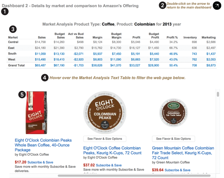
Figure 8-59: Dashboard 2 exploded view
The objects included in Dashboard 2 are:
- Dashboard title (with added instruction text)
- Text table (to provide navigation back to the Main Dashboard)
- Text table (with dynamic titles passed from a filter action from the Main Dashboard
- A Text object (providing instructions about an action triggered from the Market Analysis text table)
- A live website (controlled by a URL action invoked from within the Market Analysis text table)
To create Dashboard 2, follow these steps:
- Build the Market Analysis text table.
- Create the Market Analysis dynamic title.
- Make a calculated value that includes the navigation button text.
Once this new content is finished, you will assemble the dashboard and add a filter action that enables the information consumer to go from the Main Dashboard to Dashboard 2. You will embed a live website and add another filter action that is invoked when the user moves their mouse over the Market Analysis text table. This action will filter the embedded website by passing a combination of the Product Type and Product information from Tableau. A final action will be added using a text table that includes a string of text and a shape to enable navigation back to the Main Dashboard.
Building the Market Analysis Text Table
Start by adding a text table that you name Market Analysis Step 1 (see Figure 8-60).

Figure 8-60: Market analysis, Step 1
The view in Figure 8-60 includes additional information, but it is an inefficient layout. Including the Select Year, Product Type, and Product fields as columns in the Columns shelf consumes too much vertical and horizontal space. The design won’t work well in Dashboard 2 because we are limited to 800 × 600 pixels of space. The white space in this layout would be better utilized by data ink. You can address this problem by moving these fields into a title that utilizes dynamic title objects for those fields. Make a copy of this sheet and modify the copy to look like Figure 8-61.

Figure 8-61: Market analysis, Step 2
As you can see in Figure 8-61, this layout is much more efficient. Adding the Boolean calculation (the Sales Under Budget? field) to the Color button on the Marks card is consistent with the use of color in the Summary by Product Type text table and Sales versus Budget by Product panes in the Main Dashboard. Remember that the blue color indicates below budget sales.
The addition of the dynamic title objects is a more space-efficient way to display the Select Year, Product Type, and Product fields. Figure 8-62 shows how you should edit the title of this sheet.

Figure 8-62: Market analysis title
After you have completed this view, make a copy of the page and name the new page Market Analysis. This will become the primary data pane in Dashboard 2. Refer to Figure 8-59 (area 3).
Building the Dashboard 2 Navigation Button
The navigation button in Figure 8-59 (area 2) is a text table that includes a calculated value that is a string combined with a shape. The calculation used to make the text is displayed in Figure 8-63.

Figure 8-63: Calculated value for navigation button
As you can see, this calculation is nothing more than a text string wrapped in double quotes. Single quotes will also work—just be consistent. The field is named Return Nav, and that is what you will use to build the view. Create a new sheet and name the sheet Nav Button Step 1. Add the field to the view. Your sheet should look like Figure 8-64.

Figure 8-64: Nav button, Step 1
To finish this simple text table, duplicate the Nav Button Step 1 sheet and name the new one Nav Button. Then follow these steps:
- Hide the field labels for the rows.
- Use the Marks card to change the mark type from automatic to shape.
- Select More Shapes and then the Arrows shape palette.
- Pick the black arrow pointing to the upper right.
- Use the Size button on the Marks card to make the mark fill the space.
- Format the Return Nav font to 12-point, italics, Arial, and use a brown color.
- Use Format ⇒ Borders and change all of the borders to “none.”
When you finish these steps, the Nav Button sheet should look like Figure 8-65.

Figure 8-65: Completed Nav Button sheet
Now that the Nav Button sheet and Market Analysis sheet views are finished, Dashboard 2 can be assembled.
Assemble Dashboard 2
Create a new dashboard, name it Dashboard 2, and set the size to exactly 800 × 600 pixels, a size consistent with the Main Dashboard. Then select the Show Title option to display a title object and type in the dashboard title that you see in Figure 8-66 (Dashboard 2–Market analysis and comparison to a retail website).

Figure 8-66: Dashboard 2
Superimposed on top of the new dashboard is the Edit Title dialog box. Note that the font is Arial 12-point for the word “Dashboard” but the rest of the text is Arial 11-point. All of the title text is bold. Use the following steps to add the remaining objects to the dashboard:
- Drag the Market Analysis worksheet into Dashboard 2.
- Delete the Color legend.
- Edit the Market Analysis worksheet to Fit Entire View.
- Add a text object that says “Hover over the Market Analysis text table to filter the web page below.”
- Change the font of the text object added in step 4 to Arial, 12-point, italics, and bold, and center the text.
- Place a Web Page object below the Text object you added in step 5. Leave the URL blank for now.
- Add a Horizontal layout container above the title of the dashboard and then place the title inside the layout container.
- Drag the lower edge of the layout container down to provide more vertical space.
- Add the Nav Button worksheet to the right side of the layout container.
- Delete the Nav Button title by pointing at it, right-clicking, and selecting the Hide Title menu option.
- Set the Nav Button to fit the entire view and arrange it so that it fits in the space well.
When you finish these steps, your version of Dashboard 2 should look similar to Figure 8-67.
The blank area at the bottom of Figure 8-67 shows the Web Page object that is currently empty. When you define a URL action with a valid web URL, that space will contain a live website. The bones of Dashboard 2 are in place. Adding three additional actions to this workbook will provide navigation between the Main Dashboard and Dashboard 2 and also provide the web address needed to populate the Web Page object. Do the following steps to complete the design:
- Create a filter action using the Bullet Graph in the Main Dashboard to filter the Market Analysis text table in Dashboard 2.
- Add a filter action to return the user from Dashboard 2 to the Main Dashboard.
- Make a URL action in Dashboard 2 to filter the Web Page object in Dashboard 2.

Figure 8-67: Dashboard 2, Steps 1-11 completed
Creating the Filter Action to Navigate from the Main Dashboard to Dashboard 2
You will now create a filter action that will be triggered from the Bullet Graph in the Main Sales Dashboard to the Market Analysis text table in Dashboard 2. The purpose of the action is to allow the audience to analyze sales of a selected product type and product—by market.
Understanding what information is passed in this filter action is important. The Sales versus Budget by Product bullet graph in the Main Dashboard includes the following dimension fields:
- Select Year
- Product Type
- Product
All of these fields need to be passed in the Filter action from the Main Dashboard to the Market Analysis pane in Dashboard 2. The other important consideration is how to invoke the Filter action. The Bullet Graph in the Main Dashboard already includes a Highlight action that is triggered by Select (point and click). Therefore, you want the information consumer to stay in the Main Dashboard when they click a bar or row heading so that they see the related highlighting in the surrounding views.
Also, in my experience users can be startled if they “jump” to a completely new dashboard simply by clicking a mark or heading. For these reasons, you will trigger the Filter action to navigate the user to Dashboard 2 using the menu selection. Figure 8-68 shows the Edit Filter Action dialog box settings you should use to define the action.

Figure 8-68: Bullet graph menu filter action
Look closely at Figure 8-68 and notice that the Source sheet area has the Main Dashboard and Bullet Graph selected. The Run action on is Menu. The Target Sheets area has Dashboard 2 and the Market Analysis text table selected. Clearing the selection will leave the filter on. This is important. If the filter is not left on, the text table in Dashboard 2 will be potentially unreadable. Finally, the Target Filters area defines that All Fields are to be used in the filter action. This means that the key dimensions (Select Year, Product Type, and Product) will all be passed to the Market Analysis in Dashboard 2.
When you create actions, always check to ensure that the result is correct. If you don’t, you could potentially present incorrect information. Once you complete the filter action, test it by trying to run the filter. Figure 8-69 shows the tooltip that will appear when you point at a mark in the Bullet Graph.

Figure 8-69: Menu action
The tooltip displays the filter action created in the last step as blue text. Clicking on the blue text will take you to Dashboard 2. You can also execute the action by pointing at the row header and clicking to expose the action.
Using either method to trigger the action, the Market Analysis text table should be filtered for Coffee, Decaf Irish Cream, and the year 2013. Be sure that the “Run on single select” option is checked. You can see the result in Figure 8-70.

Figure 8-70: The filtered result in Dashboard 2
Try using the filter action on a few different markets in the Bullet Graph just to be sure that it is working properly. The title created earlier in Dashboard 2, which includes the dynamic title objects for Product Type, Product, and Select Year, provides visual confirmation that the filter action passed those dimensions correctly from the Main Dashboard to Dashboard 2.
When you are building these kinds of actions in the real world, you will probably have to iterate through this a few times to get everything working. If the filter action doesn’t work as you expected, your source and target sheets do not contain all of the necessary matching fields. When you are new to Tableau, it may require a few attempts before you get everything to work the way you want.
Next, you’ll create the URL action that will populate the Web Page Object in Dashboard 2.
Making the URL Action
If you aren’t a coder, creating a URL action that passes dimensions from your data to a web page embedded in a dashboard might sound intimidating. Don’t worry. This is not difficult. It is similar to the dynamic titles you have already seen. If you know how to search for something on a web page, you can build URL actions.
To demonstrate another way you can invoke an action, this example uses the Run Action On Hover option to trigger the action. This means that when users hover anywhere over the Market Analysis text table, the URL search will be executed. In an actual use case, it might be better to trigger the action using Select or Menu.
Open your browser and search Amazon’s website for “coffee, decaf irish cream.” Figure 8-71 shows my search.
Doing a search outside of Tableau first helps you understand how the website encodes the search string. Notice that I restricted the search on Amazon’s website to include grocery and gourmet food options. I also separated each dimension (coffee, decaf irish cream) with a comma. As you see in Figure 8-71, the search variables worked.
Copy the URL from the web browser address, which you see at the very top of Figure 8-71. Paste this code into the URL field in the URL action dialog box in Figure 8-72.
Use the Test Link button to ensure that the link works properly. What you’ve accomplished at this stage is passing the static variables that were part of the original search made to the website.

Figure 8-71: Searching Amazon’s website

Figure 8-72: URL action dialog box
To enable Tableau to automatically change the search sent to Amazon based on selections you make in your dashboard, you must replace the static search keywords contained in the URL string with fields inserted by Tableau. Figure 8-73 shows you what parts of the string to replace.

Figure 8-73: Inserting URL variables
The top half of Figure 8-73 shows the original search string. The bottom shows the string with the Tableau fields inserted using the insert arrow to place the desired fields. Use the Test Link button to verify the search is working correctly.
Go back to the bullet graph in the Main Dashboard and execute the menu action with a different product. Hovering your mouse pointer over the Market Analysis text table should trigger another search of the website, and the products displayed should reflect the new search fields inserted by the URL action. Figure 8-74 shows Dashboard 2 after selecting the Expresso, Café Mocha bar in the bullet graph while in the Main Dashboard.
Using embedded Web Page objects with URL actions provides a method for combining your data with information from the Web without having to be a programming expert. URL actions can be used in many different ways. I hope you can see the potential for enhancing your dashboards with information from the Internet. Next, you will add an action to provide a way for the user to navigate back to the Main Dashboard from Dashboard 2.
Creating a Home Button
The text table added in the upper-right area of Dashboard 2 will be the source sheet used for the filter that will take the user back to the Main Dashboard. Figure 8-75 shows the selections made to define the action.
When you double-click that button or text, you will return to the Main Dashboard. The last selection you made in the Bullet Graph will still be highlighted. Click empty space in the graph to clear that selection on the Main Dashboard.

Figure 8-74: Dashboard 2 with embedded website
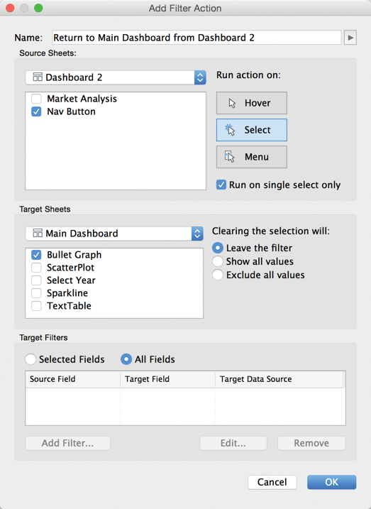
Figure 8-75: Action to return to the Main Dashboard
One additional change is required to the Main Dashboard to ensure that the Filter Action from the Main Dashboard works properly. The Product Type heading in the Bullet Graph needs to be hidden prevent the possibility of the filter action including more than one product. Why? Because if more than one product is included in the filter, the Market Analysis text table in Dashboard 2 will not display the numbers properly. Hide the Product Type heading by pointing at the heading, clicking the right mouse button, and unchecking the Show Heading option.
Congratulations! You just completed building an advanced dashboard in Tableau. Later you will add one final “disappearing” text table in the Main Dashboard that uses another option for clearing filter action selections.
The final design work on both dashboards relates to tooltips. After looking over a new design and reviewing the information presented, Tooltips are a great way to provide supplemental information and instructions for your audience.
Adding Details on Demand with Tooltips
The dashboard design is nearly complete. Getting outside feedback at this stage is helpful. Your audience may want to look at data in ways you didn’t consider, which can lead to revisions to the layout, content, and filtering. Assuming that all of the design criteria have been fulfilled, finalizing the design normally requires adding textural content to provide relevant details on demand that enhance the content.
Tooltips appear when you hover over marks in worksheets and dashboards. They are an efficient way to convey detailed and context-specific information because they appear only on demand. Best of all, they offer a great option for adding a lot of details because they appear in the view only when the audience points at a mark. Tooltips contain the fields used in your views by default and any other field that is used as a filter or used on the Marks card. They can also include manually added notes.
Using the Tooltip Editor
You can see the tooltip associated with any workbook by going to the Worksheet ⇒ Tooltip menu. Within a dashboard, click inside the data view of interest first, and then access the Worksheet ⇒ Tooltip menu. Figure 8-76 shows the tooltip for the Bullet Graph in the Main Dashboard.
The left side of Figure 8-76 shows the Edit Tooltip dialog box for the bullet graph. On the right is the tooltip as it will appear when pointing at a mark within the view. The fields and selections in the live tooltip are the defaults.

Figure 8-76: Tooltip editor—bullet graph
The editor is similar to the title editor. The top of the Edit Tooltip dialog box includes text font, size, and other style controls. The Insert button allows you to place dynamic fields into the tooltip. Any text that appears within angle brackets (< >) is a field value that will change based on the context of the selections made within the view.
The bottom of the Edit Tooltip dialog box contains options that give you control over what and how the tooltip displays.
- Show Tooltips: Uncheck if you don’t want the tooltip to display.
- Drop-down options: Responsive (default) or on Hover.
- Include command buttons: Checked (default)
The Responsive option makes the tooltip appear instantly while the Hover option will have a small delay. The Include command buttons option should not be selected in a dashboard that you are publishing to a large number of users. There are some commands that you may not want to grant access because they enable a user to exclude marks, group marks, and create sets, and they may expose the underlying data used to create the view. You can see these controls in an actual tooltip on the right side of Figure 8-76. They appear at the top of the tooltip. When the Include command buttons option is not selected, these will not appear in the tooltip.
Enhancing Tooltips and Titles
The last steps in the design of any dashboard should be reserved for customizing the tooltips and putting the finishing touches on titles. I recommend that you play with the dashboard for a few minutes and think about the questions you have. This might also be a good time to invite a few users to look at the dashboard. They will provide additional insight that will inform the content and design of your tooltips. That feedback might also lead you to place additional small instructions to highlight options that may not be obvious.
The following figures show customized tooltips that you can add to the Main Dashboard. The left side of each figure shows the tooltip as it will appear in the dashboard. The related Edit Tooltip dialog box appears to the right. Four of the five data views in the Main Dashboard are presented. The Select Year view will be presented later. Figure 8-77 is the tooltip for the Summary by Product Type view.

Figure 8-77: Summary by Product Type tooltip
Figure 8-77 includes an instruction in brown and italics that provides information on the highlight action that can be invoked from this and several other data views in the dashboard. Note the perfect alignment of the dynamic data text. The small grid alignment tool just above the text entry area is used to align each row. To align a specific row, click the row and then move the small pointer to the position you want the text to start.
Figure 8-78 shows the tooltip for the Sales versus Marketing Expense scatter plot.
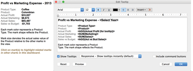
Figure 8-78: Sales versus Marketing Expense tooltip
Notice that Figure 8-78 uses different font sizes for the text at the bottom of the tooltip. The field <Actual Profit (for tooltip)> was copied from the original Actual Profit field just to provide for a different number format in the tooltip than appears in the axis of the view. The axis is in thousands while the value in the tooltip is to the dollar.
Figure 8-79 is associated with the Sales versus Budget by Product bullet graph.

Figure 8-79: Sales versus Budget by Product tooltip
The tooltip in Figure 8-80 includes nuanced text formatting, lines to define sections (8-point font is used for the lines). A Menu action also appears at the bottom of the tooltip. Just above the blue text that triggers the action is brown text that provides instructions describing what will happen when the text is clicked.

Figure 8-80: Sales Trend tooltip
The Sparkline tooltip includes a new wrinkle that I haven’t previously discussed. After reviewing this dashboard, I thought that it would be nice to add the Boolean calculation in the Sparkline as well. The blue/gray color legend is used everywhere else to communicate that information. Because color is being used here to convey Product Type, I decided to use size to indicate sales performance versus budget. The text at the bottom of the tooltip provides that information. This represents a compromise, but this might be an acceptable compromise that the dashboard audience favors.
Adding a Read Me Dashboard
Most people don’t include Read Me worksheets in workbooks. If you are serving a large user base, the additional hour of time required to document your work in a Read Me dashboard could save you time in the long run. A well-documented workbook that provides an explanation of particularly complex calculated values, the data sources used, experts consulted, or other ancillary details will reduce your phone and e-mail traffic. If you have to manage a very large number of dashboards, a well-documented workbook can jog your memory if you need to revisit an old design or help in training new staff.
The Coffee Chain dataset used for creating the two sample dashboards in this chapter demonstrates that the size of your data isn’t as important as the quality of information you can extract from it. The market analysis information contained in Dashboard 2 demonstrates how easy it is to use external information from websites with your data and make it interact with your proprietary data.
Bonus: Adding a Floating Dashboard Object
This example neglects to utilize one of the available action clearing options—Exclude all values. This option hides the object that is displayed when the action is cleared. In this way you can add data panes in your dashboard that float over other dashboard objects when the action is selected but disappear when the selection is removed. It can be useful if you want to guide your users through a series of questions by forcing a selection to expose more (filtered) data. It is also useful if you have limited space in your dashboard. I tend to avoid the use of floating objects in production dashboards because it is difficult to anticipate the effects that different screen resolutions have on the placement of the object. Because the example dashboard is fixed at a pixel resolution of 800 × 600, a floating object can be used with a predictable outcome.
Figure 8-81 zooms into the upper right of the Main Dashboard and shows a floating object that displays the percentage of sales by market when a year is clicked in the Select Year pane.

Figure 8-81: Floating object showing sales mix
The left image in Figure 8-81 shows the gray percentage sales mix table the way it appears to the information consumer when the year 2013 is selected. The image on the right shows the actual placement of the sales mix pane. Notice that the pane does not cover the color images from the Product Type color legend. Covering the colors would prevent users from clicking on the legend to highlight related marks in the other panes within the dashboard. While the dashboard includes a highlight action for that highlighting from within the other data panes in the dashboard, careful placement of the floating object preserves the user’s ability to highlight from the color legend.
Pressing the Esc key or clicking the mark or row heading in the Select Year text table removes the table. Using this technique, you can fit additional information into the same space.
The Select Year pane also includes a tooltip that provides instructions about the filter that applies to the other charts in the Main Dashboard and details about the Floating Sales Mix % text table. Figure 8-82 shows the tooltip.

Figure 8-82: Select Year tooltip
The Select Year tooltip provides additional instructions regarding filtering by year for the Main Dashboard and details about the floating object. Figure 8-83 shows the tooltip for the Floating Sales Mix % pane.

Figure 8-83: Sales Mix by Market tooltip
Pay particular attention to the Sales All Markets field you see in Figure 8-83. This is a Calculated Field that uses a Level of Detail function to display total sales for all markets. You see the calculation in Figure 8-84.

Figure 8-84: Sales All Markets LOD calculation
Before Tableau V9, the All Markets calculation would have been difficult because the table used in the view shows the data by individual market. Level of Detail Expressions make it easy to define calculations that provide results in a different Level of Detail from the view. Using the Exclude expression provides an easy way to display the total sales for all markets. As the user points at different markets in the Sales Mix by Market table, the total sales for the year being viewed is displayed along with the sales for all markets. Refer to Chapter 4 and to the function reference for Level of Detail calculations in Appendix E for more information on Level of Detail expressions.
Steps to Create a Disappearing Dashboard Object
To add the floating object that you see in Figure 8-81 to the workbook, follow these steps:
- Create a text tab visualization that contains sales and a quick table calculation for percent of total sales. Style the text table to your taste (see Figure 8-85).
- Add the worksheet to your dashboard while selecting the Floating New Object option (see Figure 8-86).
- Define the action using the Select Year text table as the Source Sheet and the Sales Mix by Market text table as the Target Sheet. Be sure to select the Exclude all values option (see Figure 8-87).
- Style the tooltip, as you saw earlier in Figure 8-83.
Figure 8-85 uses a Quick Table calculation to compute the Percent of Total, Tableau (Down). The image shows Select Year on the Filters shelf. This will be replaced by a filter action from the Main Dashboard. The Marks card includes the Sales All Markets LOD calculation, which is used in the related tooltip to display sales for the selected year for all of the markets.

Figure 8-85: Create the text table.

Figure 8-86: Add the floating object.
Figure 8-86 shows the process of positioning the Sales Mix by Market text table in the space over the Product Type color legend. Note that the New Objects Floating option is selected. Care should be taken to ensure that the color marks in the legend are not covered by the floating text table.
Figure 8-87 shows the Edit Filter Action dialog box for the Sales Mix by Market text table. Use the Clearing the selection will option, Exclude all values radio button.
After defining the action, test it by clicking either row in the Select Year text table to see exactly how the floating (normally hidden) Sales Mix worksheet appears. You will need to do some editing to hide the worksheet title. Press Escape (Esc) or click the same mark in the Select Year text table to see how the action behaves when each year is selected. Using floating actions that are hidden until a specific selection is made can be an effective way to display data in dashboards that have limited screen real estate.

Figure 8-87: Define the action.
Finishing the Titles in the Main Dashboard
To put the finishing touches on this dashboard, you need to add some small instructions to the dashboard (see Figure 8-88 for suggested additions).
As you can see in the figure, instructional text was added to the main dashboard title and to the title for the bullet graph. The font style (italics and brown color) is consistent with all of the instructional text in this workbook. If you consistently style instructional text for your dashboard titles and tooltips, your audience will be able to quickly identify these elements in your designs.
Next you learn how to use packaged workbooks to share your workbooks with others who do not have access to Tableau Desktop or Tableau Server licenses. This is facilitated through Tableau’s free Tableau Reader desktop software.

Figure 8-88: The finished dashboard
Sharing Your Dashboard with Tableau Reader
The most secure way to distribute Tableau workbooks is via Tableau Server. But when you want to share a workbook with someone who doesn’t have licensed access to Tableau Server or Tableau Desktop, Tableau Reader provides a free alternative.
Distributing content with Tableau Reader requires that you save the Tableau workbook file as a packaged workbook. Tableau Packaged Workbooks (.twbx) require local file sources, such as the following:
- Excel
- Access
- Text files (
.csv,.txt, and so on) - Tableau Data Extract files (
.tde)
If the data source for the workbook you want to share with Tableau Reader comes from a server-based database (SQL Server, Teradata, Oracle, and so on), you must extract the source data first—saving extracted data as a Tableau Data Extract. Then save the workbook as a Tableau Packaged Workbook.
Security Considerations for Publishing via Tableau Reader
Tableau Reader is intended to make your workbooks available to anyone—even those that do not have a Tableau licensed product. There are security considerations that you should be aware of when you distribute workbooks this way. Do not rely on filters to shield sensitive data that is included in the data sources used in the workbook. Tableau packaged workbooks are like Zip files. They can be unpackaged, which will expose the data source file.
If your data source includes sensitive information, you can use The Filters option when you create the data extract to exclude the sensitive data from the extract file. Figure 8-89 shows the Extract Data dialog box that is accessed by pointing at the data source (in the data window) and right-clicking.

Figure 8-89: The Extract Data dialog box
One way to exclude information when creating the extract is to exclude data by filtering. You can also use aggregation to reduce the granularity of the data included in the extract. For example, selecting “Aggregate data for visible dimensions” aggregates the extract file so that it will include only data to support the visualizations in your workbook. In addition, any fields that you hide in the data window will not be included in the data extract.
Excluding sensitive information from the data extract file allows you to control the risk of data loss caused by unauthorized distribution of proprietary data.
Using the Tableau Performance Recorder to Improve Load Speed
Distributing content that loads fast and responds quickly to query requests is one of the most critical aspects of dashboard design. A slow-loading dashboard will not provide a good user experience.
Tableau provides a built-in tool called the Performance Recorder that provides detailed information about your workbook’s performance characteristics. This tool analyzes Tableau’s log files and builds a Tableau Workbook that analyzes the key performance attributes of your workbook.
To use the Performance Recorder, start Tableau. Go to the Help menu and select the Start Performance Recording option you see in Figure 8-90; then open the workbook that you want to analyze.

Figure 8-90: Starting a performance recording
When you have the workbook open, refresh all of the worksheets; use as many different actions, filters, and highlights as you can so that queries are generated and visualization are rendered. When you are finished, return to the Help menu and stop the Performance Recorder. Tableau will generate a dashboard that looks like Figure 8-91.

Figure 8-91: Performance analysis workbook
The dashboard generated by the Performance Recorder gives you information on the data connection, queries, and rendering speeds. If you have a workbook that loads slowly, the Performance Recorder gives you the ability to find speed leakages and test corrections by comparing updated performance recordings against your original record.
Sharing Dashboards with Tableau Online or Tableau Server
Tableau offers a cloud-based option called Tableau Online. This service provides a low-cost alternative to sharing workbooks to licensed users of the service. Tableau Server is a self-managed solution that can be maintained inside or outside of your organization’s firewall. Workbooks are published to Tableau Online or Tableau Server. People consuming the workbooks are granted access to them by a designated administrator that controls security.
The process for publishing workbooks to Tableau Server on Tableau Online is similar. Once the workbook has been published, authenticated users are able to access it using a web browser. See Chapters 11 and 12 for more details on Tableau Server and Tableau Online.
Over the past few years, tablet computers have been growing in popularity. Tableau has made producing workbooks for table consumption a seamless experience for the designer.
In the next chapter, you learn about designing workbooks for consumption in a browser and on tablet computers, such as iPad or Android devices.