Chapter 2
Connecting to Your Data
“I think a manager’s world is not black and white. It’s a world filled with uncertainties and dilemmas. The sort of thing that would leave any neophyte moaning, “What the Hell is this.”
Gordon Mackenzie1
It would be nice if all the data you needed to access resided in one place, but it doesn’t. Your data is scattered over multiple databases, text files, spreadsheets, and public services. Tableau’s ability to directly connect to a wide variety of data sources makes it easier to analyze data residing in different places. At the time of this writing, fifty different connectors are available in Tableau for Windows (twenty-two connectors for the Mac version). You can analyze spreadsheets, public data tools, analytic databases, Hadoop, and a large variety of general-purpose databases as well as data cubes.
What You Will Learn in This Chapter
Tableau Software has made the user interaction easier for data connections, joins, and data blending. A new Connect Page persists in the worksheet view that provides easier access to all of your data connections. Joining tables is now a more visual experience, and the new Data Interpreter provides easy tools for dealing with poorly formatted spreadsheet and text file data sources. The Data Interpreter provides a better way to deal with typical spreadsheet problems. Readers of the first edition of this book will find a lot of new content in this chapter.
We start by introducing the Connect Page in the context of connecting to a local file. Then you will learn about connecting to databases and cloud data sources. After that, we discuss values that Tableau generates when you connect to any data source. You learn the difference between a direct connection to a data source and using Tableau’s data extract engine, as well as the advantages of each type of connection.
If you spend a lot of time working with data, you know that data preparation normally takes a lot more time than the actual data analysis. In that context, we will introduce Tableau V9.0’s new Data Interpreter by working with some spreadsheet data downloaded from the U.S. Census Bureau. Then you learn how to perform joins between different tables in a database or different tabs in a spreadsheet. Then you learn how to blend data from different data sources in a single visualization.
How to Connect to Your Data
The most fundamental skill in Tableau is connecting to your data. You can connect to local files on your computer, database files on servers, and public data sources in the cloud. In this section, you learn more about the details of the connecting to different types of data sources. Before you start working through connection examples, let’s look at one part of the Start page that we didn’t open in Chapter 1. Clicking the More Servers option opens the expanded pane of database connection possibilities. Figure 2-1 shows the Windows and Mac editions of Tableau Desktop versions.
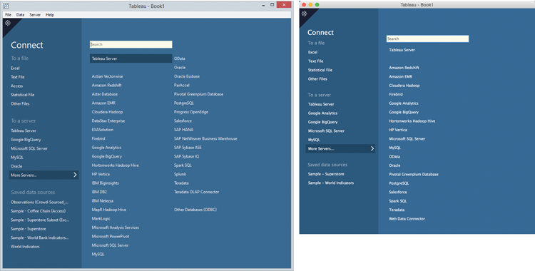
Figure 2-1: More Servers pane
The exposed list of connections includes databases, data cubes, and cloud-based services. To access a database, you must install the driver particular to the data source. Installation normally takes a couple of minutes. You can find the drivers at www.tableausoftware.com/support/drivers.
Frequently used databases will appear in the list of sources included in the main Connect pane below the (To a Server) section. The arrangement of the connections is dynamic and dependent on the frequency of usage. On the right side of Figure 2-1, the Google Analytics connection appears second and then Google BigQuery. That is because I connected to Google Analytics yesterday while in Tableau Desktop for Mac to analyze website activity. I also used Google BigQuery for some additional analysis.
If Tableau doesn’t provide a dedicated connector for a database you want to analyze, try the Other Databases (ODBC) option. That connection utilizes the Open Database Connectivity standard.
The saved data sources area you see at the bottom left of the Connect pane displays data sources that you have saved for easy access. Tableau also provides some sample training data sources in this area by default. The exact number and type will depend on the version of Tableau Desktop (Windows or Mac).
You learn how to save a data source later in this chapter. Saved data source files (.tds) are found on your computer’s hard disk in the data sources directory under the My Tableau repository. If you are logged into Tableau Server, you may also see saved data sources on your server’s repository. Next you’ll learn how to make a connection to a local file on your computer.
Connecting to Desktop Sources
Now you will connect to an Excel spreadsheet data source. The files used in this example and in the examples for the rest of the chapter can be found on the book’s companion website. See Appendix F, “Companion Website,” for the address. Download the Chapter 2 file and put it in a folder on your computer. Open Tableau Desktop and click the Excel option. This exposes the Open window, providing a view of the directories on your computer. It should look like Figure 2-2.
Navigate to the location where you downloaded the Superstore for TYD2 spreadsheet and select the file; then click the Open button you see in the lower-right side of Figure 2-2 to connect the spreadsheet file to Tableau. Doing this establishes the connection. You should now see the Connect Page in Figure 2-3.
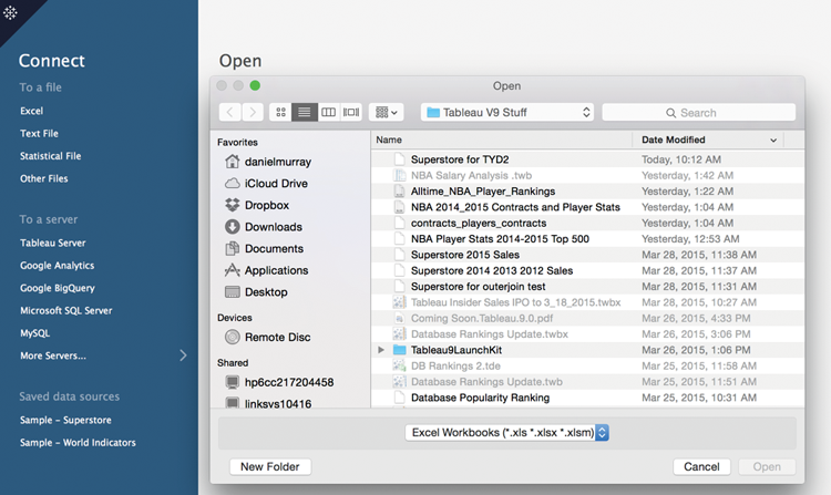
Figure 2-2: Open file window

Figure 2-3: The Connect Page
Look at the left pane. The items below the sheets area are individual tabs that are contained in the spreadsheet. Double-clicking the Orders sheet will cause that table to appear in the join area. You can also drag and drop the Orders sheet into the join area. Doing this establishes a live connection to the sheet in your workbook. Save your work. Let’s pause for a moment and go through the contents of the Connect Page in more detail.
Understanding the Connect Page
The Connect Page replaces the Connect to Data screen and connection window used until the release of Tableau Desktop V8.2 in 2014. It provides a more visual interface for connecting to data and joining tables. It also centralizes other tools for analyzing the contents of the data, performing data extracts, and restructuring data. You will learn how to use the new data cleaning features later in this chapter in the “The Data Interpreter” section.
The Left Pane Area
On the left side of the page, you can rename the data source connection and view the related sheets contained in the data source. At the top left of Figure 2-3, you see the connection currently in view. The connection has been renamed as Orders (Superstore for TYD2). You can rename the connection at the top left of the page by entering your own text and pressing Enter.
Immediately below in the Workbook area you see the filename of the data source. The sheet area contains the individual worksheet tabs from the spreadsheet data source. If the data source is a database, tables contained in the database would be listed. To see the contents of a particular sheet, look at Figure 2-4.
Hovering your mouse over the sheet of interest exposes the View Data icon to the right of the sheet name. Clicking that icon will open a tabular view of the data. This is similar to the Preview area but allows you to see the data before you place the sheet in the join area.
Connection Options
The upper-right area in Figure 2-3 contains connection options. Tableau uses a live connection to the data source by default. Clicking the Extract radio button enables you to exact the data into Tableau’s proprietary data engine. Using an extract can significantly improve performance. It also allows you to view database files remotely even if you don’t have access to the Internet. Extracting compresses the data and allows you to save the data extract on your computer. I’ll cover the details about data extracts later in this chapter.
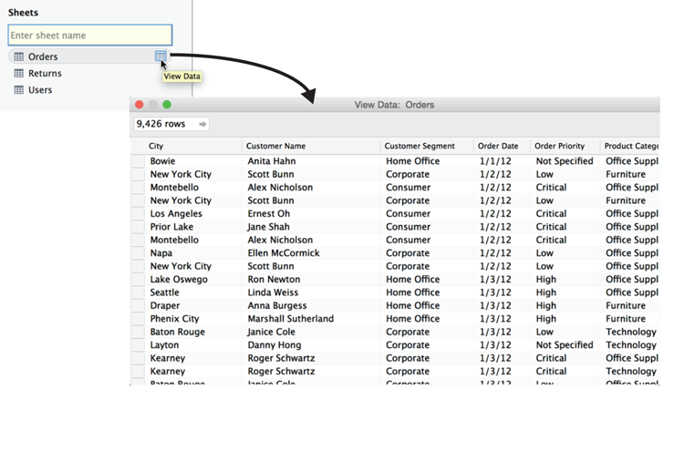
Figure 2-4: Viewing sheet content
To the right of the connection area is the Filters option. Selecting the Add option allows you to filter the data source. A running tally of the filters applied is also displayed. By filtering a direct connection, you may improve performance by eliminating unneeded data from your analysis.
The whitespace containing the orders sheet in Figure 2-3 is the join area. Starting with desktop V8.2, Tableau made defining joins a more visual experience. This approach makes the concept of joining tables more accessible to new users. You learn about the nuances of joining tables later in this chapter.
The Preview area in the bottom half of the page displays the rows and columns of the sheets placed in the join area. The two small icons at the top left of the Preview area permit you to toggle between the Data Source view visible in the Preview area in Figure 2-3 and the Manage metadata view in Figure 2-5. The Show aliases and Show hidden fields check boxes allow you to display or not display renamed or hidden items in the preview.
The Data interpreter helps you deal with problematic source data. It is turned on by clicking the button above the Preview area as shown in Figure 2-3. The Rows preview box on the top-right side of the Preview area displays the row count contained within the data source. If you are connected to a very large dataset, Tableau will initially limit the row count to 10,000 records. You can enter any number you want as the upper limit in the Rows text box.

Figure 2-5: Manage metadata view
Saving Data Sources and Workbooks
Saving a data source adds the connection to your Start page at the bottom of the Connect pane. Saving a workbook combines the data source connection metadata and all of the work you have done in one file, the workbook. You will be saving workbooks much more often than data sources. Once you’ve established saved data connections to the sources you use frequently, you won’t have to edit them very often.
Saving a Data Source
There are a few steps required to save a data source. Figure 2-6 shows the menu options required.

Figure 2-6: Saving a data source
Clicking the Sheet 1 tab in the lower left of the Data Source page takes you to the worksheet. Once there, point at the data pane displaying the data source. In Figure 2-6, the filename is Dans Superstore TYD2. The following are the steps required to save the data source:
- Point at the data connection and right-click to expose the menu.
- Select the Add to Saved Data Sources menu option.
- Click the Save button in the Add to Saved Data Sources window.
Notice in Figure 2-6 that the data source is being saved under the name assigned earlier. It was saved to the data sources directory on my computer as a Tableau Data Source (*.tds) file. Now, whenever I open Tableau Desktop, my Start page will include this data source, as you see in Figure 2-7.
The Start page includes the Dans Superstore TYD2 connection, but my workbook (Tableau – Book 1) is not saved yet.
Saving a Tableau
Before saving the workbook, drag the Product Category field from the Dimensions shelf to the Rows shelf. Then drag the Sales field from the Measures shelf to the Columns shelf. You should now have a bar chart in the view. Figure 2-8 shows one way to save the workbook.

Figure 2-7: Saved data sources

Figure 2-8: Saving the workbook
You can select File and then Save from the menu or just click the Save icon. Name the file “My first workbook” and then click the Save button, as you see in Figure 2-8. You have now saved your work as a Tableau Workbook (*.twb) file. In this scenario, you not only save the connection metadata but the work you’ve done in your workbook. Next, let’s look at how you can connect to a database that resides on a server.
Connecting to a Database
Databases have an additional level of security—requiring you to enter a server name and user credentials to access the data. The username and password you enter are assigned in the database, meaning the security credentials and the amount of access granted are controlled by the database—not Tableau. Figure 2-9 shows the connection window for a MySQL database.

Figure 2-9: Connection to MySQL
If you need to access a database source and you don’t know the server address, your username, and your password, you must request that information from your database administrator. After you receive the requested server connection information, you will access the same Connect Page you worked with in the previous example in Figure 2-9, but you will probably have a much larger number of tables displayed under the sheets section. Finding the tables you need for your analysis is facilitated by the Search filter.
Tableau’s manual provides specific details and screenshots for accessing all of the data sources that you can connect to. Figure 2-10 is a screenshot of the online manual.
Because Tableau frequently adds new connectors, the online manual is the best source of information regarding data connections. Go to Help ⇒ Open Help ⇒ Supported Data Sources in Tableau’s online manual to find specific details on connecting to different data sources. Click the Technical Specifications link in the manual to find the latest drivers for each database.

Figure 2-10: Tableau online manual
Connecting to Cloud Services
The increasing quantity and variety of data available on the Internet falls into three categories:
- Public domain datasets
- Commercial data services
- Cloud database platforms
The United State Census Bureau provides free population and business data. The World Bank provides a wide variety of country data, and many other public data repositories have emerged over the past decade. This data can be used to augment your proprietary data.
There are also a growing number of commercial data sources. Tableau currently provides connectors to
- Google Analytics
- Google Big Query
- Amazon Redshift
- Salesforce.com
- Open Data Protocol (ODATA)
- Microsoft Windows Azure Marketplace
The Google Analytics connector can be used to create customized click-stream analysis of web traffic. Google Big Query and Amazon Redshift connectors allow you to leverage storage and data processing services offered by Google and Amazon. Both enable you to purchase petabyte-scale database processing capacity on demand. There is also a connector for the popular cloud-based CRM tool, Salesforce.com, as well as the related Salesforce data products (Force.com and Database.com). Microsoft supplies data over the web via the Windows Azure Marketplace DataMarket and was the founding developer of OData (Open Data Protocol), facilitating the creation and consumption of REST APIs.
Connecting to BigQuery
Let’s look at one of the cloud database platforms, Google BigQuery. The connection screens are displayed in Figure 2-11. You can read all of the details about connecting to BigQuery in the help manual, but the setup requires only two steps. First you log in to your Google account; then you authorize Tableau to access your account.

Figure 2-11: BigQuery connection
I’ve used BigQuery to build dashboards that have over 100 million records, with less than two-second latency using a standard Internet connection. More businesses are using cloud data services because they are secure and reliable and perform well in many use cases. Tableau Software also provides a free cloud-based service, called Tableau Public, for publishing workbooks and dashboards.
Tableau Public
Tableau Public is the largest deployment of Tableau Server in the world. Thousands of people use it to share dashboards and visualizations with others. Figure 2-12 shows an example dashboard published on Tableau Public that was used in a blog post.

Figure 2-12: Tableau Public
After you sign up for a free account, two steps are required to share a dashboard on Tableau Public: Build a workbook that includes visualizations and dashboards and then publish the content you wish to share to your Tableau Public account.
The left side of Figure 2-12 shows a dashboard in Tableau Desktop and the menu options for publishing. To publish a workbook, go to the Server menu, select Tableau Public, and then pick the Save to Tableau Public menu option. If you haven’t logged into the service, you’ll be prompted to log in; then you can define exactly what parts of your workbook you want to publish, along with other options. The right side of Figure 2-12 shows the dashboard in the Tableau Public environment. Note the Share menu option at the bottom right of the image. Clicking that option exposes the embed code and link. If you want to embed the dashboard in a website, you copy that code and paste it into your post. You can also share a link to your published material on Twitter or Facebook.
Tableau has continued to expand the amount of data that Tableau Public users are able to publish. If you don’t have access to a licensed copy of Tableau Desktop, download the free Tableau Public desktop version. It works just like the paid desktop license with the notable exception being that the only place you can save your work is Tableau Public. Be careful not to publish proprietary data there as it is available to everyone without restriction.
What Are Generated Values?
When you connect to a data source, Tableau creates new fields that make difficult tasks easier. You see these fields in the data pane when you connect to a data source.
Figure 2-13 zooms in on the data pane area. If you want to follow along, the companion website contains the workbook used to build the figures in this section. Open that workbook or connect to one of the sample datasets in your saved data sources.

Figure 2-13: Tableau-generated fields
Measure Names, Measure Values, and Number of Records are always present. If your dimensions include standard geographic place names, Tableau will also generate center-point geocode coordinates.
Measure Names and Measure Values
Measure Names and Measure Values can be used as shortcuts for viewing all the measures in your dataset or to express multiple measures on a single axis.
In Figure 2-14, you can see that two measures are shown, SUM (Profit) and SUM (Sales). These appear as separate columns in the same bar chart. The generated value, Measure Names, is used in the Columns shelf to separate the bars. Measure Names is also used on the Marks card to distinguish color and on the Filters shelf to limit the number of measures shown in the view. Measure Values contains the data, and this is shown as rows as you would expect from this type of bar chart.

Figure 2-14: Multiple measures on an axis
The side-by-side bar chart in Figure 2-14 was created by multi-selecting one dimension and two measures. Using Show Me the side-by-side bar chart was selected to create the view. Tableau automatically applied Measure Names to the Columns shelf and plotted both measures on the horizontal axis. The Measure Names quick filter was exposed by right-clicking Measure Names in the Filters shelf and selecting the Show Quick Filter menu option. Using the Measure Names quick filter, you can add or remove measures from the axis. This style of chart works well only if the measures being plotted have similar value ranges.
There are many ways to combine multiple measures on a single axis. You learn those details in Chapter 3.
Tableau Geocoding
If your data includes standard geographic fields, such as Country, State, Province, City, or Postal Codes—denoted by a small globe icon—Tableau will automatically generate the longitude and latitude values for the center points of each geographic entity displayed in your visualization. If Tableau doesn’t recognize a geographic dimension, you can edit the field by right-clicking it and selecting the desired geographic unit. Figure 2-15 shows a map created using country, state, and city and then using Show Me to display a symbol map. The map is filtered using the region field to show only the United States.

Figure 2-15: Automatic geocoding
You can edit the color of the marks in the map by clicking the Color button in the Marks card and then selecting the desired color. Figure 2-15 shows the Color dialog box open with Transparency at 50% and a black border. The marks in the map were styled using the Marks card’s Color—changing the color transparency to 50% and adding a black border. This makes overlapping clusters of marks easier to see. Hovering over a mark exposes a small dialog box (tooltip) that includes additional details about the mark. The contents of tooltips can be edited by clicking the tooltip button on the Marks card.
The Eagle Pass tooltip shown in Figure 2-15 displays additional facts about the mark selected in the view. Notice that the summary information in the Status bar (lower left) of Figure 2-15 shows you that there are 1,619 marks being plotted in the map. This is the number of cities plotted on the map because city is the most granular standard geographic unit placed on the Marks card.
If Tableau fails to recognize any location, a small gray pill appears in the lower right of the map. Clicking that pill exposes a menu that helps you identify and correct the geocoding. Chapter 5 covers Tableau’s mapping capabilities in detail.
Number of Records
The final measure automatically provided by Tableau is a calculated field near the bottom of the Measures shelf called Number of Records. Any icon that includes an equal sign denotes a calculated field. The Number of Records calculation formula is typically the number one. Tableau creates a formula summing the number one to create a count of the rows contained in the data. In the special case of aggregated extracts, it is the number of records that were aggregated into that row. The bar chart in Figure 2-16 displays the record count for each customer segment and the grand total.

Figure 2-16: Number of Records
Number of records is a Calculated Value that helps you understand attributes about the data source. It is particularly helpful when you begin to join tables. Monitoring how the record count changes helps you understand data quality issues or design challenges that you may need to address in your visualization.
Knowing When to Use a Direct Connection or a Data Extract
Direct connections allow you work with live data. When you extract data, you import some or all of your data into Tableau’s data engine. This is true in Tableau Desktop and Server. Which connection method is the best to use? The answer to that question is dependent on the situation, requirements, and network resources.
The Flexibility of Direct Connections
Connecting to your data source with a direct connection means you are always visualizing the most up-to-date facts. If your database is being updated in real time, you only need to refresh the Tableau visualization via the F5 function key (Command+R on the Mac) or right-click the data source in the data window and select the Refresh option.
If you connect to massive data, the visualization is very dense, or your data is in a high-performance enterprise-class database, you may get a faster response time with a direct connection. Choosing a direct connection doesn’t preclude the possibility of extracting the data later. You can also swap from an extract to a live connection by right-clicking the data source and unchecking the Use Extract option.
The Advantages of a Data Extract
Data extracts don’t automatically refresh the data. A direct connection provides the latest content of the data source when the connection is made, but using a Tableau data extract can provide a number of benefits:
- Performance improvement
- Additional functions
- Data portability
Performance Improvement
Perhaps your primary database is already heavily loaded with requests. Using Tableau’s data engine enables you to split the load from your primary database server to the Tableau Server. Tableau’s extract may be updated manually or automatically on a daily, weekly, or monthly basis during off-peak hours. Tableau’s server can also refresh extracts incrementally and in time intervals as low as 15 minutes. In many cases, the small time consumed during the data extract update is more than offset by the performance gains.
There are several options available for creating an extract. First, you can aggregate the extract, which will roll up rows so that only the aggregation and fields used are updated for the visible dimensions and measures. Aggregating for visible dimensions when performing a data extract will reduce the amount of data that Tableau is importing. Selecting this option will cause Tableau to summarize the underlying data at the level of detail visible in your view. The appropriate level of fidelity is provided, and the size of the extract file is reduced—which makes the extract file more portable while also improving security by removing details that you don’t wish to share.
Extracting incrementally also speeds refresh time because Tableau isn’t updating the entire extract file. It is adding only new records. To do incremental extracts, you must specify a field to use as the index; Tableau will refresh the row only if the index has changed, so you need to be aware that changes to a row of data that doesn’t change the index field will be excluded from the update.
Another way to speed extracts is to apply filters when extracting the data. If the analysis doesn’t require your entire dataset, you can filter the extract to include only the records required. If you have a very large dataset, you will rarely need to extract the entire contents of the database. For example, your database may include ten years of historical data but you may require only one year of history.
Once you have created an extract, you may append another file. This may be a great alternative to custom SQL if you are considering a table UNION (applicable for spreadsheet sources on versions prior to 8.2 only). This technique might be useful if you need to combine monthly data that is stored in separate tables.
Additional Functions
If you are using Tableau Desktop V8.1 or earlier and the data source is from a file (Excel, Access, text), doing an extract will add calculation functions (median and count distinct) that are not supported by the data source. This is no longer required in V8.2 and later.
Data Portability
Extracts can be saved locally and used when a direct connection to your data source is not available. A direct connection doesn’t work if you don’t have access to your data source via a local network or Internet connection. For example, you may need to supply a dashboard to an executive that will be flying to a remote location. Using a data extract (.tde) file provides the user access to a fully functional, high-performance, local data source. Data extract files are also compressed and are normally much smaller than the host system database tables.
In enterprise environments, data governance is an important consideration. If you distribute many data extract files to field staff, keep in mind that you should consider the security of those files. Appropriate safeguards should be in place (non-disclosure agreements) before you provide these files to traveling or remote staff. Consider restricting what the extract includes via filters and aggregating for visible dimensions.
Using Tableau’s File Types Effectively
Tableau provides flexible options for the sharing of data and design metadata. This is accomplished through a variety of file types:
- Tableau Workbook (
.twb) - Tableau Packaged Workbook (
.twbx) - Tableau Datasource (
.tds) - Tableau Bookmark (
.twb) - Tableau Data Extract (
.tde)
These files are saved within the My Tableau Repository folder located in My Documents by default.
Tableau Workbook Files
Tableau Workbook files (.twb) are the default file type created by Tableau when you save workbooks. These are usually small files because they contain metadata related to your connection, field pill placements for rendering the views along with metadata associated with field aliases, renamed fields, and calculations.
Workbook files do not contain any of the actual data from the database. For this reason, workbook files will normally be small. Every time you open a workbook file that has a direct connection to a live data source, you are looking at the most up-to-date data.
Tableau Packaged Workbooks
To share a workbook with someone who doesn’t have access to the data source used to create the workbook, save it as a packaged workbook (.twbx).
Packaged workbooks (.twbx) bundle the data and metadata into a single file. If you later need to access the original data source file contained within the packaged workbook, right-click the .twbx file in an Explorer window, and select the Unpackage menu option.
People without licensed access to Tableau Server or Tableau Desktop can view packaged workbooks using a free tool provided by Tableau Software called Tableau Reader. If you are distributing sensitive or proprietary data, be aware that packaged workbook files are zip files. Packaged workbooks can be unzipped exposing potentially sensitive information. While you can mitigate this by filtering and aggregating the extract when it’s created, this isn’t a replacement for Tableau Server. The server environment provides robust data security and data governance features. The chapters on Tableau Server in Part II cover security and governance options in detail.
Tableau Data Source Files
Changes made within your data pane (the left side of the desktop workspace) alter the metadata of your connection. Grouping, sets, aliased names, field-type changes, and any other modifications made in your workbook are part of the metadata. Can you share just the metadata with others? The answer is yes. This is done by creating a Tableau Data Source (.tds) file.
A Tableau data source file defines where the source data is, how to connect to it, what field names have been changed, and other changes applied in the dimensions and measures shelves. Data source files can be saved locally or published to Tableau Server. This is particularly helpful if you work in a large enterprise. Perhaps you have a small number of database experts that understand your database schema well. They can create the connection, define table joins, group or rename fields, and then publish the data source file for other staff to use as a starting point.
To create a data source file, right-click the filename in your data window; then select the Add To Saved Data Sources option. Data source files are placed in the My Tableau Repository/Datasource folder. Additionally, files placed in that folder are automatically displayed as saved data connections on Tableau Desktop’s start page.
Alternatively, you can publish data source files to Tableau server and share them with other staff. This is a great option for sharing workbooks containing complicated database joins that must be done by more technical staff. In this way the knowledge of the most experienced and knowledge staff can be shared with a larger number of analysts. These data source files can serve as a starting point for analysis by operations team members that may know more about the business domain.
Changes made to Data Source files (.tdsx) are available to everyone who has been given permission to access the file on Tableau Server. When changes are made to these published connections, everyone who has been granted access to the file will have the latest version.
Tableau Bookmark Files
What if you have a massive workbook (with many worksheets) and you want to share one worksheet only with a colleague? This is done by using a bookmark (.tbm) file. Bookmark files save the data and metadata related to a worksheet within your workbook––including the connection and calculated fields.
To create a bookmark file, go to the Window menu bar and look for the Bookmark menu option and select Create Bookmark. The bookmark will become visible when a new Tableau session is started. The file will appear in the Window menu. Opening the bookmark file will initiate the connection and add it to the workbook. Tableau bookmark files are stored in your Tableau Repository in the Bookmarks folder.
Copying Contents
A new feature provides the ability to copy the contents of worksheet from one workbook to a different workbook. You can do this by selecting the tabs you want to copy, right-clicking, and then selecting the Copy Sheet menu option. Then, open a new workbook and paste the contents. This copies all of the metadata and data source connections to the new workbook.
In the remainder of this chapter, you learn the challenges related to establishing data connections. You also learn how to deal with data quality and data structure issues, join tables, and blend data from disparate data sources.
Dealing with Data Shaping and Data Quality
Inaccurate data can lead to bad decisions. If your data isn’t clean, errors and missing information won’t necessarily be easy for knowledgeable information consumers to identify. If you create reports and analysis that other people rely upon, you should do your best to find and correct bad or missing data before you share your workbook. If you choose to share unaudited data, you should disclose potential data quality issues to the people who will be using the information.
Tableau provides tools to help you deal with issues without requiring intervention at the database level. This is helpful if your time is limited or key technical staff are not available to fix the problem.
The best course of action when you find errors is to report them to the IT person responsible for data quality within the database you are using. If you bring together data from many different sources into a spreadsheet, it is a good idea to make notes in your workbook to document the process you went through to build the analysis. This lends credibility to your work.
Quick Data Shaping and Editing in Tableau
There are several different ways you can enhance and shape data while you are building views and stories or dashboards. Whether you are connecting to an enterprise-class database or a spreadsheet, Tableau makes it easy to refine filenames, group data elements, create user-friendly naming of fields and data elements, fix unidentified geographic place names, and deal with unmatched null values.
Renaming
You rename a field in Tableau by right-clicking the field and typing in a new name. Field member names can also be aliased. These changes do not alter the source database. Tableau “remembers” what you renamed without altering the source data.
Grouping
Let’s assume that a company name has been entered using all of these variations: A&M, A & M, A and M, A+M. With Tableau, you can multi-select (Control+Select in Windows or Command+Select in the Mac) each of these names—group them—and create a name alias for the ad hoc grouping. So, all the versions of the name appear as one record in Tableau—A&M. This grouping and name alias is saved as part of Tableau’s metadata.
Using Name Aliases to Provide Better Descriptions
It is common for database designers to categorize rows contained in a database based on a range of values or some other attribute of interest. This makes it easier to build drill-down reports. Sometimes these codes are not very descriptive to the people accessing the data. For example, the database designer may have created codes (P1, P2, G1, G2) to describe ranges of annual sales values.
In Tableau, you can alias these codes with more descriptive titles. P2 might mean Platinum Level 2, which is used to describe customers with annual sales of $1 million to $5 million. By right-clicking the P2 field name and selecting the Edit Alias option, you can create a more descriptive name (P2 - Annual Rev $2M to $5M). The Name Alias will now be how the P2 description will appear in Tableau.
Geographic Errors
Although Tableau has built-in mapping that works very well, there will be occasions when geographic locations are not recognized. Tableau will warn you by placing a small gray pill in the lower-right area of your map. Click that pill to edit problem locations or filter them out of view. This is also accessible from Tableau’s map menu.
Null Values
When you see the word “null” appear in a view, that means Tableau can’t match the record. You can filter out nulls, group them with non-null members of the set, or correct the data causing the null. There are many reasons why a null value could result. If you aren’t sure how to correct the null, seek assistance from a qualified technical resource.
Data Quality Challenges
Tableau makes it easy to connect to a wide variety of databases. Today’s marketplace rewards speed. Being the first to gain insight into something of importance has value. The “single-version-of-the-truth” ethos that pervades the database community is intended to ensure data quality, but it comes at the cost of speed. This is why people with access to a database often get time-sensitive information in spreadsheets. They can’t afford to wait. Or, if you are like the majority of people in the world, most of your analysis is done using a spreadsheet.
Spreadsheet data is readily obtainable but comes with higher data quality risk. Poor data quality can be broken down into three major areas:
- Wrong data
- Missing data
- Poor data structure
Using a spreadsheet as a data source places responsibility on you to ensure that the data in the spreadsheet is accurate and complete. If that isn’t the case, you have to decide if the data is good enough for your purpose. Tableau can’t help you deal with this directly. The main problem with spreadsheets is that the data analysis and presentation layers are in the same place. The format used in spreadsheets doesn’t always comply with the best practices of data storage. The structure of the rows and columns in your spreadsheet may not support the analysis you need to do. In addition, the data may be completely unaudited. As the designer, you assume responsibility for wrong or missing data.
For years, Tableau provided an Excel add-on tool called the Data Reshaper. It reduced the time required to deal with data structure issues. Many of the features of the Excel add-in are now built directly into the Tableau’s data source page. In the next section, you learn how to use the Tableau Data Interpreter to clean up and reformat spreadsheet data.
The Data Interpreter
Tableau’s Data Interpreter was introduced in V9.0 and is intended to help you deal with poorly formatted and structured spreadsheet data. It includes a variety of tools to help fix problems and address issues with your data source:
- Pivoting columns
- Reformatting data
- Renaming headings
- Splitting cells
- Changing data types
- Hiding unneeded data
Using the Preview Area in the Connect Page in Figure 2-3, you can determine the condition of the data and whether or not reshaping your data is necessary. If the data doesn’t look right, see if the Data Interpreter can help by clicking the Turn on option.
The example you’ll work through in the next section uses nearly all of the Data Interpreter’s toolset. The resulting clean dataset will be used in the data blending section at the end of this chapter.
Preparing a Spreadsheet for Tableau
This example utilizes a spreadsheet with population data from the United States Census Bureau.2
A copy of the source spreadsheet (NST-EST2014-0.xlsx) is provided on the companion website. Figure 2-17 provides a view of the unedited data.
The spreadsheet includes census information and population projections for April 2010 through July 2014 for the entire country, regions, states, and Puerto Rico. It’s formatted for presenting and consuming the data within the spreadsheet and is not ideally formatted to serve as a data source.

Figure 2-17: Census Bureau spreadsheet
The data should be an unbroken list with a single header row; that data should be consistent, and the list should be more row-oriented. Ideally, the multiple columns displaying the population counts and projections should be in a single column and a new reference column added that defines type of data being presented in the data column.
Areas 1 and 2 in Figure 2-17 highlight some issues. Focusing on Area 1, you see that multiple headers contain similar measures (population estimates) applied across more than one column. In Area 2 you see a gap in the rows between Wyoming and Puerto Rico. Having each year in a separate column is typical in a spreadsheet, but Tableau will interpret each year as a different measure. That isn’t necessarily bad but will not suit our needs. While each column represents a different time period, the facts collected include an actual census and estimated projections using the census as a base.
Less obvious problems exist in this dataset. For example, there are periods inserted in front of the state names that you can’t see in column A in Figure 2-17 but are visible in the field displaying Alabama (Area 3). The geographic units presented in column A (Area 4) are not consistent. Country, region, and state are all included in the same column. Let’s see how the Data Interpreter can help you address these issues.
Using the Data Interpreter to Prepare the Data for Analysis in Tableau
You will use the Data Interpreter to fix data structure problems. The other issues with the data quality and consistency will be addressed using a Tableau function and filtering. The steps for this exercise include
- Open Tableau and connect to
NST-EST2014-01.xlsx. - Use the Sheets preview to review the data source.
- Turn on the Data Interpreter.
- Rename the headings.
- Split the period from the heading in the Geographic Area field.
- Rename the split field as “state.”
- Pivot the year columns.
- Rename the pivoted fields (state and year).
- Define the state field data type as geographic (state).
- Build examples to validate cleanup.
Before you connect to the census data spreadsheet, open it and review the layout and contents. Get familiar with the layout in the NST01 tab. Now open Tableau and connect to the data source from the Start page by selecting the Excel option in Tableau’s Start page and picking the NST-EST2014-01.xlsx file from the location you stored it on your computer. Alternatively, you can drag and drop the spreadsheet on the Start page. This will open the file in Tableau as well.
Now that you’ve connected Tableau to the file, notice Tableau displays two sheets. The green symbol indicates that the spreadsheet contains named ranges. The second sheet circled in Figure 2-18 is the raw spreadsheet data. Double-click the second version of NST01.

Figure 2-18: Data source connection
This will add the sheet (table) to the join area and display the contents in the Preview area, as you see in Figure 2-18.
Preview the Sheet Content
Focus on the Preview Area in Figure 2-19. You can see that the headings in the first four rows are a problem. There are lots of null values and missing heading names.
Remove the NST01 table from the join area by clicking the gray pill in the join area and then click the red X to remove it. Or, just drag it off the screen. Then drag the first NST01 sheet with the green icon into the join pane. Notice that this named range version of the connection looks a little better. The range names in the spreadsheet were defined by the person who created the spreadsheet at the Census Bureau. Let’s work with the ugly version so that we give the Data Interpreter a bigger challenge.

Figure 2-19: Turn on the Data Interpreter.
Replace the NST01 (named range version) with the second NST01 sheet by dragging it on top of the named range version in the view.
Turn on the Data Interpreter
Turn on the Data Interpreter by clicking the Turn on button, which you can see at the top of Figure 2-19. This applies the Data Interpreter to the dataset and causes the Preview area to reformat the data, as you see in Figure 2-20.

Figure 2-20: Data Interpreter initiated
You can see data looks more orderly. Clicking the Review results button at the top of the preview area generates a spreadsheet analysis of what Tableau did to reformat the data. Figure 2-21 shows a screenshot of the Review Results spreadsheet.
On the left side is a key that describes the color-encoding used in the view on the right side of Figure 2-21. Based on improved Preview area view and the additional confirmation from the review generated by Tableau, you can access the quality of the changes made by the Data Interpreter. If the data or formatting doesn’t look right, you can turn off the interpreter and deal with the problems directly in the spreadsheet.

Figure 2-21: Excel review of interpreter changes
Next, you’ll use the Preview area to hide unnecessary fields and rename columns that you want to use in your analysis.
Hiding and Renaming Columns
Hiding and renaming columns is easy to do in the Preview area. The spreadsheet includes the following fields:
- Geographic Area
- April 1, 2010 Census
- April 1, 2010 Estimate Base
- Population Estimate (as of July 1) 2010
- Population Estimate (as of July 1) 2011
- Population Estimate (as of July 1) 2012
- Population Estimate (as of July 1) 2013
- Population Estimate (as of July 1) 2014
Start by using the Data Interpreter to hide the Census and Estimate Base columns, as you see in Figure 2-22. Pointing at the drop-down arrow in a column exposes the Hide menu option. Clicking the drop-down arrow, which appears when you hover the pointer over a column name, exposes a menu that includes the Hide option.

Figure 2-22: Hiding unneeded columns
Now that the unneeded columns are out of view, rename the population estimate columns as follows:
- Population Estimate (as of July 1) 2010: Rename as 2011
- Population Estimate (as of July 1) 2011: Rename as 2012
- Population Estimate (as of July 1) 2012: Rename as 2013
- Population Estimate (as of July 1) 2013: Rename as 2014
- Population Estimate (as of July 1) 2014: Rename as 2015
Figure 2-23 shows you how to rename the fields. The years are off by one because my data goes through the year 2015. I’m the person blending, and this is the use case that I require. Since the July 2014 data is the most recent, I’m matching it with the latest year in my data. That’s one of the nice things about blending. You define the rules.

Figure 2-23: Renaming columns
Clicking the drop-down arrow in a column exposes the Rename Field dialog box, with the original field name as shown in the middle of Figure 2-23. Type in the year number desired and click OK. Repeat this step for each of the population estimate columns.
Split the Geographic Area Column
After hiding and renaming the columns, your Preview area should look like Figure 2-24.
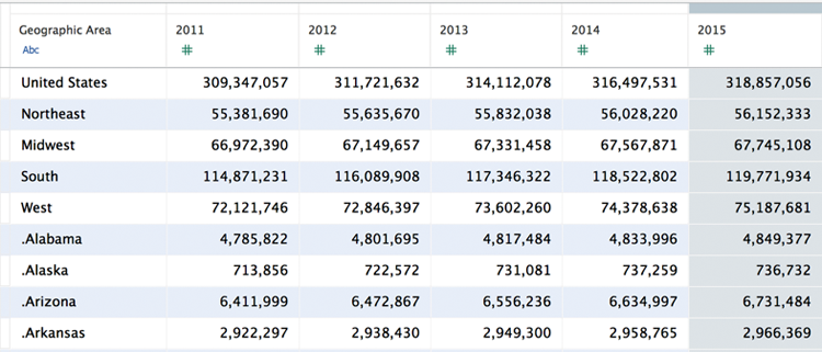
Figure 2-24: Renamed columns
Focus on the row details below the Geographic Area column. There are rows containing geographic areas that are not states, and the state rows have a period in front of the state names. This is undesirable. Use the Split menu option to separate the period and the state names into separate columns. Figure 2-25 shows you how to do this.

Figure 2-25: Field split menu
The left side of Figure 2-25 shows the menu accessed by clicking the drop-down arrow in the column. Choosing the Split option will result in the view you see on the right. States are now in their own column. The country and region information is split with blanks. Puerto Rico at the bottom has a blank column as well. This is not an issue because we are interested only in the lower 48 states, Alaska, Hawaii, and the District of Columbia.
Change the Datatype of the State Column
After hiding and renaming the columns, your Preview area should look like the top left of Figure 2-26. The Data Interpreter named the new column created by the split Geographic Area—Split 1.

Figure 2-26: Changing a datatype
Rename that column and call it State. Then, change the datatype of the column giving it the geographic role of State/Province, as you see in the lower right of Figure 2-26. The column names and formatting are complete. The remaining step is to reshape the data into a format that is more like a database would store it.
Pivot the Year Columns
You could stop the reshaping at this point, but there could be a disadvantage. If you try to create a time series analysis of this data, it would still be possible, but it would require that you utilize the measure names and measure values to place different measure on the same axis. Why? Because Tableau will interpret each year column as a separate measure. The data in each of the renamed year columns is really the same measure (population estimate) for different years. In a properly structured database the table layout would consist of three columns: one for the geographic area, another for the year, and a third for the population count.
The Data Interpreter allows you to pivot the data quickly in the Preview area. First multi-select all of the population columns, as you see in Figure 2-27. If you do this correctly, the year columns should be highlighted. Choose the Pivot menu option from the 2010 column.
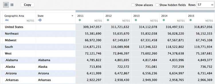
Figure 2-27: Pivot the year columns.
When you click the Pivot menu option, the Data Interpreter will create a new three-column view of the data. It should look like the top left of Figure 2-28.

Figure 2-28: Reshaped data
Rename the second column as Year and the third column as Population, as you see in the lower right of Figure 2-28. At this point, your dataset is restructured, and the column headings are updated. Look at the reshaped data in the Preview area (see Figure 2-29).

Figure 2-29: Preview data source view
Notice the check boxes for showing name aliases and hidden fields. Selecting the check box displays the two columns that were hidden. No row members (state names) were given name aliases in this example. If name aliases were used, checking/unchecking the Show Alias box allows you to toggle between the original field name or the name alias.
The two small icons at the top left of the Preview area allow you to select different views of the data. Figure 2-29 is currently showing the default preview data view. Figure 2-30 shows the Manage metadata view.

Figure 2-30: Manage metadata view
The Manage metadata view is displaying hidden fields. It shows the source of the particular column (the original table or the pivot from the Data Interpreter) and the field names in the source dataset and the renamed fields.
All of this reformatting could be done in Excel, but it is faster and easier to prepare the data using the Data Interpreter. Test your work by building a map using the reshaped data.
Using the Reshaped Data in a Map
In order to confirm that all the data cleaning done has worked properly, build a map view of the data, as shown in Figure 2-31.

Figure 2-31: Map showing population
If you are not able to create the map, don’t worry. In Chapters 3 and 5, you learn all of the details necessary to create maps and more.
Tableau’s Data Interpreter helps you analyze spreadsheet data sources faster and more easily. You must have Tableau Desktop V9.0 or later to use this facility.
Joining Database Tables with Tableau
Seldom will your data include every bit of information you need in a single table. Even if you normally connect to Excel, it may be advantageous to use related data from more than one tab. As long as the data resides in a single spreadsheet or database and each table includes unique identifiers (key records) that tie the tables or tabs together, you can join these tables within Tableau.
Database joins can be complex. The basic principle is to bring together related information in your view. If you need to connect to an enterprise-class database, many more tables will be available. You should consult with a knowledgeable expert in your organization for assistance to ensure that your joins result in the correct definition.
Beginning with the release of V8.2, the join interface became more visual. Venn diagrams are now being used for defining the joins. Most Tableau users aren’t database experts, and this more visual method for defining joins makes the task easier.
The Default Inner Join
You can define joins when you make your initial data connection or add them later. This example will use the Orders and Return tabs (tables) from the Superstore for TYD2 dataset. Figure 2-32 shows portions of the orders and returns tables. The Orders table includes all billing information. The Returns tab includes a smaller returned order table.

Figure 2-32: Orders and Returns tables
Start by connecting to the Orders sheet and then drag the Returns table into the join area, as you see in Figure 2-33.

Figure 2-33: Defining the join
Clicking the Venn diagram in the join area causes the join window to be displayed. Join options that are dimmed are not available for the data source. Because Excel is the data source, the right and full outer join options are not available. These options are dependent on the data source. Most databases support these types of joins.
Notice that the inner join is selected and the resulting row count is 98. This means that there are 98 matching records between the Orders and Returns tables. Next let’s look at what the left join option does.
The Left Join
Change to a left join by clicking the Venn diagram to expose the join options. A left join will cause all of the records from the Orders table (9,426), along with any matching records from the Returns table (98), to become available. Figure 2-34 displays the result in the Preview area.
The fields that don’t have matching records in the Returns table will be displayed as NULL values in the combined table. If you are following along, try selecting the left join type and notice that the number of rows displayed in the Preview area will change.
You can add as many tables as necessary in the join area. Try joining the Users table to the view on your own and adjust the join type.

Figure 2-34: The left join
Customizing Tableau’s Join Script
Prior to V9.0, it was possible to edit the connection script when you were working with Excel, Access, or text files. This facility is no longer available. This is the first time I’m aware of that Tableau has deprecated a feature that existed in a prior release. The Data Interpreter offers significant improvements for the majority of users. If the cost of the gained convenience of the Data Interpreter is the loss of full outer joins for Excel, Access, and text files, I think the value gained is worth the price. My expectation is that Tableau will find a way to bring this facility back in a future release.
In the meantime, if you are have more than one million records that you need to analyze, you should consider installing a real database. There are many low-cost commercial and open source databases with which Tableau provides all of the join options.
In the next section, you learn how to bring together data from different data sources into a single visualization using data blending.
Blending Different Data Sources
Wouldn’t it be wonderful if all the data you needed to create your analysis always resided in a single database? Often, this isn’t the situation. If you need to use data from more than one data source, Tableau provides a solution that does not require building a middle-layer data repository. If the disparate data sources have at least one common field, Tableau can combine them using data blending.
When to Use Blending versus Joins
If your data does reside in a single data source, it is always more desirable to use a join versus a data blend. In the last section, you saw that Tableau provides plenty of flexibility for creating joins to your data source. Joins are normally the best option because they are more robust, persist everywhere in your workbook, and offer more flexibility for defining the join clauses than blending. However, if your data isn’t in one place, blending provides a viable way to quickly create a left join–like connection between your primary and secondary data sources.
Blends persist only on the worksheet page where they were created. This makes blending ideal for ad hoc analysis. Whatever data source is used first to build a view becomes the primary data source for that worksheet. Data sources used later become the secondary data source. This means that any data source can be the primary data source in a view.
In the next section, you learn how to blend population data from the U.S. Census Bureau with sales data from the Superstore dataset.
How to Create a Data Blend
Creating data blends requires some planning. If you are going to bring data that doesn’t reside in your primary data source, you have to think about the fields you may need in order to achieve the desired result. Blending is easier if you have completely consistent field names in the data sources being used for the blend. The field names and the field members need to exactly match. Blending based on Cities will not match Saint Cloud from one source with St. Cloud in the other. If you can’t rename fields to make them match, you can still blend the files but it requires slightly more effort.
If the blending fields have identical names, Tableau recognizes the fields in common and will automatically create the link for the blend. If the fields do not have identical names (City and Cities), you have to define the blend manually using the Edit Relationships menu.
Automatically Defined Relationship
The Superstore data source contains geographic sales data. What if you wanted to know what the per-capita sales for each state were for the year 2014? The Superstore dataset doesn’t include population data but the United States Census Bureau website does.
The data in Figure 2-35 was downloaded from the web and adapted for this example. The spreadsheets used in this example are included in the Chapter 2 download on the companion website. This example uses the Superstore for TYD2 and the Population 2014 spreadsheet files.

Figure 2-35: Population data 2014
Just two columns of data are included in the table. It is important to note the field descriptions for the states. For automatic blending to work, the field name for the blend must be the same in the Superstore for TYD2 dataset and the Population spreadsheets. If the fields are not the same, you will need to edit the name in the spreadsheet or rename the fields in Tableau so that they match.
To start an automatic blend, you must define the primary data source by placing one of its fields on the worksheet. The first data source used in the view becomes the primary data source for that particular view. Figure 2-36 shows a bar chart for sales by state.
Superstore for TYD2 is now the primary data source on this worksheet; rename the sheet Blending Example. The Population 2014 spreadsheet that will be blended into this view also includes state names, but the Superstore for TYD2 field name for state is State/Province. Before attempting the blend, rename the field to State. Now both datasets use the same name for the field.

Figure 2-36: Sales by state
Next drag the Population measure from the Population 2014 data and place it on the Columns shelf. Once that is done, the data from the population spreadsheet can be used in the workbook. It becomes a secondary data source in the view. Dragging the Population field from the secondary data source onto the Columns shelf locks-in the blend. The orange check mark on the Population field and in the data window confirms the blend. Figure 2-37 now shows the sales data from Superstore next to the population for each state.
The orange border on the left side of the dimension and measures areas provides additional confirmation that the fields in the Population 2014 data are the secondary data source in this worksheet view.
A warning—when you perform data blending, you must ensure that all of the records you expected to blend actually came into the view. In Figure 2-37 this is not the case. New York population didn’t come over in the blend because the state names used in the primary and secondary data sources do not match. You can correct this by right-clicking the abbreviated state name (NY), selecting the Edit Alias menu option, and renaming it as New York. This will reconcile the name and eliminate the null value. Figure 2-38 shows the blended view with labels added that include additional information in the data in the mark labels.

Figure 2-37: Blended sales and population data

Figure 2-38: Bar chart using blended data
To save space, Figure 2-38 shows only the top six states by per-capita sales. The labels to the right of each bar show the total sales and the sales per hundred thousand people. The color of each bar encodes the total sales of each state. See if you can figure out how to create the formula to express that value. Look at the completed sample file included in the companion website materials. You will learn how to create calculations in Chapter 4.
Keep in mind that even if the field names denoting state are not the same, you can still blend the data sources using the Data/Edit Relationship menu option. The next example shows you how.
Manual Blending
What if your needs are more complicated? A scenario that requires the use of two or more dimensions is the comparison of budget data from a spreadsheet with actual data from your billing system. The field names in the data sources may be different even if they refer to the same thing. In this example, the Superstore for TYD2 file will be blended with the Budget Sales 2015 file. The budget file is included in the Chapter 2 companion website download. It contains monthly sales budgets by Product Category and Product Sub-Category. These are the steps used to build the bullet graph in Figure 2-39:
- Connect to Superstore for TYD2.
- Build a bar chart of actual sales for each product category by month filtered for the year 2015.
- Connect to the Budget Sales 2015 file.
- Pivot the 12 date fields and rename Pivot field names as Month and Pivot field values as Budget Sales.
- Use the Data/Edit Relationship menu to define the blend on product category and month.
- Drag the Budget Sales 2015 field on to the Detail button on the Marks card and then create a reference line using that field.
Encoding the bars with color was accomplished by adding the calculated value seen in the caption at the bottom of Figure 2-39 to the Color button on the Marks card.

Figure 2-39: Bullet graph with blended data
Actual sales data from the primary data source, Orders (Superstore for TYD2), is displayed using bars. Budgeted data from the secondary data source (Budget Sales 2015) is plotted with vertical black reference lines for each cell. In Figure 2-39 the blend on both fields is denoted by the two orange links in the Dimensions shelf. This multi-field blend is created via the Data/Edit Relationships menu. Figure 2-40 shows the menu and the related dialog boxes.
From the Data menu option, select Edit Relationships, as shown in Figure 2-40. This exposes the relationships window. Product category will appear automatically because that field name exists in both data sources, and Tableau should automatically recognize the blend.

Figure 2-40: The relationship menu
Clicking the Add button exposes the Add/Edit field mapping window, where the specific date aggregation can be selected from each data source. After picking the appropriate date field, select OK to lock in the date. Click OK in the Relationship dialog box to finalize the links for both fields.
Review the pill placements in Figure 2-39 to see where fields were placed to create the chart. Be aware that you can display the fields for each data source in the data window by clicking the desired data source in the data window. The blue highlight on the Budget Sales 2015 data source you see in Figure 2-39 indicates that its fields are being displayed within the Dimensions and Measures shelves.
The black reference lines in each cell were created using the blended Budget Sales 2015 field from the secondary data source (indicated by the orange check mark in the data window and by the orange border on the left side of the Dimensions and Measures shelves.
The calculated field used to create the bar colors is displayed in the caption below the graph and is stored in the primary data source. Gray bars denote items above plan. The gray color gradient behind the sale bars comes from a reference distribution that uses color hue to show sales at 60 percent, 80 percent, 100 percent, and 120 percent of planned sales. You’ll learn how to create bullet graphs with color-encoding like this in Chapter 7.
Next let’s consider factors that can affect the load speed of your data connections.
Hardware Factors That Affect Performance
Four areas affect Tableau’s speed:
- The server hardware, which hosts the database
- The database, which hosts the data
- The network, over which the data is sent
- Your own computer’s hardware, which has Tableau Desktop
Like any chain, the weakest link dictates overall performance.
Your Personal Computer
Tableau doesn’t require high-end equipment to run. But, you will find more internal memory, a new microprocessor, and a faster hard disk will all contribute to better performance—especially if you are accessing very large datasets. The video card and monitor resolution can contribute to the quality of how Tableau presents the visuals.
Random Access Memory (RAM)
Tableau 9 runs as a 32-bit or 64-bit application on Windows and on the Mac, which means the maximum memory that it can access is 4GB (32-bit) or 8GB (64-bit). Expanding RAM to the maximum amount the operating system supports provides the best performance.
Processor
A faster processor will help Tableau’s performance, but you only really get a chance to change the processor when you buy your computer. Buy the best you can justify, and you should be fine.
Disk Access Times
Tableau is not normally a disk-intensive program, but having a faster hard disk drive or a solid-state drive (SSD) will help Tableau load faster. If you work with very wide and deep datasets that exceed your machine’s internal memory capacity, it will slow down and will result in page swapping to the hard disk drive. In this circumstance a fast hard drive will help performance.
Screen Size
The resolution of your screen affects the level of detail that you’re able to discern. A visualization on a large, high-resolution screen may provide better insight than a rendering on a lower-resolution monitor into. If you have a very good monitor, you must consider that other people may be consuming your analysis with equipment that isn’t as good. If they have a lower-resolution video card, your visualization will not be the same on their computer. Chapter 8 includes tips and tricks for designing dashboards that allow you to manage your dashboard designs so that they capitalize on high-resolution hardware without penalizing information consumers with older, less-capable equipment.
Finally, consider the amount of work you are asking Tableau to do. While it is possible to plot millions of marks in a chart, ask yourself if all those marks add to understanding the data. If you run into performance issues, review the level of detail you’re plotting. Using fewer marks in the view may improve the content’s value and improve the rendering speed.
Your Server Hardware
The key consideration with regard to the specification of your server hardware is the volume and activity level you anticipate. Is your database currently deployed on the three-year-old production server with thousands of concurrent users? Does your server have other demanding applications running that may cause resource contention?
Tableau can run in the cloud and on servers that have other applications running, but as your deployment expands, it is best to dedicate a server to Tableau. For massive deployments, Tableau core licenses can be divided across multiple servers.
Specifying server hardware is not a one-size-fits-all proposition. Tableau provides guidelines on their website, but each situation is unique and requires some detailed planning. In general, oversizing the hardware a little isn’t a bad idea. Tableau normally becomes very popular when it is deployed, so consider the potential for increasing demand and get professional assistance if you are unsure about the server hardware you should purchase. Chapter 11 covers this topic in more detail.
The Network
Like any other form of infrastructure (transport, power, water), data networking is a mundane but vital component for the efficient performance of any system. Networking is therefore the responsibility of specialists within your organization, and they can help you identify if there are choke points in your network that slow the performance of Tableau. For all but the very largest organizations, network capacity is seldom a bottleneck.
The Database
If you are using live connections to your data—as opposed to data extracts—the performance of your database is one of the most significant determining factors of speed.
As more people in your organization use Tableau, it is important to monitor resource load on the server, the network, and the database. Tuning your database is the responsibility of the database administrator. It is normally helpful if someone from the IT team is directly involved in the early phases of enterprise roll-outs, especially if it is expected that Tableau may create larger or different demands on the database.
If the database administrator understands the type, amount, and timing of the query loads that Tableau may generate, proper planning can ensure that system performance will not be degraded due to inadequately indexed database tables or an overloaded database server.