Chapter 6
Developing an Ad Hoc Analysis Environment
The creative process, in essence, is an individual in dialogue with themselves and the work. The painter, when at a distance from the easel, can assess and analyze the whole of the work from this vantage. He scrutinizes and listens, chooses the next stroke to make, then approaches the canvas to do it. Then, he steps back again to see what he’s done in relation to the whole. It is a dance of switching contexts, a pitter-patter pacing across the studio floor that produces a tight feedback loop between mark-making and mark-assessing.
—Frank Chimero1
In Chapter 2, you learned that Tableau connects to a wide variety of Data sources, and this is further extended through the Data Interpreter and Data blending. Chapter 3 introduced the Show Me button, trend lines, reference line, and how filters, sets, grouping, and hierarchies can be used to present information meaningfully—for facts and dimensions that are included in views.
In this chapter, I discuss how Tableau’s design enables discovery work, how discovery differs from reporting and analysis, and how this combination of creative and analytical discovery can lead to insight in a more engaging flow than what is provided by traditional business information tools.
You will also learn about Tableau capabilities that encourage ad hoc analysis via easy-to-use forecasting, building flexible data views using parameters, and allowing information consumers in Tableau Server to change existing views or make their own analysis from secure access in a web browser.
Data Discovery as a Creative Process
When discussing discovery using Tableau, it’s important to distinguish between data analysts whose role is predominantly performance analysis and information consumers who normally don’t do analytical work. Analysts have a better grasp of the underlying data structures. Information consumers are the operational experts. When Tableau enters an organization, it is not unusual for people with operational responsibilities to take on more of the analysis and discovery work. This benefits the information technology support staff that is burdened with managing the technical infrastructure and normally is not as knowledgeable about the operational details.
A painter has knowledge of the subject, the setting, and the tools that will be used to create the painting. Similarly a good data analyst has knowledge of the source data, the domain needs, and the analytical tools used for the discovery work. Tableau’s design enables the analyst to perform analysis in the same way a painter approaches the creation of artwork by providing immediate feedback when something is added to a view. How fast and how competently one can do discovery work is dependent on the person’s knowledge of the data, knowledge of Tableau, and the quality, granularity, and completeness of the data sources being used.
Learning to do discovery work using Tableau is attainable to everyone with the inclination to do it. Tableau isn’t a barrier. It’s designed for nontechnical staff to use. Its ability to provide immediate feedback in the flow of analysis accelerates learning and enables staff that doesn’t come from technical backgrounds to perform.
Preparing Your Team for Success
Providing training to the people in your company is the best way to ensure success. The training should include the less technical staff that may not possess deep knowledge of the existing systems, and it should also include the most experienced technical resources that are responsible for the source data within the company. Tableau’s design is fundamentally different from traditional business information tools. Including your technical staff in basic training will help them understand how the underlying database design may need to change in order to facilitate analysis.
Knowledge of database schema, coding, and your company’s security requirements doesn’t always correspond with the ability to build great dashboards, create meaningful reports, or perform insightful analysis. If it did, Tableau wouldn’t be as popular as it is. Knowledge about the business context is important.
By including a broad range of analysts, technical staff, and end users in your initial Tableau deployment team, you provide the necessary foundation for success. Less technical staff need to learn the basics related to your data environment. The more technical resources need to learn how Tableau differs from the tools they are accustomed to using.
Everyone needs to develop an understanding of how Tableau can enable a much larger number of people to explore data and make actionable discoveries.
Qualities of a Good Data Analyst
A good Tableau analyst doing discovery analysis with Tableau doesn’t need to be a technical expert, but there are some personality qualities and skills that are normally part of the makeup of a good analyst who proves to be successful using Tableau. These include:
- Curious
- Detail-oriented
- Skeptical
- Open-minded
- Artistic
Discovery is undefined analysis. People who are naturally curious like going where others haven’t been. This is important because the most important discoveries can involve a novel use of disparate data sources. There won’t be a set of procedures to follow. A good analyst doing discovery work with Tableau needs to be comfortable working with loose definitions and undefined deliverables. The best discoverers are excited by the prospect of diving into a large unknown set of data.
Being detail-oriented and a little skeptical when creating the initial round of visualizations and dashboards is healthy. False assumptions can lead to inaccurate or misleading conclusions. A good analyst is diligent and digs a little deeper to validate what the discovery work initially indicates by applying additional rigor to the analysis.
Good analysts are open about the data sources being used, the completeness of their vision, and other possible explanations that could explain any outliers, trends, or correlations that are uncovered by their analysis. And, before they present their findings to a larger group, good analysts seek feedback from the most knowledgeable technical or operational resources in the domain of data that they are working with. They are not too proud to use good ideas that come from other sources.
Finally, when they are ready to present their finding to a broader audience, good analysts take the time to polish the appearance of their work. More people will consume the findings in any discovery work if the data is presented in an interesting and presentable format.
Doing Effective Discovery Work
There is no single blueprint for doing discovery work with Tableau. After using Tableau for nearly eight years, I have my own way of doing discovery work that generally follows a few basic steps. First, I get access to a granular data set of sufficient size and diversity to provide the potential for an interesting discovery. If one to two years of granular history is available, that’s desirable.
The data should also have sufficient dimensionality, including time, geographic features, and descriptive information about a service, product, vendor, staff, or process. Sufficient dimensions regarding the location, business unit, and organizational hierarchy all add grist for discovery.
My preference is to start the analysis by using Tableau measure names and measure values to display all of the dimensions and measures available in the dataset in a text table. This provides a high-level view of the range of values across the domain of dimensions and provides a foundation for assessing the reasonableness of any indications that come from later analysis. After that, I proceed to build as many different views as the dataset supports. After doing that, it’s a good idea to step away for a few minutes. Then, return and start to assemble small multiple views and interactive dashboards in order to find interesting patterns and outliers in the data. This is an open-ended process. Within a couple of hours, some stories will begin to emerge.
Some of the best success stories from Tableau customers are discovery stories. Tableau’s visual metaphor and its ability to provide quick and understandable visual feedback are engaging to analysts and end users.
What IT Can Do to Help
The more technical resources in your organization have a very important role to play in encouraging discovery work. First, they need to ensure that the data people are using is complete and accurate. They also need to ensure that the data playground is secure but not so locked down that people can’t access the data on very short notice. Creating a very rapid response capability (a user hotline) is a great way to leverage limited technical resources across a much larger group of less technical users. For this to be effective, the response must be truly rapid. That means minutes, not hours, days, or weeks. And the response times should be measured and reported to the larger Tableau community. In this way, the IT team will be perceived as enabling instead of as a road block to be avoided. For those of you working in IT, it is important to consider the staffing of this help line to ensure that the response is timely.
Spreading Discovery to Information Consumers
Once your analysts start generating interesting discoveries using Tableau, a natural demand will build, and more people will want access to the tool. In most cases, the majority of people won’t need desktop licenses. Tableau Server provides plenty of capability for end users to analyze data. There are also techniques for analysts building dashboards and interactive workbooks that facilitate discovery by information consumers. The remainder of this chapter introduces Tableau’s forecasting capabilities, parameter controls, and instructions on how information consumers can create their own formulas and build new views within Tableau Server.
Generating New Data with Forecasts
Creating forecasts is easily accomplished by dragging the forecast tool from the Analytics tab in the Data pane. The resulting figures can be exported, revised, and possibly even added to your data source—providing a fast and easy way to model the future based on past history.
How Tableau Creates Forecasts
Tableau generates forecasted values by using time-series data that is included in your worksheet. Figure 6-1 shows a time series chart that includes forecasted values.
Forecasted values are presented in a lighter color than the actual values. The forecast values in Figure 6-1 can be added by right-clicking within the worksheet and selecting the Forecast ⇒ Show Forecast menu option. It’s even easier to add the forecast by selecting the Analytics tab in the Data pane and then dragging the Forecast option within the Model section of that pane into the view.
Forecasting Options
Tableau can forecast data in a variety of ways and will automatically select what it feels is the best method. If you don’t want to accept the default, edit the forecast model by right-clicking the worksheet and selecting the Forecast Options menu. Tableau provides the following forecast trend models:
- Forecast Length
- Source Data
- Forecast Model
- Prediction Intervals

Figure 6-1: Time series with forecast
Depending on the amount and granularity of the historical data, each option will generate different results. The Forecast Options menu includes several other variables that can be adjusted. You can see the Forecast Options menu in Figure 6-2.
At the top of Figure 6-2 you can see that, by default, Tableau will generate a 12-month forecast, but it is possible to forecast a specific number of periods into the future. The number of periods that Tableau forecasts is dependent on the date range in your view and the data aggregation level presented. The Ignore Last setting allows you to omit incomplete historical data so that it won’t skew the forecast results. Checking the Fill in Missing Values with Zeros box will prevent null values from corrupting the forecast.
Review and Present Forecast Quality Metrics
You can examine the quality of the forecast that Tableau generates by right-clicking within the workspace and selecting the Forecast ⇒ Describe Forecast option. Figure 6-3 shows the Summary tab.

Figure 6-2: The Forecast Options menu

Figure 6-3: Describe Forecast Summary
The Summary tab provides details regarding the precision and quality of the forecasted values. You can choose to express forecast precision as number or percentage ranges. Forecast quality is described as poor, OK, or good. Clicking the Models tab exposes more detailed quality metrics, as you see in Figure 6-4.

Figure 6-4: Describe Forecast model
Tableau’s forecasting model weights recent history more heavily. The statistical models for the different quality metrics presented in Figure 6-4 are defined in detail in the Tableau desktop manual. The smoothing coefficients for alpha (level smoothing), beta (trend smoothing), and gamma (seasonal smoothing) refer to the amount of smoothing applied. Values closer to one are smoothed less than the lower values. If the value is very close to zero, a lot of smoothing was performed.
Adding Quality Metrics to Tooltips in Visualizations
By dragging and dropping the forecasted measure from the Measures shelf in the Data window to the Marks card detail window, this allows you to modify information contained in the tooltip to include quality and precision metrics. Figure 6-5 shows the placement.

Figure 6-5: Adding sales to the Detail button
Once sales are dropped into the Detail button (see Figure 6-5), you can modify the value presented by right-clicking the pill in the Marks card and making a selection, as you see in Figure 6-6.

Figure 6-6: Enabling quality metrics
Figure 6-6 shows the selection options for adding quality and precision metrics so that they become available for tooltips in the chart. Each individual selection desired in the view will require another sales measure to be dropped on the Details button. In this example, two metrics were added—Quality and Precision. Figure 6-7 shows the resulting tooltip.
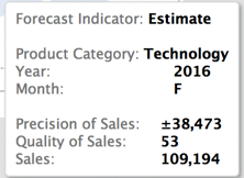
Figure 6-7: Tooltip with Quality and Precision metrics
This tooltip is exposed to users when they hover their mouse over the mark. Figure 6-7 shows that a Quality of Sales forecast metric and a Precision of Sales forecast metric have been added to the tooltip. The Quality metric range is from 0 to 100 (higher numbers mean better quality). The Precision metric is expressed as a value range and provides the 95 percent prediction interval for the forecast—a measure of the potential volatility of the Forecast value. In this example, the Value Range refers to a Sales dollar range of 49,611.
Exporting Forecasts
Exporting Tableau-generated forecasts can be a time-saver for developing more nuanced forecasts. One way to accomplish this might be to duplicate the original view in Figure 6-1 as a text table and then export the view using the menu option for Worksheet ⇒ Export ⇒ Text table to Excel. Figure 6-8 shows the resulting spreadsheet values.

Figure 6-8: Exported forecast in a spreadsheet
Alternatively, it is also possible to go to the menu option Worksheet ⇒ Export ⇒ Data to an Access database. Using either method enables you to adjust the forecasted values more specifically and perhaps add those altered figures into your main database in their own field. Tableau’s forecasting model isn’t intended to replace sophisticated statistical forecasting tools. It provides an easy-to-use way to create forecasts along with quality and precision metrics to access the quality and precision of the resulting estimates.
Creating forecasts in views that you publish to Tableau Server and share with others is one way to stimulate an ad hoc analysis environment for users who only have access to the view via Tableau Server. In the next section, you learn how to create parameter controls that enable Tableau Server users to change measures and dimensions in views or dashboards.
Providing Self-Service Ad Hoc Analysis with Parameters
Parameters enable those consuming reports to change the context of views with Quick Filter–like controls. Report builders design parameters into views when the report is created in Tableau Desktop. Parameters create a pathway for non-technical consumers to conduct ad hoc analysis by changing what and how facts and dimensions are displayed—within the boundaries of the designer’s intended usage. Concerns regarding the efficacy of self-service analysis are minimized because the report designer controls what changes are permitted.
What Are Parameters?
Parameters are variables that allow users to alter the content of a formula or change a dimension or measure contained in the view. Parameters create a powerful means for changing normally static values into dynamic entities that facilitate ad hoc discovery without the need for changing the design of the view.
How Can Parameters Be Used?
The ways in which parameters can be used are limited only by your imagination. Tableau provides some basic parameter controls by building them into different contexts that commonly benefit from the use of a variable. Creative report designers can dream up a myriad of other ways to use this powerful feature by building formula variables that control the facts in view, the dimensions that appear, or the length and granularity of time series data. Anywhere that you can place a field in Tableau Desktop is a potential repository for a parameter control.
Basic Parameter Controls
Parameter controls first appeared in Tableau several years ago, and they have become a popular feature. To make parameters easier for novice users, Tableau created basic parameter types that are built into typical use cases that benefit from variables. These include:
- Reference line parameters
- Bin size parameters (for histograms)
- Ranking parameters (in value comparison views)
The steps required to add basic parameter controls to a view are straightforward provided you know that they exist. Figure 6-9 is a scatter plot that includes basic parameter controls for the vertical and horizontal reference lines.
There are two reference line parameter controls in Figure 6-9 that enable a user to change the location of the reference lines. These variable controls are built into the same dialog box where standard fixed reference lines are created. To create the parameter, right-click the axis and select Add Reference Line to expose the reference line dialog box, and then in the Value box select the Create a New Parameter option. Figure 6-10 shows the added reference dialog box on the left. Selecting the Create a Parameter Option in the Value menu exposes the Edit Parameter window on the right of Figure 6-10.

Figure 6-9: Reference line parameters

Figure 6-10: Creating a reference line parameter
In the Create Parameter window, you name and define the parameter. A comment field can be used to hold notes describing the parameter. The Properties section is used to define the parameter type. In this example, a floating decimal point value is selected, the display format is currency, and the parameter is defined for a range of values with a specified increment defined by step size. Clicking OK adds the parameter control. Refer to Figure 6-9 again and notice that the parameters allow users to move a slider to change the position of the reference lines.
A second basic parameter type is available for making variable bin sizes in histograms. The view seen in Figure 6-11 was initially constructed by selecting the Profit field and then picking the histogram chart type from the Show Me menu. This resulted in a bin size of $5,000 with a very large concentration of items in only two bins.
Right-clicking the Profit Bin dimension that Show Me automatically created enables you to select a parameter option for bin size in a manner similar to the last example. By defining a smaller step size for each bin, you can see more granular views of the profit bins. This is always desirable when viewing histograms. The view in Figure 6-12 shows the Profit Bin Parameter set to a smaller value.

Figure 6-11: A basic histogram

Figure 6-12: Parameterize bins in a histogram
The capability to vary bin sizes within histograms can be very useful. As you can see in Figure 6-12, labeling was also added to each bar, providing an item count and the total profit or loss expressed in each bin.
Another type of basic parameter is built into charts for creating variable-sized rank lists. Figure 6-13 shows a bar chart comparing sales values by customer with a year filter. Notice the Parameter Control provides a variable rank list size for the top customers.

Figure 6-13: A top rank parameter
In this example, the Parameter Control was invoked by right-clicking the customer name pill on the Rows shelf, selecting the Top filter tab, and defining the parameter range value for the number of customers you want to display in the bar chart. This isn’t the only way you can create a flexible rank list, but it is one of the easiest methods. Figure 6-14 shows the ranking parameter menu used to create the Sales Ranking Parameter control for the bar chart.

Figure 6-14: Quick filter with sales parameter
By placing the sales parameter into the normally static top rank definition dialog box, this creates a flexible rank list. This isn’t the only way you can create a flexible rank list, but it is one of the easiest methods.
Advanced Parameter Controls
More advanced parameter controls can be created that provide greater flexibility. The steps required to create advanced parameters are:
- Create the parameter control.
- Expose the parameter control on the desktop.
- Create a calculated value using the parameter control.
- Use that calculated value in the view.
Advanced parameters do require a little more effort, but they are easy to build once you become familiar with the process. One of the most common use cases for advanced parameter controls is to permit users to alter the measure being plotted in a view. Figure 6-15 shows a time series chart that is currently displaying sales over time, but with a parameter control that allows the end user to change the measure in view to profit, discount, order quantity, or shipping cost.

Figure 6-15: A parameterized time series chart
The Parameter Control contains strings identifying each different measure. Selecting the Parameter Control’s drop-down menu exposes each measure—enabling the user to change the measure displayed in the time series chart. Also notice that the view contains parameterized headings for both the report title and the axis label. Take a look at the step-by-step creation of the Parameter Control for this example.
Create the Parameter Control
You can create the parameter control from the calculation menu or directly from the Data Shelf by right-clicking within the Dimensions shelf and selecting the Create Parameter menu option. This exposes the Parameter menu from which you can enter the options you see in Figure 6-16.

Figure 6-16: Defining a string parameter
Notice the parameter is named Select Measure, which is what appears in the parameter Quick Filter title. It may seem counterintuitive that the parameter definition is for a String type versus a number. A String is necessary to contain the field names of the measures that will be enabled in the view. This step only defines the filter box that is exposed on the desktop.
Exposing the Parameter Control
To make the Parameter Control available to information consumers, it must be exposed to the worksheet. This is done by pointing at the parameter title that appears on the Parameters shelf, right-clicking, and selecting the menu option Show Parameter Control. After this step, the control is available on the desktop to make selections.
Create a Calculated Field Using the Parameter Control
Making a Calculated Field that uses the Parameter control brings it to life. Figure 6-17 shows the completed Calculated Field.

Figure 6-17: Creating the parameter calculation
The calculation uses an if/then/else logical statement to evaluate each string contained in the parameter and then associates the selected string with a specific measure field. With the completion of this Calculated Value, only one step remains to activate the parameter within the view.
Use the Calculated Value in the View
Placing the Select Measure calculated value on the Rows shelf activates the parameter. Figure 6-18 shows the completed view.
Adding the Select Measure value to the view connects the Parameter Control to the view and changes what is communicated to the data source when a different measure is selected within the Parameter Control. The Select Measure filter now allows users to change the measure to any of the items added in the parameter and calculated value. Notice that the report title contains the parameter name. Also, the axis label is variable. Enabling these refinements requires a couple of extra steps. First, edit the report title and insert the parameter name into the title block. Then, drag the parameter from the Parameters shelf to the axis and add the name variable there as well. By editing the axis label and removing the row heading, you can achieve a clean look that flexibly names the report and the axis.

Figure 6-18: A parameterized time series chart
There are many other ways you can use Advanced Parameters, but the basic process for all of them follows these four steps. As you gain familiarity with Tableau’s calculation functions, you will think of many different ways to leverage Advanced Parameter controls.
Editing Views in Tableau Server
Another way that Tableau enables ad hoc analysis is through a facility called Web Authoring in Tableau Server. This is a powerful feature released in Tableau Version 8 that allows Tableau Server information consumers to alter and create visualizations from within Tableau Server without the need for anything other than a web browser and access rights to the view.
Formula Editing in Server
Your Tableau Server administrator makes this feature available by enabling a permission for editing views. When this feature is activated, the user will find an Edit Menu option in their browser session window. Figure 6-19 shows a typical report window within Tableau Server.

Figure 6-19: Enabling editing in Tableau Server
Notice the Edit menu option in the upper-left side of the window. This menu option appears in Tableau Server if permissions are set to allow the user to edit views. Selecting the Edit view exposes the data shelf, Marks cards, and the Rows and Columns shelves. Users can’t do everything that a Desktop user can do, but within this specific workbook, they have the ability to edit existing views or create new worksheets and build new views. Figure 6-20 shows the controls that are exposed when editing is turned on.
You can see that a new menu bar appears at the top of Figure 6-20. These controls are optimized to work in the browser and will work when using a tablet computer to access the workbook as well. Full drag-and-drop capability exists—facilitating true ad-hoc analysis for end users in a workbook that is based on data vetted and controlled though the server administrator.
Formula Creation in Tableau Server
You can also build new views from scratch by dragging fields from the Dimensions and Measures shelves to the Columns and Rows shelves. And Tableau Server V9 allows you to create calculated values. Figure 6-21 shows the creation of an Ad-hoc Calculated Field.

Figure 6-20: Tableau Server editing mode

Figure 6-21: Ad hoc formula creation in Server
The design and build capabilities in Tableau Server are not as robust as Tableau Desktop, but for many information consumers who want to do analysis or create their own views, it provides the basics.
Formula Creation in Mobile
Information consumers viewing Tableau Server workbook dashboards and worksheets can also build formulas and create views from mobile devises. See Chapter 9 for more details.
Tableau’s ad hoc analysis capabilities should reduce the workload on the technical resources within your organization and reduce the amount of time required for managers to make new inquiries of your data.
In the next chapter, you learn some tips and tricks that will help you build views more quickly and create visualizations that pack more data into small spaces.