Chapter 9
Designing for Mobile
Just as the personal computer replaced the mainframe and the laptop replaced the personal computer, even more mobile devices will eventually replace the laptop. This trend toward smaller and more powerful devices means more dashboards and visualizations will be consumed on mobile devices.
Leading technology research firms Gartner and International Data Corporation have reported on an explosion of growth in mobile devices—cell phones, and more recently tablet devices. In November 2012, Gartner reported that “821 million smart devices will be purchased worldwide in 2012; sales to rise to 1.2 billion in 2013.”1
Gartner also forecasts tablet purchases by businesses will more than triple from 13 million units in 2012 to over 53 million units in 2016. And they think tools such as Tableau will play an increasing role in the production of mobile applications: “By 2018 more than half of all B2E mobile apps will be create by enterprise business analysts using codeless tools.”2
Clearly business use of tablets is expanding rapidly; analysts and analytical tools will be a large component of that adoption.
This trend is echoed in the Business Information (BI) world with increasing numbers of people using mobile devices (tablets and smartphones) to consume data. Mobile deployment has become a key component of most successful Tableau implementations. The next section describes the physics of mobile data consumption, security considerations, usage patterns, and the design best practices for building dashboards for mobile consumption.
The Physics of Mobile Consumption
Mobile consumption of Tableau dashboards is a function of the Tableau Server, Tableau Online, and Tableau Public environments. Because Tableau doesn’t store data on your mobile device, a few prerequisites must be in place to enable mobile consumption:
- Installing Tableau’s native iPad or Android application is not required (but may be desirable). Alternatively, a standard mobile browser is necessary.
- Provide a server name and Internet address for the connection to Tableau Server.
- Select a username.
- Select a password.
Mobile consumption is a default capability of Tableau Server; no additional configuration is required to enable mobile access. It should be noted that mobile device usage patterns can differ from non-mobile consumption. Mobile users typically use more sessions of shorter duration than desktop users. The interesting result of this usage pattern typically means increased session counts at the server level as users exploit the “just-in-time” nature of mobile access to data.
Security Considerations for Mobile Consumption
Unlike the Tableau Reader or Tableau Desktop tools, Tableau’s native apps for iOS and Android are completely Server-based. This means neither mobile tool downloads an interactive data file or workbook file onto the Tablet’s physical storage. Beginning with V9.1 it is possible to download static images of sheet views and dashboards to a tablet for offline viewing. All interactive data and reports are accessed entirely through the web connection to Tableau Server.
If a user were to lose a tablet, the only Tableau-related information residing there would be information about workbooks (publisher, date modified, and name) rather than the sensitive data contained within the workbooks being accessed. Of course, any machine with access to secure information should be password-protected.
Because mobile devices typically exist outside of the corporate network, options for network accessibility should be considered before deploying Tableau for mobile consumption if they haven’t already been separately addressed.
Whether the Tableau Server has been positioned inside or outside of the DMZ (a secure area in a private network providing access to authorized users from the public Internet) dictates what special procedures are necessary to enable mobile access. If the Tableau Server is not positioned within the enterprise DMZ, solutions to provide mobile access typically include virtual private networks (VPNs) to secure the logon, or they utilize third-party Enterprise Mobility Management Suites to secure mobile access to data.
Once access to the Tableau Server machine is established, users can view dashboards and reports with the same authentication protocols used for desktop browsing. Tableau supports single sign-on (SSO) through both SAML- and Kerberos-based authentication for mobile devices in the event those systems already exist within the enterprise.
Specific mobile permissions are not configurable at the Tableau Server level without duplicating accounts or servers. If a separate set of mobile reports is desired, this process is typically mediated through a separate server or as a function of proxy-based relays.
Offline Access
Versions 9.1 and higher of the Tableau Mobile application allow for “snapshotting” of reports. These snapshots are high-quality image (PNG) files that are stored on the tablet for offline viewing. These files are secured using the mobile OS’s native security application. Organizations unwilling to allow storage of these images on mobile devices can disable snapshotting through Tableau Server’s Sites configuration menus. Figure 9-1 shows the Web Authoring selection activated.
Offline snapshots are enabled by default and will be created for any dashboard or view a user enters into the app’s “favorites.” Figure 9-2 shows a dashboard favorite that has been stored as a snapshot.

Figure 9-1: Web authoring general configuration
If you look at the top of Figure 9-2, you can see that you can toggle between a Snapshot or Live View tab if you are connected to the web.

Figure 9-2: Offline favorite snapshot
Typical Mobile Usage Patterns
Users accessing Tableau dashboards and reports from a mobile device typically have a different set of goals/intent for their experience versus those accessing data on the desktop. While this rule is not hard and fast, mobile users normally have a narrower scope and more defined use criteria.
Just-In-Time Use
The Pew Internet Trust recently found that 86 percent of smartphone owners used their phone in the past month to make real-time queries to help them meet friends, solve problems, or settle arguments.3
The Pew report provided additional details regarding the activities mobile users engage in when using their portable devices. Do any of these items sound like needs your Tableau users might have?
- Solving unexpected problems that they or someone else encountered
- Deciding whether to visit a business
- Finding information to settle an argument regarding facts
- Looking up a score
- Getting up-to-the-minute information
All of these activities are supported by Tableau’s mobile environment. If users are able to satisfy these Just-In-Time needs, they can seamlessly integrate that information into their daily activities.
Mobile Design Implications
Just-In-Time use has significant implications for dashboard and report design. The mobile market is not homogeneous. Do not assume all of your mobile users will have the same intent. But you can make some reliable assumptions about mobile information consumers and their desire for Just-In-Time information.
Mobile users want the most up-to-date information possible for asking questions and solving problems. Mobile users are more likely to be looking for a specific answer to a specific question, rather than embarking on a multi-hour session of complex analysis. This tendency should inform your dashboard designs for mobile consumption.
These requirements imply that mobile dashboards need to be more focused on specific areas and answering the kinds of questions that arise most frequently.
Design Best Practices for Mobile Consumption
Mobile device screens are obviously smaller than personal computer monitors, and your input method will be less precise than a mouse pointer. These differences were carefully considered when Tableau enabled their products for mobile usage. You also need to think about how your dashboard designs need to be adapted for this kind of consumption. When developing for a mobile environment, consider the following:
- Lack of a control button and no multi-select through Ctrl+click.
- The hover action is not available as an action trigger.
- The finger for pointing and clicking versus a mouse pointer.
- Zoom via a pinch/expand gesture in place of function keys or a mouse scroll wheel.
These differences have significant implications for your mobile dashboard designs. The emergence of mainstream touchscreen-based operating systems including iOS, Android, Windows, Smart Tables, and Smart Screens means many of the design criteria specific to mobile devices will soon be applicable to a much larger user segment.
Design Implications Related to Screen Resolution
Consumer display resolution is a primary consideration for dashboard design, regardless of the consumption environment. Because there are fewer possible resolutions available for mobile devices, it is easier to create “table-friendly” designs. Fixed dashboard sizing—desirable for mobile designs—also provides performance advantages at the Tableau Server caching level. As with all dashboard designs, it is best to err on the side of caution and size your view for the lowest resolution anticipated. This ensures that information consumers won’t be forced to scroll to see all of the content. Tableau has predefined dashboard resolutions for mobile devices. You can also define any resolution required should your needs not fit industry-standard sizes.
Best Practices for Mobile Design
Designing for mobile devices is similar to designing for personal computers. Many of the best practices in designing for the PC apply. There are some additional allowances that have to be made because of the smaller screen size:
- Design for a specific orientation.
- Consider the limits of finger navigation.
- Reduce the number of worksheet objects displayed.
Design for a Specific Orientation
The best dashboard designs for mobile devices should be optimized for a specific design. Most of the tablet dashboards that I’ve seen are designed for landscape mode viewing; however, what is most important is that you commit to an orientation and build the dashboard for viewing that way. Tableau’s dashboard worksheet includes two predefined orientations for tablets—one for landscape mode (1020 × 625 pixels) and another for portrait mode (764 × 855 pixels). You can tweak those values to fit any resolution needed by using the Exactly mode when creating your design. This selection allows you to define specific pixel height and width if the mobile devices you’re designing for don’t conform to the default values.
Consider the Limits of Finger Navigation
The primary interaction medium will be users’ fingers, which do not have the precision of a mouse. If a dashboard design feature is actuated through a filter or highlight action, ensure that the selection options are large enough for users to easily select without accidentally hitting a neighboring point. Nothing makes for a grumpier tablet user than one waiting for an unnecessary filter to render.
To avoid this trap, design dashboards with one of two alternative navigations. Choose heat maps, bar charts, highlight tables, or bullet charts to trigger actions. These provide discrete layout boundaries and preclude overlapping or closely spaced marks. Conversely, scatter plots have continuous axes that typically produce clusters of overlapping marks. This would not be a good choice for a filter action if precision is required. Figure 9-3 illustrates the point.
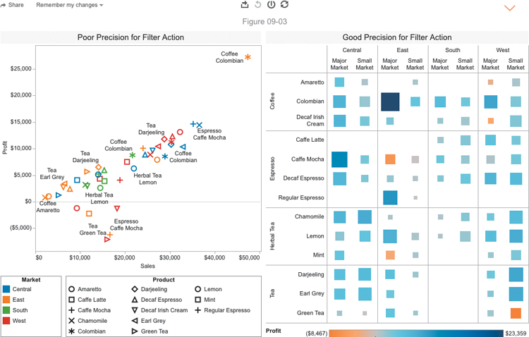
Figure 9-3: Chart style and finger navigation
The scatter plot on the left of Figure 9-3 includes many closely spaced or overlapping marks. This makes it a poor tablet-based action trigger because it is nearly impossible for the user to select a particular mark unless it is one of the outliers that are not included in the cluster.
The heat map on the right side of Figure 9-3 has marks that are regularly spaced. No mark is too small to provide a good click target. The heat map not only communicates data effectively but also provides for easy action triggering. To ensure that the smallest values were large enough, the mark size was edited—increasing the minimum mark size to avoid all possibility of individual marks being too small to click.
Tableau recently updated their application to support multi-select by tapping, holding, and then circling marks. Figure 9-4 shows six marks in the Region & Category heat map that have been selected.

Figure 9-4: Multi-select by tap and hold action filter
The selected marks in Figure 9-4 could be used to trigger an action to filter the other charts in the dashboard. Tableau has also tuned quick filters by changing their behavior, making them automatically expand into versions that are more easily selected using your finger on mobile devices. This doesn’t require any special effort when you design the dashboard. Tableau detects the consumption environment and changes the design of the quick filter automatically.
These design differences provide a mobile-optimized interaction, though it does slow the experience slightly vis-à-vis consumption on a PC. For example, three selections are required to initiate a mobile quick filter—one click to activate the Quick Filter dialog box, another to pick a value, and a third to return to the dashboard.
Reduce the Number of Worksheets Being Displayed
Because of the reduced screen size of mobile devices, it is best to use no more than three worksheet objects in a dashboard. One of those may need to be a very small text table limited to a single measure. Designs with too many worksheet objects are generally difficult to see.
A Tablet Dashboard Example
The following example was created with the Superstore sample data. The dashboard has three primary data visualizations, one quick filter, one parameter control, and a filter action triggered by selections made in the heat map. You’ll also see how a small text table with a shape can be used to hold more detailed instructions within a tooltip. Figure 9-5 shows a sales dashboard that is designed to be consumed using a tablet in landscape orientation.

Figure 9-5: Tablet dashboard in landscape mode
The dashboard in Figure 9-5 utilizes best-practice techniques. Using three data visualizations, the top-line chart displays current- and previous-year sales using color to distinguish each year. Region and category are broken down in a heat map that displays current sales with a secondary measure of change from previous year sales denoted by color. The bullet chart breaks product categories down further into subcategories, comparing current and previous year’s sales. Utilizing both a heat map and a bullet chart provides discrete separation that will allow the user to filter using an action executed by selecting marks from either visualization. A parameter control allows the user to change the “current” benchmark year, enabling self-service comparison across many possible years. A quick filter allows the user to filter the entire dashboard by order priority, a fourth dimension, while conserving space.
Figure 9-6 shows how the slider-type parameter control pops out while using the Select Year parameter—making it easier to select the appropriate year. After the selection is made, the filter will collapse to its former size.

Figure 9-6: Expanded year parameter control
The order priority is changed using a quick filter that pops out to allow multiple selections, as you see in Figure 9-7.
A filter action placed in the heat map allows the user to filter the dashboard. As you can see in Figure 9-8, selecting a mark also causes a tooltip to display related details.
In Figure 9-9, a small text table using a question mark shape contains navigation instructions.
When the user points at the light bulb image, a tooltip is displayed that contains detailed instructions.

Figure 9-7: Select Priority quick filter

Figure 9-8: Filter action and tooltip

Figure 9-9: Small instructions near the work
For someone needing timely information regarding sales by product line, this dashboard is an easy-to-navigate, Just-In-Time environment. The dashboard provides details in the worksheet object titles that change based on the filter and parameter selections made. The portions of the titles in a bold orange color confirm those selections (see Figure 9-10).

Figure 9-10: Titles confirm filter and parameter selections
This mobile dashboard is designed for quick response. It loads and filters quickly and is easy to read because it is designed for answering a specific set of questions related to sales, growth, and the product line.
Mobile Authoring and Editing
Mobile authoring and editing are native to the Tableau Mobile application. These capabilities are also available through browsers on a mobile device. The mobile-specific editing capabilities closely mirror those of the standard web editor, though the user interface has been adapted to support touchscreen interaction and the lack of a mouse. The same Tableau Server permission settings that enable or disable web editing apply for mobile editing. Chapters 11 and 12 cover the setup options in detail. Figure 9-11 shows the mobile editing interface on a tablet.

Figure 9-11: Mobile editing interface
Chapter 12 includes additional details on Tableau’s web editing menu options in Server. These controls are identical to what you see displayed in Figure 9-11.
A Note on Project Elastic
During Tableau’s 2014 user conference, Tableau’s management introduced a new product under development. Project Elastic will be designed for ad hoc mobile exploration of self-contained mobile datasets. This will be a completely new standalone product. Initial versions will only allow for ad hoc exploration of local datasets, not live database connections or Tableau Server data sources.
I’ve seen the early alpha product demonstrations and recently had discussions with one of the lead developers involved. Later this year, I expect to see a working prototype for testing. No firm date has been announced for this product. In future releases of this book, I plan to cover Project Elastic in detail.
In the next chapter, you learn how to use Tableau’s Story Point feature to share insights with others and give information consumers the ability to step through specifically annotated visualizations in a predetermined order.