Chapter 5
Using Maps to Improve Insight
Maps can reveal more than the landscape, and have for several centuries. Remember the dictum: Anything that can be spatially conceived can be mapped. The new technologies broadened the conceivable meaning of “anything” and gave mapmakers the means to call up all manner of information about people, places, and environments—anything mappable—and visualize it swiftly and in many different guises.
—John Wilford1
People are accustomed to using maps to find places, predict the weather, and see information regarding world events. Seeing your data displayed on a map can provide new insight. Visualizing geographic data with Tableau brings new understanding to the many “guises” that this perspective can bring. For some reason, people are always drawn to data plots on maps. Tableau’s standard maps are good and render quickly. You can also replace the standard maps with customized versions provided by web mapping services. Or, if you have spatial data that is too small to fit on a map, you can replace maps with images.
Tableau provides two different map types: symbol maps and filled maps. Symbol maps place marks at the center point of standard geographic units. Filled maps color-encode standard geographic shapes using a measure or dimension to apply the color. Three standard map background image styles are provided:
- Normal: Off-white land forms with blue water
- Gray: Gray land forms with white water
- Dark: Dark gray land forms with light gray water
If you do not need to make a clear distinction between land and water forms, the gray map style places more emphasis on your data. The dark map style is particularly useful if you have to present maps using an older overhead projector. Try different appearance options by going to the Map menu and selecting the Map Options menu. From there you can change the map style, alter the washout of the map background, or apply map layers. Adding map layers provides context by including (Base layers, Land Cover, Streets and Highways) and United States census data. If you want to save your map option selections for use later, click the Make Default button at the bottom of the Map Options menu. Tableau’s standard maps provide fine-grained geographic details when you have an Internet connection. If you don’t have an Internet connection, less-detailed offline maps are provided.
Using Show Me, you can create a map visualization in less than five seconds by double-clicking any geographic dimension (denoted by the globe icon) and then double-clicking any measure. Show Me is always operating in the background and will position three pills on the appropriate shelves and then present you with a map view of your data with the measures placed in the map at the center of the geographic dimension selected.
New Map Features
Tableau V9 adds more geographic details for international customers. Place names are localized using the language selected for your computer’s operating system. More selection and filtering tools are now available in maps. You can now search places by entering a place name. Two additional selection tools have been added: Radial search and Lasso search. Map rendering speed has been improved, and tooltips now render instantly. Beginning with Tableau V9.1 the Radial Selection tool measures and displays approximate distances (in localized units of measure) and allows you to turn off pan and zoom controls in maps.
Creating a Standard Map View
Take a look at what happens when you want to plot more complex data using the Show Me menu to create a map. Using the Superstore for TYD2 dataset, create a map that uses State or Province and Product Category from the Dimensions shelf and Sales from the Measures shelf. Multi-select the fields and use the Show Me button to pick the symbol map. The resulting map is displayed in Figure 5-1.
You can see that Tableau placed six pills in various places to create the symbol map. In fact, double-clicking any geographic field will result in a map being created in which the marks plotted will show the center point of the selected entity. This is why you should rely on Show Me to build maps—it’s much faster than manually dragging fields on to the Rows and Columns shelves.

Figure 5-1: Symbol map created using Show Me
Open Show Me again and select the filled map. When you make that change, Tableau automatically moves the Product Category field to the Rows shelf. This results in the display of three maps. Each map shows sales for a specific product category. Dragging the Product Category pill from the Rows shelf to the Filters shelf collapses the view into a single map. I also added a quick filter for Product Category, changed the colors used in the Color Legend, and turned on labels for each state to display the sales amounts in thousands of dollars. Figure 5-2 shows the resulting view filtered for the Office Supplies and Technology Product categories.
The Sales amount labels were turned on by clicking the Label button on the Marks card and selecting the Show mark labels option. The number format was changed by pointing at the label, right-clicking, and then using the formatting menu to change the number style to currency with one decimal point using units of thousands. To edit the map style, use the main menu option for Map and choose the Map Layers menu. Figure 5-3 shows the Map Layers menu on the left. Beginning with Tableau Version 9.2 you can select Map Options from the menu to expose the floating control seen on the right of Figure 5-3. Using this floating dialog you can control whether or not to enable map panning and zooming, the map search control or the Show View Toolbar.

Figure 5-2: Filled map created with Show Me

Figure 5-3: Map Options menu
For the filled map in Figure 5-2 the map washout was changed to 100 percent. This hides map features from view. The areas bordering the United States are blank. If any state lacked sales, it would be blank as well. At the top of the background section, the light map type is selected. There are two other map types: normal and dark. Figure 5-4 shows the differences between normal, light, and dark backgrounds.

Figure 5-4: Map background style options
The map options menu in Figure 5-3 also allows you to add more details to the map by selecting additional map layers. These options allow you to color-encode geographic shapes in the map using state, county, zip code, or census block level of detail. For the United States, there are thirty different census datasets related to population, race, occupation, households, and housing. If you want to override Tableau’s standard map settings with the new options you’ve selected, click the Make Default button at the bottom of the menu.
How Tableau Geocodes Your Data
Tableau places marks on your map, automatically positioning them at the center of the geographic unit displayed. It recognizes a large number of standard geographic entities. The United States is mapped in detail, and the geographic detail for international locations is extensive and growing with every version update. Geographic units include:
- Area code
- CBSA/MSA (USA census blocks)
- City
- Congressional District (USA only)
- Country/Region
- County
- State/Province
- ZIP Code/Post Code
- Latitude/Longitude (added to your data)
Locally stored geographic data is used to place your information on the maps. By default, Tableau uses detailed online maps.2 If you can’t get a web connection, Tableau’s offline maps provide you with less detailed map images. Figure 5-5 shows online map examples for San Francisco and New York City.

Figure 5-5: Tableau online map
Using the light map style and displaying the streets and highways map layer, Figure 5-5 also includes projected population growth at the ZIP code level of detail. ZIP code boundaries and titles are also displayed. The black marks (circles) display sales data by ZIP code. The marks in Figure 5-5 are plotted at the geographic center of the ZIP code. Tableau doesn’t include international census data at this time, but international maps do include extensive road details. Figure 5-6 shows four international cities using the normal map style.

Figure 5-6: International maps
Tableau balances the rendering speed of maps with good map details so that you can find relevant reference points quickly. This is accomplished by displaying more granular details as you zoom into smaller areas. Tableau maps provide more than 300,000 municipalities globally. Detailed map views are available for most locations.
Searching for Items in Maps
After building a map of your data, it’s normal to want to drill down into specific parts of the map. Tableau provides zooming, selecting, and filtering tools inside the map. Figure 5-7 highlights the tools.
The plus and minus symbols in the upper-left side of Figure 5-7 are basic tools for zooming in and out on the map in view. When you zoom, the pushpin symbol in the map and in the icon bar will appear to be depressed. Clicking the right-pointing arrow exposes more tools for zooming, a rectangular selection tool, a radial selections tool, and the lasso selection tool. The image in Figure 5-7 shows the result of using the lasso selection tool for the highlighted marks on the map. Get familiar with how these tools operate by testing them in a map view you create.

Figure 5-7: Map zoom and filtering tools
The Radial and Lasso Select tools were added in V9.0. Tableau also added the location text filtering tool that you see in Figure 5-8.

Figure 5-8: Text filtering tool
As you can see, the map has been filtered in Figure 5-9 by typing in Manhattan, New York. You can filter for any standard geographic unit that Tableau recognizes using this filter.
Typical Map Errors and How to Deal With Them
It isn’t unusual to have some missing or erroneous data, especially when you are investigating data for the first time. Fortunately, Tableau helps you identify non-conforming details and make corrections quickly without having to edit the data source directly. Figure 5-9 shows a filled map. The color encoding of the map displays the relative sales value of each state. You can see that there is something wrong with the view because Missouri is blank. This could be caused if an abbreviation was used for Missouri (MO) if the other state names are not abbreviated. In this case, the problem was caused by a misspelling of the Missouri state name in the data source.

Figure 5-9: Filled map missing data
In the lower-right area of the map in Figure 5-9 there is a gray pill that includes the text (1 unknown). This indicates that one geographic record is missing or unrecognized in the dataset. Clicking the pill opens the special values menu, which provides three options for dealing with the unknown record:
- Editing the locations (to correct the error)
- Filtering the data (to exclude the record)
- Showing the data at the default position (this means zero)
Clicking the Editing the locations option exposes the special values menu you see in the upper-left area of Figure 5-10.

Figure 5-10: Correcting place name errors
Selecting the Edit Locations option exposes the menu on the right of Figure 5-10. Tableau identified that the state of Missouri was misspelled. This is why there is no color fill for Missouri in the map. You fix the error by typing the correct spelling into the Matching Location area. After typing a few letters, Tableau narrows the list of candidates to Mississippi or Missouri. Selecting Missouri aliases the state name in Tableau with the correct spelling and fixes the problem. The source data set is still wrong, but Tableau’s name alias will correct the problem in the map. Lock in the change by clicking OK. Tableau recognizes different place name variations (abbreviations) and will edit other geographic entities as well (city, county, province, and so on). This ability to quickly identify and correct non-conforming records will save you time and make it easy for you to provide detailed feedback to correct errors in your source data.
Plotting Your Own Locations on a Map
It would be impractical for Tableau to monitor and save every possible location in the world. If you have specific places you want to plot on maps that Tableau doesn’t automatically recognize, you can enable this using two different methods. You can add the specific longitude and latitude to your source data, or you can import custom geocode lists into Tableau.
Adding Custom Geocoding to Your Data Source
You must obtain geographic coordinates in the form of longitude and latitude values that you provide to your dataset in order to add custom geocoding to your data source. There are many free web-based geocoding services that provide this information. Figure 5-11 shows a list of jazz clubs in the metro New York area that have the necessary latitude/longitude data added.

Figure 5-11: Custom location list
The sample data partially in view in Figure 5-11 includes more than 500 addresses. You can see the coordinates in the far-right columns. Using the custom latitude and longitude data allows you to plot each location on its specific address. Figure 5-12 shows the custom plot with a tooltip exposed displaying additional location details.

Figure 5-12: Custom geocoding
The column and row shelves hold the custom latitude and longitude coordinates that place the marks on the map. The tooltips were customized to show the street address, phone number, and venue information. The dark map style was modified slightly by employing a 25 percent washout via the Map ⇒ Map Options menu.
Importing Custom Geocoding into Tableau
If you go to the trouble to add customized geographic coordinates, wouldn’t it be nice to make that available to other people within your organization? This is done by importing the address coordinates directly into Tableau Desktop. After they are imported, the custom locations behave like Tableau’s default geographic units. The import file should have the following characteristics:
- Give each location record a unique identifier (key record).
- Save the location file in comma-delimited CSV format.
- Label the coordinate fields Latitude and Longitude (these key words must be used).
It’s best not to include a lot of additional dimensional data in these import files. Be sure that you have only one instance of Tableau open when you perform the import. If you want to share this custom data with other people building reports in Tableau, store the list in a shared network directory so that other users can import from the same list as well. Figure 5-13 is an example of a custom geocode table properly formatted for import.

Figure 5-13: Custom geocode table
After saving the custom list in comma-delimited CSV format, the custom geographic data can be imported into Tableau. Initiate the import using the main menu (Map ⇒ Geocoding ⇒ Import Custom Geocoding). A small file will require only a few seconds to load. Large lists can take several minutes. Running the import will create a new data file on your computer within (My Tableau Repository/Local Data). The custom data is stored as a Tableau data source file (.tds) with the same name as the source CSV file that was imported.
Using Custom Geographic Units in a Map
After importing custom geocodes into Tableau Desktop, you can use them with other data files to build maps as long as those files contain the same location key record defined in your data import table. The custom data file used in the rest of this example looks like Figure 5-14.

Figure 5-14: Warehouse location table
Notice there is no longitude or latitude data in the table displayed in Figure 5-14. The Whse field is being used to link the imported data from the custom geocode table displayed in Figure 5-13. The following are the steps to use custom geocoding in this example:
- Attach Tableau to a data source.
- Alter the geographic role of the key records (use the imported custom geography).
- Use the key record in your view to plot the location on a map.
Altering the geographic role of the warehouse location is done by right-clicking the Whse field and selecting Geographic Role ⇒ Whse as you see in Figure 5-15.

Figure 5-15: Altering the geographic role
The Whse field icon will change to an icon that is similar to a standard geographic icon but with a small list in front of the globe. Tableau will now recognize the imported geographic data. Figure 5-16 shows a map plot of the custom geocoded warehouse locations.
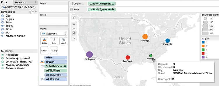
Figure 5-16: Warehouse location map
Notice that the Columns and Rows shelves are using the (generated) latitude and longitude fields from the imported custom locations to place the warehouse location marks on the map. Hovering over the Newnan location causes a customized tooltip to appear showing particulars about the warehouse. Zooming in on the Los Angeles location in Figure 5-17, you can see that the mark is more precisely placed than Tableau’s standard geocoding can provide. This geographic placement is provided by the imported geocodes shown in Figure 5-13, and tooltip details are supplied from the spreadsheet shown in Figure 5-14.
The order of the steps for enabling custom geocodes at the beginning of this section isn’t the only way to achieve the result. You can import the custom geocoding at any point—even after a map plot is created using standard geographic plotting.
Now that you’ve learned how to precisely plot any location on a map with custom geocoding, in the next section you learn how to replace the standard maps provided by Tableau with customized map sources from the web.

Figure 5-17: Los Angeles warehouse
Replacing Tableau’s Standard Maps
Tableau Maps visualizations are special scatter plots that use map images for backgrounds and special measures (longitude and latitude) to plot marks on the map. This implies you can replace Tableau’s standard map images with other image files.
Why Replace Tableau’s Standard Maps?
Tableau’s dynamic map files are designed to balance high-quality graphic details while optimizing map rendering speed. But if standard maps don’t provide the detail you require, Tableau makes it easy to replace the standard maps with custom maps provided by map services. With a little more effort, you can even use image files for map backgrounds.
There could be many reasons you might want to replace Tableau’s standard map files. Custom maps can include non-standard geographic units or demographics particular to your organization. Perhaps you have spatial data that isn’t large enough to be seen on a standard map. Examples might include warehouse or office layouts, retail planograms, building complexes, circuit board schematics, web pages, or even the human body. Or, the scale of your spatial data might be microscopic.
As long as you can define the vertical (y) and horizontal (x) coordinates within the spatial layout, it is possible to place data points on image files precisely. This process can be trivial—requiring only a few clicks—or require significant effort.
Replacing Tableau’s Standard Maps to Enhance Information
The easiest way to replace Tableau’s standard maps is with a web map service. Tableau can seamlessly integrate maps that adhere to an open source map protocol developed by the Open Geospatial Consortium. Many web mapping services adhere to the Web Mapping Service (WMS) protocol. Replacing Tableau’s standard maps with WMS services is easy because the service provides the coordinate dimensions of the map, thereby eliminating the need for you to define the map coordinates. Tableau saves these map imports as Tableau Map Source (.tms) files.
If you have specific needs and the resources to set up your own WMS service, refer to the map section of Tableau’s online manual. The sections on using WMS servers and exporting a WMS server are concise. Tableau’s online manual provides clear instructions, so I won’t review that method. I don’t recommend using free WMS mapping services for critical reporting. These services come and go. The quality of the map files provided from free web mapping services is generally not very good, and the rendering speed can be unacceptably slow. If you need map images that are more responsive, investigate paid services.
Creating a Custom TMS File
Connecting to other map services that do not support the Web Mapping Server (WMS) protocol is also possible with a little more effort. Tableau provides a knowledge base article that explains how to create a Tableau Mapping Service (TMS) file. A blog post by Zak Gorman on the InterWorks blog provides some additional resources that will help you locate additional map styles.3
Tableau stores its standard map files in the Mapsources folder contained within the My Tableau Repository directory on your hard disk. Refer to the knowledge base article for more details. You can replace Tableau’s standard maps with maps from another map service as long as the map server complies with the following requirements:
- Maps must be returned as a collection of tiles.
- The tiles must be Web Mercator projections.
- The tiles can be addressed by URL using the same numbering scheme as common web mapping services.
Even if you aren’t an XML coder, you can create your own TMS file as long as you can find a suitable map service and modify a few variables. To do this, you’ll need a text editor. Windows comes with a basic text editor called Notepad. The Mac’s default text editor is simply named TextEdit. My favorite text editor is Sublime Text, and it is available in both Windows and Mac versions. You can even use Word to create the TMS file, as long as you save it as a plain-text (.txt) file. Start by copying the XML you see in Figure 5-18 into your text editor.

Figure 5-18: Copy this XML
You need to modify three variables:
- The Boolean (true or false)
- The server-url
- The url-format
You can see the Boolean placeholder <boolean> in line 2 of Figure 5-18. In line 3, you will replace <server-url> and <url-format> with the specific values needed to render the base map layer. What exactly do these lines of script do? Line 2 defines whether the specified TMS configuration will be saved within the workbook. Answering true means that it will. A false answer means it will not.
If the false Boolean answer is provided, Tableau must have access to the TMS file saved in the Mapsources folder to display maps from the specified map server. Unless your environment requires otherwise, replacing the <boolean> script with true will provide the most flexibility—allowing your custom map to work whether you publish to an internal instance of Tableau Server or to Tableau Pubic. For this example, answer using the true variable.
Line 3 includes the server address and formatting information for the map tiles. There are at least three variables that need to be defined. To provide the server-url and url-format variables, you need a public map source that meets the map requirements defined earlier. Zak Gorman’s blog post provides an excellent web resource for finding maps at http://mc.bbbike.org. Open your browser and navigate to that site; then type 1 and hit Enter on the keyboard. This will filter the view to include just one map instead of the four-map view that the site normally displays. Figure 5-19 shows the BBBike.org website with the OSM Toner Retina display map base layer and the related XML script that is needed for the line 3 variables.

Figure 5-19: OSM toner map with exposed XML
Note that many other maps styles are available for view at this website. The parts of the script you need for the TMS file are contained in the red box highlight in Figure 5-19. The XML that follows the scr= script http://b.tile.stamen.com is the server-url information. The script immediately following that is the url-format information. You need to replace the hard-coded numbers (11/1100/671) with the url-format variables /{Z}/{X}/{Y}. The completed script should look exactly like Figure 5-20.
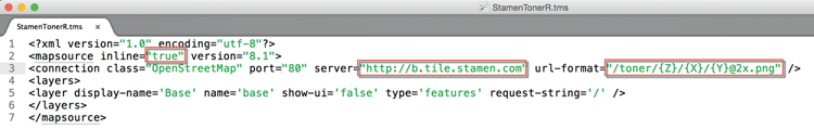
Figure 5-20: Completed TMS file
When you have completed the text file, as you see in Figure 5-20, save it with the .tms extension to the Mapsources folder on your computer. The default location differs depending on your environment for this folder:
- Windows:
C:Users<user>DocumentsMy Tableau RepositoryMapsources - Mac:
/Users/<user>/Documents/My Tableau Repository/Mapsources - Tableau Server:
C:Program FilesTableauTableau Server<version>vizqlserver mapsources
Once the custom TMS is saved in the correct repository on your computer’s hard drive, you can replace the standard Tableau map with the StamenTonerR map layer. To create a customized map using the new custom TMS file, build a standard map view of the data and then replace the standard background map with the custom TMS file. Figure 5-21 shows a map of the Superstore for TDY2 data source, filtered for the state of New York, and then zoomed to the New York City area.

Figure 5-21: Custom TMS file map
As you can see in Figure 5-21, selecting the map menu/background maps menu option permits you to select the StamenTonerR map style you just created. My iMac has eight other custom TMS map layers. These files are included with the companion website files for this chapter. You can examine those files with your text editor or just place them into your Mapsources folder to experiment with other custom map layers. Figure 5-22 shows six different custom maps.

Figure 5-22: Six custom maps
Custom maps are fun. If you are doing a blog post and need some kind of special map to add visual interest to your map view, customizing your base map layer can add value. Tableau’s standard maps are very good and perform well. Avoid using customized map layers to ensure the fastest possible load speeds. What if the space that you want to map is much smaller? Maps in Tableau are just scatter plots with a map background and a predefined coordinate system. Next, you’ll learn how to create maps using any background image.
Using Custom Background Images to Plot Spatial Data
If the spatial data you want to plot isn’t adequately portrayed on a map, you can also use image files as backgrounds. This option offers the advantage of infinite flexibility. But it requires more effort to implement because you will have to define the image boundary coordinates and the point coordinates for the items you want to place on the image.
Why Are Non-Standard Plots Useful?
Analyzing spatial data that’s too small to be meaningful on a map may still yield interesting insight. Alternatively, if you know that your audience won’t have access to the web, you can import a custom map image that contains specific details that are normally available only using online maps or not at all. For example, if you work in a large office and you want to analyze activity within the office, plotting employee movement over time within that space could help you improve the office layout. Retail merchandise managers are interested in tracking how the placement of products on shelves affects sales. Casino managers might be interested in seeing how the placement of cash machines within the casino affects revenue generation in different wagering areas. The options for spatial analysis in Tableau are limited only by your imagination.
Steps Required to Build a Custom Spatial Plot
Creating spatial analysis with image files requires additional steps that aren’t needed when using images from web mapping services because the boundary coordinates on a map are based on the longitude (y-axis) and latitude (x-axis) of the map. Image files don’t have the built-in coordinates that are provided by map services. The steps to use an image for a spatial plot are as follows:
- Find or create an image file (
.jpegor.pngformats work well). - Trim the image to include only the details you need.
- Define the image boundaries (using any metric you desire).
- Add point coordinates to your dataset.
- Tweak point coordinates to precisely position marks on the image.
Assume you want to design a small office floor plan for use as a background image to map employee movement within the space. The level of precision you can achieve is dependent on your capture system. Figure 5-23 includes a floor plan image file that will be used to create a custom map background.

Figure 5-23: Office floor plan image
You can see that Figure 5-23 includes some peripheral areas outside of the floor plan in the image file. These areas are not part of the floor plan. Including areas outside of the floor plan in the image file complicates the image layout later because the dimensions of the office encompass only the office space. For this reason, it makes sense to trim the image to include only the actual floor plan image and not the surrounding white space. The example floor plan dimensions are 64 ft 0 in. × 27 ft 7.5 in. It makes sense to define the layout coordinates in inches. This will provide for precise placement of marks within each location desired within the office space.
Positioning Marks on a Non-Standard Map
Positioning the points within images can take a little time. A point coordinate system allowing for at least one position in each room in the floor plan provides the necessary level of detail for this example. Figure 5-24 includes the dataset with locations that will need to have point coordinates. The initial estimated point coordinates are in the table.

Figure 5-24: Estimated office point coordinates
The goal of this visualization will be to place the marks in a way that won’t obscure the place labels that are included in the office layout image. The steps to finish a map of the office plan are as follows:
- Connect to a dataset that includes the data in Figure 5-24.
- Disaggregate the measures (so that each individual office location appears).
- Add an image of the floor plan from Figure 5-23.
- Edit the (X-Y) point coordinates to precisely position the marks.
After connecting to the dataset, the (X-Y) coordinate measure values should be placed on the column and row shelves. This will result in a scatter plot view with one mark. Tableau will express the sum of the (X-Y) coordinate values. The measures need to be disaggregated to display all of the rows in the dataset. This will cause one mark to appear in the view for each location in the floor plan. To do this, de-select the aggregate measure option from the Analysis menu. Figure 5-25 shows the view before and after disaggregating the measures.

Figure 5-25: Connecting to the data
Next, the background image will be added to the floor plan by accessing the maps/background images menu and setting the boundary coordinates for the background image. Figure 5-26 shows the menus used to enter the coordinates and define how the image will be displayed.

Figure 5-26: Defining the image boundaries
On the left side of Figure 5-26, you see the Add Background Image dialog box. Access this menu from the Map menu ⇒ Background Images option. This is where the coordinates for the (X-Y) axis ranges are entered. The values are defined in inches. Selecting the options menu exposes the menu shown on the right of Figure 5-26. The selected options you see on the right of Figure 5-26 ensure that the image will not be distorted if its overall size is changed. Clicking OK will add the image to the view shown in Figure 5-27.

Figure 5-27: Initial floor plan image
As you can see in Figure 5-27, the initial estimates for the mark coordinates are a little off. A good way to reposition the marks is to open the source file next to your Tableau workbook. (It helps if you have a large monitor or dual-monitor setup when you do this.) With the source file opened next to the visualization, enter revised coordinate values in the source file (save it), and then refresh the Tableau view by right-clicking the data source in Tableau’s data window. You will see the position of the mark change. Figure 5-28 shows the final adjusted coordinate layout.

Figure 5-28: Adjusted point coordinates
See how precisely each mark is placed? The bathroom marks are right on the toilet seats. It normally requires a few tries to get the marks centered exactly because it’s largely a trial-and-error process to position marks precisely on image files. Using point annotation on the marks also helps when you perform this task. With an appropriate capture system, the point coordinate data could be provided by a real-time system that captures staff position with time stamps to create the possibility of making an animated view of staff movement. This technique can be used in many different settings.
Publishing Workbooks with Nonstandard Geographies
If you use a custom map or image file and share a Tableau workbook file (.twb) with other people, you must also share the custom source map file (.tms) with them or they won’t be able to see the custom map. Alternatively, you can distribute the workbook as a Tableau Packaged Workbook file (.twbx). Tableau Packaged workbooks save all your data and any custom (.tms) image files together—eliminating the need to provide the (.tms) file separately.
Shaping Data to Enable Point-to-Point Mapping
Mapping point-to-point details on maps requires that your data supports plotting and linking each point. Possible use cases for this style of presentation might include delivery truck routes, subway line activity, or city traffic flow. Similar presentations could be made using image files for spatial plots of areas too small for maps. Real-world applications may require automation to collect time-stamped geographic points and could require millions of records. To plot customized points on a map, your data must include:
- A unique key record for each location
- Location coordinates (longitude and latitude)
- Other interesting measures or facts related to the data
The next example will map point-to-point travel between two office locations. A line connecting each point will be color-encoded to express the duration in minutes at normal speeds required to traverse each segment between points. Figure 5-29 shows a sample dataset with the necessary details.

Figure 5-29: Point-to-point details
The route in Figure 5-29 starts in Stillwater, Oklahoma, at point 1 and finishes in Oklahoma City, Oklahoma, at point 11. If there were multiple records for each location, a combination of the location, the key record, and the time stamp could be used to identify unique points. In that case, the measures would need to be disaggregated (by accessing the analysis menu and deselecting aggregate measures) so that the plot displays all the different times each location was visited. Because the sample dataset includes only one record per location, there is no need to disaggregate the measures to display all the records. Figure 5-30 shows the completed point-to-point plot.

Figure 5-30: Map view of the route
Notice that the line mark type is selected on the Marks card. Point ID defines the order of the route and must be placed in the path button so that the line connects each point in the correct order. Placing the Point ID on the label shelf causes the location point ID number to display in the map as well. The line connecting the route is color encoded by segment time duration. Because this covers a large area, it would be helpful to provide two additional map views that zoom into the local areas surrounding the origin and destination, making more granular street-level detail visible, as in Figure 5-31.

Figure 5-31: Route dashboard
The maps on the right of the dashboard show more road details around the starting and ending points. Pointing at any mark exposes a tooltip with additional information about the location. The main map view on the left shows the tooltip related to the end point of the route.
Animating Maps Using the Pages Shelf for Slider Filters
The most convenient way to animate views is to utilize a date/time dimension on the Filters shelf (or the Pages shelf) to increment time forward and backward. Creating a quick filter using a continuous dimension presents the user with a slider-type filter that will work well for animating the view. The Pages shelf goes beyond quick filters by enabling an auto-incrementing filter. The Pages shelf works well in Tableau Desktop and Reader; however, it is not supported in Tableau Server.
The example in Figure 5-31 doesn’t include a date/time dimension, but there is a single key record for each point ID. The example map can be animated by placing the Point ID field on the Filters shelf. Figure 5-32 shows the Point ID added to the desktop as a continuous slide filter.

Figure 5-32: Animating a map
The route line now ends at point 8, as specified in the quick filter. Dragging the slider to the left or right animates the route map manually. Notice that the Point ID pill on the Filters shelf is green. This color indicates that the point ID was changed to a continuous dimension. The Point ID field was initially a discrete dimension. Using a discrete dimension for the quick filter would not facilitate animating the view. The filter was changed from discrete to continuous by right-clicking the Point ID pill on the Filters shelf and selecting Continuous.
Tableau’s standard maps and automatic geocoding should meet your needs most of the time. Through the use of custom geocoding and custom maps, you’ll be able to create even more detailed geographic analysis. And, by using custom map backgrounds from web services or image files, you can fully customize the detail and appearance of map backgrounds.
In the next chapter, you learn how to create an ad hoc analysis environment with Tableau.