Chapter 4. How to Measure Returns
How do you tell whether a given investment strategy is worth following? Although this seems like a simple question, it isn’t. Suppose your friend Daniel tells you that he has developed an incredible trading strategy. He tells you that he made a 20% return on ABC, a 25% return on DEF, and a 35% return on GHI over the past month! Daniel offers to share his strategy with you so that you, too, may enjoy these gains. Daniel’s returns do sound impressive, but, unfortunately, it isn’t that simple. As we look at how we measure returns, we must also consider two other important factors: luck and risk.
Calculating Returns
With this discussion as backdrop, let’s now turn to how we measure the profitability of gap-based trades in this book. Chapter 1, “What Are Gaps?” discussed how to number the days around gaps. The day of the gap is called Day 0. The day before is Day –1, the day after is Day 1, and so forth. Because a gap can’t be unambiguously determined until the close of Day 0, there would be no opportunity to initiate a gap-based trade until Day 1. Of course, there would be some days for which you could safely guess by the last hour or last minutes of trading that either a down gap or an up gap was going to occur. But, the Flash Crash of May 6, 2010, showed that prices can change quickly and dramatically.
Assuming that gap-based trades are initiated at the open of Day 1, we performed calculations using various holding periods. The formula used for the return based on a holding period of N days follows:
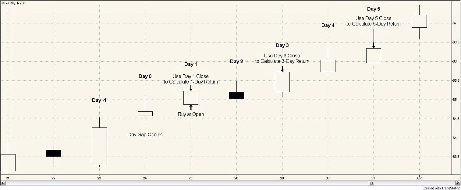
This book reports results for holding periods of 1, 3, 5, 10, and 30 days. As an illustration, consider Figure 4.1 which shows a gap up for KO on March 24, 2011. March 24 is labeled as Day 0. Seeing that a gap up occurred on March 24, you can enter a long position at the open the following day. Thus, you can purchase KO on Day 1 at a price of $64.87. The closing price for KO on Day 1 is $65.22. Hence, your 1-day return follows:
Created with TradeStation
Figure 4.1. Daily stock chart for KO, March 21–April 1, 2011
The 1-day return is simply measuring how much you would earn if you bought the stock at the open on Day 1 and sold at the close on Day 1. You can calculate longer returns in the same manner. For example, a 3-day return is calculated assuming that KO is purchased at the open of Day 1 and sold at the close of Day 3. The closing price on Day 3, March 29, was 65.72 leading to a 3-day return of 0.0131, calculated as follows:
In the same manner, the 5-day return follows:
These calculations do not make any adjustments for transactions costs. The profit that an investor would actually make on this trade would be reduced by the costs, such as commissions, the investor must pay to enter the trades. In recent years, transactions costs have fallen dramatically. Also, transactions costs vary widely across investors, depending upon their portfolios and trading frequency. Therefore, returns not adjusted for transactions are reported, allowing individual investors to determine if the profitability of a strategy would be great enough to cover their transactions costs.
Table 4.1 provides the average returns for stocks that gapped during the 1995–2011 sample period. All these returns are calculated for long positions; if a stock gapped up or down on Day 0, a long position is entered at the open on Day 1. The returns shown are in percentages. So, the value of –0.0204 for the average 1-day return for down gap stocks means –0.0204%. Likewise, the 5-day return from buying stocks that experienced down gaps was 0.3712%, or a little more than 1/3 of 1%. Another way to state this is in basis points. One basis point (abbreviated bp) is 1/100th of 1%; 100 bp equals 1%. The return of 0.3712% could be described as 37.12 bp. These numbers sound quite small. However, 37.12 bp over a 5-day period is approximately 20.35% on an annualized basis (assuming about 250 trading days in a year).
Table 4.1. Average Returns for Stocks with Gaps, 1995–2011

Now look more closely at the returns for stocks that gap down. On average, the 1-day return for these stocks is negative. Thus, on average, after a stock gaps down, the stock price continues to fall over the next day. Entering a long position on Day 1 after a stock experiences a down gap on Day 0 results, on average, in a loss the first day. By Day 3, however, the price movement has reversed, resulting in positive returns for the 3-day, 5-day, 10-day, and 30-day holding periods.
Now, consider the returns for stocks that gap up. The numbers in Table 4.1 show that, on average, the stock price is lower at the close on Day 1, Day 3, Day 5, and Day 10 than it was at the open of Day 1. Thus, the upward movement in price seen on the day of the gap does not continue over the next couple of weeks. Entering a long position on Day 1 for these stocks would be unprofitable over the next 10 days. You do see, however, positive returns for long positions held for 30 days.
These returns suggest that going long, hoping for a continuation of price movement, the day after an up gap, is not immediately profitable. For holding periods of 10 days or less, a better strategy would be to short a stock after an up gap. Up gaps appear to be associated with a reversal in price trend over the short (10-day) time frame. Down gaps do appear to be associated with price continuation, that is, the price continues downward, for a short period of time, suggesting a short position is initially profitable. Within 3 days, however, this price movement tends to reverse, suggesting that a long position should follow a down gap for holding periods of 3 days or longer.
The Impact of Luck
The authors live in San Antonio, home of the Alamodome, which was primarily designed as a football stadium even though San Antonio has no pro football team. Go figure. Let’s conduct a thought experiment. There is a football game and the Alamodome, which can hold approximately 80,000 people, is packed. At halftime you hold a special coin-flipping event. You have everyone stand up and flip a coin. You tell everyone who flipped “tails” to sit down. You then tell the people still standing to repeat this process. You continue this process until only one person, the champion head-flipper, remains. If the coins were all fair coins, you would expect the sequence of people still standing to be something like 40,000, 20,000, 10,000, 5,000, and so on. It is quite likely that the winner, whom you can call Pat, might have flipped 16 or more consecutive heads.1
A reporter might interview Pat about her head-flipping success. The interview might begin with the reporter asking, “Pat, tell me. Were you surprised when you flipped 16 consecutive heads in a row?”
Would you expect Pat’s response to be, “No, not really. You see when I was in college, I skipped a lot of my classes. I spent hours practicing coin flipping. Somehow I knew that someday it would pay off. Today it has. I get to be on national TV. Hi, Mom! I told you it would all work out someday.”
Or do you think a response such as, “I’m as surprised as you are. I guess today was my lucky day. It was definitely blind luck, but it will certainly make a good story for my grandkids.” would be more likely?
So what does this have to do with investing? Given thousands and thousands of investors, some people are bound to get lucky. Just as you need to question whether a winning coin flipper has some special talent or simply got lucky, you must ask whether an investor’s winning record is a result of a superior investment strategy or simply luck. Was Daniel in the opening scenario of this chapter like Pat? Did his investment strategy win just due to pure luck?
Be careful not to attribute good performance and a high return to a superior trading methodology too quickly. As you have just seen, you can win repeatedly just because of luck. As American screenwriter Frank Howard Clark said, “It’s hard to detect good luck—it looks so much like something you’ve earned.” Knowing when to attribute good performance to luck and when to attribute it to methodology is a difficult task. One way to do this is to see if the strategy makes rational sense. If Pat were to tell you that the winning methodology for coin flipping was to stand on her left foot when she tossed the coin, you would attribute her winning to luck. Likewise, if Daniel’s stock-picking methodology were to pick stocks by choosing three stock tickers by pulling tickers from a hat that contained slips of papers with the names of all the tickers in the S&P500, you would attribute his performance to luck. But, sometimes, it isn’t easy to tell if the strategy makes rational sense. Suppose that Daniel said he picked stocks based on a recent vacation he took to a west coast city. He saw lots of new businesses opening, a booming real estate market, and a vibrant economy. He enjoyed his visit so much he decided to invest in companies headquartered in that city. Was Daniel’s good performance luck? Or did Daniel’s strategy help him choose companies that were growing and in an expanding industry?
In addition to asking whether rational reasons exist for a winning strategy, you can control for risk to some degree by using large sample sizes. Pat may throw 16 heads in a row, but can she throw 20 heads in row by standing on her left foot? What about 25 or 30 heads? As you increase the sample size and the time period considered, the chance to have a winning strategy simply because of luck diminishes.
The Impact of Risk
The second factor with which you need to wrestle is risk. Say someone comes to you with a stock-picking system that produces a high number of winning trades. The relevant risk question is, “Does this system merely tend to select stocks with high risk?” If so, the results may not look so impressive after adjusting for risk.
But, how do you adjust for risk? There’s the rub. One method frequently used in academic finance is to adjust based on the stock’s beta, which is a measure of the stock’s systematic, or nondiversifiable, risk. This is part of what is called Modern Portfolio Theory (MPT). The work that went into MPT led to Nobel Prizes for Harry Markowitz and William Sharpe in 1990.
Although beta is commonly used as a measure of risk in the academic world, it is not without problems. Academics are still arguing about risk adjustments. The last doctoral dissertation on risk and asset pricing has not yet been written and probably won’t be for many years (if ever). For the most part, academics identify risk as uncertainty or variability of returns. This concept isn’t perfectly transferable into the practitioners world of trading.
First, practitioners are not so concerned that a trade might be more profitable than what they expected. For example, if a trader thinks there is a 95% chance that a trade will make $100,000 and a 5% chance that the trade will make $1 million, risk would not be much of a concern for the practitioner. Give the same trader a trade that had a 95% chance of making $100,000 and a 5% chance of losing $800,000, however, and risk becomes much more of a concern. To the academic, both of these trades have about the same variability and, thus, about the same risk. Academics don’t distinguish much between upside risk and downside risk; the unknown, or variability, is risk. For the trader, the possibility of loss is a much greater risk than the possibility of an extremely high gain.
Second, academics have focused on how diversification minimizes risk by eliminating unsystematic risk. Although it is true that diversification curbs huge losses by spreading your eggs across a number of different baskets, it does nothing, as the last decade has taught us, to protect investors when the entire market is in a downturn.
Practitioners generally define risk as the chance of losing capital. This can be an entirely different mindset than the academic view of risk. A number of alternative measures have been put forth to try to address the notion of risk in a trading environment. These include measures such as maximum amount of loss per trade and maximum drawdown. None of the measures developed so far perfectly meet the needs of all traders.
Obviously, measures of risk are complicated and controversial. Thus, throughout this book, the only adjustments made are controlling for overall market conditions. Individual traders need to be aware of what measures of risk are most appropriate given their own definition of risk.
Why adjust for overall market conditions? Remember Daniel from the beginning of the chapter? He made 20% in ABC, 25%, and DEF, and 35% in GHI last month. When analyzing Daniel’s strategy, economists will be quick to ask, “What was the opportunity cost?” In other words, if Daniel had placed his money in another stock, what would his return have been? If the average stock in the market went up 35% last month, Daniel’s strategy doesn’t look so good any more. His GHI pick was simply an “average” pick. Even though he made a positive return in ABC and DEF, he would have made more money purchasing the average stock in the market.
Therefore, you need to consider the overall background of the market when considering how well an investment does. You don’t want to brag about a 25% return when the average return is 35%; in this case, you did 10% worse than if you just randomly picked stocks. Under some market conditions, it is just easier to make money in the stock market than it is during other time periods. Having a 25% return during a strong market uptrend is much easier than having a 25% return when the market is in a sideways trading range.
Market Adjusted Returns
How can you control for market conditions? You do so by calculating market-adjusted returns. As most things in investments, this adjustment is not as straightforward as it sounds. As a measure of underlying market conditions, you can use the S&P500 as your adjustment. Trading in SPY, an ETF that tracks the S&P500, began in 1993, which enables you to use SPY returns for adjustment as follows.
N-day market-adjusted return = N-day return – N-day return for SPY
This adjustment is not perfect. Theoretically, you want to adjust the return for your strategy by the return you would have received if you invested in the average stock that has the same risk. We screened companies using minimum volume and minimum dollar volume criteria (as described in Chapter 3, “The Occurrence of Gaps”) to avoid thinly traded, illiquid stocks. Although we removed extremely small and illiquid companies from the sample, stocks that have a smaller market capitalization than the stocks in the S&P Small-Cap 600 remain in the sample. Thus, the sample contains stocks with a wide range of market capitalizations. Academics will be quick to point out that the risk metrics of a pool of stocks with such a wide range of market capitalization are not identical to those of SPY; thus, the adjustment made in this book for market returns is not perfect.
Use extra care when interpreting market-adjusted returns during a market downturn. The market-adjusted return is an attempt to tell how much better a strategy did than investing in stocks randomly does. If the market falls 20% and you follow a strategy that loses 5%, you have outperformed the market. Your market adjusted return would by –5% – (–20%) or 15%! Of course, an investor would rather lose 5% than 20%, but a 5% loss is a negative return. Don’t get misled by positive market-adjusted returns in a market downturn; any negative returns result in a loss of capital, something you want to avoid.
These issues are mentioned in the interest of full disclosure. The market return adjustment made in this study was simple and has its problems, but it does provide some additional, useful information.
Table 4.2 shows the market-adjusted returns for the data presented in Table 4.1. Although the 1-day return for down gaps was –0.0204, the market-adjusted 1-day return is –0.0507. That the market-adjusted return is lower than the nonadjusted return indicates the overall market was moving higher the day after the down gap. Thus, purchasing the stock that down gapped not only resulted in a negative 1-day return, but it also meant an opportunity cost of not receiving the positive return that would have resulted if that money had been invested in the market portfolio.
Table 4.2. Average Market-Adjusted Returns for Stocks with Gaps, 1995–2011

One important result in Table 4.2 is that, even though the average 3-day return for stocks that gap down is positive, the market-adjusted 3-day return for these stocks is negative. This means that purchasing a stock that gaps down at the open on Day 1 and holding it for 3 days, on average, results in a profit, but the profit is smaller than what would have been earned if you had invested in the market portfolio.
The numbers presented in Table 4.2 are averages of many observations over a 17-year time frame. The overall market conditions in the late 1990s were radically different than they have been since the turn of the century. Chapter 3 noted that gaps had become more common in recent years. This leads to the question of whether the averaging of so much data in Table 4.2 masks some underlying, important trends. To better understand how stable these results have been over time, the returns are broken down by year. Table 4.3 presents returns for down gaps by year from 1995 through 2011. Negative numbers are lightly shaded to discern patterns more easily.
Table 4.3. Returns for Down Gaps by Year, 1995–2011
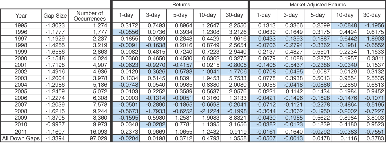
The results in Table 4.3 highlight some of the differences in considering nominal returns versus considering market-adjusted returns. Look at 1997. The nominal returns for purchasing a stock at the open the day after it gaps are positive for all the holding periods, yet the market-adjusted returns for all holding periods are negative. The market, as measured by the S&P500, rose by 33.36% in 1997. Although the prices of stocks that gapped down reversed by the next day, they tended not to rise as much as other stocks over the next 30 trading days. A similar result occurred in 2011. In 2011, the S&P500 rose only 2.05%, so a bull market cannot be the explanation for the negative market-adjusted returns. As you can see when you look at market conditions more closely in Chapter 8, “Gaps and the Market,” 2011 was characterized by some extreme price moves within a trading range without much directional movement. Interestingly, although the size has changed, the 1-day market-adjusted return for down gaps has been negative each of the last 6 years.
The results for up gaps are broken down by year in Table 4.4. The nominal returns for all holding periods were negative for four of the years: 2002, 2007, 2008, and 2011. The market-adjusted returns for all holding periods were negative for 5 years: 1995, 1996, 2006, 2007, and 2011. The nominal returns for all holding periods were positive for three of the years: 1995, 2009, and 2010; the only year in which the market-adjusted returns were all positive was 2009.
Table 4.4. Returns for Up Gaps by Year, 1995–2011
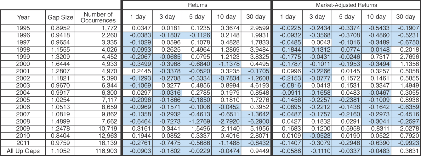
The up gap results for 1995 are particularly striking; all the nominal results are positive, but all the market-adjusted returns for that year were negative. The average 30-day nominal return for purchasing a stock on the day after it gapped up was 2.9599, which is about 27.52% on an annualized basis. However, the S&P500 gained 37.8% in 1995. Thus, even though stocks that gapped up saw continuation in upward price movement, they did not rally as much as the broader market. When the gains earned from investing in the stocks that gapped up are compared to the opportunity cost of not being invested in the broader market in 1995, the market-adjusted returns are negative.
Another year that is particularly interesting is 2009 in which nominal returns and market-adjusted returns were all positive. The nominal returns in 2009 were remarkably high. The 5-day return of 1.5496 translated into an annualized rate of 115.73%. The 10-day return of 2.114 is equivalent to an annualized rate of 68.7%; the 30-day return of 2.8071 is an annualized rate of 52.51%. Investors purchasing a broad portfolio of stocks, as measured by the S&P500, earned 26.46% that year. Thus, a portion of the profits earned by an investor purchasing stocks after they gapped up were attributed to the bull market, but this accounted for only about half of the profits. It appears that gap ups signaled which stocks would outperform the market in 2009. Although not as strong, you can see similar results for 2010.
Extreme Values
Extreme values in any set of data are always interesting. From an investing standpoint the extreme values are especially intriguing. What trades would have been the most profitable? What trades would have been the least profitable? Would it reasonably have been possible to spot these opportunities beforehand? What can be learned for future reference?
The extreme cases presented in this chapter are from 2011. This is done for a couple of reasons. First, it is the last year in the sample and therefore is of particular interest as the most current year in the study. Second, in Chapter 3 you saw that the frequency of gaps has been increasing over the years; in Table 3.1 you saw that with 32,232 gaps, 2011 had more than any other year in the sample. With that many gaps, surely some interesting extreme examples exist.
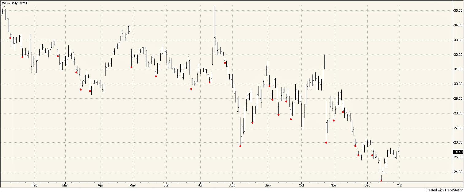
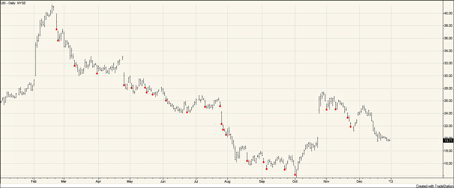
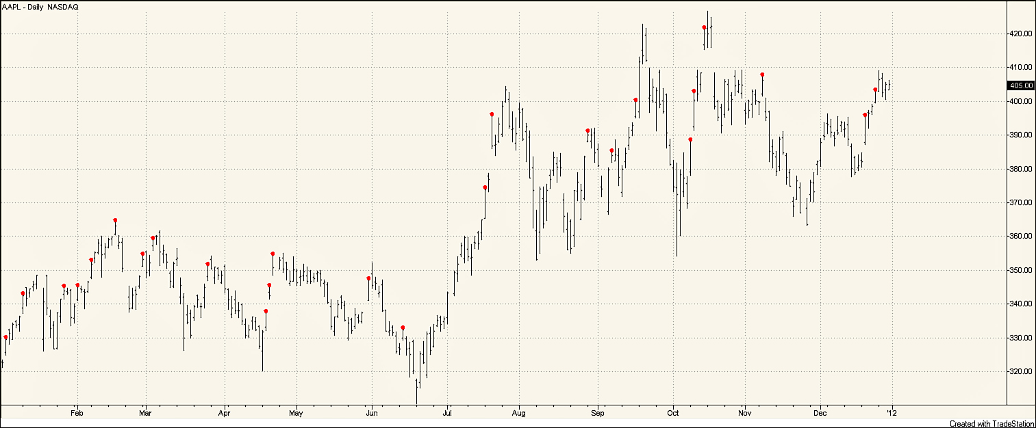
First, consider the stocks that were extreme in terms of the number of gaps. Two stocks tied for the highest number of down gaps in 2011; both Resmed Inc. (RMD) and Unisys Corp. (UIS) had 25 down gaps in 2011. With approximately 250 trading days in a year, that means that RMD and UIS were experiencing a down gap on about 10% of the trading days. RMD, shown in Figure 4.2, makes medical equipment related to respiratory ailments. UIS, shown in Figure 4.3, is an information technology company. The company with the highest number of up gaps was Apple Inc (AAPL) with 24; the stock chart of AAPL is shown in Figure 4.4. All three of these companies have strong links to technology. Because technology stocks tend to be volatile, it is not surprising that these stocks top the list for the highest number of gaps.
Created with TradeStation
Figure 4.2. Daily stock chart for RMD, January 1–December 31, 2011
Created with TradeStation
Figure 4.3. Daily stock chart for UIS, January 1–December 31, 2011
Created with TradeStation
Figure 4.4. Daily stock chart for AAPL, January 1—December 31, 2011
Stock charts for the three stocks share some similarities but are quite different. The high number of gaps makes all three charts look somewhat choppy. The chart for RMD is especially irregular. The gaps create several large gaps in price. Overall, the stock trended down in price over the year, falling almost 30%, but did so in fits and starts. Although RMD experienced at least one gap down every month in 2011, the stock experienced an unusually high number of down gaps in September. In the first 15 trading days of September, RMD had five down gaps. Surprisingly, the stock also had two up gaps during that same 15-day period. Thus, for the first 3 weeks in September, RMD experienced a gap almost every other day.
Looking at UIS in Figure 4.3, you see that the stock increased approximately 40% from the beginning of 2011 through mid-February. During this rapid increase, the stock experienced no down gaps. However, the story quickly changed on March 22 when a down gap, followed by a down gap on March 23, caused the price of UIS to fall by more than 12%. For the rest of the year, UIS trended downward. Five down gaps occurred during July, with the last five trading days of July seeing four down gaps. During October, the stock experienced a short uptrend, during which no down gaps occurred. Just as in February, however, this uptrend came to a halt with a down gap on the first trading day in November. The stock price continued to fall, losing approximately 20% over the November–December time frame. Thus, for UIS, down gaps were associated with the time frames that UIS was in a downward trend.
In Figure 4.4, you can see that AAPL was in a trading range for the first half of 2011, In July, AAPL experienced an uptrend; by September, the stock was again in a trading range. For the most part, the up gaps for AAPL were spread across the year. No more gaps occurred during the uptrend than during trading ranges. Most noticeable, AAPL did experience three up gaps in a row in late April. However, these up gaps were not enough to push the stock out of the trading range.
Profitable Trading Examples
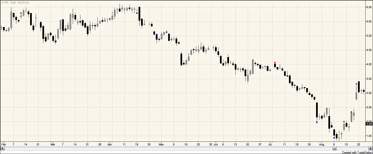
Now consider some particular gap trades that would have been highly profitable. In particular, which trades were the best trades in 2011? The single best 10-day trade after a down gap would have been to buy Clearwire Corporation (CLWR) after its August 8 down gap. Clearwire is an interesting company. It has a 4G mobile broadband network that extends across much of the United States and reaches about one-third of the U.S. population. Its service is branded CLEAR in most of its markets. CLWR went public with its March 2007 IPO at a price of $25. By the end of 2008, the price was hovering around $4. In September 2009, its price recovered to more than $9. For the next year CLWR traded in a $6–8 range. In October 2010, the price began a steady descent from about $8, dipping below $2 for the first time in August 2011. As shown in Figure 4.5, on August 8, 2011, the stock gapped down closing at $1.52. However, there was a dramatic turnaround at that point. The 10-day return from the open on August 9 was an amazing 94%.
Created with TradeStation
Figure 4.5. Stock chart for CLWR, January 31—August 24, 2011
Hindsight is always 20/20. Now it is easy to identify the August 8 down gap as an exhaustion gap. But, were there clues that might have pointed someone to a buy decision around that time period? The stock had gapped down three times in the preceding 3 months—on April 27, May 12, and July 28. In the 25 trading days between July 5 and August 8, the stock had black candles on all but 5 days. It was definitely on a bad roll.
What was happening with CLWR? Revenue had gone from $20 million in 2008 to $557 million in 2010. In 2011, the company was on a path to push revenue to more than $1 billion. However, the company was still incurring dramatic losses. The company had been making large investments in plant, property, and equipment. It also had more than $800 million in cash at the end of June.
At the time, the company was receiving some mention in the press due to Raj Rajaratnam’s insider trading trial. On May 11, a Forbes article titled “I Knew Rajaratnam Was a Crook After He Tried to Sell Me Insider Info” contained this paragraph:
Clearwire (CLWR) was often mentioned in the reporting on this trial as another entity about which Intel’s investment was made known to Raj before it was made known to the general public. The Clearwire connection concerned the building of a nationwide Wi-Fi network which at this moment remains the fastest network extant. Even if you own a new 4G phone (I bought one last week), they will tell you in the phone store to use Wi-Fi if it is available because it is so much faster than any cellular connection.2
The company was getting attention for its fast Wi-Fi network but in the context of an insider trading trial. The former was clearly good press. However, the latter was not. No company, regardless of the facts of the case, wants to be mentioned in connection with insider trading. This may have been an additional factor dragging the stock price down. On May 12, the company’s stock dropped by 15.6%.
Could astute investors have put all this information together and bought at the open on August 9? If they had done that, they might not have kept their position through the day. It opened at 1.56, reached a high of 1.62, hit a low of 1.35, and closed at 1.42. The trade might have been stopped out. The stock was also quite volatile on the 10th, with a range from 1.32 to 1.68, closing at 1.44. But, here’s where things get more interesting. On the 11th the stock closed at 1.59. On the 12th it gapped up, closing at 1.91. With its second up gap in 4 days on the 17th, it closed at 2.33. Two days later it gapped up again and closed at 3.01. Even if investors had waited to buy until after the 2nd gap up during this period, they could have caught the move from the open on the 18th at 2.21 to the close on the 19th at 3.01; that would have been a 36% gain.
Buying on the 9th would have been betting on a reversal. Going long after observing a gap up on either August 12 or August 17 would have been pursuing a continuation strategy. So how do you reconcile this with the observation that a reversal approach generally seems to be more profitable? This book is about trading gaps. Although the authors present evidence that points toward the advantage of a reversal approach in general, it isn’t appropriate in every case. In this particular case CLWR had continued its downward march after the three down gaps on April 27, May 12, and July 28. It also closed down on the August 10 after the down gap on the 8th. After the up gap on the August 12, the price went up. There was certainly a case to be made to use a continuation approach on either August 12 or the August 17. If you throw in the other factors (rapidly rising revenue, building a leading edge network, lots of cash on the balance sheet, and some unfortunate linkage to an insider trading case), there were some good reasons to suspect that perhaps it was about time for the 4-month march from $6 to $2 to reverse course. There was even one more factor; on August 10 the company announced that the chief operating officer was promoted to president and CEO and that the company’s chairman and interim CEO was becoming the executive chairman of the board of directors. There were some important changes occurring.
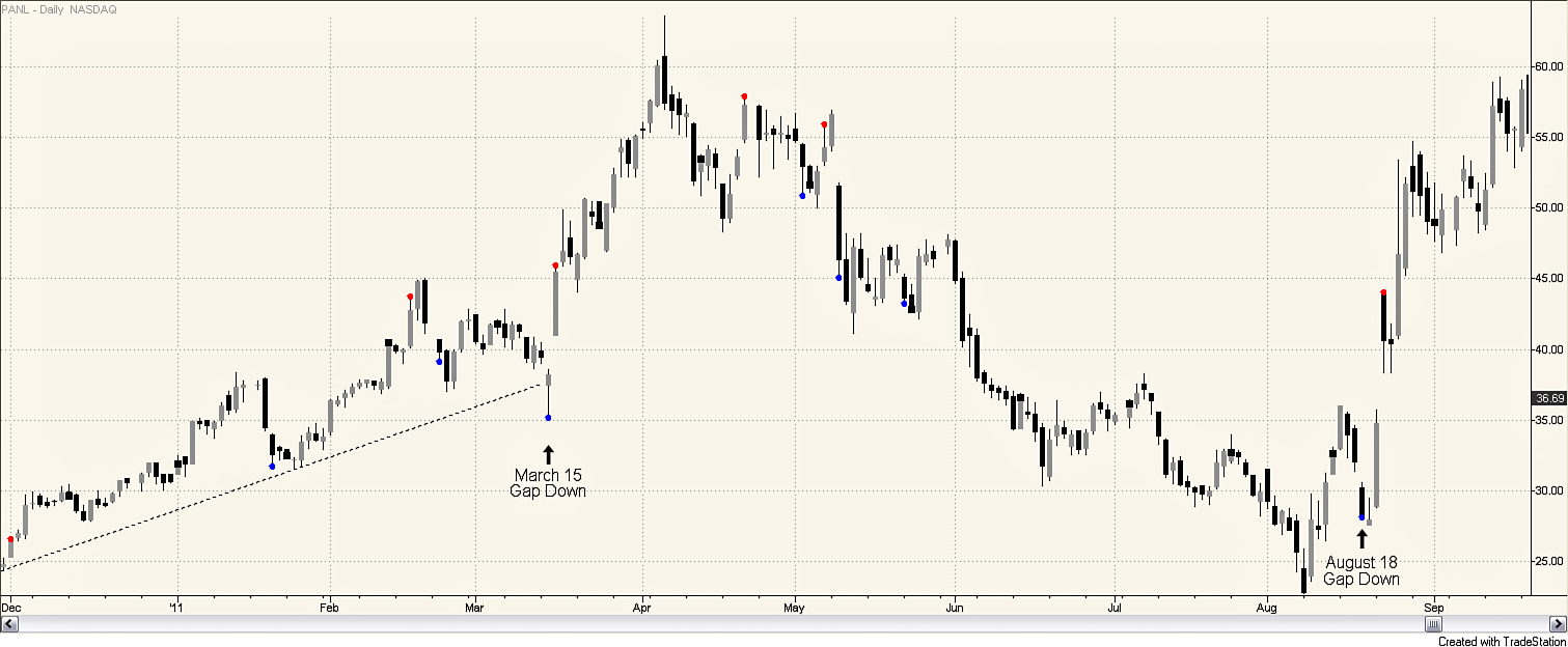
Trading the August 18 down gap for Universal Display Corporation (PANL) had the highest 5-day return for any down gap in 2011. PANL engages in the research, development, and commercialization of OLED technologies and materials for use in flat panel display. Figure 4.6 illustrates the price movement of PANL from December 2010 through September 2011. Over a 4-month time period, December 2010 through March 2011, PANL doubled in price. Following this 4-month uptrend, a 4-month downtrend ensued. This downtrend was just as strong as the uptrend, and PANL lost more than half of its value. On August 8, PANL closed below $25 per share, ending the downtrend. By August 15, PANL had reached $36, representing more than a 40% gain over a 1-week time period. This price increase appeared to be fueled by better than expected sales and profit numbers. However, the enthusiasm was short-lived, within 3 days PANL dropped back down below $28 a share. At the time, someone watching the stock and seeing the down gap on August 18 would have easily thought that PANL was still in a downtrend. In hindsight, that down gap was a great buying opportunity. Enthusiasm for PANL quickly returned as a licensing agreement with Samsung was announced on August 23. Buying PANL at the open on August 19, the day following the gap, and holding the stock for 5 days would have resulted in a 69.5% return; holding the stock for 10 days would have resulted in a 77.7% return.
Created with TradeStation
Figure 4.6. Daily stock chart for PANL, December 1, 2010—September 20, 2011
Interestingly, PANL also had a down gap on March 14, 2011, which also was followed by a high rate of return over the next several weeks. The March 15 down gap broke through a significant trend line, suggesting an end to the uptrend. However, the following day, PANL gapped up and continued in an even steeper uptrend. Thus, both of these profitable trading opportunities were a result of a down gap, which at the time suggested a change in trend, but in hindsight were a fabulous buying opportunity.
You looked at several of the most profitable opportunities for going long after a down gap in 2011. These were basically opportunities in which the down gap price movement quickly reversed after the down gap. Now consider some of the most profitable trading opportunities with up gaps.
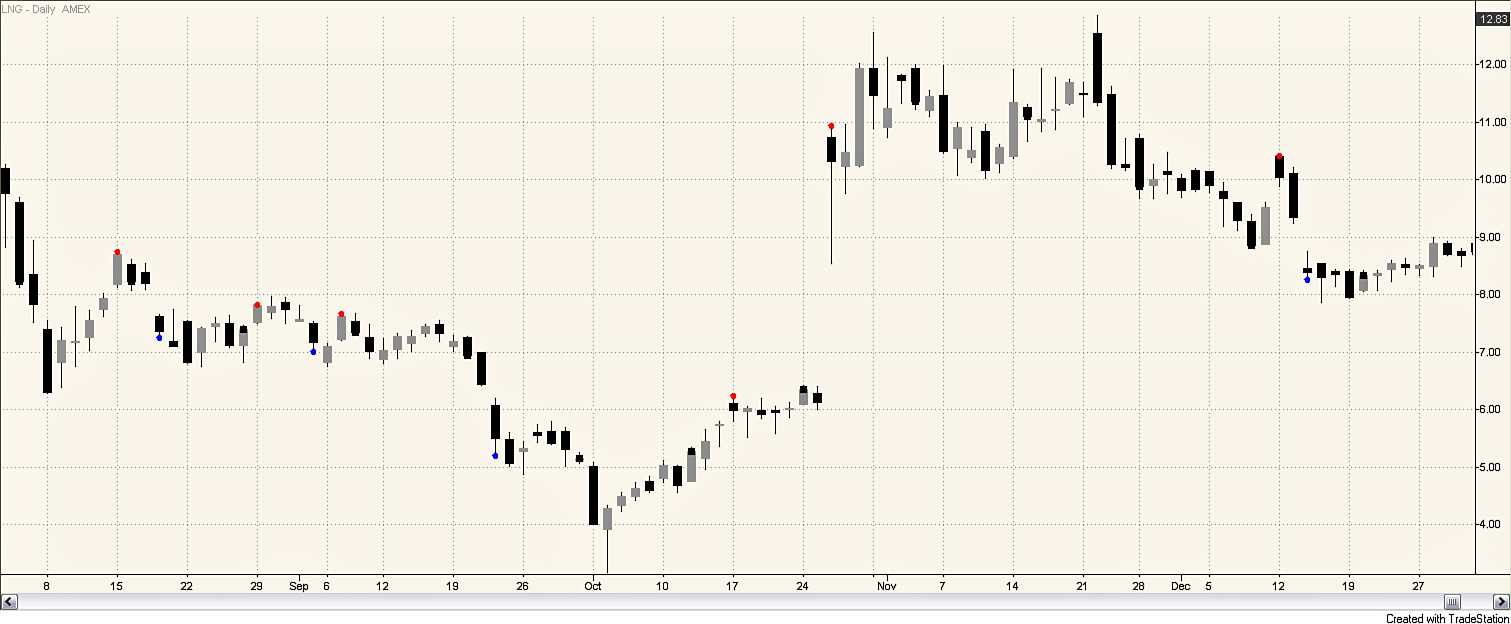
On October 17, 2011, Cheniere Energy Inc. (LNG) experienced a gap up. An investor who purchased LNG the following day would have made a 91.6% gain in 10 days. LNG builds and operates liquefied natural gas terminals and pipelines. As Figure 4.7 shows, the October 17 gap was not spectacular, and nothing much happened to the stock price over the next week. The story changed, however, on October 26, when the stock gapped up again, this time in a spectacular move. The market stock price opened approximately 75% higher, and even though it moved down somewhat during the day, a gap of more than $2 a share remained. The price did continue to rise over the next few days, contributing to the 91.6% 10-day return, but the substantial price move on October 26 accounted for the majority of the gain. Why did the big price jump occur on October 26? LNG announced a major deal with a British energy firm to export liquefied natural gas out of the United States.
Created with TradeStation
Figure 4.7. Daily stock chart for LNG, August 3—December 31, 2011
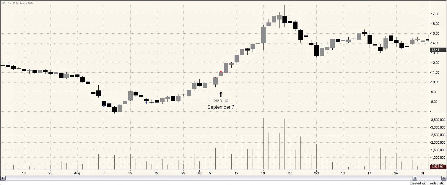
Figure 4.8 contains a stock chart for Optimer Pharmaceutical, Inc. (OPTR). The stock entered an uptrend in mid-August. As this trend continued, an up gap occurred on September 7. Price continued to move up, resulting in a 21% 5-day return and a 53% 10-day return for investors who bought the stock at the open on September 8. From a technical standpoint, this is an interesting gap. Although many of the stocks that saw incredibly high returns after an up gap were buyout targets, OPTR does not fit into this category. There was an increasing interest in OPTR. The company appeared in a number of news reports for a variety of reasons. OPTR had recently had a drug receive FDA approval. The company was covered by new analysts. Several analysts increased their ratings of the company. These were all “positive” news stories, but there was not actually any new news about the company. As the uptrend continued, the company was included in lists of high-return companies. This is an example of the feedback loop about which technical analysts talk. As more people heard that others had made money in OPTR, more people began buying, driving the price up further. This increased interest in the stock shows up in rising volume throughout September. The September 7 gap can be viewed as a measuring gap, occurring about halfway up the price increase.
Created with TradeStation
Figure 4.8. Daily stock chart for OPTR, August 12—November 1, 2011
Summary
This chapter explained a methodology for calculating the returns for gap trading strategies. You saw that immediately after a gap occurs, whether it is a down gap or an up gap, price tends to move lower. These results hold whether looking at nominal returns or market-adjusted returns and suggest following a shorting strategy immediately after a gap. However, price movement quickly reverses, especially for gap down stocks, suggesting that a long strategy is more likely to be profitable over longer holding periods. As you continue through this book, you will look at how the consideration of additional variables, such as volume, price movement prior to the gap, and overall market measures, might increase the profitability of trading when a gap occurs.
Endnotes
1. The chance of flipping a head on a single coin toss is 1/2. The chance of flipping two heads in a row is 1/4; so out of four people, one person will, on average, flip two heads in a row.
2. Lapping, Joan. I Knew Rajaratnam Was a Crook After He Tried to Sell Me Insider Information,” Forbes Online, www.forbes.com/sites/joanlappin/2011/05/11/i-knew-rajaratnam-was-crooked-after-he-tried-to-sell-me-insider-info/.

