20
Visual Aids
“‘If your pictures aren’t good enough, you aren’t close enough.’”
–Robert Capa
Visual aids are things extraneous to the speaker that are visual and are used to enhance the effectiveness of the message. Visual aids act in consonance with the speaker, his body language, vocal variety and all the other elements discussed in earlier chapters. Visual aids include, but are not restricted to, white (black) boards, flip charts, posters, web sites, presentation materials (such as PowerPoint slides), models, working prototypes and so on.
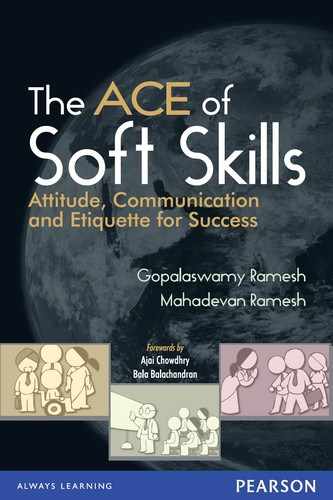
Visual aids serve the following purposes:
They act as a reminder to the presenter not to miss the key points: Visual aids lead the presenter through the presentation. They give cues for sequencing the presentation so that the presentation proceeds in a logical (and planned) sequence.
They leave an impression on the audience as they get visual input: As we have seen before, the visual channel is the most powerful way of getting through to the audience. When a speaker uses visual aids, they act as significant reinforcement to the vocal and the verbal channel. Visual aids enhance the recall of a message by the audience.
They can incorporate transitions, graphics and other multimedia elements for added emphasis: A PowerPoint presentation for example can include effective graphics and multimedia effects to drive home key points. For example, to show sales rising over the years, a graph with the value of each year coming up one by one can convey a lot more information than any words.
They can be left behind as handouts with the audience for further reference: Copies of a presentation can be left behind with the audience so that these copies can be referred to as needed in future, thereby providing more opportunities to reinforce the message.
What visual aids are NOT meant to be:
They are not supposed to replace the speaker: Visual aids are just that: aids to the speaker. They are not meant to steal the thunder from the speaker. Visual aids cannot and should not replace the speaker. That is why, the same PowerPoint presentation given by two different people look as different as day and night.
They are not meant to be ‘read aloud verbatim’: Since the visual aids do not replace the speaker, it follows that the visual aids should not contain each and every word that the speaker is going to utter. They should only contain pointers that trigger or prompt the full presentation.
In the above discussion, we have tacitly assumed that visual aids mean things like transparencies, foils, canned presentations and so on. As mentioned earlier, visual aids can also be working models or demonstration prototypes of devices shown to the audience. For our discussion, we would only consider the first type and not discuss working models or prototypes.
20.1 Types of Visual Aids
There are various types of visual aids. These fall into two categories: prompted, interactive visual aids and pre-canned presentations.
Using prompted, interactive visual aids is appropriate to give an impromptu feeling to your presentation when you want to develop the entire storyline as you go along. Black (white) boards, flip charts and overhead transparencies are the common types of visual aids in this category. In each of these, the presenter writes on the board or chart or the foil during the presentation. The advantages that these media bring to the table are:
- They have a real-time, ‘developing’ feel to them and therefore present an opportunity for being more flexible and spontaneous than canned presentations.
- Since the presenter has to write on the media, it can slow down the presenter and give the audience more time to understand the presentation.
- These may leave a permanent record of the presentation and the direction in which the presentation went.
- Some of the ‘low-tech’ options like white board and flip charts would not get derailed because of power cuts and such infrastructural glitches.
Some of the disadvantages of this type of media are:
- Since no canned presentation is used, it is easy to forget some of the key points.
- Since the presentation is interactive by design, it is easy to get sidetracked.
- In the case of white boards and flip charts, the presenter would have to turn his or her back to the audience to write and during this time, he or she loses valuable chances of establishing eye contact and opportunities to watch and respond to the audience’s body language.
- In the case of writing on an overhead foil, the presenter’s eyes are obstructed by the glare of the projector and the presenter also obstructs the projection onto the screen. Anyway, this media is not much in vogue today, being replaced by a computer connected to projection equipment.
Most people today use pre-canned presentations as visual aids. PowerPoint, Flash and web pages are the most common types of tools used. Of these, we will focus only on PowerPoint in this chapter since a large percentage of presentations made by people use PowerPoint.
The next section focuses on the various aspects of PowerPoint. We don’t intend this to be a user’s guide on PowerPoint. Rather, we have tried to encapsulate a few basic tips that we have found effective while using the software and have also tried to present a few common pitfalls that we have seen people falling prey to. We have also consciously stayed clear of giving operational instructions (e.g., menu options and actual key strokes) as these can change from one version to another.
20.2 PowerPoint Components
20.2.1 Slides
PowerPoint organizes a presentation into a series of slides. Each slide presents a unit of information and can act as an anchor for other slides. We can include multimedia content as well as information from other applications. In order to emphasize various points, we can further use animation and transitions of objects within a slide.
There are different formats for a slide:
Pure Text
Such a slide will have only text, usually in large fonts. Typically these may be used for emphasis and such text is usually self explanatory (see Figure 20.1). It is also common to use Word Art to spruce up the appearance of the text.

Bulleted Text
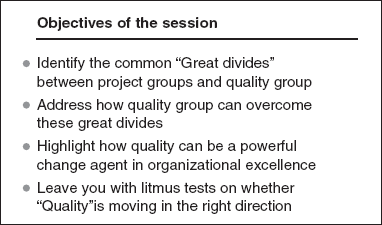
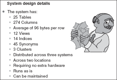
A bulleted text would have a series of bullets; each bullet is a specific point or topic of the presentation that could be expanded in subsequent slides. You could have single level bullets or multi-level bullets. Typically, single level bulleted slides are used as agenda slides or to highlight the major points. The next level of bullets serves as explanations for the major bullet under which they come (see Box 20.1).
Make sure there are no more than five bullets in a slide. More numbers of bullets mean that there are too many points for the audience to remember. Psychologists have pointed out that the human brain can absorb ‘seven plus or minus two’ points at any time. We would be conservative and stick to the minus two option. When there are a large number of bullets in a slide, you cannot control what the audience chooses to absorb and chooses to ignore. (See Figure 20.4) Besides, as you increase the number of points or bullets, the font size decreases and this reduces readability.
Use fairly large font size and a readable font for bulleted items—e.g., Arial, 25. Since these are the major points the audience should take away, it makes sense to etch them clearly into the audience’ visual memory.
Don’t use more than two levels of bullets. When you use more than two levels of bullets, the font size decreases and also, the focus gets diluted. When you have three levels of bullets, the chances are that the lower levels are details that probably warrant separate slides.
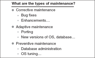
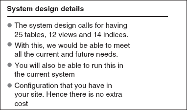
Avoid putting full sentences as bullets. The bullets are meant to be lead-ins for the speaker to make his points and not meant to be the very points to be made, presented in their entirety. If the bullets contain full sentences, the speaker may tend to read the entire sentence and the value addition that the speaker provides will be considerably reduced (see Figure 20.5).
Use bullets effectively with transitions. We will discuss this point in more detail later in this chapter.
You will notice that the list in Box 20.1 is itself a bulleted list. It contains five bullets. What is appearing in bold is the bullet, while the rest are explanations that can be provided by the speaker, which would not appear as a part of bulleted text in a slide (see Figures 20.2 and 20.3).
20.2.2 Graphics
Graphics can be a mix of graphs, trend charts, pictures, cartoons and multi-media. True to the old adage ‘a picture is worth a thousand words’, it makes a lot of sense to put in as many graphics as possible in a presentation (see Box 20.2). Some of the common uses of graphics are:
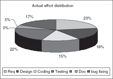
Graphs and Trend Charts: These can be used to pictorially present some of the results. These are effective in situations where details like sales figures, profitability analysis, competitive analysis, category distribution, root cause analysis and so on, have to be presented (see Figure 20.6).
Pictures and Cartoons: These are very effective in providing some lighter moments and variety. An appropriate cartoon can get the message across in a more effective way than pure text and it will also have a higher retention and recall value in the minds of the audience.
Be conscious of colour contrast. If, for example, you want to compare two areas of a graph, it makes sense to say ‘compare the blue area and red area’ rather than say ‘compare the light blue area with the dark blue area’. Also, make sure that there is colour contrast not only within the graph, but also with the background. Sometimes the projection equipment distorts the true colours on the slides; hence it is a good idea to see how the colours look through the projection equipment.
Ensure that the graph is reasonably large. This will increase the readability of the graph. When the graphs are too tiny, their purpose is lost. If you are using legends or titles, choose a reasonably sized font.
Make sure there are appropriate legends and titles. You want to emphasize the fact that the revenues and profits are going up while the expenses are going down. Putting appropriate legends and titles in the graph would help a lot. It may make sense to also show the actual values in the graph, but these sometimes tend to clutter the space and reduce readability.
Combine graphs, charts, cartoons and pictures to increase effectiveness. Variety is the spice of life. Mixing these up judiciously would increase the effectiveness of the message.
Don’t be compelled to introduce cartoons and graphics in every slide. We have seen presentations where people use cartoons in every slide and these cartoons have absolutely no relevance to the point being discussed.(see Figure 20.7) They distract from the actual message being conveyed. There are some very popular cartoons that are used ever so often in too many presentations and they have become too predictable, boring and irrelevant.
20.2.3 Use of Transitions and Animations
Transitions and animation will help you direct the audience to focus on one point or object at a time, without getting diverted (see Box 20.3).
When you have bulleted texts or objects (like cartoons, graphs, shapes, etc.) in a slide, you can make the bullets or objects appear one at a time. After you finish explaining the first point, you can press a key and the second bullet (point) would appear on the screen and so on. PowerPoint provides several ways to effectively use transitions.
- In case of multi-level bullets, you can control the sub-levels that appear together: make all the sub-levels of a bullet appear together or make the sub-bullets appear one by one. It depends on what you want to emphasize.
- You can control the direction from which the bullet or object appears. For example, you can make it come from top, bottom, left, right or from a diagonal direction.
- You can control the pace with which the bullet or object comes in. This is especially useful for emphasis. For example, if you want a tortoise and a hare to appear on the screen, you can make the hare come in really fast and the tortoise can come in slowly.
- You can add special effects for transition. For example, you can make the text or object come in with a diamond pattern, checkerboard, box, etc. You can further become very creative and use options like ‘Box In’, ‘Box Out’, etc.
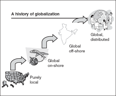
As an example, consider Figure 20.8 that shows the evolution of global teams. You can use transitions and show one stage (the picture and the description) come up first, then the arrow would appear and then the next stage would come in. This will make the audience focus on what you say about each stage instead of getting distracted by the fourth stage when you are talking about the first one.
If you have included transitions and animations, make sure you utilize them. We have seen presenters who make each bullet appear with a transition (key stroke). But they will put on that slide and then hit the enter key five times, make all the bullets appear on the screen and then explain all of them point by point! The speaker might as well have had no animation in the first place!
Don’t have too many transitions. Sometimes you may forget to hit the enter key. You may be thinking ahead of yourself and not notice what is on the screen. In this case, the animation may in fact have a negative or adverse impact.
Be aware of physical limitations. If you are going to be on a podium with the laptop at one corner and you are moving around the podium, then having a transition that requires you to hit a key on the keyboard or click a mouse would require you to move back and forth. This may be very distracting. One option is to see if you can use a remote control.
Don’t use too many special effects. PowerPoint provides a large number of special effects like spinning, fading in, fading out and so on. While these are flashy, in our opinion, they do not always add value and tend to look out of place in a professional presentation.
Carefully choose the unit of animation. Some people use the option of making each letter in a text drop one by one; some make the individual words drop one by one; some make the major bullet and the associated minor bullets drop together; some make the major bullet come first and then their corresponding minor bullets. There is no one correct way of using these. In our experience, the jazzy options of making letters or words drop down like rain drops don’t find much use in professional presentations.
20.2.4 Some Special Usages and Features
PowerPoint provides a host of other features. While it is not our intent to cover all these features exhaustively, in this section, we will provide some of the novel ways in which certain elements can be used and also discuss some of the not-so-effective ways of using PowerPoint. Since most of these are best illustrated by looking at the actual slides, we will be including slides for these in the book’s Web site.
Use of Icons and Pictures for Transitions
In the previous section, we discussed how to use single-level and multi-level bullets to introduce flow and structure into the presentation. These are slides that use pure text. As an example, suppose you are going to present on the various functions served by the offices in San Francisco, London and Bangalore, you could put together a bulleted list like the one given in Figure 20.2. An alternative approach could be to show a world map. When the mouse is clicked on San Francisco, the functions of that office can be shown as a pop-up. Similarly, when the mouse is clicked on Bangalore, the functions of that office can be shown as a pop-up. Since this approach combines graphics and transitions, it is likely to leave a better impact on the audience.
Use of Action Buttons
PowerPoint provides a set of action buttons that can be used to control the movement through the various slides. For example, each slide can have a next, previous, first and home buttons. The next and previous buttons when clicked, can take you to the next or previous slide. The home button can be the transition to the first slide of the presentation, while the first could make the transition to the first slide of a given set. Taking the previous example of the multi-location organization, supposing for each of the locations you need three slides of text to describe it, then in each of the three slides, you can put in the action buttons next, previous, first and home. Next will take the presentation to the next slide of the presentation (i.e., for that location), except for the third slide, where next is disabled. Similarly, the previous button from Slide 3 will take the presentation to Slide 2 and from Slide 2 to Slide 1 (all for that location). The previous button for the first slide is disabled. From any slide, home will take you to the very first slide of the presentation, while first would take you to the world map.
Use of Embedded Objects
Sometimes you may want to show an Excel spreadsheet or a Word document or some other object within a presentation. You can embed such an object within the presentation
Use of Tables
In general, we feel that tables are not very effective when used in PowerPoint, except when they are very small. The size of the cells and the space available reduce readability. It is visually far more appealing to link the slide to a table in Word or Excel and show those in full screen and then jump back to the original screen.
20.3 In Summary
First of All, choose the right type of visual aid to use for a given occasion. Flip charts and white boards may be the most appropriate for interactive communication while PowerPoint is more suitable for a structured presentation.
While there are a lot of interesting features in PowerPoint, choosing what you need for the given situation is very vital. For example, while graphs may be the most obvious choice when you are projecting sales figures, photographs and animation may be most effective when you are trying to demonstrate the working of a product model.
Choose which features you need, don’t just try to use all the features of PowerPoint!
As in other aspects of communication, variety is the key to the effectiveness of using visual aids. Your visual aids should have a mix of graphs, pictures, animation, transitions and bulleted lists.
Variety is the key!
Finally, visual aids like PowerPoint, present a lot of opportunities to synergize with the other communication elements like vocal variety, body language, etc. As we said in an earlier chapter,
Synchronize, synthesize and orchestrate all the elements.
Now that we have seen all the individual elements that aid communication, it is time to explore how all these work in unison—the topic for the next chapter.