

Since early childhood, Tom Swimm has felt an instinctive need to paint. Although he is self-taught, he has long been inspired by the work of Van Gogh, Monet, and Hopper, and he considers these masters his teachers. To Tom, being an artist is about challenging himself to evolve creatively. Tom’s first one-man exhibition was at the Pacific Edge Gallery in Laguna Beach, California. His work has also been featured in several other California galleries, at ArtExpo New York, and at the APPAF exhibition in Paris, France. His paintings have appeared on the cover of Skyward Marketing’s In-flight Magazine in 2001, as well as on the cover of Artist’s Magazine in 1992. Tom won the People’s Choice award at Echoes and Visions in 1997 and the Art of California Gold Award in 1994. Born in Miami, Florida, and raised in New York, Tom currently resides in San Clemente, California.
DOORWAY

Selecting Your Photo
I selected a photo that had bright colors and visual interest and cropped it in various ways to find a pleasing composition. I decided the foreground was too dark and not important to the scene, so I “zoomed in” on the doorway itself, eliminating the dull, distracting areas. I wanted to avoid placing the door in the exact center of the composition, so I set it to the right, which gave me room to include flowers on the left.

STEP ONE
I start with a light underpainting of yellow ochre, cadmium red light, and burnt sienna. I darken the mixture with sap green and then with alizarin crimson to block in the archway on the left with a large flat brush. I indicate the shadow across the door with a mix of Prussian blue and Payne’s gray. I block in these main areas with very thin washes of color. I make the application thin enough that I can still see the drawing underneath, which will help me when I develop details.

STEP TWO
When working with oil paints, I like to work from dark to light, so I add the darkest colors to the painting at this stage. Using a medium flat brush, I apply a mixture of sap green and alizarin crimson to the leaves and the foreground shadows. Using the outline underneath as a guide, I’m actually drawing as I paint. To add interest, I leave some negative space. To create the leaves, I use the flat side of the brush and make short, choppy brushstrokes, alternating the direction of each stroke. I use a dry brush to pull some color from the canvas and indicate breaks in the foliage, adding a sense of realism and depth.

STEP THREE
Using Prussian blue mixed with Payne’s gray, I paint the doorway shadow and small window opening, as well as the shadows cast by the door handle. Next I add a mix of phthalo violet and Payne’s gray to the lacy shadows cast from the trees on the right. As with the leaves, I use a variety of brushstrokes and leave some “holes” in the shadows, which breaks them up and adds visual interest. Using yellow ochre mixed with burnt sienna and a little cadmium red light, I add the middle values of the front steps and foreground, along with some detail in the tree branches and door hardware. Then I define the flowers with the same dark red mixture.

STEP FOUR
This is where it starts to get fun and the painting comes to life! In this step, I add the last colors of the underpainting before applying the highlights. Using a mixture of blue-violet and flesh with a little white, I paint the surface of the doorway wherever it isn’t shadowed. Then I paint the entire surface of the wall with a mix of flesh and a little white, using the negative spaces I’d created in the previous step as a guide. After covering the largest areas, I embellish some of the details, such as the vertical grooves in the door, with a slightly darker mix of blue-violet and flesh.

STEP FIVE
Using a mixture of flesh and white, I go back over the entire wall to punch up the lights. I load my brush more heavily with color now and vary the direction of the brushstrokes to add some texture. I also bring up the other highlighted areas in the door and the foreground. When I’m adding highlights, I like to paint loosely and let the brush do the work. I’m not concerned with trying to get a perfectly smooth, even surface. By varying the direction of the brushstrokes and the pressure, I create an illusion of dimension and reality. Flat, two-dimensional surfaces are boring in any painting, so be spontaneous. Paint boldly and have fun!

STEP SIX
Now I add more interest and texture to the wall with a final application of brilliant yellow mixed with white. I also soften the highlights in the door by going over them with a dry brush. Using yellow ochre and cad. red light, I apply one more layer of color to the front steps and create some highlights with flesh and white. Once I’m satisfied with these final elements, all that remains is to bring life to the flowers and leaves. I bring out the color of the leaves by adding various green mixtures, starting with the darkest and working up to some final highlights. As with the door, it’s important to stay loose and not try to cover the whole area. I paint around some of the dark areas to create the illusion of bright sun hitting the leaves. Finally I add the brightest flowers with a mix of cadmium red light and alizarin crimson for the bougainvillea and add a few touches of brilliant yellow and cadmium orange for both the flowers on the right and the patch of grass in the foreground.
BOAT
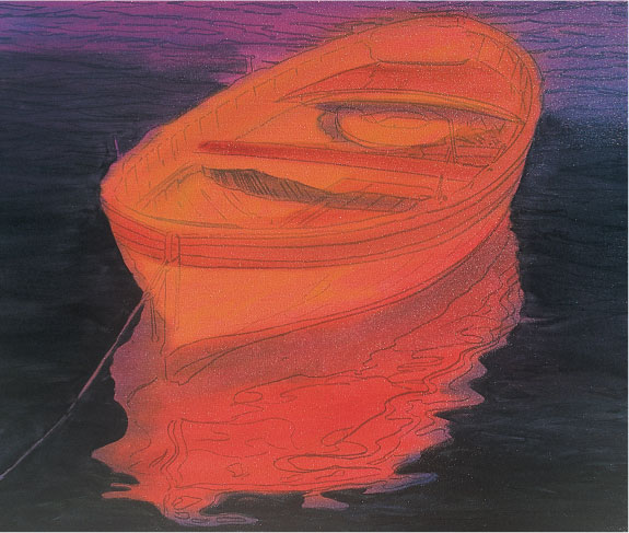
STEP ONE
Once I’m happy with my sketch, I start applying very thin washes with a large brush. First I block in the basic shapes of the boat and its reflection using a mixture of yellow ochre, alizarin crimson, and burnt sienna. I use very little pigment at this point, as I don’t want to cover up my drawing, which I’ll still need for reference. Then I add a little Payne’s gray for the shadowed areas of the boat. Next I paint the water with various mixes of Prussian blue, viridian green, sap green, cerulean blue, and phthalo violet.
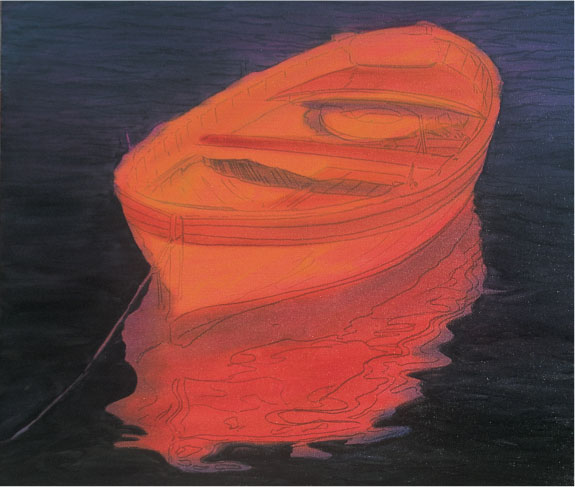
STEP TWO
Now I develop the water by building up each of the values. Although the finished boat will be almost white, I use much darker colors for its reflection, mixing some of the colors I used for the water with the boat color mixture of yellow ochre, alizarin crimson, and burnt sienna. This creates a deeper blue version of the boat’s color, which gives the illusion of depth and transparency.

STEP THREE
For the reflections of the hull, I add burnt sienna and raw sienna to the cerulean blue and viridian green mixture. Then I add a red tint to the shadows with a mixture of alizarin crimson, cadmium red light, and Payne’s gray. Next I switch to a medium-sized flat brush and draw with the paint, adding dark, contrasting ripples. I create the reflected red stripes with alizarin crimson, cadmium red light, and Payne’s gray. For the main part of the hull, I use a mixture of yellow ochre and alizarin crimson. Again I keep my brushstrokes fluid to convey the feeling of the boat floating on the water.
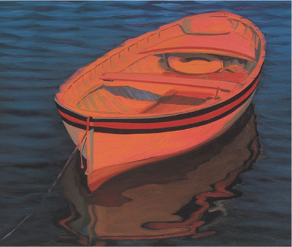
STEP FOUR
Now I define the individual ripples in the water with four slightly different mixes from step one. I work from top to bottom, placing the lighter values toward the top, which heightens the realism of the water and adds depth and contrast to the painting. I also let some of the darker underpainting show through to give the waves more dimension. Next I add a thin coat of flesh over the sunlit areas and define the shadows with a mix of Payne’s gray, flesh, and cerulean blue. I darken this mix for the two lines of trim on the outside of the hull. For the middle of the trim, I mix cadmium red light and Payne’s gray and use minimal brushstrokes to give the lines a smooth, uninterrupted look.

STEP FIVE
Now I paint the seats and the wood with a mixture of cadmium red light and flesh. Then I whiten the boat, loading a medium brush with a thick mix of white and brilliant yellow. I apply the paint liberally, varying the direction of my brushstrokes to create interest and texture. Accuracy is important, but I don’t spend too much time on any one area; I don’t want to overwork my colors. I let my brush do the work and try to create an impression of the details rather than painting photorealistically. A slightly unfinished look can actually give a painting more character than a perfectly realistic rendering.

STEP SIX
I continue building up the white of the boat. Then I make a few adjustments, adding lighter reflections to the hull in the water and defining the elements inside the boat and on the wood trim. Finally I touch up the rope and add a few more highlights to the water at the top of the painting.
EUROPEAN STREET SCENE

Outlining Shapes
I begin with a rough drawing, outlining the basic shapes with a fine-point marker. At this stage, I’m concentrating on making sure the perspective and proportions are correct; I’ll add the details when I paint.

STEP ONE
Once I’m happy with my sketch, I apply the first layer of paint in thin washes to establish the basic relationship of colors and values. With a large brush, I use colors straight out of the tube, starting with cerulean blue for the sky, background hills, street, and one building. I use sap green for the foliage and mix burnt sienna and yellow ochre for the remaining buildings. To define some of the shadowed areas, I apply a little Payne’s gray. Next I’ll add the darkest values.
STEP TWO
Using a medium flat brush and a mixture of Prussian blue, sap green, and alizarin crimson, I paint the dark foliage and define the dark shapes of the windows and shadows. I avoid using black, as I feel it brings a harsh, artificial tone that does not really exist in nature. Experiment and you’ll find you can vary the hue of even the darkest areas in your paintings without ever using black. Next I add more color to the roof in the center with a mix of yellow ochre and Payne’s gray, varying the direction of my strokes to create interesting textures.

STEP THREE
Here I bring out the middle values with stronger color and thicker paint. I use variations of a blue-violet and Payne’s gray mixture for the hillside, the building in the center, the street, and the shadows on the wall on the right. I also add some middle values of the same mixtures to the foliage, the vines growing on the roof of one of the buildings, and the trees in the background. Once the darks and middle values of the underpainting are complete, I’m ready to enliven the scene.
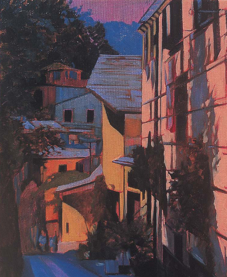
STEP FOUR
I load the brush with flesh and work on the large wall of the building on the right, painting around the shadows and some of the architectural details. Using a combination of flesh and yellow ochre, I add highlights to the yellow buildings. For the darker buildings and some rooftops, I use the blue-gray mixture from step three. Then I apply a mixture of cadmium red light and yellow ochre to the building at the bottom center. It’s important to have fun and let the brush do the work from this point on; I try not to spend too much time on any particular area.

STEP FIVE
For the plants and foliage, I apply a variety of green mixtures (see color mixtures below), varying the direction of my brushstrokes and painting around the dark areas that I already established in my underpainting. At this stage, the scene should have a feeling of true dimension and depth.

STEP SIX
I step back and take a look at what I’ve completed so far and decide what I need to adjust. I want the sky to have a hazy feeling to heighten the contrast in the buildings, so I mix white with a little flesh color and blue-violet. I create the brightest highlights on the rooftops with a mixture of white and brilliant yellow. To add a sense of texture and realism, I keep my brushstrokes loose. I mix cadmium yellow light and white for the final highlights on the yellow buildings. I also apply this color to some areas of the wall on the right for interest. I bring up the lighter values of color in the other buildings and then add highlights to the foliage using sap green mixed with cadmium yellow light and viridian green mixed with yellow ochre.
NIGHTTIME CAFÉ
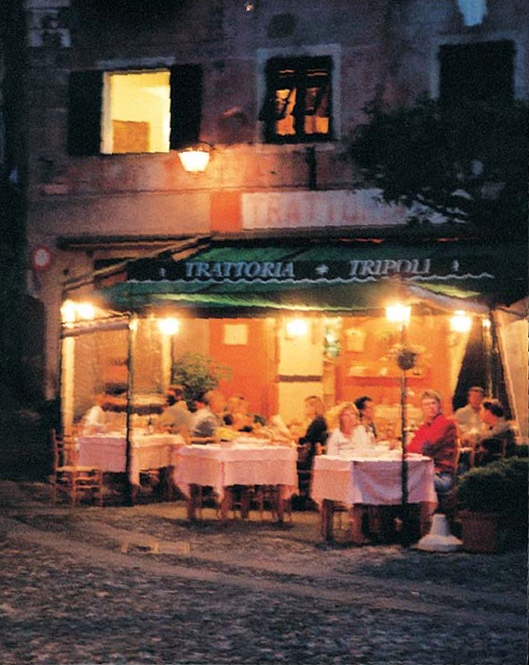
Taking Photos at Night
When photographing a scene like this for reference, I use a 35mm SLR camera on a tripod to keep the focus sharp. The newer digital cameras also work very well. I prefer to turn off the flash feature to get the most realistic, natural light.

STEP ONE
I’ve chosen a smaller canvas for this piece because I want to create a more impressionistic rendering without worrying about refining every detail. First I make a very rough drawing of the basic shapes in the composition on the canvas. Then I tone it with a thin base coat of magenta acrylic paint.

STEP TWO
Once the base coat is dry, I establish just the basic values of light and shadow with a thin oil wash that allows the drawing to show through. I use a large flat sable brush and Payne’s gray, burnt sienna, and raw sienna, working very quickly and using bold, loose brushstrokes to cover the basic elements.

STEP THREE
Now, using the drawing as a guide and referring to the photo for color, I block in the dark and medium values. I mix alizarin crimson, Prussian blue, and sap green for the darkest colors in the tree foliage and the window shutters. Then I use a mixture of phthalo violet and cerulean blue for the building. Next I mix sap green and burnt sienna to begin defining the details in the café awning and interior. I use a variety of all these colors for the foreground to establish the shadows and reflected light.

STEP FOUR
Next I mix blue-violet and Payne’s gray and use the edge of a small flat sable brush to draw in some details on the building. I build up the color in the awning with more sap green, and then I add some Naples yellow for the highlights. I add further definition to the café interior with a mix of burnt sienna, Naples yellow, and Payne’s gray. For the tablecloths, I use a mix of phthalo violet, blue-violet, and flesh, varying the direction of the brushstrokes to simulate the folds in the cloth.

STEP FIVE
I’ve saved the brightest colors for last (shown below); I set up my palette with cadmium yellow light, cadmium orange, brilliant yellow, yellow ochre, blue-violet, and white. I use cadmium yellow light as a base for the windows and the lamps, and then I blend in some cadmium orange to create the glow effect. I build up more details in the figures and the café with cadmium red light, yellow ochre, and cadmium orange. Then I mix brilliant yellow with white and apply it to the tabletops and to the lamps; I use the same color to add a few other random accents. Next I apply some yellow ochre to the foreground and use blue-violet for the lettering on the awning.
Cerulean blue + sap green

Phthalo violet + blue-violet

Sap green + yellow ochre
Cadmium red + Payne’s gray

Brilliant yellow + white

Cadmium yellow + white
PORTOFINO HARBOR
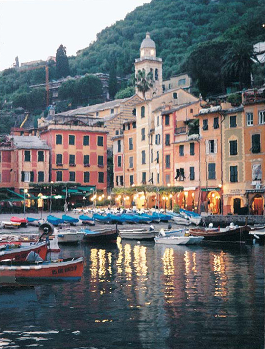
Eliminating Elements
While sketching from my photo, I decided to leave out the scaffolding on the hillside building and a lot of the confusing hardware and motors on the boats. I even cut a boat from another photo and pasted it over a distracting motor (front left) to improve the composition a bit. These are decisions that should be made before you begin the painting, so you’ll have a clear vision of the end result.

STEP ONE
Once my sketch is in place, I cover the entire canvas with a wash of magenta acrylic paint. Then I quickly apply my transparent oil underpainting to help define the areas of light and shadow. My palette is very limited here; color isn’t as important as value. I use sap green for the hills, raw sienna for the buildings and some highlights, and cerulean blue mixed with a little Payne’s gray for the sky, water, and shadows.
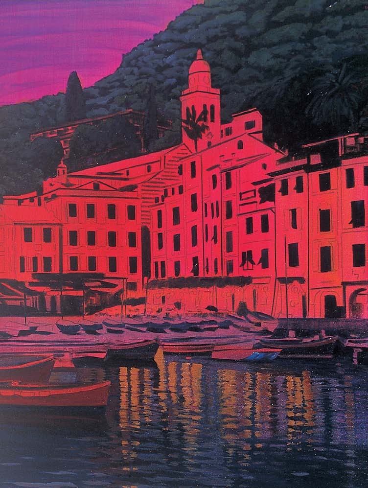
STEP TWO
I begin with the darkest areas of the buildings and trees, using a large flat brush and a dark mix of alizarin crimson, sap green, and Prussian blue. I add some cerulean blue to this mix for the water and the undersides of the boats and add a little burnt sienna for the boats and reflections. With a mix of blue-violet, sap green, and Payne’s gray, I paint the trees, leaving small areas of the darker color showing through for variation. For the water, I use a mix of blue-violet and Payne’s gray, creating ripples with short, horizontal brushstrokes. I paint the light reflections in the same manner with a mix of yellow ochre and burnt sienna.

STEP THREE
Now I begin refining the buildings. With a medium-sized flat brush and a mixture of yellow ochre, Naples yellow, flesh, and blue-violet, I start defining the lighter areas around the windows and edges of the buildings. Then I add some detail to the central tower with a mixture of blue-violet, phthalo violet, and a little Payne’s gray. Using the photo as a guide, I paint in all the areas in the scene in this color range. I keep things simple, though, and try not to re-create the photo exactly. I want a good representation of my subject, but I can record my impression of it without spending hours laboring over every single detail.
STEP FOUR
I need to create some contrast in the shadows of the buildings. With a mix of blue-violet and Payne’s gray, I paint some of the rooftops, the plaza area, and the hulls of some of the boats. I also add some more details to the docked boats with a mix of cerulean blue, cadmium red light, and yellow ochre. Then I use burnt sienna to loosely paint some details on the café. I mix a little white and flesh into blue-violet and paint the highlights on the hulls of the boats in the foreground. Then I mix cerulean blue with white and paint the sky, adding a few suggestions of clouds with a pastel mixture of flesh and white.

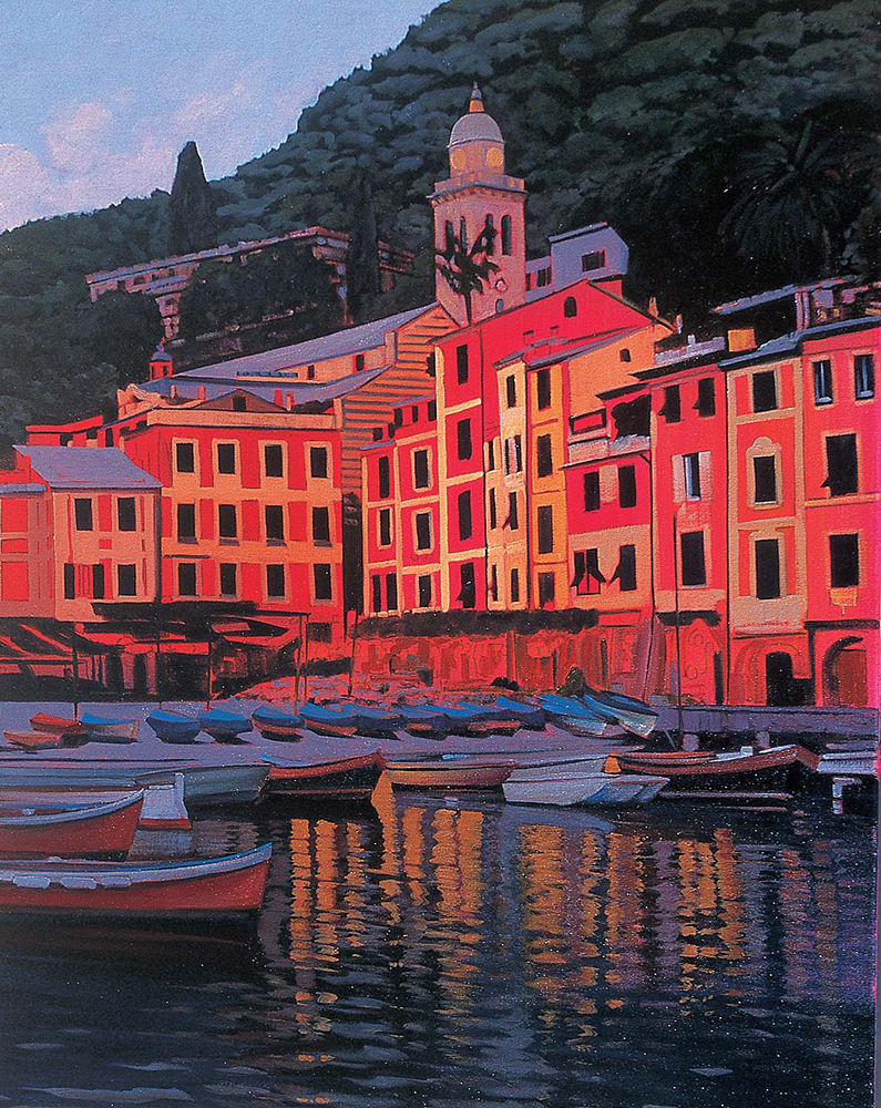
STEP FIVE
I suggest some details in the buildings, using a mix of alizarin crimson and cadmium red light for the façades on the left and the trim on the right. I mix burnt sienna and flesh for the façades on the right, adding touches of yellow ochre or raw sienna. To “punch up” the light for more contrast, I mix cadmium yellow light and yellow ochre for the reflections on the water and the doorways. I add white to the same mixture for the clock tower. Then I mix a little white with blue-violet and paint a few highlights on the water in the foreground. I also add this color to the plaza, the boats, and a few of the rooftops. I highlight the trees with a mix of sap green and yellow ochre and add some detail to the awnings with a mix of cerulean blue and viridian green. With a mix of white and cadmium yellow light, I paint some of the café tabletops. Now I add the brightest highlights. Using cadmium yellow light mixed with a small amount of white, I paint the glowing lights in the café. I lighten up the windows and indicate the shutters with a mix of cerulean blue and Payne’s gray. I step back and look for any other areas that need sharpening or contrast, adding a highlight here and there to harmonize the overall painting.

Clock Tower Detail
I use my smallest flat brush to “draw” in the details of the tower, turning my brush on its side to get a thin, clean edge.
Glowing Lights Detail
I apply thick yellow and white paint in a circular motion to capture the glow of street lamps at night.
Reflections Detail
I use the edge of a flat brush and create short, tapered, horizontal strokes to render realistic reflections in the water.
SUNLIT PATH

STEP ONE
With the gate set off to the left and the sunlit path angled right, this composition invites you into the painting, enticing you with a glimpse of the house behind the gate. After sketching the scene on the canvas and applying a magenta acrylic base wash, I lay down a thin wash of oils as an underpainting. I use a large flat brush with burnt sienna, sap green, blue-violet, and phthalo violet.

STEP TWO
Next I establish the large areas of the darkest colors and begin to define the windows, walls, and roof, as well as the shadows in the foreground. I use the edge of a large flat brush, which allows me to paint details in the gate and the shadows. I mix sap green, Prussian blue, and alizarin crimson for the darks, then use a mixture of Prussian blue and yellow ochre on the foliage. The walls of the house are a blend of blue-violet, Payne’s gray, and burnt umber, and the foreground shadows are a mix of cerulean blue and Payne’s gray.

STEP THREE
I add a thick layer of paint to the walls of the house with a mix of Payne’s gray, burnt umber, and white. Then I add a mixture of burnt umber, cadmium orange, and white to the roof tiles and to the underside of the eaves. I highlight the same area with a mix of phthalo violet, Payne’s gray, and white, and I paint the windows with a mix of cerulean blue, Payne’s gray, and white. For the foliage, I mix variations of cerulean blue and sap green, adding brilliant green for the lightest areas. I also define a few shadows using the wall colors.

STEP FOUR
Now I add the brightest highlights. For the sky, I mix a little flesh color with white. I paint around some of the overhanging trees and also add a few “openings.” Using the edge of a small flat brush as a drawing tool, I add highlights to the scrollwork in the gate. With the same brush, I paint the large areas of light in the foreground, carefully painting around the shadow areas I’ve already established. I mix brilliant yellow and white and layer this on top of the colors I’ve just applied. This really makes the sunlit ground “pop” and warms it up.
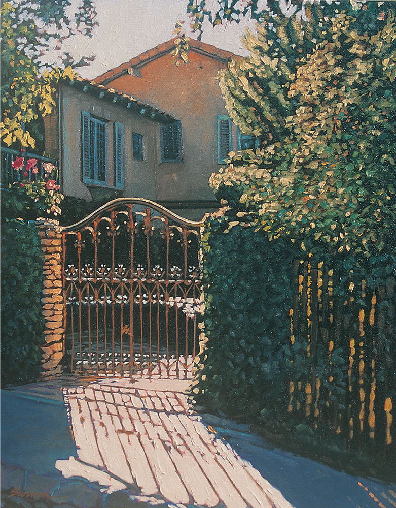
STEP FIVE
To finish, I mix some variations of sap green and cadmium yellow light with a little white and cadmium orange for the sunlit areas. Next I mix cadmium yellow light, cadmium orange, and brilliant green to paint the openings in the fence where light shines through. For the brick wall, I mix yellow ochre, white, and cadmium orange, adding a little cerulean blue for the shadows. For the scrollwork on the gate, I mix burnt sienna and cadmium orange. For a little color accent, I add the flowers on the left with a mix of phthalo violet and white.
ROCKY SHORELINE
Choosing a Viewpoint
I took a number of photos at this location, but a lot of them didn’t turn out to be very compelling compositions. In some, the rocks were too overpowering, and in others the angle of the beach was flat and uninteresting. I selected this photo because it had all the elements I wanted to capture and the point of view gave me a sense of standing right there on the beach.
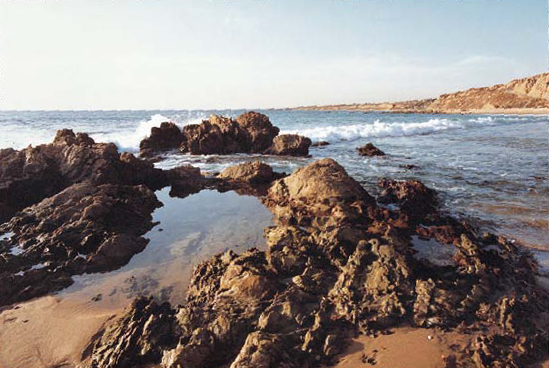

STEP ONE
I sketch the scene, adding only as much detail as necessary to separate the light and dark areas. After applying the base coat, I use a large brush to block in the basic shapes with thin washes of cerulean blue, Payne’s gray, burnt sienna, and raw sienna. I define the darkest values in the rocks with a mix of burnt sienna and Payne’s gray, varying the direction of the brushstrokes to keep the forms from looking too static.

STEP TWO
Now I add the underpainting for the water; I mix cerulean blue and blue-violet for the lightest areas and add phthalo violet and Payne’s gray for the darkest areas. I also paint the sand below the tide pool in the foreground. I’m careful to paint around the brightest areas of the water where I’ll later add the highlights. Then I mix raw sienna and cerulean blue and blend this mixture into the water that I’ve already painted—this gives the effect of transparent, shallow water. Then I apply this same mixture to the shaded bluffs in the background.

STEP THREE
To brighten the values in the surf, I apply a mix of blue-violet and white to the waves and to the ocean in the background. Next I apply a mix of Naples yellow and yellow ochre to the brightest areas in the hillside. Then I add the white caps in the water with a mix of flesh and light blue-violet. I want to capture the hazy sunshine in this late afternoon scene, but I also want to create a subtle transition from the blue at the top to the bright yellow at the horizon.

STEP FOUR
Now I mix four colors and apply them from top to bottom: The first is a mix of cerulean blue, blue-violet, and white. I lighten this mix with white for the second hue. The third color is a mix of flesh and white, and the fourth is a mixture of brilliant yellow and white. I use a large flat brush to apply the color and work quickly, keeping the paint wet with medium. I vary the direction of the brushstrokes and add thick areas of the flesh and yellow mixes to create the clouds.

STEP FIVE
Now I want to bring out some details and variations in the shaded areas of the rocks. I mix blue-violet and Payne’s gray for the rocks on the left and mix raw sienna and Payne’s gray for the others. I fill in large portions of the shaded areas but leave some of the darkest color showing for depth. I also use the same color to paint the rocks’ reflections in the water, which creates a lot of contrast and interesting patterns. Then I paint the foreground sand with a mixture of yellow ochre and Naples yellow.
Water

Cerulean blue + Payne’s gray

Blue-violet + Payne’s gray
Blue-violet + white
Rocks

Burnt sienna + flesh + cadmium orange

Cadmium yellow + white

Cadmium yellow + white + flesh

STEP SIX
I mix Payne’s gray, white, and phthalo violet for the midrange values in the grayish rocks on the left. Then I mix burnt sienna, flesh, and yellow ochre with a small amount of cadmium orange for the remaining rocks on the right. I use a mix of flesh, white, and cadmium yellow light for the brightest areas in the rocks, and I add more white to these mixtures for the tops of the waves and the surf. Now I step back and take a final look, making any small adjustments that will accentuate the overall color harmony of the painting.
MISSION-STYLE VILLA
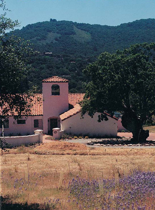
Applying Artistic License
I liked the depth and the panoramic feel of the scene in this photo, but the foreground was dull and not very colorful. I decided that once I had faithfully rendered the main elements of the composition, I’d get creative and spontaneous with the field in the foreground. Taking liberties like this with the way you portray a scene is referred to as “using artistic license.”

STEP ONE
Once my simple sketch and magenta acrylic base coat are in place, I use a large flat brush to lay in thin washes of cerulean blue, sap green, burnt sienna, and phthalo violet over the basic shapes. I mix cerulean blue and violet for the hills in the background, adding a little Payne’s gray to darken the shadowed areas. Next I add the darkest values and define the details in the trees and the building. I add a mix of sap green and Payne’s gray to the hillside foliage, and then I mix sap green, alizarin crimson, and Prussian blue to create a dark mixture for the tree trunk and the various building details. I use a medium flat brush to paint around the brightest areas of light that I’ll work on next.

STEP TWO
I paint the sky with a mix of cerulean blue and white. Then I mix cerulean blue, phthalo violet, and Payne’s gray for the farthest hill. I add a little sap green to a few areas of the hill for interest and add sap green and alizarin crimson at the bottom of the hill. I bring up the midtones in the trees with a mix of sap green, brilliant green, and yellow ochre. Then I add another wash of blue-violet and phthalo violet to the building. To suggest a lavender field, I create a mix of blue-violet and phthalo violet and apply it to the foreground with loose, random strokes.
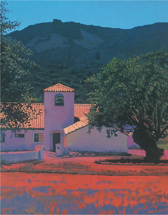
STEP THREE
Now I lighten the rooftops and the trees and enhance the shadows of the building with strong colors. I mix flesh with cadmium orange for the roof tiles and add brilliant yellow to the mix for the brightest areas. For the tree highlights, I mix variations of sap green, brilliant green, and yellow ochre, adding more texture and detail than I did in the background. For the building walls, I use a mixture of blue-violet, phthalo violet, and white. I add some flesh and yellow ochre to the mix to bring out the reflected light, varying the colors to keep the walls from looking too flat and boring.

STEP FOUR
I mix brilliant yellow and white for the final building highlights and the rocks around the driveway. Then I add more highlights to the landscape with a mix of flesh and Payne’s gray. I paint the foreground with a large flat brush and various mixes of brilliant yellow, cadmium orange, phthalo violet, blue-violet, and cadmium yellow light. At this stage, I use a lot of color, varying the direction of my brushstrokes and keeping them loose to create merely the impression of the flowers and the field, not a realistic portrayal of every leaf and petal. This additional texture also allows the colorful foreground to “pop” forward.

Tree and Building Details
I use a small flat brush for the tree leaves, adding a variety of values and making quick, random, dabbing strokes. For the tiles on the roof of the building, I use the same small flat brush, but this time I make even, deliberate strokes to create the symmetrical rows.
THE DULCIMER PLAYER
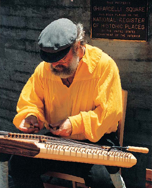
Capturing a Likeness
The reference photo I chose had a nice composition and didn’t need much cropping. I also liked the pose; the man was concentrating on his music, not looking up, and I felt this would help me capture the essence of this introspective moment. For me, this painting is not so much about the musician as a face to be recognized but as an artist who is bringing his gift to the world anonymously.

STEP ONE
I start this portrait the way I do any subject—with a rough sketch and underpainting, followed by thin layers of color. Once the magenta base coat is in place, I apply transparent oil washes of yellow ochre, burnt sienna, and Payne’s gray to the basic shapes of the figure with a large flat brush. Then I layer a thin wash of Prussian blue on the hat and apply large, sweeping strokes of burnt sienna color to the background.

STEP TWO
Using the edge of a medium flat brush, I first add Payne’s gray and then cerulean blue to the folds of the shirt and the shadows in the hands. For the beard, hair, and facial shadows, I use a mix of burnt sienna and Payne’s gray. I define the glasses with Prussian blue and darken the brim of the hat with a mix of Prussian blue and alizarin crimson. I also add a little yellow ochre to the front of the hat to indicate the reflected light.

STEP THREE
Now I establish the darkest values in the painting with a mixture of Prussian blue, alizarin crimson, and Payne’s gray. I use a thick, opaque layer of this mixture for the pants and the details in the dulcimer, and then I add some burnt sienna to the mix for the wood tones of the instrument. I add cerulean blue to the highlighted areas and begin to define the chair with burnt sienna and Payne’s gray, using the thin edge of my flat brush to “draw” the details.

STEP FOUR
I add yellow ochre with thick, loose strokes that follow the folds in the shirt. Then I refine the face and neck with a mix of Indian red and Payne’s gray. I lighten the hands with a mix of cerulean blue and Indian red, and I mix yellow ochre and cerulean blue for the shadows of the dulcimer keys. Then I apply yellow ochre to the front of the dulcimer. With a mix of cerulean blue and white, I add highlights to the hair and beard and blend some of this color into the light parts of the hat.

STEP FIVE
Next I fill in the negative spaces of the light areas in the shirt and the dulcimer with rich, warm color. With a mix of cadmium yellow light and Naples yellow, I paint the brightest areas of the shirt. For the highlights in the hands and at the top of the dulcimer, I use a mixture of flesh and Naples yellow. I also add a little Naples yellow to the uppermost part of the hat and brighten the highlights in the hair and beard with a mix of flesh, white, and blue-violet.

STEP SIX
Now I just need to add one more layer of paint to accentuate the highlights. I mix cadmium yellow light and white and apply it to the upper areas of the shirt. Then I mix brilliant yellow and white and add another layer of color to the top of the dulcimer, the highlights in the hands, and the remaining accents in the dulcimer. I also drybrush a little yellow ochre into the folds of the shirt to harmonize the areas of light and shadow.

Cap Detail
Capturing a sense of realism and texture in fabric can be easier than you think, if you just remember to keep your brushstrokes loose and varied. In this detail of the cap, you can see that a gradation of values and changing the direction of the brushstrokes gives it a three-dimensional quality without a lot of detail.

Shirt Detail
I use the same technique I used for the cap and then highlight the folds of the shirt with multidirectional brushstrokes, painting quickly and loosely. The key is not to overwork any one area; try to be spontaneous and let the brush do the majority of the work! You’ll actually end up creating a more realistic painting.
CARMEL SIDEWALK

STEP ONE
Using a fine-point marker, I make a rough drawing on the canvas and then cover it entirely with a thin base coat of magenta acrylic paint. I establish the basic areas of color and value with a thin wash of oils (burnt sienna, Payne’s gray, cerulean blue, and raw sienna) and a large flat brush, working quickly and loosely. Again the idea is to cover the canvas without being too concerned about detail or “staying within the lines.” I block in each area according to the values I see in the photo, creating a base for the contrast between the light and shadow. I draw in the darkest values of the trees and foliage with a medium flat brush and a mix of alizarin crimson, sap green, and Prussian blue. Next I use a mixture of cerulean blue and Payne’s gray for the street shadows. I add some yellow ochre to this mixture to vary the contrast in a few places, and I also apply it to the underside of the building at the upper left. Then I use a mixture of blue-violet and Payne’s gray to block in the shadows on the sidewalk. I add Payne’s gray and burnt sienna to this mix to define the shadows in the tree trunk and the sidewalk in the foreground. Then I apply a mix of sap green and cerulean blue to create some contrast in the trees.
STEP TWO
I mix blue-violet, flesh, and Payne’s gray for the window frames and doorways. Next I mix a variety of different greens for the trees, using sap green, brilliant green light, yellow ochre, and flesh. I “draw” in the trees with a small flat sable brush, referring to my reference photo to guide my color choices. Then I block in the signs and awnings with a mix of cadmium orange and alizarin crimson. I add more detail to the shadows in the street with the Payne’s gray and cerulean blue mixture from step one. I paint some of the negative space in the distance with a mixture of brilliant yellow and white.

STEP THREE
I paint the sky with a mix of cerulean blue and white. I use the negative space as a guide and paint around the foliage, “punching” light in between to break up the solid mass of leaves. I brighten up the foliage at the upper right with a mix of cadmium yellow light, sap green, yellow ochre, and Naples yellow. Then I mix a few variations of cadmium yellow light, cadmium orange, flesh, and brilliant yellow to use in the street, the building highlights, and the tree trunks. By mixing a little of each color with white, I get a lot of exciting highlight colors. I use a mixture of blue-violet, white, and flesh to paint the crosswalk lines and then fill in the sidewalk with a mix of Naples yellow and white. Then I dab on a thick mix of sap green and white for the bush in the foreground and apply a mix of white, cerulean blue, and brilliant yellow for the bright flowers.

STEP FOUR
Now I fill in the brightest highlights and add the final details. First I accentuate the awning with cadmium red light. Then I add another layer to the building and the sidewalk, varying the direction of my strokes and the thickness of the paint to create texture and interest. I make some random shapes in the shadows of the tree with a mix of raw sienna, Payne’s gray, and cerulean blue, being sure to leave some darks showing through underneath. Finally I step back from the canvas and add a few more pinpoint highlights with a mix of brilliant yellow and white.
HAWAIIAN HARBOR

STEP ONE
Once my sketch and base coat are in place (see page 4), I create the underpainting. I’ve chosen four colors to block in the basic elements: cerulean blue for the sky and water, burnt sienna mixed with sap green for the trees and land masses, and raw sienna for the brightest highlights on the buildings and the boat. I apply these base colors thinly, using a large flat brush and thinning the paint with medium. Details and accuracy are not important at this point, and you don’t have to be afraid of painting “outside the lines.” Keep it loose!

STEP TWO
I have two goals for this step: to paint the darkest colors and to enhance the details. I choose a medium flat brush so I can add definition to the drawing a little more accurately. I use a mix of alizarin crimson and sap green for the trees, a mix of Prussian blue and Payne’s gray for the water, and a mixture of burnt sienna and sap green for the details in the boats and the buildings. Then I mix cerulean blue with Payne’s gray for the rooftop on the left and the shadowed details on the dock pilings, on the boat, and on the building on the right.

STEP THREE
Next I add more details and establish the mid-range values in the shadows with flesh, blue-violet, cerulean blue, and Payne’s gray. I use the flesh color to lighten the values and Payne’s gray to mute the color. Next I develop the tree trunks, the grassy area by the dock, and the remaining water reflections with a mix of sap green and raw sienna. As in the previous step, I use a smaller flat brush to refine the details.
Painting Water Reflections
Water can take on many forms, whether calm and still or turbulent and in motion. And the reflections of objects will appear quite different depending on the state of the water. In water at rest, images are reflected almost the way a mirror reflects, but they aren’t exact copies. When the water is moving, reflections are distorted images of the objects they reflect—they’re elongated and have blurred edges. Here are a few guidelines for painting reflections in any type of water. First note that the colors in the reflections will be a little less intense than they are in the objects themselves. And light-colored objects will appear somewhat darker; dark-colored objects will appear just a bit lighter. Finally remember that the object’s form won’t appear quite as crisp and distinct in the reflections, even in very calm water, as shown in these steps of painting a boat and its reflection.


STEP FOUR
For the sky, I mix cerulean blue, blue-violet, and white. I paint the top of the sky first; then I load a small brush with sky color to “punch holes” through the tree branches, creating the negative spaces between the leaves. I gradually add white to the sky as I approach the horizon line. To highlight the trees, I apply a mix of sap green, burnt sienna, and raw sienna, leaving some of the dark color showing through.

STEP FIVE
All that’s left is to fill in the remaining areas with the lightest values, which will bring the painting to life and really make it look like a sunset scene. First I mix burnt sienna with cadmium orange for the tree trunks, the wood pilings, and a few of the miscellaneous details in the boat, dock, and water. I add some flesh to this mixture for some of the reflections in the water. Then I lighten some shadows on the boat and the dock using blue-violet mixed with flesh. For the final highlights, I mix cadmium yellow light, flesh, and white for the hull and the wheelhouse of the boat, the buildings, and a few of the details in the mast and the flag. I refer back to my reference photo one last time and tweak any final details and highlights, applying the paint sparingly with a small brush.
NAUTICAL STILL LIFE

Composing the Scene
The shape and color of nautical objects make for wonderful still life compositions. As I walked around the deck of this boat, I took a bunch of photos at various angles; I wanted to give myself a lot of choices for the final composition. But I kept coming back to this spot—the reflected light created an interesting contrast with the cast shadows. I decided to crop the photo to make the ropes the dominant visual element, allowing the shadows to fill in the lower half of the image.

STEP ONE
To simplify the beginning step, I project the photo image onto a canvas and use a fine point marker to sketch the composition. As the painting progresses, I will actually “draw” in greater detail with a brush and paint—in the same way I would use a pencil or charcoal. Next I cover the entire canvas with a thin base coat of magenta acrylic paint.

STEP TWO
Now I establish the basic tonal values with thin mixes, applying the color loosely with a large flat sable brush. I use flesh for the lightest areas, then yellow ochre for the highlights at the upper right. I block in the mast, the life preserver, and the wooden posts with burnt sienna. Then I add Payne’s gray to the ropes and the shadows in the foreground. Detail isn’t important at this stage; this layer is a rough guide, so it’s okay to paint “outside the lines.”

STEP THREE
I work from dark to light, layering lighter colors on top of the underpainting to create a sense of depth and texture. At this stage, I want to establish the darkest colors to define the deep outline and shadow details. Using a medium flat sable brush, I draw the outline of the ropes, also defining the shadowed areas. Instead of using black, I mix equal parts of alizarin crimson, sap green, and Prussian blue to create a rich, deep hue. Sometimes I use more of one color in the mix; for instance, I’ll add more crimson to make the color a touch warmer.

STEP FOUR
Next I add the mid-range values. I create drama in the foreground shadows by using subtle color variations, applying Payne’s gray, cerulean blue, flesh, Indian red, phthalo violet, and white in different combinations (see color samples) and blending with a medium flat brush. Note that the shadows closest to the ropes reflect the warm colors of the wood, and they gradually become bluer in the foreground. For harmony, I use the same colors to build up the shape and detail in the ropes, the metal plate at the base of the mast, and the label on the life preserver.
Mid-Range Values
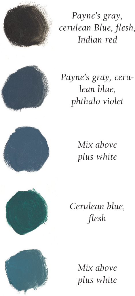

STEP FIVE
Now I mix the colors for the ropes (see color samples), applying the blues first and then the warmer colors in between these brushstrokes to add depth. I use diagonal brushstrokes to match the contour and texture of the ropes. Then I add highlights in the mast and wooden post with yellow ochre mixed with cerulean blue. For the deeper wood areas and the life ring, I use Indian red and burnt sienna. I add the brightest highlights to the ropes, mixing cadmium yellow light and cadmium orange. Finally I paint in the bright areas in the background using cadmium red light mixed with white and brilliant yellow mixed with white.

STEP SIX
I apply highlights with a mixture of flesh, cadmium yellow light, and white to the top of the railing, the posts, and the ropes where they are in direct sunlight. For the deck, I first apply a mix of brilliant yellow and white. Then I paint over it with an even lighter color—a mix of cadmium yellow light, cadmium orange, and white. I paint the remaining highlights in the life ring with a mix of cadmium yellow, cadmium red light. Then I mix flesh into this color to add a few accents in the ropes and shadows. I step back, look at the painting, and then make a few minor refinements to harmonize the color and details.
Ropes

Highlights
