The colorful paintings of Robert Moore clearly communicate his deep respect and appreciation for nature. A one-time aspiring lawyer, he earned a Bachelor of Science degree from Eastern Oregon State College. His increasing desire to pursue fine art brought him a full scholarship to the Art Center College of Design in Pasadena, California, where he majored in illustration and graduated with honors. Much of his initial study included color theory classes that transformed his color blindness into a positive and distinctive element in his work and teaching. Living along the Snake River in Idaho with his wife and children, Robert is surrounded by the same scenic beauty that first captivated him as a child. Using vivid colors and high-key values, he prefers to work on location to best capture the immediate impression of each subject. Robert teaches workshops twice a year out of his studio/gallery in Declo, Idaho.
CREATING LIVELY FLORAL STILL LIFES
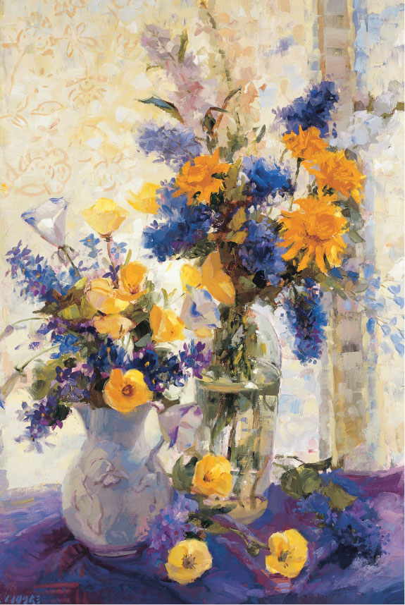
Most folks want to paint flowers because they’re taken by the freshness and brilliance of the colors. To capture their short-lived beauty on canvas almost seems to defeat time. Oil paint is an ideal medium for creating flowers’ colors, whether delicate or vibrant. It is also excellent for depicting the varied textures of soft petals and crisp foliage. Myself, I like the compositional challenge of painting bouquets and setting up imaginative still lifes.
APPROACHING YOUR WORK
A word of caution about spending a lot of time in the planning stage: Sometimes the best compositions are the accidental ones—coffee cups on the kitchen table with a jar of posies. Don’t strive for the perfect setup or the perfect painting. Even if you admire the work of another artist, you don’t want to paint exact copies. A painting is an expression of your own individuality, so paint for yourself and not for the approval of others. Think about what you are painting—the beauty of the flowers—and don’t worry about how the painting will turn out. It will be just fine.
FINDING BALANCE
When I am setting up a still life, I try not to overcrowd the flowers in the vase; I let them droop and sprawl. If the arrangement is tall, I’ll put something at the sides for balance (fruit, a dropped blossom, or favorite crockery) so it’s not too vertical. I move the vase around so my viewpoint is interesting, not necessarily straight on, but perhaps looking down or looking up at the arrangement.

Adding Movement
I chose a view looking down at the setup so there would be plenty of movement (from the teapot up to the bouquet and down again to the flowers on the table). Note all the different flower positions; no two are angled exactly the same.
Painting the “Puzzle Pieces” of Glass
A glass container will distort the shapes of objects behind it and in it. So don’t think of it as a glass vase with flower stems in it. Instead think of it in terms of shapes, colors, values, and intensity. Look for the highlights and darks that give clues to the shape—how the rim or the curved bowl catches the light, or how the elliptical base is a darker curve on one side. It’s like a jigsaw puzzle where the individual shapes don’t make sense until you cover the entire area and step back. Voilà—glass!


Starting Lean
When I painted these leaves, I started with a “lean” layer of relatively thin paint to establish a good base color.

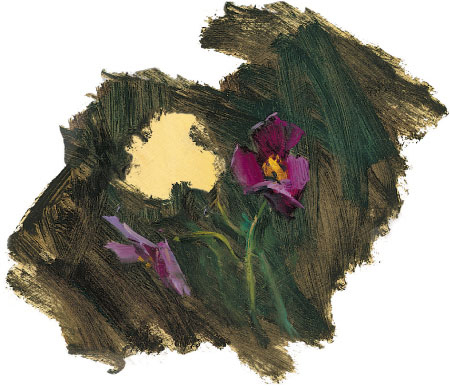
Noting the Negative Spaces
When painting pale flowers, I find it helpful to paint the dark shapes surrounding them. If I accurately render the “negative” shapes, the flowers seem to emerge—a positive result!
Building up Fat
I used my palette knife to build up “fat” color with strokes of very thick paint, being sure to leave hard ridges at the edges for extra dimension.
ADDING COLOR AND DIMENSION
Once I have my flowers displayed to my liking, I look for patterns, not individual petals. Otherwise, it’s too easy to get bogged down in the details and lose the “whole picture.” First I roughly paint in the outline of the entire shape of the arrangement. Next I block in the basic circle or oval shapes of the blossoms. I usually start with large areas of thin color, gradually building up thicker color and finer details. This process is called painting “fat over lean” (see the captions for the leaves on the opposite page). Another technique, called “impasto” (see page 12), can also be used to add ridges to the edge of a petal or leaf. I don’t work thickly right away, though, because thick paint takes a long time to dry.

Working Quickly
I painted this alla prima, or all in one session, since fresh pansies don’t last long. Painting this way gives a fresh and spontaneous feel.
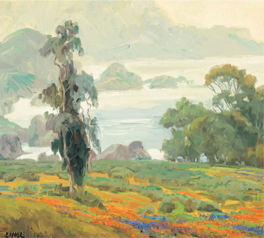
RENDERING SEASONAL TREES
I enjoy painting trees because there are so many different types and they change dramatically with each season. Experiment painting a variety of tree shapes—spreading oaks, columnar poplars, conical firs, twisted olives, and fanlike palms. Choose one or several of your favorites and make them the focus of your painting. You will discover that oils are the perfect medium for rendering trees because the paint can be stippled impressionistically to suggest dense foliage or layered thinly to let each successive color shine through.
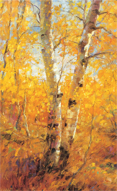
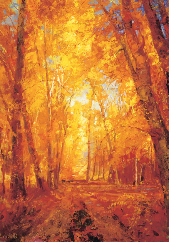
Autumn Aspens
For the fall foliage here, I used mixes of burnt sienna, cadmium yellow light, and cadmium yellow medium, with touches of violet. The warm colors are dazzling, but I think that the peeling bark is just as interesting. To paint the bark, I used a flat brush to make short, horizontal strokes that follow the curve of the trunk.
Autumn Palette
Dark values: burnt sienna plus specks of alizarin crimson, cadmium orange, and violet
Middle values: cadmium yellow light and cadmium yellow medium plus a speck of violet

Light values: cadmium yellow light plus a speck of titanium white
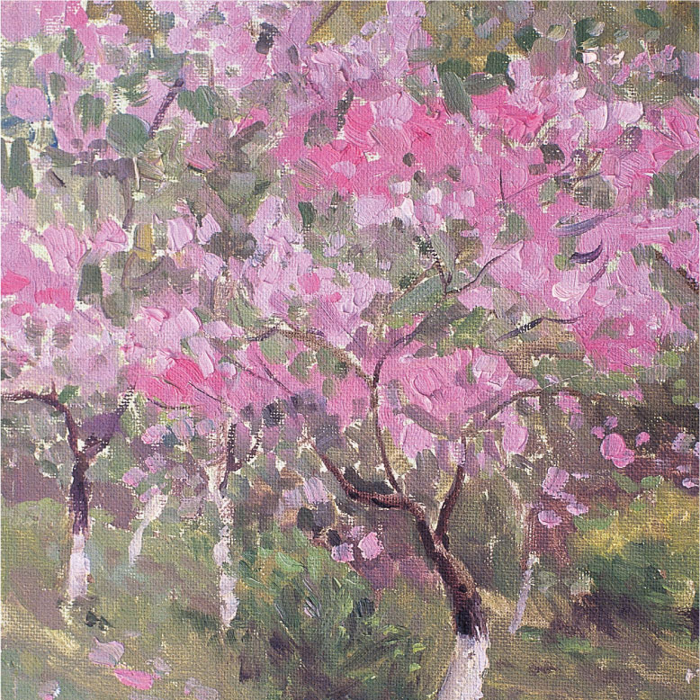
Spring Cherry Orchard
When I’m painting spring trees in bloom, such as these cherry trees, my palette is predominantly pink, with mixes of alizarin crimson, violet, and white.
Spring Palette

Dark values: white, alizarin crimson, and violet
Middle values: white and alizarin crimson

Light values: white, violet, and alizarin crimson

Summer Cottonwoods
The huge canopies of these trees almost hide their trunks and branches! Summer leaves are painted with a lot of greens and blues, with yellow and white for highlights.
Summer Palette

Dark values: burnt sienna, cobalt blue, viridian green, and quinacridone violet
Middle values: yellow ochre, burnt sienna, viridian green, and cadmium yellow medium

Light values: cadmium yellow light plus white and viridian green

Winter Cotton Wood
The branches are not just painted with boring browns straight from the tube. To make them look realistic, I added ultramarine blue for the shadows and yellow ochre for the highlights.
Painting Snow
Snow reflects the color of its surroundings—so if it’s a bright, sunny day, as it was the day I painted the scene below, I add yellow in the highlighted areas. I apply pale blue in the shallow indentations and a darker blue-gray in the deeper footprints. Since the snow surface is not flat, I vary the size, shape, and direction of my strokes to emulate the drifts.

Winter Palette
Light values: middle-value colors plus a speck more cadmium orange and titanium white

Middle values: burnt sienna, yellow ochre, and cadmium orange

Dark values: burnt sienna and ivory black
CHANGING SEASONS
Deciduous trees are wonderful subjects to paint throughout the year. The changing of colors in the fall and starkly silhouetted branches in winter are obviously striking. Flowering trees in spring and fruit-heavy trees at harvest time put on an equally flashy show. There are subtler changes too in how the pale yellow-greens of spring deepen to the blue-greens of summer.
LOOKING FOR SIMPLE SHAPES
To paint realistic trees without painting every leaf, I first look for the individual differences, and then I take out any extraneous elements. The main things to look for are the tree’s size, the shape of its silhouette, its color, and its leaf density. Also notice how most trunks are not uniformly straight and how branches droop or bend. Observe how some edges are soft and blurred, while others are crisp and detailed. Too many hard edges will outline the tree and make it look flat. (Blending wet paint into a wet background is one sure way to soften your edges!) If you observe closely and follow the shape of the tree’s canopy and the order of its branches, I am sure that you will have great success painting convincing trees!
CAPTURING WATER WITH BRUSHSTROKES
So varied in mood and form, water can be both expressive and intriguing—and oil paint is particularly well-suited for capturing its multiple personalities. By varying the size and direction of my brushstrokes and applying different thicknesses of paint, I can convey many of the fascinating qualities of water. For example, when I apply thick paint with deliberate, swirling strokes, I can create the turbulence of a fast-moving river; when I make short, choppy strokes with a bristle brush, I can depict the anger of a stormy sea; or when I smoothly blend with a soft-haired flat brush, I can mirror the serenity of an alpine lake.
SIMPLIFYING THE ELEMENTS
Water reflects the colors and images of the clouds, sky, and surrounding landscape. There are also waves, shadows, and the colors of the water itself to contend with. My advice for painting water is to edit and simplify it; don’t attempt to faithfully render every ripple. Another tip is to paint with a larger brush than you would usually use, because it will force you to paint in a very loose, interpretive way—just what is needed to capture the freedom and movement of water.

Painting Reflections
Moving water reflects; it does not mirror precisely. When I painted the reflections and shadows of the waterlilies, I did not exactly match the colors and shapes of the actual plants. Instead I painted the reflections with blurred edges and darker colors.
Creating Depth
I was fortunate the day I painted this ocean scene. A mist shrouded the details and left the trees and rocky coastline outlined—nature had simplified the shapes for me. I avoided overblending the blue and white of the water close to shore, so that the ridges of paint would appear to be waves.

Painting Sun on Water
Using both brush and palette knife for this sample, I’ve portrayed rippling water using brisk strokes of white, cadmium yellow light and medium, and ultramarine blue “grayed” with cadmium red medium and cadmium yellow medium.
BLENDING WET PAINT
Oil paint dries slowly, a quality I often try to use to my advantage when painting waterscapes. I can “push” the paint around, lightly blending together adjacent wet colors. This works especially well when depicting wave action in the distance, where the colors are muted and the water is smoother. I blend the paint less in the foreground because I want the colors and brushstrokes to remain clear and vibrant. Of course, when moving paint around, there is also the risk of churning up the underlying colors, which is something to be avoided as it makes for muddy colors.

Rendering Still Water
I wanted the cloud reflections in the lake to be the focal point of my painting, so I framed them with the curve of the shoreline and the foliage in the foreground. The viewer sees more of the dark undersides of the clouds and only a glimpse of the light tops in the water reflection. The water appears to be still and glassy, in part because the reflections of the sky and trees are undistorted.
Discovering the Colors of Water
We most often think of water as blue, but it can also be turquoise, brown, green, gray, or gold. Color comes not only from reflections but also from objects and particulates in the water itself. The mountain stream in the painting below is reddish-brown from decaying leaves. It also reflects the golds of the surrounding trees and reveals the browns of the rocky riverbed. For the shadows, I used a mixture of burnt sienna, viridian green, cobalt blue, and violet. I mixed yellow ochre, burnt sienna, viridian green, and cobalt blue for the green reflections in the water, and I used a combination of yellow ochre, burnt sienna, cadmium orange, and white for the reflections of the trees.

UNDERSTANDING LIGHT
It is the impression of light that brings life to an oil painting. So often I find that it’s not what I paint that grabs my attention but how the light falls on that object. I don’t need to pack up and move to the south of France to be enraptured by light. Even ordinary objects are transformed. A stack of hay bales in the slanting afternoon light is suddenly a thing of beauty—I am seeing the world with “new” eyes.
COMPARING LIGHT DIRECTION
The direction and intensity of light influences how the form is seen and how we perceive the mood of a scene. When light is hitting the subject head-on, there are minimal shadows and colors take on a special vibrancy. Light coming from behind the subject tends to flatten forms into silhouettes and to illuminate their edges, giving a halo effect. Three-quarter and side lighting create strong shadows and bright highlights; contrasts are intense, and perspective is accentuated, making forms look very three-dimensional. I like the control I get when using a spotlight indoors; but nothing can compete with the splendor of sunrise, sunset, and the effects of natural light outdoors!

Three-quarter Lighting
This wall of hay bales has all the solidity of a building. The strong angled lighting illuminates one plane of the hay “wall,” leaving the front in shadow, and creating a sense of dimension.

As you can see in the sketch, the light source is to the right, so that’s where I place the highlights on the hay and snowdrifts.
Back Lighting
Because you can’t see the strong highlights when the subject is backlit, it’s sometimes difficult to tell just where the light source is.
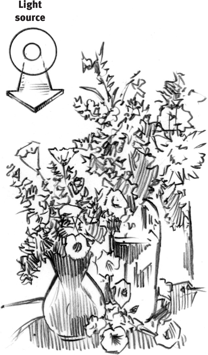
The sketch shows that the light is coming in from the window behind the floral still life. Can you see the subtle “halo” effect around the flowers? I especially like the way the back lighting casts shadows across the foreground, giving this arrangement stature and drama.
RENDERING REFLECTED LIGHT
Light can be focused and intense or diffused and soft. It can also bounce, and when it does, it creates wonderfully luminous reflections. Reflected light can come from the sky or from a nearby light-colored object. The lighter in color and shinier an object is, the more light it will throw. Reflected light is a very important factor; when recorded in an oil painting, it enhances the overall atmosphere and form of the subject dramatically.

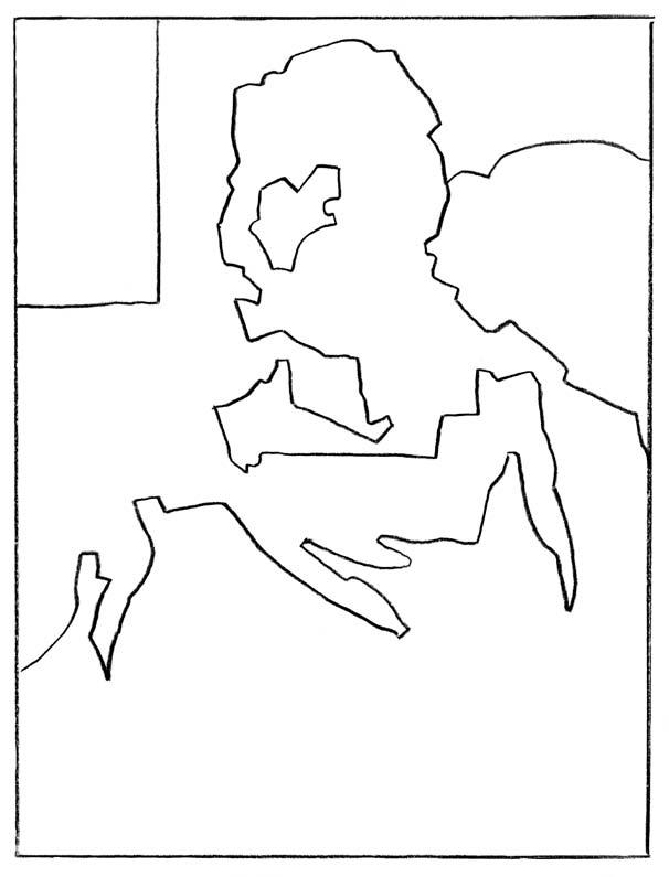
Side Lighting
The strong side lighting, illustrated in the drawing below, reaches into the shadows and allows me to show the colors of reflected light as it strikes the forms of the trees. The birch on the far right reflects the cool blue of the sky and the crooked trunk on the left shows the reflected colors of sunlit leaves. These subtle touches really bring the subject to life.


Front Lighting
A direct frontal light source (see the diagram below) illuminated the baby’s blanket and created lovely highlights on the mother’s face, bringing these elements to the forefront. Front lighting also eliminated virtually all cast shadows, which accentuated the colors of the various fabrics and kept the mood of this mother and child painting light and tender.

CONVEYING MOOD WITH COLOR
Colors are often thought of as happy (yellow) or sad (blue), but there’s much more to it than that. Have you ever come across a painting of yellow sunflowers and, without thinking, found you just had to smile? Or perhaps you involuntarily shivered when looking at a landscape rendered in various shades of blue. These are very real examples of how color affects us. In the paintings on these two pages, I’ve used color to convey particular moods. Look at each work and think about how it makes you feel. I’ll bet it has something to do with the colors!
TAKE ADVANTAGE OF COLOR’S MOODS
As mentioned before (see page 9), colors are considered to be either warm or cool. Warm colors evoke excitement, passion, or even danger; cool colors are calm and serene. So choose your colors to fit the mood you want to convey. You would not want to paint a sad subject in cheery colors, nor a lighthearted scene in a somber palette. Feel free to change colors to fit the mood; paint a brown cottage a bright red, for example. You can also make your colors less or more vibrant: Mix some blue into a hot red and it will appear cooler; or add yellow to green to give it warmth. Experiment and see how different colors affect you.
Warm Color Palette
Here I’ve used warm colors almost exclusively because the autumn subject matter called for them, and because the rich golds and russets make the cottonwoods glow with excitement.

Contrasting Colors
This landscape, with its icy, rutted road catching the colors of sunset, uses a complementary color scheme (see page 8) of yellow and purple. The yellow of the sun provides the only bit of warmth in the chilly lavender expanse of the scene.
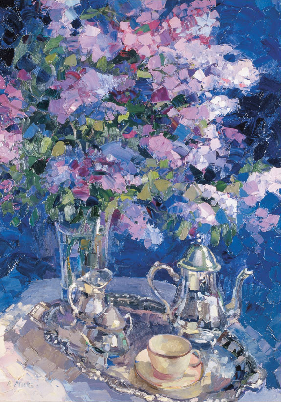
Cool Color Palette
With its predominately cool shades of purple and gray against a dark violet and blue background, this still life with flowers and tea service conveys a soothing, peaceful feeling.
USING ONLY ONE COLOR
Painting with different values (lights, mediums, and darks) of only one color is a wonderful exercise. I especially enjoy painting people this way. Although the color palette is very limited, a monochromatic painting still conveys a definite mood; one with mainly low (dark) values creates a foreboding or mysterious effect, while one with primarily high (light) values is bright and hopeful. (See page 8 for more on value, tints, and shades.)
Establishing the Form
To create a serious mood for my painting of a Civil War soldier, I chose a monochromatic blue color scheme. I began by outlining the general shapes and masses to help me place the light, medium, and dark values.
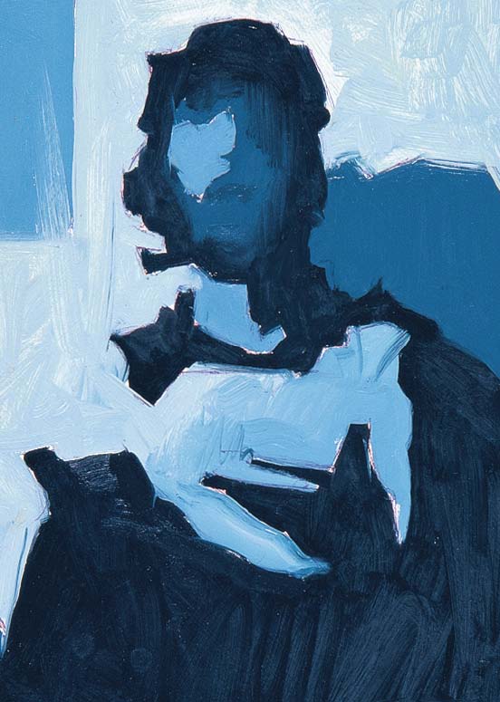
Blocking in Values
Next I filled in the large masses with different values of ultramarine blue, starting with the darks and working toward the lights. At this stage, the face is flat and featureless, but it still “reads” as a man with a cap.
Seriously Blue
I continued to use different values of ultramarine blue to create depth and add details. Notice that the whites of the soldier’s eyes are not painted white. They are shaded by the hat, so pure white would be unnaturally bright. The overall mood of this monochromatic portrait is somber—intentionally so.
FOCUSING ON FACES
I’ve saved the best for last. The human face is a natural focus for oil painting, with no two exactly alike. And the special appeal of children is universal—you had better catch them while you can; they grow up so fast! Whether you choose to paint someone you know or a model, achieving a good “likeness” is no different than painting a landscape or a still life. Closely observe the subject, get the proportions correct, and pay attention to the shapes, planes, and shadows. Not hard at all!
POSING YOUR SUBJECT
In portraiture, you want to capture the physical qualities, the mood, and the personality of your subject. To do so takes a little forethought. Do you want your subject looking directly at you? How much of the head and shoulders will you put in? And do you want to include the hands as a balance to the face? Think about the background. If you are painting a portrait of your grandmother and her favorite room is the kitchen, by all means, pose her there.

A CHILD’S PROPORTIONS
Compared to the oval adult face, a child’s round face will have a larger forehead (the brow is at the halfway mark), wider-set eyes, and a shorter nose.
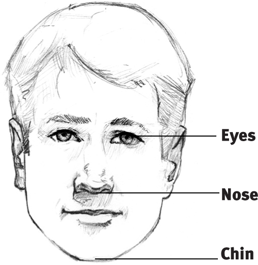
AN ADULT’S PROPORTIONS
Measuring from the top of the head to the chin, the eyes are at the halfway mark. Place the bottom of the nose halfway between the eyes and the chin.

Choosing the Pose
I painted this shy toddler reaching for a flower as an informal portrait. I chose to downplay her facial features and instead emphasized the pose—one that captures the curiosity of youth.

Telling a Story
I like to paint portraits that are a “slice of life”—freezing the moment and the movement midstride. I used delicate colors for the young girl’s and baby’s clothing to stress the children’s youthfulness and innocence and to help keep the overall mood of the painting light.
OBSERVING YOUR MODEL
Certain proportions are useful to know when painting faces. Generally, the middle of the eyes are at the horizontal halfway mark of an adult’s head. The top of the ears line up horizontally with the top of the eyes, and the bottom of the ears line up with the bottom of the nose. The pupils of the eyes align vertically with the corners of the mouth. But everyone is different, so notice how the features of individuals depart from the norm. Remember that patience and practice are the keys to success in painting!
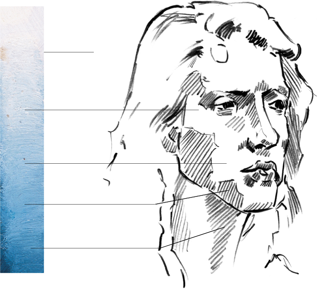
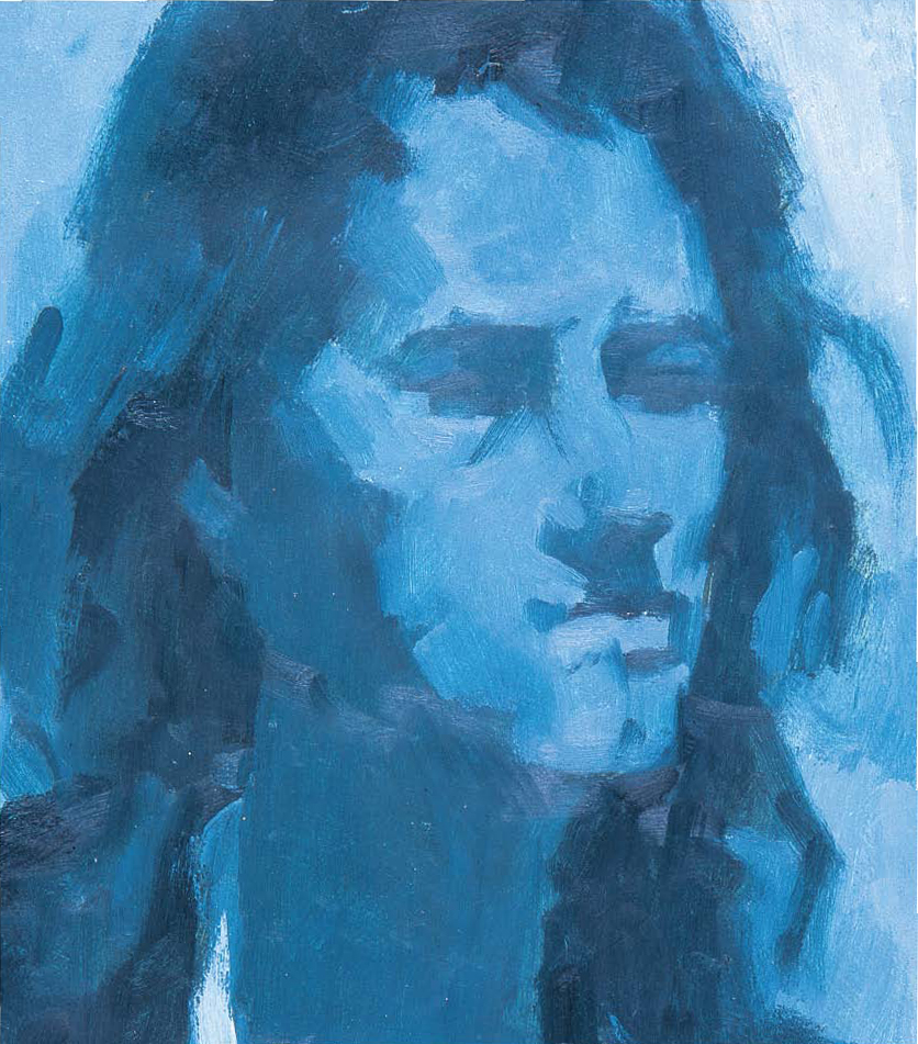
Painting a Face in Monochrome
This is the best way to start painting portraits. Without the need to match skin tones, you can concentrate on the essential proportions of the face.
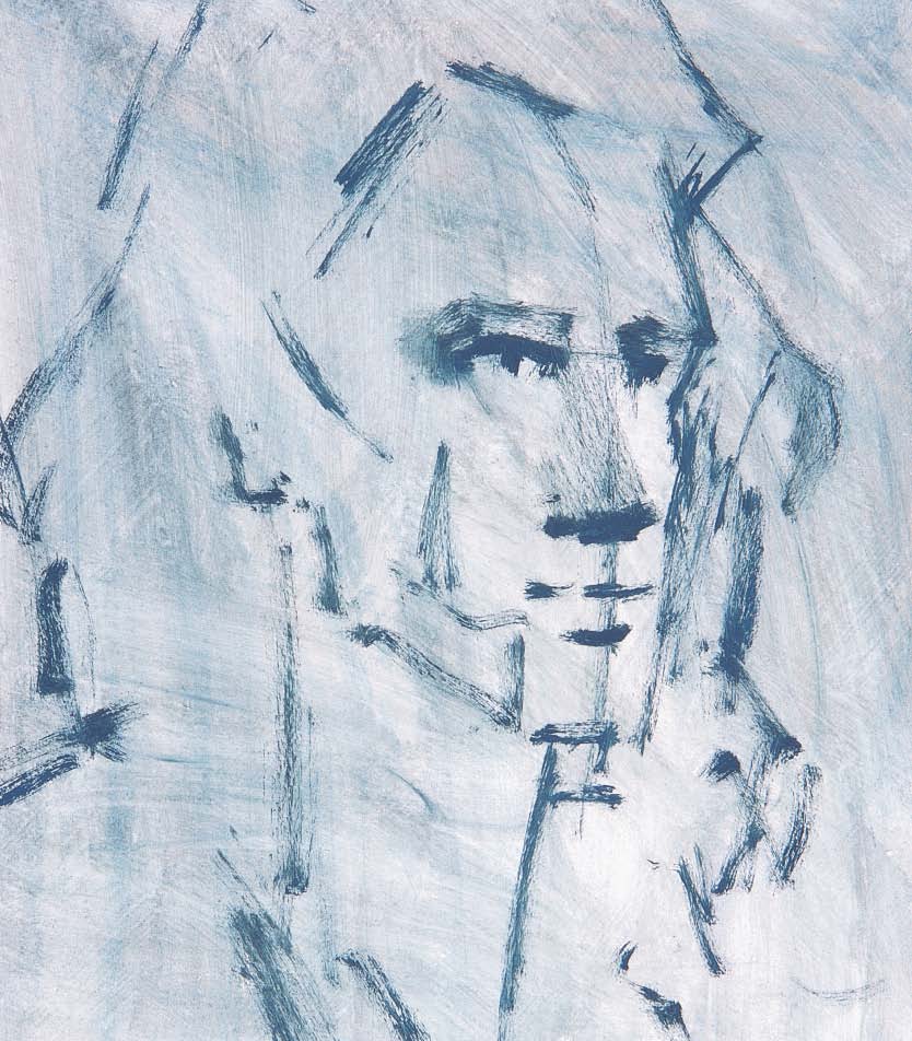
Finding the Shape Through Shadows
After roughing in the guidelines, I blocked in the shadow planes of all the facial features.

Finishing Touches
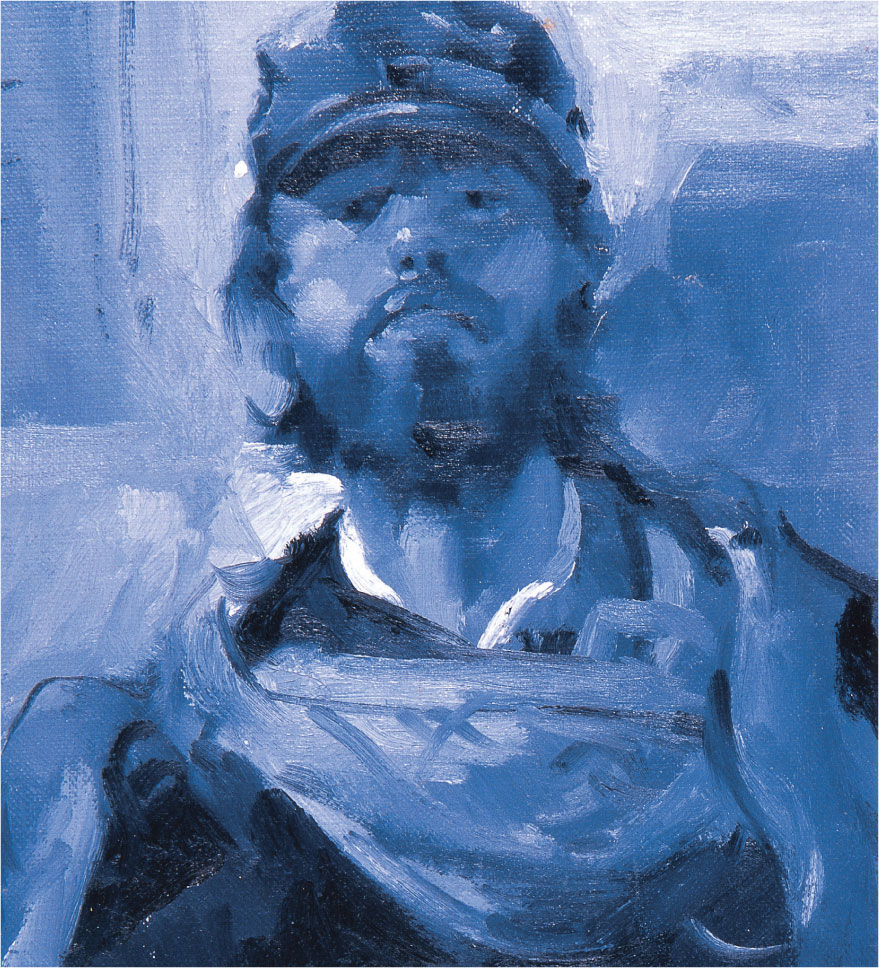
To finish, I applied white for the highlights on the forehead, cheekbone, nose, and lower lip. Limiting the palette does not limit the painting. I find that monochromatic portraits have great mood and depth and are excellent study pieces for artists of all abilities.
USING VALUES
The value scale shows the different values of ultramarine blue I needed to mix and where I used them on the face. I find it easier to mix a range of colors I think I’ll need before I paint. That way I don’t have to stop painting and mix my paints every time I need a new color.