

Anita Hampton has been painting for most of her life. Although she has studied under renowned instructors and at various colleges, she considers herself primarily self-taught. Anita is considered one of the leading plein air painters in the United States, and her work has been published and exhibited in museums, galleries, and major private collections around the world. She is a signature member of the California Art Club and Laguna Plein Air Painters of America, as well as Oil Painters of America. Anita won the 2001 Franklin Mint Award in the Oil Painters of America National Exhibition and was one of eight artists invited to attend the Plein Air Painters of America exhibition in Catalina, California, in 2002.
SPRING LANDSCAPE

STEP ONE
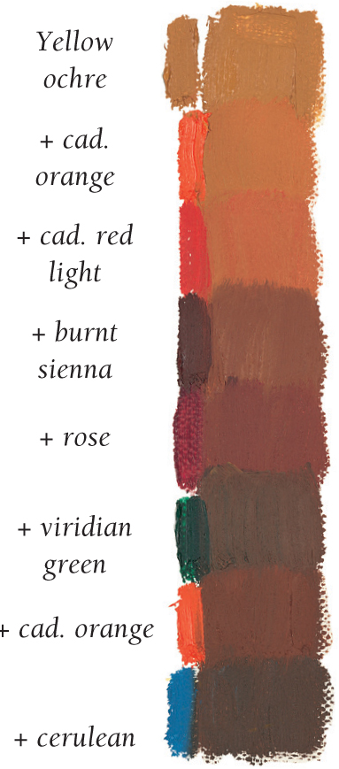
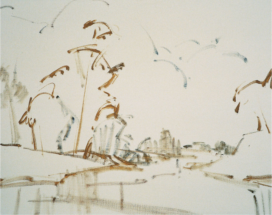
I sketch directly on my canvas with a small flat brush and a mix of viridian green, yellow ochre, and turpentine. Then I block in the largest light shape—the cloud formation to the left of the large tree—with a thick mix of white, a little cadmium yellow pale, and cadmium red light. I darken the sky with a gray mix of cobalt blue and cadmium red light, gradually adding more color with cobalt blue, cadmium red light, cerulean blue, and ultramarine blue. Then I cover the distant mountain range with a mix of white, ultramarine blue, quinacridone rose, and a touch of yellow ochre. I carry the color through the trees to the right of the canvas, so the mountains don’t seem to drop off into space somewhere in the middle of the painting.
Sky
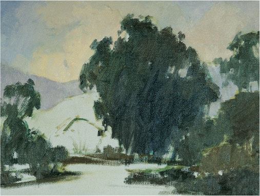
STEP TWO
I create the dark foliage with a mix of ultramarine blue, viridian green, burnt sienna, and a little yellow ochre. I block in the center of interest (the large tree), warming the upper left where the light falls with more yellow ochre and a touch of cadmium red light. For the shadowed right side, I cool the mix with viridian green and a little burnt sienna. I adjust the mixes as I paint the outlying foliage, often changing the dominant dark color, so the foliage is made up of a variety of greens. This color variation is true to nature and makes a more realistic painting. As I paint the background trees at the top right, I allow some light color from the sky to mix with the dark paint and then I blend it with light, feathery strokes (but not too much, or the color will look chalky!).
Dark Tree Mass

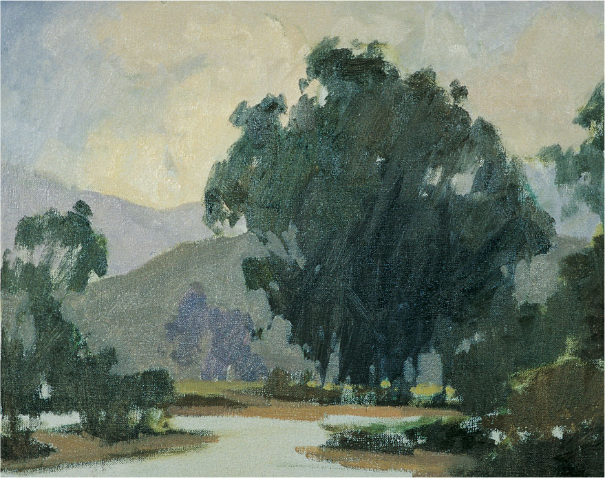
STEP THREE
I block in the mountain directly behind the tree with a mix of white, viridian green, cadmium red light, and yellow ochre. For the background, I want to show that the land recedes into the distance, so I use a cooler mix of white, cadmium yellow pale, phthalo yellow-green, and touches of cadmium red light and cerulean blue. The banks of the bay have more cadmium red light and cerulean blue with a touch of yellow ochre. Because the eye is drawn to brighter colors and warm colors “pop” forward, I warm the colors around the large tree to draw attention to it.
Mountain


STEP FOUR
I paint the left bank with a mix of white, cadmium yellow pale, cadmium red light, and cerulean blue, darkening the mix as I work downward. Then I lay in the reflections of the dark tree with horizontal strokes and a mix of ultramarine blue, viridian green, burnt sienna, and a little yellow ochre. For the sky’s reflection, I mix white, cobalt blue, yellow ochre, and cadmium red light, gently blending the light and dark colors together.
STEP FIVE
I was inspired to paint this sky by the stormy weather condition that formed magnificent clouds in a crystal clear atmosphere; the colors seemed to pop out of the sky! I start by applying more color in the upper sky, using vertical strokes to mirror the vertical strokes in the water. I use basically the same colors I used in step two but with fewer grays and whites. I make the blue sky darkest at the top, lightening and warming it toward the horizon.

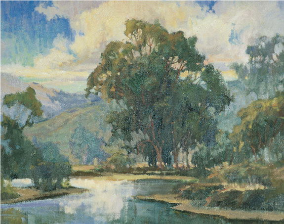
STEP SIX
I add the tree highlights with varying mixes of white, yellow ochre, phthalo yellow-green, cad. red lt., and cerulean blue. I add more highlights to all the foliage with mixes of white, viridian green, yellow ochre, burnt sienna, cad. red lt., cad. yellow pale, and ultramarine blue. For the highlights on the mountains, I add white to a mix of cad. yellow pale, cerulean blue, and a touch of quin. rose. Then I paint over the water with a few horizontal strokes of cad. red lt., blue-violet, and a touch of yellow ochre. I add detail to the large tree trunk with a mix of burnt sienna, ultramarine blue, and yellow ochre. I add a few touches of color to the outlying areas. Finally I use a mix of ultramarine blue, burnt sienna, and viridian green for dark accents in the large tree and outlying foliage.
ROSES

Choosing a Light Source
Natural light (such as light from a north window) is much cooler than artificial light (such as light from a lamp or studio light). Here I chose to use both because I like the lively contrast between the cooler natural light from a window to the left of the scene and the warmer hues created by a studio light on the right.

STEP ONE
Once I’m happy with my setup, I lay in a thin wash of Indian yellow with a large bristle brush. Then I add a touch of quinacridone rose and apply the color liberally with broad stokes to quickly cover the canvas. For the edges, I create a thin mix of quinacridone rose and cobalt blue. I establish the cooler hues on the right by adding more blue to the mix. For the warmer hues in the flower area, I add more quinacridone rose. To avoid harsh color changes, I gently blend the edges of these washes with a paper towel. Then I block in the basic shapes of my composition with a mix of sap green, cadmium orange, and cadmium red light.

STEP TWO
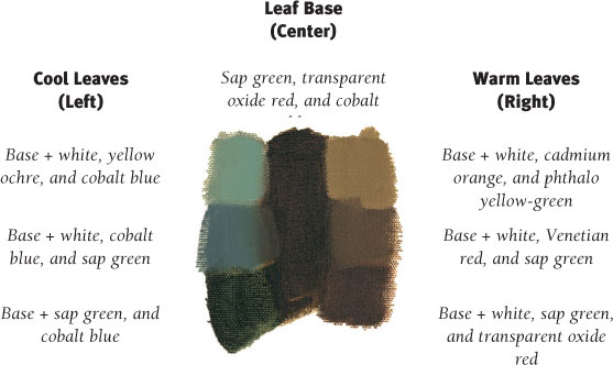
I block in the darkest values of the leaves with a mixture of sap green, transparent oxide red, and cobalt blue. I further develop the darkest values with varying mixes of a little phthalo yellow-green, rose, cad. red light, and cobalt blue added to the original green mixture. The vase has more red with only a little green, and the leaves have more green with only a little red. For the apples, I mix rose, transparent oxide red, and phthalo yellow-green. Next I block in the shadows on the cloth with a mix of white, cobalt blue, and transparent oxide red. I want the cloth to have rich variation, so I create several shades of this mix by adding varying amounts of cad. red light, cerulean blue, yellow ochre, and cad. orange. For the candleholder, I mix white, rose, cobalt blue, and a touch of yellow ochre.

STEP THREE
Now I paint the roses with a small flat brush and a basic mix of rose, transparent oxide red, Indian yellow, and a touch of phthalo yellow-green. For the flowers on the right, I warm the mix with cadmium red light or cadmium orange. For the flowers on the left I cool the mix with rose, cobalt blue, and a touch of white. For the warmest gray versions of the mix, I add a little cadmium yellow light, Indian yellow, or cadmium orange. Next I block in the light spots on the tablecloth around the vase with a mix of white, cobalt blue, transparent oxide red, and cadmium yellow light.

STEP FOUR
I warm the petals on the right with different mixes of white, cadmium yellow light, cadmium orange, and a little cadmium red light. Then I mix rose, cobalt blue, and transparent oxide red into some of the shadowed petals in the center of each rose, blending the color with light strokes to soften any hard edges. For the highlights, I mix white, rose, and a touch of cobalt blue. I paint the leaves on the left with white, cobalt blue, and a touch of yellow ochre. For the warmer leaves on the right, I mix white, cadmium orange, phthalo yellow-green, sap green, and transparent oxide red. I paint the stems with a mixture of white, rose, cobalt blue, and a touch of yellow ochre.

STEP FIVE
I use a variety of gray mixes to develop the cloth and background. For the darker areas of the background and the folds in the tablecloth, I use mixes of cobalt blue, transparent oxide red, cadmium orange, phthalo yellow-green, and a little Venetian red. I add touches of lighter colors to the background with white, cobalt blue, rose, cadmium orange, and a little cadmium yellow light. Where the warm artificial light falls on the table, I add cadmium yellow light and cadmium orange.

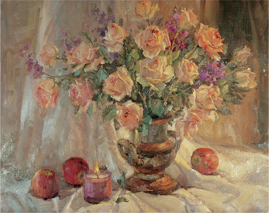
STEP SIX
Now I add details to the apples. For the stems, I use a mix of yellow ochre, phthalo yellow-green, cobalt blue, and sap green. For the darker parts of the apples, I mix rose, transparent oxide red, and sap green. I touch up the stems with a mix of sap green, transparent oxide red, and cobalt blue. I paint the candleholder with a mix of white, rose, cobalt blue, and a touch of yellow ochre, warming the right side with a mixture of cad. yellow light and cad. orange. For the left side, I add more rose and cobalt blue to the mixture. For the flame’s center, I create a thick mix of white and pure cad. yellow light. For the darker area of the flame, I use a mix of white, cad. yellow light, and cad. orange, adding a touch of cad. red light next to the yellow center. At the base of the flame, I add a dark mix of white, rose, and cerulean blue. To create smoke, I add transparent oxide red and cobalt blue to the mix and brush this color upward from the tip of the flame. When I assess the painting, I decide to change the cloth folds. I want the background to have more linear, vertical shapes to counterbalance the round forms of the flowers.
CALIFORNIA COAST

STEP ONE
I begin sketching directly on the canvas with a thin mix of cerulean blue and yellow ochre and a small bristle brush. As I sketch, I am always aware of the division of my canvas—I don’t want any shape to cut the canvas in half vertically, diagonally, or horizontally, nor do I want shapes that are completely equal in size. Variety is the key to creating interest.
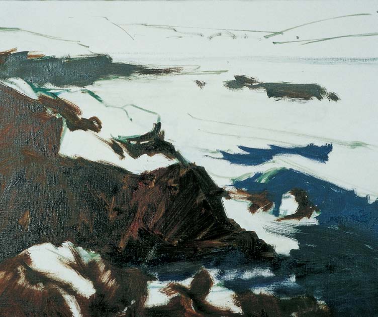
STEP TWO
I create various mixes of transparent oxide red, sap green, and ultramarine blue for the rocks. Then I apply the darks of the water with a mix of ultramarine blue, transparent oxide red, and a little white.

STEP THREE
Next I add the water midtones; at the top right, I apply a mix of quinacridone rose, cobalt blue, and white, blending it into the wet paint. For the sky, I use a mix of white, viridian green, and a touch of cadmium red light.
Water Midtones

Ultramarine blue, transparent oxide red, white, viridian green, and quinacridone rose
Headland

White, viridian green, cadmium red light, yellow ochre, cadmium yellow light, cadmium red light, ultramarine blue, transparent oxide red, and quinacridone rose
Foam Highlights

White, cadmium yellow light, cadmium red light, cerulean blue, and cadmium yellow pale

STEP FOUR
I paint more midtones in the water and then apply the light color on the rocks with a mix of sap green, transparent oxide red, yellow ochre, and cadmium yellow light. I darken the foam with a mix of white, cobalt blue, quinacridone rose, cadmium yellow light, and a touch of cadmium red light. Then I paint the clouds with a mix of white, cadmium yellow pale, and cadmium red light, blending slightly to create soft edges.

STEP FIVE
The focal point of this scene is the breaking wave, so I apply more detail there, adding brighter colors and creating more foam. As I add more color to the water, I lighten the values near the horizon to bring out more contrast in the foreground. Then I develop the clouds by adding more lights (white, cadmium yellow pale, cadmium red light, and a touch of viridian green) and darks (white, quinacridone rose, cobalt blue).

STEP SIX
I break down the shapes in the main rock by building up the texture with more light and dark values. I create highlights with a mix of white, transparent oxide red, viridian green, yellow ochre, and cadmium red light. Then I switch to a mix of sap green, yellow ochre, and cadmium red light for the dark areas. I adjust the headland by randomly adding a range of values with a small sable brush.

STEP SEVEN
I am careful not to apply too much detail in the areas outside of my focal point because I don’t want them to distract from the center of interest. As I continue, I decide to slightly alter the direction of the lower rock formations to point toward the wave; this creates more action and a contrasting diagonal line of movement. To soften the edges of the rocks, I blend the edges with a dry sable brush.

STEP EIGHT
At this final stage of the painting, I try to make sure that every brushstroke I add will enhance (and not detract from) the focal point of my painting. I decide to add the figures at the top of the headland with grayed-down mixes of the original headland colors so they don’t stand out too much. I add more darks to the crevices in the rocks with a small sable brush and apply more color and interesting shapes to the foreground foam. I step back to check my work and, finally satisfied, add my signature.
PORTRAIT OF A CHILD

Reference Photos
Painting portraits in oil can take many hours, even days. Most children have a hard time sitting still for this long. Although a photo can’t compare to a live subject posing for you, take photos of the children you wish to paint. That way you can take your time with the portrait.
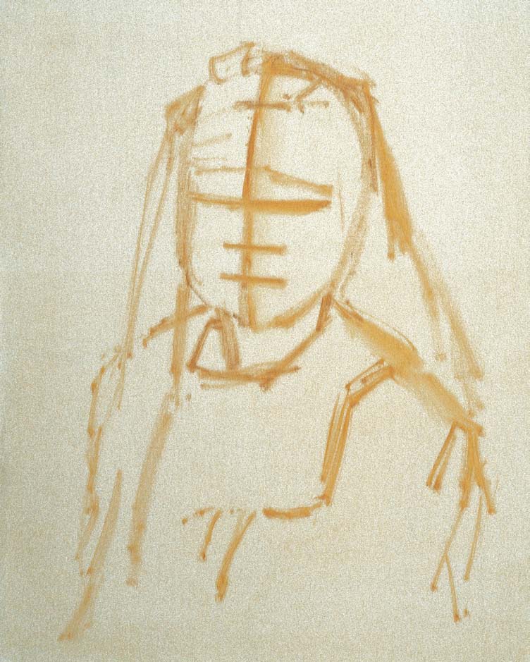
STEP ONE
I want to emphasize my model’s beautiful hair, so I sketch the head and shoulders first with yellow ochre. Then I create some guidelines for the facial features. For the slightly tilted angle of her face, I draw a curved center vertical line. Then I create the central horizontal line through the middle of the vertical line. Because Audrey is a child, her eyes, nose, and mouth all fall below this line. Below the eyeline, I add two more parallel horizontal lines to position the base of the nose and the center of the mouth, making sure my lines are and perpendicular to the vertical line.

STEP TWO
Now I draw in her facial features with burnt sienna and a clean round brush, keeping the paint fairly dry to make clean, crisp lines. If I need to remove a portion of the drawing, I dip a paper towel in solvent and lift off the unwanted paint. Next I indicate the hairline on the forehead and draw the sides of the face. I block in the shadows with pure cerulean blue, using parallel, hatch lines to keep the basic shadows clear and defined. I’ll use these lines later as guides.

STEP THREE
Now I lay in the darkest values in the hair with a mix of burnt sienna, viridian green, yellow ochre, and a touch of cad. orange. To create contrast within this large, dark shape, I separately apply touches of each color from the mix. For the lighter shadows, I lighten the mix with yellow ochre and cad. yellow deep. For the shadows around the eyes, I use a medium filbert and a mix of burnt sienna, viridian green, cad. orange, and a small amount of yellow ochre, adding separate touches of each color to create variation within the shadowed skin tones. Then I add the small shadow on the left sleeve with a mix of cobalt blue, quinacridone rose, and a little yellow ochre, twirling the brush in a loose, swirling motion that mimics the fabric patterns.


STEP FOUR
Next I add the lights in the hair with a medium bristle brush and a thick mixture of white, yellow ochre, cad. red light, and a small amount of cerulean blue. I use large, wide strokes and add touches of the original color mixture over the light hair to keep it from looking like a flat surface of plain, solid color. With a mixture of white, cad. yellow deep, cad. red light, and a touch of cerulean blue, I block in the light bodice of the dress. I make this value slightly darker than it appears, as I’ll be applying the lighter embroidery over it. Using a variety of color mixtures, I roughly block in the floral print of the dress. I’m always tempted to work on details right away, but adding details too soon can make subjects look cluttered and cause colors to conflict with each other. So, at first, I paint as loosely as possible.

STEP FIVE
I accent Audrey’s light blond hair by adding a dark gray background of ultramarine blue, burnt sienna, yellow ochre, and a little thinner. For the lighter areas, I add more yellow ochre to the mix. I let the background blend with the hair, pulling the brush with light linear strokes to create soft edges; tight, unblended edges can make a figure look as if it is pasted on the canvas. While the paint is still wet, I add more highlights to the hair with a small flat brush. Again I work some of the paint into the background to create a loose, natural texture.

STEP SIX
Now I build up the skin tones with cad. red light on the cheeks and chin and a mix of white, cad. red light, and a little yellow ochre. For the skin’s soft texture, I use a dry sable brush to smooth the paint and soften the edges. Now I develop the details of the organdy dress, bringing out the details with a mix of white, cad. yellow light, cad. red light, and a touch of cerulean blue. Then I apply a lighter shade of this mixture with feathery strokes. Because I want Audrey’s hair and eyes to command the most attention, I simplify the dress fabric, making it more muted. I develop the eyes with the colors shown at right and then I build up the hair with several thick brushstrokes.

STEP SEVEN
At this stage, I like to view my paintings in a mirror, which gives me a fresh view of my work and helps me spot areas that may need minor changes. I find I need to lower Audrey’s right shoulder and darken the right side of her face. I darken the skin slightly, as I’d added too much white to the mixture. Finally I raise the right corner of her mouth slightly, simplify the light shapes on her left sleeve, and add more detail to her left eye with a few final highlights.
Eyes

Light Skin Tones

Dark Skin Tones
HENDRY BEACH
STEP ONE
I sketch the composition directly on the canvas with a small flat bristle brush and a mix of cerulean blue and yellow ochre thinned with a little turpentine. If I need to make adjustments in my drawing, I can easily wipe off the color with a paper towel and solvent. I place the basic shapes carefully, making sure I have a variety of sizes and lines and a good placement for my center of interest—the trees on the left.

STEP TWO
I begin by blocking in the dark trees with a large bristle brush and a mixture of viridian green, ultramarine blue, burnt sienna, and yellow ochre thinned with a little turpentine. As I lay in these shapes, I occasionally change the dominant hue by adding more of one of the colors to the mixture. I block in the rest of the foliage and the reflections, working toward my lightest areas (the clouds and sky). I mix white, yellow ochre, and a small amount of cadmium red light and cerulean blue for the white clouds. For the sky, I mix white, ultramarine blue, cerulean blue, and a touch of quinacridone rose. As the blue sky nears the horizon, I apply a mix of white, cerulean blue, and a touch of cadmium yellow pale. I take extra care to thoroughly clean, dry, and load my brush each time I change colors.

STEP THREE
Now I develop the main shapes, starting with my center of interest. Using a small bristle brush, I apply color to the foliage shapes on the left with a mix of white, yellow ochre, cadmium red light, and touches of phthalo yellow-green and cadmium yellow deep. I add the darker values in the shadows with a mix of white, viridian green, ultramarine blue, yellow ochre, and a touch of cadmium red light. I am careful not to overdevelop any of these outlying areas—this could detract from the center of interest. I paint all the tree trunks with a small rigger brush dipped in a mix of white, cadmium red light, viridian green, and yellow ochre.

STEP FOUR
I develop the center of interest using a small bristle brush and my light and dark mixtures from step three. If I need a lighter value, I add a little more white to my mixes. I also work on developing the outlying areas with a large bristle brush. Using a large brush helps me maintain the large, soft shapes I’ve already created. During these final stages, I use more color and less gray in my mixtures as I slowly build up toward clean color. I also make sure to save the cleanest, purest colors for the foreground. Then I step back and view the final painting from a distance. If there are any areas that need correction or more attention, I handle them now.
ENHANCING DEPTH
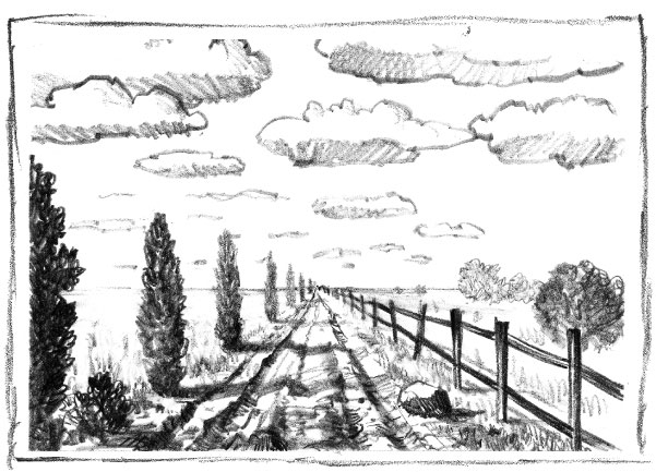
This sketch combines several techniques for showing depth (sharpening or blurring details, overlapping objects, linear perspective, and emphasizing size differences), but the differences in scale are really accentuated in the road, fence, and trees. Notice that the receding lines of these elements narrow to the vanishing point on the horizon, bringing more attention to the depth of the scene.

STEP FIVE
I carefully add clean color to various areas of the canvas that I want to highlight, and I add the ducks in the foreground for interest. In contrast to the muted tones underneath, these pure colors will “pop,” adding interest and excitement. I don’t want to overdo this stage, so I take special care and add only as much clean color as I can without losing the authenticity of my subject or distracting from my center of interest. I want less gray in the blue sky, so I mix white and cobalt blue with a little ultramarine blue and quinacridone rose, and I apply the mix with a large sable flat without disturbing the paint underneath. Finally I sign my name!
COMBINING METHODS
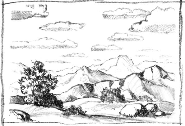
Combining overlapping techniques with texture variation is a great way to create the illusion of depth. In this thumbnail sketch, the hills are overlapping and the clouds become smaller as they move toward the horizon. There is more definition in the foreground elements, and they gradually lighten as they recede toward the hills.