C H A P T E R 24
Other CSS Properties and Features
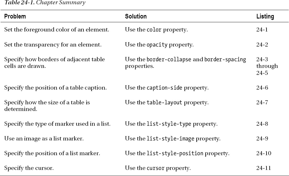
In this chapter, I finish up my coverage of CSS with the properties that didn't fit into the other chapters. These are important and useful properties, but I couldn't find a way of incorporating them into the themes that the other chapters followed. In this chapter, you'll see how to set the foreground color and opacity of elements, and how to apply special styles to HTML table and list elements. Table 24-1 provides the summary for this chapter.
Setting Element Color and Transparency
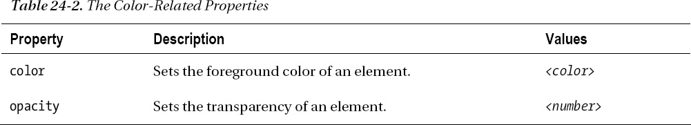
You have seen different uses for CSS colors throughout this part of the book, with the background-color property, the border-color property, and so on. There are two additional properties that relate to colors. Table 24-2 describes these properties.
Setting the Foreground Color
The color property sets the foreground color for the element. In principle, elements can have a different interpretation of what the color property means to them, but in practice, the color property sets the color of text. Listing 24-1 shows the color property in use.
Listing 24-1. Using the color Property
<!DOCTYPE HTML>

<html>

    <head>

        <title>Example</title>

        <meta name="author" content="Adam Freeman"/>

        <meta name="description" content="A simple example"/>

        <link rel="shortcut icon" href="favicon.ico" type="image/x-icon" />

        <style>

            p {

                padding: 5px;

                border: medium double black;

                background-color: lightgray;

                font-family: sans-serif;

            }

            #banana {

                font-size: x-large;

                border: medium solid white;

                background-color: green;

                color: rgba(255, 255, 255, 0.7);

            }

            a:hover {

                color: red;

            }


        </style>

    </head>
    <body>

        <p id="fruittext">

            There are lots of different kinds of fruit - there are over 500

            varieties of <span id="banana">banana</span> alone. By the time we add the

            countless types of apples, oranges, and other well-known fruit, we are faced

            with thousands of choices.

            <a href="http://en.wikipedia.org/wiki/Banana">Learn more about Bananas</a>

        </p>

    </body>

</html>
In this example, I have used the color property twice: once to set the foreground color and transparency for the span element, and once to set the foreground color of a elements when the mouse hovers over them. You can see the effect in Figure 24-1. The effect might be hard to make out on the printed page. To understand the effect, you should display the example HTML document in a browser.
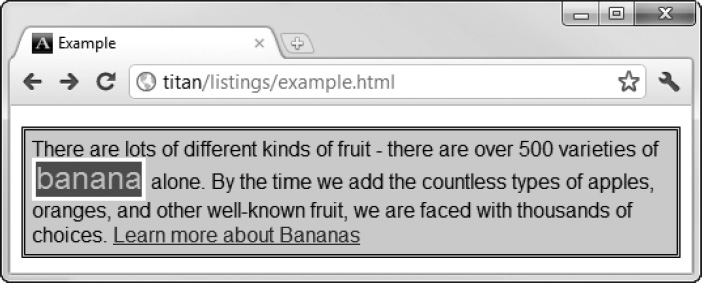
Figure 24-1. Using the color property to set the foreground
Setting Element Opacity
Notice that I used the rgba function to set the color of the span element in the previous example. I made the text slightly transparent by providing an alpha value that is less than 1. It might be difficult to see from the figure, but the effect is that the text is allowing some of the background color to show through.
You can use the opacity property to make entire elements and their text content transparent. The allowed range for this property is from zero (meaning completely transparent) to 1 (meaning completely opaque). Listing 24-2 shows the opacity property in use.
Listing 24-2. Using the opacity Property
<!DOCTYPE HTML>

<html>

    <head>

        <title>Example</title>

        <meta name="author" content="Adam Freeman"/>

        <meta name="description" content="A simple example"/>

        <link rel="shortcut icon" href="favicon.ico" type="image/x-icon" />

        <style>
            p {

                padding: 5px;

                border: medium double black;

                background-color: lightgray;

                font-family: sans-serif;

            }

            #banana {

                font-size: x-large;

                border: medium solid white;

                background-color: green;

                color: white;

                opacity: 0.4;

            }

            a:hover {

                color: red;

            }

        </style>

    </head>

    <body>

        <p id="fruittext">

            There are lots of different kinds of fruit - there are over 500

            varieties of <span id="banana">banana</span> alone. By the time we add the

            countless types of apples, oranges, and other well-known fruit, we are faced

            with thousands of choices.

            <a href="http://en.wikipedia.org/wiki/Banana">Learn more about Bananas</a>

        </p>

    </body>

</html>
In this example, I set the opacity of the span element to 0.4. The effect is shown in Figure24-2, but might be hard to make out on the printed page.
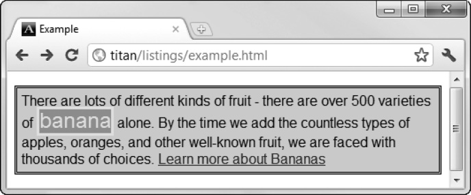
Figure 24-2. Setting the opacity of an element
Styling Tables
There are a number of properties that let you style the unique characteristics of the table element, which I introduced in Chapter 11. Table 24-3 summarizes these properties.
Collapsing Table Borders
The border-collapse property lets you control the way that the browser draws borders for the table element. You can see the default approach in Figure 24-3.
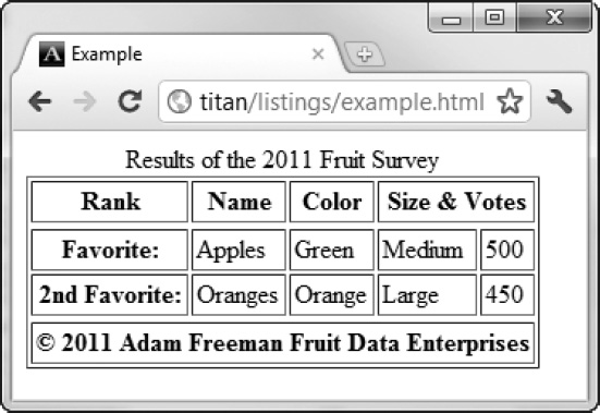
Figure 24-3. The default appearance of a table with borders
The browser draws a border around the table plus a border around each cell, creating a double border effect. You can address this by applying the border-collapse property, as shown in Listing 24-3.
Listing 24-3. Using the border-collapse Property
<!DOCTYPE HTML>
<html>
<head>
<title>Example</title>
<meta name="author" content="Adam Freeman"/>
<meta name="description" content="A simple example"/>
<link rel="shortcut icon" href="favicon.ico" type="image/x-icon" />
<style>
table {
border-collapse: collapse;
}
th, td {
padding: 2px;
}
</style>
</head>
<body>
<table border="1">
<caption>Results of the 2011 Fruit Survey</caption>
<colgroup id="colgroup1">
<col id="col1And2" span="2"/>
<col id="col3"/>
</colgroup>
<colgroup id="colgroup2" span="2"/>
<thead>
<tr>
<th>Rank</th><th>Name</th><th>Color</th>
<th colspan="2">Size & Votes</th>
</tr>
</thead>
<tbody>
<tr>
<th>Favorite:</th><td>Apples</td><td>Green</td>
<td>Medium</td><td>500</td>
</tr>
<tr>
<th>2nd Favorite:</th><td>Oranges</td><td>Orange</td>
<td>Large</td><td>450</td>
</tr>
</tbody>
<tfoot>
<tr>
<th colspan="5">© 2011 Adam Freeman Fruit Data Enterprises</th>
</tr>
</tfoot>
</table>
    </body>

</html>
The collapse value tells the browser that you don't want borders drawn on every edge of adjacent elements. You can see the effect this has in Figure 24-4.
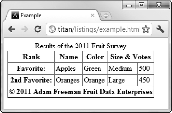
Figure 24-4. Collapsing the border for a table
Configuring Separated Borders
If you do use the default separate value for the border-collapse property, you can use some additional properties to refine the appearance. The border-spacing property defines the amount of space that will be drawn between the borders of adjacent elements, as shown in Listing 24-4.
Listing 24-4. Using the border-spacing Property
<!DOCTYPE HTML>

<html>

    <head>

        <title>Example</title>

        <meta name="author" content="Adam Freeman"/>

        <meta name="description" content="A simple example"/>

        <link rel="shortcut icon" href="favicon.ico" type="image/x-icon" />

        <style>

            table {

                border-collapse: separate;

                border-spacing: 10px;

            }

            th, td {

                padding: 2px;

            }

        </style>

    </head>

    <body>
<table border="1">
<caption>Results of the 2011 Fruit Survey</caption>
<colgroup id="colgroup1">
<col id="col1And2" span="2"/>
<col id="col3"/>
</colgroup>
<colgroup id="colgroup2" span="2"/>
<thead>
<tr>
<th>Rank</th><th>Name</th><th>Color</th>
<th colspan="2">Size & Votes</th>
</tr>
</thead>
<tbody>
<tr>
<th>Favorite:</th><td>Apples</td><td>Green</td>
<td>Medium</td><td>500</td>
</tr>
<tr>
<th>2nd Favorite:</th><td>Oranges</td><td>Orange</td>
<td></td><td></td>
</tr>
</tbody>
<tfoot>
<tr>
<th colspan="5">© 2011 Adam Freeman Fruit Data Enterprises</th>
</tr>
</tfoot>
</table>
</body>
</html>
In this example, I have specified a 10-pixel gap between borders. You can see the effect in Figure 24-5.
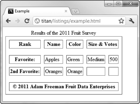
Figure 24-5. Using the border-spacing property
Dealing with Empty Cells
You can also tell the browser how to handle empty cells. By default, the browser draws a separate border when a cell is empty, as you can see in Figure 24-5. You can control this behavior using the empty-cells property. The show value, which is the default, creates the effect in Figure24-3, while the hide value tells the browser not to draw the border. Listing 24-5 shows the addition of the empty-cells property to the style element of the previous example.
Listing 24-5. Using the empty-cells Property
<style>

    table {

        border-collapse: separate;

        border-spacing: 10px;

        empty-cells: hide;

    }

    th, td {

        padding: 2px;

    }

</style>
You can see the effect of this change in Figure 24-6.
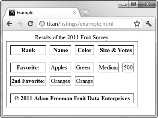
Figure 24-6. Using the empty-cells property
Positioning the Caption
As I explained in Chapter 11, when you add a caption element to a table, it is displayed at the top of the table, even when it is not the first child element. You can change this behavior using the caption-side property. This property has two values: top (the default) and bottom. Listing 24-6 shows the application of this property.
Listing 24-6. Using the caption-side Property
<!DOCTYPE HTML>

<html>

    <head>

        <title>Example</title>

        <meta name="author" content="Adam Freeman"/>

        <meta name="description" content="A simple example"/>

        <link rel="shortcut icon" href="favicon.ico" type="image/x-icon" />

        <style>

            table {

                border-collapse: collapse;

                caption-side: bottom;

            }

            th, td {

                padding: 5px;

            }

        </style>

    </head>

    <body>

        <table border="1">

            <caption>Results of the 2011 Fruit Survey</caption>
<colgroup id="colgroup1">
<col id="col1And2" span="2"/>
<col id="col3"/>
</colgroup>
<colgroup id="colgroup2" span="2"/>
<thead>
<tr>
<th>Rank</th><th>Name</th><th>Color</th>
<th colspan="2">Size & Votes</th>
</tr>
</thead>
<tbody>
<tr>
<th>Favorite:</th><td>Apples</td><td>Green</td>
<td>Medium</td><td>500</td>
</tr>
<tr>
<th>2nd Favorite:</th><td>Oranges</td><td>Orange</td>
<td></td><td></td>
</tr>
</tbody>
<tfoot>
<tr>
<th colspan="5">© 2011 Adam Freeman Fruit Data Enterprises</th>
</tr>
</tfoot>
</table>
</body>
</html>
You can see the effect of this property in Figure 24-7.
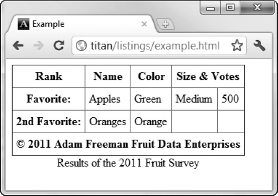
Figure 24-7. Using the caption-side property to move the caption
Specifying the Table Layout
By default, the browser sets the width of the table based on the widest cell in each column. This means that you don't have to worry about figuring out the sizes yourself, but it also means that the browser has to receive all of the table content before it can determine the layout for the page.
The approach that the browser takes to displaying tables is controlled by the table-layout property, and the default value, described above, is set by the value auto. You can disable the automatic layout by using the other allowed value fixed. In fixed mode, the size of the table is set by the width values for the table and for individual columns. If there is no column width information available, the browser will allocate the space evenly across the columns.
As a consequence, the browser is able to determine the width of each column after receiving just one row of the table data. The data for subsequent rows is wrapped to make it fit (which can cause rows to be higher than they would be in the auto mode).
Listing 24-7 shows the table-layout property in use.
Listing 24-7. Using the table-layout Property
<!DOCTYPE HTML>

<html>

    <head>

        <title>Example</title>

        <meta name="author" content="Adam Freeman"/>

        <meta name="description" content="A simple example"/>

        <link rel="shortcut icon" href="favicon.ico" type="image/x-icon" />

        <style>

            table {

                border-collapse: collapse;

                caption-side: bottom;

                table-layout: fixed;

                width: 100%;

            }

            th, td {

                padding: 5px;

            }

        </style>

    </head>

    <body>

        <table border="1">

            <caption>Results of the 2011 Fruit Survey</caption>

            <colgroup id="colgroup1">

                <col id="col1And2" span="2"/>

                <col id="col3"/>

            </colgroup>

            <colgroup id="colgroup2" span="2"/>

            <thead>

                <tr>

                    <th>Rank</th><th>Name</th><th>Color</th>

                    <th colspan="2">Size & Votes</th>

                </tr>

            </thead>

            <tbody>
<tr>
<th>Really Really Really Long Title:</th>
<td>Apples</td><td>Green</td>
<td>Medium</td><td>500</td>
</tr>
<tr>
<th>2nd Favorite:</th><td>Oranges</td><td>Orange</td>
<td></td><td></td>
</tr>
</tbody>
<tfoot>
<tr>
<th colspan="5">© 2011 Adam Freeman Fruit Data Enterprises</th>
</tr>
</tfoot>
</table>
</body>
</html>
In this example, I have set the width of the table element to occupy 100 percent of the available space, and set the layout style to fixed. I have also changed the contents of one of the cells in the second row to demonstrate the effect on the layout, which is shown in Figure 24-8.
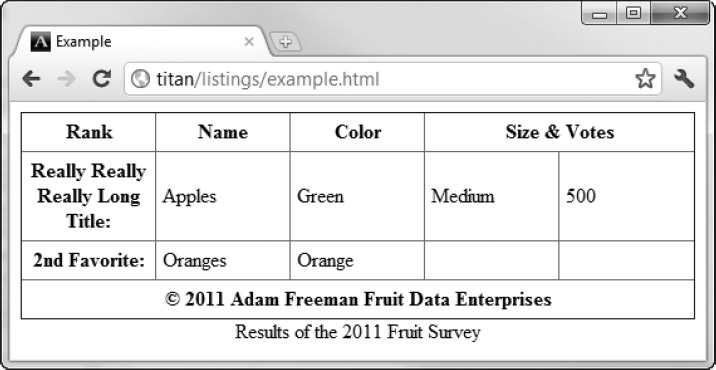
Figure 24-8. Using the table-layout property
Notice how the available space is allocated evenly across the five columns and how the long title in the second row is wrapped to make it fit, causing that row to be much higher than the others.
Styling Lists
There are a number of properties that are specific to styling lists. Table 24-4 summarizes these properties.
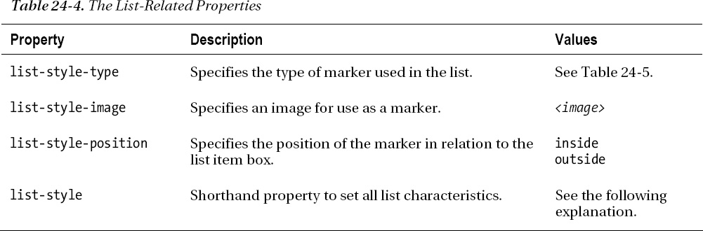
The format for the list-style shorthand property is as follows:
list-style: <list-style-type> <list-style-position> <list-style-image>
Setting the List Marker Type
You use the list-style-type property to set the style of marker (also sometimes known as the bullet) for a list. You can see the allowed values for this property in Table 24-5.
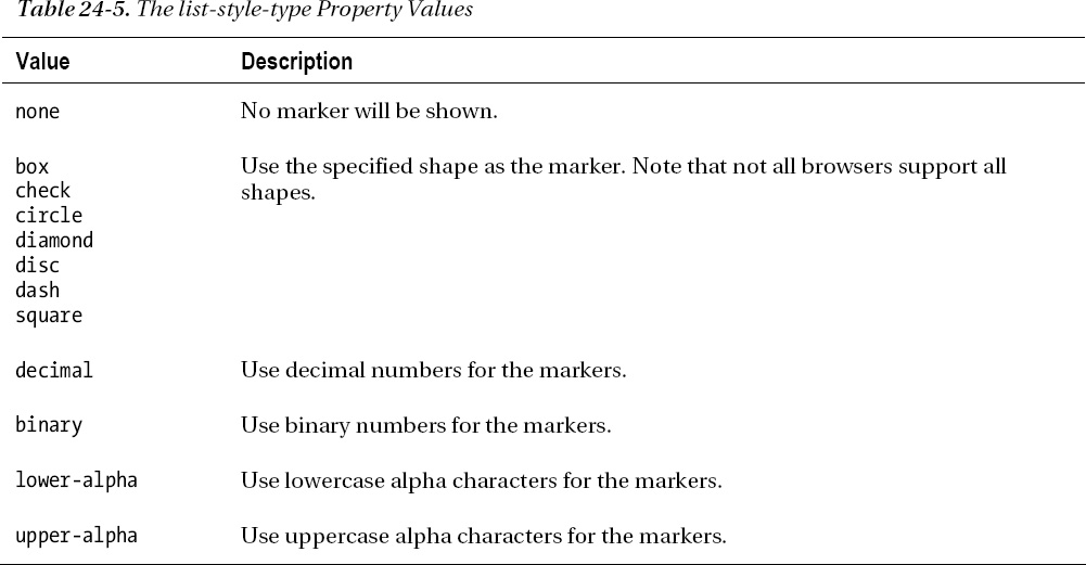
Table 24-5 shows only some of the available styles. There are a great many more, representing different alphabets, symbol styles, and numeric conventions. You can find a full list at www.w3.org/TR/css3-lists. Listing 24-8 shows the list-style-type property in use.
Listing 24-8. Using the list-style-type Property
<!DOCTYPE HTML>

<html>

    <head>

        <title>Example</title>

        <meta name="author" content="Adam Freeman"/>

        <meta name="description" content="A simple example"/>

        <link rel="shortcut icon" href="favicon.ico" type="image/x-icon" />

        <style>

            ol {

                list-style-type: lower-alpha;

            }

        </style>

    </head>

    <body>

        I like apples and oranges.


        I also like:

        <ol>

            <li>bananas</li>

            <li>mangoes</li>

            <li style="list-style-type: decimal">cherries</li>

            <li>plums</li>

            <li>peaches</li>

            <li>grapes</li>

        </ol>

    </body>

</html>
You can apply this property to entire lists or individual list items. I have done both in this example (although the result isn't something that would make sense to a reader). You can see the effect in Figure 24-9.
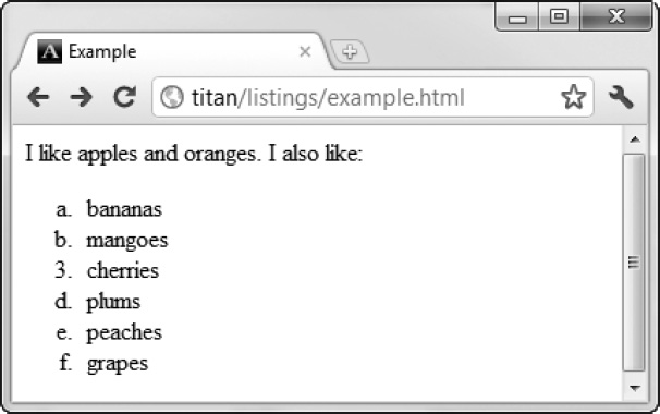
Figure 24-9. Setting the list marker type
Using an Image As a List Marker
You can use an image as the marker through the list-style-image property. Listing 24-9 shows this property in action.
Listing 24-9. Using an Image As a List Marker
<!DOCTYPE HTML>

<html>

    <head>

        <title>Example</title>

        <meta name="author" content="Adam Freeman"/>

        <meta name="description" content="A simple example"/>

        <link rel="shortcut icon" href="favicon.ico" type="image/x-icon" />

        <style>

            ul {

                list-style-image: url('banana-vsmall.png'),

            }

        </style>

    </head>

    <body>

        I like apples and oranges.


        I also like:

        <ul>

            <li>bananas</li>

            <li>mangoes</li>

            <li>cherries</li>

            <li>plums</li>

            <li>peaches</li>

            <li>grapes</li>
        </ul>

    </body>

</html>
You can see the effect of applying this property in Figure 24-10.
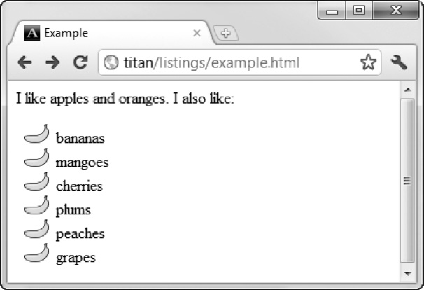
Figure 24-10. Using an image as a list marker
Positioning the Marker
You can specify the position of the marker in relation to the li element's content box using the list-style-position property. The allowed values are inside (meaning that the marker is inside the content box) and outside (meaning that the marker is outside the content box). Listing 24-10 shows the list-style-position property and its values in use.
Listing 24-10. Specifying the Position of the Marker
<!DOCTYPE HTML>

<html>

    <head>

        <title>Example</title>

        <meta name="author" content="Adam Freeman"/>

        <meta name="description" content="A simple example"/>

        <link rel="shortcut icon" href="favicon.ico" type="image/x-icon" />

        <style>

            li.inside {

                list-style-position: inside;

            }

            li.outside {

                list-style-position: outside;

            }

            li {
                background-color: lightgray;

            }

        </style>

    </head>

    <body>

        I like apples and oranges.


        I also like:

        <ul>

            These are the inside items:

            <li class="inside">bananas</li>

            <li class="inside">mangoes</li>

            <li class="inside">cherries</li>

            These are the outside items:

            <li class="outside">plums</li>

            <li class="outside">peaches</li>

            <li class="outside">grapes</li>

        </ul>

    </body>

</html>
I have broken the li items into two classes and applied different values of the list-style-position property. You can see the effect in Figure 24-11.
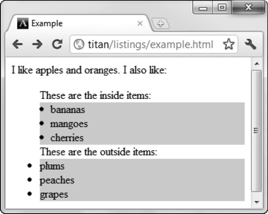
Figure 24-11. Positioning the marker
In this figure, I have set the background-color property for all of the li elements so that you can see the effect of each position value.
Styling the Cursor
The cursor property lets you change the appearance of the cursor. Table 24-6 summarizes this element.
The different values for the cursor property cause the browser to display different styles of cursor when the mouse passes over the styled element. You can see the property in use in Listing 24-11.
Listing 24-11. Using the cursor Property
<!DOCTYPE HTML>

<html>

    <head>

        <title>Example</title>

        <meta name="author" content="Adam Freeman"/>

        <meta name="description" content="A simple example"/>

        <link rel="shortcut icon" href="favicon.ico" type="image/x-icon" />

        <style>

            p {

                padding: 5px;

                border: medium double black;

                background-color: lightgray;

                font-family: sans-serif;

            }

            #banana {

                font-size: x-large;

                border: medium solid white;

                background-color: green;

                color: rgba(255, 255, 255, 0.7);

                cursor: progress;

            }


        </style>

    </head>

    <body>

        <p id="fruittext">

            There are lots of different kinds of fruit - there are over 500

            varieties of <span id="banana">banana</span> alone. By the time we add the

            countless types of apples, oranges, and other well-known fruit, we are faced

            with thousands of choices.

        </p>

    </body>
</html>
You can see the effect in Figure 24-12. I have magnified the cursor to show that it switches to the Windows 7 wait cursor when I pass the mouse over the span element.
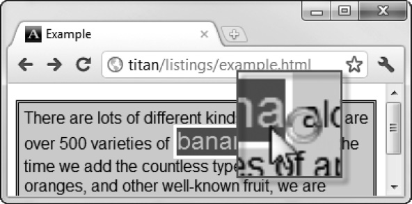
Figure 24-12. Setting the cursor style
Summary
In this chapter, I have described the CSS properties that don't really fit anywhere else. That's not to say that these properties are not important, just that they didn't fit into the theme of the earlier chapters. The properties in this chapter allow you to set the color and opacity of all elements, and apply specific styles to lists and tables, which are essential HTML features in their own right.