
23. Case Study: Kitchen Remodeling
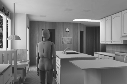
Virtual-environment model of remodeled kitchen
Effective Virtual Environments Research Project, University of North Carolina at Chapel Hill
If you can’t stand the heat, get out of the kitchen.
HARRY S. TRUMAN
Highlights and Peculiarities
Why This Case?
This simple case illustrates the power of design tools. Drawings, computer-assisted design (CAD) software, scale models, full-scale mock-ups, and a virtual-environment (VE) walk-through each benefited the design. The VE and the mock-up each added value that the other did not.
Bold Decision
Move the exterior wall. This change transformed the design.
Bold Decision
Cut a door between the Kitchen and the Living Room. Creating this door transformed all house traffic.
Skylights
Two skylights transformed the dark, north-facing kitchen into a bright, pleasant space.
Introduction and Context
Location:
413 Granville Road, Chapel Hill, NC
Owners:
Frederick and Nancy Brooks
Designers:
Frederick and Nancy Brooks
Advised by Mary June Magó and Alex Jones, ASID
Dates:
1995–1996
Context
This design was Phase II of a 1990s remodeling of a 1960s house. Phase I consisted of the addition of a West Wing, a Foyer, and a Porch. It is described in Chapter 22. Phase II was scheduled a few years later than Phase I to enable ample design time for Phase II and plenty of oversight for Phase I construction.
Objectives
Primary Goals
Our principal objectives were to enlarge, rearrange, and brighten a small, dark, north-facing kitchen–breakfast room.
Other Objectives
In decreasing order of importance:
• Improve the traffic pattern for the house, in which all traffic between halves passed through the narrows by the basement stairs. We also needed to accommodate violin student traffic coming in the back door, emptying their cases, storing the cases in the Playroom, moving to the Music Room, and back.
• Move the kitchen table to the garden window for view.
• Arrange the spaces so the cook can talk with a seated nonworking visitor.
• Make the kitchen convenient for each of
• One cook preparing breakfast
• One (short) cook doing general cooking, baking, and canning
• Multiple (up to three) cooks preparing a big meal
• Conveniently serve, via buffet, groups of 30 to 40 students.
• Add substantially more counter space.
• Install a bigger sink.
• Design a walk-in pantry.
• Keep the exterior appearance pleasing.
• Brighten the “back” entrance to the house, which is the principal entrance for family, students, and often for informal guests.
• Subordinate the back door in the exterior façade.
• Add a decorative bird mural to the dull brick chimney wall.
• Conceal miscellany in cabinets.
• Display a small amount of glassware.
Opportunities
Smaller Family
The family had shrunk, due to the children growing up. So normal kitchen-eaten meals would be for two, occasionally three, exceptionally four, rather than routinely five.
Space Available in the Playroom
Due to the 1992 construction of a music-teaching studio in the new West Wing, a 5′ × 5′ space formerly occupied by an organ became available, as well as a 2′ × 6′ space formerly occupied by hi-fi equipment.
Three-Foot Eaves
Due to Frank Lloyd Wright’s inspiration of 1960s ranch-style houses, this house had deep eaves.
Design Time and Effort Budget
These were essentially unlimited.
Constraints
User Height
The primary user of the kitchen is 5′1″ tall.
Construction Budget
The budget was not cramped, but did not admit of major structural changes.
Exterior of House
The exterior of the house was finally made attractive by the 1991 addition (Chapter 22), which we didn’t want to mess up.
Existing Kitchen
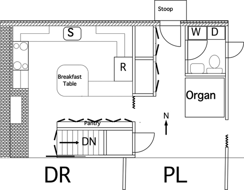
The size and shape of the existing kitchen (Figure 23-1) would determine the shape of the new one.
Figure 23-1 Kitchen plan before remodeling
Brick Chimney Wall
This wall was 8″ thick and constrained the traffic pattern.
Basement Steps
These could not be relocated.
Playroom Exterior Door
The function of this door was essential, but the placement was movable.
Back Door
Placement in the brick wall made moving it expensive.
Existing Laundry/Toilet
This room did not need to be changed.
Pantry
We needed to preserve the pantry’s function and capacity, but not its placement.
Closets
The North Hall closets’ functions and sizes had to be retained, but not their placement. This is an interesting example of the importance of probing existing use scenarios closely. The requirement could not readily have been inferred from a wealth of precedent kitchen designs. The strength of this requirement comes from the fact that we had followed particular use scenarios for 30 years and would suffer a high “chaos cost” if the closet contents were severally dispersed all over the house.
Structural Considerations
The structural vertical members in the basement staircase wall supported the roof.
Rest of House in Use
Other rooms would be in constant use during construction.
Rationing the Critical Width Budget
Needed Width North to South
In all the early attempts to find a workable design, the width proved to be the stumbling block. Consider the objectives of
• An eating area by the window
• A sink where one could see out the window
• A sink where one could visit with people at the eating area
• Easy east-to-west traffic through the kitchen
• Enough counter/cabinet space
• A short stove-sink-refrigerator triangle
Tentative Design
This suggests an island with a sink, facing the window and eating area. Putting a counter with the stove against the south wall seems necessary.
Now the width at the tightest pinch point must be rationed among, from north to south:
• Eating table (not less than 30″)
• Passage for traffic (not less than 24″)
• Sink island (not less than 24″)
• Walk/work space between sink and stove (originally estimated at not less than 36″)
• Stove and counter (not less than 27″)
This is a total of not less than 11′9″. The original width was 11′11″.
The objective of seating up to four at the table occasionally can be satisfied by having the visitors sit in the passage, effectively blocking it. This is acceptable, since only occasional.
Mock-up studies, however, showed that the sink-stove space really needed 44″, rather than 36″, because of swing-out/pull-out cabinets, stove doors, and dishwasher pull-out. So the total width needed was not less than 12′5″.
Alternative Width Solutions
Eliminate the Traffic Passage
A rejected design would have eliminated the passage and routed east-to-west traffic between the sink and stove, utterly interfering with cooking. Rejecting it meant the needed width was ≥12′5″. This suggests
• Taking over the pantry and basement stairs’ space, moving them elsewhere, or
• A bay window for the eating area, or
• Pushing the whole north wall of the kitchen out as the eaves allow
In either of the latter two cases, one would move the pantry elsewhere to pick up 9″.
Move the Basement Stairs?
Extensive studies of moving the stairs elsewhere showed that the only workable alternative would be a spiral staircase tower outside the house, connecting to the Playroom’s south exterior door. Other solutions either didn’t work with existing or reasonable partitioning upstairs, or with reasonable partitioning in the basement.
The stair tower alternative was pursued for some months. It was finally rejected as expensive and unesthetic, although workable for traffic.
For the design process, concluding that all “move the stairs” alternatives were unworkable or unacceptable was a critical moment, radically narrowing the field of possible designs. This subdesign was a good example of Simon’s “search the tree” process, as I explored multiple instances of the “spiral stair” design and, when none worked, went up a level on the design tree and ruled out moving the stairs at all.
Bay window or push the whole north wall outward?
Exterior mock-up studies showed that pushing the whole kitchen wall out northward would look much better than a bay window, and costs appeared roughly comparable. So that alternative was selected. The same mock-up studies showed that push-outs of 18″ to 24″ worked esthetically, given the 36″ eaves.
Resulting Width Design
With an extra 24″ from push-out and 9″ from moving the pantry, the width constraint was greatly relaxed. The island was widened from 24″ to 36″ to provide serving, staging, and storage space. The north passage was widened to 39″; the south passage, to 44″.
Rationing the Length Budget
The Length Pinch
The south wall became the length pinch. It had to accommodate the 48″ stove, a work counter to its right, and a work counter to its left. The west work area was chosen as the breakfast-cooking corner, so it had to accommodate a microwave oven and a toaster, for a total of not less than 36″.
The east work counter is the major general cooking and baking area, with access to dry ingredients, spices, mixers, and other cooking needs. Mock-up studies showed that a 48″ counter length would be desirable.
Design
The south wall was lengthened eastward by 18″, increasing the separation of Kitchen and Playroom into two rooms. Mock-up studies with the new Pantry in place showed that the 5′ (diagonal) opening would suffice and yield a good visual effect.
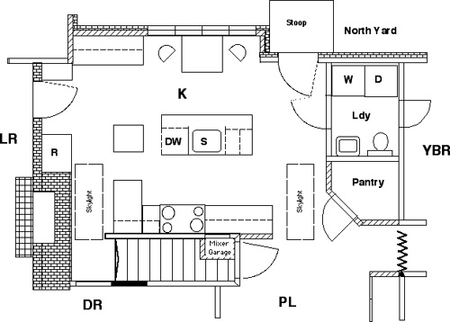
Figure 23-2 Kitchen plan after remodeling
Other Design Decisions
Doors
Should we cut a door from the Living Room to the Kitchen? Yes, even though it meant cutting through 8″ of brick wall, hence was expensive. The house traffic pattern demanded it. From the Dining Room to the Playroom? No, the wall space in each room was more valuable.
Closets
Another decision was where to move the North Hall closets. We decided to move them to the Playroom east wall.
Pantry Shelves
We moved the pantry shelves (originally on the south wall) to a new Pantry built out from the Playroom north wall, into the space vacated by moving the organ elsewhere.
Configuration of the Kitchen-Playroom Opening
Positioning the Pantry door diagonally increased the visual opening.
Traffic
The south passage is for cooks only; the north passage is for visitors and all east-west house traffic.
Cabinets
Hanging cabinets over the sink island was an option, but a virtual-environment walk-through showed these to interfere with the visual space of the room.
Perimeter of the Sink-Stove-Refrigerator Triangle
The Small Homes Council recommends that the triangle joining these three workstations have a maximum perimeter of 26′. Our final design yields a 24′ perimeter.
Storage for Plates, Glasses
Putting these items in drawers worked better than cabinet storage for the shorter user.
Rolling Auxiliary Island
The 26″ × 26″ island with a 12″ flip-up extension provides storage for silver, glasses, and implements. It also provides staging for the refrigerator and an optional extension to the main island for buffet service.
Low East Work Counter
The east work counter was made low for the convenience of the shorter user. It also enables a tall-appliance garage.
Appliance Garage
This space is embedded in the adjacent closet through the south wall.
Lighting
Skylights
Two skylights, 2′ × 4′, were placed at the ends of the island and over the darker south part of the room. This design decision was suggested by Alexander’s pattern of “Every room should have daylight on two, or preferably three, sides.”1
Back Door
We replaced the solid back door with a glass one.
Windows
We installed new kitchen windows to fit the entire breakfast nook.
Artificial Lighting
Seven circuits yield different configurations for uses, moods, and traffic pattern emphasis.
Color Scheme
Off-white aids brightness and allows accent colors. We kept the old paneling in the Playroom and east Kitchen wall and covered the brick chimney with white drywall.
Assessment
Size
The 2′9″ width enlargement by the push-out and the Pantry move changed working space and traffic space. Moving the closets lengthened the visual space by 2′3″. The square footage in the Kitchen increased by almost 54 ft2.
Traffic
The costly door to the Living Room radically transformed the whole house. Almost all east-west traffic goes through the new door. From the Kitchen one can see out the east windows in the Yellow Bedroom and the west windows in Nancy’s Study.
Brightness
Skylights, glass, the off-white color scheme, and lighting transformed the room’s feel.
Effect on Playroom
The Playroom became noticeably narrower because of the closets, but it still proves quite adequate for
• Music student staging and instrument cases
• Music student siblings playing during lessons
• Grandchildren playing
South Door
The path to the south exterior door is somewhat cramped.
Other Desiderata Satisfied
• The eating area works well as a guest area. There is also an entrancing view of the bird feeder.
• The breakfast-cooking corner is convenient—standing in one place, one can reach the microwave, electric frying pan, toaster, drawer, stove, and dishes.
• Multiple cooks can work comfortably.
• The new Kitchen works well for group buffet feeding:
• Traffic enters through the Dining Room and leaves through the Living Room.
• People take serve-yourself silver from the southwest counter drawer.
• Trays, plates, and supplies are stored in the southwest counter cabinet.
• The new Pantry is much more capacious and convenient.
• The exterior appearance was not hurt.
Use of Drawings, CAD, Models, Mock-ups, and Virtual Environment in the Design
Much effort was put into the design because
• Kitchen satisfaction accounts for much of the total satisfaction with a house.
• Kitchens are intensively used.
• This remodeling project was tightly constrained by the existing structure and its traffic pattern, creating difficult design problems.
• The designers had no limitation on the design effort budget.
The design turned out to use a full range of design tools.
Drawings and CAD
Most design was done with sketches, then rationalized into coherence and consistency with the existing structure, using the MiniCad architectural CAD system on a Macintosh. The MiniCad file served as the design document.
Most CAD work was done at 1/4″ = 1″ (1:48) scale, but the CAD system and a two-page monitor made it easy to do detailing at on-screen scales up to 1:6. Scales 1/2″ = 1′ and 1″ = 1′ were often used.
The CAD design was layered, with layers for original kitchen, removed construction, added construction, and appliances and furniture.
Design Log
The rationale behind substantial design decisions and the wanderings in arriving at them were contemporaneously captured in a design log. Edited sample pages are shown on the Web page for this book.
Isometric Drawing Kit
We also used a kitchen design kit that provided a set of isometric grids and a set of isometric drawings of appliances, cabinets, counters made to the proper scale and printed on electrostatically active plastic. It was easy to use, fast, and produced good results. The chief limitations were the set of furnishings provided and monochromaticity.
Models
Nancy made from 1/2″ = 1′ drawings a set of simple cardboard models to get a feeling for the 3-D geometry. These models proved to be substantially richer than the isometric drawings: they enabled one to view the interior of the kitchen from any angle, even though in miniature.
Mock-ups
Full-scale mock-ups were used to test the most critical design decisions. These proved invaluable.
The pushed-out exterior wall was mocked up with cardboard mattress boxes for prediction of external appearance. Interior counter arrangements were mocked up with tables, cardboard, and sawhorses, in a large interior space in another building. Then kitchen scenarios were carried out with various inter-unit spacings. This proved to be a very effective way to establish both the minimum tolerable spacings and the amount of ease effected by measured relaxations of those spaces.
This mirrored a previous experience I had on a church building committee. We ended up mocking up the church kitchen’s spacings. It proved the only satisfactory way to determine them.
Virtual-Environment Visualization
Because my UNC research team was developing a virtual-environment laboratory, Nancy and I tested the lab by testing our proposed kitchen design using it. The chapter frontispiece shows one of the views produced in the head-mounted display as the viewer walked about in the virtual kitchen. Our tracking technology allowed free walking movement over a 15′ × 18′ space, which encompassed almost the whole kitchen.
The illusion of presence during a 20- to 40-minute kitchen design session was very strong—one forgot the VE apparatus and concentrated on the kitchen.
VE Findings
• The most important finding of the VE sessions was that the hanging cabinets flanking the sink broke up the visual space and made the kitchen feel small and cramped. So we redesigned to remove those cabinets and still keep the required amount of shelf space.
• A hanging lamp at the breakfast-cooking corner was intrusive and needed to be replaced with a recessed ceiling fixture.
• The VE experience confirmed the desirability of the bird mural planned for the large chimney wall.
• The diagonal arrangement of the hardwood flooring was seen to be effective.
• Other findings showed improvements needed in the VE apparatus and techniques.
General Lessons Learned
1. The kitchen is indeed the most important room in the house. It rewards extensive design work.
2. Fourteen years later we can think of only minor details we would have done differently on this project. This happy outcome is partly due to the fact that as with Linux, the designers are the users, hence the use cases are realistic and representative.
Another large factor is the time and effort invested in the design. As with the System/360 architecture (Chapter 24), we had plenty of time. Whereas with software, one wants to use extended design time to test prototypes with real users, we used much of it to test pseudo-prototypes—mock-ups and VE models—with extensive use cases.
I am convinced that most projects need to devote a larger share of the total schedule to design.
3. Very wide consultation with friends yielded crucial good ideas, including the basic configuration.
4. Full-scale mock-ups, together with use scenarios, proved invaluable.
5. Virtual-environment technology provided important information beyond that which floor plans and even mock-ups provided, especially about visual space and the feel of the room.
As a practical matter, VEs will become cheaper and easier. Mock-ups won’t. So, the key question is not “Did VE add value beyond that provided by mock-ups?” but “Do mock-ups deliver key value that isn’t subsumed in what VE delivers?”
Both my experience in designing spaces and scientific results from our VE laboratory say “Yes.” Insko found that adding Styrofoam mock-ups that could be felt (even though seen only as model images) to a VE experience significantly improved the sense of presence.2 Those trained in a VE that included a touchable mock-up as well as a visual image traversed a real maze (blindfolded) significantly faster and with radically fewer errors than those trained in the same VE with only the visual images.
Consequently, I believe mock-ups, exercised by use scenarios, will continue to be worth their substantial effort and cost when one is designing an intensively used space, such as a kitchen, or one that will be widely replicated, such as an office in a multi-office building.
Notes and References
1. Alexander [1977], A Pattern Language.
2. Insko [2001], “Passive haptics significantly enhances virtual environments”; Whitton et al. [2005], “Integrating real and virtual objects in virtual environments.”