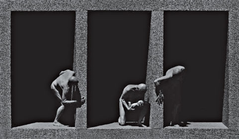
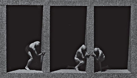
PART 1:
FRAMING AND
BORDERS
“PHOTOGRAPHY IS ABOUT FINDING OUT WHAT CAN HAPPEN IN THE FRAME. WHAT YOU PUT FOUR EDGES AROUND SOME FACTS, YOU CHANGE THOSE FACTS.”—GARRY WINOGRAND
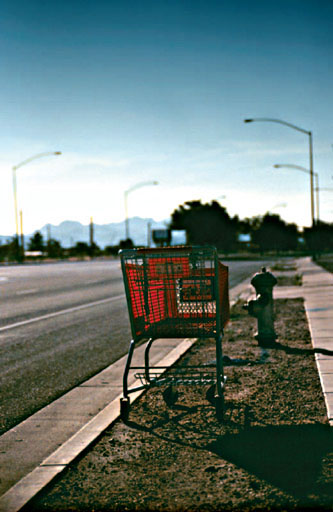
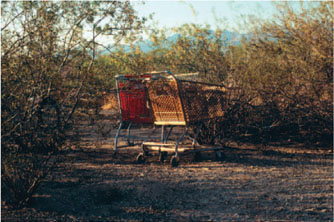
IMAGES © MARK ESHBAUGH, from his series Day’s End, Triptych (Chelmsford, MA).
WHAT IS “THE PHOTOGRAPHIC IMAGE” EXACTLY?
Simply stated, the image is the product or confluence of three components as captured within a frame. The three components can be described as subject, form, and content (Ocvirk et al., 2002, pp. 12–15). In fact, every work of art, including images, sculpture, music, literature, and dance, is comprised of these three components. Although the naming conventions used to describe them vary, it is understood that these three primary components combine to create a complete image or work of art. The subject can be defined as what the image is about; it is the essence or meaning of the image, and may or may not be visibly present in the image. In literature, the subject is often referred to as the theme of the work. An interest in the subject is often the reason photographers make images to begin with; as Magnum photographer David Hum explains, “… photography is only a tool, a vehicle, for expressing or transmitting a passion in something else” (1997, pp. 29–30). As good novels or poems operate for writers, good photographs are generally a means for an artist to convey some specific meaning (a point or message, a theme … the reason behind the work’s existence). The subject of a photograph may range from literal to abstract; however, an abstract subject such as “hope” or “transcendence” (or anything else which is not a noun) can only be conveyed through skillful consideration of the other two components: content and form.
While the term “subject” refers to what the image is about, the term “content” refers literally to the image’s contents. Image content (also referred to as subject matter) can be defined as those persons, places, or things that are visibly present and/or identifiable in the image. When the subject (or theme) and content (or subject matter) are understood as separate yet interdependent image components, photographers can combine them more accurately to convey meaning. The best photographers closely consider all image content as it relates to their chosen subject, and they do so for several reasons. First, all content, like all words, carries meaning that operates on connotative and denotative, subjective or objective, psychological, intellectual, spiritual, cultural, political, and many other levels. Therefore, the inclusion of content which is widely recognized to have specific meaning on one or more levels is more likely to communicate successfully to a wide audience. Second, each discrete piece of content in an image is like individual words in a sentence; each has the potential to either clarify or obscure meaning when juxtaposed. Additionally, like the subject of a work of art or literature, content can be abstract or non-representational; in these cases the remaining component of the image—form itself—might literally be the subject, or might afford the viewer a great deal of insight about it.
To illustrate the difference between subject and content, I often ask students if they are familiar with the novel or film The Shawshank Redemption. Most of them are. Then I ask, “What is the subject of the work?” Invariably students reply that the subject is “an innocent man who is sent to prison and escapes through ‘a river of shit.’” This interpretation by students proves that they confuse subject with content, and are thereby missing the real meaning of the work. I am familiar with the novel and the film, and I suggest to students that the subject of the work is hope or perhaps the nature of redemption itself. The innocent man imprisoned, all of his experiences, the experiences of all those around him, the “river of shit” and his unlikely path to freedom, all fall under the category of content—the concrete, identifiable aspects of the work that carry its subject or theme across. In order to use content to communicate about a subject, an artist needs to provide an organizational structure, and that organizational structure is called form.
The third component of the photographic image, its form, refers to all the means through which the subject and content are unified and presented. Form can be defined as the design elements that the artist combines to arrange a work compositionally, or the formal organization of elements that dictate the appearance of an image. Form, also called composition, in a photograph includes the traditional design elements (line, shape, value, texture, and color), to which I would add quality of light and framing. Mary Price, in her critical text The Photograph: A Strange, Confined Space suggests that what sets the work of more successful photographers above others is the photographer’s “Visual recognition of meaning in form,” and that it is precisely this recognition which “entails the ability to see a three-dimensional objective world in two-dimensional flat form … in instantaneous appreciation of what that segment about to become a separate whole will signify” (1994, p. 84).
It is the interrelationship between subject, form, and content that creates meaning in an image. Since form is the means through which an artist’s chosen subject and content are linked together, it is important to understand the technical elements behind it for a given medium. Form, specific to photography, is in large part dictated by the four technical elements which comprise all photographic imagery. When constructing images, photographers who consciously manipulate the formal arrangement of carefully selected content are able to accurately communicate their ideas about a subject. The manipulation of a photograph’s formal arrangement is in large part a direct result of the technical elements that create camera-made images. That first element is framing.
FRAMING: THE FIRST PHOTOGRAPHIC ELEMENT
Photographers who have had some basic training and practice in photography should fully understand metering and exposure in ambient light situations, as well as the attributes of their particular traditional, digital, or hybrid (meaning a combination of the two) media. Beyond that, they are most interested in creating images that apply their technical knowledge in a meaningful way, and they do so by using the elements of design and composition. But even photographers who know the basic rules of twodimensional composition don’t necessarily understand how to apply those rules toward orchestrating content within a photographic frame. This chapter explores the principles underlying framing in the camera’s viewfmder and addresses the borders of the resulting image.
If the principles governing proper metering and exposure are new to you, see Appendix B for more detailed explanation. As this is not a design text, if the elements of design and rules of basic composition are new to you, I recommend independent research using any of the excellent textbooks available on the topic.
AFFECTING VISUAL QUALITY AND PHOTOGRAPHIC MEANING THROUGH CONSCIOUS FRAMING
Photographic images—images made from the action of light—are contained within a frame. The frame can be defined as the outermost boundaries of the photograph, the structure which circumscribes the photographer’s decisions regarding image content. Framing and borders combine as the first element of photography because they intersect as the transition point between the world and the image at every stage of the image-making process. Framing begins in-camera, continues through the cropping stages, and completes with borders created in the traditional or digital darkroom.
Every camera imposes a frame; it is a constant element of photographic images regardless of camera format or lens choice, determining the specific segment of space and time that will exist within its borders. As soon as you place the imposed frame of a camera’s viewfmder between the world and your eye, you actively engage the first unique technical element of photographic image making that directly affects the visual outcome of the image. You place the camera in front of your eye, and the world, which has no boundaries, is suddenly confined to the square or rectangle of the camera format’s viewfmder. In the words of Stephen Shore, “The photograph has edges; the world does not. The edges separate what is in the picture from what is not … the frame corrals the content of the photograph all at once” (1998, p. 28). Here’s the rub: the frame defines what viewers will see as the image content regardless of the attention paid to it by the photographer. Too often the transition from “seeing” to “seeing through the camera” is not present enough in the photographer’s mind; therefore, thoughtful framing must be developed as a very conscious act.
A visually literate viewer assumes the entire content of the frame to be intended by the photographer; through framing the photographer tacitly states that all content should be addressed toward determining the meaning of the image. In this respect, framing the contents of a photograph is like composing a work of literature; conscientious authors don’t add random words to sentences or unnecessary sentences to paragraphs. For instance, while reading a novel, how would you respond if there appeared non-sequiturs which only served to misdirect you with regard to the story line, and in the end the author notes that he or she didn’t intend the extraneous sentences to be treated as part of the novel at all! Just as meticulous readers interpret each sentence (indeed each word) of a novel in order to derive meaning, meticulous viewers interpret every aspect of a photograph’s content to derive meaning.
At some point in the process, photographers decide what to include and what to exclude from the final image. Framing refers to in-camera decision making, within the imposed frame the camera provides. Photographers make framing decisions based on what they determine to be the important aspects of the scene until the precise moment of exposure (or capture); once exposed, the captured image contains all the content that it will contain. For this reason (and for ethical reasons in fields such as photojournalism or forensic photography) the best time to make framing decisions is while the camera is in your hand and the scene unfolds in front of you.
When framing the content of an image, photographers should ask the following questions:
• Does all the content in the frame contribute to the meaning of my image and lead the viewer to understand what I am trying to communicate about my subject?
• Does any content in the frame distract from communicating about the subject or theme of my image? If so, how can I eliminate it?
• How can I organize the frame so that the appropriate content emphasizes the subject and all other content supports it?
The frame does more than include and exclude potential content; however, it plays an indispensable role in organizing that content. In The Nature of Photographs, Stephen Shore describes some of the visual outcomes of framing through an attribute he calls “flatness.” He says, “When threedimensional space is projected monocularly onto a plane, relationships are created that did not exist before the picture was taken. … Any change in vantage point results in a change in these relationships” (18–19). In this concise quote, Shore touches on three important aspects of framing: vantage point, juxtaposition, and picture planes. What follows is a discussion of those three aspects of framing, because they directly affect the visual organization and hierarchy of image content.
ORGANIZING THE FRAME: VANTAGE POINT, JUXTAPOSITION, AND PICTURE PLANES
When photographers capture an image they do so on the picture plane; that is, the flat, physical surface of the media on which the image is captured. By orchestrating the frame’s contents through careful consideration of vantage point—the distance and position of the camera in relation to the subject—the photographer dictates the hierarchy of information and the visual flow of the image.
In choosing vantage point carefully, the photographer also changes the perceived spatial relationships among various content and dictates how three-dimensional space will be depicted in the two-dimensional image. Will the picture plane minimize the illusion of depth, or will it emphasize that illusion? The answer should depend on how the sense of depth (or lack thereof) in the pictorial space will affect the viewer’s reading of the image. (We will take a closer look at this attribute in the section on picture planes.) In addition to creating spatial hierarchies, vantage point can assist you in communicating specific ideas about the subject or content
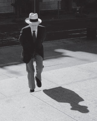
PHOTO © DAVID BECKERMAN, STEPS OF THE MET, NEW YORK, 1994.
In this photograph, David Beckerman uses vantage point to great advantage in framing the man’s light face and hat against the dark background, while ineluding a secondaary figure (the man’s shadow) that mimics his subject’s own from. Also, in pointing his camara downward to include the men’s broken shadow, he balances the the composition and leads the eye into the bottom of the frame www.davebeckerman.com.
in an image. For instance, if you wear making a portrait to someone you admire, and whom you want the the viewer to admire, you might adopt a lower vantage point and literally look up at the person when making the portrait, or place them above (frame your vantage point) the other content in the frame, conversely, if your intent, were to diminish or demean the subject of the portrait, you might literally adopt a vantage point which looks down at the person.
Additionally, by changing vantage point, the photographer organizes the way various aspects of the image content are juxtaposed—the relationship and interaction among discreet contents—and these changes alter the image structure and its subsequent meaning.
“In the field outside the controlled confines of a studio, a photographer is confronted with a complex web of visual juxtapositions that realign themselves with each step the photographer takes. Take one step and something hidden comes into view, take another and an object in the front now presses up against one in the distance. Take one step and the description of deep space is clarified, take another and it is obscured. In bringing order to this situation, a photographer solves a picture more than composes one”
(Shore, 1998, p. 23).
Juxtaposition is akey component in any language; just as words are justaposed with other words to create more complex and specific meaning, the contents of photographs are juxtaposed with other contents in order to add complexity and meaning. The work of Elliott Erwitt provides a classic example of the nature of juxtaposition; the contents within his carefully, albeit spontaneously, composed frames often reference one another in extreme or visually obvious ways in order to create the humor or irony he calls attention to. The work of Alexandre Orion uses juxtaposition as well and can be viewed in the Portfolio Pages of this chapter.
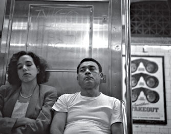
PHOTO © DAVID BECKERMAN, MAM AMD WOMAM, SUBWAY, NEW YORK, 1993.
This photograph illustrates one aspect of the nature of juxtaposition. Buy framing both thr people whose attention is passively downward and sign whose eye intently peer back at us as, David Beckerman juxttaposes two gaze upon other.
The third organizational aspect of the frame is the picture plane—the flat, physical surface on which the image is captured. When the binocular perspective of our vision is removed, one of the three primary types of spatial organization emerges onto a picture plane because of the way that three-dimensional space is ordered when flattened through a single lens perspective. The three types of picture planes are: parallel, diagonal, and overlapping. They delineate the way depth is organized in the pictorial space, and perhaps as important, they dictate the pace at which the viewer’s eyes move into and through that space to read the image.
1. Parallel picture planes emphasize the two-dimensionality of the image; in them the image content is parallel to the picture place, so there is no real sense of depth or receding space in these images. On the one hand they can be viewed as quit and meditative, and on the other stagnant and boring.b One common means of limiting or elirninating the sense of receding space in a photograph
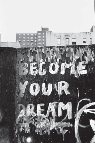
PHOTO © DAVID BECKERMAN, BECOME YOUR DREAM, NEW YORK, 2005.
This image uses a parallel picture plane by facing the content of frame head-on. It creates a confrontational image, with unavoidable connections create between the background high-rise buildings and hand-scrawld Become Year Dream graffiti the froeground.
is to approach content straight on, such that from your vantage point three-dimensionality is minimized.
2. Diagonal picture planes provide the sense of receding space that is created when the photographer’s vantage point is at an oblique angle to the content of the image. In this way the content forms a real or implied diagonal line through the image at an angle to the picture plane. Images framed in this way convey a sense of rapidly receding space, aided by the increased size of content in the foreground in relation to the diminishing sizes toward the background.
3. Overlapping picture planes contain a sense of depth due to image content overlapping from foreground to background. In these cases, the viewer perceives space as receding due to some content being in front of other content form the camera’s point of view Since overlapping occurs from the point of view of the camera, care should be taken to insure that the vantage point helps to clarify the image. Common problems
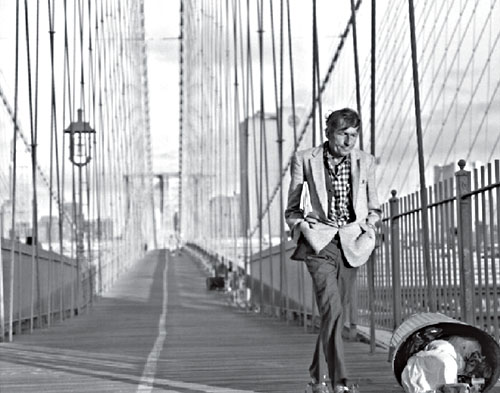
PHOTO © DAVID BECKERMAN, CROSSING BROOKLYN BRIDGE, 1993.
Diagonal picture plane: The image composition creates dramatic depth in receding space, since the frame’s primary content is diagonal to the picture plane. The direction of the subject’s movement toward the corner of the picture also activates the composition and leads the viewer’s eye in that direction, where we view a significant piece of secondary content—an overturned trash can.
of inattention to vantage point when composing overlapping picture planes include tangents (when two elements barely touch and therefore create distracting visual tension) and tonal mergers (when using black and white media in particular, two independent objects that stand apart visually due to color contrast might blend together when reduced to grayscale tonal value … using contrast filters designed for shooting black and white film or adjusting the separate Channels in Adobe Photoshop help prevent tonal mergers from being a problem in the final image).
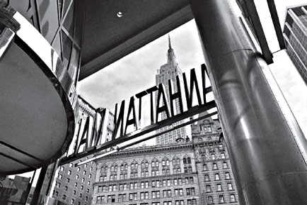
PHOTO © DAVID BECKERMAN, MANHATTAN MALL, NEW YORK, 2006.
This image uses overlapping planes at varying angles in order to juxtapose uses overlapping planes at varying angles in oder to juxtapose content in the frame. It well describes the crowded nature of the place, allow David Becherman to incorporate the name in relation to other contentual slements, and gives the viewer a definite sense of spatial relationships.
CONTACT SHEETS: KEY TO CHOOSSING THF BEST FRAME
Once the images are captured and processed, the next step is to edit, and contact sheets—prints with several thumbnail sized images printed on them—are an indispensable tool for image editing. They allow photographers to look at the sum of images they have created in printed form and choose from the group one or several that most successfully represent their ideas. The most effective contact sheets provide images large enough to view and are of good density, contrast, and color. There are many methods of editing images from contact sheets. I recommend first editing for technical quality: any images that are poorly exposed, out of focus, or have camera shake due to slow shutter speeds should be immediately eliminated—don’t try to “fix” these problems in the traditional or digital darkroom; instead, learn from your technical mistakes and don’t make the same mistakes again. Next, edit for content and formal quality: ask yourself which of those technically sound frames best convey your meaning or express your ideas about your subject. I recommend enlarging these images into work prints, hang them up, and live with them in your office or studio for a while, so that only the best images emerge in your view as successful. Your contact sheets and work prints will also reveal that even the best attempts at in-camera framing sometimes fail to produce the desired result … and it is then that a photographer might decide to crop.
There are great advantages to editing from high-quality printed versions of images (rather than from negatives or from digital files). It is easier to note subtle technical and formal differences from frame to frame—changes in exposure, focal length, distance, vantage point, shutter speed, and depth of field—which serve to significantly affect the image as the photographic process unfolds. In the contact sheets, the evidence of the photographer’s growing awareness and sharpening of the composition of contents from frame to frame is apparent.
CROPPING: FRAMING AFTER THE FACT
While the ideal time to make framing decisions is with the camera in hand, it’s not always practical. For example, in making images “from the hip” a photographer might know to some extent what will be captured in the frame, but cannot predict it with certainty; or when shooting quickly in rapidly changing circumstances as photojournalists often do it’s important to capture the moment. In these cases the decision to eliminate extraneous elements initially captured near the frame edges in the traditional or digital darkroom might help to clarify meaning of the image for a viewer. Conscious cropping is a valid, and valuable, means of defining the content of a photographic frame, although many photographers choose never to crop an image in the printing stage.
The decision to exclude aspects of the original frame’s content is referred to as cropping. There are two times after image capture when photographers have the opportunity to re-define the boundaries of the image by excluding certain aspects of it. Cropping affords photographers a second chance to eliminate extraneous content from a frame prior to publication or exhibition. It can be done at either of two points after capture: during printing or during presentation. The latter, and perhaps the worst, time to crop is during presentation; that is, a photographer might choose to crop a part of an image during window matting or display if cropping decisions were neglected during the previous two opportunities.
In the traditional darkroom, the most indispensable tool for precision either in printing the full-frame or cropping is a four-bladed adjustable easel. There are many brands and types of easels on the market, but those with four independently adjustable blades are best designed to control sizing, framing, and borders of the print. In the technical section of this chapter you will see a variety of techniques used to control sizing, framing, and borders of the print, and a variety of effects achievable through careful use of a four-bladed easel.
BORDERS: THE EXTERIOR EDGE OF THE FRAME
Even photographers who posses a practiced sense of framing and composition in-camera might be delayed in the realization that the image border—the transitional space between the image content and its surroundings—has its own significance. Perhaps because it is a boundary space, the image area’s border carries with it all the weight and connotations of any other, similar boundary. It is the space where a viewer enters, rather unconsciously most of the time, the pictorial space. In this way entering the frame is like opening a book; the quality and attention to the outside cover affect our ideas—whether consciously or unconsciously—about the book prior to our reading a word of it. As an undergraduate photography student I hadn’t thought of “carrier edge” as being anything other than sloppy craftsmanship until my professor, Jack Teemer, explained it in reference to his color photographs of children at play. Of the colorful, jaggedly inconsistent border area he said, “I wanted to suggest that this environment continues beyond the frame.” And it did! Where the image
content ended, there were hints of color and detail extending beyond the interior of the frame, all visually related to the content at the edges all the way around the frame. At that moment I realized the importance of this boundary to the image, and I began to experiment with a variety of border effects in the darkroom, and to consider as part of my printmaking decisions the type of border to create (if any) in order to best carry my message about my subject.
TRADITIONAL DARKROOM BORDER TECHNIQUES
In the traditional darkroom, the relationship between the inside edge of the negative carrier and the outside edge of the image area on the film determines the types of borders that are produced. The interior dimensions of standard negative carriers are made slightly smaller than the dimensions of the image area on film. Because of this, and with the help of easel blades, photographers making prints using standard negative carriers tend to produce prints with a “clean edge” almost by default; that is, assisted by the easel blades the print’s image area ends where the white space of the paper begins. If you don’t like that option for your images, some simple planning and engineering of the negative carrier can make a marked difference in the appearance of your printed image borders. See the Technical Tutorials Section for Chapter 1 for a detailed discussion of how to alter your negative carriers to produce specific effects.
In the following examples, prints made from traditional black and white negatives demonstrate several types of border effects. These border effects are some that I refer to as “organic”; that is, the borders are a natural outcome (albeit nurtured) of the interrelationship among the tonal values at the edge of the negative, the edge of the carrier, and exposure to light. I recommend making work prints with several different types of borders in order to help you to determine how these effects reflect on the subject and content of your images.
• Borderless: In this example, fine art photographer Todd Dobbs created a traditional darkroom gelatin silver print using a long strip (multiple Holga camera exposures overlapped) of 120 film placed in a glass negative carrier. The carrier was masked at the image edges using rubylith tape, and the easel blades were adjusted to be just inside the image area to create a clean edge. The resulting clean, pristine border between the image area and the paper is a somewhat default method of printing standard negative sixes. Borderless prints suggest that the border itself is inconsequential to the meaning of the image.
• Fine black border: With the negative placed in a filed out negative carrier, the easel blades are adjusted to a
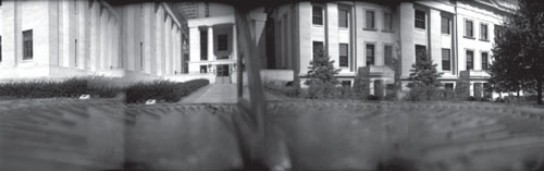
IMAGE © TODD DOBRS, BUILDINGS NO. 12, 2002.
position just outside image area to include the film base plus fog. The width of the black border can be adjusted to anywhere inside the projected negative carrier edge. By creating a black border around the image area, the photographer tacitly points to the boundary of the image, and the viewer more consciouslv enters the pictorial space.
• Vignetted borders: In addition to any of the borders that the carrier helps to create in the darkroom, you might choose to vignette the image—to darken or lighten gradually—toward its edges. To do this is simple in both the traditional and digital darkrooms, but it’s also easy to go overboard and create a poorly made vignette, so practice and technique are essential. As a supplement to the print exposure, the photographer adds density to the outer edges of the image by burning them in, or reduces density from the outer edges of the image by dodging them. The degree of the vignette is determined by the duration of the burn or dodge as well as the contrast used. Whether a standard or filed out carrier is used, when the edges of the print are vignetted, the viewer’s attention tends to remain more inside the frame.
Most often, vignetted-edge manipulations carry with them connotations of memory, traveling back in time, or projecting forward to the future. They can also allude to notions of ephernerality, ethereality, and other transitional states. The edges create a smooth visual transition into the pictorial space, allowing the viewer to enter the image and regard its contents gradually. Vignetting applied to the wrong image content can have an overly sentimental or cliché feeling, but a conscious photographer will avoid such cliché. One successful example demonstrating the visual and communicative power of vignetting is in a series entitled At Rest by fine art and portrait photographer Melissa Mercado. The images are presented as diptychs, and are the product of hybrid (combined traditional and digital) media.
A variation of these vignetting techniques is to vignette the border through burning, with the entire sheet of paper printed to black. To do this, an exposure set to maximum black is made to the area of photographic paper outside the image area, after the initial exposure is made. Simply place an opaque board of the size of the image on top of the image, lift the easel blades, and make the exposure to the remainder of the paper
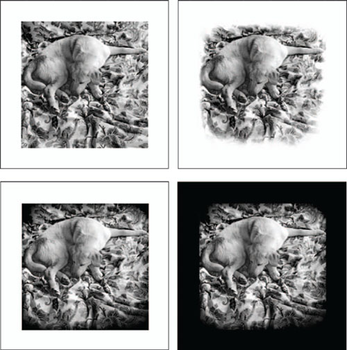
IMAGE © ANGELA FARIS BELT, DHARMA IN A PAISLEY FIELD, 2005.
Clockwise from upper left: plain border, fade to white border, vignetted border with paper printed to black, and vignetted border. The various methods used to print the borders of the final image change the feeling and intensity of the image, and affect how the viewer reads the image content.
surface. Techniques such as this are often used when the treatment of the entire sheet of photographic printing paper is considered a part of the work itself. Often, prints such as these are displayed “floating” in a frame using spacers (and no window mat) or are incorporated into a larger whole.
THE DIGITAL REALM: BORDERS WITHOUT FILM EDGES
With digital photographic capture, there is no physical media edge extending beyond the sensor, and so nothing extending beyond the image area with which to continue the frame’s communicative effects. As a result, many photographers have gravitated toward borderless images or the use of template borders. Template borders are prefabricated borders that are often supplied with online Photoshop tutorials and are digitally loaded into the image document and set in place. Template borders are either scanned or digitally created and often appear similar to borders such as those created through use of Polaroid Type-55 or Polaroid transfer images. While these borders are adequate for many commercial and graphic design applications, artists want to create and control the appearance of their image even to its borders.
The emphasis here is on hand-made (what I call “organic”) borders, specific to the image content itself. While the appearance of traditional darkroom borders is dictated by the physical relationship among the film edge, carrier edge, and easel blades, the appearance of digital darkroom borders is dictated in Photoshop with the primary relationship among the image size and canvas size, and the effect of image layers and blending modes on the tones occurring at the image edge. In traditional darkroom images the carrier edge is unique to each image; the potential for that same unique-to-the-image character exists for digital darkroom images with some understanding of the tools, practice, and patience.
In the Chapter 1, Technical Tutorial Section called Digital Darkroom Borders, I will attempt to lure you away from the ease of canned effects, and toward more organic and conceptually sound approaches. These are simple techniques designed to help you begin experimenting with the borders of your digital images. Once you begin to work with the tools, you’ll find that there are myriad ways to affect the look of your image borders without using canned borders. I’ll outline creating fine black borders, and creating “painted borders” using the edge tones and colors of the image itself, and applying blending modes to create a seamless transition. These tutorials offer starting points, and unlimited results can be achieved if you are willing to experiment.
IMAGES © ANGELA FARIS BELT.
Fine Black Borders Technique
CHAPTER EXERCISES
In the Introduction to this text, I suggested that you choose a specific subject or genre, and to work with it throughout the chapter exercises. You should choose a subject that will be engaging to you visually and intellectually throughout the exercises; a subject that is of interest to you and that has the potential to be of interest to others. The reason for doing this is simple; it will enable you to approach your subject in a more faceted way, guided by the grammatical elements of photography. Throughout the course of these exercises you will learn a great deal about both your subject and the elements that guide photographic language. Through critique you will begin to fully understand how the elements of photography can be manipulated to better communicate a visual message about your subject. Before commencing with the first exercise, clearly define your subject or concept and commit to conducting research about it. The more you know about your chosen subject, the more likely you are to make informed decisions about content, and the more able you are to use photography’s technical elements to guide your creation of meaningful images.
For all of these exercises you may shoot traditional or digital media, color or black and white, or you might shoot an alternative media with an alternative camera. Media choice is up to you.
Exercise No. 1: Making Conscious Framing Decisions
This exercise should be used to define your subject both for yourself and for your viewers, and it should assist you in maintaining awareness of your in-camera framing decisions. Concentrate on using the imposed frame of the camera’s viewfmder to define the content of your images. For each subject or scene, make two photographs:
1. Fill the frame with the subject matter. For this image, leave no area inside the frame untouched by the primary subject matter, and try your best not to abstract it. That is, frame the content such that the viewer still knows what he or she is viewing, but so that it encompasses the entire frame.
2. Photograph the same subject matter so that it fills only a small (perhaps 10%) portion of the frame. For this image, secondary image content is used to support the subject and lead the viewer to it.
Understand that it will likely take several images per scene in order to achieve the two successful images for each. Study your results, and edit several images to enlarge.
Exercise No. 2: Picture Planes
Conscious structuring of content within the picture plane allows the photographer to dictate the sense of space that the three-dimensional world takes within the two-dimensional picture plane. It also dictates pace at which viewers will read the image, and the viewer’s sense of spatial relationships among various content within the image.
For this exercise, make three images of each scene you photograph. Remember that it will likely take several images per picture plane in order to achieve three successful images:
1. Structure the content using a parallel picture plane.
2. Structure the content using a diagonal picture plane.
3. Structure the content using overlapping planes.
Consider the placement of your subject matter and the way that the sense of depth (or lack thereof) through the picture plane affects your viewer’s attention to it, their pace at reading the image, and sense of relationship between objects within the pictorial space. Remember to use a sufficiently small or large aperture to render the depth of field you need.
Exercise No. 3: Darkroom Borders Experimentation
Edit and print three identical copies of your four best images from the previous two exercises. These should be your best four images from the exercises, not comparison images from a single exercise. Using the media of your choice, create 2–3 different border effects for each image. Critique these images and determine which border effects work best with your subject and what you were trying to say about it. Determine whether this border effect might be used throughout the series of images.
PORTFOLIO PAGES
The artists represented in the Framing and Borders portfolio pages engage in a wide range of photographic practices. To create their work they use traditional, digital, and hybrid media, and they consciously (visually as well as conceptually) address the framing and borders of the photographic image. The work in these pages is not about framing and borders; rather, it uses them as visual strategies to support or address the subject of their images.
These images are intended to inspire creative thinking and critical debate about the content and subject of the work, as well as the use of framing and borders in relation to that content. Additionally, what other artists do you know whose work uses the frame consciously, or refers to it in the work literally in order to comment on their subject? How might a more conscious use of the imposed photographic frame and created borders of the print add dimension and meaning to your images?
METABIOTICS
ARTIST STATEMEMT
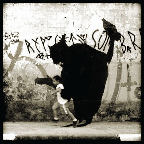
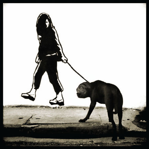
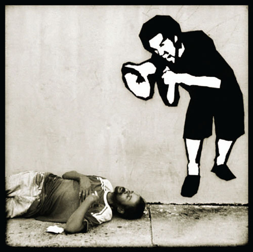
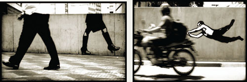
Alexandre Orion grew up in some of the busiest streets in Brazil. As a child in São Paulo, he became accustomed to sidewalks thronged all day, and the din of traffic at night. Orion was quick to respond to the appeal of the streets and his first graffiti was done at the age of 14. While adolescent instinct drove him, the hard reality of the streets called for new ideals. Now he draws inspiration from multitudes; silence and thought; experiences and memories; happiness and suffering. An artist amid the crowd, the many found within him. Humanity lives in Orion: his time unique, his universe collective space.
Discovering photography in 2000 coincided with an interest in the theory of image in Barthes, Dubois, and Aumont. A year later, his Metabiotics project involved finding a place in the city where he would paint the wall and with his camera at the ready, await the decisive instant when people interacted spontaneously with his paintings. Framing the precise situation promoted a joining of painting and real life, encouraging an encounter (or confrontation) between reality and fiction within the field of photography.
This decisive moment of interaction between people and painted image led to Metabiotics, as opposed to traditional photography’s conveying the false idea of all that is photographic being real. Metabiotics questions truthfulness: the paintings were actually done in the walls, people really did pass by and act spontaneously, but what we see suggests a type of montage that did not exist. Everything is both true and false.
METABIOTICS CONCEPT
Origin:
Metabiosis, female noun. Intermediate symbiosis; a state in which an organism only survives after another organism has prepared a favorable environment and died. Portuguese Language Student Dictionary, Brazilian Ministry of Culture, 1976.
Definition:
Meta—Greek prefix meaning objective, target, limit, or transposition.
Bi—Latin prefix meaning duplication or repetition.
Otics or optics—part of physics that studies the phenomena of light and vision.
Explanation:
Painting and photography share the same environment like two inseparable yet incompatible organisms. Photography as purpose is an environment in which there is no distinctive boundary between attachment and detachment between languages. There is something beyond the two viewpoints: a tenuous and infinite gap that leads us to non-existence.
Alexandre Orion, visual artist
“THE IN-BETWEEN”
ARTIST STATEMENT
Personality is continuously shaped through associations with people in our immediate environment and our perceptions of the world. In a nation established on immigration many of us are products of cross-pollination and are caught among several cultures. Habits, stories, and traditions from various groups are passed from one generation to the next and most of these things transform over time through a subtle metamorphosis. One of the results is a magnitude of assumptions made about others based on a pre-constructed interpretation. My artwork is driven by a fascination with the invisibility of such transmutations and its effect on our society as a whole. Overall, exploring heritage is a rich journey, particularly in a time when social equality and ethnic recognition are prominent political topics.
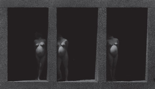
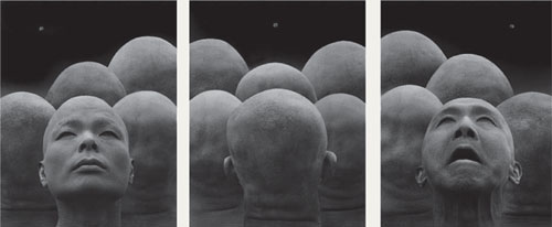
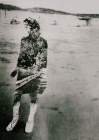
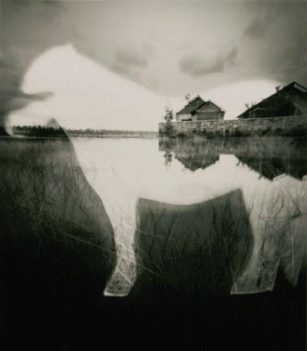
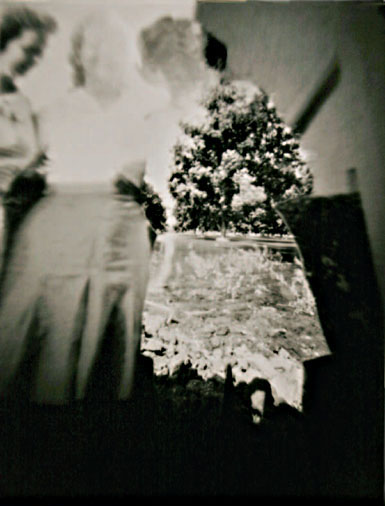
The dreamy quality of the pinhole camera distorts the sense of scale of the landscape and the dioramas. Likewise, the primitive quality of the camera contrasts a current obsession with technical advancement. Cutting out various shapes of figures or objects and placing them in front of the photograph from which they came makes it seem as if they have stepped out of time to confront the viewer. The duplication of characters is similar to the retelling of the stories and the open silhouette holes are analogous to the vacant cultural histories of the displaced. Subsequent generations, such as my own, find themselves in-between imagination and the real world in order to put pieces together to build understanding and define distinction.
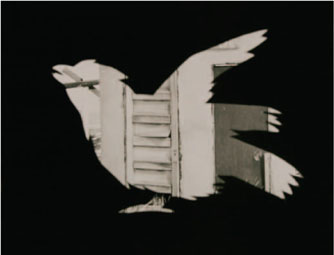
convene, 2006.
convene, 2006.
buoyant, 2005.
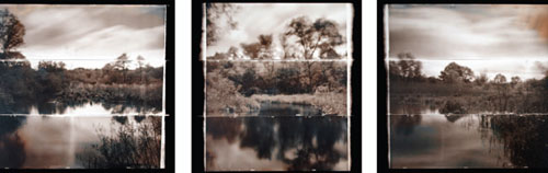
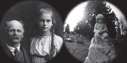
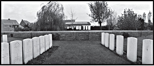
TEARS OF STONE: WORLD WAR I REMEMBERED
ARTIST STATEMENT
While on a research trip to France, I was deeply moved by the sheer number of monuments created in honor of those who died in World War I. The unprecedented number of wartime casualties introduced the concept that when a country loses a huge portion of its population in wartime, it has a need to acknowledge and defend the sacrifice in a public manner. In Western Front countries, the thousands of national, local, and private memorials that were built became, and continue to be, places of pilgrimage and remembrance, along with the hundreds of military cemeteries where soldiers lie buried.
A desire to examine the manner in which these men are still memorialized today became the catalyst for the body of work titled Tears of Stone: World War I Remembered.
Undertaking acts of remembrance to lost loved ones can be a profound experience, regardless of culture or era. As long as the objects of remembrance that came to be built after the Great War continue to exist, it is my belief that the memory of those who fell will continue to be honored. In that sense, these photographs act both as a reminder of the ongoing cost of historical events and as a mirror to the human heart.
Process Information
Two medium format panoramic cameras, a Pinoramic 120, and a Noblex Pro 6/150 U, were used to photograph Tears of Stone: World War I Remembered. Working in a panoramic format allowed me to make pictures that did justice to the nature of my subject. I chose to include a black border around each photograph in part to lend visual gravity to their content. However, it is customary in many European countries to include a black border around obituary notices and photographs of the deceased. Including a black border around photographs of European war cemeteries and monuments was consistent with that custom.
After editing from contact prints, the negatives of the chosen images were drum scanned and retouched in PhotoShop®. The exhibition prints were made on Epson® printers with Piezography™ BW software and quad black inks, on Wells River digital watercolor paper.
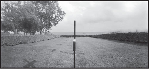
Achiet-le-Petit German Military Cemetery, France.
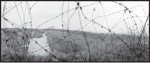
Fort Douaumont, France.
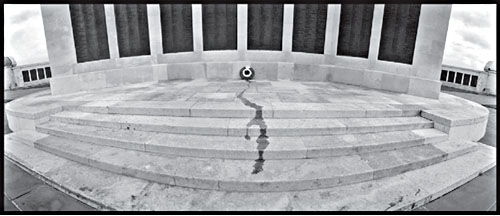
Chatham Naval Memorial, England.
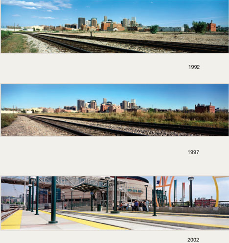
CITYSCAPE PANORAMA PROJECT
ARTIST STATEMENT
The Cityscape Panorama Project is a manifestation of my interests in the built environment, change, downtown Denver, panoramic viewing, light, and the preservation of memory.
In 1992 I walked throughout Denver, taking 160 snapshots with the intention of deciding on a certain number of views that would define the city, and set the stage to record its fabric and pace of change. These were edited to 40 views that I believed accurately represented the various looks of downtown from attractive to ugly, from humorous to sad, from boring to stimulating. I stepped away from my commercial sensibilities of making everything look glamorously lit and planned to shoot at all times during the day.
I also planned to keep careful records of each shot, its location and the weather conditions, so that I could return in 5 years, repeat the shot under similar conditions and allow for an “apples and apples” comparison.
I have now shot each of the views three times, with a fourth planned for August and September of 2007.I have to say that the results have been highly rewarding on many levels, and eye openers as well.
This project has many facets and implications. Some are about form: lighting, composition, and timing. But the most significant aspects are definitely about content.
Watching the city change tells us about what works and what does not. It makes us think about what should remain, and what could change. It is a visual record in a society that has so many organized written records and so few organized visual records. On this topic, I have become a bit of an evangelist, encouraging communities of any kind to visually record their environments.
Showing this work has made me realize something important which is that I enjoy projects that appeal to my fellow artists as well as people completely removed from the art world. Both seem to be engaged by the photos, spending long periods examining the prints.
Finally, I would like my viewers to think about the value of the “preservation of memory.” It is so easy for us to forget what was on a corner a short while after it has been replaced with something else. The Cityscape Panorama Project helps us retrieve those memories as individuals and as a society.
Process Statement
The Cityscape Panorama Project is shot on medium format color negative film, using an Art Pan camera with a ground glass back that yields a negative of 2¼″ by 9½″ with a field of view of approximately 90°.
During the first year of the project, I shot transparencies, and in ensuing years I have been able to reproduce the exact same compositions by taping outtake transparencies to the ground glass and using them to align the views. I scan the film and make digital prints.
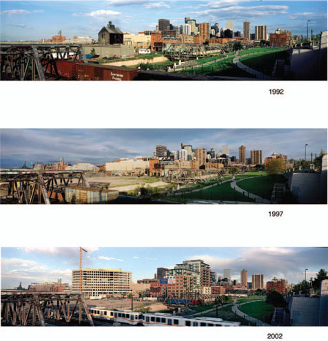
Rail Yards, 1992, 1997, 2002.
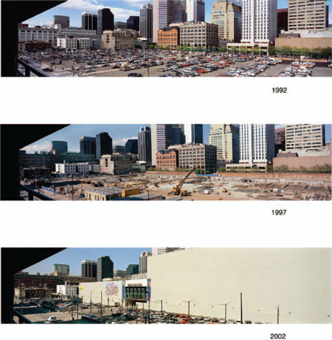
Pavilions, 1992, 1997, 2002.
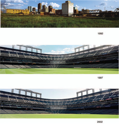
Ball Field, 1992, 1997, 2002.
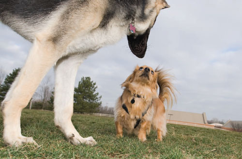
BOB
ARTIST STATEMENT
I’ve done art projects before (Ernie: A Photographer’s Memoir, Capra Press, 1985) where I’ve focused on an animal for an extended period of time (2–3 years). Ernie was my first book, and my most successful book as far as sales, but since then I hadn’t done an animal project. I figured, I’ve done that.
But then, Bob came along. Bob is my first dog, and I’m fascinated by him. I’ve been photographing him and his friends forthe past 2 years. All the pictures are done with flash, and especially, from the eyelevel of the dog. Animal pictures are usually done by photographers standing up and aiming down. The low vantage point captures their world from their perspective. Having the sky in every picture also provides a cool tone to balance the warm colors of the dogs.
Process Statement
I shoot all the pictures with a Nikon 10 megapixel digital SLR. All the pictures are shot with flash, which allows me to stop motion, use a large depth of field, and provide terrific sharpness. I usually take a lot of pictures of every situation and always check the camera’s display after every picture, to see if the exposure and the frame are working for me, and if they are off, I adjust for the next shot. I print them at home with an Epson wide printer, to a size of 24″ × 36″, on Epson ultra smooth fine art paper.
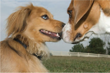
Untitled from Bob.
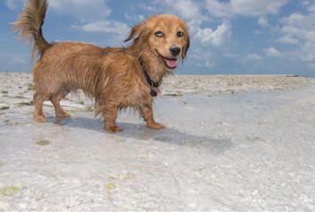
Untitled from Bob.
Untitled from Bob.
LIVING ON BENSON HIGHWAY
ARTIST STATEMENT
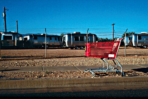
My work explores ideas of representation, and I often attempt to simultaneously engage realistic and idealized reads of my work. By instilling some measure of doubt or uncertainty concerning the images, I endeavor to explore the representative nature of images on what and how we think. It can be through association, questioning ideas already formed, or bringing about new ones by prompting the viewer into interpretive dialog. This allows a kind of semiotic approach to the work: studying signs and symbols, what they mean, and how they relate to the things or ideas they refer to or represent. This work focuses on a short stretch of county highway that was once a major business thoroughfare and has since been severely impacted by the adjacent construction of a newer interstate highway. Now lined with defunct shops, bars, restaurants, derelict motels, and homeless encampments, the numerous dislocated shopping carts found in the area became acutely symbolic of how the landscape and its inhabitants had been transformed as a result.
A unique characteristic of any work of art is its capacity to provoke a viewer’s imagination based on representation. Interpretation of a subject’s meaning is dependent on both the objects represented and the setting of representation. In photography, every time you compose an image you make choices about framing. It’s important to have the final image in mind, so as to arrange things in order to achieve the desired effect. Framing provides the general background or context within which something takes place. To allow for a contextual read, it’s essential to look for compositional devices that add meaning to the subject matter. Working with the premise that “meanings are contextual” or rather that something, in particular an object, does not inherently have meaning suggests the meaning is dependent on the setting in which the representation occurs. Thus juxtaposition comes into play, and placing two or more things together suggests a link between them or emphasizes the contrast between them. Successful framing will ultimately allow the meaning of the image to effectively begin revealing itself.
Roadside #1, 2004.
Homeless Camp #1, 2004.
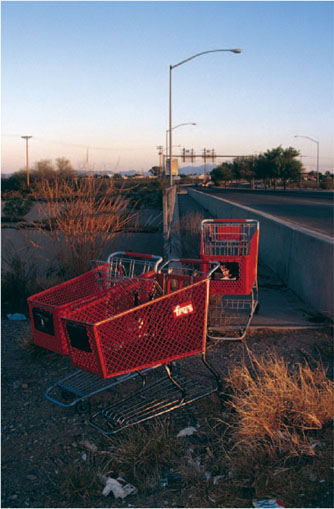
Highway Ramp #1, 2004.
SUB-VERSION SERIES
ARTIST STATEMENT
I’m a Romanian-born photographer who has lived and worked in Mexico, Europe, and the United States. Since 1990 my work has been involved with ideas about transience, loss, identity, memory, and war. I’m interested in the lines of destiny that shape our lives and the tidal waves of history that can sweep those lines away.
My current project, Sub-version was begun in the aftermath of 9/11 as an effort to conjoin the scenes of violence emanating from my television with the eerily quotidian view of life outside my window. I combine documentary and staged photographs to explore interconnections between truth and fiction and to portray how politics and world events increasingly enter our daily domestic sphere.
Sub-version is about terror, mass media, post-millennial anxiety, dual realities, shadowy threats, and ominous rumors.
Regarding Framing and Borders
I work mainly with 35-mm film cameras and wide-angle lenses for maximum portability, spontaneity, and engagement. My hands are so familiar with the equipment that I don’t have to think about mechanics and can direct my full attention on the formal aspects of the picture and the mood and meaning I’m seeking to create. I compose with an awareness of the edge of the frame, allowing reality to play itself out before me—until that crucial moment of tension and Tightness when I choose to release the shutter.
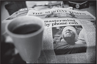
The Times, London, September 18, 2002.

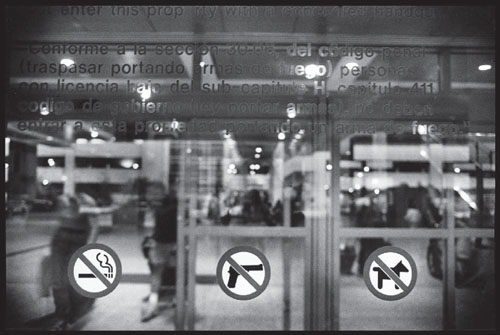
Intrusion, Utica, NY, September 15, 2001.
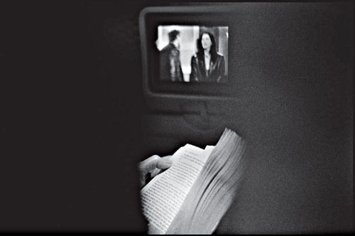
Arrivals, Austin, TX, March 19, 2003.
PHOTOGRAPHY
ARTIST STATEMEMT
The greatest power of the photograph, our belief in its straightforward truthfulness, has been lost forever. We place our confidence in what accurately represents reality, and photography, with its realistic accuracy and exactitude, has long been aligned with “truth” and its etymological relative, “trust.” Its undeniable advantage to painting and other mediums is that we subconsciously believe that what is photographed has to exist.
In the digital era, however, truth can be conjured and changes made quickly, with no chemicals, no darkness, and no mistakes.
My first introduction to digital photography demonstrated how similar it is to analog techniques and I believe that a soul of a photograph, its magnetic language of feeling, can be achieved both ways. At this moment, however, I do not see any reason to switch to digital manipulation. I still prefer the glowing quality of the original print and the laborious process to achieve it.
Process Statement
All my images are assembled in a traditional darkroom under one enlarger using a masking technique developed and perfected over the years.
The process is always the same. Once I have determined my concept, I work out my compositions in sketches. Using my sketch as a guide I photograph components of a future image. Before I print the original, I make tests and adjustments for every negative to be printed. I write the tables where I indicate the proper exposure and all sequences of manipulations for every negative used. Next is the stage of “dry” printing. This part is the most unforgiving. I meticulously project one negative after another, constantly changing precise masks until the last negative is used. One mistake and lots of time is wasted.
The next step is the most exciting part of the process— developing the print of the first edition. I usually print editions of seven plus three artist’s proofs.
Doubt #11.
After the first print is developed and closely inspected, the tension disappears. It feels like returning home safely after a long, long drive.
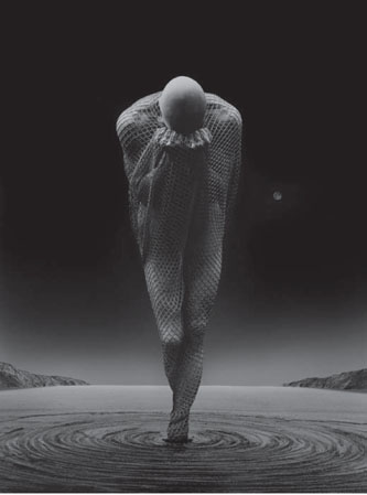
Doubt #12.
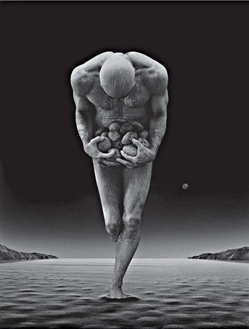
Sheptun #1.