MATERIALS AND
PROCESSES:
THE AGGREGATE
IMAGE
“THE PHOTOGRAPH IS NOT A PICTURE OF SOMETHING BUT IS AN OBJECT ABOUT SOMETHING.”—ROBERT HEINECKEN
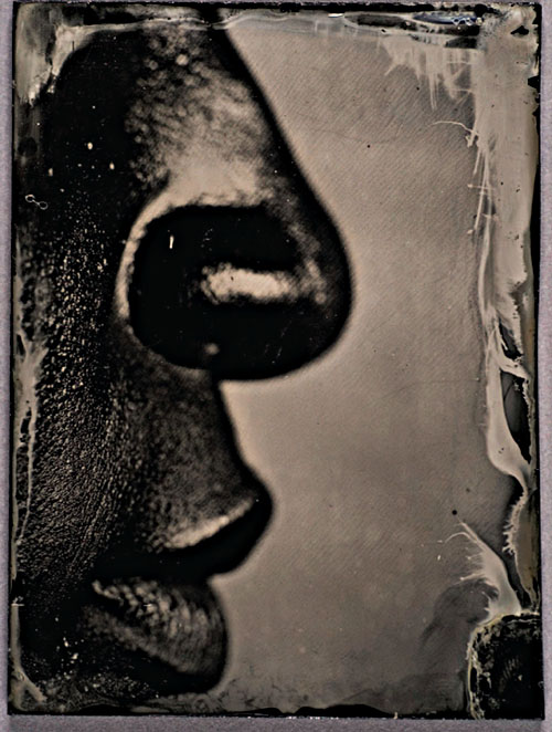
PHOTOGRAPH © MYRA GREENE, Untitled, from her series Character Recognition; 3″ × 4″ black glass plate Ambrotype.
How many Americans, in particular those interested in U.S. history, have read the Declaration of Independence (or the Bill of Rights or the Constitution) in a textbook, online, or in any other publication? If you are moved by the words in this influential document, how much more so would the words affect you if you gazed upon the actual, hand-written object (housed in the Rotunda of the National Archives in Washington, DC)? What is it about being in the presence of the physical document that imbues its words and their message with more power? Perhaps it allows us to connect, through time and space, with the document’s creator. Perhaps we recognize in the object itself the ability to bridge time and space, its physical presence a testament to the enduring nature of the things we create. The central component of a historic document or a work or art that loses impact, in whole or in part, in a reproduction is its form. The subject (or theme) and the content (in this case the words) are present in reproductions, but the form they take … in the color of ink used, in the quality and tone of parchment, as well as the style of handwriting … are all absent. This is a central element, the part of the work that can communicate a sense of the thing itself when tied to its subject and content.
A discussion of the Declaration of Independence might seem misplaced in a book about photography, but it isn’t. The physical object of the photograph also holds significant meaning. While a reproduction of a photograph in a book, magazine, or on the Internet can carry the message of the image, in many cases it cannot embody its entire meaning. A photograph that is intended to take a particular physical form beyond the ephemeral image in the camera is intended to be regarded as an object. The ability to view reproductions of objects in various forms is an advantage in terms of sharing and disseminating information to a wide or even global audience, but copies fall short in their ability to translate the experience of the thing itself.
This is the fourth element of photography: the physical materials and processes comprising the object that contribute significantly to the meaning of the image. All photographic images are affected to some degree by the materials and processes from which they are made; some images, such as photojournalistic images, surveillance photographs, x-rays, ID photos, and the like are not particularly dependent on materials and processes in order to communicate their meaning fully. Other images, however, are greatly affected by the specific materials and processes used to create them, and rely on this element of photographic language in order to communicate their meanings. Those images are the ones addressed most specifically in this chapter.
MATERIALS AND PROCESSES: TECHNICAL CONSIDERATIONS AND VISUAL OUTCOMES
As stated in the introduction, this book is about the four elements that comprise the technical foundation, as well as dictate the visual outcomes, of all photographic images. They form what I refer to as the grammar of photographic language. Framing, focus, and the rendering of time and motion are all associated with image capture, but are also controlled in post-capture image production. The final element, materials and processes, is different from the first three in that this element is not controlled through the camera mechanism, but it is integral in that materials and processes is the very stuff of which the image is made. Included in this discussion are aspects of the physical object that are important in forming the image. There are three primary aspects of this photographic element: grain structure; surface structure (tint, tone, and texture); and size and scale. Additional discussion is devoted to the impact of the viewing space on the image.
Grain Structure
Since light-sensitive media is itself a physical object, its surface texture and physical composition impact the quality of the image it captures, literally imposing an image of its own physical nature into the image it captures. Both traditional film and digital sensors have similar characteristics pertaining to light-gathering ability and its effect on images; “grain” is not the technically correct term for referring to the makeup of digital sensors, but for this discussion it helps to think of a digital sensor as being composed of millions of evenly spaced, identically sized light-gathering particles.
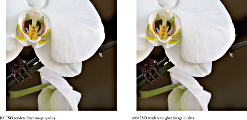
The light-gathering ability of photo-sensitive media is rated by the International Standards Organization (ISO); the lower the ISO rating for a given media type, the slower the media responds to light to record an image. ISO numbers are explained at length in Appendix B of this text. As a general rule, slower ISOs produce images with finer grain (traditional) or noise (digital); faster ISOs produce images with larger or more apparent grain or noise. The reason for this is that with traditional film, the faster the ISO, the larger the actual grains of silver have to be; this provides a larger surface area for light to render adequate exposure faster. With digital media, the effect is similar—increased noise with increased ISO—but the reason is different; digital sensors are optimized at their slowest ISO, and the electrical signal created upon exposure to light is amplified when you move to higher ISOs, thus rendering faster exposure but with noisier image quality.
There are two other image quality considerations related to light-sensitive materials. They are resolution and acutance. Resolution refers to the material’s ability to produce a detailed image; acutance refers to the material’s ability to produce fine edges and transitions between tonal differences. In general, the slower the ISO the finer the resolution and acutance, but other factors such as lens quality and differences between media—say, silde film versus negative film, and digital sensor types—are also significant.
The following example represents an image captured digitally at both 100 ISO and 1600 ISO sensor speed ratings. The blow-up versions show the increased noise caused when a faster ISO is used.
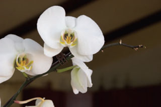
PHOTOGRAPH © ANGELA FARIS BELT 2007.
Generally speaking, photographers choose the ISO rating that best suits the lighting condition and exposure needed, but often the decision about ISO can be made for purely awsthetic reasons. For example, consider that since slower ISO media creates a finer image, it might communicate more seamlessly or transparently about a subject, while faster ISO media might draw a viewer’s attention to itself through added texture. In addition to the capture material’s ISO characteristics, the processes used in the traditional or digital darkroom can emphasize either extreme. Using the materials and processes together enhances your ability to communicate to your viewer.
Imagery about difficult subjects, for instance poverty, war, disease, social injustice, or violence, created with the grainy, gritty texture of the materials enhanced, transmits a more concrete and visceral experience to a viewer than could the same imagery using the finest grain structure. The potential impact of maximizing the light-sensitive material’s structure is apparent in Robert Frank’s The Americans, and is underscored in the storm of American public response to the work. More recently, it is powerfully utilized in Jim Goldbeg’s Raised by Wolves, a social documentary account of San Francisco and Los Angeles inner cities’ homeless teens. The images use grain as a communicative element, since
smooth, silky imagery that minimizes the light-sensitive material’s structure is in many ways at odds with the intellectual and emotional response their subject should evoke.
Surface Structure (Tint, Tone, and Texture)
A second significant aspect of the materials and processes from which the photographic image is made has to do with the surface structure of the image—the hue (actual color), value (relative degree of light or dark of the color), and intensity (the saturation or purity of the color) of both the substrate and the image material, as well as their texture. These are considerations even when the image is said to be black and white, because neither the substrate nor the image material may be a pure neutral tone, and even a subtle degree of color can make a dramatic impact on the feeling of an image.
That the surface structure so dramatically affects the appearance of the final image is a reason enough to understand its nature, since the appearance of the image affects its interpretation. Understanding how color forms in a photograph does not take a degree in chemistry, but only the ability to research the materials you wish to use. Although the two terms are often used interchangeably, for this discussion, I will use the term tint to refer to the substrate’s color characteristics (the paper, fabric, etc., that the image is printed on), and I will use the term tone to refer to the color characteristics of the image material (the inks or emulsions that form the image).
Tint: This refers to the paper or substrate’s density and color characteristics including its hue, value, and intensity. Some papers look warm, some neutral, and others cold. Some papers look bright white, some natural white, and others dingy white. Alternative printing materials can also be used, such as linen and other fabrics, 3-dimensional substrates, and even clear glass, to which photo-sensitive emulsions are added. It should be understood as well that the tint of the substrate is often responsible for the perception of contrast in the image.
The tint of the substrate is a factor in both traditional and digital imagery. While pre-sensitized substrates for traditional darkroom use are becoming more limited, coated inkjet substrates are becoming more varied. Rather than use coated substrates for inkjet printing, some artists use traditional watercolor papers and other materials for printing with inkjet technology, and others are transferring inkjet prints from one substrate onto another similar to Polaroid Transfer techniques. The results of these printing methods vary widely, and experimentation is required for greater understanding and control.
Tone: This refers to the color characteristics of the image material; these are the inks, dyes, or emulsions that form the image on the substrate.
When using chemical emulsions, the degree of light sensitivity (how fast or slow the emulsion responds to light) might be a consideration that limits aesthetic choices about tone. Additionally, the chemical processes used in developing the prints affect the color of the image. There are three basic emulsion formulations of black and white darkroom printing papers, though the numbers of available papers are dwindling.
1. Chloride emulsions: These emulsions are generally used for contact printing, as they have slow sensitivity to light and will often fog before an enlargement can be made. They tend to produce warm tones, and can be used for split-toning using a heavy selenium bath.
2. Bromide emulsions: These emulsions are generally used for making enlargements, as they are more sensitive to light. They tend to produce a more cold tone print.
3. Chloro-bromide emulsions: These emulsions are a mixture of the previous two, and can produce exposure and color qualities anywhere in between, depending on the ratio of chloride to bromide.
Texture: Substrates, emulsions, and other image materials have texture that imprints itself onto the final image. Textures range from smooth, slick, high gloss, to toothy matte; they have a dramatic effect on how the image tone is applied to the material as well as on the reflective value of the surface. They also affect how the materials must be handled, since many more glossy materials must be handled with extreme care as they are prone to surface scratches. High gloss materials often are associated with commercial photography applications while more matte surfaces carry with them connotations of hand-made quality.
Various tints and tones, as well as surface textures of prints greatly affect image appearance, thereby influencing how the viewer interprets the image. Decisions regarding these
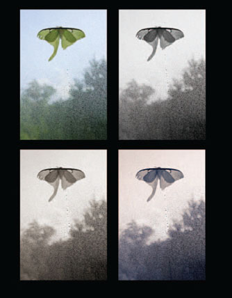
PHOTOGRAPH © ANGELA FARIS BELT, LUNA MOTH, 2006.
Clockwise from upper left The original color image, a grayscale version, a split toned version, and sepia toned version.
aspects of image production are important throughout the process, and research and experimentation are invaluable guides.
DIGITAL DARKROOM GRAIN AND SEPIA EFFECT
Although digital sensors are capable of producing very fine detail, sometimes that’s not what you need to make your images work well. Sometimes you want grain or noise to add perceived texture to the image, and there are ways to enhance it in the digital darkroom. The “Grainy Effect” tutorial found in the Tutorials Section for Chapter 4 walks you through a simple procedure developed by one of my students, Jennifer Hardman.
Size and Scale
Materials and processes determine important aspects of the appearance of photographs precisely because we relate to them physically in a visual sense. The image’s appearance affects us, not only because of its subject and content, but also because of its form, including all of the physical attributes of the image. One of these attributes, which exists somewhat outside of materials and processes, is the size and scale of the image. Just as the aesthetics of focus range from uber-sharp to unrecognizably diffused, the aesthetics of size and scale also display a range. But the determining factor for the size of images shouldn’t depend on the current trend; rather, it should depend on factors such as practicality (what is the end use of the image and what is an appropriate size for this end use) as well as how the size of the image content relates to its viewers, and what the size of the image says about the subject.
Susan Stewart, in her critical text On Longing: Narratives on the Miniature, the Gigantic, the Souvenir, the Collection, states that, “The body is our mode of perceiving scale.” Our perception of the size and scale of anything outside our bodies is relative to our own (human) size. Stewart says that, “The miniature is considered … as a metaphor for the interior space,” it is personal, secretive, sensual, private as a family snapshot and nearly as sentimental. “The gigantic,” on the other hand, “is considered as a metaphor for the abstract authority of the collective state and the collective, public life”; it is engulfing, overpowering, open to all and thereby impersonal.
Two contemporary artist-photographers come to mind when discussing size and scale relative to the content of images. Andreas Gursky, the German photographer, is known for photographing public spaces, retail stores, and large landscapes from high vantage points. He has printed images at an enormous scale, sometimes exceeding 6ft at
their minimum dimension, by combining several oversized sheets of photographic paper. The photographs, like the places depicted in them feel public. Their saturated color and crisp detail throughout packed frames is almost overwhelming, and commands perhaps more tactile presence than would the scene itself. At the opposite extreme is Japanese artist Masao Yamamoto’s ongoing series of photographs entitled A Box of Ku. There are hundreds of unique images in the series, each small enough to fit in the palm of a hand. In this work, not only is the scale that of a personal souvenir, but the print surfaces are manipulated to feel as though each has had its own life in the world; they are torn, creased, stained, and feel as though they have lived in a pocket. The scale makes the work feel simultaneously universal and personal, and speaks to the understated beauty of the individual print’s varied and enigmatic content.
A CASE STUDY IN THE EFFECTS OF MATERIALS AND PROCESSES
Aging and antique images carry with them a unique aesthetic; the natural decomposition of papers, emulsions, metal, dyes, etc., all contribute to this aesthetic, and their contribution will continue to evolve as their materials continue to change over time. The effects—a distinct range of appearances from mould to flaking to discoloration and decomposition—are tied to the original physical and chemical composition of the materials and their response to time and environmental factors. This is all largely an unpredictable phenomenon because photography has not been in existence long enough for its practitioners to carefully study the effects of aging on the aesthetics of the medium. But as this aesthetic emerges, it has had a significant effect on both traditional and digital photographic practices, and has been mimicked and utilized in both fine art and commercial realms. To a certain degree, the resurgence of alternative chemical and historic photographic processes owes as much to the aging of old photographs as it does to the rise of digital imaging technologies.
IN THE GALLERY: DISPLAY MATERIALS AND CONSIDERATIONS
Like Jack Teemer said about his use of carrier edge implying a world that extends beyond the confines of the frame, the gallery space (or alternative means of sharing images) operates as an extension of the frame. It does so in that everything we see before and after the image, everything adjacent to the image, and the conditions of the gallery environment itself, imposes itself to a certain degree onto the images and affects viewer interpretation.
One significant factor in displaying two-dimensional photographic work is the spacing between images. The established spacing is by default usually set to equal increments, but this display spacing ignores the fact that the space between images helps to set the pace and rhythm for viewing them. Ideally, when spacing images in a gallery setting, one should consider proper pacing for the images (i.e., are there several distinct groups within the series, like stanzas in a poem; are there images that should act as punctuation, and stand out from the others; etc.) as well as the size and configuration of the gallery space.
In addition to spacing, the type of glass or protective surface over the image, as well as the lighting conditions in which the images are viewed, play important roles in the way images are perceived.
Most two-dimensional photographs set for display are placed into a frame behind glass. We do this to protect the image, but often do not think about the effect the extra surface layers have on the appearance of the print. The importance of this consideration is not unlike the importance of choosing lenses for the quality of glass: the higher-quality the glass, the better the image will look. There are several types of glass and Plexiglas on the market for framing purposes, and both have common benefits and drawbacks to consider. The benefit of Plexiglas is that it is shatter resistant, which is necessary for shipping work to remote locations. However, the drawbacks of Plexiglas are several: it gets scratched easily, is not as clear as glass, and can have significant color casts. Whenever possible, the choice for framing two-dimensional work should be glass. But, beyond being breakable and so not suitable for shipping, glass has the significant drawback of being highly reflective. This problem has been solved with the production of non-reflective or non-glare glass. These types of glass work to reduce reflections, but can have a foggy appearance if not coated properly. The other consideration for both glass and Plexiglas is the UV light which passes through them can begin to destroy the image. Both Plexiglas and glass manufacturers make UV-coated products, and both can be distinctly hazy when they are thick enough to be effective (the thicker the material, the more UV they absorb). The best option, though quite costly, is to frame two-dimensional work behind museum-quality (so clear that it disappears in front of artwork) glass that is anti-reflective coated and UV protected.
One final consideration about the appearance of photographic prints in gallery settings is the type and quality of lighting in the space. If you take great care in making prints that are the exact color and density that you want them to be under your studio lighting, you might be shocked when you see your work in a gallery setting under different lighting conditions. This is caused by metameric failure. Briefly explained, this phenomenon is the same one that causes your chosen paint swatch in the hardware store to look different when it is mixed as pigment, and different again when you put it on your walls at home. Essentially, the same color can (and usually does) look different under various lighting conditions. Unless you can control the range of lighting conditions under which your work will be viewed, one recommendation is that you evaluate your prints under color-corrected D50 viewing lights. These lights are balanced to 5500 K temperature, which is equivalent to daylight. If you are working in the digital darkroom, you can calibrate your monitor to the same temperature, so that the image on your screen more accurately reflects the image as it will appear under the viewing lights. While most galleries use tungsten spotlights balanced to 3500 K or warmer, it is impractical to color balance prints to gallery viewing conditions, since they vary widely and are often mixed with window light or fluorescent lighting. Ideally, the prints will not exist in the gallery permanently, as they will find a home in a personal or corporate collection, and you cannot predict the lighting that will exist there. Therefore, best practices indicate that color correction under daylight-balanced lighting is ideal; in this way, you know that your images look the way you want them to look under a standardized quantity of light.
CHAPTER EXERCISES
This chapter’s exercises are designed to get you to consider carefully the materials and processes you use to make your photographs and to determine if those materials and processes help you to create images that communicate the way you want them to. Try a variety of capture and output methods, and consider the ways in which the materials and processes you use imprint themselves on your images.
Exercise No. 1: Color or Black and White
Most photography practitioners tend to make images either in color or in black and white. For this exercise, make both grayscale and color prints of a section of your images. Once complete, consider and discuss with others which set of images seems to work best with your chosen subject and content, and your approach to them.
Exercise No. 2: Changing Texture
For this exercise, if you tend toward materials and processes that render the finest detail and smoothest images (using slow ISO speeds, traditional or digital processing methods that minimize grain and maximize detail, and printing on smooth surface papers), try the opposite. Use any technique necessary to maximize the grain structure of your images (high ISO, grainy developers, increased noise, etc.), and consciously address the resulting images with an open mind, critically evaluating if the lowered fidelity of the images adds to their meaning or aesthetic quality.
If you tend toward materials and processes that render the grainy, low-fidelity images (using fast ISO speeds, traditional or digital processing methods that maximize grain and minimize detail, and printing on textured surface papers), try the opposite. Use any techniques necessary to minimize the grain structure of your images, and consciously address the resulting images with an open mind, critically evaluating if the increased fidelity of the images adds to their meaning or aesthetic quality.
PORTFOLIO PAGES
The artists represented in this chapter’s Portfolio Pages engage in a wide range of photographic practices. To create their work they use traditional, digital, and hybrid media, and they consciously (visually as well as conceptually) address how the materials and processes they employ affect the appearance and meaning of their photographic images. As with the previous chapter portfolios, the work in these pages is not about process; rather, it consciously uses the visual outcomes created by specific processes in order to support or address the subject of their images. The artists here push the envelope in terms of combining and hybridizing media; they use the gallery space and framing conventions to affect how viewers interpret the work; some use scanners and alternate means of capturing the image made by light; some consciously draw attention to process and methods; and all of them customize the process to the meaning they wish to infuse in their images.
These images are intended to inspire creative thinking and critical debate about the content and subject of the work as it relates to the materials and processes used to create it. They are intended to urge you to keep seeking out new photographers whose work would add insight to your own research, to keep expanding your scope of appreciation, and to find your own unique voice.
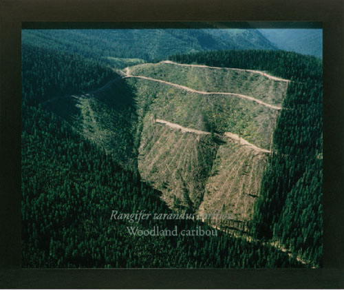
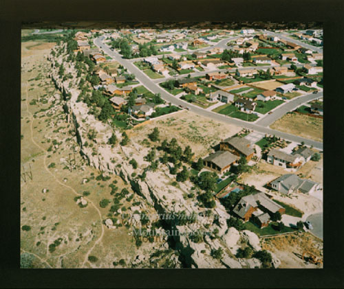
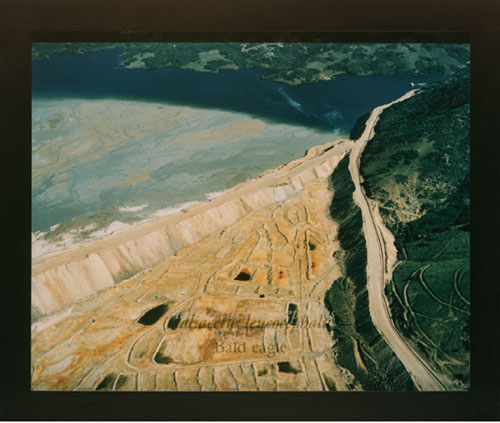
“THE TREASURE STATE”: MONTANA 1889–1989
ARTIST STATEMENT
During the past 25 years, my photographic work and mixed-media installations have investigated the contemporary American landscape as it reflects our culture and its most constructive and destructive energies. These works explore a broad range of American environments, from mines and power plants to military installations, hazardous waste sites, and industrial and agricultural landscapes, examining the relationship of humans with their environment in the late 20th century. Collectively, these works begin to reveal an entire pattern of terrain transformed by human beings to serve their needs.
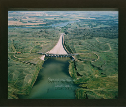
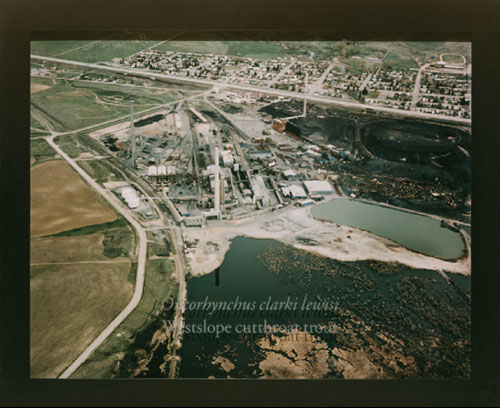
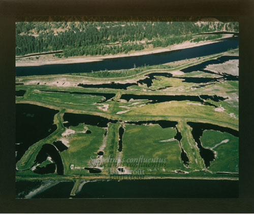
“The Treasure State”: Montana 1889–1989 is a personal response to the state’s centennial celebrations: “100 Years of Progress in Montana.” This series (1991–1993) is a study of land use in Montana, examining the primary economic and industrial forces that have shaped and radically altered the state’s environment. I photographed farms and cattle feed lots, timber clear-cuts and paper mills, mines and smelters, military bases, the oil and gas industries, industrial waste sites, railroads and airports, hydroelectric dams, urban and suburban environments, and tourist recreation areas. Each site is paired with one of Montana’s imperiled wildlife species that have been impacted by it. The Latin and common names of the species have been etched onto the glass covering the print. Under a gallery spotlight, the etched text is projected onto the recessed print below, casting a kind of “ghost shadow” of the name onto the photograph. The works are sequenced by the species’ name, alphabetically within taxonomic class. The correspondences between sites and species are in most cases direct and documented: for example, the siltation and contamination of streams by logging and paper mills have severely impacted the bull trout, and the damming of major regional rivers like the Missouri and Big Horn has destroyed the breeding habitat for several bird species and disrupted the spawning of pallid sturgeon and other native fish. In some cases, the correspondences are more broadly representative of the toll taken on native wildlife and habitat by increasing agriculture, industry, human population, and tourism. All of the animals included in this series have been heavily impacted by human activities; their numbers have declined significantly, and they are now vulnerable to extinction. Most of them are officially listed as endangered or threatened, or are candidates for listing; some of them are already extirpated. All that remains are their names, faint traces evoking those that have disappeared.
In November 1995, a flock of snow geese migrating from the Arctic to California stopped over in Butte. They landed in the Berkeley Pit, the world’s largest toxic pond, which is filled with 28 billion gallons of highly poisonous mine wastes. Within the next 2 days, 342 snow geese were found dead in the lake, all of them poisoned and internally burned. Surrounded by one of the largest open-pit copper mines in the world, Butte is a part of the biggest Superfund hazardous waste site in the United States. Wastes from 130 years of gold and copper mining and smelting have heavily polluted the neighboring hillsides, grasslands, and 100 miles of the Clark Fork River. Lush mountain valleys, pristine creeks and rivers, and abundant wetlands have been replaced by a barren wasteland of frequent fish kills, toxic dust storms, and the carcasses of snow geese floating in a sulfurous, poisoned pit. ©2007 David I Hanson
The following are installation views of framed Ektacolor prints behind etched glass.
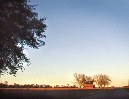
THE ROAD TO STILLMORE
ARTIST STATEMENT
Photographs from the series The Road to Stillmore begin my current exploration into the medium of digital photography, in particular video capture. Iconic stills are collected from video recorded while passing briefly through the landscape of my childhood home in southeastern Georgia. The resulting image quality creates photographs that speak to impressionistic landscape painting when viewed from a distance, however, from close range the forms of the landscape break apart into digital texture. While the images are captured in a particular place, these scenes of apparent rural simplicity combined with pixilation leave the viewer with a mixed sense of the past and present.
Process Statement
These photographs are first captured as short digital videos, ranging in length from a few seconds to a few minutes. The stills are then selected through editing software, and minor adjustments are made to the image color and contrast. All soft focus, pixilation, and image degradation result from using the video camera for image capture rather than from manipulation after capture. The final images are printed 24″ × 30″ with archival ink on watercolor paper mounted on hardboard.
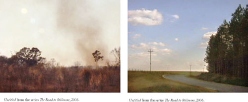
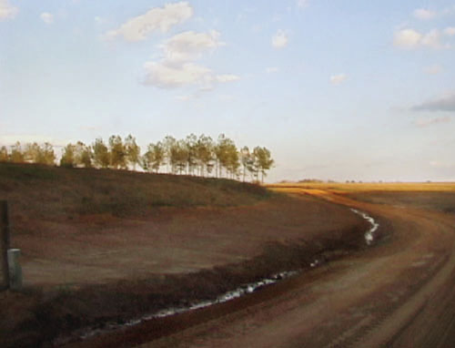
Untitled from the series The Road to Stillmore, 2006.
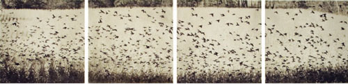
TRACES
ARTIST STATEMENT
My ongoing series, Traces, is a phenomenological study of Beauty as perceived through the sense of sight. Through this series I document visible manifestations of Beauty (what some might call the Divine) within the physical universe. To me, Beauty is best described by how it differs from what we call beautiful; while “beautiful” is a superficial attribute of things, Beauty embodies ineffable truths of our existence, allowing us to glimpse the larger Universe through the thin veil of physical reality. I find beauty in moments of temporality and transcendence held in balance; coherent form emerging from chaos; gestures of grace, accordance, and transformation; perennial, persistent, and recurring processes; the rapture of living existence tangled with the inevitability of its own impermanence; and the perfection of the present. Running in tandem with Traces, I create discrete, and often more abstract series of 4 or 8 images such as those entitled Sparks in Air, Hand Prints, Fractal Shorelines, and Perfect Circles. These operate as visual poems or koans, tracing the invisible threads that tie fallen leaves to the tree.
I concentrate on natural phenomena as the content of my work because of their purity, mystery, and myriad forms all seamlessly adhering to the same rhythmic patterns and laws. I am drawn to visible evidence of human interaction with the more-than-human world—the land and its non-human inhabitants—and the ability to transform clearly discernable natural forms through camera manipulation.
Process Statement
I make photographs using a DSLR camera and process them in the digital darkroom where I can carefully control their density, contrast, and fine details. In most series, the completed files are printed as limited edition archival pigment prints, or are transferred to fine art papers using archival inks. In these examples, the completed files are transferred to inkjet transparency film with an appropriate output adjustment curve applied. The transparencies are then contact printed onto photo-polymer plates using a UV point light source. The plates are processed in tap water, hardened, inked, and proofed. Finalized plates are printed as limited-edition intaglio-type polymer photogravure prints. This hybrid process enables me to avoid the toxicity of traditional darkroom and photogravure processes while maintaining their technical and aesthetic advantages. I am able to print with a range of archival papers and inks through which I control tint, tone, and texture, allowing me to produce images perfectly representative of my conceptual and aesthetic vision.
As it relates to photographic image making, polymer gravure is still somewhat an experimental process. Although several master printmakers have developed consistent, controlled results using polymer plates, most of these are limited in their ability to produce highly resolved photographic images with sensitivity to subtle tonal shifts and detail. My desire was to apply this printmaking technology and its techniques to photographic output. Upon moving to Denver, Colorado, in 2006, I met with fellow artist Jon Lybrook, owner of Intaglio Editions, who has developed a procedure that produces more photographic quality polymer photogravure plates resulting in finer detail and more continuous tone prints. Jon and his company assist artists in achieving more photographic imagery on their own and have made their standard procedure freely available at http://intaglioeditions.com/procedures/polymer_photogravure.html. They are also available to make polymer plates and run large or small editions (for information on their services, see http://www.intaglioeditions.com). I have found his methods produce extraordinarily beautiful intaglio-type photographic prints, and I am adopting the process for some specific series within the range of my creative work.
The following copy images of intaglio-type polymer gravure prints on Reeves BFK show the embossed edge of the plate.
FROM THE CABINET OF CURIOSITIES
ARTIST STATEMENT
During the 17th century in Europe, some privileged individuals assembled collections known as Cabinet of Curiosities. These Cabinets displayed marvels that were rare, foreign, or exotic. Sometimes they contained the bizarre, the unusually large, the unusually small, triumphs of technical skill, the remarkable, and the unexpected.
I have been frequenting small museum collections looking for and photographing, in situ, objects that might have been part of a Cabinet collection. In addition, I have been taking objects from my own shelves and borrowing pieces from friends to photograph in the more controlled environment of my studio.
The final prints are 8″ × 10″ Tintypes. There is a pearly, rich patina to the surface that enhances the image’s straightforward presentation. The prints have a tendency to be dark, suggesting the way one might discover the objects cloistered in a Cabinet.
Process Statement
My process involves the use of contemporary film photography, digital imaging, and a modern version of the historical Tintype print. (The Tintype process, light-sensitive emulsion on metal, was first used in 1853 and was most popular during the U.S. Civil War era.)
I capture source material by using the camera most appropriate for both the image quality and for the shooting context: medium format view camera or high-resolution digital camera. I employ black and white film, color film, and also use high-resolution digital files.
The next step is to move the source images onto the computer by scanning the film or by directly loading the original digital files. Using Adobe Photoshop, I adjust, rework, and/or fabricate a final digital image. Using a “film writer” (Polaroid ProPalette), this final digital image is converted to a film positive that I use in the darkroom to produce the Tintype print.
In the darkroom, I sensitize an aluminum plate by melting and pouring liquid silver emulsion (Rockland AG Plus) onto one surface of the plate. Once the plate is dry, it is developed in a special reversing developer (Rockland Tintype Developer). With this method, I can create an edition of “sister” prints but cannot make exact duplicates.
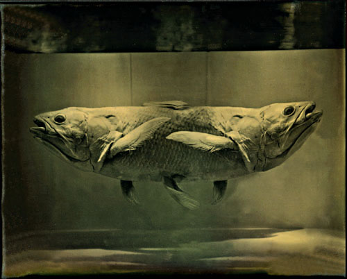
Conjoined Fish, 2006.
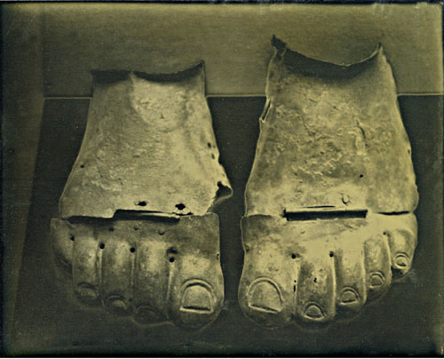
Hinged Feet, 2006.
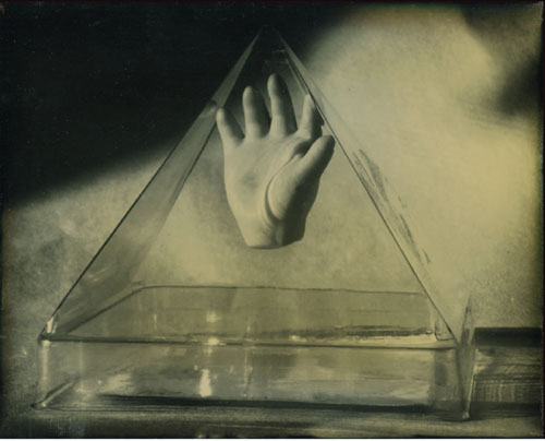
Pyramid Hand, 2007.
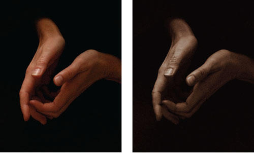
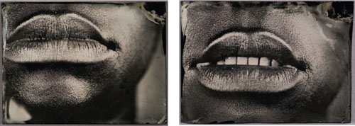
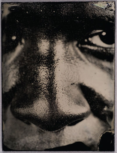
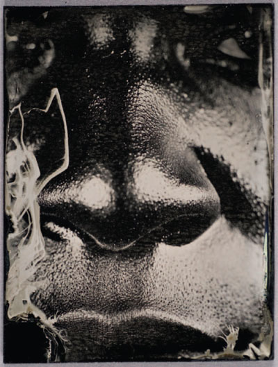
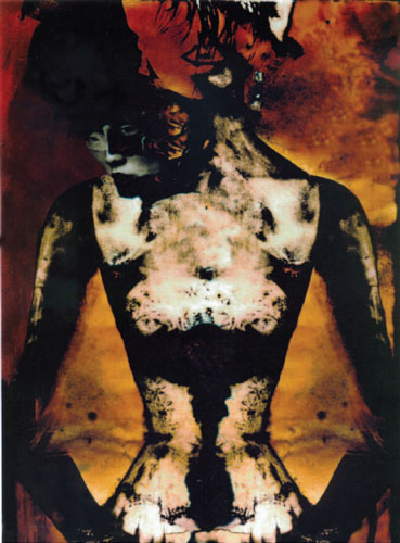
CHARACTER RECOGNITION, 2006
Throughout my artistic practice, I have returned to the body to explore a variety of issues. Issues of difference, beauty, melancholy sentiment, and physical and emotional recollections have played out on the surface of the skin.
ARTIST STATEMENT
Confronted with an up swell of bigotry both personal and public (the rhetoric surrounding Katrina) I was forced to ask myself, what do people see when they look at me. Am I nothing but black? Is that skin tone enough to describe my nature and expectation in life? Do my strong teeth make me a strong worker? Does my character resonate louder than my skin tone? Using a process linked to the times of ethnographic classification, I repeatedly explore my ethnic features.
Always fascinated by historical processes, I wanted to learn how to make wet-plate collodion. This process, which is coated onto black glass and was popular from the 1850s through the 1880s, creates a singular unique image. The glass is first coated with a thin layer of collodion, and then sensitized in a silver bath. While still wet, the glass is exposed using a large format camera. The plate is then developed and then fixed. When I applied this old process to my interest in the black body and self, the imagery described my body in a way never imagined. Tainted with the visual history of American slavery, these images point directly to the features of race. Thick lips and nose, and dark skinned; these contemporary studies link the view to a complicated historical past. The lessons learned are haunting and frightening in these modern times.
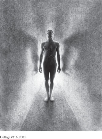
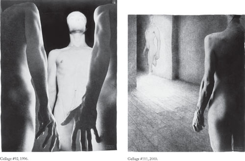
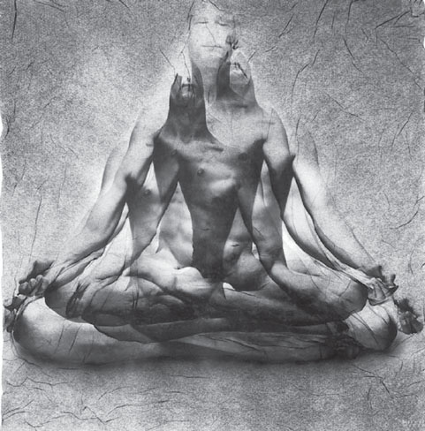
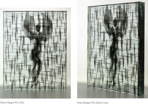
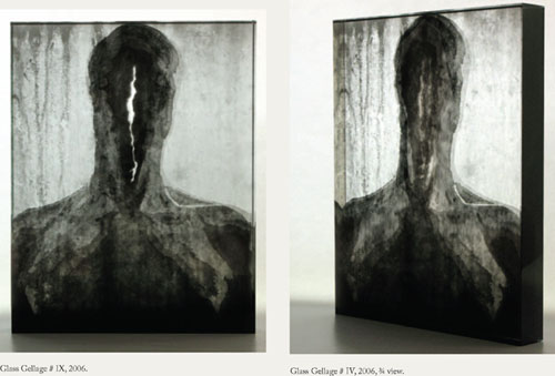
GELLAGE
ARTIST STATEMENT
“I use the nude human body (mostly my own) in my pictures. Through the photographic process [of Gellage], this concrete human body is compelled to meet with abstract surroundings and distortions. This connection is most exciting for me and helps me to find new levels of humanness in the resulting work.
I am always seeking new means of expression and, step by step, I am discovering almost unlimited possibilities through my work with loosened gelatin. Photographic pictures mean specific touch with concrete reality for me, one captured level of real time. The technique of Gellage which I am using helps me to take one of these ‘time sheets’ and release a figure, a human body, from it, causing it to depend on time again. Its charm is similar to that of cartoon animation, but it is not a trick. It is very important for me to be aware of the history of a picture and to have a sense of direct contact with its reality. My work places ‘body pictures’ in new situations, new contexts, new realities, causing their ‘authentic’ reality to become relative. I am interested in questions of moral and inner freedom. I do what I feel, and only then do I begin to meditate on what the result is. I am often surprised by the new connections I find in it. Naturally, I start out with a concrete intention, but the result is often very different. And there, I believe, lies a hitch. One creates to communicate what cannot be expressed in any other way. Then comes the need to describe, to define.”
Process Statement
In the gellage process, gelatin is separated from its base chemically and is worked with while it’s wet, in effect in the form of a gel. The changing, unstable forms the figures have in the water always fascinated me during my work. Then I transfer the image to the soaked paper and that’s what enables me to manipulate it precisely into the form I want. When the composition is finished, I simply let it dry and it sticks together. The first gellages were only one layer, and step by step I was discovering the technique and adding other elements. For instance, with the first gellages of crowds I used a background to which the figures were applied, so that the resulting image was compact. I also began to discover other possibilities, for example, amplification of the figure through repeating one negative. And then I was adding more negatives and their combinations, etc. The themes as they emerge little by little, and they go hand in hand with the development and discovery of the technique. The glass geilages are an extension of the process, and are more complex in their three dimensionality.
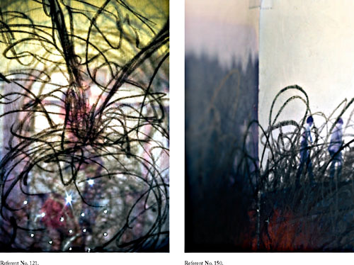
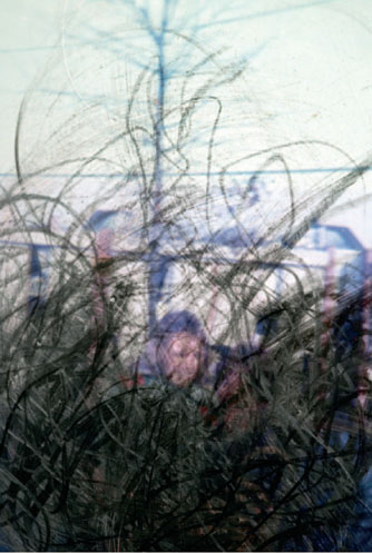
REFERENT
ARTIST STATEMENT
I am interested in the family photograph as a physical and metaphorical thing, a piece of paper that transcends all other pieces of paper—a reliquary of memory, hope, and Utopian dreams. In the photographs, entitled Referent, I look to re-define and re-invent the family snapshot and explore its greater mysteries by interacting with the image and the physical piece of paper on which it is printed. Through a varied method of mark making and alteration, I intend to draw attention to the often overlooked, and in many cases, more poetic nature of the material and image.
Process Statement
I work into the original family photograph stressing the physicality of the medium. I look at the age, emulsion cracks, discoloration, and scratches, as well as the lighting, fragmented subject, focus, composition, etc., as a way to explore meaning in simple, often repeated, gestures and actions. I scratch, bend, and mark the photograph, and then utilizing various directional lights, re-photograph a small section of the manipulated image area stressing the breakdown of the physical surface and the fragmented form. I continue to alter the image in digital form manipulating color, density, and format. I do this with the intent of maintaining many of the original qualities of the image, at the same time stressing my interaction with the material and the image. Although I utilize the digital environment to meet my aesthetic demands, I do not use all of the tools commonly associated with the digital process. I do not want to lose the original subject because it grounds the resulting photograph in the family snapshot and the notion of the record. This fact is very important because the original photograph is where the mysteries exist. I utilize the preexistent image and my interaction with it to draw attention to the often overlooked, and in many cases, more poetic nature of the material and the image. Once the digital process is complete the images are printed using a large format pigment-based inkjet printer.
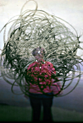
Referent No. 101.
REPRESENTATIONS
ARTIST STATEMENT
As a kind of playful homage to Henry Fox Talbot’s 19th-century treatise, The Pencil of Nature, my series Representations, combines color photography and drawing to create what I like to call photographic documents of three-dimensional drawings. Choosing objects from the recent past, I first whitewash them with ordinary house paint and then draw directly onto their surfaces with charcoal so that they appear to be simply sketched outlines when viewed through the camera. No digital manipulation is involved; however, the angle of view is imperative as the monocular vision of the camera’s lens helps to produce the illusion. The resulting images present visual hybrids that vacillate between drawing and photography, black-and-white and color, signifier and signified, and explore the concept of photographic truth and its correspondence with perceived reality. Examining the conventions for representing, identifying, and categorizing the world around us the series draws attention to how we see, and considers to what degree human vision is learned or innate. I’m interested in creating images that unite what appear to be opposites, to throw perceptual expectations off-guard, and subvert passive viewing. Ultimately, my photographs examine the camera’s role in negotiating what we consider to be real, as well as those assumptions we might have about photography and its relationship with what we believe to be true.
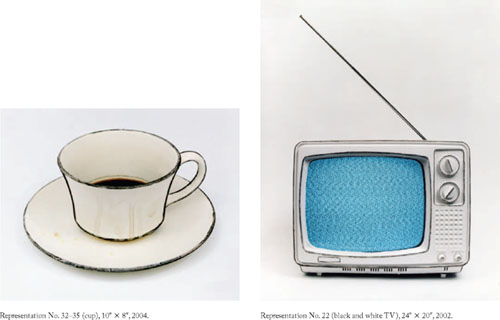
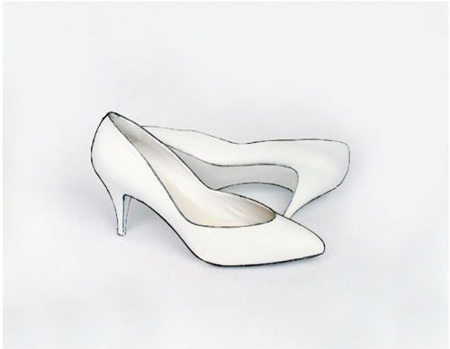
Representation No. 36 (shoes), 20″ × 24″, 2004.
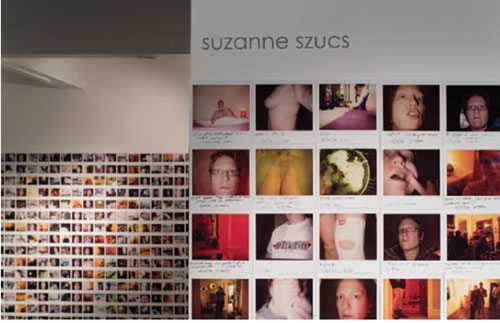
JOURNAL, IN PROGRESS
ARTIST STATEMENT
Journal, In Progress, is the accumulation of an instant Polaroid self-portrait made everyday since January 1994. Started as a visual diary, the project soon evolved its own set of guidelines. Not quite snapshots, the images seem at first to catch random moments. Together the unassuming and approachable images present a narrative time line measuring growth, change, and regression. Individually, they address issues of the body and identity in a direct and non-glamorous way.
The simplicity of an instant image undermines fine art photography, at the same time belying the complexity of meaning the photographs hold as a group. The randomness of the moments depicted and their equal treatment subvert the importance of any single portrait. Their diaristic candor breaks down personal boundaries and presents a series of surrogate selves for the viewer. Together the photographs depict universal experience; their raw, personal, and sometimes frivolous nature demythologizes the self with humor and vulnerability. The text written on them—at the least recording the time and date—ranges from the factual to the absurd, becoming more about mark making than dialogue.
The images document, yet remain elusive. Viewed close up, they suggest individual transformations, recording momentary changes. Seen from a distance, the figures evaporate, the ritual becomes more apparent, and the measurement of time emerges. Whereas the regularity of the image making imposes structure, the formal qualities of the piece as a whole—color, shape, light—are determined by chance. The images will fade and change over time, like memory, imprecise and shifting, an imperfect memorial to the everyday. Their deliberate presentation—like a figure traveling across the wall—contradicts the immediacy with which the individual images are made.
As an installation piece, Journal, In Progress grows around the viewer. The 4″ × 4″ Polaroids are arranged chronologically as vertical strips of 17 images, equaling the artist’s height of 5′6″ and growing an average of 7ft a year. Since each of the strips is put up individually they can wrap around and turn corners. Because of this, the project transforms to whatever space it is displayed in, mimicking our own tendencies to transform to ever changing situations. When installed, new images are constantly added, the piece literally accumulates itself, even as we accumulate experience and memory. Through its process, Journal, In Progress becomes a constantly changing piece of art—different each time it is displayed, its parameters of height and chronology allow for flexibility in its presentation keeping the piece lively and engaging. The project has been shown fourtimes in its entirety, most recently during its 10th year at Flatfile Gallery in Chicago.
Journal, In Progress, installation views Flatfi le Gallery Chicago, 2004.
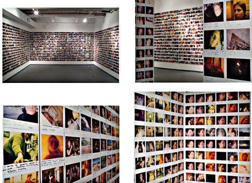
Journal, In Progress, installation view Flatfi le Gallery Chicago, 2004.
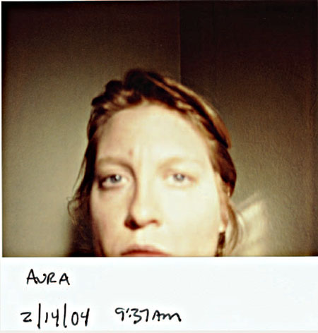
Aura, from Journal, In Progress, 4″ × 4″ Polaroid Spectra, 2004.
IMAGES © SUZANNE E. SZUCS, FROM HER SERIES JOURNAL, IN PROGRESS, INSTALLATION VIEW AT FLATFILE GALLERY CHICAGO, 2004; INDIVIDUAL 4″ × 4″ POLAROID SPECTRA PHOTOGRAPHS, INSTALLATION 5′6″ × APPROXIMATELY 80′ INSTALLATION PHOTOGRAPHS BY CYNTHIA LAPP AND SUZANNE E. SZUCS, 2004.
LANDSCAPES
ARTIST STATEMENT
I learned and practiced photography in the era before the introduction of photographic digital technology. I exposed film in a camera and then proceeded to my darkroom to develop the film and make prints. I studied the art of photography at university programs learning theory and critical thinking based on the medium as we then understood it. I immersed myself in that world and, as an artist, was challenged to explore its potential.
Then along came Photoshop. A few years ago, after long and serious deliberation. I closed down my darkroom and sold my darkroom equipment. I replaced the darkroom with a computer, software, inkjet printer, and various other new digital wonders and set off to explore their impact on my practice of photography. I am fortunate to have a history with chemical darkroom photography and now have available to me this new digital technology. I have a foot in both worlds.
I am most interested in that converging space between the traditional definition of photography and the imagery of the newly emerging digital arts. I am not trying to replicate traditional photography with the now available digital tools but yet am trying to maintain some connection with it. My work draws on both the history and practice of traditional photography and the language of the new technologies.
Process Statement
This work is from a series of “landscapes” with the term referring to both its use in the history of photography and to the horizontal format for digital printing. The images first begin as photographs I made with a digital camera. The pictures are then opened in Adobe Photoshop and manipulated. The “natural” color is replaced with an “artificial” one and I add a few simple digitally drawn components. Exhibition-size prints are made on cotton rag paper using an Epson 7600 and ImagePrint software.
On one hand an image closely resembles a “straight” photograph, yet on the other, appears to be an obvious contrivance. The work treads the boundary between traditional photography and new technology and examines the landscape of my life.
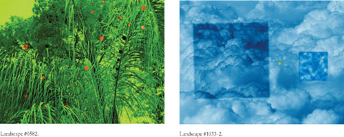
Landscape #1288–2.
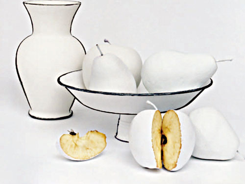
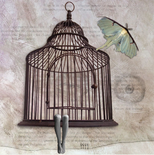
AWAKENING TO A DREAM
ARTIST STATEMENT
For as long as I can remember, I have been a collector of objects. My archive of objects always seems to find its way into my work. I enjoy juxtaposing these seemingly ordinary things with the figure fragmented as a way to speak to the fragility of life and the body. By constructing these still lifes, I can invest meaning into simple object forms, using the body as a vehicle for expressing human emotion and reinforcing a figure presence.
This body of work is part of an ongoing project titled, Awakening to a Dream. Each piece is intended to render a vision associated with a common dream experience such as flying and falling or pregnancy and relationships. This work is driven by an affinity for the biological sciences, human anatomy and psychology in addition to everyday dream encounters. The images are not intended to illustrate specific dream stories as much as render the idea of something fleeting more real, more tactile–like the memory of a dream.
Process Statement
These images are archival pigment prints composited in Photoshop using digital photographs and drawings as well as scanned prints, objects, and texts. I believe that these pieces exemplify how traditional and digital photographic techniques may be synthesized. My working methods include: (1) painting and photographing a background for my images; (2) digitally photographing the human figure; (3) scanning and/or photographing selected objects, silver prints, line art, and found texts; (4) assembling all of these components in Photoshop so that I may tweak color, scale, layer order, etc.; and finally (5) incorporating computer-generated drawings utilizing the Wacom graphics tablet.
On the computer I can manipulate my photographs with much greater control, integrate layers of visual and textual information, and create illustrations in the style of conventional studio media. Also, I have the freedom to explore an expressive color palette and suggest painterly surface textures that translate nicely on watercolor paper. This way of working allows me to expand my image-making processes beyond the darkroom and still embrace the photographic.
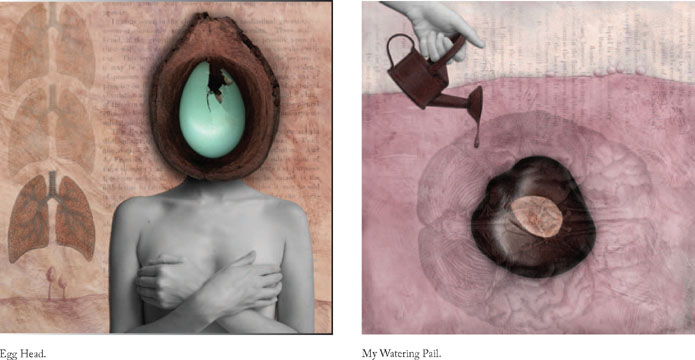
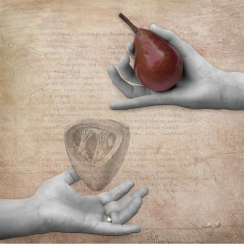
Never.
INSIDIOUS CHARMS
ARTIST STATEMENT
Throughout history, women have put their bodies, and, thusly, their psyches through torturous measures trying to live up to the elusive thing, that is beauty. We have constricted our breathing and injected ourselves with poison. We have teetered precariously, balancing on miniscule pedestals; we have crafted our flesh into acceptable contours. But we have not been forced into doing so. We have consensually, if not violently, subjected ourselves to these dangerous tribulations.
This is a condition that I not only detest but also welcome and embrace. It has left me in a love/hate relationship with the idea of beauty and the quest to attain it. These images have emerged from this dichotomy. Through a combination of technical processes, I am able to merge representations of the accepted and established beautiful with those of my own manufactured grotesque. In this manner I am able to create imagery that manages to, at once, glorify and chastise, ultimately giving way to a different definition of beauty, one of engaging oddity and lush ambiguity.
Process Statement
All source images are appropriated and collaged from fashion and bridal magazines because I believe these propagate what we perceive as beautiful. The collaged images are then contact printed onto black and white fiber-based photographic paper in the wet darkroom. Next, the images are treated with the Mordancage process in which a copper chloride and acid solution causes deterioration to the black portions of the photograph. The print is then left out to oxidize. Once the oxidation process has occurred, oil paint is hand applied to the portions of the image to ensure the ideal color palette and to create additional texture. Then the Mordancage image and the source images are all scanned into the computer and then digitally collaged and manipulated using Adobe Photoshop. The finished image is printed onto archival canvas and treated with a varnish sealant.
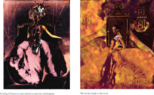
The season I lost my breath and accepted my future.
FURNITURE SERIES
ARTIST STATEMENT
The Furniture Series addresses issues of body image, personal experience, and memory by combining photographs and autobiographic writing with furniture. The combination of furniture, photography, and text is used to express hidden thoughts or subjects that prove difficult for engaging dialogue. The comfortable and familiar veneer of the furniture serves as a welcome invitation to the viewer.
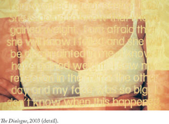
The piece titled The Dialogue consists of two chairs facing each other as if joined in conversation and confronting each other in battle. Conversations occur within the text that is embroidered on the fabric of the chair. The text and images of a figure transferred onto the fabric bring the chairs to life.
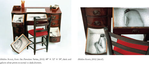
Hidden Secrets is a desk that is a contemplation of self-image. Autobiographical writing obsessively covers every surface of the interior space. The piece is intended to be inspected and upon closer examination, secrets and thoughts are exposed.
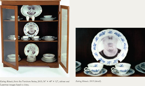
Eating Rituals examines the relationship between food and rituals of anorexia and bulimia. Working with imagery and text fused to dinnerware, secrets about eating rituals typically kept private are revealed.
Process Statement
Through the use of photography, furniture and text, I create large-scale photographic sculptures. Each piece starts by intuitively searching for furniture that fits my conceptual idea. Next, I transfer photographic imagery and text onto the surface of the piece and then re-assemble the work to give it new life.
The Dialogue was created by transferring images onto fabric, using Epson iron-on transfer material. The fabric was then embroidered by machine and upholstered by hand.
The process, which is labor intensive, methodical, and repetitive, explains a great deal about my artistic approach to most projects.
Hidden Secrets consists of self-portraits of my body mounted to the bottom of desk drawers. To create this piece, I built a box with the same ratio as the drawer, but large enough to fit my body. These images were enlarged in the darkroom to fill the inside of the drawers. The rest of the drawer was painted white and then covered with hand-written text.
Eating Rituals is a china cabinet with images fused to dinnerware. Using Lazertran transfer material, decals of mouths were transferred onto the china and then baked in the oven to harden.
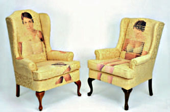
The Dialogue, from the Furniture Series, 2003; 72″ ×; 48″ × 36″, two Victorian wingback chairs, iron-on transfer images on upholstery fabric, and embroidered text.