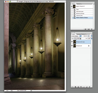
TECHNICAL TUTORIALS
SECTION
As stated in the introduction to the text, these tutorials are not intended to represent the range of techniques that can be employed. They are intended as a starting point for experimentation with the elements of photography, and can lead to increased understanding of tools and capabilities with respect to photographic image making.
CHAPTER 1
Negative Carriers Tutorial
One alternative to using a standard negative carrier is to use a glass negative carrier. Glass negative carriers are sold for 4 × 5 enlargers, or can be made simply by having two sheets of clear 1/16″ glass cut, its edges seamed for safety, and “sandwich” your negative between them. The advantage to glass carriers is that they work for multiple size frames, but they have the added disadvantages of trapping dust particles, as well as decreased image clarity due to the extra surfaces through which the image is printed. Because light surrounds the entire glass carrier and is not blocked, increased flare around the image area can be a problem, so it is wise to mask the area beyond the intended printed area with black paper tape.
A better alternative to using a standard negative carrier or glass carriers is to make your own “filed out” negative carrier; that is, a standard negative carrier in which the opening is enlarged to reveal some amount of the film base plus fog surrounding the image area, so that that part of the film can be printed as well. There are a few ways to “file out” the opening of a negative carrier. You can do it yourself by hand or you can take the carrier to a machine shop and have the opening professionally enlarged. I prefer the latter method, since it is relatively inexpensive and the results are precise and consistent. If fi ling out the carrier by hand, you simply need to measure the size of the image area versus the size of the carrier’s opening, and, using a sturdy file, begin making the opening larger. As you progress, be sure to check the size of the opening against the film size so that you don’t create a larger opening than the size you need. Hand-filing the edges of a carrier tends to leave minute jagged edges which will easily scratch your negatives if not smoothed properly; therefore, once the opening is of the proper size, showing perhaps 1 cm of the fi lm base + fog around the image area, smooth the edges of the carrier with a fine file and last with fine sand paper. Once complete, paint the inside of the carrier with flat black paint to insure that no unwanted light reflects from the interior edges; you might bevel the inside edges to insure this as well.
A third means to customize a negative carrier is to simply trace a template of your enlarger’s standard negative carrier. Then, using black 4-ply or 8-ply mount board and a mat cutter, cut an interior hole to the precise dimensions you need. It is simple to do, and allows you to reveal the exact amount of the negative you want to print without spending a lot of money on customizing several different standard negative carriers. You can even make your own negative carriers for printing three-panel panoramic images from 35-mm negatives when printing with a 4 × 5 enlarger, or two 6 × 7 negatives that form a diptych, or a grid of four 35-mm frames stacked, or … The options are limitless, really, as long as the image area falls within the diameter of the enlarger’s projected light.
Digital Darkroom Borders
TECHNIQUE NO. 1: FINE BLACK BORDERS
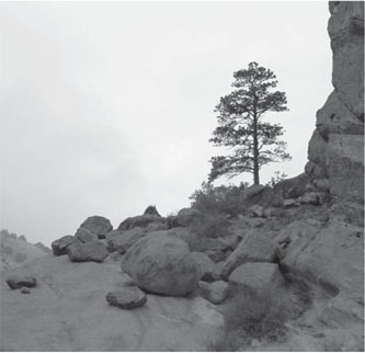
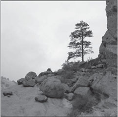
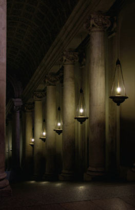
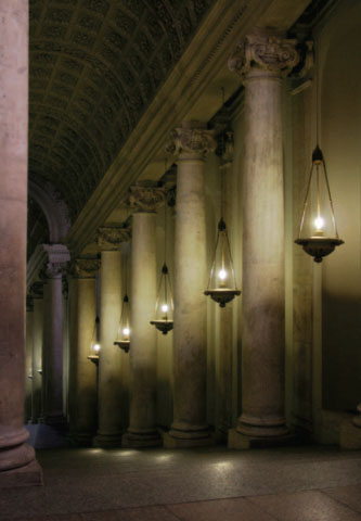
The image below was digitally captured on a foggy day in the Front Range foothills west of Denver, Colorado. The area of sky backlighting the scene blends too much into the surrounding white of the paper and window mat that will lie on top of it, so I decided that the image would benefit from a fine black border, similar to the one I would make in the darkroom. This type of technique is also used in graphic design and other imaging applications in the form of drop shadows and other unobtrusive borders.
Making a fine black border around your image is even easier in Photoshop than in the traditional darkroom. There are many ways to do it, but the following is a simple, two-step process:
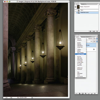
Step 1. Open an image and perform all your usual tonal, color, and creative adjustments before proceeding to make a border.
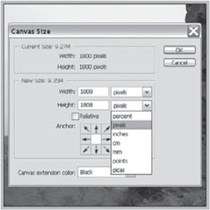
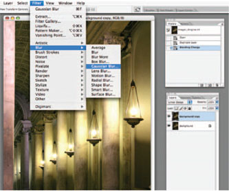
Step 2. Go to the Image Menu, and select Canvas Size. Change the “New Size” view of the canvas to Pixels in the pull-down menu (this gives you finer control over the width of the border) and add an equal number of pixels to both the width and height, say, 8 pixels. Under “Canvas
Step 1
Extension Color” choose black (or you might choose from any of the millions of other colors available in Photoshop). Click OK.
That’s it! This simple technique allows the image to separate from its surrounding base support in a quiet, inconspicuous way, and clearly indicates the boundary of the image to the viewer.
Step 2.
“Final Image with Fine Black Border”.
TECHNIQUE NO. 2: PAINTED BORDERS
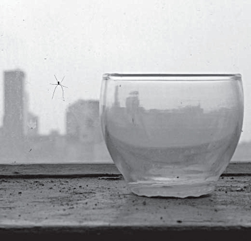
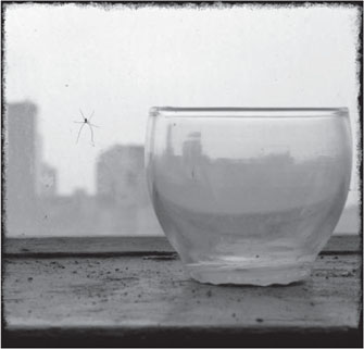
The image below of the spider on my studio window overlooking the city has a calm, meditative feeling to me, so I wanted to experiment with how adding an edgy border would alter the feeling.
Making a hand-painted border around your image is straightforward in Photoshop, and produces countless variations and subtleties once you really begin to work with it. There are innumerable ways to create painted borders; this tutorial is simple to the point of being bare bones, and can be made much more robust by using multiple layers and blending modes to merge the border effects with the image edge. The following is a simple, four-step process that yields excellent “organic” results to start, and allows plenty of room to experiment and adjust the results for your particular image:
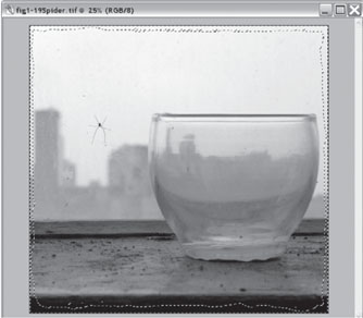
Step 1. Open an image and perform all your usual tonal, color, and creative adjustments before proceeding to make a border.
Step 1.
Step 2. Using the rectangular tool (for an even selection) or the lasso tool (for a hand-drawn selection) select most of the image, excluding only the area you want to give over to making the border. This selection can be rough, as you will fi ne-tune it in the next two steps. Once you have made the selection, go to Select > Inverse so that only the border edge is selected.
Step 2.
Step 3. Enter Quick Mask Mode to refine your border selection. Choose the brush tool, and select a type and size of brush that will give you the look you want. (I often use a chalk-style brush or a dry media style brush to give the edges of the selection a more uneven quality.) Using brushes in Quick Mask Mode, you add to the selection when your foreground color is white, and subtract from the selection when your foreground color is black. Additionally,
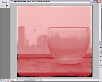
Step 3.
in Quick Mask Mode you can go to the Filters Menu and using any number of filters you can affect the edges of the selection. Using your brush or filters, paint the edges of the selection until you like the look of the selection in relation to the image content.
Step 4. View of the “Spatter Filter” menu prior to exiting Quick Mask. Exit Quick Mask Mode and view your selection. You can re-enter Quick Mask Mode to refine your selection until you are satisfied with the selected border.
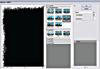
Step 4.
Step 5. Go to Edit > Fill and fill the selection with black or any other appropriate color or tone. Click OK, and deselect the border area. You can then use the Dodge and Burn Tools in combination with layers, various brushes, and blending modes to fine-tune your results by blending the border with the adjacent tones in the image.
Step 5. Final Image with Painted Border.
The end result of border creation and manipulation is always a product of working with the image content at its edges—with its colors and tones—to produce a border that looks and feels like a natural extension of the image, and that bounds the image in a way that allows the viewer to best enter the visual experience.
TECHNIQUE NO. 3: MAKING MULTI-FRAME PANORAMAS IN-CAMERA
If you are making panoramic exposures, whether to stitch seamlessly or not, there are several technical considerations that you should understand. The Technical Tutorials Section for Chapter 1 provides more information about how to successfully create images such as these.
1. Decide whether you want the panorama to align perfectly. In order to make a successful panoramic image in which the vertical edges of the frames line up perfectly and match horizontally across your field of view, you need to use a tripod with levels attached. There are several kinds of pan-specific tripod heads (complete with degree scales and dual bubble levels) on the market, there are aftermarket attachments that fit between your camera and tripod, or you can construct an accurate system of levels yourself. In any event, you’ll need to insure that two axes or planes are aligned with levels as you rotate the camera. First, the plane of rotation—located at the base of the tripod head—must be level to the horizon; this can be achieved by attaching a level to the top of the tripod base where the legs come together. Second, the media plane must be perpendicular to the plane of rotation; this can be achieved by attaching a dual bubble level to the horizontal and vertical sides of the tripod head where the camera sits, or by attaching a bubble level to the camera’s hot shoe.
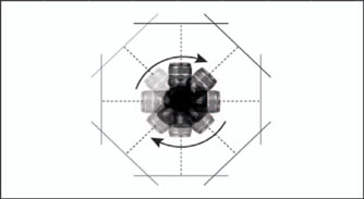
Top-view illustration of camera rotation (adjusted according to the angle of view of the specific lens) in order to make a panoramic image. The most seamless results are accomplished by placing the camera on a tripod with bubble levels. Illustration © Toby Cochran, 2007.
2. Determine where the edge of one image ends and the next begins. When making panoramas to be stitched in Adobe Photoshop’s Automated Photomerge, you must overlap the frame content approximately ⅓ of the way, so that the program has enough redundant pixel information to create the panorama with ease. When making panoramas to be printed in close proximity to one another, consider how much content you want to overlap; if there is too much overlap then the image will not be read as a continuous scene. Remember that camera viewfinders provide different percentages of viewable area (very few viewfinders provide an exact 100% view); if your camera does not have a 100% or fill-frame viewfinder, you will have some slight overlap because of the edge included that you can’t see.
3. Keep your exposure the same throughout the images, unless there is a good reason not to. If you make several exposures over a wide or tall field of view, the quantity of light in the scene and the reflectance value of the content might change dramatically. If you want the image density to stay the same throughout the panorama, take an average meter reading and keep your exposure consistent; some images will be lighter or darker than others, but the densities will be relative to one another and will produce a more visually coherent result.
4. Keep your focus point where you want it. If you want to create a seamless panorama, keep your focus point at the same distance by turning off any auto-focus capability that the camera has. If you want to use selective focus as part of the image, you can re-focus to different distances throughout the process, and you can mimic shallow depth of field to isolate your primary subject by capturing the surrounding frames intentionally out of focus.
CHAPTER 2
Plastic Lens Effect and Diffusion
TECHNIQUE NO. 1: PLASTIC LENS EFFECT
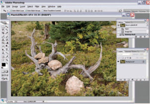
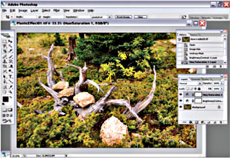
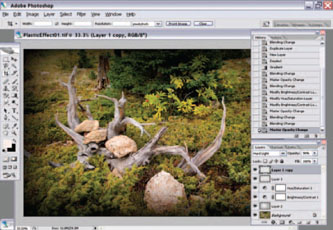
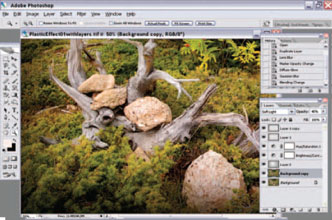
This Plastic Lens Effect Tutorial is easily modified for producing a range of plastic camera effects in Adobe Photoshop; I developed it through research and a good amount of trial and error. You can begin with the step-by-step,
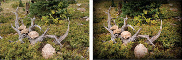
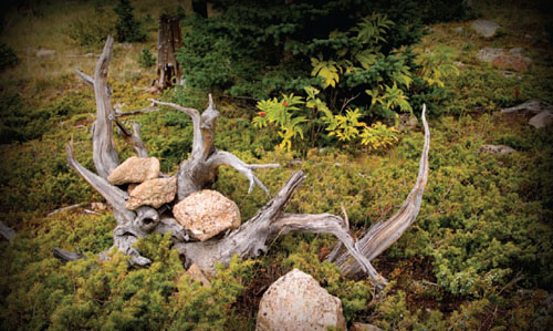
Comparison between original capture and plastic camera effect applied in Photoshop.
ORIGINAL IMAGE © ANGELA FARIS BELT, 2006.
and develop more individualized techniques based upon your needs.
The effect of plastic cameras varies, but two of the more telltale signs are slight softness, and intensified color and contrast, in particular near the vignetted edges of the image.
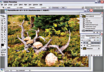
Step 1. Open your image in Adobe Photoshop; do any re-touching, curves adjustments, and sharpening to the image.
Original capture.
Step 1.
Steps 2 & 3. Create a Brightness/Contrast adjustment layer, and increase contrast by a numerical value of 20–40 points.
Plastic camera effect supplied.
Steps 2–3.
Note: Using adjustment layers instead of applying the adjustments to the image allows you to go back and re-adjust these tonal changes later in the process.
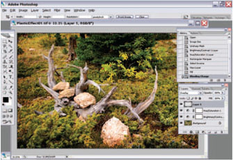
Step 4. Select your Rectangular Marquee Tool and set the Feathering to 1/10–1/12 of the pixel width of the image. My image is 2400-pixels wide, so divided by 12 means that I set my feathering to 200 pixels. Note: You can vary this amount depending on experimentation and your desired results.
Step 5. Select the inverse (so that the image edges are selected rather than the center).
Steps 4–5.
Step 6. Create a New Layer (Layer > New Layer), and fill the selection with black using Edit > Fill. Change the Blend Mode of the new layer to Overlay (for the time being). The edges of the image will appear darkened and somewhat bizarre warm color.
Step 7. Create a Duplicate Layer (Layer > Duplicate Layer). Keep its Blend Mode to Overlay for the time being. The edge effect of the previous layer will intensify.
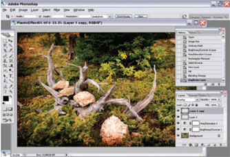
Step 7.
Step 8. Make the Background the active layer, and deselect the canvas edges. Create a new transparent layer (Layer > New Layer). Select the Gradient Tool and set its options to the following specifications: Type, Spherical; Blend Mode, Normal; Opacity, 50%; Preserve Transparency. Drag the Gradient tool from the center of the image outward to create the gradient. Set the layer’s Opacity to 40% and the Blend Mode to Soft Light.
Note: Now it is a good time to go back and fine-tune your Adjustment Layers to achieve the color and tonal appearance you want.

Step 8.
Step 9. Adjust the Opacity of Layer 1 and Layer 1’s copy to about 90% and change their Blend Modes to Soft Light. You can mix and match the effects, and alter the opacity to create the desired effect.
Step 9.
Step 10. Duplicate the Background (image) Layer. Change its opacity to 50%. Add three filters: Filter > Blur > Lens Blur: set the radius to 35 and leave everything else at the defaults. Press OK. Then Filter > Distort > Diffuse Glow: Set the Graininess to 0, Glow Amount to 5, and Clear Amount to 20. Press OK. Last, Filter > Blur > Gaussian Blur: Set the blur amount to 20. Press OK. Change the Layer Blending Mode to Soft Light.
Step 10.
And that’s it! In lieu of shooting film through a plastic camera and scanning it to make digital prints, this method allows you to capture digital images and convert them to a plastic camera look with unparalleled control over the degree of the effect.
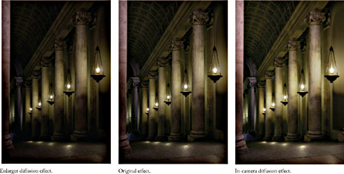
TECHNIQUE NO. 2: DIFFUSION EFFECTS, BY LINDSAY GENRY
Diffusion filters used on-camera will “bleed” the highlight areas into the shadows, creating a glowing, hazy look around highlight tones. Diffusion filters used in the traditional darkroom will “bleed” shadow areas into the highlights, creating a heavy, though softened look around the shadow tones. In the following tutorial, Lindsay Genry reproduces both techniques in the digital darkroom.
DARKROOM DIFFUSION EFFECT
Step 1. Open the image and duplicate the background layer. Change the copy layer blending mode to Darken or Multiply (setting the blend mode to Multiply will intensify the effect). The image will look strangely dark.
Step 1.
Step 2. Go to Filter > Blur > Gaussian Blur and set the radius to anywhere between 4 and 12. Don’t be afraid to go too far, since you will adjust the opacity of the layer later. Click OK.
Step 2.
Step 3. Change the layer opacity to a percentage value that creates the effect you want for the image. You can also alternate the blend mode between darken and multiply while experimenting with opacity to see which method will work best for the image.
This technique mimics the effect of using diffusion materials or filtration in the traditional darkroom, but the opacity slider in Photoshop gives you more control. If you would prefer the opposite effect of the one obtained here, read on …
CAMERA DIFFUSION EFFECT
Step 1. Open the image and duplicate the background layer. Change the copy layer blending mode to Lighten or Linear Burn (setting the blend mode to Linear Burn will intensify the effect). The image will look strangely light.
Step 1.
Step 2. Go to Filter > Blur > Gaussian Blur and set the radius to anywhere between 5 and 15. Don’t be afraid to go too far, since you will adjust the opacity of the layer later. Click OK.
Step 2.
Step 3. Change the layer opacity to a percentage value that creates the effect you want for the image. You can also
Step 3.
alternate the blend mode between darken and multiply while experimenting with opacity to see which method will work best for the image.
Step 4. Final Image.
CHAPTER 3
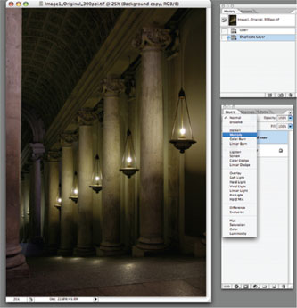
TECHNIQUE NO. 1: DIGITAL LIGHT PAINTING, BY JOE LAVINE
The next image was created using a technique referred to as Digital Light Painting. Before the onslaught of digital technology many film photographers used long exposures and continuous light sources, such as flashlights or a product called a Hosemaster, to literally paint an image with light. This gave the photographer amazing control as to where to direct light.
Unfortunately CCD and CMOS chips in digital cameras generally don’t do well with extremely long exposures. There are many variations in the following technique and some of the framework must be credited to Dave Montizambert’s 2001 article published in PEI Magazine.
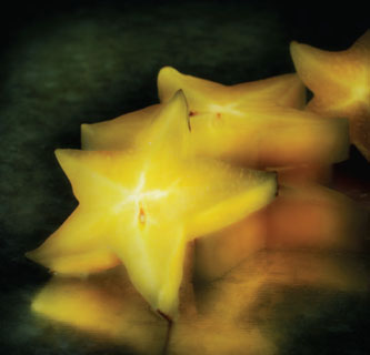
Image 1—Star Fruit.
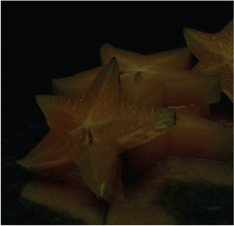
Step 1. You’ll need to begin with two separate images of your subject. One image (Image 2) should be roughly two stops underexposed. I prefer to use a very soft light source such as a soft box directly above the subject. The idea is to just fill in the shadows. The second image (Image 3) gives your subject the underlying direction of light. This image should be overexposed between one and one-and-a-half stops. For Star Fruit image, I used a single strobe head with a silver reflector to the left of the camera. If the images seem to have too much contrast you may need to add a fill card, but you want to keep a strong direction of light. It is important to remember that while shooting you should not move the camera, adjust focus, or change your aperture.
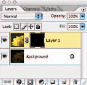
Step 2. Here is where the Photoshop fun begins. Using the move tool drag the brighter of the two images on top of the dark image. If you hold down the Shift key while using the Move tool the images should be perfectly aligned. If the alignment is a little off just lower the opacity of the top layer and carefully re-position so that they are directly on top of each other. This is a perfect time to apply a Layer Mask to the top layer. Since I prefer to paint light in instead of removing it, I recommend using a Hide All Layer Mask. With the top layer highlighted go Layer > Layer Mask > Hide All (Capture 1).
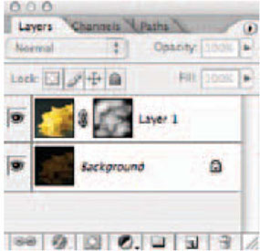
Step 3. Using the Brush or Airbrush tool slowly begin to paint on the Layer Mask using white as your foreground color. This should seem as though you are painting light into your image. You’ll want to use a fairly low setting for the brush’s opacity and flow settings. I usually begin with less than 25% on each. High-key subjects usually require much lower setting than low-key subjects (Capture 2).
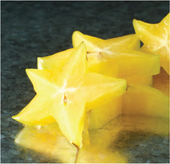
Image 3.
Step 4 (optional). Although I have listed this step as optional it adds a nice color enhancement to your image. You’ll need to change the Foreground color to the most pre-dominant color in your image. With the Eyedropper tool click on any part of your image that has the predominant color. Remember to be on the image and not on the mask.
Create a new Layer and fill with the new Foreground color. From the menu bar go Edit > Fill > Foreground Color and click OK. A shortcut would be to hold down the Option Key and hit the Delete Key. You’ll probably notice that your entire image is now this color. Change the
Capture 2.
Blending Mode in the Layer’s palette to either Overlay or Soft Light and once again apply a Hide All Mask. Using the same painting skills paint some of the color into your image. I will usually paint the key elements in my image that I really want to pop. See Images 4 and 5.
One of the key elements that gave traditional light painting such a romantic and painterly feel was the soft glow within an image. When shooting with film photographers usually placed diffusion material in front of the lens while painting in these areas. Some photographers used expensive filters while others relied on crumpled up cellophane.
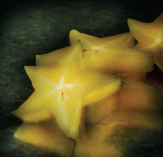
Image 5—After.
Accomplishing this look in Photoshop is remarkably simple.
Step 5. At this point you have a couple of options. If you have a limited amount of RAM available I recommend saving your file, creating a copy, and begin working from the copy, as you will need to flatten the two layers.
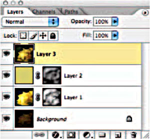
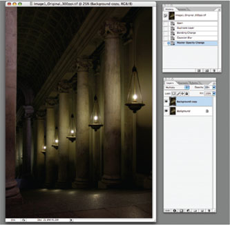
Working from the copy ensures you have an unflattened image to return to. If RAM is not an issue then Photoshop gives you a little trick to create a new layer that combines all that are visible. While holding down the Option/Alt key go Layers > Merge Visible (Capture 3).
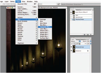
From this point duplicate the new layer (Layer 3 in the screen captures) and apply a Gaussian Blur. Go a little
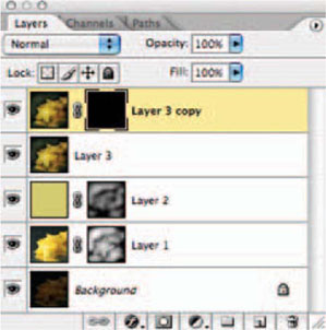
Capture 4.
crazy here; you can always lower the opacity if it is too much. Filter > Blur > Gaussian Blur (radius 25) and click OK. Using the same process in steps 2 and 3 apply a Hide All Layer Mask and paint your desired amount of diffusion back into the image (Capture 4). If you prefer to start with the diffused version then use Reveal All Layer Mask and paint with black instead of white.
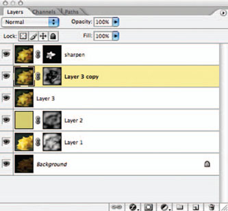
Capture 5—Final Layers Palette.
Step 6. My final step is designed once again to add a little more pop to the image. So far we have painted in the bright image, a predominant color and a soft blur. The only thing missing is some very carefully placed sharpening. This will add the final touch.
Follow the process in Step 5 and create a new layer that combines all of the previous layers. Using the UnSharp Mask slightly over sharpen the new layer. Filter > Sharpen >
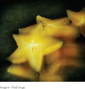
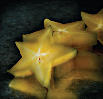
Image 6—Final Image.
UnSharp Mask. Don’t be afraid to over sharpen as you can always use the Opacity slider for a reduction. Apply a Hide All Mask and paint your sharpness into the image. On the Star Fruit, I painted the highlights on the front slice.
A few last thoughts: When painting with light, always try to work the brush in one direction; the goal is to follow the path of the original light source. Don’t be in a rush; I always use the brush in very low settings to allow myself to go over the area many times. Think of it as a building process. If you make a mistake, you can always paint back over the mask with black to remove what you have done. And finally, have fun with it.
CHAPTER 4
TECHNIQUE NO. 1: GRAINY EFFECT,
BY JENNIFER HARDMAN
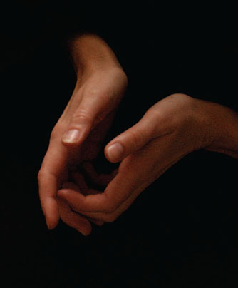
For this picture, my goal was to emulate pictures made by Alfred Stieglitz of Georgia O’Keefe’s hands.
In capture, start with a high ISO so that you can increase noise in the file. Bracket your exposures, but you will want to use one that is significantly underexposed (this will also increase noise).
Step 1. Open the image in Photoshop.
Step 2. Add noise to the image by going to Filter > Noise > Add noise. For “Distribution” choose Gaussian. (This image works best with Gaussian distribution, but experiment with uniform distribution to see what works for your image.)
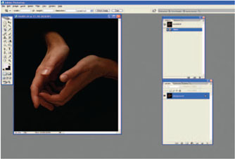
Step 2.
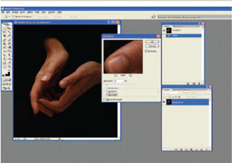
Step 3.
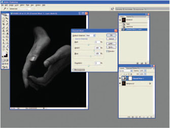
Step 3. Go to Image > Adjust > Channel Mixer (or better yet, make a Channel Mixer Adjustment layer). CHECK the Monochrome Check Box. Convert the image to a tonal range you like; the proportions of RGB are up to you; for this image I added green because of how it affected the skin tone. An advantage of an adjustment layer is that you can go back to it and change it later in the process.
After converting the image to monochrome, UNCHECK the Monochrome box before closing the Channel Mixer.
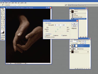
Step 4. Go to Image > Adjust > Color Balance (or better yet, make a color balance adjustment layer). Now you’re going to make the image a “sepia tone.” Every image requires different numbers, but I start with +25 Red in the red/cyan channel and −15 Blue in the blue/yellow channel and adjust as necessary from there. For this image, I settled on +30 Red and −24 Yellow.
Step 5. Open a Curves Adjustment layer. Adjust the curve for the mood you want to achieve. For this picture, I don’t want the highlights bright, but I do want more detail in the mid-tones. I placed an anchor mark at the 1/3 highlight

Step 5.
and another toward the shadow end of the curve. I brought up the middle section of the curve to add detail in the mid-tones without affecting the highlights and shadows.
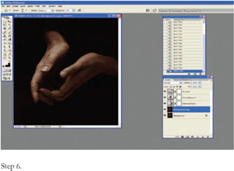
Step 6. Make another copy of the background. In Stieglitz’s photographs of O’Keefe’s hands, the wrinkles and folds of her hands are burned in. To give this image that same look I burned very lightly with the burn tool, and added more little by little. Burn or dodge any details that you wish, and add a vignette to the edges of the image as well.
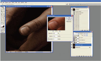
Step 7. The final step is to use Unsharp Mask to sharpen the image.
Step 7.
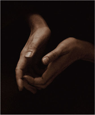
IMAGE © JENNIFER HARDMAN, HANDS, 2007.