3. Spacing Features
You might not believe this at the moment, but knowing how to control spacing issues in InDesign is probably the most important difference between a project that looks amateurish and one that appears professional. Spacing includes the space between letters, between lines, between paragraphs, and between elements. Inappropriate or unconscious letterspacing can make type difficult to read, difficult to comprehend, and difficult to respect.
There is no formulaic method for adjusting the spacing—it is entirely dependent on the typeface, the type size, the paper, the color of ink, the purpose of the piece. The final judge is your eyes. Your eyes know if the spacing is uneven, too tight, or too loose.
Listen to your eyes.
That is, listen to your eyes—and know how to control your software.
What a difference a letter space makes
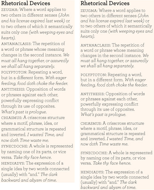
• Kerning is the process of adjusting the space between characters (discussed on the following seven pages).
• A good font has auto kern pairs built into it that make your type automatically look pretty good (see pages 42–43).
• To refine the spacing between individual characters, you can apply manual kerning (pages 44–45).
• To adjust a selected range of type, you can use tracking (see pages 46–47).
• Sometimes you might need to adjust the space between words (see page 48).
• You almost always need to adjust the spacing between the lines, called leading (see pages 49–53).
• And you must always control the spacing between paragraphs (see pages 54–57).
• To add specific amounts of spacing between all the characters in a paragraph, use the “Letter Spacing” options in the Justification dialog box (see pages 60–61).
Units of an em
An em (also called a mutton) is a typographic unit that is the width and height of the point size of the type. That is, if you’re setting type in 24 point, an em is 24 points square. InDesign kerns and tracks based on thousandths of an em, which essentially means that it deletes or adds space based on the point size of the type. When you kern 12-point type, the unit of space added or removed is proportional; when you enlarge that 12-point type to 120 point, the kerning values are enlarged proportionally. This is a good thing.
Although it might sound like removing space equal to a few thousandths of an em is overkill, you’ll be surprised at how critical it becomes as your eyes become more and more attuned to letter spacing.
Reminder
When working with type, it’s easiest to work in points and picas, as explained in Chapter 1 (page 20), so be sure to change at least the vertical measuring system to picas (right-click on the vertical ruler and choose “Picas”).
First, set your defaults
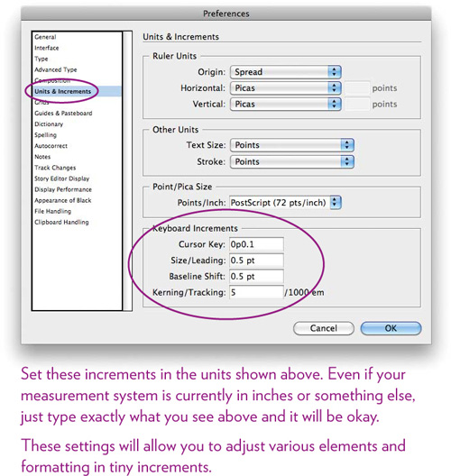
Before we start playing with the various spacing options, let’s first look at the preferences that control your kerning values. You should change these preferences while no document is open on your screen because these values will serve as the defaults for all new documents (existing documents will retain their own defaults). Even if you have no idea what I’m talking about, please trust me and do this:
Task 1 Set the defaults for kerning and tracking
1 Open InDesign, if it isn’t already, and make sure no document is open; close any open documents. All you should see is the menu bar across the top of your screen or window, and perhaps some panels on the right and the Toolbar on the left (or wherever).
2 From the InDesign menu, choose “Preferences...,” then “Units and Increments....”
3 Change the specifications in the callout below. Type in the values you see, including the letters, such as 0.5 pt.
Click OK.
Understand the auto kern pairs
A well-designed typeface includes a number of auto kern pairs. Certain pairs of letters always need kerning, such as “To” or “Va,” so the letters tuck into each other nicely. The spacing happens automatically as you type, as shown here:
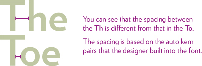
Metrics kerning
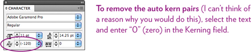
A well-designed face has the kerning built into the font metrics so when you type certain combinations of characters, they automatically snuggle up together. A font might have anywhere from fifty to several thousand auto kern pairs. InDesign, by default, applies these auto kern pairs, as you can tell by the Kerning field—when you select a range of text, it typically says “Metrics.”

This means InDesign is using the font metrics and applying the kerning values built into the font (which is why type automatically looks better in InDesign than it does in most word processors because most word processors do not apply the auto kern pairs). However, when you click the insertion point between two characters, this same Kerning field displays a number in parentheses—that’s the kerning value of the auto pair. (That number will change if you manually kern the characters, and the number will no longer be in parentheses.)
Optical kerning
If you use a typeface that does not have built-in kern pairs, that’s when you want to choose the “Optical” option in the Kerning field (shown on the opposite page). Optical looks at the shapes of the letters and tries to adjust them as well as it can—without eyes.
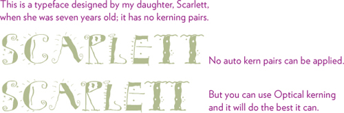
You’ll also want to choose Optical kerning when you’re using a combination of fonts, styles, or sizes because the metrics cannot apply to characters unless they are the same font, style, and size. Below is a typical case in which you would want to choose Optical kerning (you will probably need to do some manual kerning as well).

NOTE: Kerning values always apply to the character on the left, so if you want to apply Optical kerning, select only the characters you want to apply it to. For instance, in the example above, you would select the V or just click your insertion point directly after the V. If you select two characters, such as Va, you will also apply the Optical kerning between the a and the next letter to the right, which might not be what you want!
Manual kerning the space between letters
Manual kerning is when you adjust the space between two characters (that is, two characters as opposed to a range of text). This important letterspacing feature is the only one dependent on your eyes. Manual kerning is what you’ll use to fine-tune your text (typically only your headline text) after all the other options have been adjusted. Manual kerning is the most important feature to master because it is a key to creating professional-level typography.

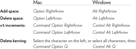
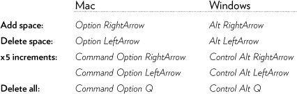
The most efficient way to manually kern is with the keyboard shortcuts (shown below). With each tap of the shortcut, InDesign applies the amount you have set in the preferences pane shown on page 41.
Any manual kerning you apply is added to the auto pair kern that might be built into the two characters. The Kerning field displays the total amount of the auto pair kern and any manual kerning you apply. But you don’t really have to worry about the numerical value—kerning is by eye, not by number. So ignore all the numbers in the boxes and listen to your eyes.
Keyboard shortcuts for manual kerning: With the Type tool, single-click to set the insertion point between two characters.
Note
The point is not to tighten all the spacing—the point is to make it visually consistent so there appears to be the same amount of space between all the letters.
Task 2 Kern a word
1 Create a text frame about four inches wide, then type this word in all caps: WATERMELON
2 Use a sans serif font and make it 36 point.
3 Kern the word manually: With the Type tool, single-click between two characters. Use the keyboard shortcuts shown on the opposite page.

Task 3 Kern a headline
1 Create a text frame about four inches wide, then type a headline into it, such as Not for the Slow-Headed.
2 Format the text with 36-point serif type, something like this:
![]()
3 The metrics are already applied, so now you need to manually kern it. The object is to make the spaces between letters visually consistent.
![]()
Reminder
The kerning value is applied to the character on the LEFT. You can copy and paste that character, and the kerning value goes with it. Delete the character, and the kerning is deleted.
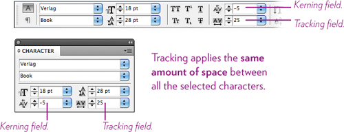
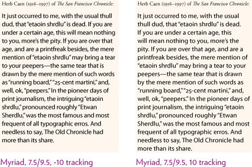
Tracking the space between letters
Tracking is when you adjust the space between a selected range of characters. Instead of applying an individual amount between a pair of letters, tracking applies the same amount to all the characters that are selected. Because tracking does not take into account the shapes of the letters, it’s only useful to get a start on adjusting the space—you still need to fine-tune with manual kerning.
Any tracking you apply is added to the manual kerning and to the auto pair kerns. That’s why you might select an entire word and apply one value of tracking, but when you click between two characters in that same word, the Kerning field displays a different value. But the Tracking value does not affect the Kerning value! You can manually kern between individual characters until they are visually consistent, then apply tracking and everything will tighten or loosen proportionally.
Keyboard shortcuts for tracking: With the Type tool, press-and-drag over a range of characters. (These are the same shortcuts as for manual kerning.)
Tip
You can add tracking to a style sheet. For instance, you might want to open up the look of the body copy—add a wee bit of tracking to a Body Copy style sheet.
Task 4 Track a headline
1 Create a text frame about four inches wide, then type a headline into it, such as In Pearl and Gold.
2 Format the text with 36-point sans serif type, something like this:
![]()
3 The larger the type, the tighter the letterspacing it generally requires. So to get a head start on the process, you can select the entire headline and apply some tracking. If necessary, add manual kerning to finish it.
![]()
Task 5 Open up the letterspacing in the body copy
1 Create a text frame about four inches wide, then fill it with text (from the Type menu, choose “Fill with Placeholder Text”). Or type a paragraph of text, or copy and paste some text.
2 Format the text: Use 10.5-point type.
3 Select all the text and apply some tracking. Just keep hitting the keyboard shortcuts to open up the spacing; see how it looks, then tighten the spacing to see how that looks. Try to get a sense of what makes the text the most readable (it’s a fine line).
The space between words
Occasionally you might need to adjust the space between words. One common circumstance is with some script faces where the tails of the letters encroach on the word spaces; you might need to tighten the letterspacing so the characters connect to each other, but open the word spacing so you can read it easily.

You can also adjust the word spacing in any style sheet (see Chapter 6 on Style Sheets). For instance, if you have a font that always needs more or less word spacing and you want to use it in the headlines of your newsletter, adjust the word spacing in the headline style sheet (use the Justification dialog box, as explained on pages 60–61).
Keyboard shortcuts for word spacing: With the Type tool, press-and-drag over a range of characters.

The space between lines
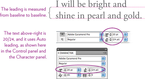
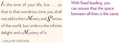
It is amazing how adding a wee bit of space between the lines makes the text not only look more appealing, but easier to read. The space between lines is called leading (pronounced ledding), a name that comes from the thin strips of lead that were used for centuries to separate lines of metal type.
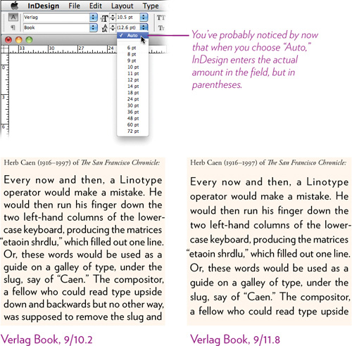
As with most things in life, leading has a standard from which we can deviate. The standard value for leading is 20 percent added to the point value of the type. For instance, if you use 10-point type, the standard leading value—the Auto leading—that InDesign applies to the text is 12 points (20 percent of 10, added to the 10, equals 12). This is written as 10/12, which means 10 point type with 12 points of leading.
But even though it’s called 12-point leading, there are really only 2 extra points of space between the lines! I know, it’s confusing.
The 12 points are distributed from the baseline (the invisible line upon which the type sits) of one line of text to the baseline of the text above.
It’s important to know these things because if you can’t control your leading, it can make you crazy. So let’s talk about how to control it.
Once you become conscious of linespacing, you’ll start getting very fussy with it. It never ceases to amaze me what a difference even a half point of leading can do. If you have read The Non-Designer’s Design Book, you understand how important the concept of proximity is to communication, and now in InDesign you will understand how to create exactly the amount of proximity you need between items for clear communication.
Task 6 Experiment with the leading in body copy
1 Create a text frame about four inches wide, then fill it with text (from the Type menu, choose “Fill with Placeholder Text”). Or type a paragraph of text, or copy and paste some text.
2 Format the text: Select all the text and choose 10.5-point type, plus Auto leading (choose “Auto” from the Leading field pop-out menu).
3 Select all the text and change the leading values. Experiment: Take out leading, add more, add an excess, etc. Either choose an amount from the Leading menu or type in any amount. Print up a page of these paragraphs using different amounts of spacing. How do the various amounts of linespace affect the readability of the text?
Task 7 Play with negative leading
The leading value does not always have to be larger than the point size. In fact, the larger the font size, the less leading you need. You will regularly find yourself decreasing the leading in headlines.
1 Create a text frame and type the headline you see below.
Do not hit a Return after “Crush”—either make the text frame smaller so the line breaks at that point, or hit Shift Return or Shift Enter to force a line break (this breaks the line but does not create a new paragraph).
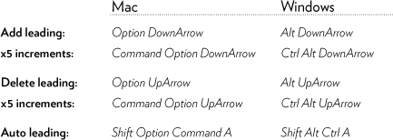
2 Notice how much unnecessary empty space is between the lines. Select all the text and reduce the leading amount. Use the keyboard shortcuts (shown below) so you can judge the appropriate amount with your eyes. You’ll see the value in the Leading field change as you use the shortcut.
Keyboard shortcuts for leading: With the Type tool, press-and-drag over a range of characters. The amount of leading that is added or deleted is the amount specified in the preferences shown on page 41.
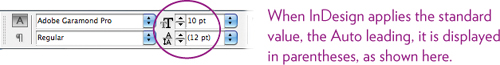
Auto leading versus fixed leading
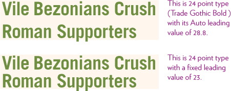
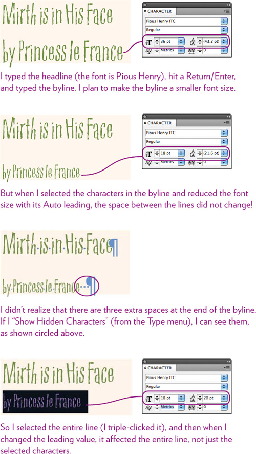
Auto leading: When the leading applied to text is Auto (which will be displayed in parentheses in the Control panel and Character panel, as shown on the opposite page), the space between the lines adapts as you resize the type. No matter how large or small you make the text, the leading is always proportionate to the size of the type (120 percent of the point size).
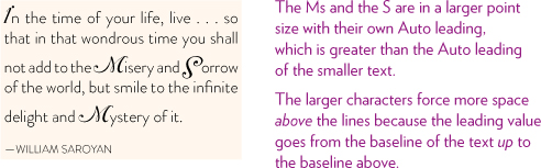
This is fine for many things. You will run into issues, however, if you enlarge the point size of any character in a line that uses Auto leading because the character with the largest amount of Auto leading takes over the whole line. It creates this kind of look:
The solution is to use fixed leading.
Fixed leading: When you fix the leading by typing in your own value (even if it’s exactly the same amount as the Auto leading value), the leading stays that value, no matter how large or small you make the text. By fixing the leading, you avoid problems like the one shown above because the line spacing will stay the same no matter what the point size of the type.
If there are any blank characters at the end of a line (which are invisible to you!), they hold on to their leading value and can impact the line spacing. When changing the leading in a line or paragraph, make sure you select the entire line or paragraph, as shown here:
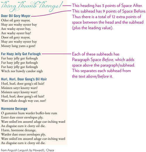
The space between paragraphs
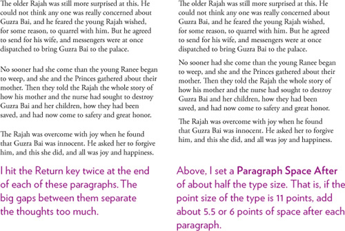
This is one of the most critical spacing features you can learn to use, in which you can add wee bits of space between paragraphs without having to hit the Enter or Return key twice. In fact, after you read this, you are never again allowed to hit Enter/Return more than once. (I’m just going to call it a Return from now on, but know that it works for the Enter or Return key.)
When you hit Return, InDesign starts a new paragraph, as you know. Automatically included in that Return is a certain amount of space between the paragraph you just finished and the new one you are starting. The default is usually 0 points or 0 inches of space, which is why one might automatically hit two Returns to make more space.
But two Returns makes a big, dorky space and all your paragraphs end up looking like disparate elements on the page. So ideally you want just about a half line between paragraphs, like what you see in this text you’re reading and in the example below-right. That’s where Paragraph Space After comes in.
Tip
If you get confused about whether to add paragraph space before or after, just remember this guideline: Always use Paragraph Space AFTER. The day will come when you hit upon a design problem and discover that there is the perfect place to add Space Before, and then you will feel comfortable doing so. Until then, use Space After.
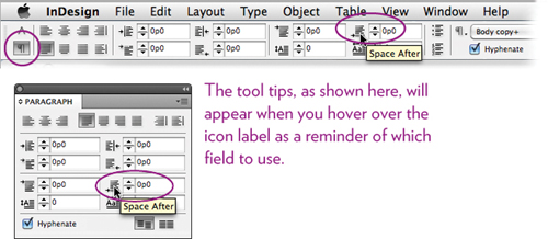
The amount of space between paragraphs is determined in the Paragraph panel, as shown below. Let’s start with the Paragraph Space After because it’s a little easier to understand.
Task 8 Experiment with the Paragraph Space After
In this example, you’ll adjust the spacing between several paragraphs. First, make sure your measuring system is in picas: Right-click (or Control-click) on the vertical ruler on the left side of the window, and choose “Picas.” Then:
1 Create a text frame about three inches wide and five inches deep.
2 While the insertion point is flashing in your text frame, choose 10 point for the font size.
3 Type three short paragraphs of anything. At the end of each paragraph, hit ONE Return or Enter—not two! At the moment, it might look like there is no space between the paragraphs; that’s okay.
4 When you’ve got three paragraphs, each at least two or three lines long, select all the text.
5 In the Paragraph panel or in the Control panel with the paragraph specs showing (as shown above), enter 0p6 in the Space After field, then hit Enter. You should now see 6 points of space between each paragraph.
Experiment with other values until you can predict what will happen when you hit Enter.
Tip
Any Paragraph Space After or Before is added onto the leading value.
Task 9 Combine leading and Paragraph Space After
In something like a bulleted or numbered list, you want the lines in the paragraph to be closely connected, but you want more space after each section. So tighten up the leading a wee bit, and open up the Space After.
1 Recreate the list shown below with any list of your choice.
2 Tighten the leading just a tiny bit, like half a point, and add Paragraph Space After to all paragraphs, including the headline (separately). You can immediately see the huge difference in clarity.
Task 10 A place to use Paragraph Space Before
This example is one of the few times when it’s perfect to use the Space Before feature instead of the Space After. When you have body text that is broken up with subheads, you want the subheads to be closer to the body copy it refers to and farther away from the text above/before the subhead. So add Space Before to subheads.
In something like a newsletter or a brochure, you’ll create a style sheet (as explained in Chapter 6) for subheads to make the space appear automatically.
1 Create several short paragraphs, each with a subheading. Hit a Return after each subheading, and a Return at the end of each paragraph.
2 To each subheading, add 9 or 10 points of space to the Paragraph Space Before.
If you really have to make it fit . . .
Sometimes the text just doesn’t fit and you have to cheat a little here and there to force it into the space. For instance, you might want to bring the short last word of a column up to the line above, or make a one-line statement fit on one line, or send a couple of words to the last line. Here are a few extra tricks you can use, and probably no one in the entire world will notice (which is kind of sad).
• If your text frame is flush left, widen or narrow it just a hair. Or two.
• To force one line that’s just a little too long into one line, justify it.
If that doesn’t work, select the entire line and use the tracking keyboard shortcut to take out wee bits of space.
Or do both of the above.
• If you have many pages and you want to make everything just a tiny bit shorter or a tiny bit longer, remove something like one-quarter or one-half of a point out of the leading, or add a tiny bit.
Or select the appropriate text and use the Justification dialog box (see the following two pages) to delete/add a tiny bit of Letter Space to all of it.
• Change the Horizontal Scale of the selected characters. You can make them 2 percent wider or narrower and few people will notice. In headlines, you can get away with a little more compressing or stretching because people seem to almost expect it, which means few people will worry about it too much.
![]()
• Triple-click to select an entire paragraph, then use the keyboard shortcuts to track the text, adding either a tiny bit of space or deleting. This can bring the last word, an orphan, up into the paragraph, or send a couple more words down to the last line so you don’t have an orphan at all.
Advanced tips: Paragraph-specific letterspacing
Feel free to skip this section—you can probably live your entire life without reading it. But if you are feeling confident about spacing issues in InDesign and want to know even more, learn about the Justification dialog box and how it impacts spacing.
First, understand that kerning values are “character-specific,” meaning you can apply them to selected characters. Tracking values are also character-specific, but can be added to style sheets in the “Basic Character Formats” pane; when added to a style sheet, the tracking affects every character in the paragraph.
But there’s another way to adjust the letterspacing in a paragraph of text, or in all headlines, a story, or an entire document—paragraph-specific letterspacing. Because this letterspacing does not take into consideration any tracking, kerning, or pair kern values, it is the fastest and most processor-efficient way for InDesign to adjust the space between lots of characters. This is the feature you want to use if you have pages of text to open up or tighten. (You won’t see the paragraph letterspacing value reflected in the tracking or kerning fields.)
The specifications in the Justification dialog box affect all the type on the page, whether you realize it or not.
The Justification dialog box
Open the Justification dialog box in either your style sheet options or from the Paragraph panel menu. These specifications tell InDesign how much it can adjust the word spacing, the letter spacing, and even the width of characters (glyphs) when the text is justified (lined up on both the left and right sides). For instance, the defaults shown below tell InDesign that if you justify the text, it is allowed to squish the word spacing up to 75 percent to make text fit on the line, or it can expand the word spacing up to 150 percent. If necessary, it is also allowed to adjust the letter spacing where necessary, but in these specs it cannot squish or expand the letterforms/glyphs.
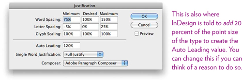
Now, there are two things to remember about these specs:
• The “Minimum” and “Maximum” amounts only apply if you justify the text. That is, flush right or flush left text will ignore whatever is in those fields and will simply apply the “Desired” amount.
• The “Desired” amount must be between (or including) the “Minimum” and “Maximum.” For instance, if you want to change the “Desired” letterspacing to 30 percent, first you must change the “Maximum” to 30 percent or more.
The smaller the type size, the more letterspacing it needs, proportionally, and the larger the type, the less letterspacing it needs. So let’s say you have a page of small type and you want to open up the space a little. You could do it with tracking, but it will be faster and more efficient to use the paragraph letterspacing.
So select the text or style sheet. In the Justification dialog box, first enter an amount in the Letter Spacing “Maximum” field. If your text is justified, enter the percentage that you want to increase the spacing by, and enter that same amount in the “Desired” field. If your text is not justified, enter any amount in the “Maximum” field, then enter your desired increase in the “Desired” field.
If you’re working with large type that needs less letterspacing, you can enter negative numbers in the “Minimum” and “Desired” fields.
The Word Spacing in the Justification dialog box works the same as Letter Spacing: The designer has built into the font metrics the “spaceband,” or the amount of space that appears on the page when you hit the Spacebar. You can deviate from this amount by a desired percentage. I sometimes open up the word spacing just a wee bit for clarity.
The Glyph Scaling, as I mentioned, can allow InDesign to squish or expand the actual letterforms to fit the text in the desired line length. Alternatively, you can use these fields for an intentionally distorted type effect! (For short pieces of text, such as the one below, you can also use the Horizontal Scale field in the Control panel or the Character panel.)

Tip
To force a line break without making a new paragraph, use Shift Return or Shift Enter.
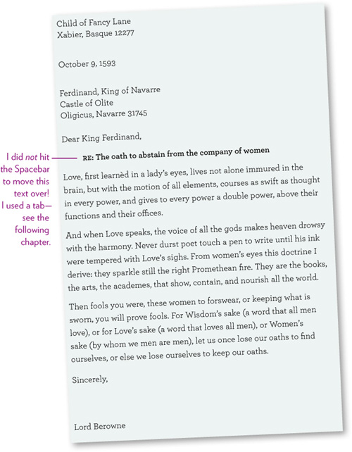
Try this!
Recreate a letter like the one below. Do not hit double Returns/Enters to create the spacing! Everything can be done with Paragraph Space After and with leading. Once you have the letter set up, you can use it as a template for future letters.