6. The Meat and Potatoes
Now let’s move the discussion from the From name and Subject line (external to the email) and the preheader (external/internal) and the header (internal) to the meat and potatoes of an email. This part of the email helps to drive action and is what we’ll cover in this chapter. For some emails, this call to action starts with the table of contents.
Table of Contents
A table of contents (TOC) is typically what you see in a book (like this one) or a magazine. It lists the contents of the document, broken into the order they appear—Introduction, Chapter 1, Chapter 2, and so on. Magazines often have a type of TOC that includes a bit more of a teaser about each article or section. Either way, the point of a TOC is to give readers an idea of what information the book or magazine contains.
Email marketing messages that include a TOC are not much different. Email TOCs range from the basic, such as a list of the various sections within an email newsletter, to the more advanced—such as a format that enables readers to quickly scan the top of the email and click a link to jump to the section in which they are most interested. In online marketing speak, the “jump” refers to what’s known as an anchor link. Clicking on this link takes the reader to that particular section in the email.
Not every email will or should have a table of contents. It’s utilized most often by more traditional media and/or publishing companies. Additionally, if an email is extremely long (more than a few printed pages), then including a TOC to break up the copy and enable subscribers to read just those sections they are most interested in is common.
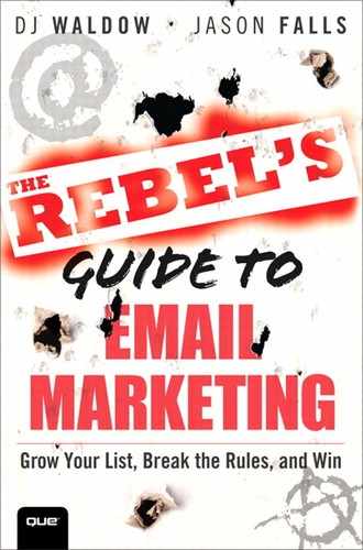
Zappos’s Digest TOC Email
Online retailer, Zappos, is one such company who includes a TOC in some of its emails. On occasion, they send a “digest” email—one that highlights many of their items for sale—that includes an “IN THIS ISSUE” section. This functions as a TOC, as shown in Figure 6.1.
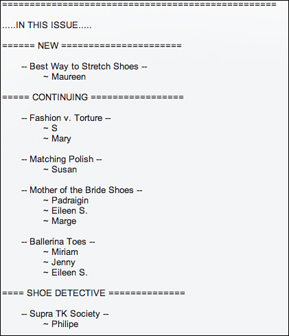
Figure 6.1. This digest email from Zappos includes a very basic table of contents. This email is also mostly text.
As you can see in Figure 6.1, the Zappos “IN THIS ISSUE” TOC informs its subscribers of what’s included in the email. It’s one of the more basic TOCs out there. Zappos doesn’t use anchor links or make the email fancy in any way. Instead, it chooses to keep it simple and direct. You’ll find out more about mostly text emails in Chapter 10, “The Perfect-Looking Email.”
MarketingProfs’s Approach to Email Table of Contents
MarketingProfs, with a list size of nearly 500,000 subscribers, has been doing email marketing since the turn of the millennium. Email marketing is a critical part of its business model.
As Ann Handley, Chief Content Officer at MarketingProfs and co-author of Content Rules (Wiley, 2011) said, “From its early incarnation, email is the Gorilla glue that helps cement relationships with our subscribers. With every bit of emailed content we send out, I hope to deliver great information, useful knowhow, excellent content, and top-shelf advice. My job—in a big way—is in service to our email subscribers, our members. Because to paraphrase country music’s Tracy Byrd... ‘ When they ain’t happy, no one’s happy.’”
MarketingProfs’s VP of Marketing, Anne Yastremski, says that email marketing is the company’s main source of revenue and at the center of all marketing-related campaigns. It sends close to one million emails each week (not including e-newsletters). “As you can imagine,” says Yastremski, “the marketing team spends the majority of each week on email campaign planning, creative, segmentation, list management, and reporting to make sure we get the most return from our investment in email marketing.”
When it relaunched MarketingProfs Today as a daily email in January 2011, the team saw it as an opportunity for redesign. According to Handley, the team chose to include a table of contents for two reasons:
• Newsletter headlines and content would appear “above the fold.” In other words, subscribers would not have to scroll down to access the day’s content (and it could be seen in many email client preview windows).
• In one quick glance, a subscriber can see the day’s offering.
“We know a daily email equals a lot of communication—this was our attempt to make it less weighty, more accessible,” said Handley.
However, the MarketingProfs’s TOC is not your average one, as shown in Figure 6.2.
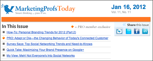
Figure 6.2. MarketingProfs’s daily email has a table of contents whose links go to specific landing pages.
In contrast to the Zappos email, MarketingProfs uses its TOC as an opportunity to get more subscribers to click through to an article or blog post on its website. The MarketingProfs TOC serves a few purposes, one of which is to list the various content blocks (sections) of the email. This allows readers to skim what’s “in this issue” and quickly decide what’s most interesting to them. However, these links are not the traditional anchor tags that are often utilized in an email TOC. Instead, each link redirects to a specific landing page—an article, a blog post, and so on—on one of the MarketingProfs websites.
“We didn’t want to force our subscribers to click or scroll more than necessary,” said Handley. “An anchor link would necessitate a second click (once to the in-newsletter headline, then a second click through to the site). That’s unnecessary, and you risk annoying (or losing) readers along that path.”
Besides making it easier for readers to quickly access the content, another advantage of this approach is that the email service provider (ESP) can track the click-through numbers and provide MarketingProfs rich data on which and how many subscribers are taking action on each link in the TOC. This allows MarketingProfs to segment its users based on links they click and make some educated guesses on which content is most appealing to each reader.
In the first quarter of 2012, the top-ten content links in terms of unique website page views were all from the table of contents links. In fact, among the top 400 content links in the MarketingProfs Today daily email, the table of contents links accounted for 63 percent of the unique website page views.
Open a few of the emails you opted in for in Chapter 2, “How to Grow Your List.” Do any of them contain a table of contents? If so, what does it look like: the more traditional one listing what’s in the newsletter, or topics linked like the MarketingProfs example? Does your personal or company email newsletter contain a TOC?
Breaking the Rules: Table of Contents
Figure 6.3. AppSumo doesn’t need a table of contents because its email contains one big idea rather than many small ones.
Main Calls to Action
Let’s now move to the actual body of the email. The main call to action (CTA) is the purpose of your email marketing message. It’s what you want your subscribers to see, read, click, or do. It’s the action you want them to take. Ideally, you make the offer so compelling (“Holy cow! This is great!”) that they have no other choice but to click.
In many cases, the main CTA is similar to the Subject line and can be an extension of it. Remember: The goal of the Subject line is to get someone to open your email. If the Subject line includes a promise of “Free Shipping” or information on an upcoming webinar, ensuring that the main CTA is consistent is important. Make it easy for your subscribers to quickly respond to your message.
An email CTA is not all that different from any other CTA. Let’s compare it to a few more traditional and new media examples:
• Television commercials: Think back to the last TV commercial you watched. What was it about? What did the advertiser want you to do? Go to a website? Call a super-special number? That website or phone number is the call to action.
• Outdoor billboard: Considering many billboards are located on the side of highways, they have to get their point across quickly and succinctly. Similarly to a TV commercial, many include a website or phone number as their main call to action, or the simple instruction to exit now and eat!
• Social media updates (Tweets, Facebook status updates, Google+ posts, and so on): When using social media for marketing purposes, you have a limited number of characters to get someone to take action. Most often, a link is that main call to action, directing your community to a website or landing page where they can learn more.
Look at the emails you opted in for in Chapter 2. Do they all have a main call to action? Is it clear and obvious what the goal of the email is, what action the sender wants you to take? If you are having trouble answering that question, the email likely lacks a call to action.
Think about the call to action in your email campaigns. Is it working? Are your subscribers clicking through? Are they reading that article you point them to? Are they buying the product you want them to? If not, it’s worth considering running some split tests, keeping one email the same and changing the other in some way. Most email marketing providers will allow you to test one email’s creative (copy and/or artwork) against another. Try setting up a few tests, such as these:
• Size of button: Test a large button versus a smaller one.
• Placement of button: Test the button left justified versus centered versus right justified in your email layout.
• Frequency of button: Test putting the same button in multiple places in your email.
• Button versus link versus images: Test different types of calls to action.
Digitwirl founder Carley Knobloch, whom we first introduced in Chapter 2, relies heavily on email marketing to drive website and video views. She told us that her typical open rates are between 45 and 55 percent—well above industry averages. Additionally, her click-through rates average around 20 percent. Not bad.
“I completely credit [these high rates] to fantastic content...content [that] is solving a problem...making it very relevant,” she said. “We only produce one show per week so we always try to ‘knock it out of the park.’ The email is no more than three to four sentences long with a prompt to click on the video.”
That prompt is her call to action.
Check out an example of the Digitwirl email in Figure 6.4. Can you spot the main call to action?
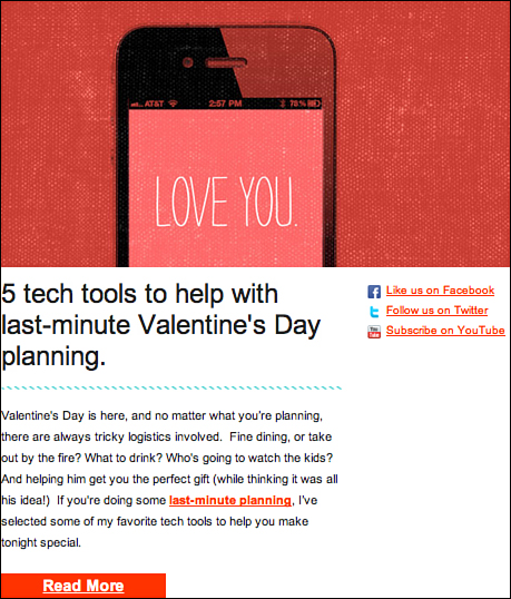
Figure 6.4. This Digitwirl email has a simple call to action—a red Read More button.
If you guessed the Read More button, give yourself a high five. However, notice that this email also includes a link call to action (“last-minute planning”) as well as an image call to action (an iPhone with “Love You” on it). If clicked on, all three of these CTAs send subscribers to the same landing page, which details Digitwirl’s weekly tip and includes the embedded video.
Whatever method you choose to showcase your call to action, it is the authors’ strong belief that every single email marketing message needs one. Why bother sending out an email if you don’t have a purpose to fulfill, a goal to achieve, or an action you want your subscribers to take?
What’s important is to test. What works for some subscribers might not work for others. Try sending out the exact same email with one small change: Instead of using a button as your main call to action, replace it with a link. See what happens. How does that change impact your click-through rate? Your social shares? Your conversions?
Breaking the Rules: Calls to Action
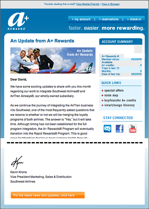
Figure 6.5. AirTran subtly placed its CTA in its emails to customers about its integration with Southwest Airlines. (Image not meant to be read in detail.)
Secondary and Tertiary Calls to Action
As we introduced briefly in Chapter 5, “The First Impression,” the secondary and tertiary calls to action are typically less prominent in the email. They are often “below the fold” (meaning you have to scroll down a bit to see them). Sometimes they are on the sidebar or closer to the footer of the email (see Figure 6.6). Suffice it to say, these calls to action are not usually the first thing that catches a reader’s eye.

Figure 6.6. An email from REI shows a secondary call to action (#5), both on the right sidebar and below the main call to action.
If the main CTA is the action you want your subscribers to take, then consider the secondary and tertiary calls to action as bonus areas. To be clear, we are not saying they are less important or that you don’t want your subscribers to take action on these other calls to action, only that they are not as prominently featured for a reason—the marketer really wants you to click on the main call to action (that’s why it’s featured!).
In the REI example (see Figure 6.6), the main call to action (#4) is on the left side, above the fold. This area is typically where a reader’s eyes are drawn to first. REI’s main goal is to have subscribers click through to the snowsports section of its website (“Shop all snowsports”).
Moving to the right is where you find the secondary calls to action (#5). Notice how they are significantly less prominent: The imagery is smaller and the calls to action are less noticeable links compared to the large image and big blue button in the main call to action.
Continuing down the email are the tertiary calls to action, which appear below the fold: In other words, subscribers are forced to scroll to see the rest of the email. In this area, REI encourages subscribers to “Check out Arbor” snowboards and shop at its online outlet store. Although the call to action is still quite strong and large, you can tell it’s not the main call to action because of its placement below the fold.
Although REI would not object to having customers click through—and ultimately purchase—items in the secondary and tertiary areas, the main goal of the email is to have readers click through to snowsports. The reason for adding additional calls to action is to give readers some options—especially those who are not enticed by the main call to action.
Secondary and tertiary calls to action can be very important to the success of an email; however, they don’t appear in every email. Some marketers choose to include only a single CTA in their emails. This approach can work if your email has a single goal such as to register for a webinar, save 20 percent on all merchandise, or read a blog post. In this case, you don’t want to distract your subscribers with any extraneous information. Your goal is to get them to take one and only one action.
Buttons vs. Links vs. Images
Email marketing CTAs come in many flavors. Sometimes a simple link serves as the main call to action, as shown in Figure 6.7. In other cases, a big button (see Figure 6.8) or an image does the trick. Some marketers use a combination of links, images, and buttons (see Figure 6.9).
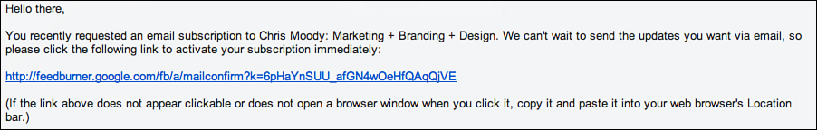
Figure 6.7. An email from Feedburner shows a simple link as the main call to action (no buttons, no images).
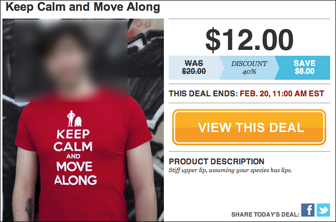
Figure 6.8. An email from BustedTees uses a big, orange button as the main call to action.
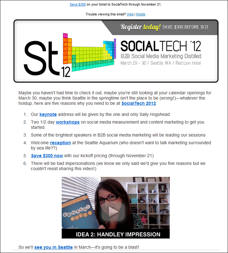
Figure 6.9. An email from MarketingProfs uses many different tactics—links, buttons, and videos—for its main call to action.
If you’ve ever subscribed to receive blog post updates via email from Feedburner, you’ll recognize the email shown in Figure 6.7. This email is known as a “double opt-in” email. In other words, to start receiving Chris Moody’s blog posts via email, the subscriber needs to click the link within the email. In this case, a single, link-based call to action is appropriate. What action the sender wants each reader to take is very clear (click the link!).
BustedTees also includes a clear call to action in its Deal of the Day emails. However, as opposed to a single link, its emails have a big “View This Deal” button, as can be seen in Figure 6.8.
BustedTees doesn’t bother with secondary or tertiary calls to action nor does it add any other distractions to the email. The email is simple and straightforward: a picture of a man modeling the “Keep Calm and Move Along” t-shirt, the discounted price ($12.00), the date and time the deal ends, a brief product description, and the big “View This Deal” button.
Similar to the single link call to action in Figure 6.7, BustedTees’s “big button” approach makes it very clear what action it wants its subscribers to take. The only way to learn more about the offer is to click the “View This Deal” button.
One of our favorite examples of an email that includes one main call to action with a variety of CTAs is from MarketingProfs.
How many different types of calls to action can you find in this email? How many total CTAs do you count? Let’s see how much you’ve learned so far in the “Anatomy of an Email” part of the book. If you are the type who writes in books, grab a writing utensil and circle all the calls to action in this email.
Let’s see how you did.
Starting from the top, you can see a call to action link (Save $300) in the preheader. That’s one. Moving down just a bit to the header is a clickable image with a “Register today!” call to action. That’s two. Continuing down the email, the opening paragraph provides readers an introduction to the SocialTech 2012 event as well as the main call to action link: SocialTech 2012. That’s three. Next, there is a bulleted list of six reasons to attend the March event. This section has four clickable links as well as a clickable image of a video. Toss in the “see you in Seattle” link, and the email contains nine total calls to action. Breaking this down by call to action “type,” it has seven clickable links (one in the preheader), one clickable image in the header, and one clickable video image.
What’s really great about this approach is it enables the MarketingProfs community to engage with the content in whatever way appeals most to them. Whether it be a link that catches a subscriber’s eye or the video that draws them to take action, it doesn’t matter to MarketingProfs. As long as the subscriber clicks through to the landing page (and registers), MarketingProfs is happy.
What’s the best type of call to action? Should it be a button or a link or an image? Part of the answer comes through proper testing, but it also depends on what type of marketing message you are sending. For example, if you are an online retailer who sells men’s and women’s clothes, say Ibex Outdoor Clothing, showing pictures and images of your products is important (see Figure 6.10).
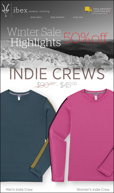
Figure 6.10. This email from Ibex Outdoor Clothing features men’s and women’s long-sleeve crew shirts appears to be one big image, but is actually sliced into multiple images.
The Subject line of this Ibex email is “Get Our Indie Crew for Your Crew—50% off!” Notice that the main call to action in Figure 6.10, a clickable image, is very consistent with that Subject line. The big image features a snowy landscape with pictures of both a men’s and women’s Indie Crew shirt. The text on top of the image reinforces the Subject line and the imagery.
Even better, when a subscriber clicks anywhere on this image, he is sent to an Indie Crew product landing page.
Contrast the Ibex “image CTA” with the one from Help a Reporter (HARO), which sends out an email to its subscriber base three times per day with simple links as its main call to action. See an example of one of those emails in Figure 6.11.
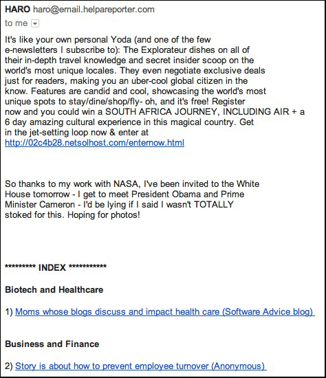
Figure 6.11. HARO’s email digest of public relations pitches and journalists’ story resource needs is all text and only presents calls to action in link form.
Considering the HARO email is mostly text (intentionally), its main calls to action are simple links; nothing fancy, just links. This email generates a high amount of response from its audience. Reporters and public relations professionals actively read and click through the links to see which reporters need help with stories and what pitches might resonate with a media outlet’s audiences. HARO is a perfect example of a highly successful email marketing effort that breaks all kinds of rules. It has no images; multiple calls to action with none called out as primary; and it is incredibly long.
Like preparing meat and potatoes for your family at dinner, preparing this part of your email marketing gives you lots of options. You can use images, buttons, or links for your call to action. Or, you can have lengthy emails that inform, assuming your audience will intuitively know to click through and buy things. You can deliver one message per email or compose a more traditional “newsletter” style email with many different content elements. You can forego sending the email to everyone on your list and segment your email list and send specific messages to specific types of customers. The key to having this part of the anatomy of your email as successful as possible is creating content (deals and coupons, informative articles, beautiful pictures, entertaining videos, and so on) that your audience finds irresistible: Readers become insatiable for your emails. When you accomplish that, your CTA metrics will impress you.
However, having delicious meat and potatoes in your email doesn’t mean the meal is finished. You have to have dessert, right? So let’s put some finishing touches on these campaigns.
Endnote
1. “View from the Inbox 2009,” Merckle. http://www.customerinsight-group.com/marketinglibrary/wp-content/uploads/2009/04/view-from-the-inbox-2009.pdf