10. The Perfect-Looking Email
We all can think of a thing or two that drives us nuts about email marketing messages. For some, HTML (or website code) in email is the best thing that’s ever happened. It allows senders to create aesthetically pleasing messages, ones that are easy on the eyes as well as make clear what action they want subscribers to take. However, for others, HTML in email is not so good. These are people who we believe should never be allowed to design emails or be in charge of email marketing programs. Okay, maybe that’s a bit harsh, but you get the point.
In 2012, one would think marketers have matured from mostly text emails or emails with one big image. There is no excuse for sending ugly emails in the second decade of the twenty-first century. Unfortunately, this is not true. Email marketers break these “rules” all the time. Examples of “ugly” emails are everywhere, in every inbox across the world.
How can that be?
You have to remember that beauty is in the eye of the beholder. What you think is ugly might be gorgeous to someone else. This adage applies to more than just email marketing, of course, but is also true in the inbox. Also keep in mind that one company’s target audience or customer base is different from another’s. What looks appealing for a retail company focused on teenagers might not be the best format for a business-to-business (B2B) firm targeting chief financial officers.
Despite these rules, many companies are successful sending emails that are far from perfect looking. These people send mostly text or mostly images emails. They make opting out easy for their subscribers by placing an unsubscribe link or button at the top of their emails. They send what many would call “ugly” emails.
Are these folks crazy? Maybe. But that’s another book altogether. What’s interesting is that most of them are intentionally breaking the rules of email marketing by sending “ugly” emails and still finding a great deal of success. In this chapter, we’re going to get ugly, but successful, and show you how the beautiful ones aren’t necessarily the chosen few in email marketing.
It’s Okay to Send Mostly Text Emails
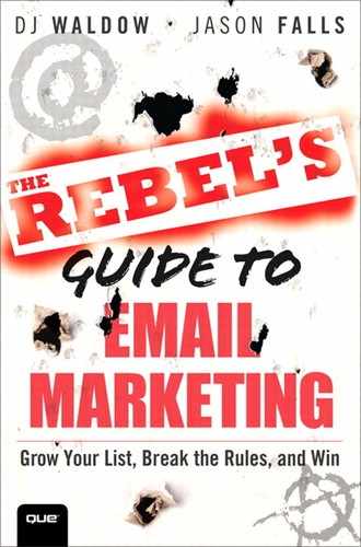
Although Jameson Lopp might have been a bit extreme with the tweet shown in Figure 10.1, it’s similar to a question we often hear: Why in the world would I send an all or mostly text email when I have the option of sending an HTML email with images?
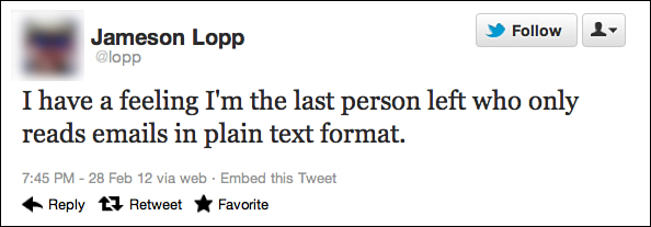
Figure 10.1. In a tweet, Jameson Lopp admits to reading email in plain text format.
Before we address that question, let’s take the time machine back to the end of the twentieth century. In the late 1990s, as the Internet and email were first starting to become more accessible and mainstream, many people were still using modems with slower-than-molasses dial-up connections. Due to these slow speeds, images took forever to load on websites as well as in your email client (think: America Online and “You’ve Got Mail”). Additionally, not all email clients could read HTML. If you wanted your email to load quickly and have the best chance of being read by most of people, a text-only email was your best option.
One argument in favor of mostly text emails has to do with how HTML emails render (or display). Litmus is a company whose software allows you to preview your HTML emails in actual email clients and mobile devices before sending your message, allowing you to see how the message renders. Then, based on what you discover, you can go back to your email and modify it accordingly.
As you can see in Figure 10.2—a screenshot using the Litmus software—the same email can look very different depending on the email client (Gmail, Hotmail, AOL, Lotus Notes), browser (Internet Explorer, Firefox), smartphone (BlackBerry, HTC, iPhone), or tablet (iPad 2) your subscriber is reading it on.
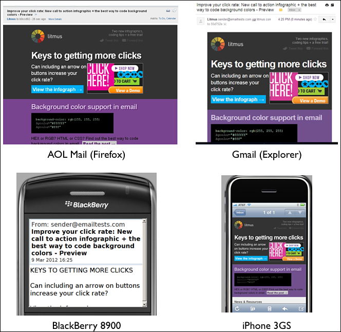
Figure 10.2. A preview of one email (using the Litmus software) looks very different depending on the email client, browser, and smartphone being used.
Sending a plain text email nearly guarantees your email will look the same on every device. Even though most smartphones can read HTML emails, BlackBerry devices continue to have rendering problems with them (as seen in Figure 10.3). Email service provider MailChimp published a support document1 that listed several reasons why you should still create plain-text emails. One confirmed what Lopp tweeted: Some people just prefer plain-text emails. Another one focused on security concerns. Many modern email programs warn their users about potential threats of privacy and phishing. This is when someone sends an email that appears to be from a legitimate source, such as a bank, to get the recipient to respond with personal information such as his account password, Social Security number, and the like.
Figure 10.3. The same Litmus email viewed on a BlackBerry 8900 (left) and an iPhone 3GS (right). Which one is most likely how the sender intended it to look?
It’s safer to use plain text emails because HTML is often preferred by scam artists. A plain text email also streamlines the amount of code, or technical information, that is contained in the email file. Smaller file sizes can help your email clear spam filters and appear safer to your recipient’s email service provider.
Finally, plain text email can seem a lot more personal—more one-to-one. When was the last time a friend, family member, significant other, colleague, or co-worker sent you an HTML email? When was the last time they dropped you a note that was in a template with images and various styles? Unless you signed up for that person’s email list, probably never. For personal communications, everyone is much more accustomed to seeing emails in plain text.
However, the key to success is to test. What works well for one audience might be totally different for another. Your goals and success metrics might look quite different than someone else’s.
Some Subscribers Prefer Simple Text Emails
Derek Halpern, who does marketing at DIYthemes and is the founder of Social Triggers, is big on testing. Through blog posts, articles, podcasts, webinars, and live presentations, Halpern shares insights on how to use psychology to better understand what makes people tick.
In less than a year, Halpern has grown Social Triggers into one of the leading destinations for online marketing advice. As of April 2012, he had attracted more than 20,000 subscribers to his site. Email marketing has historically been, and continues to be, a big reason for Halpern’s rapid growth.
“I’ve experimented with both simple text and fancy HTML, and in all my experience, simple text generates the best results,” Halpern said. Knowing that his emails are mostly text, we asked him to clarify how he determined best results.
“Not only did I average more click throughs, I also had lower unsubscribes and more interaction,” he said. Halpern even asked his subscribers to share their thoughts about simple text versus fancy HTML email in a survey. The results:
• 55.1 percent of respondents said they preferred simple text.
• 19.7 percent preferred HTML.
• 25.2 percent of respondents responded with “Kind of...” (which really means that they like text, but there was something else bothering them like the width of the email).
Those who responded in favor of the simple text emails shared a bit more about why:
• “Clean”
• “Much easier to read”
• “The new format tended to make me feel as if I were a tried and trusted confidant—and that was welcomed”
• “It’s clean and easy to read. Call to actions are also clean and easy to follow.”
Halpern told us that focusing on simple text emails has been extremely effective. “On one email I sent out to more than 10,000 people,” he said, “I saw a 74.2 percent open rate and a 25.1 percent click-through rate.” He’s able to measure this open rate because his email, while mostly text, is still written in HTML, thus allowing the email service provider’s invisible image to record an open. (For an explanation of the invisible image approach, see the following sidebar on open rates.)
“This all depends on how you condition your subscribers,” Halpern explained. “Also, it depends on how great your content is. Just because text emails work for me, doesn’t mean they will work for you. However, don’t let that be your excuse for not trying them. Smart email marketers test, and they test often. What’s true today may not be true tomorrow.”
Halpern believes, and we agree, that one of the keys to email marketing is to take widely accepted assumptions (best practices) and ensure they’re true in your business. In other words, best practices are practices that work best for you and your subscribers.
Writing Letters Versus Pamphlets
Jason Keath is a social media speaker and analyst. He is an entrepreneur as well as Founder and CEO of Social Fresh, a social media education company. Keath produces high-level social media conferences and training across the country and online, for the marketing perspective. Keath has been doing email marketing for nearly six years. Like Halpern, email plays a critical role in his business.
“(Email is) our most direct line to our fans and customers. If we want to let our stakeholders know when we are launching a new event or product or websites, email reaches ten times what we can get through Facebook, Twitter, and our blog combined,” Keath said.
In 2011, Keath decided to switch his email campaigns from well-designed, “pretty” HTML emails, to mostly text with a few links as the main calls to action. He cited several reasons, including more efficient production time, the emails are more easily read on mobile devices, and the new format allowed him to build more of a personal connection with his email audience. He said the transition was, “like writing letters as opposed to mailing out pamphlets.”
The personal touch and community connection aspect of mostly text emails is the most important one for Keath. Considering Social Fresh advocates the personal connection, this approach makes sense. Equally as important, he’s seeing great results. Opens and click-through rates on Keath’s mostly text emails are higher than his more traditional, HTML template emails with images. Since making the switch, Keath has seen open rates rise from 18 percent to 21 percent, whereas click-through rates have jumped from under 6 percent to more than 8 percent.
Like Halpern, Keath also stressed that the content of his emails, more than the format, is the real driver in success. “Very timely topics get high click-throughs. Talking about Facebook when they are in the news or topics related to broader newsworthy topics like Christmas or the Super Bowl [generate more clicks].”
Text Emails Have a Clean Look
Chris Brogan is the president of Human Business Works, a media and education company. He’s also a consultant, professional speaker, and bestselling co-author of the book Trust Agents (Wiley, 2010). Brogan and his team at Human Business Works have been sending a weekly, mostly text, email newsletter to their list since 2010. In late 2011, they switched to a new email service provider and really began focusing on list growth. The result? An 86 percent growth in their email list in a short 11 weeks.
Rob Hatch, Chief Operating Officer of Human Business Works, attributed this rapid growth to four main factors:
• Useful content written in a personal way; connecting with people in a human way and being helpful
• Consistency of delivery; generally delivered on Tuesday mornings at 10:30 a.m.
• Asking people in a simple, direct and clear way to subscribe. And to do so in many places.
• Asking for referrals, recommendations, and shares at the end of emails
As you can see in Figure 10.4, Brogan’s email is nearly all text, with a few links here and there. It’s written 100 percent by him and has averaged a 34 percent open rate since the company began sending on a more consistent (weekly) schedule.
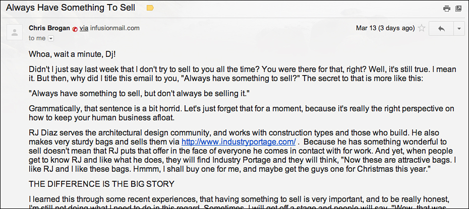
Figure 10.4. Professional speaker Chris Brogan sends emails written in HTML, but they are mostly text.
In case you missed that last part, it’s worth repeating: The Human Business Works mostly text email averages a 34 percent open rate—almost double the industry average!
So why send mostly text emails, especially when Human Business Works uses an email platform that makes creating HTML emails in a “pretty” template easy?
“We like the clean and direct look of a text email,” Hatch explained. “Your friend doesn’t send you emails in a nice template, I’m not sure we need to. I really believe plain text appearance (done in HTML for tracking) makes for easy reading on all devices and gets right to the point with the reader, which is to be helpful.”
Early on in 2010, the company sent templated HTML emails. Hatch said, “We didn’t see them as useful or necessary for the community of folks who subscribe to our newsletter.”
Text Works for B2C Marketers, Too!
The preceding three examples are from service-related businesses or consultancies, but mostly text emails also pop up on occasion in the business-to-consumer (B2C) world. Chad White, Research Director at Responsys, said that sometimes companies mix up their normal messaging style to provide a “wake-up slap.” He said subscribers to your email newsletter can get bored by opening the same type of email again and again.2
The company 1-800-Flowers.com mixed up its regular style email (see Figure 10.5). Although it still included its logo and color template in the header of this message, the rest of the email is rich text with a few calls to action links. That’s it.
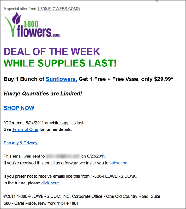
Figure 10.5. 1-800-Flowers.com deviated from its normal, HTML, image-heavy messages. This “wake-up slap” tactic helps capture subscriber attention.
White believes this type of email, when mixed in with your typical, image-heavy HTML emails, can provide enough of a double-take to get subscribers to pay attention and take action.
“This [1-800-Flowers] email is a big deviation from their usual design, so subscribers are more likely to pay attention,” White said. “The brief, text-heavy arrangement also screams urgency, which is exactly what you want with a deal email like this.”
Help A Reporter Out (also known as HARO) does not use the “wake-up slap” approach. It never sends pretty HTML emails. In fact, none of its messages contain images at all. They are comprised of a whole bunch of text, a few anchor links as well as many, custom email address links.
To be fair, HARO is not your average company. Although it’s in the media relations business, it takes a very different approach than the industry standard of reaching out to media and hoping for a response. HARO reverses the process, collecting the coverage needs of journalists who submit them.
Founded by Peter Shankman in 2008 and purchased by Vocus in June 2010, the HARO community boasts more than 132,000 registered sources and more than 28,000 reporters (as of the first quarter of 2012). Between the registered HARO sources and pass-along forwards to non-registered users, the HARO currently has nearly 200,000 readers daily.
Any guesses as to which medium those queries and pitches are delivered? You’ve got it: Email! And not just your standard weekly email. Nope. In fact, it’s not even a daily email (like Groupon or Living Social). Instead, HARO sends its subscribers three emails every single day. Yes, you read that correctly! Three emails every single day! On top of that, these emails are nearly all text (see Figure 10.6).
Figure 10.6. This portion of the HARO (Help A Reporter Out) mostly text email newsletter, shows that the three-times daily email is just a simple, plain text email with just the important links added.
“The HARO’s simple and clean mostly text format is a manifestation of function over flare,” said Chris Pilbeam of Vocus, which owns the service. It wants to do everything in its power to avoid ending up in spam folders.
HARO is not interested in its emails being pretty, because a good-looking email does not determine success. Instead, a key success metric is a high number of its emails landing in the inbox and being read. Pilbeam said that for HARO to work properly, the sources must receive the emails. Plain text helps the company ensure higher open and read rates.
After a HARO email is delivered to subscribers’ inboxes, readers can do a quick scan to see the queries for which they are a good fit. Pilbeam said the simple layout and format is critical for this to happen. Because each email contains 50 to 60 queries and speed is a factor in a company representative’s getting the reporter to pick him as a source, simple is best. Dressing the email up with fancy graphics would likely just get in the way of the functionality.
Expectations are important, too. Everyone who subscribes to the HARO emails are expecting them at the three regularly scheduled times each day. Believe it or not, some HARO users even set their alarms so they won’t miss the first HARO email, delivered at 5:45 a.m. EST.
As you can tell, text-only emails not only can be effective, but sometimes are more effective than their more graphically-designed counterparts. But let’s also look at the opposite end of the spectrum: When an email is nothing more than one, big image.
One Big Image Can Work
“Never send an email that is simply one big image.”3—From “Email Marketing Best Practices” by StartUpNation, February 2, 2012
“Common practice is to wag a warning finger at any commercial email made up mostly (or even entirely) of images.”4—Mark Brownlow, November 22, 2007
Email marketing messages that are made up of mostly images or (gasp!) one big image are often frowned upon in best practice circles for two reasons, both quite valid. One is that emails that are heavy on images are more likely to be flagged as spam. If you use an email service provider, you should get an alert before you send an email telling you whether or not it has too many spam-like characteristics. This service is called a spam filter.
One of the most common content-based spam filters is SpamAssassin, an open source one that generates a score based on various rules. According to Campaign Monitor, an email service provider that uses SpamAssassin, “A score of more than 5 may cause deliverability issues while scores of greater than 10 frequently develop delivery issues. You should always aim to keep your score under 5 for each campaign you send.”5
Another reason big images are frowned upon is that most email clients, such as Gmail, block images by default. You can see an example in the email from AAA in Figure 10.7. The message at the top of this Gmail email reads, “Images are not displayed.” The subscriber is then given two options:
• Display images below: This shows the images for this one email.
• Always display images from AAA.mail.goaaa.com: If this option is clicked, all images from this sender (assuming the company uses the same From address) will always appear automatically.
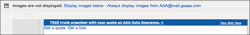
Figure 10.7. A Gmail user must choose whether images in an email can load.
For emails with just a handful of images, and none that really impact the overall meaning of the message, this blocking is not a huge issue. However, if your email is one big image, getting your subscribers to understand the contents of the message might be a challenge if they can’t see it! Assuming you don’t enable images on this email from National Geographic, Figure 10.8 shows what you’ll see in your inbox when you open the message.
Figure 10.8. An email from National Geographic (top half only) with images turned off leaves a lot to the imagination.
Now compare that same email with images on (see Figure 10.9), and you get a pretty good sense of what the email is all about.
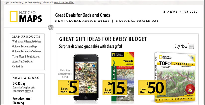
Figure 10.9. With images turned on, the same National Geographic email becomes a lot more interesting.
We agree that emails are more likely to get marked as spam if they have a high ratio of images to text. We also agree that with most email clients blocking images by default, “images off” emails like the one from National Geographic in Figure 10.8 are, well, not all that interesting to look at.
However, we don’t believe “never send emails with mostly images” is a rule you should follow all the time. In fact, many companies intentionally send emails in this format and are quite successful.
In many cases, the decision to display images from a sender has to do more with trust and value than anything else. Let’s step through a real example to explain what we mean. Both DJ and Jason have been Apple fans for years. Between us, we own three iPhones, two iPads, an iPod Shuffle, two MacBook Pros, an iMac, and a MacBook Air. We both frequent the Apple Store, both in person and online.
We’ve also been subscribers of Apple’s email marketing messages for years. We trust the brand. We look forward to seeing Apple’s emails. We enjoy reading them. So, when a mostly image email lands in our inbox from Apple, we turn images on without hesitation. Truth be told, we set our respective email accounts to “Always display images” from Apple a long time ago.
The bottom line is this: If someone wants to see your email content, and he trusts you as a sender, he will turn on images for your email. In fact, according to The Relevancy Group, 35 percent of consumers turn on images in their email. The number jumps to 56 percent for 27-to-32-year-olds. Statistics show that the younger the consumer, the more likely he will turn images on for emails.6
David Daniels, CEO of The Relevancy Group, not only advocates for using images in email, he goes as far as to recommend adding more images and making them larger to make emails more readable and scannable on mobile devices. Not quite what the email marketing purists would suggest.
Many companies not only send mostly image emails, they do so purposefully.
King Arthur Flour’s Image-Heavy Emails
We first introduced King Arthur Flour (or KAF, if you’re hip) in Chapter 9, “My Word! You Must Read This Now!” If you recall, this company broke the “never use the word FREE or all caps in the Subject line” rule. It’s back at rule-breaking, this time sending emails with mostly images, like the one in Figure 10.10.
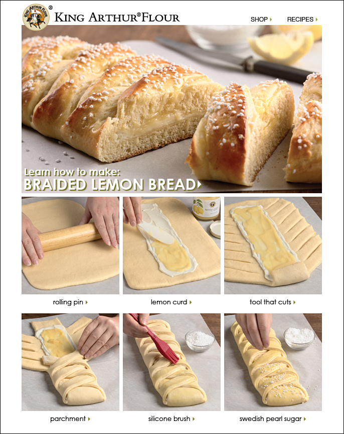
Figure 10.10. King Arthur Flour’s email is composed of mostly images, sliced up a bit. How good does that Braided Lemon Bread look?
KAF spends more time on email creative (copy and images) than any other aspect of its email marketing. As you can see from the email in Figure 10.10, it also is not afraid to use mostly images in its messages. “All emails are image heavy and we are okay with that,” said Halley Silver, Director of Online Services at King Arthur Flour. “We want people to drool over the screen and click through and buy.”
With this goal in mind, KAF also is deliberate about when it sends its image-heavy emails.
“We send them late morning so [subscribers] get them before lunch,” Silver reported. “Creatively, the best way to get people to click through is to have a gorgeous shot of something gooey and delicious. A strong graphic works.”
KAF takes email marketing pretty seriously. It tests. It tweaks. It experiments. KAF also mixes it up by sending content-heavy emails occasionally. However, the goal of these emails is focused more on content and education. The company often
follows up a big promotion with this type of email to keep people interested and engaged.
Making Mostly Image Emails More Readable
One of the biggest arguments against crafting an email with many images, or one big image as shown in the National Geographic example, is that getting a sense of what the message is all about can be tough unless a subscriber enables those images.
Mark Brownlow proposed an interesting workaround to help ensure subscribers will see image-heavy emails. He said, “Anybody wanting to try image-rich emails safely could simply pull out a list of ‘people who previously opened at least one email from us’ and send this group the image-rich mail. New subscribers and those with no open yet recorded get a ‘safe’ design with a nice balance of text and images, etc.”7
In theory, this strategy would work for the most part; however, it assumes that someone who previously opened an email has now enabled all images from that sender. Also, the possibility exists that an open was recorded not due to images being turned on, but because the reader clicked on a link (as discussed in Chapter 9). Either way, this tactic might be worth testing.
You can use two other ways to make image-heavy emails more readable as well as encourage subscribers to enable images. Those include using alt text and a method called “slice and dice.”
Alt Text
Alternative tags, also known as “alt tags” or “alt text,” are the text associated with an image viewable when images are not available. This tag, which is part of the HTML code of the page, applies to images on web pages as well as in emails. Alt tags are often used in search engine optimization to let search engines know what a particular image is. Search engine bots cannot see an image, only read the code that tells the browser to display it.
When an image is supposed to be loaded on a page (on the web or in an email) but for some reason it doesn’t display (maybe the email software prevents images from displaying for safety reasons), the text that populates the alt tag will display where the image should be.
Alt text can be a good way to ensure that your mostly image email is still readable by subscribers who have images turned off by default. If you are using an editor within an email service provider’s application, most include an option to include alt text. If you are comfortable editing the HTML of your email marketing messages, you can modify the alt text by changing what’s inside the quotes after alt=.
When viewing the HTML in the example from Petco (see Figure 10.11), notice what’s in quotes after alt=: “It’s Bark Madness! 20% Off Sitewide!” Those two sentences are the alt text and can be modified to show whatever text you want your subscribers to see when images are turned off.
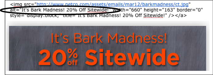
Figure 10.11. HTML code includes the alt text for this image in an email from Petco.
Speaking of Petco, most of its emails rely heavily on imagery. The email in Figure 10.12 is one big image that’s been sliced into five smaller images and then mashed back together. On the left is part of its email with images turned off; on the right is the same email with images turned on.
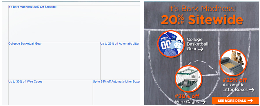
Figure 10.12. A Petco email with images off (left) and images on (right) uses alt tags to describe what each image is, enticing their subscribers to enable images.
Petco does a nice job of using the alt text to exactly describe each image. Notice that the alt text for each image is consistent whether or not images are turned on. This allows subscribers to quickly scan the email with images disabled and decide whether turning them on is worth their time.
If you are ready to take it up a notch and really entice subscribers to turn images on, try doing what blogger Chris Penn does in his weekly email newsletter. Remember Penn’s in-your-face, quite ugly unsubscribe button that he uses at the top of all of his emails? In case you forgot, we’ve included it again in Figure 10.13.
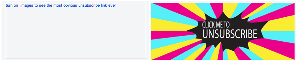
Figure 10.13. Chris Penn’s unsubscribe link with image off (left) and on (right) shows how to use a bit of humor to entice subscribers to enable images.
The image on the right in Figure 10.13 is what Penn’s unsubscribe button looks like with images turned on. See? We told you it was not pretty. On the left is what the image looks like when a subscriber does not enable images in her email client. However, notice that Penn customizes the alt text with a bit of humor: “turn on images to see the most obvious unsubscribe link ever.”
Those who enable images are “rewarded” by being able to see the rest of the buttons and pictures Penn includes in his weekly email. For Penn, he’s able to get a more accurate open rate number. Win-win.
Another creative way to showcase an email when images are turned off is to do what British company Pizza Express did in the “Celebrating 40 Years of Live Music” email shown in Figure 10.14.8
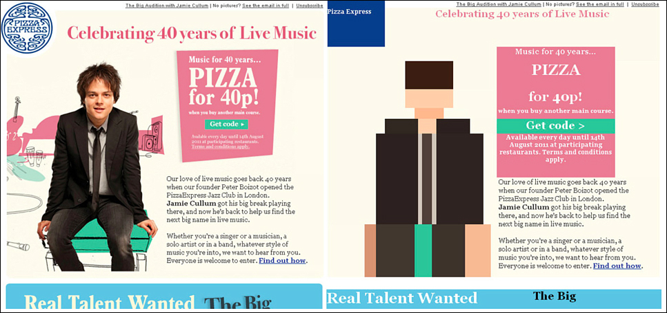
Figure 10.14. An email from Pizza Express shows a creative way to use images off (see portion on right).
The screenshot on the left in Figure 10.14 is the Pizza Express email with images turned on. However, if you were to view the same email with images off, you would see the one on the right. Pizza Express has taken quite a creative approach for the “images disabled” version of the email. It has actually styled the images-off email with various background colors to make the picture of musician Jamie Cullum look like the old-school Atari version of him. In fact, the entire images-off email creatively uses styling so not much is lost when images are disabled.
Slice and Dice
In many cases, especially in the B2C world, imagery is essential to an email marketing campaign. As discussed earlier in the King Arthur Flour example, a picture of braided lemon bread, along with step-by-step pictures of it being made, will likely appeal to more subscribers versus a plain-text description.
Even if you come up with the most creative, descriptive, humorous alt text for that one big image, it’s still going to appear mostly blank. Also, one image can only have one link. What if your image had multiple places on your website you wanted your subscribers to be taken to? One big image can be limiting.
An alternative is what Molly Niendorf, a member of the Content team at email service provider Emma, calls “slice and dice.” Using Niendorf’s method, “you’re able to slice your large image into more digestible pieces, link those pieces to any number of URLs you desire, and safely send to your audience. [This is] good for you and good for your audience.”9 Ibex Outdoor Clothing, LLC, a merino wool clothing company based in Vermont, employs the “slice and dice” method for most of its emails. You can see an example of this on the left in Figure 10.15. Each grid-like section is a different image slice. Put together—and once images are enabled—they form one big image, as can be seen on the right of Figure 10.15.
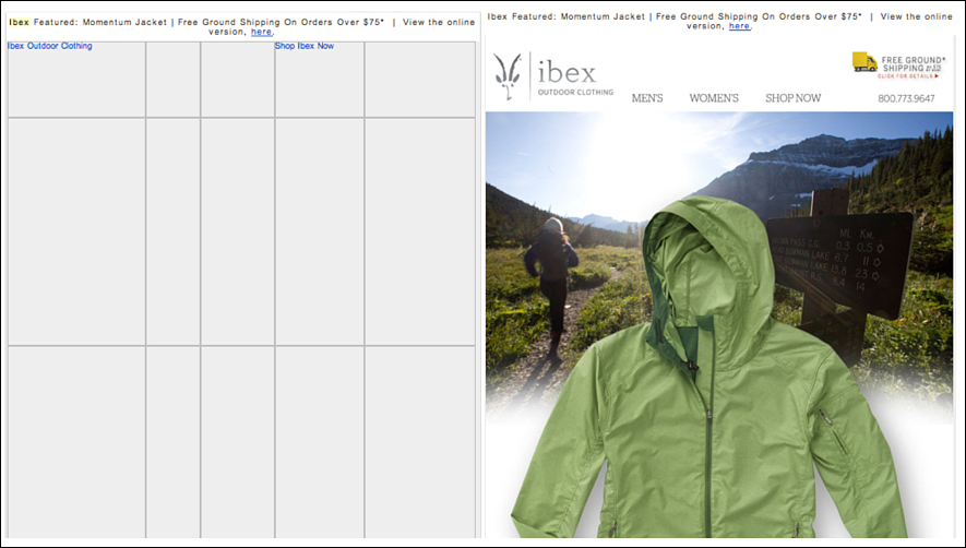
Figure 10.15. The top half of an email from Ibex shows how different the message renders with images off (left) vs. on (right). The bottom half, not shown, includes more text; however, imagery is critical to the Ibex brand.
Jess Moschetti has been with Ibex for more than five years and is currently its Email Marketing and Website Content Manager. Over that time, Moschetti has seen email marketing become a serious revenue driver for the Ibex direct online business. In fact, about 20 percent of its direct sales can be attributed to the email marketing channel.
With a total list size of nearly 70,000 subscribers—of which 40,000 are active customers—Moschetti spends a lot of time thinking about each and every email.
And, as you can see in Figure 10.15, the top half of many Ibex emails is composed of one big image.
“It’s important that we are being true to our brand and our aesthetics,” Moschetti said. “We want to hold strong to those factors so that our customers know, recognize, and come to expect our emails to have a certain look.” She said they also don’t want their emails to be just be about sales but also beautiful imagery and clean design.
One thing to note about the Ibex emails: The company could take advantage of alt text to either add a description of the image or get more creative and style it using HTML. However, this mostly image tactic works for Ibex. According to data from its email service provider (Bronto), it averaged a 20.6 percent open rate, 31.1 percent click-through rate, and 4.7 percent conversion rate.
But what about deliverability issues? After all, it is sending a mostly image email, right? Moschetti told us, in her five years at Ibex, the company has not encountered any deliverability issue that would be attributed to the image-heavy email. Now you know that text-only can work, as can image-only emails. How’s that for following the rules? But you need to know about another so-called best practice that affects how beautiful your email is as well. This one might surprise you because it’s about inviting people to opt out of your list before they even get to the juicy content.
What If the Unsubscribe Link Is at the Top of the Email?
If consumers want to stop receiving permission emails, they will click the link to unsubscribe most of the time (actually 67 percent, according to ExactTarget10). The same ExactTarget report lists a few other actions subscribers take when they are no longer interested in getting emails from a certain organization:
• Delete the emails when they arrive: 17 percent
• Click the “spam” or “junk” button: 8 percent
• Nothing; just ignore the emails: 6 percent
• Set up a filter in an email program: 2 percent
Let’s say you received an email from an organization: one you opted-in for, yet no longer want to receive. The content might no longer be relevant, you are receiving too much email, or you just want out for some reason. Let’s also assume you are in the 67 percent category of subscribers who click the link to unsubscribe. Where would you look within the body of the email to find the unsubscribe link? The right side? The left side? The preheader? The header? The body? The bottom of the email (the footer)?
If you guessed “the bottom of the email,” you would be in the majority. In fact, in the Unsubscribe Email Strategies Report,11 Epsilon found that nearly 99 percent of all marketers put the unsubscribe link at the bottom of their emails. We’ve been trained to look for this unsubscribe link in the email footer or somewhere near the bottom of the message.
We agree with the 99 percent. The unsubscribe link should be in the bottom of all email marketing messages. If that’s where subscribers will first look to opt out, it should definitely be there. However, what would happen if another unsubscribe option were located somewhere else within the email, somewhere a bit more prominent? How would this affect complaints? How would it impact unsubscribes?
We see one issue with putting the unsubscribe link in the footer of emails. Often the unsubscribe is tacked on as an afterthought and blends in with the rest of the message, as shown in Figures 10.16 and 10.17.
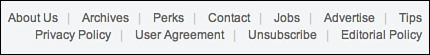
Figure 10.16. This unsubscribe link blends in with the other links in the footer of this email. Can you find it?
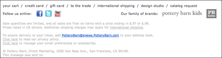
Figure 10.17. This unsubscribe link is very difficult to find unless you look closely. Notice the smaller, gray font that blends into the background.
Other times it’s buried among legalese or requires users to take multiple steps—clicking a link, going to another web page to log in, unchecking a box—to process the unsubscribe (see Figure 10.18).
Figure 10.18. This email unsubscribe requires users to first log in before unsubscribing from their mailings.
In regard to requiring multiple steps in order to opt out, senders have to be careful. Some language in the United States CAN-SPAM Act makes it illegal to require a recipient to take any steps other than visiting a single Internet web page to unsubscribe. As always, be sure to consult legal counsel for interpretation of the law.
Other websites might have confusing statements on their opt-out page (see Figure 10.19).
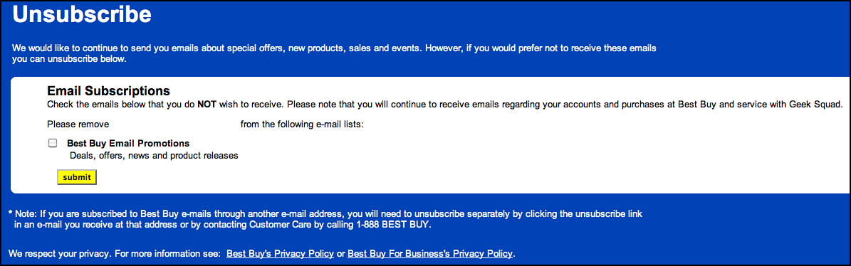
Figure 10.19. Best Buy’s unsubscribe instructions might be confusing to some email recipients.
“Check the emails below that you do NOT wish to receive.” Huh? Also, look at the note at the bottom, under the submit button: “If you are subscribed to Best Buy e-mails through another e-mail address, you will need to unsubscribe separately by clicking the unsubscribe link in an e-mail you receive at that address or by....” We realize Best Buy is trying to cover itself legally by including this statement, but it sure is confusing for the average subscriber.
Others, such as Carnival, give their subscribers a choice to “opt down” (receive fewer emails). After subscribers click the unsubscribe link at the bottom of a Carnival email, they are redirected to the page shown in Figure 10.20.
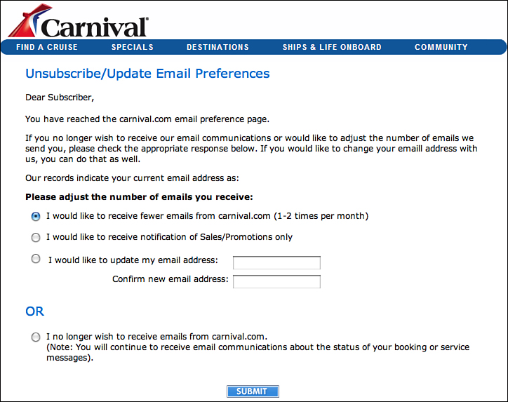
Figure 10.20. After clicking the unsubscribe link in a Carnival email, subscribers are redirected to this manage preferences page where they can “opt down” to receive fewer emails.
From this page, subscribers have the ability to “adjust the number of emails [they] receive.” They can opt down to one or two emails per month or only receive sales/promotion messages. Finally, they still have the choice of opting out entirely.
Sometimes a subscriber unsubscribes because that’s the only option. What they really want to do is just not get so much email from the sender. This opt-down approach provides that option. It has the potential to decrease both unsubscribes and complaints.
Some marketers are offering a similar option to opting down by allowing their readers to “snooze” their emails.
This snooze feature, provided by email service provider Silverpop, gives subscribers the option to pause all emails from that sender for a specified period of time. As you can see in Figure 10.21, when subscribers click on the unsubscribe link in a J&P Cycles email, they are presented with the option to “snooze me for ... 1 month, 3 months, or 6 months.” Of course they are still given the option—via a big button—to unsubscribe, if that’s what they really wanted to do.
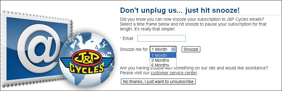
Figure 10.21. The J&P Cycles email preference center allows subscribers who click on the unsubscribe link to choose to “snooze” their emails for a specified period of time.
According to Loren McDonald, VP of Industry Relations for Silverpop, retention rates for clients enabling this feature are in the range of 3 to 5 percent. In other words, of those who clicked on the unsubscribe link, 3 to 5 percent chose to stay subscribed by opting for the snooze option.
Several other Silverpop clients have also found success with the snooze feature. Since including it as an option on its manage preference page, Moosejaw has seen 3 percent of customers who click the unsubscribe link opt to put their subscriptions on hiatus. Eoin Comerford, Vice-President of Marketing at Moosejaw, an outdoor apparel retailer, expects this number to reach close to 10 percent over time.12
Teletext Holidays reports its snooze number to be 5 percent. In just over a month, 5 percent of those who would have opted out chose to snooze instead. “Not only does this limit the number of customers opting out from receiving our communications but also gives us an opportunity to re-engage with them and capture their new preferences at the point of un-snoozing,” said Media Manager Amy Patel.13
We can see this working in a variety of industries. For example, let’s say you just purchased a new pair of running shoes. You are an active runner so will likely need a new pair in three to six months. This snooze feature allows you to pause all emails from that company until you are ready for that next purchase. It’s great for the sender because sending emails to folks who will not read them doesn’t make much sense. Also, if the alternative is for you to unsubscribe, the company has been able to retain you. The benefit for the subscribers is that they keep the emails in their inbox more relevant and timely. Win-win.
However, other than the examples from Carnival and J&P Cycles, all others discussed make opting out a challenge. If someone wants to unsubscribe from your email marketing messages, don’t make it difficult. Don’t create multiple steps. Don’t force a login or make it confusing. All of these have the potential to turn a clean break up into an ugly divorce. If a subscriber wants out, let him leave. Good riddance. No hard feelings. It makes more sense to send emails to a list of people who rejoice when they see your emails in their inboxes. Wouldn’t it be nice if people set their alarm clocks so they could be one of the first to open your emails (like some people do with the HARO 5:45 a.m. EST email)?
Instead of making opting out a chore, make it easy and obvious. Try flipping this “rule” of the unsubscribe always having to be at the bottom of the email completely on its head. Consider adding an unsubscribe option at the top of the email. Put the control back in the hands of the subscriber.
Another reason to make opting out easy for your subscribers is this: If they really want to opt out, yet have difficulty doing so, they are going to be frustrated. If they’re frustrated, they’ll be more likely to mark your email as spam, which can impact your overall email deliverability: certainly not worth it. Further, frustrated users who happen to also be plugged in online and active on social media might express that frustration to their social networks. That’s the bad kind of viral message: one you don’t want out there about your company.
Chapter 5, “The First Impression,” previewed the unsubscribe rule breaker method by showing how WhatToExpect.com includes a prominent unsubscribe button in the preheader of its emails (refer to Figure 5.6). Chapter 7, “The Finishing Touches,” showed you Chris Penn’s far-from-pretty unsubscribe graphic he includes near the top of every email. Plenty more examples exist of both business-to-business (B2B) and business-to-consumer (B2C) companies who include an unsubscribe option at the top of their email. All of these organizations believe strongly in their decision to move it to the top.
We are not suggesting removing the unsubscribe link from the footer. If that’s where consumers are trained to look, it should remain there. However, consider adding it to the top, in the preheader or header, as an alternative.
The Most Headache-inducing, Eye-searing Graphic Possible
A few years ago, when blogger and cohost of the Marketing Over Coffee podcast, Chris Penn was spending a lot of time focused on growing his email list, he got tired of reading complaints from his subscribers saying they didn’t know how to unsubscribe. So Penn contacted his friend, Paul R.J. Muller of the CaffiNation Podcast, and asked him to create “the most headache inducing, eye searing graphic possible.”
Muller answered the challenge and then some (see Figure 10.22).
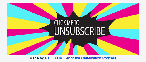
Figure 10.22. Chris Penn includes this unsubscribe button at the top of every single email. Hard to miss!
Penn actually breaks a few rules with his unsubscribe button. First, it would likely fit into the “ugly” category. Unless bright pink, yellow, and blue are your thing, this button is not that pretty. Also, Penn has moved the unsubscribe button to the top of the email—front and center literally. Why would Penn make the unsubscribe button so ugly and obvious? “I wanted it to be really, really obvious,” said Penn. His goal was to make it so obvious that if a subscriber missed it, Penn wouldn’t feel bad about just outright deleting their email complaining they could not find the opt-out.
Penn has had an unsubscribe button of some kind at the top of his emails since 2010. It was around this time he began sending out his email newsletter on a regular schedule. This increased frequency and volume, Penn thought, would also increase the number of folks who might want off his list.
As it turns out, since adding this big, ugly unsubscribe link at the top of his emails, Penn’s unsubscribe rate has held steady at .15 percent or less per email newsletter. Even more impressive is that he has not received a single spam complaint in more than two years. Keep in mind, his list has more than 13,000 subscribers.
Penn’s advice on unsubscribes and retention include making it painfully obvious how to get to your preferences center so readers can control their experience with your email. Penn even has a video on his preferences center page that reminds people why they subscribed in the first place, so he has an opportunity to retain those who might be there to opt out.
Setting proper expectations upfront, on your opt-in form and in your welcome email, is important to build trust. However, reminding your subscribers why they signed up in the first place is equally if not more important.
Groupon’s Creative Unsubscribe Solution
Groupon also includes a link to unsubscribe at the top of its emails, as shown in Figure 10.23.
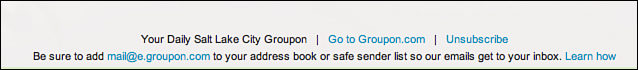
Figure 10.23. Groupon includes an Unsubscribe link in the preheader of all of its email marketing messages.
Although not nearly as in-your-face obvious as Penn’s unsubscribe button, the Groupon team makes opting out of its emails easy by placing a prominent link in the preheader of its daily emails. Notice the preheader actually includes a few links: “Go to Groupon.com,” “Learn how” (for adding their email address to a subscribers’ address book), and “Unsubscribe.”
Groupon also includes a standard unsubscribe link at the bottom of its emails just in case subscribers miss it at the top. The messaging reads, “If you prefer not to receive Daily Groupon emails, you can always unsubscribe with one click.” Clicking on that link does just that: unsubscribes a user immediately. However, on that same page is the option to manage your email preferences as well as resubscribe for certain Groupon emails. This step is important because it allows subscribers to remove themselves from one list while remaining on others. At the bottom of this page, Groupon provides a link to unsubscribe from all emails from Groupon.
In 2010, Groupon tested a unique approach with its unsubscribe link. If users clicked unsubscribe, they were immediately opted out (one click) but then redirected to a landing page that included a video (see Figure 10.24).
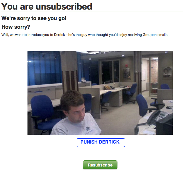
Figure 10.24. After subscribers opt out from Groupon emails, they have the option to “punish Derrick” as well as resubscribe.
This landing page included a message confirming the user had unsubscribed and saying they were sorry to see them go. In addition, this page had a video embedded on it. When users clicked the “Punish Derrick” button, they were treated to a short video of “Derrick’s” co-worker dumping a cup of water on his head after yelling at him for sending all of those Groupon emails. It’s a clever and effective tactic. In fact, adding this opt-out link in the preheader resulted in a decrease in spam complaints by 30 percent!14
Test the Rules; Don’t Just Break Them Outright
Gary Vaynerchuck is a speaker as well as the founder of WineLibrary.com and Win Library TV. He’s full of energy and passion. He also knows how to get an audience to pay attention. That’s just what he did in 2011 in Miami when he keynoted the Email Evolution Conference. In his talk about email marketing, he shared something that had many attendees talking for weeks after. He said he had recently hired a team of people whose only job was to pick up the phone and call someone after they had unsubscribed from his weekly email newsletter. Talk about breaking the rules! Although certainly on the innovative end of the spectrum, this tactic is by no means illegal. His team still honored the opt out; however, they found nearly 40 percent of those who had previously unsubscribed ended up re-opting in after the personal phone call.
You don’t have to pick up the phone and call (harass?) people who have unsubscribed from your emails, nor do you have to put a big unsubscribe link or button at the top of your emails. Just test some of the rules of email marketing and see what works best for you and your subscribers.
Beauty Is in the Eye of the Subscriber
Some people think an email on either end of the image continuum—mostly images or mostly text—qualifies as ugly. However, the possibility exists for an email with a nice balance of text to images to be unappealing.
We are talking about those emails that are aesthetically repulsive. When you open these messages, your eyes cross and your head spins. Describing exactly that this email looks like can be difficult, but you know it when you see it.
The challenge with truly ugly emails is that they can be very subjective. What makes you say, “That is one ugly email!” might be just the email that someone else opens, clicks, and converts on. You might find emails with 17 different font types and sizes, animated images, and 42 pages long unappealing, yet the person sitting next to you loves it (or at least it doesn’t bother him as much as it does you).
We’ve all heard the phrase, “Beauty is in the eye of the beholder.” We’d like to borrow that phrase and modify it slightly for email marketing. Beauty, in this case, is in the eye of the subscriber. Each email marketing subscriber, each list, and each segment has the potential to see your message differently. Each has the possibility to react differently depending on the sender, the content, and the offer.
Just like in life, ugly can be quite subjective. Ugly can be confused with bland or boring. However, if the email works for you (the email marketer) or your audience (subscribers), then who cares what it looks like? If your success metric is conversions and your email is consistently converting, whether the email is ugly or pretty doesn’t matter.
Ugly Emails That Consistently Perform Well
Take a look at Figure 10.25. This image is from a well-known website, a company you’ve heard most likely heard of before. It’s one of the top 500 websites in the world and top 100 in the United States.15 In fact, the same image you see in Figure 10.25 is also used on television commercials.

Figure 10.25. Would you call this image from a well-known website pretty or ugly?
Any idea which website we’re referring to? If you guessed Publishers Clearing House (pch.com or “PCH”), you are correct!
When you see that image, using letters in a big font and all caps, one that jumps off the page, what comes to mind? For us, this screams UGLY! If this image was included in an email, some would be less likely to click on it. Some might even mark it as spam or delete it.
Now, compare Figure 10.25 to an email from PCH. (Figure 10.26 shows the top half of one of its emails.) Did you have the same reaction as we did when you looked at this email? Yuck!
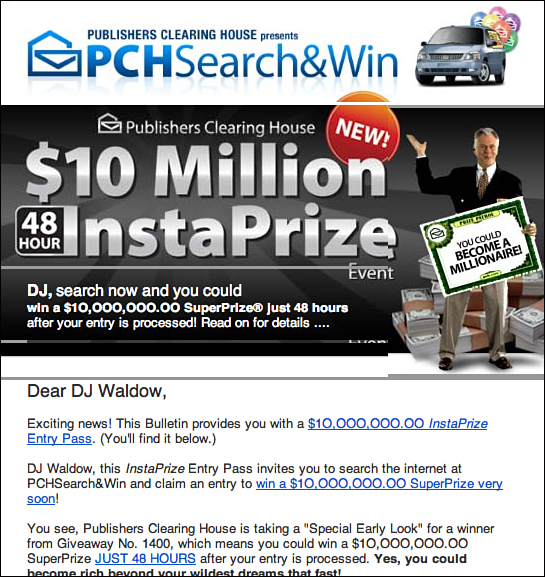
Figure 10.26. This top half of an “ugly” email from PCH.com is pretty typical of what it sends.
Let’s break down all the components that you could deem ugly:
• Subject line (not shown in Figure 10.26): “DJ—Confirmed Contents.” We are not even sure what that means.
• Header: It has a huge image with lots of things going on: different font size and colors, DJ’s first name, and a random person with a bunch of cash at his feet holding a “YOU COULD BECOME A MILLIONAIRE” sign.
• Copy: Two more mentions of DJ’s name in the first few paragraphs, bold and all caps text, use of the words “InstaPrize” and “SuperPrize,” and the number $10,000,000.00 used not once, but twice!
All in all, this email could make your head spin off your shoulders. Remember, too, this is just the top portion of the email. Below the fold is an animated image flashing incessantly at you. Looking through the lens of a “best practices” person, this PCH email would seem ludicrous. All of the above would likely get it blocked by spam filters. Not just that, but it’s unlikely anyone in their right mind would click on those links let alone open the email.
As it turns out, lots of folks open these emails; many click on the links, images, and buttons; and several convert (purchase items). In regard to deliverability, you might think the spam filters would flag these PCH emails. Wrong. The typical PCH emails get into the inbox 99.2 percent of the time (as audited by a third party).16 Compare those numbers to your own email marketing program. Can you claim a 99.2 percent inbox delivery? Our bet is the PCH ones are a bit higher than yours.
If you think that 99.2 percent number is impressive, just wait. Prepare yourself for a few other mind-blowing metrics.
Sal Tripi is the Assistant Vice President of Digital Operations and Compliance for Publishers Clearing House. Since 2002, email has been a critical component of the marketing mix at PCH. It’s one channel the company doesn’t ever take for granted.
Tripi told us PCH used to have one big prize (remember the Prize Patrol van and the big check?) but have since expanded, thanks to the Internet, to include daily prizes. Email marketing has played an integral role in broadening the reach and growing PCH’s online business. “Email has taken what we’ve done offline and put it on steroids,” Tripi said.
PCH has several email lists totaling “in the millions” of subscribers and sends hundreds of millions of emails every year. The majority of its email list is built by way of sweepstakes that people opt into. While they are in the process of entering, PCH uses a pre-checked box (see Figure 10.27) to opt them in for “special contests and offers from pch.com and their partners.”
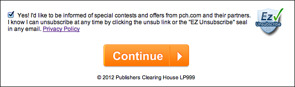
Figure 10.27. PCH includes a pre-checked opt-in box during the data collection process of its sweepstakes offers.
Testing is something Tripi and PCH take a lot of pride in. PCH’s email team is composed of more than a dozen individuals, eight of them on the creative side. Their entire job is to create new test packages (email campaigns) that beat the control. After the test beats the control, it becomes the new control. Their performance is measured on winning packages.
Other than compliance and other legal regulations, no rules exist in regard to testing. “All of the rules are constantly being updated,” Tripi told us. “What works today may not work tomorrow.” There is nothing the testing group is not allowed to test. “They can use more images. They can use more text. Everything is testable. Everything is re-testable.”
Ugly emails are not the only rule PCH breaks. When subscribers click through on an image or link in their email, they are redirected to a landing page with a similar look and feel. Instead of leading potential buyers nicely through the checkout process, PCH puts obstacles in their way such as checkboxes and popups! In fact, if you close a PCH tab or window, a popup appears asking whether you are sure. “We have found the more we engage the consumers with unique offers, the more they click, the more they purchase.”
In February 2010, DJ met Tripi at the Email Evolution Conference. The night before DJ’s presentation about “ugly emails,” he ran into Tripi and they engaged in a “healthy” debate about the not-so-pretty emails PCH sends. DJ was adamant they were ugly. Tripi did not disagree. That night, DJ learned two valuable lessons:
• As we’ve said before, beauty is in the eye of the subscriber. What is ugly for some is not ugly for others.
• You are not necessarily your own audience. The average PCH subscriber is female (60 percent), over 40 years old, low to middle income, and lives in a rural area.
So why does PCH use lots of colors, big letters and numbers, and a bunch of flashing stuff in their emails? Simple. The goal of email marketing at PCH has always been to replicate the direct marketing pieces. Its emails intentionally read as if they are a direct mail piece. PCH attempts to speak to its email subscribers about what’s most interesting and relevant to them.
Just because the PCH emails are ugly and don’t appeal to DJ or Jason does not mean they don’t perform.
Now for those mind-blowing metrics: The average open rate across all email marketing programs at Publishers Clearing House is 40 percent, nearly twice as high as the email industry average. Although that number on its own is impressive, it pales in comparison to its click rate. Of those who open the PCH emails, 87 percent click at least one link. 87 percent! To be clear, that’s not one campaign. It’s not their best campaign. It’s the average click rate across all PCH email marketing programs.
In addition, 52 percent of its active online members have been engaged with PCH for more than five years. So not only does its approach work in the short term, it’s also a great retention tool.
Wow. Ugly works (for PCH).
Why does sending this “less-than-pretty” email work for PCH? It’s possible that it works due to the business PCH is in (raffles, sweepstakes, and other free stuff). Although nobody can be certain, the “beauty is in the eye of the subscriber” theory seems to fit. What we think is ugly is likely not as appalling to PCH’s subscribers. After all, these are folks who are signing up for PCH sweepstakes offers. This means they’ve been to PCH’s website. They have seen the creative. They have read the copy. Whether or not they find it appealing, they keep coming back. PCH’s emails are consistent with the look and feel of its website. The branding is the same. The copy is similar. All of this matters. The user experience is fluid.
Remember: You are not always your own audience.
A Split Test of Ugly Versus Pretty
Marketing Over Coffee (MoC) is a weekly podcast hosted by John Wall, director of marketing at Glance Networks, and Chris Penn. Every week, Wall and Penn record a show in their local coffee shop that covers classic and new marketing. To accompany the podcast, they also send out an occasional email newsletter to their subscribers.
As you can see in Figure 10.28, their email was, well, let’s just say it was far from pretty. It was mostly text, had a variety of different font sizes, was long, and was not that aesthetically pleasing.
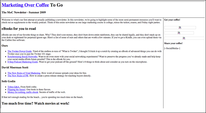
Figure 10.28. Marketing Over Coffee’s email template from August 2009 would likely fall into the “not-so-pretty” category—and this is only the top half!
However, Wall and Penn were not all that concerned because it was meeting their performance expectations while outperforming industry averages. It was hard to complain with an average open rate of nearly 30 percent and an average click-rate of more than 40 percent. Their subscribers certainly loved what was landing in their inboxes.
Joanna Lawson-Matthew Roberts was a client service manager at Blue Sky Factory (an email service provider) in 2009 and was assigned to the MoC account. When she saw this ugly template, she convinced Wall and Penn to allow her team to design a new template for them. This new template was promised to reflect all the email marketing industry best practices out there. Blue Sky Factory’s creative team came up with an industry best practices template, shown in Figure 10.29.
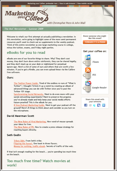
Figure 10.29. This Marketing Over Coffee “industry best practices” (pretty) email template was tested against the ugly email from August 2009. (This image is not meant to be read in detail.)
“We don’t know about you, but we are confident that this template is a (major) improvement over [old one], said Lawson-Matthew Roberts.17 She said there were six reasons why the team loved the new template:
• The preheader included snippet text, view in browser, and a mobile version.
• The header included clear branding as well as the MoC logo.
• It had distinct sections, good use of white space, and clear headlines.
• The email width was within the 600–650 range (quite a bit smaller than the previous version).
• It included Forward to a Friend and other social sharing features.
• It had a clean design with clear calls to action.18
Take a minute to flip back and forth between Figures 10.28 and 10.29. Don’t think too hard; just react. Which email template would you say is prettier and would you rather look at in your inbox? Clearly, the second one, the new and improved template, is the better one.
However, Lawson-Matthew Roberts and the Blue Sky Factory team did not stop with making a new template. They moved forward with testing. After all, even though most people would agree the new template was prettier than the old one, the data would not lie.
They set up a split test; each template was sent to 20 percent of the MoC email list. To keep the test fair, both emails had the same Subject line and content, and were sent at the exact same time. The only thing that was different was the look and feel of the email.
On September 22, 2009, the test began. Twenty percent of the list received the original template while another 20 percent was sent the new template. After two hours, the new template had an 11.6 percent open rate and a 2.3 percent click-through rate. The old template’s open and click-through rates were 9.8 percent and 0.9 percent, respectively. Based on this data, the new template was then sent to the remaining 60 percent of the list.
However, after looking at the same metrics the next day, Lawson-Matthew Roberts saw the following metrics:
• Old (ugly) template: 25.7 percent open rate and a 4.2 percent click-through rate
• New (pretty) template: 27.0 percent open rate and a 4.7 percent click-through rate19
Even though the new template certainly outperformed the old template as far as their two key metrics, open and click-through rate, the numbers were not too different. The open rate on the pretty “industry best practices” template were only 1.3 percent higher than the ugly template, while the click-through rate was a mere .5 percent higher.
Although you might be surprised by the results, remember one thing: This is why best practices should be tested against your own subscribers. What works for one audience might not work for another. The same is true for a particular list or segment of your database. Marketing Over Coffee, with the help of its email service provider and its client service manager, was able to effectively prove the “pretty emails perform better than ugly emails” best practice.
Making Assumptions and Challenging Them
The whole ugly versus pretty argument is typically predicated on assumptions. You assume that what you think looks good looks good to everyone. You assume that the prettier email will get more eyeballs, opens, and clicks. You assume that what the industry experts have been saying for years is always and forever true. The truth is just the opposite. Best practices evolve as user adoption increases, trends and tastes in what’s appealing ebb and flow, and better technologies and innovations change the game.
What’s effective for audiences in terms of what communications appeal to them changes like the fashions of the day. If you don’t think so, consider this book title from 1993: “Turn Your Fax Machine Into A Money Machine.”20
What turns those who blindly follow the best practices, sometimes like lemmings off the cliff, into communications professionals who adjust and adapt with the changes of the audience is taking on a bit of the rebel mentality. Don’t assume that because one company or consultant saw an X or Y percent open rate from an email campaign that you will, too, if you follow the same formula.
By challenging the assumptions that all people formulate by following the rules, you often find the rules don’t always apply to you or your audience. To prove that point a bit more, the next chapter revisits the concept of growing your list and covers how to do so by breaking those rules.
Endnotes
1. “Why Bother With Plain-Text Emails?” http://kb.mailchimp.com/article/why-bother-with-plain-text-emails
2. White, Chad, AM Inbox. “‘Wake-up slap’ tactics” 8/23/11. http://www.retailemailblog.com/2011/08/am-inbox-wake-up-slap-tactics.html
3. StartUpNation.com, “Email Marketing Best Practices.” February 02, 2012. http://www.startupnation.com/Email-Marketing-Best-Practices/topic/
4. Brownlow, Mark, “Is an image-rich email so bad?” November 22, 2007. http://www.email-marketing-reports.com/iland/2007/11/is-image-rich-email-so-bad.html
5. CampaignMonitor.com (Help & FAQs section), “What does my SpamAssassin score mean? How can I reduce it?” http://help.campaignmonitor.com/topic.aspx?t=104#HTML_IMAGE_ONLY_04
6. “Is an Email Marketing Offer Just Like a TV Commercial?” http://www.clickz.com/clickz/column/2158488/email-marketing-offer-tv-commercial
7. Email Marketing Reports, “How to help ensure your email’s images won’t be blocked.” January 11, 2008. http://www.email-marketing-reports.com/iland/2008/01/how-to-guarantee-your-emails-images.html
8. http://emailfail.posterous.com/pizza-express-have-fun-with-images-off
9. Niendorf, Molly, “Why you shouldn’t send one big image—and what you can do instead: Building a slice and dice campaign.” June 1, 2011. http://myemma.com/blog/send-big-image
10. Subscribers Fans and Followers, “The Social Break-Up Report #8.” 2011. http://www.exacttarget.com/resources/sff8.pdf
11. Epsilon, “Unsubscribe Email Strategies Report.” May 2011. http://www.epsilon.com/news-events/press-releases/2011/unsubscribe-email-strategies-report-email-institute-and-multichannel
12. Peterson, Tim, “Moosejaw Mountaineering offers email snooze button.” August 1, 2011. http://www.dmnews.com/moosejaw-mountaineering-offers-email-snooze-button/article/208058/
13. Silverpop, Client quotes. http://www.silverpop.com/clients/client-quotes.html
14. White, Chad, AM Inbox. “Third major retailer adds preheader unsubscribe link.” April 8, 2010. http://www.retailemailblog.com/2010/04/am-inbox-third-major-retailer-adds.html
15. Retrieved from http://www.alexa.com/siteinfo/pch.com on March 22, 2012.
16. Email Marketing, “How Publishers Clearing House uses “blacklisted” words yet achieves a 99.2% delivery rate.” June 1, 2011. http://www.marketingsherpa.com/article.php?ident=31926
17. Blue Sky Factory Blog, Marketing Over Coffee: The Creative Reveal. September 21, 2009. http://www.whatcounts.com/2012/04/anatomy-ofan-ab-test-marketing-over-coffee/. (This is a summary.)
18. Blue Sky Factory Blog, Marketing Over Coffee: The Creative Reveal. September 21, 2009. http://www.whatcounts.com/2012/04/anatomy-ofan-ab-test-marketing-over-coffee/. (This is a summary.)
19. Blue Sky Factory Blog, Marketing Over Coffee: And The Winner Is.... September 28, 2009. http://www.whatcounts.com/2012/04/anatomy-ofan-ab-test-marketing-over-coffee/. (This is a summary.)
20. Hooton, Marcia, How To Turn Your Fax Machine Into A Money Machine. New Wave Consultants, 1993. (http://www.amazon.com/Turn-Your-Machine-into-Money/dp/0943172071/ref=sr_1_5?s=books&ie=UTF8&qid=1334066144&sr=1-5)