8
COLOR HARMONY
In Search of Beauty / Intervals and Harmony / Hue and Harmony / Major and Minor Themes / Value and Harmony / Saturation and Harmony / Beyond Harmony: Dissonant Colors / The X-tra Factor: Surface and Harmony / Some Harmonious Conclusions
The enjoyment of colors, individually or in harmony, is experienced by the eye as an organ, and it communicates its pleasure to the rest of the man.
—Johann Wolfgang von Goethe
There is a theory in design that people will respect and care for surroundings and objects that they find beautiful and will disdain and neglect, even damage, those that are unappealing. On some level, the pursuit of happiness always includes the pursuit of beauty.
In Search of Beauty
Beauty is the quality of an object or experience that gives pleasure to one or more of the senses. A color can be beautiful, or a sound, or a scent. Delight in the presence of beauty is as natural to the human condition as breathing.
Harmony is the happy condition that follows when two or more different things are sensed together as a single, pleasing experience. Things that are in harmony are perceived as complete, continuous, and natural. Harmony is intuitive; a feeling that things are just as they should be. In a harmonious situation everything is in balance; everything belongs. Happy families live in harmony; barbershop quartets sing in harmony; a hermit lives in harmony with nature. Harmonious experiences are without gaps or surprises.
Color harmony occurs when two or more colors are sensed together as a single, pleasing, collective impression. A single color can be beautiful, but it cannot be harmonious. Harmony requires a grouping of elements.1 A key characteristic of harmonious colorings is that they seem effortless and uncontrived. Each color seems natural in its relationship to the others. No color seems out of place. To paraphrase Goethe, the colors in harmonious compositions seem to “belong together according to our senses.”2
A color does not have to be pleasing on its own to be used well. It is perfectly possible to dislike certain colors and still use them in harmonious ways. Someone who insists that a certain color is “awful” is expressing a personal taste, like a preference for vanilla over chocolate, or jazz over opera. No color is inherently “bad.” It is the relationship between the colors in a composition to each other that creates color harmony, not the colors themselves.
Johannes Itten defined color harmony simply as “the joint effect of two or more colors.”3 But harmony implies beauty, which is only one possible outcome of combining colors. Not all color combinations are intended to be harmonious. Harmony may be more pleasing than chaos, but it is not necessarily more interesting or exciting. A design concept may call for colors that are distinctly unbeautiful: startling, visually aggressive, even disturbing. Dissonant combinations of color play a significant role in design.
A more comprehensive term for the collective impression of colors used together is color effects. Color effects fall into two broad categories. The first is color harmony, the traditional idea of beauty or pleasingness in color combinations. The “pleasing joint effect of two or more colors” may be a closer definition of color harmony. The second is visual impact: the effect of color choices and combinations on the power of a design or image.
Successful color combinations are realized in terms of a goal. Instead of thinking about combinations as harmonious or dissonant, they can be thought of as successful or unsuccessful. What was the colorist trying to achieve in choosing the colors? To create an image with shock value or high visibility? A suggestion of luxury? To startle, excite, or disturb the viewer? To evoke an association with a particular product or idea? Color effects addresses the central issue of color use:
What makes a group of colors work together to solve the problem at hand?
The old “laws” of harmony may seem antiquated now, but the observations that gave rise to them remain fresh and valid. They are immensely useful as a starting place for creating color harmonies. But no set of laws for color harmony is comprehensive, and no single factor determines it. All aspects of color composition—hue, value, saturation, the spacing of intervals, and completeness—contribute to a harmonious effect. When all are considered, it is possible to generate color harmonies that transcend historical theory and even at some level personal bias. Harmony can be found within that premise perfectly stated by Josef Albers: “What counts here—first and last—is not so-called knowledge, but vision—seeing.”4
Intervals and Harmony
Human intelligence has been described as the search for order in all things. The impulse to put things—any sort of things—into some logical order is irresistible. Babies demonstrate this before speech, when they arrange blocks or toys in size order. Adults control information in the same way, designating small, medium, large, or ascending or descending letters or numbers. Intervals, particularly even intervals, represent a kind of order in perception. Albers's “What counts here— first and last . . . is seeing” acknowledges that natural inclination, more than learning or experience, is the first determinant of color choices. Munsell speaks of “smooth sequences” as harmonious.5 Even intervals make easy work for the eyes and brain. They are visually and intellectually comfortable. They do not challenge or disturb; they feel right. A series of visually logical steps between any colors is inherently pleasing.
Creating intervals between unlikely elements responds to a recurring problem in design: how to achieve a good result when forced to work with colors that seem at first to be hopelessly incompatible. You have inherited Aunt Maude's buttercup yellow loveseat, but it will have to sit on your old dusty-rose rug. Introducing a series of intervals between the two creates a visual bridge; a connectedness that responds to the human need for order. No matter how unlikely a combination of colors may seem at first, a series of intervals between them establishes a kind of order that the eye accepts as logical. Creating a series of intervals between unrelated colors is a principal way in which they can be transformed into a harmonious grouping.
At times a color composition may seem sparse, or thin. A limited palette can be enriched by adding intervals between colors already present, expanding it without disturbing the original color concept. If the original colors are similar in value and the overall effect seems flat, adding steps of value accomplishes this in a second way.
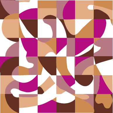
Figure 8–1. Intervals and Harmony. Creating intervals between two apparently incompatible colors turns them into a pleasing combination. Here, additional steps of value add punch to the composition.
The arrangement of the intervals is not particularly important. Progressive intervals arranged in linear order may not make pictorial sense. Even intervals of any quality—hue, value, saturation, or any mixture of these—within the same composition tend to be more pleasing than random intervals no matter how they are arranged.

Figure 8–2. The Harmony of Value in Even Intervals. Which design is more appealing?
Hue and Harmony
Historically, the search for color harmony has focused on the relationship between hues and, more specifically, on the link between harmony and complementary colors. That there is a natural inclination toward complementary schemes is evident in every kind of product from high fashion to cereal boxes. Variations of “pink and green” (red and green), “peach and blue” (orange and blue), and “purple and gold” (violet and yellow) are constantly recurring combinations.
Goethe's phrase “completing colors” is a reminder that the eye finds equilibrium in the presence of three primaries. Colors in a complementary relationship are physiologically satisfying. The eye is more comfortable at rest than at work, and comfort is pleasing. Albers “seeing” again goes to the heart of the matter. The complementary-color theories of color harmony are supported by the real-life experience at the most fundamental level.
But not every pleasing color combination is made up of complements. Colorings are also harmonious when a single hue is used in a variety of values or saturations, as monochromaticschemes, or as analogous schemes made up of two primaries without the third. The menu of possible harmonious hue combinations is really a simple proposition:
Any hues used together can be harmonious.
This does not mean that any hues used together are harmonious. It means only that there are no inherently bad hue combinations.
Major and Minor Themes
Many complex colorings have an additional characteristic. A single hue or group of closely related hues is enlivened by the addition of small areas of complementary or near-complementary colors. A rendering may have dozens of colors in the green range. Some are bright and others muted, some dark, some light, but the overall effect is green. Small areas of red or red-orange, no matter how subtle or muted, emphasize the green by contrast and at the same time fulfill the eye's need for equilibrium. The combination of analogous colors and their complements as major and minor themes produces some of the most elegant and complex colorings imaginable.
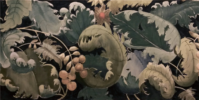
Figure 8–3. Major and Minor Themes. Small areas of warm color support and emphasize the cool palette around them; at the same time, they satisfy the eye's need for equilibrium. Backdrop painting for A Midsummer Nights' Dream, courtesy of Mark Simmonds.
Value and Harmony
Although the principal function of value is to create separation between figure and ground, traditional color theory offers three ideas about the relationship of value to color harmony:
- Even intervals of value are harmonious.
- Middle values are harmonious.
- Equal values in different hues are harmonious.
The first premise, that even intervals are harmonious, is about intervals rather than about value. Even intervals of any color quality have a natural flow. A smooth sequence of values provides an immediate and effortless harmony.
The second premise, that middle values are harmonious, suggests that hues at the light and dark ends of any value scale are less pleasing than those in the center. To examine this idea, consider a color—blue, for example—as a value scale from darkest to lightest, then exclude both ends of the series. The remaining samples are middle value blues, some lighter, some darker. There is no reason to think that these colors are by their nature more harmonious than their darker or lighter extremes. What is true is that middle values often are selected as preferable to very dark or light hues because they are easier to discriminate. But all values, including extreme darks and lights, are equal in their potential to create harmonious palettes. To say that middle values are harmonious tests the definition of “harmonious” and falls short.
The final premise, that equal or close values used together are harmonious, has two aspects. Each depends for its success on the intent of the colorist. Several different hues of close value can be pleasing when they are used together against a value-contrasting ground. The colors seem to float, with warm colors softly forward of cooler ones, following the guidelines of spatial effects.

Figure 8–4. Hues of Equal Value. Different hues of similar value seem to float together above a value-contrasting ground.
Different hues of close value create elegant harmonies without a contrasting ground when no image is intended. Some of the most beautiful stones, ceramic products, book endpapers, textiles, and faux finishes result from the interplay of different hues of similar value. These harmonies share some of the characteristics of optical mixes, but patches of color that are close in value do not meld into a single new color. Instead, they create surfaces on which masses of color, soft-edged and elusive, float without forming an image or pattern. These multihued surfaces can be glorious, whether used alone or as a background for images or patterns laid over them.
Figure 8–5. Hues of Close Value. Different hues of close value create a rich background for the curving lines of dark patterning in a hand-thrown bowl.
Saturation and Harmony
It is sometimes said that muted colors are more harmonious than brilliant ones because the eyes are at rest in their presence, but it is always the relationship between colors that creates harmony, not the colors themselves. Brilliant colors are stimulating and muted ones more restful, but neither is more harmonious than the other. Successful compositions are possible with colors at any level of saturation.
Intervals of saturation, like any intervals, have a natural harmony. In illustration, muting a color as a series of steps (or as a gradient) from bright to dull can reinforce—or even substitute for—dark-to-light shading. Brighter colors come forward and duller ones recede, creating a soft and gradual impression of depth. Traditional floral-printed textiles, for example, often have leaves moving from bright green to gray-green, becoming both darker and less vivid, suggesting foliage receding into shadow. Elaborate compositions like Aubusson carpets have dozens of hues, each in many steps of saturation as well as many steps of value.
Most color compositions, however, are more pleasing when their overall level of saturation is reasonably constant. When a general level of saturation is in place any atypical element is disruptive. A single pure color inserted into a muted palette will pop forward. A spot of muted color in a composition of clear colors is a blot in the clean brightness around it.
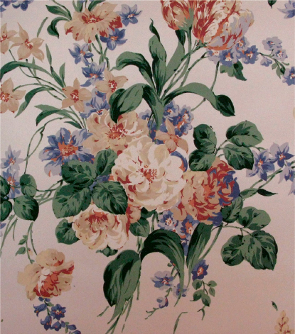
Figure 8–6. Muted Colors. Softened colors and a traditional floral pattern suggest a restful atmosphere. Wallpaper Compton Court II. Courtesy of First Editions Wallcoverings and Fabrics, Inc.
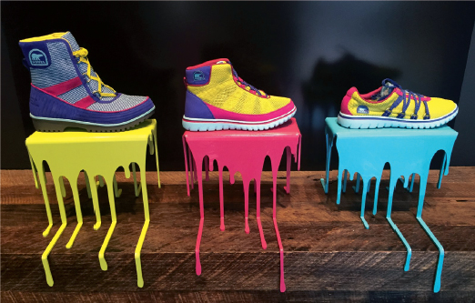
Figure 8–7. Window Shopping. A composition of high-impact colors has an eye-catching immediacy.
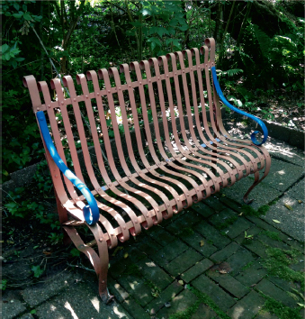
Figure 8–8. Consistency of Saturation. The startling blue arms of a garden bench stand out in contrast to the colors of surrounding nature.
There are times when colors are used to direct attention. A patch of unexpected brilliance is a surprise, drawing attention away from the whole. Color used in this manner is a way to create focus, not an aspect of harmony. The same is true for an area of dark in an otherwise light colorway (or vice versa), or a spot of warm color set into an otherwise cool field. Each follows the rules of spatial effects of colors, calling attention to itself by coming forward relative to its lighter, darker, or more muted surroundings.
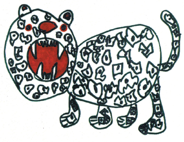
Figure 8–9. The Element of Surprise. A patch of unexpected high color draws immediate attention to itself. Drawing by artist Emily Garner.
Beyond Harmony: Dissonant Colors
If color harmony is the good child of design, its polar opposite (and evil twin) is disharmony, or dissonance. Dissonant colorways are disturbing. If harmony communicates balance and order, disharmony communicates imbalance, unease, edginess, chaos—a sense of things missing or out of place. The colors do not seem to belong with each other. Dissonant colorings can be dynamic and exciting—not pleasing perhaps, but certainly a way to draw attention. When the guidelines of color harmony are deliberately ignored the result may startle or repel, but it may also be memorable. Unpleasing colorings have their own uses and strengths.
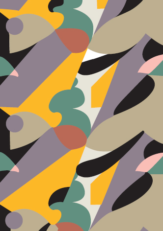
Figure 8–10. Dissonant Color. Sharp yellow-orange pops forward against a muted palette in an early twentieth-century pattern book. This coloring was stylish in its time, but “stylish” does not necessarily mean “harmonious.”
The X-tra Factor: Surface and Harmony
The natural world is a richly chromatic experience. Extraordinarily brilliant and subtly muted colors coexist. The colors of nature are also fragmented: some are better described as optical mixes, others as broken fields of color. Either suggests texture, and a textured surface, or the impression of one, engages more of the senses than a flat one. Broken color invites a tactile response, responding to the human need for connection to the natural world. The images of nature often found in medical waiting and treatment rooms are a good example, meant to offer patients and their families a soothing distraction from the realities of a clinical environment.
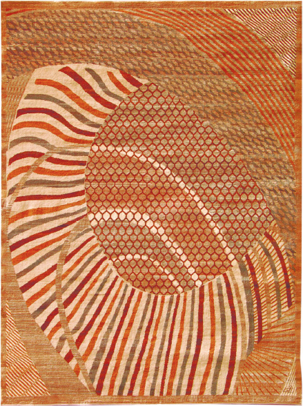
Figure 8–11. Surface and Harmony. Natural yarns, dyed and undyed, give this carpet an irregularity that seems to invite touch. Image courtesy of Orley Shabahang.
Flat color has its own purpose and place in design. While broken color suggests nature, hard-edged, flat colors are dramatic and compelling. They have a discipline that responds to an entirely different human need: the need to control. The designer of a new electronic device is unlikely to call for color that suggests a flower garden. A surface that is flat, sleek, and flawless implies precision. The decision to use flat or broken color is a small but meaningful side trip on the road to successful colorings.
Some Harmonious Conclusions
A central feature of successful harmonies is completeness. The ground is often the largest single area in a composition, and the idea of completeness includes consideration of the color of the ground, even when it is simply white. Subtractive whites are not “pure” (although white light can be). Every white has some undertone: yellow, green, blue, gray, violet, or some other color. Blacks and grays, too, carry undertones. There are green-blacks, blue-blacks, violet ones, brown ones. A well-chosen ground means the difference between a fully realized color harmony and a less satisfying one.
There is no way to escape the conclusion that a great deal of what we find harmonious originates as involuntary responses of the eyes and mind. The brain has a built-in bias for certain kinds of combinations, and it is a little disconcerting to think that one's personal response to color is predetermined by physiology. An impression of harmony is influenced by the eye's need for equilibrium, the comfort level of vision, the human need for logic in perception. An instinct for what is harmonious can be trusted because the eyes dictate boundaries of comfort, but physiology alone does not guarantee that a combination will have appeal. Ultimately, individual color preferences rest on an old idea—there's just no accounting for taste.
Finally, it is good practice to avoid a reverence for authority when searching for color harmonies. The traditional ideas have validity, but “laws” can be stifling to the creative spirit. No new idea ever grew from a strict adherence to rules. What does make sense is to consider some observations about color harmony:
- No single factor determines color harmony. All elements of a color composition contribute to the overall effect.
- The complementary relationship between hues is a strong basis for harmony, but it is not the only basis. Any hues used together can be made to be harmonious.
- Even intervals between colors contribute to harmony. Even intervals are pleasing whether between colors of different hue, different value, different saturation, or any combination of these qualities.
In general, color compositions tend to be harmonious when the level of saturation is relatively constant. In pictorial compositions, areas of reduced saturation create an impression of depth and soften, but do not conflict with, the overall level of brightness.