10
THE MEDIUM OF LIGHT
Images of Light / Lost in Translation / The Screen Display / Color Display Modes / Color Management / Color on the Web / Web Color Coding / Emerging Media: E-Ink
Now that we have the machines let us, instead of imitating former products and techniques, try to design goods that are characteristic of machine production—do not let us imitate former designs. Let us, with the help of these technical aids, produce the new.
—Gregor Paulsson, Design and Machinery, 1919
Few designers today remember a time before drawings were made on a screen, but the medium that allows the exploration of design solutions with speed and precision has existed for barely two generations. When it became possible to create images of light—when editing and correcting became the work of an instant—the studio workplace and the design industries changed forever. With rare exceptions, drawing in light is standard practice today in studios of all types and sizes.
Screen drawings are created for two principal end uses. Some are made as preparation for print; others are destined to be seen only on a screen. And while many color challenges are the same for all kinds of media, some are unique to digital drawing, and each end use has its own set of protocols and constraints. Color issues that must be addressed for screen-to-print distribution are not necessarily the same as those for screen-to-screen.
Images of Light
A graphic image can be as simple as black-and-white text or drawing or as complex and richly colored as an impressionist painting. It may or may not include drawings, text, photographs, and color, but no matter what it includes, a graphic is in every sense a visual communication. Graphic design is the arrangement of forms and colors into a composition whose purpose is to deliver information, to draw attention, or both. Graphic design is also called (perhaps more accurately) communication design, and this is often the discipline that first comes to mind when screen drawing is the topic. But communication design is only one field of many in which screen drawing is the medium of choice. All fields of design require drawing, whether that drawing is an elaborate rendering or a simple diagram. Among the principal uses of screen drawings are:
- The preparation of technical drawings
- The preparation of materials to be printed, like books, brochures, periodicals, advertising flyers, and packaging
- The preparation of product renderings for sales or production purposes
- The design of web pages meant to convey information about actual products, as online catalogs
- The design of web pages intended only for on-screen viewing and not associated with a physical product
In the past, renderings were executed by hand in subtractive media like pencil, ink, gouache paint, watercolor, or marker. These are now a rarity, even a luxury. Architects and engineers, interior designers and package designers, automobile designers, garden designers—all use design software to visualize and communicate their ideas. The monitor is the designer's canvas, an empty picture plane awaiting the input of visual information.
Josef Albers wrote about the interaction of colors in subtractive materials like paints and color papers. Designers today must navigate the interactions that exist between additive and subtractive colors, between light and substance. The monitor screen is a matrix in which three modes of color mixing may be in play at the same time: the red-yellow-blue of design thinking, the red-green-blue of working in light, and the cyan-magenta-yellow-black of process printing.

Figure 10–1. Modes of Color Mixing. Designers today must understand at least three different modes of color mixing.
Lost in Translation
The challenge of transposing colors from one medium to another is not new. Printed colors, for example, are never exactly the same as product colors, but what can be achieved is close (and satisfactory) representation. Even as the capabilities of hardware and software advance the crucial difference between screen images and those produced by traditional media is often overlooked. Much of the time today the designer draws and paints in additive colors images of things that ultimately will be experienced as subtractive colors.
Working in light is an intoxicating experience. Images have extreme clarity and colors are crisp, brilliant, and mutable at the click of a mouse. But colors seen as light are experienced differently from the colors of physical objects. The colors of an object are seen as scattered or reflected light, and reflected light is invariably reduced to some extent. A slight amount of light is lost as the light travels from the source to the surface, and more is lost as the light travels from the surface to the eye. An additive color that is the putative “match” of a subtractive color—a screen color that represents a product or printed color—will be sensed as more brilliant on the screen than in life or on a printed page.
The things that impart distinction and vitality to the colors of objects—irregularities of surface, or those that occur because of the use of a variety of colorants—cannot take place on a screen. They can be simulated, but the complete experience of an object and its color, with the attendant sense of its tactile quality, is difficult to convey in light. And although vision is the primary sense used to identify objects and surfaces, the sense of touch is closely associated with it, as every “PLEASE DO NOT TOUCH” sign in museums reminds us. Images made in light are vision-only, single-sensory experiences.
Reflected colors also seem more natural. Human beings are predisposed to understand reflected color as “real.” The surface of every object scatters light in distinctive ways. Colors on a monitor screen, unmodified by surface, have an inevitable flatness. In nature, light that comes from an angle 45° above or behind the viewer is sensed as the most natural. Light emitted by a monitor screen reaches the eyes from a direct frontal position.
The brilliance of colored light can be used to advantage in illustrating certain kinds of surfaces. Additive color and the capabilities of drawing software combine to great effect in rendering reflective materials. Screen drawings of materials like glass, polished metals, laminates, and high-gloss finishes are particularly convincing.
Materials with textured or matte surfaces like unpolished stone, natural woods, and textiles are more difficult to display. Pattern and color can be represented, but the way in which textured surfaces reflect light is not easily conveyed. Textiles are particularly problematic. Color fields on a screen can be fragmented into areas of dark and light to suggest texture, but because the light that reaches the eye comes from only one direction, the characteristic flat brilliance of additive color persists.
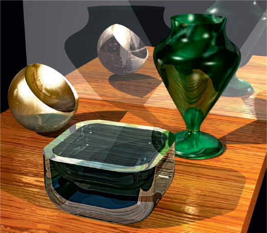
Figure 10–2. Screen Drawing. Digital drawing is perfectly suited to rendering reflective surfaces. Courtesy of retired professor Ron Lubman, Fashion Institute of Technology.
The Screen Display
Every screen image represents an interplay of platform, hardware, and software. Each platform—the combination of a particular type of computer and a particular operating system—has features that enable it to perform certain tasks better than others. Software is designed to operate on a specific platform. The two platforms in most widespread use, PCs (personal computers) and Macs (Apple Macintosh) offer somewhat different capabilities, although differences between them continue to diminish. Mac and PC design programs are equally available, but Macs, with their more intuitive interface, continue to dominate the design market.
Images on a screen are created by the distribution (pattern) and strength (brightness) of light emitted at different wavelengths. The range of colors that a monitor displays is its gamut, or color gamut. There are limitations to the color gamut of any monitor, but today's typical consumer-marketed monitor displays so many colors that its capability approaches the range of human color vision.
The monitor screen is made up of pixels (picture elements), which are the smallest units of the screen display. The pixels are arranged as a vertical and horizontal grid. Each pixel is made up of three components that can be triggered by an electrical impulse to display the additive primaries red, green, and blue. The strength of the impulse applied to each pixel determines what color is displayed. Mixing the light emission within each pixel allows a full range of hues to be displayed. A pixel emitting both red and green light, for example, displays yellow, the additive mix of the two. Each pixel on the screen can be altered in hue, value, and saturation. Pixels are measured as dpi, or dots-per-inch (or ppi, pixels-per-inch) The higher the dpi, the greater the screen's resolution, or ability to show detail.
A bit is the smallest element of electronic information that a computer can use. The number of ways in which a pixel can be altered is determined by its bit-depth. The more bit-depth a monitor has, the more pieces of information—the greater the number of colors—that can be displayed. The earliest monitors had only a 1-bit depth and displayed only black and white. The next generation had an 8-bit depth, enabling a display of 256 colors. The 24-bit-depth monitor, now standard for consumers, can display 16,777,216 variations in color, but as a practical matter only about 20,000 are available for design purposes, a number that is adequate for most tasks. The rest are there, and are necessary, to make smooth gradations between colors.1
The first computer monitors were cathode ray tubes (CRTs), bulky forms that occupied considerable space. Color display was created by the glow of a grid of phosphors, substances that emit light when bombarded with electrical energy.2 The CRT monitor has been displaced by the LCD, or liquid crystal display. LCD monitors were first developed as flat screens for laptop computers. Today they are standard for personal computer monitors, televisions, laptops, and the miniaturized screens of handheld devices. LCD monitors are energy efficient, lightweight, and take up only inches of depth on a work surface, a combination of features that makes large screens practical.


Figure 10–3. The LCD Monitor. The flat screen LCD monitor is used for all design tasks. Image courtesy of the Stevenson Studio, wwwthestevensonstudio.com ©2005.
An LCD monitor displays color when light passes through a screen-wide matrix made of layers of pixels, each pixel filled with liquid crystal and red, green, and blue filters. A light source provided behind the pixels bends (refracts) the light to produce spectral hues. Since each pixel has three components (red, green, and blue) and each is represented by 8 bits, the total bit-depth of an individual pixel is 24 bits. By varying the strength of the light stimulus, the hue intensity of each pixel can be extended to 256 steps. Combining the pixels (256 X 256 X 256) enables a display of more than 16 million colors. Because colors on an LCD screen are seen directly as wavelengths of light, the colors that result are true spectral hues.
The first LCD screens employed fluorescent backlighting. Fluorescent backlighting has been replaced by LEDs,3 which are brighter and enable a wider color gamut. According to Paul Gagnon, senior analyst for IHS Technology, the vast majority of displays today use LCD technology and LED backlight. He warns, however, that not all LED backlights have the same color reproduction capabilities. Some are not even capable of displaying the full range of colors. The best screens use a wide color gamut (WCG) to increase the range of available colors.4
The colors of a screen display can be expanded by the addition of various phosphor coatings on the LEDs and by the use of improved filters. The screen display can also be enhanced by the addition of quantum dots, tiny elements that have a single function: light reaching a quantum dot causes it to glow with a single color that can be finely tuned. Screens that produce images through the use of organic light-emitting diodes (OLEDs) without backlighting are a recent development. These offer an even wider color gamut, deeper blacks, and lower energy use but are at present limited in availability and high in cost.
Another recent development in color display is four-color LCD technology, which adds a clear, strong yellow to the red-green-blue of each pixel. Advertised as “four-primary-color” technology, it is said to expand the gamut of available screen colors enormously while also deepening blacks. Four-color technology is presently marketed only for high-end television monitors but seems likely to enter the computer monitor market within the foreseeable future.
Monitors with up to 48-bit color are available for specialty purposes like professional image editing and medical imaging. These use only the 24 bit-depth for colors; the additional bits are for special effects like animation or translucency.
Today's technology demands of the user a constant adaptation to change. Advances in hardware and software are so rapid that nearly anything written about them is outdated before it goes into print. Future advances in ways that the colors are delivered and mixed on a screen are unlikely to affect the nature of the medium itself. The colors of light are as measurable and constant as when Newton revealed them.
Color Display Modes
Bit-depth determines only how many colors a monitor is capable of displaying. The software determines how many colors are actually displayed and how those colors are mixed on the screen. There are three different ways in which design programs display and mix colors. All offer a basic assortment of hues, a range of grays, and black and white presented as a box or circle called the color palette. Colors on the palette are mixed in one of three possible ways: the CMYK mode, the RGB mode, and the HSB mode. Each kind of display software has a limited number of available colors, and it is this range of colors that makes up its particular gamut.
The CMYK mode simulates on-screen the results of mixing process colors. Each color displayed in the CMYK mode represents a color of process ink. A bar of each color allows the user to select cyan, magenta, yellow, or black as a percentage of the screen display. When two of the CMY colors are mixed without black, clear colors and tints result. Three CMY colors mixed in equal percentages (with no black) result in a middle gray with a chromatic basis. Muted colors are achieved by using this chromatic-gray mix and manipulating one or two colors until the desired effect is achieved.
Achromatic gray scales are made by manipulating percentages of black (K) alone. Black is also used for making hues darker: one or two of the CMY screen colors plus black creates shades; the black-based gray mixed into a pure hue on-screen will make it darker, not more muted. This is an important difference between mixing colors in a CMYK light display and mixing CMYK inks; in mixing inks, black is used in producing both shades and muted colors.
Varying the percentages of the three hues and black enables the designer to mimic the wide range of colors that are available in printing inks, including most hues, values, and saturations. Because the CMYK display mode requires little new thinking about color mixing for designers who are familiar with process colors, it facilitates working on-screen for print production.

Figure 10–4. Color Display Modes. Each color in the CMYK mode represents a color of process ink. Reprinted with permission from Adobe Systems Incorporated. ©2010 Adobe Systems Incorporated. All rights reserved. Adobe and Photoshop is/are either [a] registered trademark[s] of Adobe Systems Incorporated in the United States and/or other countries.
The RGB mode of screen display parallels the behavior of light. It is used to create images that will be viewed only as light display, like web pages or DVDs. In the RGB mode each of the light primaries—red, green, and blue—is displayed as a separate bar, called a channel. Each channel has an 8-bit depth, so each primary can be displayed in 256 variations, and these multiply to the possibility of millions of variations.
The user selects each color for mixing in a range from no display (0%) to full display (100%). When 100% of each of the three light primaries is mixed, the result is white. When none (0%) of each primary color is mixed, the display is black. If 50% each of red, green, and blue is displayed, the result is a middle gray. Varying the relative percentages of red, green, and blue in RGB mixtures enables the user to view most hues, values, and saturations.
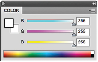
Figure 10–5. Color Display Modes. The RGB mode of screen display is used to design for the medium of light. Colors are mixed exactly as light is mixed. Reprinted with permission from Adobe Systems Incorporated. ©2010 Adobe Systems Incorporated. All rights reserved. Adobe and Photoshop is/are either [a] registered trademark[s] of Adobe Systems Incorporated in the United States and/or other countries.
RGB mixing does not correspond to either of the two familiar forms of subtractive mixing, artists' colors or process colors. It is not suitable for printing because the number of colors that can be generated in the RGB mode is much greater than can be printed using the CMYK process. The RGB mode is most directly associated with working and viewing in the medium of light.
The HSB mode of display stands for hue, saturation, brightness (value). The HSB mode displays a color map. Next to the color map are three boxes, one each for hue, saturation, and value. Each box has a range of numerical values. The user first selects a color from the map, then instructs each of the boxes to modify that selection in hue, saturation, or value. Unlike the CMYK or RGB modes, it does not correspond to either additive (light) or CMYK (printing ink) color mixing. Although colors are mixed on the screen in a way that is familiar to users of traditional media like paints, the HSB mode actually requires learning to mix light in a way that is associated only with digital design. Software for the HSB display mode is also marketed under different names: HSL (hue, saturation, lightness) and HSV (hue, saturation, value).
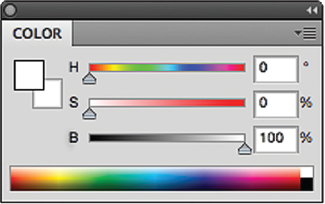
Figure 10–6. Color Display Modes. Colors in the HSB mode are mixed as separate steps—one each for hue, saturation, and brightness (value). Reprinted with permission from Adobe Systems Incorporated. ©2010 Adobe Systems Incorporated. All rights reserved. Adobe and Photoshop is/are either [a] registered trademark[s] of Adobe Systems Incorporated in the United States and/or other countries.
Dithering is a capability of some programs that extends the range of colors in software that has a limited palette. Dithering takes advantage of the human eye's tendency to “mix” colors that are similar to each other. In a dithered image, colors that are not available in the gamut are approximated by pixels in a mixture of two or more similar colors from those that are available. Dithered images, particularly those with relatively few colors, can have a fragmented, grainy appearance. The wide range of available colors in the gamuts of most present-day hardware has made dithering less of a concern.
Color Management
The difficulties of displaying subtractive colors in an additive medium are so universally acknowledged that an entire industry is devoted to solving them. Color management tools, both hardware and software, help to reduce the difficulties of making acceptable matches between screen colors and print or product colors.
Color standards are essential to maintaining a high level of consistency between the color of a product or printed page and its representation on-screen. A standard is a single sample that enables the designer to make constant comparisons against the same color at each step in the design process. Standards for color printing are most often quality-controlled printed colors on paper, but a standard can also be a sample of an actual product like a metal or wood, a yarn or a lipstick.
In order to best represent the colors of a product on-screen, the source of any image must also be standardized. This means that the colors of a product and any photograph, transparency, scanned image, or rendering of it must conform to the same set of standards. Unless all of these elements can be cross-referenced, even the most carefully prepared screen image is potentially unreliable. A spectrophotometer is a color management tool that measures and brings into synchrony the wavelengths of reflected color from a standard and those of emitted color from the screen so that the screen image will be a reasonably close representation of how colors appear in real life.
ColorMunki exemplifies a multipurpose color management product. It offers programs that can synchronize palettes to specific design programs, match screen colors to Pantone CMYK and spot color inks, create and name custom color palettes, and calibrate colors for large-screen projections.5 Its spectrophotometer captures the color of any material or image and creates an onscreen match. At times the user must consider the end-use lighting condition of the standard because subtractive colors appear differently under different sources of ambient light; ColorMunki can even evaluate subtractive colors under different light sources. Versions are available for both Mac and PC platforms, and there is also a product for photography.
Color management devices are also available for purposes of calibration. To calibrate a monitor means to adjust it so that specific combinations of red, green, and blue signals produce specific colors on the screen. A colorimeter is the tool used to calibrate the monitor with its software. Colors on a monitor drift over time, even a relatively short period of time, so monitors that are used for design purposes must be calibrated on a regular basis.
Calibration is also done to standardize colors between devices. A group of monitors can be calibrated to display like colors, but within limitations. Different platforms handle color slightly differently. Not all colors seen on a Mac, for example, will appear the same on a PC. Even within the same platform, in order for all viewers to see the same colors, their monitors must be calibrated in the same way—standardized with each other as well as with the source of the color image.
Monitors that share the same display capabilities can be calibrated identically so that a number of monitors display the same colors with a high level of consistency. Monitors that have different display capabilities cannot be calibrated in this way, but they can be calibrated to the same set of standards, so that a reasonable level of display consistency can be achieved. With care and good calibration it is possible to distribute images that are reasonably close in color to a controlled audience of any size.6

Figure 10–7. Color Management. ColorMunki exemplifies the multipurpose calibration product. Image courtesy of X-Rite.
Reference standards and color management tools provide designers with the means to make acceptable matches between additive and subtractive colors, particularly between screen and print colors. Not all users take advantage of these tools. Much of the time, coordinating between screen color and product is done by matching each color individually by eye. Several design professionals interviewed even confessed to shifting screen colors deliberately away from a standard in order to provide a livelier image for on-screen presentation. Even with the best tools, there are no absolutes. No matter what standards and tools are employed, the ultimate decision about the quality of a match—and the best presentation—is made by human eyes.
Not all screen drawings call for serious color management. The precision that is essential to drawing plans for constructing a ship, an airplane, or a building is now unimaginable except as digital drawing, but in general, technical drawings use color only to make diagrammatic situations easier to read. These drawings may employ color, even require it, but accuracy in rendering a specific color—a certain red, or a particular blue—is rarely essential to their purpose.
A screen drawing often provides the first—and sometimes the only—opportunity for a vendor to decide whether or not a proposed new product or colorway is worth producing. Many drawings are simply about selling. An architect's drawing of a new building may be both beautiful and imaginative, but its underlying purpose is to sell real estate. Color management on the screen is as essential to small-scale undertakings as to large ones. The florist making a laptop presentation to a bride-to-be is as dependent on good color as the developer of a hotel complex making a PowerPoint presentation to a group of investors.
A second important use of renderings is to communicate product design and color from the studio to the manufacturing floor. The use of preproduction renderings is industry-wide, ranging from the design of cars and appliances to textiles and building materials. A rendering can be sent electronically to a manufacturing location, where the colors in the image are matched to actual materials. Alternatively, the selection of some material—yarn, metal, plastic, stone—is made first, and the artist works from these physical standards. The manufacturing facility has an identical set of samples and treats the rendering as a color placement guide.

Figure 10–8. Traditional Rendering. A hand-painted rendering is shown to a client for approval, then sent from the salesroom to an overseas factory for fabrication. Gouache rendering courtesy of Donna Frost.

Figure 10–9. Computer Rendering. Computer-generated drawings have overtaken hand-rendering for carpet design. Carpet design by David Setlow for Stark Carpet Corp.
The most extensive efforts to facilitate the transition from screen color to product color have been made for the printing industry. The great majority of printers, whether small personal printers or large commercial ones, produce continuous fields and shadings of color using process color inks. Software that limits the colors on the screen to the capabilities of CMYK printing is standard in graphic design programs and, with the support of color management tools, helps to ensure that the screen image will be reproduced in print as closely as possible.
Color on the Web
The Internet, conceived in the 1960s as a means of communication for national defense, is now a seemingly limitless public broadcast medium. Interconnected networks make it possible for information to be accessed and shared on a global basis at any time and in (nearly) any place. The World Wide Web offers text, images, motion, sound, and interactive communication to businesses, organizations, and individual users. Because much of this information is delivered as text and static imagery, sound is a secondary presence. A screen is reading material, and the meaning of the word “literate” has come to include not just the ability to read and write but also the ability to use a computer.
Although the incidence of Internet use is still weighted by factors like region, affluence, ethnicity, education, and age, according to the Pew Research Center the gaps between groups using it are diminishing. In January 2014, 87 percent of United States households accessed the Internet, and within the subset of 18- to 29-year-olds, 97 percent accessed the Internet.7 Consumers can find information about any conceivable topic or product 24 hours a day, 365 days a year. For vendors, the magnitude of the potential audience is breathtaking.
A web page is nothing more than a graphic design: a contained arrangement of forms and colors. Whether it is static, includes motion, or is accompanied by sound, its first purpose is to attract and hold attention. Consumers rate color as the single most important factor in making a decision to purchase, and screen images are potentially richer in color than any other means of presentation.8
Whether or not a page will succeed rests in large part on the appeal of its colors. Screen colors can be displayed with near-perfect consistency between monitors when they share the same platform and software and are calibrated to the same set of standards. This kind of controlled situation might be found in a design studio, even including off-site locations. But consumers who retrieve information from the Internet are not a controlled audience. They regularly experience color-display inconsistencies, although they are not necessarily aware of them. The consumer may be using a Mac, a PC, or some other platform. Home monitors vary in type and quality. The average person is unlikely to calibrate or use color standards. Since color depends on the display properties of the receiving monitor, there is no guarantee that the designer's carefully planned colors will reach home screens with any fidelity. Even viewers who do calibrate do not necessarily employ the same calibration software or set of standards. Realistically, the colors of a web page cannot be assumed to arrive at their destinations intact. They will be somewhat different on every screen they reach.
Many web pages include catalogs that must represent as closely as possible the colors and textures of the goods on offer. A sweater the purchaser identifies as blue on the screen is likely to be returned if it arrives in green. There is no perfect solution, but an image whose color has been calibrated to a product standard before being broadcast has a reduced risk of disappointing the consumer. As more and more items are purchased online, careful Internet vendors alert potential purchasers that the color of the product may be different from the image on their screen.

Figure 10–10. Selling Color on the Web. Stephen Gerould reminds potential purchasers of his handmade ceramic lamps that the color of the product they receive may not be the same as the image on their screen. Photography by Carolyn Schirmacher from the website of Stephen Gerould Handmade Ceramic Lamps.
When a web page offers information only, and does not represent a product, the page itself is the product. Although it is a certainty that there will be a disparity in color between the designer's colors and the viewer's colors, only one step separates the two. And because the image represents only itself, differences in colors between the sender's screen and receiver's screen are less likely to matter.
Web Color Coding
HTML (hypertext markup language) is the principal programming language of the Internet. It is the language in which web pages are designed. Web design colors are specified by three widely used systems of coding: binary coding, hexadecimal coding, and CMYK coding.
Computer function is based on binary code. Binary code separates each piece of information into a string using some combination of two digits, 0 and 1. A string of eight binary digits, or bits, can represent any of 256 possible pieces of information. Colors in many widely used programs are specified in binary code by their relative proportions of red, green, and blue wavelengths.
Binary color coding identifies 256 steps, designated 0 to 255, of red, green, and blue (in that order) for each pixel of the on-screen image. Each color is coded by its intensity within that pixel, with 0 representing no color and 255 representing maximum color. Black, for example, has no color and is 0,0,0. White has all three primaries equally and at full intensity and is coded as 255,255,255. Red is 255,0,0; green is 0,255,0; blue is 0,0,255. Binary codes for the secondary colors of light follow logically: yellow, the mix of red and green, is 255,255,0; cyan, made of green and blue, is 0,255,255; magenta, made of red and blue, is 255,0,255. Any color in the available gamut can be coded in this way. A color described as “orange-orange red,” for example, is 255,102,0—full red, with just enough green (because green and red mixed equally in light produce yellow) to make it into an orange.
Colors for web graphics are also described using the hexadecimal system. The specification for each color in the hexadecimal system is based on a 16-symbol code consisting of the numbers 0 through 9 and the letters A through F. Each color is specified by two symbols as a percentage of each primary emitted in red, green, blue order. The full specification is called a hex triplet. No emission at a wavelength is indicated as 00; the maximum possible emission as FF. Black is therefore 00000, or no light emission; white is FFFFFF, or all primaries emitted equally. Red is indicated as FF0000; green as 00FF00, and blue as 0000FF. Yellow is FFFF00, the secondary color mix of red and green, with no blue. Any color in the available gamut can also be coded in this way. The “orange-orange red” that is 255,102,0 in binary code is FF6600 in hexadecimal code.
Neither binary nor hexadecimal coding offers perfect color transitions. Middle codes may or may not be middle colors, and color intervals are not reliable by number. The designer's eye is still necessary to make decisions about final colors and sequences.
CMYK coding mimics the ratios of CMYK printing inks. Each code gives the percentage of each ink, in CMYK order, that will produce the desired color when printed as dots. CMYK coding offers the most direct pathway to preparation for process printing, including its limitations.

Figure 10–11. Screen Color Coding. Screen colors are coded in more than one way. A screen color can be specified in binary coding, in hexadecimal coding, and by its CMYK print equivalent.]
Colors that have been specified in binary code can be converted to hexadecimal code, and vice versa, by using readily available charts or formulas. Both binary and hexadecimal coded colors are also specified by names that are generally acknowledged by most web browsers. The names help web designers to locate some colors more easily than by their hex triplet or binary designations, but the number of names includes only a small fraction of available colors.
Early color monitors had limited bit-depth. A tool that helped designers working on material for Internet distribution was a group of RGB colors called the web-safe (or Netscape) palette. These colors were (and still are) available online, in book form, and as an option in older design programs. The web-safe palette identifies 216 colors in a full range of hues that are reasonably consistent for viewing on both Mac and PC platforms and monitors with a limited (256 colors) display range. Restricting colors to this palette gave designers some assurance that colors reaching the home computer would display as a reasonable approximation of the original.
The colors in the web-safe palette were selected for the likelihood of consistent transmission, not for ideal design application. Many of the colors within each hue group are quite similar. For the greatest chance of success in reaching a wide variety of platforms and monitors, the designer working within the web-safe palette had to avoid using colors with subtle differences, and the limited options made working within the web-safe palette less than satisfying. Advances in the capabilities of hardware and software and the proliferation of monitors with greater display capability have made the web-safe palette a still useful but less essential tool than in the past.
Outside the limits of the web-safe palette lies an enormous range of available colors, each of which must be individually specified for each situation. Selecting colors from this vast number can be overwhelming. Reducing a gamut to a smaller palette, a limited group of colors with preselected and designated relationships, helps to make color selection a more manageable process. Preselected color palettes are available to designers, both as software and as free or for-purchase charts, each offering its own organization, set of preferences, and point of view.

Figure 10–12. The Web-Safe Palette. VisiBone offers the web-safe palette online and in print as charts, books, folders, and cards. ©2005 VisiBone. (This figure does not use VisiBone's eight-color printing process to match computer screen color.)

Figure 10–13. Limited Palettes. VisiBone offers a preselected palette of 1,068 colors that are outside of the web-safe palette, with their binary code designations as a reference tool for web page designers. © 2010 VisiBone's 1,068-color reference chart. (This figure does not use VisiBone's eight-color printing process to match computer screen color.)
One of the problems associated with a fixed color palette is that colors needed to display a specific image may not be available in the palette, while many of the available colors may not be needed. A fixed palette containing mostly variations of pink, for example, would not be well suited for images that do not include pink. One trend in software, which assumes a 24-bit depth monitor, is the use of an adaptive, or optimized, color palette, in which the available colors are determined by how frequently they appear in the original source image. An image based on an optimized palette is more likely to be close to the original source image than any other approach.
Emerging Media: E-Ink
E-books, or electronic readers, do not use LCD screens. Instead, they use a screen that is a bridge between subtractive and additive display. The image on screen is created by e-ink, a substance made of tiny capsules that contain both black and white particles.9 The particles within each capsule are suspended in a medium, a clear fluid. In one formulation, the white particles have a positive electrical charge, and the black ones have a negative charge. The capsules suspended in the medium are applied to a surface that is laminated to a layer of electrical circuitry. When positive and negative charges are applied selectively, the capsules rotate so that either black or white becomes visible on the surface. The pattern of dark and light is established by the pattern of the circuitry and is controlled by a display driver. There is no backlighting; instead, ambient light is reflected back from the surface, so e-ink is considered to be less tiring to the eyes. Although a recent advance has added a single color to the e-ink display, full color in e-ink has not yet successfully been developed.